
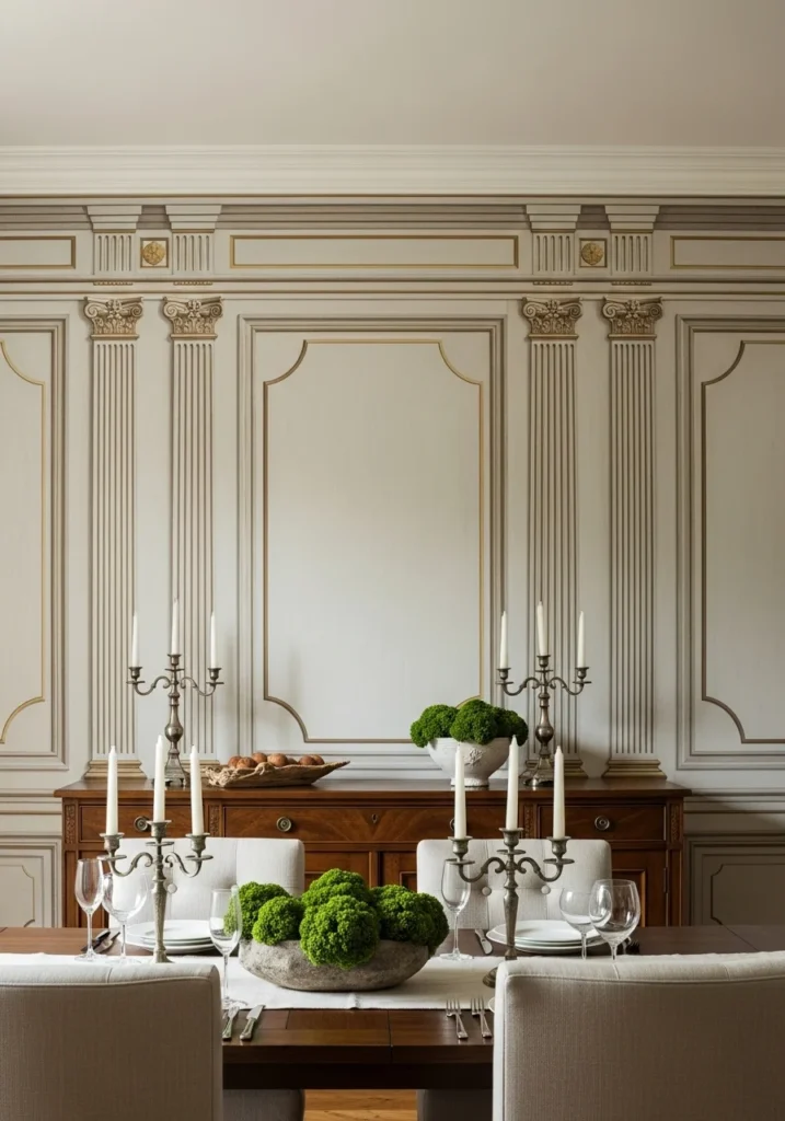
You walk into someone’s dining room and immediately think “this looks like it cost a fortune” – but it’s not the furniture or the chandelier that’s doing the heavy lifting. It’s the wallpaper. One accent wall can completely change how expensive and intentional a space feels, especially when you nail the color and pattern.
Green wallpaper in dining rooms is having such a moment right now, and honestly, it makes perfect sense. Green feels natural and calming, which is exactly what you want when people are sitting around a table for hours. Plus, it photographs beautifully and works with basically every wood tone and metal finish you can think of.
But here’s the thing – not all green wallpaper is created equal. Some looks expensive and editorial, others look like you wrapped your walls in gift paper from 1987. The difference comes down to understanding which patterns, finishes, and shades actually work in real spaces versus what just looks good in a sample book.
Ready to create a dining room that stops conversations when people walk in? These 15 green wallpaper ideas will give you that high-end, magazine-worthy look without having to hire a professional designer.
What Makes Wallpaper Look Expensive vs. Cheap
Before diving into specific patterns, let’s talk about what separates wallpaper that looks like a million bucks from wallpaper that screams “rental apartment makeover.”
Quality of Materials – The paper itself makes a huge difference. Heavyweight papers with satin or matte finishes photograph better and feel more substantial than thin, shiny papers that show every imperfection on your walls.
Scale and Proportion – Small, busy patterns can make spaces feel cramped and dated. Large-scale patterns with breathing room read as more sophisticated and contemporary, even when they’re based on traditional designs.
Color Complexity – Flat, single-tone greens often look cheap and artificial. The best green wallpapers have depth – multiple tones, subtle variations, or mixed materials that create visual interest without being overwhelming.
Installation Quality – Even the most expensive wallpaper looks terrible if it’s poorly installed. Seams need to align perfectly, patterns need to match, and corners need to be crisp. This is not a DIY project if you want professional results.
How Green Works in Dining Spaces
Green is basically the perfect dining room color, and there are solid psychological reasons why it works so well in spaces where people eat and socialize.
It’s Naturally Calming – Green connects to nature and growth, which makes people feel relaxed and comfortable. This is exactly what you want in a space where conversations need to flow naturally and people should feel welcome to linger.
It Works with Everything – Seriously, green pairs beautifully with warm woods, cool metals, natural stone, and basically any accent color you want to add later. It’s like the chameleon of interior design colors.
It Photographs Beautifully – Green wallpaper creates gorgeous backdrops for food photography and dinner party pictures. It’s rich enough to add interest but not so bold that it competes with everything else in the frame.
It Ages Well – Unlike trendy accent colors that feel dated quickly, green has staying power. Forest green, sage, emerald – these shades have been working in interiors for centuries and will keep working long after other trends fade.
15 Green Dining Room Wallpaper Ideas
1. Bookmatched Green Marble Vein Wallpaper
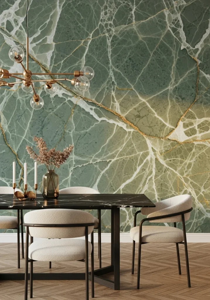
This is the kind of wallpaper that makes people stop and stare. Large-scale bookmatched marble veining printed on satin-finish paper creates the illusion of actual marble slabs across your feature wall, but without the weight or insane cost of real stone.
What makes this work so beautifully is how the veining patterns mirror each other across the wall, just like real bookmatched marble. The satin finish catches light and creates subtle reflections that make the veining glow, especially with warm golden-hour lighting.
Pair this with a low-profile black marble or walnut dining table, brushed brass chandelier, and cream boucle chairs. The marble wallpaper becomes your statement piece while everything else stays sleek and supportive. This combination screams expensive without trying too hard.
The installation is crucial here – seams need to align precisely like real stone slabs, and you want that golden-hour side light to let the veins really shimmer against any metallic accents in the room.
2. Tonal Venetian Plaster Effect Wallpaper
This ultra-textured wallpaper mimics hand-troweled Venetian plaster in soft sage or warm taupe, and honestly, it’s hard to tell the difference from the real thing unless you get up close and touch it.
The genius of this option is how it adds incredible depth and texture to your walls while keeping the installation relatively simple. Real Venetian plaster requires serious skill and time, but this wallpaper gives you that same bespoke, high-end feeling in a fraction of the time.
Style it with a walnut table, linen slipcovers, and unlacquered brass sconces. Add a single large still-life painting as your only wall art – the textured wallpaper provides enough visual interest that you don’t need much else competing for attention.
The low-sheen finish works beautifully with soft wall-wash lighting that reveals all the texture and depth. This is sophistication that doesn’t scream for attention but quietly impresses everyone who sees it.
3. Hand-woven Grasscloth in Deep Emerald
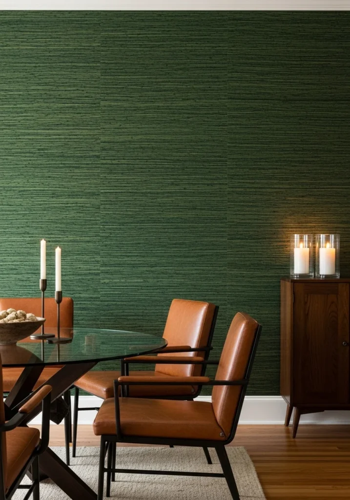
Natural grasscloth dyed in deep emerald or forest green creates this gorgeous tactile richness that photographs like a fabric-lined room. The natural fiber texture adds warmth and organic beauty that you just can’t get with printed patterns.
What’s brilliant about grasscloth is how it brings natural elements indoors while still feeling refined and luxurious. The deep emerald color feels jewel-like and sophisticated, but the woven texture keeps it from being too precious or formal.
Pair this with leather chairs and a glass-top table so the wall texture can really be the star. Warm wood flooring grounds everything and prevents the green from feeling too cool or overwhelming.
Plan your seams carefully since grasscloth has natural variation, and consider a clear protective topcoat in high-traffic areas. The midday light with warm accent lighting from candles or lamps really shows off the weave dimension and makes the whole room feel intimate.
4. Oversized Botanical Mural in Muted Editorial Palette
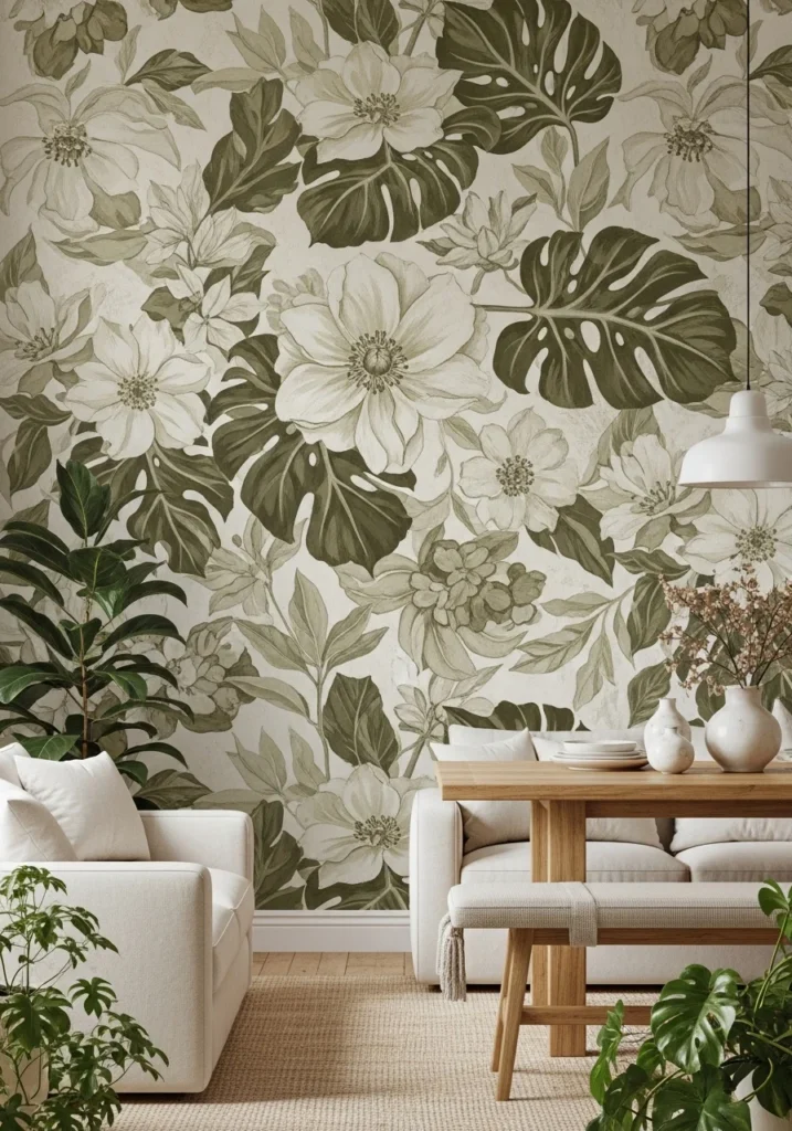
This custom approach uses hand-painted or digitally printed murals of oversized leaves and blossoms in desaturated olives, creams, and stone tones. It creates this garden-to-table narrative that feels both editorial and timeless.
The key to making botanical murals work is keeping the color palette sophisticated rather than literal. Instead of bright green leaves, think muted olives and sage tones that photograph beautifully and work with real furniture rather than competing with it.
Keep your furniture minimal – maybe cream seating and an oak table – so the mural stays the absolute star of the space. This is about creating a backdrop that tells a story while still being livable and functional for actual dining.
Use a matte finish to avoid glare, and consider wrapping the mural slightly around a corner for a more custom, immersive feeling. Soft side grazing lights reveal the painterly brushwork, and you can frame the scene with real plants to extend the garden feeling.
5. Painterly Abstract Brushstroke Wallpaper
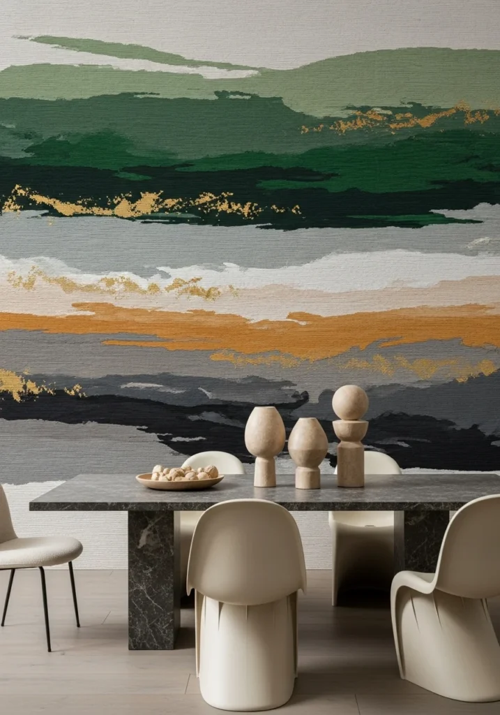
Large-scale abstract brushstroke wallpaper in layered greens, warm grays, and gold flecks reads like floor-to-ceiling artwork. This is dramatic without being overwhelming, and perfect for high-end dining spaces that need serious visual impact.
The genius of this approach is how it brings fine art energy to your dining room without the cost or commitment of actual commissioned artwork. The abstract brushstrokes feel modern and sophisticated while the green tones keep everything grounded and livable.
Pair with sculptural dining chairs, a simple stone tabletop, and sculptural centerpieces that echo the artistic vibe. Choose slightly textured paper to give the brushwork actual physicality rather than just printed flatness.
Gallery-style lighting and a low camera angle make this wall treatment look absolutely monumental. This is for people who want their dining room to feel like an art gallery where you happen to also eat dinner.
6. Luxe Metallic Geometric Art-Deco Modern
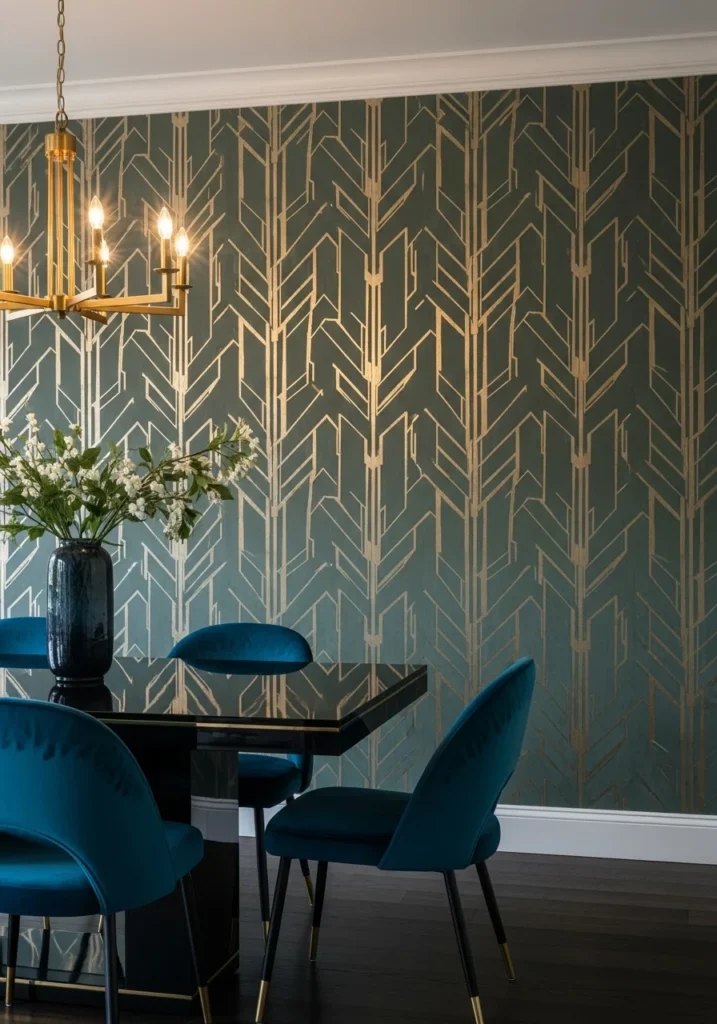
Geometric wallpaper with hand-applied brass or aged-gold foil accents on a matte deep-green background brings instant glamour and editorial shine. This is art-deco geometry updated for contemporary spaces.
The magic happens in the contrast between the matte background and the metallic geometric elements. The green provides richness and depth while the brass foil catches controlled highlights and creates visual movement across the wall.
This pairs beautifully with a black lacquer or onyx dining table, velvet chairs in jewel tones, and a satin-gold chandelier. The whole combination feels like something from a luxury hotel or high-end restaurant.
Test your foil samples carefully – you want enough metallic to create impact but not so much that it feels overwhelming or gaudy. Evening lighting with chandelier glow reflecting in the foil veins creates pure cinematic opulence.
7. Contemporary Toile – Overscale, Tonal Palette
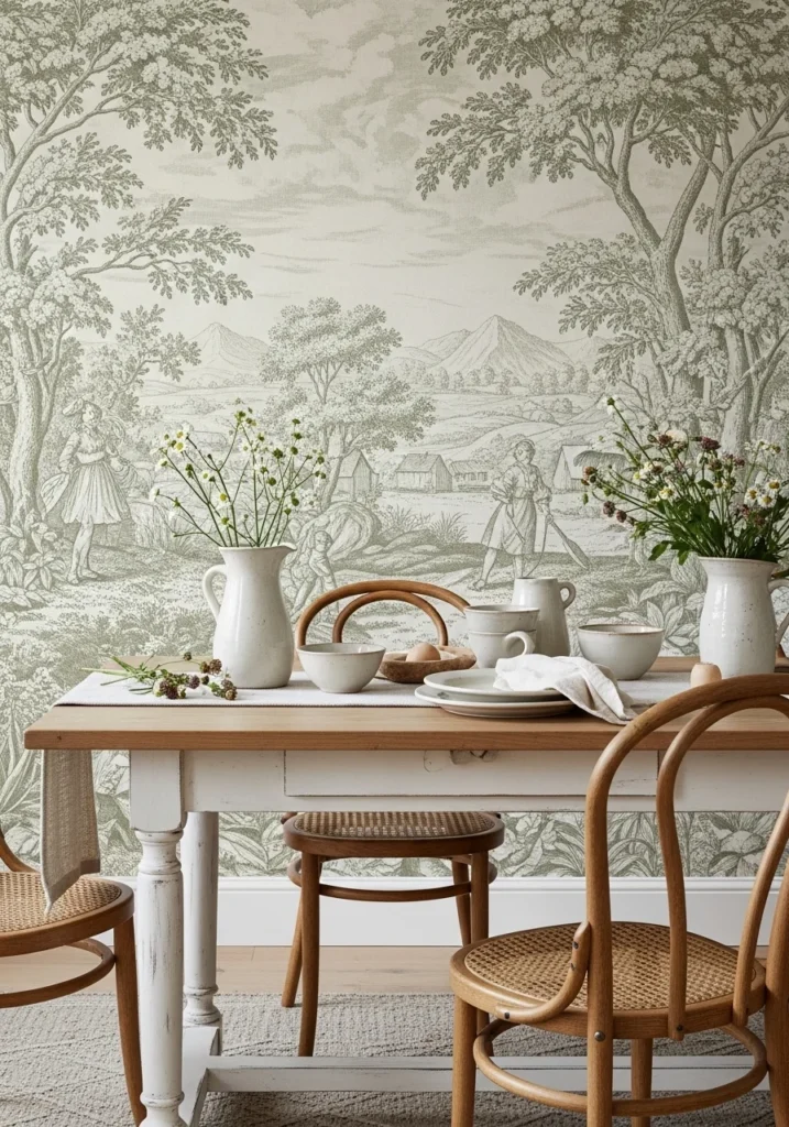
This modern reinterpretation takes traditional toile and scales it way up, printing overscale pastoral scenes in tonal sage and cream on heavy linen-effect paper. It’s nostalgic craft given a couture update.
What makes this work so well is how it takes a pattern that could feel dated or twee and makes it feel fresh and editorial through scale and color choice. The tonal palette keeps it sophisticated while the overscale proportions make it feel contemporary.
Style with painted oak table, cane-back chairs, hand-thrown ceramics, and loose wildflower bunches. Everything should feel collected and natural, letting the wallpaper provide the pattern interest while keeping accessories organic and understated.
Wide bolt widths minimize seams, and the matte finish keeps everything photo-friendly. Soft morning light with shallow depth of field gives the pastoral scenes a romantic, dreamy quality at the edges.
8. Velvet-Flocked Jewel-Tone Wallpaper
Low-pile flocked wallpaper in rich moss, teal, or aubergine creates tactile velvet surfaces that make your walls feel like upholstery. This is sumptuous, luxurious, and completely unexpected in the best way.
The velvet pile adds incredible depth and richness that you can’t get with any printed pattern. It’s walls that beg to be touched, and the jewel tones photograph beautifully while feeling sophisticated rather than overwhelming.
Pair with satin brass fixtures, cream seating, and bronze or marble center tables to balance all that texture. The contrast between smooth surfaces and the flocked walls creates visual interest that keeps the space from feeling flat or boring.
Flocking requires careful maintenance – vacuum gently and avoid high-traffic areas where people might brush against the walls. But the payoff is walls that feel like luxury hotel suites or private clubs.
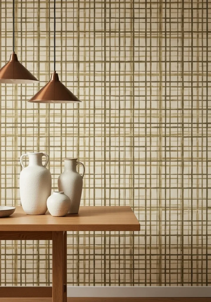
9. Antique-Map Cartography Wallcovering
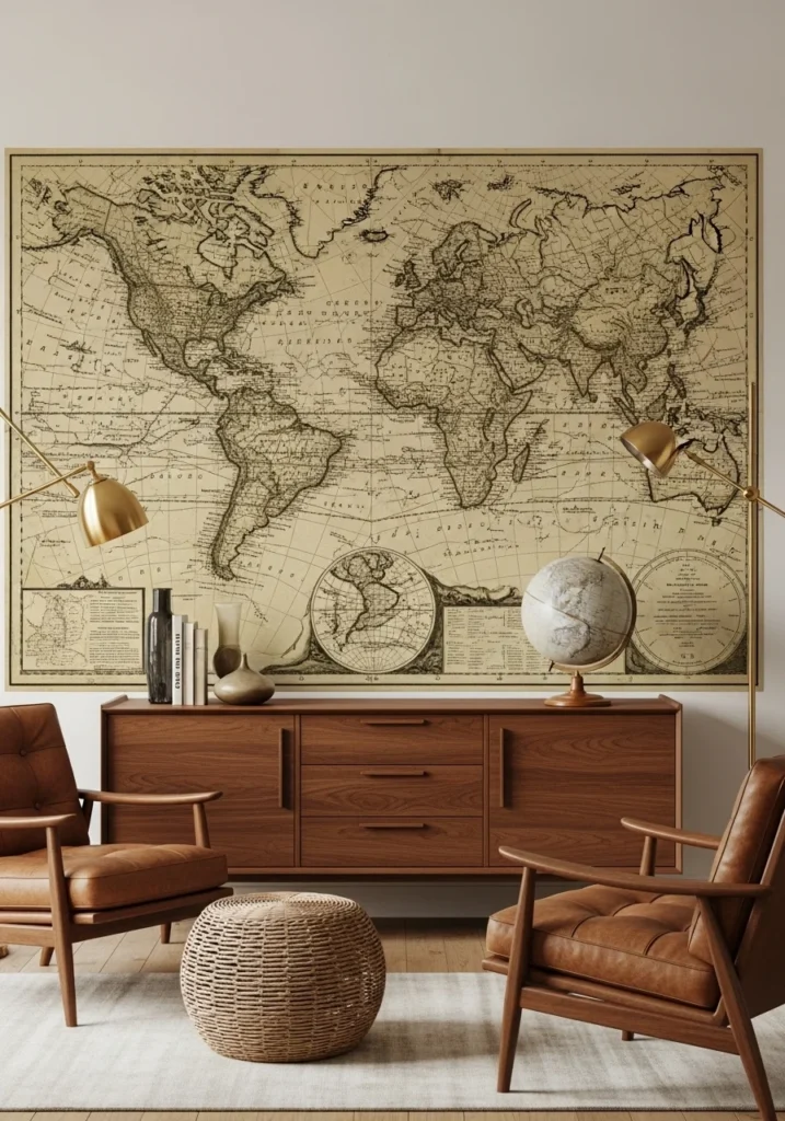
Large-scale antique map or vintage cartography prints in sepia and olive tones create intellectual, cultured sophistication without being too literal or theme-y. This is old-world elegance that works in contemporary spaces.
What’s smart about cartography wallpaper is how it adds visual interest and conversation starters while maintaining sophisticated color palettes that work with real furniture. The sepia and olive tones feel rich and complex rather than flat or obvious.
Style with walnut sideboards, leather armchairs, maybe a globe, and sculptural brass lighting. Everything should feel collected and thoughtful, like a private library or gentleman’s club where serious conversations happen over good meals.
Use coated, durable paper with slight satin sheen to mimic aged paper, and plan your lighting to create that warm, museum-like presence. This is for people who want their dining rooms to feel cultured and worldly.
10. Large-Scale Modern Damask (Matte + Tactile)
Oversized damask motifs scaled up and printed in tone-on-tone greens or warm grays on textured paper takes classic patterns and makes them feel contemporary and grand. This is perfect for mixing antiques with modern pieces.
The key is the scale – traditional damask can feel busy and dated, but when you scale it way up and use subtle tonal variations, it becomes sophisticated and modern while maintaining its classical elegance.
Pair with carved gilt mirrors, linen upholstery, and Aubusson runners for layered texture that feels collected over time. The damask provides pattern interest while everything else adds material richness.
Relief embossing adds extra tactile effect, and aligning repeats with floor moldings creates custom-looking installations. Diffused daylight with candle accents shows off the pattern depth and creates beautiful shadow play across the textured surface.
Also Read: How to Create a French Country Dining Room That Actually Looks Authentic
11. Painterly Terrazzo Influence Wallpaper
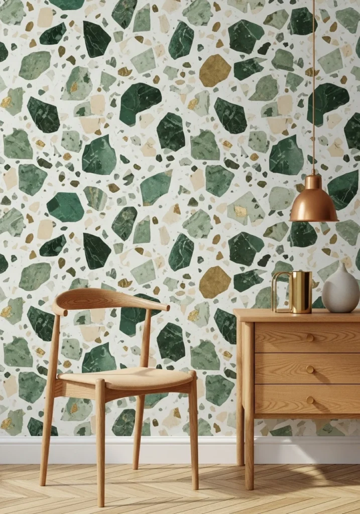
Terrazzo-inspired wallpaper with painterly “chips” in green marbles, creams, and flecks of brass on a soft base brings luxe material language without installing actual stone. This is pattern that feels both organic and sophisticated.
The genius of terrazzo patterns is how they feel random and natural while actually being carefully composed. The green marble chips with brass flecks create richness and visual interest that photographs beautifully and works with simple furniture.
Pair with Scandinavian-modern furniture in warm oak and brass details. Keep the furniture lines clean and simple so the wallpaper pattern can provide all the visual complexity while maintaining overall harmony.
Matte finish keeps the “chips” reading as tactile rather than glossy or artificial. Crisp daylight with low-contrast shadows emphasizes the pattern and makes all those material references feel authentic and sophisticated.
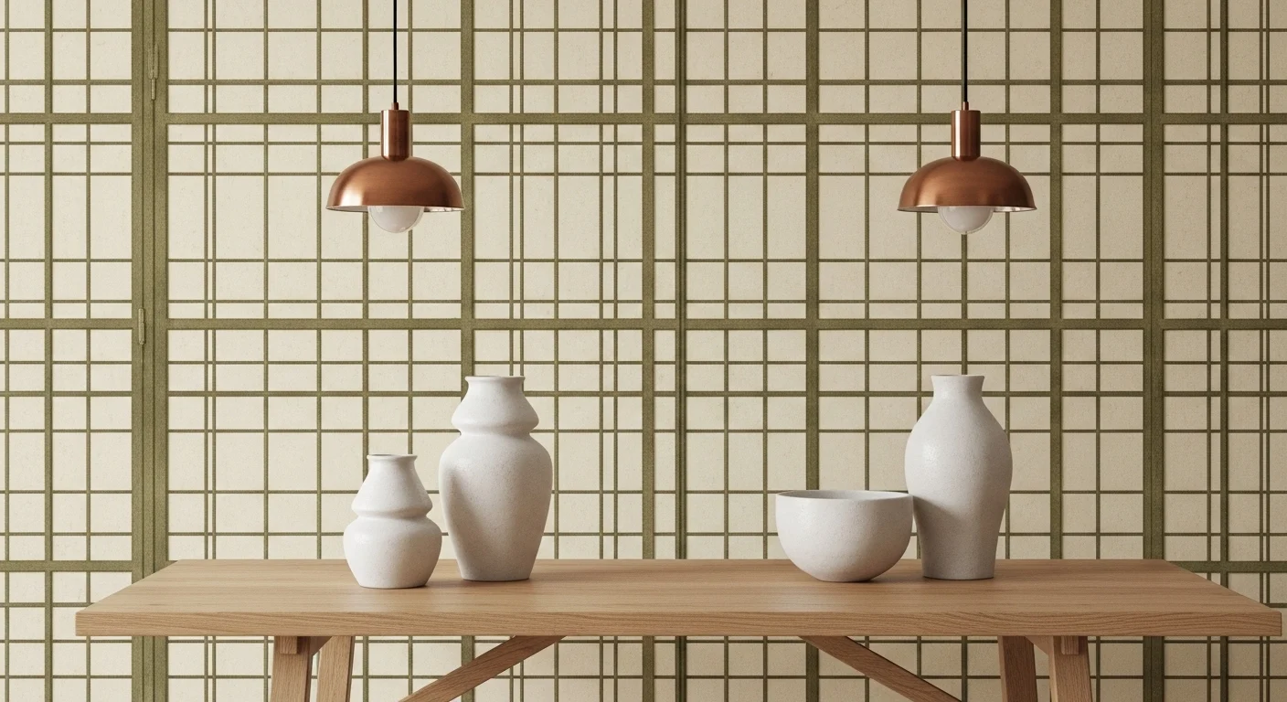
12. Shoji-Inspired Lattice with Modern Twist
Refined lattice wallpaper inspired by shoji screens but rendered as layered, soft-ink patterns in warm olive and cream provides geometric rhythm without strict zen references. This feels architectural and editorial.
What makes this work so well is how it brings geometric structure and visual rhythm to dining spaces while maintaining softness through the ink-wash technique and organic color palette. It’s structured but not rigid, geometric but not cold.
Pair with minimalist oak tables, sculptural ceramic vases, and warm bronze lighting. Everything should feel carefully curated and sophisticated, letting the lattice pattern provide architectural interest while keeping accessories simple and beautiful.
Slightly textured paper coordinates with trim lines, and soft side lighting reads the lattice depth while casting delicate shadows that change throughout the day. This creates living, breathing pattern that never feels static or boring.
13. Hand-Painted Trompe-l’oeil Paneling Wallpaper
Trompe-l’oeil wallpaper that mimics hand-painted wood paneling with panels, rails, and subtle gilded insets creates instant classical architecture for way less money and effort than real millwork.
This is brilliant for people who want the gravitas and sophistication of traditional paneling without the construction, cost, or commitment. The illusion is convincing from normal viewing distances and adds serious architectural character.
Pair with antique buffets, classical candlesticks, and neutral upholstery for luxe table scenes that feel like they belong in historic homes or private clubs. Everything should support the architectural illusion while adding comfortable functionality.
Matte eggshell finish mimics painted wood, and coordinating paint tones with actual trim and ceiling details makes the illusion more convincing. Warm midday light with low camera angles shows off the depth illusion beautifully.
14. Subtle Metallic Brushstroke Wash (Soft Shimmer)
Soft wash wallpaper with horizontal metallic brushstrokes in brushed-gold or brass over a linen base adds movement and quiet glamour without heavy pattern. This works especially well in long, narrow dining rooms.
The horizontal brushstrokes create visual movement that makes spaces feel wider and more dynamic, while the metallic elements add just enough glamour to feel special without being overwhelming or flashy.
Style with minimalist wood tables, sculptural centerpieces, and brass candleholders that echo the metallic brushstrokes. Everything should feel refined and understated, letting the subtle shimmer provide just enough luxury to make the space feel elevated.
Narrow repeat patterns avoid visible seams, and the matte plus metallic combination balances any glare issues. Sunset glow with reflected shimmer from metallic accents creates intimate, luxurious dining atmosphere that photographs beautifully.
15. Curated Library / Faux Bookshelf Wallpaper
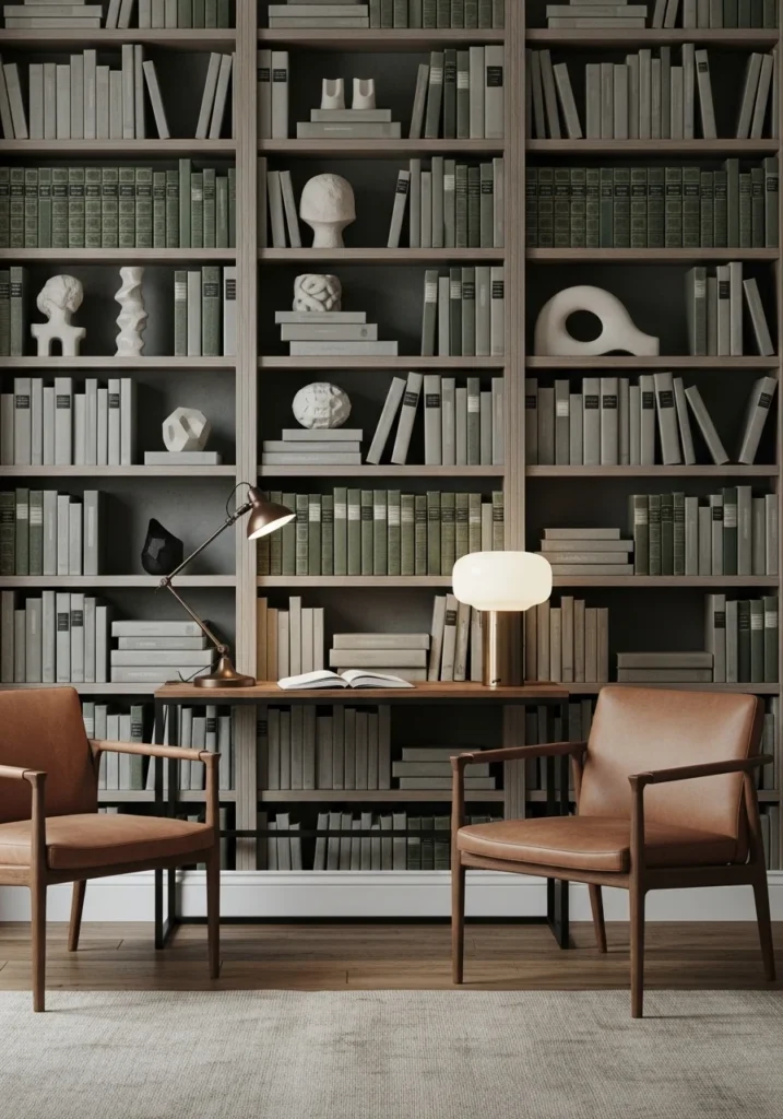
High-resolution bookshelf wallpaper printed with curated, tasteful book bindings and sculptural objects in green and neutral tones gives rooms cultured gravitas without sacrificing floor space for actual bookshelves.
This is perfect for people who love the look of floor-to-ceiling bookshelves but don’t have the space, books, or budget to create the real thing. The illusion adds instant intellectual sophistication and visual texture.
Style with leather or velvet chairs, a small writing console, and a single sculptural lamp to complete the scholarly vignette. Everything should feel considered and literary, supporting the bookish atmosphere while providing comfortable functionality.
Matte, non-reflective finish keeps the book spines reading as authentic on camera, and warm task lighting with side-shelf spotlights creates intimate, bookish atmosphere perfect for long dinner conversations.
Final Thoughts
Creating a dining room that looks expensive and magazine-worthy isn’t about spending the most money – it’s about understanding which wallpaper choices actually work in real spaces with real lighting and real furniture. Green wallpaper works because it’s sophisticated enough for grown-ups but welcoming enough for comfortable dining and conversation.
The key is choosing patterns and finishes that photograph well, install cleanly, and work with the lighting and furniture you actually have rather than some idealized version of your space. When people walk into your dining room and immediately feel impressed but can’t quite put their finger on why, that’s when you know you’ve chosen the right wallpaper.
Start with understanding your space’s proportions and lighting, then choose patterns and colors that work with those realities rather than fighting against them. The most beautiful wallpaper in the world won’t work if it’s wrong for your specific room and lifestyle.