
Here’s the truth nobody talks about: most office spaces look like they were designed by someone who hates the concept of human happiness. You know the vibe—those soul-crushing beige walls, fluorescent lighting that makes everyone look like they’re dying, and furniture that screams “we bought this in bulk from the cheapest supplier we could find.”
But here’s what’s wild—color has this crazy ability to completely change how you feel about being in a space. The right palette can make you feel focused and energetic, while the wrong one can make you want to fake sick and work from your couch indefinitely.
Whether you’re setting up a home office that doesn’t make you want to cry, designing a corporate space that doesn’t feel like a prison, or just trying to figure out why your current workspace feels so depressing, the color story is probably a huge part of the problem. The good news? It’s also one of the easiest things to fix.
Most people think office design has to be boring to be “professional,” but that’s complete nonsense. The most productive, creative spaces often have personality and intentional color choices that actually support how people work and think. Ready to stop settling for beige mediocrity? Let’s talk about colors that actually work.
Understand How Color Actually Affects Your Brain
Before you start painting walls or ordering furniture, it helps to understand why certain colors make you feel alert and focused while others make you want to take a nap. This isn’t just aesthetic preference—there’s actual psychology happening here.
Warm Colors for Energy and Creativity – Reds, oranges, and warm yellows can boost energy and stimulate creative thinking. But too much can be overwhelming, so use them as accents rather than dominant colors.
Cool Colors for Focus and Calm – Blues, greens, and cool grays help with concentration and reduce stress. These work well as primary colors in spaces where people need to focus for long periods.
Neutrals as Your Foundation – Beiges, creams, and soft grays provide a calming backdrop that lets accent colors do their job without overwhelming the space. Think of them as the canvas, not the whole painting.
Consider Your Actual Work Style
Different types of work call for different color approaches. A creative studio has different needs than an accounting firm, and your home office might need to do double duty for both focused work and video calls.
Creative Work Needs Inspiration – Spaces for brainstorming, design work, or creative problem-solving can handle more color, pattern, and visual interest. These environments benefit from stimulating color combinations.
Analytical Work Needs Calm – Spaces for detailed work, analysis, or long periods of concentration work best with calming, non-distracting color palettes that support sustained attention.
Meeting Spaces Need Balance – Areas where people collaborate need colors that feel welcoming but not distracting, energizing but not overwhelming.
Think About Light Like a Pro
Color and lighting work together in ways that can make or break your office vibe. The same color can look completely different depending on whether it’s lit by natural daylight, warm LED bulbs, or harsh fluorescents.
Natural Light Changes Everything – If you have good natural light, you can handle deeper, richer colors that might feel too dark in artificially lit spaces.
Consider Direction and Time of Day – North-facing rooms get cooler light that can make colors feel different than south-facing rooms with warm, bright light throughout the day.
Layer Your Lighting – The best offices have multiple light sources at different levels—ambient, task, and accent lighting that work together to create the right mood.
15 Office Color Palette Ideas
Palette 1: Emerald Green and Gold for Executive Confidence
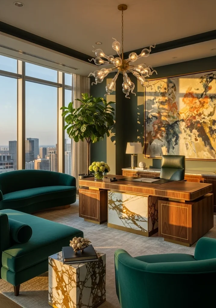
This combination screams sophistication without being stuffy. Deep emerald green creates a sense of luxury and growth, while gold accents add warmth and success vibes. Use emerald for accent walls or major furniture pieces, with gold hardware, lighting, and accessories. This palette works especially well in traditional or transitional offices where you want to feel established and successful. The key is balancing the richness—too much emerald gets overwhelming, while gold should always be the supporting player, not the star.
Palette 2: Midnight Blue and Rich Walnut for Creative Focus
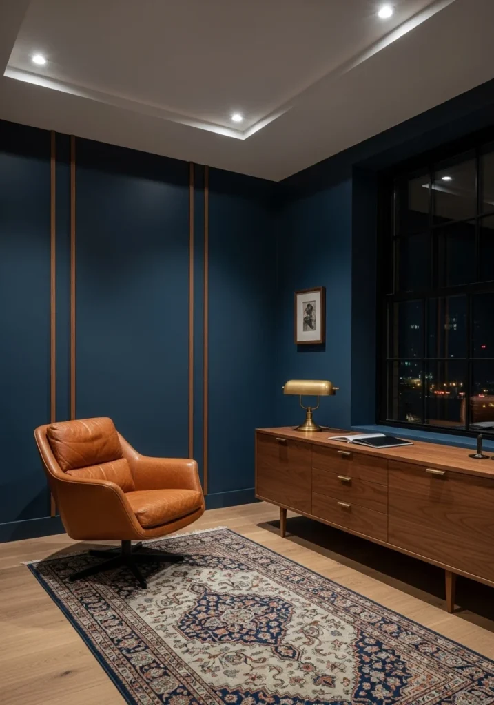
Midnight blue creates this cocoon-like feeling that’s perfect for deep work and creative thinking. Paired with warm walnut wood tones, it feels sophisticated but not cold. Use the blue for wall paneling or large furniture pieces, with walnut desks, shelving, and warm wood accents. Add brass lighting and hardware for subtle warmth. This palette works beautifully in spaces where people need to concentrate for long periods—it’s calming without being boring.
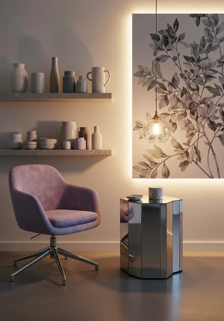
Palette 3: Blush Pink and Champagne for Feminine Minimalist Luxury
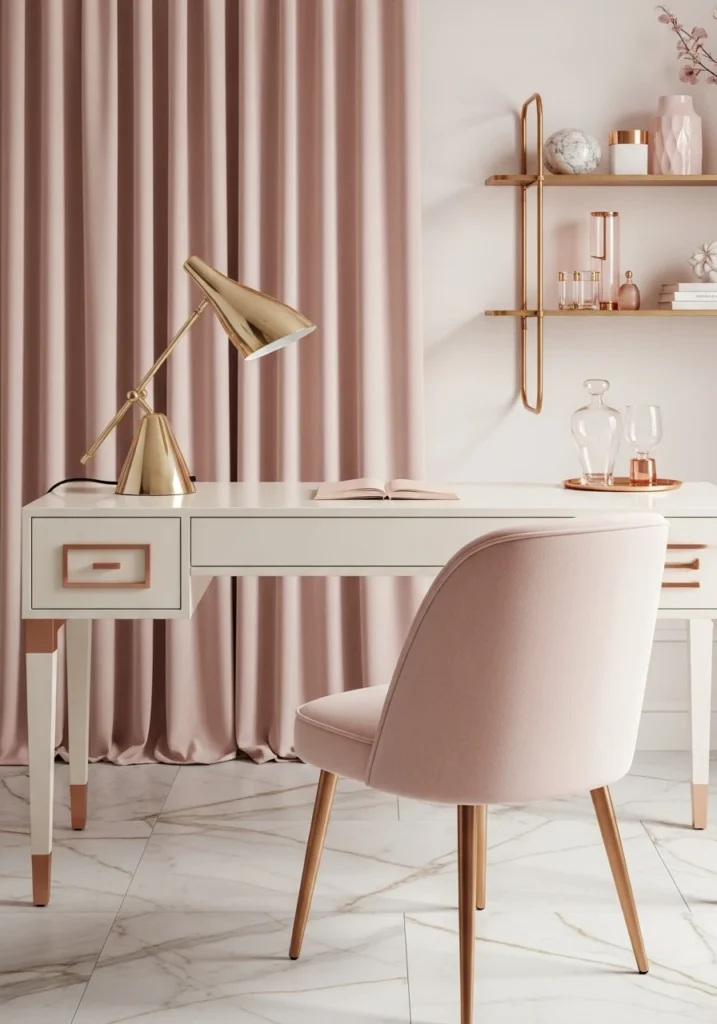
Soft blush pink brings warmth and creativity without being overwhelming, while champagne metallics add sophistication. This isn’t little-girl pink—it’s sophisticated and grown-up. Use blush as an accent color in upholstery, artwork, or window treatments, with champagne hardware and lighting fixtures. Keep the majority of surfaces neutral—whites, creams, and pale grays—so the pink feels intentional and elegant rather than overwhelming.
Palette 4: Charcoal Gray and Brushed Brass for Modern Drama
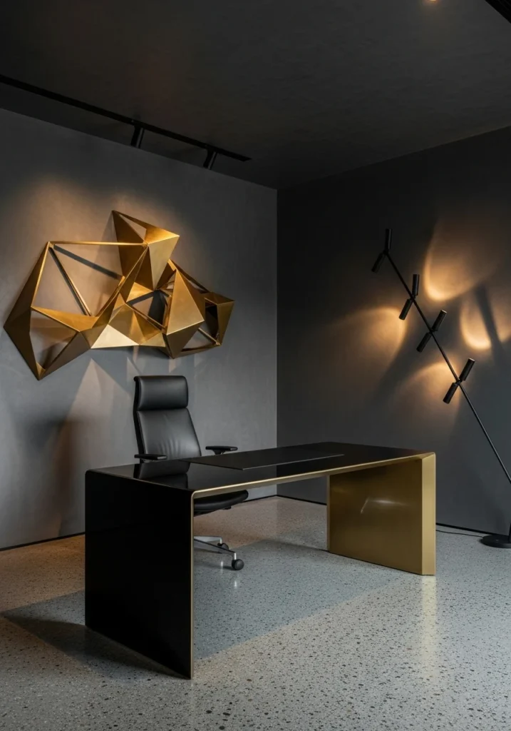
Charcoal gray creates this sleek, professional backdrop that makes everything else look more expensive. Brushed brass adds warmth and prevents the gray from feeling too cold or industrial. Use charcoal for larger surfaces like walls or major furniture, with brass accents in lighting, hardware, and accessories. This palette works especially well in modern offices where you want drama and sophistication. The contrast between the dark gray and warm brass creates visual interest without being busy.
Palette 5: Cream, Light Oak, and Olive Green for Scandinavian Calm
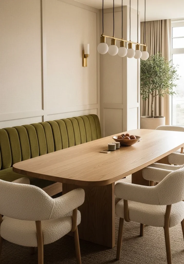
This palette is all about creating a calm, natural environment that reduces stress and supports focus. Cream provides a warm neutral base, light oak adds natural texture, and olive green brings in a connection to nature. Use cream for walls and major upholstery, light oak for desks and storage, and olive green for accent pieces like plants, artwork, or throw pillows. This combination works especially well in spaces with good natural light.
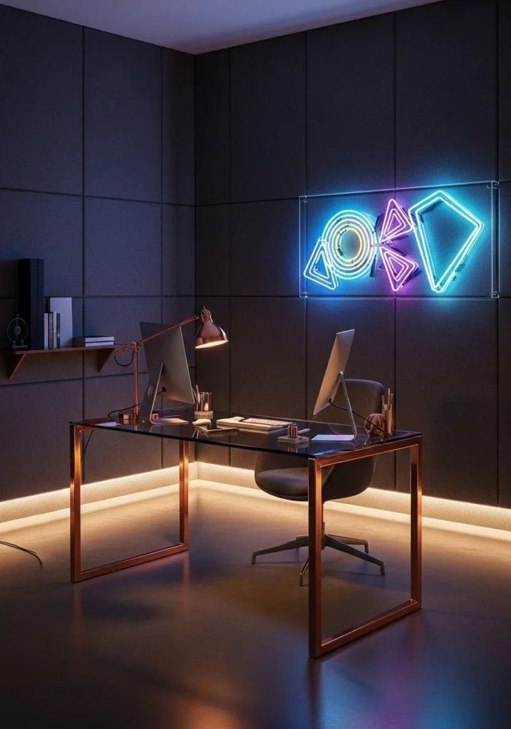
Palette 6: Onyx Black and Polished Nickel for High-Tech Sophistication
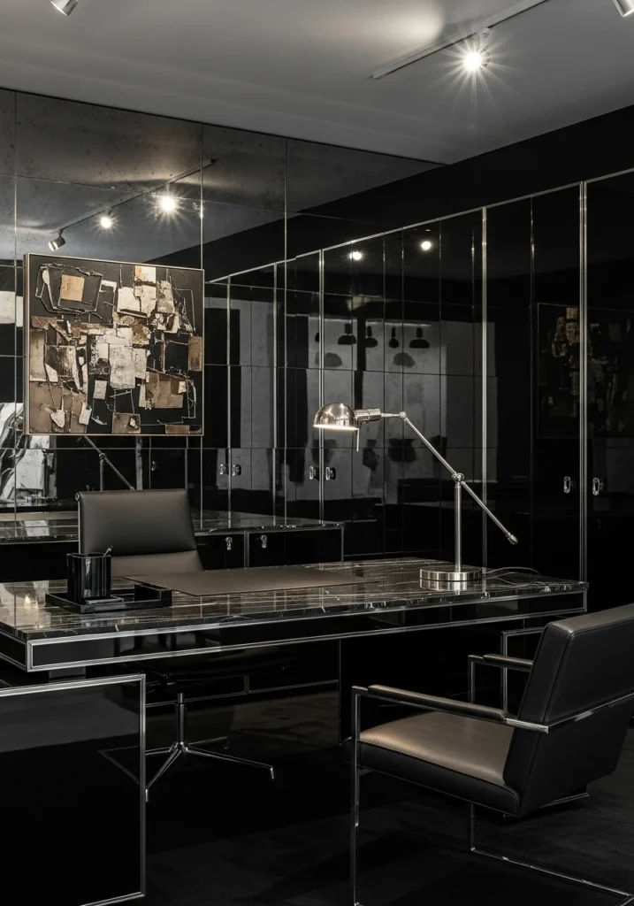
Black can feel heavy and depressing if done wrong, but when balanced with reflective metals and good lighting, it creates serious drama and sophistication. Use onyx black for sleek surfaces like cabinetry or accent walls, with polished nickel hardware and lighting. Add mirrors or glass elements to keep it from feeling too heavy. This palette works well in modern offices where you want to make a strong, confident statement.
Palette 7: Sapphire Blue and Antique Brass for Art Deco Glamour
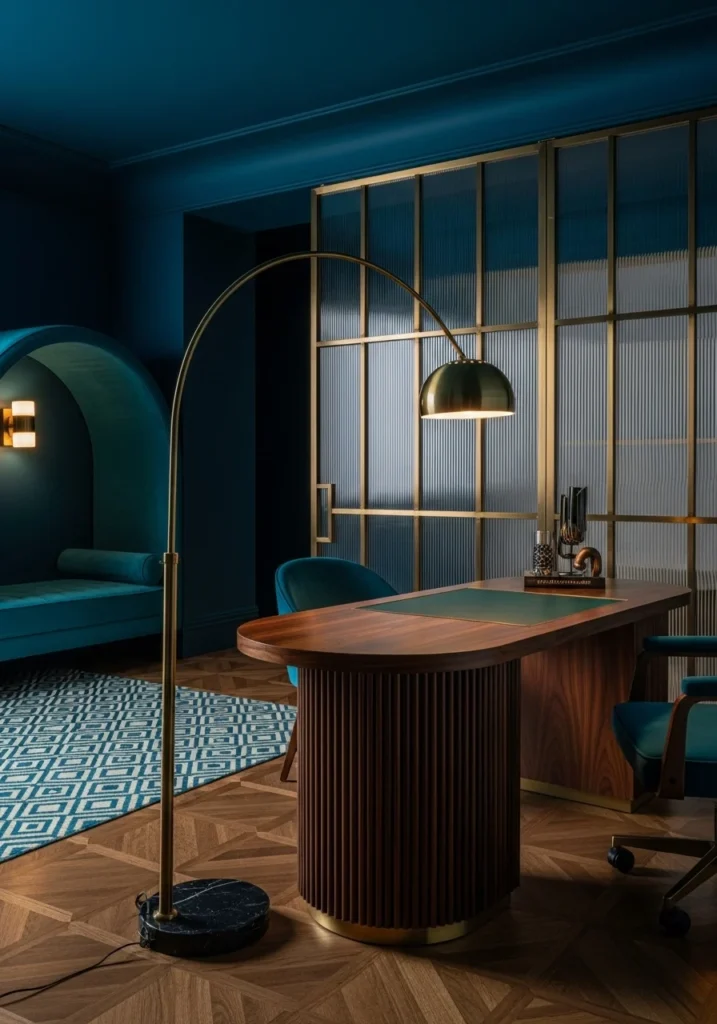
Rich sapphire blue paired with warm antique brass creates this gorgeous vintage-modern vibe that feels both timeless and current. Use sapphire for upholstery or accent walls, with antique brass lighting, hardware, and decorative elements. This palette works especially well in offices with architectural details or vintage elements. It’s sophisticated enough for client meetings but interesting enough to inspire creativity.
Also Read: 15 Office Cubicle Decor Ideas That Don’t Scream “I’ve Given Up on Life”
Palette 8: Sandy Beige and Burnt Orange for Desert Modern Warmth
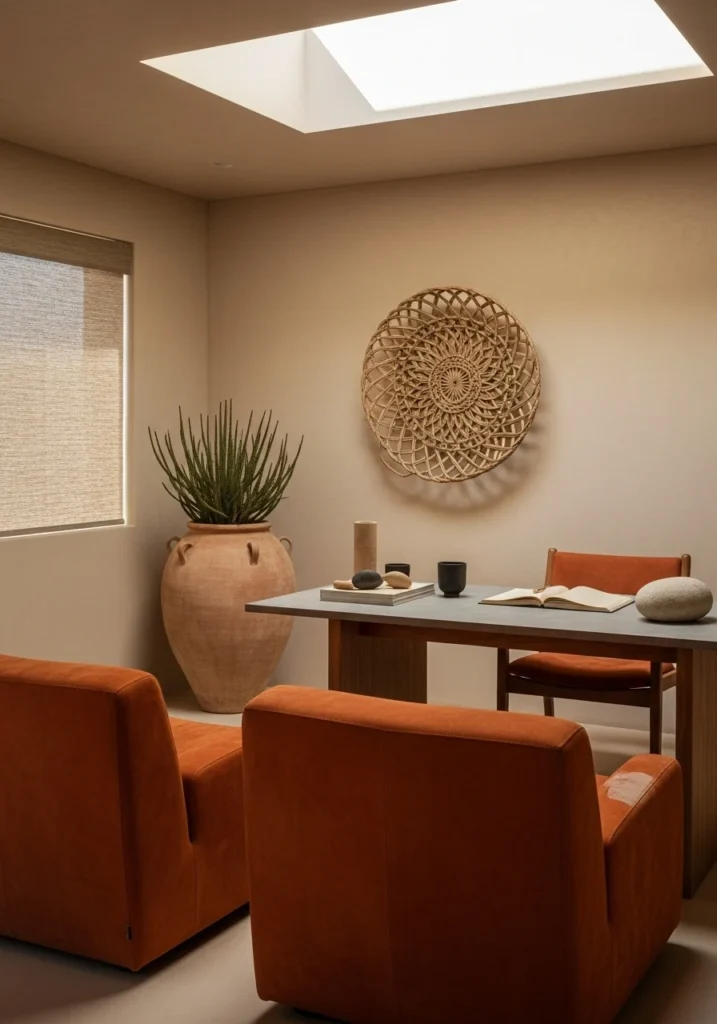
This earthy palette brings warmth and calm without being boring. Sandy beige creates a soothing backdrop, while burnt orange adds energy and creativity. Use beige for walls and larger furniture pieces, with burnt orange in accent pieces like artwork, plants, or upholstery details. Add natural materials like wood and stone to enhance the desert modern vibe. This works well in spaces where you want to feel relaxed but energized.
Palette 9: Lavender Gray and Polished Silver for Creative Calm
Soft lavender gray is sophisticated and calming while still having personality. Paired with polished silver accents, it feels modern and fresh without being cold. Use lavender gray for walls or major upholstery, with silver hardware, lighting, and accessories. This palette works especially well in creative offices or spaces where people need to feel inspired but not overwhelmed. It’s unexpected enough to feel special but neutral enough to live with long-term.
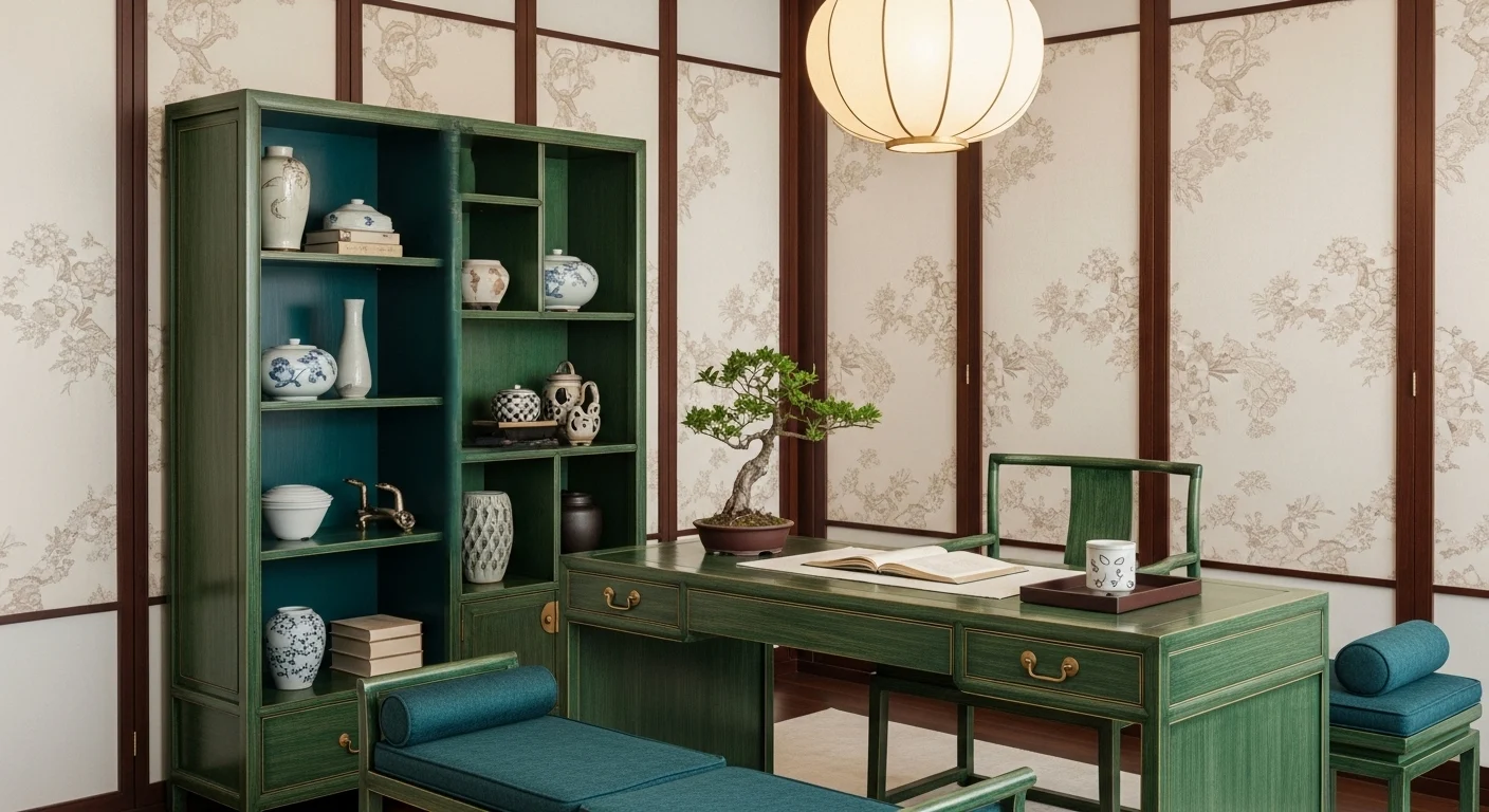
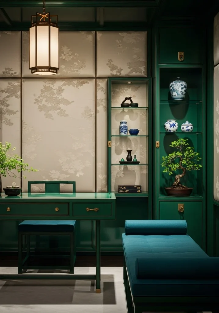
Palette 10: Forest Green and Cognac Leather for Library Sophistication
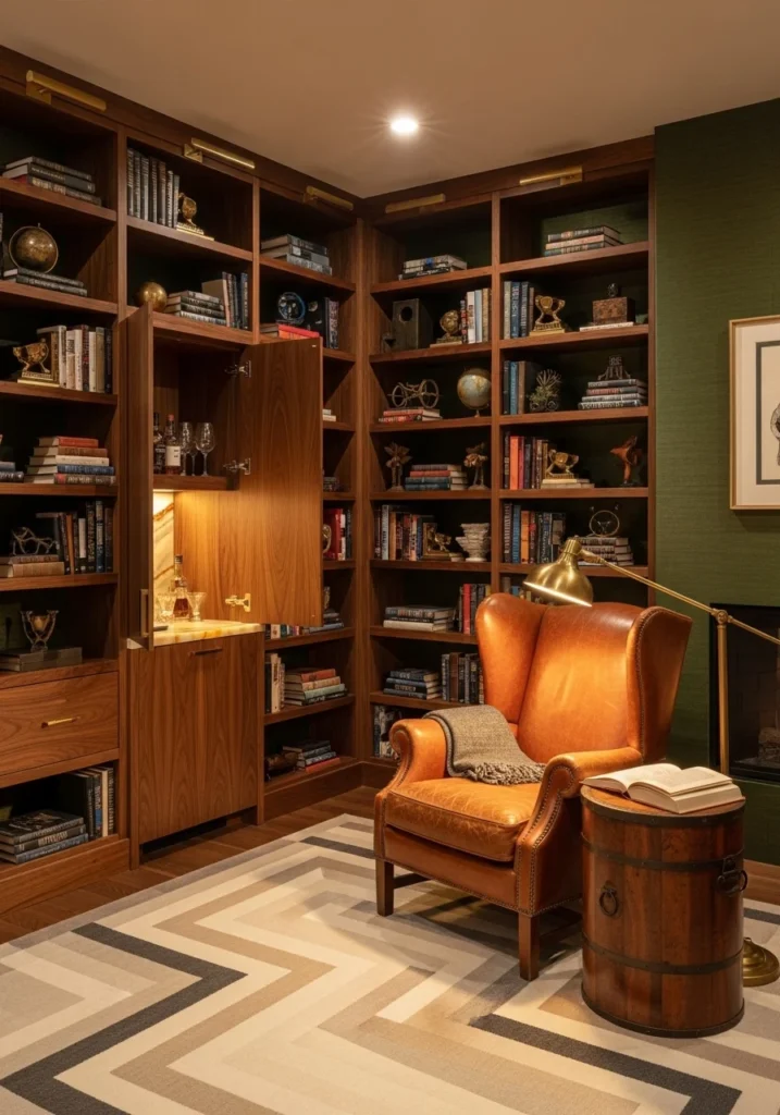
This classic combination feels timeless and sophisticated—think traditional law office or private library. Forest green creates a sense of calm and focus, while cognac leather adds warmth and luxury. Use forest green for walls or built-ins, with cognac leather seating and accessories. Add brass hardware and warm wood tones for additional richness. This palette works well in traditional or transitional offices where you want to feel established and credible.
Palette 11: Pearl White and Rose Gold for Minimalist Luxury
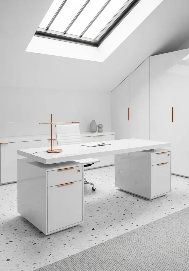
Clean pearl white creates a fresh, modern backdrop that makes everything else look more expensive. Rose gold adds just enough warmth and personality without being overwhelming. Use pearl white for walls and major surfaces, with rose gold hardware, lighting, and accessories. This palette works especially well in smaller offices or spaces with limited natural light, as the light colors help reflect and amplify available light.
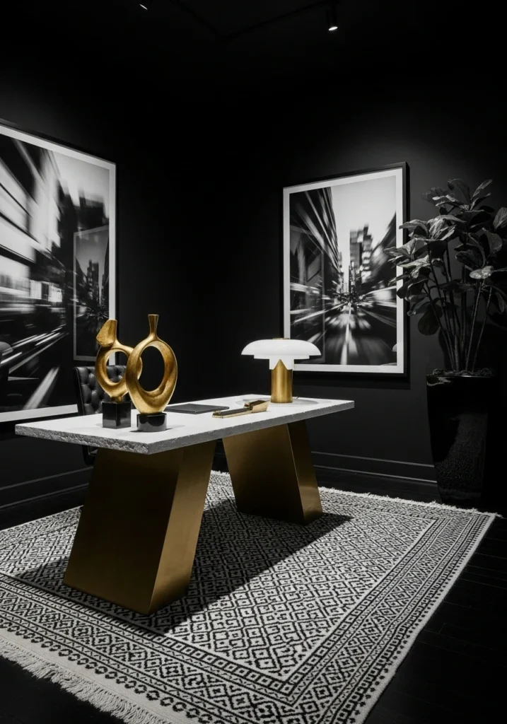
Palette 12: Graphite and Copper for Industrial Sophistication
Dark graphite creates drama and sophistication, while copper adds warmth and prevents the space from feeling too cold or industrial. Use graphite for accent walls or major furniture pieces, with copper lighting, hardware, and accessories. This palette works well in modern or industrial-style offices where you want to feel cutting-edge and professional. The key is balancing the darkness with good lighting and some lighter accent pieces.
Palette 13: Navy Blue and Pale Ash with Coral Accents for Coastal Professional
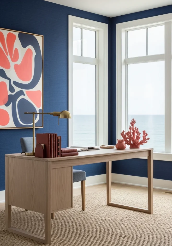
Navy blue provides a classic, professional backdrop, while pale ash wood adds natural warmth. Coral accents bring in just enough color and energy without being overwhelming. Use navy for walls or major upholstery, pale ash for desks and storage, and coral for artwork, plants, or small accessories. This palette works well in offices where you want to feel professional but not stuffy—it has personality without being unprofessional.
Palette 14: Black and White with Gold Highlights for Classic Drama
High-contrast black and white creates instant drama and sophistication, while gold accents add warmth and luxury. Use black and white in roughly equal proportions—maybe white walls with black furniture or vice versa—and add gold through hardware, lighting, and accessories. This palette works well in modern offices where you want to make a strong visual statement. It’s classic enough to never go out of style but dramatic enough to feel special.
Palette 15: Jade Green and Cream with Teal Accents for Zen Sophistication
Soft jade green creates a calming, nature-inspired backdrop, while cream adds warmth and sophistication. Teal accents provide just enough contrast and interest. Use jade green for accent walls or major pieces, cream for larger surfaces and upholstery, and teal for smaller accessories and artwork. This palette works especially well in offices where stress reduction and calm focus are priorities. It feels sophisticated but never overwhelming.
Making Color Work in Real Life
The best office color palettes are ones that support how you actually work, not just how you want the space to look in photos. Consider your daily tasks, how much natural light you have, and what kind of mood you want to create.
Start small if you’re nervous about color—you can always add more later, but it’s harder to tone things down if you go too bold initially. And remember, the goal isn’t to create a showroom—it’s to create a space where you can do your best work while feeling good about being there. When your office makes you feel focused, inspired, and professional all at once, you know you’ve gotten the color story right.