
Let’s be honest—most of us drive past those gorgeous houses in our neighborhoods and think “I wish my house looked like that” without actually doing anything about it. You know the drill: your exterior paint is fading, maybe chipping in places, but somehow a full repaint always gets pushed to “next year’s project list.”
But here’s the thing: your home’s exterior color is literally the first impression everyone gets of your space. It’s your chance to be the house that people slow down to admire, the one that looks effortlessly chic and totally intentional.
Whether you’re working with a 1960s ranch that needs some serious love or a newer build that just feels bland, these trending colors will help you create something that stops traffic. Ready to become the neighbor with the legendary curb appeal? Let’s dive in.
Set the Foundation for Success
Before we get into all the gorgeous color options, let’s talk about the basics that actually matter. You can choose the most Instagram-worthy shade in the world, but if you skimp on prep work or use cheap paint, none of that beautiful color is going to save you.
Quality Paint Investment – This is where you absolutely cannot cut corners. Invest in high-quality exterior paint that’s designed to last. It doesn’t have to be the most expensive brand out there, but it should be something with good reviews and proper UV protection.
Proper Prep Work – Make sure your surfaces are clean, primed if needed, and any repairs are done first. Peeling paint under your gorgeous new color will ruin the whole effect.
Consider Your Climate – Choose paint formulated for your specific weather conditions. If you live somewhere with harsh winters or blazing summers, make sure your paint can handle it.
Think Like a Design Pro
The best exterior makeovers don’t just slap on a trendy color and call it done. They consider the whole picture—architecture, landscaping, and how everything works together.
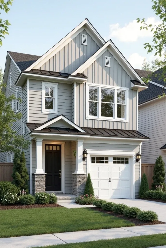
Architectural Style Matters – Your paint color should complement your home’s bones, not fight against them. A modern farmhouse can handle different colors than a traditional colonial.
Lighting Throughout the Day – Colors look completely different in morning light versus afternoon sun. Test your color in different lighting conditions before committing.
Neighborhood Harmony – You want to stand out in a good way, not be the house that clashes with everything around it. Consider your surroundings while still expressing your personality.
Resale Value Impact – Even if you’re not selling anytime soon, choose colors that will age well and appeal to future buyers if needed.
Create Layers of Visual Interest
This is where the magic happens—those details that transform a basic paint job into something that looks professionally designed.
Trim and Accent Colors – One flat color everywhere is boring. Use trim, shutters, and architectural details to create depth and interest.
Natural Material Integration – Think about how your paint color works with existing stone, brick, or wood elements on your home.
Landscape Coordination – Your exterior color should complement your landscaping, not compete with it.
15 Exterior House Colors 2025
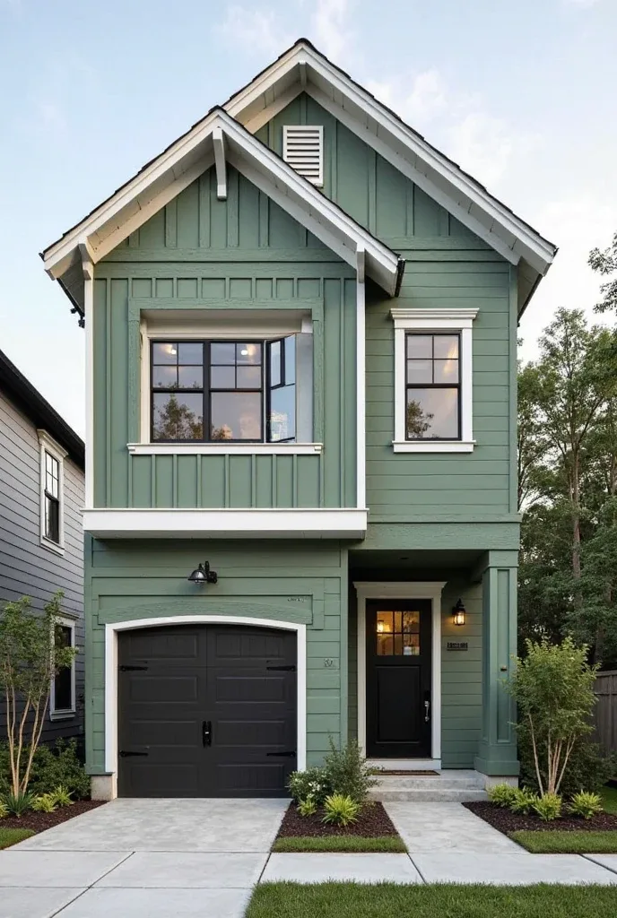
Sage Green – The Undisputed Champion
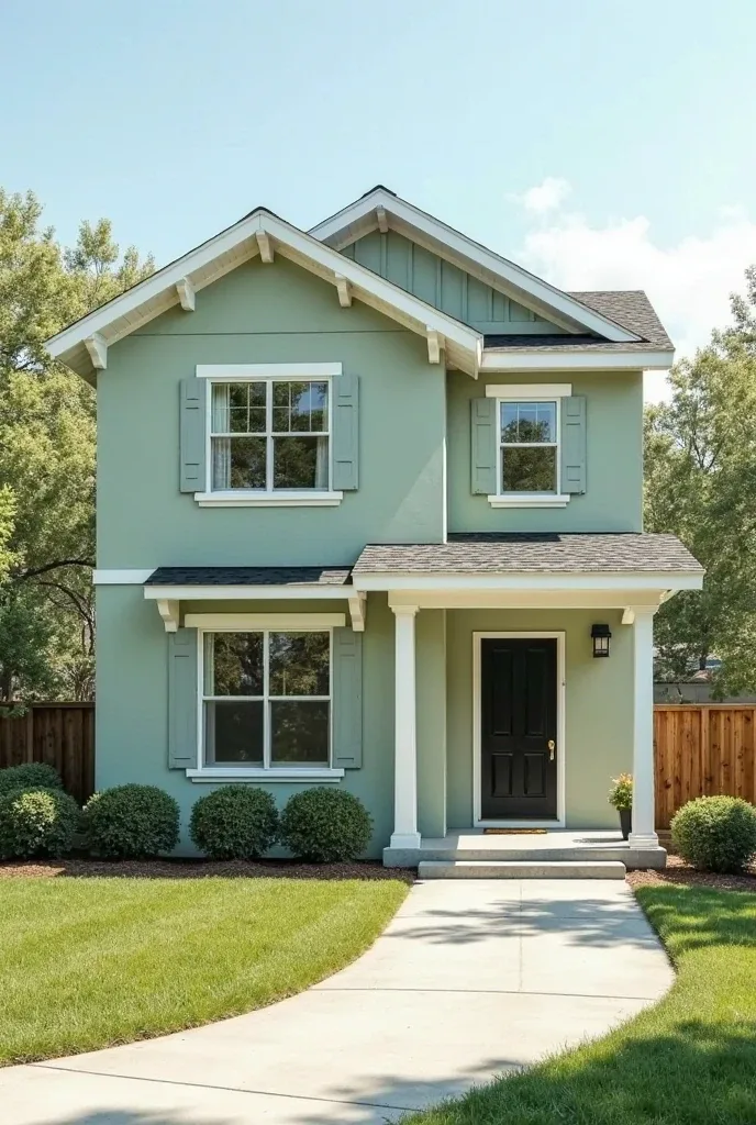
This muted, sophisticated green is having such a moment right now, and honestly, I get it. It’s like the perfect balance—distinctive enough to feel special but calm enough to live with long-term.
What makes sage green so genius is how it works with literally everything. Natural stone? Beautiful. White trim? Classic. Wood accents? Perfection. Plus it photographs like a dream, which matters more than we want to admit.
The key is finding the right undertone for your home’s architecture. Some sage greens lean more gray, others more yellow. Test a few options to find your perfect match.
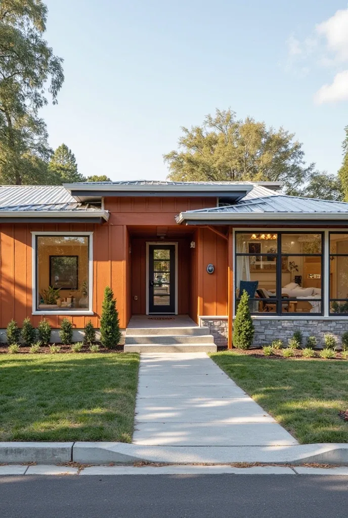
Warm Terracotta – Desert Vibes Everywhere
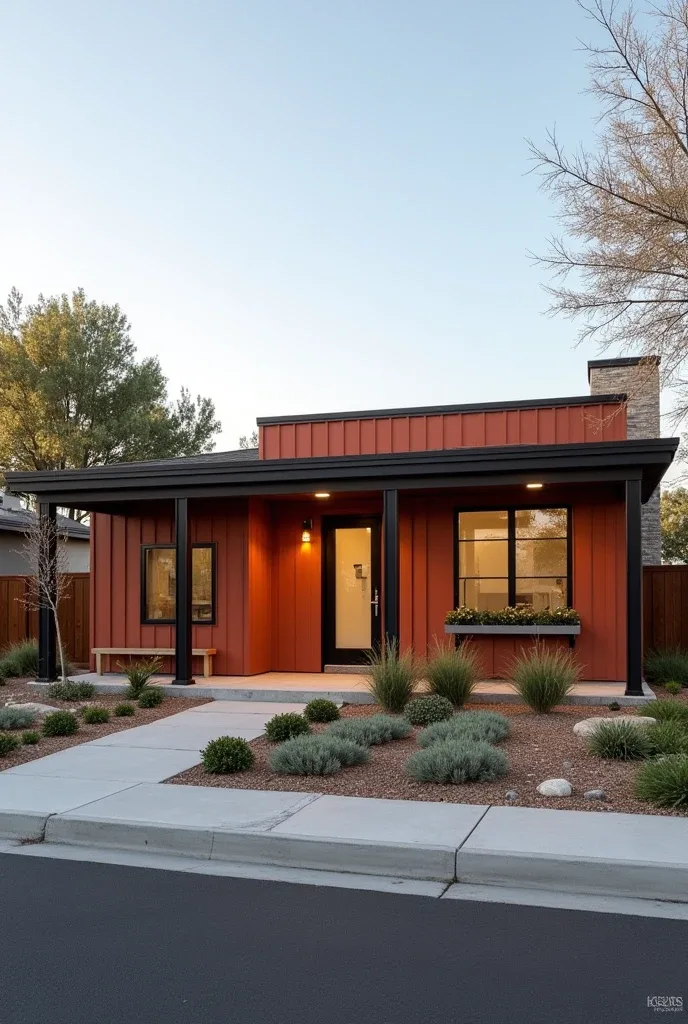
This warm, clay-inspired color brings such cozy southwestern energy, even if you’re nowhere near Arizona. It’s like wrapping your house in a sunset—warm, inviting, and totally unique in most neighborhoods.
Terracotta works especially well on stucco or brick homes where the texture enhances that handcrafted, artisanal feel. Pair it with black window frames and natural wood, and you’ve got something that looks straight out of Architectural Digest.
Just make sure your landscaping can handle the warmth. Lush green plants create gorgeous contrast, while desert-style plantings feel perfectly coordinated.
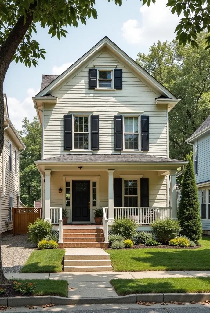
Sophisticated Charcoal Gray – The New Black
While everyone was painting their houses jet black a few years ago, 2025 is all about this softer, more nuanced approach. Charcoal gray gives you that same dramatic impact but feels warmer and more livable.
The genius of charcoal gray is its versatility. Go classic with white trim, or try something unexpected like warm brass accents. It works on modern homes, traditional styles, and everything in between.
Test this color on different sides of your house—gray can look completely different depending on the light exposure.
Forest Green + Cream Two-Tone Magic
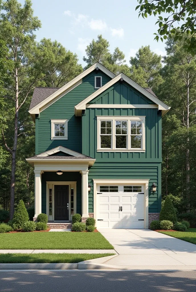
This classic combination feels both timeless and totally fresh right now. Use the deeper forest green on your main house and cream on trim and architectural details for a look that’s sophisticated but approachable.
The key is getting the proportions right. Too much cream and it looks bland; too little and the contrast isn’t strong enough. Study some classic New England homes for inspiration on how to balance these colors.
This combination works beautifully on traditional colonials, craftsman homes, and any architectural style that has interesting trim details to highlight.
Warm Mushroom Beige – The Perfect Neutral
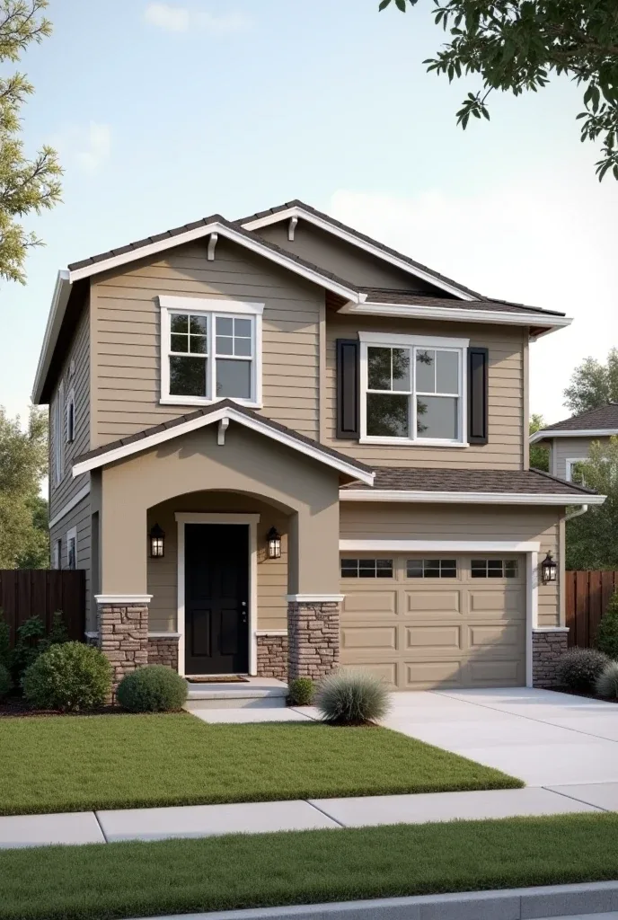
This isn’t your grandmother’s boring beige. This sophisticated neutral has just enough gray to feel contemporary and just enough warmth to feel welcoming. It’s like the perfect backdrop that makes everything else—your landscaping, your front door, your seasonal decor—pop.
What makes mushroom beige so genius is how it works in any setting. Urban, suburban, rural—it adapts to its surroundings while still having personality.
Pair it with deep green shutters, natural wood doors, or even bold black trim for different vibes. It’s the ultimate chameleon color.
Deep Navy Blue – Coastal Sophistication
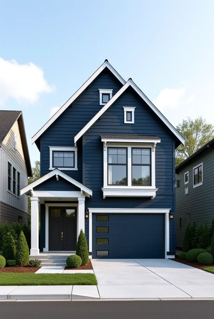
Navy blue exteriors are having such a moment, and I’m totally here for it. This rich, deep color manages to feel both classic and contemporary, nautical and sophisticated all at once.
The magic happens when you pair navy with the right accents. White or cream trim keeps it classic, while natural wood doors and brass hardware add warmth. Copper gutters? Even better.
Navy works especially well if you have great landscaping—it creates beautiful contrast against greenery and makes flowers really pop.
Dusty Rose – Romantic and Unexpected
I know what you’re thinking—pink on a house? But this sophisticated dusty rose with gray undertones is absolutely stunning and completely unexpected in the best way.
The key is treating it like any other sophisticated neutral. Pair it with charcoal gray trim and black hardware for a modern edge, or go softer with cream and sage green accents.
This color works particularly well on homes with interesting architectural details that deserve to be highlighted. It’s romantic without being overwhelming.
Rich Chocolate Brown – Warm Alternative to Black
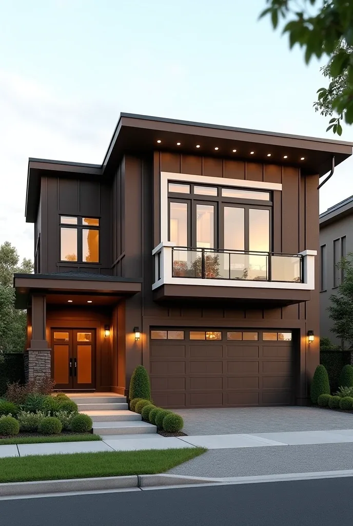
Deep, rich brown is becoming the sophisticated alternative to stark black, and honestly, it’s so much more livable. It’s dramatic without being harsh, striking without being cold.
Brown works beautifully with natural materials—think cream trim, natural stone, copper accents, and warm wood tones. The whole palette feels earthy and grounding.
This color is particularly gorgeous on homes with mixed textures. If you have stone, wood, and siding all on one house, brown unifies everything beautifully.
Soft Dove Gray – Contemporary Comfort
Softer and more welcoming than cool grays, this warm dove gray has subtle brown undertones that make it feel lived-in and comfortable from day one.
What I love about dove gray is how it works with both traditional and modern styles. It’s sophisticated enough for a contemporary home but gentle enough for a classic colonial.
The key is choosing the right trim color. Bright white can feel too stark—try warm white or even soft cream for a more cohesive look.
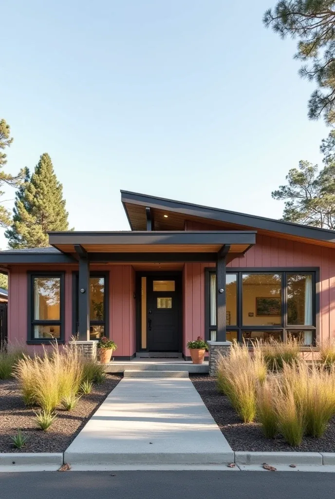
Adobe Pink – Southwestern Chic
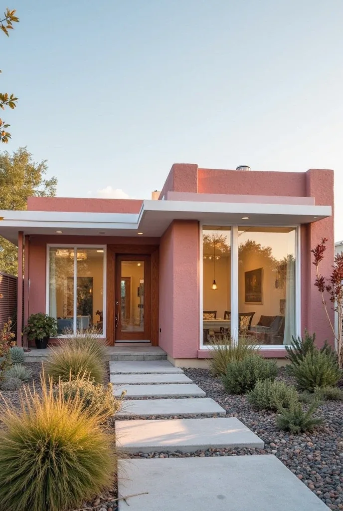
Inspired by those gorgeous Southwestern homes, this warm pink with terra cotta undertones is showing up on houses everywhere, bringing such unique personality and warmth.
The trick with adobe pink is grounding it with natural materials. Pair it with wood, stone, or natural fiber elements to keep it from feeling too bold or overwhelming.
This color works particularly well in areas with desert landscaping or if you want to create a warm, vacation-home vibe year-round.
Stormy Blue-Gray – Dramatic Sophistication
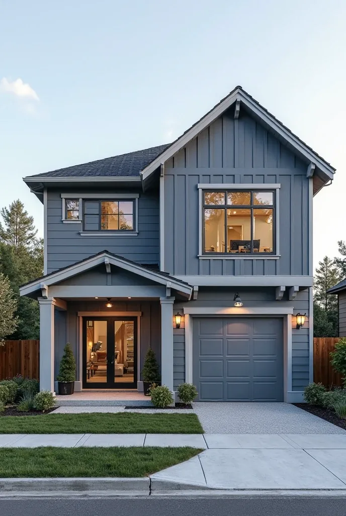
Deeper than navy but not quite gray, this stormy blue offers drama with total sophistication. It’s perfect for contemporary homes that need a color with serious presence and personality.
The beauty of stormy blue-gray is how it changes throughout the day. In bright sunlight it reads more blue, in overcast conditions more gray. It’s like having multiple colors in one.
Pair it with crisp white trim and natural wood accents, or go bold with black trim for maximum drama.
Also Read:14 Entryway Decor Ideas That Make Every Entrance Feel Grand
Warm Cream White – Elevated Neutrals
This sophisticated neutral has just enough warmth to feel inviting while maintaining all the clean, fresh appeal of traditional white. It’s white that actually photographs well and feels welcoming.
The genius of warm cream white is how it works with any accent color you choose. Want to switch up your front door seasonally? This background can handle it.
It’s particularly beautiful on homes with great architectural details that deserve to be highlighted rather than overwhelmed by color.
Burnt Orange – Bold Energy
This warm, spice-inspired color brings such energy and optimism to any home. It’s especially gorgeous on craftsman-style homes and pairs beautifully with natural wood and stone.
Burnt orange works particularly well in areas with autumn foliage—imagine how gorgeous this would look surrounded by fall colors. But even in other climates, it brings warmth and personality.
The key is balancing it with neutral accents so the color feels intentional rather than overwhelming.
Sage Green with Natural Wood Accents
Combining trending sage green with unpainted natural wood creates a look that’s both totally on-trend and completely timeless. This combination feels organic and effortlessly beautiful.
Use sage green as your main color and incorporate natural cedar or pine for trim, doors, or architectural details. The contrast between painted and natural elements creates visual interest without being busy.
This approach works particularly well on homes with great bones—the natural wood highlights architectural details while the sage green provides a sophisticated backdrop.
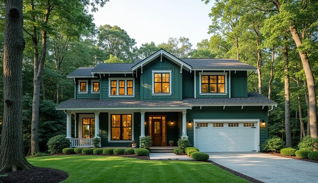
Deep Forest Green – Rich Drama
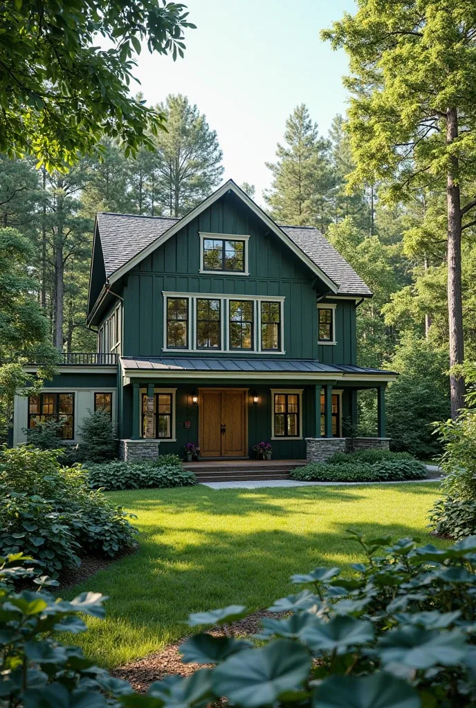
Richer and more dramatic than sage, deep forest green creates an almost jewel-like effect on home exteriors. It’s particularly stunning on homes with interesting architectural details that deserve to be showcased.
The key with deep forest green is having enough contrast in your trim and accents. Cream, warm white, or even natural wood all work beautifully to highlight the richness of the color.
This color works especially well if you have mature landscaping—it creates a beautiful harmony between house and surroundings.
Final Thoughts
Creating stunning curb appeal with the right exterior color isn’t about following every trend or spending a fortune on the fanciest paint. It’s about choosing a color that works with your home’s architecture, fits your neighborhood, and makes you smile every time you pull into your driveway.
The best exterior makeovers are ones where you can tell someone actually thought about how all the elements work together—the color, the trim, the landscaping, the architectural details. When your neighbors start slowing down to admire your house, you’ll know you’ve created something really special.
The most important thing? Choose a color you actually love. Trends come and go, but you’re the one who has to look at your house every single day.