
Walk into most kitchens today and you’ll see the same predictable color story: white cabinets, white countertops, white backsplash, maybe a subway tile if the homeowners were feeling adventurous. It’s safe, it’s clean, and it’s completely forgettable. Your kitchen—the space where you start every morning and gather every evening—deserves so much more personality than that.
Here’s what’s happening in the most beautiful kitchens right now: color is making a sophisticated comeback, but not in the ways you might expect. We’re not talking about the bold, overwhelming color explosions that felt trendy five years ago and now look dated. Today’s most stunning kitchen color schemes are nuanced, intentional, and designed to create emotional experiences that enhance how you feel in your space.
The right color combination can make your kitchen feel larger, more luxurious, and infinitely more welcoming. It can turn a basic cooking space into the heart of your home—a place where people naturally gather, conversations flow easily, and even mundane tasks like morning coffee feel more intentional and enjoyable.
But choosing colors for your kitchen isn’t just about picking pretty shades. It’s about understanding how different hues affect light, mood, and perception of space. It’s about creating harmonious relationships between colors that work together throughout different times of day and various lighting conditions. Most importantly, it’s about selecting a palette that reflects your personality while maintaining the timeless sophistication that makes your investment worthwhile for years to come.
Ready to discover how the right color story can transform your kitchen from ordinary to extraordinary? Let’s explore the color combinations that are defining the most beautiful kitchens of 2025.
The Science of Kitchen Color Psychology
Before diving into specific color combinations, it’s essential to understand how different hues psychologically affect our daily kitchen experiences. Color choices influence everything from appetite and energy levels to perceived space size and overall mood—making these decisions far more important than simple aesthetic preferences.
Warm vs. Cool Temperature Balance – Warm colors (creams, terracottas, golden tones) create cozy, inviting atmospheres that encourage lingering and conversation. Cool colors (blues, greys, sage greens) promote calm focus and can make spaces feel larger and more serene. The most successful kitchen color schemes balance both temperatures to create spaces that feel both energizing and relaxing.
Light Interaction and Reflection – Colors behave differently throughout the day as natural light changes. Morning light enhances warm tones, while evening artificial lighting can shift cool colors dramatically. Understanding how your chosen palette will look during peak kitchen usage times—morning coffee, afternoon prep, evening entertaining—ensures your color choices remain beautiful and functional throughout daily routines.
Appetite and Digestion Considerations – Certain colors naturally stimulate appetite while others can suppress it. Warm earth tones, soft reds, and golden hues tend to enhance dining experiences, while stark whites or cool blues might feel too clinical for spaces centered around food preparation and family meals.
Spatial Perception Enhancement – Strategic color placement can dramatically alter how large or small your kitchen feels. Light colors reflect more light and create expansion, while darker colors add intimacy and sophistication. The key is using this knowledge intentionally to enhance your kitchen’s best features while minimizing any challenging proportions.
Creating Sophisticated Color Harmony
The difference between amateur color choices and professionally designed palettes lies in understanding color relationships and how to layer multiple hues into cohesive, sophisticated schemes that feel intentional rather than accidental.
The 60-30-10 Rule Applied – Professional designers typically distribute kitchen colors using this formula: 60% dominant color (usually cabinetry), 30% secondary color (countertops, backsplash), and 10% accent color (hardware, accessories, lighting). This creates visual balance while allowing for personality through carefully chosen accent elements.
Undertone Consistency – Even seemingly neutral colors have undertones that can clash if not carefully coordinated. Cream cabinets with pink undertones will fight against countertops with green undertones, creating subtle discord that makes spaces feel “off” even when individual elements are beautiful. Successful color schemes maintain undertone harmony throughout all major elements.
Natural Material Integration – The most sophisticated kitchen color schemes consider the colors already present in natural materials like wood floors, stone countertops, or brick walls. Rather than fighting against existing elements, beautiful color palettes enhance and complement these permanent features.
Seasonal Adaptability Planning – Great kitchen color schemes provide flexibility for seasonal updates through accessories, textiles, and changeable elements. A well-planned base palette should feel appropriate year-round while allowing for holiday decorations, seasonal flowers, or changing artwork without color conflicts.
Balancing Trends with Timelessness
The challenge with kitchen color choices is selecting schemes that feel current and exciting without being so trendy that they’ll feel dated in five years. The most successful approaches blend contemporary color trends with classic principles that ensure long-term satisfaction.
Investment vs. Changeable Elements – Reserve trendy colors for elements that can be easily updated—backsplashes, hardware, lighting, accessories—while choosing more timeless colors for expensive, permanent features like cabinetry and countertops. This strategy allows you to refresh your kitchen’s look without major renovations.
Personal Style Integration – The best kitchen color schemes reflect the homeowner’s authentic style preferences rather than simply following current trends. A scheme that feels true to your personality will remain satisfying longer than one chosen solely for its Instagram appeal.
Regional and Architectural Appropriateness – Consider your home’s architectural style and regional context when selecting colors. A southwestern terracotta palette might feel forced in a New England colonial, while cool Scandinavian colors could feel out of place in a Mediterranean villa.
Lighting Infrastructure Support – Ensure your lighting plan supports your chosen color scheme. Some colors require specific lighting temperatures to look their best, while others are more forgiving. Plan your electrical work and fixture selections to enhance rather than undermine your color choices.
12 Kitchen Color Schemes That Define Sophisticated Design
Cream and Sand Harmony for Timeless Warmth
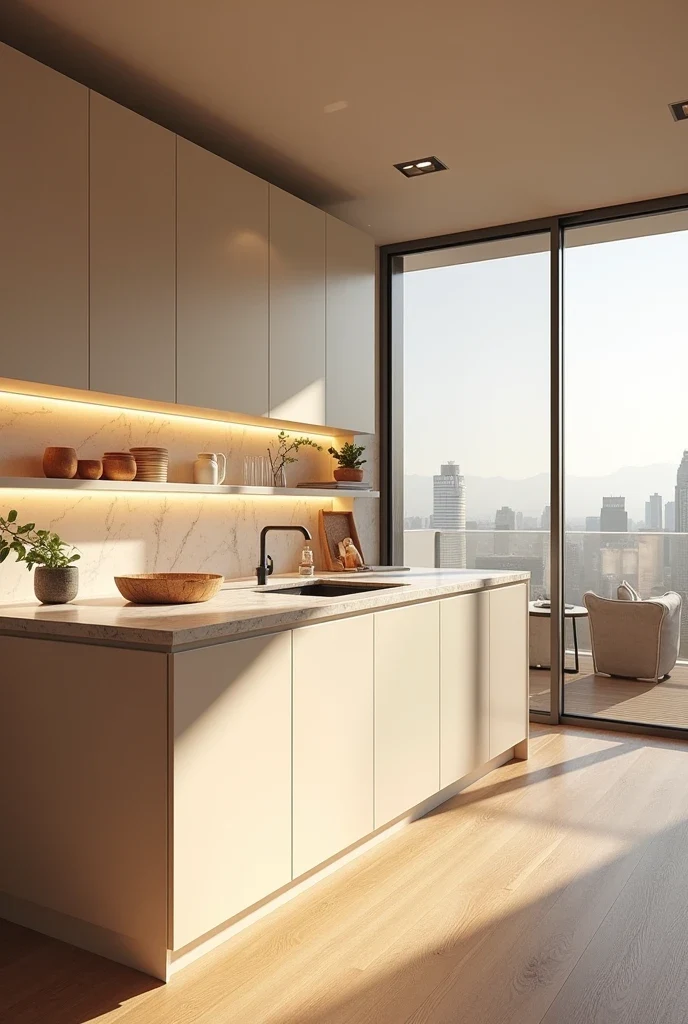
The ultimate expression of sophisticated neutrals, cream and sand combinations create kitchens that feel both contemporary and timeless. This palette works beautifully in spaces with abundant natural light, where the subtle color variations can be fully appreciated throughout the day.
Ultra-modern applications feature high-gloss cream cabinetry paired with warm sand-toned countertops and backsplashes. The monochromatic approach feels serene and spacious while soft LED under-cabinet lighting emphasizes texture variations and creates gentle warmth during evening hours. Natural wood flooring grounds the palette while maintaining the overall light, airy feeling.
This color scheme works particularly well for homeowners who want sophistication without boldness. The cream and sand palette provides enough visual interest to avoid blandness while remaining neutral enough to accommodate changing decor preferences and seasonal updates.
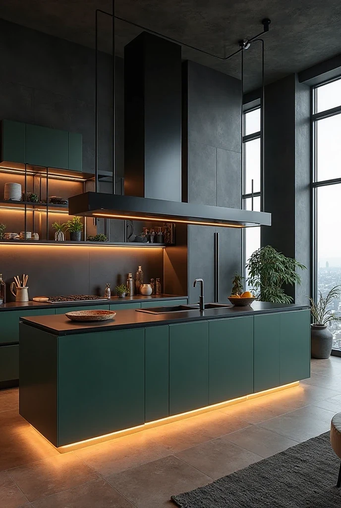
Navy and Brass Elegance for Dramatic Sophistication
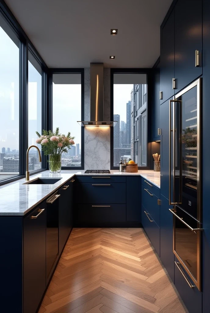
Deep navy blue represents the perfect balance between bold color choice and timeless elegance. When paired with warm brass accents, navy creates kitchens that feel both dramatic and welcoming, sophisticated enough for formal entertaining yet cozy enough for family life.
Luxury applications feature deep navy lower cabinets with lighter upper storage to maintain visual balance. Brushed brass hardware, lighting fixtures, and plumbing fixtures add warmth that prevents the navy from feeling cold or overwhelming. Quartz countertops in soft whites or warm greys provide neutral balance while herringbone wood flooring adds texture and warmth.
This combination works especially well in kitchens with city views or evening entertainment priorities. The navy creates intimacy and sophistication, while brass accents catch and reflect light beautifully during dinner parties and evening gatherings.
Sage Green Calm for Organic Sophistication
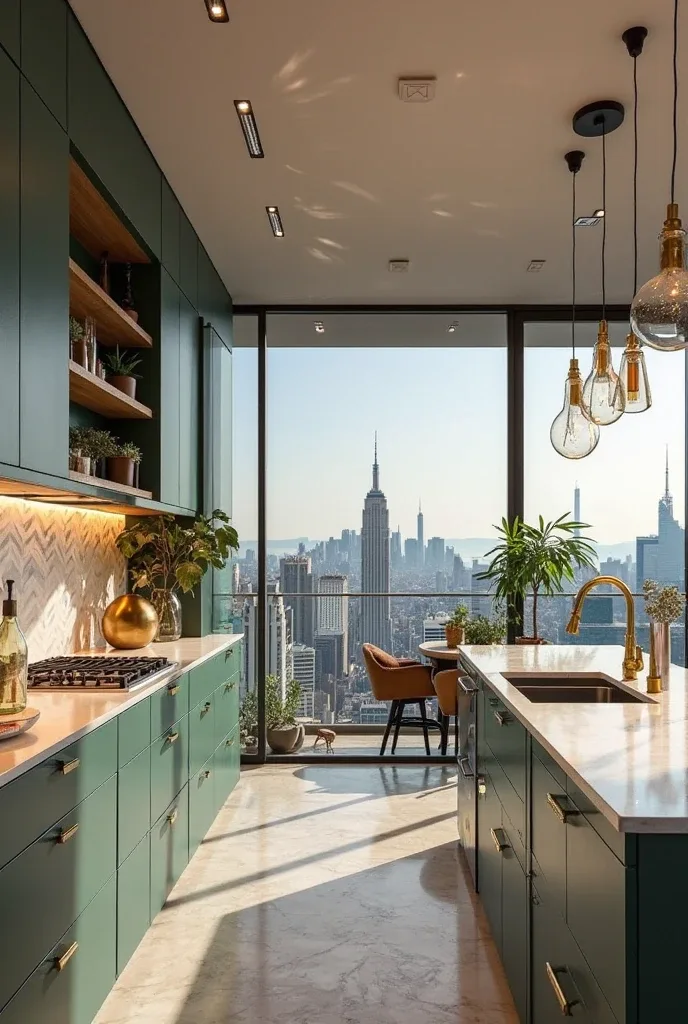
Sage green has emerged as the perfect alternative to stark whites or bold colors, offering sophistication with an organic, calming quality that makes kitchens feel more connected to nature. This color works beautifully in both traditional and contemporary settings.
Modern interpretations pair sage green cabinetry with white marble countertops that emphasize the color’s natural, earthy qualities. Soft gold fixtures add warmth without competing with the green, while matte black pendant lights provide contemporary contrast. Indoor plants feel naturally integrated, and textured backsplashes in natural materials enhance the organic feeling.
The sage green palette appeals to homeowners seeking sophistication with a wellness-focused approach to interior design. This color naturally promotes calm and relaxation while maintaining enough character to feel intentional and designed.
Charcoal and White Monochrome for Modern Drama
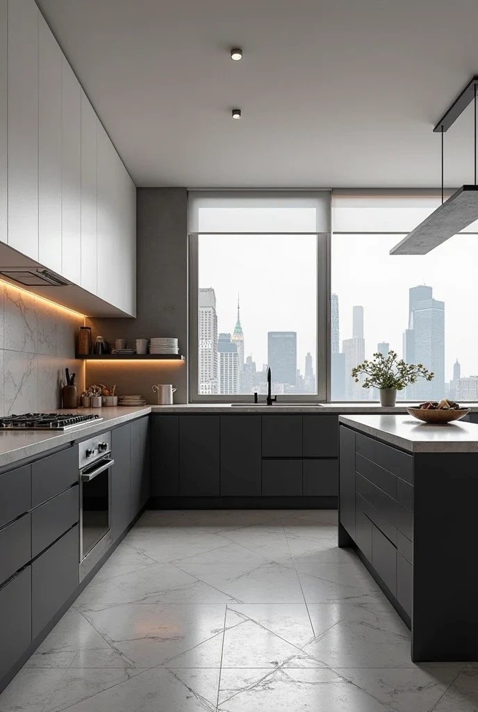
High-contrast monochrome schemes create some of the most dramatic and sophisticated kitchen environments. The interplay between dark charcoal and crisp white provides visual impact while maintaining neutral flexibility for styling and accessories.
Contemporary applications feature dark charcoal lower cabinets anchoring the space while matte white upper cabinets maintain lightness and prevent the dark colors from overwhelming smaller spaces. Floating shelves in matching white provide practical storage while emphasizing the clean, minimal aesthetic. Terrazzo flooring adds subtle texture while stainless steel appliances complement the modern approach.
This color scheme works particularly well in urban environments where the dramatic contrast complements city views and contemporary architecture. The monochrome approach feels sophisticated and intentional while providing excellent backdrops for colorful foods and styled accessories.
Blush Pink and Rose Gold for Feminine Glamour
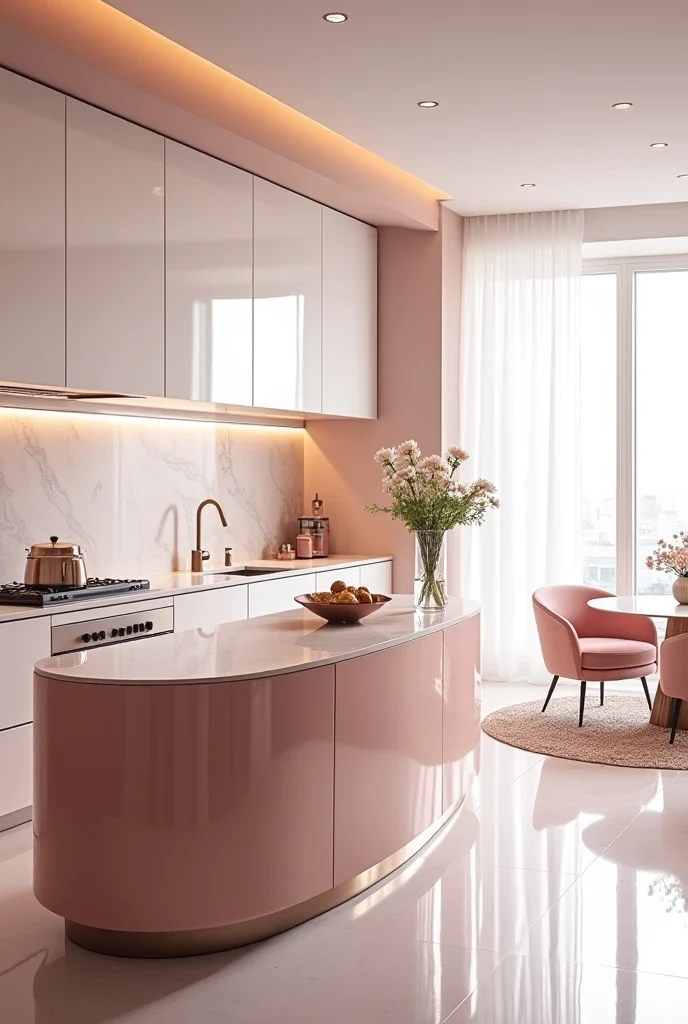
Soft pink tones create surprisingly sophisticated kitchen environments when executed with luxury materials and refined proportions. This palette challenges traditional kitchen color expectations while maintaining elegance and warmth.
Glamorous applications feature soft pink cabinetry with high-gloss finishes that reflect light beautifully. Rose gold hardware and fixtures add metallic glamour without feeling overwhelming, while polished white backsplashes provide clean contrast. Curved islands and soft velvet seating emphasize the feminine aesthetic while maintaining practical functionality.
This color scheme appeals to homeowners who want their kitchens to feel unique and personally expressive. The blush pink palette creates spaces that feel warm and welcoming while challenging conventional ideas about appropriate kitchen colors.
Earthy Olive and Wood Tones for Mediterranean Luxury
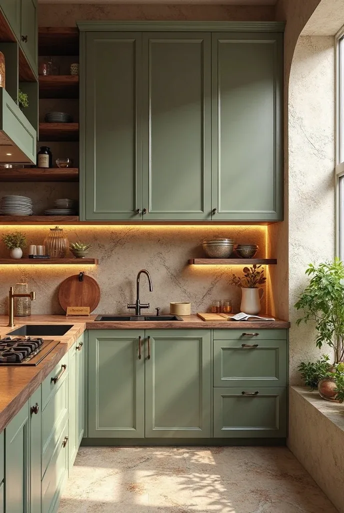
Olive green combined with warm wood tones creates kitchens with sophisticated Mediterranean influences that feel both exotic and comfortable. This palette works particularly well in homes with architectural details that support the organic, Old World aesthetic.
Elegant applications feature olive green cabinetry paired with warm walnut countertops that emphasize natural wood grain. Textured ceramic tiles add authentic Mediterranean character while brass fixtures provide warm metallic accents. Organic decor elements like woven baskets and ceramic vessels feel naturally integrated within this earthy palette.
The olive and wood combination appeals to homeowners seeking sophisticated alternatives to more common color schemes. This palette creates spaces that feel traveled and cultured while maintaining the warmth and functionality essential for family kitchens.
White and Gold Statement for Timeless Glamour
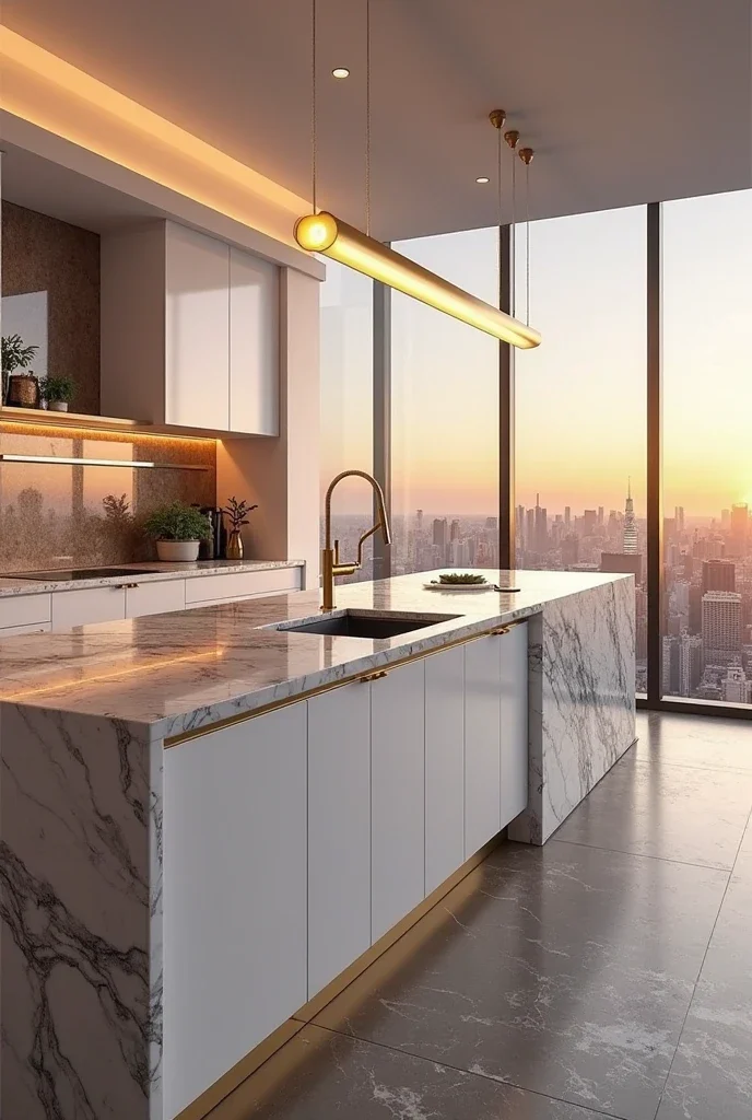
The classic combination of crisp white and warm gold creates kitchens that feel both timeless and luxurious. This palette never goes out of style while providing opportunities for dramatic metallic accents that catch and reflect light beautifully.
Glamorous interpretations feature crisp white cabinetry with gold hardware that feels substantial rather than decorative. Marble waterfall islands create dramatic focal points while gold lighting fixtures add sculptural interest. Polished concrete floors provide contemporary contrast while expansive windows emphasize the clean, airy aesthetic.
This color scheme works particularly well for homeowners who entertain frequently or want their kitchens to feel like luxury hotel suites. The white and gold combination photographs beautifully while creating sophisticated backdrops for both casual family meals and formal dinner parties.
Jet Black and Wood Contrast for Bold Sophistication
Jet black cabinetry creates some of the most dramatic kitchen environments while warm wood accents prevent the darkness from feeling overwhelming or sterile. This high-contrast approach requires confidence but delivers unparalleled sophistication.
Bold applications feature matte black cabinetry with walnut wood accents that add warmth and natural texture. Open shelving in matching wood provides practical storage while breaking up the dark surfaces. Smoky grey backsplashes bridge the contrast while pendant lights emphasize the dramatic aesthetic.
This color scheme appeals to homeowners who want their kitchens to make strong design statements. The black and wood combination creates spaces that feel sophisticated and contemporary while maintaining enough warmth for comfortable daily use.
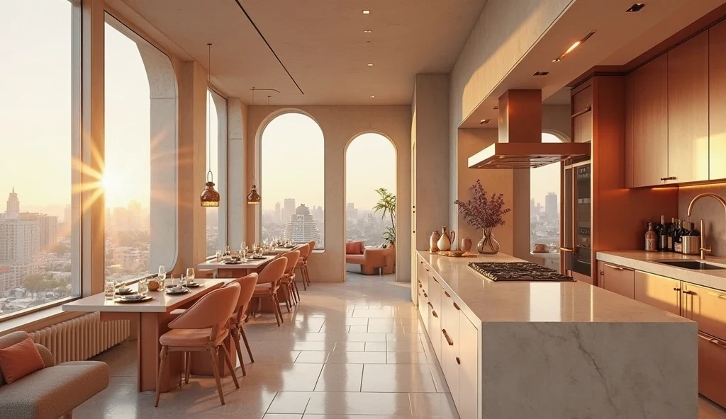
Terracotta and Cream Southwest-Inspired Warmth
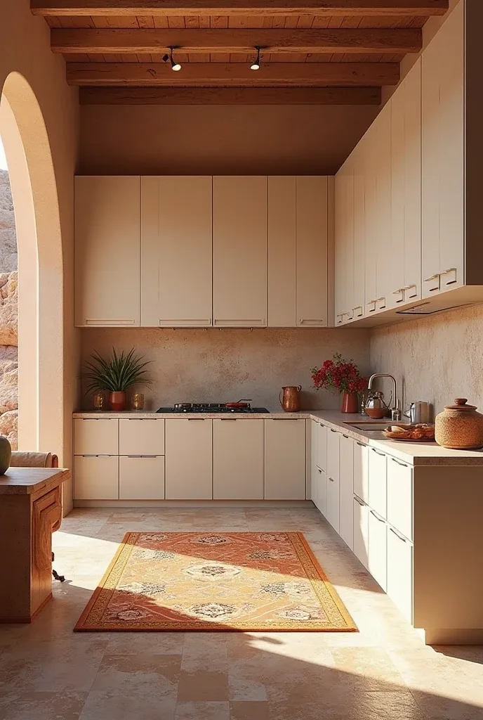
Terracotta tones bring warmth and earthiness to kitchen design while cream accents provide balance and sophistication. This palette works particularly well in homes with architectural details that support southwestern or Mediterranean influences.
Southwestern applications feature terracotta-toned accent elements paired with cream cabinetry that feels warm and inviting. Hand-painted tiles add authentic character while curved architectural details emphasize the organic aesthetic. Natural textiles and desert-inspired accessories feel naturally integrated within this warm palette.
The terracotta and cream combination appeals to homeowners seeking color schemes that feel warm and welcoming without being overwhelming. This palette creates spaces that feel connected to natural landscapes while maintaining sophisticated execution.
Icy Blue and Silver Coastal Chic
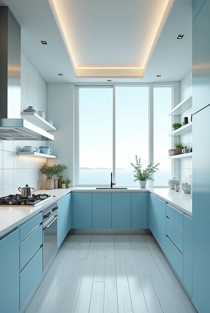
Cool blue tones combined with silver accents create kitchens with sophisticated coastal influences that feel serene and spacious. This palette works particularly well in homes with water views or abundant natural light.
Coastal applications feature icy blue cabinetry with silver fixtures that emphasize the cool, calming qualities of the color scheme. Frosted glass upper cabinets add visual lightness while white-washed flooring enhances the beachy aesthetic. Clean lines and minimal accessories emphasize the airy, uncluttered feeling.
This color scheme appeals to homeowners who want their kitchens to feel like retreats from busy daily life. The blue and silver combination creates spaces that promote calm and relaxation while maintaining sophisticated coastal elegance.
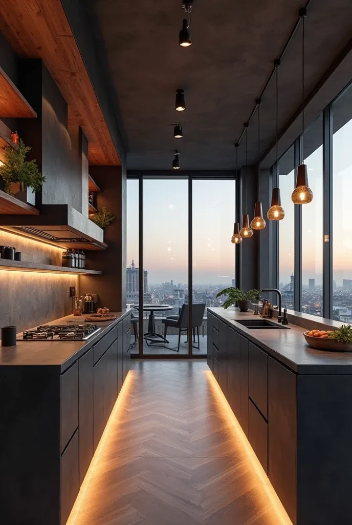
Forest Green and Matte Black for Moody Elegance
Deep forest green creates sophisticated kitchen environments with natural richness while matte black accents add contemporary drama. This combination feels both organic and modern, creating spaces with distinctive personality.
Moody applications feature forest green base cabinets with matte black countertops and backsplashes that create striking contrast. Metal-framed glass cabinets add industrial elements while ambient LED lighting emphasizes the rich, dramatic colors. Urban skyline views complement the sophisticated color palette.
The forest green and black combination appeals to homeowners who want bold color choices that still feel sophisticated and grown-up. This palette creates spaces that feel distinctive and memorable while maintaining contemporary functionality.
Warm Beige and Copper for Soft Luxury
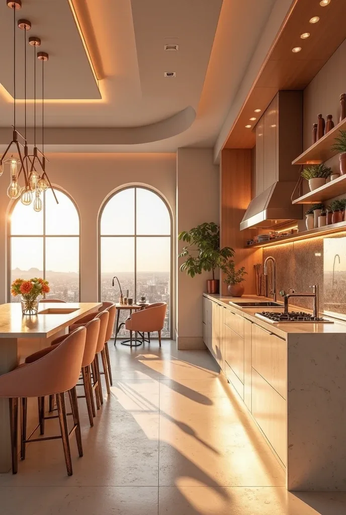
Warm beige tones combined with copper accents create kitchens that feel both sophisticated and welcoming. This palette provides color interest while maintaining neutral flexibility for styling and seasonal updates.
Luxurious applications feature warm beige cabinetry with copper hardware and fixtures that add metallic warmth. Creamy stone countertops emphasize the natural, organic qualities while built-in coffee nooks and plush seating create comfortable gathering spots. Golden hour lighting through wraparound windows enhances the warm, inviting atmosphere.
This color scheme works particularly well for homeowners who want sophisticated color without boldness. The beige and copper combination creates spaces that feel expensive and intentional while remaining comfortable for daily family life.
Final Thoughts
The most successful kitchen color schemes enhance your daily experience while reflecting your personal style and supporting your home’s overall aesthetic. Color has the power to transform not just how your kitchen looks, but how it feels to cook, gather, and live in the space every day.
Choose colors that make you excited to start your morning coffee ritual and comfortable hosting friends for dinner. The best kitchen color schemes feel authentic to your lifestyle and personality rather than simply following current trends or playing it safe with generic neutrals.
Remember that color choices affect everything from perceived space size to mood and energy levels. Take time to observe how different colors make you feel, consider how your kitchen is used throughout the day, and choose palettes that support both practical needs and aesthetic desires.
Start with one color that truly excites you—whether it’s the drama of navy blue, the warmth of terracotta, or the sophistication of sage green—and build your palette around that inspiration. The goal is creating a space that feels uniquely yours while maintaining the timeless sophistication that makes your investment worthwhile for years to come.
Really superb visual appeal on this web site, I’d value it 10 10.