
Your home probably has that safe, builder-grade white walls everywhere situation going on. Or maybe you attempted some color but now you’re stuck with rooms that don’t flow together and a paint scheme that felt right in the store but looks completely wrong in your actual space.
Choosing a cohesive color palette is where most people completely freeze up. You see those stunning interiors with perfectly coordinated colors that somehow work together effortlessly, and you wonder how designers make it look so easy. The truth is, it’s not about randomly picking pretty colors—it’s about understanding how different tones interact, how light affects everything, and building layers of color that create actual depth.
Whether you’re starting from scratch or trying to fix a color situation that’s not working, these curated palettes will help you create spaces that feel intentionally designed rather than accidentally decorated. Ready to move beyond safe neutrals into something that actually has personality? Let’s figure out what colors belong in your home.
Master Color Strategy First
Before you buy a single paint sample, let’s talk about what actually makes color palettes work in real spaces versus looking good on a mood board.
Light Changes Everything – Colors behave completely differently in north-facing versus south-facing rooms. What looks warm and inviting in natural light can feel completely different under evening artificial lighting.
Proportion Matters More Than Choice – It’s not just which colors you choose, it’s how much of each one you use. Your dominant color should cover about 60% of the space, secondary around 30%, and accents the remaining 10%.
Material Interaction – Colors look different on matte versus glossy surfaces, on plaster versus wood, on fabric versus tile. Consider how your chosen colors will appear across different textures and materials.
Flow Between Spaces – Your color palette should make sense as you move through your home. This doesn’t mean everything matches, but there should be intentional connections between rooms.
Think Like a Designer About Color
The most sophisticated interiors use color strategically to create mood, define spaces, and add visual interest without overwhelming.
Tonal Layering Approach – Multiple shades of the same color family create depth and sophistication that single flat colors can’t achieve.
Temperature Balance – Mix warm and cool tones intentionally to prevent spaces from feeling too hot or too cold. Most successful palettes include both.
Accent Strategy – Choose one or two accent colors and use them consistently throughout your space for cohesion.
Natural Material Integration – Consider wood tones, stone colors, and metal finishes as part of your palette, not afterthoughts.
15 Home Color Palette Ideas
Soft Clay and Charcoal

Build your space around warm terracotta clay walls layered with charcoal plaster accents for sophisticated earth tones. This combination creates warmth without feeling overwhelming while the charcoal adds necessary contrast and grounding.
Layer in cream linen upholstery and travertine stone elements to lighten the palette, then add tanned leather and aged brass for material richness. This works particularly well in living spaces where you want warmth and intimacy without darkness.
Verdigris and Driftwood

Create coastal sophistication with weathered teal-green paired with pale driftwood tones. This palette feels beachy without the nautical clichés, sophisticated enough for year-round living rather than just summer.
Use the verdigris as an accent in built-ins or feature walls while keeping main surfaces in warm sand and bleached wood tones. Matte black fixtures and brass details add necessary edge that prevents the palette from feeling too soft.
Ink and Pearl

Design dramatic spaces with deep ink-blue walls against pearl-white millwork for high-contrast modern elegance. This bold approach creates instant sophistication while remaining livable for daily use.
The key is balancing the drama with luxurious materials—Calacatta marble, blackened steel, and brass accents add richness that prevents the high contrast from feeling stark. Strategic lighting makes this palette work from morning through evening.
Sage, Stone and Linen

Build serene spaces around muted sage green, pale limestone, and soft oat-colored linens. This Scandinavian-inspired palette creates calm, minimal spaces that still feel warm and inviting rather than cold.
Bleached oak furniture and ceramic accessories in off-white maintain the tonal harmony while subtle texture variations prevent the space from feeling flat. This works beautifully in rooms where relaxation and peace are priorities.
Forest Green and Cognac

Create rich, enveloping spaces with jewel-toned forest green walls paired with cognac leather furniture. This classic combination feels both traditional and completely current when executed with quality materials.
Built-in walnut shelving and bronze accents add warmth while dark wool rugs ground the space. Multiple light sources at different levels prevent the deep colors from feeling heavy or oppressive.
Also Read: Modern House Exterior Ideas That Make Your Home Look Like It Cost Millions
Blush Rose and Smoke Pink

Design romantic spaces with muted blush walls and smoked-rose velvet upholstery for sophisticated femininity. This palette proves pink can be elegant and modern rather than juvenile or overly sweet.
Warm stone furniture and champagne-gold fixtures add necessary grounding while soft grey bedding prevents the space from becoming too monochromatic. Layered textures in similar tones create depth and interest.
Monochrome Terracotta

Explore tonal layering with multiple shades of terracotta from pale clay to deep rust. This Mediterranean-inspired approach creates warmth and depth through subtle color variations rather than contrast.
Balance the warmth with tempered black hardware and off-white concrete surfaces to prevent it from feeling overwhelming. The interplay between matte plaster and glazed tile finishes adds visual interest within the limited palette.
Graphite, Eucalyptus and Honey

Combine urban sophistication with natural warmth through graphite cabinetry, eucalyptus-green accents, and honey oak flooring. This trio balances contemporary edge with organic warmth.
Matte-black fixtures and brass hardware add necessary polish while leather seating introduces another natural material that ties the palette together. This works well in kitchens and open-plan spaces requiring both style and functionality.
Teal and Mustard Mid-Century

Embrace bold color with deep teal and mustard yellow for playful mid-century modern energy. This combination requires confidence but creates spaces with genuine personality and visual excitement.
Ground the bold colors with walnut furniture and brass accents that reference mid-century design heritage. Geometric patterns in rugs or textiles reinforce the period aesthetic while maintaining contemporary livability.
Pearl Grey and Aquamarine

Create spa-like serenity with soft pearl-grey walls and aquamarine ceramic accents. This gentle palette works particularly well in bathrooms and powder rooms where calm and cleanliness are priorities.
White oak cabinetry and chrome fixtures maintain the cool, clean aesthetic while frosted glass and matte ceramics add subtle texture. Abundant natural light makes this palette sing.
Slate Blue and Burnished Copper

Design industrial-luxe spaces with slate-blue plaster walls and burnished copper lighting fixtures. This unexpected combination balances cool and warm tones while feeling both current and timeless.
Polished concrete floors and dark-stained oak furniture add industrial edge while leather seating softens the harder materials. Evening lighting that emphasizes the copper’s warm glow transforms the space after dark.
Olive, Ochre and Ash

Channel European countryside elegance with olive-green walls, ochre accents, and ash-wood furniture. This earthy palette feels both historic and contemporary when executed with modern proportions.
Textured plaster walls and woven textiles add tactility while matte ceramic accessories maintain the natural material focus. This combination works beautifully in dining spaces and entry areas.
Blackened Oak and Champagne Gold

Create formal elegance with blackened oak cabinetry paired with champagne-gold hardware and lighting. This luxurious combination feels special without being overwhelming or overly trendy.
Alabaster stone surfaces and cream velvet seating lighten the drama while maintaining sophistication. Controlled lighting that creates dramatic shadows and reflections enhances the glamorous quality.
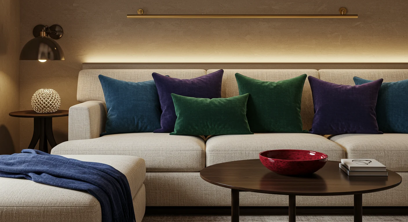
Jewel Accents on Warm Neutral Canvas

Build around warm sand plaster and ivory upholstery, then punctuate with jewel-toned accents in sapphire, emerald, and ruby. This approach lets you introduce bold color without commitment to painting entire rooms.
Satin brass hardware and dark walnut furniture provide grounding while the jewel tones add personality and visual excitement. This flexible approach allows seasonal changes through accessories while maintaining a sophisticated base.
Making Color Work in Real Life
Choosing a color palette isn’t about finding the prettiest combination—it’s about understanding how colors will actually function in your specific spaces with your particular light conditions and lifestyle needs.
Test paint samples on multiple walls and observe them at different times of day before committing. Colors that look perfect in morning light might feel completely wrong in evening artificial lighting. Consider how much natural light each room receives and how that affects your color choices.
The most successful color schemes create emotional responses that enhance how you want to feel in each space. When your home’s colors make you feel genuinely happy and relaxed rather than just looking good in photos, you’ll know you’ve found the right palette.