
Your entryway floor is currently working harder than it gets credit for and looking worse than it deserves. Every person who walks through your front door lands on it first—muddy boots, wet umbrellas, wheeled luggage, dogs who did not get the memo about wiping their paws—and then it has to look good anyway, under whatever lighting your builder installed in 1994. It is the most abused surface in your home and, in most cases, the most underdesigned one.
The flooring decision gets treated as a practical problem—something durable, something that cleans easily, something that won’t show dirt—and the aesthetic dimension gets pushed to a secondary concern that never quite makes it to primary. Which is how most entryways end up with generic tile that does its job quietly and makes absolutely no impression whatsoever on anyone who crosses it.
What nobody says out loud is that entryway flooring is actually one of the highest-impact design decisions in the entire house, because the floor is what you see first and from the widest angle—it’s in view before the walls are, before the furniture registers, before anything else has had a chance to make an impression. A floor that does something interesting transforms the entry before a single piece of furniture or a single coat of paint gets involved. And a floor that’s just technically adequate drags down everything above it, no matter how good the rest of the decisions are.
Why Your Current Entry Floor Isn’t Doing Its Job
Flooring failures in entryways are predictable enough that they’re worth cataloguing before getting to the solutions.
Choosing material without choosing scale — The same tile that looks elegant in a large format looks cheap in a small one. The same wood plank that reads as luxurious at eight inches wide reads as ordinary at three. Scale is not a detail—it’s the decision that determines whether a material performs or just occupies the floor.
Pattern fear dressed up as practicality — Most people reject patterned entryway floors on the grounds that they’ll tire of them, date quickly, or be difficult to match against other design choices. What they’re actually expressing is a preference for the known quantity of boredom over the risk of something interesting. Pattern in an entryway, properly chosen, doesn’t compete with the rest of the house. It marks the threshold between outside and inside in a way that plain flooring simply cannot.
Ignoring the transition — The point where the entryway floor meets the flooring of the next room is a design moment that most people treat as a technical problem to be solved with a strip of brass threshold tape. The best entryways design that transition deliberately, using it to mark the shift from entry to interior in a way that feels intentional rather than awkward.
What Every Great Entryway Floor Decision Has in Common
Across wildly different materials and styles, the floors that genuinely transform an entry share these qualities.
The material was chosen for this specific space — Not for the house in general, not because it was on sale, not because it matched something already existing. The material was chosen because it was right for the entry specifically—its light conditions, its traffic, its relationship to what comes next in the house.
The installation is doing as much work as the material — Herringbone, checkerboard, parquet, random ashlar—the pattern in which a material is laid changes its character entirely. The same tile laid straight reads entirely differently from the same tile laid diagonally. Installation direction and pattern are design decisions with as much impact as material choice, and treating them as afterthoughts always shows.
It aged into the space rather than fighting it — The best entryway floors look like they were always there, whether they’re sixty years old or installed last spring. They have a relationship with the architecture, the light, and the materials around them that feels settled rather than imposed.
Entryway Flooring Ideas Worth Stealing
Refinished Multicolour Slate That Stopped Apologising for Being Itself
Refinished the slate floors in my 1964 house’s foyer
by u/senor-mango in Mid_Century
Whoever originally installed this slate floor in 1964 had opinions, and whoever refinished it recently had the wisdom to get out of the way and let those opinions continue to express themselves. Multi-tone slate in charcoal, burgundy, grey-green, and near-black laid in a random ashlar pattern fills the foyer with a material story that no contemporary tile could replicate—because contemporary tile is trying to look like this, and this is actually it. The irregular colour variation that might read as inconsistency in a lesser material reads here as geological character, and the refinishing has brought back a clarity that lets every tone read distinctly rather than muddying into grey. A warm honey-toned wood console and mahogany cabinet sit against white walls without competing with the floor—they let it be the room’s dominant feature, which is correct because it is the room’s dominant feature. The globe pendant overhead provides warm light that enriches the stone tones rather than washing them out. If you have original slate somewhere in your house that you’ve been thinking about covering up, reconsider that thought carefully.
Light Oak Floors with a Barn Door That Solved Two Problems at Once
White walls, light oak plank floors, and a black front door with sidelights is a combination that appears on approximately four hundred thousand mood boards annually, and this entry shows why—because when it’s done correctly, with the right scale of plank and the right warmth of tone, it genuinely works and continues to work without ever becoming tired of itself. The floors are wide-plank, which is the decision that separates this from looking generic: narrow planks in a light tone read as cheap laminate regardless of what they actually are, while wide planks in the same tone read as considered. The sliding barn door in reclaimed diagonal-pattern wood on a black hardware track is the genuine surprise—it’s doing practical work (accessing an adjacent space without a swing radius) while contributing warmth, texture, and a material note that the otherwise minimal palette needed. A black metal open-shelf console with a woven ceramic lamp, dried branch stems in a stone vase, and an oval black-framed mirror keep the styling in the same clean, earthy language as the floor. The geometric runner near the door and the lantern pendant overhead close the composition without overcomplicating it.
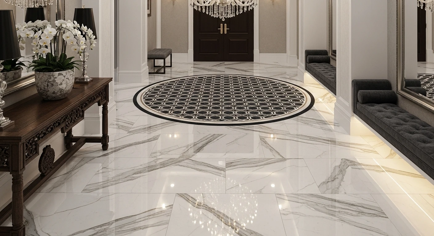
Polished Black and White Marble Checkerboard Through a Black Arch
The checkerboard floor is one of design history’s most durable choices because it operates simultaneously as pattern and as neutral—it introduces graphic drama without committing to any specific color story, which means everything placed above it can be almost anything without clashing. This version executes it in large-format polished marble in true black and white, which is the version that demands commitment: smaller tiles soften it toward decorative, but oversized slabs make it genuinely architectural. The black arch that frames the entry is the detail that pushes this from “nice floor” to “considered space”—the arch’s curve echoes the softness that a rigid checkerboard could easily lose, and its deep black picks up the floor’s dark tiles in a way that connects floor to architecture rather than letting them sit in separate visual layers. A linen upholstered bench along one wall with a large olive tree in a woven basket provides the organic softness the hard-surfaced room needs, and the full-height glass-paneled doors flood the space with the light that polished marble requires to do its full reflective work.
Herringbone Brick Floor That Aged Into Something a New Floor Can’t Buy
There is a quality that old brick floors have that no new flooring product can replicate, no matter how convincing the distressing—it’s the result of decades of actual use, actual variation in the kiln-fired colour, and actual settling of the material into its setting. The herringbone brick in this entry corridor has all of it: warm, irregular, slightly imperfect, and completely beautiful in the way that only genuinely old things can be. White walls and ceiling keep the focus on the floor, which deserves it. A simple stone-topped ledge beneath the window holds a few stems of greenery, two baskets of what appears to be firewood provide grounded texture at floor level, and hats and a dog lead hung directly on the wall rather than on dedicated hardware feel like the incidental marks of a lived-in house rather than styling decisions. The wooden stairs at the end of the corridor are warm enough in tone to transition from the brick without competing. Everything about this entry reads as honest—no material is trying to be something it isn’t, no surface is straining for effect, and the result is the specific warmth that only genuinely unpretentious spaces achieve.
Art Deco Encaustic Tile That Turned a Narrow Corridor Into a Gallery
The decision to install a floor this graphic in a hallway this narrow takes a specific kind of courage—the kind that comes from understanding that pattern in a tight space doesn’t make it feel smaller, it makes it feel intentional. A deep navy encaustic tile in a repeating Art Deco fan motif with cream, gold, and terracotta detailing covers the full length of the corridor without interruption, and the effect is extraordinary: the pattern’s geometry emphasises the directional length of the space rather than fighting it, creating something that feels more like a designed journey from front door to interior than a simple connecting corridor. A coral-red painted door is the one above-floor colour decision visible in the frame, and it’s the right call—the warmth of the red picks up the terracotta notes in the tile rather than introducing something foreign. Dark walls on either side are visible at the far end, suggesting that the design confidence doesn’t stop at the floor and continues into whatever comes next. The lesson here is straightforward and uncomfortable for anyone who defaulted to plain tile: the floor that looks like too much in the tile showroom is almost always the floor that looks exactly right once it’s in the room.
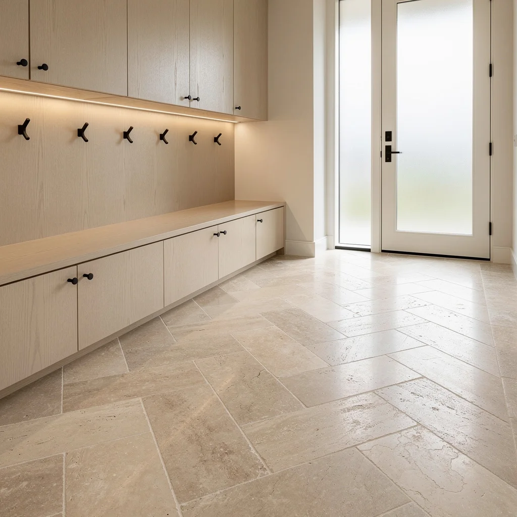
Go Luxe with Travertine Slabs—Because Your Entry Deserves It
Ditch the dingy tiles and make your mudroom scream money by installing large honed travertine slabs in a herringbone pattern. Don’t cheap out—get that subtle veining and smooth finish for tactile goodness. Let creamy oak built-ins melt right into the stone floor, but anchor everything with matte black coat hooks so it doesn’t look washed out. Pump up the natural light, and always add LED strip lighting under cabinetry—if your stone’s not glowing, you’re doing it wrong. Pro tip: Never let your storage touch the floor; keep cabinetry floating or built-in for seamless high-end vibes.
Porcelain Power: Stagger Those Tiles and Flex Modern Mojo
Forget weird grout lines—pick oversized charcoal-gray porcelain tiles and lay them in a classic brick pattern for instant sophistication. Rectified edges are non-negotiable if you want that seamless, magazine-worthy look. Surround these tiles with pale walnut millwork and floating shelving—yes, LEDs inside for the flex. Shoe storage goes pristine white and bench quartzite for that stone-on-stone power move. If you want an uncluttered space that still packs a punch, nix visible baskets and stash them in a custom niche. Pro tip: Always run your tile pattern straight from threshold to storage for visual flow.
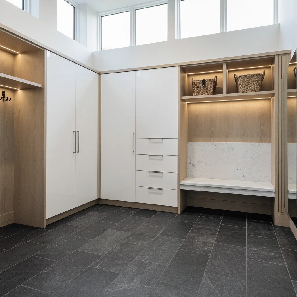
Matte Black Slate: Make Your Entryway Moody, Not Messy
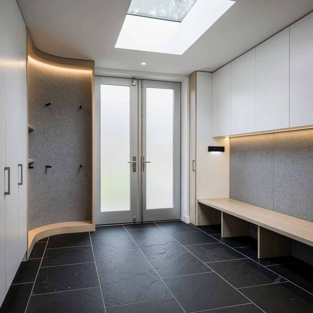
Want a modern, grown-up mudroom? Lay big matte black slate tiles in a running bond pattern—precision is your friend, so line them with the cabinetry or go home. White wall-to-ceiling storage keeps things crisp, and pale ash built-in seating stops you from slipping into all-black drama. Create movement with undercabinet sensor lighting and bring in a skylight for soft daylight (a must, unless you like living in a cave). Don’t skip the vertical felt-clad niche for extra storage with backlit LEDs; it’s organizational swagger at its finest. Pro tip: When using black, pair with reflective surfaces to avoid total gloom.
Terrazzo Triumph—Italian Artisanal Flair Without Trying Too Hard
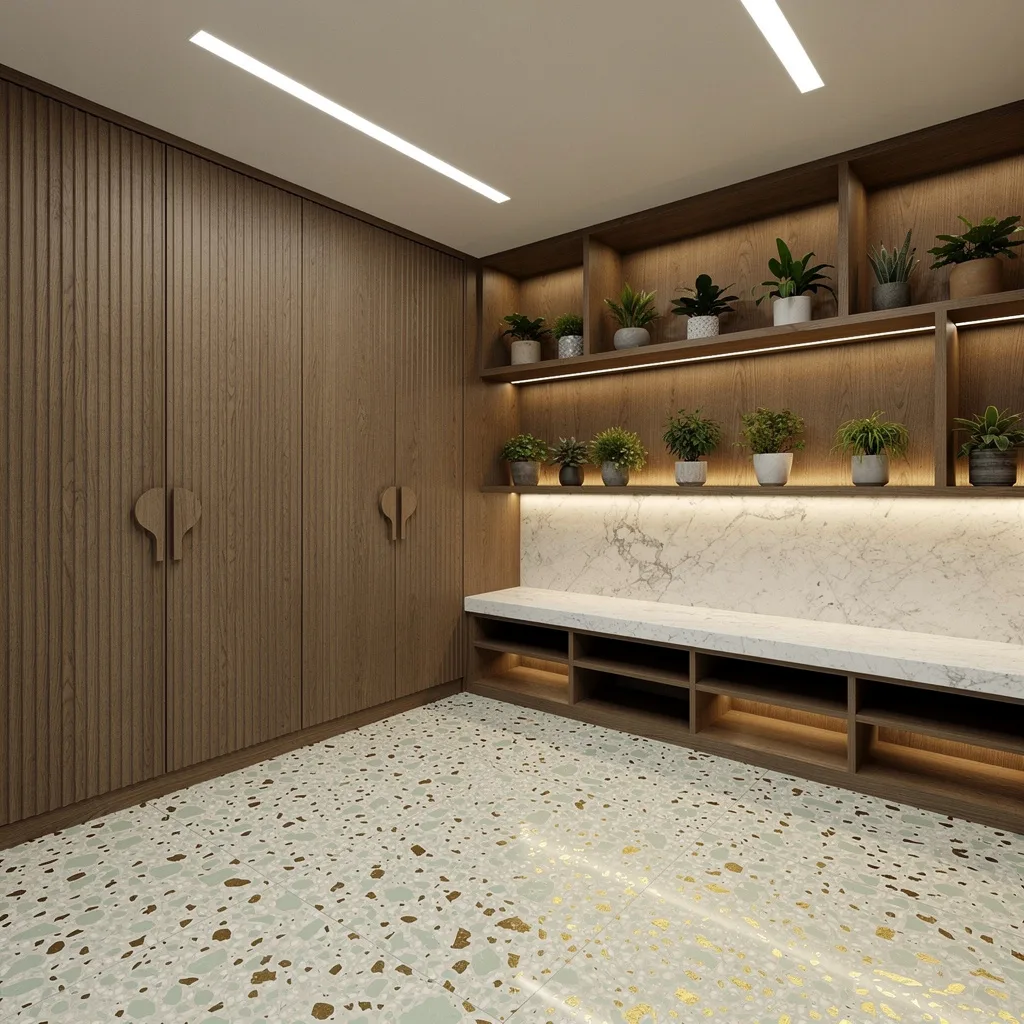
If you want a floor that says ‘I travel to Milan,’ pour down custom Italian terrazzo in off-white, pale sage, and flecks of brass. Don’t settle for cheap speckles; each piece should be polished to a subtle shine. Fluted walnut cabinetry is your storage sidekick—ditch handles and get sculpted finger pulls for instant sophistication. Cap it off with a marble shelf and saturate everything with strip lighting so the terrazzo pops. Pro tip: Don’t let plants touch the floor—always style them on display shelves to keep things feeling refined, not messy.
Cork Floors: Eco Hot, Not Hippie Ugly
Get sustainably harvested, wide-plank cork in chestnut tones underfoot if you care about the planet (and want soft, resilient floors). Make it pop with in-floor radiant heat—cold toes are for quitters. Combine with light oak and smoke-gray cabinetry, and fill your space with cubbies instead of random baskets. Shoe storage goes under benches, and coat rails light up for night-time flex. Flood the entry with sunlight, but never let your pendant light look weak; oversized or nothing. Pro tip: If your cork is patterned, stain it deeply to avoid patchy, dated vibes.
French Oak Parquet: Instant Heritage, Zero Fuss
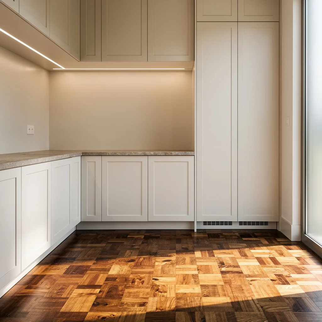
Go ultra-refined with mosaic-cut French oak blocks arranged in basketweave parquet—oiled, not lacquered, so the grain breathes. Run handle-free cabinetry full height in soft warm white, and stone-top your console for an extra grown-up touch. Cove uplights behind the joinery make your cabinetry float (no excuses), and let slim frosted windows wash over the wood for warmth. Pro tip: Never let your parquet touch water—layer with a boot tray or mat near entry, but keep it patterned for more than just ‘mudroom’ feels.
Polished Concrete Grid: Industrial Chic Without Looking Like a Basement
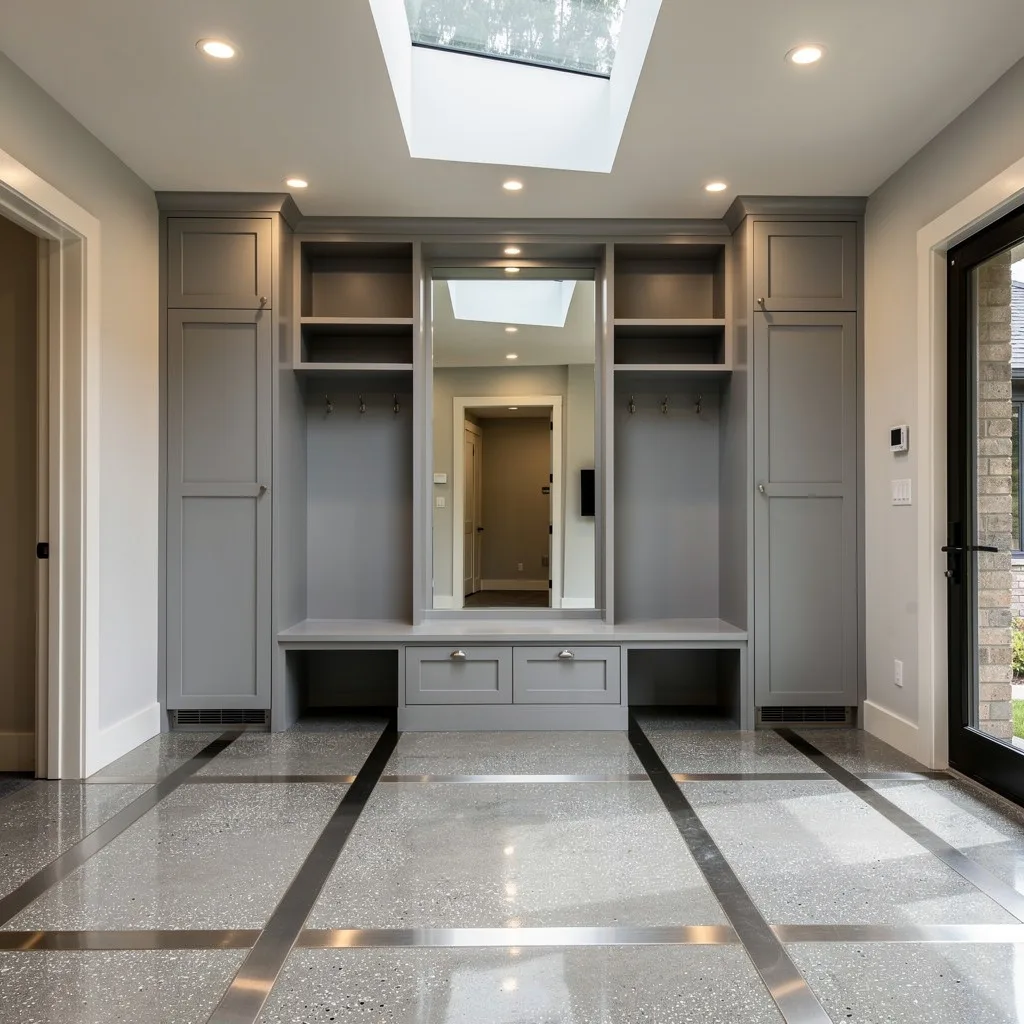
Elevate your entry game (and no, not just ‘industrial’) with highly polished concrete floors featuring a subtle silver aggregate. Inset brushed-nickel transition strips for a low-key grid pattern that actually looks intentional. Go dove gray cabinetry, integrated bench seating, and overhead cubbies—keep storage slick and hidden. Drop in a full-height mirror built into the millwork for bounce and depth. Flood the space with daylight using a skylight, and add soft recessed spots up top for nighttime ‘hotel lobby’ vibes. Pro tip: Always polish concrete to a mirror finish—if you skimp, it’s just garage.
Final Thoughts
An entryway floor that genuinely works isn’t the result of finding the right tile at the right price on the right weekend. It’s the result of understanding what the floor is actually doing in the space—setting the tone, establishing the material vocabulary, marking the threshold between the public and private, providing a foundation that everything above it either earns or fails to earn.
The floors on this list succeed because each one was a decision, not a default. The multicolour slate refinished rather than replaced. The checkerboard executed in real marble at a scale that meant it. The encaustic tile installed in the narrowest corridor rather than saved for a more forgiving space. The marble with hardwood inlay that committed to grandeur without hedging.
Your entryway floor is the first material your home offers to every person who enters it. It should be worth the introduction.