
The kitchen is the room that gets cooked in, eaten in, argued in, and visited by literally every person who comes to the house — and yet it’s consistently the room that gets the least intentional decorating attention. The living room gets the throw pillows and the gallery wall. The bedroom gets the aesthetic overhaul. The kitchen gets a dish soap dispenser that someone chose in thirty seconds and a fruit bowl that’s been in the same spot since the previous owners left it there.
Part of the problem is the assumption that kitchen decor is either expensive — new cabinet fronts, new countertops, a full renovation that takes three months and costs more than a used car — or pointless, because whatever you do, it’s still a kitchen and someone’s going to spill something on it within forty-eight hours. Both of those assumptions are wrong, and the proof is in every kitchen that looks genuinely considered without having been touched by a contractor.
Counter styling, wall treatments, hardware swaps, lighting additions, and the strategic placement of things you already own — these are the decisions that transform a kitchen from a room you cook in to a room you want to spend time in. None of them require permits, demolition, or a budget that makes you reconsider your life choices. They require the same thing every other room in the house requires: someone slowing down long enough to make a few decisions on purpose rather than by default.
Why Budget Kitchens Stay Looking Budget Even After You Buy Things for Them
The kitchen decorating mistakes that drain budgets without improving rooms are consistent enough that they deserve a direct conversation before anyone buys anything.
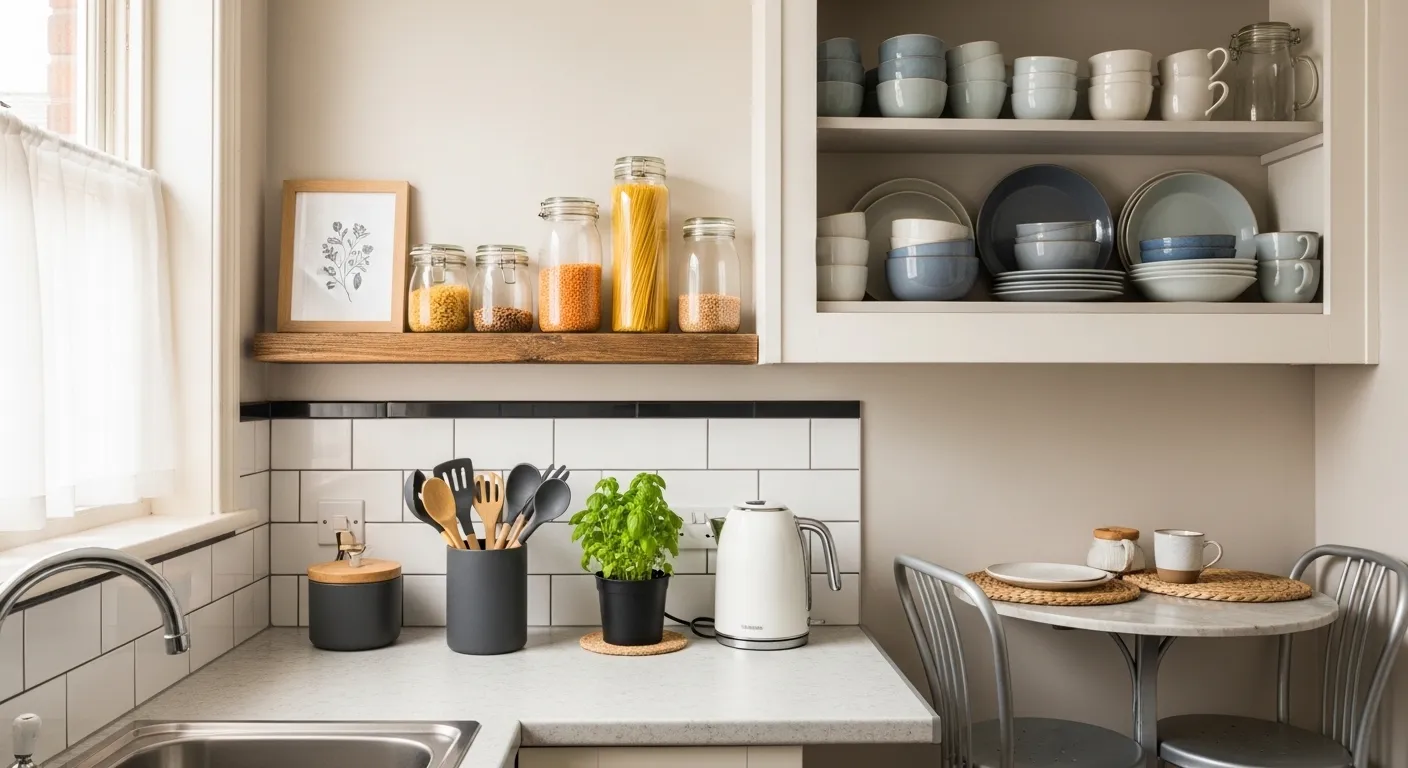
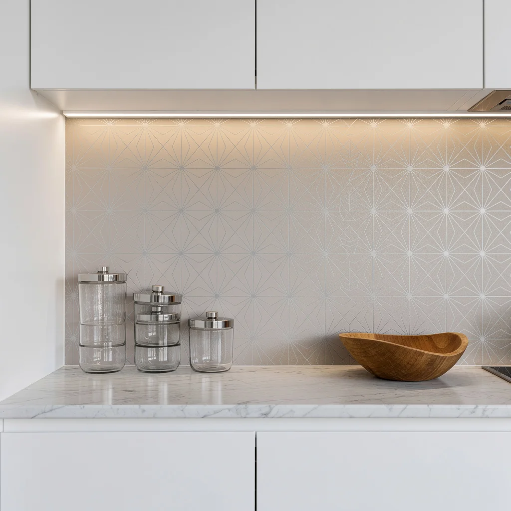
Counter styling is not the same as counter cluttering — The difference between a kitchen counter that looks designed and one that looks loaded is curation, not quantity. Every appliance, utensil holder, plant, and decorative object on a counter is either earning its visual place or contributing to the chaos that makes even expensive kitchens look messy. The rule is simple: if it doesn’t get used daily or look genuinely beautiful, it goes in a cabinet, and the counter gets breathing room instead.
The wall above the counter is doing nothing and could be doing everything — Kitchen walls above the backsplash and below the upper cabinets are some of the most neglected vertical real estate in any home. A gallery of vintage oil paintings, a collection of woven baskets, a single large landscape print leaning on a shelf — any of these transforms that dead zone into the room’s personality piece without touching a single cabinet or counter surface.
Hardware is the lowest-effort highest-return upgrade in any kitchen — Swapping builder-grade chrome or brass cabinet pulls for matte black, brushed brass, or unlacquered bronze costs between fifty and two hundred dollars for an entire kitchen depending on the number of cabinets, takes an afternoon, requires a screwdriver and nothing else, and changes the entire temperature of the room. It’s the upgrade that makes people ask if you renovated when you technically just did some light hardware shopping.
What Makes Budget Kitchen Decor Actually Work
The kitchens that look like they cost more than they did share qualities that have nothing to do with the price of any individual element.
A consistent material palette makes cheap things look expensive — Three or four materials used throughout — say, brass, white ceramic, natural wood, and woven texture — create the kind of cohesion that makes a kitchen look designed. Introducing a new material or finish with every purchase produces the scattered quality that makes even expensive kitchens look undecided. Pick your palette before you buy anything and hold to it even when something off-palette is tempting and on sale.
Lighting changes everything after 4pm — Most kitchens run on a single overhead fluorescent or recessed grid that produces the kind of flat, even illumination better suited to surgical theaters than rooms where people eat. A pendant over the table, fairy lights along the perimeter, or under-cabinet LEDs on a warm setting transform the evening experience of the kitchen from utilitarian to genuinely atmospheric — and that transformation costs less than most decorative objects while doing considerably more work.
Plants in a kitchen are worth three decorative objects each — Fresh herbs in terracotta pots on a windowsill, a trailing pothos on an open shelf, a small fern on the counter — plants introduce color, texture, life, and the specific quality of looking genuinely tended-to that no decorative object can fake. A kitchen with plants looks inhabited. A kitchen without them looks like a showroom, regardless of how nice the other elements are.
Budget Kitchen Decor Ideas
The Fairy Light Kitchen:
My cozy decorated kitchen
by in CozyPlaces
A narrow apartment kitchen with dated brown cabinets, aging hardware, and all the architectural charm of a corridor — transformed by a single strand of warm white fairy lights draped along the perimeter of the ceiling, a macrame wall hanging centered on the end wall below a framed print arrangement, and enough personal objects placed with enough intention that the whole thing reads as a cosy, deliberately warm space rather than a rental kitchen someone gave up on — is the most honest entry on this list because it shows what decorating within real constraints actually looks like. The fairy lights are doing more heavy lifting than they have any right to: they shift the entire room’s color temperature from cool fluorescent overhead to warm amber ambient, which is the single most impactful change possible in a kitchen with fixed fixtures and an unchanged cabinet situation. The macrame hanging centered at the end of the corridor gives the eye something to travel toward, which transforms a dead-end kitchen layout into a composition with a focal point — the difference between walking into a corridor and walking into a room. The framed prints above the window are hung at the right height to create a display zone rather than random art placement, which is the styling discipline that separates deliberate from decorative. This kitchen proves that warmth is a legitimate design strategy when structural options are limited, and fairy lights at eight dollars a strand are a more impactful investment than most objects that cost twenty times as much.
The Vintage Floral Gallery Wall and Black Counter Kitchen:
Covering the wall above a black granite countertop and farmhouse sink with an arrangement of vintage floral oil paintings in ornate gold frames — various sizes, none of them matching, all of them hung with the kind of density usually reserved for Victorian dining rooms — and then adding a silver candelabra with taper candles and a crystal vase of fresh purple lilacs on the counter is a kitchen decor decision that has entirely stopped caring what kitchens are supposed to look like and is significantly better for it. The gallery wall works precisely because nobody expects it — the kitchen is the last room in the house most people would hang serious art in, which means doing exactly that reads as a confident design statement rather than a decorating accident. The ornate gold frames against the warm cream upper wall and black lower wall create the contrast that makes each painting visible rather than merged into a dark backdrop, and the brass bridge faucet picks up the gold frame tones in a way that makes the hardware feel like part of the composition rather than just plumbing. The lilacs are the fresh element that stops the whole thing from feeling like a museum installation — one vase of actual flowers in a crystal vessel communicates that this kitchen is lived in and loved, which is the most important thing a decorated room can communicate.
The Olive Cabinet and Marble Backsplash Kitchen:
Deep olive green shaker cabinets with small brass knob hardware, a full-height marble slab backsplash, a brass bridge faucet over a white farmhouse sink, open shelving displaying stoneware and woven baskets, a rough terracotta jug of dried winter branches as the counter centerpiece, and a vintage landscape oil painting in a gold frame leaning against the backsplash shelf — this kitchen has assembled a material palette of exactly five elements and refused to introduce a sixth, which is the discipline that makes it look considerably more expensive than the sum of its parts. The olive cabinet color is doing the most significant work: it’s specific enough to read as a deliberate choice rather than a default, warm enough to make the brass hardware glow rather than yellow, and dark enough to make the white marble backsplash and white sink pop at high contrast. The vintage painting leaning casually on the shelf rather than hung formally on the wall is the styling decision that makes the kitchen feel like a home rather than a showroom — that one degree of informality signals genuine habitation in a way that a perfectly arranged kitchen never quite manages. The open shelving showing real everyday items — actual stacked plates, a functional wicker basket, a wooden board — is honest in a way that purely decorative open shelf styling isn’t, and that honesty is what makes the room feel real.
The Woven Basket Wall Kitchen:
Mounting a collection of woven rattan and seagrass baskets in varying sizes, weave patterns, and tones on the white plastered wall beside the kitchen, above natural pine lower cabinets and a concrete countertop, with open wood shelves on the adjacent wall holding herb plants in terracotta and assorted ceramics — this is the kitchen that solved its wall problem by going to the thrift store with a very specific intention and coming back with something that looks like a considered installation. The basket wall works in a kitchen for the same reason it works in a dining room: it introduces organic texture, warm tone, and pattern variety all from a single material family, which creates visual richness without creating visual noise. Every basket on that wall cost between two and fifteen dollars secondhand and the collective result looks like someone paid a stylist to source them, which is the budget decorating paradox that patience and a clear concept can produce. The natural pine cabinets with matte black handles and the concrete countertop complete a material palette — wood, concrete, white plaster, natural fibre — that stays entirely within one temperature register, warm and earthy, which is why the basket wall feels at home rather than stuck on.
The White Kitchen with Butcher Block and Woven Everything:
An all-white shaker kitchen — white cabinets, white subway tile backsplash, white round dining table — rescued from blandness by butcher block countertops in warm honey wood, a large woven rattan pendant light overhead, open shelving displaying wooden serving boards and natural-toned dishware, woven placemat rounds on the table, and a round white ceramic vase of dried lavender and wheat as the table centerpiece, is a case study in how one warm natural material introduced consistently throughout a white kitchen transforms the entire temperature of the space. The butcher block counter is the foundational decision: it brings the same warmth into the counter zone that the rattan pendant brings to the ceiling and the woven placemats bring to the table, creating a material through-line of natural fibre and warm wood that runs through every level of the room vertically. The open shelving is styled with the specific restraint that makes open shelves look intentional rather than overcrowded — wooden boards propped vertically rather than stacked, a small number of dishes displayed rather than the full set, one or two decorative objects with clear breathing room around them. The hanging rail below the upper shelves holding white ceramic mugs is the functional detail that also reads as display, which is the dual-purpose styling approach that makes a kitchen look curated without requiring any non-functional elements.
The White Farmhouse Kitchen with Matte Black Hardware:
White shaker cabinets, white quartz countertops, white subway tile backsplash, a farmhouse sink — none of this is revolutionary, and none of it needs to be, because the matte black hardware throughout is the single decision that takes a completely standard kitchen layout and makes it look like someone made at least one conscious design choice. The bar-pull cabinet handles in flat matte black are doing the work of a cabinet color change without any of the commitment, cost, or irreversibility — they shift the room’s register from “builder grade” to “intentional” with hardware that costs under ten dollars per pull and can be installed in an afternoon. The counter styling shows exactly the level of restraint that white kitchens require to look designed rather than sterile: one black stand mixer, one small herb plant in a basket, a wooden “HOME” letter display, a knife block, and a checkered hand towel over the farmhouse sink edge — enough to feel inhabited, not enough to create visual clutter that a white kitchen cannot absorb. The lesson is that white kitchens don’t need more color or more decoration, they need better editing and one hardware decision executed with commitment.
Master the Floating Spice Rack Power Move
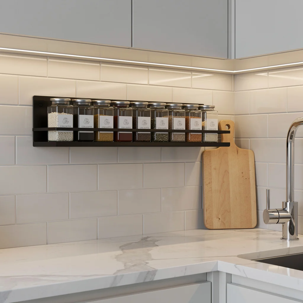
Think a wall-mounted spice rack is basic? Wrong. Real style is all about order and drama, not a messy pile of turmeric in your cabinet. Grab a matte black metal rack and mount it at eye level so your glass jars become kitchen jewelry, not clutter. Slap on uniform minimalist labels—because nobody has time for mismatched handwriting. And hello, soft under-cabinet LED strip lighting is the glow-up for your cayenne dreams. Bonus: One solid natural wood cutting board says ‘chef’—anything more is ‘hoarder.’ Pro tip: Always decant your spices—brand packaging kills the vibe.
Fake Luxury With a Grid of Gold Mirrors
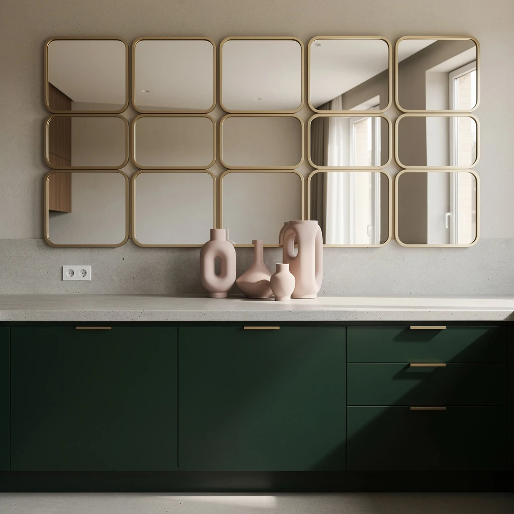
Want your weird little galley kitchen to double in size? Go high with a collection of slender, matte gold framed mirrors in a perfect grid—yes, symmetrical. This trick hacks natural light, fakes space, and tells your friends you shop at galleries, not garage sales. Place them above a concrete countertop for Euro-cool contrast. Drop some ceramic vases in calm, pastel tones to kill empty counter energy. Deep forest green cabinets plus tiny brass handles make you look loaded without dropping stacks. Pro tip: Stick to small mirrors—big ones just scream ‘gym bathroom’.
Open Shelving, Ultimate Flex

Corner open shelves in pale walnut wood are the underrated MVP for tiny kitchens. Go vertical to display a few, not all, of your quirky bowls and planters—rest stay in the back, unseen like last year’s resolutions. Stick to stone, muted ceramics, and trailing plants so you hit ‘curated’ instead of ‘yard sale.’ Frosted white pendant? Yes, it’s a must. Matte white walls and gray flooring mean everything you own looks artful. Pro tip: Treat open shelves like Insta highlights—not a pantry overflow. Edit ruthlessly; clutter is for amateurs.
Backsplash On a Post-It Budget
Peel-and-stick tile backsplash: literally the cheat code for updating any kitchen. Grab a pattern with geometric lines in matte silver or not-too-warm taupe for that ‘designer drew this’ feel. Balance the budget drama with a faux marble laminate countertop—no one can tell unless they’re licking it (don’t). Stackable glass canisters and a sculpted wooden fruit bowl break up the white cabinetry monotony. Pro tip: Always add under-cabinet LED lighting. It isn’t just ambiance—it’s your savior for midnight cheese hunts.
Wall-Mounted Knife Strips for the TikTok Chef Life

Stop shoving knives into a jammed drawer—real adults mount them. Get brushed stainless steel magnetic strips and line them up horizontally for max chef drama. Bonus points for matte-black utensils—just don’t go rainbow, unless you want your kitchen to look like a college party. Choose hand-polished dark oak countertops for a ‘fancy restaurant but I have rent’ feel, and add a single modern ceramic vase (no bouquets, please) with fresh eucalyptus. Pro tip: Keep the knives spaced evenly—crooked lines are for haunted houses, not kitchens.
Abstract Vinyl Decals: The Rental Renegade’s Weapon
Want zero-commitment color? Custom-cut self-adhesive vinyl wall art in abstract earth tones adds instant cred for the price of a fancy pizza. Stick them above your matte white breakfast bar to draw the eye up and make the area read ‘grown-up zone.’ Go for designer industrial pendant lights in brushed bronze for peak mood lighting, and stockpile soft grey or blue porcelain mugs for your mugshot (pun intended). Pro tip: Keep cabinetry in understated matte grey to make sure your wall decor doesn’t battle with your cabinets—and resist the urge for busy patterns.
Gallery Ledge Game: Coffee Shop at Home

Gallery ledges made from reclaimed light ash are your hack for instant ‘slow living’ vibes. Mount a single ledge on a slate-grey wall and arrange glass jars with coffee beans, loose leaf teas, or sad, artisanal sugar sticks. Mix in a few matte-white ceramic pieces, but don’t cluster—give each object some elbow room. Add a single fern in a concrete planter to keep things from feeling dusty. Pro tip: Integrate LED uplighting under the ledge. If there’s not a secret glow, you did it wrong.
Pegboard Wall for the Chronically Disorganized

Pegboards aren’t just for dads in garages anymore. Snag a blush pink pegboard and go wild with elegant matte copper utensils and minimal bamboo baskets—hang them, don’t pile them. Warm white recessed spotlights spotlight your organization skills (because you’ll never have them in life). A polished speckled quartz countertop and folded linen towel in slate blue offer that ‘I have my sh*t together’ illusion. Pro tip: Only hang beautiful tools—nobody needs to see your crusty pizza cutter up there.
Go Minimal With a Floating Shelf Under the Window
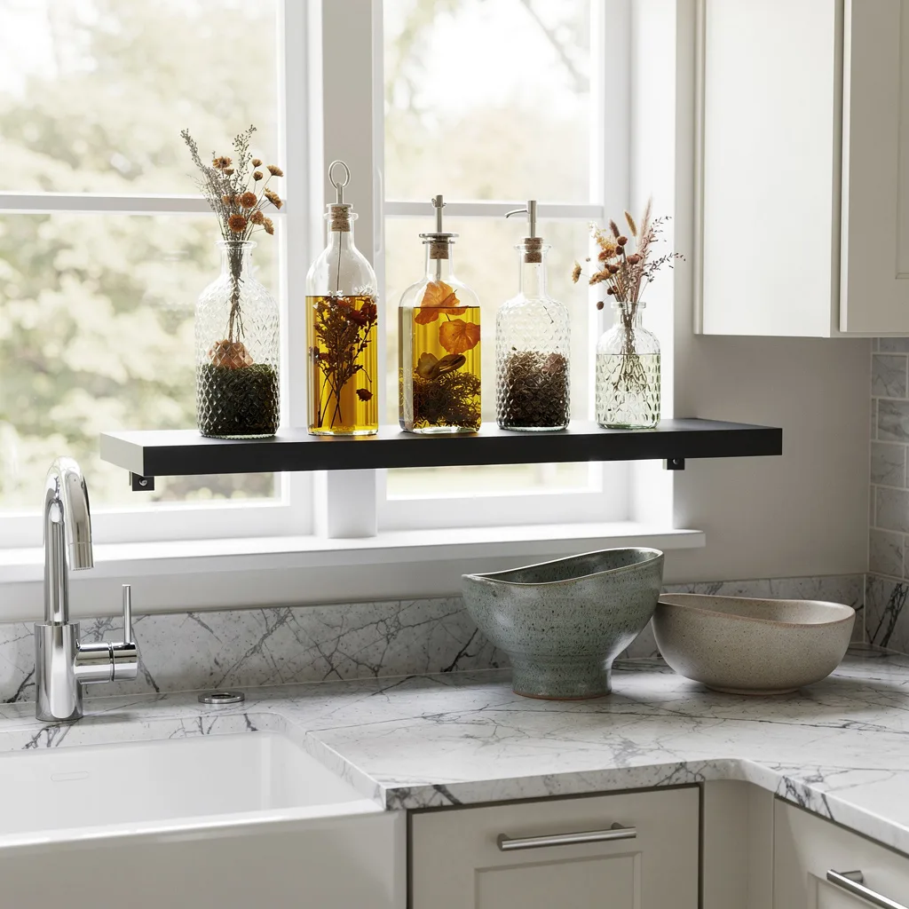
Need a reason to keep your windowsill clear of trash? Install a compact floating shelf in matte charcoal just beneath the glass, and parade your most aesthetic glass bottles of infused oils and dried herbs—Superhost energy, unlocked. Toss in some hand-glazed pottery bowls for artisan points. Make sure your hardware is polished chrome for that subtle flex, and use a marble-patterned laminate counter for budget gloss. Pro tip: If it doesn’t spark joy or make salad, it doesn’t belong on display.
Tray Organizer: Serving Looks, Not Just Salt
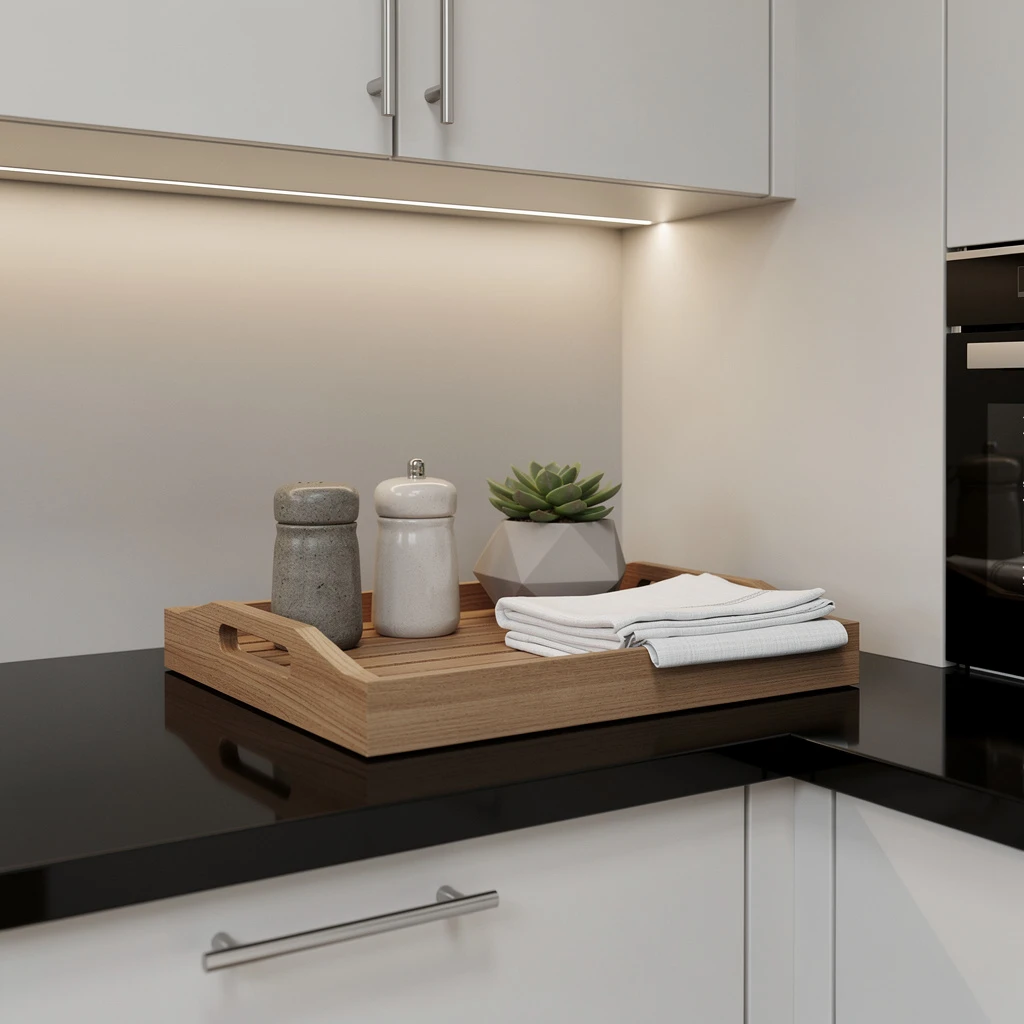
A sleek natural wood tray on your counter is the lazy person’s guide to cohesion. Use compartments to corral artisan stoneware salt and pepper cellars, a tiny succulent (fake if you must), and crisp linen napkins you’ll never actually use. Keep it perched on a glossy black counter for edge—and add subtle cabinet LED lighting over top to highlight your ‘intentional’ mess. Flat white cabinetry levels up the look; brushed nickel pulls add money vibes. Pro tip: Edit your tray regularly—random ketchup packets kill all class.
Shadow Boxes: Not Just for Art Nerds
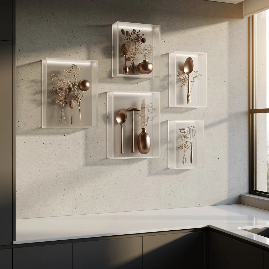
Mount a grid of frosted acrylic shadow boxes on your kitchen wall and you have instant drama without dust traps. Fill them with dried botanicals or sculptural metallic utensils—keep colors muted for gallery appeal. Place these over a pale concrete backsplash and a glossy white counter to keep things looking modern, not mummified. Matte graphite cabinets ground your wall display, so don’t even think about bright primaries. Pro tip: Group shadow boxes in odd numbers—threes or fives always look better than sad, lonely pairs.
Hanging Rails: The Mug Flex
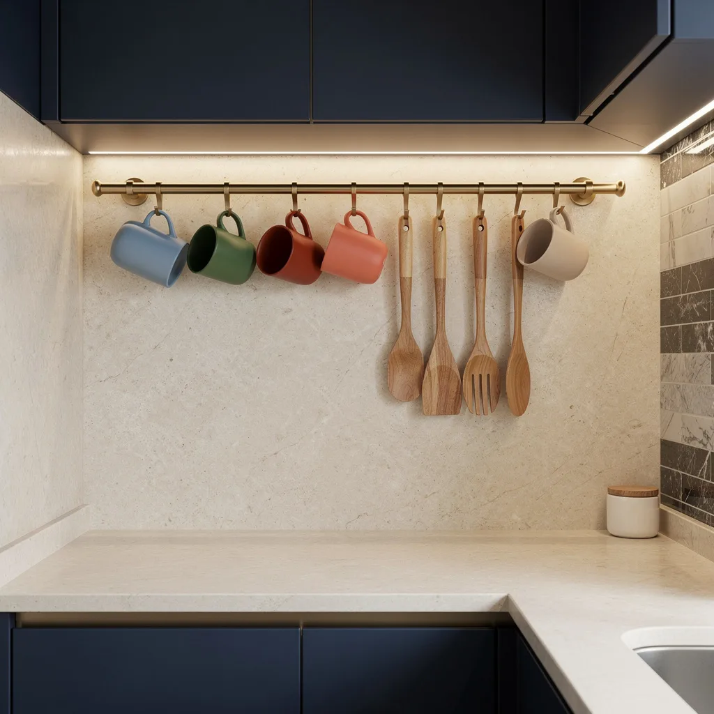
Show off your mug collection and wooden utensils like a design genius with a brushed matte brass hanging rail installed above a creamy stone-effect countertop. Hang only your chicest, most ‘this-mug-was-actually-expensive’ ceramics—ditch anything chipped or looking like a dorm. Soft indirect LED strip lighting above the rail glows up your late-night ramen sessions. Flat-front navy cabinets and marble tile accents dial up the glam without the drama of a kitchen reno. Pro tip: Never hang more than one line of mugs—nobody wants to see your entire life story up there.
Final Thoughts
A kitchen that looks genuinely cared for doesn’t require a renovation, a contractor, or a budget that makes you reconsider how much you actually need to eat at home. It requires the same thing every other room requires: a material palette you commit to, a wall that does something besides exist, counter surfaces that were edited rather than just cleared, and at least one light source that creates warmth rather than just illumination.
The kitchens here all found their version of that and executed it without hedging. One went all-in on vintage art and candlelight. One committed to a cabinet color and let the rest respond. One solved the entire wall problem with baskets from a thrift store. None of them renovated a single fixed surface to do it. Pick your version, make the two or three decisions that matter most in your kitchen specifically, and stop waiting for a budget that’s twice as large before you let the room you spend the most time in actually look like someone lives there on purpose.