
Paint color is where most entryway decisions go to die a slow, beige death. Someone stands in the paint aisle, gets overwhelmed by the sheer number of ways to be inoffensive, and walks out with something called “Accessible Greige” or “Agreeable Gray” or any of the other twelve thousand names the paint industry has invented for the color of mild anxiety. It goes on the walls, it looks fine, and the entryway continues its career as the most forgettable room in the house.
The problem isn’t that people have bad taste. It’s that they’re making color decisions for their entryway the same way they’d make them for every other room—prioritizing what won’t go wrong over what might go spectacularly right. In a living room, that caution is at least understandable. You live in it for hours every day, and a color you hate in year two of staring at it is a genuine problem. But an entryway? You pass through it. Guests experience it for forty-five seconds on the way to somewhere else. The stakes for getting it wrong are extremely low. The stakes for getting it right—for creating a moment of color so good it makes people stop mid-step—are very, very high.
Color in an entryway doesn’t need to be livable in the same way bedroom color does. It needs to be interesting, intentional, and confident enough to make an impression before the rest of your home gets a chance to weigh in. Which means the safe choice isn’t just boring. It’s also strategically wrong.
Why Entryway Color Decisions Keep Going Sideways
The mistakes are consistent across houses, budgets, and style preferences, which means they’re also consistent in how to avoid them.
Choosing color in isolation from the light — A paint chip in a hardware store is not the same color as that paint chip on your wall at 7am on a cloudy morning, at noon with sun streaming through a glass door, or at 8pm under whatever lighting you have. Color shifts dramatically with light conditions, and entryways often have the most variable and the least controlled light in the house. Sampling on the actual wall for at least forty-eight hours is non-negotiable, and yet most people skip it and then wonder why the color looks nothing like what they chose.
Stopping at the walls — The single most common reason a bold color choice doesn’t land in an entryway is that it stops at the wall and leaves everything else—trim, ceiling, doors—in a default white that fights rather than supports the color. The entries that make people stop and look are almost always the ones where the color decision extended to the trim, or the ceiling, or the doors, or all three. Painting one element boldly and surrounding it with generic white reads as unfinished, not courageous.
Choosing a color that belongs in another room — Entryway colors don’t need to follow the same logic as living room or bedroom colors. They don’t need to be relaxing, or energizing, or conducive to any particular activity. They just need to be interesting and right for the space. Some of the most successful entryway colors—very dark greens, deep wines, saturated teals—would feel oppressive in a room you spend hours in and feel electric in a corridor you move through.
What the Good Color Choices Have in Common
Color confidence in an entryway follows patterns, and the successful ones share these consistently.
The color does more than cover the walls — Every entry on this list uses color as a compositional tool rather than just a background. The dark paneling that makes light oak floors glow. The deep wine that makes a faded red rug feel like it was always meant to be there. The charcoal that makes a Victorian tile floor look like the most intentional choice in the room. Color in relationship with other elements is the entire game.
The trim decision is as important as the wall color — Whether the trim matches the wall, contrasts it sharply, or mediates between the wall and a third element, the trim choice is doing half the design work. Default white trim with a bold wall color is a choice, but it’s rarely the best one—and the entries that look truly considered are almost always the ones where someone thought about the trim as carefully as the wall.
Light sources are treated as part of the color story — The amber Edison bulbs hanging from the driftwood ceiling beam, the brass chandelier throwing warm light across grasscloth walls, the lantern pendant in a wine-colored room—each of these is doing color work as much as any paint choice. Warm light enriches warm colors and softens cool ones. Cool light does the opposite. The best color decisions account for the light sources before the paint goes on, not after.
Entryway Color Ideas Worth Stealing
Dark Paneling with a Driftwood Pendant That Nobody Could Have Planned
The hallway in our first house 🍃✨
by u/ceciliaeffa in CozyPlaces
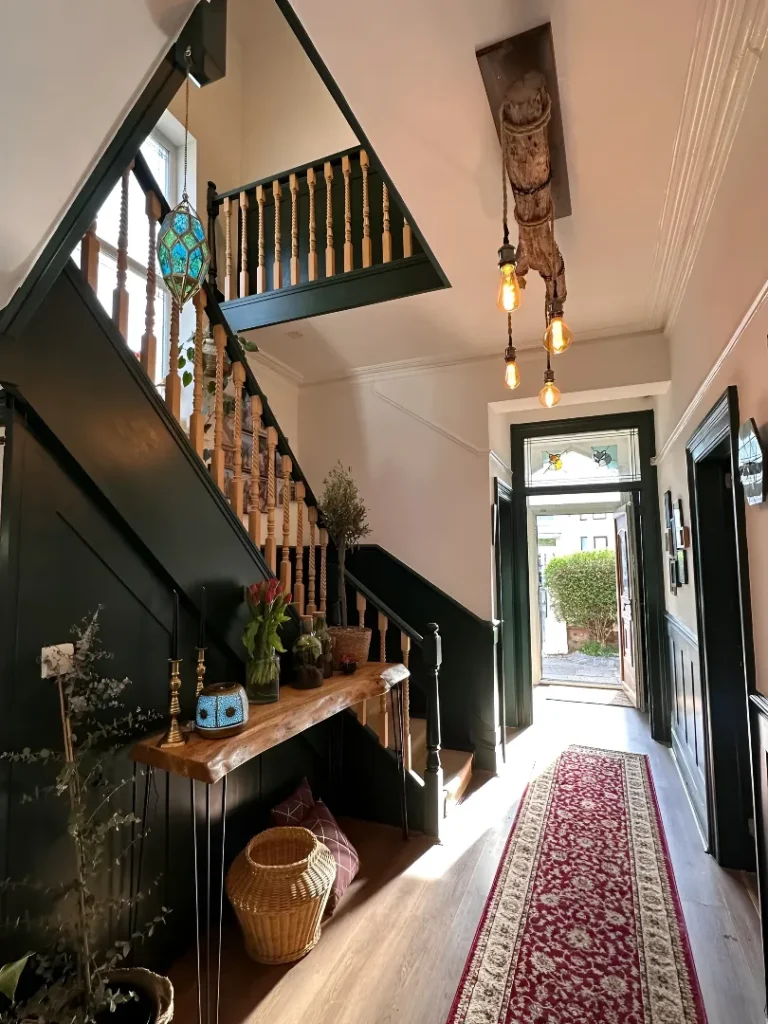
This is the entry that happens when someone has strong instincts and the courage to follow them all the way through without asking anyone’s permission. Near-black paneling covers the lower half of the walls and the staircase structure, creating a dramatic contrast with the white upper walls and ceiling that gives the narrow corridor a sense of scale it technically doesn’t have. The raw driftwood beam mounted to the ceiling with three Edison bulbs hanging from it at staggered lengths is the detail that shouldn’t work and absolutely does—it introduces organic warmth and a completely unexpected texture that stops the dark paneling from feeling too controlled. A live-edge console holds plants, brass candlesticks, and a ceramic pot in jewel tones without any of it looking arranged. A red Persian runner leads the eye toward the front door and the stained glass transom above it, which casts colored light into the space in a way that changes the whole entry depending on the time of day. This room was assembled by someone who clearly bought what they loved rather than what matched, and the accumulated effect of those decisions over time is a space with genuine personality.
Slate Blue Grasscloth with Gold Leaf Mirrors and No Intention of Being Subtle
The distinction between “dark” and “moody” is sometimes hard to articulate, but this entry illustrates it cleanly. Slate blue grasscloth wallcovering goes from floor to wainscot rail, texturing every surface it touches and giving the color a depth that flat paint simply cannot replicate—because you’re seeing a slightly different angle of the weave at every point in the room, and the color shifts with it. Crisp white wainscoting and door trim below provide the contrast that stops all that blue from becoming heavy, and the ceiling tray in warm wood paneling overhead does double duty as architectural detail and warmth source. A gold ornate mirror in a leaf motif frame above a dark cabinet with circular hardware is the decorative moment the room is organized around, flanked by gold leaf-shaped sconces that echo the mirror’s shape in a way that’s deliberate without being stiff. A brass ring chandelier overhead, yellow tulips on the cabinet, and a faded blue-green rug underfoot complete a room that is unambiguously glamorous and completely comfortable with that fact.
Duck Egg Blue Tongue-and-Groove with an Antique Bench That Lived a Whole Life
The blue-green that works in this entry is one of the most difficult shades to get right in a real room—too green and it reads as seafoam, too grey and it goes cold, too bright and it becomes a 1970s bathroom tile problem. This shade lands perfectly because the tongue-and-groove paneling covering every surface including the ceiling gives the color a texture that softens it and keeps it from going clinical, and because the warm wood floor, antique pine bench, and dark metal industrial pendants provide exactly the tonal counterweight the cool blue needs to stay in balance. A colorful landscape painting above the hook rail is the one moment of warmth and pattern in an otherwise disciplined composition, and the floral Roman blind in the window adds softness without competing. The hooks are brass, minimal, and mounted at intervals that create a rhythm rather than a row. The brick floor at the far end near the door is the genuine surprise—the shift from smooth wide plank to rough brick marks the threshold between inside and truly outside in a way that’s both practical and unexpectedly beautiful.
All-Pink Built-In Cabinetry That Is Absolutely Not Apologizing for Itself
The argument against pink in an entryway usually goes: it’s too sweet, too feminine, too much of a commitment, too likely to date badly. This entry makes the counter-argument more convincingly than words ever could. Floor-to-ceiling built-in cabinetry in a warm dusty rose covers every wall of the mudroom, and the effect is not precious or saccharine—it’s warm, enveloping, and genuinely joyful in a way that most neutral mudrooms simply cannot compete with. Dark bronze hardware throughout keeps the pink from going sugary, a white marble bench top provides clean contrast at the seating level, and slate tile on the floor grounds everything with a material weighty enough to stop the pink from floating. Woven baskets on the floor, a straw hat on the hook, fresh yellow and pink flowers on the open shelf—every incidental object looks better than it would in a white or grey room because the pink background makes everything pop rather than receding. The white shiplap wall visible through the door into the adjacent space reminds you that this commitment to color is deliberate and contained, which makes it feel confident rather than accidental.
Slate Grey Paneling with Victorian Mosaic Tile and a Pendant That Understands Drama
Victorian terraced houses come with an entryway problem that most modern design advice completely fails to address: the corridor is long, narrow, tall, and contains original tilewerk that is simultaneously beautiful and impossible to design around if you’re trying to go contemporary. This entry solves the problem by going further into the period rather than away from it—deep slate grey paneling with full molding detail runs on both sides, embracing the architectural heritage and enriching it with a color that makes the original geometric mosaic floor look intentional rather than inherited. A large Art Deco-style opal glass pendant provides overhead light with just enough period credibility to sit comfortably in the space, a second smaller pendant at the far end creates depth in the corridor rather than leaving the far wall in shadow, and a heavily gilded ornate mirror frame visible at the right edge introduces the one genuinely maximal element that the dark walls are authoritative enough to support. The staircase ahead, its runner lit by light from a glass partition above, creates a vanishing point that makes the corridor feel like it leads somewhere worth going—which is precisely the feeling a well-colored entryway should create from the moment the door opens.
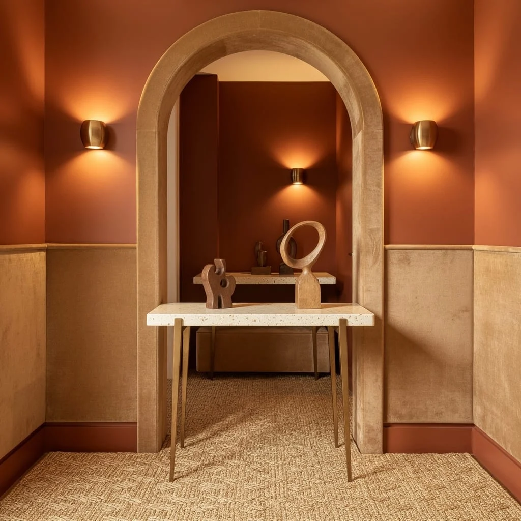
Go Moody with Forest Green and Gold
Craving an entryway that screams ‘I have my life together and also maybe a butler’? Paint those walls in the deepest, richest forest green you can find. slap a walnut wood accent wall on one side for high-roller contrast. Do not cheap out on lighting—run LED channels in the ceiling for a chic, indirect vibe. Marble-look tile floors (matte only! we don’t do 90s shine) and a dark stone console with green veining seal the deal. Toss in a massive gold-framed mirror and only pick geometric accessories—no farmhouse here, please. Here’s the key: Light both the ceiling AND under your console so guests look flawless and mysterious.
Lavender and Concrete for Chill Royalty
Want to vibe modern but soft, not like you started a cement business? Drench those walls in smokey lavender, letting as much sunlight in as your lease allows. Pour a pale grey concrete floor (or fake it with large tiles) and add a matte black slim console, topped with a lilac terrazzo slab. Level up with champagne bronze on your fixtures and go for a geometric, deco-inspired mirror. Overhead, a modern glass chandelier adds ‘I know what I’m doing’ energy. Make sure you float minimalist shelves in warm white for your vases—no open mail, only style. Pro tip: Always choose lighting with a dimmer; blinding guests is a criminal offense.
Navy & White: The Only Blue You Should Allow Past The Doormat
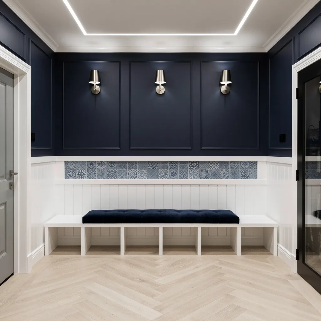
If you want an entryway that looks both expensive and not trying-too-hard, slap some navy blue panels on the walls. Top with crisp white beadboard for fail-proof contrast. Lay down a pale chevron oak floor for subtle pattern (get it done right or embrace chaos from the start). Integrated storage cubbies in white hide the shame piles. Plop down a deep indigo velvet bench and mount matte nickel sconces in trios—it says sophistication, not suburban. Add recessed ceiling lighting and sneak in a blue ceramic tile inset for texture. The trick here: Never let your storage show more than two items. Order reigns supreme.
Blush and Rose Gold: Flirt Without Trying (Too) Hard
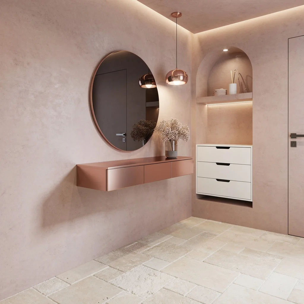
Think you’re too grown for pastels? Absolutely not. Coat your entryway in a seamless blush microcement—walls and ceiling, don’t be scared. Go oversized with cream limestone floor tiles in a staggered layout for that architectural feel. Float a rose gold metallic console beneath a circular smoked mirror. Hang a dainty metallic blush pendant overhead for warmth and be bold with minimalist white drawers. Light indirectly—no harsh overheads—so your blush reads luxe, not kid’s room. Here’s the fix: Blend all pastel tones slightly off—matching is for refrigerators, not luxury entryways.
Earthy Olive & Copper: Mother Nature But Make It Iconic
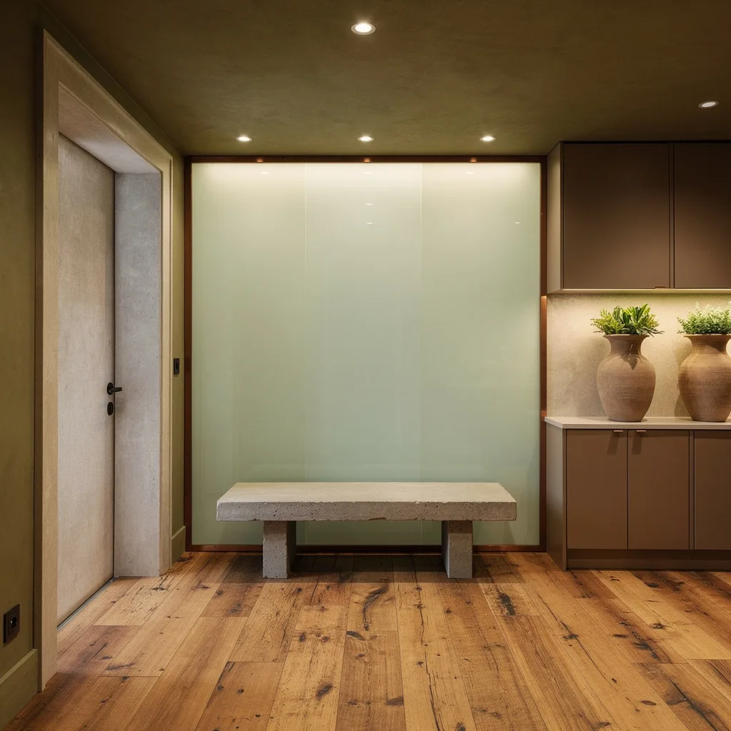
Ready to pretend you own an Italian villa? Slather limewash in an olive tone all over your entry, then frame it out with vintage copper trim around the door. Pull in wide-plank reclaimed wood floors for actual character—fake-wood people, do better. Drop a cast concrete bench somewhere practical and don’t skip the backlit opaque glass wall with sage hues, because drama isn’t just for reality TV. Add recessed ceiling spots to light up sculptural clay planters and custom taupe cabinetry. The takeaway: Too many plants or earthy tones and you’re in a terrarium, not a house.
High-Drama Charcoal with Monolithic Black
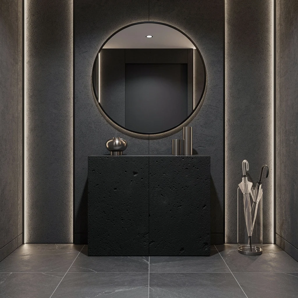
If you think dark colors make a space smaller, stay in pastel jail. Go full throttle with charcoal microtexture plaster walls and coordinate with slate tile floors. Anchor your look with a hulking matte black stone console—no delicate legs allowed. Run LED strips vertically up the walls and under the console to seriously flex your lighting game. Pop a mammoth round mirror with a skinny black frame across from your portal and swap in a translucent acrylic umbrella stand because you’re not basic. Crucial rule: Don’t break up the drama with random colors. Stay in your (dark, moody) lane.
Terracotta, Camel, And the ‘Try To Not Touch Everything’ Entry
Dreaming of an entry with actual warmth? Paint the top half in terracotta, then wrap the lower in camel suede panels—yes, real texture or it doesn’t count. Ditch vinyl; run woven sisal for the floor so socks meet sophistication. Light up with soft brushed copper sconces and park a slim pale cedar console topped with creamy speckled stone for a friendly, not fussy look. Line your archway in suede trim so everyone knows you care (about everything but fingerprints). Styling hack: Accessorize minimally—and for the love of all things cozy, no mass market wall art.
Powder Blue & Chrome: Crisp and Cold (In A Hot Way)
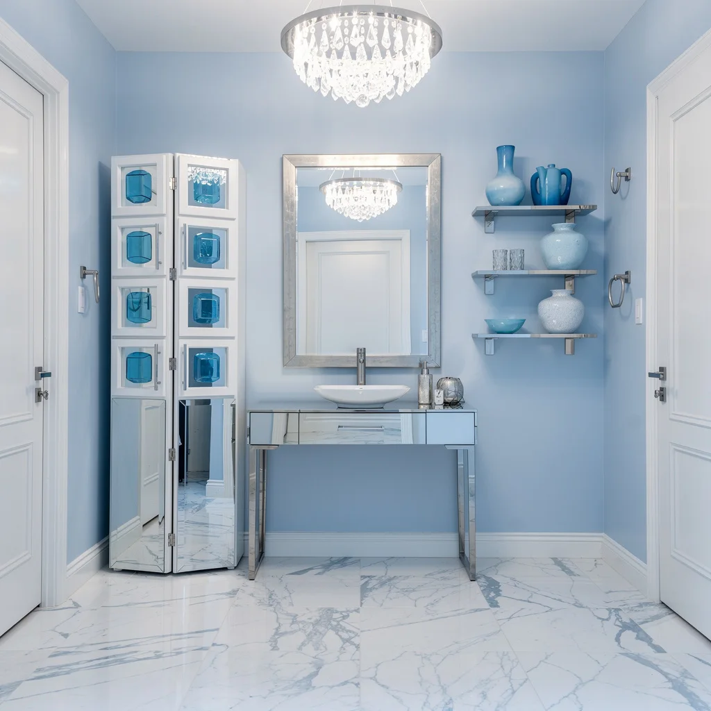
Need your home to say ‘I’m smart AND fresh’? Hit those walls with crisp powder blue and lay down a high-gloss white marble floor with blue veins. Install a floating chrome console and hang an oversized full-length mirror in platinum. Let a crystal LED chandelier steal the spotlight, shooting sparkle everywhere. Stash keys in cubist white storage with blue glass pulls and arrange a couple icy blue ceramics on streamlined shelves—no clutter, ever. Major flex: Use only pale silver hardware for a look that’s cool but never clinical.
Pearl Grey and Soft Neutrals: For People Who Actually Have Their Lives Together
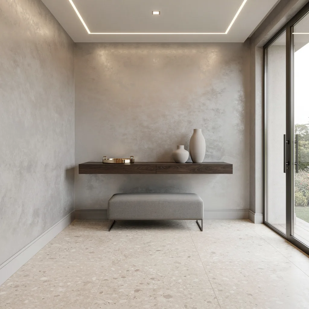
If you want ‘quiet luxury’ without looking like you just gave up, cover your walls in pearly grey Venetian plaster and throw down pale terrazzo tiles for the ultimate “textured but not trying” base. Float a slim smoked oak shelf for catch-alls, but keep trays and vases in matte neutral finishes—no lousy fake greenery. Toss a pale grey bench in for style, not just function. Make your glass door DO something: bounce daylight around, never rely on just overhead lighting. The pro secret: Layer three light sources so you get glow, not glare.
Emerald & Maple: Mood Board Explosion, But Cohesive
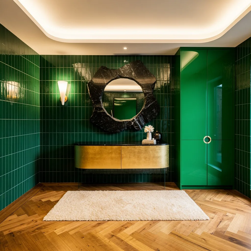
Dying for bold? Go emerald green vertical tile up your entry walls—commit, don’t chicken out. Drop honey-toned maple herringbone on the floor so your color choice reads bold, not clownish. Install a gold-leaf floating console, and get a sculptural black granite mirror up there for extra drama. Choose built-in storage, hi-gloss lacquer green only, and tuck in a plush cream runner so feet have a reason to slow down and admire. Always balance strong hues with neutrals and soft white ceiling cove lighting—otherwise it’s a fever dream, not design.
Mocha Paneling and Titanium: Cozy Grown-Up Energy
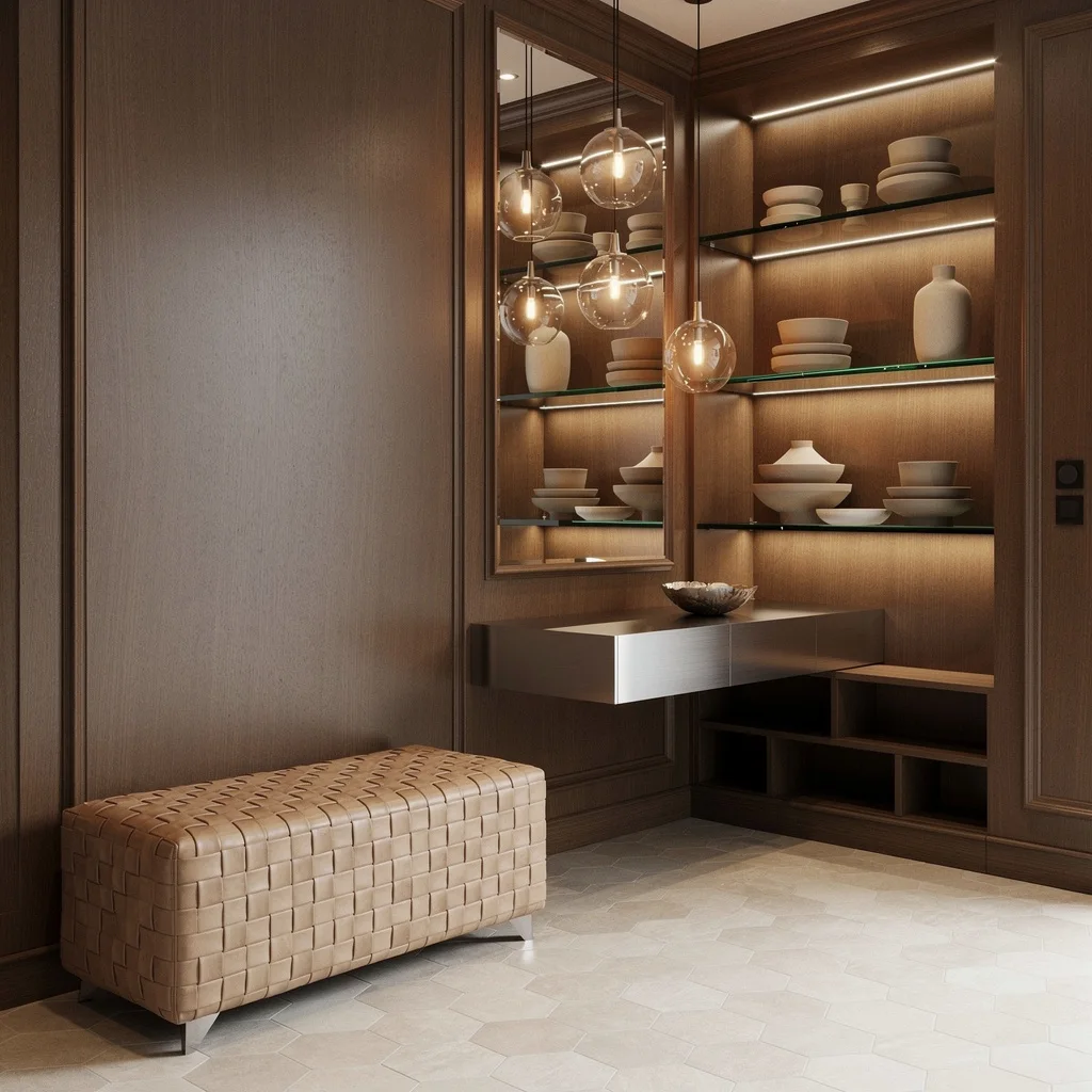
Channel total sophistication with rich mocha wood paneling on the walls—this is for adults only, kids. Run light stone tiles in a subtle geometric pattern underfoot and float a brushed titanium console. Toss a woven leather bench in caramel tones next to minimalist glass orb pendants that scream custom designer, not big box catalog. Feature shelves in glass for pottery layering—only display what you want friends to ask about. Indirect LED lighting should always highlight architectural features, not cords and random shoes. Word to the wise: Keep what you display intentional and edited.
Satin Lemon Yellow & Ash Wood: Happy Without The Cheese
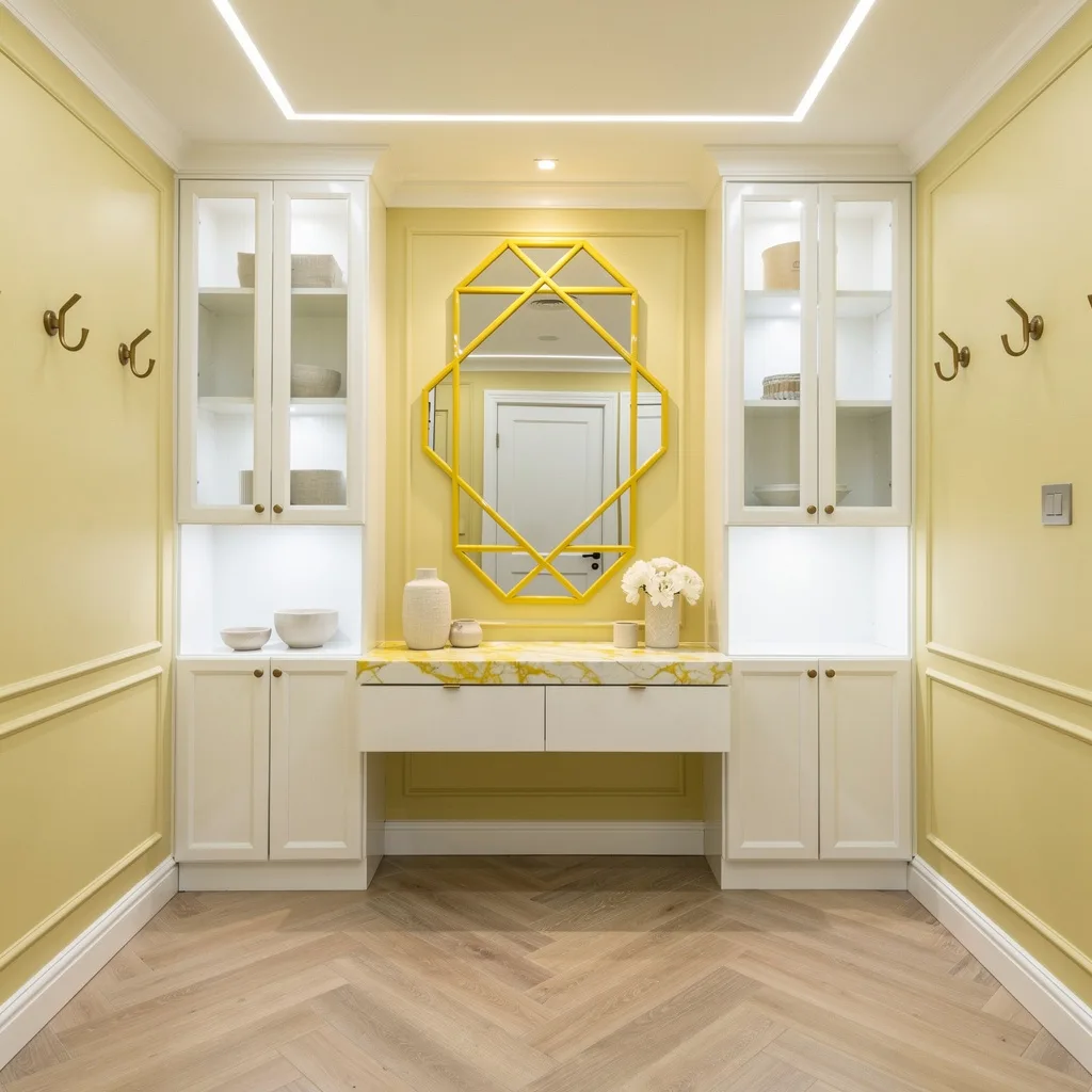
Want pure joy? Go with pale lemon satin walls and white trim—like actual sunshine without sunglasses required. Lay a chevron-patterned ash floor for grown-up balance and float a glossy white console with yellow-veined marble for subtle sass. Install cabinetry with frosted glass doors for an expensive finish and slap up an oversized mirror with a yellow lacquer frame for that immediate energy boost. Stick with crisp linen accessories and wall hooks dipped in muted gold. The hack: Always pair yellow with natural textures so the space feels rich, not rubber ducky.
Final Thoughts
Color in an entryway is either the best decision you make in your whole house or the missed opportunity that haunts every subsequent renovation conversation. There’s not much middle ground, because the space is too small and too visible for a halfway choice to disappear into.
Every color that worked in this list worked because someone made a complete decision—not just choosing a wall color but deciding what relationship that color would have with the trim, the floor, the lighting, and the furniture—and then executed it with the kind of consistency that makes a space feel resolved rather than in-progress. The dark paneling that picked up the stained glass. The wine that swallowed every architectural element in the room. The pink that covered every surface of cabinetry without flinching.
Your entryway’s color doesn’t need to be universally loved. It doesn’t need to appeal to future buyers, please your most conservative guest, or transition gracefully into every adjacent room. It needs to be interesting enough to make thirty seconds feel like a moment worth having. That’s a completely achievable goal, and it starts with picking something that you actually find extraordinary rather than something that just isn’t wrong.