
Most entryway furniture situations fall into one of two camps: the chaotic pile of hooks, shoe racks, and random side tables that accumulated over the years without anyone making an actual decision, or the overcorrected showroom setup that looks staged and functions about as well as a display model. Neither of these is a home. Neither of them is the first impression you want every single person who walks through your door to receive before they’ve even sat down.
The entryway furniture problem is fundamentally a prioritization problem. People agonize over sofa choices for months, deliberate over dining table dimensions, and then buy whatever’s available in the right size for the entry because it’s “just” the entryway. The result is furniture that technically fits the space and completely fails to serve it—pieces that don’t solve the storage problems, don’t create the right atmosphere, and don’t hold up to the actual volume of daily use an entry demands.
What makes entryway furniture genuinely difficult is that it has to do more things simultaneously than furniture anywhere else in the house. It needs to handle incoming chaos—coats, bags, keys, shoes, umbrellas, the mail that someone said they’d deal with and didn’t—while looking like none of that chaos is happening. It needs to work as a transition between the outside world and the inside world, setting the tone for everything beyond it. And it needs to look good doing all of this, every day, under whatever conditions your household generates.
The Furniture Decisions That Keep Going Wrong
Before the ideas, the mistakes—because they’re consistent enough across entries that naming them saves considerable trouble.
Buying a single piece instead of building a system — A console table alone doesn’t solve an entryway. A bench alone doesn’t solve an entryway. The furniture that genuinely transforms an entry is almost always a composition of pieces working together: something for surfaces, something for seating, something for storage, something for the wall above it all. Buying one piece and hoping the rest resolves itself is why most entries feel perpetually unfinished.
Prioritizing how it looks in the store over how it performs at home — Showroom conditions have no coats on them, no shoes underneath them, no keys and mail and sunglasses accumulated on their surfaces. A piece that looks beautiful unoccupied and chaotic when in daily use is not the right piece, regardless of how good it looks in isolation.
Getting the scale wrong in both directions — An entryway console that’s too small for the wall behind it makes the space feel unresolved. Built-in storage that’s so dominant it overwhelms a modest entry makes it feel like a furniture warehouse. Scale in entryway furniture is about the relationship between the piece and the space, and that relationship needs to feel considered rather than accidental.
What the Furniture Setups That Actually Work Have in Common
Three qualities show up consistently in entries where the furniture genuinely solves the space.
Every piece is pulling its weight — The entries worth learning from don’t contain furniture that exists purely for appearance. Even the most decorative-looking console is providing a surface for specific objects. Even the most minimal bench is genuinely used for sitting. When every piece has a job, the entry functions with a kind of effortless organisation that has nothing to do with effort and everything to do with setup.
The storage capacity matches the actual household — A single hook rack in a family of four is a furniture failure waiting to happen. A floor-to-ceiling built-in storage system in a studio apartment is overkill that will never be fully used and will look worse for being half-empty. The right furniture volume is matched to the actual daily load the entry needs to manage—and getting that calibration right is what separates entries that stay organised from ones that drift back into chaos within weeks.
The furniture makes a material statement — The entries that people photograph and return to are almost always the ones where the furniture introduces a material that sets the tone for the home—warm walnut, honest reclaimed wood, the specific patina of an antique chest. When entryway furniture is chosen for material quality rather than just function and appearance, it creates a warmth and credibility that no styling can substitute for.
Entryway Furniture Ideas Worth Stealing
The Apothecary Chest That Refused to Be Replaced by Something More “Entryway Appropriate”
Entrance furniture
by u/DaviddPet1812 in interiordecorating
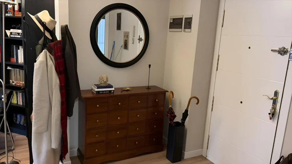
The unspoken rule that entryway furniture must be purchased from the entryway furniture section of anywhere is a rule this setup broke completely and correctly. A wide apothecary-style chest of drawers in warm walnut with brass knob hardware is functioning as the primary surface piece, topped with a round black-framed mirror, a small sculptural object, a stack of books, and a thin black candle holder—and it’s providing sixteen drawers of storage that a conventional console table with one shelf could never match. A freestanding coat rack with a sculptural arc holds everything from a white wool coat to a plaid scarf to a wide-brimmed hat, and a black metal umbrella stand deals with the rain situation without drama. Two small framed photographs hang on the wall at different heights, informal and personal. The whole setup has the quality of something assembled thoughtfully over time rather than purchased in one trip—which is the quality that no amount of styling can manufacture if the furniture itself doesn’t have it. The lesson: the best entryway furniture is often not designed as entryway furniture.
Botanical Wallpaper Mudroom with Cabinetry That Earns Its Square Footage
A mudroom that manages to feel like a room rather than a utility space is a specific achievement, and it almost always comes down to the same decision: treating the cabinetry as the architecture rather than as an insertion into the architecture. Floor-to-ceiling white shaker cabinetry with brass hardware covers the full wall, providing upper cabinets with woven basket storage, a middle section with brass hooks, a bench with a padded white seat, and lower cubbies for baskets at floor level. The critical move is the botanical-pattern wallpaper covering the remaining walls in a warm tan and cream—it transforms what could have been a purely functional room into something with genuine character, and the two framed botanical prints hung against it reinforce the connection between the wallpaper pattern and the objects on the wall. A bouclé barrel chair beside a small brass side table near the window turns the room into somewhere you might actually choose to sit, which is the difference between a mudroom and a mudroom that feels like a designed space. A vintage-style runner on the light oak floor ties everything together without competing with the wallpaper.
Arched Black Steel Door with a Sculptural Branch Chandelier and Furniture That Understood Its Role
When the architecture is this strong—a full arched black steel and glass double door filling the visual center of the space, a ceiling height that commands genuine respect—the furniture’s job is to support the architecture rather than compete with it. A raw-edge live wood console in a warm walnut tone with a brass lamp, a small ceramic arrangement, and a single candle sits against the left wall with the specific confidence of a piece that knows it’s supporting cast in this room. A cane-back settee with linen cushions and leather-trimmed pillows sits to the right, providing seating without demanding attention. A large white ceramic vase beside the door holds a tall branching plant that reaches toward the chandelier overhead, creating a vertical axis that connects floor and ceiling in a way no piece of furniture could achieve alone. The chandelier itself—a sculptural arrangement of copper-toned branches with integrated lighting—is doing more design work than everything else in the room combined, and the furniture is wise enough to let it. The pale oak herringbone floor provides the warm, continuous surface that this level of architectural drama requires.
Slate Blue Built-In With Checkerboard Floor and Enough Storage to Actually Live On
The built-in entry unit that handles everything without looking like it’s trying is a very specific design achievement, and this one pulls it off in a colour that most people wouldn’t attempt in a utilitarian space. Slate blue tongue-and-groove paneling covers the full built-in: upper section with open shelf and woven baskets, middle section with brass hooks, integrated bench with a ticking-stripe seat cushion, and open cubbies at floor level holding three additional woven baskets. The brass hardware throughout ties every element together and warms the cool blue enough that the room doesn’t feel cold. A black and white checkerboard stone floor does enormous tonal work: it picks up the dark of the door and the light of the ceiling simultaneously, creating visual rhythm that the monochrome built-in needs to feel dynamic rather than flat. A large olive tree in a woven basket occupies the corner beside the door with enough presence to hold its own against the built-in without competing for the same zone. Green rubber boots beside a large basket, a plaid cushion on the bench seat, a woven tote on the hook—this is an entry that’s been used, and it looks better for it.
Navy Grasscloth Walls with a Glass Console and One Mirror Doing Everything
The apartment entry that can’t fit a whole furniture system needs to be solved with a single piece chosen so correctly that it handles all the visual work on its own, and a glass and chrome console on slim legs is exactly right here for reasons that a solid console would not be. Against navy grasscloth wallpaper—textured, deep, and doing significant atmospheric work—a see-through console disappears rather than crowding the space, while still providing the surface and lower shelf that the entry needs functionally. A large round mirror with a black outer frame and gold inner trim hangs centred above it at generous scale—the size relationship between mirror and console is the detail that makes this work rather than just exist. A tall white ceramic vase on the floor beside the console holds a palm branch that reaches into the mirror’s reflection, doubling its visual presence without adding physical volume. A white shell bowl, a white candle, and a small white rose arrangement on the console surface keep the styling in the same cool, minimal language as the mirror. Two globe pendants overhead provide warm light that the navy walls absorb and return as depth rather than reflection.
Modular Iron and Wood Hall Unit That Solved the Whole Entry in One Purchase
The hall furniture unit—mirror, hooks, shelf, and bench combined into a single freestanding structure—has a reputation for looking temporary and cheap, and this one is making the case that it doesn’t have to. A black powder-coated iron frame holds an oval arch mirror on one side, a wood-slatted hook panel with four hooks above a two-tier wood shelf on the other, creating a composition that addresses both practical zones of the entry—the outerwear-and-bag zone and the shoes-and-small-items zone—in a single piece with enough visual cohesion to read as designed rather than assembled. Woven seagrass baskets on the shelves provide the storage containers rather than leaving objects loose, a wicker umbrella holder beside the unit handles the rain gear, and a round jute rug underfoot anchors the whole setup. A large-leafed plant in a white ceramic pot to the left brings the organic note the warm wood tones of the unit need to feel alive rather than merely present. The dark wood front door visible beside the unit is warm enough in tone to sit comfortably with the black iron frame—the material relationship between door, unit, and floor reads as considered rather than coincidental.
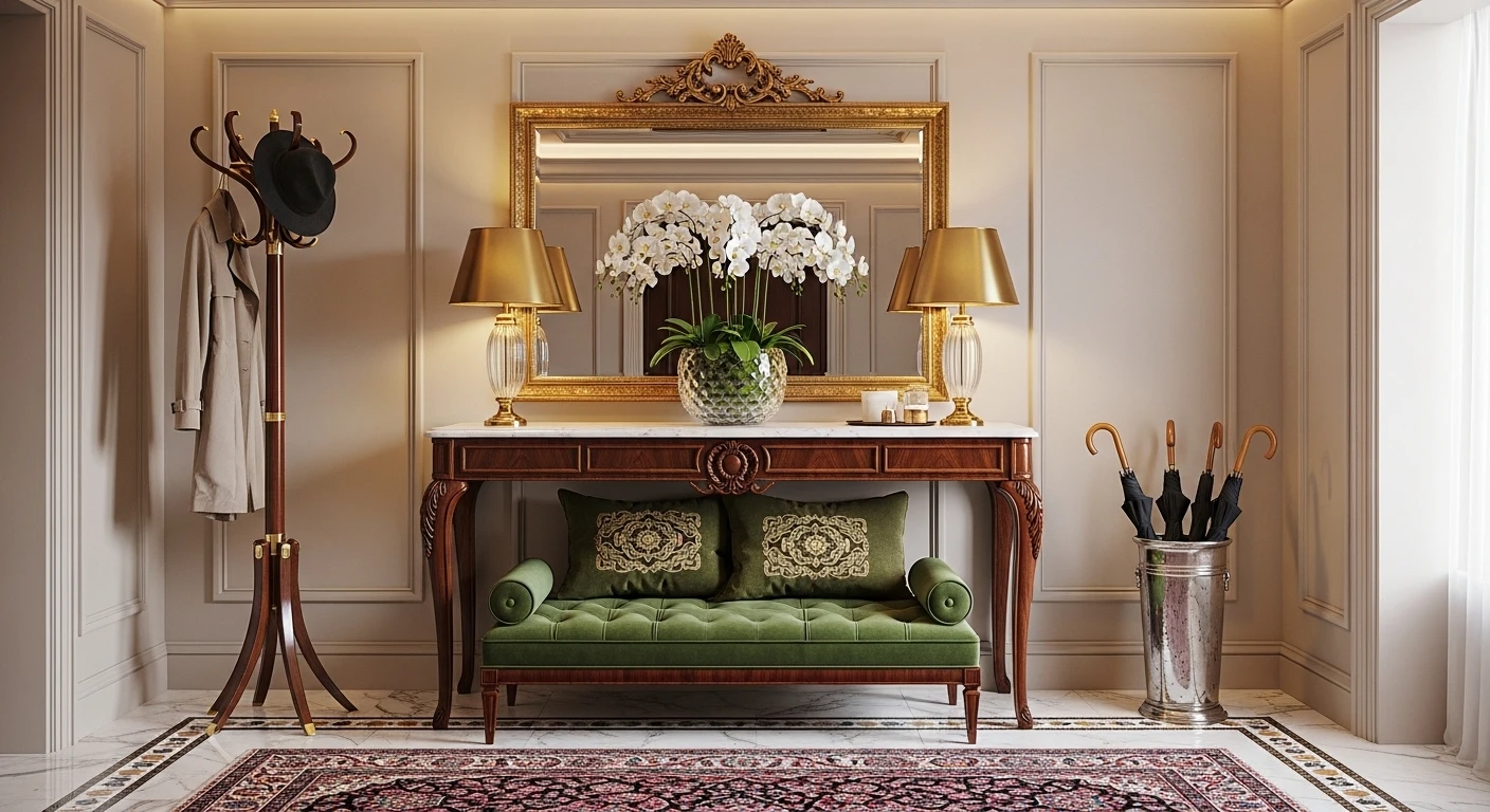
Go Luxe With Walnut, Marble & Velvet—Because You Deserve It
Want your entry to scream ‘I get what custom millwork means’? Start with a seamless walnut console table. Demand integrated drawers; no loose junk allowed. Drop a wild slab of honed marble on top for what? Instant flex. Now, upgrade that basic bench setup: Go for plush, olive-green velvet and add two for symmetry’s sake—or break the rules with asymmetry if you’re feeling advanced. A circular mirror with bevels multiplies light and majorly boosts perceived square footage. Don’t phone in your lighting: stick LED strips in the ceiling and opt for a brushed brass sconce for soft, sexy warmth. Finish with fresh greenery in a sculptural vase for that, ‘Oh, I just happen to be growing peonies’ look. Pro tip: Always keep bench seating aligned but not crowded—designers will drag you online if you cramp your entry with furniture Tetris.
Built-Ins and Benches: Pretend Adulting Is Your Thing
Sick of tripping over shoes? Ditch flimsy racks and tell your contractor you need a built-in oak bench—curvy edges only, no sharp 90s. Insist on taupe leather upholstery, because your Postmates bag deserves luxury, too. Max out shoe storage with concealed drawers beneath, and embrace vertical slatted wood panels on your wall for texture (matte black hooks required, obviously). Float a white quartz shelf up top for your rare vintage books or that objet d’arts nobody actually reads. Don’t forget—dark slate tile is the move for a moody, durable floor. Final tip: Center lighting overhead but keep it recessed so it glows (never glares), making messes disappear into the shadows.
Go Sculptural With Travertine and Pottery—Less Basic, More Bougie
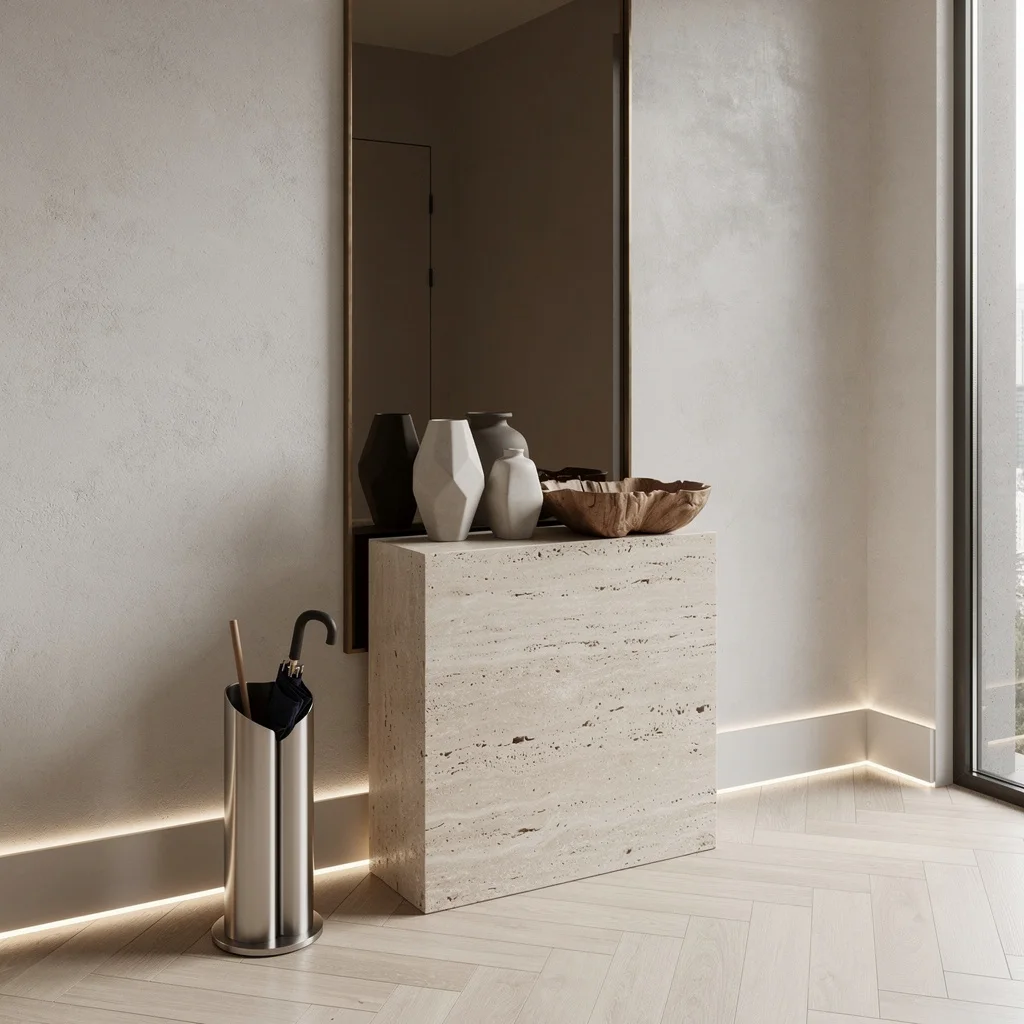
Ready to flex your taste level? Park a freestanding monolithic travertine plinth front and center. Top it with a tight cluster of geometric matte pottery (no kitsch, please) and a low, hand-carved bowl for instant gallery vibes. Herringbone pale oak floors are your backdrop—accept nothing less. For rainy days, an architectural umbrella stand in stainless steel is non-negotiable. Limewash your walls for subtle drama and stick an oversized smoked glass mirror up, but insist on a bronze frame for the flex. Sneaky uplights along the baseboard? Yes. Rule: Only show what you love—don’t use every shelf for clutter or risk ending up on a ‘don’t’ list.
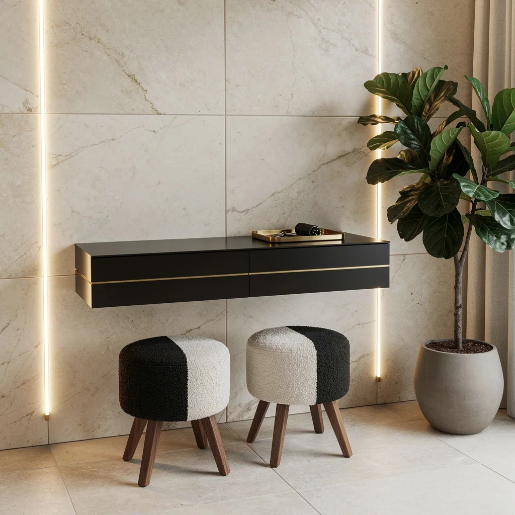
Float Your Console, Ditch the Clutter—And Get Gold Involved
Look, floating consoles are life. Mount a matte black lacquer beauty with slim gold inlay above limestone tiles and never trip on corner legs again. Two-tone boucle stools with walnut bases can station beneath or nearby for ‘I wear slippers at home’ energy. Go dramatic with oversized ivory marble panels behind—LED light-bar embedded vertically on the side for True Crime mood lighting. Never let stray keys breed on your console—corral them in a brushed gold tray, or you’ll give yourself anxiety. Cap it with a major ficus in a matte pot. Designer rule: Treat seat space as a privilege, not storage. Banish tote bags instantly.
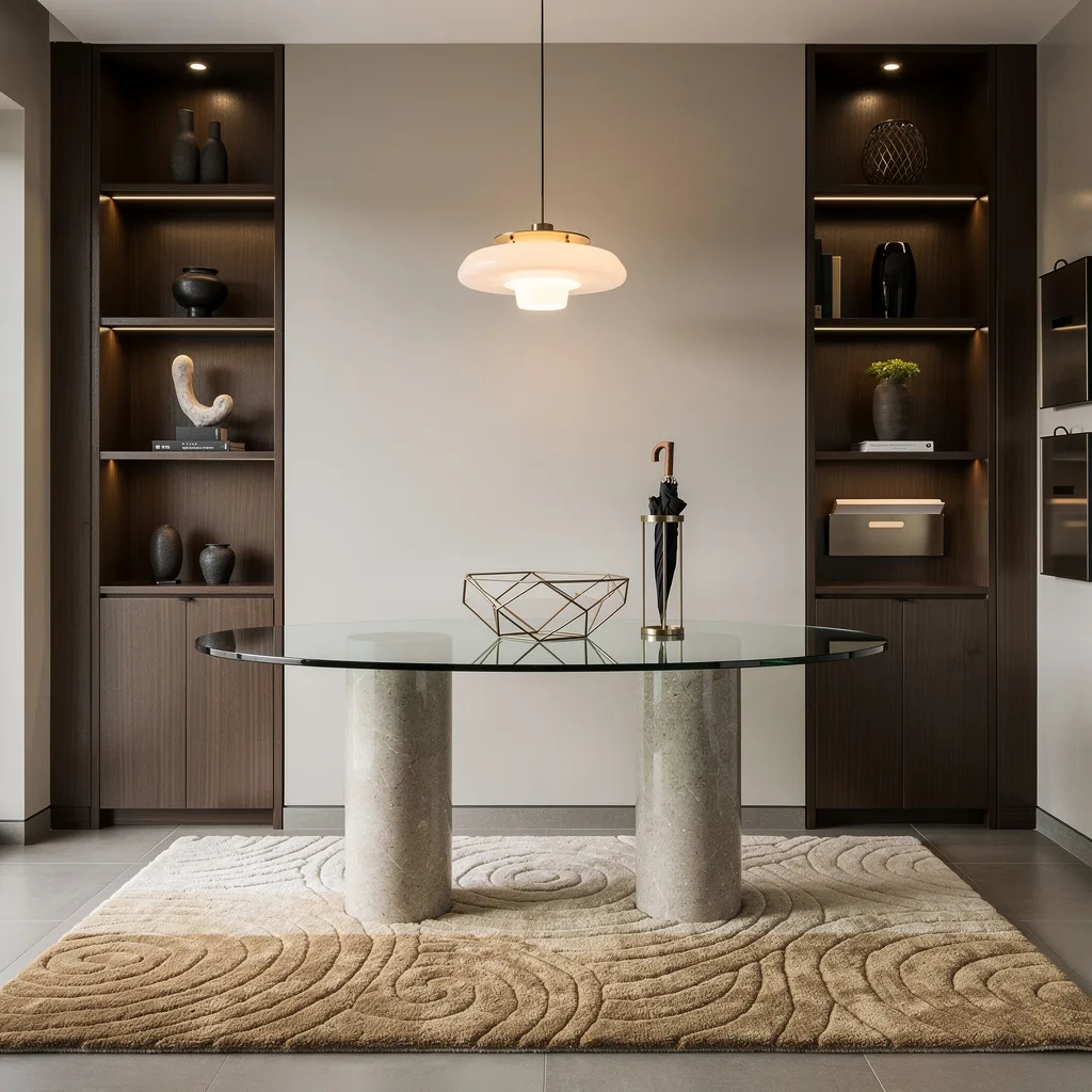
Get Glassy: Elliptical Consoles & Show-Off Shelves
Refuse to settle for average. Center your entry with a sculptural elliptical glass console on stone pedestals. Underneath, layer a plush hand-tufted wool rug in tonal sand—nothing says ‘this house is expensive’ like custom gradients underfoot. Spotlight your favorite weird objets on smoked oak alcove shelves with integrated lighting. Hang a minimalist pendant (go frosted glass shade for the win) right above for soft drama. No excuse for a sad umbrella tray—pick a geometric metal piece, and if your mail organizer isn’t wall-mounted and chic, you need help. Always: Edit shelves weekly, or your ‘display’ turns into dollar-store chaos.
Floating Minimalism: For Those Who Can’t Stand the Clutter
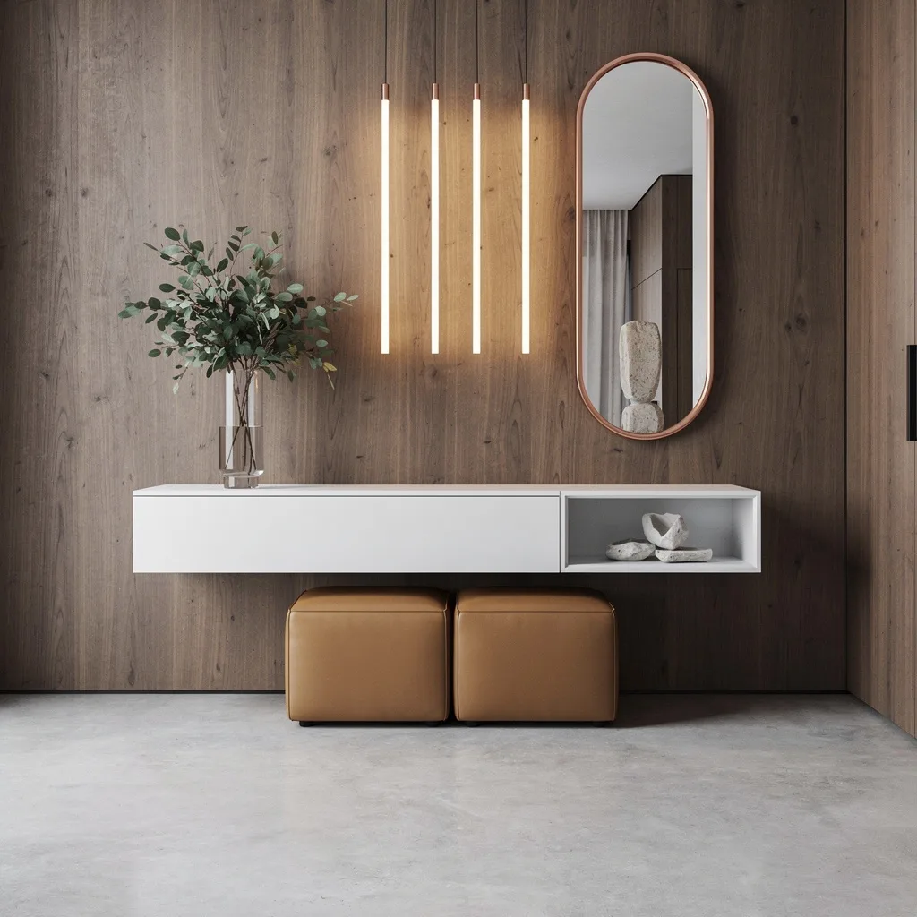
Demand a console that floats in matte white—legs are for try-hards—and lay it against smoked eucalyptus veneer for visual interest (or show-off points). Tuck tan leather ottomans beneath; you’ll want those for tying imaginary Italian loafers. Run LED strips vertically for a wake-up call every time you get home, and display only museum-worthy stone sculptures on open shelving. A slim oval mirror wrapped in brushed copper is the move for reflecting light and judgment. Lush greenery in a glass vase makes you look alive. Rule: Always style in threes or fives—odds look intentional, evens look like you gave up.
Integrated Perfection: Bench, Storage & Drama—All in One

Demand a built-in walnut bench that doesn’t quit—have it snake seamlessly into a vertical storage system with textured glass doors (and gold pulls or you’ll regret it). Deep indigo velvet on the cushion makes anything you drop look rich, not messy. Layer in cove lighting above for that soft, moody hotel effect. Lay down a handwoven jute rug so your sneakers don’t scuff anything precious. Adjacent, drop a slim black marble console for your grab-n-go chaos. Pro tip: Never cram the console full. Leave negative space or risk faux-Parisian flea market realness.
Ribbed, Plush & Stone—Go Textural or Go Home
Insist on a cantilevered console table with a pale granite top and a matte bronze base for major ‘editor lives here’ vibes. Hang a circular ribbed wood storage unit above for aesthetics and hiding ugly stuff. Flooring shouldn’t blind you: Only pale luxury porcelain tiles, which bounce indirect lighting for all-day selfie glow. Twin velvet stools in burnt orange win color points and boost the mood. Drop a huge mirror with a thin aluminum frame to expand your kingdom. Designer rule: All throws should be folded, not draped. This isn’t your dorm room.
Curves and Niches: Transitional Should Never Mean Boring
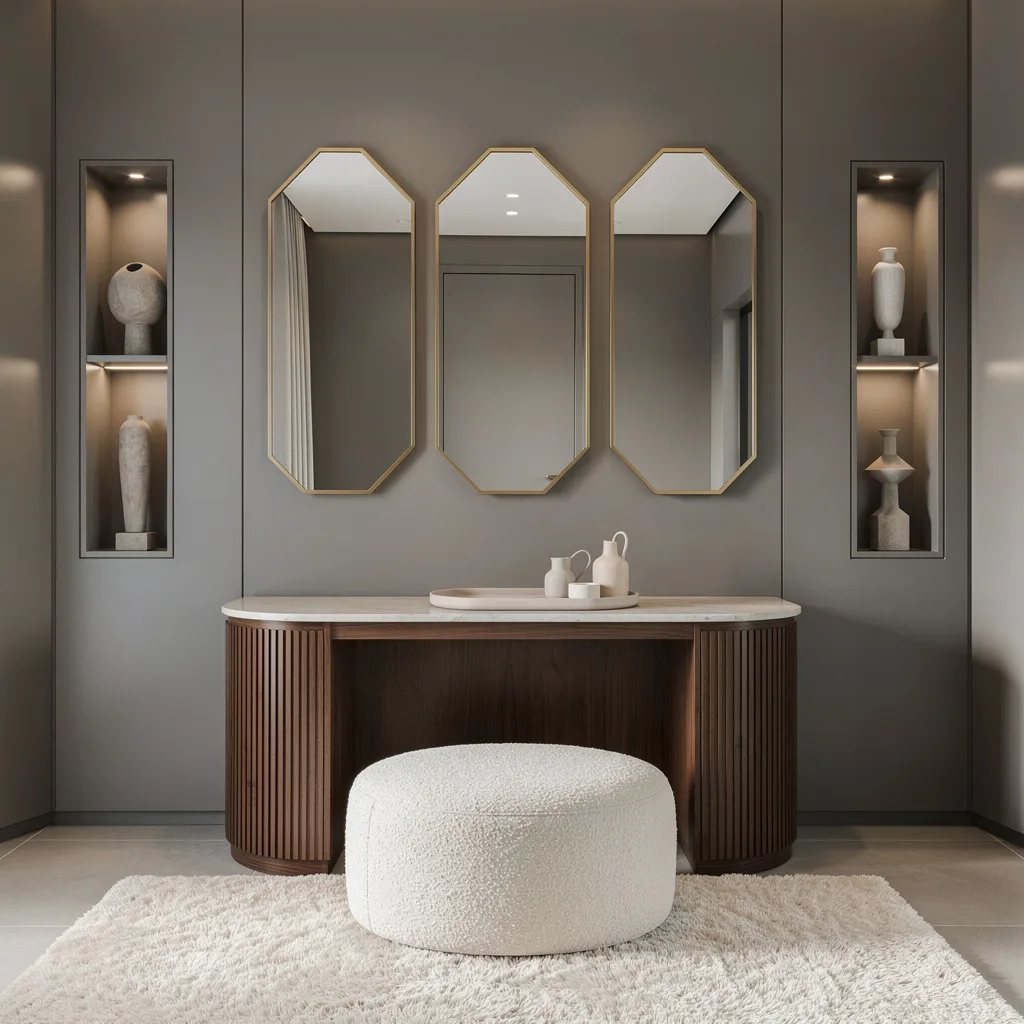
Want classic to hit hard? Use a curved walnut console with fluting for old-world-gets-a-makeover attitude. Place a circular creamy chenille bench in front—bonus points for symmetry. Go full monochrome with matte gray walls and play up the glow with trio gold-framed mirrors. Uplights must be concealed; harsh beams are a crime. Thick pale wool rugs = instant grown-up, zero regrets. Curate the console tray for function over random catch-alls. Final word: Keep decorative objects minimal in wall niches. Hoarders need not apply.
Stack, Stash, Repeat: Modular Shelves for Actual Storage
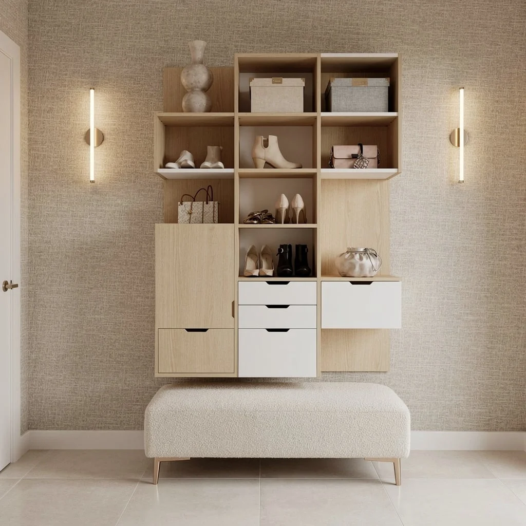
Outsmart shoe chaos with a modular shelving system—pale oak all day—with white accents to dodge visual heaviness. Wallpaper in a woven-fabric texture in champagne tones will make your landlord cry with envy. Install linear LED sconces to keep everything glowing, not garish. Place a low boucle bench in cream for ‘yes I curate my groceries’ energy. Floating shelves are not for clutter—limit them to designer vases, art books, or actual storage boxes. Final note: Never let accessories outnumber shoes. Too much stuff and you’re basically a garage.
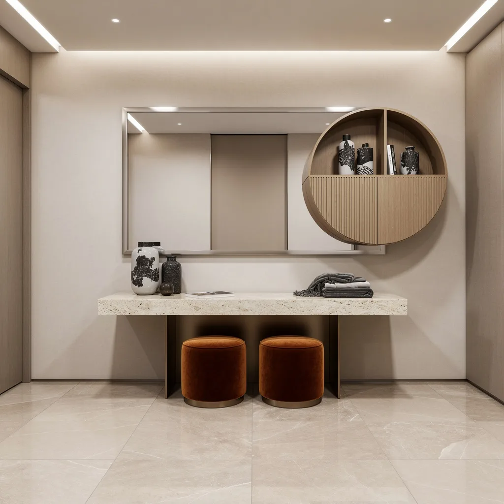
Cold Steel, Soft Leather, and Drama: High-End Minimalism
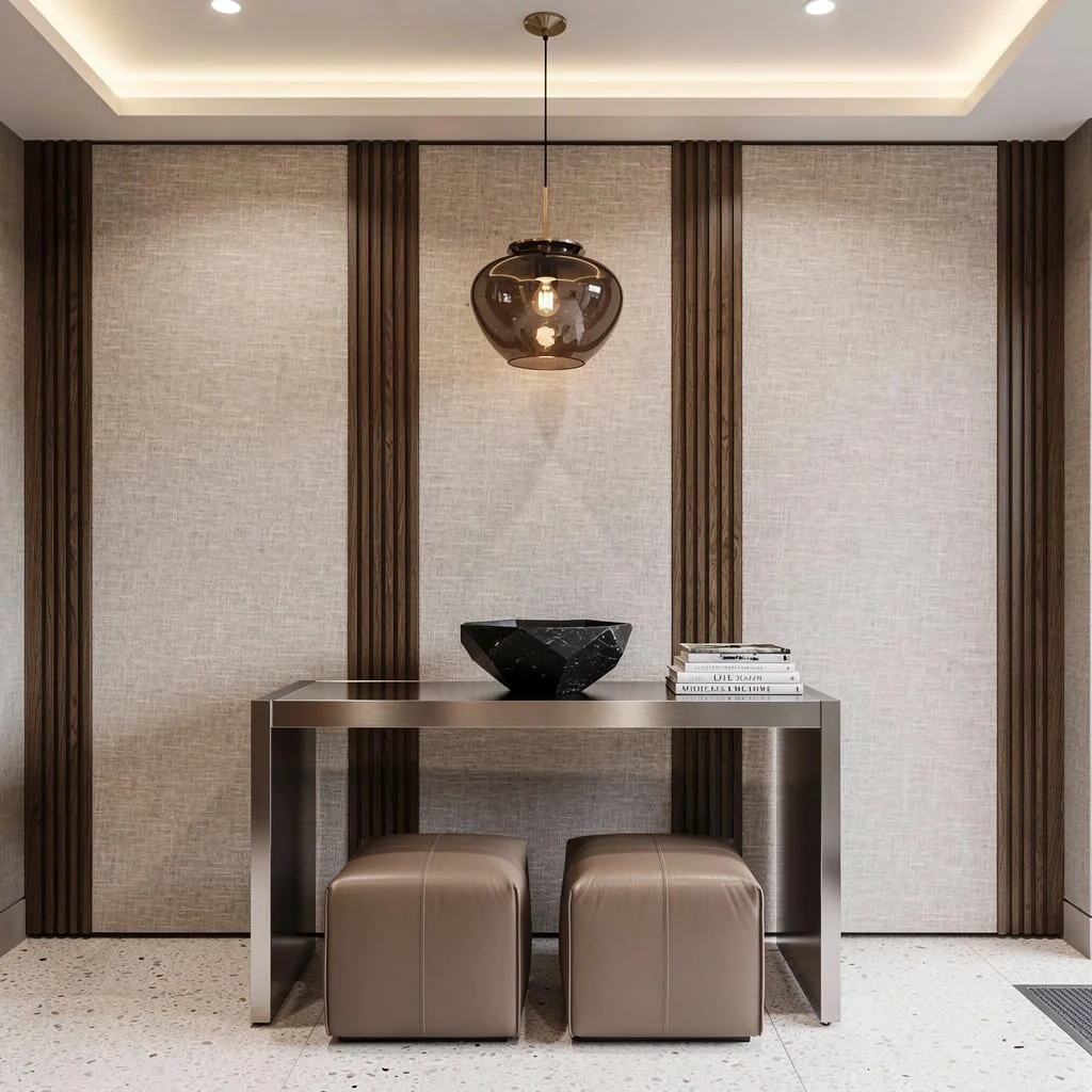
Got taste and want to prove it? Drop a brushed stainless steel console—slim but impossible to miss—beneath a wall clad in textured linen panels with vertical walnut slats slicing through. Pile on a jet-black faceted stone bowl and a few too-cool-to-read art books. Hang a custom smoky glass pendant—because basic overheads are over. Beneath, land two taupe leather poufs on pale Terrazzo. Finish with indirect ceiling-mounted lighting and nothing else. Pro tip: Hard surfaces call for soft accessories. If your console top isn’t perfectly styled, try again—the minimalists are watching.
Final Thoughts
Entryway furniture that genuinely works is furniture that was chosen to solve a specific set of problems in a specific space—not to fill a gap, not to match a style trend, not because it was the right size and available in the right colour at the right moment. The entries on this list are worth studying precisely because each piece in each setup is doing something identifiable and necessary, and the overall effect comes from that functionality rather than from decoration layered on top of it.
The apothecary chest that provides sixteen drawers of storage while looking like a considered antique. The built-in that turns a mudroom into a room worth being in. The glass console that disappears against a dramatic wall while still anchoring the space. Each of these is a solution to a real problem, and the beauty is a consequence of the solution rather than a separate goal.
Your entryway furniture doesn’t need to be expensive, custom, or sourced from a specialist. It needs to be chosen for what your entry actually demands of it—the specific volume of coats, the specific number of people, the specific storage problems that currently aren’t being solved—and then placed with enough intention that the composition feels as considered as the individual pieces. Get that right and the rest takes care of itself.