
The hallway is the room that decorating advice forgot. Every style guide, every renovation show, every mood board you’ve ever pinned spends approximately zero time on the corridor between your front door and everywhere else—because corridors are boring, they’re narrow, they’re just connective tissue between the rooms that actually matter. This is the logic. This is also why most hallways look exactly as bad as you’d expect when nobody’s paying attention to them.
What makes the neglect particularly egregious is that the hallway is the one space in your home that literally everyone who visits must pass through. The living room gets to make an impression on people who sit in it. The kitchen matters to the people who cook in it. The hallway performs for everyone, every single time, whether it’s ready for them or not. Sending guests through a beige tube with a radiator and a hook rack while your living room gets all the attention is a bit like rehearsing the second act of a show and improvising the opening every night.
Hallway design is genuinely harder than most rooms precisely because the constraints are real. The space is narrow, often long, usually dim, sometimes structurally complicated by a staircase or multiple doors, and it needs to accommodate both the visual job of looking interesting and the functional job of handling everything that comes through the front door. Getting both right simultaneously is what separates the hallways worth photographing from the ones you just walk through with your eyes slightly unfocused.
These six ideas prove that the corridor is not a lost cause—it’s actually one of the most interesting spaces in the house to solve, once you stop treating it like an afterthought.
Why Hallways Keep Ending Up This Way
The failure modes for hallways are specific and consistent, which makes them worth naming before any ideas get involved.
Long and narrow is treated as a problem rather than a design language — Narrow corridors don’t need to be disguised with mirrors and pale paint and every trick in the “make it look bigger” playbook. They need to be designed with an understanding of what makes a narrow, directional space feel intentional rather than accidental—which is often about embracing the linearity rather than fighting it.
Lighting gets the absolute minimum — A single ceiling pendant in the center of a hallway is not a lighting plan, it’s a placeholder. Hallways need layered light that travels the length of the space, creates warmth at different heights, and makes the materials and art visible rather than just preventing people from walking into walls.
The radiator problem defeats everyone — Every UK hallway, in particular, contains at least one radiator that someone has tried to ignore into invisibility and failed. The radiator is not going anywhere. The question is whether it gets designed around properly or just becomes the awkward object everything else has to negotiate.
What the Good Hallways Have in Common
The corridors worth stealing from are operating on the same underlying principles even when they look completely different on the surface.
They treat the hallway as a destination, not a route — The best hallways give you a reason to stop and look before you move through—a view toward something interesting at the far end, an art arrangement worth pausing for, a lighting effect that registers before you’ve consciously noticed it. The space rewards attention rather than just permitting passage.
Scale is used deliberately in both directions — Oversized art in a narrow hallway doesn’t make the space feel smaller; it makes it feel considered. An enormous bloom arrangement on a small pedestal table does the same thing. Playing with scale—putting something unexpectedly large in a tight space—is one of the most reliable ways to make a corridor feel designed rather than just furnished.
The floor treatment does more work than anywhere else — In a narrow hallway, the floor is often more visible than the walls because of the angle at which you see the space. A runner, a painted pattern, a distinctive tile, or a beautifully aged material underfoot transforms the entire character of the corridor in a way that wall treatments alone cannot replicate.
Entryway Hallway Ideas Worth Stealing
The Victorian Hallway That Decided Narrow Was a Vibe, Not a Flaw
My Narrow Victorian Hallway, UK. 1m x 5 m
by u/ohhomelygirl in CozyPlaces
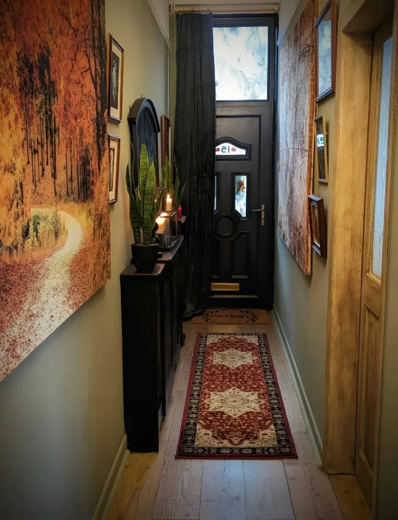
This is a hallway that looked at its own one-metre width and said “fine, we’re leaning in.” Sage-green walls provide the backdrop, neither dramatically dark nor forgettably pale—landing in exactly the range that makes a narrow space feel considered without feeling heavy. Both walls are hung gallery-dense with oversized artwork: a large autumnal forest tapestry on the left takes up most of the wall surface and brings a warm, amber depth that the sage green sets off beautifully. A black radiator cover serves as a narrow console, topped with a snake plant, candles, and a small dark ceramic bowl—the fact that it’s a radiator cover doing console duty is completely invisible because it’s been styled with enough intention that nobody is looking for the radiator underneath. A red Persian runner leads the eye directly toward the black front door at the end, and the stained glass transom above it casts colored light into the space that changes throughout the day. The oval mirror above the radiator console fakes depth without looking like it’s trying to, and the result of all of it together is a hallway that feels inhabited, considered, and genuinely characterful—which is everything a narrow Victorian corridor should be and almost never is.
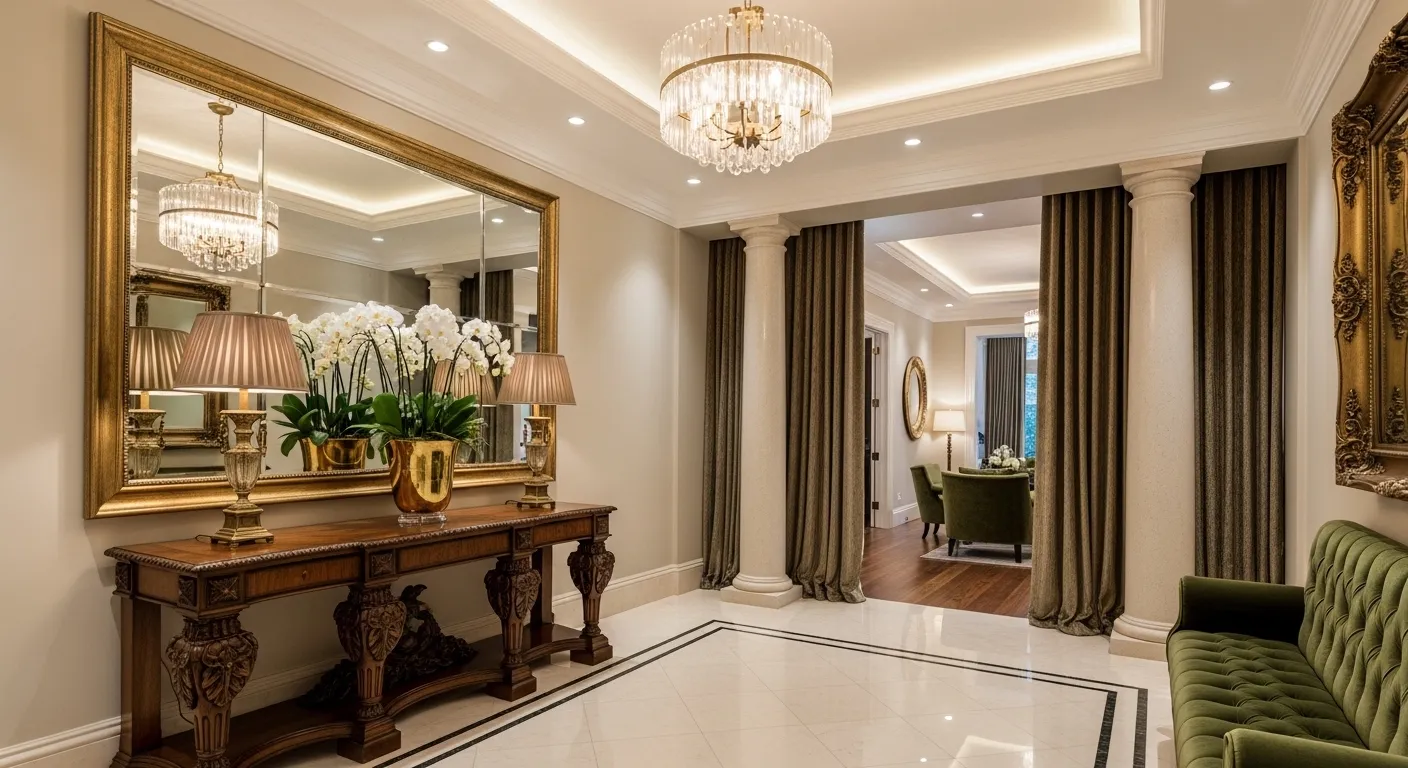
The Painted Checkerboard Floor That Became the Entire Room
When the floor is this interesting, everything else gets to be quieter—and this entry understood that completely. The original floorboards have been painted in a large-scale black and natural diamond pattern that transforms the corridor into something that feels more like a deliberate design choice than a practical floor covering, because it is. Duck-egg blue walls and doors provide the cool backdrop, white beadboard ceilings add brightness without fussiness, and an ornate black pedestal table holds the one piece of décor the room needs: an enormous flowering branch arrangement in white and green that reaches up past the lintel of the doorway ahead and fills the visual center of the space with something genuinely spectacular. A crystal chandelier overhead is scaled to the ceiling height rather than to some imagined minimum, which is the confidence move that makes it work. The whole composition—the floor, the blue, the branches, the chandelier—is an example of what happens when a hallway gets treated like a designed room rather than a space to be moved through quickly and not thought about again.
Dark Wood Slats, Warm Taupe, and a Mirror That Earns Its Space
The narrow corridor that feels expensive rather than cramped is almost always the one where someone made a deliberate decision about which wall gets the treatment and which one provides the neutral backdrop—and then executed that division with enough resolution that the two sides feel designed together rather than independently. Dark wood vertical slats cover one wall completely, a slim floating console in the same dark tone sits in front of them, and a large round frameless mirror hangs against the slats at exactly the right height for it to function both as mirror and as a circular visual counterpoint to all that vertical rhythm. The opposite wall stays in warm taupe with a grid of four black-framed black-and-white photographs, providing art without introducing any new material. White high-gloss floor tiles run the length of the corridor and reflect the overhead spot lighting back upward, doubling the apparent light in a space that would otherwise be dim. The whole setup repeats itself in the room at the end of the corridor—another console, another round mirror, another moment of symmetry—creating a visual axis that makes the length of the hallway feel purposeful rather than simply long.
Moody Grey Corridor with a Gold Mirror and Candles That Mean Business
There’s a version of the dark hallway that feels like a mistake and a version that feels like a hotel lobby, and the difference is almost entirely about whether the darkness is committed to or apologized for. Charcoal grey walls with a slight texture run the full length of the corridor, and rather than any concession toward lightening the mood with pale accents, the setup doubles down: a bronze-toned console table with hairpin-style legs, a large circular mirror with a thick burnished gold frame, amber glass votive candles clustered on the console surface, and a large fiddle leaf fig in a concrete pot at floor level providing the one green note the room gets. A lit open shelving unit in warm wood and black steel at the end of the corridor provides depth and a termination point for the eye to land on, and full-height steel-framed glass panels allow glimpses into adjacent rooms without opening the hallway up entirely. The herringbone floor in a warm blonde wood is the crucial counterweight that stops all that grey from becoming oppressive—the warmth of the floor material rises up through the space and takes the edge off everything above it.
Cream Wainscoting with an Arch Mirror, Macramé, and Zero Regrets
The light, neutral hallway that doesn’t feel like a blank canvas waiting for something to happen is harder to achieve than it looks, and this one pulls it off through accumulation of small, considered choices rather than one dominant design move. White wainscoting runs the lower half of both walls, the upper halves stay in a warm cream, and an arch-topped mirror in a thin black frame becomes the focal point above a radiator shelf—the radiator given a wooden top to serve as a narrow display ledge rather than being hidden or ignored. A black Shaker-style hook rail on the left wall does practical work while holding a macramé hanging planter, a woven wall pennant, and the everyday items that actually live in a hallway. A gallery of four black-framed photographs continues along the wall beyond the mirror toward the far end of the corridor where natural light from the rear of the house creates the vanishing point that makes the space feel longer in a good way rather than an endless way. A wire mesh pendant provides overhead light with enough visual lightness that it doesn’t compress the ceiling. The straw hat hung casually on the wall hook is the one detail that tips the whole composition from styled into lived-in, which is exactly where it needs to be.
Black Stair Rail with a Herringbone Runner and Christmas Garland That Earns Year-Round Study
The staircase hallway has one design problem that wall-only corridors don’t: the staircase itself is a large, present, structural element that can either be part of the design composition or the awkward thing everything else has to work around. This setup treats the staircase as the dominant architectural feature and designs everything else in relation to it. A bold black painted newel post and handrail run against crisp white spindles and white paneled stringer, creating a graphic contrast that extends the full vertical height of the space—black-and-natural herringbone stair runner with black border adds pattern that continues the black-and-white story underfoot. The hallway floor at the base switches to light tiles with a bold black-and-cream geometric rug, maintaining the tonal palette while marking the transition from stair to hall. A pine and greenery garland wound around the balustrade is the kind of seasonal decoration that looks considered rather than hasty because the underlying staircase design is strong enough to carry it. Pillar candles placed on each tread at the base of the staircase is the detail that makes this look like a styled shoot rather than a photograph taken on a Tuesday—and the dried sculptural branches visible in the adjacent room complete a home that treats transitional spaces as seriously as any other room in the house.
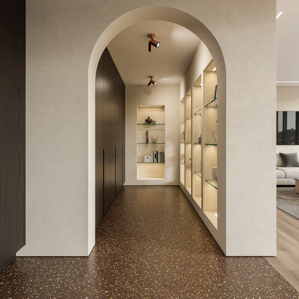
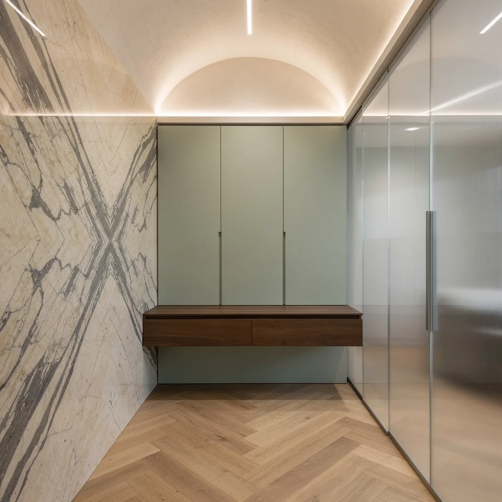
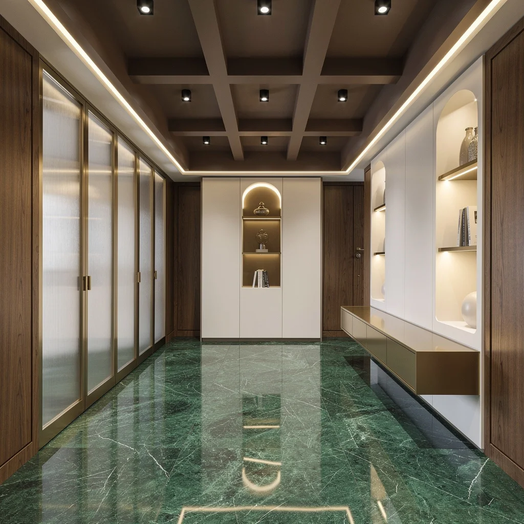
Go Luxe With Marble and Moody Accents
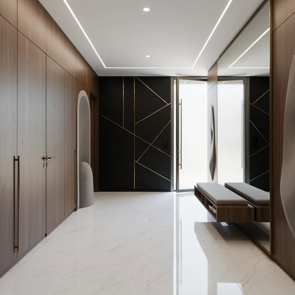
If you want your entryway to serve ‘rich and unbothered,’ you need the drama of marble floors, warm walnut walls, and a hint of black with geometric bling. Ditch the clutter and go big with a frameless custom mirror to fake a double-sized hallway (yes, please). Keep the cabinetry low-key—think built-in, with bronze handles—and slap on a floating walnut bench for top-tier function and style. Always run LED strips in the ceiling; your friends’ selfies will thank you. Don’t skip sculpted niches—they scream ‘custom’ and hide your mail pile in plain sight.
Master Texture: Fluted Panels and Lit Niches
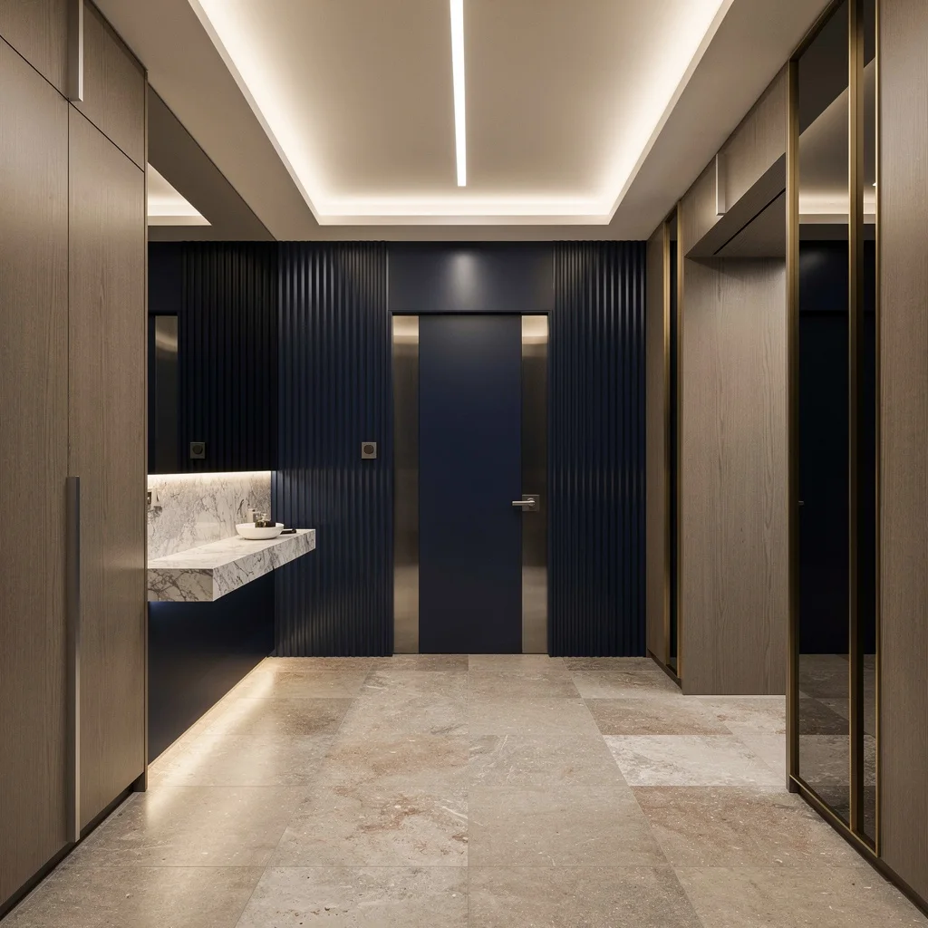
Want your hallway to look like you actually have opinions? Use limestone tiles on the floor for old-money vibes and lacquered midnight blue fluted panels for the wall—stop defaulting to bland paint. Install a backlit marble console in a wall niche and work gold-edged vertical mirrors like a beauty filter for your entry. Conceal messy storage in matte oak with sleek architectural reveals. Pair smoked glass door panels with cove ceiling lighting and a killer linear pendant; forget every standard overhead you’ve ever seen. Never, ever underestimate what under-lighting does for night drama.
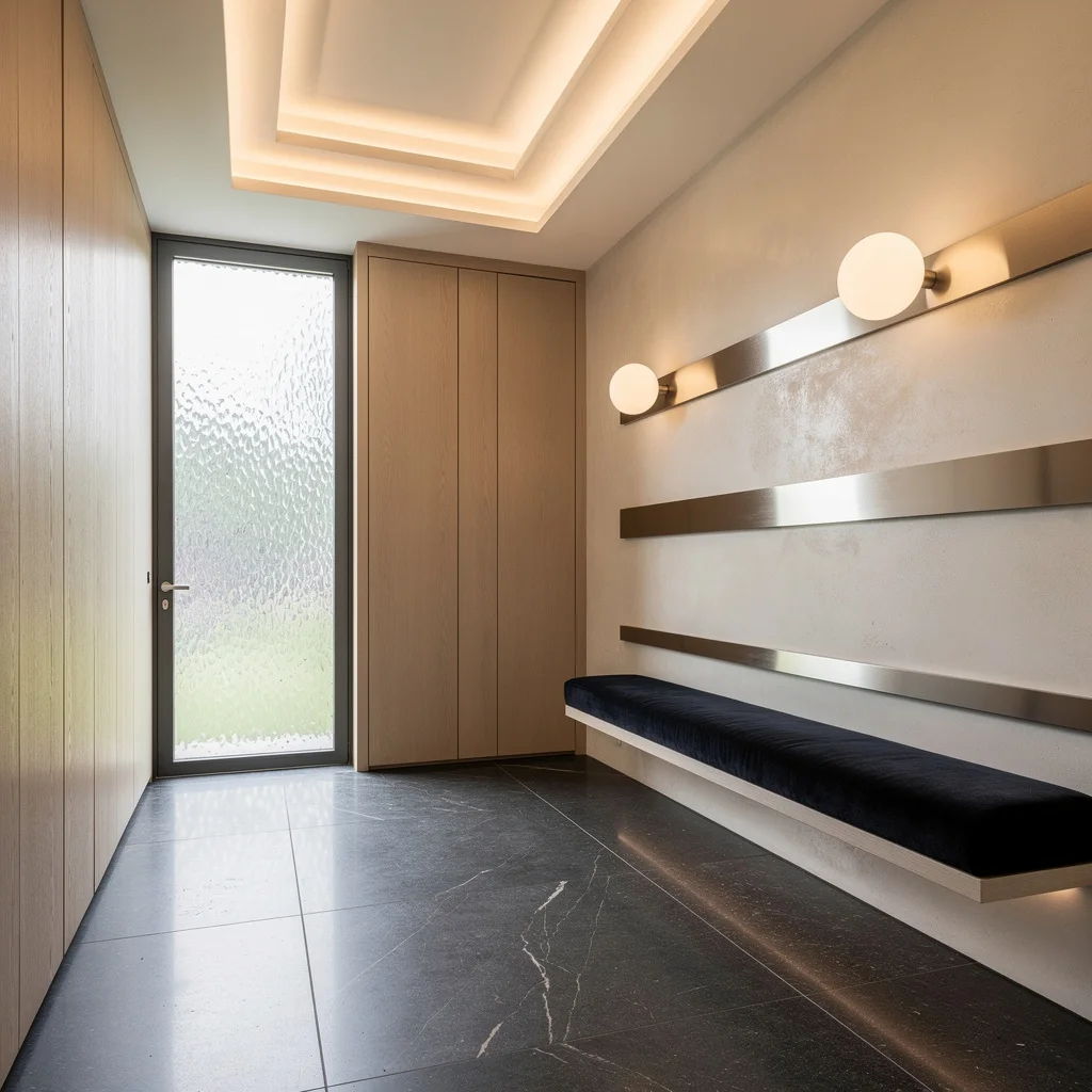
Embrace Soft Minimalism: Taupes and Texture, Baby
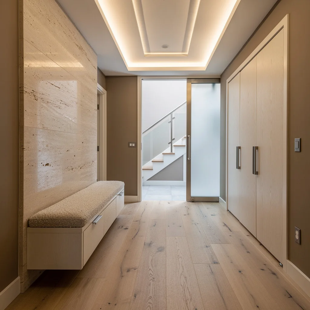
Craving comfort and that elusive designer serenity? Pair ash hardwood planks with taupe walls, but avoid that contractor special—layer one wall in honed travertine instead. Slide in custom white oak storage and mount a floating bouclé bench to make the place feel bougie without trying. Frosted glass panels keep it breezy; stainless steel accents add just enough ‘grown-up’ energy. Tray panels with concealed LGs in the ceiling mean soft, museum-level glow. Here’s the pro move: Bouclé + wood = softer minimalism, so you don’t end up with a clinical shoe row.
Bring It to Life: Checkerboard and Vertical Greenery
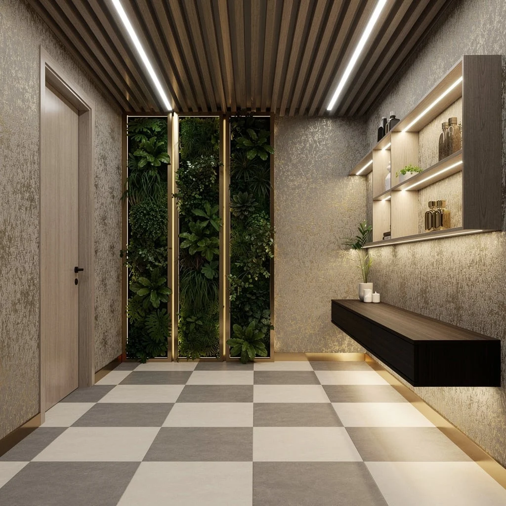
Bored with square footage? Go checkerboard on the floors using porcelain in soft greys and ivories—none of this fake farmhouse stuff. Install built-in vertical garden modules on the wall, framed in bronze, for flex-worthy greenery and fresher air (science!). Go full glam with metallic wallpaper and light up those built-in shelves. Detail the ceiling with elongated wood slats and invisible strip lighting so you’re not stuck in a cave. And, for the love of aesthetics, float a dark walnut console with ambient lighting—display, don’t dump. Rule: If you can’t keep a plant alive, get a fake, but make it look real.
Upscale Understatement: Terrazzo and Wenge Wood
Crushing over Pinterest-perfect hallways? Lay down moka-brown terrazzo with gold and cream flicks for instant luxury—it beats cheap laminate every. single. time. Use seamless cream plaster on the walls, breaking it up with custom glass wall niches, subtly lit from above because yes, everything looks better illuminated. Ditch the obvious handles on wenge cabinets, and shoot for that slim, architectural arch into your living space; spotlight with brushed copper for a warm finish. Here’s your cheat code: Understatement always wins long-term—recessed niches = high-end display, less is more, so stop overstuffing with tchotchkes.
Daylight Goals: Basalt and Brushed Aluminum Brag
Ready to blind your friends with natural light? Use a full-height textured glass sidelight at the door and slap down wide, matte basalt tiles—thermal reflection detail is the move for that ‘Who designed this?’ comment. Go vertical on one wall with white oak panels and contrast using a polished ivory microcement wall accented with horizontal brushed aluminum. Build in a bespoke bench in dark velvet, stick on some orb sconces for that ‘expensive glow’ and contour the ceiling with a stepped perimeter, loaded with LEDs. Pro tip: Benches should be comfy AND look custom, or don’t bother.
Channel Couture: Vaulted Ceilings and Marble Drama
Want the drama without the actual theater? Lay herringbone oak for movement underfoot, then install a barrel-vaulted ceiling with seriously hidden linear illumination. Wrap one wall in book-matched marble slabs—it’s not thirsty for attention, it just is. Stash your life behind seamless sage green cabinetry and top it with a floating walnut console for the ‘I’m organized, not basic’ brag. Soften sightlines with full-height frosted glass partitions (privacy, but make it hot). Dirty secret: Floating consoles are key—use underlighting for that subtle ‘Am I on Instagram or just home?’ moment.
Play With Light: Limestone, Maple, and Rattan for the Win
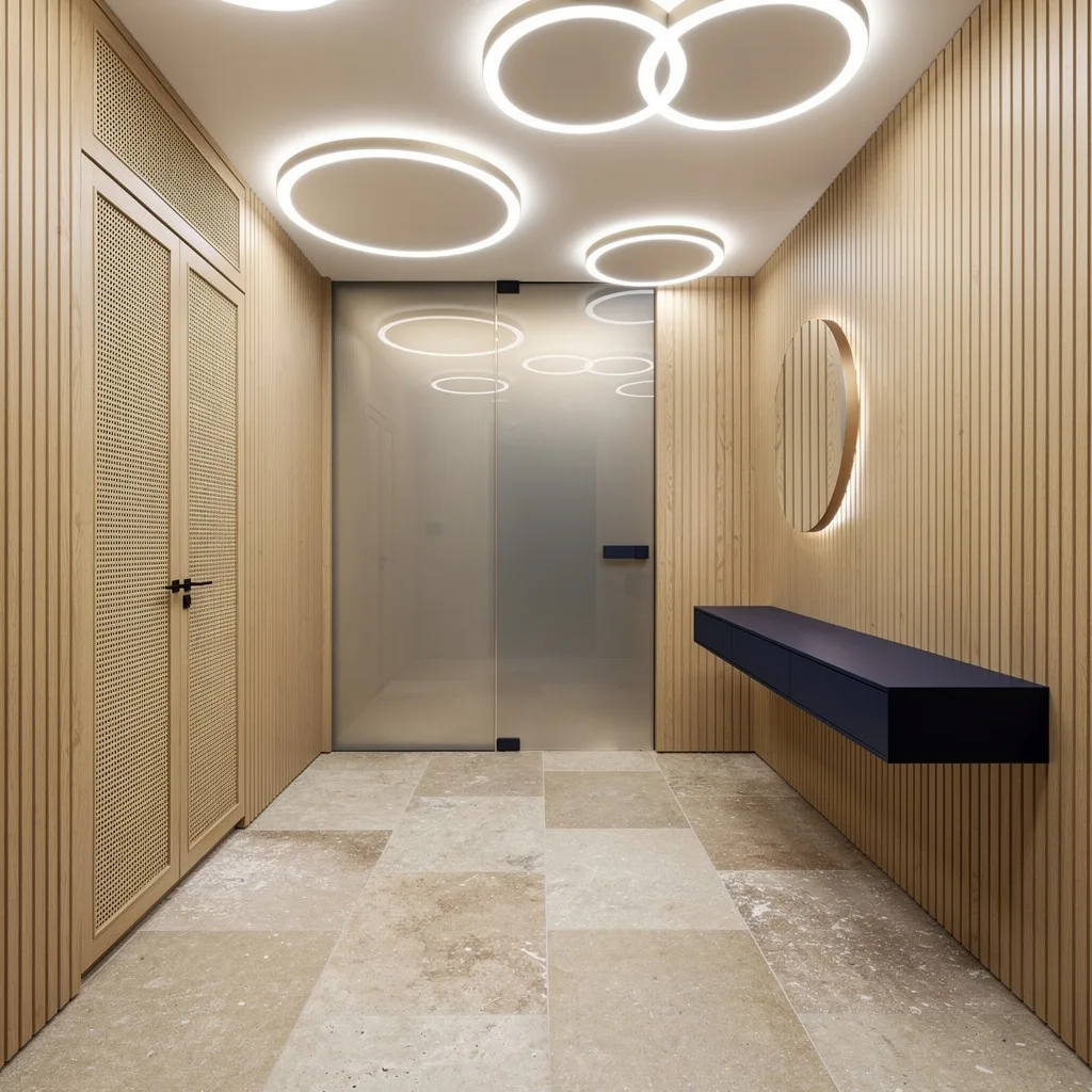
Sick of sterile hallways? Lay oversized, sandblasted limestone for raw texture. Vertical groove maple panels level up the walls, and forget those sad can lights—go offset circular LED on the ceiling for playful, designer vibes. Wrap hidden storage in woven rattan; it’s tactile and gives boho points without looking like a dorm. Use a tinted glass partition for modern lines and anchor with a navy floating console shelf in powder-coated steel. Secret sauce: The more varied your textures, the less boring your neutral palette—don’t match, just coordinate, and always layer lighting.
Statement Metals: Brass Inset and Mesh Luxe
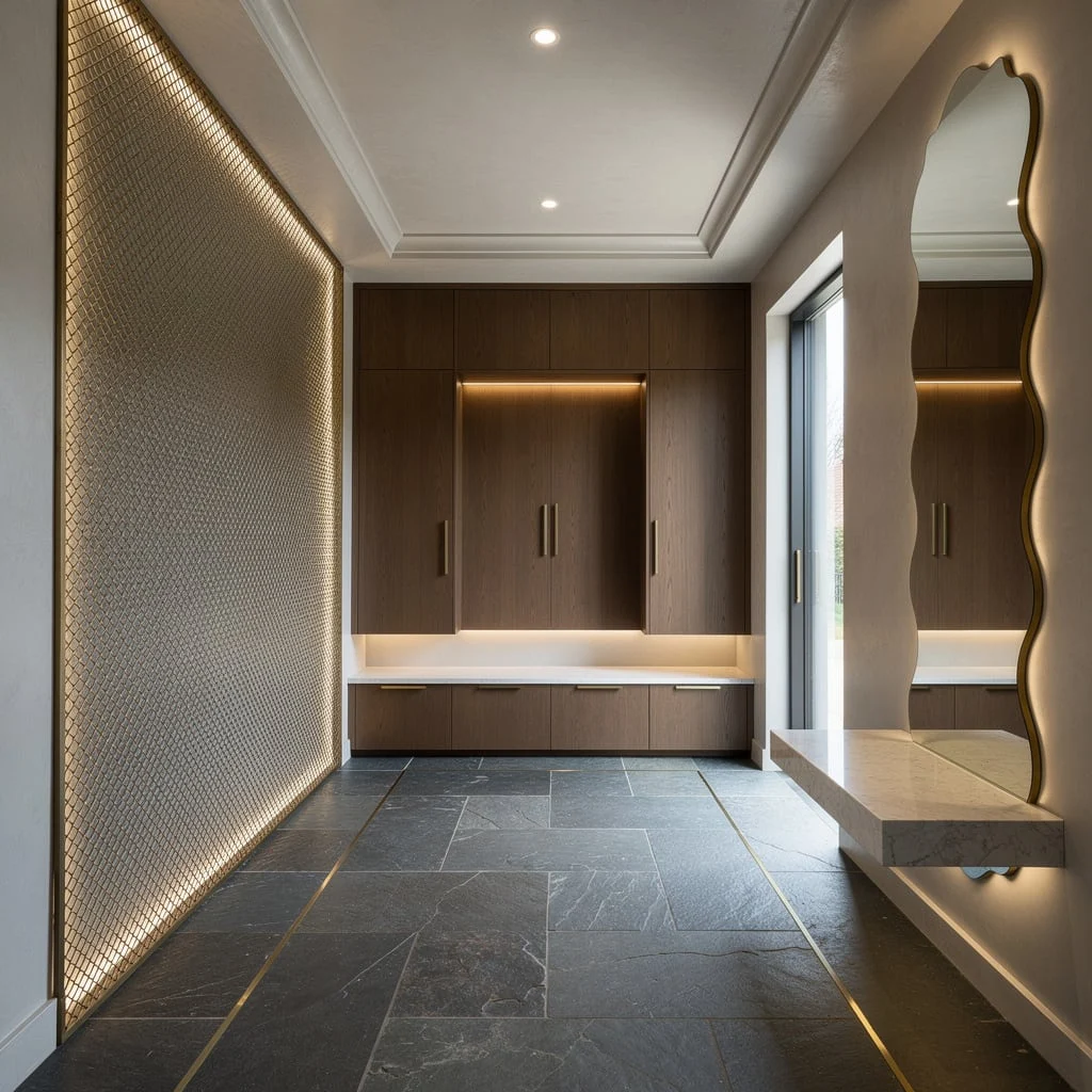
Crave a ‘why does this look expensive?’ entry? Use Belgian bluestone floors with brass insets—these lines trick your eye into thinking your real estate is bigger. Lose the gloss, go ultra-matte grey stucco on the walls, and drop in a statement bronze mesh with backlighting for visual depth. Add shallow coffer ceilings with precise spots; this keeps things sharp, not busy. Float a quartzite bench for easy seating, custom walnut storage with integrated lighting for grown-up organization, and scalloped-edge mirrors to bounce light around. Rule: Architectural metals always need to be repeated at least twice—don’t stop at just hardware.
Layer like a Boss: Microcement and Velvet Clash
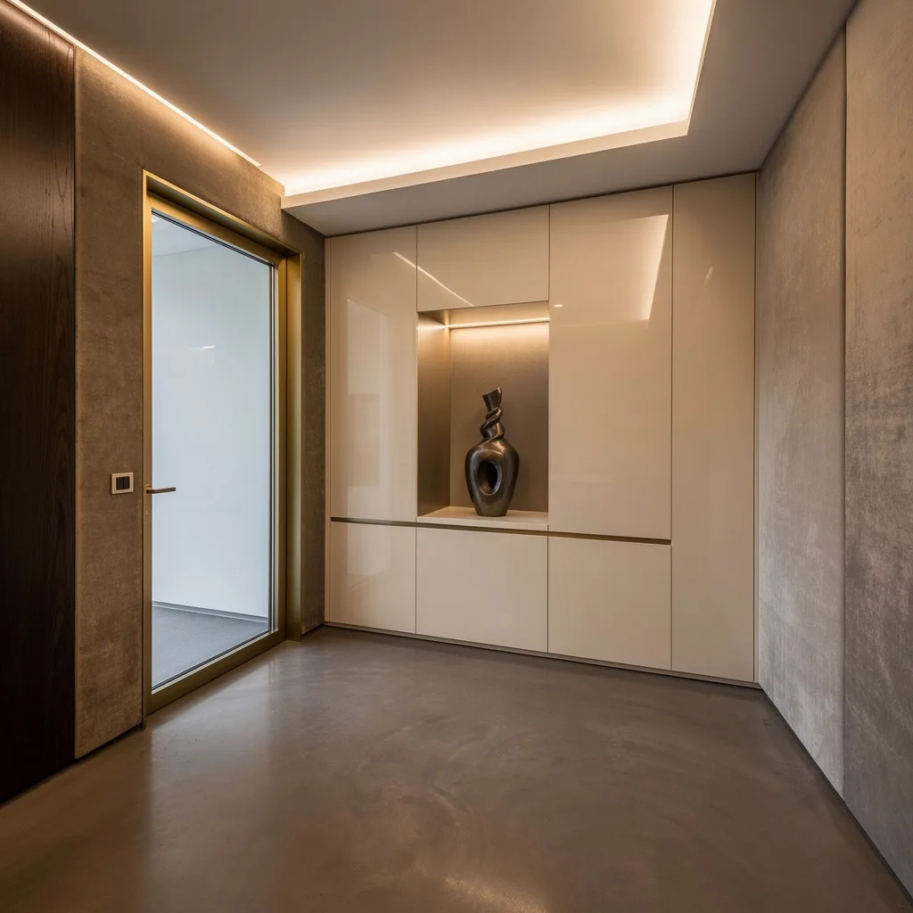
Want people to actually remember your entryway? Pour seamless microcement floors in smoky taupe (it’s basically indestructible), then alternate dark birch wall panels with swathes of brushed velvet. Frame the entry with a flush-mount glass door outlined in satin brass, and stick on glossy ivory cabinetry for just the right amount of reflection. Float the ceiling and build in soft cove lighting—no basic drum fixtures allowed. House a sculptural vase in a niche with hidden LEDs; everything else should disappear. Golden rule: Use three textures minimum, or you’re just playing safe and boring.
Monochrome Ecstasy: Shiplap, Encaustic Tiles, and Skylight Brag
Want modern with a twist so sharp your grandma will text you for tips? Lay encaustic ceramic tiles in muted shades and pair them with white shiplap walls for graphic pop (bye, builder bland). Demand natural drama with an oversized skylight—let pendant lights in brushed gold drop like earrings. Integrate pale oak storage and go hard on black steel for edge. Float glass partitions for separation, not isolation; display your stuff on stone shelves instead of cramming into baskets. Fast tip: Let architectural features do the flexing—never fill a hallway with random art just because the wall is empty.
Go Glam: Emerald Green Marble Is Not Optional
Ready to live your inner extra? Emerald-green marble floors say ‘don’t spill your coffee here,’ while warm concealed LEDs in the ceiling make the stone shine (literally). Use custom walnut panels and set in frosted glass between bronze frames for modern mansion goals. Go minimalist with matte white floating cabinetry; light up display niches because everything looks priceless when lit. Float an aluminum console in champagne finish and just watch Instagram melt. Pro tip: When running deep paint shades on the ceiling, always use spotlights—don’t lose all that reflective drama to a bad lighting plan.
Final Thoughts
A hallway that works—really works, in the way that makes people slow down rather than speed up—is one where the constraints of the space became design decisions rather than design problems. The narrow width becomes a reason for bold art. The unavoidable radiator becomes a ledge. The staircase becomes an architectural anchor. The corridor’s length becomes a vanishing point that pulls the eye through the space toward something worth looking at.
The hallways on this list aren’t successful because they’re large or architecturally special or expensively furnished. They’re successful because someone looked at what they had—a metre-wide Victorian corridor, a staircase hall with a radiator, a long neutral tube of a space—and made decisions rather than compromises. That’s the difference between a hallway you walk through without registering and one that makes you feel something before you’ve even reached the room at the end of it.
Stop saving the good design decisions for the rooms people sit in. The hallway sees everyone. It deserves the same attention.