
Nobody walks into an entryway and thinks “what this space really needs is less mirror.” And yet the average entryway mirror situation across the country is either a tiny frameless rectangle hung at the wrong height by a previous owner, or absolutely nothing at all — just a blank wall doing its best impression of a space that hasn’t been thought about since the house was built. Both options are, in their own way, a cry for help.
The mirror is arguably the most powerful single object available to an entryway because it does three completely different jobs simultaneously without being asked. It bounces light around a space that’s almost always fighting for natural illumination. It creates the last-glance moment before leaving that saves people from walking into meetings with their collar half up. And it provides a focal point that gives the whole entry composition something to organise itself around — which is the design function that most entryways are missing entirely and wondering why the space feels unresolved.
What makes mirror choice genuinely consequential rather than decorative is that the frame, scale, shape, and placement determine the entire visual register of the space around it. A large black-framed round mirror sitting above a dark console with cage-light task lighting is doing something completely different from a cluster of organic gold-framed ovals across a fluted wall panel. The mirror isn’t just reflecting the room — it’s defining it, and choosing one without understanding that relationship is how entryways end up with mirrors that technically work and atmospherically don’t.
The Mirror Frame Is the Design Statement, Not an Afterthought
Every mirror has a frame making an argument about the room’s personality, and that argument is being made at full volume every time anyone walks through the door. Treating the frame as a secondary consideration after finding a mirror the right size is designing backwards.
Frame Weight Communicates Visual Confidence — A thin frame almost disappears and lets the reflection do all the work, which suits spaces with enough going on around the mirror to carry the composition. A substantial frame — carved timber, thick black steel, layered metal — becomes an object in its own right that would read in the room even without the reflective surface inside it. Neither is universally correct, but both need to be chosen in relationship to everything surrounding them.
Shape Carries Personality Information — Round mirrors feel casual and accessible regardless of their size. Rectangular mirrors feel architectural and formal. Arched mirrors bridge the two, adding organic softness to a geometric shape. Irregular organic silhouettes feel contemporary and artistic. The shape is communicating something before the frame material, the finish, or the scale even register — and that first communication needs to match what the rest of the entry is saying.
The Frame Material Should Connect to Something Else in the Space — A brushed brass frame that has no other brass in the entryway looks like a standalone purchase. The same frame above a console with brass hardware, beside a light fitting with brass detail, against a warm-toned wall creates a material thread that makes the whole composition feel curated. Mirrors that work hardest are the ones whose frames are in conversation with the room rather than simply hanging on it.
Scale, Placement, and Height Decisions That Actually Matter
The mirror at the wrong height in the wrong proportion to its wall is a remarkably common problem that costs nothing to avoid and creates a consistently unresolved feeling that homeowners sense without always being able to diagnose.
Centre Height Should Serve the User, Not the Tape Measure — The conventional advice to hang mirrors at eye level produces correct results for average height people and consistently wrong results for everyone else. An entryway mirror serves multiple people at multiple heights, which is why floor-length mirrors and oversized pieces hung lower than convention suggests are often the most practically successful choices — they work for everyone rather than optimising for a statistical average.
Width Relative to the Console Below Is a Proportional Decision — A mirror significantly narrower than the console beneath it makes the console look too wide and the mirror look lost. A mirror significantly wider than the console beneath it makes the console look like a support act for something that doesn’t need one. The relationship between the two should feel deliberate — either matched in width, or in a proportion that clearly understood the other piece existed before being hung.
Distance From the Floor Determines Whether the Mirror Reads as Furniture or Decoration — A mirror hung high on a wall reads as wall art. A mirror hung low, or leaned against the wall entirely, reads as furniture — as a substantial object with physical weight and presence in the space. Both are valid approaches but they create completely different spatial relationships with the console, floor, and entry as a whole, and the distinction needs to be made consciously rather than defaulted into.
Styling the Console Beneath the Mirror Without Ruining Both
The console and the mirror are a composition, not two separate styling exercises that happen to share a wall. Everything placed on the console surface exists in relationship to the mirror above it — scale, colour, height — and that relationship either enhances both pieces or undermines them.
One Anchor Object, Two Supporting Players — The most reliable console styling formula that entryways repeatedly prove correct: one tall or visually substantial anchor object, two smaller supporting elements in varied heights and textures, negative space on the remaining surface. Adding more than three objects starts creating visual competition that the mirror above loses to rather than winning against.
Plant Scale Should Match Mirror Scale — A small potted succulent beneath a large architectural mirror looks like a garnish that got lost. A substantial branching plant or an oversized vessel with dramatic greenery reads as a response to the mirror’s scale rather than a forgotten addition. The botanical element in an entryway styling arrangement needs to be proportional to the rest of the composition, not just present in it.
Lighting on the Console Does Different Work Than Overhead Lighting — A table lamp or pair of wall sconces flanking the mirror provides warm, directional light at human height that changes the entire atmosphere of the entryway compared to a ceiling fitting doing its flat, even job from above. The console light source and the mirror together create the kind of layered illumination that makes entryways feel genuinely designed rather than lit for functionality.
Entryway Mirror Ideas
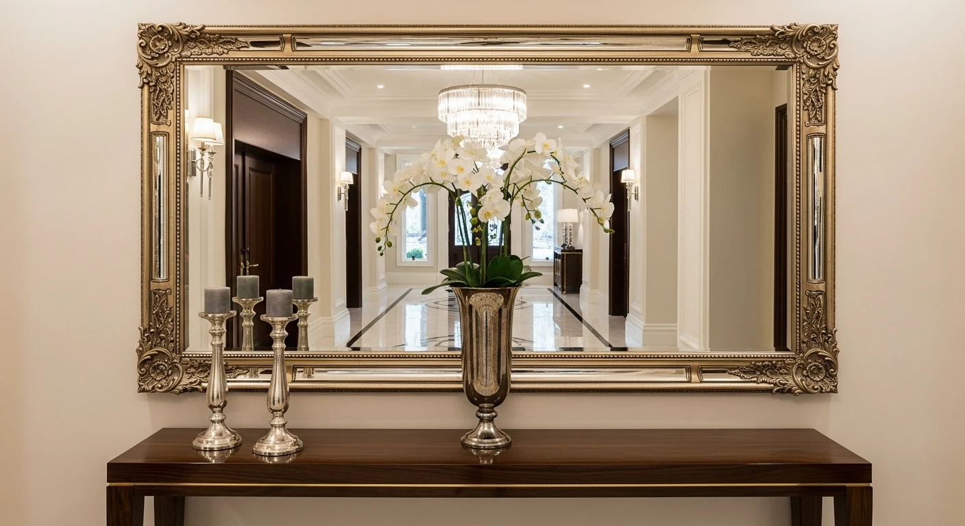
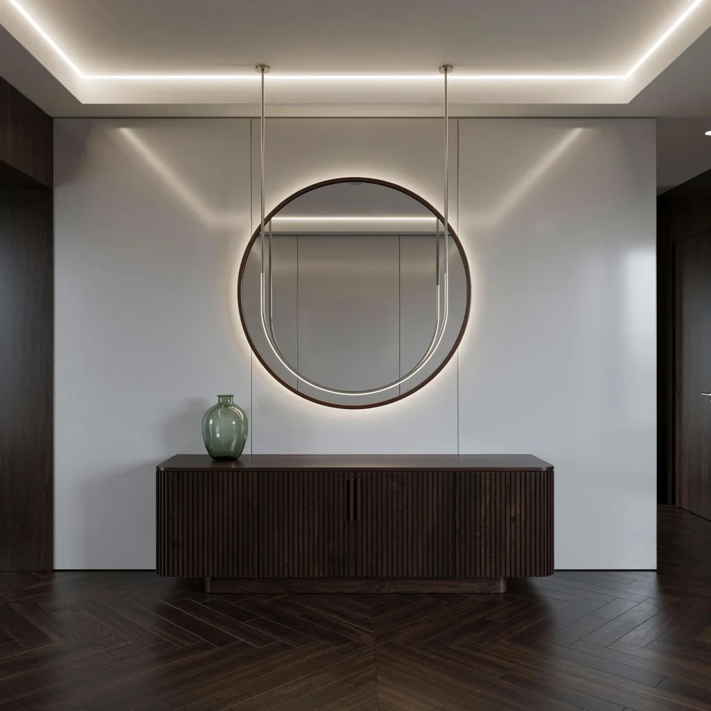
The Dark Console Setup That Understood Atmosphere Is the Point
Tried to create a cozy entryway vibe Added a round mirror, some greenery, and warm lighting. How does it look should I keep it simple like this or add wall art around the mirror?
by u/FawnFairfieldEL in Creativehomehacks
A large round mirror with a slim matte black frame anchors the wall above a dark espresso console table with X-frame detailing and three shallow drawers, while a multi-arm industrial cage floor lamp positioned to the left throws warm amber light across the whole arrangement. The console surface is styled with small potted plants, a lantern vessel, and a few decorative objects that collectively read as collected rather than purchased as a set, and the dark hardwood floor beneath grounds the whole thing without competing with it. What makes this work when the same combination could easily tip into cluttered is the restraint applied to the object count on the console surface and the way the floor lamp adds vertical scale on one side that balances the mirror’s circular mass above. The blue note caught in the mirror’s reflection from the space beyond is, inadvertently, the most interesting colour in the whole composition.
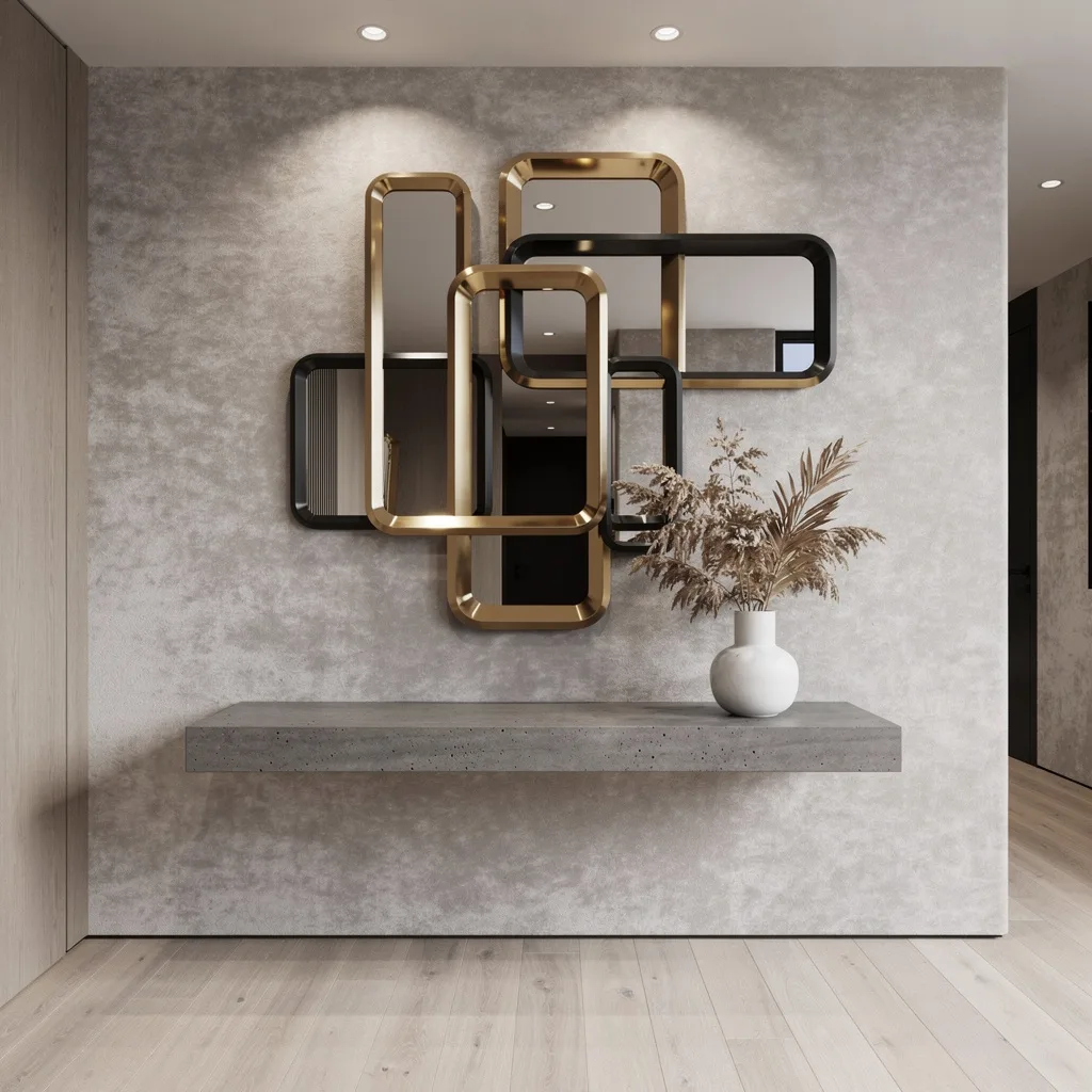
The Organic Oval Cluster That Turned a Staircase Wall Into an Art Moment
Multiple organic oval mirrors in varied sizes clustered together within matte gold frames create a composition that reads as a single sculptural installation across a deeply fluted dark timber wall panel, anchored by a black marble and gold-legged console below carrying white roses, dried grasses, a gold sphere, and a stack of books. A curved plaster ceiling detail with integrated cove lighting frames the whole wall from above, and matching hexagonal brass wall sconces on either side provide the flanking light that makes the full installation readable after dark. This is the kind of mirror idea that requires commitment — to the wall treatment, the console quality, the flower arrangement — and delivers a result that makes every conventional single-mirror entryway look significantly less ambitious by comparison. Nothing about it happened accidentally, which is entirely the point.
The Black Frame and Floating Shelf That Proved Monochrome Has Range
A large rectangular mirror with a slim matte black frame sits flush against a crisp white wall, and rather than being paired with a separate console, it integrates a thin floating black shelf within its own composition — part of the mirror structure, not an addition to it — while a single industrial pendant lamp with a clear glass shade hangs to one side providing the only warm light source in an otherwise cool palette. The styling on the shelf is disciplined to the point of severity: a small framed print, a green stem in a vessel, a white cylinder. The abstract grey and black rug below and the white marble-look flooring create the floor plane, and the moulded black door to the right connects the whole dark-accented composition into something coherent. It’s the most restrained idea on this list and the one that would tolerate the least deviation from its established rules without collapsing into something that just looks unfinished.
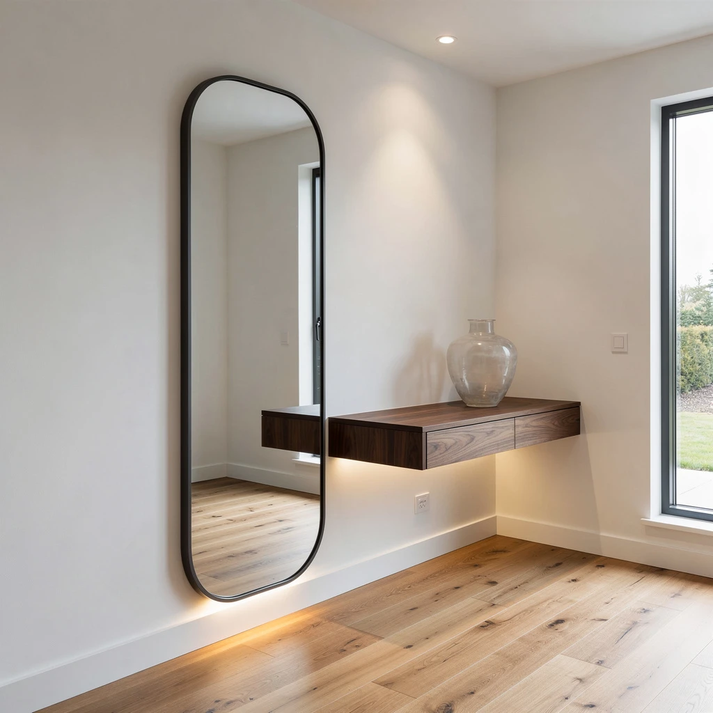
The Arched Mirror Entry That Got the Skylight Doing Double Duty
A full-length arched mirror with an ornate black iron frame leans against a white wall in a bright corner entry, working in combination with a rectangular skylight overhead that floods the space with natural light the mirror then doubles and distributes across a room that would otherwise be working much harder for illumination. A small white tulip table beside it carries a large black ceramic amphora vase with a dramatic trailing branch arrangement, a wooden stool at the mirror’s base holds hats and a jacket in a way that looks deliberate rather than dropped, and a wicker basket in the corner adds one more natural texture to a composition that’s consistently warm against the white walls and pale oak floor. The black steel-framed glass door beyond echoes the mirror’s dark frame and creates a material connection between entry and exterior that makes the whole space feel considered from threshold to wall.
The Organic Mirror and Cylinder Console That Made Curves a System
A wavy organic-edge mirror with a warm brown frame hangs above a solid oak console with cylindrical column legs and a gently rounded rectangular top, and the relationship between those two curves — the irregular mirror silhouette and the deliberate cylinder legs — creates a design language that makes both pieces look like they were specified together rather than found separately. The textured buff-toned wall tile behind provides warmth and depth that a painted wall simply couldn’t, a pleated-shade table lamp with a dark ceramic base anchors the left side, and a white textured vase with green foliage provides the organic material counterpoint on the right. The geometric jute rug below adds pattern at floor level without competing with the curves above it, and the overall palette of warm tan, black, cream, and green feels resolved in a way that suggests someone spent real time reaching it rather than arriving at it casually.
The Arched Floor Mirror and Bouclé Bench That Elevated a Haussmann Wall
A full-height arched mirror in a substantial warm walnut frame leans against an extraordinary wall of white plaster moulding with ornate carved detail in every panel, while a low curved walnut bench with a cream bouclé cushion sits at its base and a mosaic-patterned ceramic vase with autumn branches occupies the wall to the left. Sculptural white and gold wall sconces flank the mirror at a height that respects the moulding panels around them, a slim recessed LED strip runs the ceiling line overhead, and the warm herringbone parquet floor below anchors what is otherwise a very vertical composition. The genius of this entry is that the mirror doesn’t compete with the moulded wall — it reflects it back, doubling the ornate plasterwork into a composition that fills the space with considerably more architectural richness than even the wall itself provides. It’s the most extravagant idea on this list by a significant margin and earns every inch of that distinction.
Go Full Luxe With an Arched Niche and Brass
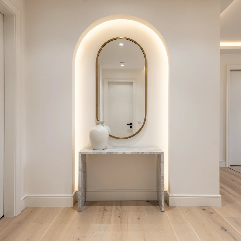
Ready to make your entryway scream ‘Rich Person Energy’? Build yourself an arched wall niche and install a chunky oval mirror with a brushed brass frame. Don’t cheap out on that marble console—use soft grey veining for the perfect ‘I only drink expensive wine’ vibe. Stick a big, matte white vase on top, and keep your walls super crisp warm white. For lighting, go with recessed LEDs. Light oak wide-plank floors are your best friend for keeping things chill. Pro tip: Keep your styling sparse. Too much stuff kills the elegance—one vase, one mirror, and that’s it.
Honeycomb Geometry That Eats Up Awkward Modern Corridors
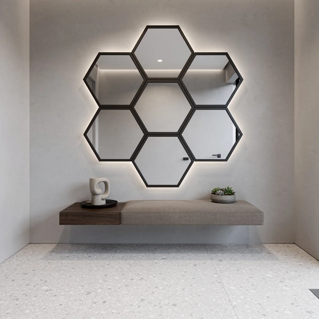
If your entry is short on personality, slap on a geometric, multi-panel mirror installation in an asymmetric honeycomb pattern. Each panel needs a slim, matte black border because chrome is for people who still say ‘bling’. Mount a floating walnut shelf underneath and add a sculptural tray with a single succulent—no more, no less. Walls should be smooth dove-grey plaster; floors go pale terrazzo for subtle pop. Hide LED strips above the mirror to get that dimensional lighting. Never forget: Minimal decor on the shelf stops it from looking like a junk drop zone.
Double-Height Drama With Floor-to-Ceiling Mirror Luxe
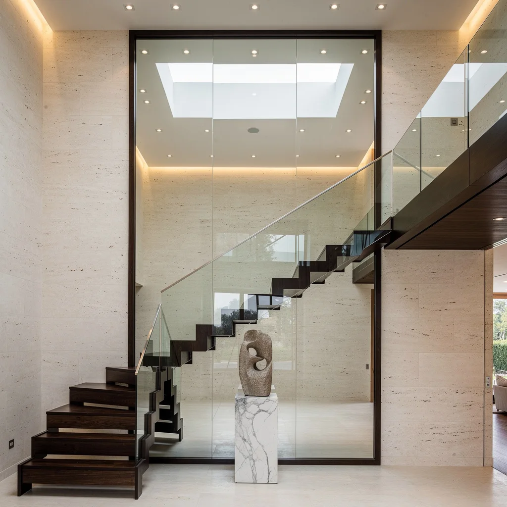
Stop pretending your staircase doesn’t matter; install a full-height custom mirror behind it. Go beveled edge, obviously. This mirror bounces daylight from skylights like a Kardashian cheekbone, making everything feel huge. Floating stairways need glass balustrades and dark oak treads. Put a marble pedestal with a weird stone sculpture in front. Wrap the walls in creamy limestone veneer and use recessed spotlights—no gross overhead glare. Pro tip: Keep the pedestal tiny, or you’re just blocking the mirror and killing those lines.
Rock a Carved Walnut Surround for Ultimate Entry Drama
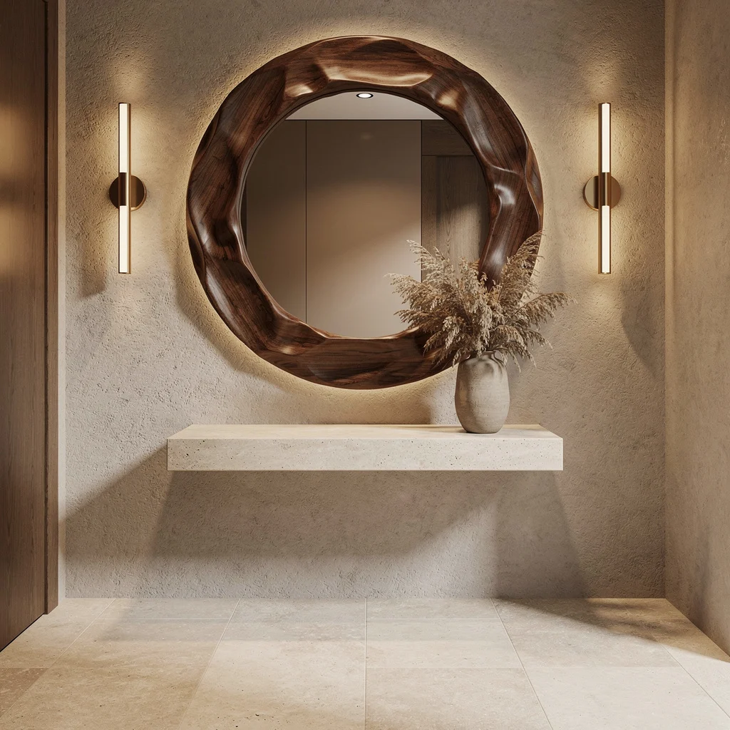
Want your entry to punch up the welcome? Hang a giant circular mirror with a hand-carved walnut surround. Keep it finished matte so you don’t blind people with gloss. Mount a floating stone shelf below, color matched to your pale travertine flooring—consistency is king. Next, install vertical wall lights in brushed brass to spotlight shadow drama. Use textured plaster for the walls, and drop dried botanicals in a ceramic vessel. Pro tip: Don’t overstuff the shelf. The wall lights and mirror do most of the talking—plants are just the supporting cast.
Midnight Blue Velvet and Chrome: Your Entryway’s New Power Move
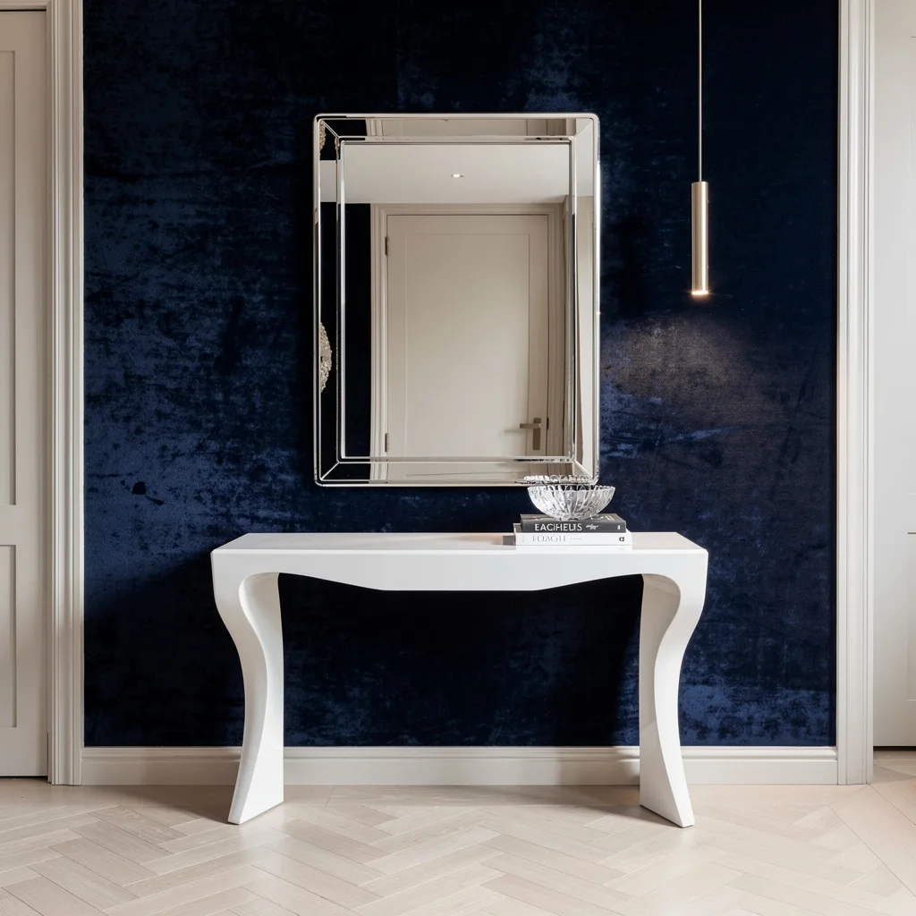
If you crave ‘cool rich aunt’ energy, slap up a chrome-bordered rectangular mirror on a midnight blue velvet wallpaper. Don’t skimp on the sculptural white lacquer console table—let that shine below, and toss on a stack of designer books and a crystal bowl for flex. Use a slim, brushed nickel linear pendant light for soft, even illumination. Floors should be pale herringbone parquet—classic, not basic. Pro tip: Limit the color palette. If you start mixing more than three colors, you’ll lose the luxe vibe faster than you can say ‘clearance rug’.
Mirror Trio Stack For Slim Spaces—Gold All Day
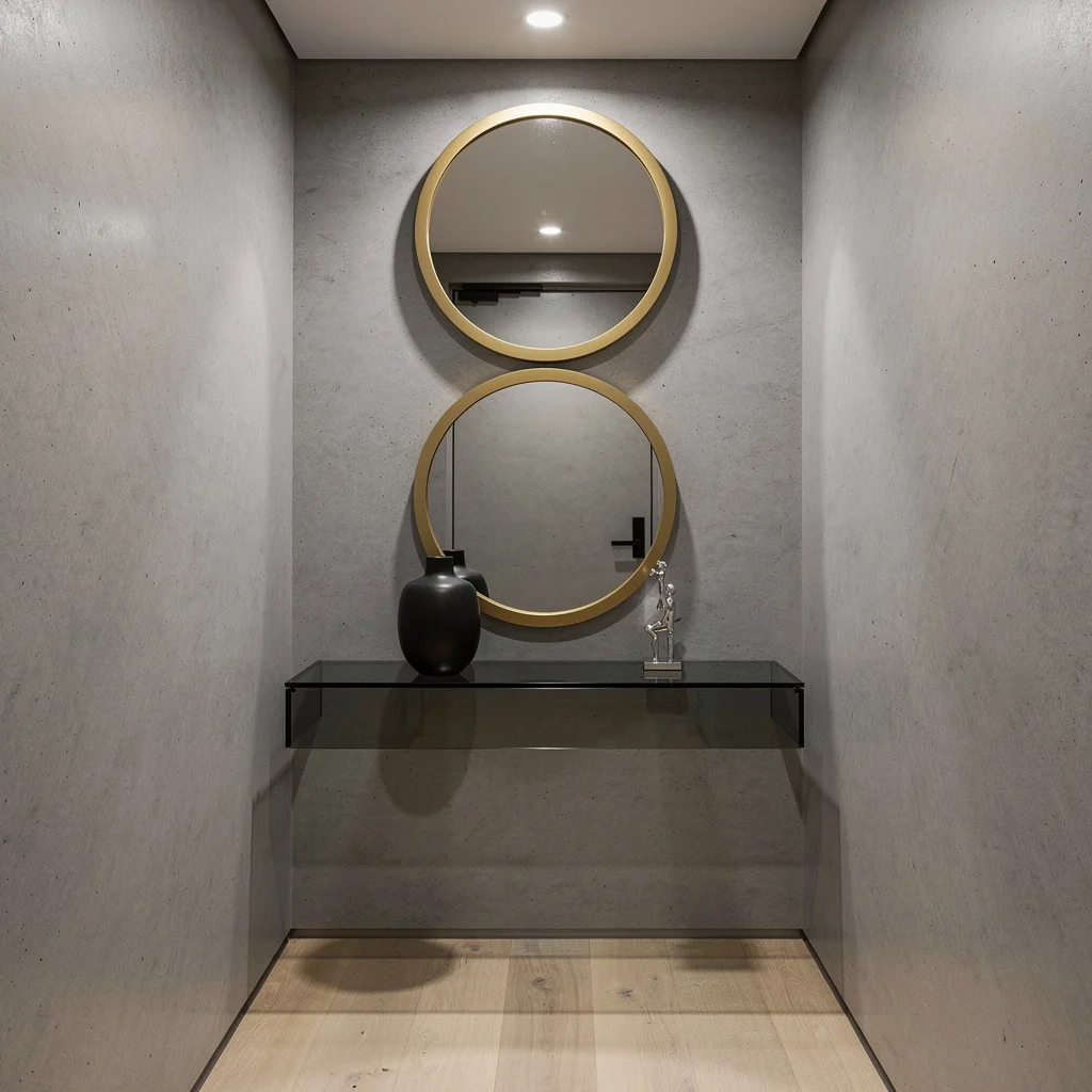
Tiny entryways need vertical magic, so stack three round mirrors with matte gold rims. Space them out perfectly above a floating smoked glass shelf—don’t eyeball it, use a ruler like a grown-up. Keep your walls concrete gray for edgy refinement. Style just a black vase and a small silver sculpture on the shelf. Add ceiling-mounted LEDs to show off those textures. Light oak flooring keeps it bright and airy, and minimalist decor makes sure the trio doesn’t look messy. Pro tip: Skip groups of random objects—mirror repetition is all the statement you need.
Organic Ellipse Mirror With Matte Bronze—Call the Designer Hotline
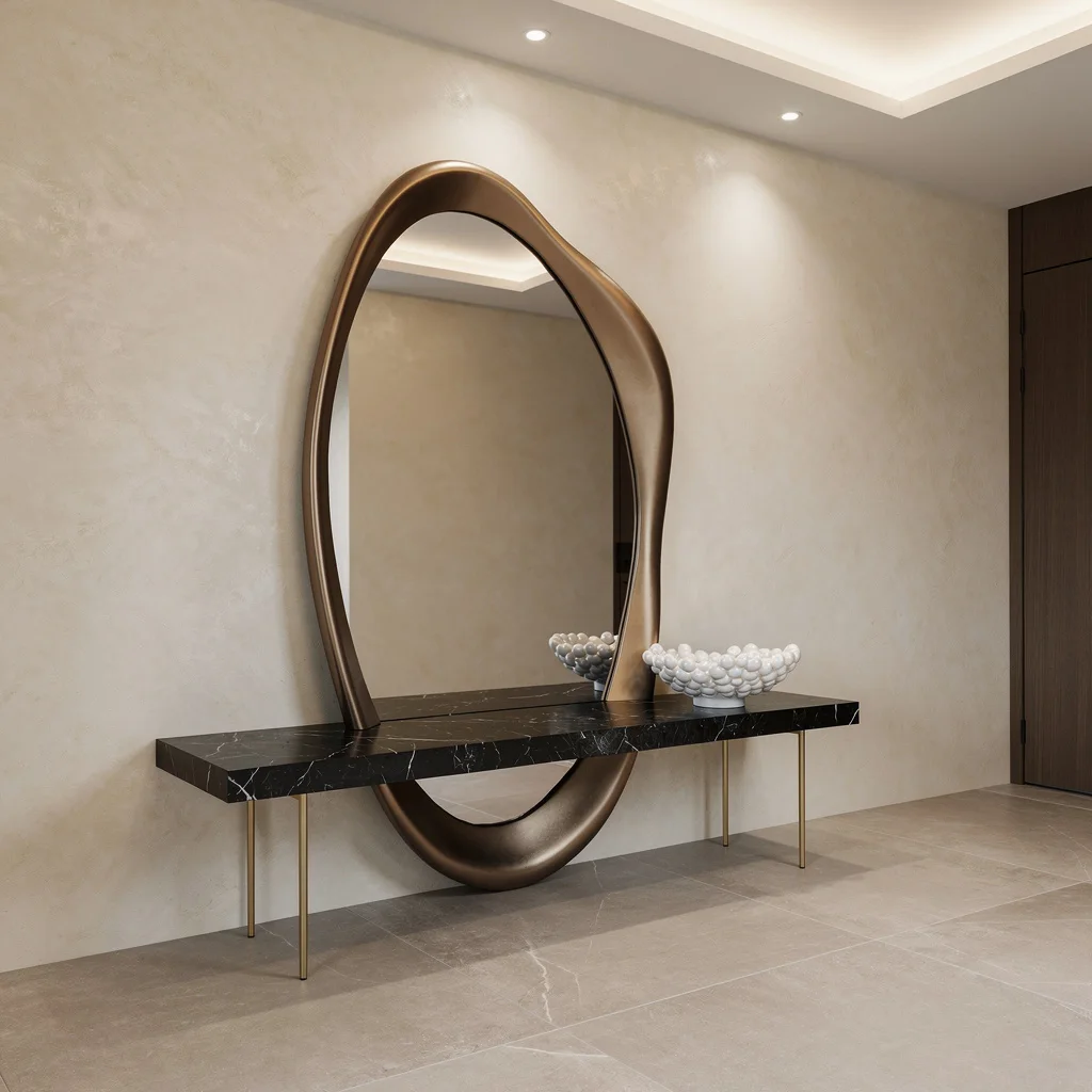
Don’t even bother with basic rectangles; prop up a custom oversized ellipse mirror with a sculpted matte bronze frame for pure designer flex. Let it lean against creamy Venetian plaster walls—because texture is life. Pair it with a floating black marble bench on skinny brass legs and drop a pearl-white bowl for accent. Go for large-format porcelain tiles in soft taupe underfoot. Overhead recessed light panels will highlight every curve. Pro tip: Always let the mirror REST. Don’t hang it; lean it gently, for that gallery look you can’t get from a hardware store.
Hand-Etched Mirror Magic for Entryway Artistry
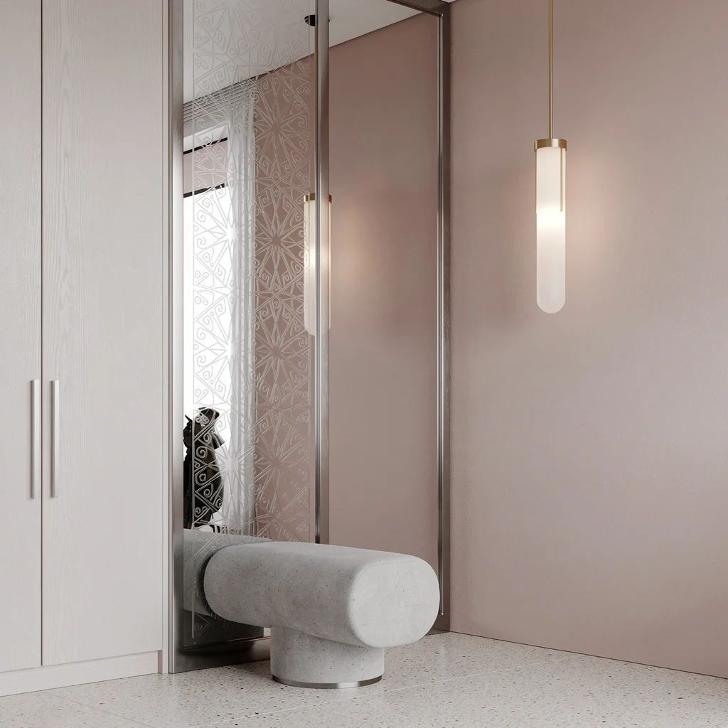
If you want your guests pausing to catch their breath, install a vertical etched mirror panel in brushed stainless steel—geometric for bonus points. Pair it with a minimalist entry closet in matte white oak. Underneath, stick a floating cylindrical concrete bench. Paint the walls a soft blush tone, and hang a frosted glass pendant nearby for that swanky ambient glow. Pale terrazzo flooring keeps it modern. Pro tip: Don’t mess up the blush-gray palette; too much color ruins the vibe. Keep etchings sharp, and let lighting show off the craftsmanship.
Floor-to-Ceiling Charcoal Mirror for Gallery Entry Vibes
Craving space and drama? Mount a tall, floor-to-ceiling mirror with a curved matte charcoal aluminum frame. Slide it beside a floating walnut console—integrated LED lighting below is non-negotiable. Use eggshell white walls for openness, then set a translucent, oversized pottery vase on the console. Choose natural oak wide-plank flooring for grounded goodness, and drop a recessed wall spotlight to highlight both mirror and console. Pro tip: Keep the console clear. One vase, maybe two accessories max. You’re aiming for gallery vibes, not grandma’s clutter cave.
Copper Triptych Mirrors—Straight Out of a Designer’s Moodboard
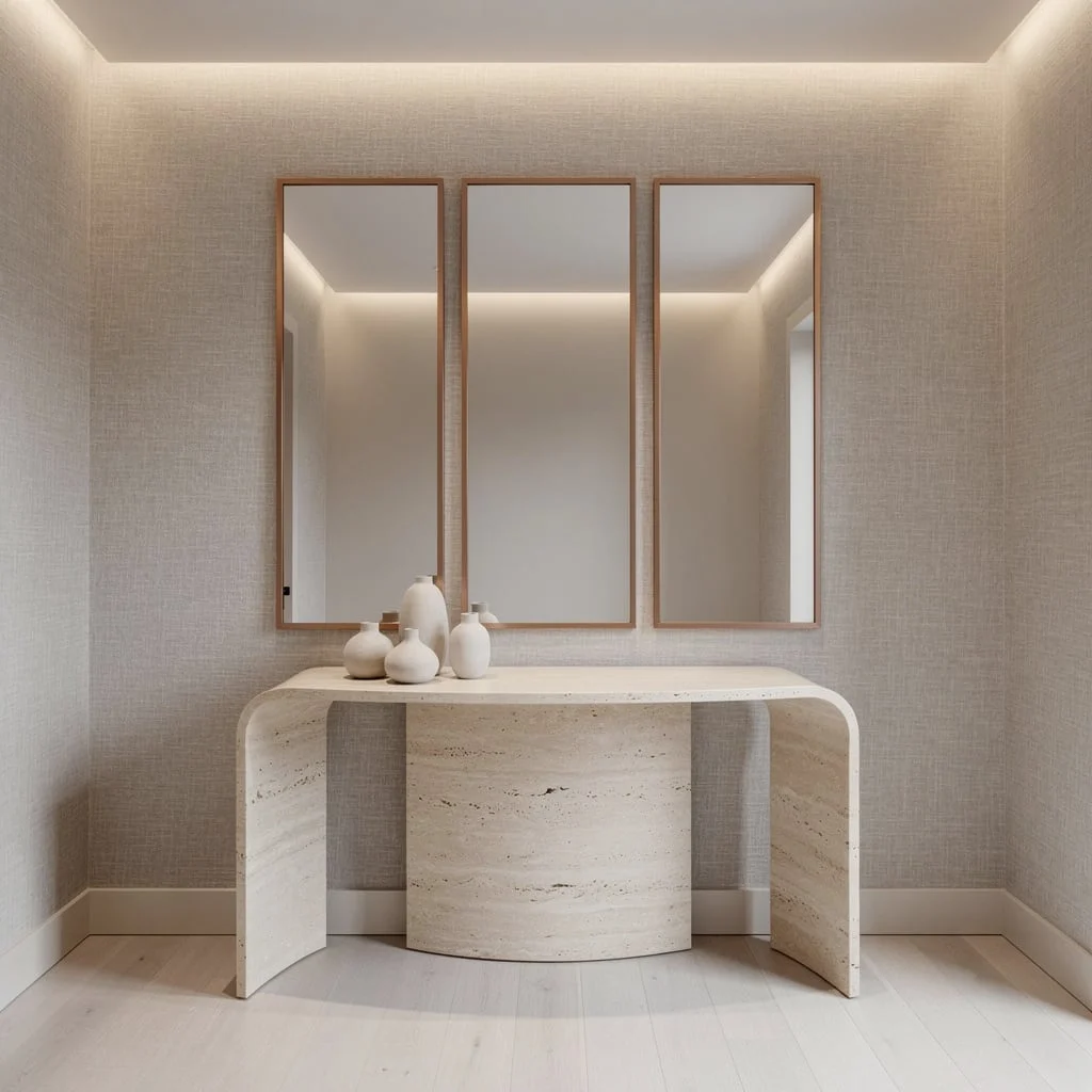
Go high-brow with a triptych of rectangular mirrors in thin matte copper frames. Anchor them above a curved creamy travertine stone console. Use pale taupe linen wallpaper for wall texture—no boring paint here. Install LED wall washers up top for soft, atmospheric lighting. Place a cluster of minimalist vessels on the stone console; skip anything fussy. Brushed white oak floors radiate tailored elegance. Pro tip: Space the mirrors evenly for architectural rhythm. Triptychs work best when everything is symmetrical—don’t leave gaps and kill the visual flow.
Suspended Circular Mirror—Floating Drama for Fancy Foyers
If you really want a show-off foyer, hang a big circular mirror from the ceiling with slim tension cables—forget wall mounting, that’s old news. Put it dead center above a fluted deep teak credenza. Back wall should be high-gloss lacquer in pearl light grey, so it bounces light like a TikTok ring lamp. Use embedded LED strips in the ceiling and credenza for soft, low-shadow illumination. Place a handmade glass vessel in sage green as the only accessory. Wide dark herringbone flooring grounds it all. Pro tip: Polish the back wall till it’s flawless—mirror reflections reveal everything.
Let Mirrors Double As Modern Art—Rectangular Sculpture Chaos
Declare war on boring entryways and build a multi-level mirror sculpture from interlocking rectangles in polished brass and matte black frames. Clad the wall in oyster-gray suede for rich texture beneath. Float a concrete ledge with a minimalist ceramic vessel and dried architectural foliage. Ultra-slim recessed spotlights are your magic for highlighting mirror depth. Pale Scandinavian oak floors and carefully chosen accessories bring it home. Pro tip: Mix brass and black equally. Too much of one looks try-hard; balance is what makes it art—not random leftover parts.
Final Thoughts
An entryway mirror is not a functional checkbox — it’s the piece that completes the composition, provides the focal point, and determines whether the space reads as designed or assembled. The difference between those two outcomes is usually not budget. It’s whether the frame, scale, shape, and placement were chosen in relationship to the space and each other, or whether the mirror was simply the first one that looked approximately right at approximately the right price.
Every mirror here succeeds because someone understood what it needed to do beyond reflecting faces — anchor a wall, create depth, distribute light, establish a material conversation with the console below and the room beyond. Those are not small jobs and they deserve the same consideration given to any other significant design decision in the house.
The entryway mirror is the first thing people see when they arrive and the last thing they check before they leave. Treating it as an afterthought is perhaps the most regularly committed design mistake in residential interiors — and also the most easily corrected one, which makes continuing to tolerate a bad one entirely inexcusable.