
Most entryway table styling situations follow a predictable arc. Someone buys a console, props a mirror above it because every guide says to, places a lamp on one end because lamps go on tables, adds a vase because vases are decorative, and then stands back wondering why the whole thing looks like a furniture store display that nobody actually lives near. The objects are fine. The table is fine. The result is somehow aggressively mediocre, and the reason is almost impossible to pinpoint.
The reason is always the same: the decor was chosen to fill the surface rather than to tell it something to say. A lamp placed because console tables need lamps. A mirror hung because mirrors make spaces look bigger. A tray corralling keys because trays corral keys. Every decision technically defensible, collectively producing a setup with no point of view, no personality, and no reason for anyone to stop and look at it.
Console table decor that actually works starts from a completely different place. It begins with a feeling—what should the table communicate in the five seconds someone has with it—and then builds backward from that feeling toward the objects, the arrangement, and the scale that will produce it. The dog-bed-and-plant setup that decided warmth and habitation were the entire brief. The sculptural black and gold table that decided this staircase landing was a gallery. The autumnal console that decided seasonal warmth shouldn’t require seasonal replacement. Every one of them started with an idea rather than a shopping list.
Why Your Console Table Styling Keeps Falling Flat
The failure patterns are consistent and specific, which makes them worth naming before reaching for solutions.
Styling the surface in isolation from the space — The console top gets all the attention while the wall above it, the floor below it, the lighting around it, and the objects at floor level go completely unconsidered. A beautifully arranged tabletop in an otherwise empty, unlit, unresolved space reads exactly as empty and unresolved. The table’s decor is part of a composition that extends beyond the table’s edges in every direction, and treating it as a self-contained exercise always produces a self-contained result that feels disconnected from the room it’s in.
Objects chosen by category rather than character — “A console needs a lamp, a vase, some books, and a tray” is the interior design equivalent of a grocery list without a recipe. It produces entries that contain all the right categories of object and none of the specificity that makes a space feel inhabited rather than assembled. The lamp chosen because a lamp was needed produces light. The lamp chosen because this specific lamp was interesting produces atmosphere. The difference between those two outcomes is the entire game.
Getting scale wrong in both directions — A tiny lamp on a long console, a small mirror over a substantial table, accessories too modest for the wall they’re set against: scale mismatches are the most common reason a console table setup fails despite containing individually nice things. Everything in the composition needs to be sized for the relationship it’s in—sized for the table, sized for the wall, sized for each other—and getting that wrong undermines every other correct decision around it.
What the Console Table Setups Worth Stealing Actually Have In Common
Across completely different styles and completely different budgets, the tables that genuinely anchor an entry share these qualities.
One element earns all the attention — Every successful console table setup has a clear focal point: the oversized mirror that dominates, the sculptural object that stops the eye, the arrangement so generous it reads as the room’s statement rather than its accessory. Everything else in the composition plays a supporting role, and the willingness to let one thing win while everything else serves it is what separates curated from cluttered.
The table and the wall are one composition — The mirror, the art, the sconce, or whatever lives above the table is not a separate decision from the table’s surface. They’re parts of the same vertical composition, and they need to be chosen and sized in relationship to each other. A table styled without reference to what’s going above it will always feel unfinished from a distance, regardless of how considered the surface arrangement is up close.
The functional objects are styled, not surrendered — The tray holding keys, the basket hiding shoes, the lamp providing actual light: in the best console setups, the functional elements are chosen and placed with the same intention as the purely decorative ones. A beautiful tray doing key-corral duty is still a beautiful tray. An ugly one doing the same job is just an ugly tray sitting on your nice console.
Entryway Table Decor Ideas Worth Stealing
The Foyer Table That Turned a Fandom Into a Design Moment
Our foyer nook/table
by u/passion4film in CozyPlaces
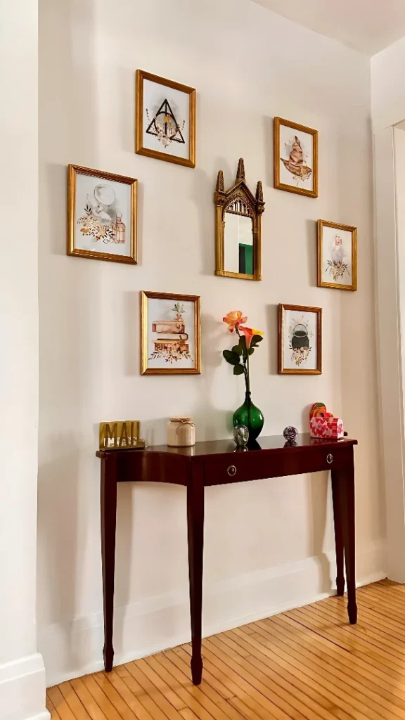
The entryway table that tells you exactly who lives here before you’ve exchanged a single word is either the most personal thing in design or the most risky, depending on your threshold for commitment—and this one committed completely. A dark mahogany console with tapered legs holds a green glass vase with a single orange rose, a brass letter sculpture, a small crystal sphere, and a scattering of small objects with zero pretension about being a styled tablescape. Above it, six watercolor prints of magical-world objects in matching gold frames orbit a gothic arch mirror in the same warm metal, creating a gallery wall that is unambiguously specific to someone’s actual enthusiasms. The warm bamboo floor beneath it ties the whole nook together. This table doesn’t want to impress anyone who isn’t already on its wavelength, which is precisely what makes it work.
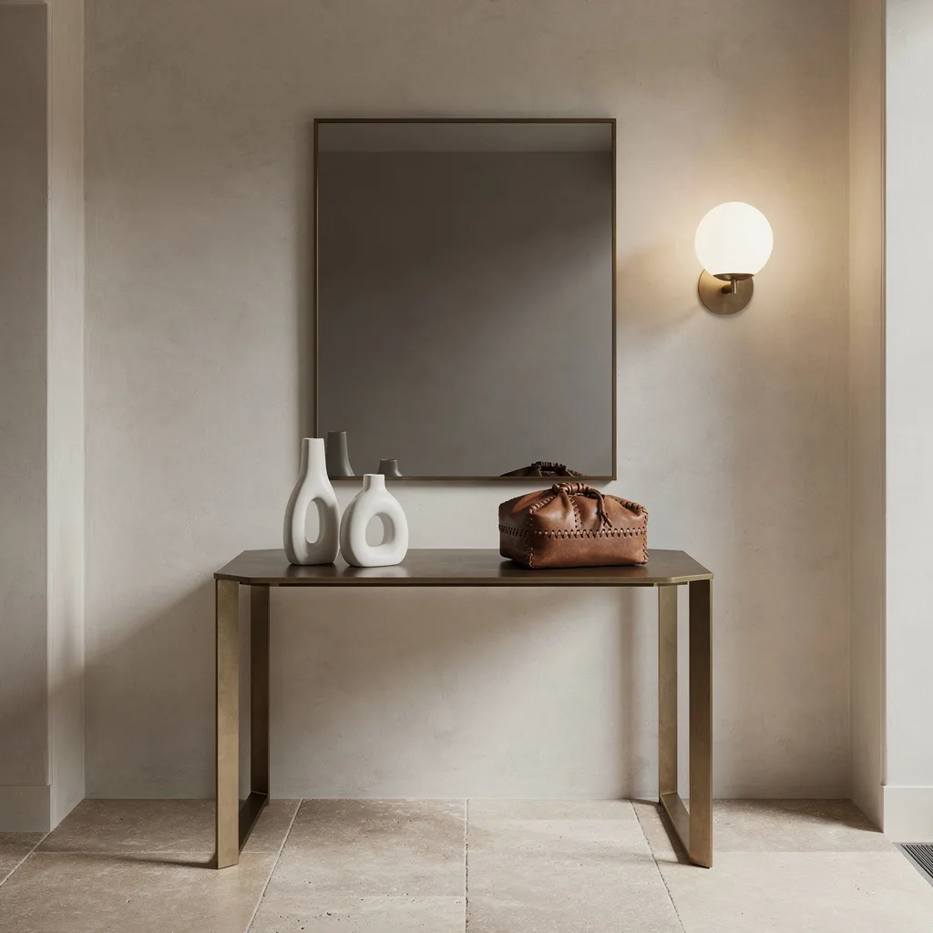
Industrial Grid Mirror with a Crystal Chandelier That Had No Business Working This Well
The large-format iron grid mirror occupying most of the wall above this console is the decision the entire setup was built around, and everything else in the composition exists to either reinforce or counterbalance it. The counterbalance is the crystal chandelier overhead—an extravagant, glittering object that has no obvious business sharing a room with an industrial iron mirror and yet produces, in proximity to it, exactly the kind of elegant tension that makes people stop in their tracks. The slim dark wood console below holds a ceramic lamp with linen shade, two stacked books, and a large white ceramic planter with ferns trailing over its edge—quiet, classic, unhurried. An antique leather trunk at floor level in front of the table provides storage while doubling as the composition’s ground anchor. Every element in this setup is pulling slightly against the others, which is precisely what stops it from reading as a coordinated set rather than a genuinely interesting space.
Cream Fluted Console with Gold Mirror and an Olive Tree That Earned Every Inch of Its Corner
The console table setup that wants to feel genuinely welcoming—not generically welcoming in the sense of a hotel lobby, but specifically warm in the way of a space that someone built around their own idea of what arriving home should feel like—is genuinely difficult to achieve deliberately, and this one got there. A cream fluted console on gold frame legs with a single drawer holds a large textured round ceramic vase overflowing with white florals, pampas, and loose eucalyptus at one end—the arrangement large enough to feel genuinely generous rather than merely decorative—and a gold-based ceramic table lamp with cream shade at the other. A round gold-framed mirror above it reflects the room’s natural light and returns it doubled. Two woven seagrass baskets on the lower shelf sit with the ease of objects that were placed rather than stored. An olive tree in a large woven basket in the corner beside the table brings scale that holds its own against the mirror without competing. Every tone is warm, every texture is natural, and the pale blush walls behind it make the whole setup glow in a way that has nothing to do with the lamp and everything to do with how the light moves through the space.
Sculptural Black and Gold Table at a Staircase Landing That Decided It Was a Gallery
The console table positioned beside a staircase has a particular challenge: the staircase is an enormously present architectural element that either becomes part of the composition or dominates it at the expense of everything else. This setup solved the problem by making the table itself so interesting that the staircase becomes the backdrop rather than the subject. A round black and brass table with a studded cone base is as much a sculptural object as a piece of furniture, and it sits at the base of the stair with the specific ease of something that has no anxiety about being looked at. A three-dimensional gold geometric wall sculpture hung beside it echoes the table’s material palette while providing wall-level drama that keeps the eye moving vertically between table and wall rather than settling at one height. Three allium stems in a simple white vase and a matte black bead bowl on the table surface are the entire styling—because the table and the wall piece are doing the work, and adding more would be competing with them rather than completing the picture.
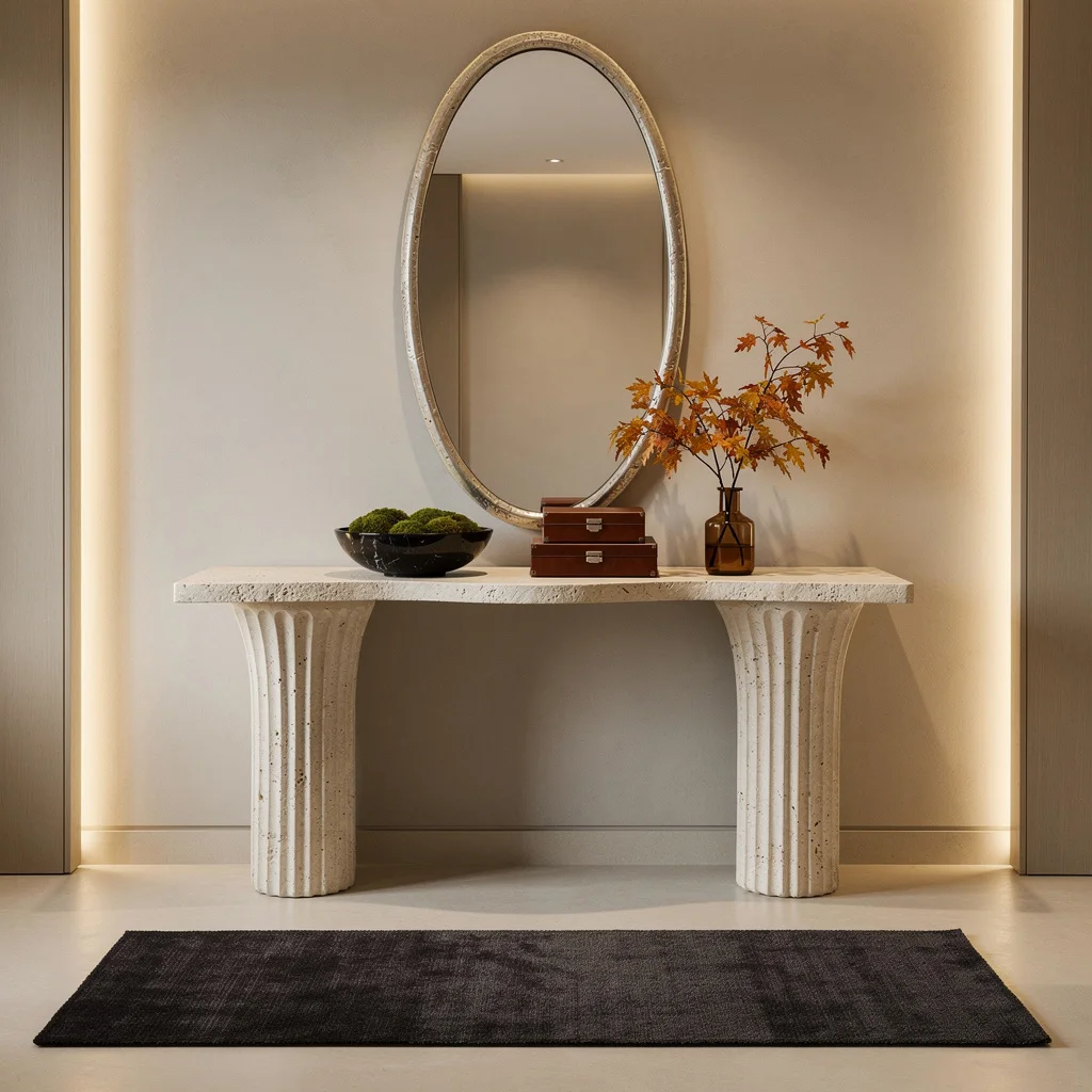
Warm Wood Console with Autumn Styling That Proved Seasonal Decor Can Have a Backbone
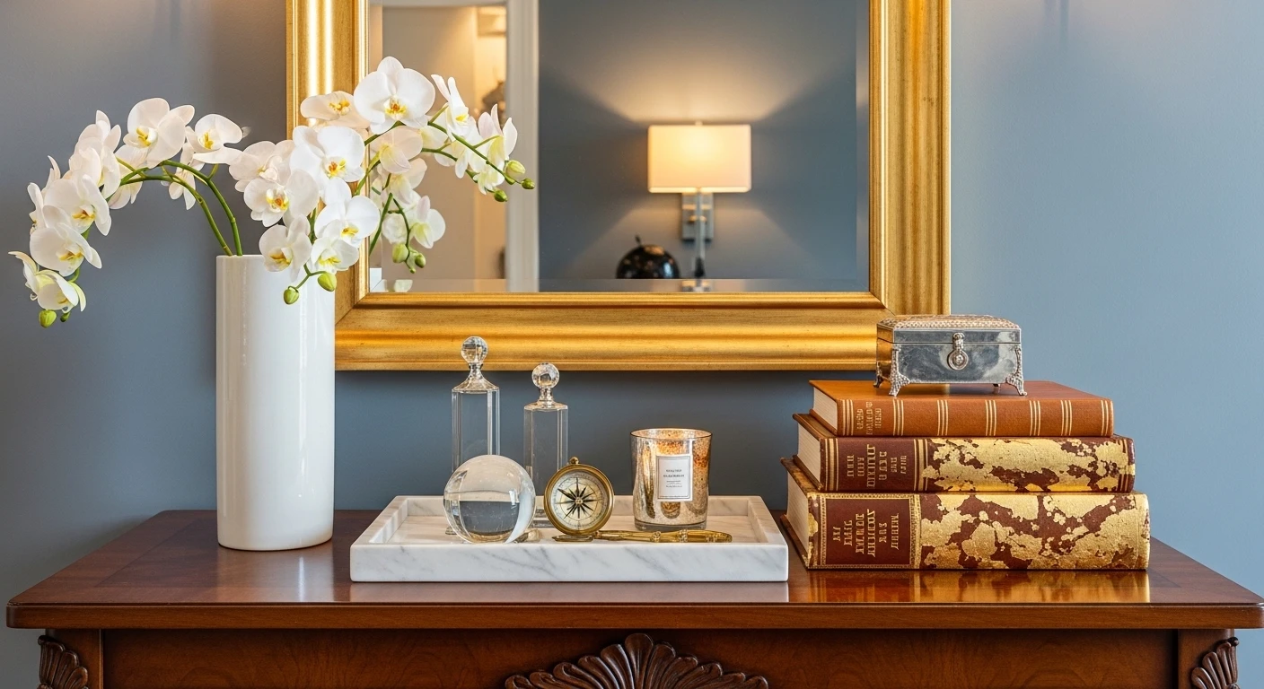
The console table setup that survives the seasons without requiring a complete overhaul every three months is the one where the permanent elements are strong enough to carry the space on their own, making seasonal additions feel like contributions rather than replacements. A wide chunky natural wood console with heavy proportions and a lower shelf holding two upholstered square ottomans in warm linen is the kind of piece that works regardless of what goes on top of it—its material warmth is unconditional and requires no seasonal justification. Amber dried autumn branches in a rough terracotta vase, a large matte ceramic pot lamp with linen shade, brass candlesticks at varying heights, a ceramic bowl, an amber glass pumpkin, and a stack of books with a leaned landscape print: the seasonal layer is confident without being precious, warm without tipping into the kind of autumnal maximalism that looks dated by November. A round black-framed mirror above reflects the arrangement and makes the surface look twice as considered from across the room. This is the table that photographs beautifully in October and requires nothing more than swapping one vase in February to stay current—which is the standard every console table setup should be held to.
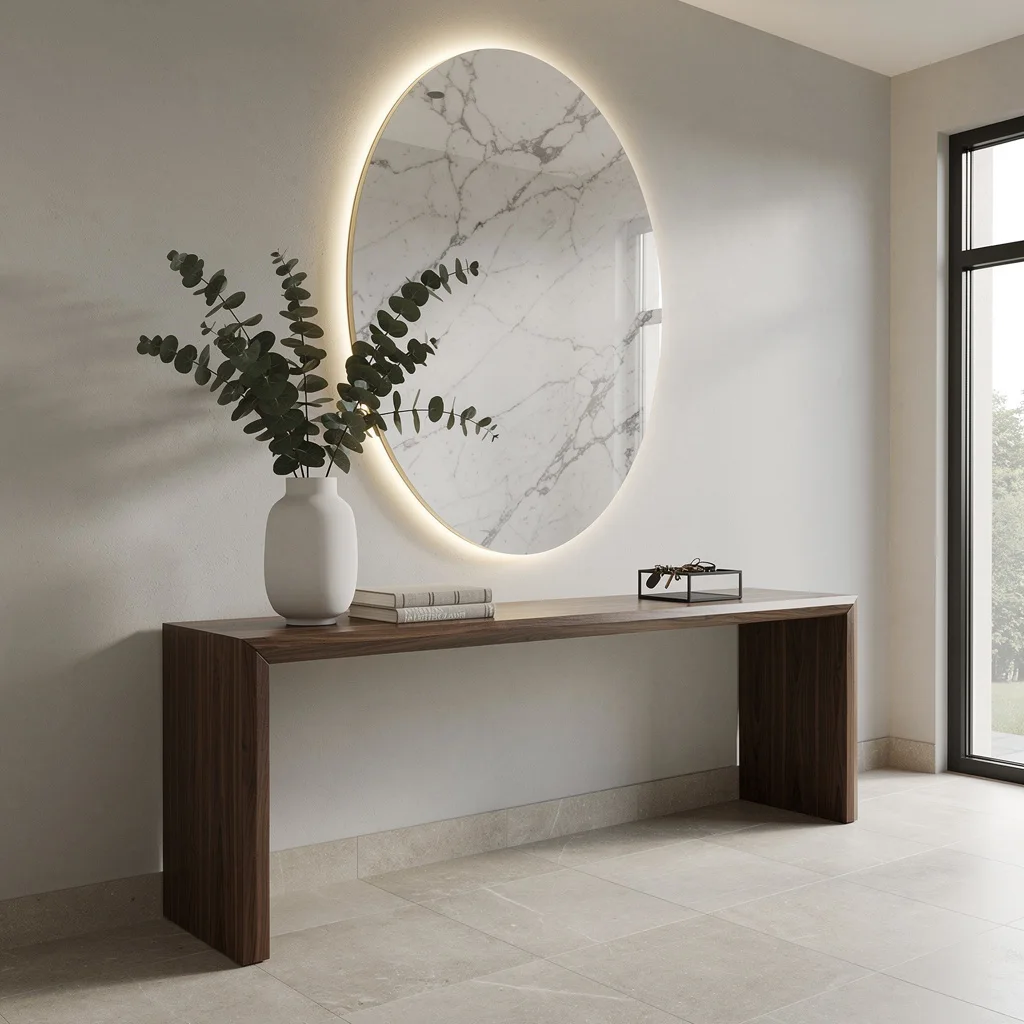
Go Big With Backlit Marble and Walnut—No More Basic
If you’re chasing an entry vibe that screams money and taste (without literally screaming), start with a wall-mounted walnut table—waterfall edge mandatory. Don’t even think about those wobbly IKEA consoles. Slap up an oversized, oval marble mirror, and light it from the back. The glow is your new filter for the entire room. Drop a hand-made white vase with tall eucalyptus stems for height. Stack linen art books to pretend you read, and corral your mess with a minimalist black metal tray. Rule of thumb: Mirrors should never be smaller than your ego—oversize or bust.
Brushed Brass & Crystal: Let Your Entry Flex Its Bling
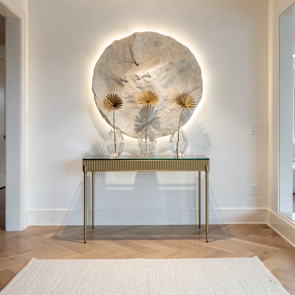
Want an entryway that actually feels airy and expensive—without fake plants and clutter? Use a slim, brushed brass table and a fluted glass top. Don’t cheap out on the table; if it doesn’t reflect light, you’re wasting your cash. Style with a trio of faceted crystal vases, each showing off a single dramatic dried botanical. Pin a circular stone wall sculpture behind for the drama, and light it up with LEDs. Always stagger your vases—never line them up. If your runner isn’t subtle and woven, you’re doing it wrong. Minimalist doesn’t mean boring, it means purposeful.
Ash Wood & Terrazzo: Welcome To Entry-ART School
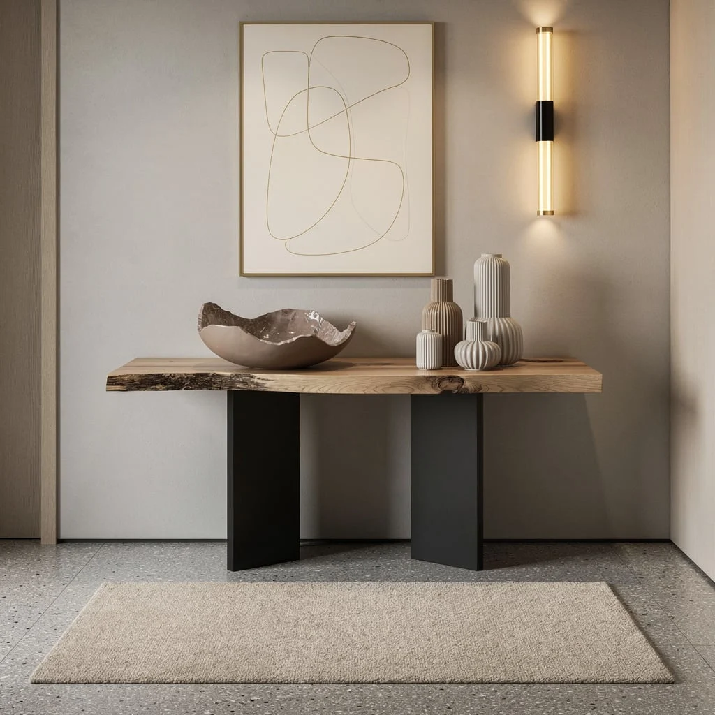
If you want your entry to whisper ‘I could host a gallery opening,’ get yourself a live-edge ash table with black plinth supports. Ignore anything that looks like it belongs in your grandpa’s cabin. Style this bad boy with a sculptural resin bowl and cluster various ceramic vessels—different heights, so nobody gets bored. Pin up abstract line art in cream and gold so your wall isn’t just wall, and catch golden light with a vertical sconce. Real tip: Terrazzo floors beg for a cozy custom wool rug; otherwise, you’ll slip and your dog will too.
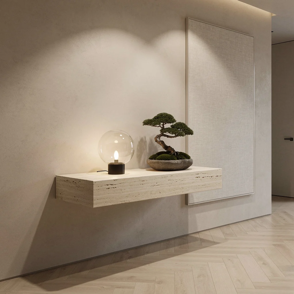
Floating Travertine: Minimalism For People With Actual Taste
If you crave a minimalist entry that isn’t sterile (or cringe), mount a creamy travertine console—floating, slab, sharp corners only. No chunky hardware allowed. Style it sparse: mouth-blown glass orb lamp and a shallow Japanese vase with sculptural moss. Don’t even think about over-accessorizing. Hang a large-format linen art panel for texture. Hit those stucco walls with shadow-casting downlights. Rule: Keep your floor pale oak parquet and your lighting moody. Minimal means every object is a statement, not a sentence. Two objects is max—any more and you’re killing the vibe.
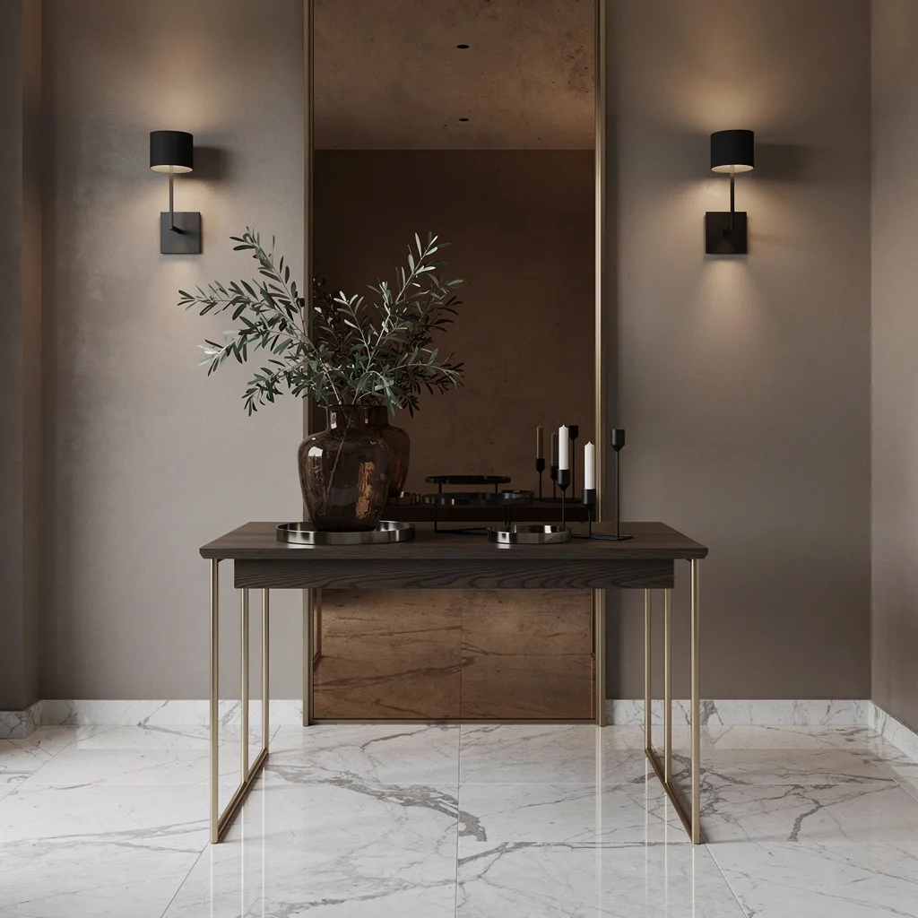
Oak & Brass: Mirror Your Way Into Sophistication
If sophistication is your goal but your space is blah, start with a slim oak table on brass legs. Center it under a full-height mirror clad in bronze-tinted glass—no, not those sad little mirrored tiles. Mount art lights on both sides for instant hotel-lobby energy. Style with a smoked glass vase crammed with olive branches, steel trays, and a blackened steel candleholder. You want polished Italian marble floors and taupe walls to set the mood. Real talk: Keep your mirror tall and your accessories low. This combo tricks the eye, stretching your space—even if your entry is closet-sized.
Sculptural Steel: Make Your Entryway a Gallery, Not a Dumping Ground
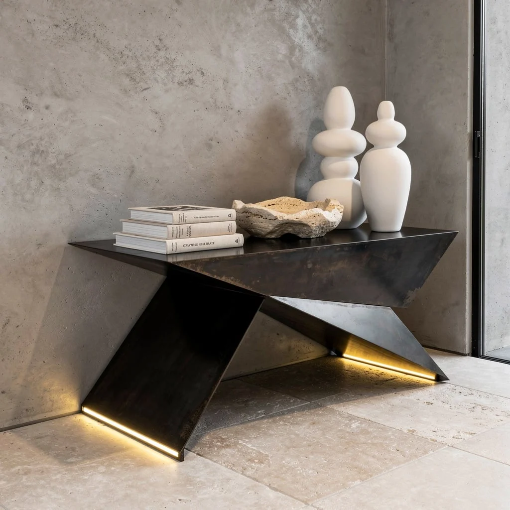
If you’re tired of entry tables doing nothing except collecting junk mail, step up with a geometric blackened steel table sporting built-in LEDs. Style it with neutral rare art books and a hand-carved travertine catchall. Go big: matte white ceramic totems grouped on an edge—bizarre, balanced, beautiful. Finish with raw microcement walls and oversized stone tile floors if you want gallery vibes. Tip: Never crowd your table. Abstract forms are your flex; if your table isn’t communicative, your guests won’t be either. Concealed lighting is your secret weapon—flood, don’t spotlight.
Reclaimed Timber & Bronze: Get Organic, But Not Dirtbag
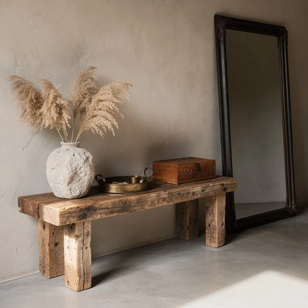
Ground your entry with a rustic reclaimed timber bench table; the dirtier the grain, the better. No faux finishes, please. Style with a rough stone vessel of dried pampas, bronze-finished tray, carved wood box. For height and drama, lean an extra tall, blackened steel mirror with smoked glass against the wall. Keep the floors poured concrete, and finish walls with trowelled plaster. Rule: Only use items that look like you found them in an antique shop—or your coolest cousin’s loft. Organic means textural and real, not cluttered or unkempt.
Dark Walnut & Arched Plaster: Transitional Is Hot Again, Sorry
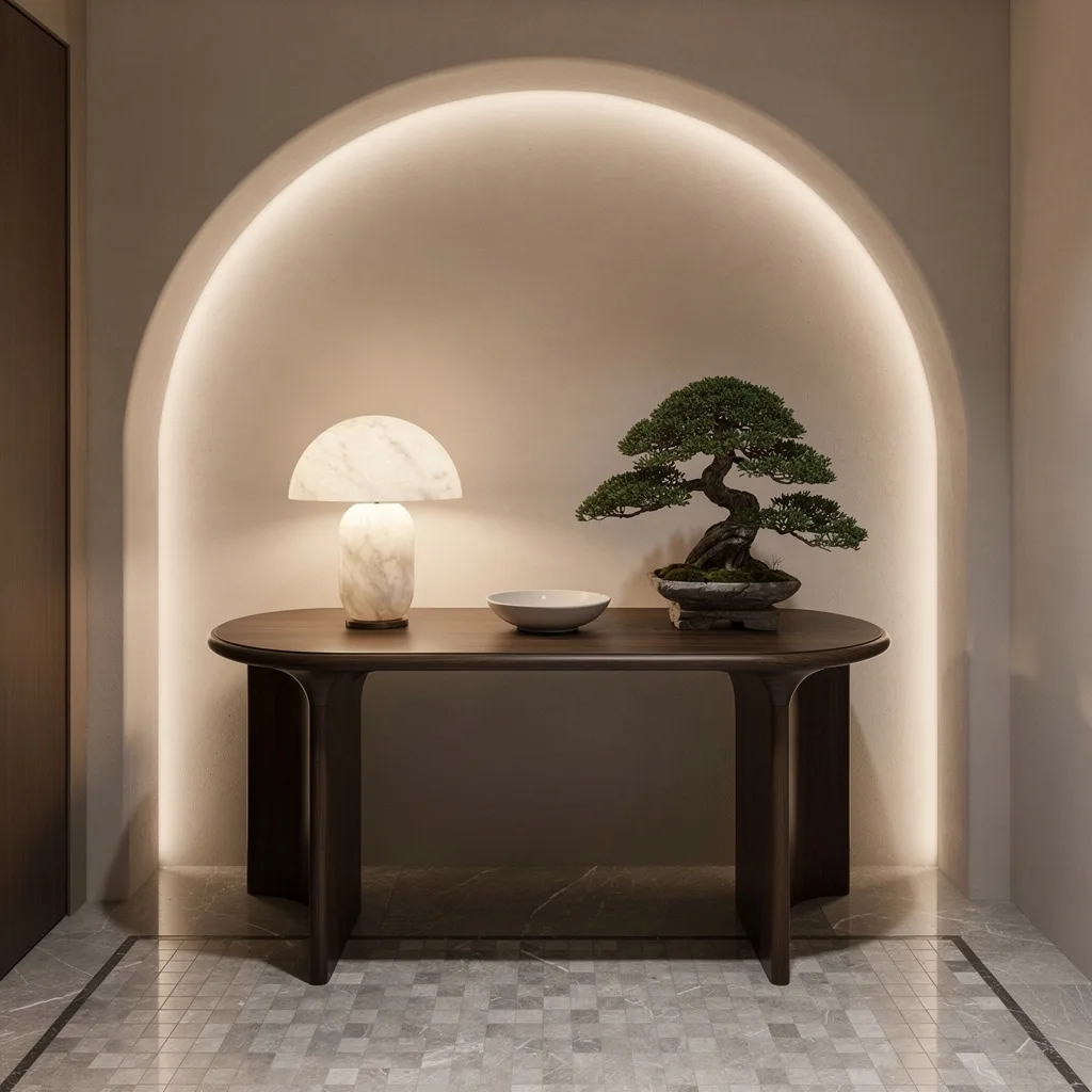
If you want a vibe that straddles classic and modern (and doesn’t bore everyone), grab a console-height oval walnut table with a softly contoured edge. Put it in front of a subtle arched matte plaster wall—no cheesy faux arches. Style with a sculptural alabaster lamp for moody light, a minimalist porcelain dish, and a stacked-stone bonsai planter. You need brushed marble mosaic underfoot, and micro-LED cove lighting washing the wall. Trick: Use low objects so the lamp steals focus. Don’t let the table get crowded—transitional means layering, not pile-on.
Mid-Century Terrazzo: The Cool Kid’s Entry Formula
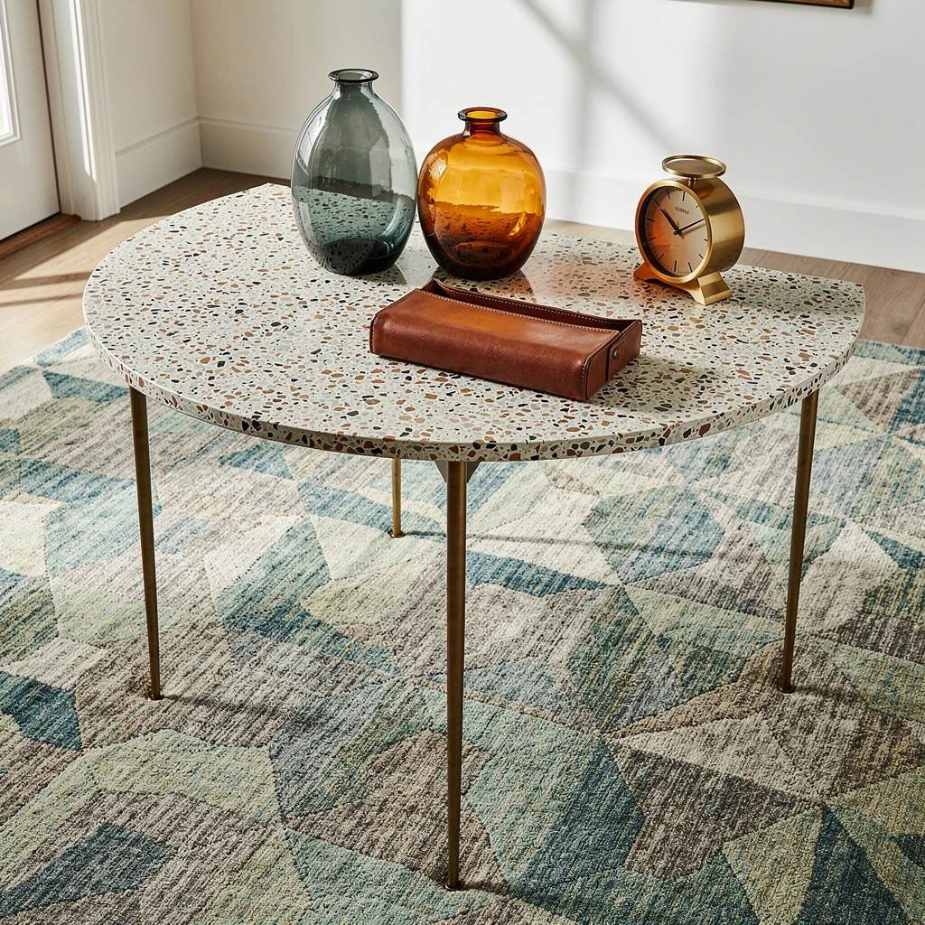
For an entryway that doesn’t scream ‘pretend mid-century,’ pick a half-moon terrazzo top on thin antique brass uprights. Place blown glass vessels in smoky teal and amber together; don’t scatter, cluster. Drop a rectangular leather valet tray and a brushed gold desk clock for realism. Rug must be custom, geometric wool—none of that stiff synthetic stuff. Work with ample natural and overhead light for crispness. Pro hack: Make your accessories reflect the colors in your terrazzo or rug. That way, the whole look reads intentional, not random thrift-store grab bag.
Black Granite & Charcoal Wood: Minimal Luxe = Maximum Impact
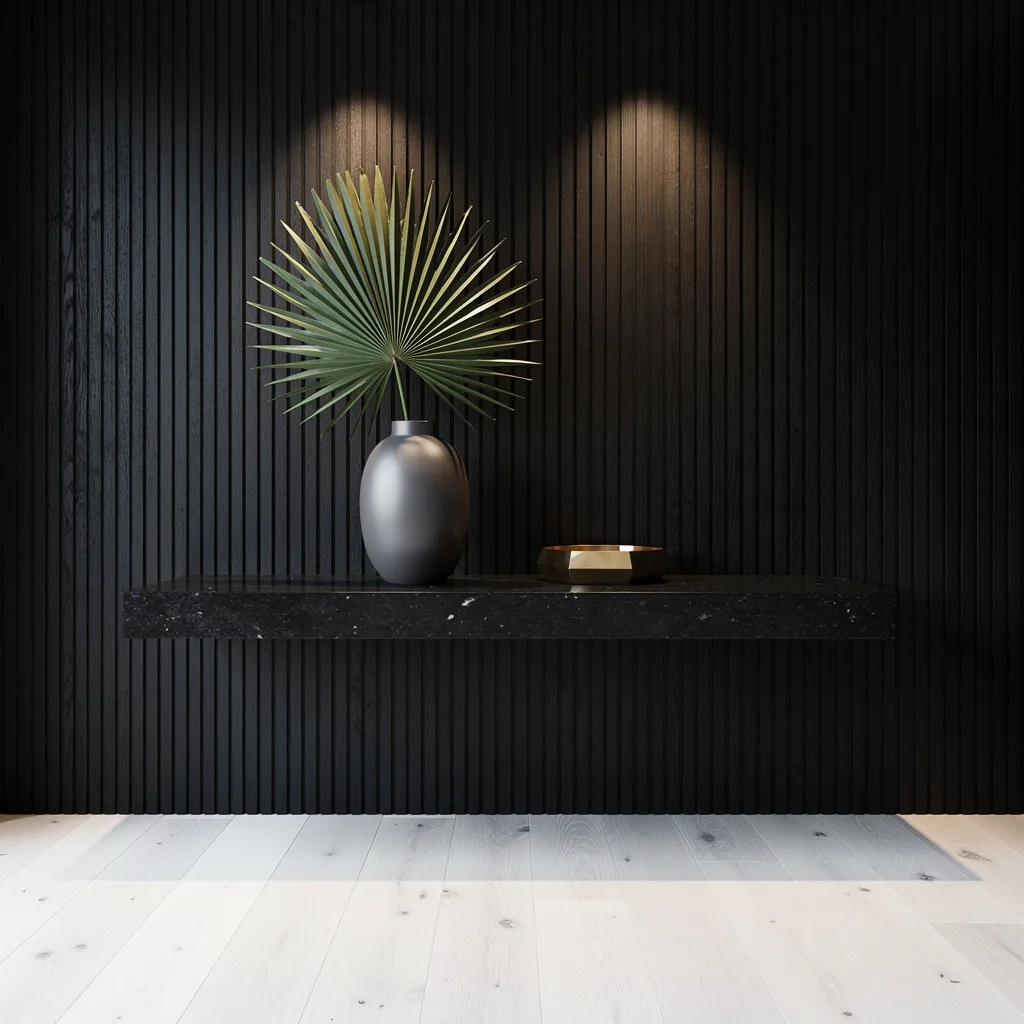
If your entry needs a vibe overhaul, float a seamless black granite table against a deep charcoal wood slat wall—fully cantilevered, so no legs, no excuses. Place a matte oval porcelain vase with a massive fan palm frond for maximum attitude, plus a geometric brushed gold catchall tray. Ground with wide-plank white oak floors, and hit the wall with twin recessed LED washers. Rule: Keep accessories oversized and spaced out. Minimal-luxe needs drama and emptiness, not a clutter of tiny objects. If you’re not using black, you’re not serious.
Patina Bronze: Understated Is Not ‘Invisible’—Use Contrast
If you’re after subtle luxury (without snooze-factor), a custom slimline bronze table is where you start—let the patina show. Hit it with cross-grain light from a wall-mounted opal glass globe lamp for some magic hour vibes. Style with two minimalist white sculptures and a hand-stitched leather catchall. Square smoked grey mirror should frame the scene, not dominate. Floors: muted travertine slab, walls: pale Venetian plaster for soft texture. Real tip: If your bronze isn’t reflective, your lighting flops. Understated needs high-contrast, so don’t let the accessories disappear against your surface.
Fluted Limestone: Elegant Entry, No Grandma Energy
If elegance without stuffiness is your mission, use a fluted limestone console with curved front profile—no sharp edges, just smooth sophistication. Hang a slim elongated oval mirror with an antiqued silver frame above. Style with a low polished black stone bowl full of moss, stacked brown leather boxes, and a tiny amber glass vase with autumn branches. Deep charcoal wool runner is mandatory; otherwise, your floor floats unanchored. Pro move: Indirect LED cove lighting and creamy microcement floors keep things fresh, not dated. Never let organic elements crowd your centerpiece. Less is always more in elegance land.
Final Thoughts
Console table decor that genuinely works starts from a single question that most people skip entirely: what should this table make someone feel in the five seconds they spend with it? Not what should it contain, not what style should it represent, not what does every guide say goes on a console—what feeling should it produce, specifically, in the actual space where it actually lives.
Every table in this list started from a clear answer to that question. The plant table said: comfortable, inhabited, built for the life actually being lived here. The sculptural table said: confident, art-forward, interesting enough to stop mid-step for. The autumnal wood console said: warm enough to feel like coming home regardless of the calendar.
Your console table has a brief moment with every person who walks past it. Give it something worth saying in that moment, and the objects will find their right places naturally. Chase the checklist without the underlying idea, and the checklist will give you exactly what it always gives—a surface covered in appropriate objects that adds up to nothing. The objects are not the point. The feeling the objects create together is the entire point, and it’s worth starting there.