
The entryway wall is the most neglected surface in the average home, and the neglect is so consistent it’s almost impressive. People paint it whatever neutral they painted everything else, hang one mirror that was on sale, and declare the wall decorated. Then they walk past it every single day for years, mildly aware that something is missing but not quite sure what—and the answer, almost always, is that nothing on the wall is actually saying anything.
Wall decor in an entryway operates under different rules than wall decor anywhere else in the house, and most people apply the wrong rules. Living room art needs to coexist with furniture, textiles, and a dozen other design decisions across a space you inhabit for hours. Bedroom art needs to be calming enough to look at when you’re trying to sleep. Entryway wall decor has approximately thirty seconds to make an impression on someone who’s either arriving or leaving, and in that thirty seconds it needs to do something genuinely interesting or it might as well not be there.
The walls in this list are doing something interesting. Some of them are doing something so interesting that the rest of the decor decisions in the room became almost irrelevant—because a wall that commands attention that completely changes what the entry is for entirely. It stops being a passageway and starts being a destination, and that shift changes the experience of arriving home from a mundane daily routine into something that registers, however briefly, as worth noticing.
Why Entryway Wall Decor Keeps Falling Short
The patterns of failure here are specific and almost universal, which makes them worth naming.
One of everything is not a strategy — A single mirror, a single hook, a single small print: this approach produces a wall that feels unresolved regardless of how nice the individual pieces are. Wall decor in an entryway needs either a composition of multiple elements that creates visual weight together, or one element large and confident enough to do the work on its own. The in-between—several small things scattered without relationship to each other—produces something worse than either extreme.
Decorating the wall in isolation from the floor — The wall and the floor are parts of the same composition, and treating them independently produces a disconnect that’s difficult to diagnose but immediately felt. Art that’s too small for the floor space below it looks precarious. Decor that doesn’t connect visually to what’s on the surfaces beneath it looks imported from a different room. The best entryway wall decor is chosen in relationship to the furniture it’s above and the floor it’s grounded in.
Playing it safe with subject matter — Entryways get more abstract prints, more generic landscapes, and more inoffensive neutral art than any other room in the house—because people apply the logic of “it should appeal to everyone who walks in” rather than “it should say something specific about who lives here.” The entries that make an impression are almost always the ones where someone made a choice that was genuinely personal rather than broadly acceptable.
What the Wall Decor Decisions That Actually Work Share
The entryway walls worth studying are operating on these principles, whether they know it or not.
Scale commands respect, timidity invites neglect — Oversized art, oversized murals, oversized mirrors: the wall decor that works in an entryway almost always errs toward too much rather than too little. A large piece creates presence that a small piece simply cannot, and presence is the one quality an entryway wall must have to justify the attention it’s asking for.
The wall becomes the room’s identity — The best entryway wall decor doesn’t decorate the entry—it defines it. The mural that you build the rest of the room around. The gallery that establishes the home’s aesthetic before any other room gets a chance to. When the wall is doing that much work, everything else in the space gets easier because the identity is already set.
Personal beats pretty — An entry wall decorated with things that mean something specific produces a space that feels inhabited rather than staged. The art that was found somewhere interesting, the mural that was painted by hand, the collection that accumulated around an actual interest—these things create warmth that purchased-to-coordinate art cannot replicate regardless of quality.
Entryway Wall Decor Ideas Worth Stealing
The Colourful Foyer That Proved Entryways Are Allowed to Be Seating Rooms
Our new colourful cozy foyer
by u/cassopie in CozyPlaces
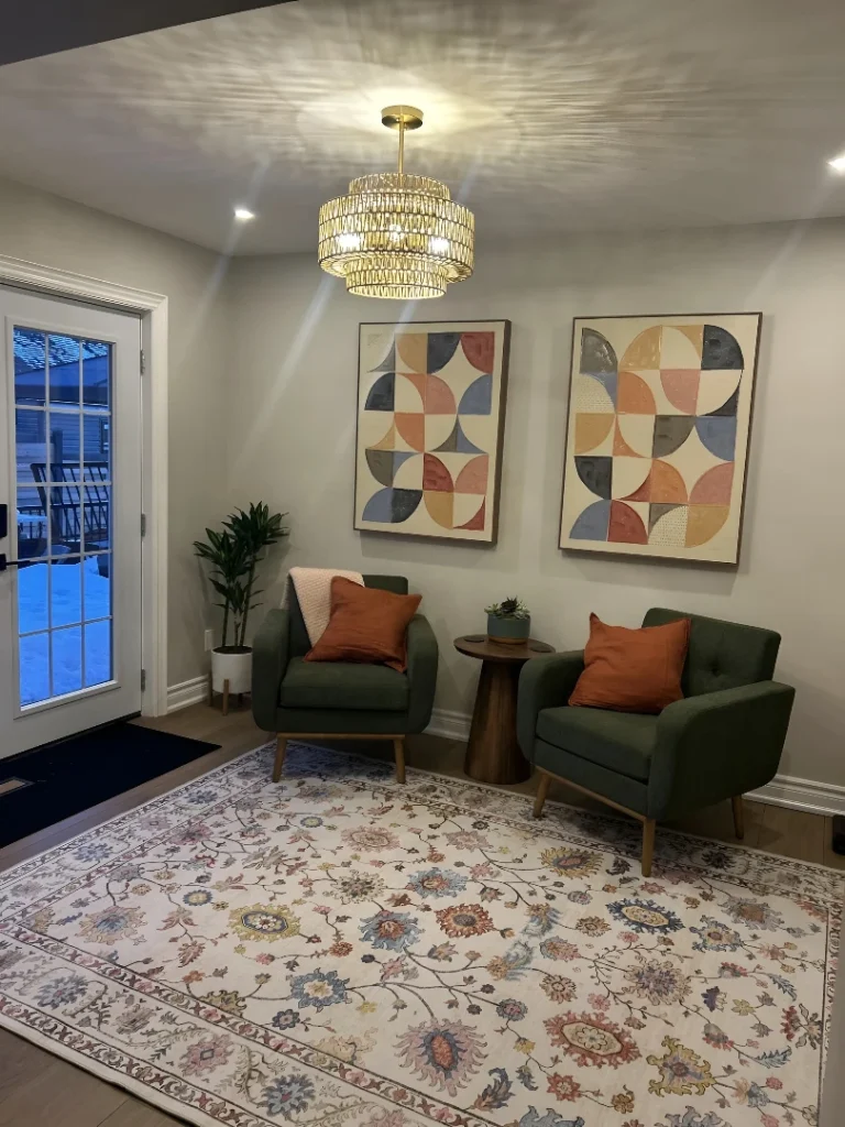
The radical move here was treating the entryway as a room where people actually sit, rather than a space they pass through as quickly as possible, and then furnishing it with enough conviction that the idea holds. Two deep forest green barrel chairs with walnut legs face each other across a small cylindrical side table, both loaded with terracotta velvet cushions that pull the warm tones from the geometric art diptych hanging above. Those prints—muted arcs and quadrants in rust, slate, gold, and cream—are sized generously enough to anchor the full wall without crowding it. A gold multi-tier pendant chandelier overhead casts light in all directions, its reflections playing across the ceiling in a way that makes the room feel lit from everywhere at once. A floral Persian rug in complementary tones grounds the seating zone and makes arriving home feel like walking into somewhere genuinely worth stopping in.
Iron Grid with Greenery Garland and Candle Sconces Going Full Cottagecore Without the Cringe
The farmhouse wall moment that doesn’t make you feel like you’re standing in a curated gift shop requires a specific kind of restraint—enough restraint to let the genuine warmth of the elements come through without tipping into the manufactured sentimentality that gives this aesthetic its bad reputation. An oversized iron window grid panel hung high on the wall provides the structural anchor, a eucalyptus garland draped over it adds organic looseness that the rigid iron frame needs, and a small wooden sign nestled into the arrangement is the one concession to words-on-walls that the entry gets. Two tall iron candle sconces flank the composition symmetrically, providing the kind of warm candlelight that no overhead fixture can replicate. Below it all, a weathered wood bench with linen cushions and a draped throw sits with the specific ease of a piece of furniture that has been in a room long enough to find its place. A wire basket with loose olive branches adds height at the side without demanding attention. The whole arrangement operates on the principle that organic material—living or dried—is doing the atmospheric work that manufactured decor can never quite achieve.
Charcoal Barn Door with Reclaimed Beam Ceiling and a Console Doing the Most
The wall decor here is technically a door, which is either a technicality or the most useful observation in this whole list depending on how you think about it. A wide charcoal-stained barn door with X-brace detail is the dominant feature of the space, flanked by tall narrow sidelights that frame it like artwork rather than treating it as infrastructure. Reclaimed timber beams run across the ceiling perimeter in a warm weathered grey that picks up the door’s tone and grounds the height, and a globe chandelier with iron candle-arm detail provides the overhead light. The walls themselves are white shiplap, and they’re doing exactly what shiplap should do in this context: providing texture and rhythm as a backdrop rather than competing with the door for attention. A long black metal open-shelf console against the right wall with a gold-framed round mirror above it, a brass sconce, and a collection of organic objects—cotton stems, a dark ceramic vase, a woven basket—handles the decorative moment that the opposite wall’s door arrangement has already set up. The jute runner leading toward the door is the floor-level element that connects everything visually from the entry point to the destination.
Botanical Gallery Wall Over a Black Metal Console That Understood Its Moment
A gallery wall in an entryway works when every piece in it shares a strong enough visual language that the collection reads as a whole rather than as a group of separate decisions that ended up on the same wall. This one uses vintage-style botanical and natural history prints—wildflowers, ferns, poppies, fruit cross-sections—in a mix of frame sizes and finishes that look deliberately assembled rather than randomly accumulated, because the subject matter consistency holds everything together regardless of the frame variation. The frames themselves mix gold, white, dark wood, and no frame at all, which would be chaotic in a gallery with mixed subject matter and reads as collected here because every print is speaking the same botanical language. Below the gallery, a long slim black metal console on hairpin-style legs provides surface and lower shelf storage, a gold oval mirror leans against the wall rather than being hung, and a small plant with a black tote bag complete the practical layer. The grey wainscoting below gives the gallery wall a framed quality—the art exists above the chair rail in a zone that reads as the display area, which is both practical and compositionally clean.
Floating Shelves with Candles and String Lights Making a Corner Feel Like an Event
The corner entry that has nothing architecturally interesting going for it can either be ignored or turned into the room’s deliberate focal point, and this one chose the second option with enough commitment that the corner stops feeling like a leftover space and starts feeling like the reason the room exists. Three staggered floating white shelves at different heights carry a collection of candles, small florals, a few ceramic objects, and nothing else—the edit is disciplined enough that the arrangement reads as intentional rather than cluttered. String lights draped loosely behind the shelves provide the ambient glow that makes the whole corner look different after dark than it does in daylight, which is a quality most wall decor doesn’t have. A round black-framed mirror hangs above the arrangement, and at floor level a large matte black ceramic pot with a green plant and a glass lantern holding a cluster of pillar candles complete the vertical composition from ceiling to floor. A woven basket adds texture without disrupting the monochrome palette. This is the entry that cost almost nothing and looks like someone thought about it very carefully, because someone did.
Oversized Feather Mural with a Marble Console That Remembered to Be Glamorous
The large-scale wall mural in a neutral palette is the design move that produces the most dramatically different results depending on execution quality—done half-heartedly it looks like an elaborate wallpaper mistake, done with full commitment it makes the rest of the entry choices look like they were always going to be this good. This mural in blush, ivory, and warm grey with oversized feather forms sweeping across the full wall surface is firmly in the second category: the scale is confident, the palette is restrained enough that it doesn’t fight with anything, and the graphic border panel in black and cream running vertically at one side gives the composition a structured edge that separates mural from wall rather than letting it blur into the surrounding surfaces. A marble-topped console on gold legs below it provides the surface moment, a round gold-framed mirror above handles the reflective function, and two cream bouclé cube ottomans underneath keep the lower level practical without introducing anything that competes with the wall above. Pampas grass in a cream vase adds the one organic note the room needs to stop feeling entirely constructed. The gold door hardware visible at the frame edge is the detail that tells you someone thought about the full composition rather than just the wall.
Go Vertical with Wood Slats and Bronze—Not Your Dorm Room
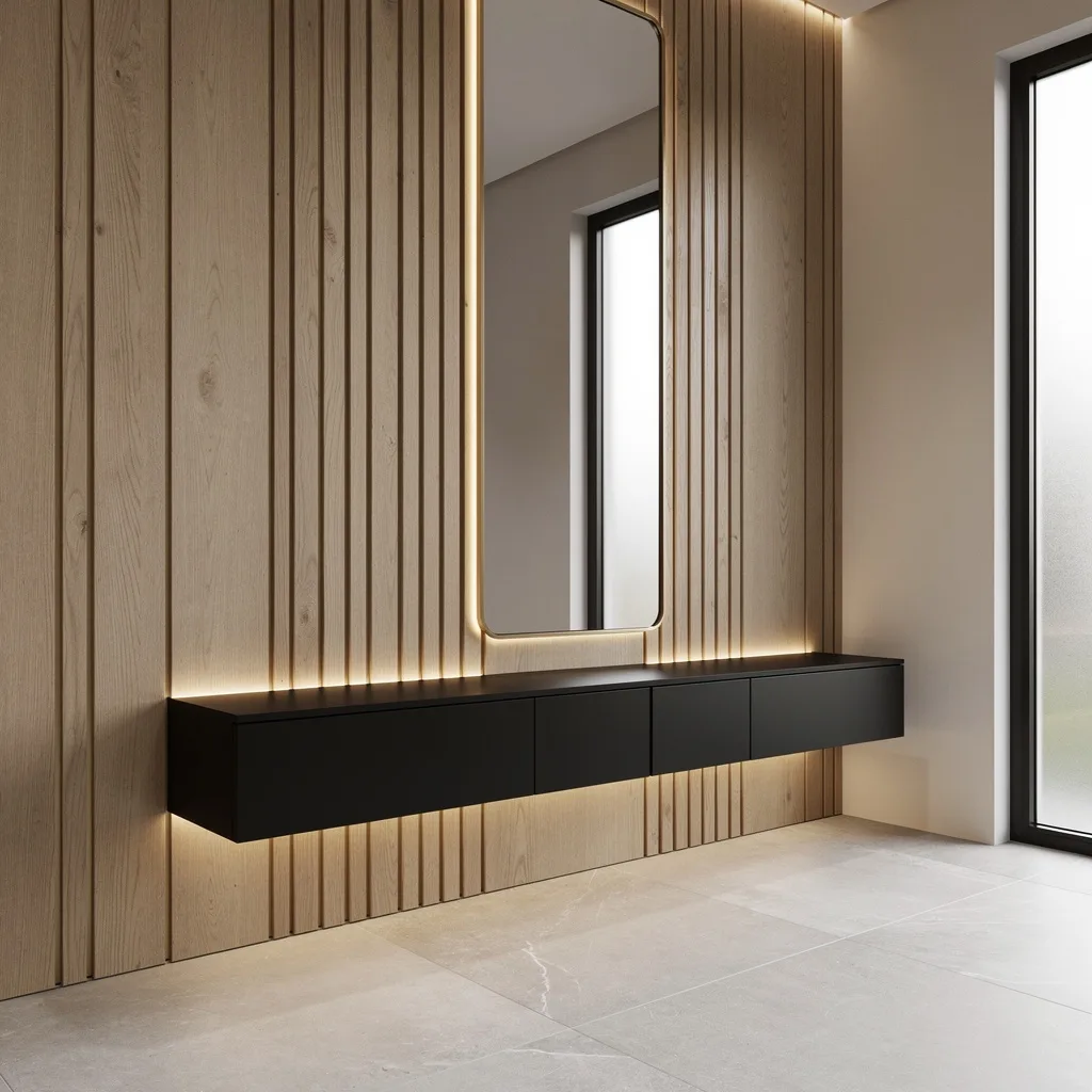
If you want your entry to hit with Scandinavian calm but scream luxe, stack light oak vertical slats from floor to ceiling and sneak in slim bronze inlays. Mount a floating matte-black console for instant sleek points, and kill overhead glare with hidden LED lighting under the console—soft, ambient glow only. Swap sad floor tiles for pale limestone and throw up a tall bronze-framed mirror that actually bounces daylight. Pro tip: Always use layered uplighting instead of one lonely ceiling bulb. Shadows make wood look like money.
Venetian Plaster and Brass Mirrors—Hello, Bougie Arrival
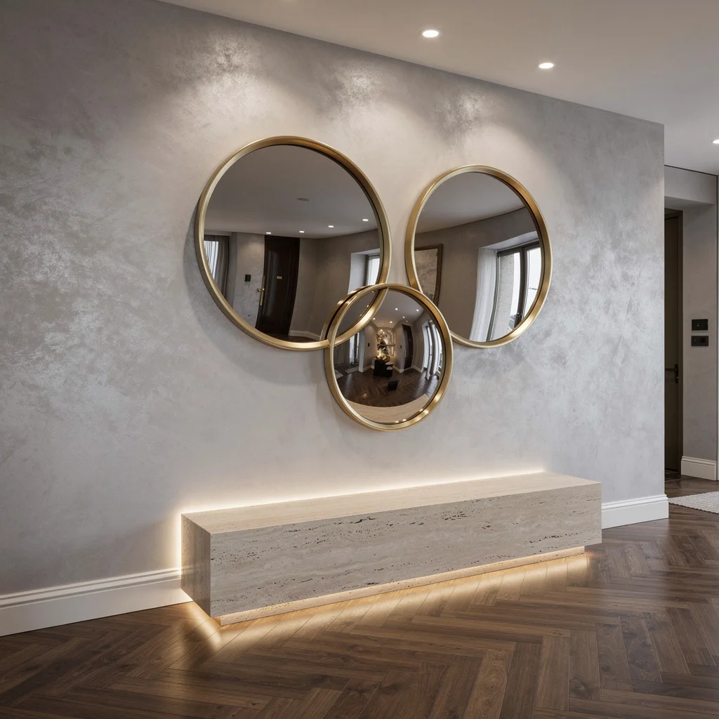
Stop thinking paint is enough. Coat your entry wall with hand-finished Venetian plaster for that expensive texture, then smash three oversized convex brass-rimmed mirrors on it in a freeform cluster. Backlight a monolithic travertine bench—hidden LEDs, obviously—and choose walnut parquet for the floor if you ever want to flex. Install recessed spotlights and let them play off those brass mirrors for real drama. Basic mirrors? Nope. Always cluster mirrors at eye level to maximize light and make your entry feel three times bigger.
Geometric Corian Panels—Go Full Sculptural, Not Full Boring
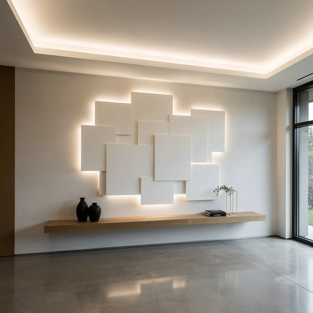
Ready to flex your artsy muscles? Build your wall out in staggered oversized geometric Corian panels, going pure white and mixing depths. Wall grazing LEDs will throw killer shadows, especially if you ditch clutter and set up a minimal oak ledge for your designer crap, not your keys. Pair with polished concrete floors for that industrial-fancy balance. Indirect covelight at double height? Yes, that’s drama. Pro tip: Set panels with varied depth but keep alignment strict. You want art, not a mess.
Blue-Green Glass Tiles—Your Entry Needs More Water, Less Boredom
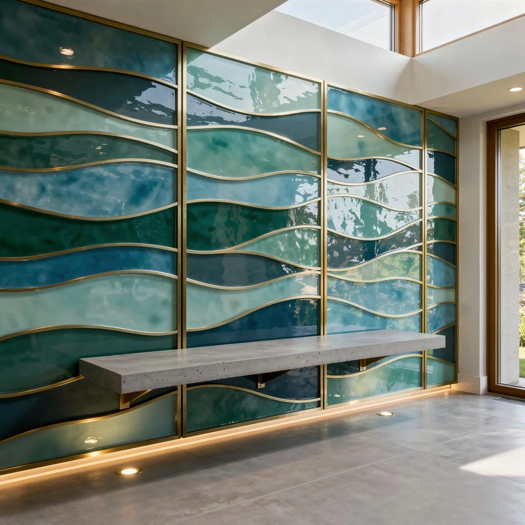
Splash out (literally) and layer glossy blue-green glass tiles in wavy patterns for instant movement. Use linear brass reveals to break up all the color and catch the light so you don’t end up with ‘70s pool vibes. Float a slim concrete bench underneath, anchored by invisible brackets—no ugly supports, please. Natural light from a clerestory window is ideal, but cheat with recessed floor uplighting if you’re stuck with cave vibes. Always install tiles with staggered edges so the pattern feels organic, not assembly-line.
Backlit Onyx—Stone That Actually Glows (Try Not to Mess It Up)
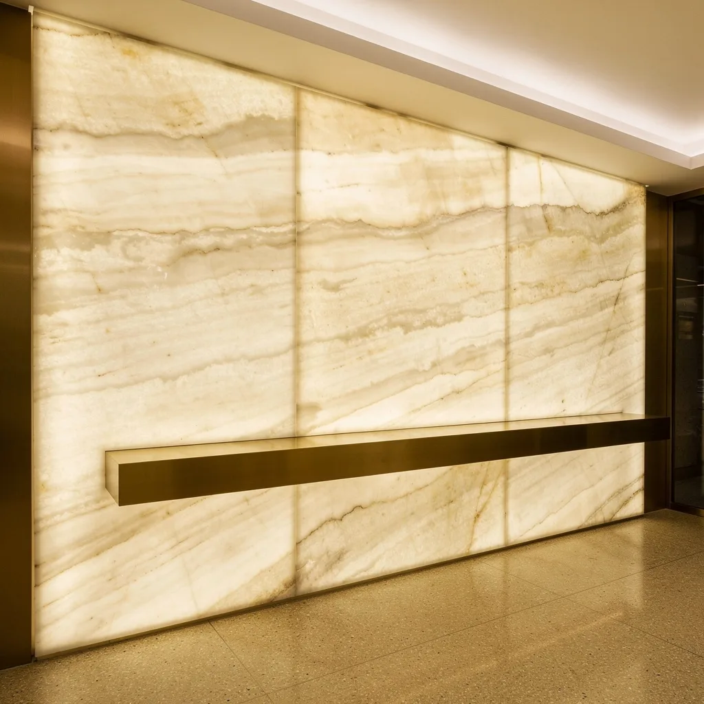
Stop pretending your painted wall is special. Panel your entry in pale striated onyx and blast it from behind with warm LEDs to flex that natural veining nobody else has. Run a floating shelf in burnished brass for bonus glam—and to reflect the glowing stone, not hide it. Go for champagne-toned terrazzo flooring so the space doesn’t feel heavy. Cove lighting up top finishes the mood—don’t skip it. Pro tip: Always backlight your stone, but keep the LEDs diffuse, so you don’t end up with hospital vibes.
Acoustic Felt Panels—Yes, Soft Walls Can Be Sexy
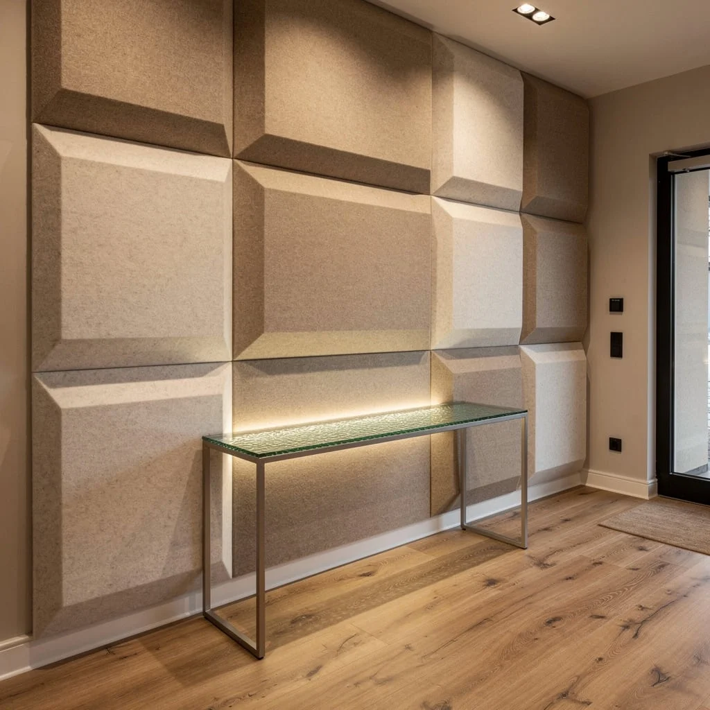
If your entry echoes like a cave, slap up large-format acoustic felt panels in taupe and cream, mixing geometric rhythms and depths. Mount a powder-coated steel console with textured glass top and kick hidden LEDs underneath so your stuff glows without blinding. Brushed European oak for the floor keeps things warm, not bland. Directional spotlights are your friend here: show off the felt geometry, don’t flatten it. Always space panels with deliberate gaps to exaggerate dimension and make your entry way less boring.
Charcoal Reclaimed Brick—Moody Entry, Modern Power
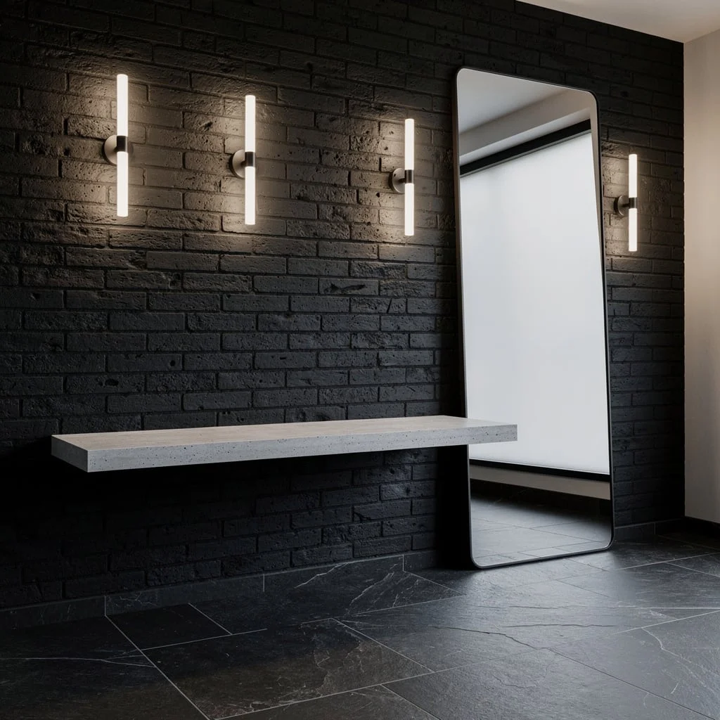
Forget classic red brick; paint that reclaimed stuff ultra-matte charcoal for instant tactile drama. Hang a floating honed concrete shelf (because chunky supports are so last season) and install a full-height, frameless mirror off-center—the weirder, the better. Use dark slate tiles for the floor and finish off with wall-mounted tube sconces for vertical diffused light. Rule: Always paint brick in dark hues for high contrast, and never center your mirror unless you want your entry to look like a dentist lobby.
Walnut Chevrons and Brass—Rich People Patterns Done Right
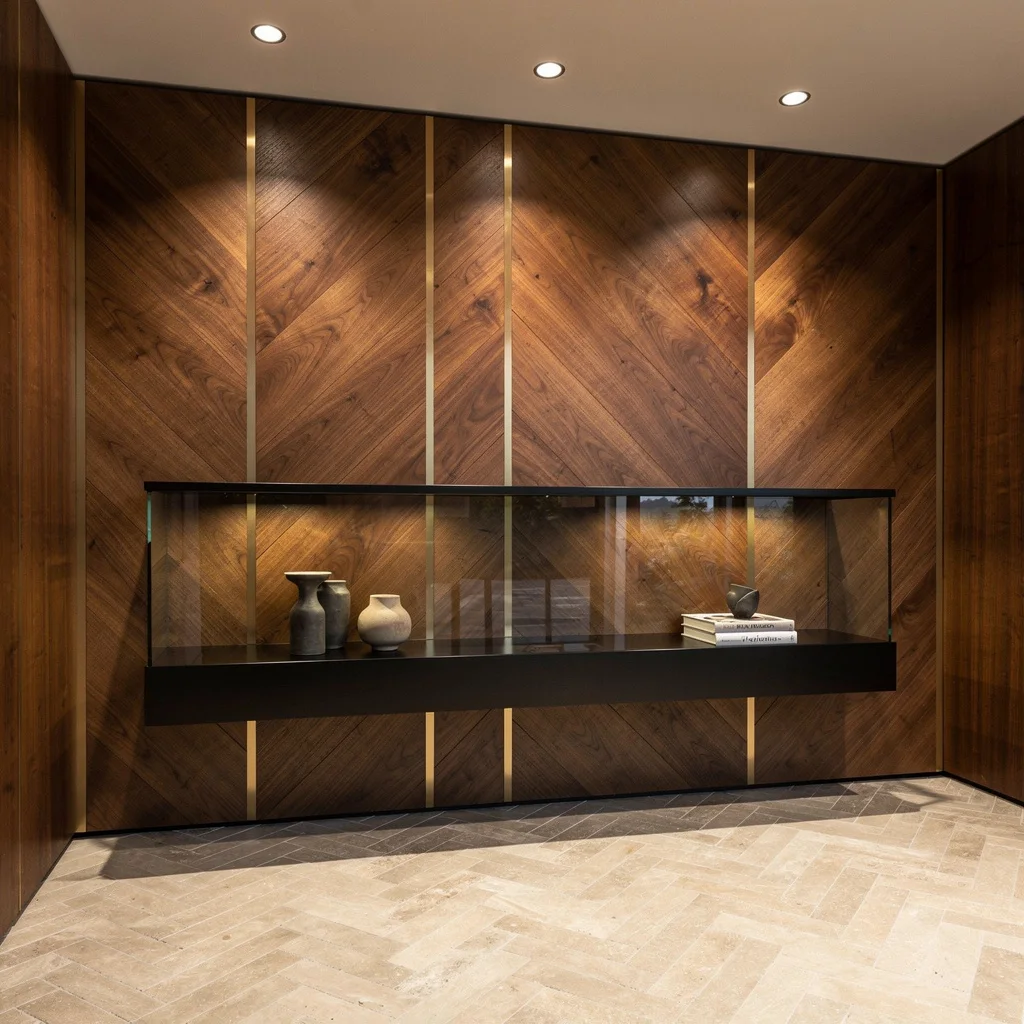
Channel old-money chic and panel your wall in American walnut chevrons with random brushed brass inlays. Float a double-layered ledge in matte black steel and smoked glass for stacking curated decor—no family photos allowed. Go herringbone limestone for the floor to echo the wall pattern. Recessed ceiling spotlights should always wash warm light over walnut, no overhead glare. Always let your brass inlay be random—not planned—so it feels like custom craftsmanship, not a Home Depot special.
Book-Matched Marble—Drama from the Stone Age
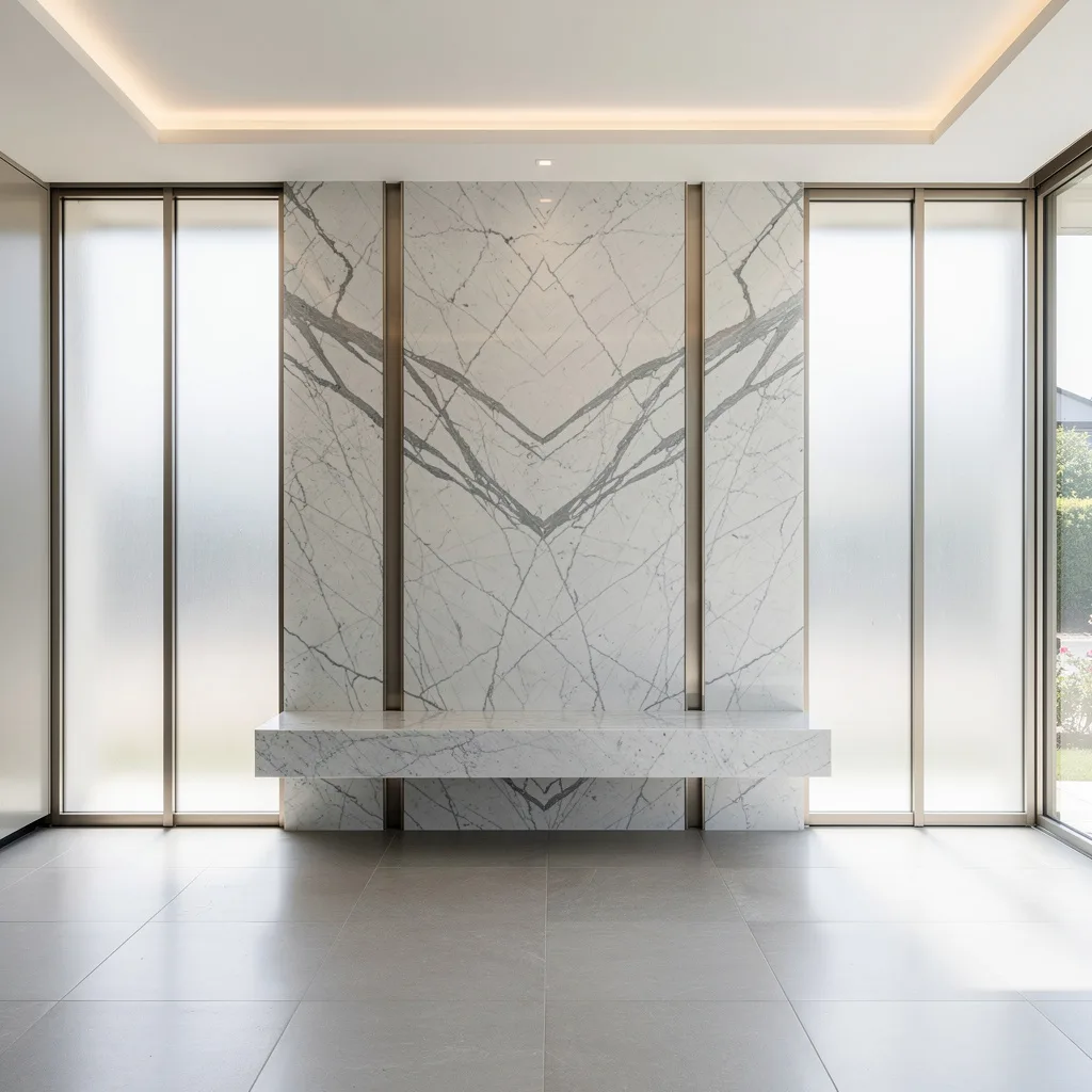
If you want your entryway to serve instant drama, clad a wall in super-thin book-matched marble slabs and throw in vertical brushed nickel battens for architectural detailing. Put a thick marble plinth as seating right in the wall’s lower third—pretend it’s built in, not dropped in. Frosted floor-to-ceiling sidelights are a must to diffuse sunlight, plus pale gray large-format tile floors to reflect all the brightness. Always run marble slabs in pairs; book-match for mirrored veining. Otherwise, it’s just stone, not art.
Metal Patchwork—Entry That Reflects Your Inner Chaos
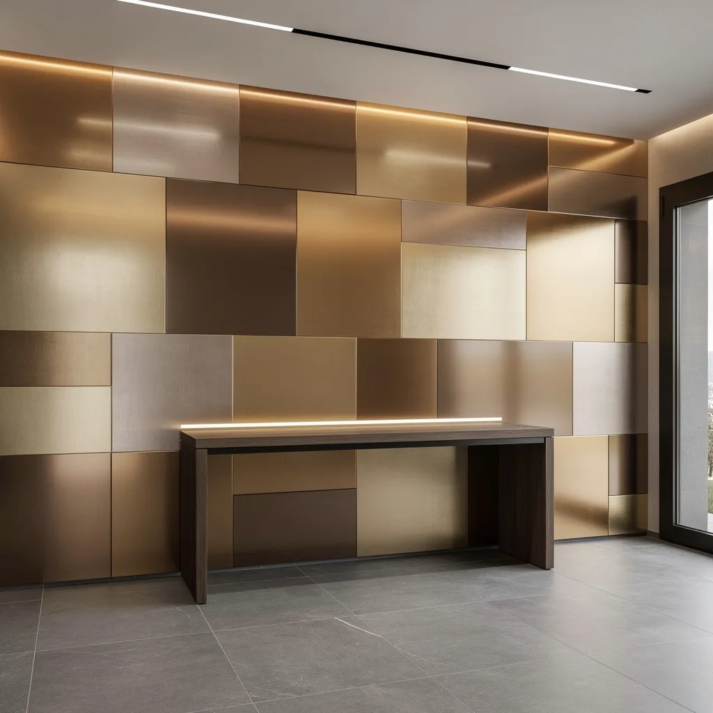
Why settle for basic metal? Mount oversize polished metal tiles in bronze and champagne alternately, flush for max texture, staggered for attitude. Anchor with a backless smoked oak console table—slim lines only—and hide an LED bar underneath so reflections dance. Throw in muted gray porcelain tile floors as hard contrast. No big overheads here; rely on hidden linear diffusers for soft ambient light. Always use different finishes in your tiles for visual depth, otherwise it’ll look flat and cheap.
Textured Concrete & Eucalyptus—If You Want Modern, Go Full Brutalist
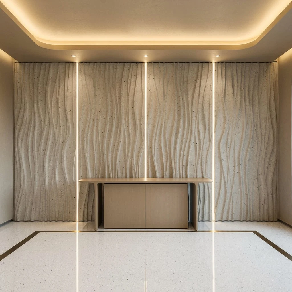
Ready for grown-up entry taste? Clad your focal wall in sculptural concrete panels with dramatic deep grooves, then set a slender matte eucalyptus console—bonus points for integrated vertical LEDs so your wall texture pops without going club lighting. Lay polished white terrazzo and frame it in bronze trim, because borderless floors are lazy. Overhead, a concealed cove emits golden glow for gallery-feels. Always line up grooved panels vertically to stretch the room taller—horizontal lines just make your whole entry look wider and off-proportions.
Final Thoughts
Entryway wall decor that genuinely transforms a space shares one quality across every style, every budget, and every approach: somebody made a decision rather than a compromise. The hand-painted mural that took days. The gallery assembled around a specific subject that someone actually cares about. The iron grid arrangement that was hung rather than leaned. The mural that covers every surface in a single bold color because half-measures weren’t going to get there.
The walls that don’t work in entries—and you know the ones—are almost always the result of caution. Art chosen not to offend. Colors chosen not to commit. Scale chosen not to risk. The accumulated result of all that careful not-doing is a wall that says absolutely nothing, which is somehow worse than a wall that says the wrong thing—because at least the wrong thing is evidence that someone tried.
Your entryway wall is the first interior surface that tells people who you are. It deserves a sentence with a point of view rather than a paragraph of disclaimers. Pick something specific, execute it at the right scale, and commit to it completely. The entries worth remembering always did.