
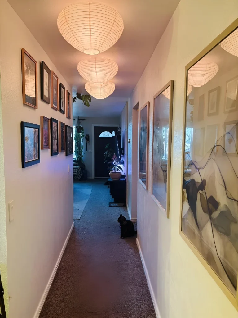
Hallways get designed last, budgeted least, and thought about almost never—which is remarkable given that they’re the connective tissue of every home, the space every single person moves through multiple times a day without once stopping to notice anything. The corridor gets whatever paint was leftover from another room, a few frames hung at approximately the right height, and the quiet resignation of a space that knows it will never be anyone’s priority.
The accent wall changed that calculation somewhat, but most hallway accent walls are executed with the same low ambition as everything else in the corridor. A different color on one wall. Maybe some board-and-batten that stops at shoulder height. The kind of thing that shows up, technically qualifies as a design decision, and produces approximately nothing in terms of experience. You notice it was done and immediately stop noticing it, which is the least a design choice can aspire to.
Hallway accent walls that genuinely work do something most rooms can’t: they turn a passageway into a sequence of experiences. The gallery wall that asks you to slow down and look. The 3D geometric panel that makes the wall itself a destination. The full-coverage damask wallpaper that makes moving through the corridor feel like moving through somewhere with opinions. These aren’t walls that got a different coat of paint. They’re walls that changed what the hallway is for.
Why Hallway Accent Walls Usually Underdeliver
Going bold on one wall while leaving everything else untouched is the mistake most people make. A dramatic surface surrounded by builder-grade baseboards, contractor-white ceilings, and floors that were never really chosen makes the accent wall look like an isolated experiment rather than a design decision. The wall needs the rest of the hallway to meet it at its level—not necessarily with matching drama, but with enough intention that the treatment feels like part of a whole rather than a panel propped against an unfinished backdrop.
Choosing a treatment that doesn’t travel the corridor compounds the problem. A feature wall at one end with nothing responding to it along the length creates a destination without a journey—and hallways are fundamentally about the journey. The treatments that feel designed are the ones where the decision extends in some form along the full length of the space, whether through the same material, a complementary one, or a contrast deliberate enough to read as planned rather than accidental.
What the Hallway Accent Walls Worth Learning From Share
Scale chosen for the corridor specifically—not imported from a different context—is the quality every successful hallway treatment has. A motif too small for the corridor’s length reads as busy without presence. An element too large overwhelms a narrow space into feeling like a tunnel. The hallways that work sized their decisions specifically for a space this directional and this proportioned, which is a different calculation than sizing for a living room or bedroom wall.
Light treated as part of the design, not left to chance, is the other consistent quality. Hallways are often the worst-lit spaces in the house, and an accent wall that disappears at night has only done half its job. The corridors on this list are lit with enough intentionality that the material—the wallpaper pattern, the panel relief, the art—is visible and deliberate at every hour, not just in the afternoon when the light comes through from the right direction.
Hallway Accent Wall Ideas Worth Stealing
The Paper Lantern Gallery Corridor That Made Long and Narrow Work For It
Long japandi hallway
by u/justashhere in CozyPlaces
Long narrow hallways make most people nervous, and the nervous response—pale colors, minimal art, nothing that might make it feel tighter—is exactly what turns architectural presence into quiet desperation. This corridor chose the opposite direction. Gallery-dense mixed framing fills the left wall entirely, warm wood and dark frames creating depth that rewards slowing down rather than rushing through. Oversized gold-framed canvases scaled to full wall height on the right make the corridor feel grand rather than pinched. Three Noguchi paper lanterns running the ceiling length provide warm diffused glow that transforms the whole passage into something that feels inhabited rather than merely traversed.
3D Geometric Feature Wall That Turned a Plain Entry Into an Architectural Moment
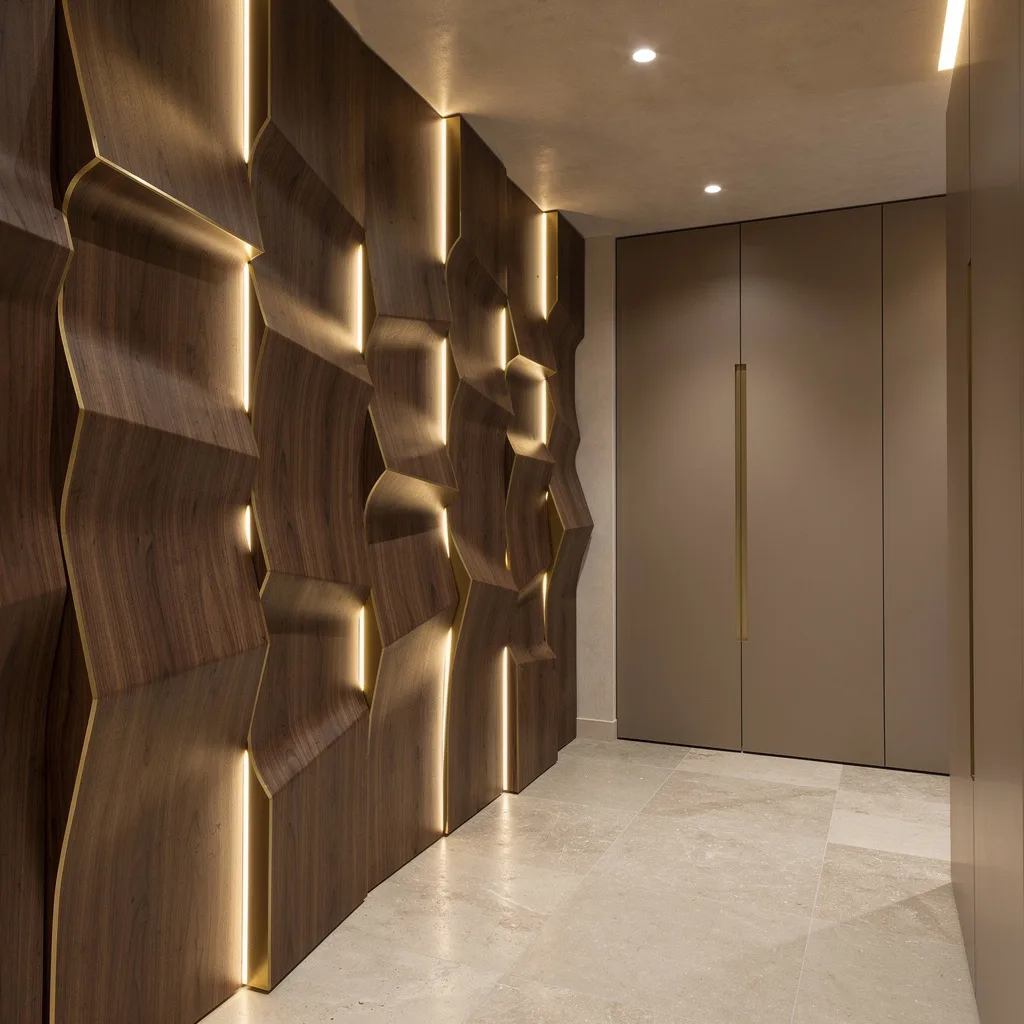
This is what happens when someone commits to relief over color—and discovers that a surface changing with every shift of light is more interesting than any flat paint decision could be. Full-height charcoal 3D panels with irregular geometric channels catch the overhead recessed lighting at constantly shifting angles, making the pattern visible and alive rather than static. A slim black console with a crystal lamp and gold accessories sits in front of it, their reflectivity picking up the spots and adding light back into the dark surface. The high-gloss white tile floor reflects everything upward, preventing the charcoal wall from making the space heavy.
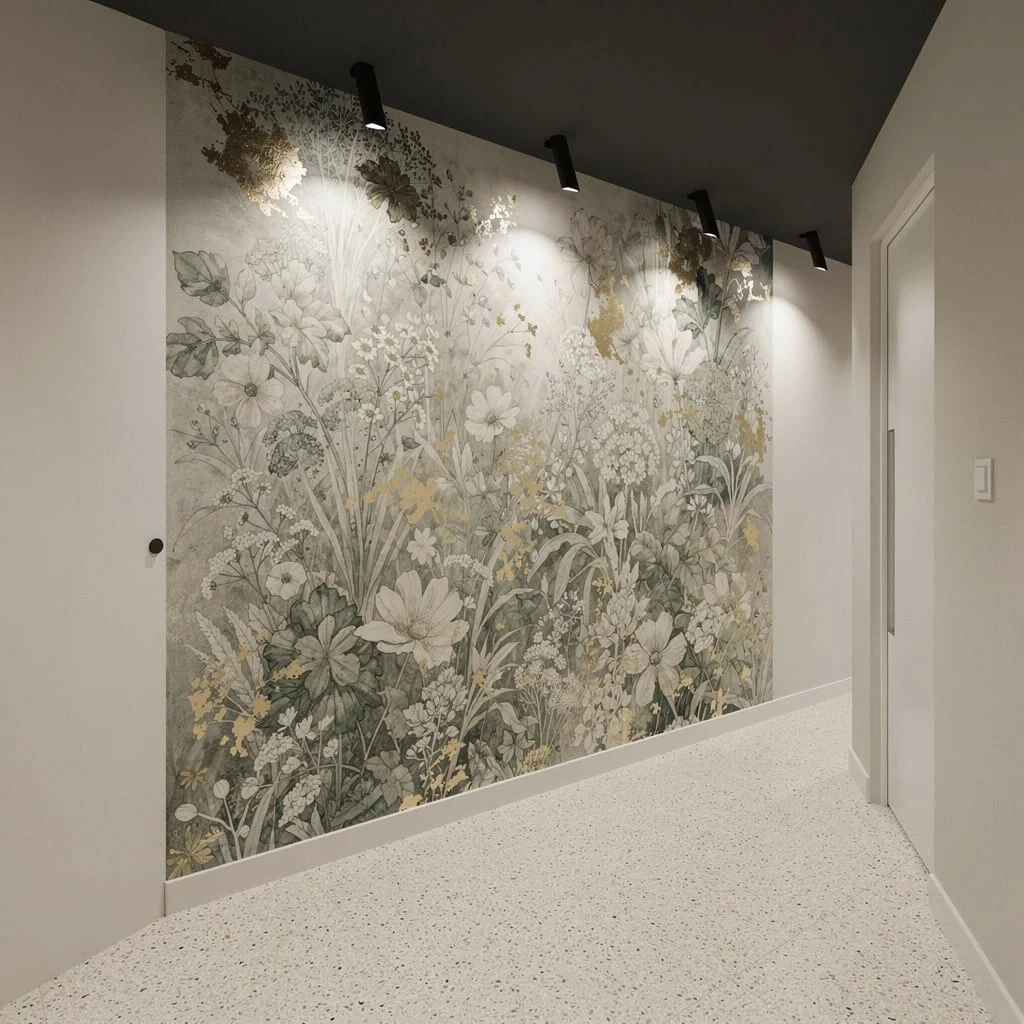
Morris-Inspired Botanical Wallpaper with Dark Wainscoting That Treated the Corridor Like a Room
The hallway that borrows the full material ambition of a Victorian drawing room makes the argument that corridors deserve the same investment as the spaces they connect. Dense botanical wallpaper in warm greige sits above deep charcoal board-and-batten wainscoting, each element giving the other context it couldn’t generate alone—the intricate pattern needs the dark base to avoid floating, and the wainscoting needs the pattern above to avoid feeling like a half-finished project. Two black-framed prints at mid-height embed themselves in the design rather than sitting on top of it. A crystal chandelier overhead introduces the one moment of sparkle into an otherwise entirely texture-driven scheme.
Dark Paneled Hallway with Gold-Framed Art Where the Staircase Becomes the Backdrop
Deep charcoal panel molding covering the full corridor wall gives the staircase alongside it something to push against compositionally—the dark horizontal surface making the oak treads and glass balustrade read as lighter and more architectural than they would against a pale wall. A large gold-framed illustrated print holds its own against the near-black panels because the frame’s warmth and the artwork’s ochre tones are assertive enough at that scale. A fiddle leaf fig at floor level provides the organic counterpoint the dark walls need to feel designed rather than gloomy. Recessed ceiling lighting runs the length and keeps the dark treatment from absorbing too much of what it’s given.
Teal Damask Corridor with Brass Sconces That Refused to Be Transitional
The hallway that covers every surface—walls, moldings, door surrounds, built-in cabinetry—in the same deep teal damask and matching paint stops being a passageway and becomes a room in the fullest sense, its tone-on-tone pattern shifting between flat and textured as the light moves through it. Brass candle-arm sconces at regular intervals provide the warm directional illumination the damask needs to reveal its depth. A gilded baroque mirror above the built-in console doubles the corridor’s perceived width while reflecting the sconce warmth back into the space. A vintage Persian runner in deep reds and navies introduces the one warm counterpoint the saturated cool teal needs to feel complete rather than cold.
Botanical Grandeur: The Hallway That Went to Finishing School and Has Opinions About Wallpaper Provenance
Sage green paneling and detailed molding frame a section of the most extraordinary botanical wallpaper — hand-illustrated birds, flowering branches, and dense foliage in a dark background that makes it feel like a window into an overgrown garden rather than a flat surface. Herringbone walnut floors run the full length, adding warmth and movement that keeps the space from feeling stiff. An antique inlaid chest with a marble top sits beneath a gilded mirror flanked by brass candle sconces, styled with a single dramatic branch arrangement in a bronze urn — nothing more, nothing fussier. This hallway works because it pairs maximum visual richness with maximum restraint in the styling, letting the architecture and wallpaper do the talking while the furniture and objects simply support the story rather than compete with it.
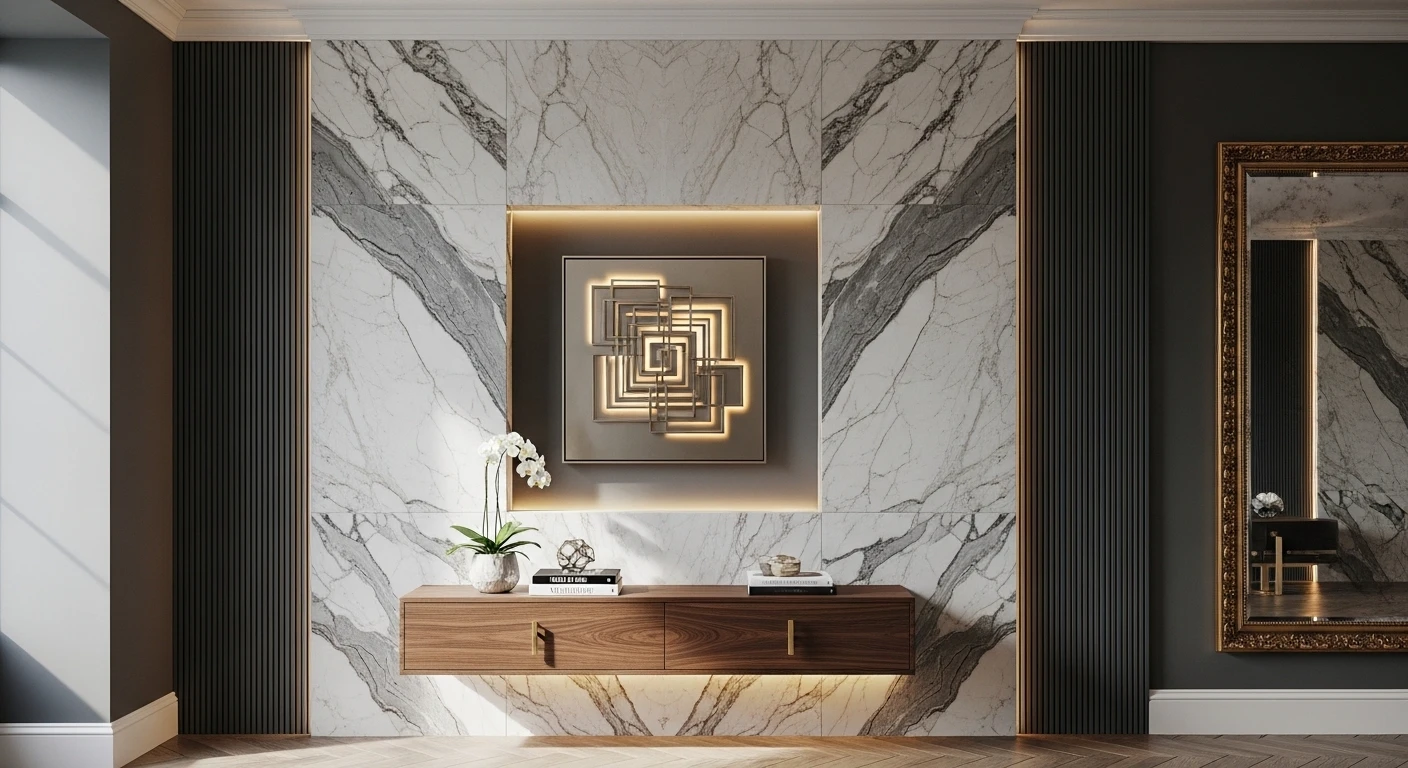
Go Sculptural with Walnut, Brass, and Fashion Lighting
Want your hallway to hit peak luxury? Go all-in with laser-cut walnut panels sporting brushed brass edges. The secret sauce is playing with panel depths—so stack them, layer them, make that wall practically jump out at you (without the usual blandness). Get sneaky with recessed LED strips running behind the brass for shadow drama that’ll make your neighbors jealous. Don’t overthink the rest—limestone floors and muted cabinetry keep things grown-up. Always use vertical lighting if you want your statuary wall to flex those contours; horizontal shadows are for amateurs.
Channel Modern Gallery Chic with Marble Tiles and Steel
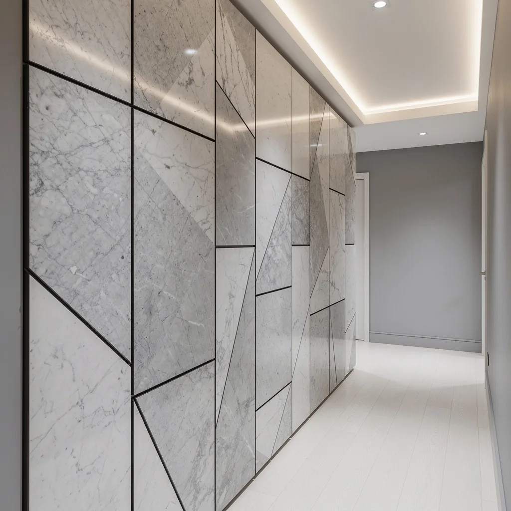
Ready to flex your inner art collector? Smash together oversized geometric marble tiles and blackened steel seams for a wall that says ‘I don’t do basic.’ Alternate matte and polished finishes so your hallway doesn’t fall flat. Flood the upper half with sneaky linear uplighting, but skip the harsh overhead glare—cove lighting keeps things smooth. Pair white oak planks on the floor for a low-key, high-class vibe. Never forget: your accent wall is a statement, not a monologue. Keep surrounding paint chill, but ditch anything too try-hard.
Botanical Mural Magic—Hand-Painted Luxe, Not Grandma’s Wallpaper
Want your hallway to feel like MOMA, not Motel 6? Commission a pro for a hand-painted botanical mural and make sure they sneak in metallic gold accents. Think muted greens and grays for layers instead of loud distractions—precision beats punch. Pop in adjustable picture lights to focus on the mural (not your dirty sneakers) and let terrazzo floors set the foundation. Pro move: keep your ceiling dark and matte for unexpected drama, but always spotlight your art wall—your mural isn’t shy, so don’t hide it.
Glass and Chrome—Welcome to Your Bright, Boujee Hallway
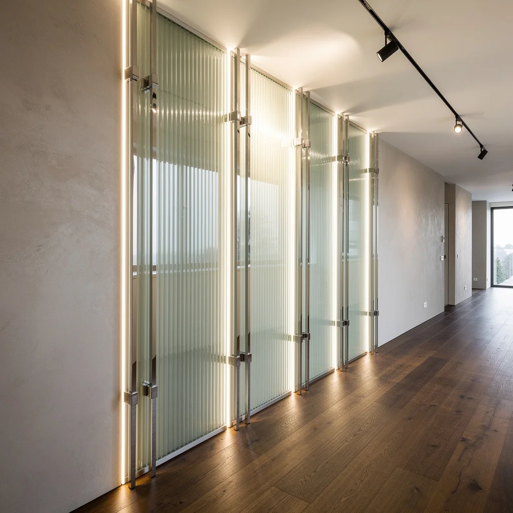
Think hallway, think light play. Ditch drywall and stack oversized ribbed glass panels vertically, separated by slim polished chrome for extra bling. Hide LED strips in those edges for glowing borders that scream designer, not DIY. Lay down smoked oak floors for warmth and keep microcement walls cold to contrast. Mount adjustable spotlights for real-time control of your shiny masterpiece. Rule #1: never use thick brackets—the thinner, the hotter. Let reflections do the heavy lifting, and always chase natural light, not the ghost of fluorescent.
Venetian Plaster Mood—The Adult Crayon Box You Never Had
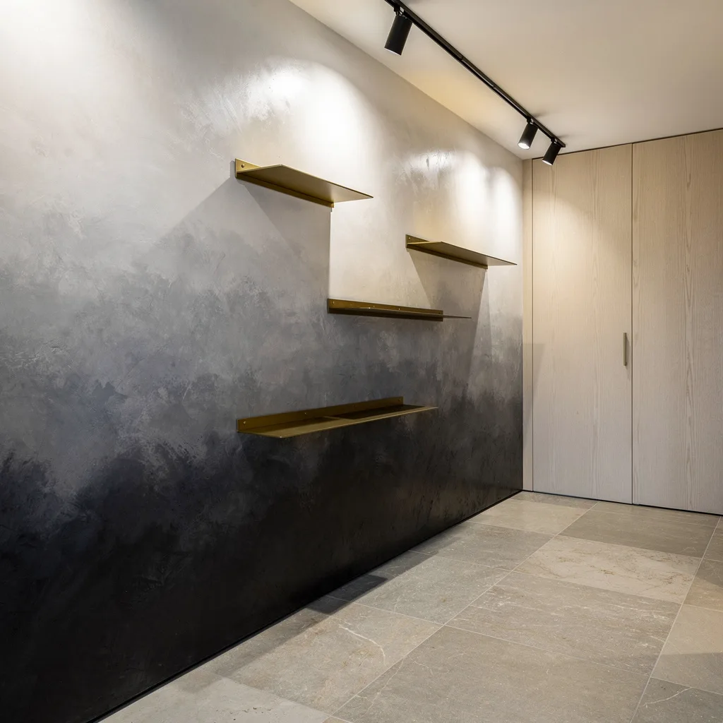
Tired of flat paint? Layer Venetian plaster in a gradient from moody charcoal to goddess pearl white. Take your time: hand-apply, don’t rush, and embed minimal brass shelves that double as an art installation. Blast the texture with directional LED spotlights, and balance it with rift-cut oak panels on the opposite wall. Keep limestone floors heated if you have the cash (cold feet are for peasants). Always spotlight your shelves; brass deserves attention, not subtlety. Use gradation to stretch your hallway visually—if it’s short, go vertical.
Mirror and Slate—Mix Glam with Earthy, Because You’re Complicated
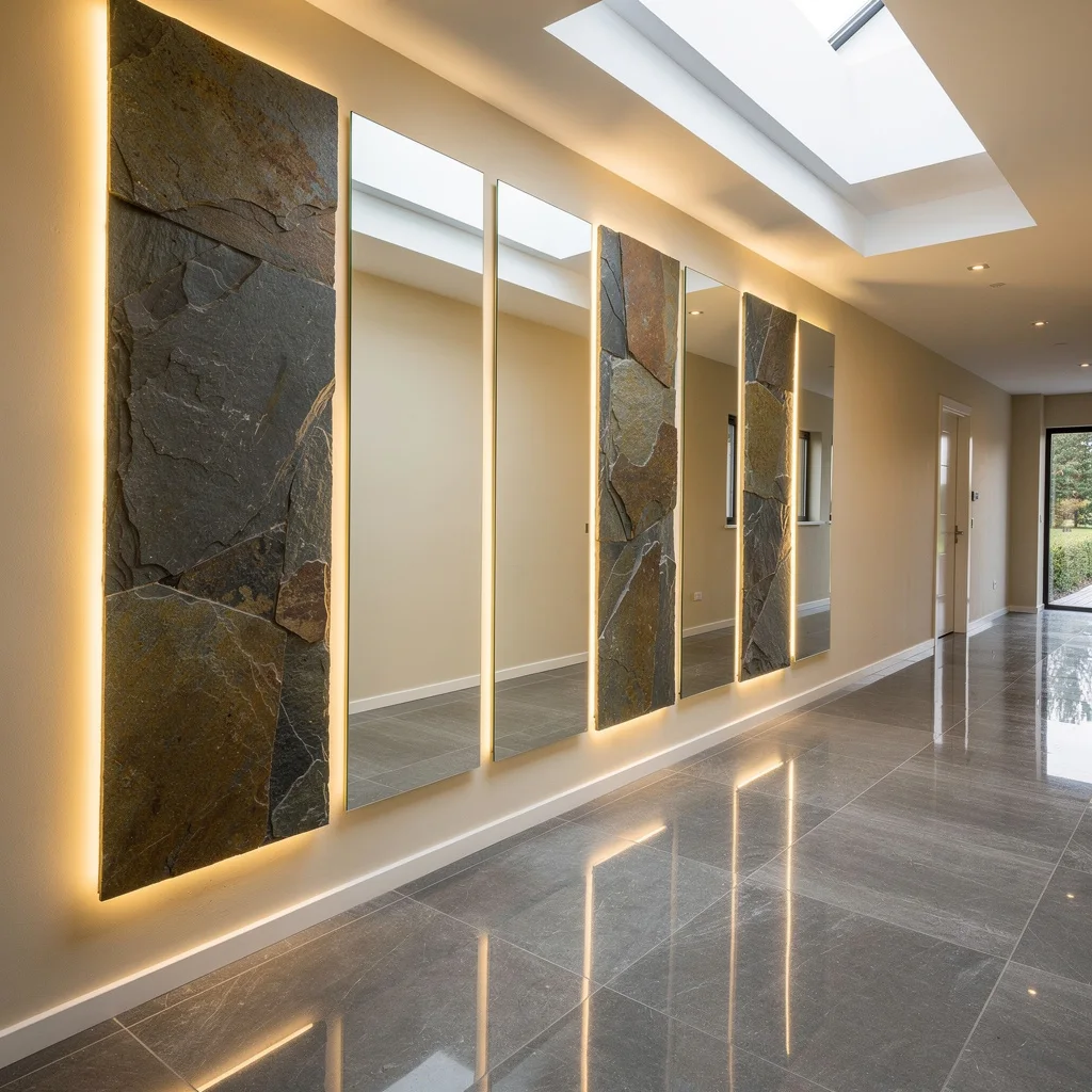
Want reflective glam but still crave that ‘I hike sometimes’ vibe? Install flush mirror panels broken up with slabs of natural slate. Backlight the mirrors with golden glow LEDs and keep slate cool for the ultimate contrast. Drop some smoky porcelain tiles on the floor, ivory walls around, and flood the hallway with daylight using a linear skylight if you’re blessed with one. Pro move: always use diffused LEDs—hard outlines are tacky. Mix materials to balance your inner diva and lumberjack; don’t play favorites, play fusion.
Copper Sculptural—Drama That Outlives Your Social Media Stories
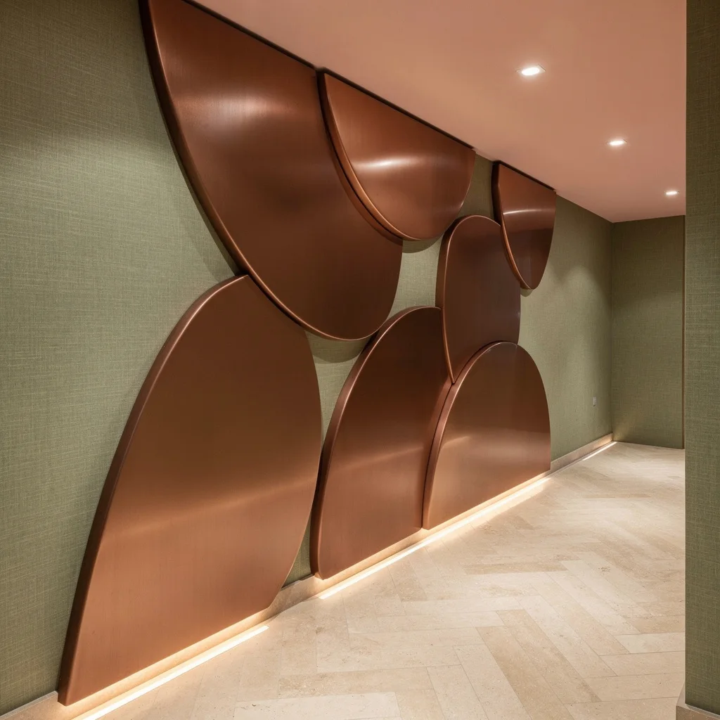
Stop with boring paint. Cover your accent wall in oversized brushed copper panels—throw in some curves with concave and convex shapes for architectural drama. Downlight them with recessed floor-level strip lighting, making the metal pop. Keep linen wallpaper in sage nearby for tactile softness, then slap down creamy herringbone travertine because basic tile is so over. Use blush on your ceiling, but stick to micro-LED spots for mood. Golden rule: never stack copper flat—depth is queen. Lighting from low makes all those curves flex in the dark.
Quartz Etched Precision—Cool, Abstract, and Just a Bit Flashy
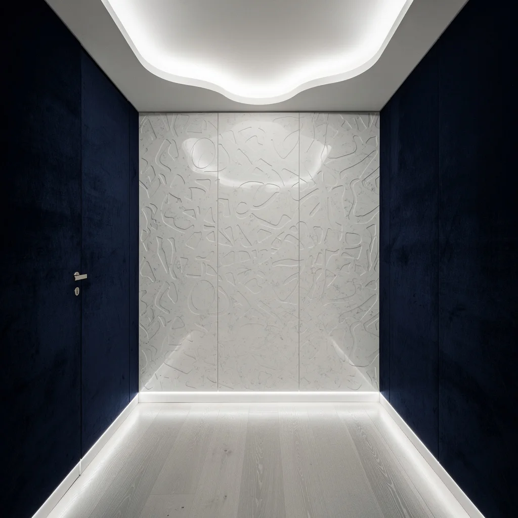
Want your hallway to whisper luxury instead of yell? Cover one wall in custom laser-etched quartz panels and underlight them with clean, recessed LEDs along the baseboard. Keep the walls deep navy with a velvet matte finish—don’t mess with gloss unless you want reflection chaos. Drop pale silver maple wood on the floor for barely-there contrast, and rig up a minimalist drop ceiling with indirect edge lighting. Always carve subtle, never shouty patterns into the quartz. If your house parties crave flex, this combo is pure money.
Basalt Columns and Glass—Architectural Tough Guy Meets Soft Lighting
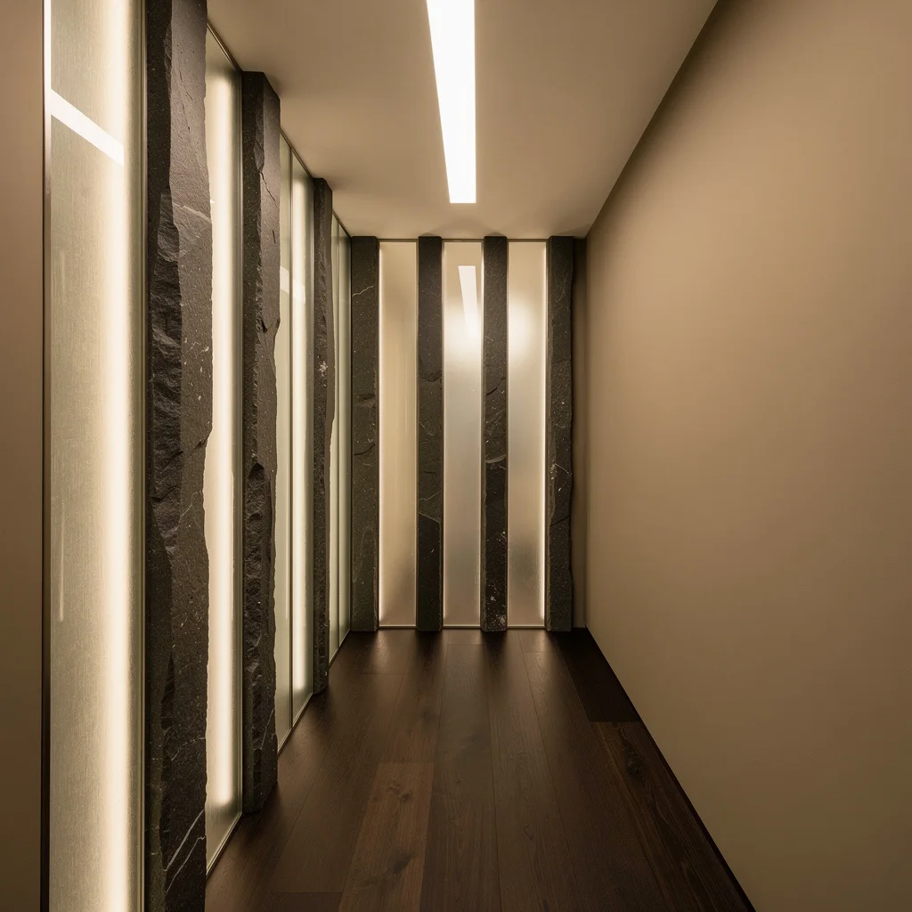
Hallways feeling skinny or flat? Go for vertical basalt columns alternated with frosted glass sections, and give the glass some hidden warm white LEDs. Keep opposite walls sandy and the floor wide-plank walnut. Light up the space from a central linear lightbox—serious ambient vibes. Make sure columns have a hand-finished touch; slick and shiny is cringe. Always embed LEDs inside the glass—not on top. This setup grabs your eye and lifts ceilings, so if you’re suffering from shoebox syndrome, go tall and layer that depth.
White Oak Herringbone and Brass—Heritage with Legit Modern Flex
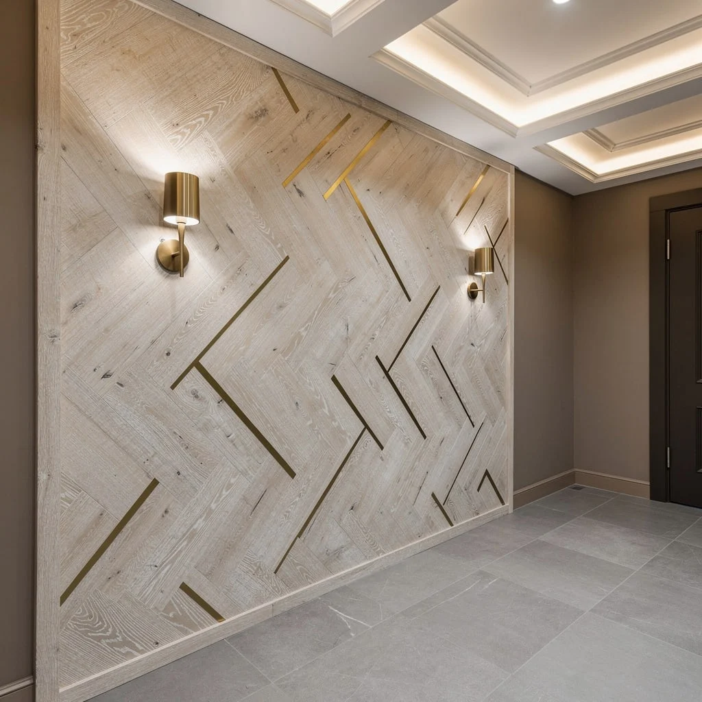
If you’re done with plain, install oversized white oak herringbone and stagger brass inlays for the wow factor. Let those patterns grab attention with bronze sconces right on the wall, and put down soft gray porcelain tiles for quiet luxury. Matte taupe for other walls keeps things focused. If you’ve got high ceilings, go for a coffered setup with recessed perimeter LEDs; short ceiling? Fake height with vertical wall patterns. Rule to live by: always stagger the brass, never line it up straight. Asymmetry is where the magic lives.
Final Thoughts
A hallway accent wall that genuinely works asked and answered a single question before any material was chosen: what should it feel like to move through this space? Not what color should go here, not what’s currently trending, not what will look good in a photograph—what should the experience of this specific corridor actually be.
The gallery corridor invited slowing down. The teal damask room made passing through feel like arriving somewhere with a strong point of view. The mural hallway turned the daily act of walking from room to room into something worth registering. Every one of them started from that question and then committed to the answer with enough resolution that the hallway stopped being the room everyone ignores and started being the room everyone notices on the way to everywhere else.