
Most people treat their hallway like a necessary inconvenience — a stretch of floor between the front door and the rooms that actually matter. Paint it off-white, shove a console table against the wall, hang a mirror that came in a multipack, and call it finished. The hallway tax has been paid. Move on.
Except guests walk through your hallway before they see anything else. It’s the trailer for the film that is your home, and right now, a lot of people are running a silent, beige trailer that promises absolutely nothing. Nobody’s excited. Nobody’s commenting on it. It just exists, and everyone politely ignores it, the way you ignore a bad haircut you didn’t ask for.
The genuinely strange thing is that hallways are one of the lowest-stakes rooms to redesign. You don’t sleep in them, cook in them, or need to seat anyone comfortably in them. There’s no sofa arrangement to agonize over, no kitchen triangle to respect, no feng shui disaster waiting to happen. It’s a corridor. The only thing it needs to do is look good while you walk through it — and somehow, that’s the brief most people completely fail to meet.
Bold hallways aren’t accidents. They’re the result of someone deciding that a transitional space still deserves real design decisions, not the leftovers from every other room. Whether you want something moody and atmospheric, layered and eclectic, or sharp and minimal, the corridor connecting your home’s spaces can do a lot more heavy lifting than you’re currently asking of it.
The Problem With “Playing It Safe” in a Hallway
Safe hallway design has a very specific look. Greige walls, recessed lighting, a runner that matches nothing and offends no one, and maybe — if you were feeling adventurous that day — a framed print from a homeware chain. It photographs terribly, it impresses nobody, and it communicates that the person who decorated it was primarily motivated by the desire to not make a mistake. That’s not interior design. That’s interior avoidance.
The irony is that hallways can actually absorb far more drama than larger rooms. A living room painted ink-black needs to work around sofas, rugs, curtains, and a television that refuses to cooperate with your aesthetic vision. A hallway painted ink-black just needs to exist, and it will immediately look like something. The constraints that make bold choices harder in bigger rooms simply don’t apply here.
The Rules That Actually Matter in a Hallway
There are exactly three things that determine whether a hallway looks considered or chaotic, and none of them are “keep it neutral.”
Scale your art properly — The single most common hallway mistake is undersized artwork. A small frame on a long wall looks like a Post-it note on a billboard. Go bigger than feels comfortable, hang fewer pieces, and let each one actually register.
Commit to your floor — The floor in a hallway is disproportionately visible because the space is narrow and the eye travels down it. A patterned tile, a bold runner, or a richly toned hardwood does more for a hallway than almost any wall treatment. The floor is not the place to cut corners or settle for whatever was left over from the kitchen.
Light it like you mean it — Overhead recessed lighting alone makes a hallway feel like a corridor in a mid-budget hotel. Add a pendant, add sconces, add warmth. Lighting is what separates a hallway that looks finished from one that looks functional, and those are very different things.
Nobody’s Talking About How Much Personality Fits in a Narrow Space
The narrower the hallway, the more intentional every decision has to be — and intentional decisions, almost without exception, look better than casual ones. A narrow hallway forces you to edit ruthlessly, which means everything that makes the cut is actually earning its place. That’s a discipline that produces better results than the sprawling rooms where you can keep adding things indefinitely and never quite finish.
The best hallways tend to belong to people who stopped apologizing for the size of the space and started working with it. Dark colors make narrow hallways feel like destinations rather than passages. Tall mirrors make them feel like they go on forever. A single piece of genuinely good art makes them feel curated rather than decorated. These are not expensive interventions. They’re confident ones.
Hallway Decor Ideas Worth Stealing
Greige Done Right: When Neutral Has an Actual Point of View
Neutral Hallway
by u/DeniseDuff in malelivingspace
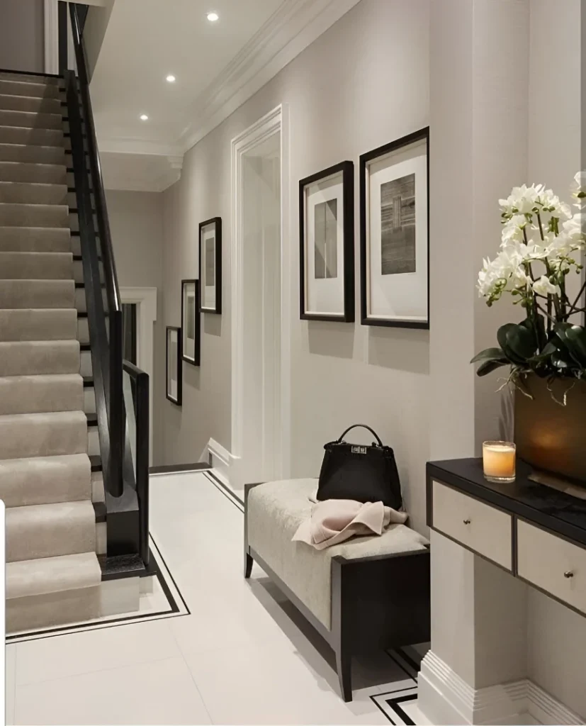
There’s a version of neutral that’s cowardly, and then there’s this — warm greige walls with real depth, white marble-bordered floor tiles adding graphic definition underfoot, a carpeted staircase in the same warm tone creating continuity rather than a jarring transition, and black-framed photography running up the wall in a composed progression. A tailored upholstered bench with black legs, a dark console topped with white orchids and a lit candle, and recessed spots angled with intention rather than abandoned to flood the ceiling. The difference between this and a forgettable neutral hallway is that every single element here was chosen on purpose. Nothing was defaulted to. Neutral doesn’t have to mean undecided — it just usually does.
Charcoal Paneling & Abstract Art:
Dark charcoal wainscoting, textured gray plaster walls above, a matte black-painted ceiling that kills any idea of this being a “light and airy” hallway and replaces it with something far more interesting — atmosphere. Two brass dome pendants hang in a line, their warm glow cutting through the darkness without softening it, and a single oversized abstract painting in black and white commands the wall above the paneling with a brass picture light aimed directly at it. Tapered black candle sconces flank the painting like silent attendants. A worn Persian runner adds warmth at floor level, and a white plinth with a branch arrangement at the far end provides the one moment of quiet in an otherwise deliberately moody space. This is a hallway that has a strong opinion about itself, and it is correct.
The Collected Boho Hallway:
White walls, warm honey floorboards, a rattan and wicker bench piled with textured cushions, baskets stacked casually underneath, a Kilim runner in burnt orange and deep red, and a gallery of circular mirrors in rattan and wood frames covering the left wall alongside a floating shelf holding plants and small collected objects. On the opposite side, a full-length arch-top mirror leans against the wall in a thin gold frame. A woven pendant shade hangs from the ceiling with a bare Edison bulb visible through it. What makes this work is that it reads as genuinely collected rather than assembled from a single shopping session — the mirrors are different sizes and frames, the plants are thriving and trailing, nothing matches perfectly and that’s entirely the point. This hallway has been lived in. You can feel it immediately, and that’s worth more than any amount of expensive matching sets.
Chrome, Crystal and Confidence:
Polished grey marble-effect floor tiles run the full length, catching and throwing light from a double-tiered crystal chandelier overhead that announces immediately this is not a house that entertains self-doubt. On the left wall, an enormous abstract painting in black, white and silver occupies most of the available surface. On the right, geometric metallic wallpaper in gold and champagne provides the backdrop for a mirrored console styled with a sunburst mirror, white roses in a glass vase, a white ceramic urn, and a black sculptural object for contrast. A second smaller chandelier continues the drama down the corridor. This is maximalism executed with enough discipline that it reads as glamorous rather than exhausting — every element is in the same metallic family, which is what stops it from tipping over. Restraint of palette, excess of personality.
Monochrome Mural and Checker Floors:
This hallway is tiny. It is also spectacular, which proves definitively that square footage has nothing to do with design ambition. Floor-to-ceiling toile-style landscape murals in black and white cover every wall, framed by heavy black molding and trim that turns the whole space into something resembling a lacquered jewel box. Black-and-white diamond marble tiles cover the floor. A vaulted ceiling painted in smoky gray with a spiked sunburst chandelier hanging from it adds a layer of drama that the already-dramatic room somehow absorbs without complaint. A black writing desk, an antique chair with an amber velvet seat, hot pink peonies in a black vase, and a gold-framed oval mirror are the only accessories needed — and nothing more should be added, because the room is already doing everything. The lesson is that going all-in on one graphic treatment in a small space is not risky. Playing it safe in a small space is risky.
Deep Forest Green and Geometric Tiles:
Forest green on every surface — walls, paneling, door, ceiling — makes this hallway feel more like a room than a corridor, in the best possible way. White and gray geometric encaustic tiles cover the floor in a bold repeating pattern that holds its own against the dark walls without competing. A bronzed antique-style radiator doubles as a design feature along the right wall. A midcentury-style side table in warm walnut carries a dome lamp, trailing air plants, and small objects with the studied casualness of someone who actually has taste rather than just access to a homeware store. An oversized woven pendant light hangs wide and flat from above, casting a diffused glow over the whole scene. A tall potted plant stands by the door, a vintage film poster in a dark frame leans against the paneling, and a small oval mirror on the left wall catches the light just enough to keep the space from feeling sealed. Dark hallways work when they’re layered this deliberately. They fail when someone just paints the walls dark and stops there.
et Gallery Status with Mirrors and Botanical Flex
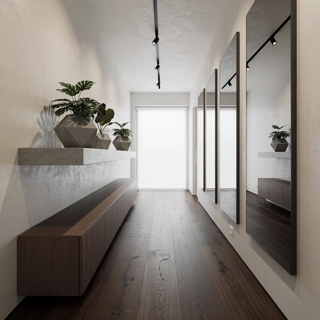
If your hallway feels more ‘closet’ than ‘catwalk,’ let smoked oak floors and microcement walls set the foundation. Build in walnut cabinetry with a chunky concrete shelf—plant geometric planters with architectural foliage but steer clear of sad supermarket palms. Mount oversized frameless mirrors vertically; the bigger, the better, and bounce that light like you’re doubling the square footage. Go for spotlights on a sleek black track overhead. Back your hallway with a frosted window. The pro tip? You better clean those mirrors—fingerprints ruin the whole ‘airy gallery’ charade.
Sculptural Drama: Orb Lights, Moss Walls, and Boucle Benches
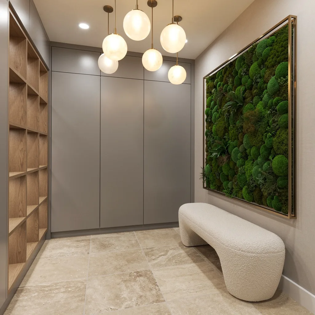
Want your short hallway to punch above its weight? Start with travertine tiles and gray lacquered paneling, then integrate flush oak storage cubbies for real-life-functionality. Hang orb-shaped opal glass pendants at wonky heights—stop pretending symmetry means sophistication. Throw a moss wall in a bronze frame opposite and splash organic luxe like you own the biotech future. Stash a sculpted cream boucle bench at the side—forget the old wooden church pews. The game-changer? Don’t overdo the moss—one slim installation is drama; a whole wall is allergy clinic.
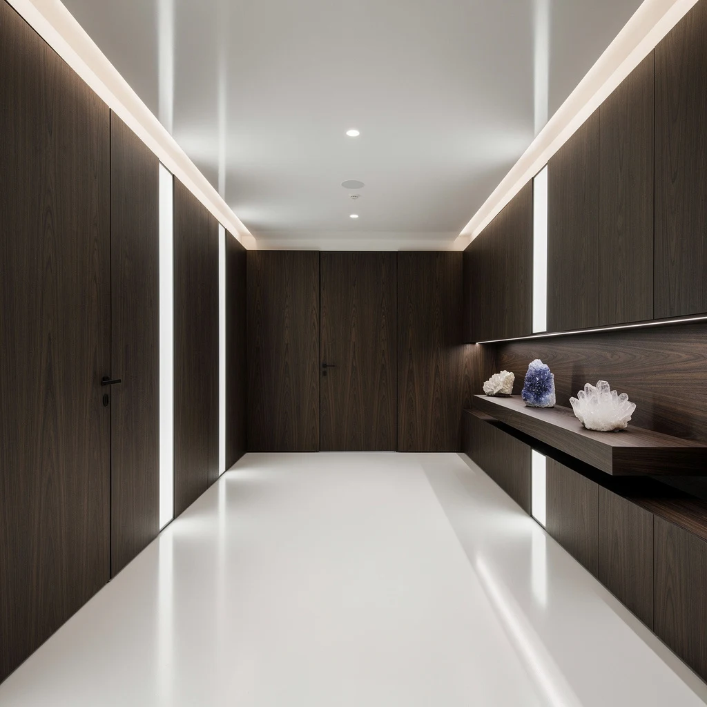
Architectural Chic: Walnut, Fluted Oak, and Floating Bookshelves
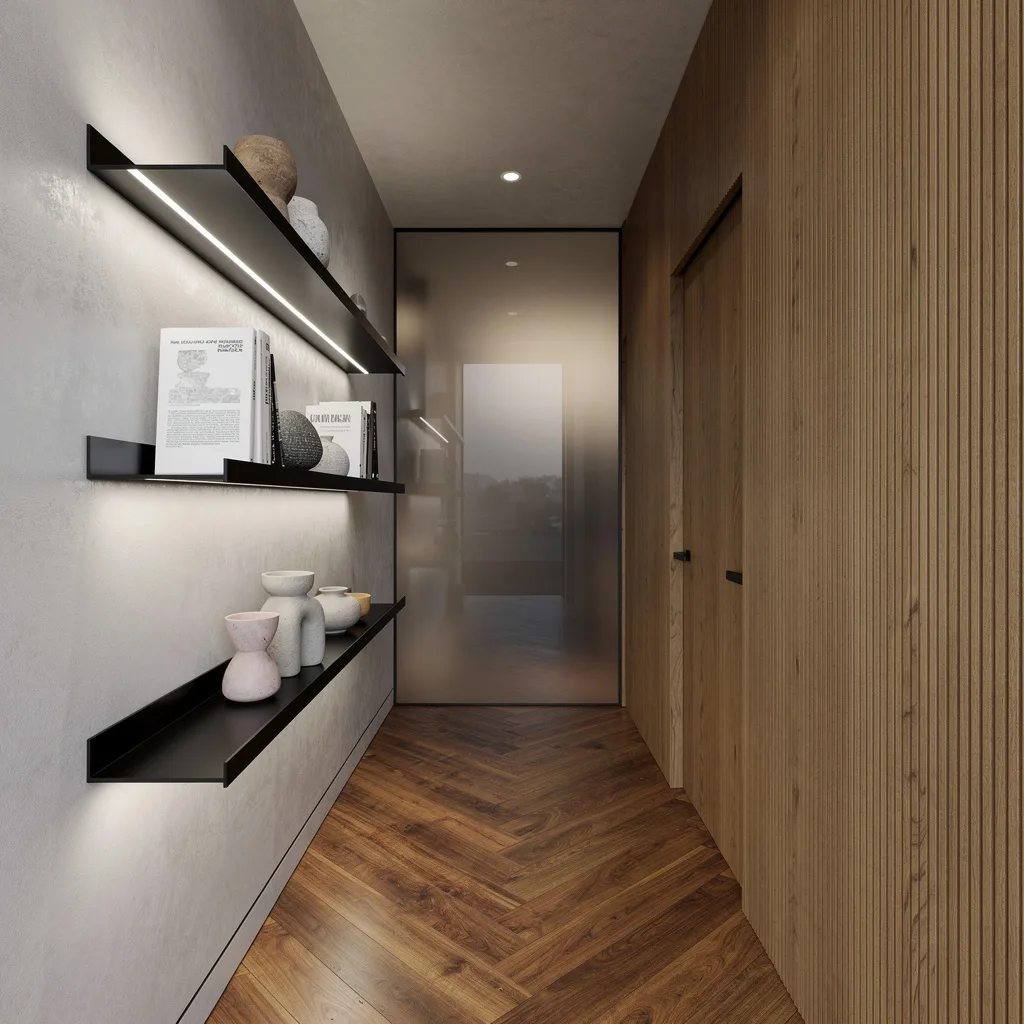
Intellectual vibes start where walnut floors meet pearl-gray plaster. Float matte black metal bookshelves and keep your display minimal: a handful of hardcover books and quirky ceramics, not your yearbook collection. Uplight with discreet LEDs to add that gentle halo nobody realizes costs triple the basic lamp. Hide a door behind fluted oak cladding; if you’re still buying visible hinges, rethink your life choices. Cap your hallway with smoked glass for privacy—without killing daylight. The flex? Never fill your shelves to capacity—empty space is your friend.
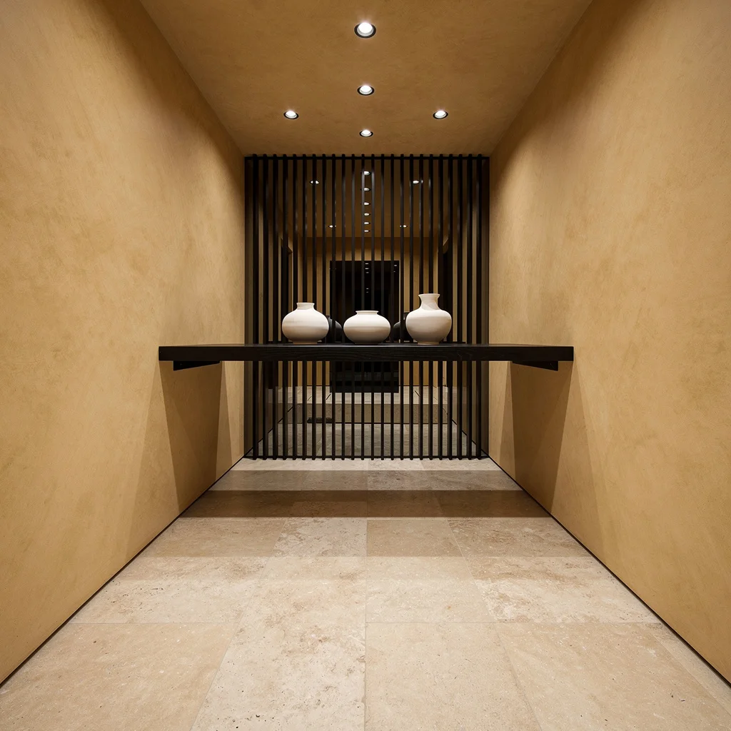
Let the Sun In: Terrazzo, Skylights, and Stone Consoles
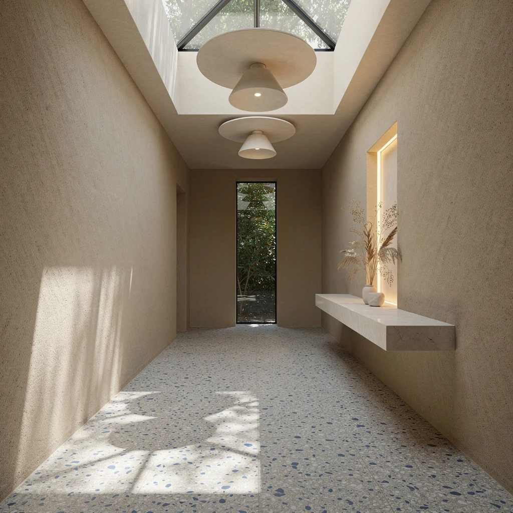
Ready to make ‘hallway’ feel holy? Terrazzo flooring with blue and white fragments under a double-height skylight means your space is naturally lit, not artificially sad. Coat walls in sand-toned lime render and stick a floating stone console along one edge—top it with dried botanicals in a backlit niche for peak low-maintenance cool. Sculptural plaster discs overhead give you textured lighting, not boring bulbs. End it all with a vertical window framing leafy views, and never hang blackout blinds in a corridor—let your foliage flex.
Modern Gallery Moves: Pastel Panels and Stainless Steez
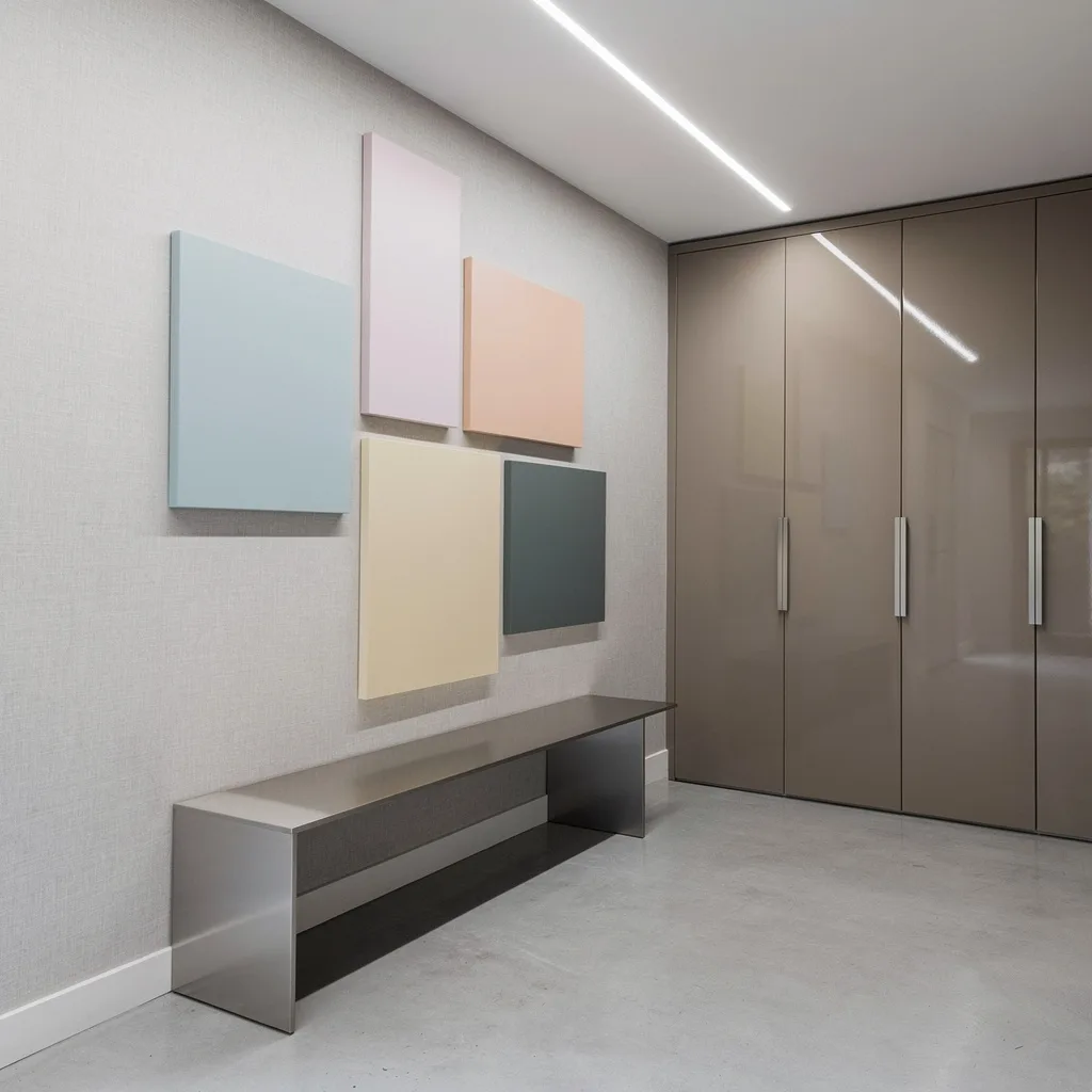
If you’re allergic to boring, go pale grey concrete for the floor and linen-textured wallpaper for grown-up softness. Create a wall-mounted grid of oversized pastel panels, keep the hues matte and the layout asymmetric. Conceal touch-latch cabinetry on the opposite side with glossy taupe lacquer—no handles, no hardware, just clean slaps of storage. Hang a continuous recessed linear ceiling light to run the full length, then add a slender brushed stainless bench for Insta-worthy utility. Pro tip: Vary the panel dimensions—uniform squares are rookie mistakes.
Minimalist Flex: Maple, Birch, and Ribbed Stone Nooks
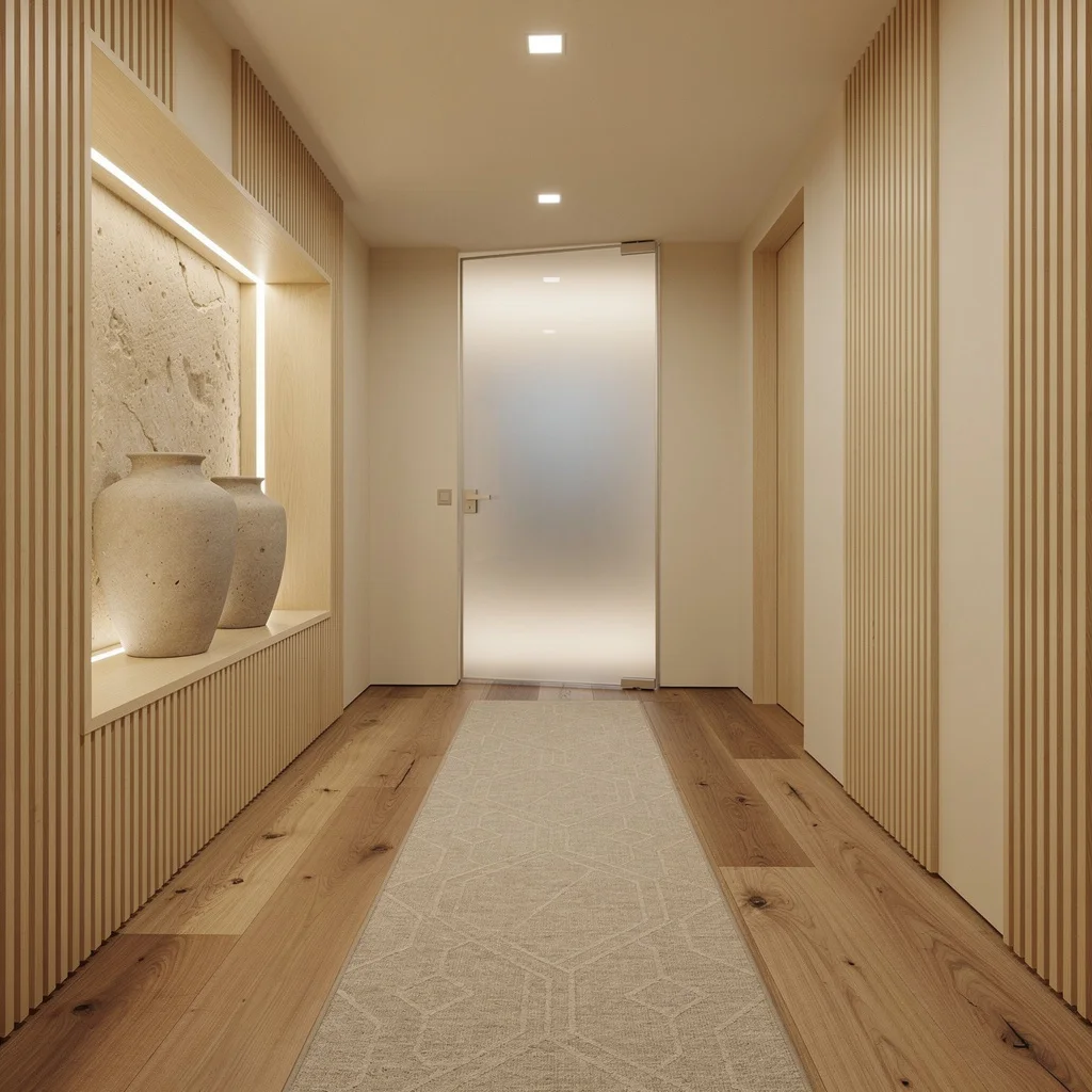
Don’t let your hallway fade into ‘meh.’ Go solid maple planks on the floor and throw cream paint on the walls, but break up the monotony with vertical birch slats for instant depth. Embed display alcoves with ribbed natural stone and blast them with lighting so your oversized vases get the attention they deserve. Choose square, flush-mount LEDs for unbroken illumination. At the end, install a pivoting frosted glass door that glows with backlighting—bonus points for adding a wool runner with subtle geometry. Never clutter the alcove—one statement vase, max.
Metallic Mood: Brushed Bronze and Dramatic Backlighting
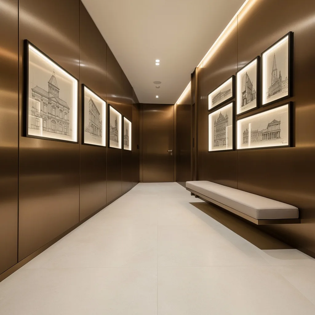
Want your hallway to scream ‘custom, not catalog’? Lay down extra-wide porcelain in a bone finish and run brushed bronze paneling along one wall. Curate framed architectural sketches under acrylic, backlight them for that art gallery drama—don’t settle for poster prints. Wash the bronze panels with LED strip lights from a hidden slot, let the reflections do their thing. Install a low bench at waist height in soft dove leather for utility and chic. Don’t let the art droop—level is mandatory; everyone notices when you’re crooked.
Monolithic Vibes: Ash Wood, Resin Floors, and Illuminated Glass
If subtle drama is your goal, stick to matte white resin floors and custom paneling in dark-stained American ash. Integrate vertical glass slivers with hidden illumination to spotlight wood grain—function as art, not just as cover-up. Install a floating lacquered ceiling, flanked by concealed cove lighting, for glowy ambiance. Display crystalline objets on a floating ash ledge—no knickknacks allowed. Seamlessly clad the end door to match your panels; breaks in the finish signal amateur hour. Never use daylight white bulbs—go for warm ambient tones, always.
Gallery Precision: Limestone, Venetian Plaster, and Blackened Steel
You want refined but striking? Try oversized limestone tiles underfoot and wheat-toned Venetian plaster on the walls. Span a floating shelf in ebonized wood, keep ceramic vessels matte and monochrome—cream and white, always. Drop recessed disc spotlights overhead for sharp, directional light; skip the ‘soft glow’ nonsense. Cap your hallway with blackened steel fins vertical at the end, a tad industrial, but tasteful. The magic move? Never over-accessorize the shelf: three vessels max, and style them by height—not every piece needs equal billing.
Ripples and Brass: Futurist Waves Meet Artifact Display
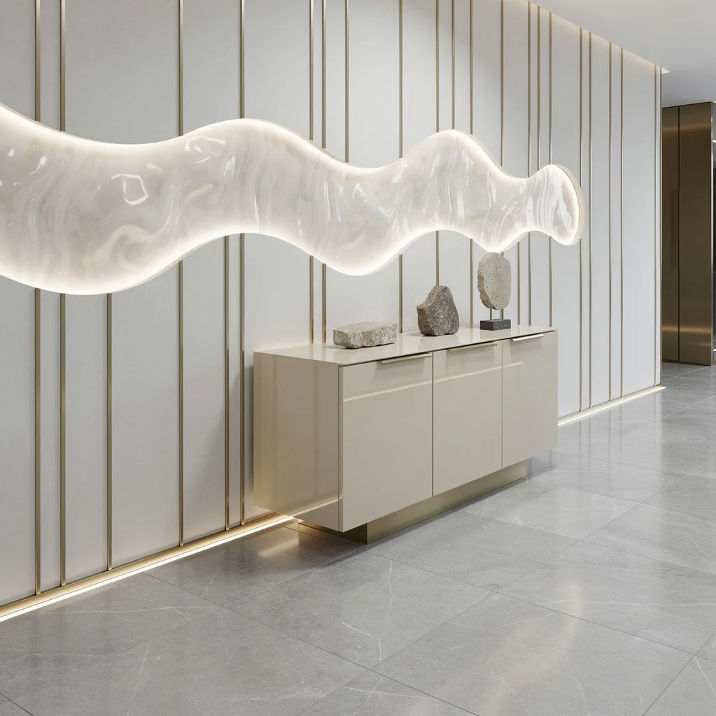
Step up your game with silver-gray porcelain floors and slim vertical brass rods on crisp white walls—random intervals, not gridlock. Integrate a backlit rippled glass wave at shoulder height and diffuse hidden LED lighting for that futuristic glow. Use a glossy cream sideboard topped with stone artifacts, but skip anything souvenir-y—no snow globes or sand bottles. Run a recessed floor washer along the brass detailing for subtle light, not search-and-rescue intensity. Never let your lighting expose dusty corners—keep the fixture line continuous and clean.
Final Thoughts
The hallway is never going to be the room you spend the most time in, but it is consistently the room that shapes how people feel about everything else they’re about to see. A great hallway sets expectations upward. It signals that the person who lives here makes actual decisions, has an actual point of view, and didn’t just open a paint chart and choose the one in the middle because it seemed the least likely to cause conflict.
None of the hallways worth remembering got that way through caution. They got that way because someone decided the space deserved real attention — a considered color, a piece of art that’s actually significant, lighting that creates a mood rather than just illuminating a path, and a floor that makes you look down and then look again.
Your hallway doesn’t need to be big to be good. It doesn’t need a renovation budget or a designer’s invoice. It needs decisions — real, committed, specific ones. Make them, and the corridor you’ve been walking past without seeing for years will suddenly become the room everyone talks about when they get home.