
Nobody talks about hallway color. Interior design magazines dedicate entire spreads to living room palettes, kitchen cabinet finishes, and bedroom mood boards — spaces where color choices get the reverence they deserve. The hallway gets a paragraph at most, usually something patronizing like “stick to light neutrals to make it feel bigger!” Thanks for that groundbreaking insight.
And yet, your hallway is the first room every single guest walks into. The color on those walls sets the tone for your entire home before anyone’s even taken their shoes off. It’s the opening line of your design story, and most people are writing it in the most forgettable shade of greige they could find.
The standard approach is to keep hallway color “safe and neutral” — which is decorator code for “I was scared and I made it everyone else’s problem.” Off-white walls, maybe a slightly warmer white on the trim if you were feeling rebellious that day. The result communicates absolutely nothing except that you own a paint roller and have no strong feelings about anything.
What nobody tells you is that hallways are actually the perfect place to use the colors you’ve been too nervous to commit to anywhere else. Because you’re not living in them, you’re moving through them — which means a color that might feel overwhelming in a bedroom or living room hits completely differently in a corridor. It creates an experience rather than a backdrop.
Why Hallway Color Gets Treated Like an Afterthought
The hallway color problem isn’t really about not knowing what looks good. Most people have a color they love — they just keep talking themselves out of using it anywhere that matters. The hallway becomes the room where all the nervous energy of “what if it’s too much?” gets projected, and the result is a corridor that actively works against the rest of your home’s personality.
The irony is that bold color in a hallway is significantly lower risk than bold color anywhere else. You don’t have to live with it for hours at a time. You don’t have to coordinate it with a sectional sofa or blackout curtains. You walk through it, it makes an impression, and you move on. That’s an ideal situation for doing something genuinely interesting with color, and most people waste it entirely.
What Color Actually Does in a Hallway
Before reaching for the paint chart, it’s worth understanding what color is actually doing in a narrow, transitional space — because it behaves differently here than anywhere else in your home.
Dark colors create depth, not claustrophobia — The idea that dark colors shrink a hallway is one of the most persistent myths in interior design. What dark colors actually do is give a hallway atmosphere and intention. A corridor painted deep green or inky blue feels like a destination rather than a passage.
Light colors need contrast to work — A pale hallway that’s all one tone reads as unfinished rather than airy. If you’re going light, you need something to give it structure — a graphic floor, strong trim color, or bold art that stops the whole thing from dissolving into nothing.
Saturated colors reward commitment — Half-hearted application of a bold color — painting just one wall, or choosing a muted version of what you actually wanted — produces worse results than going all the way. The colors that look best in hallways are the ones where someone clearly decided and didn’t look back.
The ceiling is part of the color scheme — Leaving the ceiling brilliant white while painting dramatic walls creates a hard, unfinished edge that undercuts the whole effect. Carrying your color onto the ceiling, even slightly lightened, makes the space feel intentional rather than interrupted.
Stop Letting the “Future Buyer” Live in Your Hallway Rent-Free
The single most destructive force in hallway color decisions is the hypothetical future buyer — that imaginary person who will apparently be so offended by your forest green walls that they’ll walk away from an otherwise perfect house. This person is being given entirely too much power over your daily life.
You are not selling your house today. You are walking through your hallway today, every single day, and the color you chose out of fear is failing to make you feel anything every single time. The future buyer can repaint. You, right now, are living with the consequences of a decision you made to please someone who doesn’t exist yet. That’s worth reconsidering.
Hallway Color Scheme Ideas That Actually Commit to Something
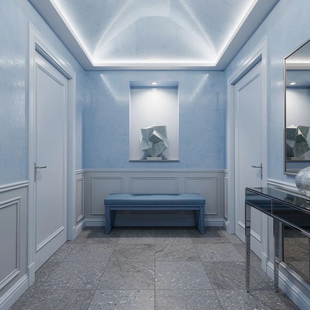
Soft Gray and Brass: The Color Scheme That Proves Subtle Can Still Be a Choice
Our hallway before and after! The first project we finished in our new home and it feels great!
by u/PurplePoisonBerry in HomeDecorating
There’s a version of gray that’s a cop-out, and then there’s this — a deliberate, considered soft blue-gray applied consistently to every door, every trim detail, and every ceiling coffer, creating a tonal scheme that’s quiet without being empty. The white walls and white floor tiles don’t fight the gray; they let it breathe, which is what keeps the whole palette feeling intentional rather than washed out. The antique brass pendant is the color scheme’s one moment of warmth, and it earns enormous returns for a single fixture — its aged gold tone is exactly what stops this from reading as cold or clinical. Gray works in hallways when it’s chosen with this kind of specificity and applied with genuine consistency, rather than grabbed off the chart because it seemed the least likely to offend anyone.
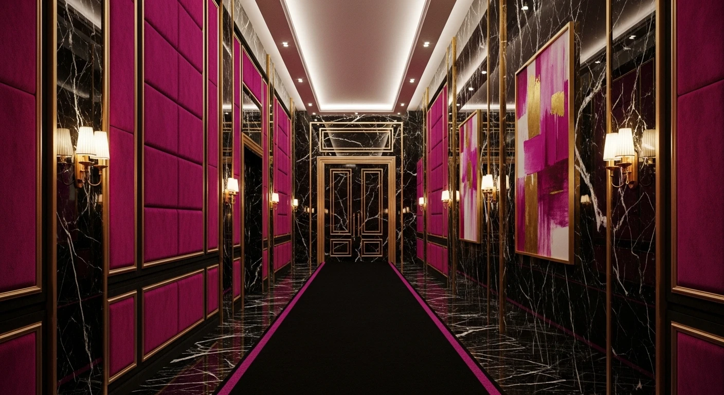
Magenta and Black: The Color Scheme With Absolutely No Apologies
Plum-purple textured walls bleeding into deep magenta at every surface, matte black woodwork and staircase framing the whole composition, warm amber light from jeweled lanterns and a beaded chandelier doing the heavy lifting at every level — this is a color scheme that saw the paint chart and skipped straight to the end. The black floor grounds what could otherwise tip into sensory overload, and the faded Persian runner in magenta and crimson proves that when your color scheme is this committed, even the accessories have to show up properly. What makes it work isn’t that it’s restrained — it isn’t, not even slightly — it’s that every single color decision is pushing in exactly the same direction. Total commitment is its own form of discipline.
Ink Blue and Ebony: Dark Done With Full Architectural Confidence
Deep ink-blue walls, ebony-stained floorboards, matte black painted woodwork on the staircase and balustrade, ornate carved archways framing the whole space — this color scheme looked at the conventional advice to keep hallways bright and airy, filed it under irrelevant, and moved on. The floor transition from geometric black-and-white encaustic tile at the entry to the dark stained hardwood further in is a masterclass in using color and pattern to create zones within a single space. Tropical plants in terracotta pots provide the only warm color note in an otherwise deeply cool palette, which is precisely why they register so strongly. Dark blue in a hallway doesn’t make the space feel smaller. It makes it feel like somewhere worth arriving.
Forest Green and Black-and-White: The Color Scheme That Knows Exactly Where It Stands
Forest green wainscoting running the full length of both walls, cream above the dado rail keeping the upper half light enough to breathe, and a black-and-white diamond marble floor providing the graphic contrast that gives the whole scheme somewhere to go. The relationship between the three colors is what makes this work — the green is saturated enough to hold its own against the high-contrast floor, the cream is warm enough to stop the green from reading as cold, and the black in the floor tiles echoes the black door at the end to create a visual full stop. Brass globe sconces add warmth without disrupting the palette. This is a color scheme with a clear hierarchy and no internal arguments, which is why it looks so effortlessly resolved.
Deep Plum and White: The Color Scheme That Uses Contrast as a Design Tool
Deep plum-purple walls from dado rail to ceiling, bright white paneling and trim below, dark hardwood floors running the length of the corridor — the contrast between the saturated purple and the crisp white isn’t just decorative, it’s structural. The white wainscoting creates a visual baseline that stops the dark walls from pressing down on the space, while the brass cage pendants hung in a line down the ceiling provide warm punctuation at regular intervals. The bold striped runner in pink, red and burgundy picks up tones from the wall color and brings them down to floor level, tying the whole palette together vertically. This color scheme works because the white isn’t a retreat from the purple — it’s a deliberate counterweight that makes the purple land harder.
Dusty Pink and Crimson: Soft Color With a Backbone
Dusty rose pink paneling at waist height, clean white walls above, warm honey oak flooring underneath — and then a deep crimson door at the entrance that changes everything. Without that door, this would be a pleasant, soft-toned corridor that nobody would feel strongly about. With it, the whole palette suddenly has somewhere to go — the crimson gives the pink something to answer, the white provides breathing room between them, and the warm floor stops the combination from feeling either precious or predictable. A moon-phase runner picks up the pink and mauve tones at floor level and adds just enough personality to confirm that the softness here is a choice, not a default. Muted colors earn their place when there’s a saturated anchor somewhere in the scheme reminding you that the restraint is deliberate.
Stay Cool With Monochrome Blue
Feeling fancy but not ready for green? Flood your hallway with sky blue, but keep all the tones tight—powder blue, pale blue-gray, nothing wild. Slap on glossy paint, then upgrade your floor game with slate-gray terrazzo. Vault your ceiling and run those LED strips, so your corridor glows like a spaceship. Match bench paint with your walls (repeat after me: no muddy wood colors here) and throw in brushed silver hardware. Mirrored glass consoles add that ‘refined, not frozen’ look. Pro tip: When going monochrome, texture is your best friend—don’t let it flatline.
Burnt Orange & Taupe: Designer Energy
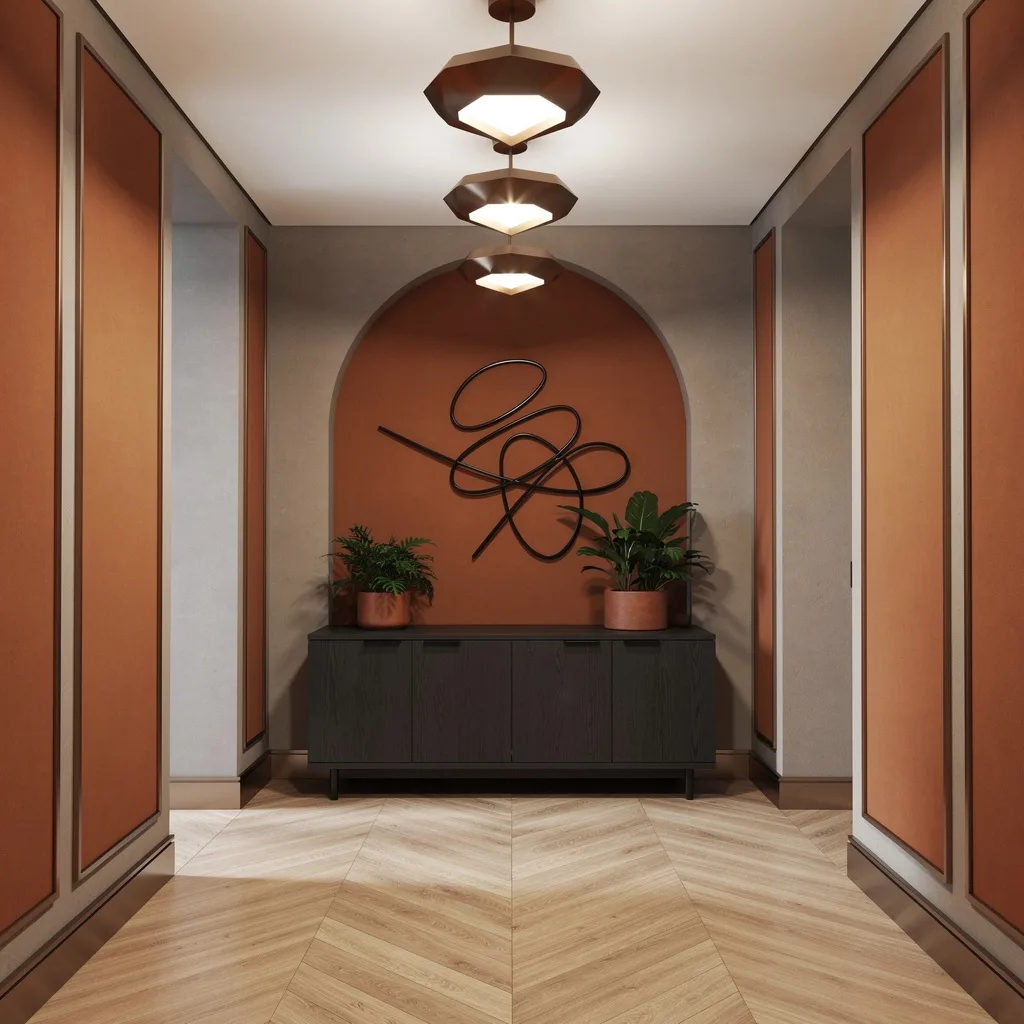
Want your entryway to look like an architect lives here? Alternate burnt orange panels with taupe plaster but always outline with bronze—don’t let your paint job get lost. Use chevron oak on the floor for added movement, and keep the ceiling simple white but show off geometric bronze lighting. Add a charcoal oak sideboard and style it under an arched alcove stuffed with green plants in rust pots. Toss up some abstract black metal wall art. Rule: Never let your accent color battle your main shade—use bronze to tie it all together and keep your designer cred safe.
Charcoal & Ivory: Modern Sleek Madness
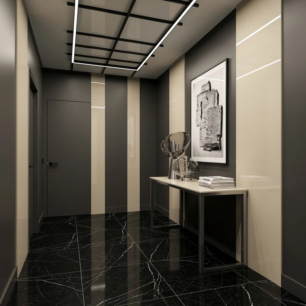
Sick of scuffs and tacky ‘light grey’? Go full charcoal, and punctuate with mirrored ivory vertical panels for instant dimension. Lay down large-format black marble tiles with white veining, then grid your ceiling with slim matte black LEDs. Rest a stainless console along the wall and stack glass vases (not ten, start with two) next to books. Black-and-white artwork? Absolutely. The rule: Mirror-finish panels and marble floor mean you can’t slack on cleaning—dust = design death. Keep metallics to one finish (stainless, not chrome).
Blush & Sand: Upscale, Not ‘Cute’
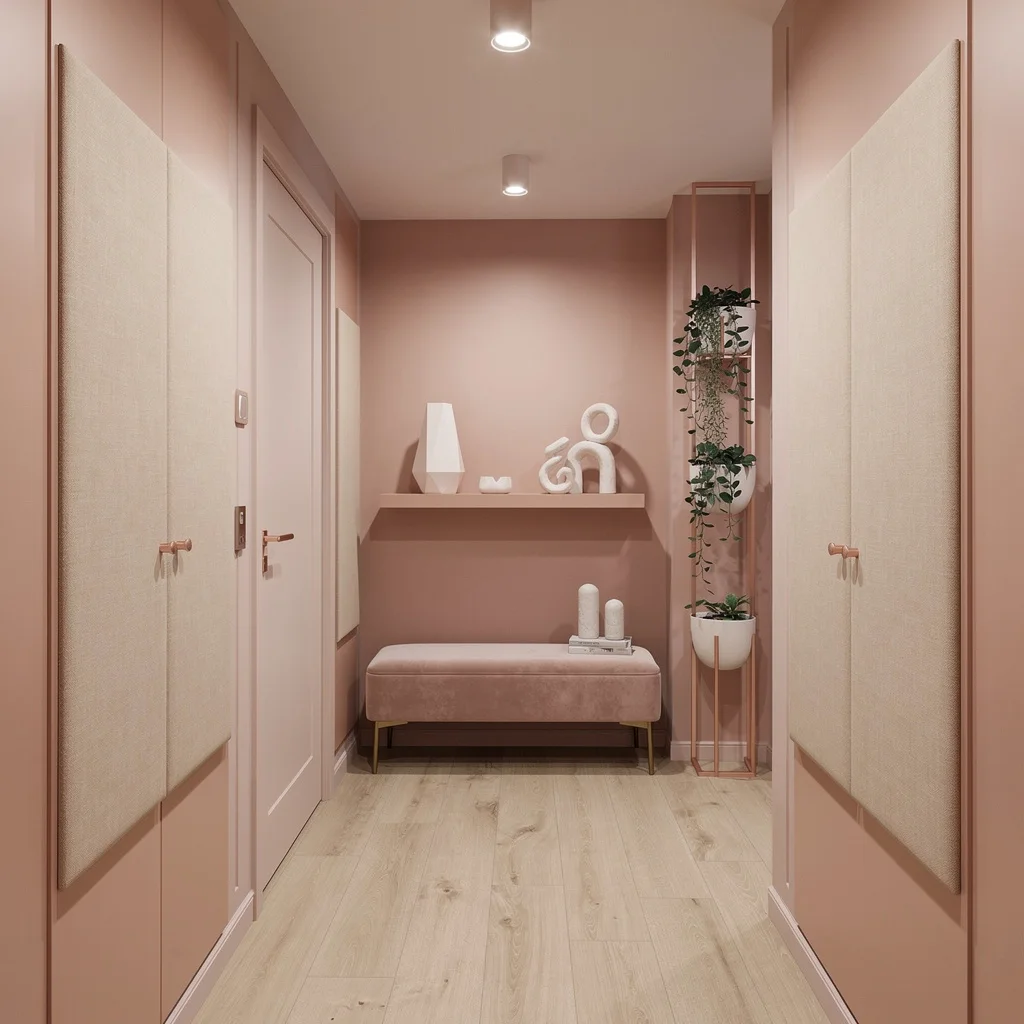
Wanna nail the mushy Instagram vibe and still look rich? Swaddle your walls in blush pink and build out sand-toned upholstered panels. Light maple wood flooring keeps things warm, not washed-out. Drop frosted glass spotlights to light your hallway in soft focus. Go for a pale pink velvet bench and angle a floating shelf overhead, then style it with angular white pottery—don’t let anyone think it’s from a dollar store. Rose gold hardware is your friend, but use it sparingly. Pro tip: Blush goes badly wrong if you don’t balance it—always offset it with sand and metallics to avoid the “baby shower” effect.
Navy & White—If You Want Drama, Not Nautical
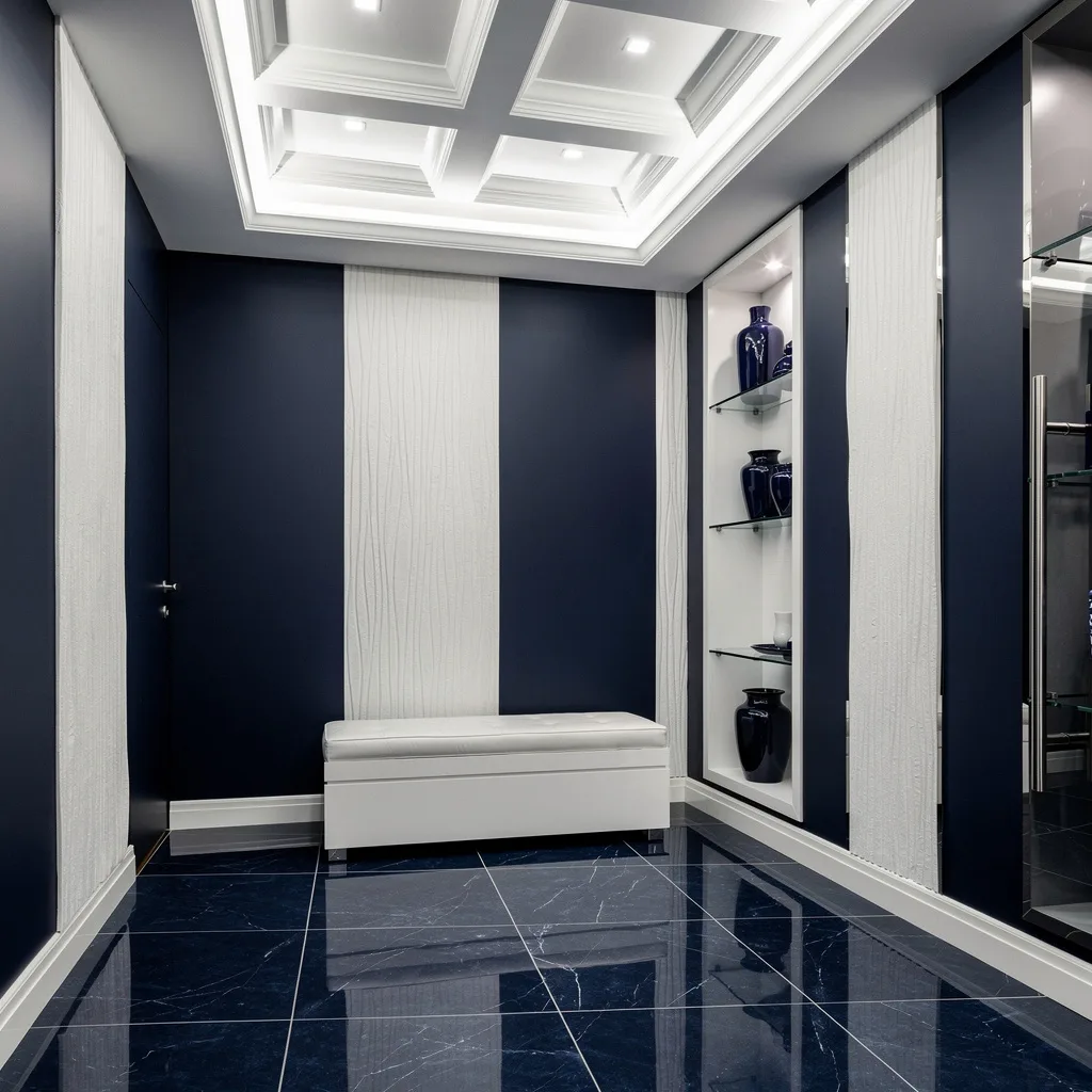
Make your hallway punchy with deep navy walls and vertical white textured stripes—go matte or risk looking cheap. Glossy navy porcelain tiles step up the sophistication and make the space feel expensive, not themed. Install a coffered ceiling and embed LED strips for a crisp glow. Keep benches and shelving sleek white, but don’t get OCD with symmetry—let a navy ceramic accent throw things off a bit. Chrome hardware is your only metal friend here. Rule: Navy needs white for breathing room. Don’t go half-hearted or it’ll look like a failed yacht club.
Sage & Copper: Chill But Grown-Up
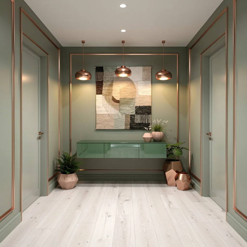
Bring your hallway into the future with muted sage walls trimmed in brushed copper. Lay warm white oak on the floor or fake it with a good-quality laminate; the copper pendant lights keep things glowing. Float a green-tinted glass console under a big abstract wall tapestry and drop geometric planters in terracotta and matte copper. This isn’t a yoga retreat—keep the styling minimal and purposeful. The pro tip: Sage and copper are a team; never let copper overpower. Use it only for outlines and accessories, not as a main color unless you really want a steampunk vibe.
Champagne Gold & Cream—Because You’re Extra
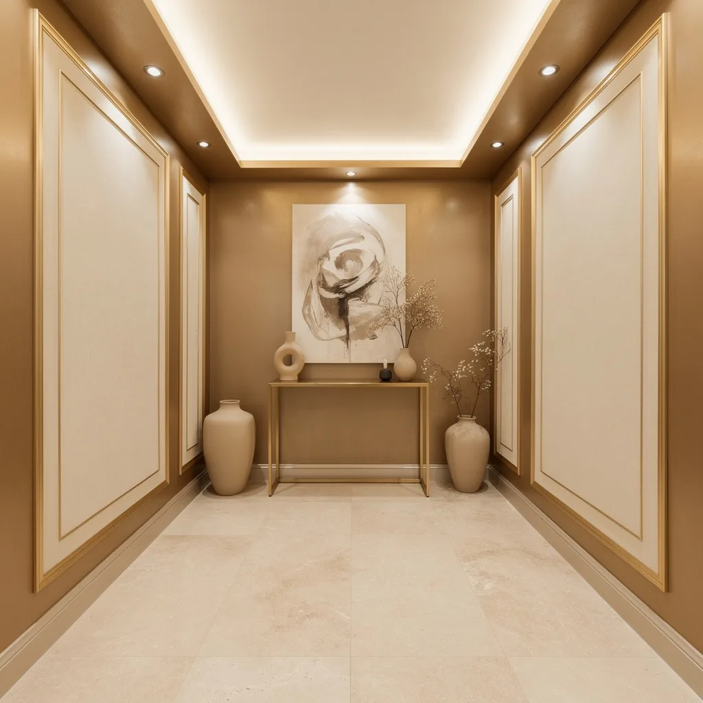
Flex your hallway with metallic champagne gold walls and creamy inset panels framed in gold leaf—don’t substitute with anything cheap. Use creamy limestone slabs to keep the floor seamless. Run gold-toned cove lighting and upgrade your console to champagne gold (because why stop at wall paint?). Style the console with beige ceramics and dried botanicals, but don’t drown the space in bling—you’re not an influencer in Dubai. Pro tip: When working with metallics, make sure your bulbs are warm, not cold—they’ll murder the vibe.
Forest Green & Ash Wood: Minimalist Earthy Richness
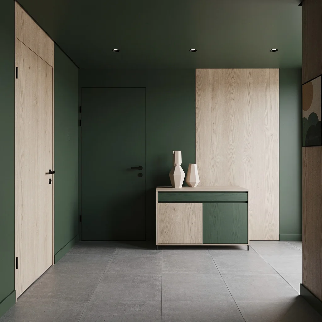
If nature calls but you hate rustic, slap on forest green and vertical ash wood paneling—keep things linear, not cottage-core. Matte gray concrete tiles? Do it. Use recessed lighting for that soft, gallery-level glow. Set up an ash wood sideboard and accessorize with geometric ceramics and slim black hardware. Keep wall décor minimalist, not corny. Rule: Never let your wood look muddy—ash is pale, so ghost the mahogany. Earth-toned art only, nothing floral unless you’re cool with grandma vibes.
Ice Gray & Soft Violet: Futurist With Feelings
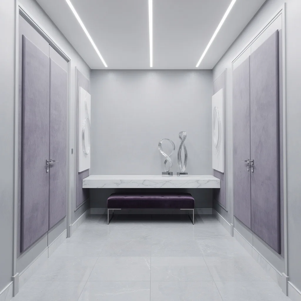
Want your hallway to look like a skincare ad? Paint walls ice gray and add muted violet suede panels for swanky texture. Lay pale gray stone tiles and run custom linear LED track lights on a white ceiling for that gallery effect. Toss in a violet velvet bench and style a white marble floating shelf with glass abstracts—nothing chunky, keep it sleek. Matte silver hardware adds edge. Get creative with subtle wall art, but no motivational quotes. Pro tip: Mix feathery textures with dope lighting and keep violet as accents—too much and it gets tragic fast.
Terracotta & Cream: Warmth Without Grandma
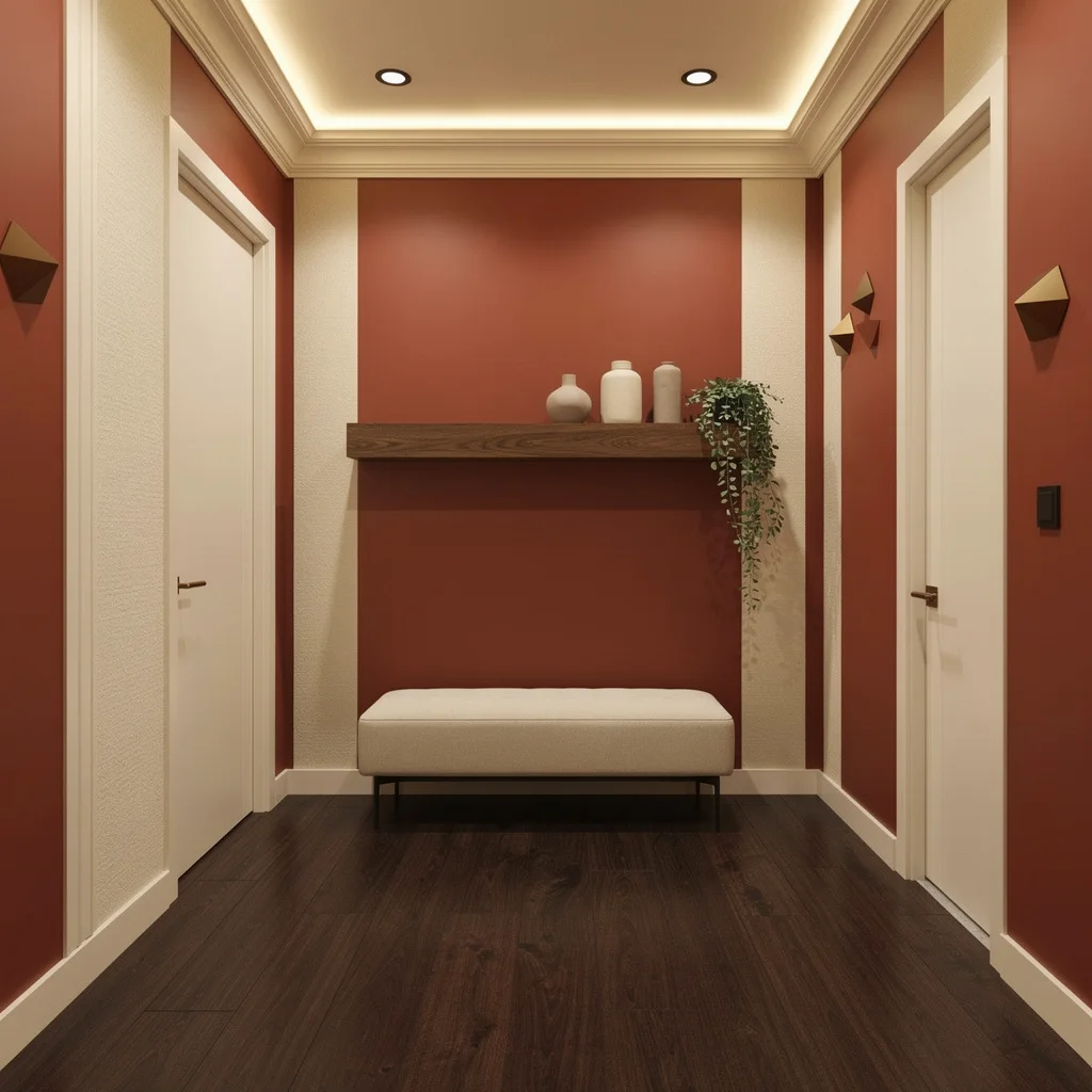
Craving a hallway that actually feels inviting? Paint it with matte terracotta and fat cream stripes—texture is key, or your wall will look flat. Anchor the space with dark walnut floors and spotlight cream LED lighting to highlight your best moldings. Cream upholstered benches sit pretty but need walnut shelving overhead—don’t get lazy with styling. Use bronze handles and geometric wall sculptures, but lay off the antique knickknacks. Rule: Terracotta needs greenery. If you skip plants, it goes full 1970s office vibe. Keep stripes broad, not pinstriped.
Teal & Matte Black: Vivid With Attitude
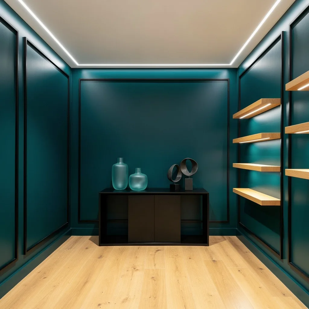
It’s time to ditch safe neutrals and smack your hallway with matte teal and matte black geometric framing. Light honey oak floors keep the palette energetic, not moody. Hide LED strip lighting along ceiling edges—you want ambient, not interrogation-room vibes. Plant a sleek matte black console against teal walls, then style with frosted teal glass vases and abstract objects. Balance the display with honey oak wall shelves. Pro tip: Use black to frame, not to overwhelm. Teal needs space; heavy black furniture kills the vibe. Stick to clean lines only, and let the art go bold.
Final Thoughts
Hallway color isn’t a minor decision dressed up as a minor decision. It’s the first impression your home makes, repeated every single day for everyone who walks through your front door — including you. Getting it right, or at least getting it interesting, is worth more than most people give it credit for.
The color schemes that work in hallways aren’t the safe ones. They’re the ones where somebody looked at a corridor and decided it deserved the same level of care and commitment as any other room in the house — then chose a direction and followed it all the way through instead of hedging at the last moment with a “safer” version of what they actually wanted.
Pick the color you keep looking at and talking yourself out of. Use it properly — which means consistently, with the right lighting, the right floor, and the right restraint in styling. Your hallway will go from the room everyone ignores to the room everyone mentions, and that is a very good use of a tin of paint.