

January deserves its own color story. After the holiday chaos, these palettes bring the calm, sophisticated energy the month actually needs. From moody ivory-and-onyx combinations to unexpected teal moments, these color schemes prove that winter interiors can feel rich and intentional without being heavy or dark. This is how you design spaces that match January’s fresh-start energy.
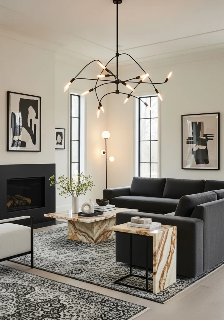
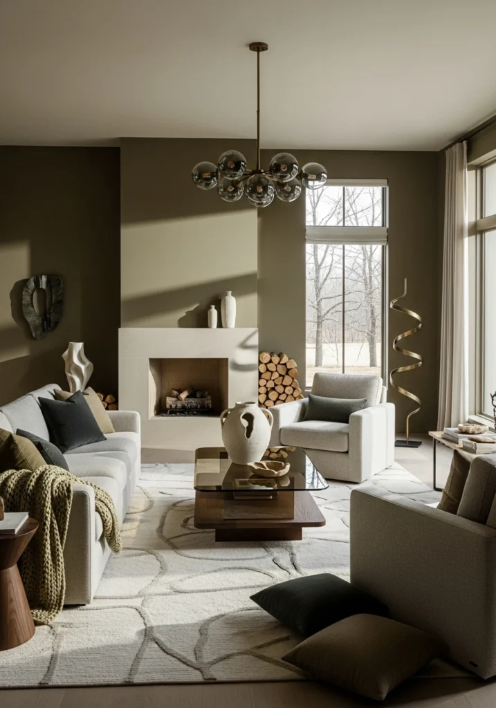
Ivory · Deep Shadow Grey · Polished Onyx
High ceilings get even more dramatic with ivory limewashed walls creating this soft backdrop for deep shadow-grey sectional seating. Polished onyx accent tables bring that luxe contrast without making the room feel heavy. Tailored wool rugs ground everything while sculptural lighting adds architectural interest.
Subtle black detailing throughout creates visual rhythm. The moody yet luxurious winter vibe works because the ivory keeps things from going too dark. This palette feels expensive in that quiet, assured way where nothing needs to shout. Perfect for January when you want calm but refuse to compromise on impact.
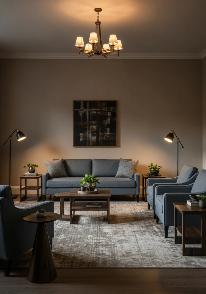
Warm Camel · Bone White · Dark Walnut
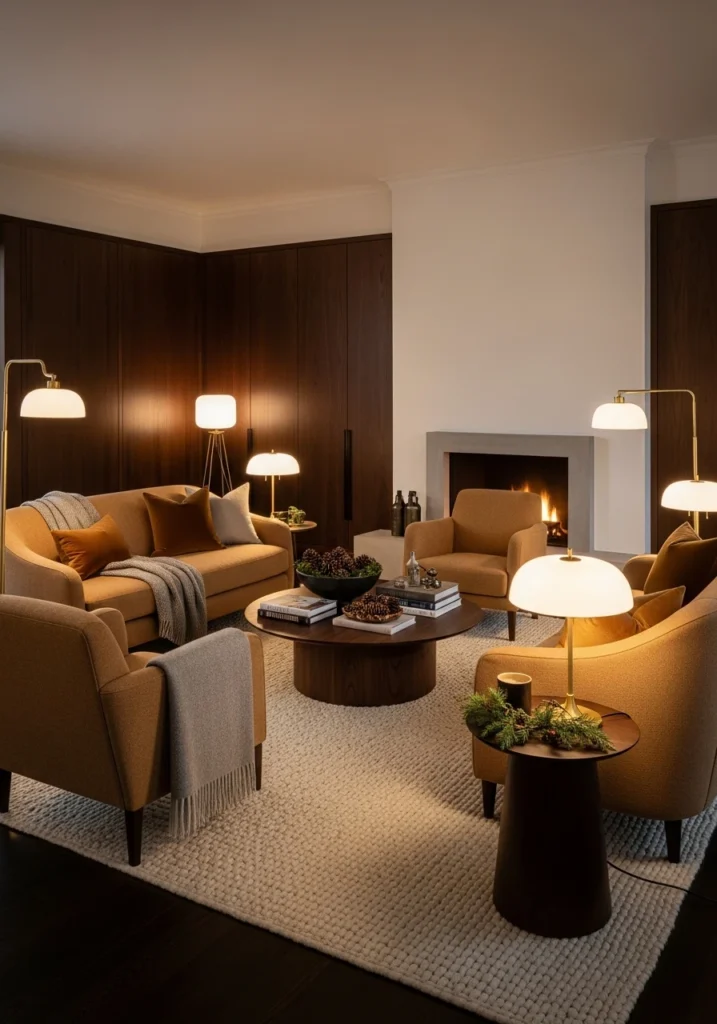
Warm camel upholstered sofas against bone-white walls create this inviting foundation that still feels sophisticated. Dark walnut paneling adds depth and richness without going full wood cabin. Curved furniture silhouettes soften all those straight lines.
Low ambient lighting enhances the warmth. Tactile fabrics layer in comfort that makes winter feel cozy rather than cold. The refined seasonal richness comes from balancing warm tones with clean backgrounds. This palette completely avoids rustic or traditional territory while still feeling welcoming.
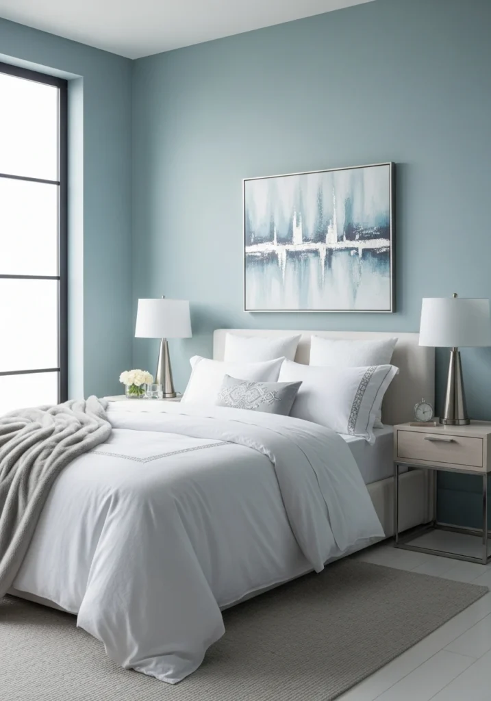
Soft Fog Blue · Chalk White · Cool Silver
Winter bedroom perfection. Soft fog-blue wall treatments bring color without overwhelming the calm atmosphere. Chalk-white bedding layers create that cloud-like comfort, while cool silver accents add just enough shine. Minimal furniture keeps the focus on the palette itself.
Plush textiles and diffused daylight work together to create this serene January vibe. The airy, sophisticated quality comes from keeping everything light and intentional. Restraint is the luxury here, proving you don’t need warmth to create comfort.
Greige · Charcoal Ink · Brushed Brass
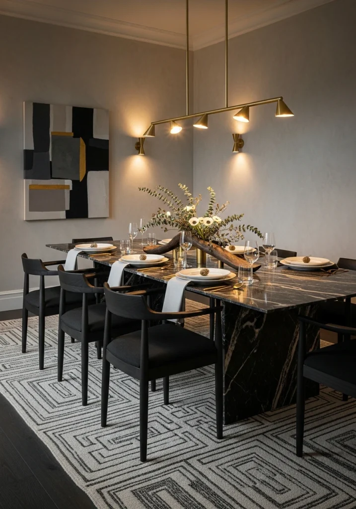
Greige plaster walls provide the perfect neutral canvas for charcoal ink dining chairs to make a statement. Brushed brass lighting fixtures add warmth and elegance without going too traditional. The statement table grounds the whole palette.
Subtle textural contrasts throughout elevate what could be a simple color scheme into something dramatic yet balanced. This modern palette works for January dining rooms that want sophistication without stuffiness. The brass prevents the grey tones from feeling cold.
Muted Olive · Stone Beige · Smoked Glass
Finally, a winter palette with some green. Muted olive accent walls bring unexpected depth, while stone-beige upholstery keeps things grounded and calm. Smoked glass elements add that contemporary edge and subtle transparency.
Sculptural decor and soft shadows create visual interest across the tonal palette. Organic shapes echo the olive’s natural reference. The whole combination feels winter-ready and visually rich without needing bold colors. This is how you do earthy tones for January.
Alabaster · Ash Taupe · Blackened Steel
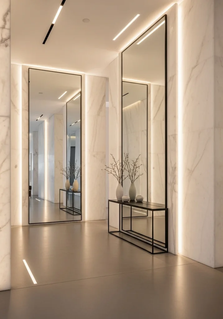
Powerful first impressions start here. Alabaster walls create this pristine backdrop for ash-taupe flooring to add warmth. Blackened steel console details bring that industrial-luxe edge without going too warehouse.
Oversized mirrors amplify light and space. Architectural lighting emphasizes the clean lines throughout. This palette creates the kind of refined January entryway that sets the tone for the entire home. Strong, polished, and completely intentional.
Cool Mushroom · Frost White · Pale Bronze
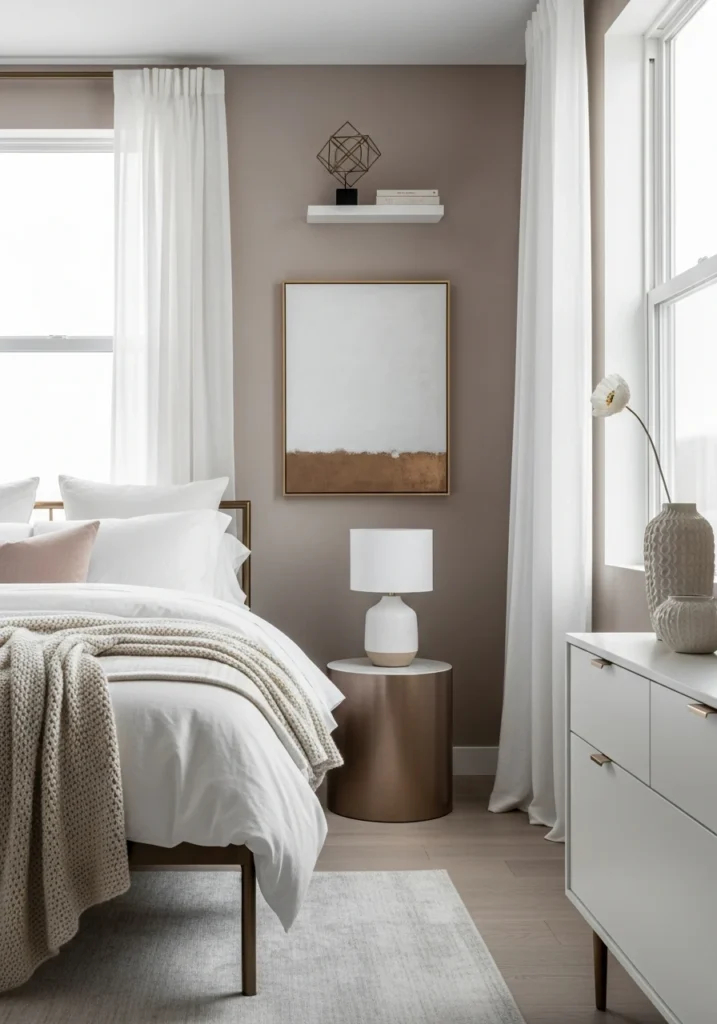
Cool mushroom-toned walls bring organic warmth that frost-white linens balance perfectly. Pale bronze accents add subtle shine that catches light beautifully. Layered bedding creates texture within the restrained palette.
Minimal decor lets the color story do the work. Warm lighting balances the winter coolness just enough. The understated luxury comes from how carefully the tones are calibrated. This bedroom palette feels like a retreat designed for January mornings.
Stone Grey · Soft Ecru · Dark Oak
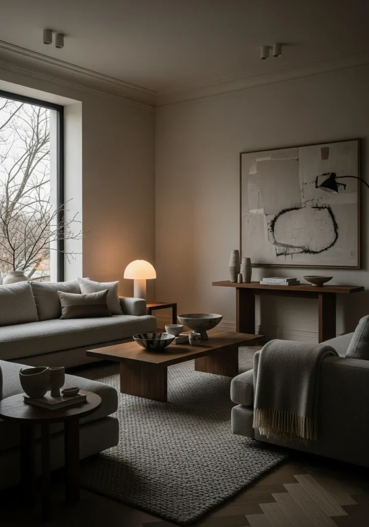
Masculine sophistication without the typical bachelor pad clichés. Stone-grey seating anchors soft ecru walls beautifully. Dark oak furniture adds weight and richness that makes the space feel serious and considered.
Low-profile forms keep everything modern. Rich textures throughout add depth that solid colors alone couldn’t achieve. The calm, deeply polished winter interior works for spaces that want presence without loudness. Subtle contrast is more powerful here than bold statements.
Cloud White · Dusty Cocoa · Satin Nickel
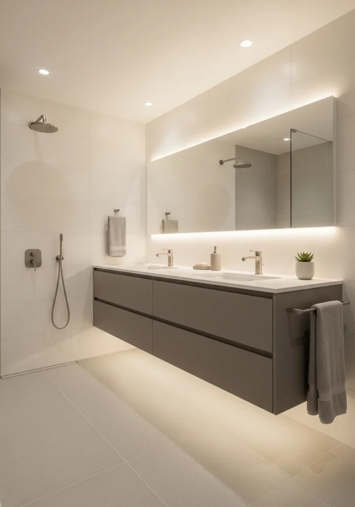
Spa vibes for your actual bathroom. Cloud-white surfaces create this pristine foundation, while dusty cocoa cabinetry adds warmth and prevents the white from feeling clinical. Satin nickel fixtures bring that refined metallic element.
Clean geometry and soft lighting create the spa-like atmosphere. Minimal decor keeps the focus on the materials and finishes. This modern, elevated January palette makes daily routines feel like self-care rituals.
Warm Linen · Slate Blue · Smoked Wood
Reading room goals. Warm linen walls create intimacy, while slate-blue accent seating adds that moody pop of color. Smoked wood finishes bring organic depth without going rustic.
Tailored upholstery and moody lighting create this cocooning effect perfect for January. Intentional spacing prevents the room from feeling cluttered despite the rich palette. This combination creates intimacy without visual noise.
Soft Sand · Cool Concrete · Graphite Black
Bold minimalism for open-plan living. Soft sand-toned walls warm up cool concrete flooring beautifully. Graphite-black accents create striking contrast that makes the neutral base feel intentional rather than safe.
Bold lines and architectural balance throughout create visual interest. The clean yet impactful winter aesthetic works for spaces that want drama through restraint. This palette proves neutrals don’t have to be boring.
Pearl White · Muted Plum · Antique Gold
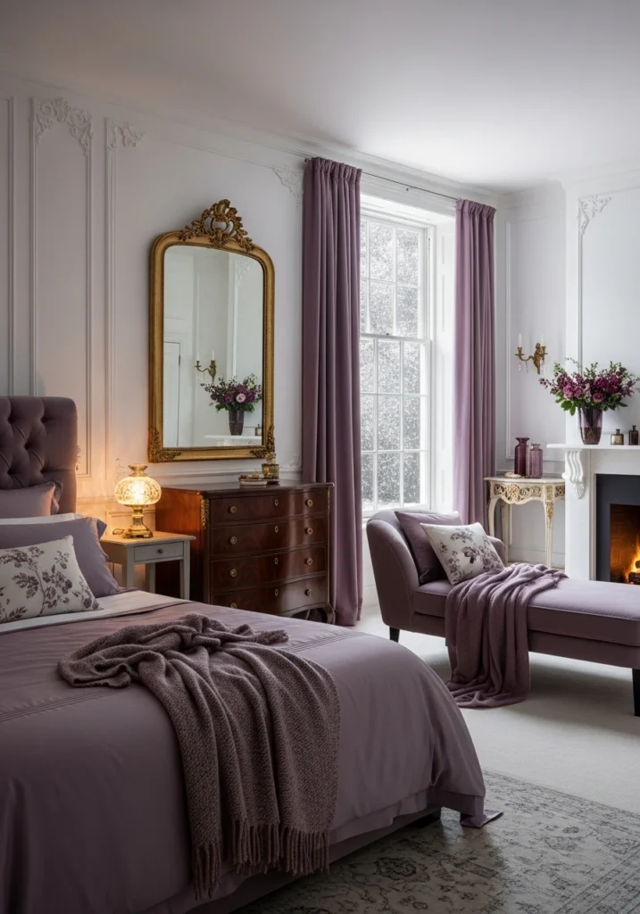
Unexpected richness for January. Pearl-white walls keep things light while muted plum textiles bring that deep, saturated color moment. Antique gold detailing adds warmth and luxury without feeling overdone.
The controlled color story feels romantic and modern simultaneously. Rich without becoming heavy is the goal, and this palette nails it. Perfect for bedrooms that want to feel special and deeply luxurious during winter months.
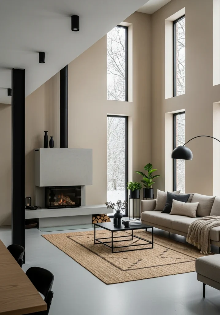
Warm Putty · Charcoal Brown · Soft Copper
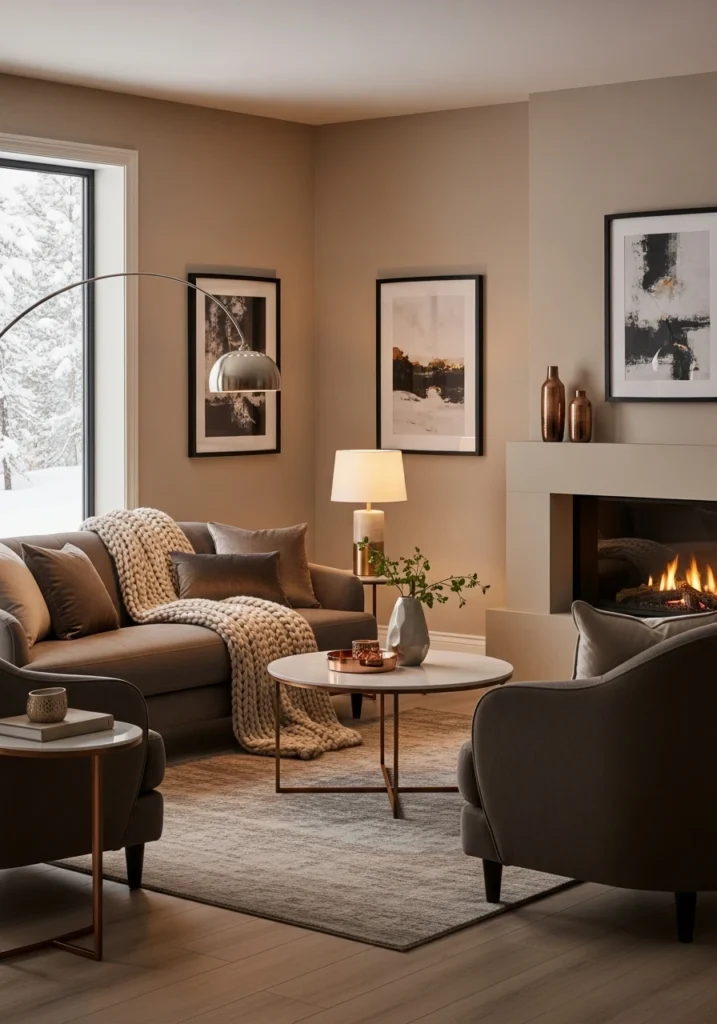
Warm putty walls create this enveloping base for charcoal-brown upholstery to anchor against. Soft copper accents bring that organic metallic warmth. Layered textures throughout add depth.
Curved forms soften the space while ambient lighting enhances the warmth factor. This palette creates depth perfect for winter months when you want rooms to feel substantial and cozy. Contemporary without being cold.
Cool Taupe · Frosted Grey · Natural Ash
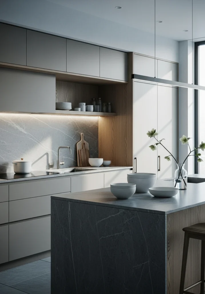
Kitchen perfection in winter tones. Cool taupe cabinetry pairs beautifully with frosted grey stone surfaces. Natural ash wood elements prevent the cool tones from feeling sterile.
Minimal styling and clean lines let the material palette shine. Soft illumination brings out the subtle variations in the grey and taupe. This modern winter palette feels fresh and intentional, perfect for January when you want to start clean.
Ivory Cream · Deep Teal · Brushed Gunmetal
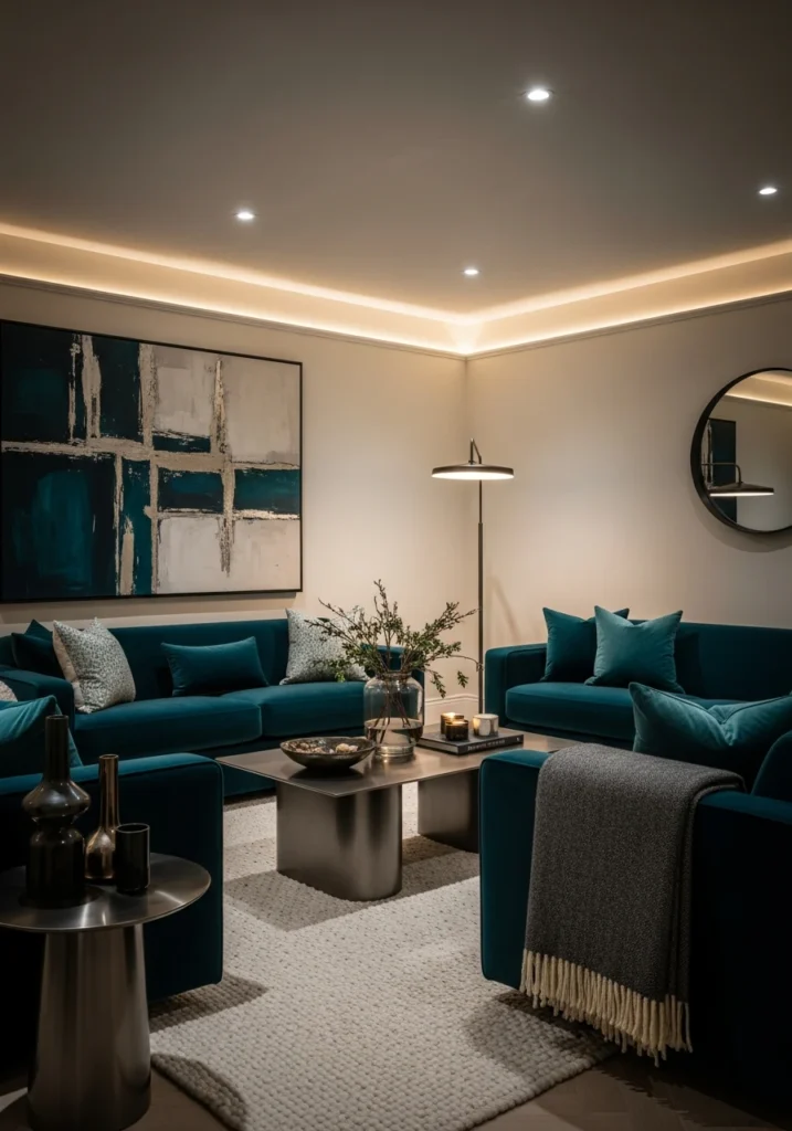
Bold move, big payoff. Ivory-cream walls provide the perfect backdrop for deep teal upholstered seating to absolutely steal the show. Brushed gunmetal accents add industrial edge that keeps the teal from feeling too traditional.
Rich textiles and controlled lighting create this confident, editorial quality. The whole palette feels like a statement without being loud. This is January color done for people who refuse to play it safe with neutrals.
The best January color palettes understand that winter interiors need depth, warmth, and sophistication without heaviness. Whether you go moody with shadow grey and onyx or fresh with fog blue and silver, these combinations prove that January deserves thoughtful color choices that match its fresh-start energy. This is how you design spaces that feel both seasonally appropriate and timelessly elegant.