
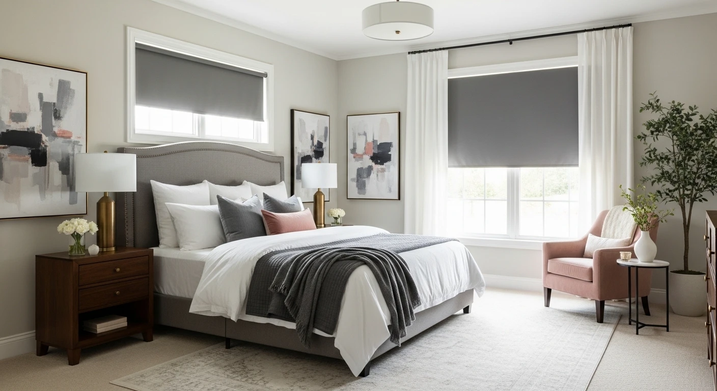
Tired of master bedrooms that feel like hotel conference rooms someone forgot to check out of? Your color scheme is the problem — and the solution isn’t another shade of greige that looks exactly like the last three shades of greige you tried. Whether you want deep moody drama, calm sophisticated neutrals, or the kind of bold pairing that makes guests stop in the doorway and actually comment, these master bedroom color scheme ideas will prove that the difference between a bedroom that’s fine and a bedroom that’s genuinely impressive starts with a more committed decision at the paint counter.
🎨 The Palette Proving Ground
Stop playing it safe. Build a palette and see if it passes the interior design test.
Why Most Master Bedroom Color Schemes Are Safe in the Worst Possible Way
Safe color choices in a master bedroom don’t just fail to excite — they actively undermine the room. A color that was chosen because it couldn’t offend anyone produces exactly the effect you’d expect: a room that doesn’t offend anyone, but also doesn’t do anything for the person who has to wake up in it every morning. The bedrooms that get remembered, that guests comment on, that feel genuinely luxurious rather than generically presentable, are the ones where someone made a color decision they were actually willing to defend.
Committing to one dominant color produces better results than balancing three safe ones
The impulse to keep a bedroom neutral is often expressed as three or four different almost-neutral colors deployed in roughly equal quantities across the walls, bedding, curtains, and furniture. The result looks indecisive rather than considered. A bedroom with one strong dominant color — even a deep, saturated, or unconventional one — that the rest of the palette genuinely supports will almost always look more designed than a bedroom where every surface is playing it safe simultaneously.
Dark colors in bedrooms create atmosphere that light colors structurally cannot
The received wisdom that bedrooms should be light to feel larger and calmer is contradicted by some of the most impressive bedroom design being produced right now, almost all of which involves deep, saturated, or moody color choices. Dark colors in a bedroom create a sense of enclosure that reads as cocooning rather than claustrophobic when the proportions are right and the lighting is considered. They also make the artificial lighting work significantly harder — a warm lamp against a deep teal or charcoal wall creates atmosphere that the same lamp against an off-white wall simply cannot.
Accent colors need to earn their place rather than simply existing
The concept of an accent color is widely understood and almost universally misapplied. An accent color that appears in two cushions and a vase hasn’t accented anything — it’s just present in the room without doing work. An accent color that appears in the headboard fabric, the throw, the lampshade, and the art earns its presence because it creates a visual thread that the eye can follow. Accent colors should be used sparingly in terms of quantity but consistently in terms of placement.
Metallic finishes are part of the color scheme and need to be treated as such
Brass, bronze, chrome, and gold are not neutral hardware choices — they are color decisions that need to agree with the room’s dominant palette. Warm metals belong in warm-toned rooms. Cool metals belong in cool-toned rooms. Mixing warm and cool metals in the same bedroom reads as indecision unless it’s handled with considerable skill. Choosing one metal finish and applying it consistently across hardware, lighting, and accessories is one of the cheapest and highest-impact color decisions available in a bedroom.
Color Schemes That Actually Impress
It isn’t about the colors you choose. It’s how you deploy them.
Texture extends the palette
Adding more colors to a room that needs visual interest is the wrong diagnosis. A room needs more texture within the existing palette, utilizing linen, velvet, microcement, and timber.
The ceiling is an underused tool
A bedroom where the ceiling color is considered rather than defaulted to white feels more cohesive, more enveloping, and more designed—creating true atmospheric immersion.
The en suite transition is the color story
Treating adjacent spaces as separate exercises produces visible, awkward seams. Successful suites share at least one material, tone, or finish across both zones.
Master Bedroom Color Scheme Ideas
Cognac Leather Headboard, Teal Velvet, and Terracotta
A grasscloth-panelled feature wall in warm caramel with overlaid black and gold abstract line art serving as both wall treatment and gallery backdrop, a cognac button-tufted leather headboard flanked by mid-century walnut nightstands, teal velvet cushions and duvet in deep jewel tones, a terracotta runner across the foot of the bed, and a tufted teal bench providing the room’s final horizontal line. Gold angular wall sconces and a pair of cylindrical table lamps with warm shades complete the lighting layer. Every color in this room is saturated and none of them apologise for it. Pro tip: When using three strong colors in one room, keep the distribution unequal — one dominant, one secondary, one accent — and the result reads as curated rather than competing.
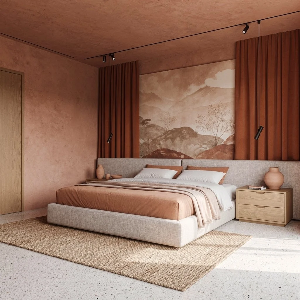
Deep Teal Walls, Rust Bedding, and a Blue Viscose Rug
Deep petrol-blue walls running floor to ceiling with clean white cornice providing the only relief, a white upholstered headboard that deliberately refuses to compete with the wall, layered rose and rust linen bedding that shouldn’t work against the teal and absolutely does, a cognac leather accent chair with a teal cushion reversing the palette, and a vivid blue viscose rug covering almost the entire floor and tying the wall color to the floor zone. An abstract landscape painting in the same warm terracotta and teal tones leans against the wall. Pro tip: Complementary color schemes — those using colors opposite each other on the color wheel — need one color to dominate significantly for the room to feel resolved rather than balanced in a way that creates visual tension.
Warm Brown Walls, Olive Green Bedding, and Dusty Rose Accents
Warm chocolate-brown limewash walls, a copper pendant hanging asymmetrically from one side, twin framed abstract watercolour prints in earth tones and deep forest green, a low timber nightstand with ceramic vessels and dried stems, and a bed layered in olive duvet, sage pillowcases, and dusty rose accent cushions with a camel fringe throw draped across the foot. A pale jute rug grounds everything without introducing a competing tone. The color palette chip visible in the image shows exactly how deliberately the specific shades were chosen — warm brown, caramel, two values of sage, deep chocolate, and pale wheat. Pro tip: Earth tone palettes only feel contemporary rather than dated when the tones are slightly muted — full-saturation terracotta and brown read as retro, while dusty, slightly greyed versions of the same colors read as considered.
Dark Espresso Panelling, Crystal Chandelier, and Ivory With Plum
Floor-to-ceiling vertical board panelling in deep espresso-brown on every wall and the ceiling, creating a fully enveloping dark surround that makes the room feel significantly more intimate than its actual dimensions, a tiered crystal chandelier in warm gold providing the room’s primary drama and warmth, a linen upholstered bed in warm greige with plum velvet cushions and a deep burgundy throw, oak nightstands with ceramic table lamps throwing warm circles of light, a large Persian-style area rug in warm browns and creams, and two boucle round ottomans at the foot of the bed on gold bases. Pro tip: When panelling walls and ceiling in a dark tone, the floor must stay warm and light — dark floors in an all-dark room remove the visual anchor and make the space feel oppressive rather than cocooning.
Dusty Rose Walls, Burgundy Velvet Headboard, and Gold
Dusty mauve-rose walls in a matte finish that shifts slightly between the natural light from the window and the warm lamp light in the evening, a floor-to-ceiling channel-tufted burgundy velvet headboard that occupies the entire wall behind the bed as a single unbroken statement, crisp white bedding with black-striped trim and a gold embroidered cushion providing the only break from the deep velvet, a matching tufted burgundy bench on gold legs at the foot, gold-based table lamps with white rectangular shades on slim brass nightstands, and a large abstract art print in dusty pink and burgundy in a gold frame above the headboard. Pro tip: A headboard that runs wall-to-wall only works when the bedding is kept deliberately simple — the headboard is the entire visual statement and the bedding’s job is to stay out of its way.
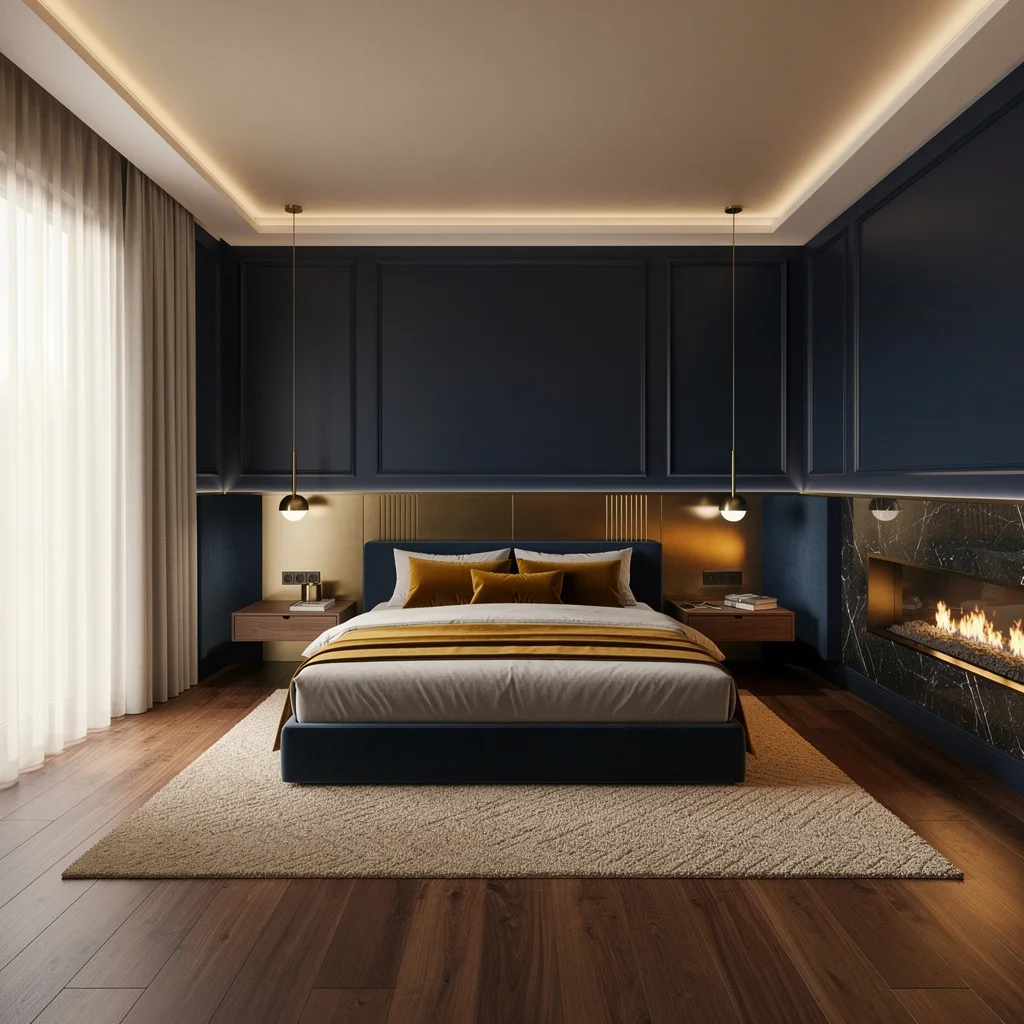
Go Full Luxe with Navy and Brass (No, You’re Not Too Fancy)
Dare to want a master suite that doesn’t look like a washed-out hotel? Bring in deep navy for instant moody glam and throw around brushed brass like you’re starring in your own Oscar-winning drama. Slap matte navy paint on paneled walls, wire in integrated LED uplighting, and put a custom headboard with brass inlay front and center. Use wide-plank walnut floors and anchor your bed with a chunky hand-knotted rug. Don’t half-send accessories—for texture, drop in velvet ochre cushions and sheer ivory curtains, and finish with a dark marble fireplace. Short version: rich materials, clean lines, and every daylight trick you can find. Always float your nightstands—nothing ruins the vibe faster than clunky furniture legs.
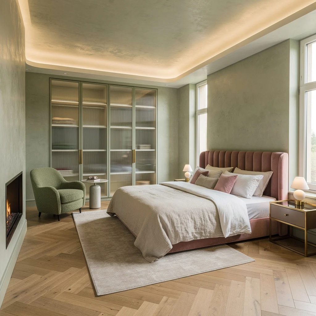
Chill Out with Sage Green and Rose (But Still Be Extra)
Want serene but not snore-inducing? Go sage green and muted rose for peace without putting everyone to sleep. Texturize your walls with limewash for movement—flat paint is for the uninspired—then pop a plush rose velvet headboard to break up the monotony. If you’re not using ribbed glass closet doors and oak herringbone floors, stop decorating and start over. Mix microcement for shine and keep things ambient with concealed cove lighting. Stay in your nook game with a moss-green boucle chair and minimalist fireplace. Rule one: never let your bedding or drapes out-shine each other—neutral layers and brass-edged nightstands keep you chic, not chaotic.
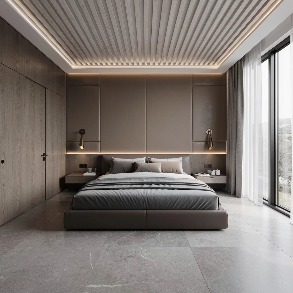
Channel Sleekness with Stone Gray and Warm Taupe
Sick of sterile gray death traps? Blend stone gray with warm taupe so your master actually feels like a suite, not an exam room. Go big with a full-height, leather-upholstered wall behind your low-profile bed and blast perimeter LED strips for glow without glare. Limestone tiles all the way into the bath = endless spa energy. Insist on grain-matched walnut cabinetry and minimalist bronze sconces for consistency. Lay white oak slats on the ceiling for rhythm and layer in silk curtains for privacy and softness. Pro tip: Silk drapery frames windows like a facelift for your walls—don’t cheap out.
Get Scandi with Misty Blue, Sans Boredom
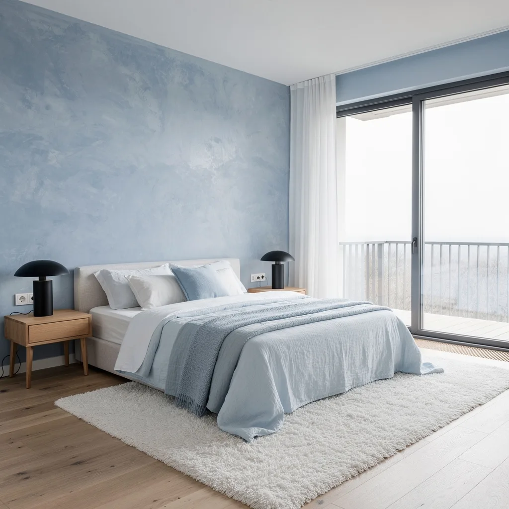
Not another all-white box, please. Instead, wash your bedroom in misty blue for calm that’s not clinical. Italian up your feature wall with Venetian plaster, then paint the rest cloud blue. Layer your bed with as many pale blue and white linens as you can find and install hardwired matte black reading lights—lamps are for rookies. Demand minimal oak nightstands and a serious high-pile rug; blue floors need not apply. Finish with wide planks in natural oak. Always run your curtain rods wide and high over glass doors to exaggerate the light—small windows kill Scandi dreams dead.
Moody AF: Charcoal, Emerald, and Ivory That Actually Works
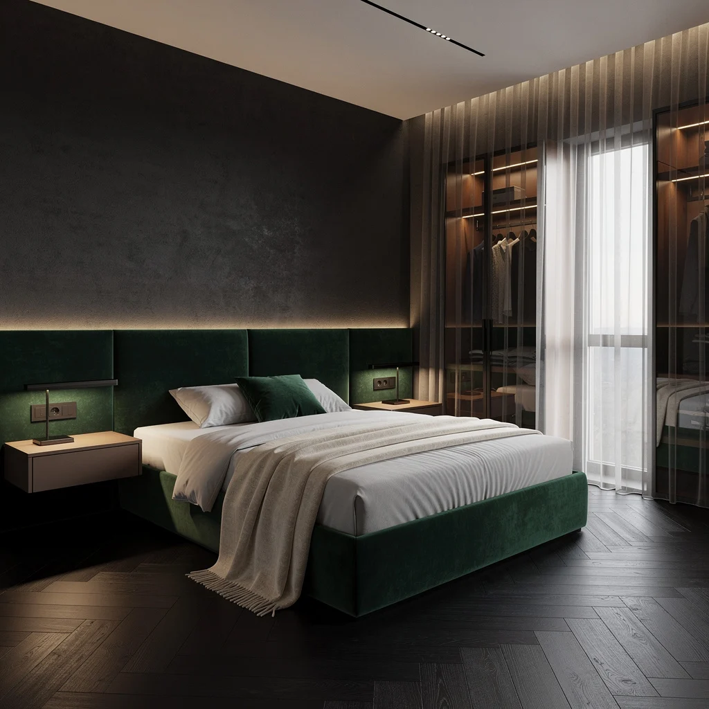
Moody doesn’t have to mean goth cave. Deep charcoal walls plus an emerald velvet headboard and black-stained herringbone wood floors? That’s how grown-ups do cozy. Slide in smoked-glass closet doors for mystery and keep your floating nightstands underlit for subtle lounge vibes. Top off your bed with an ivory cashmere throw—because standard throws are for the lost. Get full-height blackout and sheer curtains ready for dark naps and perfect lighting controls. Never trust a moody palette that doesn’t offer a hit of luxe ivory—contrast is everything.
White and Cream: So Fresh It Hurts Your Eyes (In a Good Way)
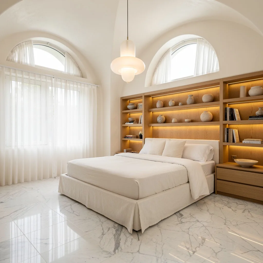
If you crave a room as crisp as freshly laundered sheets, stick with a strict white and cream palette. Sheetrock every surface, arch your ceiling for drama, then go wild with ivory linen for your platform bed (cotton bedding? Amateur move). Backlight built-in oak shelves to give pottery and books the diva treatment. Go hard with Carrara marble porcelain tile flooring—anything less will look basic. Let natural light into your life by using only tulle curtains—heavy drapes don’t belong here. Always invest in a statement pendant in frosted glass; those builder-grade fixtures just kill the vibe.
Live Large with Chocolate and Burnished Copper (Yum)
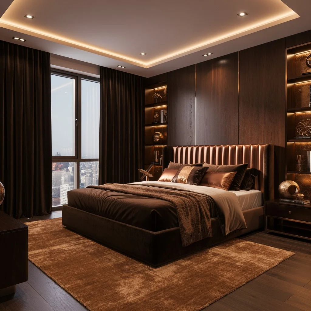
Make your bedroom edible—figuratively—with rich chocolate brown and burnished copper. Wrap your walls in walnut panels, then drop a copper-slatted headboard for that influencer-level finish. Pile mink satin and copper-toned linen pillows onto your bed, then demand dark coffee velvet for curtain drama. Recessed linear lighting will flatter every inch—overhead cans are for cubicles. Throw down a plush caramel area rug and illuminate bronze accents on shelving for depth. Never install curtain hardware at window height; go all the way to the ceiling if you’re serious about luxury.
Clay and Terracotta: Earth Tones That Won’t Age You
Sick of bland, safe colors that look straight out of grandma’s scrapbook? Throw clay and terracotta on your walls and windows for modern earthiness. Go all in on textured clay plaster finishes and bring terra cotta suede drapes for an organic hit. Keep the bed low—give it woven linen upholstery, not polyester nightmares—and skip clunky nightstands for slim, natural oak. Let terrazzo flooring flow and commission a custom wall mural in faded earth tones (yes, your landlord will recover). Layer in a woven jute rug and blast spotlights on your best ceramics. Here’s the move: keep lighting adjustable to highlight textures—ambiance is everything.
Slate Blue + Alabaster: Chill, But With Range
No one needs another rental gray. Instead, push slate blue walls behind your bed with slats for texture and paint the rest of the room creamy alabaster. Float your minimalist bed on a platform—skip clunky frames and go ribbed or go home. Use French oak for flooring and throw in a cozy cushion pile in your bay window nook to win at relaxation. For lighting, hang frosted globe pendants for subtlety and add custom cabinetry to store chaos out of sight. Never buy short drapes—proper neutral wool curtains must hit the floor or your room shrinks instantly.
Dare to Go Dark: Ink Black and Gold for Drama
Your bedroom can be dramatic without being a Batman cave. Go for ink black everywhere—a matte black bed frame, black marble side tables, and then pile on the gold with a padded headboard and gold-leaf trim on graphite walls. Anchor with a silk area rug in pale gold; shag carpet is not invited. Use cove lighting and flush-mount LEDs to make sure every surface glows, not glares. Lower blackout drapes in fine sateen so sunlight only sneaks in when you want it to. If your hardware isn’t gold, repaint it—you need consistent metal action for real drama.
Stormy Hues: Make Gray Feel Peaceful, Not Gloomy
If you want serenity with an edge, drench the room in stormy blues, steel gray, and silver for literal chill vibes. Mix matte cool gray paint with metallic plaster for the right dose of soft and glam, and mount an asymmetric blue-gray headboard for visual chaos with purpose. Don’t skip polished concrete floors—slap down a handwoven blue wool rug over them before your feet freeze. Chrome floating nightstands and sculptural reading lamps finish the look. Pro tip: sheer silver curtains should hit the floor and reflect daylight to keep gloom at bay—no half measures.
Refined Mahogany and Lavender: Grown-Up Girly, No Fluff
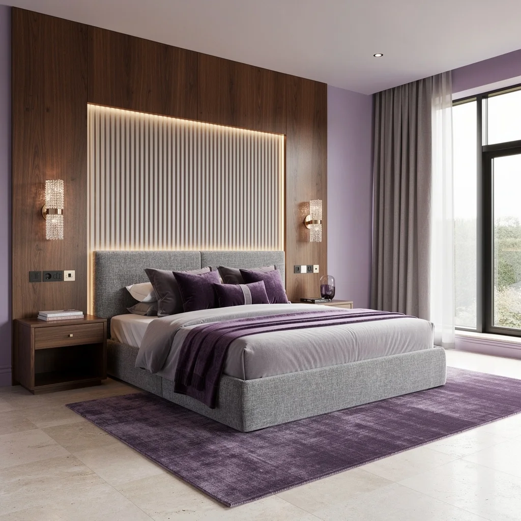
Level up past blush pink—chase dusty lavender with rich mahogany detailing for a bedroom that’s elegant, not twee. Install a fluted mahogany wall with integrated LEDs behind the bed and hit all other walls with chalky lavender paint. Upholster your bed in tactile gray chenille, then load it up with velvet and silk cushions—plain cottons need not apply. Lay pale travertine for your floors and add a deep lavender rug for foot drama. Stay sharp with bespoke walnut nightstands and finish strong with crystal sconces. Quick rule: blackout linen curtains mean real sleep—your circadian rhythm will thank you.
Final Thoughts
A master bedroom color scheme that works properly doesn’t just look good in photographs — it changes how the room feels at seven in the morning, how it reads by lamplight at ten at night, and whether the person waking up in it feels like they’re in a space that was designed for them or a space that happened to contain them. The difference between these two experiences is almost entirely a function of color commitment — not color expense, not color convention, but the willingness to make a decision about what the room is going to be and execute it without hedging. The bedrooms that get it right are the ones where someone stopped playing it safe long enough to find out what their room could actually look like.