
Minimalism got a bad reputation somewhere along the way, and frankly it deserved it—because for a while there, “minimalist entryway” became code for “I removed everything and called it a design choice.” A single white wall, a bare hook, and a doormat that says “welcome” in a font that’s trying too hard. That’s not minimalism. That’s just an unfinished room with philosophical pretensions.
Real minimalist design is one of the most demanding approaches you can take, precisely because there’s nowhere to hide. In a maximalist room, a wrong choice gets absorbed by everything around it. In a minimalist one, every single decision is fully visible and completely accountable. The lamp, the rug, the one plant you chose to keep—they’re all on their own out there, making a case for why they deserve to exist in the space, with no crowd to blend into.
The entryway is where minimalism either pays off spectacularly or falls apart immediately. Get it right and you walk into your own home and feel something—a kind of calm that registers before you’ve consciously processed anything. Get it wrong and you’ve created a space that feels less like intentional restraint and more like you just haven’t gotten around to decorating yet. The difference between those two outcomes is almost entirely about quality of choice rather than quantity.
These six setups show what minimalist entryway design actually looks like when it’s done with conviction—and what makes each of them work rather than just look empty.
The Minimalist Trap Most People Fall Into
Minimalism fails in entryways for a handful of very predictable reasons, and knowing them upfront saves a significant amount of redecorating.
Removing things without making decisions — Minimalism isn’t the absence of stuff, it’s the presence of intention. Clearing a surface and leaving it empty is not a design choice, it’s a pause. The difference is whether what remains was chosen or just left over after everything else was cleared away.
Choosing neutral without choosing interesting — The minimalist color palette tends toward whites, creams, taupes, and greys, which is fine—but within that range there’s an enormous difference between interesting and bland. Texture, tone variation, and material quality are what separate a minimalist space that feels luxurious from one that feels like a rental waiting for the next tenant.
Ignoring the vertical dimension — Minimalist entryways frequently get the surface level right and completely abandon everything above it. The space between the top of the furniture and the ceiling is part of the room. Leaving it unaddressed doesn’t create calm—it creates an unresolved quality that undermines the whole composition without the owner being able to identify exactly why something feels off.
What Separates the Good Minimalist Entries from the Just-Empty Ones
Three consistent principles show up in every minimalist entryway worth looking at twice.
Material quality fills the role that quantity cannot — When you’re working with fewer objects and less visual complexity, the quality of what’s there carries the entire aesthetic weight. A cheap hook on a beautiful wall still reads as cheap. One excellent ceramic tray on a floating oak shelf reads as curated. Material choice is not optional in a minimalist space—it’s the whole game.
Every functional element gets the same design attention as the decorative ones — The hook isn’t just a hook, it’s a considered piece of hardware. The rug isn’t just floor coverage, it’s a texture decision. Minimalist spaces fail when the practical elements are treated as an afterthought and only the “decorative” pieces get design consideration. The functional stuff is more visible here than anywhere else, not less.
Negative space is an active ingredient, not leftover space — The empty wall beside the console, the floor visible around the rug, the ceiling above the furniture—these aren’t areas waiting to be filled. In a good minimalist entry, the space around things is as considered as the things themselves, and removing that breathing room in favor of one more object almost always makes the composition worse.
Minimalist Entryway Ideas Worth Stealing
Sage Board-and-Batten with Brass Lighting and Zero Apologies
My cozy front entryway!
by u/leeanneloveshfx in CozyPlaces
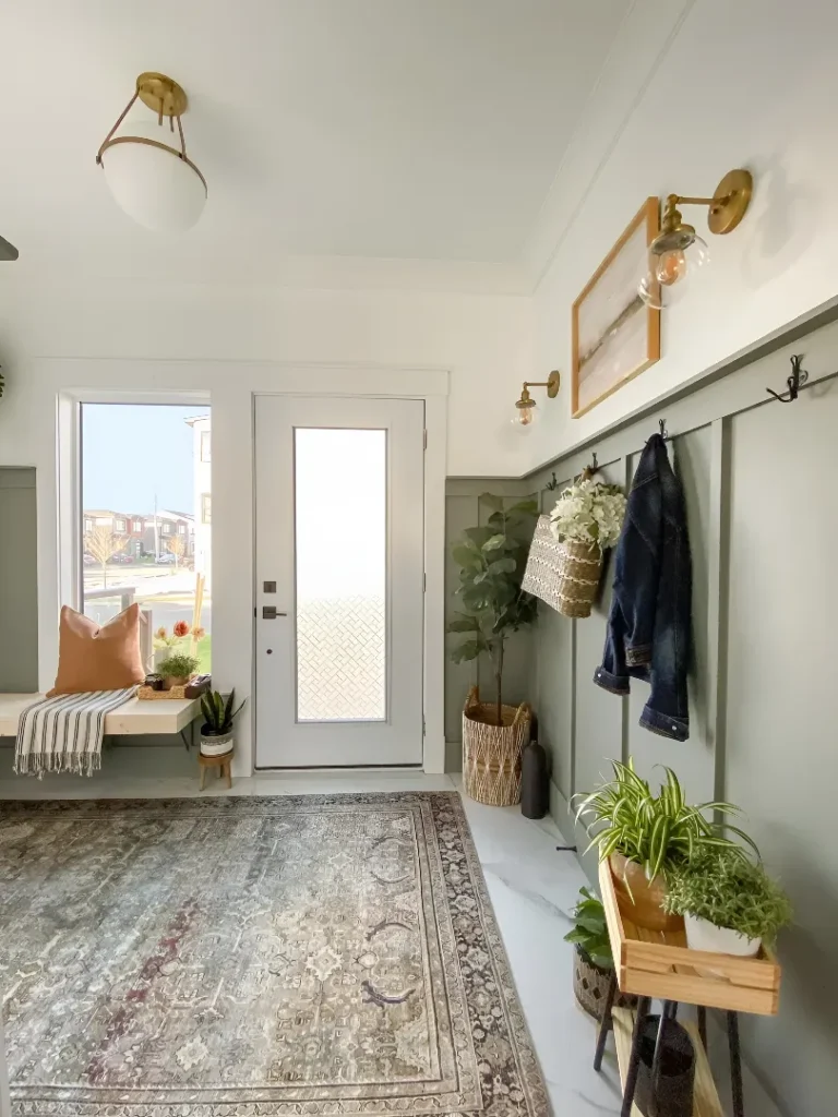
The thing about this entryway that makes it work where similar setups don’t is that it commits to warmth rather than coldness—which is the move that saves minimalism from feeling clinical. Sage green board-and-batten runs along one full wall, giving the space texture and color that reads as intentional without being loud, and a row of simple dark hooks mounted directly into the paneling handles the practical work of a busy entry without a separate rack or built-in. Two brass globe sconces provide warm, directional light that no overhead fixture could replicate in this space, a framed landscape print in a gold frame adds the one decorative moment the wall gets, and a simple wood bench with a striped throw and terracotta cushion sits at the window end. Plants are the wild card—a fiddle leaf in a basket, potted greenery on a wood plant stand, smaller pots near the bench—more of them than a strict minimalist would allow, but each one placed with enough deliberateness that the collection reads as curated rather than accumulated. The vintage Persian runner ties the whole floor together while adding the one note of pattern the space needs to avoid feeling flat.
Warm Wood Pivot Door with an Arched Entry and Absolutely Nothing Competing With It
The uncluttered entry that doesn’t feel vacant is a harder trick than it looks, and this setup pulls it off by making the architecture itself do all the decorative work. A large-format vertical-slat oak pivot door flanked by full-height glass sidelights is the centerpiece, visible the moment you step through the arched opening from the adjacent room, and it’s beautiful enough to justify the near-total absence of anything else. A round jute rug anchors the floor space in front of the door, a terracotta olive tree in a dark clay pot provides the one organic element at ground level, and on the far right wall, a rattan-drawer console with a single woven vase and an organic-shaped mirror handle all the remaining visual weight together. A large drum pendant in linen provides centered overhead light without competing with the door’s grain and texture. Nothing else is present because nothing else needs to be—the decision to invest in genuinely beautiful architecture and then step back from it completely is exactly the confidence that makes minimalism work.
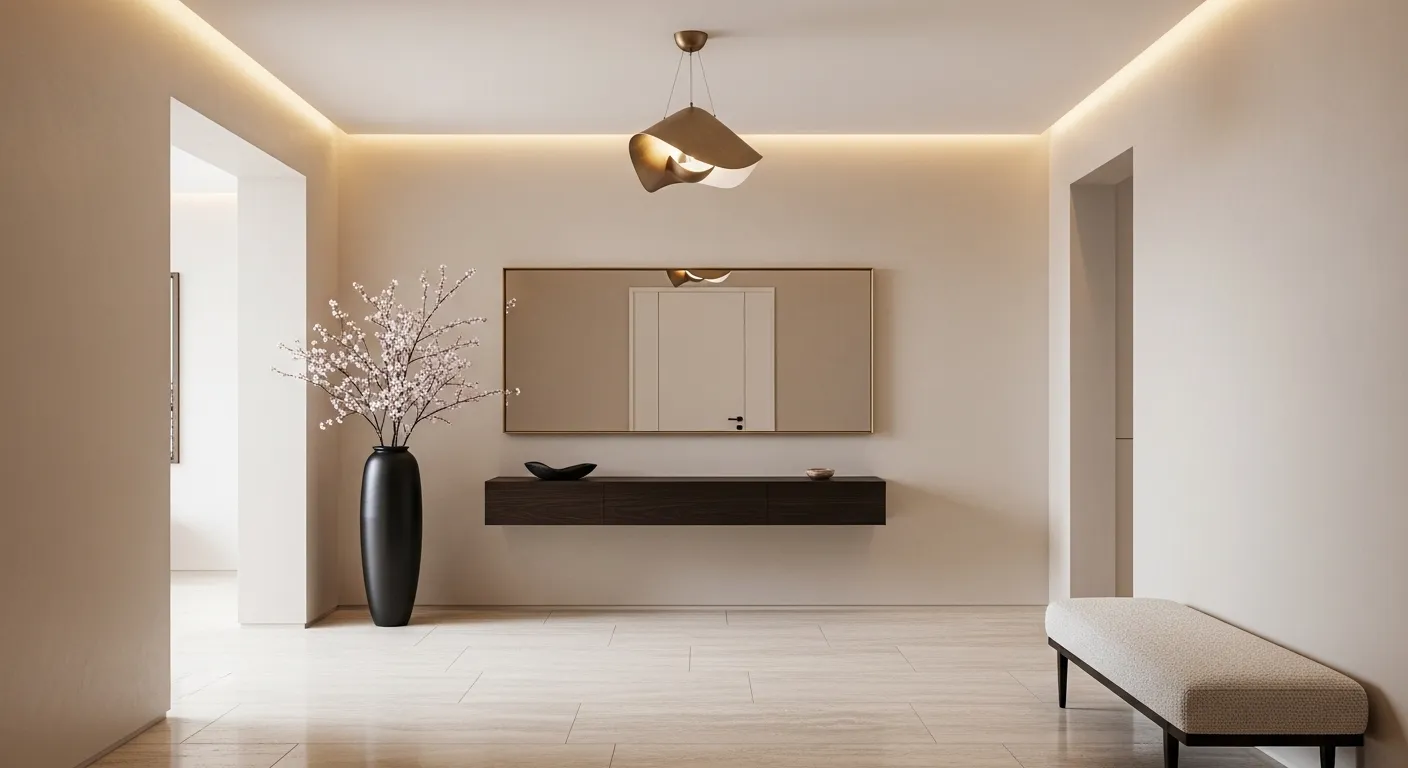
Sculptural Console with a Wavy Mirror That Broke the Shape Rules
The organic mirror trend exists because someone looked at a room full of rectangular frames and decided there had to be a more interesting option—and in the context of a minimalist entry, the wavy-edged mirror delivers a softness that the space would lose without it. A chunky cylindrical-legged oak console with a rounded front edge brings sculptural presence at furniture level, the undulating dark-framed mirror above it introduces movement without pattern, and the wall behind both of them is covered in large-format handmade-looking tile in a warm sandy tone that gives the whole setup a textural richness no painted wall could provide. The tabletop styling is almost laughably restrained: a ribbed black lamp with a pleated shade, a stack of books, two small matte vessels in black and sand, and one large textured ceramic vase with loose dark greenery. A geometric jute rug underfoot adds the final layer of natural texture. This is a setup that looks expensive not because it is, but because every choice shares the same organic, warm sensibility—and that consistency of vision is worth more than budget.
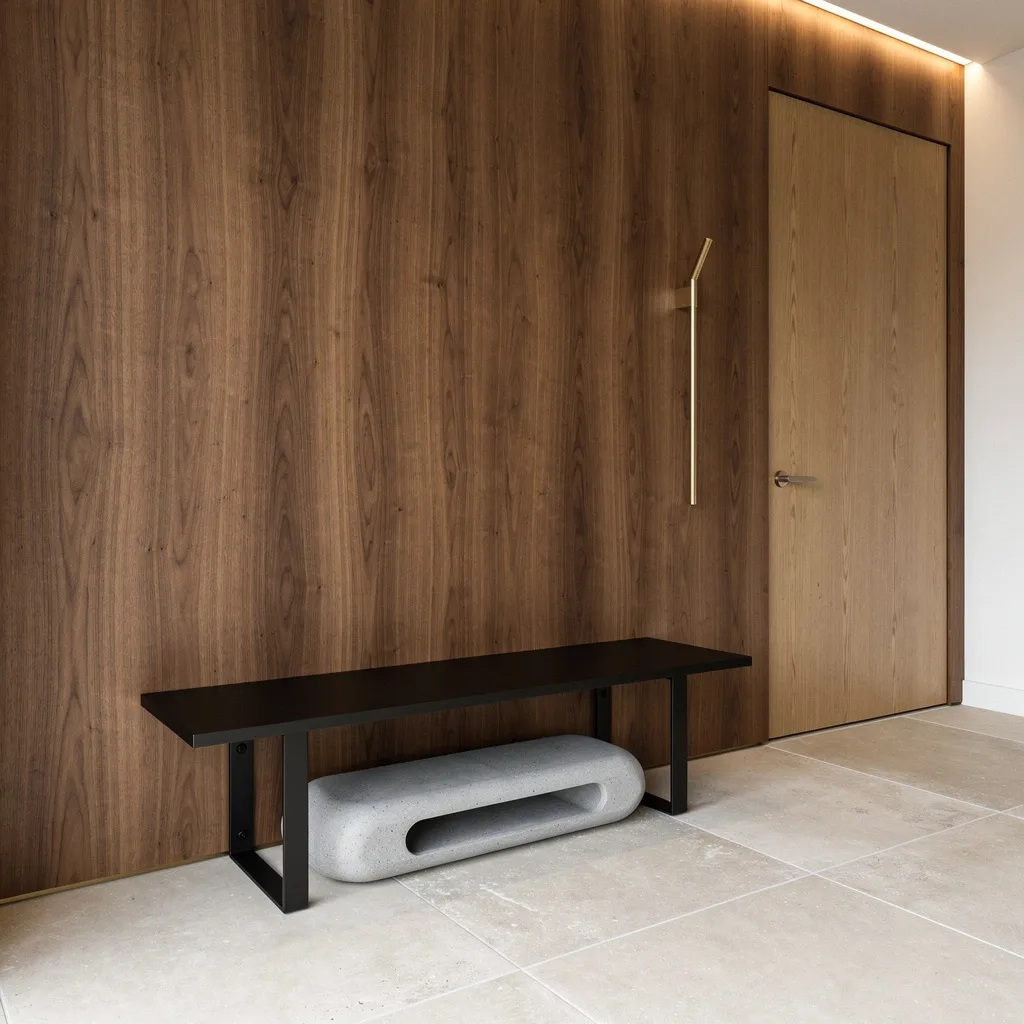
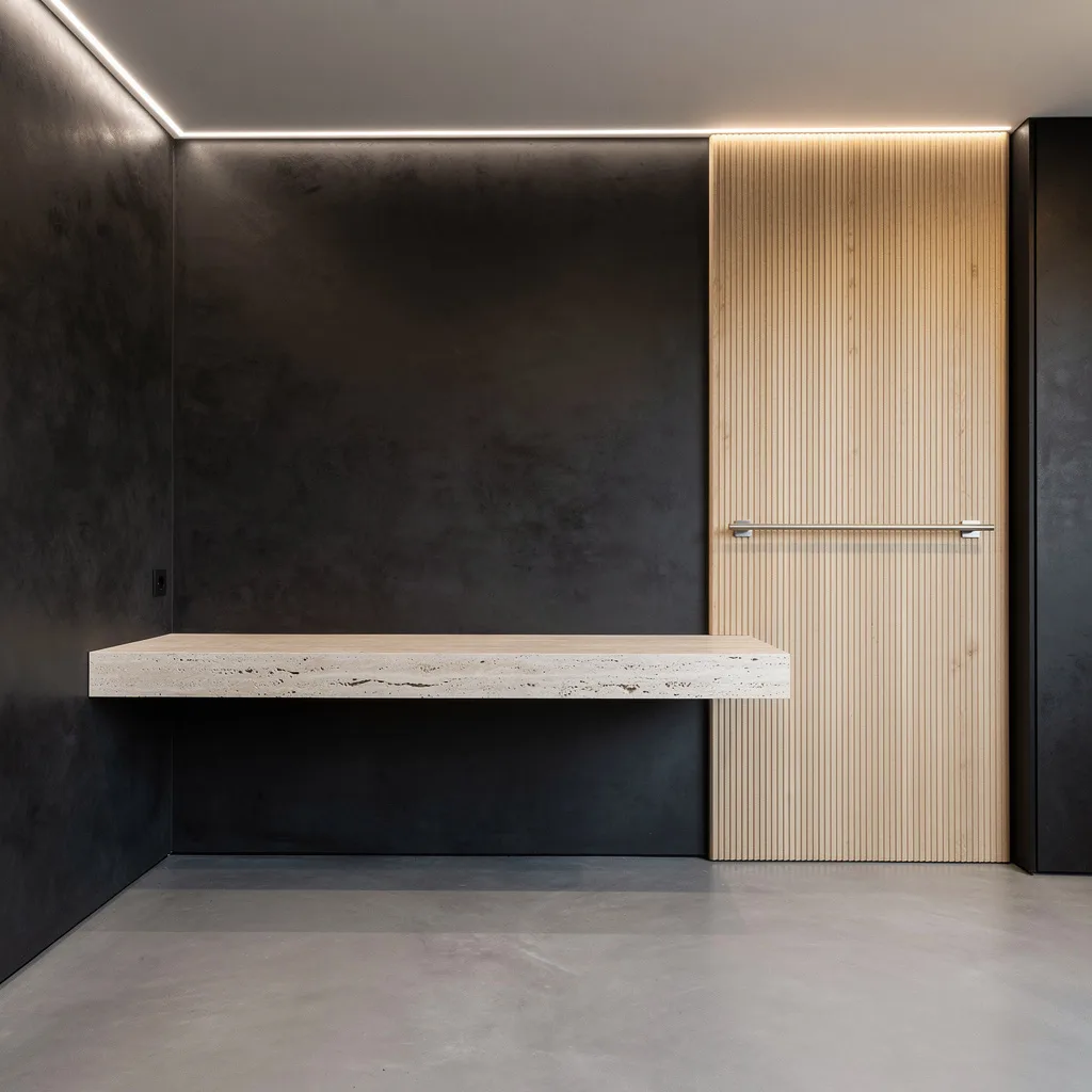
Dark Slat Panel with a Floating Console and Two Ottomans Doing All the Work
The partial feature wall is a move that minimalist design handles better than almost any other approach—because using slat panels for one vertical band rather than covering an entire wall creates composition without overwhelming the space. Dark walnut-toned slats run floor to ceiling in a single column, an irregularly shaped frameless mirror hangs against them for a shape contrast that’s doing a lot of quiet work, and a floating two-drawer console in matching tonal wood sits in front of it all with two cylindrical upholstered ottomans underneath for seating. Three minimal matte hooks on the adjacent plain wall handle outerwear, a fiddle leaf fig in a white textured pot provides the one green note the room needs, and the warm oak flooring runs continuously through without any rug interrupting it. Everything here is paired: the slats with the smooth wall, the circular mirror with the rectangular console, the dark handles with the light drawer fronts. That system of deliberate contrasts is what gives a space with this few elements its visual interest—without it, the room would feel not minimalist but simply sparse.
Black Console, Gallery Wall, and a Brass Lantern Walking Into a Narrow Entry
Narrow entries are where minimalism stops being a stylistic preference and starts being a structural necessity—and the constraint produces some of the most resolved design decisions, because there’s no room for hedging. A black console table with clean bracket-free legs and a lower shelf sits against one wall, topped with a single large ceramic vase in graphite grey, two stacked books, and a small gold bowl: three items, three heights, done. Above it, a grid gallery wall of nine identically framed black-and-white photographs creates visual interest across the full height of the wall without introducing any color that would compete with the black door at the end of the corridor. Two black wall sconces with white shades illuminate the art from either side, a brass open-frame lantern pendant handles the overhead light with warmth, and a black-and-cream geometric runner leads the eye directly toward the door. The white walls and cream carpet make this level of black and brass work without tipping into heaviness—the light surfaces around the dark elements are part of the composition, not just a neutral background.
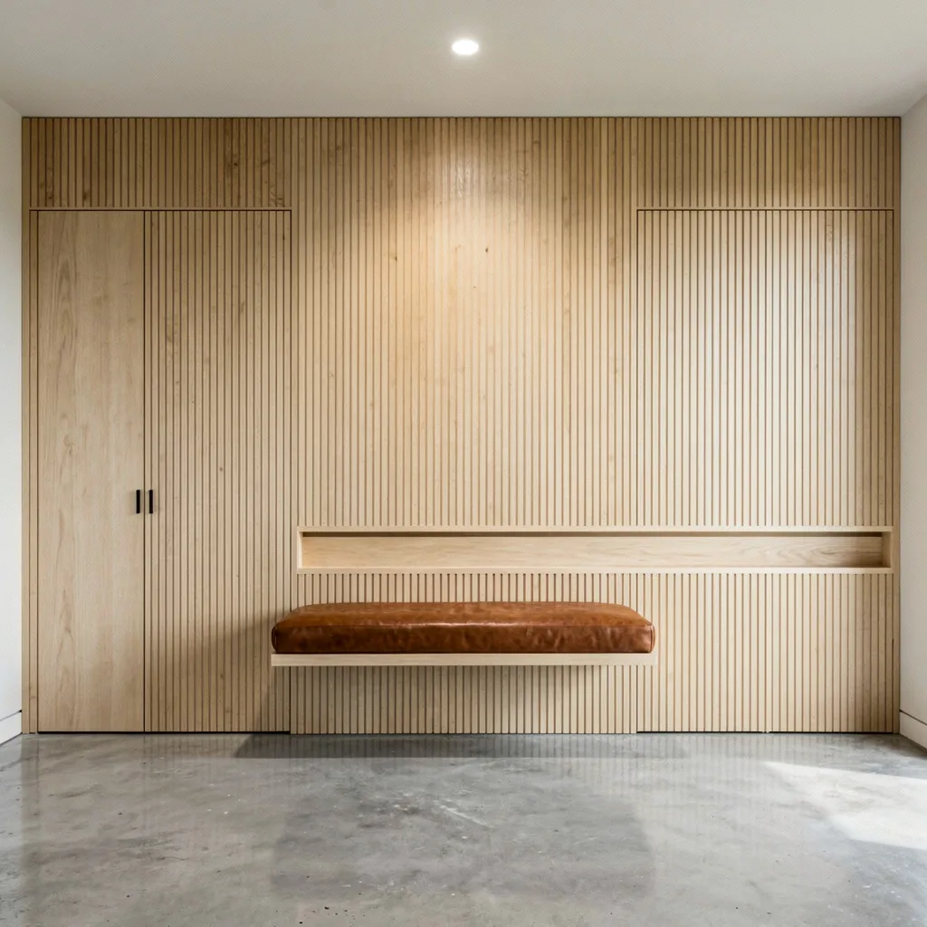
Wood Slat Storage Wall with Modular Cabinets and Art That Earns Its Corner
The working entryway—the one that has to handle coats, shoes, bags, and sports equipment on a daily basis—has no business looking this good, and yet here it is. Vertical wood slats in a warm honey tone cover one full wall, wall-mounted hooks carry an actual jacket and a badminton racquet without embarrassment, a bench with cushioned seat and open cubbies beneath handles shoe storage in full view without looking chaotic, and a tall white modular cabinet beside it handles everything else behind closed doors. On the opposite wall, a floating white shoe cabinet with push-latch drawers and a small green plant on top keeps the practical infrastructure visible but composed, and above it a geometric abstract print in mustard, cream, and black introduces the one moment of color in an otherwise neutral space. The setup works because the storage is distributed and differentiated—open cubbies for things that need to be grabbed quickly, closed doors for things that need to stay hidden—rather than demanding that everything be concealed or everything be on display. That honesty about how a real entry actually functions, solved with enough design attention to look deliberate, is the most useful minimalism of all.
Go Rich with Walnut and Matte Black—Stop the Boring Door Drama
If you want your entryway to feel like it has its life together, slap on vertical walnut veneer—hello, instant warmth and texture. Ditch the clunky bench; go for a floating matte-black metal number with no visible brackets and let those limestone tiles span the floor like you’re entering a spa, not a hardware store. Install an oak pivot door so flush it’ll make your old door jealous and throw on linear LED uplighting to highlight the walnut grain. Keep it clean with a single brass hook at eye level and a sculpted concrete tray for shoes. Rule: No visible hardware, no extraneous baskets—this vibe is for grown folks who can handle a little restraint.
Get Ultra-Bright: Venetian Plaster for the Vanity Crowd
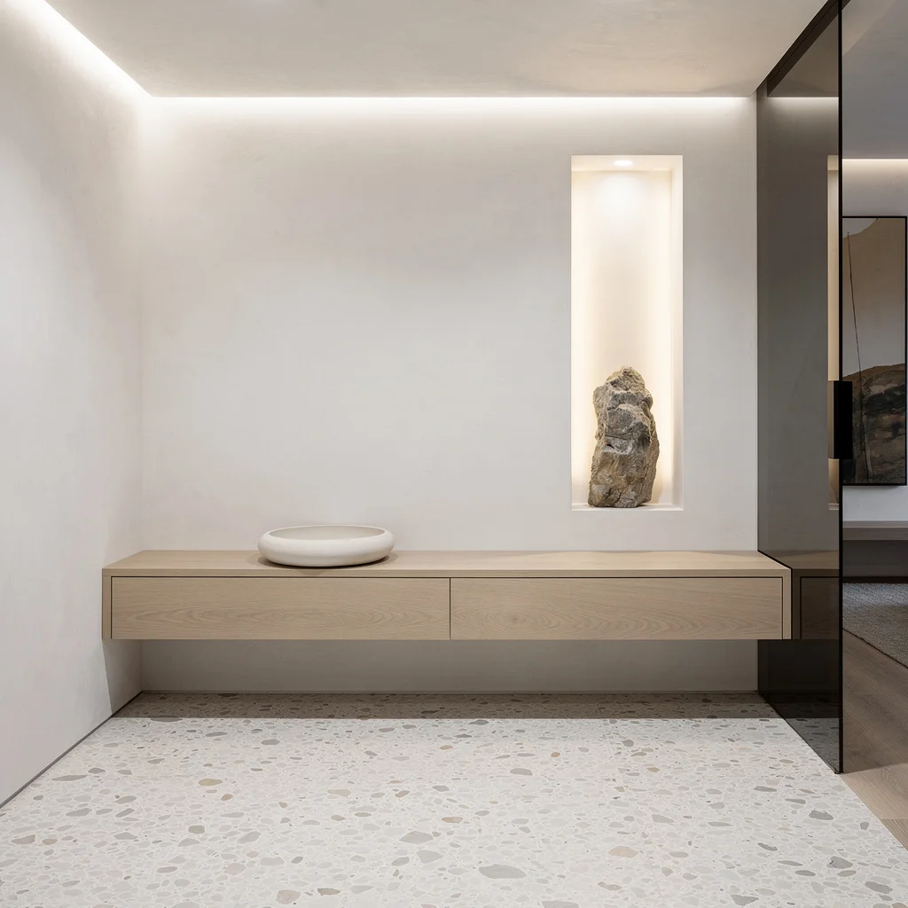
Want a pristine entry that screams ‘I care about surfaces and you should too’? Coat your walls with Venetian plaster in crisp white, add a ceiling-integrated slim light cove to flood your ashwood console with subtle drama. Toss down some pale terrazzo with flecks, just for a smidge of movement, and install a smoked frameless glass divider for separation without shutting down the vibe. Let your keys chill in a single ceramic tray, with an inset vertical niche lit for an organic stone sculpture nobody needs, but everyone secretly loves. Keep it tranquil—if it can’t earn its place, toss it.
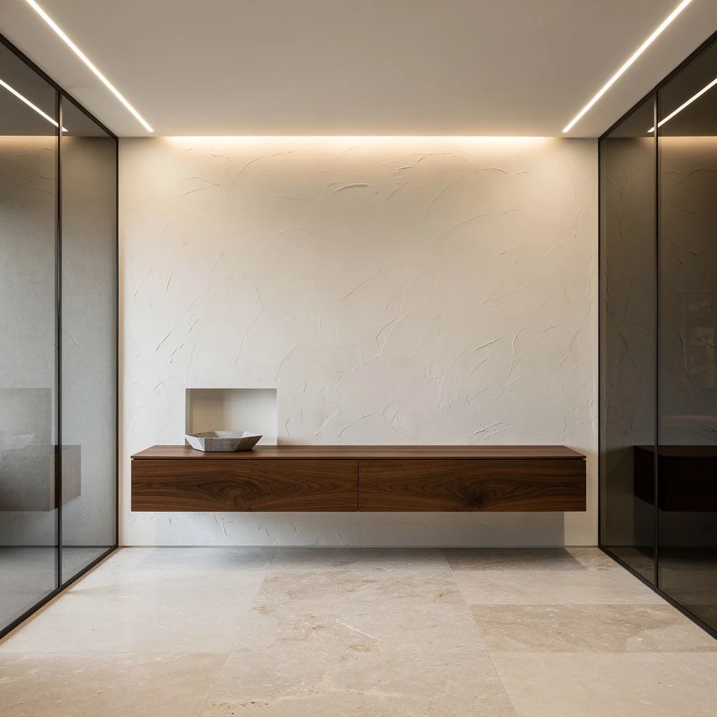
Embrace Moody Minimalism: Travertine and Microcement FTW
If your heart beats for high-end chill, bring in a honed travertine ledge cantilevered from a deep charcoal limewashed wall. Microcement the floors so seamless, you might trip over your sense of awe. Use linear LEDs to trace wall/soffit intersections and keep lighting indirect, not screaming for attention. Add a fluted pale oak panel for discreet texture. Get real about storage: integrate a brushed-nickel rail in your wall for the essentials only, because ‘valet zone’ is code for ‘don’t put your keys everywhere.’ Pro tip: Space out your LED strips to keep things chill—not a rave.
Mirror Magic: Because Selfies Need Good Lighting, Duh
If you crave an entryway that feels bright, tall, and gallery-ready—slap up a floor-to-ceiling, frameless mirror panel. Pair it with a flush, light bleached-oak shoe cabinet with touch-latch doors. Tumbled limestone pavers add grown-up texture underfoot. For lighting, toss out the builder-grade junk and get a custom circular wall sconce with a diffused halo, so every entry feels dramatic. Let the matte lacquered door blend right in, then stage books or anything worth displaying in a fine-edged, softly lit niche. Rule: Never let mail stacks outgrow your mirror’s real estate.
Filter Daylight: Ribbed Glass Is Your Entryway’s Ultimate Flex
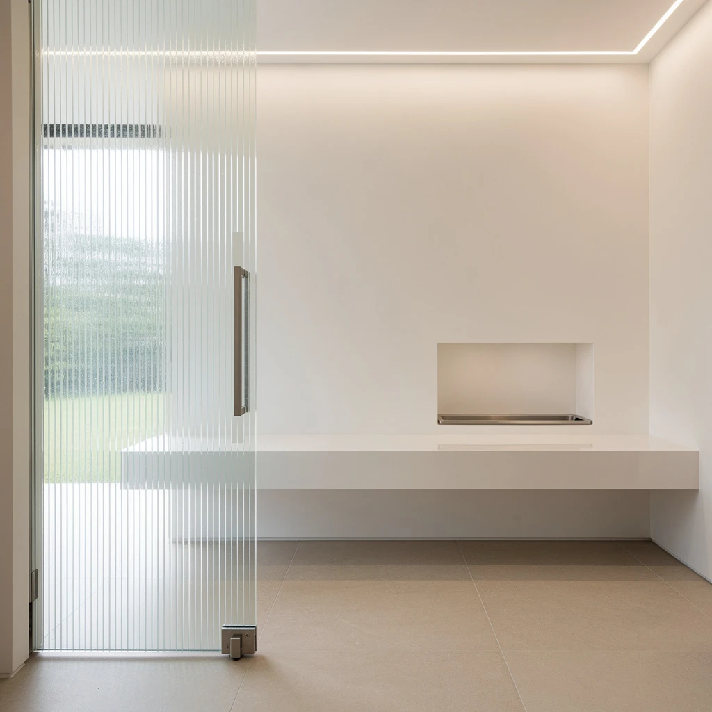
If your entry feels sad and dark, bring in a ribbed-glass sliding pocket door—daylight filtered, privacy intact. Floors? Matte porcelain tile in sand tones should do the trick. Mount a floating white Corian bench for seamless style, skip visible supports (they’re for quitters). Install a mini stainless tray in a niche for keys, and blast ambient light from a hidden ceiling LED wall grazer. If your details aren’t flawless, people will notice—so obsess over junctions. Pro tip: Slide that door closed when the nosy neighbors are peering, but leave enough glass to flex your style.
Stripe Up with Maple Slats for Tactile Minimalism
Ready to look like you actually hired an architect? Line your entry with thin, vertical European maple slats across wall and closet doors for texture without the circus. Underfoot, lay polished concrete—cold, chic, brutalist, but warm it up with a flush-mount, leather-wrapped bench that’s actually built in. Want function? Carve an ultra-thin groove picture rail for mail/keys, instead of random baskets. Center a flush LED downlight for crisp illumination. Rule: No visible hooks. Stop clutter before it starts by making storage subtle and dope.
Invisible Doors and Taupe: Sophistication for the Shady
If you’re tired of obvious doors screaming their existence, wrap them in flush matte taupe panels—let the entry look mysterious and grown. Use large-format porcelain slabs on the floor with warm stone veining for that ‘yacht club but chill’ vibe. Add a blackened steel shelf seamlessly, then light it up with a horizontal slot embedded in the wall. Centralize a circular stone catch-all because stray coins are for basic people. No hardware, no junk. Rule: Align your shelf perfectly—that’s what separates you from middle-tier design. Don’t let lighting outshine the space.
Staggered Travertine Tiles Mean No More Boring Walls
If you want geometry without going full math nerd, use travertine tiles staggered horizontally for balanced rhythm. Go for a floating monolithic bench in Scandi birch, then build in a shoe drawer underneath so footwear doesn’t become décor. Flush square ceiling lights are your move—forget anything pendant-shaped. Micro-topping taupe floors add subtlety; frame your entry niche in matte aluminum for a wink of contrast without getting obnoxious. Conceal every functional element; your friends will think you hired a designer, but really, you just stopped showing off junk. Rule: Never over-style a bench. Minimalism means one tray, not ten plants.
Entryway Transparency: Glass Pivot Doors for the Bold
If you’re into flexing every square inch, throw in a nearly invisible full-glass pivot door with ultra-slim bronze framing—good luck hiding from delivery people, but you’ll have insane light. Seamless pale terrazzo floors with micro-aggregate make the entry feel modern, not clinical. Pair a cantilevered limestone shelf with a recessed, lit cubby for drama without clutter. Let the Venetian plaster walling do the talking—mute gray, just soft enough. Stick to pristine white ceilings and perimeter cove lighting for that floating vibe. Rule: Make sure your cubby is always lit; nothing ruins the look like a dead LED.
Oak Panel Walls: Minimalism for Storage Hunters
If you need storage but hate the sight of it, wrap your main wall and closet in custom-seamed white oak panels—interrupted only by your need to function. Lay off-white, speckled terrazzo across the floor so you don’t start the day in sadness. Float a softly curved matte lacquer credenza to mimic the wall’s lines, and stash your essential items in an architectural tray tucked in a niche. Spotlights should be subtle—think pools of light, not interrogation room. Rule: Keep handles invisible and always, always match your wood grains from panel to panel.
Backlit Onyx: Minimalism for People Who Like Drama
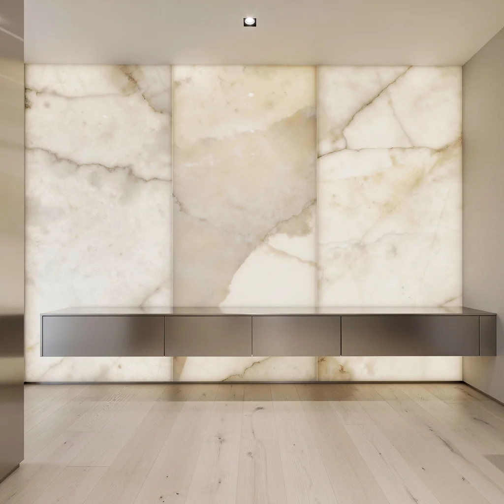
If you crave entryway drama without a chandelier, hang massive pale onyx panels and backlight them for a vibe that’s more rave than rental. Wide-plank white-oiled oak is your floor move—soft, luxurious, but not yelling for attention. Float a satin stainless steel cabinet beneath, keeping storage hidden and surfaces clean. Run a single recessed spotlight for subtlety and let the onyx glow do most of the work. Rule: Don’t over-decorate. Let your premium materials flex; anyone who puts a fake plant on their onyx deserves jail.
Hand-Troweled Clay Walls: Welcome to Minimalist Zen
If you’re all about calm vibes, slap on hand-troweled clay plaster in a chill off-white, then mount a brushed walnut floating cabinet that shows continuous grain—Commitment, baby. Divide the space with floor-to-ceiling tinted glass panels. Lay honed, large-format fossil limestone floors for that rich, ancient look (minus the dust). Linear ambient lighting in the ceiling grazes wall and floor; every element intentional, no uglies allowed. Stash a geometric stone tray in a recessed alcove. Rule: If you add anything plastic, expect a visit from the design police. This space is for tactile purists only.
Final Thoughts
Minimalist entryway design rewards patience and punishes impulse buying more severely than any other approach, which is either the appeal or the deterrent depending on how you think about interiors. Every object in the space is fully exposed to scrutiny, which means the bar for what earns a place there is genuinely higher than it would be in a busier room.
The entries on this list succeed not because they contain fewer things in absolute terms, but because everything present was chosen rather than defaulted to. The hook style, the rug scale, the plant species, the hardware finish—in a minimalist space these are not minor details that get absorbed into the overall effect. They are the overall effect. There’s nothing else to look at.
Start by deciding what the space needs to do—store coats, handle shoes, give you a surface to put things down for thirty seconds—and meet those functional requirements with objects good enough to look at once the practical job is done. The minimalist entries worth living in aren’t ones where someone removed everything until discomfort set in. They’re the ones where someone kept removing things until only what was genuinely worth keeping remained, and then stopped right there.