
Small dining rooms get a bad rap, but honestly? They can be some of the coziest, most intentional spaces in a home. The dining setups below prove that limited square footage doesn’t mean compromising on style or function. From clever banquette seating to statement lighting that punches above its weight, these small dining room ideas show how to make every inch count while creating spaces that actually make you want to linger over dinner.

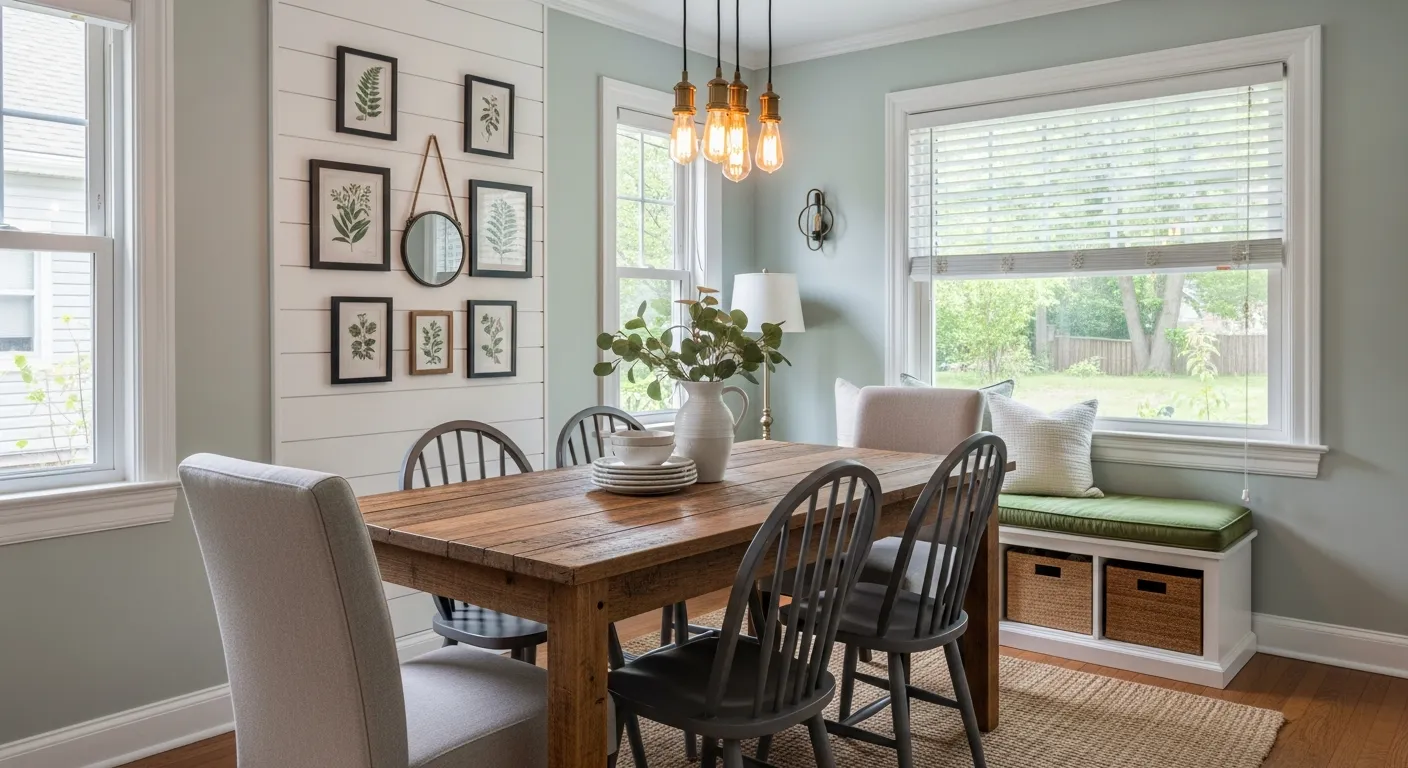
This dining room nails that perfect balance between cozy and stylish. u/confidentbut went with a sage green accent wall that creates such a calming backdrop—it’s the kind of color that makes the space feel intentional without being too bold. That woven rattan pendant light is gorgeous, it adds texture and warmth overhead without taking up visual space. The round wood table is smart for small rooms since there are no sharp corners to navigate around, and those light upholstered chairs keep things feeling airy. The large round mirror with wood frame is doing so much heavy lifting here—it reflects light around the room and makes the space feel way bigger than it actually is. Those floating wood shelves flanking the mirror add both display space and symmetry. The natural jute rug grounds everything and adds another layer of that organic texture. The mix of plants throughout brings life without cluttering, and that macrame wall hanging adds a boho touch.
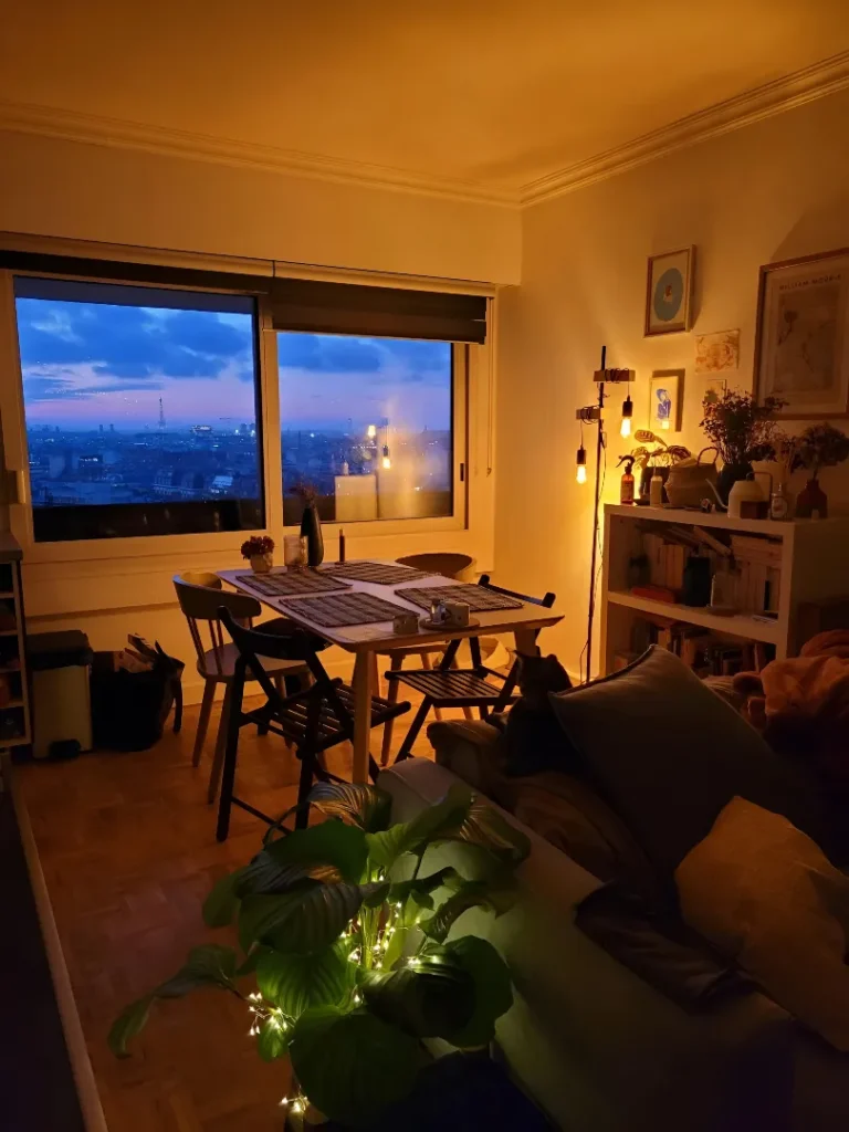
This small dining space totally gets it—when you’re working with limited square footage, good lighting and a killer view make all the difference. u/schraderbrau set up this cozy corner that takes full advantage of those floor-to-ceiling windows with the cityscape beyond. The warm golden glow from the pendant lights creates such an inviting atmosphere, especially at dusk when the city lights start twinkling outside. That simple wood dining table and mismatched chairs keep things feeling casual and collected rather than too formal. The open shelving unit styled with plants, books, and decor does double duty as storage and a room divider without blocking light or views. The way plants are incorporated at different levels—on the windowsill, on the shelves, tucked in corners—brings so much life to the space.
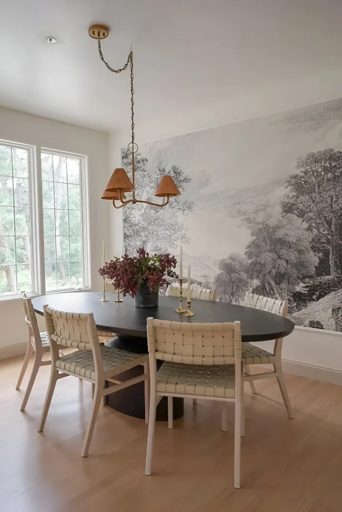
This dining room is basically a lesson in how one statement wall can completely carry a space. u/Halcyon-Haus chose that monochromatic landscape mural with its misty, dreamy quality that’s absolutely stunning—it adds so much depth and makes the room feel way bigger than it actually is. The soft, atmospheric trees and fog create such a serene backdrop that you don’t need much else going on. The black oval dining table grounds the space and provides contrast against all that soft gray imagery. Those woven leather chairs in natural tones are gorgeous—they add warmth and texture that prevents the neutral palette from feeling too cool or stark. The beautiful floral arrangement and tall candlesticks on the table bring in just enough color and life.
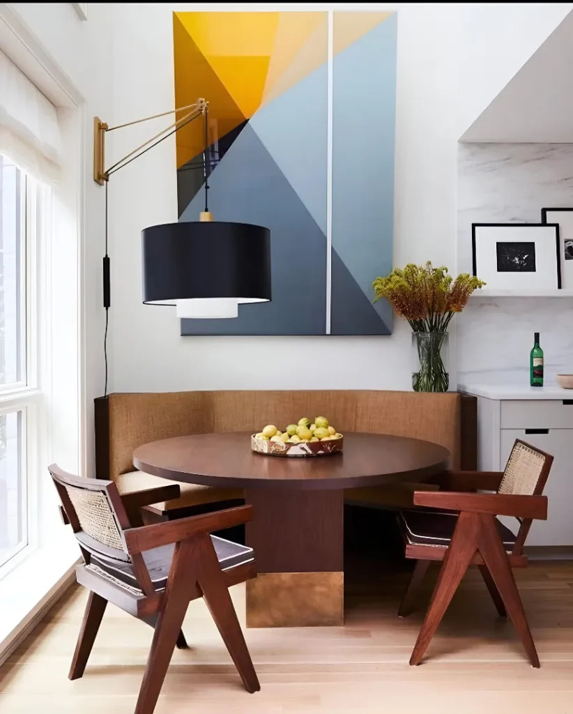
This small dining nook is all about that mid-century modern vibe done right. u/BeginningTumbleweed built in a curved banquette in warm walnut that creates such a cozy, wraparound seating situation—it maximizes space without needing multiple chairs taking up floor area. The round pedestal table in matching wood tones is perfect for the scale. Those cane-backed chairs with the sculptural wood frames are absolute classics—they add visual interest and that signature mid-century look without being too heavy. That oversized abstract painting in mustard yellow, slate blue, and rust tones brings in such a bold pop of color that anchors the whole vignette. The brass and black pendant light hanging low over the table adds focused task lighting and a modern touch.
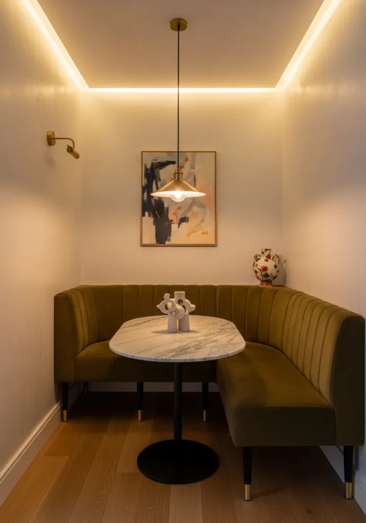
Corner banquettes are one of those smart solutions that just make sense for small dining rooms. The idea here is wrapping seating around a round marble table so you’re using corner space that often goes to waste. Deep-olive velvet for the upholstery brings in richness without feeling too heavy, and adding brass-tipped legs keeps it from looking like built-in furniture—it reads more custom and intentional. Marble tabletops always feel a bit luxurious, but keeping it round means the space stays approachable and easy to move around. The key with this approach is layering in warmth through things like oak parquet flooring and pale plaster walls so all that elegance doesn’t tip into cold or formal. A single piece of abstract art and a sculptural centerpiece give personality without clutter. The real genius is in the lighting—combining a low brass pendant with recessed cove lighting means you get both task light for eating and ambient glow that makes the whole corner feel cozy.

The whole concept of making your lighting the main event is such a smart move for tiny dining rooms. When your footprint is seriously limited, going big with an oversized sculptural pendant draws the eye up and makes people forget about the square footage. Think dramatic glass and brass fixtures that feel like jewelry—the kind that would look absurd over a massive farmhouse table but are perfectly scaled drama for a two-person setup. Pairing it with a simple round walnut table and a couple of leather chairs keeps everything else understated so that fixture can really shine. The trick is adding a deep charcoal textured wall behind the setup to create contrast—suddenly all that brass and glass pops even more. A subtle mirror panel tucked somewhere multiplies the light without being obvious about it. This approach is all about understanding that in small spaces, one incredible statement piece beats five mediocre ones every time.
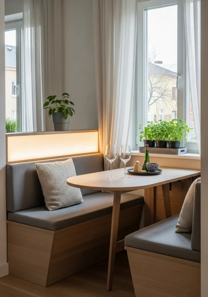
Window-side dining gets even better when you build in a cushioned banquette that takes advantage of all that natural light. The smart part is choosing a foldable table so you’re not locked into a permanent dining footprint—you can collapse it down when you need the space for other things. Floor-to-ceiling sheer curtains do double duty, softening the whole setup during the day while maintaining privacy. But here’s the really clever bit: building LED lightboxes behind the banquette cushions means the spot works just as well at night. Suddenly your bright daytime breakfast nook turns into a cozy, glowing dinner spot. Adding a potted herb tray on the windowsill brings in greenery and fresh scents. The pale oak slats on the bench add texture so it doesn’t just look like plain built-ins. This whole concept proves that window dining areas can actually work around the clock when you think about lighting in layers.

Foldaway tables get a bad rap for looking temporary or cheap, but the concept here flips that completely. Imagine a sleek wall-mounted fold-down table in matte walnut with custom brass hinges and a leather strap handle—suddenly it’s a design feature even when it’s folded up. The real brilliance is pairing it with stacking cane chairs that store vertically on hidden wall pegs. Everything disappears when not in use, but it’s all right there and accessible. Terrazzo tile flooring adds pattern and personality without needing rugs or extra décor. Warm sconces provide ambient lighting that makes the alcove feel like an actual destination rather than just a folding table shoved in a corner. This approach works because it treats space-saving furniture as an opportunity for beautiful design rather than a compromise.

Textured accent walls can do more heavy lifting than paint color ever could. The idea of a moody ribbed plaster wall in deep indigo creates dimension that flat paint just can’t match—it’s almost sculptural. Pairing it with a small oval black-marble table on a fluted brass base brings in elegance without taking up visual space. Boucle upholstered chairs in warm oatmeal add another tactile layer while providing contrast against all that darkness. A slim gallery shelf keeps art and objects displayed without requiring a full wall of frames. The lighting concept here matters—soft directional uplighting washes the textured wall to emphasize those ribs, while candles on the table add warm, flickering ambiance. This whole approach shows that when you’re working with limited square footage, investing in one incredible textural moment creates way more impact than trying to do too much everywhere.

Floor-to-ceiling antique mirrors are basically magic for narrow dining spaces. The concept completely changes the perception of size—suddenly that tight niche feels twice as deep and way more interesting. Antique mirrors have that aged patina that adds character new mirrors just can’t replicate. Keeping the table petite, round, and glass with a brass rim maintains that light, airy feeling so you’re not blocking the reflective magic. Tufted velvet chairs in muted teal bring in color and luxury without visual weight. A low-profile rug grounds things without adding bulk. The pendant with soft diffused light creates ambiance, and when late-afternoon sun hits all those mirrors, the whole space just glows. This approach works because mirrors do the spatial heavy lifting while everything else stays elegant and understated.
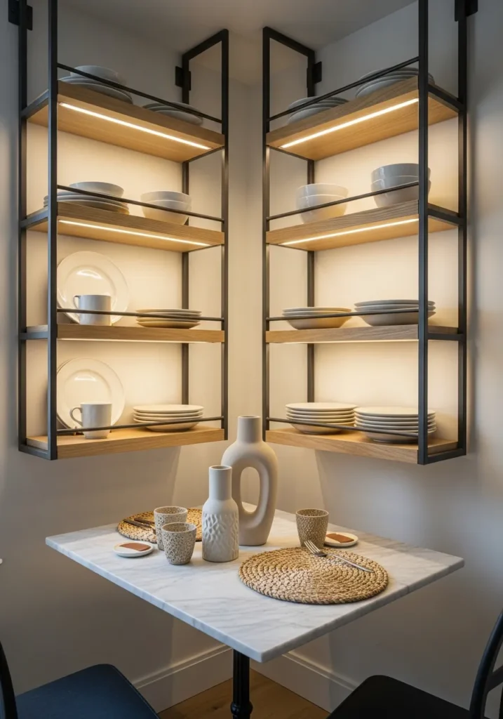
Going vertical with storage is crucial when floor space is tight. The concept of floating steel-and-wood shelves that serve as both display and practical plate storage is brilliant—suddenly you’re using wall space that would otherwise just be blank. Building in recessed lighting to each shelf level means they’re illuminating whatever you display while adding ambient room lighting. A marble-topped bistro table for two keeps the footprint small and the vibe café-chic. Woven placemats and a sculptural vase add organic texture. Balancing cool daylight with warm shelf LEDs creates beautiful layered lighting. This whole approach proves that in small dining rooms, multifunctional elements are essential—everything should do at least two jobs.
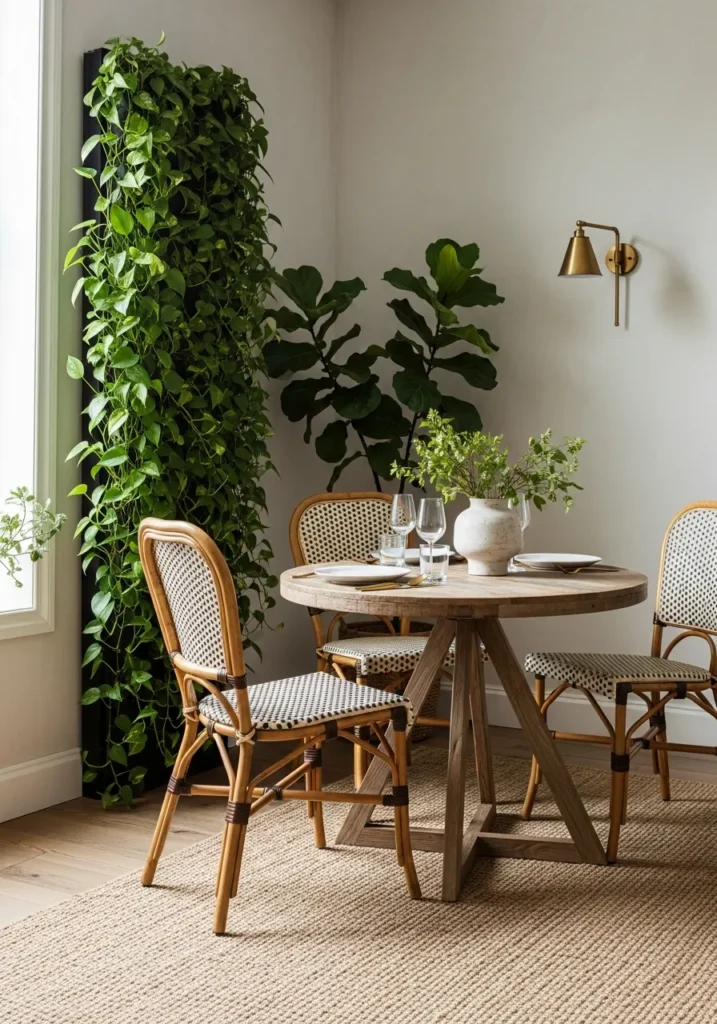
The vertical planter column concept is such a smart way to bring serious greenery into tight dining spaces without sacrificing floor area. Imagine a tall column of trailing philodendron and sculptural fiddle-leaf fig right next to your dining table—it adds life, softens hard edges, and draws the eye upward to make ceilings feel higher. Pairing it with rattan-backed chairs and a round reclaimed-wood table creates a natural, earthy aesthetic that works beautifully with all that green. A natural fiber rug adds more organic texture. The lighting concept layers soft filtered daylight with a single brass wall lamp for evenings. This approach shows how bringing abundant nature indoors can make tight spaces feel alive and welcoming rather than cramped—the green volume does so much to soften everything.
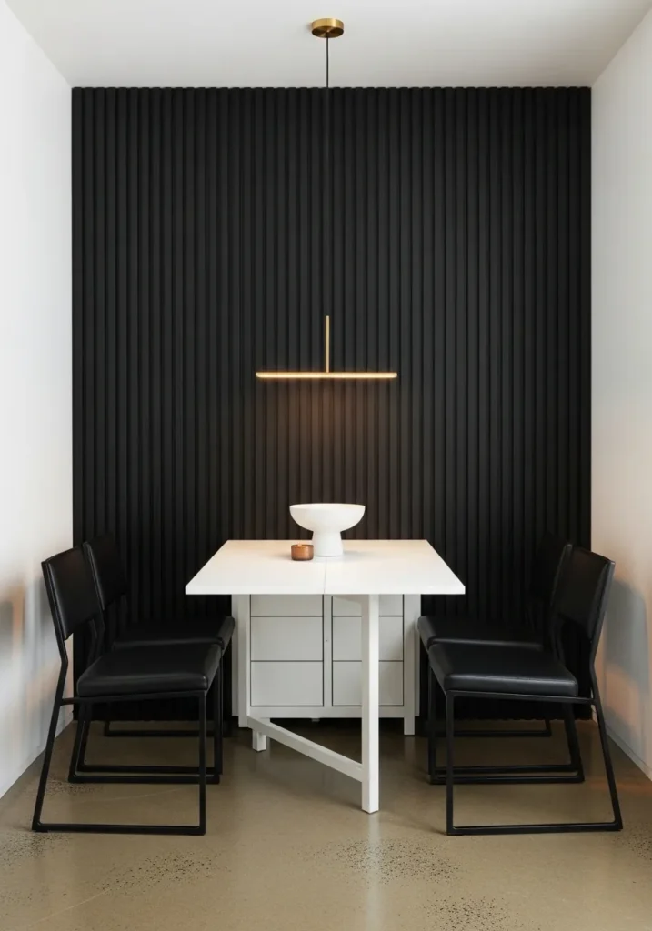
Committing to a strict black-and-white palette might seem risky, but the concept creates such a graphic, gallery-like effect. A matte black slatted wall becomes architectural sculpture that doesn’t need any added décor. The white lacquer fold-out table provides function without permanent visual weight. Black leather cantilever chairs bring in those clean, sculptural lines. A thin brass pendant adds just a touch of warmth without disrupting the high-contrast scheme. White ceramic centerpiece, polished concrete floor—everything reinforces that minimalist, refined aesthetic. This approach works because stripping away color forces you to focus on form, contrast, and quality materials, which makes small spaces feel incredibly sophisticated.
Whether these small dining rooms involved clever built-ins, statement lighting, space-saving furniture, or just smart styling decisions, they all prove that limited square footage is no excuse for boring design. Some went bold with color and texture, others kept things minimal and let key pieces shine, but every single one shows that small dining spaces can be just as thoughtful, beautiful, and inviting as their larger counterparts—sometimes even more so.