
Let’s talk about the strip of floor between your front door and the rest of your house — that four-foot purgatory where shoes go to multiply, bags accumulate into geological layers, and the coat situation has become something that social services might have opinions about. You know it’s a problem. The evidence is literally on the floor every time you come home.
Small entryways attract bad decisions with magnetic efficiency. The logic goes: the space is tiny, so anything will do, so nothing gets properly thought through, so nothing works, so the chaos compounds. Six months later you’re stepping over a pile that started as “just for now” and has developed its own ecosystem. The entryway didn’t fail you. You failed the entryway by deciding it didn’t deserve a plan.
What makes this particularly worth addressing is that the entryway is the room guests form their first impression of your home in, and the room you personally interact with twice every single day without exception. Getting it right doesn’t require square footage — it requires committing to what the space needs to do, choosing everything that serves those needs, and having enough discipline to leave out everything that doesn’t.
Why Small Entryways Fail at the Concept Stage
The problems that produce chaotic small entryways almost always originate in a decision made before anything was purchased or installed — usually the decision to not make any decisions at all.
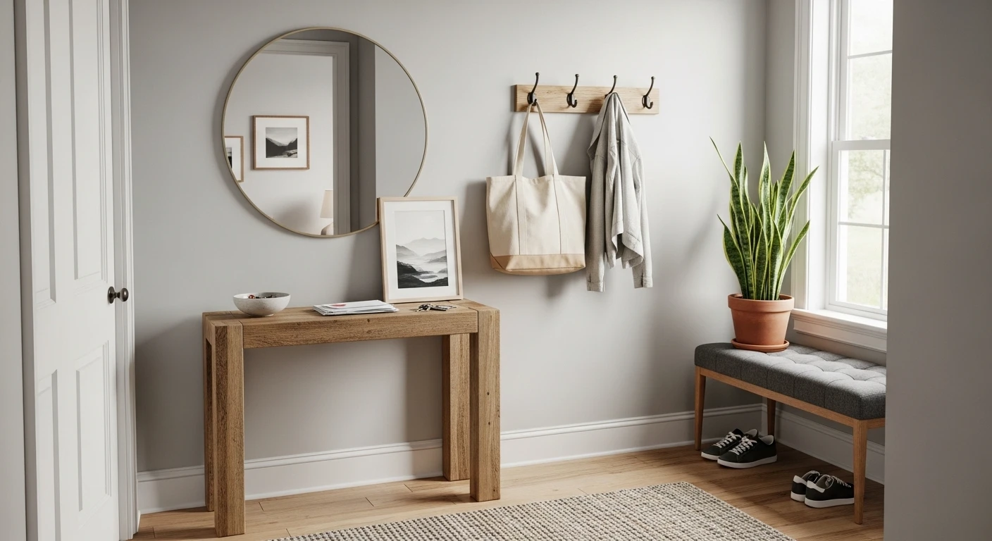
Function Has to Come Before Everything Else — An entryway needs to receive coats, store shoes, hold bags, and provide a surface for the daily deposit of keys and whatever else travels through the front door. Any space that can’t do those four things reliably will look cluttered regardless of how nice the decorative elements are, because the chaos has nowhere to go. Storage solves clutter. Styling doesn’t.
Too Many Solutions Create the Same Problem as Too Few — Three coat hooks, a standing rack, hooks on the door, and a row of pegs on a shelf all in the same tiny entry is not abundance — it’s design anxiety made physical. One hook system, sized and positioned properly, works better than four inadequate ones competing for the same coats and producing a different kind of visual mess.
The Rug Earns Its Entire Living or Gets Nothing — A rug in a small entryway is either the element that defines the floor zone, creates warmth underfoot, and ties the whole composition together — or it’s a tripping hazard in a pattern that fights everything around it. The rug decision needs the same attention as anything else in the space because in a small entry, the floor is proportionally the most visible surface in the entire room.
Making Small Entryways Work at Every Scale
A small entryway isn’t a design problem. It’s a brief — a tight, specific brief that rewards precision and punishes vagueness in a way that larger rooms simply don’t. The constraint is the creative condition.
Vertical Space Compensates for Floor Space — The moment floor area runs out in a small entry, the walls become the entire design surface. Hook rails that run full wall width, shelving stacked above seated height, storage units that reach to ceiling — these are not compromises forced by limited space, they’re the design logic that makes limited space genuinely functional and often more considered than a sprawling entry with room to spread things around and ignore them.
Colour Does Scale Work Without Taking Up Inches — A small entry painted in a colour with genuine conviction — a committed sage, a confident charcoal, a warm taupe that actually commits rather than hedges — reads as designed in a way that a safe neutral rarely achieves. The colour doesn’t make the room smaller. It makes it feel intentional, and intentional spaces feel bigger than unintentional ones regardless of the actual measurements.
The Hook, the Surface, the Light — Everything Else Is Optional — Strip a small entryway back to its genuinely necessary components and you need somewhere to hang things, somewhere to put things down, and enough light to find everything in the morning. Every other element — the rug, the art, the plant, the decorative basket — is atmosphere rather than function. Atmosphere is worth having, but function is what prevents the chaos, and function comes first in a space with limited room for both.
The Mistakes That Turn Small Entryways Into Expensive Disappointments
Given that small entryways require relatively little investment to get right, the frequency with which they go wrong comes down almost entirely to avoidable errors that cost nothing to avoid if identified in advance.
Undersized Furniture Looks Apologetic — A tiny console in a narrow entry doesn’t look proportionally correct — it looks like someone bought the wrong size and decided to live with it. A piece that fills the available wall width confidently, even if the space is genuinely narrow, looks chosen rather than compromised and provides considerably more practical surface in the process.
Styling Without Storage Is Interior Design Theatre — Decorative baskets that hold decorative things, pretty hooks that hold nothing, a console styled with objects that have no relationship to how the entry actually gets used — all of this looks good for the photograph and functions terribly for the other 364 days. Small entries cannot afford the luxury of decoration that doesn’t simultaneously solve a practical problem.
The Wall Behind the Hooks Is a Design Surface Too — Most entryway walls get a hook rail attached and then nothing else — just wall, which makes the hook rail look like it was installed rather than designed. The wall behind the hooks, treated with paint colour, panelling, wallpaper, or a wall treatment that gives the hook rail something to sit against, transforms the whole zone from a functional installation into a composed design moment that costs almost nothing additional to achieve.
Small Entryway Ideas
The Sage Green Panel Wall That Did Everything Right
My cozy front entryway!
by u/leeanneloveshfx in CozyPlaces
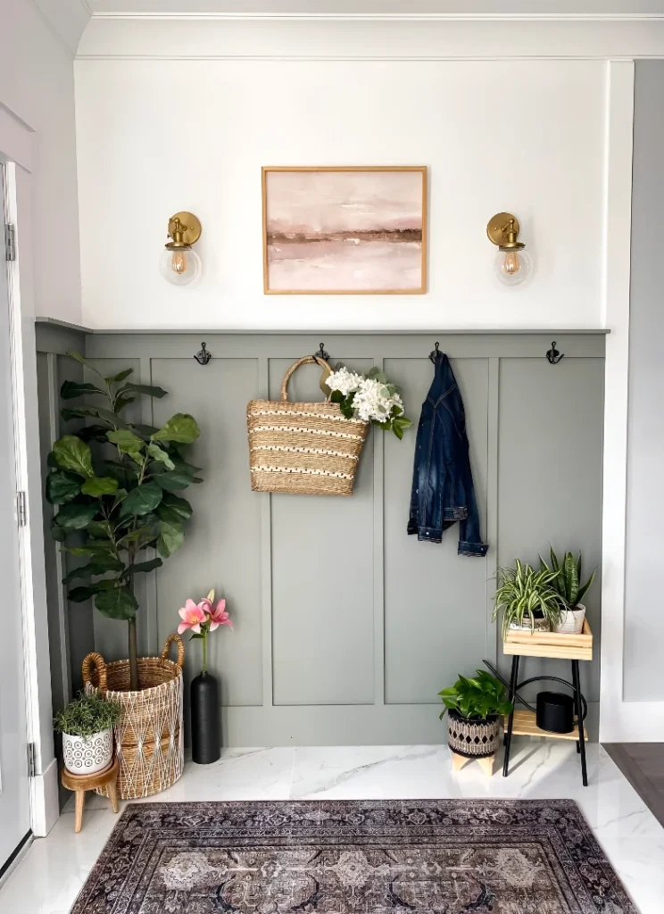
Sage green board and batten panelling runs half the wall height in a crisp, confident colour that immediately makes this entry feel designed rather than decorated, with three matte black hooks running the panel length at the right height for actual daily use. Paired brass globe sconces flank a soft abstract painting centred on the white wall above, a fiddle leaf fig in a woven basket anchors the left floor corner, a plant stand with spider plant sits at the right, and a vintage-style rug grounds the marble-look tile floor. The denim jacket and wicker tote hanging on the hooks complete the lived-in quality that prevents this from reading as a staged setup rather than an actual home.
The Maximalist Entry That Treated Every Surface as an Opportunity
Harlequin black and white marble tile floors, trellis-patterned wallpaper covering walls and ceiling simultaneously, a grid of eight botanical prints in matching black frames covering the far wall from dado height to ceiling, a rococo-carved console in faded gilt, a brass and glass lantern pendant overhead, and a leopard print ottoman glimpsed at the base — this entry committed to its maximalist brief so completely that the result reads as designed rather than accumulated. The spotted ceiling particularly refuses to apologise for itself. What prevents it from collapsing into chaos is the consistent monochrome palette running through every pattern — the wallpaper, the floor, the prints, the frames — all speaking the same black, white, and warm gold dialect regardless of the surface they occupy.
The Moody Earthy Entry That Understood Quiet Is a Choice
Warm taupe beadboard panelling, a matte black door with a small glazed panel, a vintage wooden side table with honest wear and a wicker basket beneath, a single white hydrangea arrangement in a cream ceramic pot as the only styling element, a small landscape painting in a natural timber frame on the wall above the hooks — this entry is doing absolutely the minimum required and producing an atmosphere that considerably more effortful spaces fail to achieve. The palette of warm brown, taupe, cream, and black is restricted enough to feel intentional, and the decision to let one white flower arrangement carry all the decorative weight rather than filling every surface shows the kind of restraint that only looks effortless when it’s actually the result of considerable self-discipline.
The Dark Wall Collector Entry That Has a Personality and Knows It
Charcoal almost-black walls, a reclaimed timber hook rail mounted with chrome cup hooks, vintage road signs — W 4th St, Road Closed, Watch For Children 10 MPH — hung with complete conviction above it, a luxury monogram tote hanging from the hook below, and a letter board partially visible by the door delivering what appears to be a declarative statement about someone’s lifestyle priorities. This entry is the design equivalent of a very specific person who has no interest in your opinion of their taste, and the confidence of that position is precisely what makes it work. The vintage signs give the dark wall context rather than just blackness, and the chrome hooks against the reclaimed timber against the near-black wall create a material contrast that reads as curated despite being entirely composed of objects with actual daily use.
The White Farmhouse Entry That Optimised for Cheerfulness
Bright white throughout — walls, doors, closet — with a geometric herringbone rug providing the floor pattern, two stacked rustic wood peg rails carrying an umbrella, keys, a white wreath, and a canvas market tote, a timber “hello” sign above the upper rail, and a wicker basket with a cream knit blanket at the floor as the single soft organic note. The grey glazed front door with its architectural glass insert brings one tonal contrast against all the white, and the cowboy boots sitting on the rug beside the basket do what boots on rugs always do in entryways — make the whole thing look inhabited rather than styled. It’s a small entry that solved every functional requirement without a single element that isn’t earning its keep.
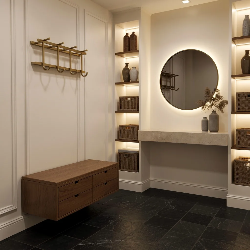
The White Built-In Unit That Solved the Small Entry Question Permanently
A full-height white built-in mudroom unit occupies one complete wall — open cubbies at the top for seasonal storage boxes and baskets, a whitewashed shiplap back panel with gold and brass hooks for coats and bags, a built-in bench seat with a floral cushion above three open shoe cubbies at the base, a narrow shelf on one side for sunglasses and small items, and pink wellington boots on a boot tray beside it. This is the small entryway solved as an engineering problem rather than a decorating one — every function the entry needs to perform has been assigned a specific location, and the result is a space that can absorb the full chaos of daily household arrivals and departures without ever looking anything other than organised. The floral cushion and the pink colour palette add the warmth that keeps it from feeling clinical.
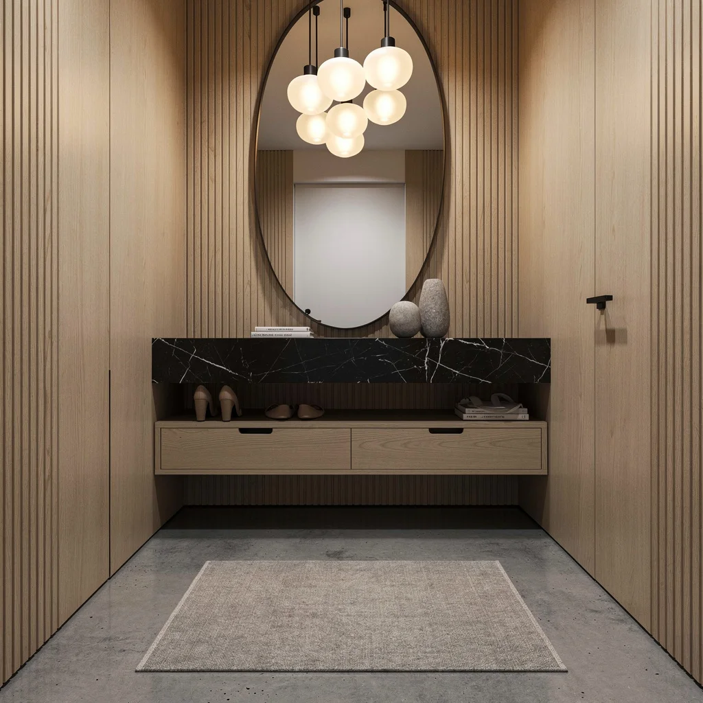
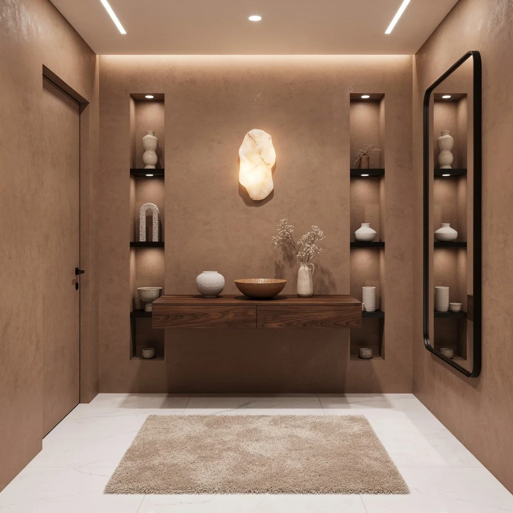
Fake Fancy: How to Work That Walnut Paneling
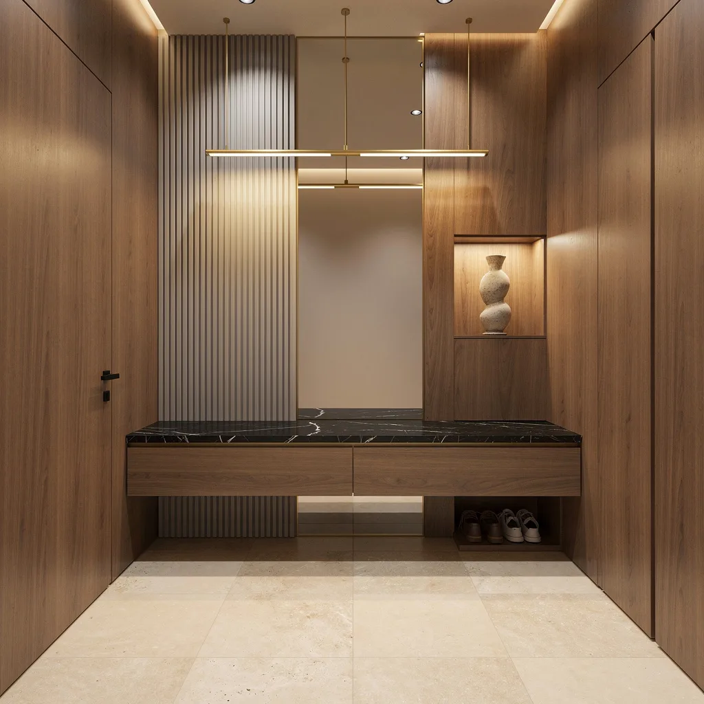
Chasing luxury on a shoebox footprint? You need mood, not mess. Slap up some sleek walnut paneling for instant five-star-hotel vibes, then float a matte black marble-topped console so none of your clutter ever hits the floor. Layer creamy travertine tiles underfoot and don’t you dare use boring can lighting—suspend a skinny brass fixture for that slick glow. Line the mirror wall with vertical ribbing (floor-to-ceiling, drama only) to bounce light and fake space. Hide your shoes beneath, stash a single arty ceramic vase in a niche, and turn on that cove lighting. Rule: Monochrome messes with your head—in a good way. Soften, sculpt, and store. Always hide the ugly.
Unclutter Your Life with That Minimalist European Flex
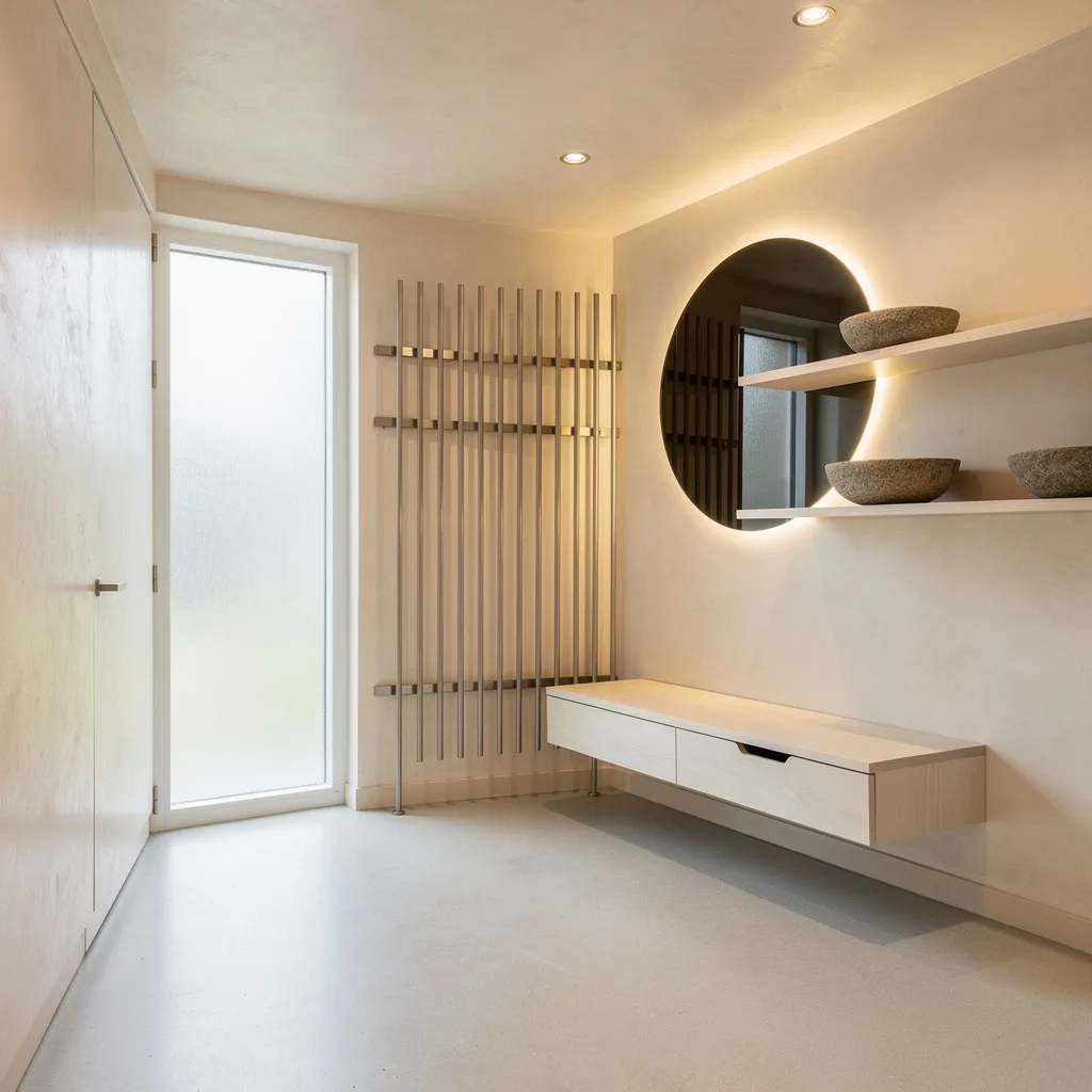
Want to look Scandinavian-level effortless? Smother your entry in pale Venetian plaster and microcement flooring, and let natural light do the heavy lifting with a frosted side panel. Toss out your clunky bench; go for a skinny white oak bench with drawers no one will see but you’ll love. Mount a wall-to-ceiling coat rack in brushed nickel and float some minimalist shelves for decorative stone bowls—not your random junk mail. Over the bench, hang a circular smoked glass mirror with subtle backlight—because depth is everything. Never skip a soft spotlight ceiling—nobody looks good in harsh light. Store, style, and strip everything back: less is way more.
Go Bold or Cry About It: Navy Millwork and Bougie Vibes
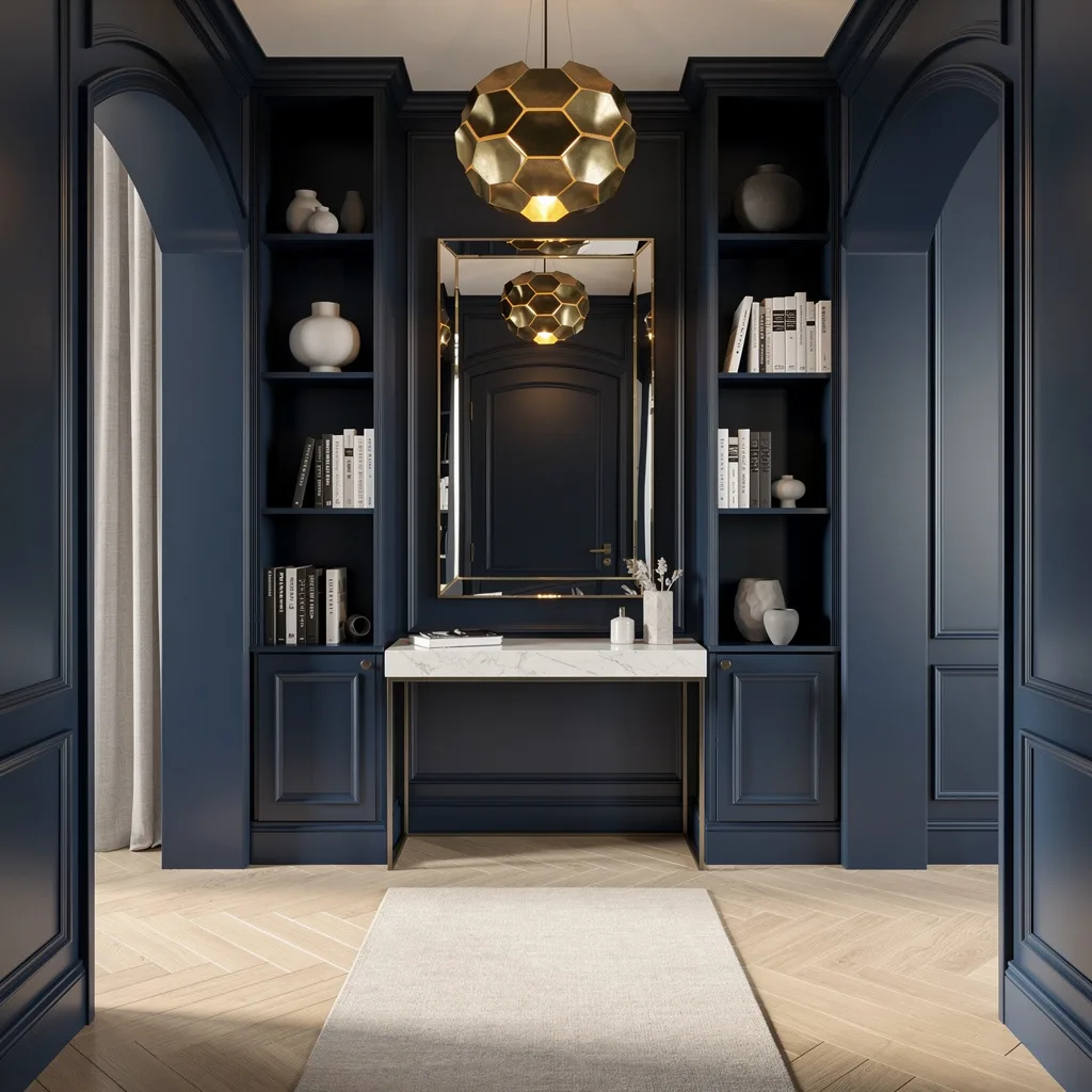
Tired of everyone’s all-white box? Grow up and go navy. Wrap your millwork in deep blue and choose herringbone oak underfoot for that ‘architect did this’ look. Sling up a honeycomb brass pendant (no, not a lighthouse), then drop a minimal marble-topped console under an oversized beveled mirror. Vertical shelves for high-contrast books or monochrome ceramics are where your ‘I read design books’ personality can actually shine. Drag a neutral runner up to a lacquered archway—yes, arches are back and basic doorways are over. Rule: Keep foot traffic moving, and mirrors huge. Big mirrors, big power move.
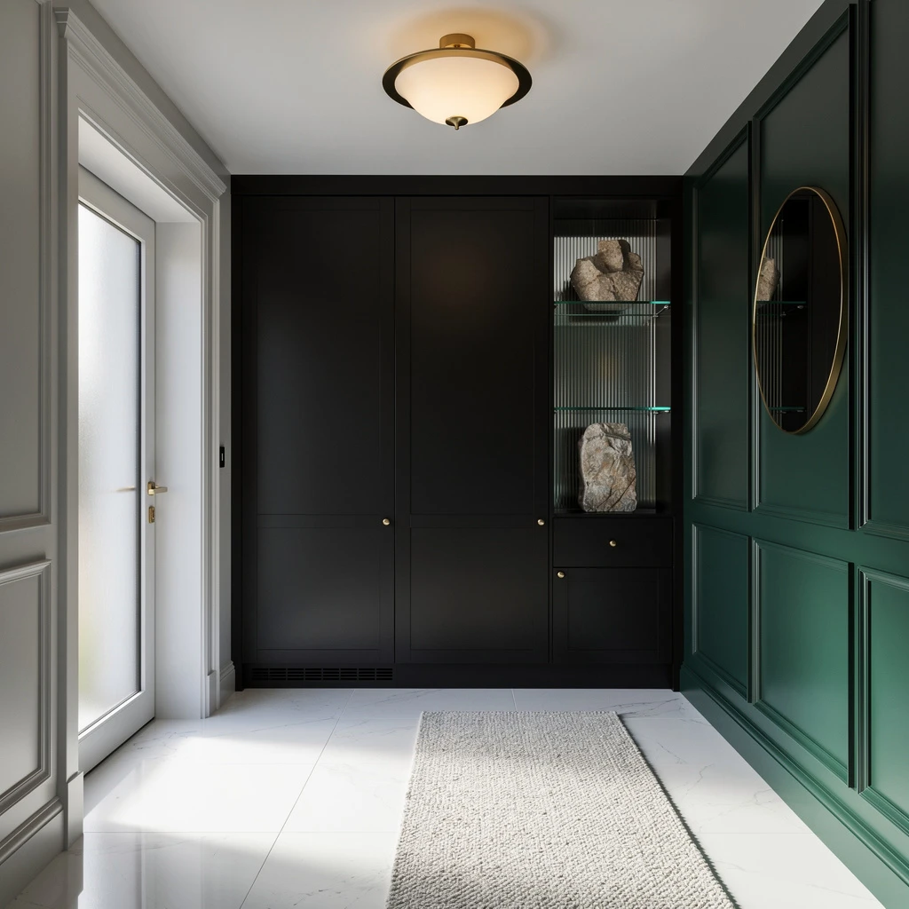
Matte Black Moves: Fresh Luxury for Lazy People
If your entry is boring, slap up creamy lime-wash walls and contrast those with slick matte black porcelain floors. Stop with the hooks; insist on a sculptural black steel coat rack, light it up with moody LED stripping, and keep your bench chill—sand-y upholstery, people! Install a deep green glass shelf for bowl stacking, and hunt down a low-profile cabinet with custom brass handles (because no normie knobs allowed). Frame an arched mirror with globe sconces for glow without glare. Rule: Opposites attract—mix curvy mirrors and sharp racks for tension that designers love and neighbors envy.
Can’t Afford a Paris Apartment? Here’s Your Maple Hack
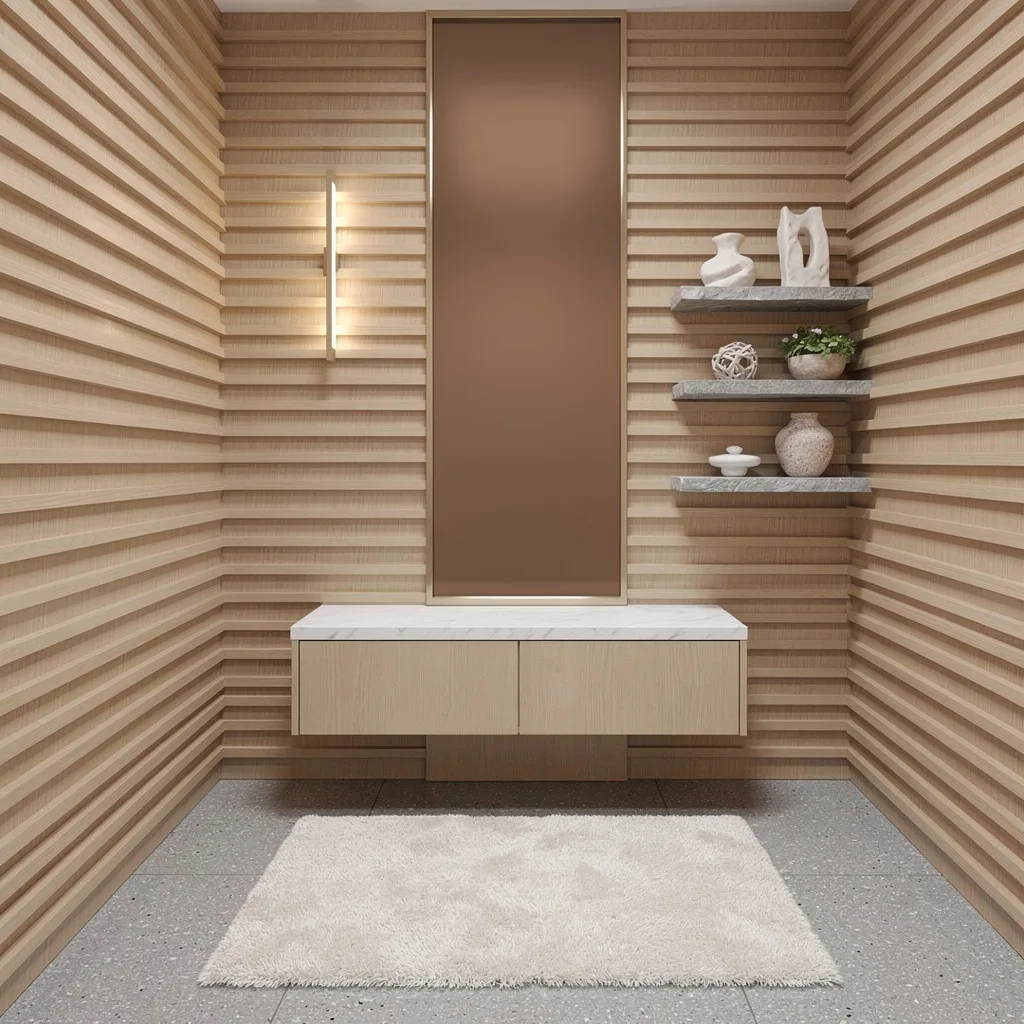
Channel those European IG feeds—go wall-to-wall maple slats for texture without the chaos, and float a white marble console so you finally have a drop zone. Get a gray terrazzo floor to hide shoe scuffs and cat hair, and mount a skinny bronze mirror for insta-filtered selfies. Tuck your shoe cabinet under the console—storage should lurk, not shout. Float some chunky stone shelves for only-cool-object storage, and drop a linear light above to show you’re not using those ceiling ‘boob lights’ anymore. Rule: Layer three kinds of texture, always. No texture? No taste.
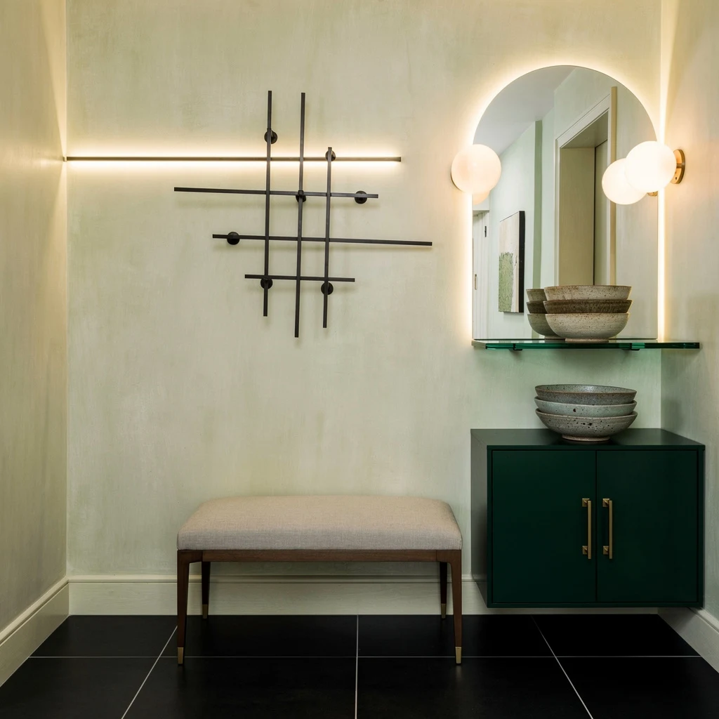
Forest Green Flex: Rich Vibes for the Color-Phobic
Done with white-everything? Smack a forest green feature wall next to dove gray paneling. Slam down chalk-white porcelain tiles for sleekness, and let all sunlight in with a vertical glass insert on your door. Store your junk in matte black built-ins, not scattered baskets. Float a ribbed glass shelf for a couple of stone bits—don’t overdress. Overhead, go brass and opal on your fixture. Always drop a minimalist round mirror (it’s like a selfie filter for your life). The secret? Use a wool runner to anchor your feet and your chic. Rule: Bold color doesn’t mean clown. Just one feature, then back away.
Pattern Play: Ditch Boring Tiles If You Dare
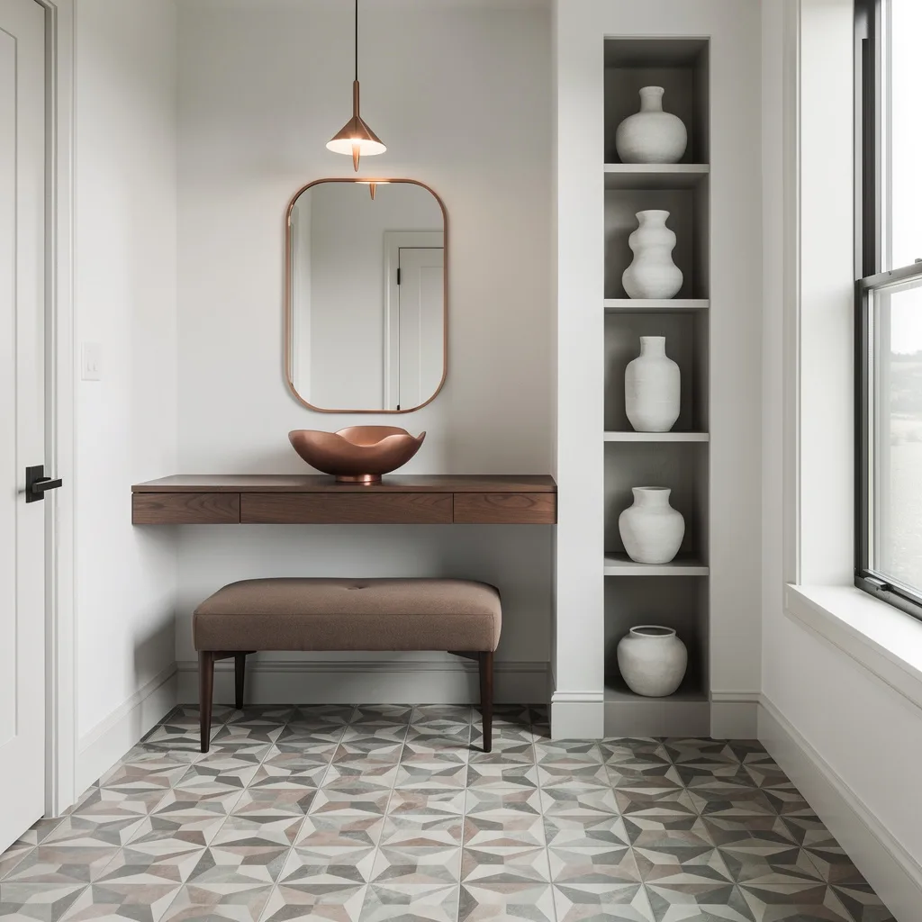
Ready for floors with actual personality? Drop geometric ceramic tiles in muted tones (no wild circus colors, please). Keep walls and trim blindingly white for that modern-art-gallery effect. Mount a floating walnut console—just wide enough for your keys, not for your laundry. Top it with a chunky ceramic bowl and hang a copper-framed mirror because basic black is tired. A slim pendant overhead is like dropping jewelry on your outfit—necessary drama. Slide in a taupe bench under the window. Rule: If you go bold on floor, keep the rest clean or risk full chaos gremlin.
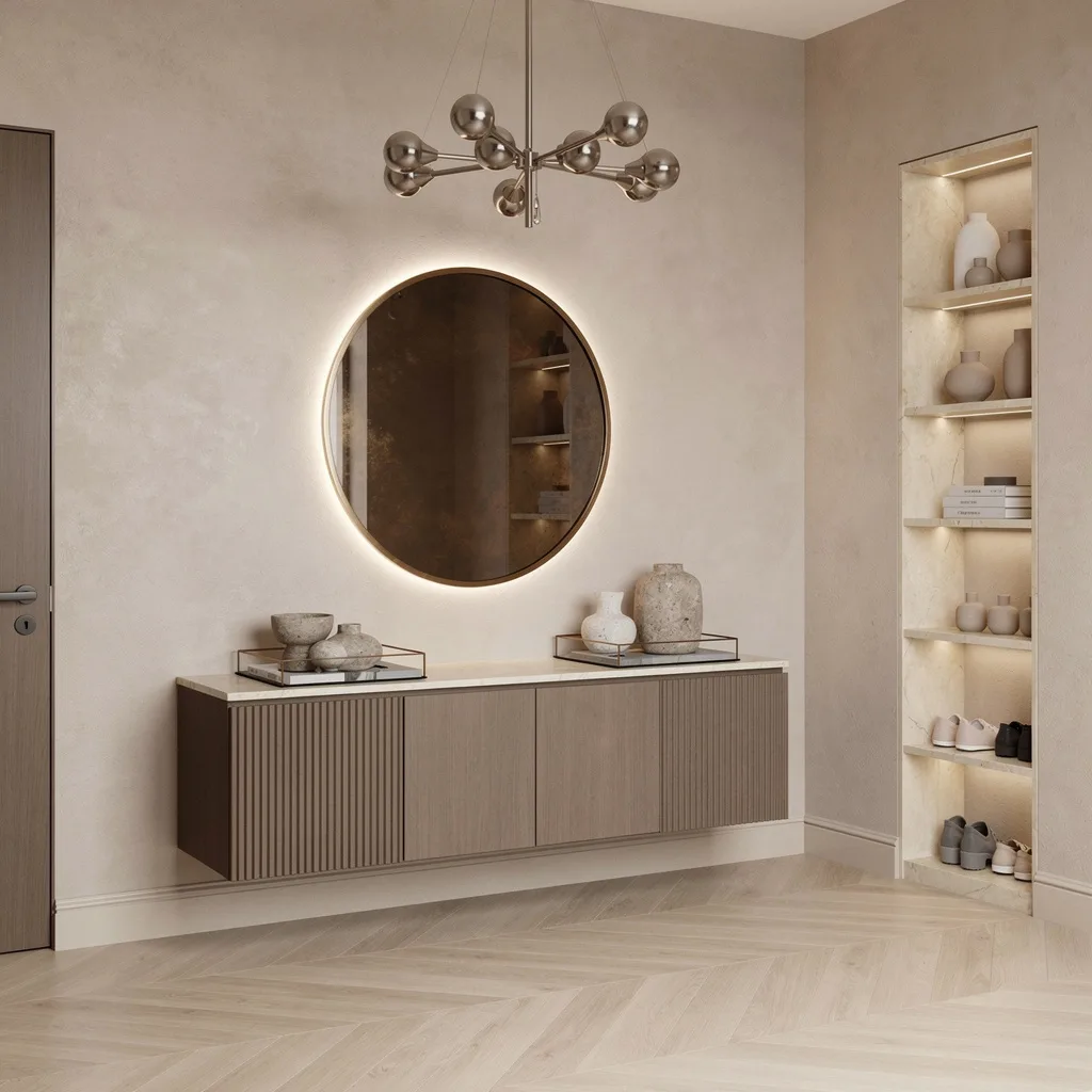
Soft Power: Oak + Stone for Quiet Wealth
If loud drama isn’t your thing, you need a cozy charcoal slate floor under warm white paneling. Ditch boxy benches for a floating oak bench with hidden soft drawers (so chic, never cheap). Mount a brass coat hook, but do it in stylish tiers and keep it curated—no random coats from 2013. Minimalist console tables in satin stone pair with a smoked round glass mirror for soft-focus vibes. Light up the scene with LED wall washers and always build in slim shelving for baskets and vases on rotation. Rule: Texture is everything—if it feels expensive, your entry looks expensive.
Architect’s Secret: Flute Your Walls, Not Your Coffee
Upgrade sad drywall with fluted ash wood panels—vertical lines stretch the space and look way pricier than they are. Concrete floors in polished finish scream ‘architect lives here’. Your console should float—try a cantilevered black marble shelf for max cool factor. Only accessorize with stone objects (nobody wants to see your junk drawer contents). Oversize your mirror—frameless, oval, massive. Cluster ceiling pendants in frosted glass for soft light that makes clutter disappear. Hide shoes in muted custom drawers, throw a wool runner on the floor, and stick to clean lines. Rule: Contrast makes small spaces wow—never match every single finish.
Yes to Chevron: Fluted Wood + Marble (Actual Adulting)
Sick of looking at starter-apartment mess? Slick on soft stucco, throw down light chevron flooring, and hang a sculptural brushed nickel chandelier for serious grown-up glamour. Float a fluted walnut console (custom if you can swing it), layer with trays and marble vessels, and squeeze a built-in shoe cabinet underneath. Only settle for an antique bronze mirror ringed with subtle LED for the glow-up effect. Open marble shelves hold only neutrals; keep grandma’s figurines somewhere else. Rule: Always let your lighting do double-duty—pretty and practical. Otherwise you’re not trying hard enough.
Warm Mushroom, Cool Vibes: Go for Maximum Chill
Wrap your tiny entry in mushroom plaster—it’s the underdog of wall colors. Lay white quartz underfoot for clean, crisp light bounce. Mount a suspended teak console (no sad flatpack!) and display subtle stone bowls, nothing tacky. Hack your wall with vertical niches for styling and sneaky storage. Matte-black framed mirrors look elevated and architect-approved; place it where it throws back your best light from smart, recessed cove fixtures. Center your sconce in sculptural alabaster and treat your feet to a plush rug. Rule: Cohesion wins—keep tones tonal, and nothing ruins the mood.
Marble Drama: Welcome to Your Gallery Foyer
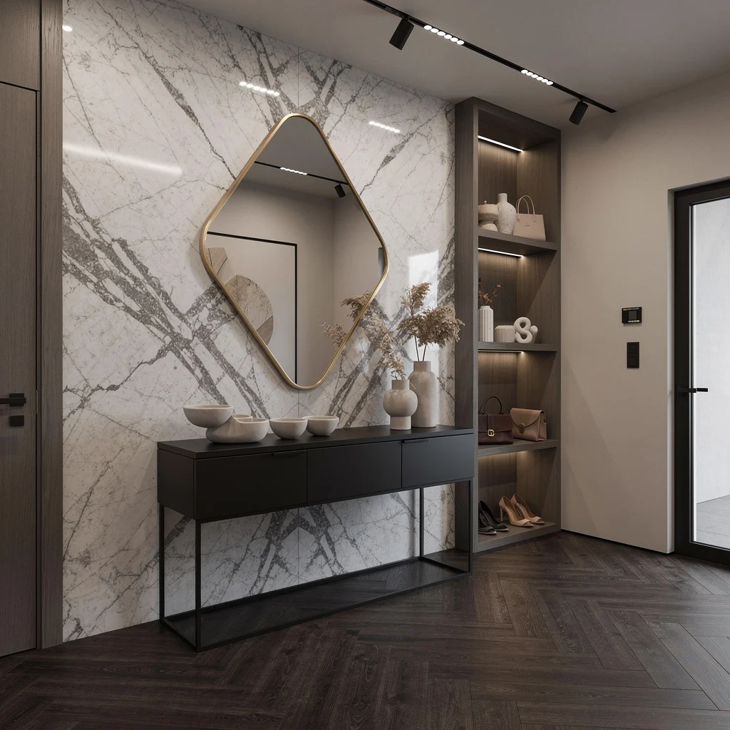
Grab drama by the walls—full veined marble paneling is the only way to fake ‘art gallery’ in 40 square feet. Ground with dark herringbone oak underfoot, float a black metal console (no legs in sight!), and layer it with ceramics, not keys and gum. Choose an asymmetrical geometric mirror with a gold edge for designer cred. Sequence recessed spotlights along your ceiling to highlight your built-in alcove shoe storage. Keep shelving open but neutral; only display things that prove you have taste. Rule: Never line up your objects—stagger everything or go home.
Final Thoughts
Small entryways don’t need more space — they need better decisions made in the space they already have. Every entry on this list proves that the square footage is almost irrelevant to the outcome when someone actually commits to what the space needs to do and designs around that requirement rather than around whatever storage solution was on sale at the time.
The practical rule is consistent across every example here: function first, always. The hooks need to be where the coats actually land. The surface needs to hold what actually gets put down. The storage needs to contain what actually accumulates. Designing around how the entry is theoretically used rather than how it’s actually used is how beautiful entries become beautiful chaos within a fortnight.
Get the function sorted and then, and only then, make it look the way you want it to look. The sage green panelling, the road sign collection, the maximalist harlequin floors, the quiet earthy palette — all of them work because the hooks and the baskets and the surfaces are doing their jobs correctly underneath the aesthetic. Small entries that look good are the ones that first work well. Every other approach is just postponing the inevitable return of the boot pile.