
Sick of waking up in a bedroom that screams “I gave up”? Spring is your annual permission slip to stop hoarding safe neutrals and actually commit to color that does something for the room besides exist. Whether you’re craving the kind of softness that makes Monday mornings survivable or the kind of bold that makes guests immediately ask who did your room, these spring bedroom color schemes will drag your space out of its seasonal slump and land it somewhere worth waking up in. Your walls have been waiting for this conversation.
Colour Architect
Master the 60-30-10 rule and unlock the intelligence of undertones.
Why Your Bedroom Color Scheme Is the Last Thing People Fix
Every season, people redecorate their living rooms, fuss over their kitchens, and completely ignore the room where they spend more hours than anywhere else in the house. The master bedroom gets the leftover budget, the leftover energy, and the paint color that was on sale — and then everyone wonders why they don’t feel rested. Color in a bedroom isn’t decoration. It’s the entire psychological atmosphere of the space, and spring is the one season where getting it right has the most immediate and the most visible payoff.
The color you wake up to sets the tone before you’ve had coffee
This is not a wellness lecture, it’s basic neuroscience. Warm, saturated colors increase alertness. Cool, soft colors lower cortisol. Muddy neutrals do nothing at all except make the room feel like it’s waiting for a decision to be made. Choosing a spring bedroom color scheme deliberately — rather than defaulting to whatever felt safe at the paint counter — is one of the few design decisions that pays you back every single morning.
Undertones are where most bedroom color schemes go quietly wrong
A wall painted in what was supposed to be a soft sage can read greenish-grey in morning light and almost brown in the evening if the undertones weren’t considered properly. Spring colors in particular — the mints, the lilacs, the dusty greens, the warm creams — have undertones that shift dramatically depending on the light source and what they’re paired with. Sample on the actual wall, in the actual room, at multiple times of day before committing.
Ceiling and trim color are part of the color scheme whether you treat them that way or not
The people who paint their walls a beautiful spring color and leave the ceiling bright white with brilliant white trim have made a color scheme decision — just not a considered one. Ceiling color in particular has enormous impact on how the wall color reads, how the room feels spatially, and whether the whole thing hangs together as a composition or just looks like someone painted the walls and stopped. Spring is the ideal season to finally extend the thinking upward.
The 60-30-10 rule exists because someone got tired of watching people get this wrong
Sixty percent dominant color — usually walls and large surfaces. Thirty percent secondary color — upholstery, bedding, curtains. Ten percent accent color — cushions, art, accessories. When spring bedroom color schemes go wrong, it’s almost always because someone reversed the ratios, put the accent color everywhere, and ended up with a room that feels chaotic rather than layered. Pick your dominant color first, build outward from there, and stop adding accent colors after the third one.
What Spring Color Actually Does to a Bedroom That Neutral Palettes Simply Cannot
There is a specific quality that well-executed spring color gives a bedroom — a sense of aliveness, of the room participating in the season rather than just sitting there tolerating it. Neutral palettes can be beautiful and considered, but they don’t do this particular thing. They don’t make the room feel like it changed with the weather, like something is different about being in it in April versus January. Spring color does that, and it’s worth understanding why before you commit to a palette.
Soft color creates depth that white walls fundamentally cannot
A pale sage wall, a dusty rose ceiling, a soft mint linen — these colors create visual depth because they interact with light rather than simply reflecting it back. White walls reflect everything and create brightness. Soft spring colors absorb some wavelengths and reflect others, which is why a room painted in a considered spring palette feels dimensional in a way that a white room, however beautifully furnished, simply doesn’t.
Warm spring colors do things to artificial light that transform evening atmosphere
Butter yellow, warm peach, dusty rose — these colors interact with warm artificial light in the evening in ways that genuinely shift the atmosphere of the room. The same lamp that looks flat against a white wall will throw a completely different quality of light against a warm spring color, creating the kind of ambient glow that makes a bedroom feel genuinely restorative rather than just adequately lit.
Cool spring colors make small bedrooms feel more considered, not smaller
The received wisdom that small rooms should be painted white to feel bigger is not wrong exactly, but it leaves a lot on the table. A small bedroom painted in a well-chosen soft teal, pale periwinkle, or seafoam green can feel more intentional and more interesting than the same room in white — and interesting rooms feel more spacious than bland ones, regardless of the square footage. Cool spring colors work in small bedrooms when the tones are soft enough and the rest of the palette is kept tight.
Color on the ceiling changes everything for rooms with interesting architecture
Exposed beams, coffered ceilings, plaster medallions — these architectural details are completely wasted under flat white paint. A spring color carried up to the ceiling or used specifically on ceiling elements makes the architecture read properly, creates a sense of the room being wrapped in the color rather than just painted, and signals a level of design intention that guests notice immediately even if they can’t articulate why.
The 4 Rules of Spring Bedroom Colour
The card that makes paint counters irrelevant.
The colour you wake up to is a neurological decision
Warm saturated tones raise alertness. Cool soft tones lower cortisol. Muddy neutrals do nothing except make the room feel like it is waiting for a decision.
Undertones shift with the light
Sage can read grey-green at dawn and almost brown by evening. The paint chip in the shop is lying to you. Hang samples in the real window for two full days.
The ceiling is part of the colour scheme
Painting walls a considered colour and leaving the ceiling brilliant white is still a decision — just not a deliberate one. Carry the thinking upward.
60-30-10: Dominant first, accent last
When schemes go wrong it is because someone put the accent colour everywhere. Pick dominant first, build outward, stop at three accent colours.
Spring Bedroom Color Schemes That Actually Deliver
Warm Ivory, Herringbone Oak, and Terracotta Accents
Plaster white walls with barely-there warm undertones, herringbone pale oak floors that catch afternoon light and hold it, gold-framed arched mirrors flanking the bed in symmetrical niches, and a linen upholstered bed frame in warm greige that disappears into the palette rather than fighting it. Terracotta and rust floral cushions provide the season’s warmth without demanding attention, a chunky knit throw in caramel drapes across the foot of the bed, and sculpted white ceramic vases hold eucalyptus branches that do the spring work without any fuss. The globe pendant overhead in matte white and a ribbed upholstered bench at the foot complete a room that looks considered rather than decorated. Pro tip: Exposed ceiling beams only work when the walls are warm enough to meet them — cool whites with raw wood feel unfinished, warm plaster tones feel intentional.
Mint Green Walls, White Linens, and a Crystal Chandelier
Walls in a full-commitment mint green that doesn’t apologise for being exactly what it is, floor-length curtains in the same tone hung from a dark bronze rod that ties them to the wooden floor rather than the ceiling, and a white upholstered headboard that lets the room’s color do all the talking. White quilted bedding, mint bed skirt, embroidered mint cushions on a crisp white bench at the foot — the monochromatic layering within the green and white palette is where this room earns its sophistication. White hydrangeas on a tray on the bench, a crystal chandelier catching the light from the garden doors. Pro tip: Monochromatic spring color schemes only work when you vary the texture significantly within the palette — the mix of quilted cotton, smooth linen, and embroidered fabric here is what stops it reading as a paint sample.
Forest Green Walls, Yellow Floral Bedding, and a Button-Tufted Headboard
Deep forest green on every wall, a button-tufted headboard in the same saturated tone, and large-scale yellow floral bedding that treats the bed as a garden border rather than a place to sleep quietly — this room made a decision and followed it through without flinching. Solid green quilted pillow cases, yellow embroidered accent cushions, yellow botanical prints in warm wood frames above the headboard. A glass lamp on a dark mahogany nightstand throws warm light against the deep green and makes the yellow pop in the evening in a way that daylight can’t manage. Pro tip: When going deep on wall color, always pull the headboard fabric into the same family — the contrast between the wall and a lighter headboard will look unintentional, where matching them reads as deliberate.
Scallop-Edge Nightstand, Ikat Curtains, and Sky Blue Twin Beds
Striped scallop-edge wallpaper in sage and cream running floor to ceiling, ikat-print curtains in the same green-and-white palette over a linen Roman shade, two sky blue upholstered beds with carved headboards sitting in perfect symmetry, and matching green-and-white geometric ottomans at the foot of each — this room stacked four patterns in the same tonal palette and made it look completely calm. A scallop-detail white nightstand between the beds, a white globe lamp on a brass base, an ikat wool rug tying the floor into the whole story. Brass wall sconces flanking the window complete the hardware story. Pro tip: Pattern mixing works when every pattern shares the same two or three colors — the sage green and sky blue running through every element here is the only reason this room reads as curated rather than chaotic.
Dusky Rose Walls, Ceiling, and Trim
Dusty mauve-rose on every wall, carried up across the ceiling and through the crown moulding in the same tone — no relief, no white escape hatch, just a room that committed entirely and landed somewhere that feels genuinely atmospheric rather than overwhelming. A fluted panel headboard in a slightly deeper rose, a quilted linen duvet in pale blush, floral embroidered cushions in dusty pink and sage, a crystal ceiling chandelier on a brass fitting that catches the pink light and scatters it. An oversized antique-framed mirror leaning against the wall, a spindle side table with fresh lilacs in a white jug. Pro tip: Carrying the same color through walls, ceiling, and trim only works when the tone is dusty and complex rather than bright — saturated pink on the ceiling becomes a nightclub, dusty rose becomes a room with genuine character.
Ivory Panelled Walls, Herringbone Floors, and a Six-Print Gallery Wall
White plaster panelled walls with deep relief moulding that casts its own shadow at different times of day, warm herringbone hardwood floors in a rich reddish-brown tone, a linen upholstered headboard in warm greige, and a six-print botanical gallery wall arranged in a tight two-by-three grid above the bed in matching gold frames. Mint and soft floral cushions on crisp white bedding, a floral upholstered round ottoman on a pale sage bordered rug, generous brass lamps on mahogany nightstands, and a brass chandelier overhead that fills the room with warm light in the evenings. Striped linen curtains in cream and taupe frame the tall French windows without competing with anything else. Pro tip: Gallery walls above beds work when the grid is tight and the frames are identical — any variation in frame size or spacing reads as an installation error rather than a curation decision.
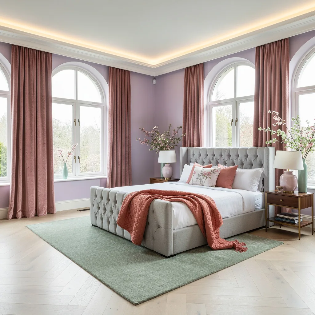
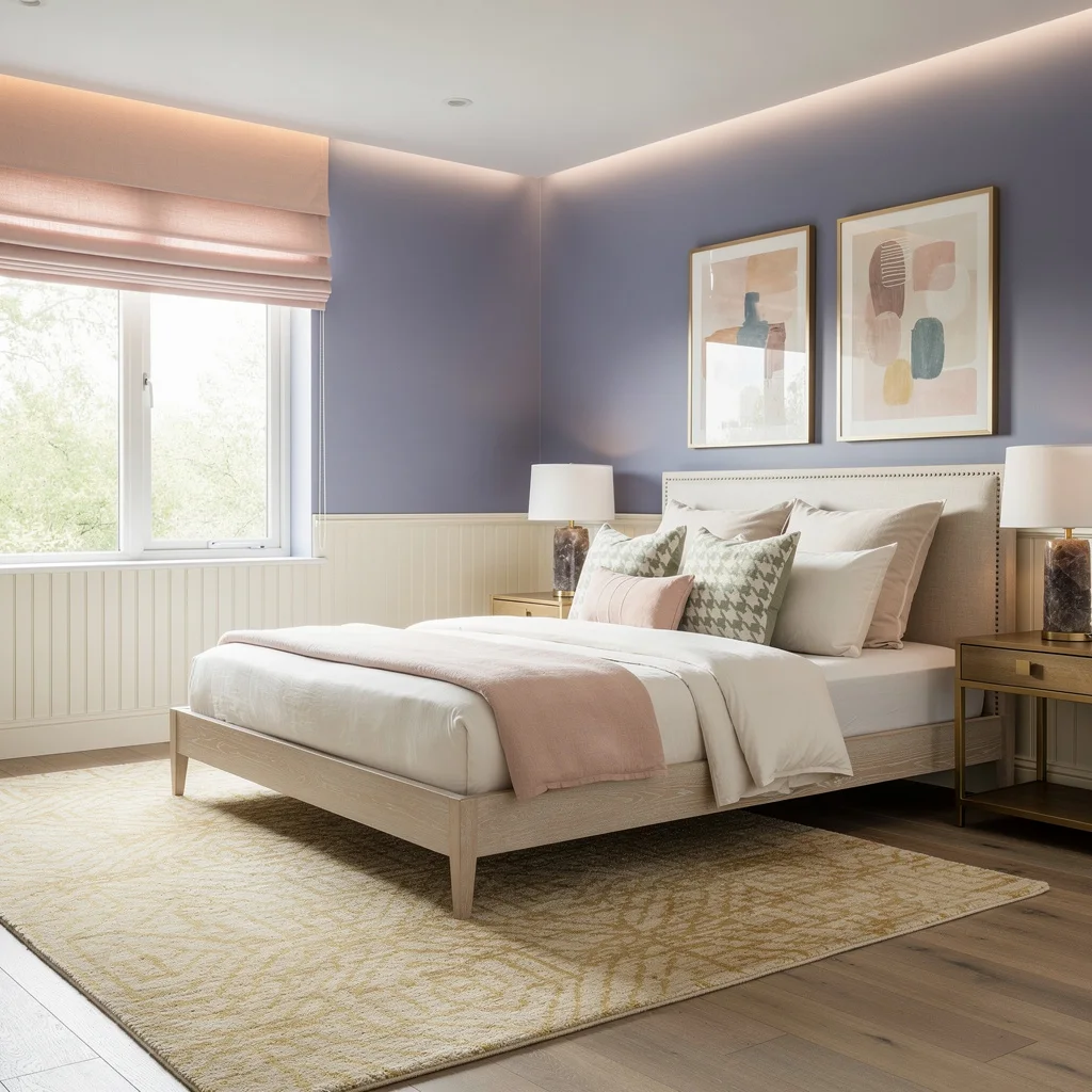
Get Lilac and Chill: Soft Color with Bold Texture
If you’re over boring neutrals and want a calm space that doesn’t put you to sleep, go lilac. Flood your room with daylight—because let’s face it, moody corners are for winter. Paint your walls a pale purple, pair buttery rose velvet drapes with ivory oak floors, and slap a channel-tufted bed on a sage green wool rug. Pick pastel lamps for your brass nightstands and toss a coral throw at the bed’s foot. Recessed cove lighting? Yes, seriously. For styling, stop lining up your plants; stagger mint vases with botanical bits for movement, not museum monotony.
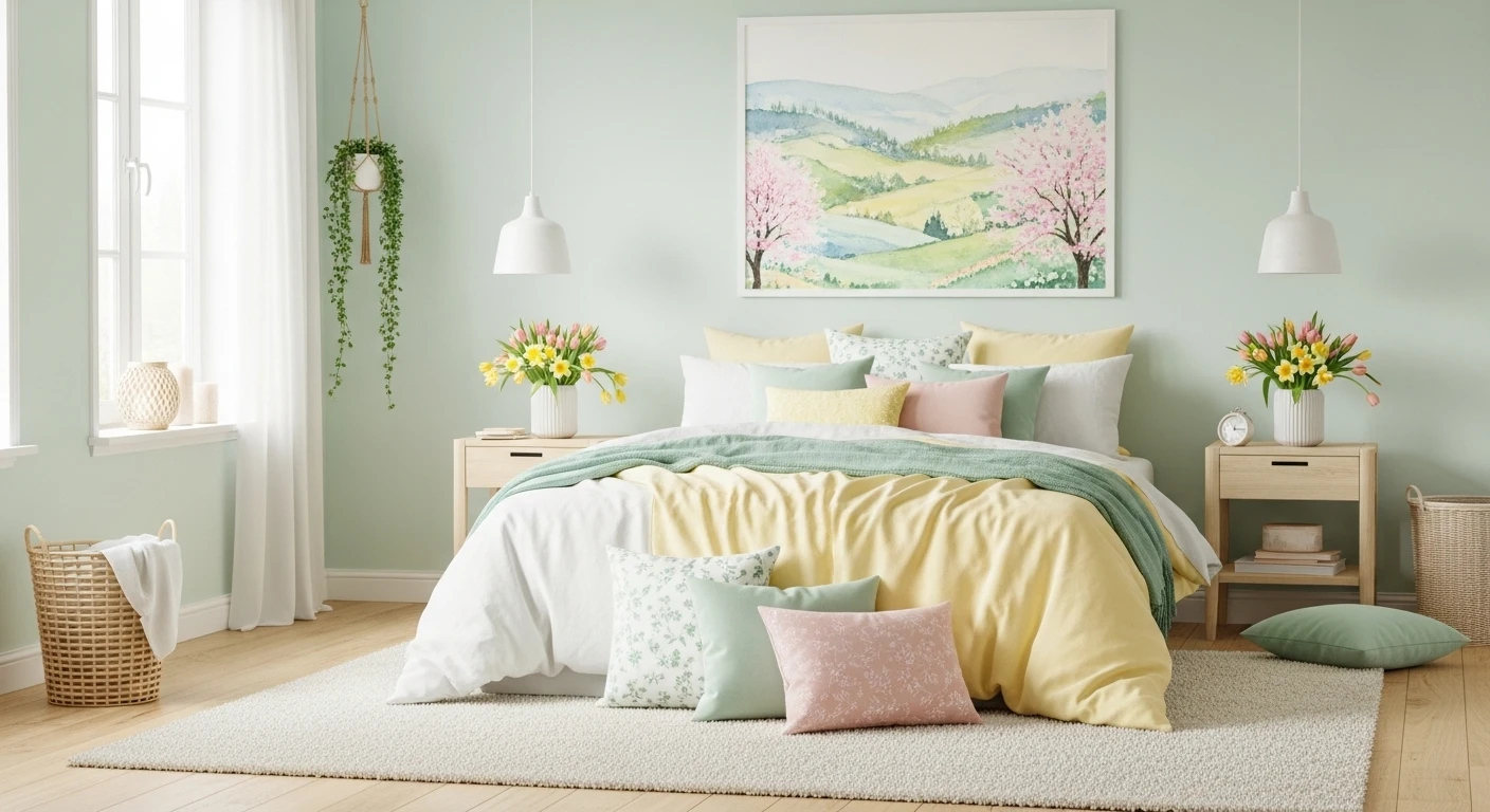
Lemon Cream & Blue—Freshness Overload
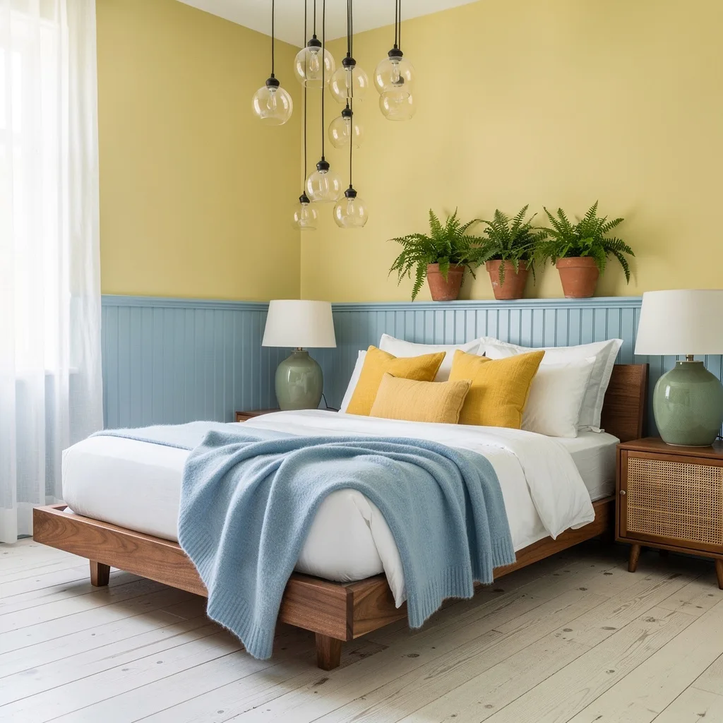
If you’re craving energy, paint your walls a creamy yellow, then contrast with powder blue wainscoting and watch your serotonin spike. Go for a low walnut bed with sharp white linens, layer with yellow accent pillows and blue throws, and ground everything using whitewashed oak floors. Style a rattan nightstand with a sage ceramic lamp, add glass pendants overhead, then drop ferns in terra cotta planters like you’re actually serious about spring. For extra pop, hang those sheer white curtains high—stop being stingy with sunlight, nobody wants cave vibes.
Teal Grasscloth Drama with Soft Blush Accents
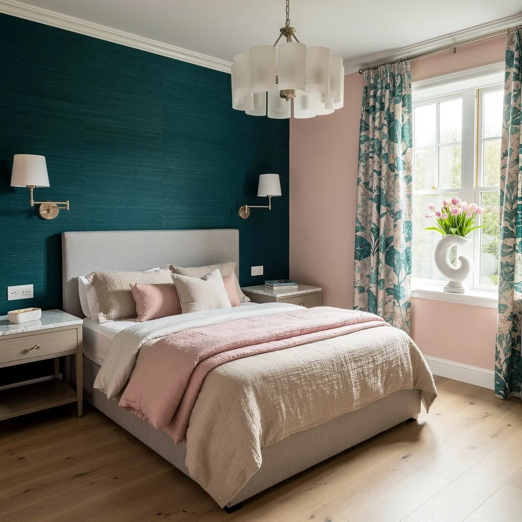
Want luxury without looking like a hotel? Coat an accent wall in teal grasscloth and balance with blush on the other walls; this combo screams grown-up, not grandma. Anchor your bed with dove grey upholstery, layer sand and pastel pink linen bedding, and match nightstands topped in marble. Nickel wall sconces and a frosted chandelier add legit sophistication (enough with bulb-only fixtures). For serious spring style, opt for botanical-print drapes and throw tulips in a sculptural ceramic vase. Never skimp on drape length—they should graze the floor or you’re just lazy.
Watercolor Minimalism—Green, Peach, and Cane
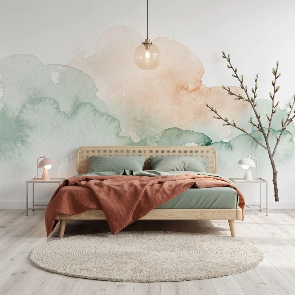
You want serenity but hate bland? Go white walls with a massive mural in watercolor greens and peaches—skip basic art prints. Grab a cane and oak platform bed and layer it up with sage green percale sheets and a rust linen duvet. Pick ash plank flooring and add a circular wool rug for softness. For the glow up, powder-coated steel side tables and pastel reading lamps do the trick. Keep branches in botanical arrangements for a lived-in feel, and always mix lamp heights; symmetry is overrated, embrace the mismatch.
Seafoam and Sky—Playful Pastels for Dreamers
If soft color palettes are your jam but you refuse to drown in bubblegum, paint your walls seafoam, trim them white, and grab a tufted sky-blue velvet bed. Layer linens in white, mint, and peach, and slap a blush viscose rug underneath. Floating grey nightstands win over clunky wood, while rose-gold reading lights deliver the sparkle. Capiz shell chandelier overhead = instant mood. Populate glass vases with single ranunculus stems (no mixed bouquets). For art, go large and abstract to anchor—if your piece is smaller than a cereal box, it’s time to upsize.
Eucalyptus Paneling Meets Aqua Bedding—Fresh and Fierce
Don’t just paint some random wall green and call it a day. Panel your walls with powdery eucalyptus, keep the uppers off-white, and style a reeded wood headboard. Throw cool aqua and sunshine yellow bedding into the mix—spring doesn’t mean you can only use pastels. Travertine side tables and pale green vases set the tone under woven rattan pendants, while lemon wool rugs add punch to sandy oak floors. Embroidered bedding steps up the visual interest, and remember: Mix materials like your grandma mixes bingo cards—never go all-matchy.
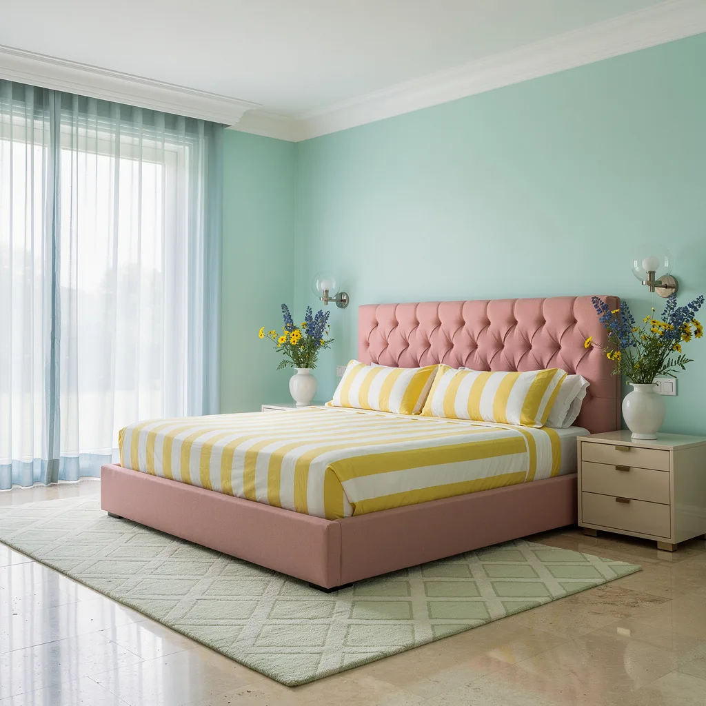
Cream and Peach Stripe—Subtle with a Pop
You’re not basic, so stop acting like it. Paint cream walls and slap on a pastel peach vertical stripe for instant dimension (don’t even try with horizontal stripes—too tired). Roll with a walnut-spindle sleigh bed and choose matte blush linen bedding, topping it off with sage green velvet shams. Pick fluted concrete nightstands and mushroom-shaped glass lamps for a not-so-typical touch. Oak floors and a silk rug add warmth, but the real flex is a crystal pendant that throws rainbows, plus ceramic planters on the window for daffodil drama. Always cluster plants; spread-out looks sad.
Dove Grey and Wildflower—Tailored Tranquility
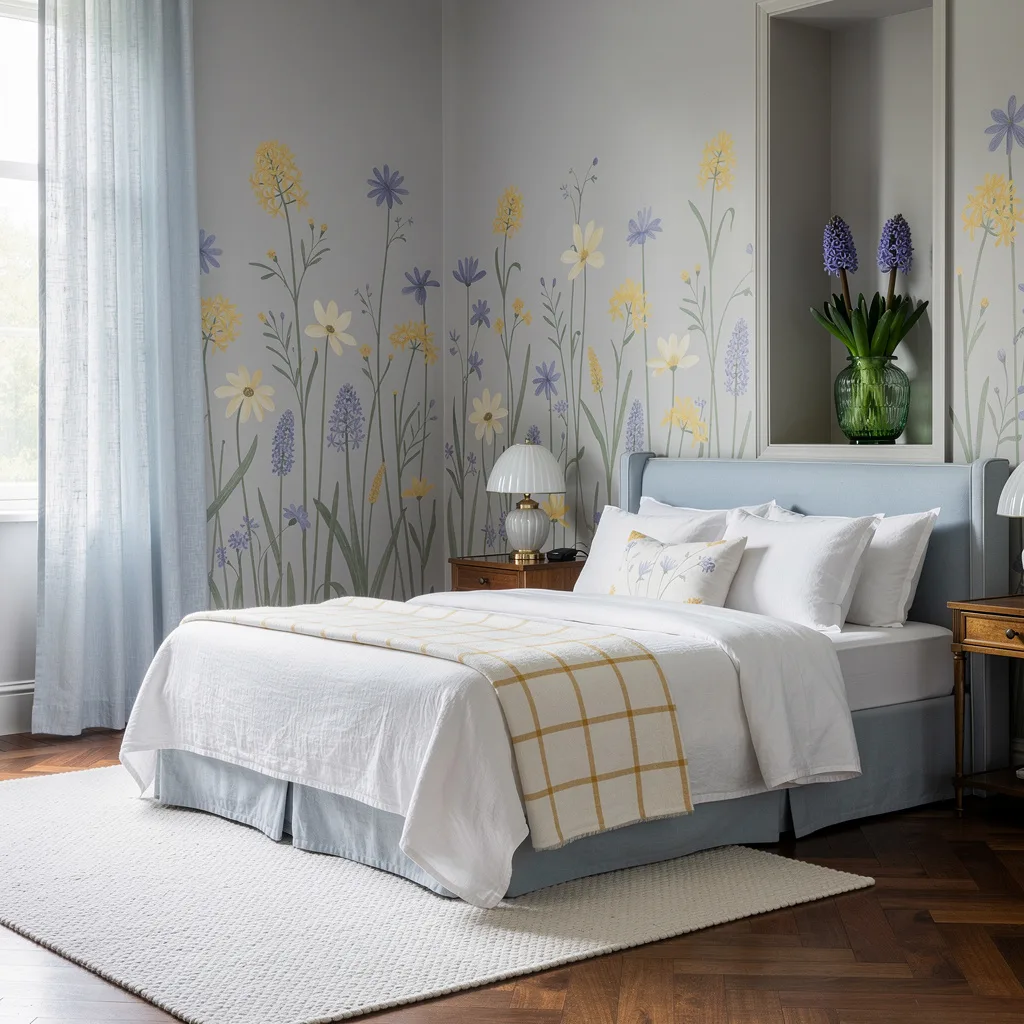
If you want tranquil but not cold, paint your space in soft dove grey and add a huge wall of hand-painted yellow/periwinkle wildflowers. Pick a powder blue upholstered bed and layer throws in white and maize check (checks are back, don’t fight it). Bronze nightstands and frosted glass lamps keep the lighting classy. Choose walnut parquet for upscale flooring and pair with a cloud-white rug. Hang icy pale blue linen curtains sky-high, and always toss spring hyacinths in a vintage green vase—real flowers, please; plastic is for hospital waiting rooms.
Dusty Periwinkle Meets Sage—Easy Elegance
Tired of plain blue? Slap on dusty periwinkle walls and contrast with creamy beadboard—don’t pretend beadboard is just for farmhouse, it’s got range. Pick a bleached ash poster bed and layer vanilla, blush, and sage houndstooth pillows. Set silky quartz lamps on brass nightstands, then roll out a pale gold Tibetan wool rug on stonewashed oak. Perimeter LED lighting makes boring artwork look expensive, and blush roman shades at the windows up that spring magic. For artwork, group pastel frames—solo pieces make your wall look lonely, so show some love.
Mint + Shell Pink—Clean Modern Spring
Spring wants mint—and so should you. Paint your walls fresh mint, crown molding in dove white, and pick a platform bed with a channel-tufted shell pink headboard. Layer striped yellow/white linens for brightness, and slap glass globe sconces on cream lacquer nightstands (not more wood, thank you). Floor-to-ceiling powder blue sheers make daylight your best friend, while a travertine floor plus a geometric green rug equals grown-up cool. Keep wildflowers in white vases across the room; always mix ice blue and yellow florals for contrast, and please don’t buy fake stems.
Final Thoughts
A spring bedroom color scheme isn’t a seasonal decoration project — it’s a decision about what kind of room you want to live in for the next several years, made during the one season when your instincts about color are at their sharpest and the light is actually telling you the truth about how things will look. The rooms that get this right are the ones where someone picked a direction, understood what the color was actually doing, and then had the commitment to follow it through to the ceiling, the trim, and the last cushion. Spring doesn’t reward hesitation. Neither do bedrooms.