

Sick of waking up to a stale, personality-free sleeping zone? Spring’s your golden hour to ditch those basic blackout curtains and actually commit to a serious style upgrade. Whether you’re stuck with sad builder’s-grade curtains or just want to flex on your friends with your taste, these curtain ideas are for anyone who’s allergic to boring. Forget describing trends you’ll never achieve — get ready to steal legit designer moves, swap lukewarm neutrals for major colour, and finally give your bedroom the kind of soft drama it’s been thirsting for. Buckle up — your windows are about to get hot.
The Curtain Formula
Build a bespoke window treatment blueprint.
Your Curtains Are Either Making the Room or Slowly Embarrassing It
Most people treat bedroom curtains like an afterthought — something to stop the neighbours seeing in and the sun waking them up, purchased in a ten-minute online scroll and never thought about again. That is exactly why most bedrooms feel finished but not actually good. Curtains occupy more visual real estate than almost any other single element in a bedroom, and treating them like a utility purchase is the fastest way to neutralise every other design decision you’ve made.
Height and width are the first things you’re probably getting wrong
Curtains hung at window height instead of ceiling height are one of the most common and most fixable bedroom crimes. Mount your rod as close to the ceiling as possible, extend it well beyond the window frame on both sides, and watch the room gain height and proportion it didn’t have before. This costs nothing extra and fixes everything.
Fabric weight determines the entire character of the room
Sheer linen and heavy velvet are not interchangeable options from the same menu — they create fundamentally different rooms. Sheer fabrics filter light and keep things airy and soft. Heavier fabrics absorb sound, add warmth, and make a room feel considered and substantial. Decide which room you want before you decide which fabric to order.
Colour in curtains reads differently than colour anywhere else
Because curtains move with air, catch light at different angles throughout the day, and occupy vertical space from floor to ceiling, a colour that looks one way on a paint chip or fabric swatch will read completely differently once it’s hanging. Always order samples, hang them in the actual window, and live with them for at least two days before committing.
Pattern scale matters more than pattern choice
A small-scale print on a full-length curtain panel disappears into noise from across the room. A large-scale botanical print on the same panel reads as intentional and graphic. If you’re going to use a patterned curtain, scale it up enough that the pattern is actually visible when the panels are hanging — anything smaller than your fist at arm’s length won’t survive the distance.
Why Spring Is the Only Season That Actually Rewards a Curtain Overhaul
Every season technically gives you a reason to refresh your bedroom, but spring has a specific and genuine argument for prioritising the windows above everything else. The quality of light changes more dramatically between winter and spring than at any other point in the year, and curtains are the single element most directly responsible for what that light does when it enters your room.
Spring light is softer and more directional than summer light
The angle of spring sunlight — lower in the sky than summer, but with genuine warmth — creates opportunities for beautiful filtered light effects that heavy winter drapes simply block out entirely. Swapping to lighter-weight panels in spring lets you take advantage of a light quality that only exists for a few months and is genuinely worth designing around.
Airy fabrics in spring do things thermally that they can’t do in winter
Linen, voile, and sheer cotton weaves allow air circulation in a way that blackout-lined panels don’t, which matters increasingly as temperatures start climbing. A spring curtain swap isn’t just aesthetic — it’s also the point at which your window treatments can start working with the season’s temperature instead of against it.
The colour palette available in spring fabrics is wider than any other season
Soft sage, dusty blush, pistachio, sky blue, warm ivory — the spring curtain palette is genuinely broader and more interesting than what’s available in autumn and winter ranges. If you’ve been waiting for an excuse to move away from the safe neutrals you defaulted to last time, this is the season where the alternatives are most abundant and most convincing.
What Nobody Tells You About Making Curtains Look Expensive
There is a gap between curtains that look expensive and curtains that are expensive, and it is a gap entirely worth understanding before you spend anything. The expensive-looking ones share a handful of specific characteristics that have nothing to do with price tag and everything to do with decisions made before the curtain even gets hung.
Fullness ratio is the detail that separates good curtains from great ones
Curtain fullness — the ratio of fabric width to window width — is where most budget curtain purchases go wrong. A panel that exactly covers the window with nothing to spare will hang flat and look mean. The standard for a luxurious-looking drape is two to two-and-a-half times the window width in fabric. If your panels don’t have enough fabric to gather, they will never look right regardless of what they’re made from.
The hem situation is non-negotiable
Curtains that hover above the floor look unfinished. Curtains that puddle dramatically on the floor look intentional and luxurious. The sweet spot for most bedrooms is a break of one to two inches — just enough fabric to rest lightly on the floor and signal that the length was deliberate. Anything that floats half an inch above the floor reads as a measurement error, not a design choice.
Hardware deserves the same budget consideration as the fabric
Visible curtain rods and rings are part of the design. Thin, chrome, telescoping rods from the bargain aisle undermine even genuinely good fabric. Solid brass, aged bronze, matte black, or antique nickel hardware in a substantive diameter elevates the entire window treatment and costs a fraction of what the fabric costs. It is the last place to economise.
Lining transforms the drape and the light
Unlined curtains look thin, let in more light than most people want, and don’t hang with the same weight and movement as lined ones. An interlining — a layer of fabric between the face fabric and the lining — is what gives those absurdly good-looking curtains in design magazines their particular sculpted quality. It also significantly extends the life of the face fabric by protecting it from UV degradation.
Why Your Curtains Look Wrong
The 4 Fixable Mistakes. Zero tolerance for builder-grade.
Rod position is the cheapest fix
Mount at ceiling height, extend past the frame on both sides. This costs nothing and adds a foot of perceived height instantly.
Fullness ratio: the hidden metric
Two to two-and-a-half times your window width in fabric. Panels that just cover the glass will always look mean regardless of material.
The hem is deliberate or a mistake
One to two inches breaking on the floor reads as intentional. Half an inch floating reads as a measuring error. There is no middle ground.
Hardware is not for economising
Thin chrome telescoping rods undermine good fabric. Solid brass or matte black in a substantive diameter elevates everything.
Spring Bedroom Curtain Ideas That Actually Deliver
Sage Pinch-Pleat Linen Panels and a Bay Window Seat
Floor-to-ceiling sage linen in a precise pinch pleat, mounted on a warm walnut rod that runs the full width of the bay — this is what happens when someone makes two correct decisions and trusts them completely. The panels frame a cushioned window seat without competing with it, the crystal chandelier overhead catches the light filtering through the fabric, and a quilted sage throw on the bed pulls the whole colour story together. The braid trim detail running down each leading edge is the kind of quiet finishing touch that makes the whole room look custom even if it wasn’t. Pro tip: Always run your rod past the window frame by at least twelve inches on each side — the sage linen needs room to stack back without blocking any of that garden view.
Botanical Toile Panels Over Linen Roman Shades
Dark botanical toile in a deep sage and charcoal print, hung in generous pinch pleats from a brass rod that wraps a corner bay, layered in front of clean linen Roman shades doing the actual privacy work — this is curtain layering executed with real intelligence. The cream armchair with its sage cushion below the window earns its position. The ceramic lamp on the dark wood nightstand throws warm light that plays beautifully against the print at night. The shiplap ceiling keeps the whole composition from tipping into heavy. Pro tip: When running curtain rods around a corner bay, use a continuous wraparound rod rather than two separate ones — the seamless line is what makes the whole treatment read as intentional rather than improvised.
Ivory Botanical Print Panels and a Woven Roman Shade
Cream linen printed with a repeating golden fern motif, hung alongside a woven bamboo Roman shade that handles the light control while the drapes handle the personality — this is a window treatment situation that has done its homework. The marble lamp base on the dark walnut nightstand, the block-print floral cushions, the turned-post canopy bed frame in weathered wood — every element is pattern, yet nothing competes because the scale and tone of each pattern are considered rather than accidental. Pro tip: When mixing a printed curtain with a textured shade, keep both in the same tonal family — the fern print and the bamboo weave work because they share the same warm ivory and tobacco palette.
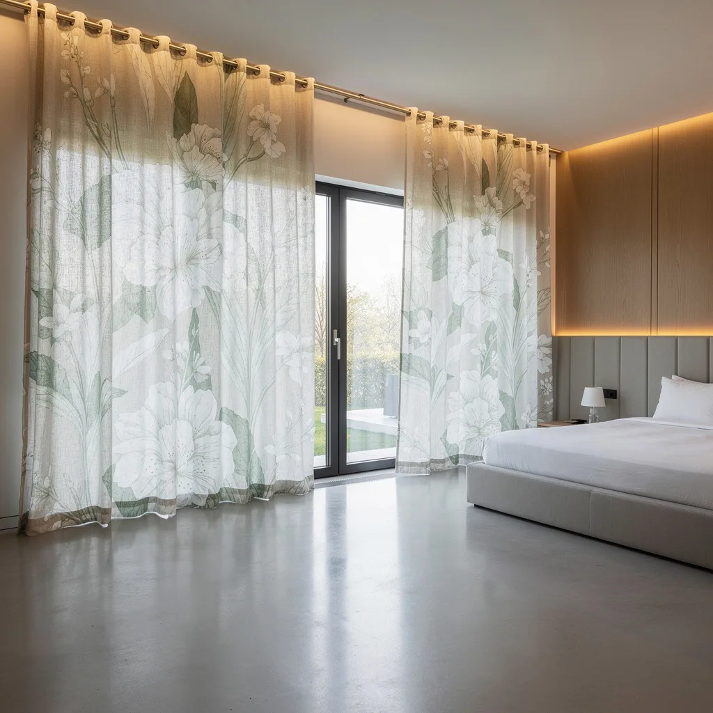
Sheer Botanical Print Voile
White voile panels printed with a scattered wildflower botanical — poppies, dahlias, herbs, trailing stems — that filter light into the room while turning the window itself into something worth looking at. The print is loose and naturalistic rather than formal, the fabric light enough to move with any air current, and the whole effect at midday when sunlight is pouring through is genuinely something to arrange your furniture around. A dark wood chair, rattan basket, and indoor plant at the base complete the composition without overloading it. Pro tip: Pair sheer botanical voile with a simple white roller blind behind it for light control — the voile does the beauty work and the blind does the practical work, and neither has to compromise.
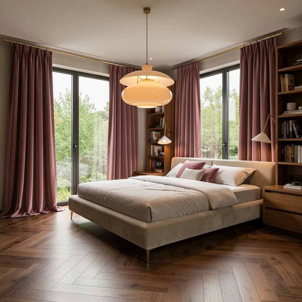
Blush Linen and White Sheer Layers
Dusty blush linen panels layered over floor-length white sheer voile, both hung from ceiling height, with the sheer doing the light diffusion and the blush providing the colour moment — this is how you use pink in a bedroom without it reading as a teenage decision. A rattan pendant overhead, a cane-panelled headboard in natural wood, ice-blue and cream bedding, cherry blossom branches in a round ceramic vase, and a hanging brass pendant beside the bed. Every warm element is balanced by something cool or natural. Pro tip: When layering coloured linen over white sheer, give the linen panel its own separate track set slightly in front of the sheer track — the separation of layers is what creates the depth and movement that makes this combination genuinely special.
Go Dreamy With Custom Sky-Blue Linen
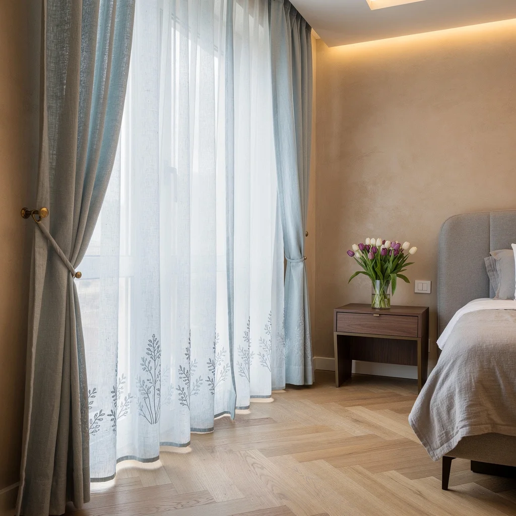
Snag that serene, cloud-nine vibe and quit pretending your muddy old panels are cutting it for spring. Invest in custom floor-to-ceiling sheer linen in a tranquil sky blue to let all that filtered daylight actually seep in and lift your space. Embroider some subtle botanical motifs along the base—not grandma vibes, but a nod to the fresh cut tulips or literally any green thing you can keep alive. Finish the look with brass tiebacks for a dose of polished glam. Always float your curtains as high and wide as the wall allows. No more curtain rod half-mast, thank you.
Triple Layer, Triple Flex: Mixing Voile, Silk, and Velvet

Ready to flex all your fabric-wrangling skills? Stack crisp white cotton voile, then gentle blush silk, and finish with pale sage velvet. Cue the sunlight games and extra tactile attitude—a minimalist base means your curtain drama won’t read as Grandma’s attic. Whip those layers across oversized windows and opt for gold-accented wall sconces if you’re into the subtle baller look. When layering curtains, go lightest to darkest from inside to outside. You want that sheer for privacy AND that heavy hitter to blackout your ex’s texts in style.
Sculptural Pistachio Organza: The Main Character Move
Stop sleeping on organza and go architectural with sculptural, pistachio-colored fabric from a sleek, ceiling-mounted track. Ditch pedestrian rods for the seamless look; pleated organza throws sparkling daylight everywhere and makes you feel like you almost own an art gallery. Keep the furniture streamlined and let that delicate textile bring the softness, because bulky furniture and wispy curtains are a literal mismatch. Always use a ceiling track for organza—wall-mounted rods will just kill that Insta-worthy modern effect and drag the whole vibe down.
Motorized Flax Linen: Let Technology Serve Your Scandinavian Spring
Why bother touching your curtains when sleek, motorized flax linen exists? Go for floor-length panels and pale wooden valances with geometric cut-outs—yes, CNC-cut, because regular is lazy—if you want Swedish meets James Bond. Pale terrazzo bedside tables and an obscenely plush, oversized green wool rug will dial up the comfort and symmetry. Let those curtains float and sway with the window open, pretending you’re on a wellness retreat. Always avoid touching your drapes with your bare hands—remote-control your way to dust-free luxury.
Dramatic Dusty Rose Blackout (with Sass Satin Lining)
Ready to commit to blackout drama that isn’t just for vampires? Grab deep, dusty rose panels, fully blackout with a luxe satin lining in a flashy contrast—extra points if you let them puddle on that wood floor for a queen vibe. Skip the bargain rods: subtle brass is mandatory. If your space is too boxy, soften with floating beds and oversized pendants for balance. Always puddle blackout drapes at least 2-3” on the floor for purposely messy-luxe energy. None of this floating an inch off the floor nonsense.
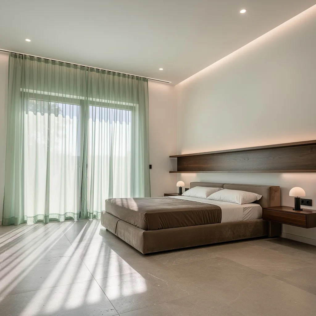
Fresh Grass-Green Linen, But Make It Embroidered
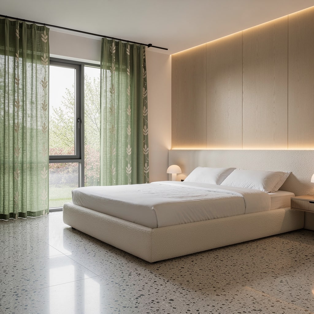
If you want that lush, spring-is-here energy without pretending you like houseplants, grass-green linen curtains with hand-embroidered ivory leaves just do the job. Hang them on a minimalist matte black rail for a sharp, contemporary contrast. Let the fresh light in and back it up with streamlined furniture—no patterns, no excess drama. Always add concealed uplighting in the window recess to make the threadwork pop at night, turning modest linen into the sneaky showstopper your friends will try to copy on a discount.
Ombré Curtains: Lemon to Garden Green Gradient (Cheer Included)

Fake joy (or amplify the real deal) by swinging up ombré bamboo silk curtains that fade from pale yellow at the top to rich green at the bottom. Light will shimmer and bounce, making anyone who visits forgive your messy nightstand. Keep the rest of the room light and textured—think white oak, powder blue, and sculptural lighting. Always run your ombré from ceiling to floor, not from left to right—nobody needs a ‘90s color block throwback. Say no to horizontal gradients outside a rainbow cookie.
The Ultimate Soft-Serve: Sheer Mint Over Cashmere

Try dual-layered minty sheer curtains facing off with an off-white handwoven cashmere for the top layer. Use a chunky window wall and nestle a rattan bench underneath for rich, chill energy. Coast with cashmere for that rich-witch look but don’t even think about skipping a minimalist, indirect floor wash to throw texture on the drape at night. Always mix contrasting textures—sheers over nubby cashmere. Matchy-matchy is for the uninspired. Let that mint pop, and your zen factor will skyrocket.
Box-Pleat Powder Blue Velvet: Where Regal Meets Chill
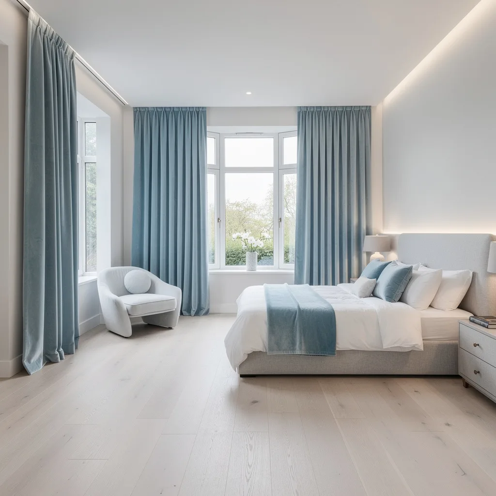
Want a curtain that says ‘I make rent, but I travel business class’ without being insufferable? Hang powder blue velvet panels with sharp, tailored box pleats from a ceiling rail—never visible hardware. Balance out the bold velvet with ashy light floors and sculptural, soft furnishings in light gray. Accent with a gentle, integrated glow to make the fabric’s luster the headliner, not your utility bill. Always dry clean velvet; if you steam it to death, your curtain will look like tired sweatpants.
Hand-Painted Botanical Linen: Statement Curtains for Grown-Ups
Spring is not for subtlety—go bold with linen drapes hand-painted in giant white and soft green leaf patterns. Use custom satin nickel rods, let them gently break on your microcement floor, and build out with light oak details. Make sure coordinated uplighting is in place to spotlight that craftsmanship every evening. Always commission or source oversized, hand-painted motifs if you want your drapes to be art, not wallpaper. Generic, small-scale prints are for the scaredy cats—own your choices and actually have a point of view.
Final Thoughts
Great spring bedroom curtains aren’t the result of finding a fabric you like and buying enough of it to cover your windows. They’re the result of understanding how light moves through your specific room, deciding what role the curtain is playing — drama, softness, privacy, colour, pattern — and then executing that one decision with enough fabric, the right hardware, and the correct hem length to make it look like it was always meant to be there. Spring gives your windows the best light of the year. The only question is whether your curtains are ready to do something useful with it.