
Most dining rooms end up being color afterthoughts—painted in whatever “safe” neutral was on sale, furnished with whatever chairs matched the table, and lit with whatever fixture came with the house. The whole space ends up feeling like a waiting room where food occasionally appears.
But dining rooms have the potential to be the most atmospheric spaces in your home, places where color psychology actually matters because you’re creating the backdrop for gathering, conversation, and celebration. The right color palette can make a Tuesday night dinner feel special and a holiday meal feel absolutely magical.
The best dining room color schemes understand that this isn’t just about picking pretty colors—it’s about creating an environment that enhances the experience of sharing meals and spending time with the people you care about.
Understanding How Color Actually Works in Dining Spaces
Dining room color choices affect everything from appetite to conversation quality, so understanding color psychology helps create spaces that genuinely enhance the dining experience.
Warm Colors Encourage Lingering – Reds, oranges, and warm yellows stimulate appetite and conversation, making people want to stay at the table longer. Cool colors can feel more formal but might not encourage relaxed gathering.
Lighting Changes Everything – Dining room colors look completely different under candlelight versus bright overhead fixtures. Test your palette under the lighting conditions you’ll actually use.
Contrast Creates Drama – Dining rooms can handle more dramatic color combinations than bedrooms or offices because they’re used for shorter periods and special occasions.
Personal Connection Matters Most – The most successful dining rooms reflect the personalities and entertaining style of their owners rather than following generic color rules.
Building Your Color Foundation
Before committing to specific shades, think about the mood and atmosphere you want to create for different types of dining experiences.
Consider Your Entertaining Style – Formal dinner parties need different color energy than casual family meals. Choose palettes that support how you actually use the space most often.
Factor in Natural Light – South-facing dining rooms can handle darker, moodier colors while north-facing spaces might need lighter, warmer palettes to feel inviting.
Think About Adjacent Spaces – Dining room colors should flow naturally with connecting living areas and kitchens rather than creating jarring transitions.
Plan for Flexibility – The best dining room palettes work for both intimate dinners and larger gatherings, creating atmosphere that adapts to different occasions.
15 Top Dining Room Color Palette Ideas
1. Timeless Black and White Contrast
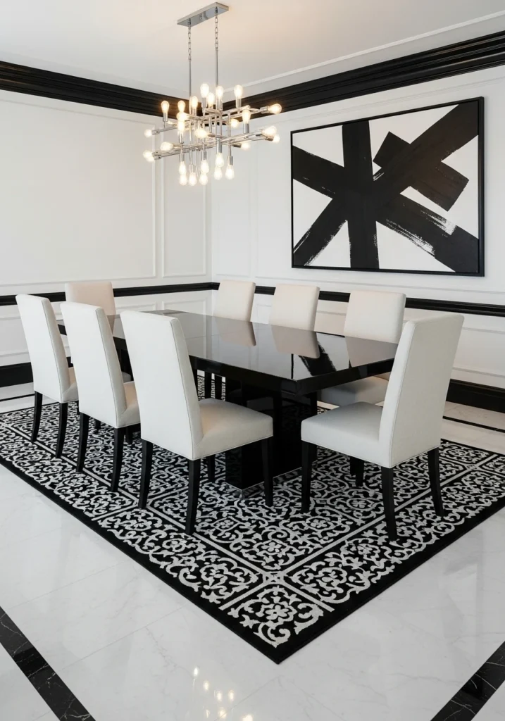
Ultra-luxury black and white creates dramatic sophistication with glossy black dining table, high-back cream upholstered chairs, and white walls with black crown molding.
Add large abstract monochrome artwork and patterned black-and-white rug for visual interest. Chrome chandelier and polished marble flooring complete the modern elegance.
This palette works for both formal entertaining and everyday meals while photographing beautifully and never going out of style.
2. Warm Neutrals and Taupe Elegance
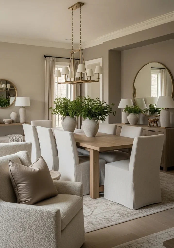
Sophisticated neutral palette using light beige walls with taupe accents, natural wood dining table, and linen chairs in cream tones.
Layer textures through boucle upholstery and silk window treatments while brushed brass chandelier adds warm metallic sparkle. Soft wool rug grounds the space.
This approach creates inviting warmth that works year-round while providing sophisticated backdrop for any table setting or seasonal decoration.
3. Deep Navy and Brass Drama
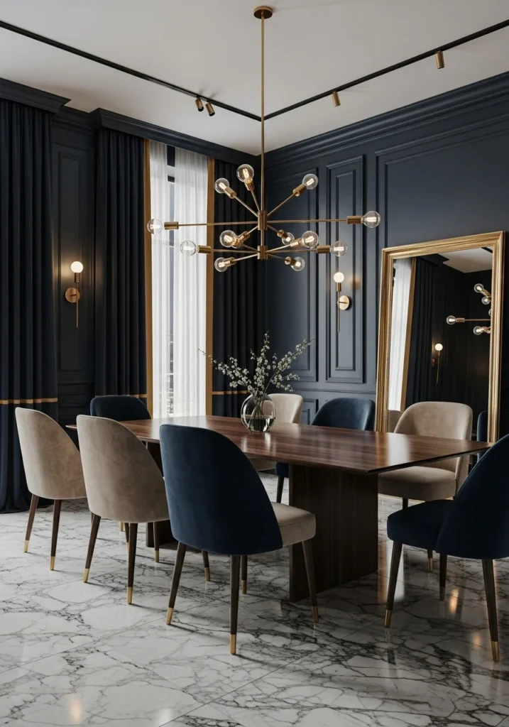
Moody sophistication through deep navy walls with gold-trimmed detailing, dark walnut dining table, and mix of velvet upholstered chairs in beige and navy.
Brass chandelier and sconces provide warm lighting while marble flooring with subtle veining adds luxury foundation. Navy curtains with golden trim complete the look.
This palette creates intimate evening atmosphere while feeling substantial enough for formal entertaining.
4. Soft Greys with Marble and Silver
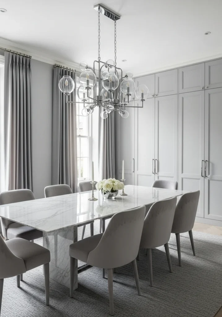
Cool-toned sophistication using light grey walls, large white marble dining table, and dove grey velvet chairs for refined elegance.
Chrome chandelier with glass details and silk grey curtains add reflective elements while light grey wool rug softens hard surfaces.
This palette works well in contemporary spaces and provides neutral backdrop that makes food and table settings the star of the show.
5. Rich Emerald and Dark Wood
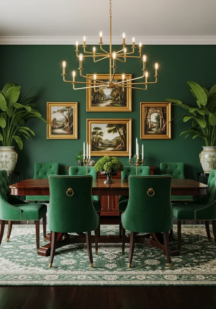
Opulent jewel-tone luxury with emerald accent wall, gold-framed art, and mahogany dining table paired with emerald velvet chairs.
Large brass chandelier provides warm lighting while patterned rug with green threads and ceramic planters with greenery reinforce the color story.
This bold palette creates memorable dining experiences and works particularly well for holiday entertaining.
6. Warm Terracotta and Cream Balance
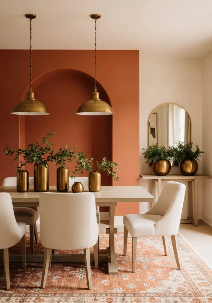
Mediterranean-inspired warmth through terracotta accent wall balanced with cream upholstered chairs and light wood dining table.
Brass pendant lights and terracotta patterned rug continue the warm earth tone theme while fresh greenery in brass vases adds natural elements.
This palette creates sun-kissed atmosphere that makes every meal feel like vacation dining.
7. Luxurious Burgundy and Gold
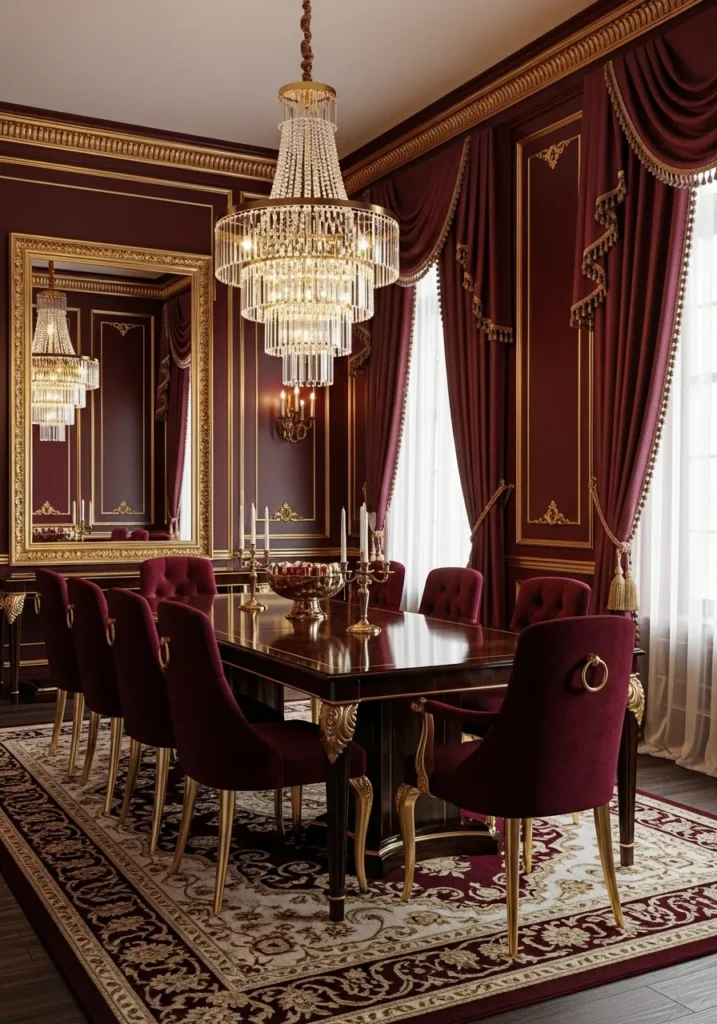
Formal elegance through deep burgundy walls with gold-trimmed frames, dark wood dining table, and burgundy velvet chairs.
Gold chandelier with crystal details and silk burgundy drapery create maximum luxury impact while ornate gold-framed mirror reflects candlelight.
This traditional palette works perfectly for formal entertaining and creates genuinely special occasion atmosphere.
Also Read:13 Bed Design Ideas That Turn Your Bedroom Into a Statement Space
8. Crisp White with Natural Wood
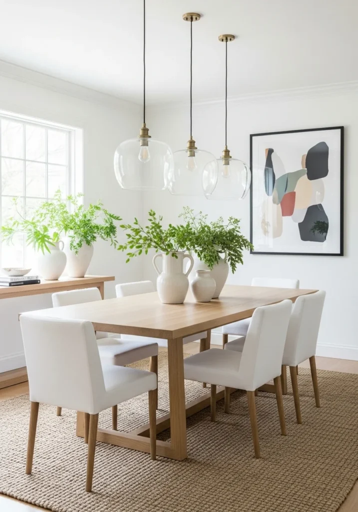
Scandinavian-inspired freshness using crisp white walls, light oak dining table, and white upholstered chairs for clean, bright atmosphere.
Large glass pendant lights and woven jute rug add natural textures while black-framed modern artwork provides graphic contrast.
This palette creates airy, light-filled dining experience perfect for casual meals and morning coffee.
9. Charcoal Grey and Metallic Highlights
Sophisticated moodiness through charcoal-painted walls, marble-topped dining table, and gold chandelier for dramatic luxury.
Velvet dining chairs in charcoal and jewel tones with bold abstract artwork in white and cobalt create visual interest and metallic decor accents sparkle.
This palette works well for evening entertaining and creates intimate, cocoon-like dining atmosphere.
10. Muted Sage and Light Oak
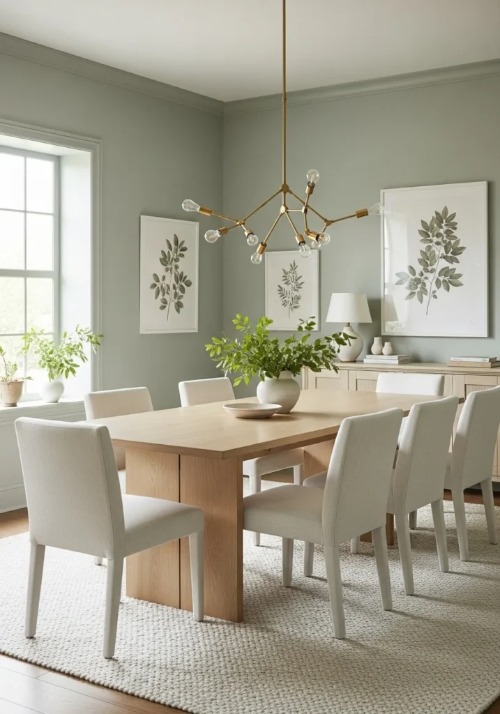
Natural elegance using sage-painted walls, light oak dining table, and ivory linen upholstered chairs for organic sophistication.
Brass chandelier with sculptural design and cream woven rug provide warm accents while botanical artwork and fresh greenery reinforce the natural theme.
This palette creates calming, restorative dining environment that works for both family meals and entertaining.
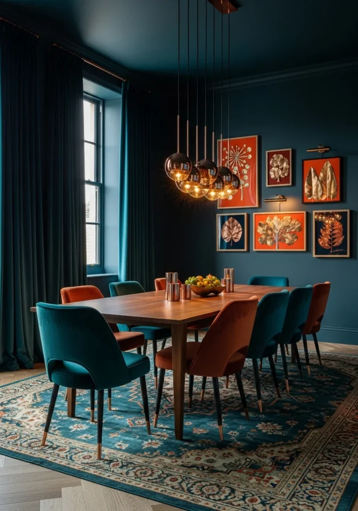
11. Moody Teal with Copper Accents

Bold intimacy through moody teal-painted walls, walnut dining table, and velvet teal and rust dining chairs.
Copper pendant chandelier and rich velvet drapery in teal create cozy atmosphere while silk patterned rug and warm orange artwork add richness.
This palette creates memorable, jewel-box dining experience that feels both bold and intimate.
12. Cream and Champagne Glamour
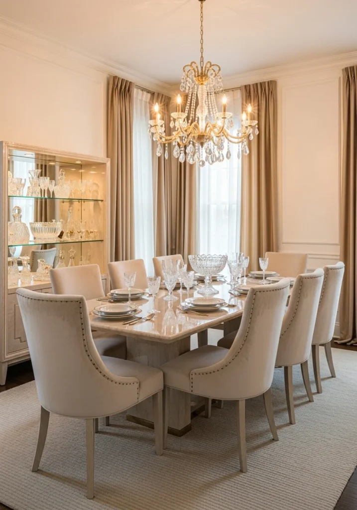
Soft luxury using off-white walls, champagne-gold chandelier with crystals, and marble dining table for understated glamour.
Cream velvet chairs and silk champagne drapery create layers of subtle luxury while crystal tableware and ivory rug complete the refined look.
This palette creates glowing, feminine elegance perfect for special occasions and romantic dinners.
13. Earthy Browns and Olive Green
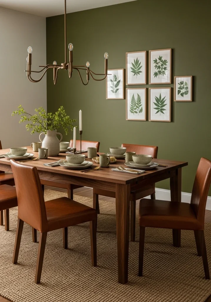
Grounded natural luxury through olive green accent wall, walnut dining table, and leather dining chairs in warm brown.
Bronze chandelier and woven natural rug reinforce the organic theme while ceramic tableware and botanical artwork add authentic earth-tone sophistication.
This palette creates warm, welcoming atmosphere that feels connected to nature while maintaining designer elegance.
14. Dusty Rose with Warm Neutrals
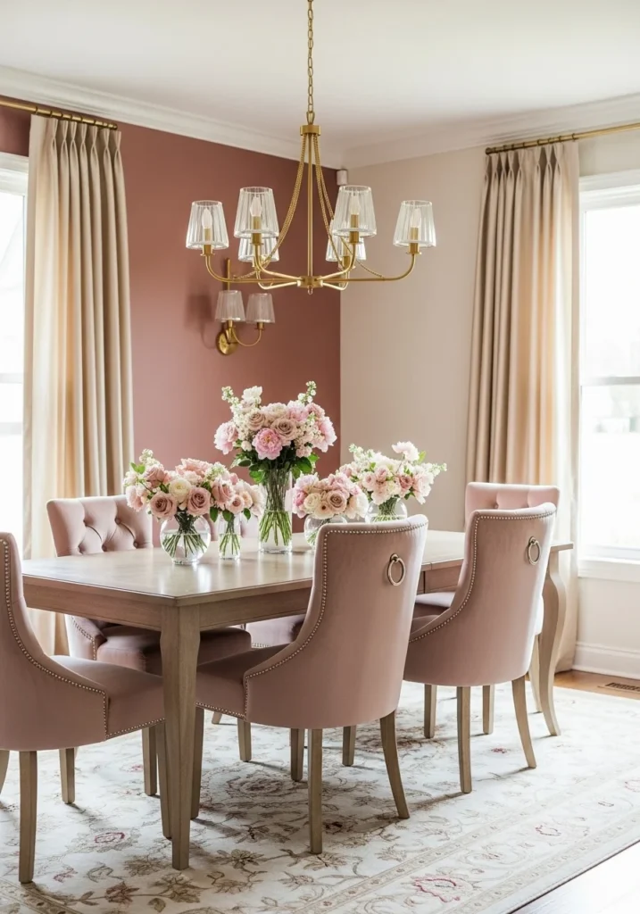
Romantic femininity using dusty rose accent wall, beige and cream furniture, and upholstered chairs in blush velvet.
Gold chandelier and patterned rug with blush accents create warm, romantic atmosphere while silk champagne curtains and floral decor add softness.
This palette works beautifully for brunches, celebrations, and intimate dinners where romance and warmth are desired.
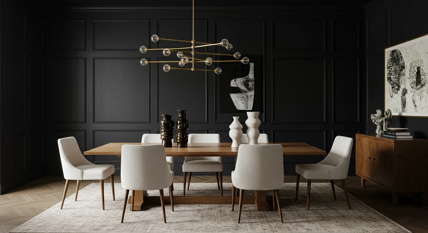
15. Bold Black with Warm Wood
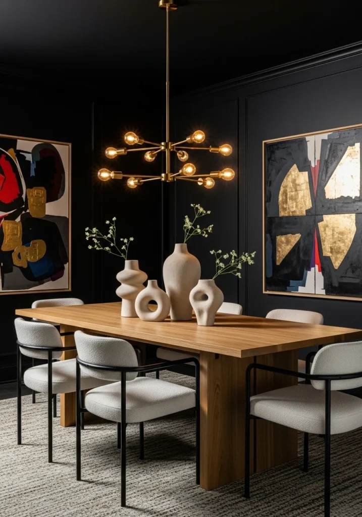
Contemporary drama through matte black walls balanced with warm oak dining table and ivory upholstered chairs.
Large brass pendant chandelier provides warm lighting while textured rug and sculptural vases add visual interest against the dramatic backdrop.
This palette creates striking modern elegance that makes every meal feel like a special event while maintaining surprising warmth.
Final Thoughts
Choosing the right dining room color palette isn’t about copying magazine spreads or following the latest trends. It’s about understanding how color affects mood and atmosphere, then selecting palettes that enhance how you actually use and enjoy your dining space.
The best dining room colors make people feel comfortable, encourage conversation, and create the right atmosphere for both everyday meals and special occasions. When you choose colors based on your entertaining style and personal preferences rather than generic design rules, you create dining rooms that genuinely enhance the experience of gathering around the table.
The most important thing? Pick colors that make you genuinely happy to spend time in the space. Your dining room should reflect your personality and make every meal—from Tuesday night takeout to holiday feasts—feel a little more special.