
A wedding tablescape sets the tone for the entire celebration. It’s the first thing guests see when they sit down, and it’s what they’ll remember when they look back at photos months later. The tablescape ideas below range from minimalist and modern to lush and romantic, proving that there’s no single “right” way to dress a table—only the way that feels right for your celebration. Whether you’re drawn to jewel tones and drama, crisp whites and geometry, or warm naturals and candlelight, these ideas show how thoughtful styling transforms a simple table into something guests actually want to linger at.
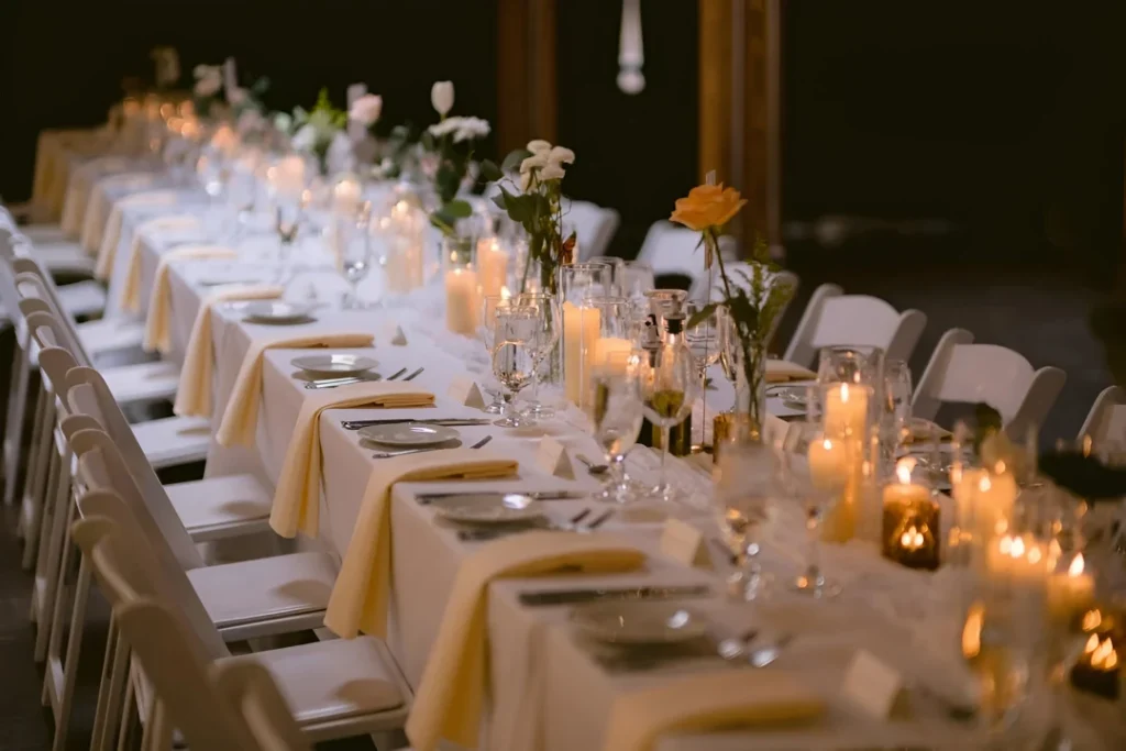
A long elegant table set in white with abundant cream-and-white florals, baby’s breath filling space between roses, tall glass hurricanes with pillar candles, and gold-accented chargers creates classic romance. u/MindlessYou7806 kept the florals lush and generous, filling the entire table length. Glass vessels and clear candlesticks create reflective surfaces. Table signs hand-written like “Table Two” and other markers add personalization. Gold spoons and sophisticated detailing show attention to every element. This abundant-white approach shows how generous florals and generous scale create the feeling of a celebration—nothing feels sparse or pinched.
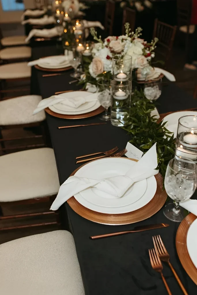
A long black-linen table with copper chargers and warm gold flatware creates rich contrast. u/lkat17topped it with white plate settings, pale folded napkins, and a low runner of white flowers mixed with soft green foliage creating movement down the table. Candlelight glows warmly. The extended table recedes into the dark background, creating depth. This dark-table-with-white approach proves that dark linens aren’t somber—paired with white place settings and warm lighting, they create drama and sophistication that makes the table feel like it’s floating in candlelight.
A long intimate table set with cream runners, pale-pink napkins, white chargers, and abundant centerpiece florals in blush tones creates soft romanticism. u/Reasonable_Drama_835 used peonies, roses, and ranunculus in cohesive color story. Warm candlelight and glassware catch the soft light. The intimate scale and consistent palette create a cohesive moment. This blush-and-cream approach shows how a tight color palette executed with generous scale creates romance without requiring drama—the softness itself is the statement.

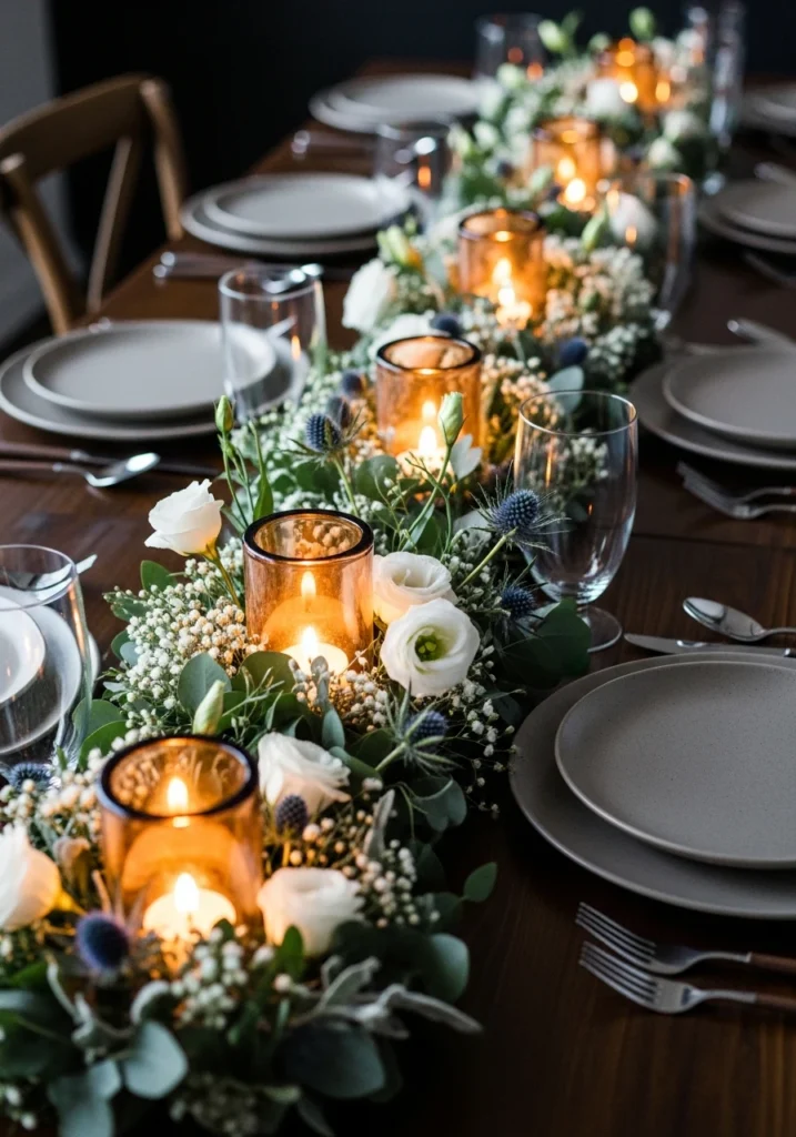
A long dark-wood table dressed with a continuous low trench filled with frosted fir sprigs, silver-green eucalyptus, and white hellebores creates an organic garden-like centerline. A narrow integrated brass candle trench with rows of short white tapers provides safe, even flame down the entire length. Matte-white porcelain chargers, warm-gold flatware, and smoked-crystal water glasses create subtle sophistication. Oatmeal linen napkins tied with tiny olive sprigs add textural detail. Soft warm 2700K pendant glow combined with overhead cool-blue uplight creates beautiful contrast. This trench approach shows how a continuous element down the table creates flow and makes the space feel cohesive—guests at opposite ends still feel connected.
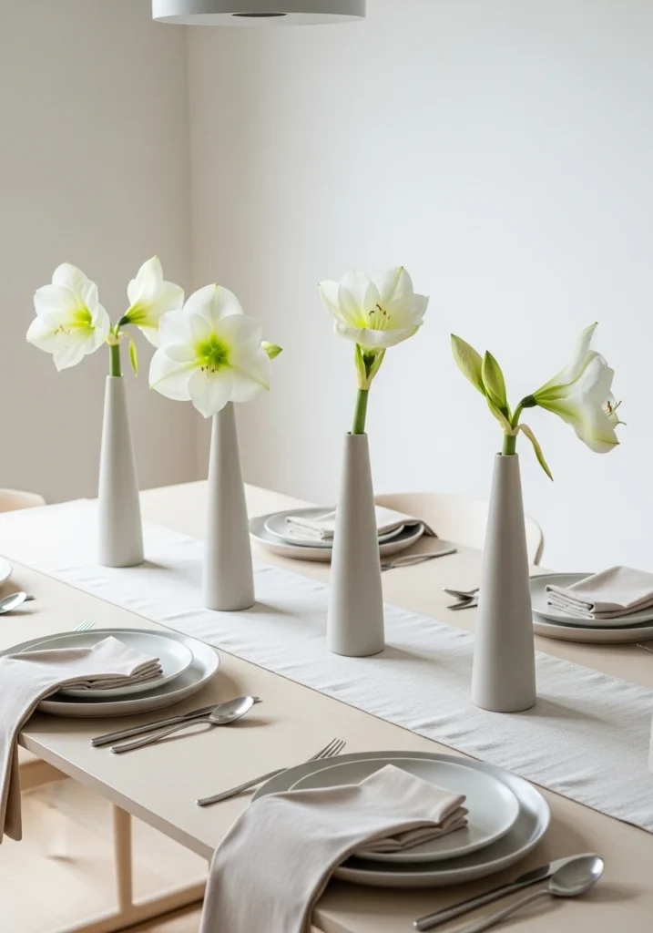
A pale-ivory lacquer table set with a single line of tall narrow matte-ceramic vases, each holding one oversized white amaryllis, creates sculptural rhythm without clutter. A low ivory linen runner grounds the arrangement. Handmade porcelain plates with thin matte-gold rim, minimal matte-silver flatware, and ivory velvet napkins folded simply maintain the restrained aesthetic. Soft diffuse daylight combined with a single low pendant creates intimacy. This minimalist approach proves that sometimes the most impactful tablescapes are the ones that know when to stop—less is absolutely more here.
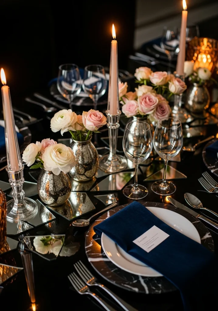
Mirrored runner shards laid intermittently along a dark table create reflective intrigue. Mixed mercury-glass low vessels with white ranunculus and pale-pink spray roses catch light beautifully. Tall tapered clear crystal candlesticks add height. Black-marble chargers provide dramatic grounding. Polished silver flatware and deep-navy velvet napkins complete the picture. Warm amber candlelight dominates the mood with subtle cooler pin lighting creating depth. This crystal-and-mercury approach works because reflective surfaces multiply light and create visual interest without requiring more flowers or accessories—it’s about working with what catches light.
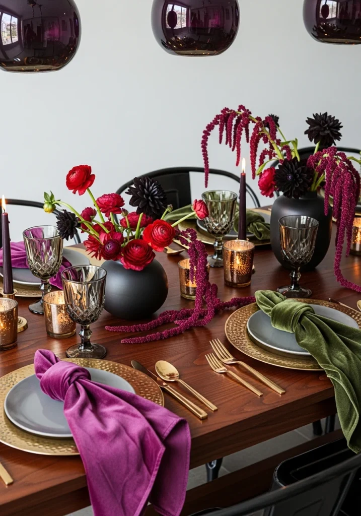
Deep-wood tables set with jewel-toned velvet napkins in aubergine and bottle green create rich, luxurious immediately. Filled low matte-black vases with ruby ranunculus, black dahlias, and dark burgundy amaranth feel both seasonal and sophisticated. Hammered-brass chargers catch warm light. Smoky crystal glassware and warm brass flatware tie the warm metals together. Low votives scattered throughout create candlelit pools of intimacy. Dim 3000K pendant lighting makes the jewel tones glow rather than feel heavy. This jewel-tone approach shows how deep florals and rich materials create luxury without requiring pastels or silvers.
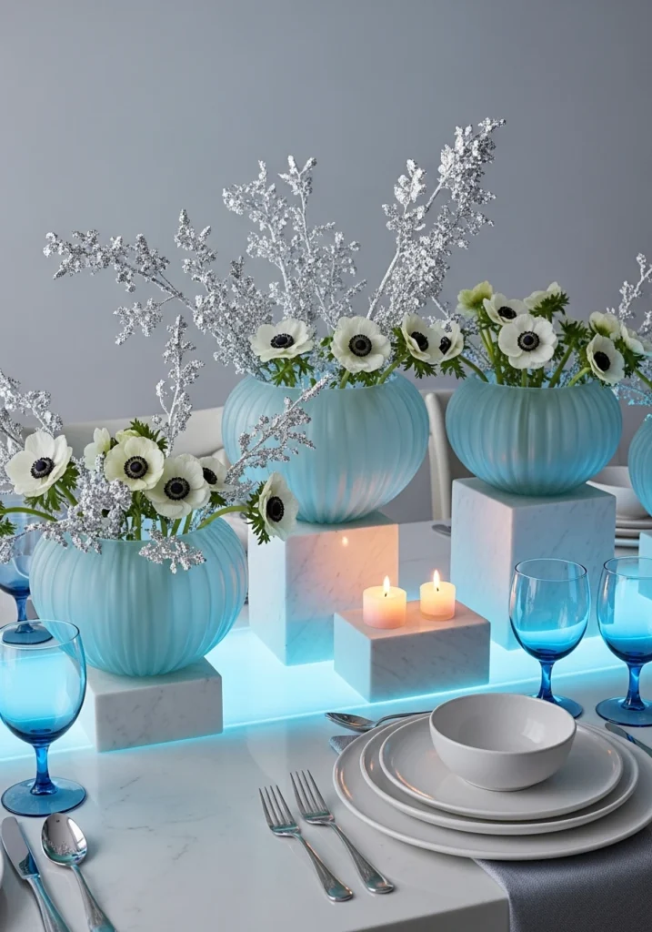
Frosted pale-blue blown-glass bowls as centerpieces filled with white anemones and dusted silver-leaf branches create a cool-toned moment. White marble small plinths vary the heights naturally. Cool-blue accent LED under-table wash balanced with warm candlelight creates visual temperature play. White stoneware plates and cool polished-silver flatware maintain the cool palette. Translucent blue water goblets echo the centerpiece color. This ice-blue approach works because cool tones feel inherently winter without requiring frost or snow—the glass and silver-leaf create the icy effect naturally.
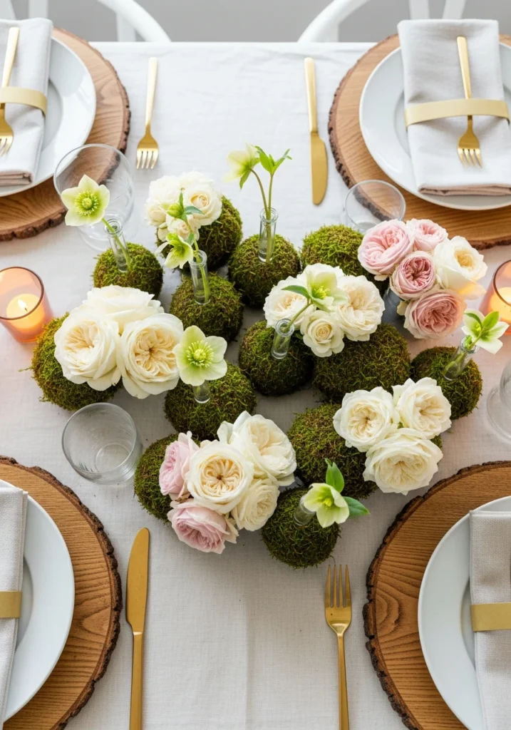
Organic groupings of small hand-formed peat-moss pods interspersed with clusters of garden roses in cream and blush create textural interest. Tiny glass tubes with single hellebore stems poking through moss add delicate detail. Raw-edge oak chargers bring warmth and natural texture. Brass butter knives and linen napkins maintain the organic aesthetic. Soft side window light combined with warm candle accents creates flattering illumination. This moss-pod approach shows how natural, tactile materials create interest without requiring a lot of florals—sometimes less arrangement and more layering of textures works better.

A pure-white palette executed across everything—white lacquer table, porcelain chargers, white peonies and anthuriums in low white bud vases—creates serene elegance. Mother-of-pearl place cards in blank (let guests write their own names) and shell-shaped salt bowls add subtle texture. Matte-chrome flatware maintains the minimalist aesthetic. Soft daylight with a single low warm pendant keeps the space from feeling cold or sterile. This monochrome-white approach proves that white-on-white doesn’t have to feel boring—it’s actually incredibly luxurious when textures are varied.
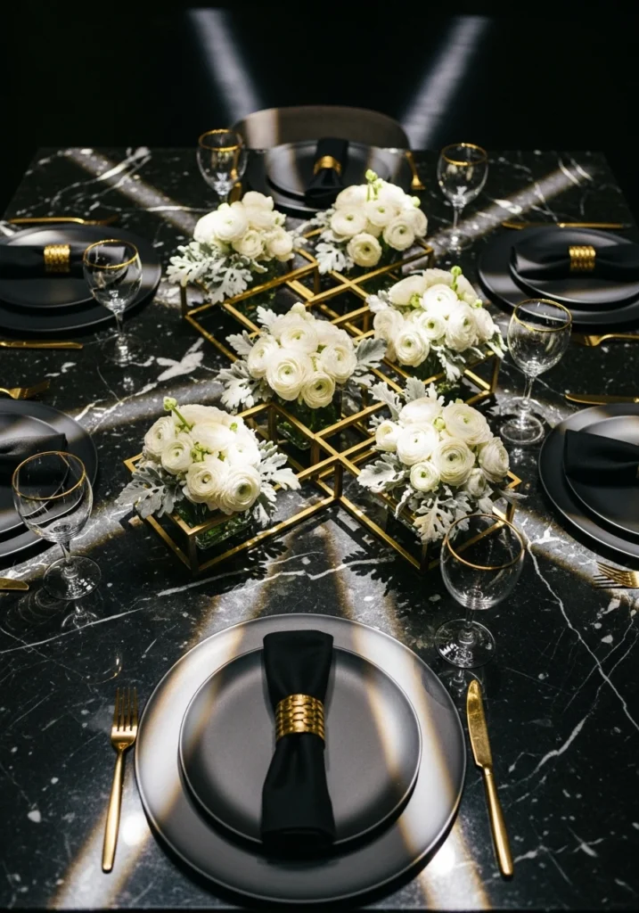
A black marble tabletop hosts a central geometric brass sculpture (hollow trays) with compact white ranunculus and silver-gray dusty miller creating height and focus. Matte-black chargers ground the place settings. Gold-rimmed stemware adds warmth. Tailored black linen napkins with brass napkin rings echo the hardware. Focused spotlights above create crisp shadow geometry. This geometric-metallic approach works because the sculpture becomes functional art—it holds flowers while also serving as the table’s focal point.

A natural-wood table dressed with a runner of halved blood oranges, whole kumquats, sprigs of rosemary, and small cedar boughs creates edible-meets-decorative appeal. Low neutral ceramic plates and raw-edged slate chargers keep focus on the citrus colors. Warm hammered-brass flatware and clear stemware with amber votives warm the citrus coolness. Morning light creates fresh sheen on the fruit. This citrus-and-pine approach shows how actual food can be tablescape decor—it looks beautiful and smells incredible, plus it’s less wasteful than flowers alone.
An arrangement of small lanterns in staggered rows down the table center, each sitting on a cushion of low flowers—white lisianthus, dusty eucalyptus, and small thistle—creates repetitive rhythm. Soft amber glow from lanterns with just a hint of cool uplight creates mood. Matte-ceramic plates and dark wood flatware provide contrast. This lantern-field approach proves that repetition of a simple element down the table creates impact—you don’t need variety when one element is executed consistently.
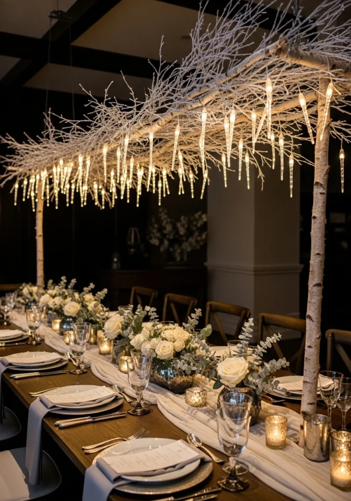
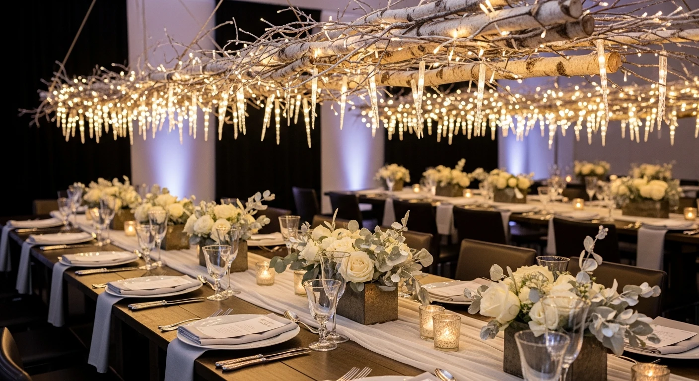
A long banquet table with an overhead suspended canopy of frosted birch branches and micro LED “icicle” lights creates architectural drama. Beneath it, low vessels with cream roses and silvered eucalyptus provide ground-level interest. Pale-linen runners, hammered-silver flatware, and slightly antiqued glassware complete the picture. Warm 3000K uplight on the branch undersides creates soft downward glow. This frosted-canopy approach shows how overhead elements transform a table—suddenly you’re dining under a winter forest rather than just at a table decorated with branches.
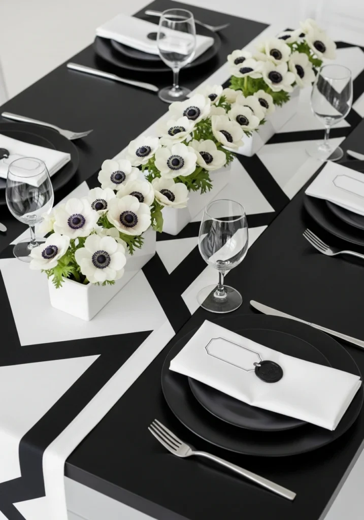
A matte-black table with crisp white geometric runner creates bold graphic contrast. A single low row of white anemones in rectangular white ceramic troughs runs down the center. Black porcelain chargers, satin steel flatware, and crisp folded white napkins with black wax-sealed tags maintain the graphic aesthetic. Cool gallery lighting emphasizes the contrast. This minimalist-black-and-white approach proves that graphic design principles work beautifully for weddings—sometimes the boldest move is restraint and contrast rather than decoration.
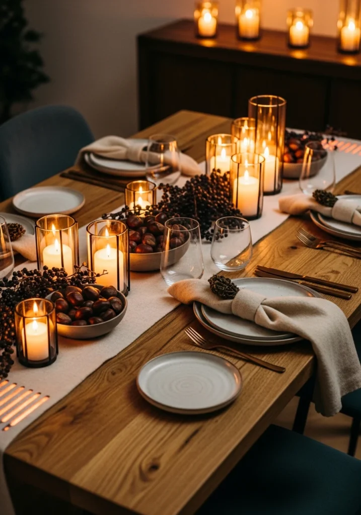
A reclaimed-oak dining table hosts clusters of small warmed-lantern-style candle holders paired with low bowls of roasted chestnuts and winter berries creating texture and aroma. Deep-cream wool napkins, bronze flatware, and ceramic plates with soft matte glaze maintain warmth. Ambient warm lighting and concealed table-top heaters (suggested under runner) show practical luxury. This rustic-luxe approach proves that real weddings require thinking about guest comfort—heated tables and toasty lighting aren’t less elegant, they’re more thoughtful.
Whether these wedding tablescapes embraced bold geometry, lush florals, jewel tones, or crisp minimalism, they all prove that a table becomes memorable through intentional choices about color, materials, lighting, and scale. Some went spare and sculptural, others went generous and romantic, but every single one shows that guests remember how a table made them feel—whether that’s cozy, sophisticated, romantic, or celebrated. That emotional impact comes from thoughtful design, not from spending the most or decorating the most. A table that understands its purpose and executes with intention will always outshine one that just looks expensive.