
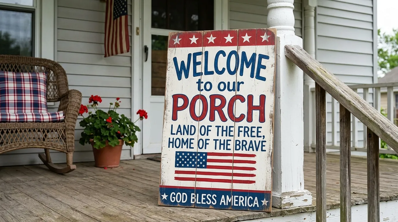
The generic wreath and a mat that says “Welcome.” That’s the standard American summer porch. That’s what ninety percent of front doors look like from Memorial Day straight through to Labor Day. It communicates nothing except that someone went to a big box store and made the expected choices.
A sign changes all of that. Not a generic one. Not a plank that says “Home Sweet Home” in script that could belong to any house on any street in any state. A sign with a voice. One that says something specific enough that a stranger walking past might actually smile, or stop, or feel something.
The best porch signs are the ones that hold a personality. They tell you who lives there before the door opens. They commit. They say: this family grills hard, laughs louder, and is fully aware that fireworks are not a responsible financial decision — and they have absolutely no plans to change.
That’s what this post is about. Not how to hang a wreath. How to make the thing on your front porch say something worth reading.
Why Most Patriotic Porch Decor Falls Flat
Something goes wrong between intention and execution almost every time. People want their porch to feel festive. They end up with a surface that feels dressed. There’s a difference.
The Colour Scheme Isn’t the Concept
Red, white, and blue is a palette. It is not a design. The mistake most people make is treating the colour combination as if it’s doing all the work. It isn’t.
A porch draped entirely in red, white, and blue ribbons and bunting with no clear focal point is just noise. The eye doesn’t know where to land. Nothing reads as intentional. It looks like a party supply store exploded against your siding.
The colour palette should support the central element. It should not be the central element. When you lead with a sign — something with actual words, actual wit, actual personality — the red, white, and blue around it becomes context rather than clutter.
The Sentiment Is Too Safe
“Happy 4th of July.” “Land of the Free.” “God Bless America.” Fine. All fine. Also forgettable. The problem with safe sentiments is that they signal nothing about who you actually are. They’re the porch equivalent of “nice to meet you.”
The porches that make people stop and take a photo are the ones that take a position. Usually a funny one. Humour is a form of honesty. A sign that makes your neighbour snort while checking the mail is doing more social work than three tasteful wreaths combined.
The Scale Is Wrong
A small sign on a large porch gets swallowed entirely. A large sign on a narrow stoop is all anyone can see. Most people default to signs that are too small because small feels safer. It isn’t. Small reads as tentative.
Porch signs work best when they’re sized for their environment. A tall, vertical leaner sign needs to be at least four feet to hold its own against the architecture. A wall-mounted horizontal sign needs generous margins — crowded lettering against an edge looks rushed. Give the words room to breathe, and they’ll carry further than you expect.
Getting the Foundation Right Before Anything Else
Before you buy a sign, or make one, or commission one, there are three questions worth settling. The answers will determine everything.
Decide on Display Method First
There are three ways a porch sign lives: leaning against the house or door frame, wall-mounted with hardware, or standing on an easel. Each requires a different sign shape and weight.
Leaner signs are tall and vertical. They need enough weight at the base to stay put in wind without being so heavy they damage the surface they’re resting on. Add a non-slip furniture pad to the bottom edge. Wall-mounted signs need D-rings or sawtooth hangers on the back, and the mounting hardware on your porch needs to match the weight load. Easel-mounted signs are the most flexible because they can be repositioned, but the easel itself is part of the composition — a cheap, flimsy easel under a beautiful sign is a problem.
Know Your Porch Wall Before Choosing Scale
Measure the wall space or door frame area where the sign will live before committing to a size. A sign that’s too narrow for the wall behind it floats unanchored. A sign that’s too wide crowds the space and competes with everything else.
For a standard entry porch column or door-adjacent wall, a vertical sign of roughly twelve inches wide and forty-eight to sixty inches tall tends to read well from the street. For a horizontal wall mount, aim for a sign that spans roughly half the visible wall width.
Pick One Voice and Commit to It
Sincerity and humour are both valid. Mixing them within a single sign can work — but only when the structure is clear. The earnest line lands first, the punchline follows. If both halves are equally weighted, neither reads cleanly.
Decide before you start making or ordering: is this sign a tribute, a joke, or a wink? The clearest signs are the ones that know exactly what they are.
Fourth of July Porch Sign Ideas
The Dual Stained Wood Panel Entry That Honours Service
Source two pine boards — the same wood, same stain, different designs — and stand them on either side of the front door. The proportions matter: each panel needs to be tall and narrow enough to frame the door without blocking the path.
For the left panel, paint the upper half with a navy field of hand-stamped white stars, then transition into horizontal wood grain stained in a warm red-brown to suggest the stripes of the flag. Tie a generous burlap bow at the midpoint where the painted section meets the natural wood. The bow masks the transition line and adds texture.
For the right panel, start with a dark walnut stain on the upper quarter and letter “U.S. Army Veteran” in white paint — the branch name in script, the rank designation in bold all-caps. Below the text, paint a partial flag motif in the same red, white, and navy. Tie a matching burlap bow at mid-height.
The power of this look is the pairing. Two panels, two sides, symmetry that frames the door like columns. The “Home Sweet Home” coir mat between them grounds the composition. Keep the planting on either side low — boxwood or ornamental grasses — so the panels remain the dominant vertical elements.
The Chalkboard Easel Sign with a Single Big Bow
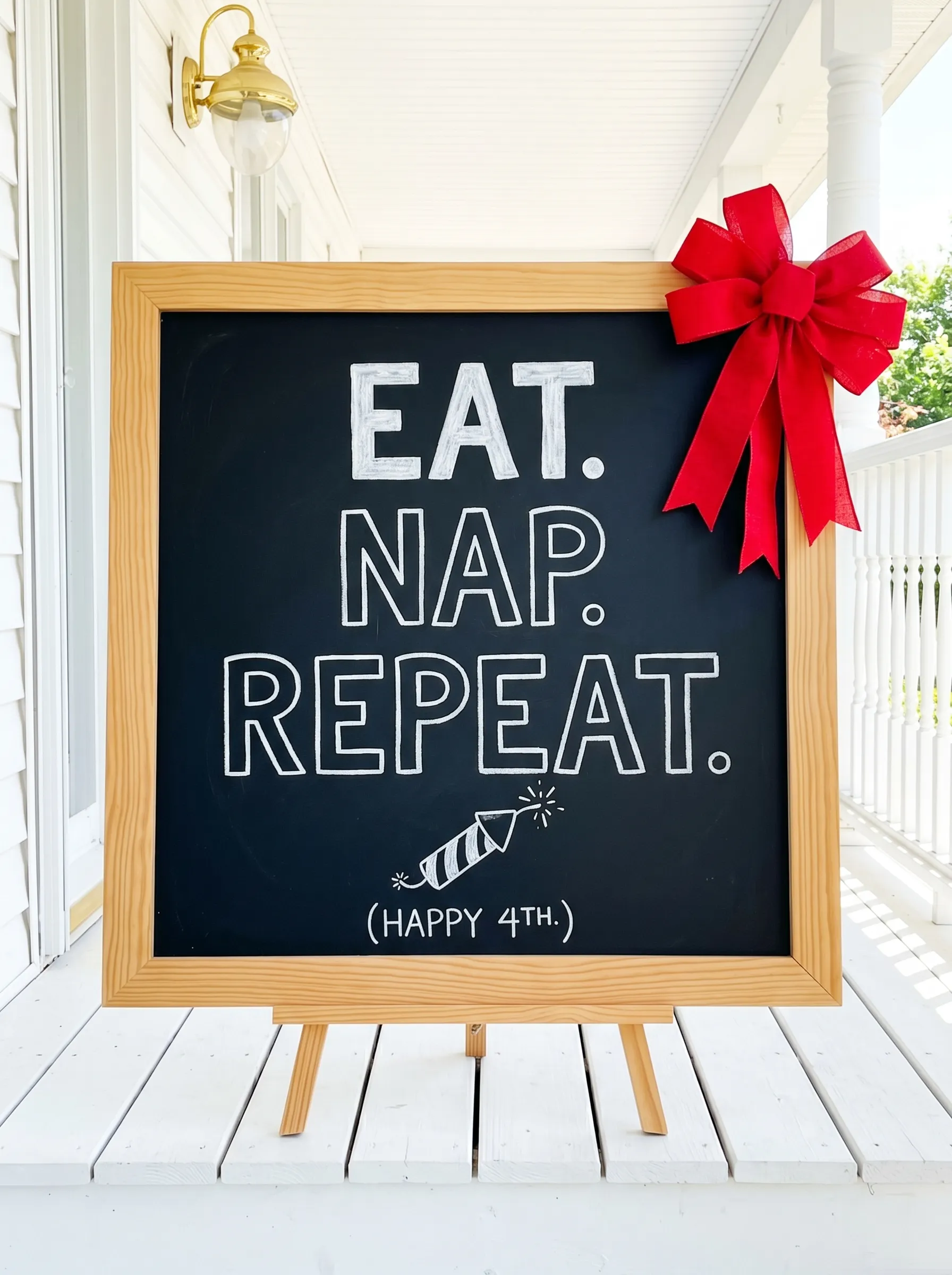
Buy or build a square chalkboard with a natural wood frame — approximately twenty-four by twenty-four inches — and set it on a matching wood easel. The easel should be clean-lined, not ornate. This is about the message, not the stand.
Write the text in large, casual hand lettering using a white chalk pen rather than traditional chalk dust. The chalk pen gives cleaner lines and won’t smear if someone brushes past. Go big on the first line, slightly smaller on the second, smallest on the punchline. Add a small illustration below — a firework, a burger, a firecracker — drawn in the same casual style as the lettering.
Attach a single large bow to the upper right corner of the frame. Not centred, not symmetrical — off to the side, so it frames the composition without interfering with the text. Red ribbon reads as festive and emphatic here. Make the bow large enough to be visible from the street.
The Quilt-Pattern Barn Board Column Sign That Stops Traffic
Find or commission a wide barn board panel — roughly sixteen inches across and sixty inches tall — and section it into three parts: a narrow stained header block at the top lettered with “USA” in a deeply carved or painted serif, a long centre field for the quilt pattern, and a matching footer block with the establishment year.
The quilt pattern is the centrepiece. Use a pinwheel block design in the three colours: navy triangles, deep red triangles, white negative space, with a central star medallion at the focal point. The blocks should be geometric and precise — use painter’s tape to achieve clean edges, and apply at least two coats of each colour so the white stays bright against the weathered wood grain showing through elsewhere.
Flank this sign against the porch column rather than leaning it on the ground. Use a French cleat or a pair of heavy-duty picture hooks drilled into the column to hold it flush to the post.
Then layer in the supporting cast: galvanised metal buckets planted with red geraniums and white blooms, small American flags grouped in bunches, a burlap banner strung along the porch step, and patriotic cushions on a rocking chair behind. The sign is the anchor. Everything else orbits it.
The Raw Pine Horizontal Wall-Mounted Plank with Bracket Hardware
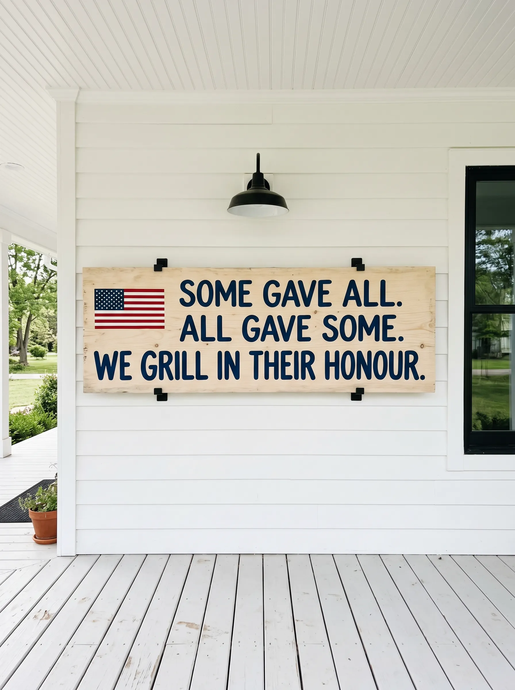
Cut or source a single pine board approximately fifty-four inches wide and sixteen inches tall, with a natural pale finish — just a clear sealant, no stain. Mount it to the porch wall with two pairs of black metal board brackets, one set at each end. The brackets are structural and decorative simultaneously; they frame the text and suggest permanence.
Paint the text directly onto the raw wood in a deep navy. The content should be three lines of descending gravity: something earnest, something more earnest, then something that cuts. The contrast between the weight of the tribute and the lightness of the final line is what makes this format work. The raw pine ground makes the navy jump. Mount a single American flag miniature into the left side of the composition to anchor the theme without over-illustrating it.
Hang a gooseneck barn light directly above the sign. It serves both function and framing — at night, the sign stays lit, and the light fixture itself reads as a considered detail rather than a utility choice.
The Clean White Hanging Square Sign That Wins on Restraint
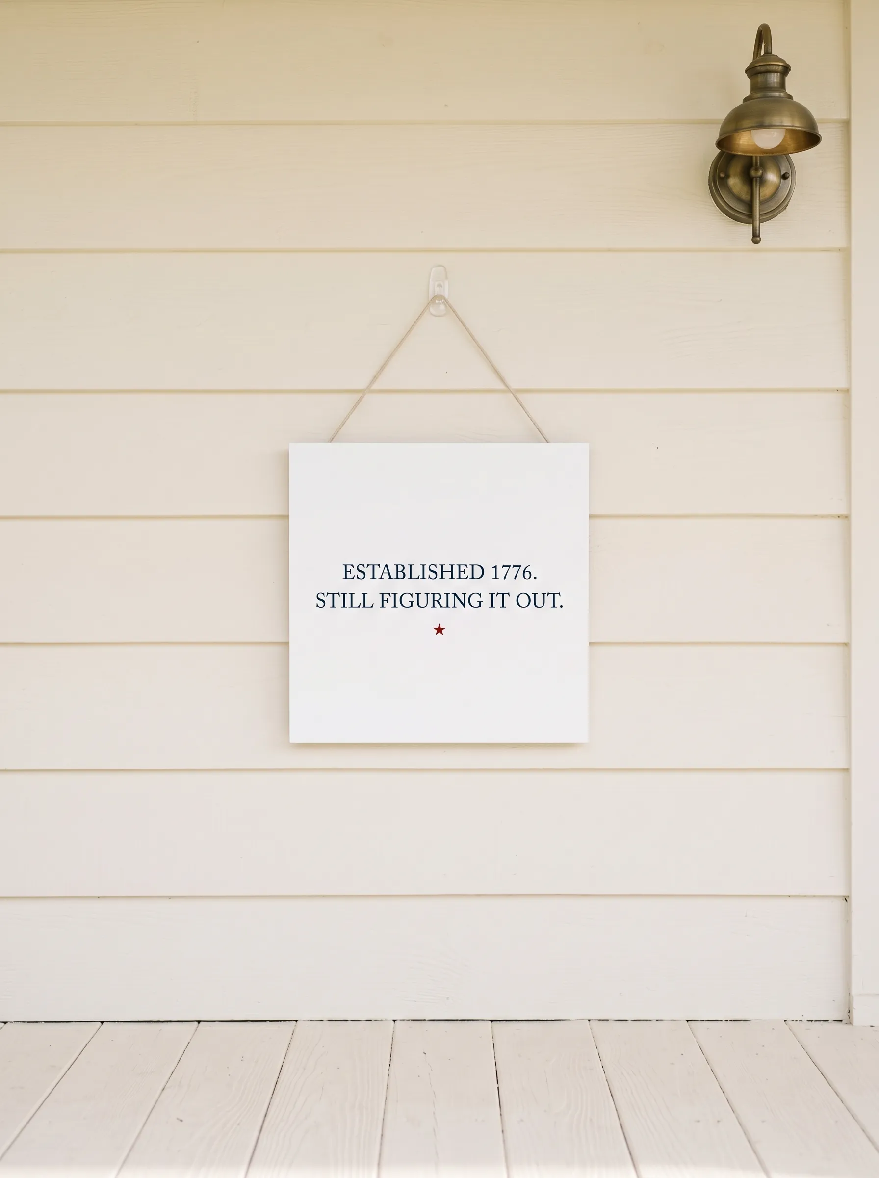
Paint a square wooden panel — roughly fourteen by fourteen inches — in a flat white or off-white. No distressing. No woodgrain showing through. The point of this sign is the absence of noise.
Letter two short lines of text in a clean serif typeface in the upper centre, set with generous margins on all sides. Keep the font weight medium — not hairline thin, not aggressively bold. Add a single small accent element: one dark red star, small, placed below the text and centred. Just one.
Hang it from a simple jute or cotton cord through a single eyelet at the top. The hanging mechanism is part of the aesthetic — raw, handmade, slightly imperfect in the way things are when someone actually made them.
This sign works because of what it doesn’t do. No wreath, no bow, no clustering of other elements. Just the panel, the words, and the wall behind it. It trusts the message to carry the moment.
The Tall Navy Board with Typography That Runs the Full Height
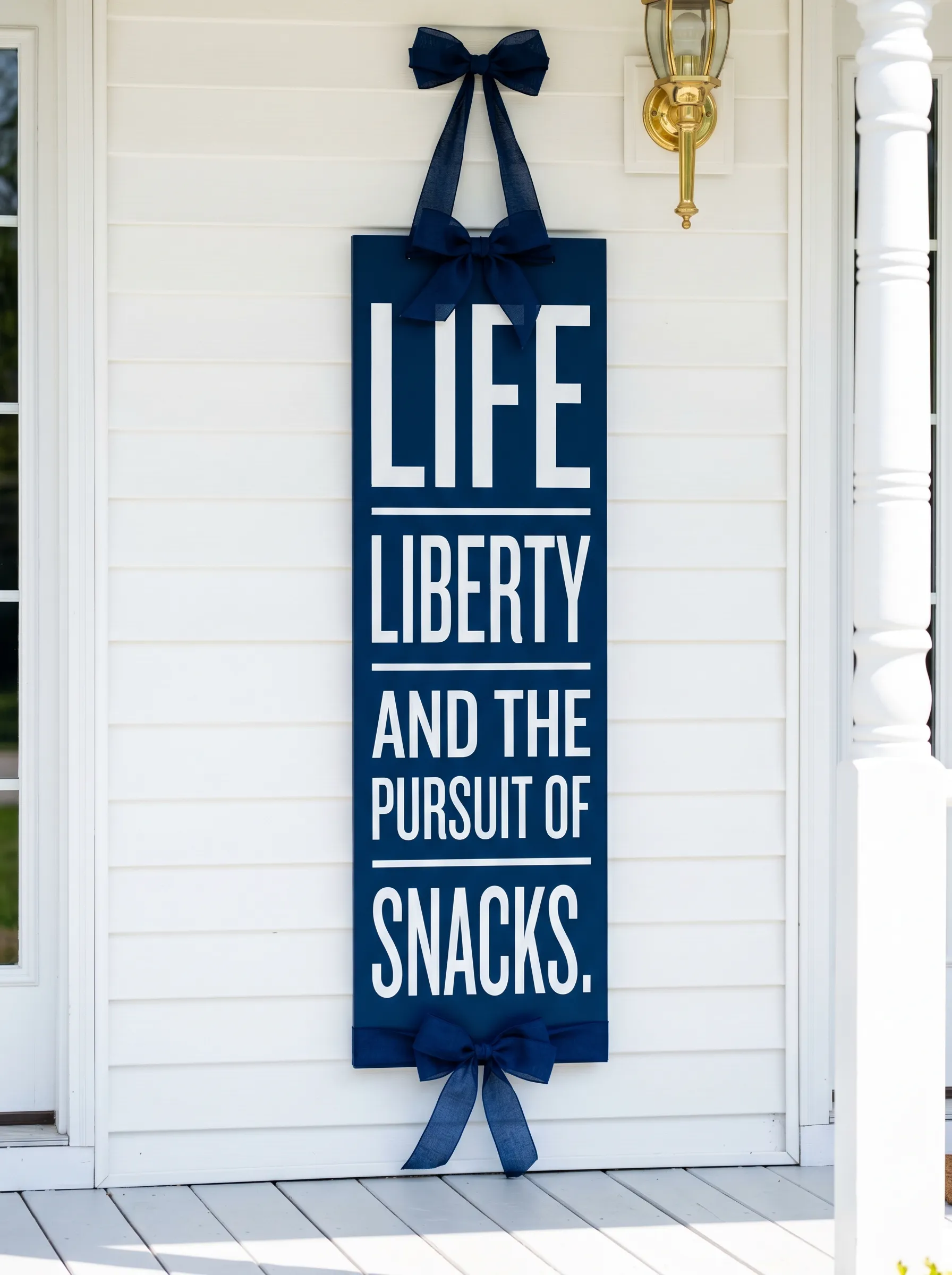
Start with a MDF or plywood panel, roughly twelve inches wide by fifty-six inches tall, and paint the face in deep navy — two full coats, no shortcuts. Sand lightly between coats for a smooth finish. The goal is a surface that looks deliberate and graphic, not painted.
Letter the text in white in a bold, compressed sans-serif typeface. Use vinyl lettering cut on a home cutter or apply the text with stencils and a dense foam roller for clean edges. The words should run the full height of the board with generous spacing between lines — the white space between words is part of the composition.
Attach three matching navy ribbon bows: one at the top, secured through a small eyelet for hanging, one at the top face of the panel for decoration, and one at the bottom. The repetition of the bows gives the sign a formal quality that balances the cheeky content of the words.
The Distressed White Vertical Leaner with Gingham Bow for the Rustic Porch
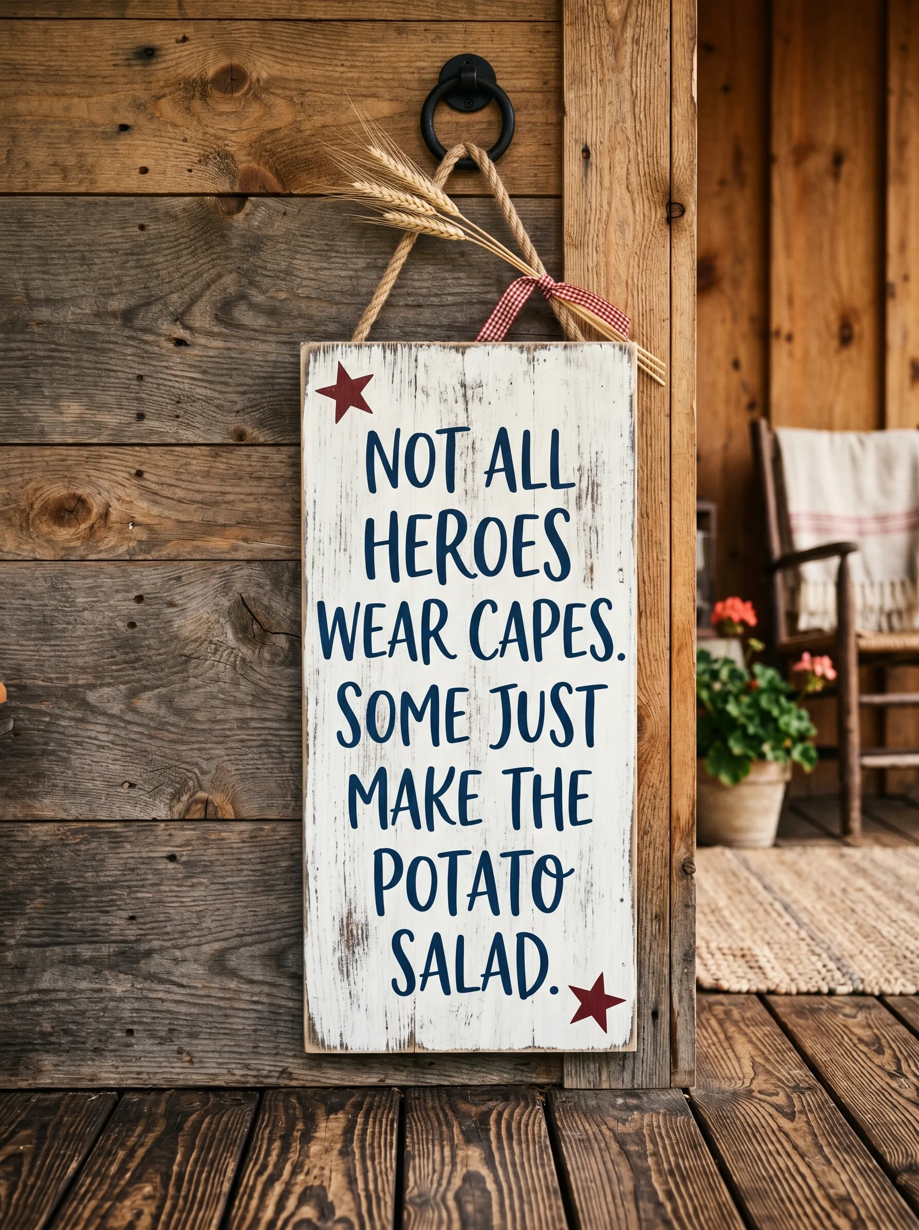
Source a reclaimed or intentionally distressed white-painted board, roughly ten inches by forty-eight inches. The distressing should look earned, not manufactured — rough sand the edges and raised grain areas after painting, don’t sand the face uniformly.
Hand-letter the text in navy in a casual, rounded typeface. The letters should fill the width of the board generously — leave a quarter inch of breathing room on each side but no more. The effect should be that the words own the board completely.
Add a single small dark red star near the bottom right corner. Nothing else. At the top, tie a large burlap bow through an eyelet hanger. Burlap and distressed white are completely cohesive materials — they both carry the same quality of something worn and honest.
This sign style suits a porch with rough-hewn wood, brick, natural fibre elements, and rocking chairs. It would look slightly wrong on an ultra-modern white board-and-batten facade. Know your porch before you commit to your material.
The Cedar Board on Easel with Two-Colour Lettering
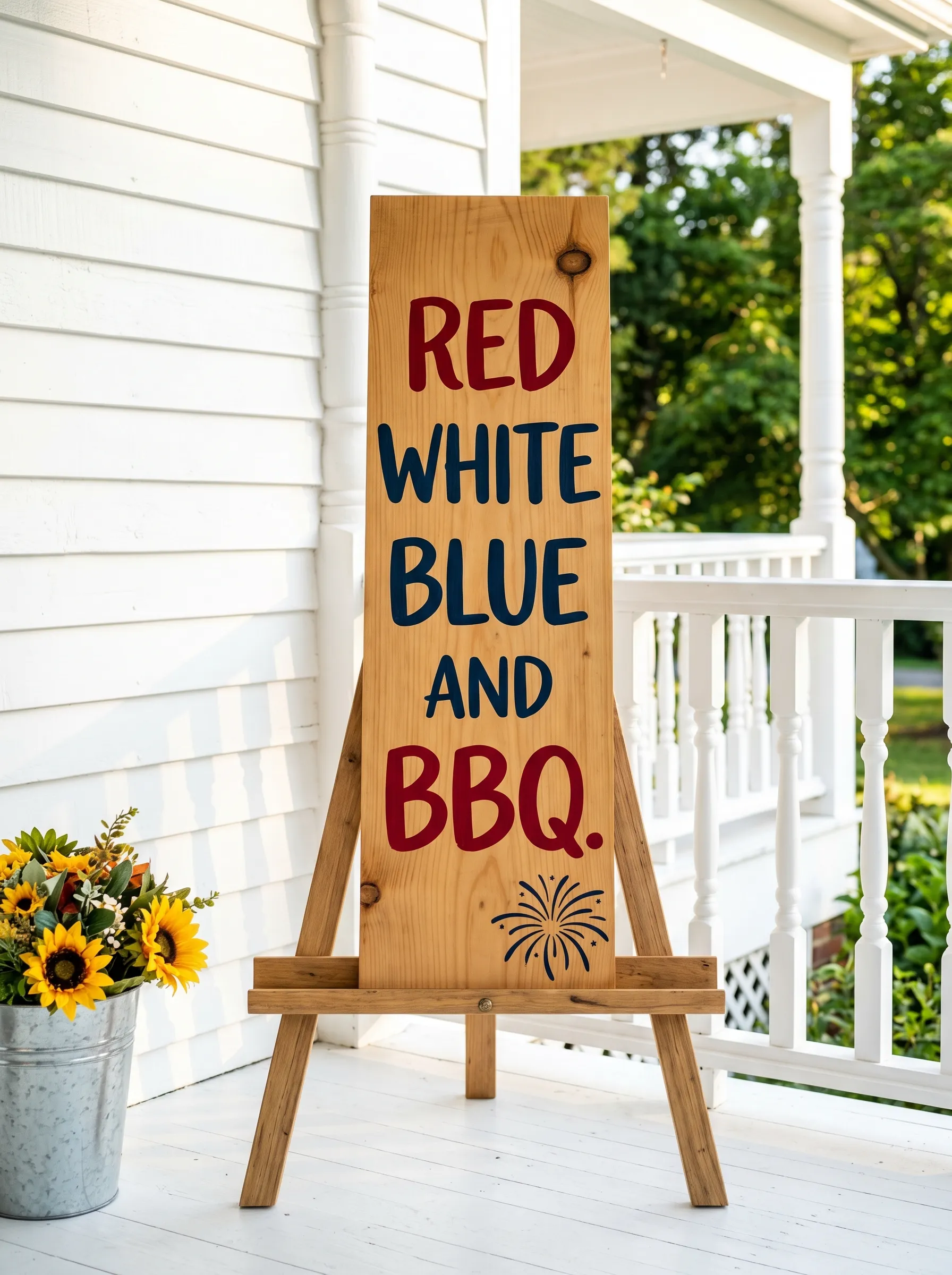
Find or cut a vertical cedar plank — a natural knot-and-grain slab, roughly twelve inches wide by thirty-six inches tall — and seal it with a clear matte finish so the wood tones stay warm and visible.
Apply the text in two colours: the first line and third line in dark red, the second line and fourth line in navy. This alternation creates a rhythm that makes the short phrases feel like a list building toward a punchline. Add a small illustrated element at the bottom — a simple firework burst in the same navy, drawn freehand or applied as a small vinyl decal.
Stand the board on a natural wood A-frame easel. The easel legs should be visible — they’re part of the composition, and hiding them would make the sign look like it’s floating. Pair with a galvanised metal bucket planted with sunflowers placed beside the easel base.
The Evening Chalkboard on a Wrought Iron Stand

Choose a square chalkboard with a thick, ornate dark frame — something that reads as architecture when it sits beside a porch wall rather than a prop. Mount it on a small scrolled wrought iron easel stand.
Write the text in an off-white or cream chalk pen in a tall, casual script. Three short lines, each slightly different in weight: the first two earnest, the third a knowing punctuation mark. Add five small hand-drawn stars in a horizontal row below the text. Set a small glass jar candle at the base of the easel frame — the warm flicker at night lifts the whole composition.
This sign works best on a dark porch with warm ambient lighting. The drama of the sunset colouring around it in the evening context is intentional — it makes the message feel reflective rather than merely decorative. It’s the sign for the end of the day, after the cookout is done and the sky is doing something extraordinary.
The Large Format Horizontal White Panel with Red Rule Lines
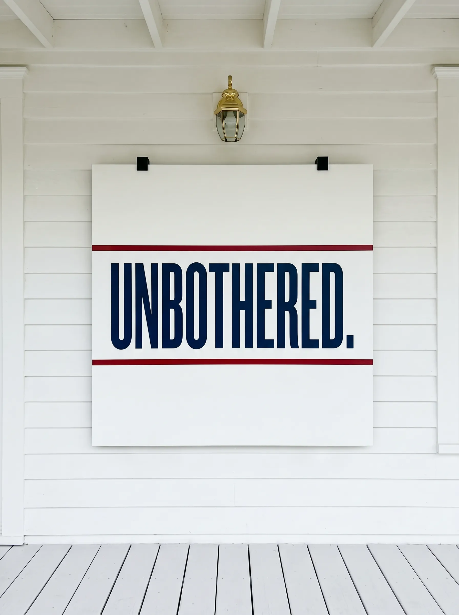
Build or source a square panel, roughly thirty by thirty inches, in smooth white-painted MDF or plywood. The face should be absolutely flat and smooth — this sign is about graphic clarity, and any texture will fight the design.
Paint two horizontal crimson rule lines across the panel: one approximately forty percent down from the top, one approximately sixty percent down. The text — a single large bold word, all caps — sits in the band between the two lines. Use navy for the lettering, and make it fill the space with authority. The margins above the top rule and below the bottom rule should be approximately equal — they act as breathing space.
Mount to the porch wall with two black metal strap brackets at the top edge. The brackets should be visible and read as hardware, not hidden. They add an industrial note that sharpens the otherwise clean graphic quality of the sign.
This is the sign that looks most like it belongs on a building rather than in a craft store. That quality of institutional confidence is what makes it memorable.
The Distressed Tall Leaner Leaning on a Sage-Coloured Porch
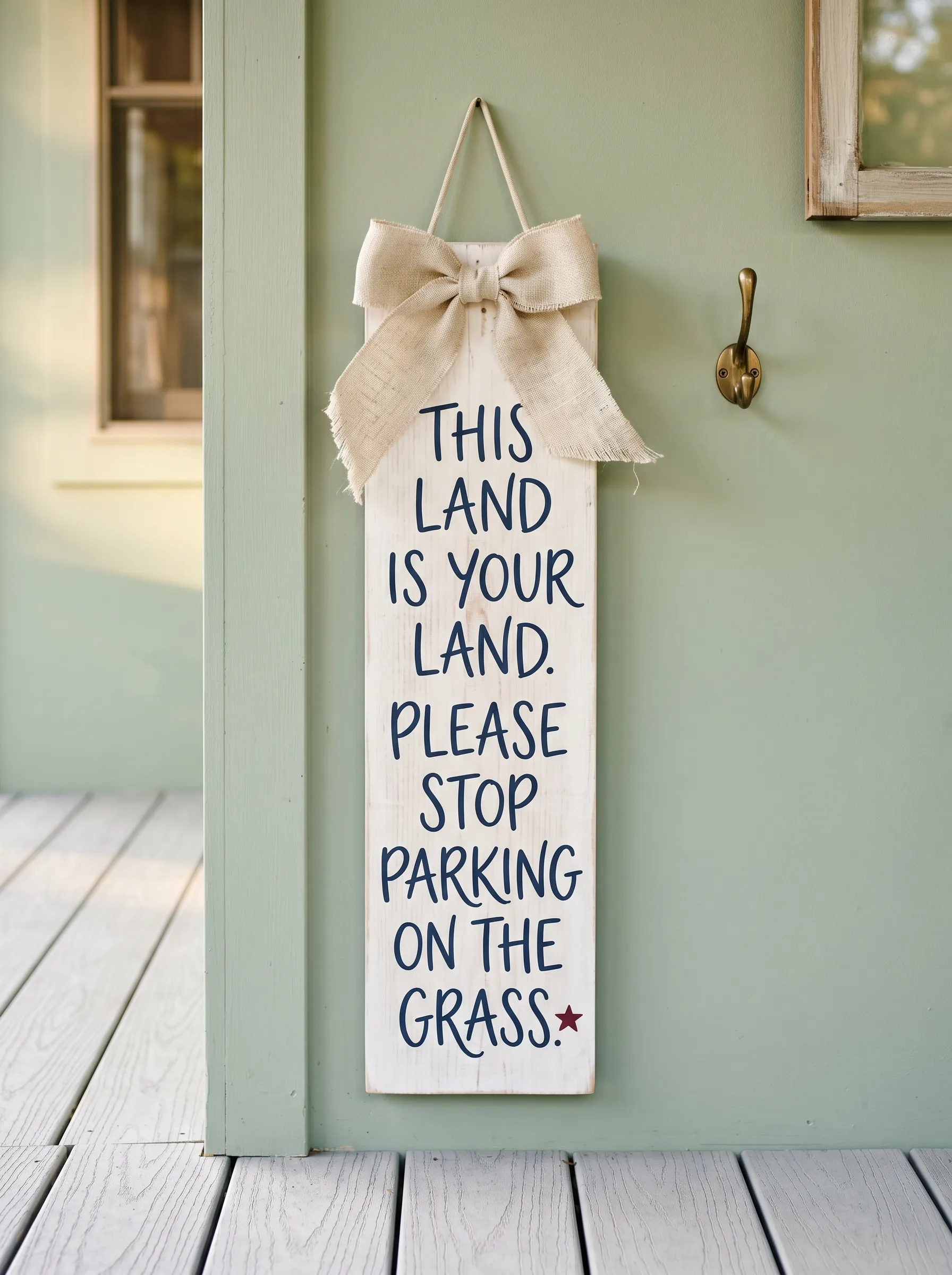
Take a narrow, vertical plank — eight or ten inches wide, fifty-four inches tall — and paint it in a chalky off-white with visible brush texture. Allow streaks. Sand the edges and corners until the raw wood shows through on every edge. The finish should look like something that has been outside for three summers and weathered honestly.
Letter the text in navy in a loose, rounded hand lettering style. The letters should be large and fill the board generously. Add one small dark red star near the bottom right. Add a jute hanging cord through a top eyelet.
Tie a very large burlap bow to the cord, positioned so it sits at the top face of the board and partially overlaps the first line of text. The bow should be full and floppy — not tight and architectural. The looseness is intentional.
Place this sign beside a sage or pale green porch door. The warm white of the sign against the cool green wall creates a contrast that makes both elements look more deliberate than they would in isolation.
The Natural Plank Horizontal Sign on a Small Tabletop Easel
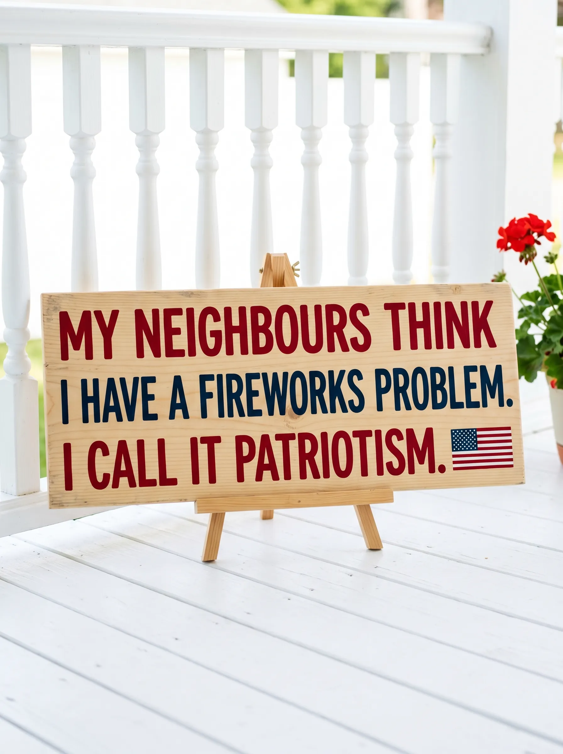
Source a light natural pine board, roughly twenty-two by ten inches, with no stain or paint. Just seal it. The pale raw wood is the entire aesthetic premise.
Letter the text in alternating crimson and navy rows — the colours should feel punchy against the pale ground. Keep the typeface bold and rounded, not serif and formal. A firework burst illustration in the same navy, small, at the bottom right corner closes the composition.
Stand the board on a small natural wood tabletop easel. The easel legs should splay visibly. Pair with a galvanised bucket of sunflowers positioned to the left. The sunflowers are not a decoration — they are a colour note. The yellow-gold of the sunflower heads picks up the warmth of the raw pine and keeps the whole composition from feeling cold.
The Large A-Frame Chalkboard with Gingham Bow and Porch Swing Context
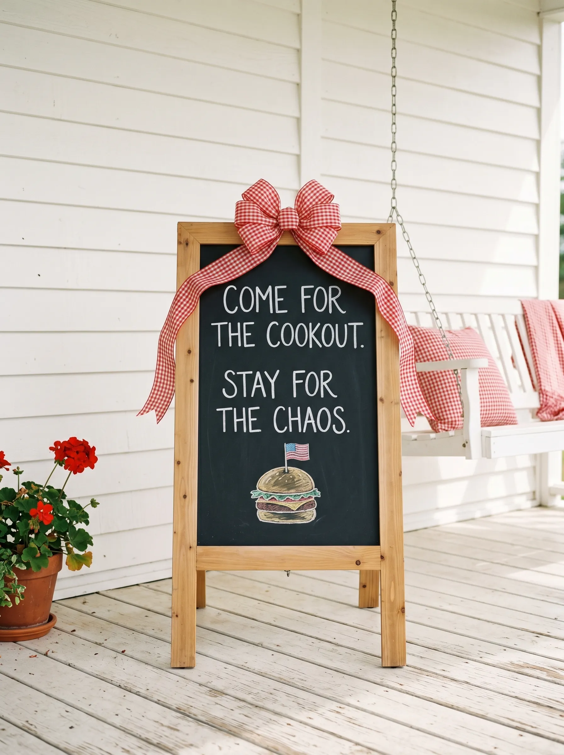
Build or buy a sandwich board A-frame in natural pine — roughly eighteen by twenty-four inches, with a chalkboard face. The frame should be clean, unfinished, straight-lined.
Letter the text on the chalkboard face in a large, playful hand lettering style using a white chalk pen. Two short lines of invitation, then the subversion — the thing that tells you exactly what kind of household this is. Add a small chalk illustration in colour: a burger, a flag, something food-adjacent and festive.
Tie a very full gingham bow to the top of the frame. Red and white check is the right fabric here — it echoes the energy of the text without competing with it. Make the bow wide and full. It should be almost as wide as the board.
Set the A-frame on a white painted porch beside a swing. Put a folded red gingham blanket on the swing seat behind it. The swing is in soft focus in the background, but it matters — it tells the whole story of the porch in a single image.
The Chalkboard with Bold Typography on a Barn Red Exterior
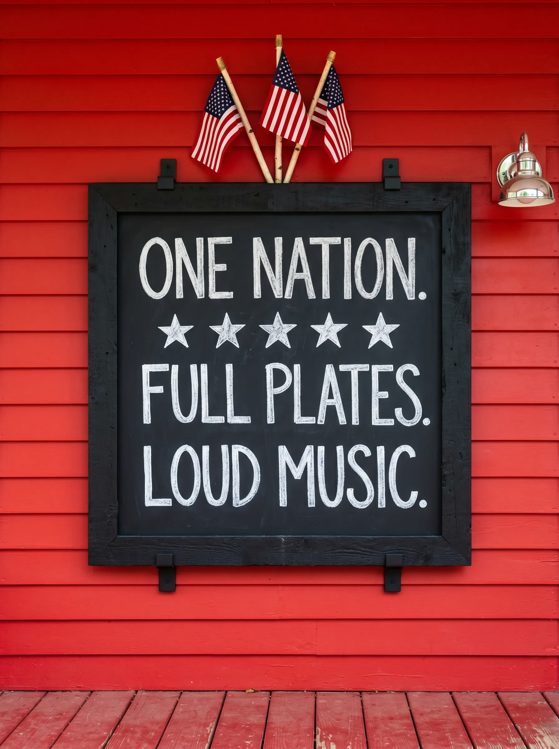
Paint the porch wall or exterior siding in a deep, flat barn red before mounting anything. This is a whole-surface decision and it needs to be made before the sign is chosen, not after.
Mount a large chalkboard panel in a thick reclaimed black frame to the red wall using heavy-duty black metal pipe bracket hardware. The frame and the hardware should both be black — they unify and disappear against the chalkboard face.
Letter the text in large, chalky white all-caps with slight imperfections that read as hand-drawn rather than printed. Three lines — a declaration, a detail, a luxury. Add five white hand-drawn stars between the first and second lines.
Slot three small American flags into the top mounting bracket above the sign — evenly spaced, upright. They break the plane of the wall and add the literal flag element that the chalkboard’s words imply. This sign needs the red wall. On a white or grey exterior it would lose sixty percent of its impact.
The Burned Reclaimed Wood Horizontal Plank on a Black Metal Stand
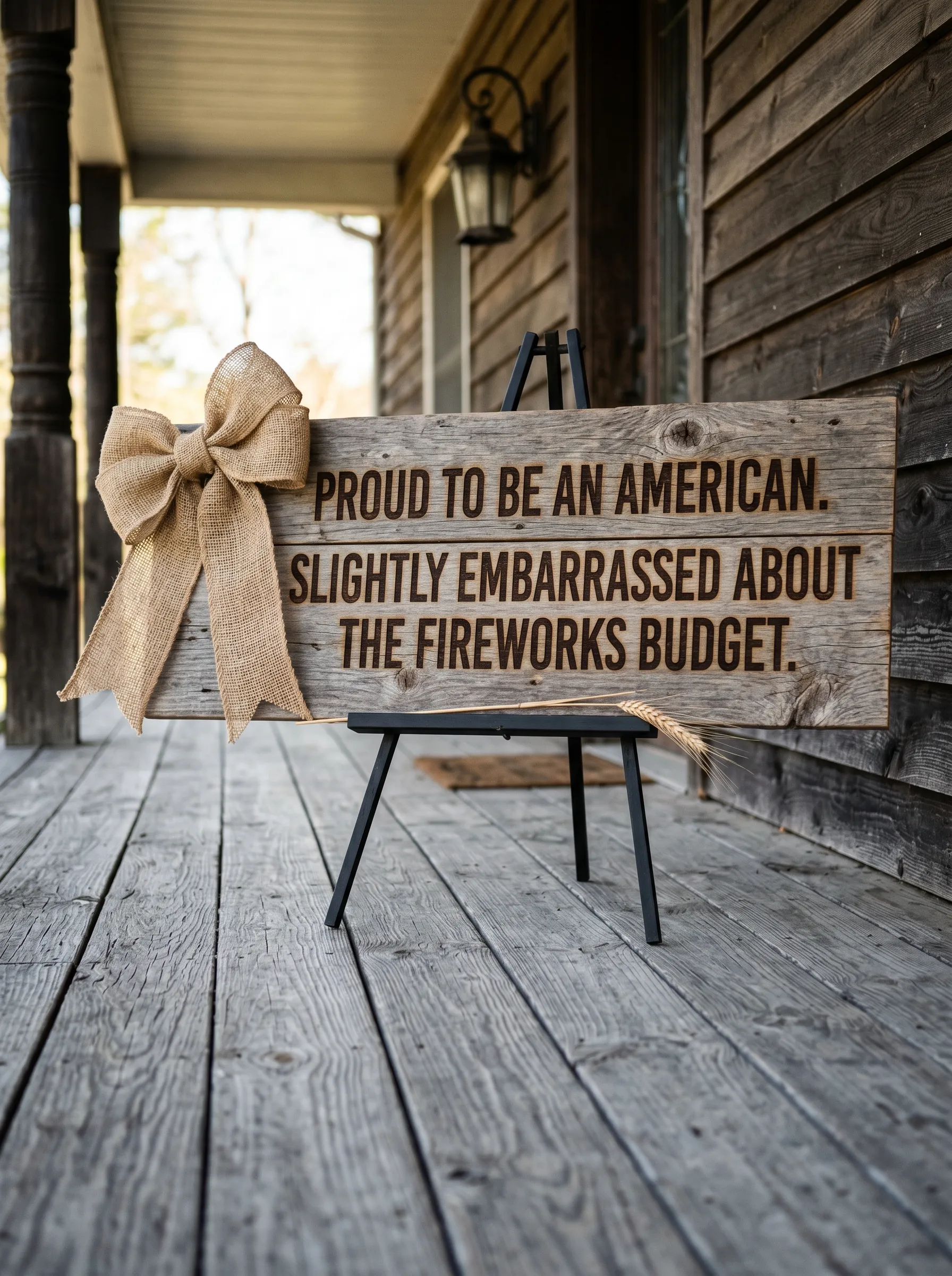
Source a wide, weathered reclaimed wood board — the kind with visible grain variations, old knots, and natural colour differences across the surface. Burn or deeply engrave the text directly into the wood in a block sans-serif. No paint. No colour. The message is in the mark made by removing material, not adding it.
Attach a very large burlap bow to the left end of the board, tied directly to the board face rather than a hanging cord. The bow should be floppy and generously sized — it softens the roughness of the board’s texture.
Set the whole thing on a simple black powder-coated metal folding easel stand. Add a single dried wheat stem tucked under the burlap bow knot. Place the display slightly off-centre on the porch, closer to the railing than the door.
The whole look is honest materials treated honestly. No irony in the execution — the wood is rough because it is reclaimed, the text is burned because permanence was the point.
The White Distressed Vertical Leaner with a Navy Burlap Bow
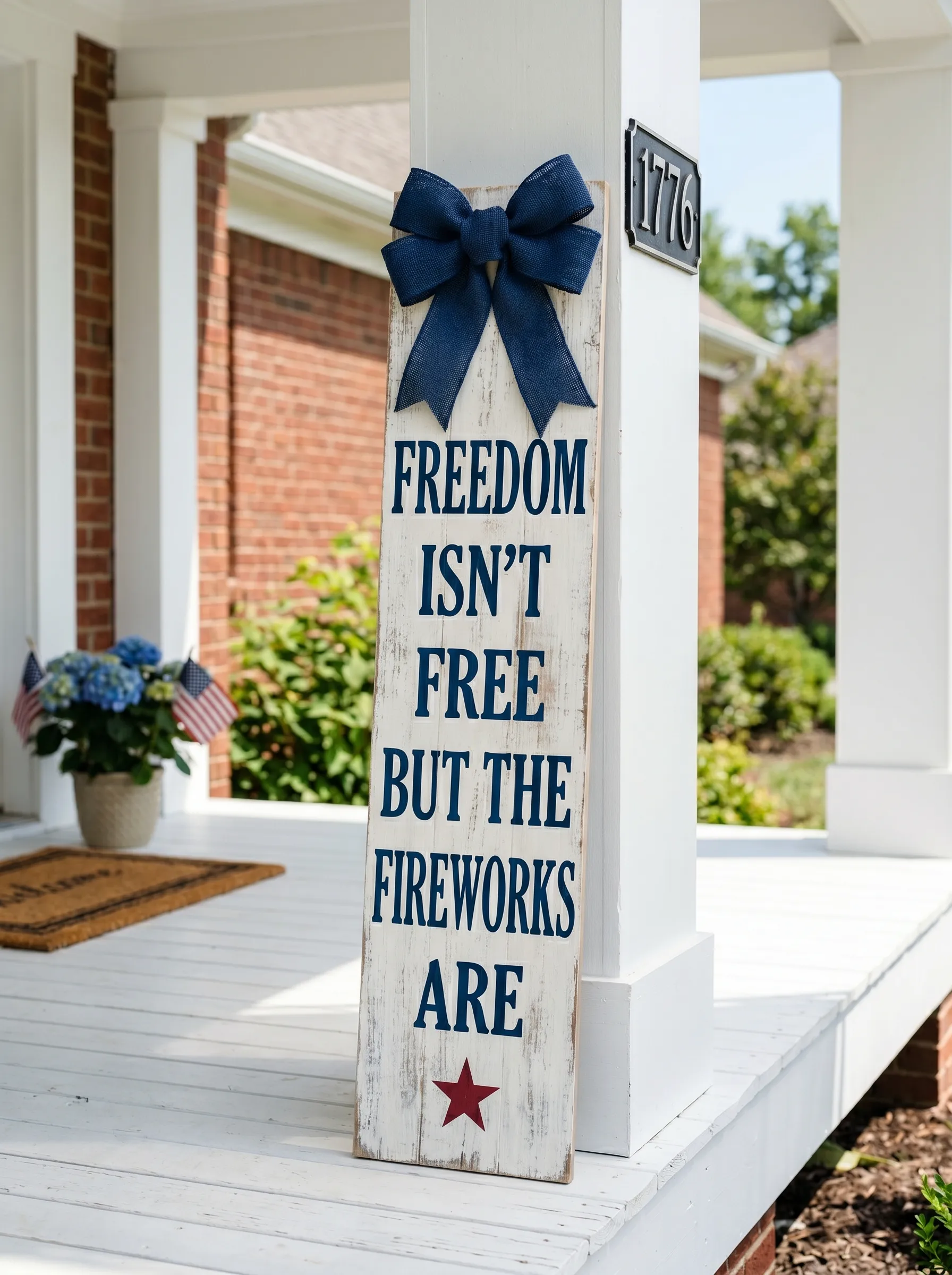
Take a wide, distressed white board — twelve to fourteen inches wide, fifty-four to sixty inches tall — and apply a base of off-white chalk paint with visible brush direction. Distress the face with fine sandpaper, focusing on the edges and any areas where wood grain rises through the paint. The surface should look like old porch furniture, not new craft supplies.
Letter the text in navy using a stencil and sponge brush or a chalk marker. The typeface should be clean and upright — slightly condensed, all caps. Use one dark red star at the base as the only colour accent.
Tie a large navy burlap bow through an eyelet at the top. Burlap is the right material here because it has the same quality of honest roughness as the distressed board. Lean the sign against a white porch column. Place the house address number — ideally something historically satisfying — on the column beside it.
Add hydrangeas in a white pot at the base. Blue hydrangeas, if they’re available. They pick up the navy of the lettering and the bow without making the colour story feel calculated.
Final Thoughts
Every sign in this collection knows what it is. That’s the thing they have in common, more than the colour palette or the holidays they’re marking.
The earnest ones are fully earnest. The funny ones commit to the joke without hedging. The ones that mix the two — a solemn opening line followed by something about potato salad — are only effective because the structure is clear and the timing is right.
Your porch sign is, in a narrow but real sense, a statement about who you are as a household. Not your politics. Not your income. Something more interesting: your sense of humour, your relationship to tradition, whether you take your grilling seriously enough to put it in writing.
The best ones are unapologetic about all of it.