
A shelf is not furniture. It’s a stage.
Most people miss that entirely. They buy the shelf, they own it for six months, and then one Saturday they shove whatever’s lying around onto it — a candle, some mail, a single sad succulent — and call it decorated.
That’s not styling. That’s surrender.
The best shelves in the world do something different. They tell you who lives there, what they collect, what they read, what city they can see from their window. This blog is about how they do it, and how you can steal the technique without stealing the exact vase.
Why Most Shelves Fail
Everything Facing Forward
The most common shelf crime is uniformity. Every book upright, every object dead center, every item facing the same direction like soldiers at attention.
It reads as tidy. It also reads as nothing.
Real shelf styling breaks that formation on purpose. Books get stacked flat under a vase. A frame leans instead of hangs straight. A jar tips slightly, like someone actually touched it recently.
No Color Logic
A shelf with fifty random book colors looks like a yard sale. A shelf with one aggressive color-block system looks like a magazine spread.
Neither extreme by accident works. The good ones commit to a palette — jewel tones, all neutrals, a single accent color repeated three times — and stop there.
Skipping the Object Layer
Books alone are a library. Books plus a bowl, a candle, a strange little stone, a framed photo leaning at an angle — that’s a shelf with a personality.
Most people forget the object layer entirely. They fill the whole shelf with spines and wonder why it looks flat.
Shelf Decor Ideas
Color-Coded Circular Bookshelf
Find a round, deep-set shelving unit — the kind with real depth, not a flat disc. Paint the interior black or another dark color so the books read as objects against a backdrop, not just clutter against a wall.
Sort your books by spine color in loose gradient blocks. Reds near oranges, blues near teals. Don’t alphabetize. Nobody wants to see the Dewey Decimal system on a living room wall.
Break up every shelf with one gold or brass object — a small statue, a lidded jar, a candlestick. Metal against dark paint and colorful spines is what makes the whole thing pop instead of just looking busy.
Leave the top shelf slightly sparser than the rest. A circular shape draws the eye up naturally, and an overloaded top ring will make the whole piece feel top-heavy.
Labeled Basket Mudroom Shelves
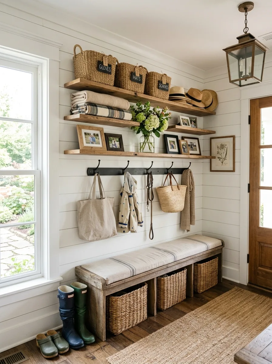
Install two shelves stacked above a bench, and use the top shelf exclusively for large, uniform woven baskets. Label each one plainly — gloves, hats, scarves — with a small tag or chalkboard label.
On the second shelf down, mix function with sentiment: folded blankets, a vase of fresh greenery, and a handful of framed family photos interspersed between practical items.
Add a row of black iron hooks directly beneath the shelves for coats, bags, and leashes. The hardware should be simple and slightly industrial, a contrast to the warm wood above it.
Keep the wall material visible and textural — shiplap or beadboard works well — so the whole wall feels considered even in a room built purely for function.
Layered Trailing Plant Shelves
Install two floating shelves at slightly different heights, one higher and to the side, one lower and centered. The offset is what makes this look designed instead of default.
On the upper shelf, let a trailing plant genuinely spill — not one small vine, but a full, cascading one that drapes down past the shelf edge and into open space. This is your movement element.
Keep the lower shelf calmer: a framed print leaning against the wall, a stack of natural objects like pinecones or stones, one small sculptural piece. Let the top shelf be wild and the bottom shelf be quiet.
Add a second, separate low shelf below for a simple vase-and-flowers moment. Two shelves at different heights read as a considered vignette instead of one crowded ledge.
Fireplace-Flanking Oak Shelves
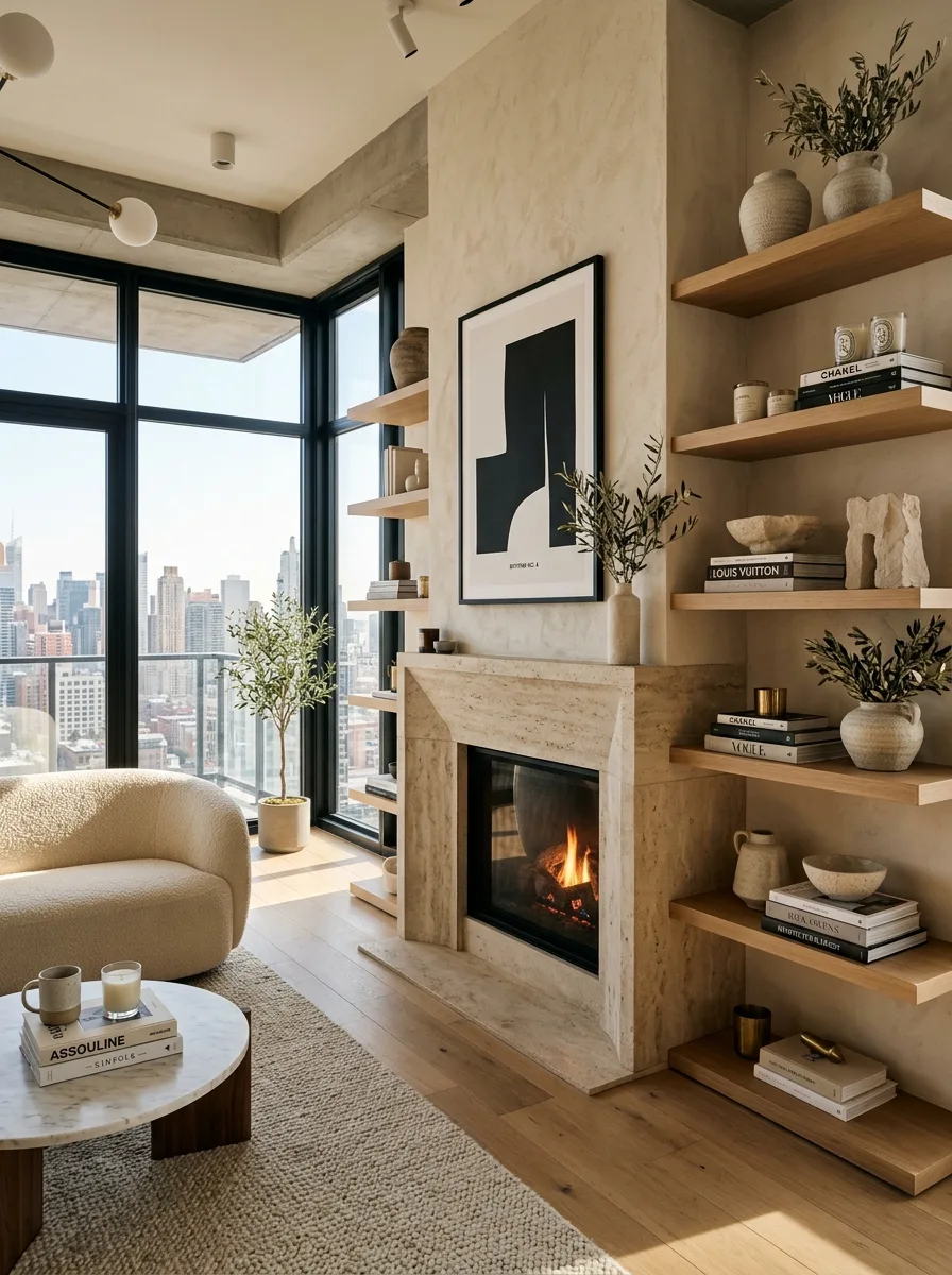
Run floating light oak shelves vertically up both sides of a fireplace surround, spaced evenly but left open in the middle around the mantle itself.
Stack neutral coffee-table books in twos and threes, always with one book laid flat under a small object rather than every book standing upright. Add stone or ceramic vases in warm, sandy tones to match the fireplace surround material.
Use small brass or bronze accents sparingly — a candle holder, a small dish — as the only metal note against an otherwise all-neutral, textural palette.
Let one or two shelves stay nearly empty aside from a single vase and a sprig of greenery. Next to a fireplace, restraint reads as calm rather than unfinished.
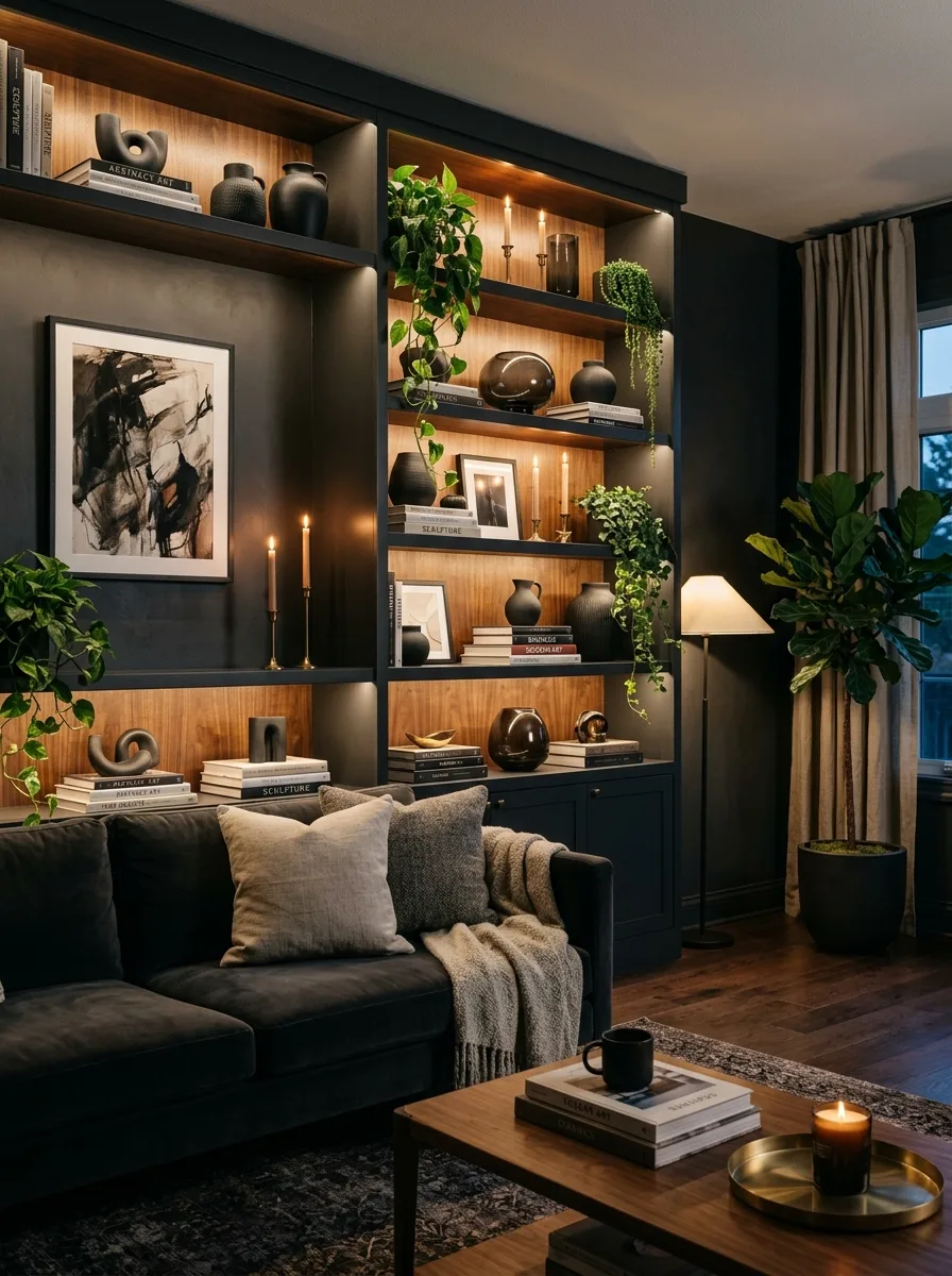
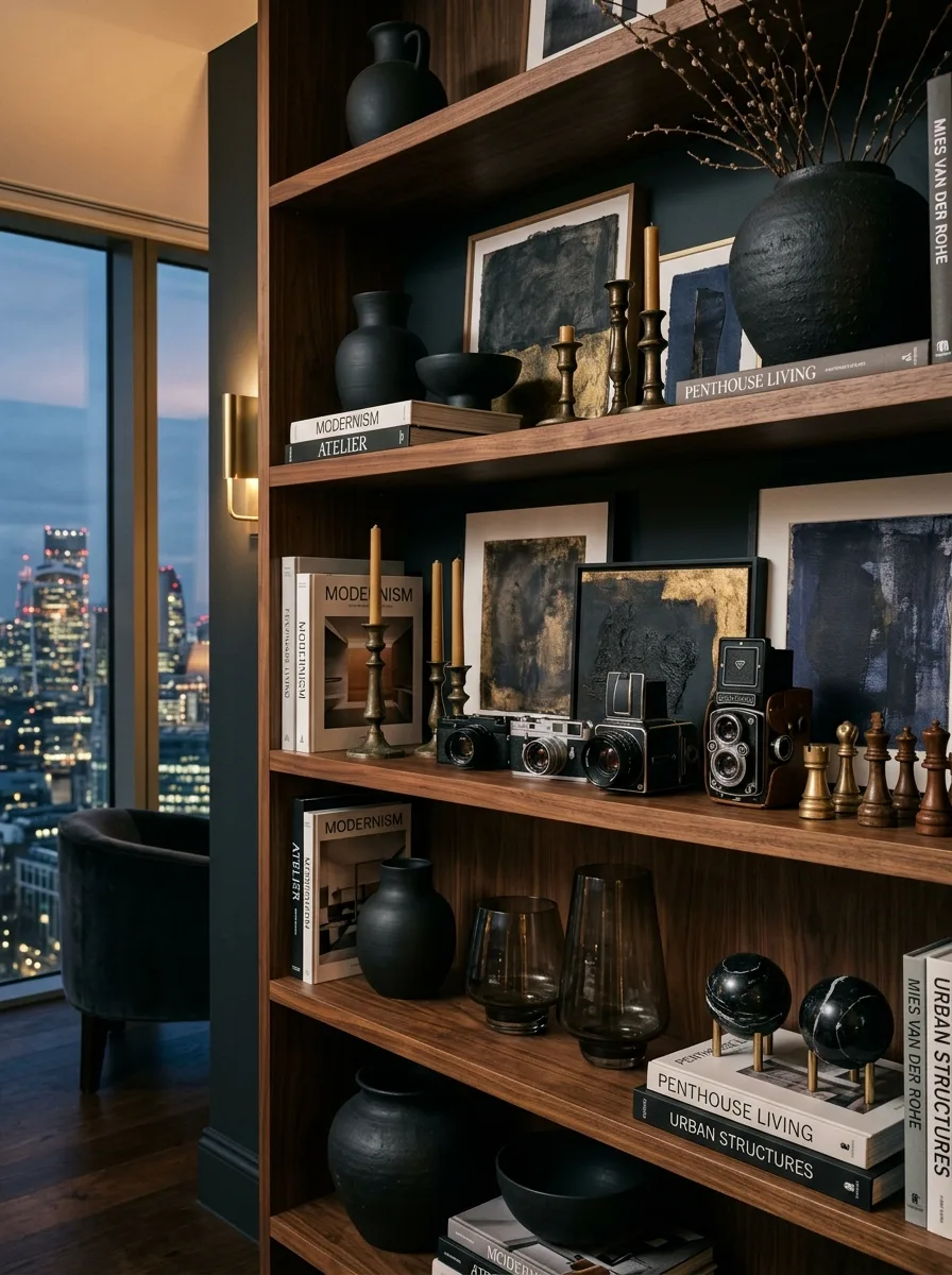
Moody Charcoal Built-In Display
Paint the interior of a built-in bookcase a deep charcoal or near-black. This single move makes every object placed inside look like it’s floating in a gallery case.
Fill the shelves with a genuine mix: hardcover books in muted tones, one leaning framed piece of art, and at least two organic-shaped vases in warm terracotta or stoneware finishes.
Add small brass or wood objects between book stacks — a wooden ring, a small dish, a stack of vintage-looking volumes. These little connective pieces keep the eye moving instead of stopping at each object individually.
Leave one shelf noticeably calmer than the others, styled with just a small vase of white flowers and two stacks of books. The contrast between a busy shelf and a quiet one is what sells the whole cabinet.
Coral Travertine Coastal Shelf
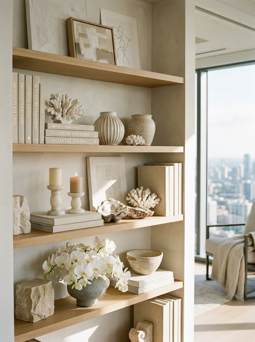
Use pale, unfinished oak shelving as a neutral base, then build the styling entirely around natural, ocean-adjacent textures — coral fragments, oyster shells, and sand-toned ceramics.
Stack books with muted, tonal covers rather than graphic ones, keeping titles related to coastal or sculptural themes so even the text reinforces the mood.
Add a pair of lit candles in simple stone or ceramic holders on one shelf, and a small vase of white orchids or similar delicate flowers on another. The soft flowers keep the coral and stone from feeling too raw.
Leave visible gaps between object groupings rather than filling every shelf edge to edge. Coastal styling depends on looking like it was gathered on a walk, not purchased as a set.
Vertical Corner Shelf Tower
Stack three or four floating shelves vertically in an awkward corner nook instead of writing the space off as unusable. Vary the depth slightly if you can, so the tower doesn’t feel like a single monolithic block.
Put your tallest, most architectural object on top — a fashion coffee-table book stack works well here — and let a trailing plant cascade down from behind it, so the greenery becomes the connective thread running down the whole tower.
Style the middle shelves with small, single objects rather than groupings. A lamp on one, a stack of magazines on another. Vertical shelving reads best with restraint at each level.
Let natural light hit the tower directly if you can. A corner that catches golden hour sun will make even simple objects look considered.
Designer Handbag Display Wall
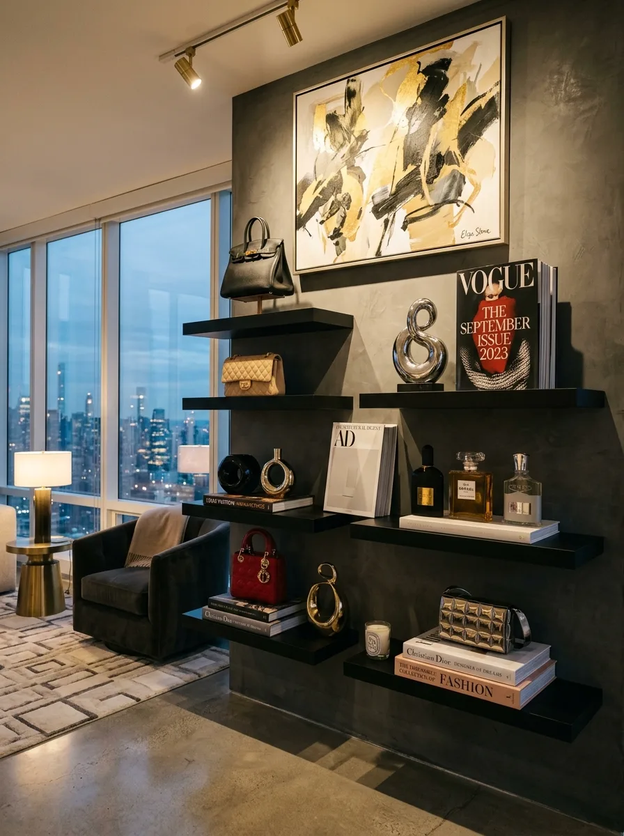
Mount asymmetrical black floating shelves at staggered heights and widths directly on a dark, textured accent wall. The irregular arrangement is what turns this into an installation instead of a shelf.
Display your best handbags standing upright rather than stacked, spaced apart so each one is clearly visible as an individual object, not a pile.
Stack fashion magazines and designer coffee-table books flat beneath perfume bottles and small sculptural objects, grouping by height so the display reads left to right like a gallery wall.
Hang one large abstract painting above the entire arrangement to anchor it. Without a strong piece of art overhead, a wall of bags and bottles reads as a display case rather than a design choice.
Live-Edge Slab Kitchen Shelves
Source thick, live-edge wood slabs instead of standard milled shelving. The irregular bark edge is the entire point — it turns a utilitarian kitchen shelf into a piece of furniture in its own right.
Stack your everyday dishware in a way that shows off shape variation: wooden bowls of different sizes nested together, a mix of ceramic mugs, a couple of cutting boards propped upright rather than laid flat.
Add one living, perishable element per shelf. A small potted herb, a trailing vine, a scatter of fresh berries directly on the wood. This is what keeps a kitchen shelf from looking like static storage.
Avoid symmetry entirely here. Group items in odd numbers and uneven clusters. A live-edge slab already has a wild, organic shape — matching it with rigid, evenly spaced objects fights the material instead of complementing it.
Backlit Walnut Display Wall
Install shelving with a built-in LED strip along the underside of each level, angled to wash light down the wall behind the objects rather than straight down onto them.
Paint or panel the wall behind the shelves in a warm wood tone that contrasts with a darker exterior cabinet frame. The light will catch the grain and make the whole backdrop glow instead of just illuminating dust.
Cluster black ceramic objects — vases, bowls, sculptural shapes — against the lit wood backdrop. Black against warm backlit wood reads as expensive in a way that black against white paint never quite manages.
Let at least one trailing plant spill from a top shelf down the front of the unit. It softens what would otherwise be a very hard-edged, architectural display.
Apothecary Bottle Bathroom Ledge
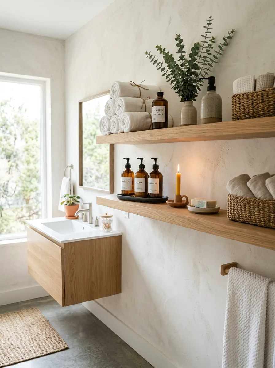
Swap your plastic bathroom bottles for amber glass apothecary bottles with plain typed labels. This one substitution does more for a bathroom shelf than any amount of extra decor.
Roll your towels instead of folding them, and stack them in a loose pyramid rather than a stiff, even stack. Rolled towels read as spa, folded towels read as linen closet.
Add one woven basket for overflow storage and one small live plant — eucalyptus works especially well here for both scent and shape. Keep everything else off the shelf so these two elements actually register.
Light a single candle on the lower shelf before anyone sees the room. It’s a small, almost silly move, but a lit candle signals effort in a way nothing else on a bathroom shelf can.
Minimalist Terracotta Entry Ledge
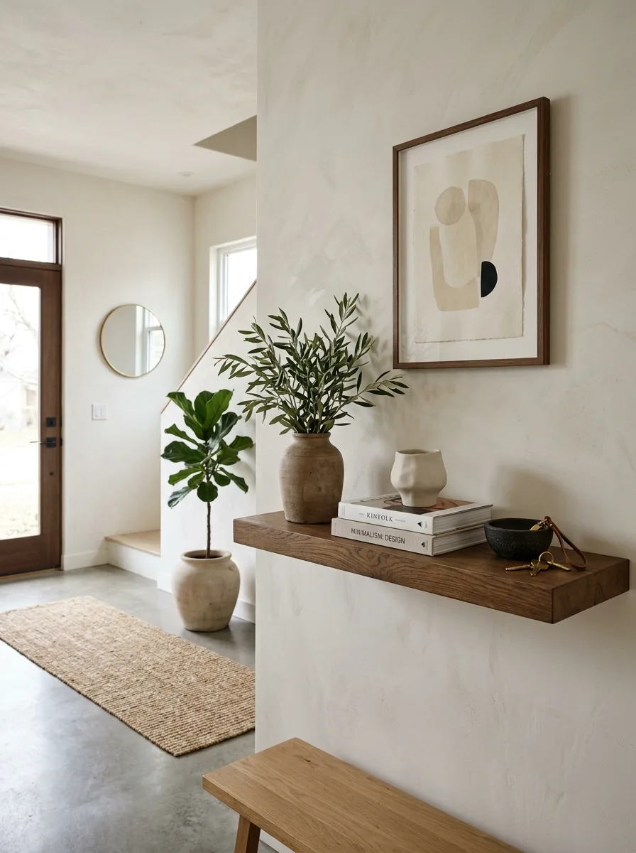
Mount one single, substantial wood shelf at a height just above where a console table would normally sit. A single thick shelf does more than a cluttered console ever will in a tight entryway.
Place one oversized terracotta or stoneware vase with tall, loose branches — olive branches work especially well for their irregular, sculptural shape. Let the branches extend well above the frame of any nearby art.
Stack two or three coffee-table books flat beneath a small ceramic object, and leave a shallow bowl nearby for keys. This is the only “storage” moment the shelf needs.
Keep the wall behind mostly bare except for one framed piece of abstract art. An entryway shelf should feel like a single held breath, not a landing pad for everything you own.
Backlit Dining Room Shelves
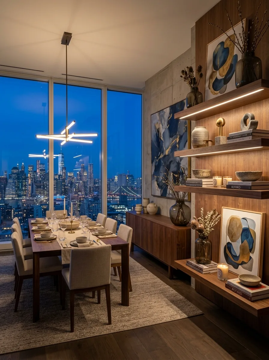
Choose warm walnut floating shelves with a concealed LED strip running along the underside of each one, positioned to wash light down over a dark accent wall.
Style with abstract art leaning behind ceramic vases rather than hung flat — the layered depth reads better under warm, directional light than a flush-mounted frame would.
Group stoneware vases and bowls with dried branches in odd numbers, keeping the tallest pieces toward the back and shorter dishware and stacked books toward the front edge.
Position the shelving where it will be visible from the dining table itself, ideally with a city or outdoor view nearby to compete with. Warm wood and warm light hold their own against almost any backdrop.
Brass-Trimmed Bedroom Built-In
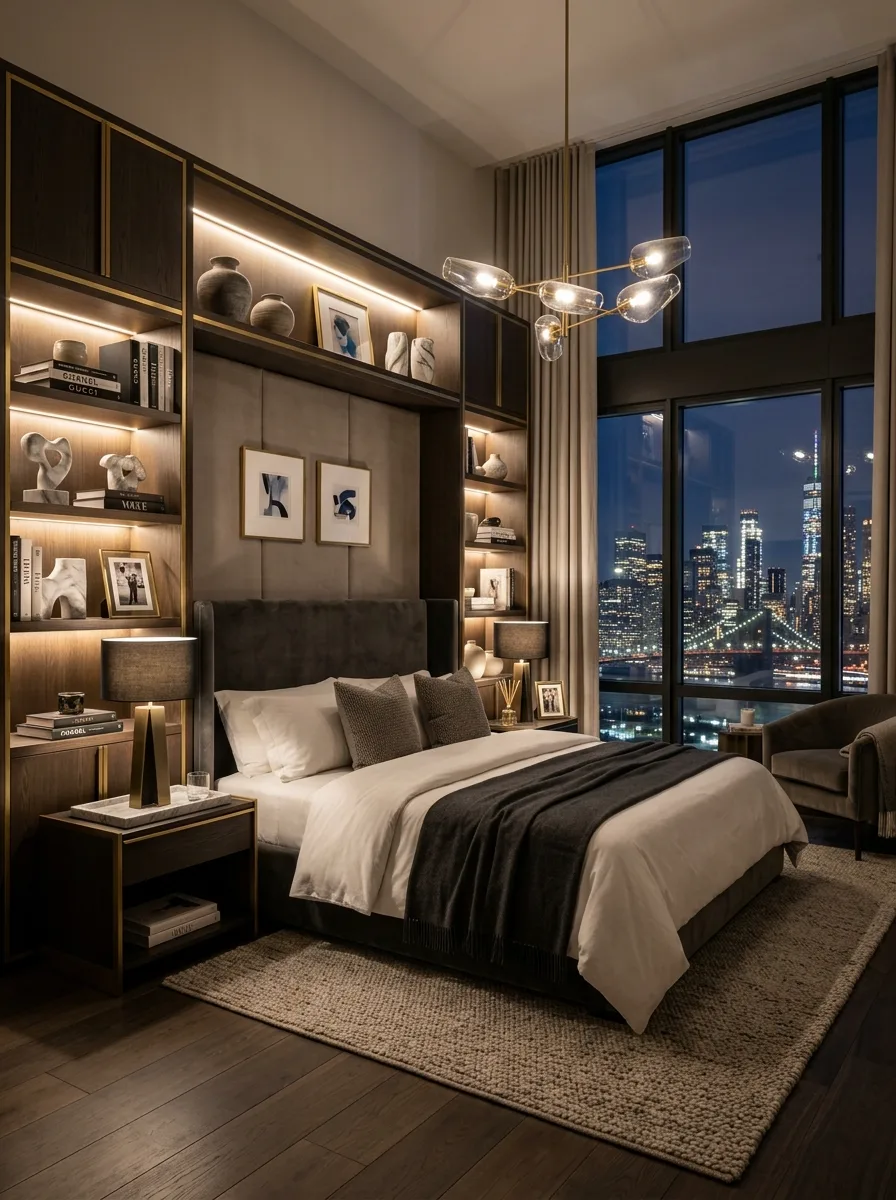
Build symmetrical shelving units flanking a bed’s headboard wall, using dark wood with visible brass trim along every edge and shelf line.
Add a continuous strip of warm, concealed lighting behind each shelf’s back panel so books and objects are lit from behind rather than from an overhead fixture.
Style each side identically in rough composition — a stack of design books, one small sculptural object, one framed photo — but avoid making them perfect mirror images. Near-symmetry feels intentional; exact symmetry feels like a hotel chain.
Keep the bedding and pillows in the same tonal family as the wood and brass. A bedroom built-in only works if the shelf and the bed are clearly part of the same design decision.
Architecture Books Reading Nook
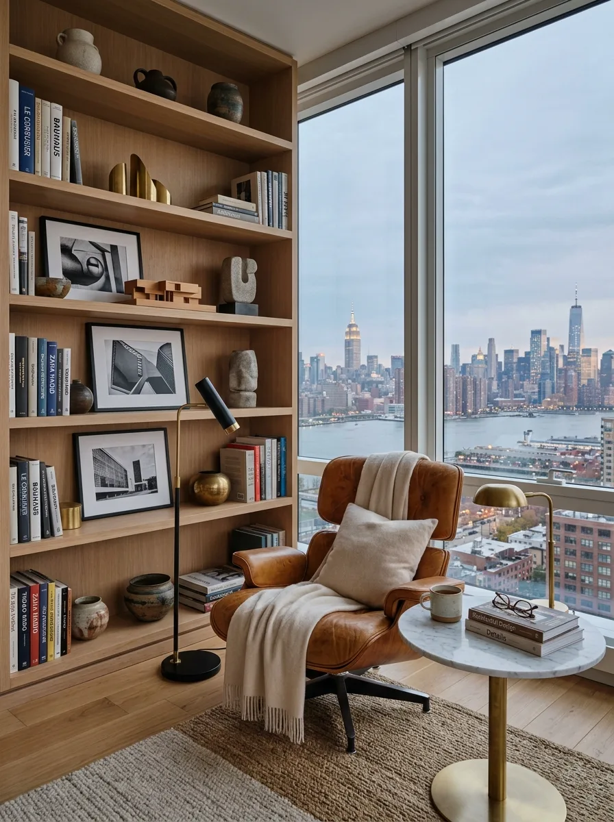
Build a tall, open bookshelf using pale, unfinished-looking oak, and dedicate it almost entirely to hardcover design and architecture books, spine-out and grouped loosely by size rather than color.
Lean one or two black-and-white framed photographs directly against the books instead of hanging them, letting the frame edges overlap the spines slightly.
Place a single worn leather armchair directly beside the shelf, angled toward a window rather than the room, with a thick knit throw draped over one arm.
Add a small round side table within arm’s reach holding nothing but a mug, glasses, and one open book. The shelf is the backdrop; the chair and table are where the room actually happens.
Color-Blocked Travel Book Spines
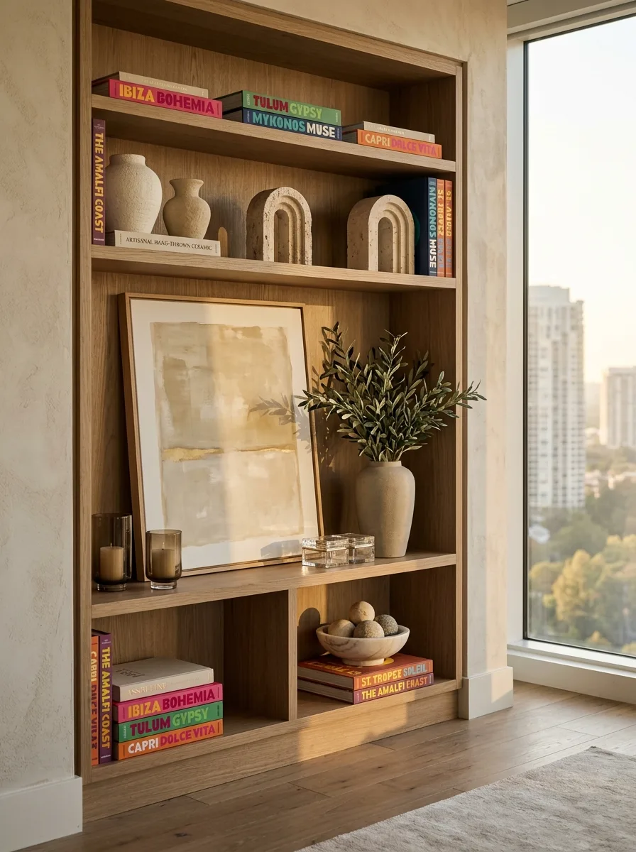
Commission or seek out book spines designed in bold, saturated single colors with oversized typography — think travel-destination titles in hot pink, kelly green, and mustard yellow.
Stack these colorful spines in twos and threes across multiple shelf levels, always breaking them up with neutral stone or ceramic objects so the color doesn’t overwhelm the whole unit.
Add pale travertine or stone bookends in simple arch shapes to physically separate book groupings and give the eye a resting point between color bursts.
Lean one large piece of muted abstract art against the shelf’s back wall, positioned so the neutral art sits directly behind the boldest color cluster. The contrast is what makes both elements work.
Fashion Book Vanity Riser
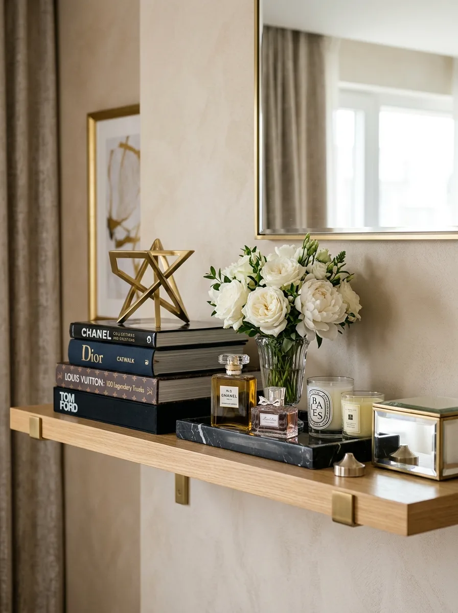
Stack designer fashion books — the heavier, glossier the better — in a single tower, and use that stack itself as a riser for a smaller object like a perfume bottle or trinket tray.
Place a full, loose bouquet of white roses or peonies in a simple glass vase directly beside the book tower, letting the blooms extend higher than anything else on the shelf.
Set a dark tray beneath your perfume bottles specifically so they read as an intentional grouping rather than scattered items, and add one small lit candle nearby for warmth.
Position the whole vignette below a mirror or reflective surface if you can. The doubled reflection makes a modest single shelf read as twice the display.
Vintage Camera Collector Shelf
Dedicate an entire shelf level to a genuine collection rather than decorative filler — vintage cameras work especially well for their varied shapes and worn leather textures.
Pair the collection with matte black candlesticks of varying heights, lit with real candles rather than left bare, so the whole shelf has warmth alongside its hardware edge.
Lean framed abstract art with visible gold or metallic brushwork behind the collection instead of hanging it flush, letting the frame edges catch the same warm light as the candles.
Add one unexpected, playful object nearby — a chess set left mid-game works well — to keep a shelf full of serious vintage gear from feeling like a museum case.
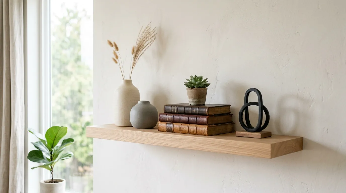
Single Shelf Travertine Arch
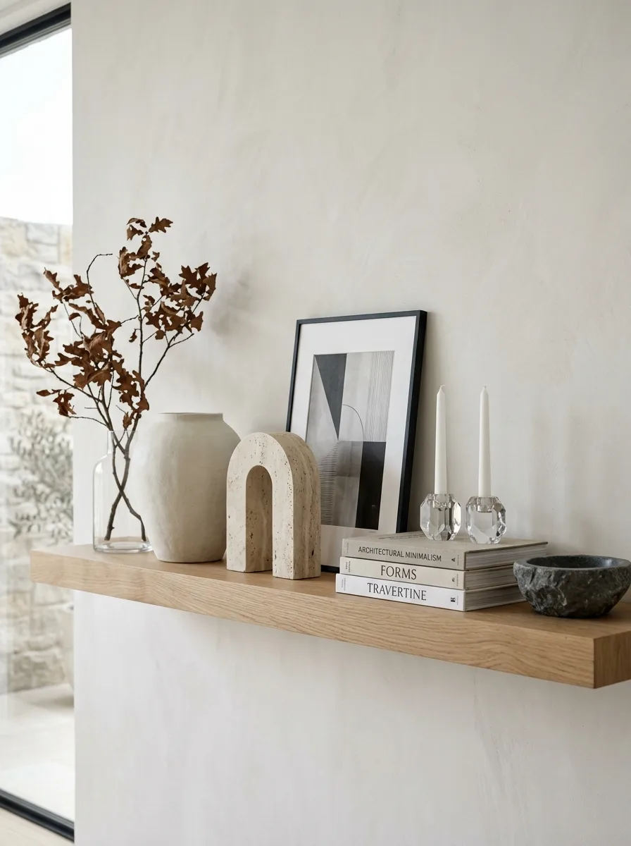
Install one long, simple floating oak shelf rather than a full unit, and treat it as a single sentence rather than a paragraph. This works best in a hallway or narrow wall.
Anchor one end with a substantial object — a travertine arch bookend or similar sculptural stone piece — and let it visually hold down that side of the shelf.
Add a framed abstract print leaning rather than hanging, a small stack of neutral books, and one pair of glass candlesticks grouped tightly together near the opposite end from your anchor piece.
Include one branch of dried, textured foliage in a simple glass vessel at the far end, letting it lean slightly rather than stand perfectly upright. A single shelf needs visual weight at both ends and calm in the middle.
Explorer-Themed Travel Shelf
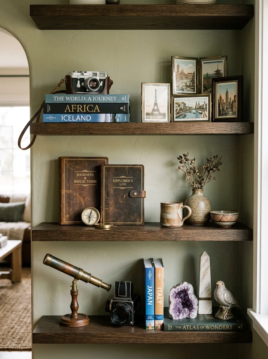
Paint the wall behind open shelving in a muted sage or olive green — this warm, unexpected color is what elevates simple vintage objects into a themed display.
Stack well-worn leather journals and travel guidebooks by destination, mixing in a genuine vintage camera or compass as a functional-looking centerpiece rather than a purely decorative one.
Group framed travel photographs or postcards in mismatched vintage frames at one end of a shelf, letting the frame styles clash slightly rather than matching them.
Finish with one dramatic, oversized natural object — a large geode or crystal cluster works well — paired with a small brass telescope or similar instrument. The mix of raw mineral and old brass hardware is what sells the whole explorer theme.
Final Thoughts
None of these shelves are actually about storage. Storage is what happens when you give up.
What they have in common is restraint applied unevenly — dense in one spot, empty in the next, loud with color here, completely quiet three feet over. That rhythm is the entire skill. Nobody teaches it because it looks like instinct, but it’s really just editing.
The specific objects don’t matter nearly as much as people think. A geode, a rolled towel, a stack of Chanel books — none of it is magic on its own. What makes a shelf work is the decision to stop halfway through filling it and ask whether the next object is earning its spot.
Most shelves never get asked that question. That’s the actual difference between the ones that go unnoticed and the ones people stop to look at.