
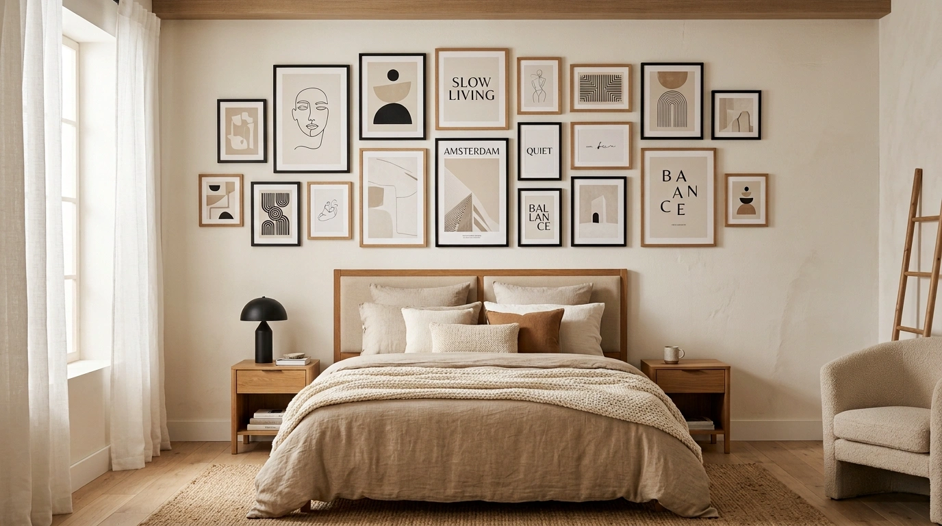
A bedroom can have all the right pieces and still feel like something is missing.
The bed looks good. The bedding is finished. The lighting works. Yet the wall above the bed feels strangely empty or disconnected.
That is where choosing posters for bedroom spaces gets tricky.
A print can look great in a shop and still feel completely wrong once it is surrounded by your actual furniture, wall color, lighting, and textiles.
The better approach is to choose the artwork as part of a finished room composition.
Think about the poster, bed, wall, flooring, furniture, and light as one visual arrangement rather than separate purchases.
The designs below take that approach.
Each one creates a different bedroom direction, from quiet Scandinavian spaces to darker rooms filled with vintage-inspired artwork.
The posters use botanical subjects, landscapes, architecture, abstract shapes, celestial graphics, maps, and other non-human artwork.
No people, faces, portraits, silhouettes, or human figures are part of the concepts.
Complete Posters for Bedroom Design Ideas Worth Saving
Maximalist Gallery Wall With Fairy Lights
This corner takes a vibrant, eclectic route by covering two intersecting walls with a massive grid of motivational posters and art prints. Warm fairy lights weave around the entire display, framing the collection and casting a cozy glow over the mix of pink, black, and neutral tones. The prints feature everything from botanical studies to typography and photography, creating a deeply personal and energetic atmosphere. That layered lighting highlights the gallery setup without feeling overpowering against the simple room background. The key to this look is embracing the volume of prints so the corner feels completely alive.
Oversized Botanical Posters Above a Low Walnut Bed
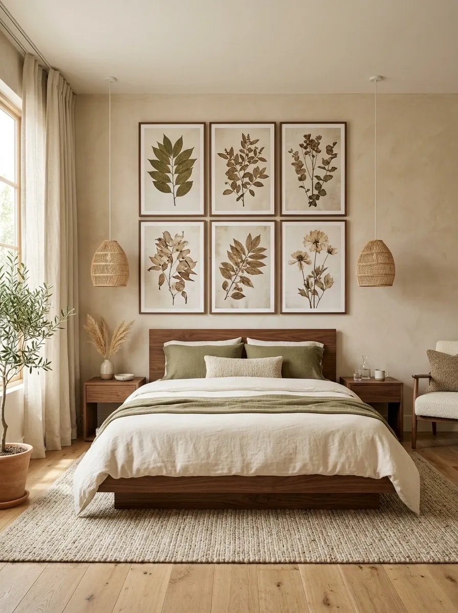
This bedroom uses large botanical prints as one broad composition rather than scattering small artwork around the wall.
The low walnut platform bed sits against a warm plaster-colored wall, with cream linen bedding, olive accents, woven pendants, and a textured neutral rug grounding the space.
The artwork uses detailed leaves and branches in muted olive, brown, and faded cream.
That palette connects naturally with the room instead of introducing a separate color story.
I’d keep the nightstands simple here.
The oversized artwork already gives the wall enough visual weight.
The key is scale. The poster grouping should feel wide enough to belong to the bed rather than hovering like a small decoration.
Soft Pink Gallery Wall in a Cozy Modern Bedroom
This bedroom leans into a charming, cohesive color story by surrounding a sleek desk setup with a curated gallery wall of pink-toned art. A mix of black, white, and natural wood frames holds a variety of typography and graphic prints that echo the soft aesthetic of the bedding and furniture. The metal spindle bed and pale grey walls provide a calm backdrop that lets the warm pink accents stand out without overwhelming the space. A sleek white vanity desk sits neatly below the artwork, complemented by a playful patterned chair and simple desktop essentials. The arrangement feels thoughtfully balanced, proving that a busy wall can still maintain a clean and restful feel.
Black-and-Cream Graphic Posters in a Moody Modern Bedroom
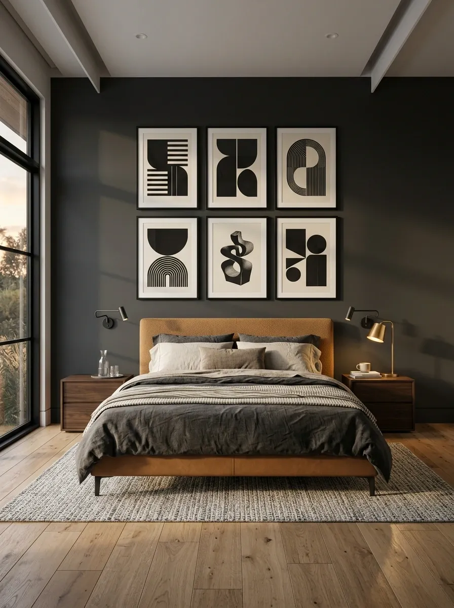
A charcoal bedroom can handle bold artwork, and this composition makes that contrast the entire point.
Several oversized black-and-cream graphic posters sit above a camel upholstered bed, with dark wood nightstands, black reading lights, and warm directional lamps.
The artwork should stay mostly monochrome so the camel fabric becomes the room’s one softer color.
That restraint keeps the design architectural rather than busy.
A dark wall absorbs some of the black in the posters, while the cream elements keep the display readable.
I wouldn’t add a collection of small accessories to the nightstands.
The graphic wall needs visual breathing room.
Neutral Abstract Art Triptych Above an Olive Headboard
This bedroom uses a trio of large abstract posters to create a sophisticated, gallery-like focal point above the bed. The framed prints feature muted earth tones, soft brushstrokes, and delicate calligraphy that tie seamlessly into the rich olive green tufted headboard and neutral bedding. Dark wood nightstands and a marble-topped accent table ground the space, while a warm bedside lamp adds a gentle glow across the textured pillows. The artwork uses a restrained palette of cream, charcoal, and warm taupe that connects naturally with the room rather than introducing a separate color story. The key here is symmetry and scale, giving the sleeping area a polished and finished look.
Soft Vintage Bedroom With Mismatched Botanical Frames
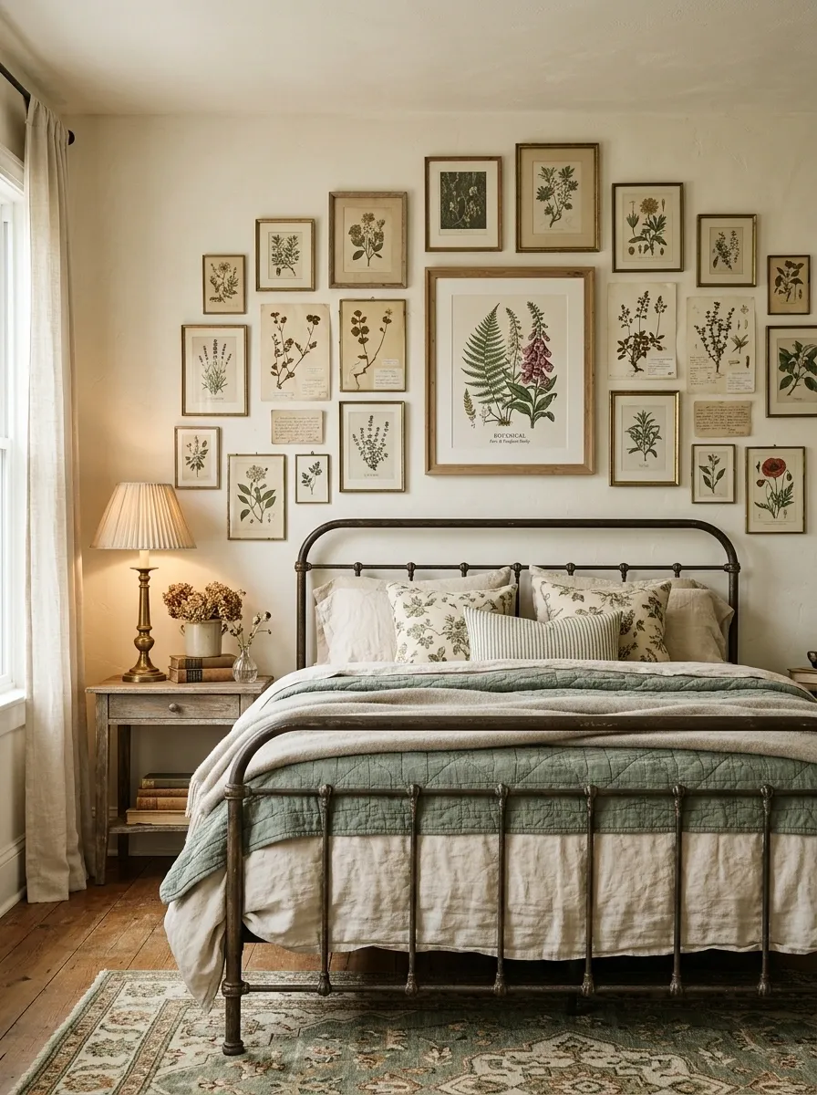
This room takes a quieter route with a collected wall of vintage botanical and herbarium-style posters.
The prints sit in a mixture of slim wood and aged brass-toned frames above an iron bed dressed in faded cream and dusty green textiles.
Nothing is perfectly symmetrical.
One larger botanical print anchors the middle while smaller studies step outward, giving the arrangement the feeling of something gathered over time.
A weathered wood dresser and old-fashioned bedside lamps reinforce that character without turning the room into a period set.
The trick is to keep the artwork related.
Different frames work because the botanical subject matter gives the collection a common thread.
Monochrome Corner Poster Collage
This corner embraces a striking monochrome aesthetic by wrapping two walls in a sharp, diamond-shaped grid of black-and-white posters. The collection relies entirely on typography, bold graphics, and striking imagery to create a high-contrast focal point that instantly draws the eye. Keeping the color palette strictly black and white allows the graphic nature of the prints to do all the visual talking. The clean white walls serve as the perfect canvas, letting each individual poster pop within the larger geometric composition. It is a bold, modern approach that turns a simple empty corner into a statement-making art installation.
Oversized Abstract Poster in a Minimal White Bedroom
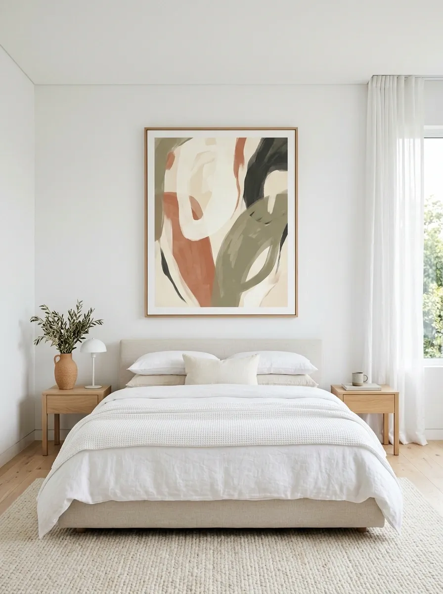
Here the artwork does almost all of the visual talking.
A single oversized abstract composition hangs above a simple upholstered bed, surrounded by pale oak furniture, soft white bedding, a textured rug, and nearly empty walls.
The poster uses broad organic shapes in warm ivory, muted terracotta, dusty olive, and charcoal.
Those colors are repeated only lightly around the room, which keeps the artwork distinct.
The furniture stays low and visually quiet so the large wall composition has room to breathe.
This approach works especially well when the bedroom architecture is already clean.
Adding lots of decorative objects would weaken the effect.
Open wall space around
Artwork carries the visual emphasis
Chic Wine-Themed Posters in a Warm Neutral Bedroom
This bedroom brings a cozy, café-inspired charm to the walls with a stacked pair of playful prints featuring rich burgundy tones. The top poster showcases cozy typographic lettering on a striped pillow motif, while the lower print displays hands relaxing in bed with a bottle of wine and a glass. A sleek wall sconce with a globe shade casts a warm light over the cream bedding and the burgundy accent pillows below. The color palette of deep red and warm beige repeats through the textiles and the artwork, creating a harmonious and inviting atmosphere. Adding a tall potted plant and a textured wooden nightstand completes this relaxed yet stylish retreat.
Terracotta Poster Wall With Warm Mediterranean Bedding
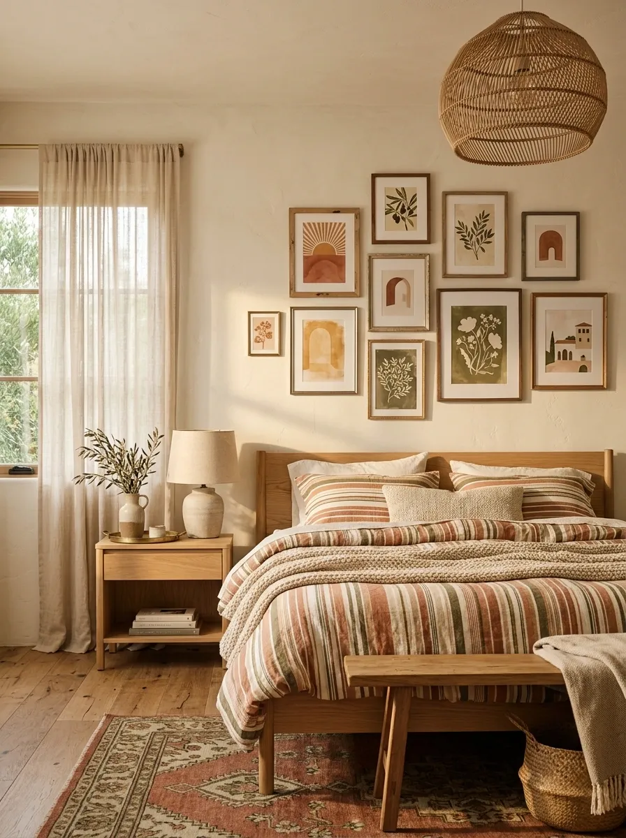
A Mediterranean-inspired bedroom can feel rich without becoming themed.
Here, the wall uses a loose arrangement of terracotta, faded ochre, olive, and cream posters featuring abstract sun forms, botanical studies, and simple architectural shapes.
A light oak bed, striped linen bedding, limewashed cream walls, woven pendant lighting, and a few handmade-looking ceramic pieces complete the setting.
The poster colors repeat through the textiles rather than matching them exactly, which keeps the room relaxed.
The wall should feel slightly imperfect.
Small differences in frame size and spacing make the arrangement look collected instead of mechanically measured.
Large Black Frames Over a Soft Greige Headboard
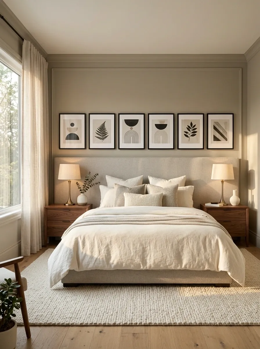
This bedroom uses a wide upholstered headboard as the visual base for a row of black-framed artwork featuring abstract shapes, botanical silhouettes, and simple architectural lines.
The warm greige wall keeps the black frames noticeable without creating a harsh contrast.
Cream bedding, walnut nightstands, brushed bronze lamps, and a soft textured rug fill out the room.
The artwork follows the width of the headboard, making the entire bed wall feel intentional rather than leaving an awkward strip of empty space above it.
I’d keep the frames aligned along a clear visual line.
The arrangement feels polished because the furniture and artwork share a similar horizontal rhythm.
Floor-to-Ceiling Poster Gallery in a Small Apartment Bedroom
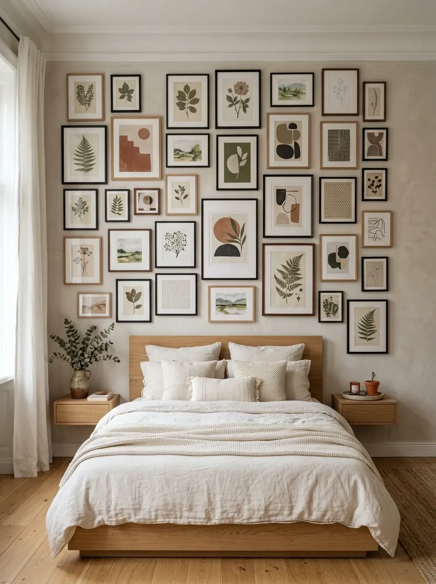
Instead of trying to make a compact bedroom look larger with oversized furniture, this design uses the vertical wall.
A dense collection of framed botanical studies, abstract prints, tiny landscape scenes, and geometric artwork climbs from just above the bed toward the ceiling.
The rest of the room stays restrained with a compact oak platform bed, slim floating nightstands, warm white bedding, and a narrow floor lamp.
The artwork gives the small room personality without taking up valuable floor space.
The important detail is the vertical composition.
Keep the furniture low so the wall artwork becomes the strongest element from floor level to ceiling.
Soft Blue Bedroom With Sepia Travel Posters
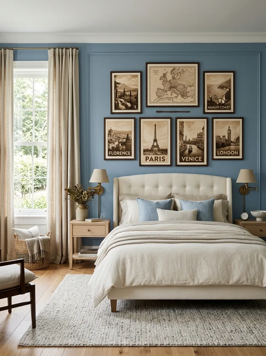
Dusty blue walls give this bedroom a cool foundation, while sepia-toned posters of maps, vintage buildings, coastlines, and old-world landscapes bring warmth back into the composition.
A cream upholstered bed sits below the artwork, accompanied by pale oak nightstands, linen curtains, and aged brass lighting.
The posters should feel like a collection of places rather than a collection of random decorative prints.
Repeating paper tones and similar frame finishes make them read as one story.
The balance comes from the contrast between cool blue walls and warm sepia artwork.
Everything else stays quiet so that relationship remains obvious.
Gallery Wall Above an Exposed Brick Bedroom
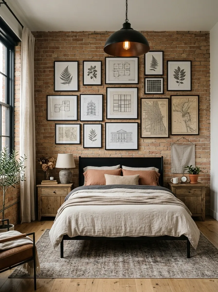
Here the posters don’t fight the architecture.
They work with it.
A warm exposed brick wall forms the backdrop for a mixed collection of black-and-white botanical drawings, architectural sketches, abstract grids, and vintage map artwork.
A simple black metal bed, oatmeal bedding, aged wood nightstands, and a large industrial pendant keep the room grounded.
The poster frames are deliberately simple because the brick already provides plenty of texture.
The design feels strongest when the artwork sits against one broad section of exposed brick instead of being scattered across every wall.
The brick becomes the backdrop, not another competing focal point.
Oversized Nature Poster in a Deep Olive Bedroom
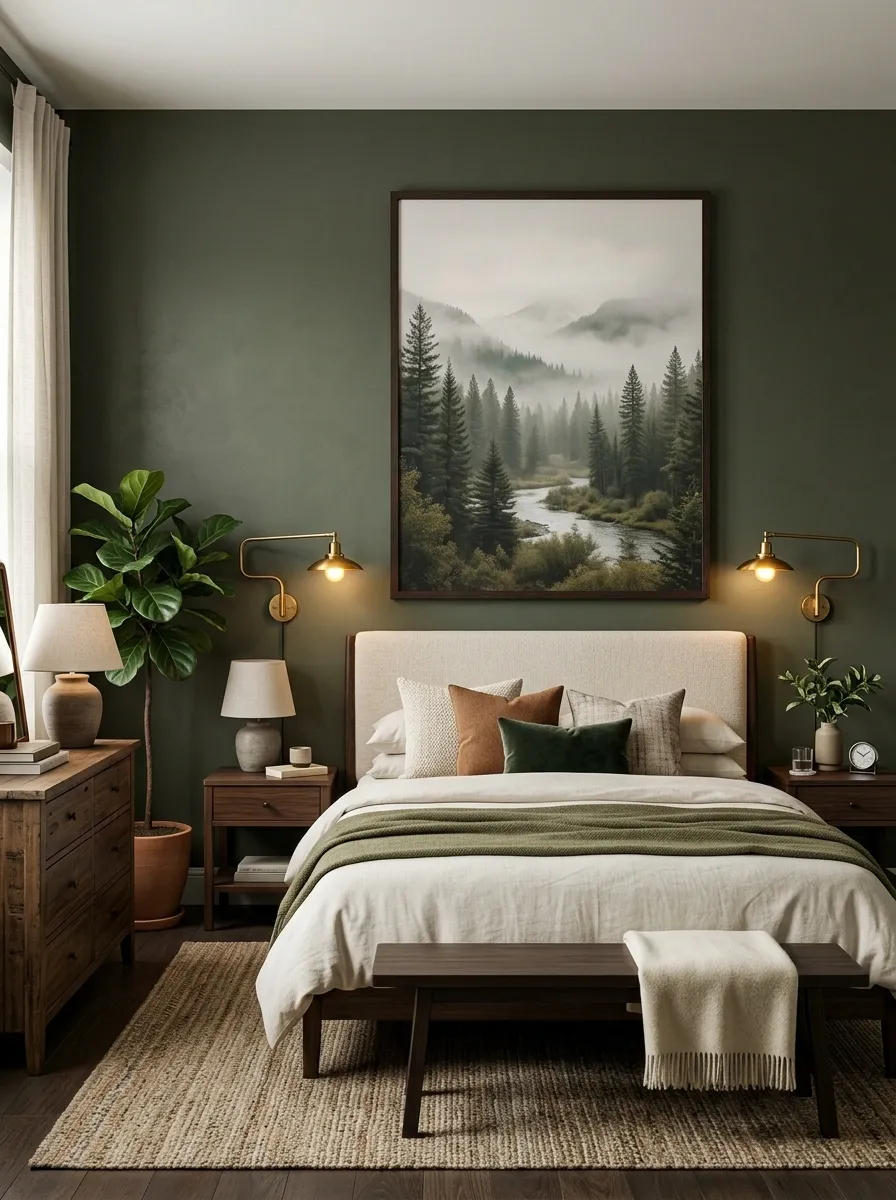
This design keeps the artwork simple but dramatic.
A single oversized nature scene showing distant mountains, trees, or a quiet forest landscape fills most of the wall above a cream upholstered bed.
Deep olive paint surrounds the composition, while dark wood furniture and aged brass sconces support the richer palette.
The artwork doesn’t need many colors.
Muted greens, brown earth tones, and a little atmospheric cream are enough to connect it to the room.
Keep the rest of the wall mostly empty.
The large image needs space around it to feel intentional rather than crowded.
Coastal Bedroom With Soft Blue Poster Panels
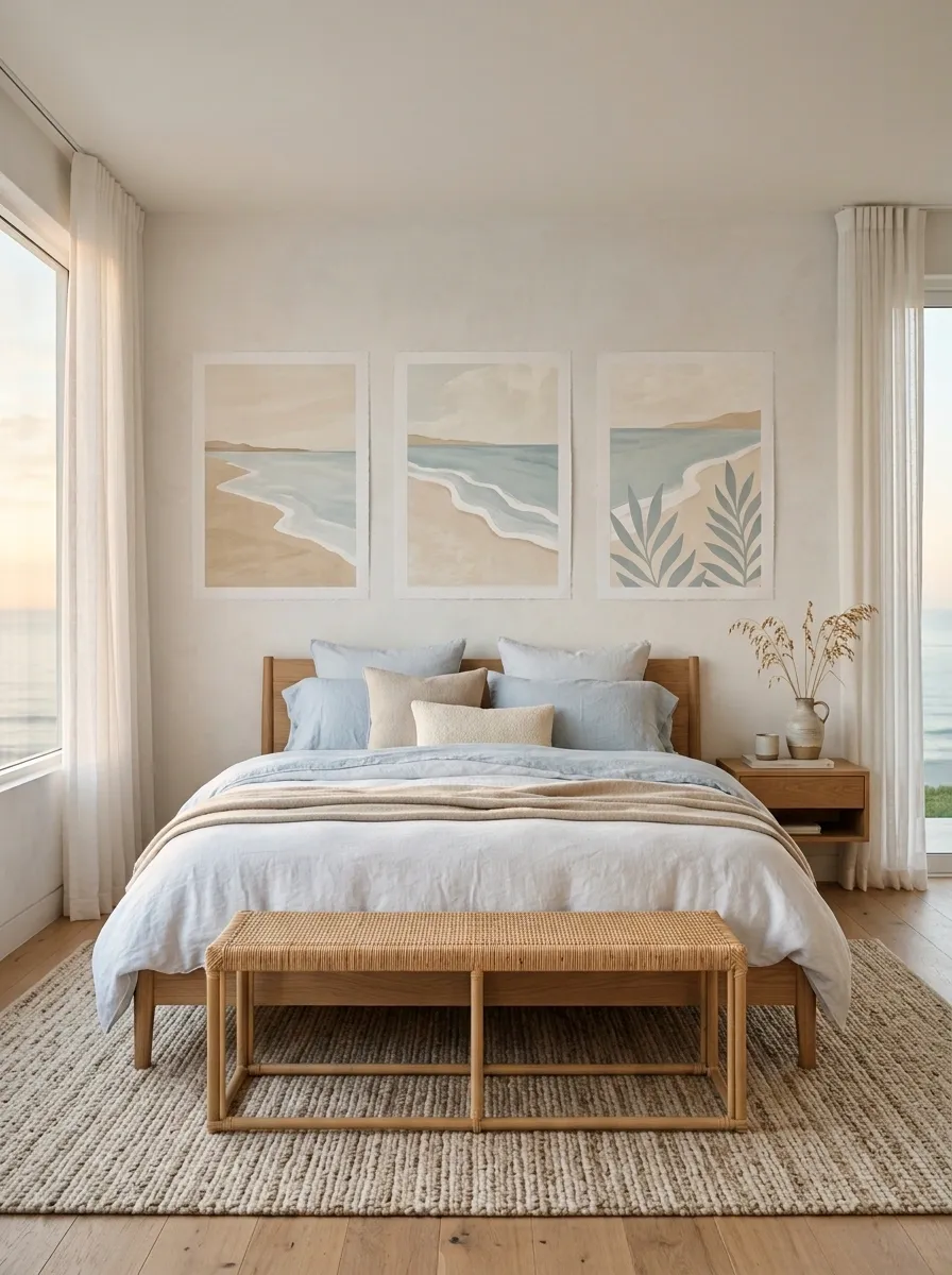
This coastal bedroom avoids obvious nautical decoration and gets its character from color and texture instead.
Three large posters show abstract shorelines, soft horizon lines, and simplified botanical forms in sandy beige, pale blue, and chalky cream.
The artwork sits above a white oak bed with rumpled linen bedding, a woven bench, pale curtains, and a textured rug.
The room feels airy because the artwork repeats the colors of the textiles without introducing bright blue accents everywhere.
I’d avoid adding shells, anchors, or other themed accessories here.
The quieter approach feels more sophisticated and gives the artwork room to carry the coastal idea.
Moody Burgundy Bedroom With Museum-Style Nature Posters
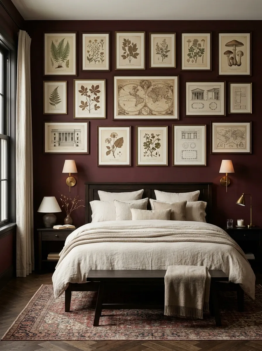
Deep burgundy walls give this bedroom a dramatic foundation.
A carefully spaced arrangement of botanical studies, pressed-leaf illustrations, antique maps, and architectural drawings adds detail without introducing people or faces.
A dark wood bed, cream bedding, aged brass sconces, and a faded patterned rug complete the composition.
The artwork should feel collected but deliberate.
Keep the frames within a narrow family of dark wood and muted bronze so the display looks connected.
The lighter paper tones become especially effective against the burgundy wall.
The room doesn’t need much additional decoration.
The rich wall color and artwork already create enough depth.
Japandi Bedroom With One Quiet Architectural Poster
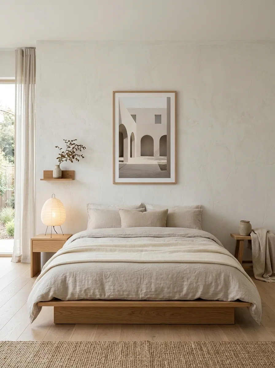
This bedroom strips the idea back to one refined architectural poster showing a simple archway, courtyard, stair geometry, or quiet building facade.
The artwork hangs above a low oak bed with oatmeal bedding, textured off-white walls, paper lighting, and almost no decorative clutter.
The limited palette is intentional.
Warm oak and soft beige give the room depth, while the architectural image introduces a small amount of graphic structure.
This concept works best when the poster itself is restrained.
Avoid highly detailed artwork with dozens of visual elements.
A quiet composition matches the calm geometry of the room.
Eclectic Bedroom With Layered Botanical and Abstract Posters
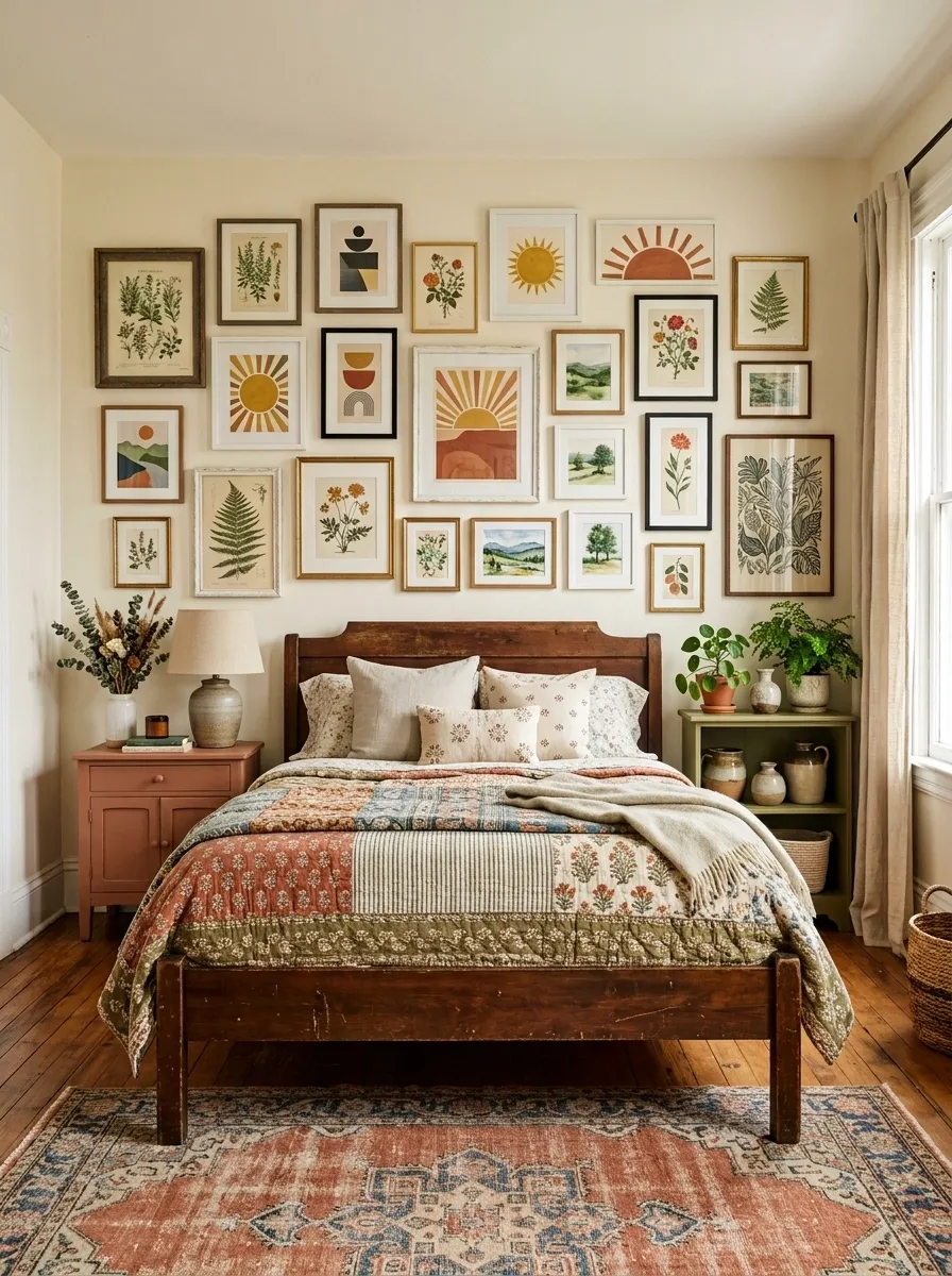
This eclectic room combines colorful but related artwork with patterned bedding, painted furniture, vintage wood, and a faded rug.
The poster collection mixes botanical illustrations, geometric abstracts, sun shapes, and small landscape scenes, creating a lively wall without relying on human subjects.
The room works because the artwork shares a limited family of terracotta, olive, cream, and muted blue.
The patterns around the room then pick up small pieces of those colors.
When using this much visual information, leave a few large surfaces quiet.
The plain wall areas and solid bedding prevent the composition from becoming one continuous pattern.
Neutral Bedroom With Layered Sepia Botanical and Architectural Posters
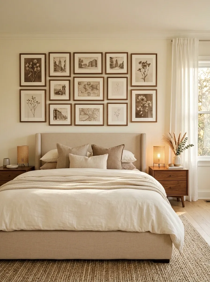
This warm neutral bedroom uses several sepia posters featuring dried botanicals, old architecture, maps, and delicate line drawings.
They sit above a beige upholstered bed with walnut nightstands, cream bedding, woven lamps, and soft linen curtains.
The artwork introduces depth without adding a bright accent color.
Sepia sits naturally between the pale walls and darker walnut furniture, so the entire room feels connected.
Use different artwork subjects but keep the paper tones and framing related.
That makes the wall feel like one collection rather than a random selection of prints.
Dusty Pink Bedroom With Chocolate Brown Graphic Posters
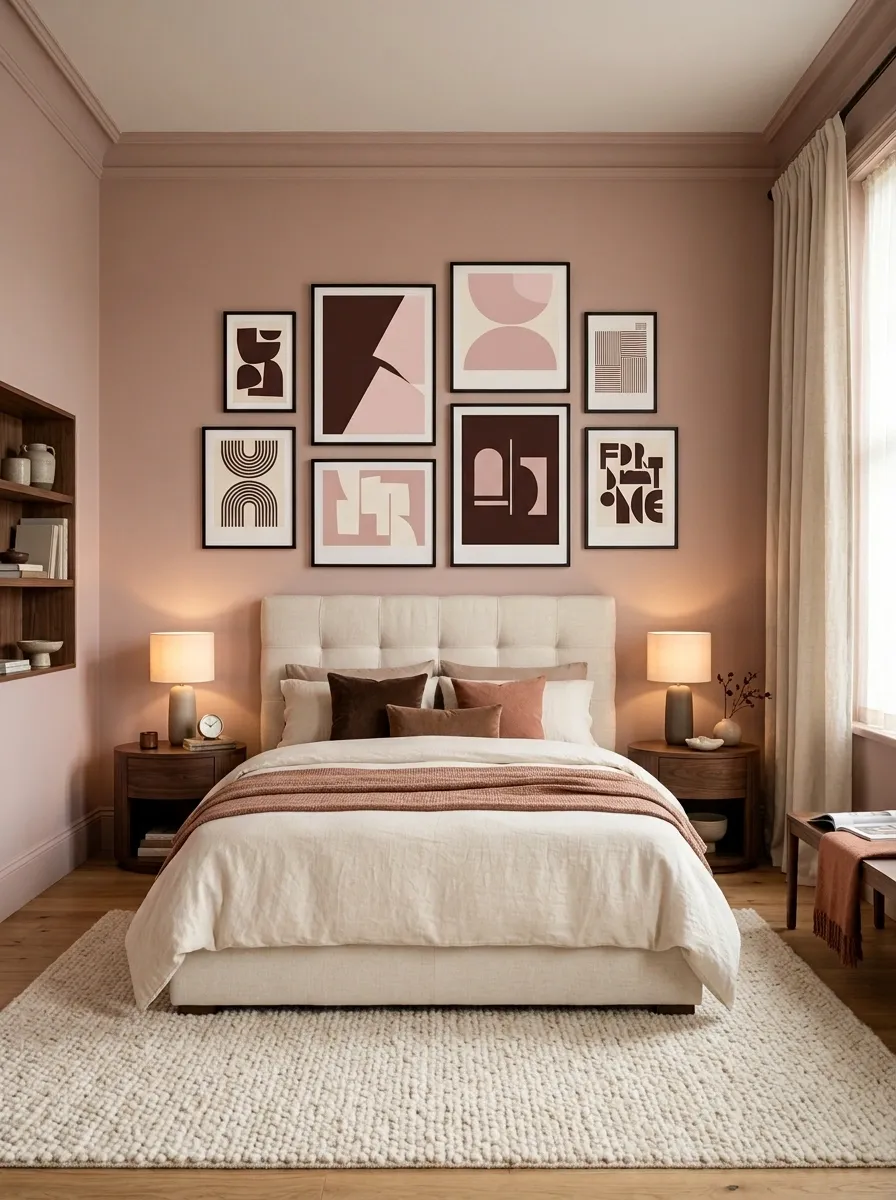
Dusty pink walls and chocolate brown furniture give this bedroom a sophisticated warmth.
Bold graphic posters introduce a sharper visual note above the bed.
The artwork uses abstract shapes, typography, stripes, and geometric forms rather than people or portraits.
A cream upholstered bed softens the contrast, while rounded walnut nightstands, a textured rug, and warm lighting keep the composition comfortable.
The posters should use brown, cream, muted terracotta, and a small amount of darker charcoal so they feel integrated.
The strongest version isn’t overly sugary.
The deep brown elements give the pink enough structure to feel mature.
Attic Bedroom With Posters Following the Roofline
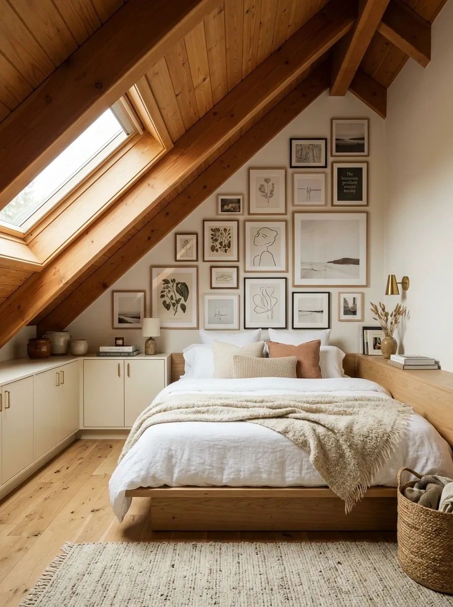
The unusual architecture becomes the main opportunity in this attic bedroom.
Instead of forcing the posters into a standard rectangular arrangement, botanical studies, architectural diagrams, celestial charts, and simple landscapes are arranged to follow the changing roofline.
A low bed, warm oak flooring, built-in storage, and soft wall lighting keep the lower half of the room visually simple.
The artwork then draws the eye upward and makes the sloped ceiling feel intentional.
Leave clear breathing room around doors, built-ins, and low ceiling sections.
The artwork should respond to the architecture rather than obstruct it.
Contemporary Bedroom With a Monumental Black-and-White Nature Poster
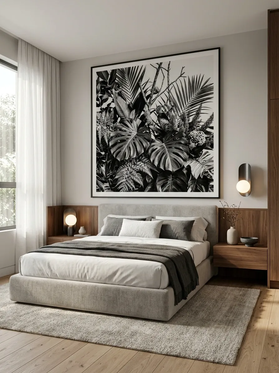
This contemporary bedroom relies on one oversized monochrome nature photograph or dramatic black-and-white botanical composition.
The poster occupies a major section of the wall behind a low upholstered bed, surrounded by charcoal accents, walnut casework, sculptural lighting, and a soft stone-colored rug.
The large format gives the room an architectural feel without needing several decorative objects.
Black and white keeps the artwork crisp, while walnut introduces enough warmth to stop the room from feeling clinical.
The important choice is scale.
A small image would lose the impact that makes this concept work.
Cottage Bedroom With Layered Botanical Poster Collections
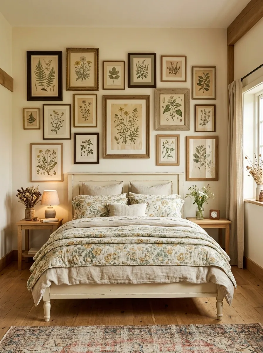
Soft cottage styling works especially well with detailed botanical artwork.
This bedroom uses several muted botanical posters above a painted wood bed, surrounded by floral textiles, a vintage-style rug, creamy walls, and small natural wood accents.
Instead of making every poster the same size, the collection feels collected through slight differences in scale and frame style.
The artwork’s muted greens, faded yellow, and warm paper tones repeat quietly through the bedding.
Keep the surrounding furniture fairly simple.
Cottage rooms already contain pattern and texture, so the poster wall should complement that richness rather than compete with it.
Luxe Bedroom With Oversized Abstract Art and Bronze Accents
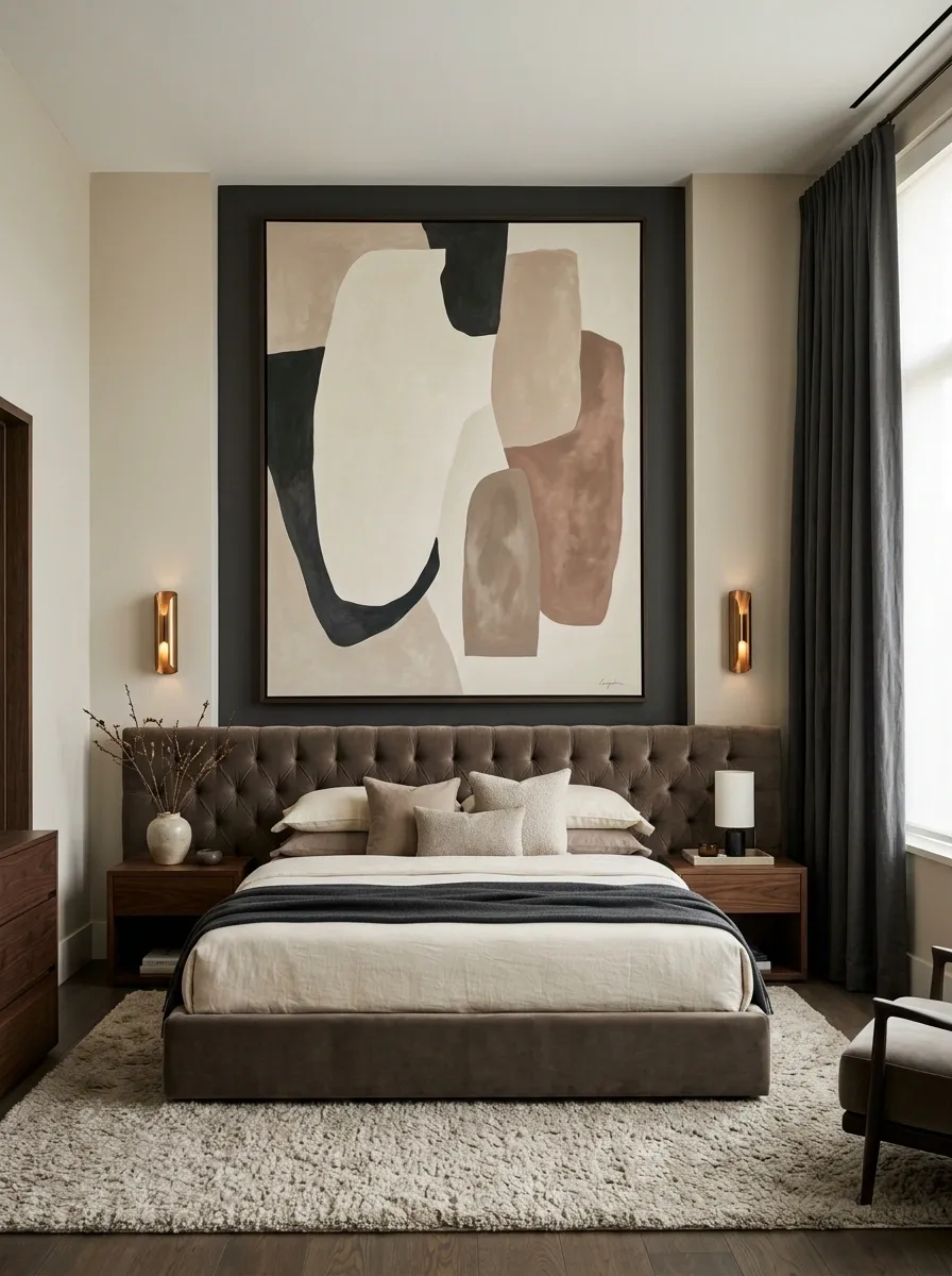
This bedroom takes a quieter luxury approach.
A huge abstract poster in cream, charcoal, muted clay, and soft brown dominates the wall above a deep taupe upholstered bed.
Dark walnut furniture, bronze lighting, thick curtains, and a plush textured rug add richness without making the room overly ornate.
The artwork should have broad shapes rather than a busy pattern.
Its scale provides drama, while the restrained palette keeps the bedroom sophisticated.
Don’t add several smaller decorative artworks around it.
The oversized composition already supplies the main visual statement.
Teen Bedroom With Colorful Posters and a Clean Study Zone
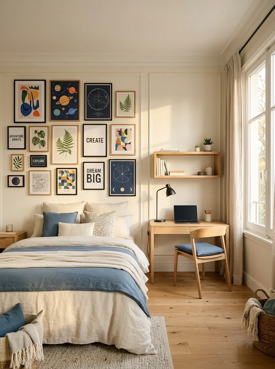
This bedroom uses artwork to connect two different functions: sleeping and studying.
A colorful poster arrangement sits above the bed and continues visually toward a compact desk with pale wood storage, a simple task lamp, and organized shelves.
The artwork features abstract shapes, planets, plants, typography, and geometric diagrams, keeping the collection playful without using people or faces.
Bedding in cream and muted blue gives the stronger poster colors somewhere to settle.
The desk should remain visually tidy.
The posters are already supplying personality, so the study area doesn’t need a pile of extra decoration.
Earth-Toned Bedroom With a Restrained Travel Poster Collection
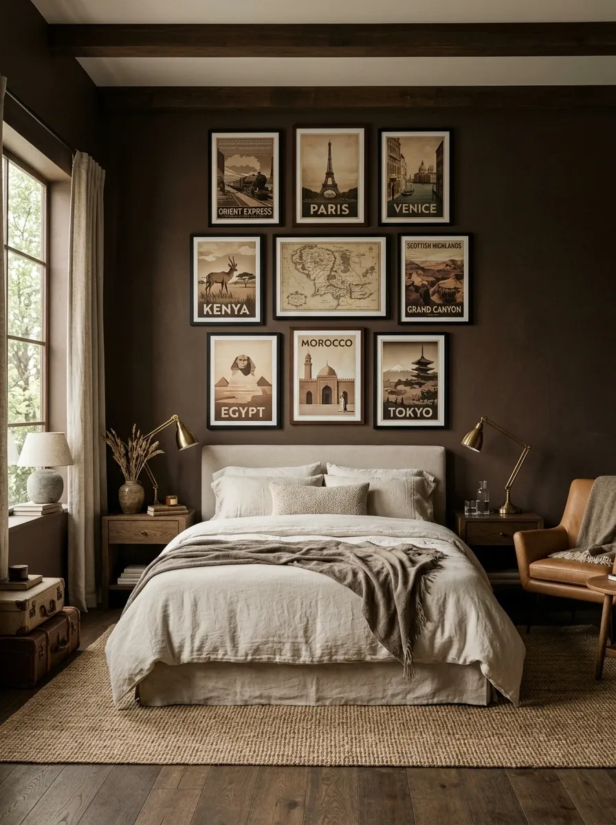
Deep brown walls, dark oak furniture, leather accents, and cream bedding create a grounded bedroom with a slightly old-world character.
Above the bed, a restrained collection of vintage travel posters shows landscapes, railway maps, scenic routes, buildings, and stylized geography.
The artwork brings lighter paper tones into the darker room and adds visual detail without introducing bright modern colors.
Black and dark wood frames keep the collection connected to the furniture.
Keep the number of posters controlled.
The room works because the artwork feels intentional rather than crowded.
Soft Scandinavian Bedroom With Pastel Art Pairing
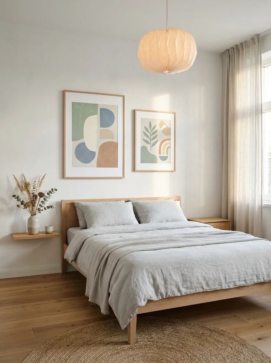
This Scandinavian bedroom keeps the furniture simple and lets two large pastel posters provide most of the personality.
The artwork uses soft sage, dusty blue, warm cream, and muted clay in abstract landscapes, geometric forms, and simplified botanical shapes.
A pale oak bed, light gray bedding, white walls, and a small sculptural pendant keep the rest of the room quiet.
The posters don’t need to match each other exactly.
Their shared color palette is enough to make the pair feel intentional.
I’d leave generous space around the artwork.
That negative space is part of what makes Scandinavian interiors feel calm rather than crowded.
Maximalist Jewel-Tone Bedroom With Dense Poster Art
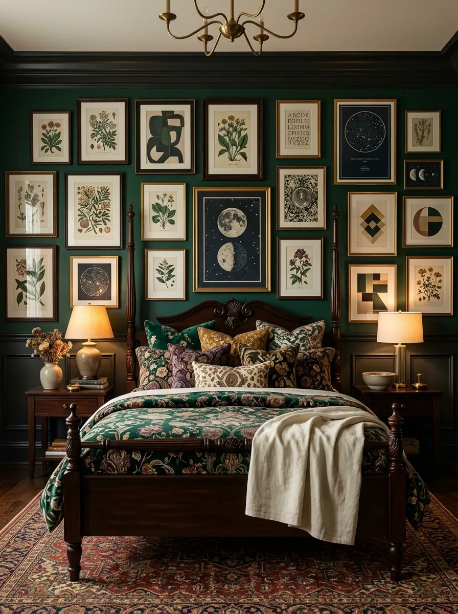
This bedroom goes in the opposite direction, using the wall as a dense visual collection.
Emerald, plum, muted mustard, cream, and deep brown appear across botanical illustrations, abstract artwork, celestial charts, decorative typography, and geometric compositions.
The posters surround a dark wood bed dressed in patterned textiles, while layered lamps and a vintage-style rug add more depth.
The result is intentionally rich, but the color relationships keep it from becoming chaotic.
With a design this full, give the eye somewhere to rest.
A plain section of bedding or one solid piece of furniture is enough to break up the visual density.
Calm Modern Bedroom With a Full-Width Art Composition
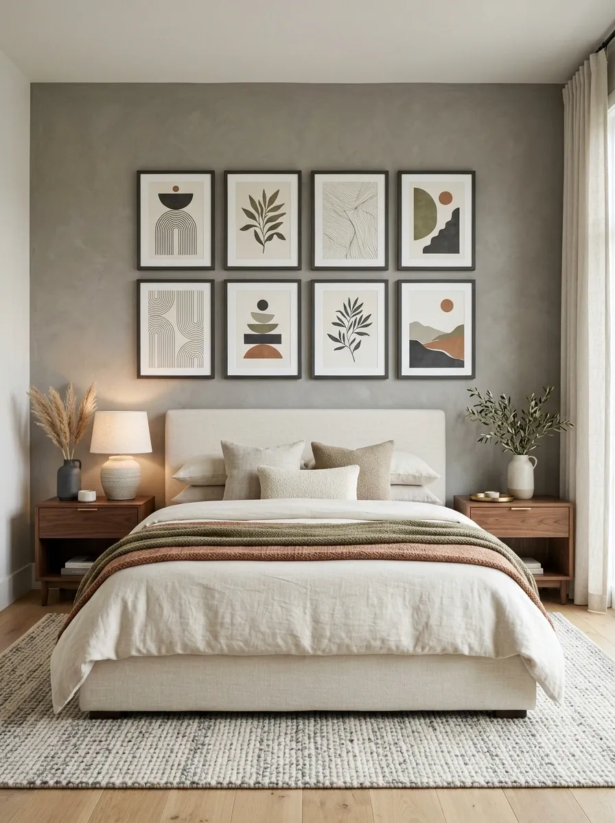
The final concept treats the poster wall almost like an architectural feature.
Several coordinated prints form one broad composition across the wall behind a low upholstered bed, using abstract geometry, quiet botanical forms, fine linework, and simplified landscape shapes.
Warm gray walls, walnut furniture, cream bedding, and soft architectural lighting keep the room understated.
The posters share a controlled palette of ivory, charcoal, muted olive, and terracotta, allowing the entire group to read as one large visual statement.
The important part is the overall width.
The artwork should connect the furniture below it and fill the bed zone without spilling too far into unrelated parts of the room.
Give the Artwork a Real Place in the Room
Good bedroom artwork isn’t just something that fills an empty wall.
It can establish the visual character of the entire room before you add the smaller details.
The most successful designs here don’t rely on one clever poster by itself.
They work because the artwork has a relationship with the bed, wall finish, flooring, lighting, furniture, and textiles.
That relationship can be quiet or dramatic, symmetrical or collected, minimal or layered.
Before choosing prints, look at the wall as a complete surface.
Think about how much visual weight it can handle, how wide the furniture below it is, where natural light falls, and which colors already exist in the room.
Then choose artwork that strengthens those decisions instead of competing with them.
Save the compositions that feel closest to your own bedroom, then use them as visual references when you’re choosing the artwork, frames, and surrounding finishes.