
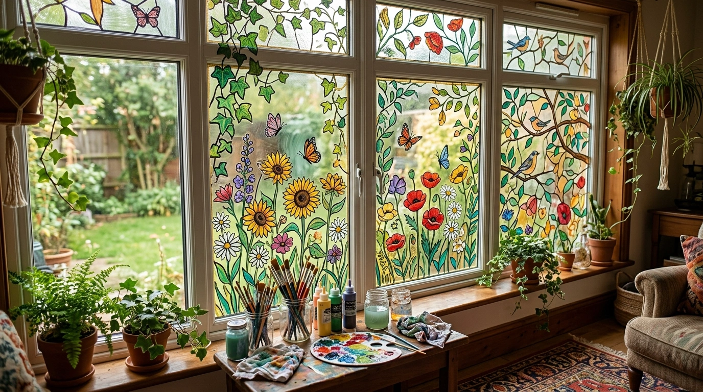
A bare window can make an otherwise lovely room feel strangely unfinished, but covering every pane with flowers, stars, and random decorative shapes isn’t automatically the glow-up anyone ordered.
Window painting works best when the artwork respects the glass, the window frame, and the amount of natural light the room needs. Otherwise, the result can look less like custom artwork and more like a craft project that lost its supervision.
Your window needs a plan, not a personality crisis.
Random flowers in one corner, a questionable rainbow in another, and suddenly the window looks like three craft projects had a custody battle. Pick a direction before the paint starts making decisions for you.
Paint the edges with trailing vines, fine line art, or a low wildflower border. Let the center breathe. The outside world did not apply to be a background character in your craft experiment.
Translucent botanical motifs can soften a window while allowing daylight through. Decorative paint is not automatically privacy glass, so check coverage and nighttime visibility before trusting it with bathroom secrets.
Go for a complete landscape, geometric arches, or a stained-glass-inspired composition. Give the colors and shapes a visual relationship. Everything everywhere is not a design style, despite what the group chat says.
THE NON-NEGOTIABLE: Check that the paint is suitable for glass, test a discreet spot, and read the removal instructions before committing. A gorgeous design that damages the window is an expensive plot twist nobody requested.
Window Painting Ideas
Botanical Glass Grids
Transforming individual windowpanes with delicate botanical prints creates an upscale look reminiscent of antique stained glass without the permanent commitment. Each glass square features fine leaf motifs, establishing a rhythmic pattern that turns a standard bathroom window into a stunning focal point.
Mixing translucent amber, soft teal, and muted green paints across the panes adds warmth and privacy while filtering natural sunlight into a gorgeous glow. The irregular placement of leaf styles keeps the overall arrangement feeling relaxed rather than overly structured or heavy.
This method works wonders for spaces where you want privacy without hanging heavy curtains or blinds. Keep the design balanced by distributing darker tones evenly across the lower and upper sections, ensuring the entire glass surface feels thoughtfully planned.
Geometric Retro Glass Blocks
Embracing a mid-century geometric aesthetic with rich terracotta and warm amber tones gives plain glass a striking architectural edge. Interlocking shapes and clean lines stretch across the lower portion of the windows, creating a stunning visual barrier against harsh outdoor views.
The layered warm hues filter sunlight into cozy, inviting tones that instantly warm up a modern interior space. Playing with varying opacities in the paint gives the illusion of expensive textured glass while keeping the application process surprisingly approachable.
Leaving the top portion of the window clear ensures you never lose your source of daylight or the open sky overhead. This retro-inspired approach provides a clever way to add artistic character to urban apartments or contemporary living rooms.
Trailing Botanical Vines Framing Clear Windowpanes
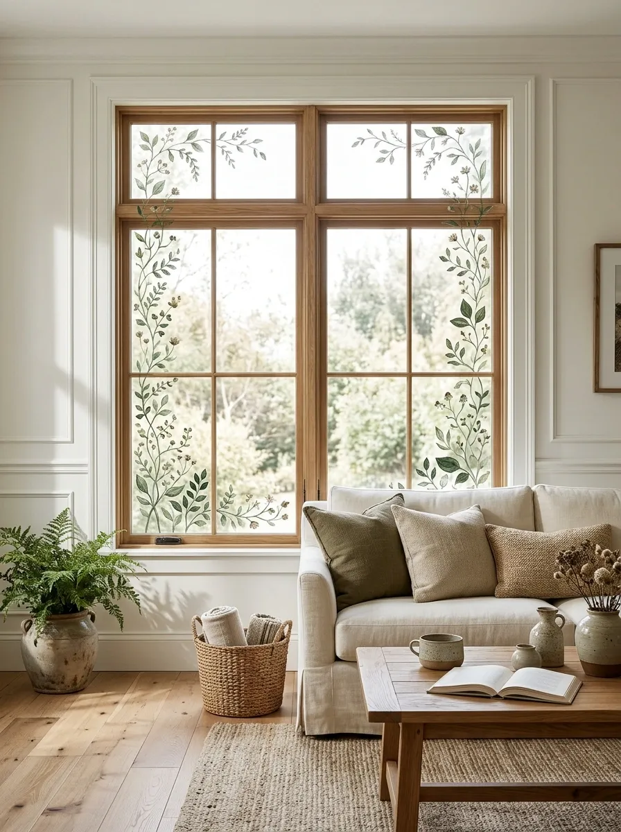
Trailing Botanical Vines Framing Clear Windowpanes
Painted foliage belongs along the edges and corners. The open center is part of the design, not an unfinished section begging for more leaves.
Trailing botanical vines give ordinary windows a softer, more natural appearance without turning the glass into a solid mural. Fine green stems can climb the side edges, curve around the upper corners, and carry small leaves that vary in size and direction. A few tiny blossoms add color without stealing the entire show.
The most convincing compositions look a little asymmetrical. One side can carry a longer branch while the opposite corner receives a lighter scattering of leaves. That balance feels more organic than placing identical vines on both sides like window curtains at a very demanding botanical hotel.
Muted sage and deep leafy green work particularly well against bright interiors, warm wood, and neutral walls. Keep the center mostly clear when the outside view matters. For a softer finish, use glass-compatible paint with an appropriate translucent effect, provided the product supports it.
Whimsical White Line Art
Covering a large store or kitchen storefront window in intricate white line illustrations turns transparent glass into an eye-catching storytelling canvas. Swirling steam cups, floating planets, and playful doodles dance across the panes in crisp monochrome perfection.
Using a bold white marker or glass paint lets you achieve maximum contrast against busy urban backdrops while maintaining an effortlessly chic aesthetic. The dense, doodle-style pattern naturally provides a clever layer of privacy without blocking out all the incoming street-level illumination.
Keeping the strokes fluid and interconnected ensures the expansive design feels cohesive rather than chaotic. This playful approach works beautifully for creative businesses and cozy kitchen nooks alike, proving that simple white paint can completely redefine a view.
Wildflower Meadow Across the Bottom of the Glass
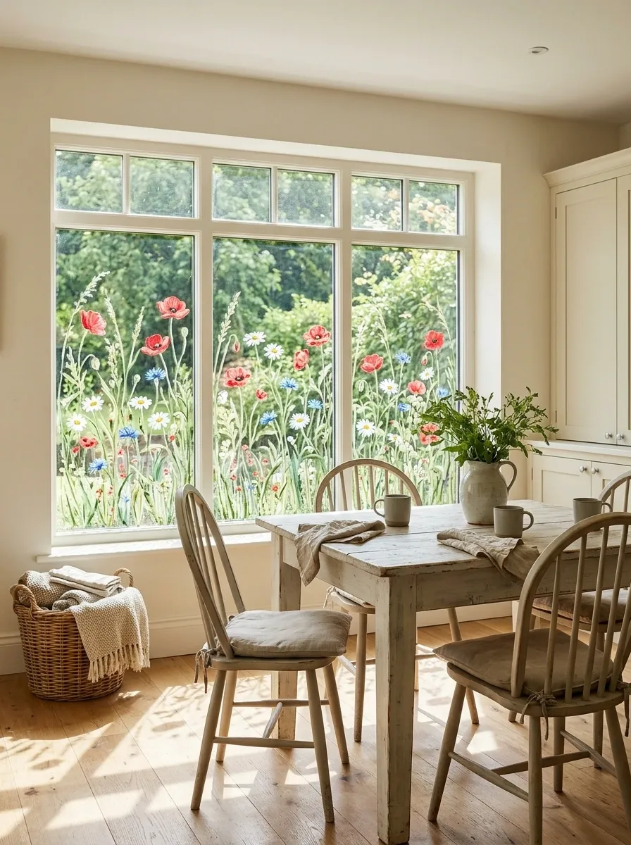
Wildflower Meadow Across the Bottom of the Glass
Vary the flower heights and leave small gaps between clusters. A natural-looking meadow has a skyline. A row of identical blooms has attendance records.
A painted wildflower meadow brings color to the lower edge of a window while leaving the upper glass available for daylight and the view outdoors. Poppies, daisies, cornflowers, and slender grasses can rise to different heights, creating the loose, layered outline of an actual field.
The composition looks strongest when the flower clusters are unevenly distributed. Put a taller group near one corner, let grasses bridge the gaps, and use shorter blooms to soften the spaces between. Bright reds and yellows can create a cheerful cottage look, while dusty pink, pale blue, and muted green feel quieter.
This approach works especially well on kitchen windows, breakfast nooks, and informal living spaces. Avoid making every flower equally large or arranging them in a perfectly straight line. Nature has never been particularly interested in spreadsheet formatting.
The lower placement helps preserve the view through the middle and upper panes. Select paint intended for glass and test the finish before starting the full design.
Art Nouveau Floral Panels With Flowing Curves
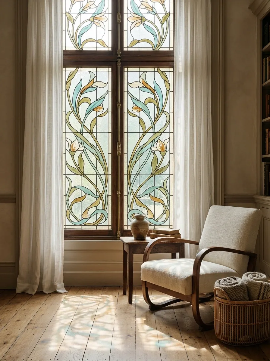
Art Nouveau Floral Panels With Flowing Curves
Art Nouveau window painting leans into flowing lines, elongated leaves, and stylized flowers. Rather than scattering individual motifs across the pane, the artwork follows a continuous visual rhythm that works with the window’s vertical divisions.
Muted teal, olive, amber, and creamy accents give the design a historic feel without making it look like a replica of an antique stained-glass window. Tall stems can stretch through narrow panes, while curved leaves fill the spaces around them. Small floral details become focal points instead of competing decorations.
The surrounding room should let the window retain some attention. Simple curtains, understated furniture, and warm wood finishes help the painted details feel intentional. Heavy patterns elsewhere can make the whole composition look like a wallpaper sample book lost its boundaries.
This style particularly suits older homes, reading corners, and rooms with traditional architectural features. Plan each panel before painting so stems and decorative shapes connect naturally across the window divisions. A curve that abruptly ends at every mullion can make a flowing design look accidentally chopped into pieces.
Mediterranean Lemon Branches With Blue Decorative Accents
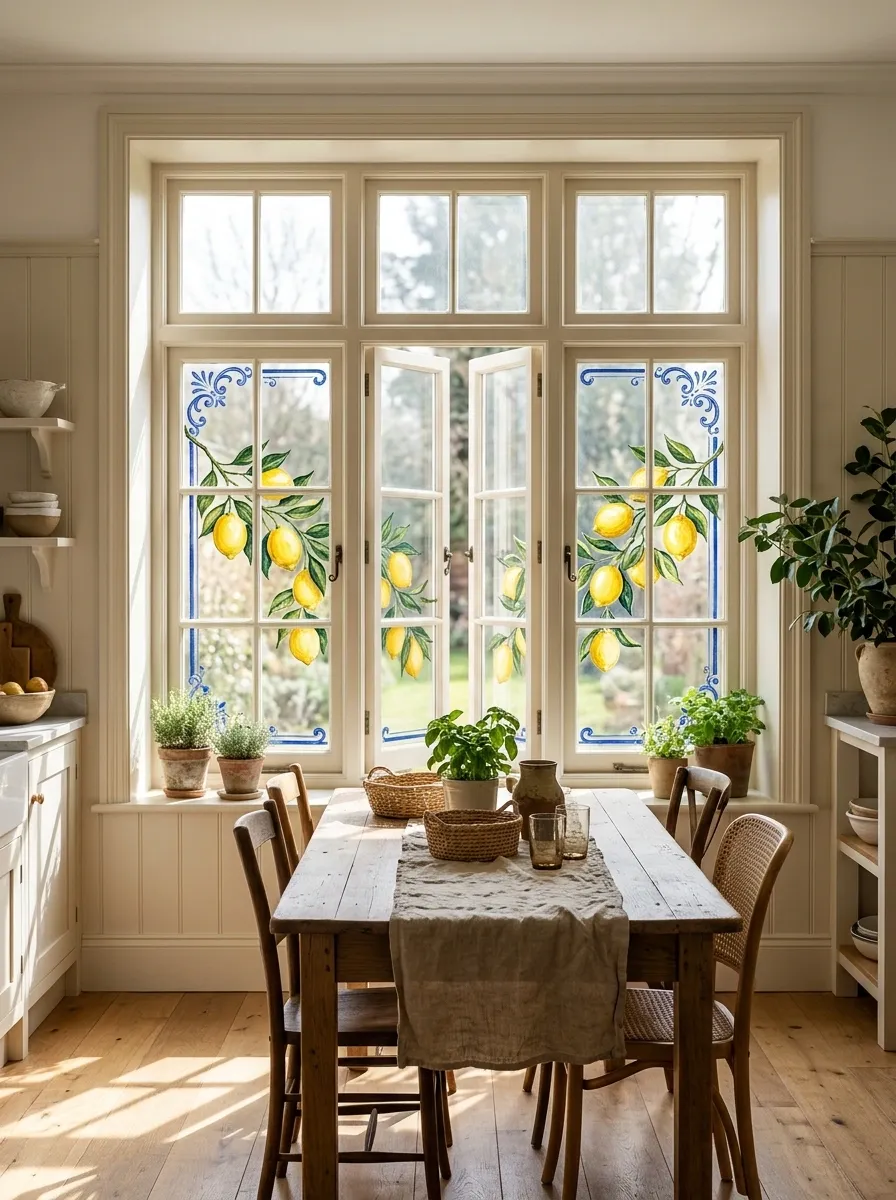
Mediterranean Lemon Branches With Blue Decorative Accents
Let blue accents frame the composition and use yellow as the focal point. When every color shouts at maximum volume, the lemons stop looking fresh and start looking involved in a traffic dispute.
A branch of lemons against blue decorative accents gives a kitchen window a sunlit Mediterranean character. Yellow fruit creates the focal point, deep green leaves provide contrast, and restrained cobalt details introduce the look of traditional ceramic patterns without requiring an entire window of painted tiles.
The artwork can follow a horizontal branch along the lower pane, with a few leaves and blue motifs climbing toward one side. Keep the lemons at slightly different heights and angles so the composition feels botanical rather than like a fruit sticker collection.
Warm white walls, natural wood, woven textures, and simple kitchen accessories support the palette. The design can also work in a breakfast area, especially where the window catches plenty of daylight.
The blue detailing needs restraint. A few decorative flourishes around the branch make the colors feel connected, while a dense border of repeating motifs can overwhelm the fruit. Let the yellow lemons remain the focal point instead of making every little swirl demand equal attention.
Use glass-compatible paint and verify its opacity before committing to the full pane. To preserve the view, keep the painted branch relatively low and leave generous clear areas between the decorative elements.
Frosted Fern Motifs for a Light-Filled Privacy Window
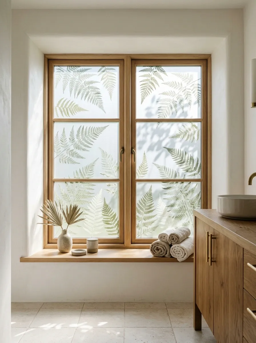
Frosted Fern Motifs for a Light-Filled Privacy Window
Frosted fern motifs soften the appearance of a bathroom, laundry room, or ground-floor window without relying on a heavy painted scene. Fine fern fronds can repeat across the glass in translucent-looking shapes, creating a botanical pattern that feels quieter than bold flowers or colorful geometric artwork.
The most effective arrangement uses varied spacing. A few larger fronds can anchor the design, while smaller leaves fill selected gaps. Keeping some glass open prevents the pattern from feeling like a solid wall, particularly in a small room where natural light matters.
Muted green tones work well with pale tile, natural wood, warm white walls, and simple metal fixtures. A nearly monochromatic finish creates a subdued look, while slightly darker fern outlines provide a clearer botanical pattern.
There is one practical catch: decorative paint does not automatically provide reliable privacy. Coverage, lighting, viewing angles, and the product itself all affect what can be seen through the glass. Test the intended finish in the actual room before relying on it. For a bathroom window that needs dependable screening, suitable privacy glazing or a properly rated window film may be necessary.
Autumn Branches Spreading Across Multiple Windowpanes
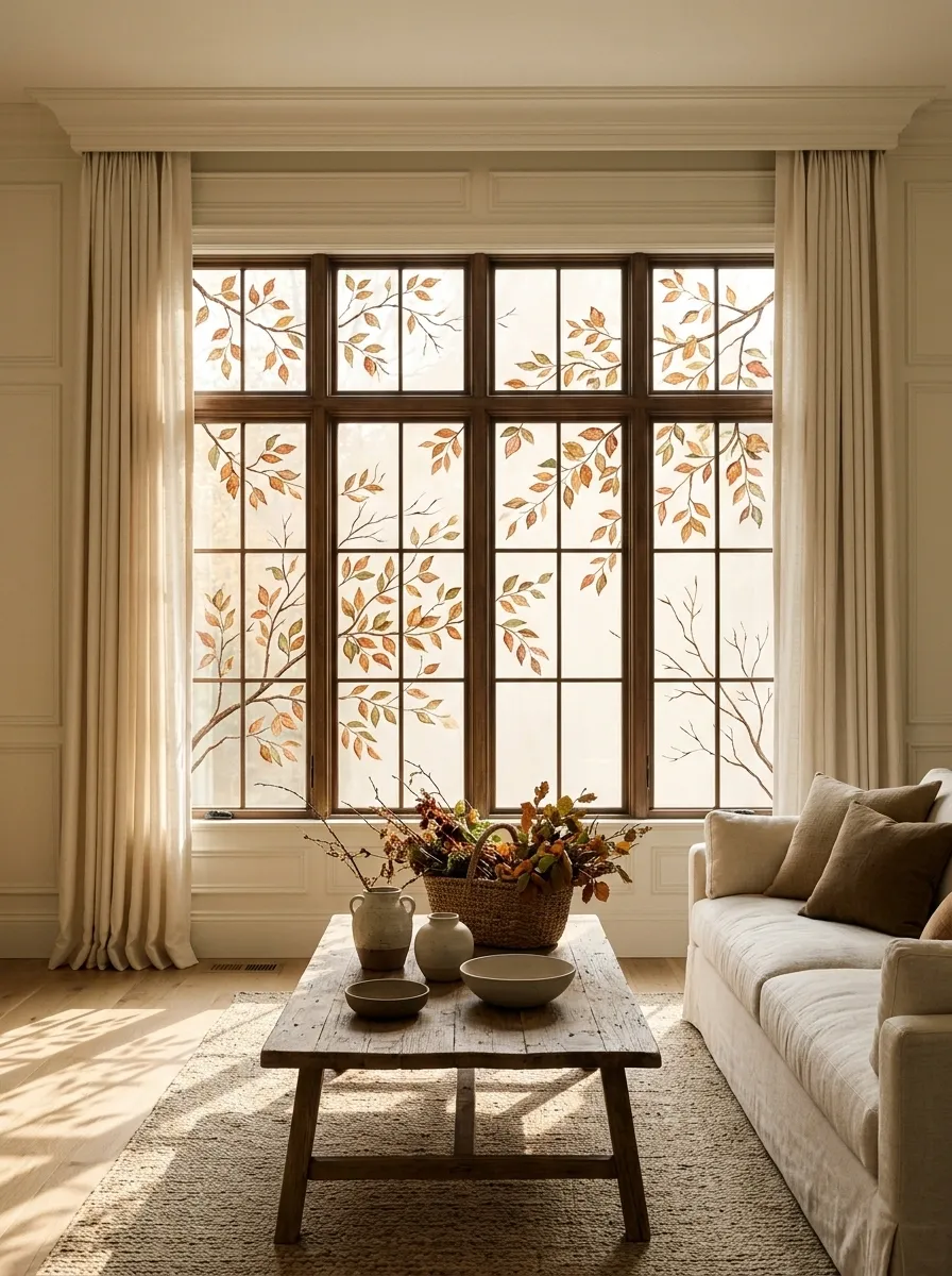
Autumn Branches Spreading Across Multiple Windowpanes
Let branches cross the pane divisions naturally. Vary leaf density so the artwork has movement instead of looking like a seasonal wallpaper sample.
The best autumn window paintings look like a tree has wandered into the room without bringing approximately seventeen bags of crunchy leaves along for the ride. Slender branches stretch diagonally across multiple panes, carrying copper, ochre, rust, and muted red leaves. The artwork feels more natural when some branches are nearly bare while others hold small clusters of foliage.
Warm rust and ochre look particularly appealing against ivory walls, linen curtains, and natural wood. A few darker leaves can add definition, while muted green keeps the palette from becoming one long orange announcement.
The key is allowing the branches to connect across the window’s individual panes. Plan the larger lines before adding the smaller foliage, and avoid placing every leaf at the end of a perfectly identical twig. Real trees have variety. Apparently, they never received the memo about matching sets.
This composition suits living rooms, dining spaces, and kitchen windows during autumn. Keep the heaviest clusters toward selected corners and leave clear glass between the branches to preserve daylight. The finished result should resemble a single spreading tree, not separate decorative stickers competing for attention.
Soft Geometric Arches With Muted Color Blocking
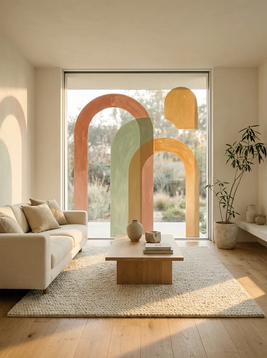
Soft Geometric Arches With Muted Color Blocking
Overlapping shapes create the composition. Leave enough visible background around them to stop the window from becoming a geometry worksheet with commitment issues.
Rounded arches give painted windows a contemporary graphic look without relying on flowers, leaves, or the usual collection of decorative doodles. Overlapping semicircles in terracotta, sage, and warm ochre create a composition that feels architectural rather than overly crafty.
The strongest versions use a small number of broad shapes. One arch can dominate the pane while a second overlaps it, creating contrast through proportion instead of additional decoration. Leave some shapes partially open to the surrounding glass, particularly on smaller windows where too much solid paint can overwhelm the frame.
This look pairs well with simple modern furniture, pale walls, and natural materials. It can also work in a rented home when the chosen glass-paint product is removable and permitted for the surface. Check the product’s instructions before treating the window as a temporary canvas.
Unlike a delicate botanical border, these arches make the painted glass itself the focal point. Keep the colors coordinated with the room and resist the temptation to introduce six more shades because they happen to be sitting open on the craft table.
Retro Checkerboard Corners With an Open Center
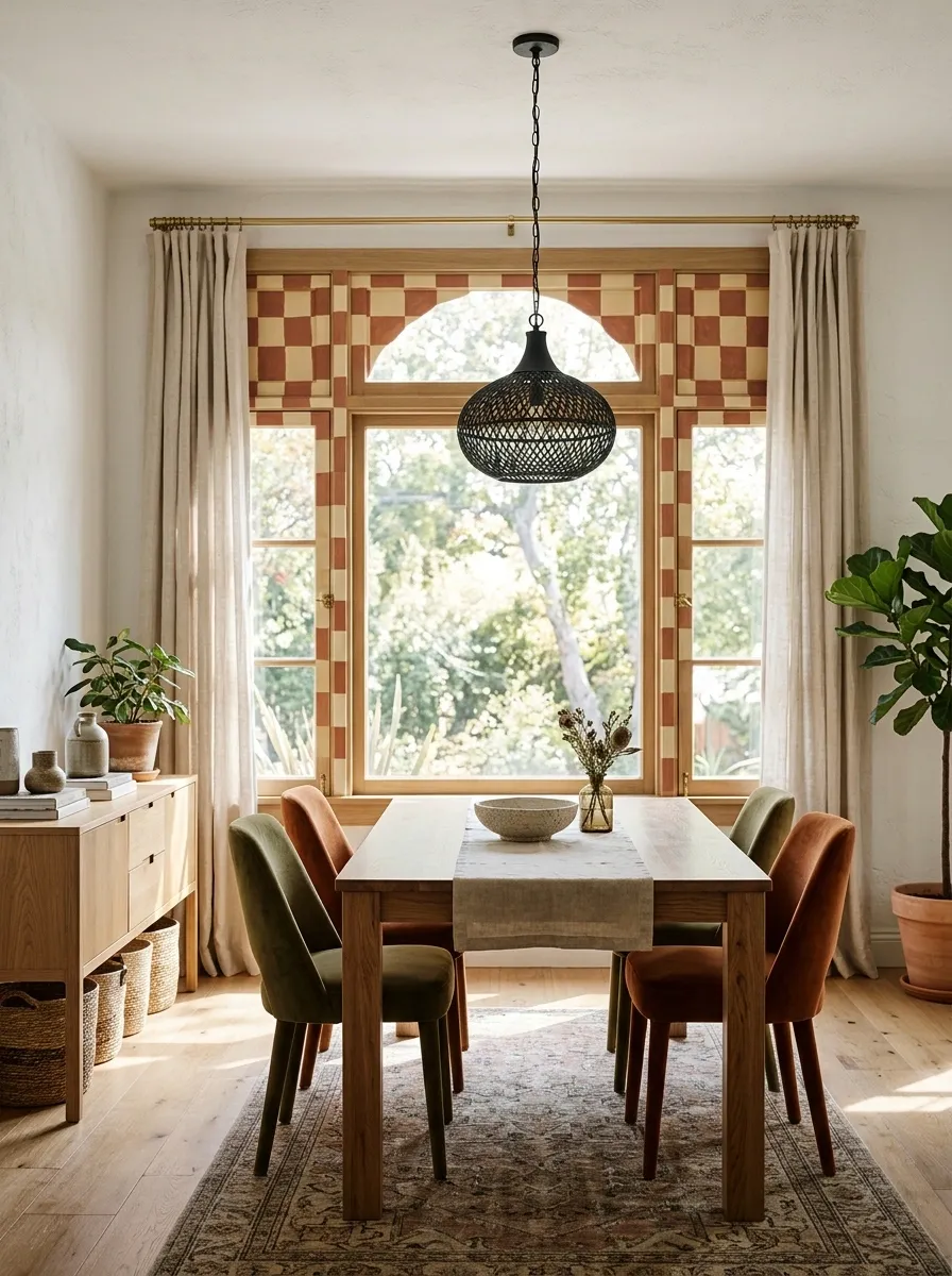
Retro Checkerboard Corners With an Open Center
Concentrate the checkerboard near selected corners or borders, then let it taper off. The pattern should frame the view, not seize control of the entire window.
Checkerboard corners add a retro touch without requiring a full pane of repeating squares. Muted rust and warm cream create a softer vintage combination, while deep green and ivory feel more graphic. The design can follow just the upper corners, extend down the sides, or form an incomplete border around the glass.
The open center is what keeps the pattern from overwhelming the window. A heavier checkerboard at the corners can gradually transition into fewer squares along the sides, producing a more considered finish than a perfectly uniform frame.
This style works well in playful kitchens, eclectic dining spaces, and interiors with vintage accessories. It also pairs nicely with solid-colored curtains and simple hardware. There is already a repeating pattern on the glass, so surrounding it with several competing prints may make the room feel like a very confused chess tournament.
Use a ruler or a removable guide to plan the square spacing before painting. Consistent proportions are especially important because irregular spacing becomes noticeable quickly. Keep the pattern aligned with the window frame, and test the color contrast against the actual daylight conditions.
Art Deco Sunbursts With Repeating Fan Shapes
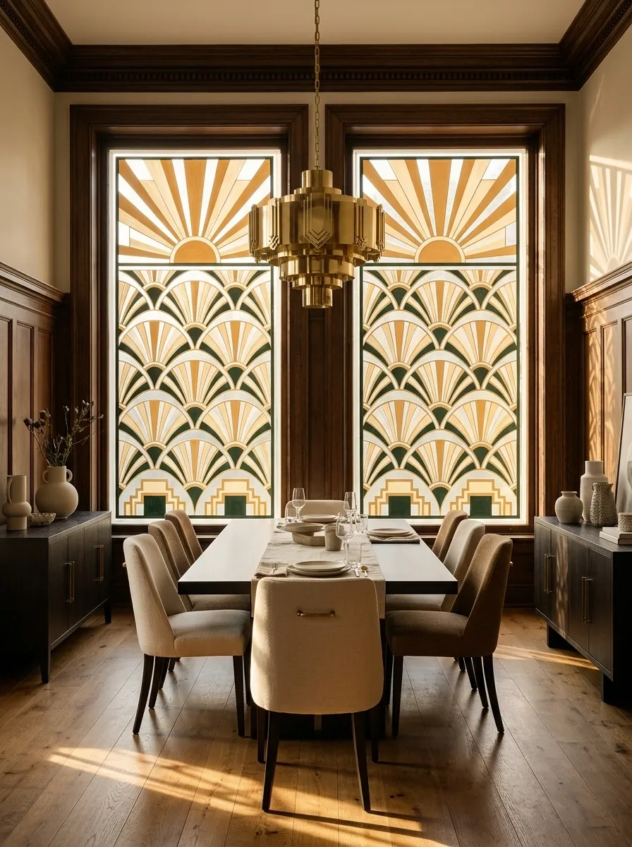
Art Deco Sunbursts With Repeating Fan Shapes
The fan-shaped curves supply the ornament. Restrained colors and clean outlines keep the finished pattern architectural rather than fussy.
Art Deco window painting leans into symmetry, stepped geometry, and repeated fan shapes. A sunburst can rise from the bottom of a tall pane, while nested curves spread outward in balanced layers. The result feels architectural and polished, especially when the colors stay limited to ochre, warm cream, and dark green or black.
Unlike loose botanical artwork, this design depends on deliberate spacing. The central axis should be clear, the curves should repeat at consistent intervals, and the surrounding shapes should support the main fan rather than crowd it.
The pattern works well in period-inspired homes, formal dining areas, and rooms with dark wood or brass details. It can also add a strong focal point to an otherwise plain contemporary interior, provided the surrounding decor remains relatively simple.
Plan the design on paper before painting the glass, particularly when the window contains several narrow panes. A fan that is accidentally cut off by the frame can look unbalanced unless that interruption is part of the composition. The goal is intentional symmetry, not an art-deco sunburst that appears to have lost an argument with a ruler.
Terrazzo-Inspired Speckles in a Colorful Lower Glass Band
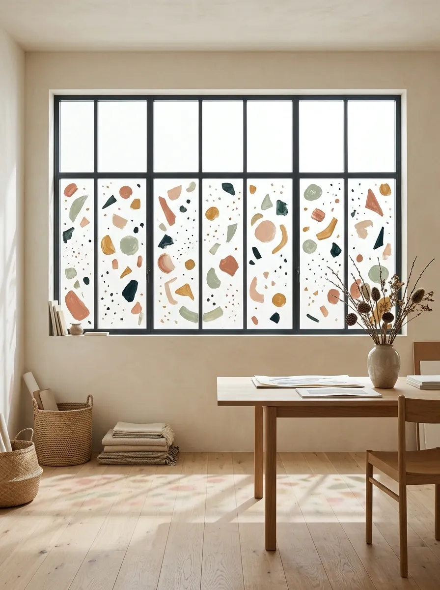
Terrazzo-Inspired Speckles in a Colorful Lower Glass Band
Keep the speckles mostly below the halfway point. Mix larger fragments with smaller marks and leave visible gaps. The design needs rhythm, not a glass pane experiencing a confetti-related emergency.
Terrazzo-inspired window painting borrows the playful speckled look of terrazzo flooring and applies it to glass. Irregular fragments in muted peach, sage, ochre, and deep green create a decorative band along the lower portion of the window, leaving the upper area open and bright.
The charm comes from variation. Some pieces should be long and narrow, others rounded or angular, with enough empty space to distinguish individual shapes. Keep the larger fragments relatively limited so they anchor the pattern without turning the whole window into a collection of oversized blobs.
This design suits contemporary kitchens, creative workspaces, and casual dining areas, especially when the room already contains a few colors from the painted palette. It also works nicely with simple furniture and understated wall finishes.
The lower band can be restrained or extend higher for a stronger graphic effect. Just keep the distribution intentional. Randomness looks artistic when it has some visual balance, which is an annoying but important distinction.
Crescent Moons and Constellations on a Bedroom Window
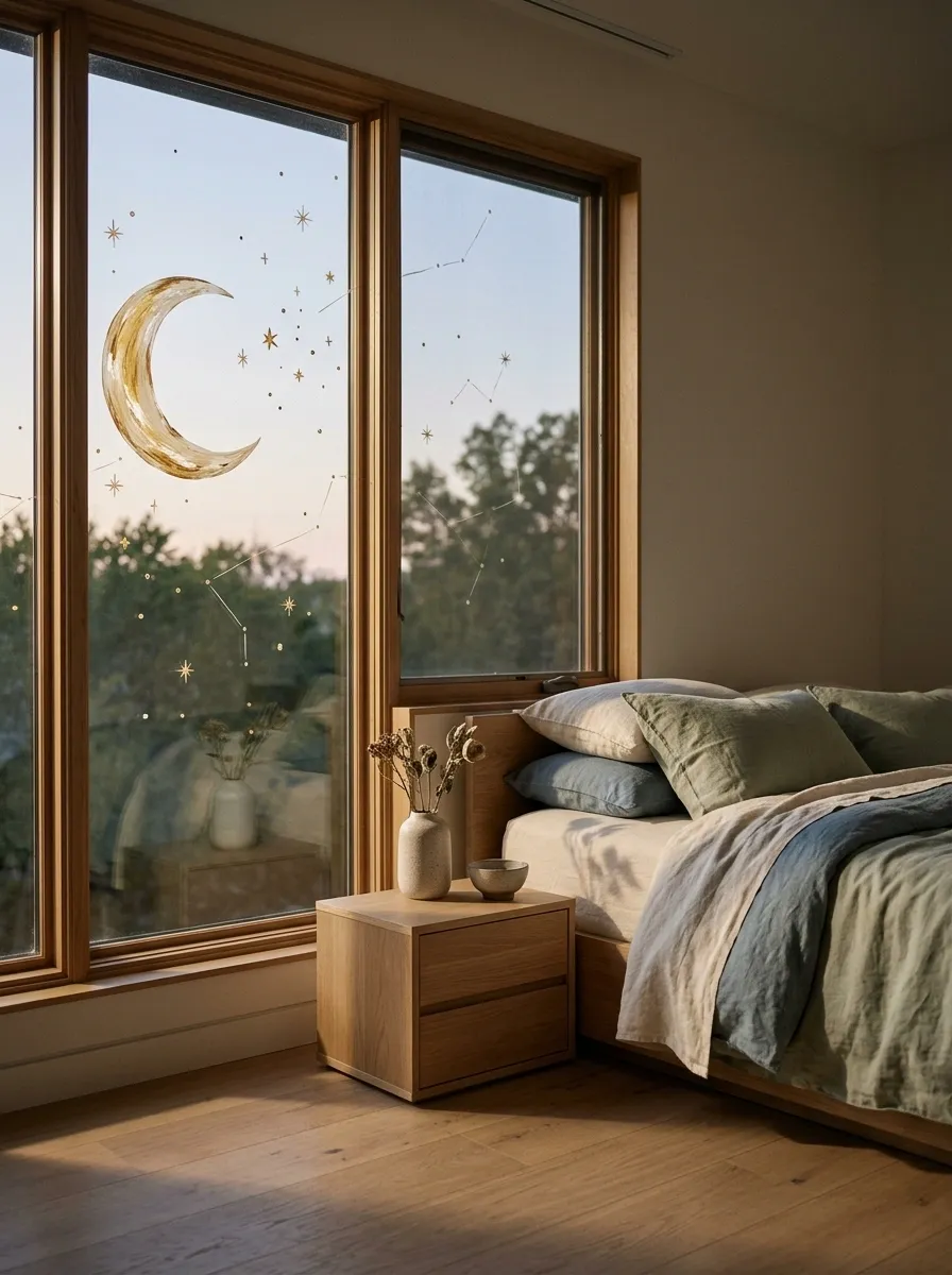
Crescent Moons and Constellations on a Bedroom Window
Celestial window painting can give a bedroom a dreamy atmosphere without covering the glass in oversized planets and an entire astronomy textbook. A prominent crescent moon, a few scattered stars, and delicate constellation lines create a quieter composition that works especially well against evening light.
Gold and warm ivory details provide contrast against darker surroundings, while dusty blue or muted green can create a softer interpretation. The stars should vary in size and spacing, with a few clusters drawing attention and larger gaps keeping the scene from looking crowded.
This concept works well in bedrooms, reading nooks, and small creative spaces. It can also be adapted for a child’s room without relying on cartoon-style illustrations. Keep the moon as the main focal point and use the constellations as supporting details.
The design looks best when the celestial elements appear to drift naturally across the panes. A rigid grid of identical stars can make the whole sky feel suspiciously scheduled. Use thin, consistent linework, and avoid placing important shapes directly over window hardware or divisions that interrupt the composition.
Layered Mountain Silhouettes Beneath a Painted Sunrise
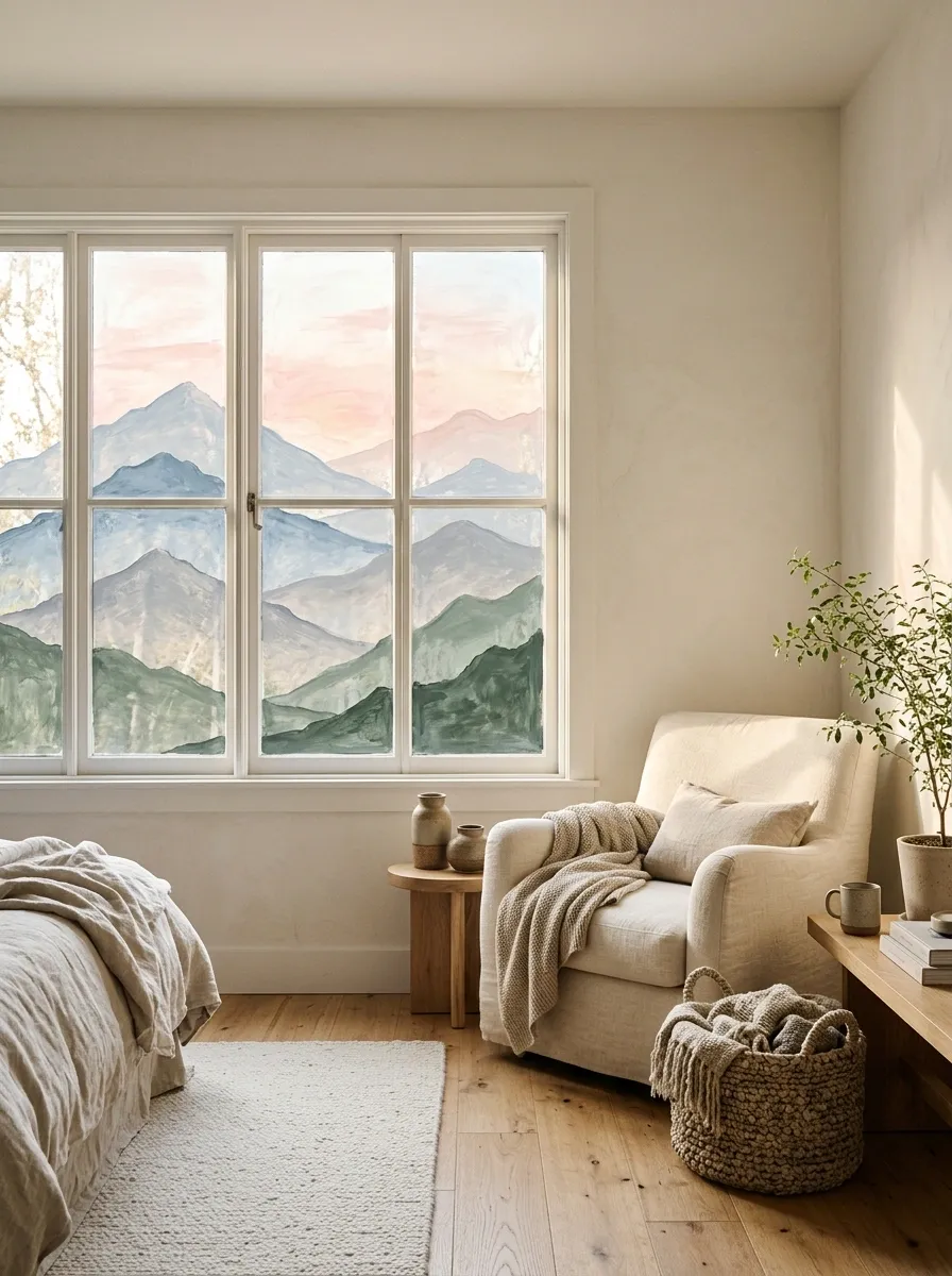
Layered Mountain Silhouettes Beneath a Painted Sunrise
Lighter distant mountains and darker foreground peaks create depth. One flat zigzag line is a logo. Several thoughtfully layered ridges become a landscape.
Mountain landscape painting turns a large window into a panoramic scene. Pale distant peaks sit against a peach sunrise, while darker foreground mountains provide definition along the lower glass. The layered effect makes the picture feel deeper than a single row of triangular outlines.
Warm pink, dusty blue, soft gray, and muted green suit this style particularly well. Keep the sun slightly off-center and vary the mountain heights so the horizon does not look mechanically repeated. Snow details can be added to selected peaks, but they should follow the mountain shapes rather than appearing as identical white caps.
This concept suits bedrooms, reading nooks, and rooms with a calm, nature-inspired palette. It can be especially effective on a wide window because the continuous landscape has room to develop across several panes.
Plan the major ridgelines before adding small details. The lightest colors should generally sit farther back, while the darkest shapes anchor the foreground. Too many competing mountain layers can make the painting visually muddy, especially when viewed from outside. A small number of distinct silhouettes will often communicate the scene more clearly than an exhaustive inventory of every peak in the imaginary range.
Desert Sunset With Layered Cacti and Warm Horizon Bands
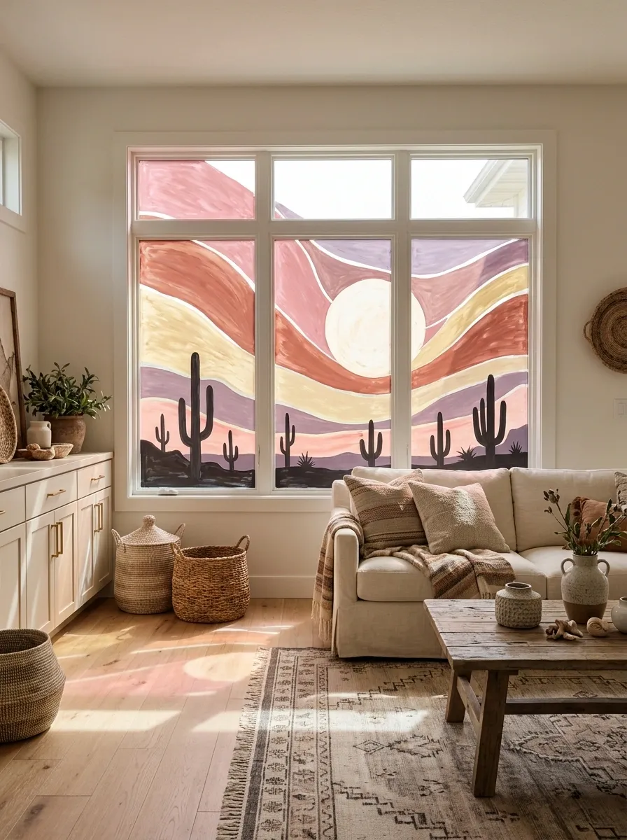
Desert Sunset With Layered Cacti and Warm Horizon Bands
Warm sky bands establish the atmosphere; dark cactus silhouettes ground the scene. Keep the foreground shapes crisp instead of adding so many details that the desert needs its own table of contents.
A desert sunset gives window painting a bold, graphic direction with warm colors and recognizable silhouettes. Bands of dusty pink, terracotta, pale gold, and muted purple form the sky, while cacti and distant hills anchor the bottom of the composition.
The appeal comes from the contrast between broad, relatively simple color fields and sharply defined foreground shapes. A large sun can provide the focal point, but placing it slightly off-center keeps the design from feeling too symmetrical. Cacti of different heights give the horizon variety, and a restrained palette helps the colors remain connected.
This artwork suits creative studios, casual living rooms, and bedrooms with Southwestern or desert-inspired details. Natural wood, woven textures, and cream-colored furnishings can echo the warmth of the painting without competing with it.
Compared with the layered mountain scene, this design feels more graphic and saturated. It relies on clear silhouettes rather than delicate landscape details. Keep the cactus shapes recognizable, leave adequate spacing between them, and make sure the sunset bands remain visible as distinct layers. A successful desert scene should have atmosphere, not look like someone accidentally dragged a paint roller through an orange gradient.
Woodland Mushrooms and Tiny Foliage in a Cottage Window
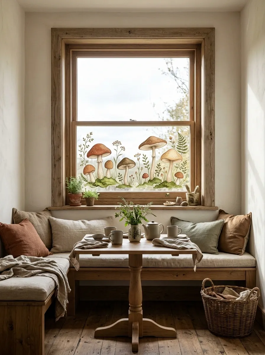
Woodland Mushrooms and Tiny Foliage in a Cottage Window
Woodland mushrooms bring a storybook quality to cottage-style windows. Rounded mushroom caps, slender stems, small leaves, and patches of moss can create an illustrated woodland floor along the lower glass. The composition feels more complete when the mushrooms vary in size and cluster naturally instead of appearing in a perfectly spaced lineup.
Rust, earthy brown, muted sage, and warm ivory suit the woodland palette. A few larger mushrooms can anchor the scene while smaller ones appear between foliage clusters. Tiny dots on selected caps add character, but giving every mushroom the exact same markings can make the artwork feel more like a repeated stamp than a miniature forest.
This design works well in breakfast nooks, cottage kitchens, children’s spaces, and rooms with natural wood finishes. It pairs particularly nicely with linen, woven baskets, and simple botanical accessories.
Keep the woodland floor relatively low so the upper pane remains open. That contrast between detailed foreground and clear glass makes the scene feel lighter and more intentional. Foliage should connect the groups without filling every available gap. The tiny imaginary forest is charming enough without needing to occupy the entire neighborhood.
Spring Tulip Border With Loose Green Stems
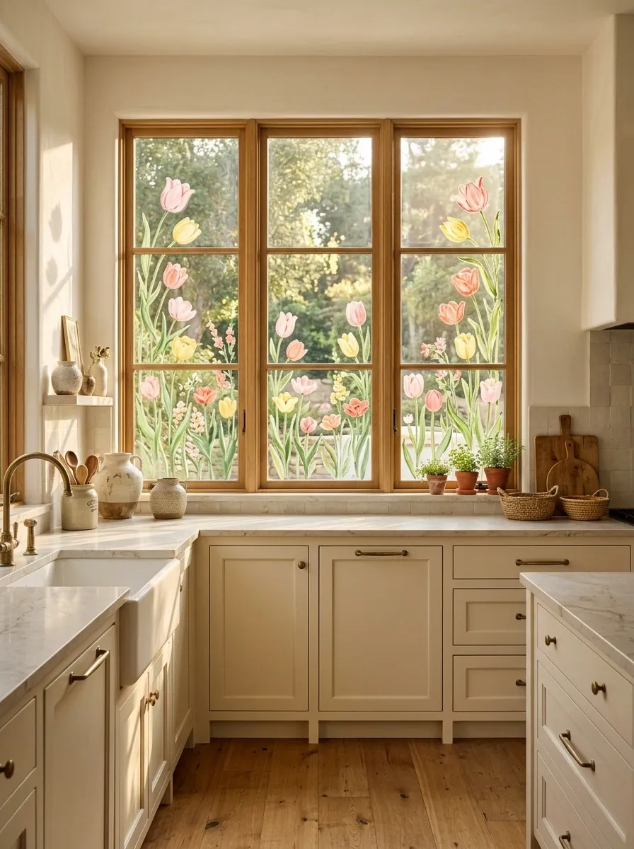
Spring Tulip Border With Loose Green Stems
Tulips make a cheerful window border, particularly when their stems rise to different heights and the blooms vary in color. Rather than forming a uniform row along the bottom, the flowers can create a loose vertical rhythm, with a few taller blooms reaching upward and shorter ones filling selected gaps.
Soft pink, butter yellow, coral, and leafy green are easy to coordinate with spring interiors. A limited palette creates a more sophisticated result than assigning every tulip a different shade just because all the paint bottles are available.
This composition works well in cottage kitchens, breakfast spaces, and bright dining rooms. It is also a useful choice for windows that need a seasonal refresh without a large mural or extensive painted coverage.
The stems should feel connected to the flowers, and the leaves should vary in direction. Leave clear spaces between some clusters to preserve the view and prevent the border from becoming too dense. A little irregularity creates movement, but the overall arrangement should still have a clear visual rhythm.
For a particularly clean result, sketch the flower positions before painting. Tulips are simple shapes, which means uneven spacing and awkward proportions become obvious rather quickly. Nobody wants a window full of flowers that look like they were lined up for a school photograph.
Tropical Monstera Leaves With Oversized Palm Fronds
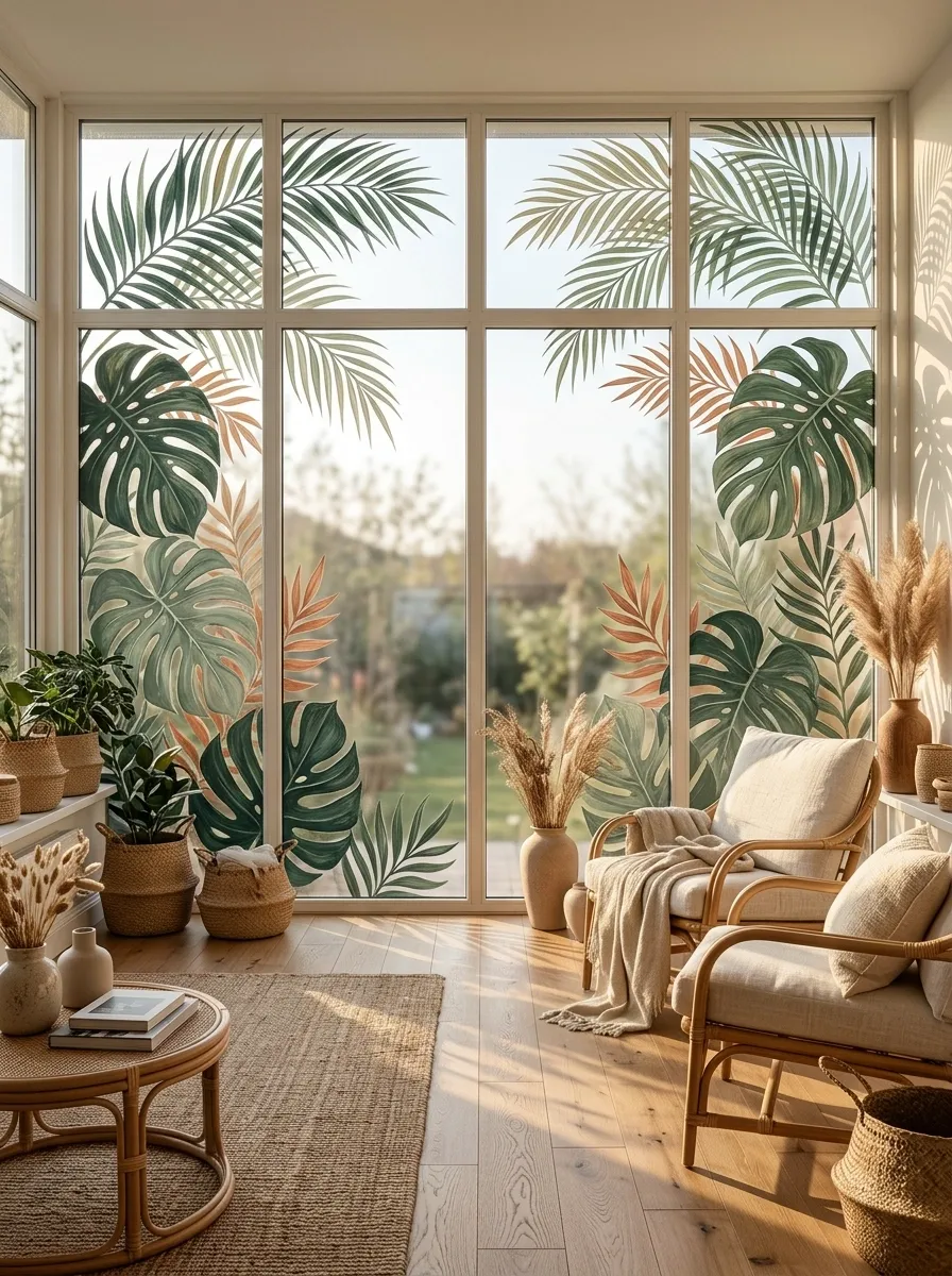
Tropical Monstera Leaves With Oversized Palm Fronds
Oversized leaves establish the shape; smaller details are optional. If every leaf gets equal space and equal importance, the design stops feeling lush and starts looking like a botanical roll call.
Oversized monstera leaves and palm fronds create a lush tropical window painting with a much bolder silhouette than delicate botanical vines. Large split leaves can frame the sides of the glass, while sweeping palm fronds fill selected upper corners. Keeping the center relatively open allows the foliage to feel expansive rather than heavy.
Deep forest green, muted sage, and a few warm terracotta accents work especially well against bright interiors. The leaves should differ in shape and scale, with the monstera forms providing broad focal points and finer palm details adding movement.
This style suits sunrooms, plant-filled living spaces, and interiors with rattan furniture, natural wood, and woven accessories. It can also bring a tropical note to an otherwise plain room without adding more physical plants to an already crowded windowsill.
Large foliage needs careful placement. The strongest leaves should anchor the composition, and the smaller ones should guide the eye between them. Avoid drawing every leaf in full detail, especially when the window is narrow. Some shapes can overlap or disappear beyond the frame to make the artwork feel more natural.
The objective is a connected tropical composition, not an inventory of every leaf in the rainforest. Give the large silhouettes room to stand out and let the remaining glass do its job.
Butterflies Following a Diagonal Flight Path
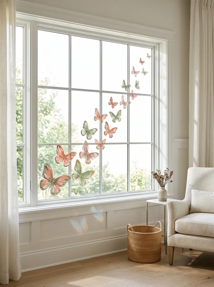
Butterflies Following a Diagonal Flight Path
Butterflies following a diagonal path create movement across otherwise plain window glass. Instead of placing identical butterflies at evenly spaced intervals, vary their size, wing shape, and spacing so the group appears to drift naturally from one corner toward the opposite side.
Muted coral, dusty pink, sage, and soft gold create a gentle spring palette. A few larger butterflies near the starting point can anchor the design, while smaller ones gradually move upward. Their changing scale gives the composition a sense of distance without requiring a detailed background.
This idea works particularly well in bedrooms, reading corners, and light-filled creative spaces. It also suits windows that need a decorative accent while preserving most of the outdoor view.
The diagonal direction matters more than the number of butterflies. A clear flow makes the artwork feel intentional, whereas butterflies scattered randomly across the pane can lose their visual connection. Keep some sections almost empty and resist the temptation to add flowers, clouds, stars, and several unrelated decorative motifs just because there is room for them.
A handful of well-placed butterflies can carry the entire composition. The glass does not need a full insect convention to make the point.
Hand-Painted Herb Sprigs With Small Botanical Labels
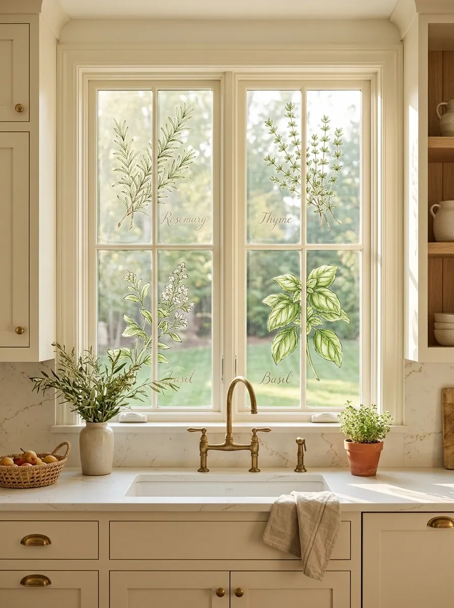
Hand-Painted Herb Sprigs With Small Botanical Labels
Give each herb its own breathing room and keep the lettering simple. The kitchen window is not a botanical dissertation with a garnish problem.
Herb illustrations bring a natural, slightly old-fashioned character to a kitchen window. Rosemary, thyme, and basil can appear as separate sprigs with fine stems, distinct leaf shapes, and small handwritten-style labels. Together, they form a cohesive botanical arrangement that feels connected to the room rather than like random greenery added for decoration.
Keep the lettering understated and leave room around each illustration. Deep green stems against clear glass create a subtle effect, while muted sage and a little warm terracotta add color without making the design too busy. The artwork looks especially appealing above a kitchen sink or beside a breakfast nook.
Natural wood, cream cabinetry, and simple ceramic accessories work well with this look. The window can feel like an extension of a kitchen herb garden without requiring extra pots on an already overcrowded sill.
Accuracy matters here. Rosemary, basil, and thyme have different leaf shapes, so the illustrations should reflect those differences. If labels are included, make them readable from the room rather than squeezing tiny lettering beside every stem. Decorative writing is lovely until it becomes an eyesight exam nobody signed up for.
Evergreen Sprigs, Red Berries, and Snowflakes
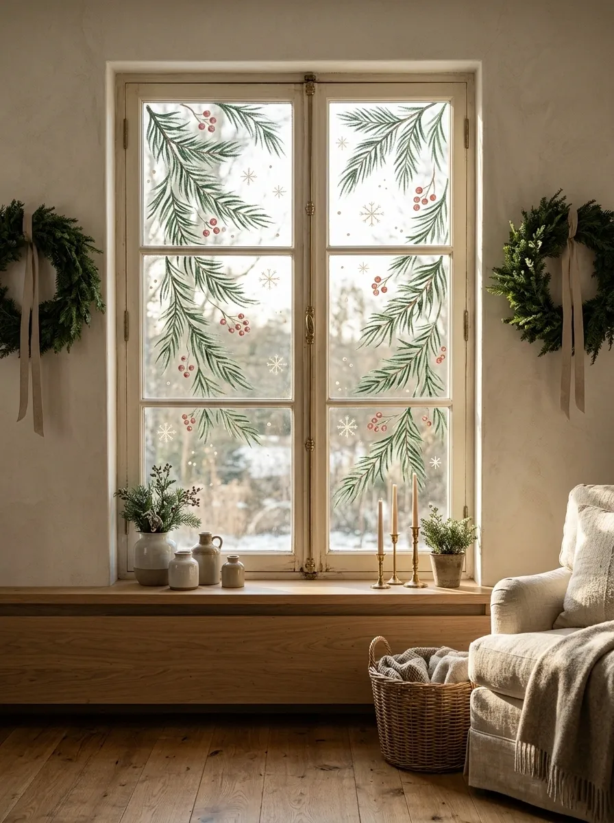
Evergreen Sprigs, Red Berries, and Snowflakes
Evergreen gives the design its structure, red berries supply contrast, and snowflakes provide the finishing detail. Three coordinated elements are festive. Fifteen unrelated holiday motifs are a committee meeting.
Evergreen branches, red berries, and delicate snowflakes create a classic winter window painting with enough detail to feel festive without taking over the room. The strongest composition begins in the upper corners or along the sides, where branches can curve naturally into the window. Small berry clusters add color, and a few snowflakes fill selected gaps.
Forest green, muted red, and warm white keep the palette traditional but restrained. The branches should vary in length and direction rather than forming two perfectly matching arrangements. A slightly irregular composition looks more natural, especially when the painted details follow the proportions of the window.
This design works well in living rooms, dining spaces, and cottage-style kitchens during the holiday season. It can sit alongside simple wreaths, natural greenery, and warm textiles without creating visual competition.
Keep the larger evergreen shapes near the edges and leave clear glass between the branches. That preserves daylight while allowing the artwork to read as one continuous arrangement. Snowflakes should support the composition, not fill every empty patch simply because the paintbrush is still wet. Even Christmas decor needs boundaries.
Choose glass-compatible paint and check whether the product is removable before starting. That practical detail matters when the holiday season ends and the window is expected to return to normal without requiring an archaeological excavation.
Snowy Village Silhouettes With Glowing Painted Windows
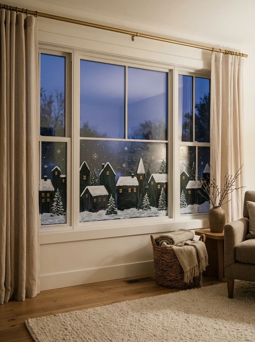
Snowy Village Silhouettes With Glowing Painted Windows
Different building heights give the village a believable skyline.
Warm windows provide contrast against the dark silhouettes.
A painted winter village turns the lower half of a window into a small seasonal landscape. Clustered houses with snowy roofs sit against a dusky background, while little golden window squares suggest warm interiors. A few trees and scattered snowflakes can connect the buildings without distracting from the skyline.
The composition works best when the houses vary in height and width. One taller building can anchor the center, with smaller cottages stepping down on either side. The snow should follow the rooflines rather than form one perfectly flat white strip across every building.
Deep forest green, charcoal, warm ivory, and muted gold create a clear contrast. The dark silhouettes give the village definition, while golden details provide focal points. It is a more immersive design than a simple evergreen border because the artwork creates an entire scene.
This idea suits broad living room windows, dining areas, and family spaces decorated for winter. It works especially well when viewed from indoors after dark, although the visual effect depends on the lighting behind and around the glass.
Leave a little open space above the village so the scene has a sense of distance. Vary the rooftops, position the trees at different heights, and avoid making every cottage identical. A charming village has character. Cloned houses in formation look less like a snowy Christmas scene and more like a suspiciously efficient real estate development.
Haunted House Silhouettes Beneath a Halloween Moon
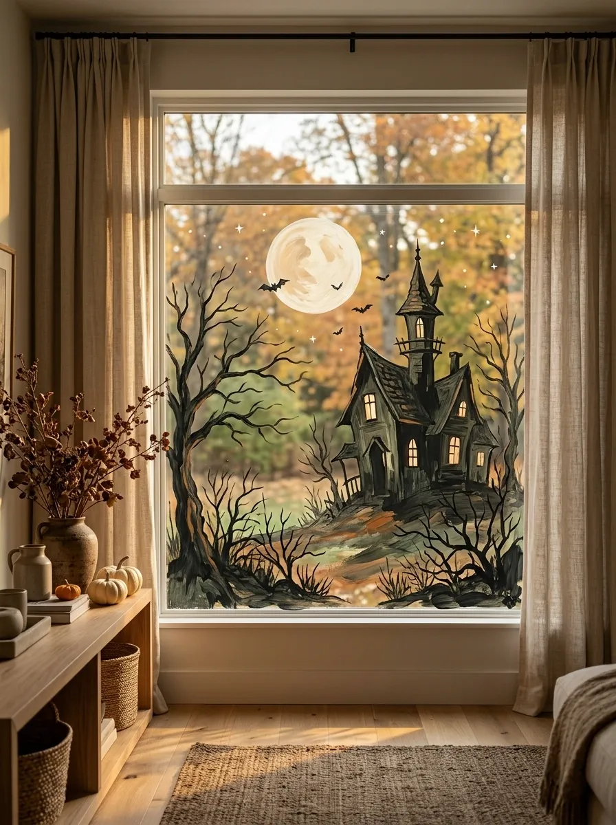
Haunted House Silhouettes Beneath a Halloween Moon
Use the dark skyline as the focal point and keep the smaller bats, stars, and branches secondary. Halloween already has a reputation for doing too much.
A haunted house silhouette beneath a pale moon creates a complete Halloween scene without requiring an overwhelming collection of seasonal decorations. The house can feature steep rooflines, a narrow tower, a few warm windows, and surrounding bare trees. Bats and small stars give the scene atmosphere while preserving a readable outline.
Charcoal, deep green, muted orange, and warm ivory form a restrained palette. The moon should remain a clear focal point, while the house anchors the lower part of the window. Slightly uneven rooflines create a spooky character, but the structure should still feel like a plausible illustration rather than a building that lost a fight with gravity.
This style works well in front-facing living room windows, playrooms, and spaces decorated for autumn. It is particularly effective on a broad pane where the house and surrounding trees can form a continuous landscape.
Avoid scattering bats across every available space. A few carefully positioned silhouettes look more intentional than an entire colony competing with the moon. The same goes for spiderwebs, pumpkins, ghosts, and extra lettering. Choose a primary scene and let the supporting elements do their jobs.
If the design needs to be removed after the holiday, check the paint’s compatibility with glass and follow the product’s removal guidance. The goal is a fun seasonal window, not a Halloween decoration that becomes a permanent resident.
Pumpkins and Golden Leaves for an Autumn Harvest Window
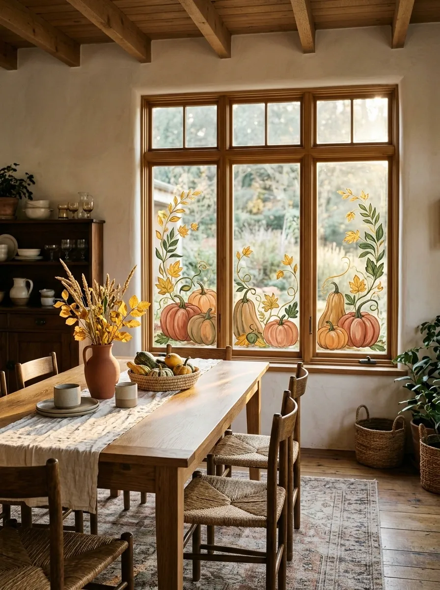
Pumpkins and Golden Leaves for an Autumn Harvest Window
Pumpkins, trailing vines, and golden leaves create an autumn harvest window with a fuller, more grounded composition than a simple scattering of painted leaves. Pumpkins of different sizes sit along the bottom edge, while curling stems and leaf clusters rise around them to connect the arrangement.
Terracotta, muted orange, ochre, and forest green create a classic seasonal palette. Use a few larger pumpkins as the main anchors, then place smaller leaves and stems around them. Variations in shape help the scene feel natural, while a clear baseline makes the pumpkins appear to sit together rather than float independently across the glass.
This design works particularly well in kitchen windows, dining areas, and cottage-style living spaces during autumn. It pairs easily with natural wood, woven textures, warm textiles, and understated seasonal accessories.
Keep the decorative foliage lighter than the pumpkins so the main shapes remain recognizable. A scattering of leaves can fill selected gaps, but an elaborate tangle of vines may obscure the composition and make the window feel crowded. Seasonal design should complement the room, not demand that every nearby surface join the harvest festival.
The lower placement also leaves more of the upper window clear for daylight. Before painting, sketch the pumpkin arrangement and check that the sizes work with the proportions of the glass. A carefully grouped harvest scene feels intentional, while a row of identical pumpkins can resemble a supermarket display with a surprisingly ambitious marketing budget.
Coastal Waves With Small Sailboats on Blue Glass
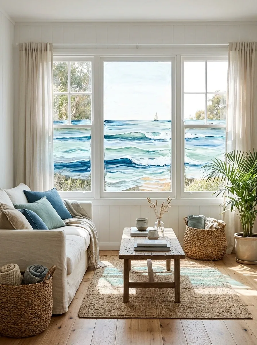
Coastal Waves With Small Sailboats on Blue Glass
Let the wave shapes overlap without forming identical stripes. The sailboats should remain small enough to support the landscape rather than become the entire personality of the window.
A coastal window painting can bring the feeling of a quiet seaside morning into a room, even when the nearest beach is nowhere remotely convenient. Layered blue waves stretch across the lower glass, white foam follows their curves, and a small sailboat sits against an open, pale sky.
The colors work best when they move gradually from light blue-green to deeper ocean blue. A few crisp white lines suggest movement, while the boat provides a small focal point. Keep the upper portion relatively unpainted so the whole scene does not become a solid blue panel.
This design suits bathrooms, sunrooms, beach-inspired bedrooms, and relaxed living spaces. Natural wood, cream textiles, and woven accessories complement the coastal palette without requiring every object in the room to feature an anchor.
The wave contours should vary in height and curvature. Perfectly parallel stripes look graphic, but they do not create the same sense of water moving across the window. Let the larger waves carry the composition, then use thinner foam lines sparingly. The goal is a believable painted seascape, not a weather forecast trying to escape its screen.
Small Café-Style Lettering With Coffee and Botanical Details
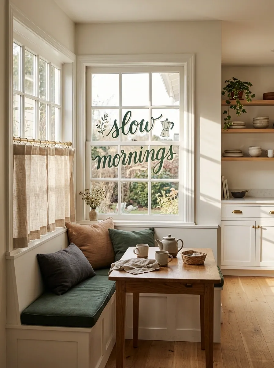
Small Café-Style Lettering With Coffee and Botanical Details
A small café-inspired design can make a kitchen or breakfast nook feel more personal without covering the glass in oversized slogans. Short lettering, a little botanical illustration, and perhaps a small coffee-related motif create a composition that feels like a neighborhood café rather than a menu pasted onto a window.
Deep green, charcoal, warm ivory, and muted terracotta work well together. The lettering should remain the main feature, with any decorative leaves or coffee beans acting as supporting details. Keep the phrase concise so it can be read comfortably from the room.
This style pairs naturally with open shelving, wooden tables, simple ceramic cups, and understated kitchen accessories. It can also work beside a small breakfast counter where the window already serves as a natural focal point.
Typography needs more attention than the decorative accents. Use a clear lettering style, sensible spacing, and enough contrast against the glass. Intricate script can become difficult to read when the background changes throughout the day.
The phrase itself should suit the space. A short coffee joke may feel appropriate in a breakfast nook, while an elaborate paragraph about the sanctity of caffeine probably belongs somewhere else. Nobody needs to read a manifesto before finding the kettle.
Rainbow Arches With a Stained-Glass-Inspired Finish
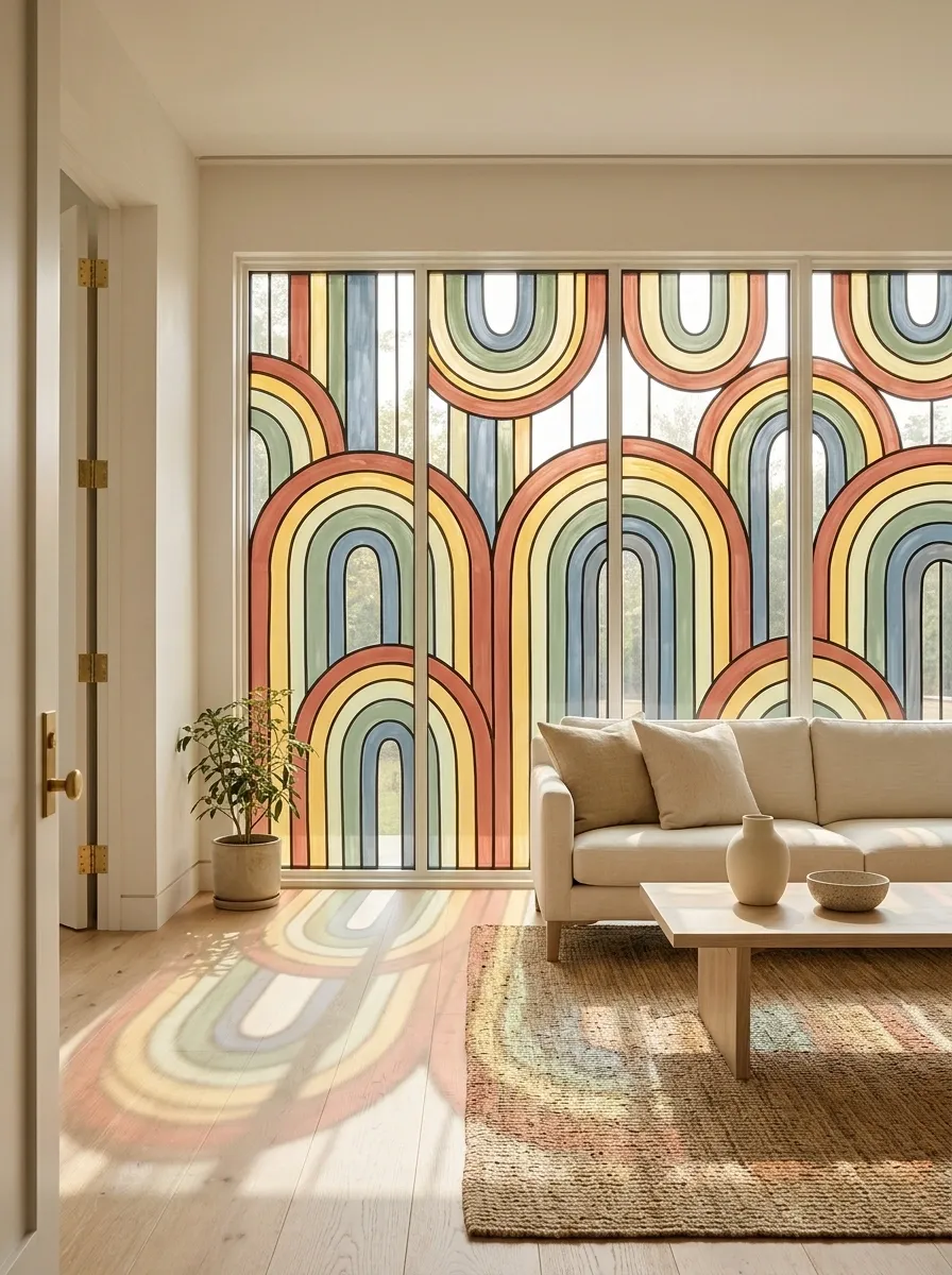
Rainbow Arches With a Stained-Glass-Inspired Finish
Keep the bands consistent in thickness.
Let the shapes create the interest.
The stained-glass impression comes from distinct color bands and a strong outline. Actual glass does not magically become stained glass because paint has ambitions.
Rainbow arches can give a window a colorful architectural feature without relying on a conventional landscape or floral illustration. Nested bands of terracotta, warm yellow, sage, and dusty blue create a structured composition that feels closer to abstract glass art than a nursery rainbow.
Consistent band thickness is the detail that makes this design work. Each arch should follow the shape of the previous one, with clean curves and a clear base. Uneven spacing can disrupt the entire arrangement, particularly when the artwork occupies the center of a large pane.
This look suits modern living spaces, bright studios, creative workrooms, and rooms with simple furniture. It pairs well with warm neutrals and natural materials because the painted window already supplies a clear burst of color.
The level of transparency should be planned before the painting begins. Translucent finishes can allow more light through, while opaque paint produces a more graphic result. Neither is identical to actual stained glass, so the intended effect should match the paint product’s capabilities.
Avoid adding extra motifs unless they improve the composition. The nested arches supply enough rhythm on their own. A few well-balanced colors and consistent curves will look more refined than an assortment of stars, flowers, dots, and decorative lettering fighting for space.
Irregular Jewel-Tone Mosaic Across Divided Windowpanes
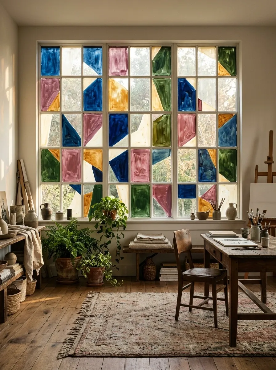
Irregular Jewel-Tone Mosaic Across Divided Windowpanes
A jewel-tone mosaic creates a dramatic window painting through irregular geometric sections rather than symmetrical arches or traditional floral details. Deep blue, muted berry, amber, green, and small areas of warm ivory form an arrangement of contrasting shapes. The result can feel artistic and slightly vintage, particularly on a window with multiple panes.
The important distinction is that the shapes should vary without feeling disconnected. A few larger color fields establish the composition, while smaller fragments provide balance. Dark outlines or the window’s existing divisions can help organize the artwork, but adding heavy borders to every shape may make the design look unnecessarily busy.
This idea works well in eclectic homes, creative studios, and interiors with rich wood tones or carefully chosen accent colors. On a large window, the mosaic can become the main focal point. On a small window, a simplified arrangement will usually look more balanced.
Because this design uses more substantial areas of color, decide how much transparency should remain before painting. A mosaic that covers most of the pane creates a very different atmosphere from one that uses selected colored sections with clear glass in between.
Keep the palette coordinated and avoid giving every section an unrelated color. Jewel tones already create plenty of contrast. The goal is a connected composition that looks intentional from a distance, not a bag of stained-glass offcuts that somehow gained voting rights.
Make the Finished Window Feel Intentional
The difference between a window that looks thoughtfully painted and one that looks improvised usually comes down to composition. A small botanical border needs well-placed leaves. A geometric design needs consistent spacing. A complete landscape needs layers that make sense together. The artwork can be elaborate or restrained, but the individual elements should feel like they belong in the same picture.
Before painting, consider how the design will look in daylight, what the room needs from the window, and whether the finish should be opaque or translucent. Check that the product is suitable for glass and follow its preparation and removal instructions. These practical decisions matter just as much as choosing the colors.
Most importantly, resist the urge to fill every empty patch. Clear glass can be part of the artwork, and a little breathing room often makes the finished composition look more polished.