
That awkward strip above the kitchen cabinets can either disappear into the architecture or become the part of the room that looks most obviously unfinished.
The difference usually isn’t a matter of finding more things to put there. It comes down to scale, proportion, color, and whether the upper space actually belongs to the visual language of the kitchen.
A cabinet-top display can easily become a row of undersized objects with no connection to the room below. On the other hand, leaving the area completely bare can look wonderfully intentional when the kitchen already has strong proportions and enough architectural detail.
The right answer depends on the room.
Designs for the Space Above the Cabinets
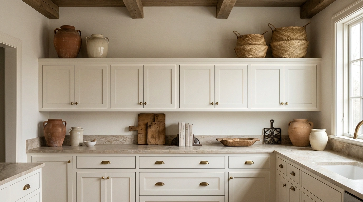
Warm Cream Kitchen With Tonal Pottery Above the Cabinets

A warm cream kitchen gains a softer, more finished silhouette when the cabinet-top space carries the same earthy palette as the room below. Handmade pottery in ivory, sand, clay, and muted beige creates a quiet collection rather than a row of unrelated accessories. A little warm oak, a stone counter, and aged brass keep the palette from becoming flat.
The strongest version uses vessels with different heights but similar visual weight. A few pieces can sit close together while larger areas of the cabinet run remain open. That breathing room matters. The arrangement feels collected because the colors repeat without making every object match.
The finished effect is warm, calm, and architectural, with the pottery acting as a soft bridge between the cabinetry and ceiling.
Minimal White Kitchen With One Long Architectural Arrangement
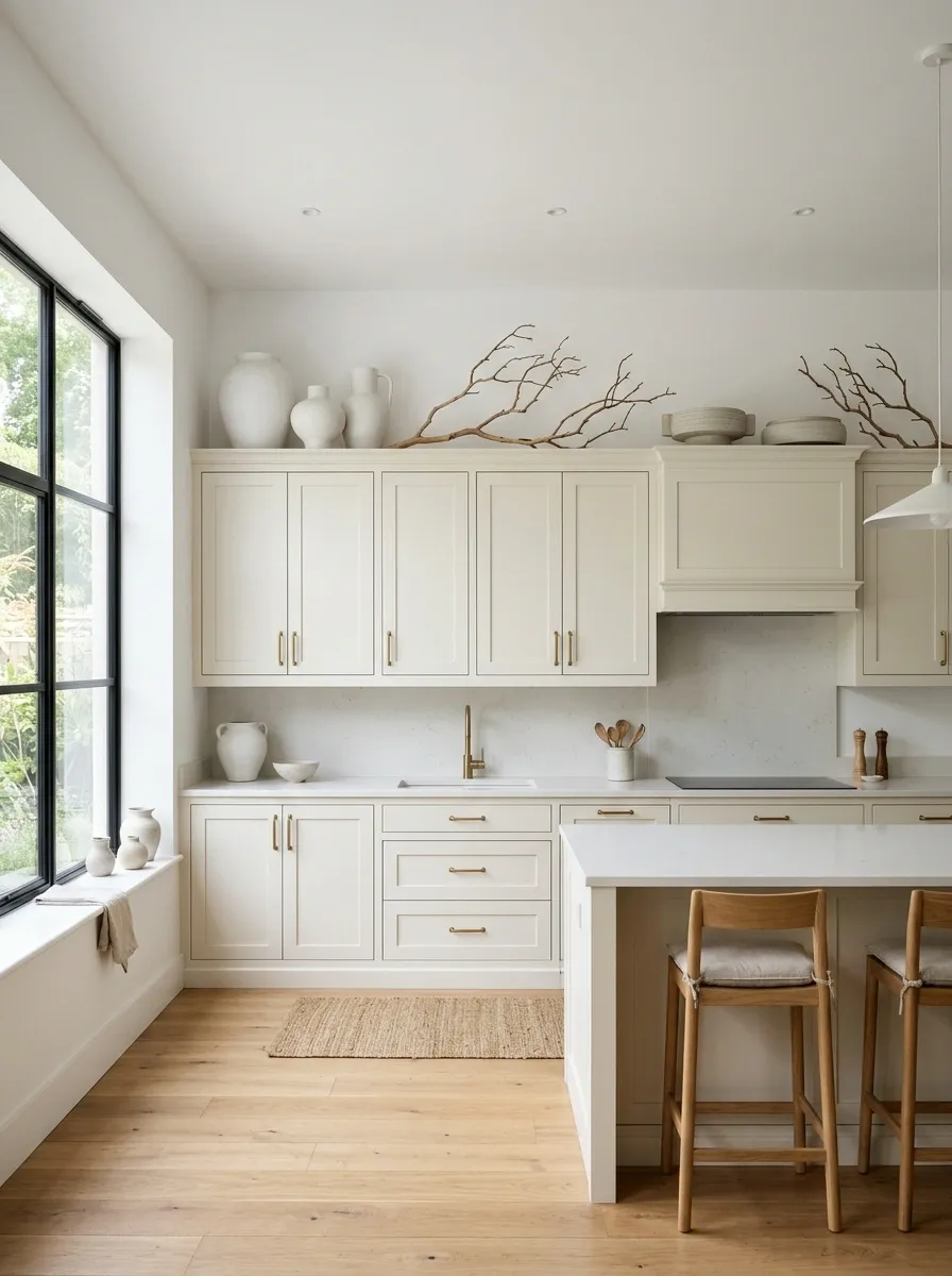
A large white kitchen does not need a collection of small objects scattered across the cabinet tops. One continuous arrangement can be far more effective. Oversized matte ceramic forms, long branches, and one or two low horizontal pieces create a visual line that follows the architecture of the kitchen.
This approach works because the display reads as one composition from a distance. The eye sees continuity before it notices individual objects. White walls and cabinetry keep the background quiet, while natural wood and soft stone introduce enough warmth to prevent the room from looking stark.
The gap remains partly open, which is important. Filling every inch would weaken the minimalist character. Here, restraint is what makes the upper zone look intentional.
Natural Wood Kitchen With Woven Texture and Greenery

Warm oak cabinetry, pale stone, woven baskets, linen-colored textiles, and trailing greenery create a softer treatment for the space above the cabinets. The look works because each material has a different texture while staying within a narrow natural palette.
A couple of woven baskets provide volume without introducing hard visual edges. Ceramic vessels add smoother surfaces, while greenery breaks up the warm neutrals with an organic shape. The lower cabinets and counters remain relatively simple so the upper composition does not become cluttered.
This kind of kitchen benefits from varied heights. Taller branches can sit toward one end, with lower baskets and vessels flowing across the remaining space. The result feels relaxed without looking random.
Traditional Kitchen With Architectural Paneling Above the Cabinets
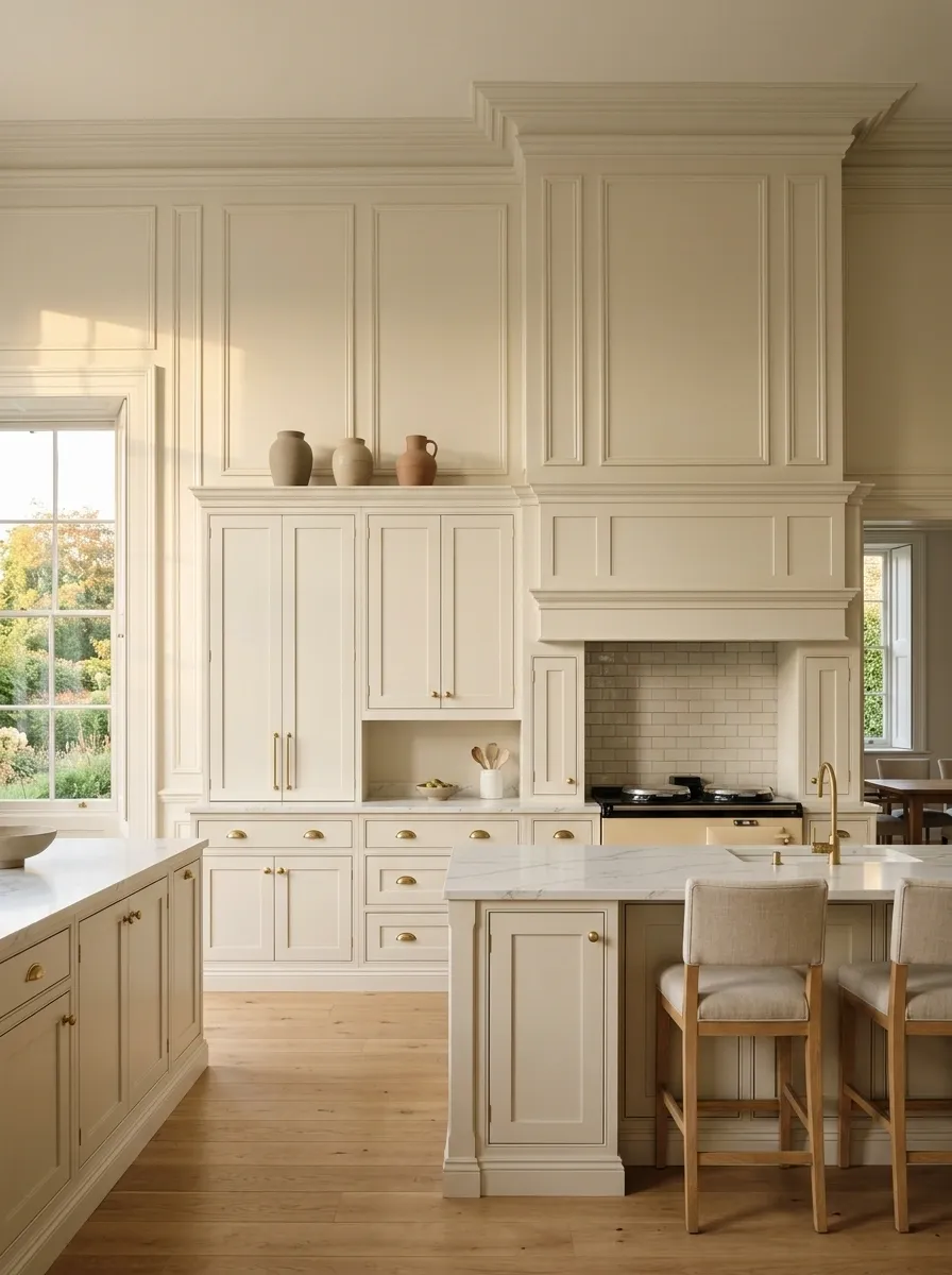
Some kitchens look more finished when the space above the cabinets is treated as architecture rather than decoration. Traditional painted cabinetry, crown molding, and shallow paneling can visually extend the cabinet run toward the ceiling and make the entire upper wall feel intentional.
The beauty of this approach is its restraint. Instead of filling the gap with baskets and pottery, the cabinetry becomes the main feature. A few understated ceramics can still appear in wider sections, but they remain secondary to the trim and paneling.
This composition is particularly convincing in kitchens with classic proportions, substantial ceiling height, and existing architectural details. The transition from cabinet to ceiling feels designed from the start, rather than styled after the fact.
Soft Blue Kitchen With Oversized Framed Art
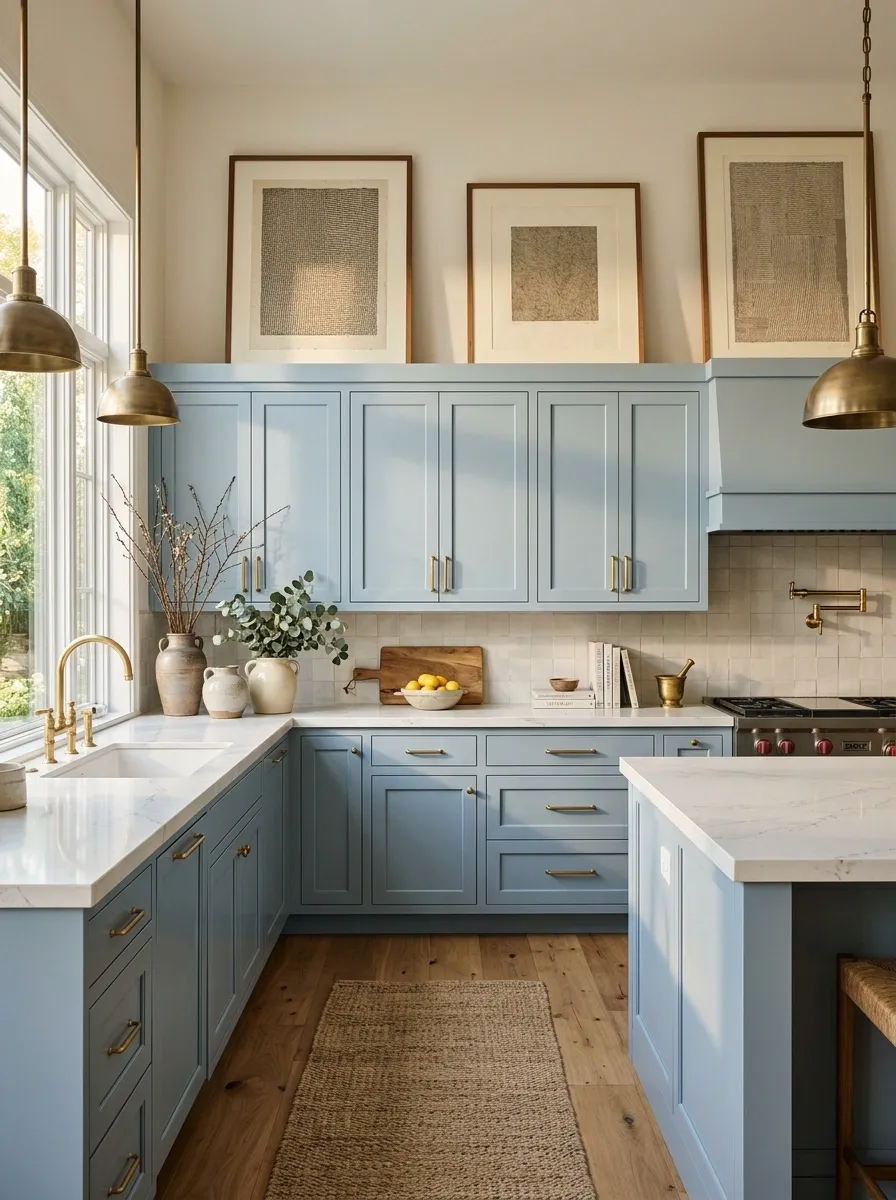
Soft blue cabinetry creates a calm backdrop for a more artful treatment above the cabinets. Instead of filling the entire gap with small accessories, a few oversized framed pieces create a strong visual statement while keeping the composition light.
Warm wood frames help connect the artwork to nearby flooring or furniture, while creamy mats echo the counters and surrounding walls. The frames can lean at slightly different angles, but their overall scale should remain substantial enough to read across the room.
The result feels collected rather than decorative for decoration’s sake. Artwork gives the empty upper zone a clear purpose, while the limited number of pieces keeps the kitchen from feeling visually crowded.
Compact Kitchen With Deliberately Empty Upper Space
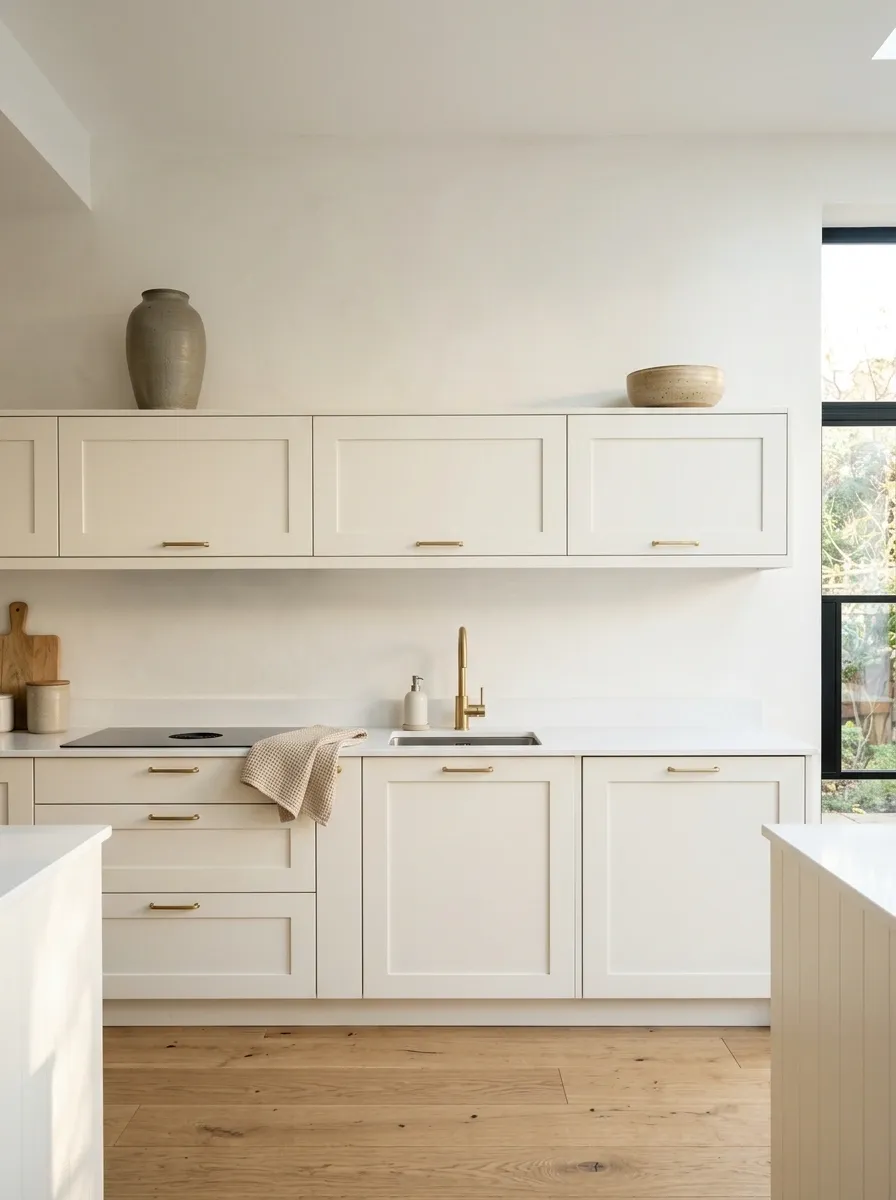
A small kitchen does not always benefit from using every available inch. Leaving most of the space above the cabinets open can actually make the room feel taller, cleaner, and less crowded.
One taller vessel at one end and a low horizontal object near the opposite side provide just enough visual interest to make the emptiness feel intentional. The rest of the gap remains quiet, allowing the cabinetry, backsplash, and natural light to carry the composition.
This approach works especially well when the kitchen already has strong finishes or limited wall space. The restraint becomes the design choice. Nothing needs to compete with the room’s primary lines.
Black-and-Walnut Kitchen With Dramatic Ceramic Sculpture
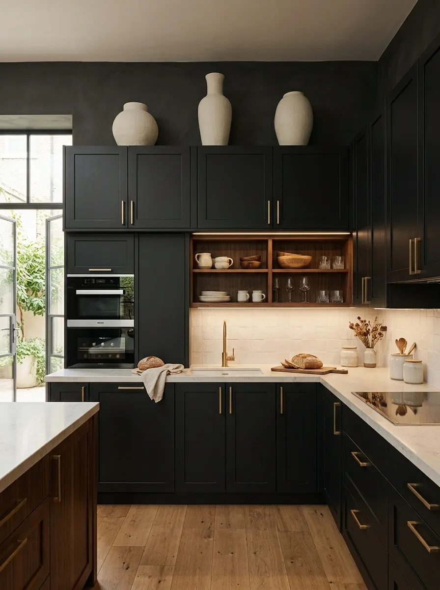
Black cabinetry and rich walnut create a naturally dramatic kitchen, so the space above the cabinets benefits from sculptural pieces rather than a large collection. A few oversized matte ceramics provide shape and contrast without introducing competing colors.
The darker palette makes pale stone, cream ceramics, and warm wood especially noticeable. A sculptural vessel with an irregular silhouette can become the focal point, while smaller pieces reinforce its form without creating clutter.
Lighting matters here. Warm illumination under cabinets and subtle ambient light help the black finishes retain depth rather than looking flat. The upper styling should stay sparse enough for the materials of the kitchen itself to remain dominant.
Farmhouse Kitchen With Layered Baskets and Vintage Boards

A relaxed farmhouse kitchen can turn the cabinet-top gap into a backdrop for oversized everyday objects. Layered wooden boards, woven baskets, old crocks, and a few muted metal pieces give the upper wall a practical, lived-in character.
The important distinction is scale. Large boards create a backdrop, while baskets and vessels provide lower, rounder forms in front. That difference in height keeps the arrangement from becoming a flat row.
Warm white or muted painted cabinetry works particularly well with this approach because the natural materials add depth without demanding a new accent color. The final composition feels useful as well as decorative, which keeps the styling believable.
All-White Kitchen With Black-and-Natural Contrast
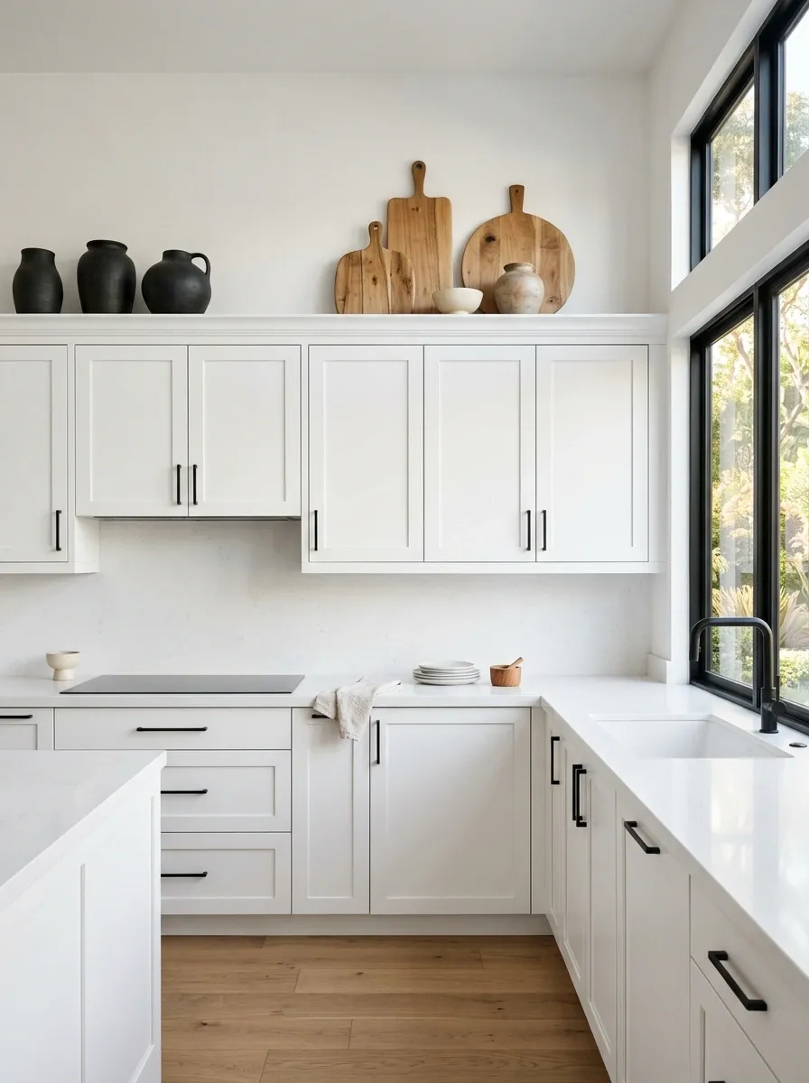
An all-white kitchen can handle a stronger styling moment above the cabinets because the architecture provides such a clean backdrop. Matte black pottery, natural wood boards, and one or two softly shaped objects create contrast without introducing a complicated color scheme.
The most successful arrangements repeat those tones elsewhere in the kitchen. Black can echo window frames or hardware, while wood connects with flooring, stools, or cutting boards. That repetition makes the cabinet-top display feel integrated with the room instead of placed there as an afterthought.
Keeping the display relatively sparse preserves the crisp character of the kitchen. The contrast should feel deliberate, not scattered.
Mediterranean-Inspired Kitchen With Terra-Cotta Above the Cabinets
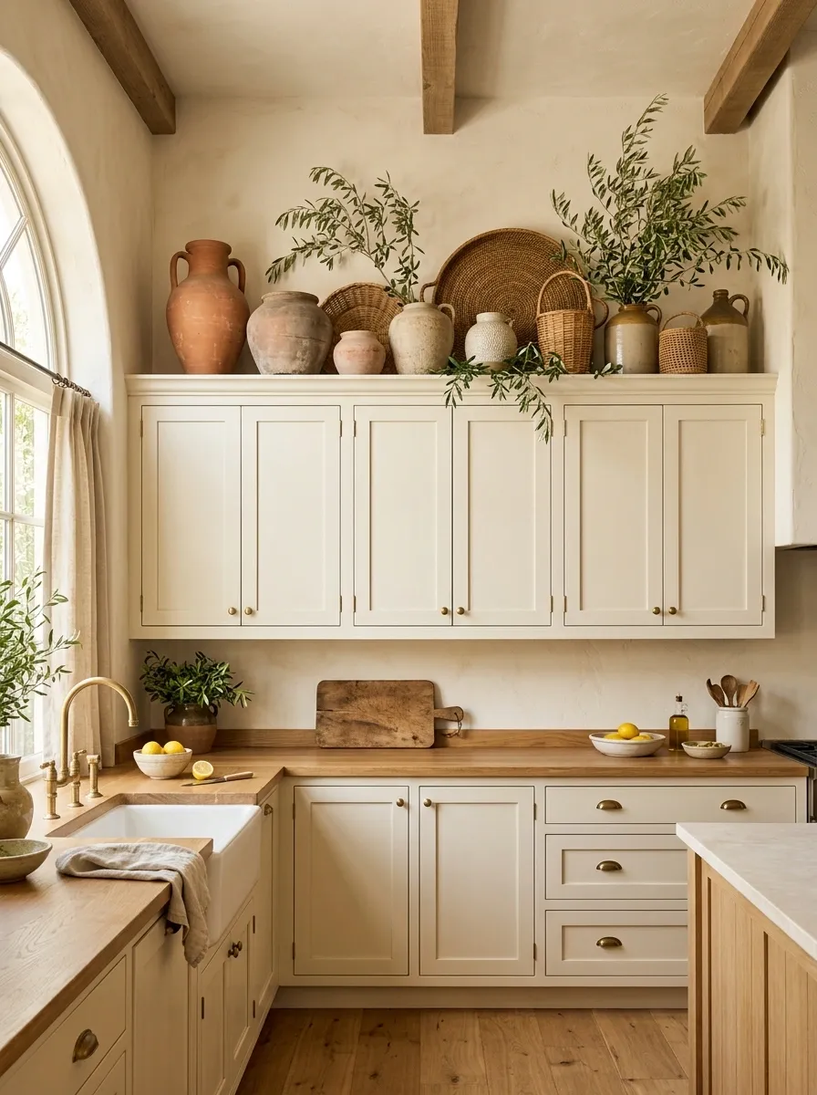
Cream plaster, warm stone, natural wood, and terra-cotta create an upper display that feels connected to sun-washed Mediterranean interiors. The space above the cabinets becomes a place for handmade vessels, textured pottery, woven pieces, and a few irregular olive branches.
The palette should stay earthy rather than overly orange. Dusty clay, chalky cream, muted brown, and soft green give the arrangement depth while maintaining a calm relationship with the kitchen below.
Rounded vessels work especially well against the harder lines of cabinetry and counters. Their handmade shapes introduce the slight irregularity that keeps the finished composition from feeling overly formal.
Low-Contrast Kitchen Where the Gap Blends Into the Ceiling
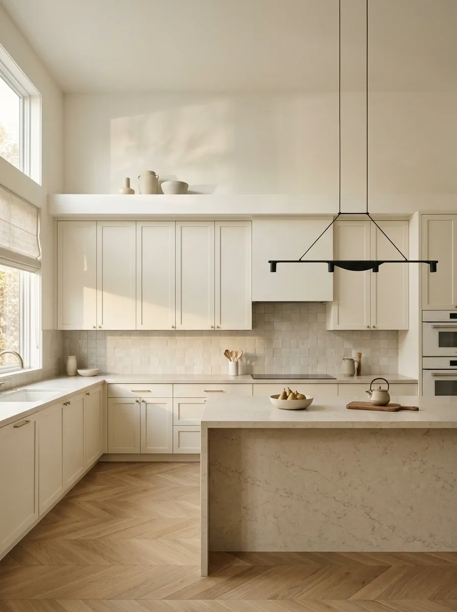
Not every cabinet-top space needs to become a display. A kitchen with pale cabinetry, walls, and ceiling can make the gap almost disappear, creating a clean architectural envelope around the room.
A few low-contrast ceramic pieces can sit above the cabinets, but they should remain close in value to the surrounding finishes. The goal is subtle layering rather than a decorative focal point.
This approach is especially effective when the kitchen already has strong flooring, a noticeable backsplash, or sculptural lighting. The upper wall becomes visual breathing room, giving the more interesting elements elsewhere in the room space to stand out.
Long Galley Kitchen With Repeated Ceramic Forms
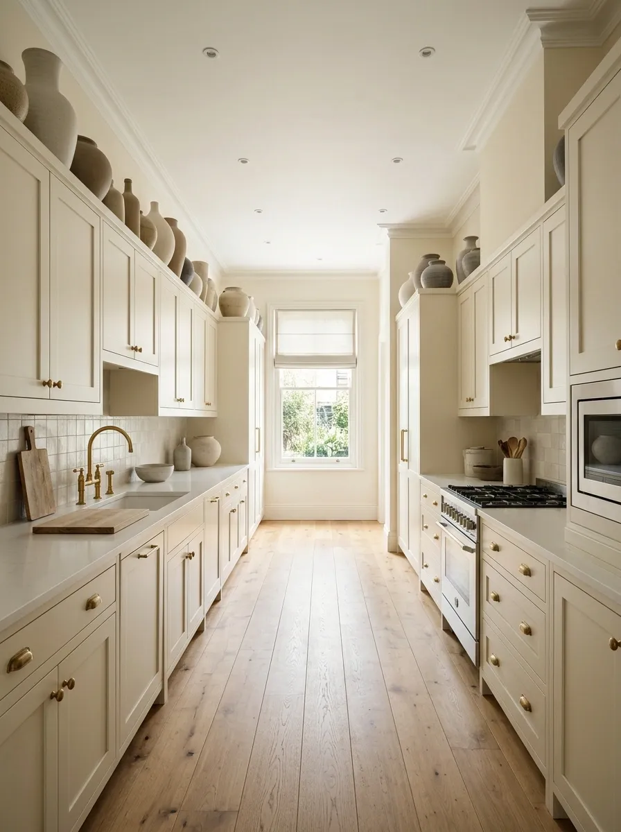
A long galley kitchen benefits from rhythm. Instead of treating each cabinet section separately, a sequence of similarly colored ceramic vessels can create one continuous visual thread along the length of the room.
The vessels do not need to be identical. Slight changes in height, opening, and silhouette keep the arrangement natural while the shared finish gives it consistency. A few empty stretches between groups stop the display from becoming a continuous wall of objects.
This approach is particularly strong when the kitchen has long uninterrupted cabinetry. Repetition reinforces the room’s horizontal geometry, making the upper space feel designed around the architecture rather than simply filled.
Classic Cream Kitchen With Decorative Crown Molding
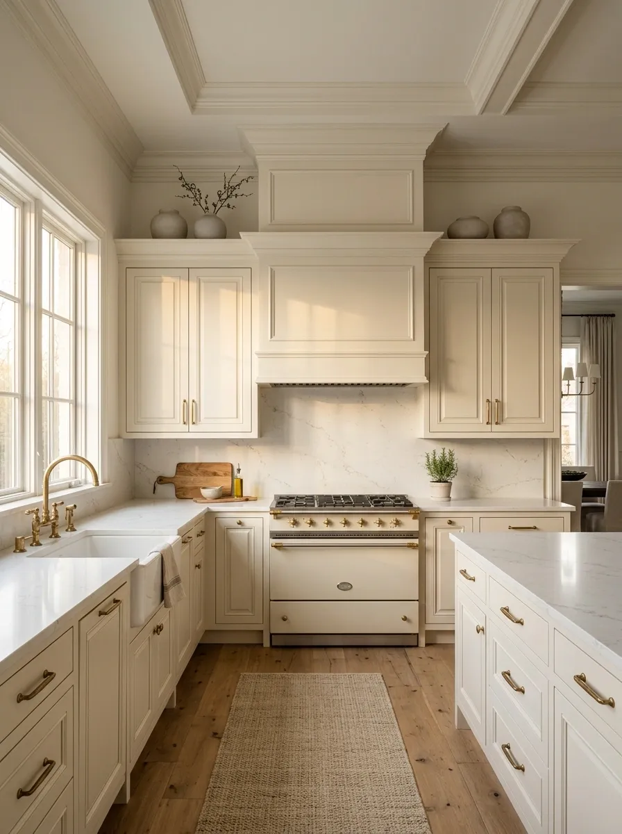
A traditional cream kitchen can make the upper cabinet gap feel almost built into the room through strong architectural detailing. Crown molding, raised-panel cabinetry, warm brass hardware, and softly veined counters create a classic foundation, while the area above remains relatively restrained.
Rather than filling the space with decorations, the molding carries the transition toward the ceiling. A few low-profile ceramic pieces can sit within wider sections, but the architecture remains the main event.
This approach works especially well when other parts of the kitchen already contain traditional details. Matching the trim profile and cabinet finish keeps the entire room visually connected.
Rustic Kitchen With Oversized Wooden Objects
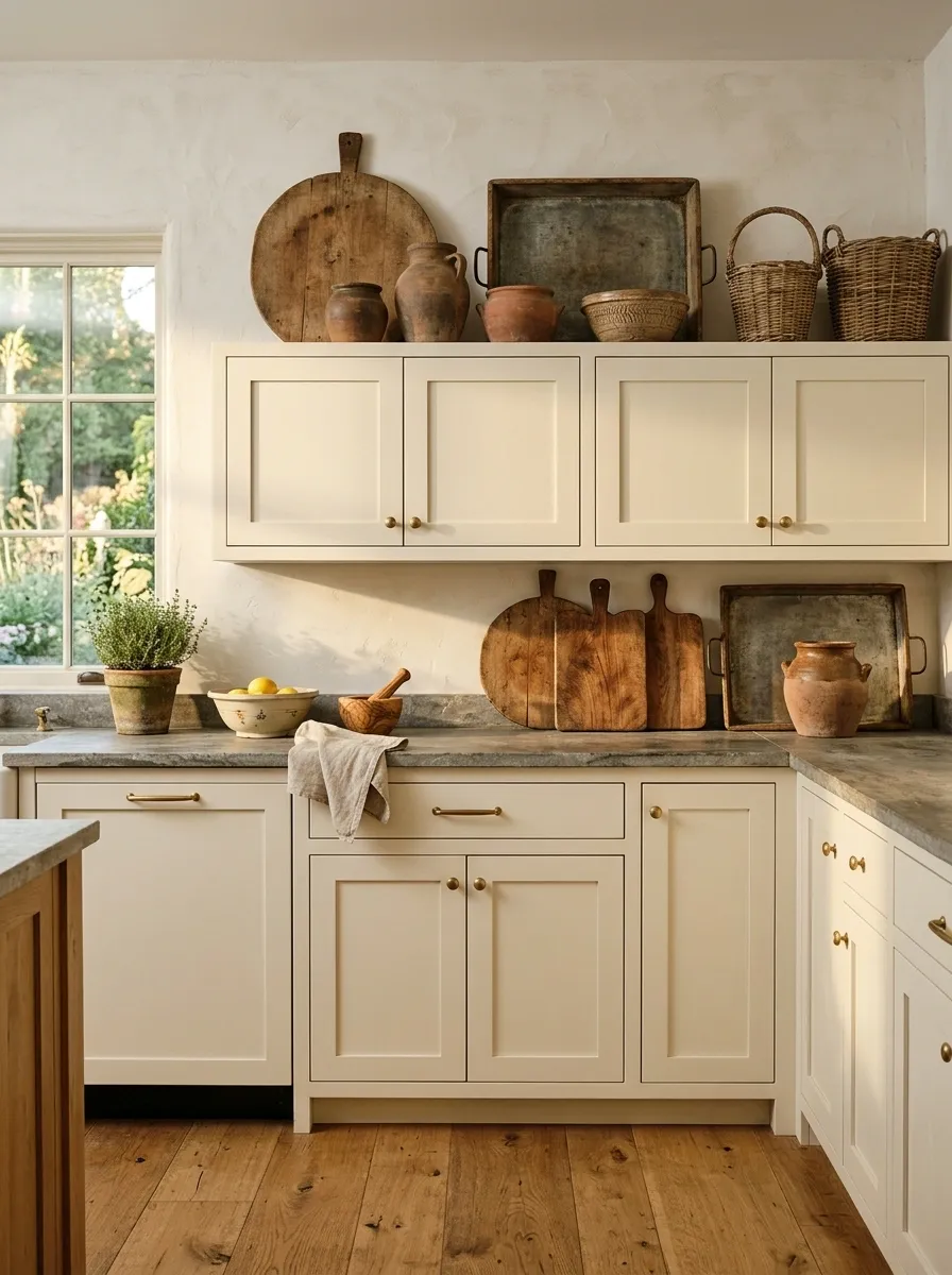
A rustic kitchen can handle substantial pieces above the cabinetry because the surrounding materials already have visual texture. Oversized wooden boards, old trays, chunky pottery, and weathered baskets give the upper wall enough presence without creating the feeling of a formal display.
Large objects work better here than many small accessories. Their irregular edges and aged surfaces bring character while allowing generous areas of open space around them.
Stone counters, exposed wood, and textured walls reinforce the rustic palette. The cabinet-top arrangement should feel substantial but not precious, with visible material variation doing most of the decorative work.
Contemporary Kitchen With a Continuous Art-Led Gallery
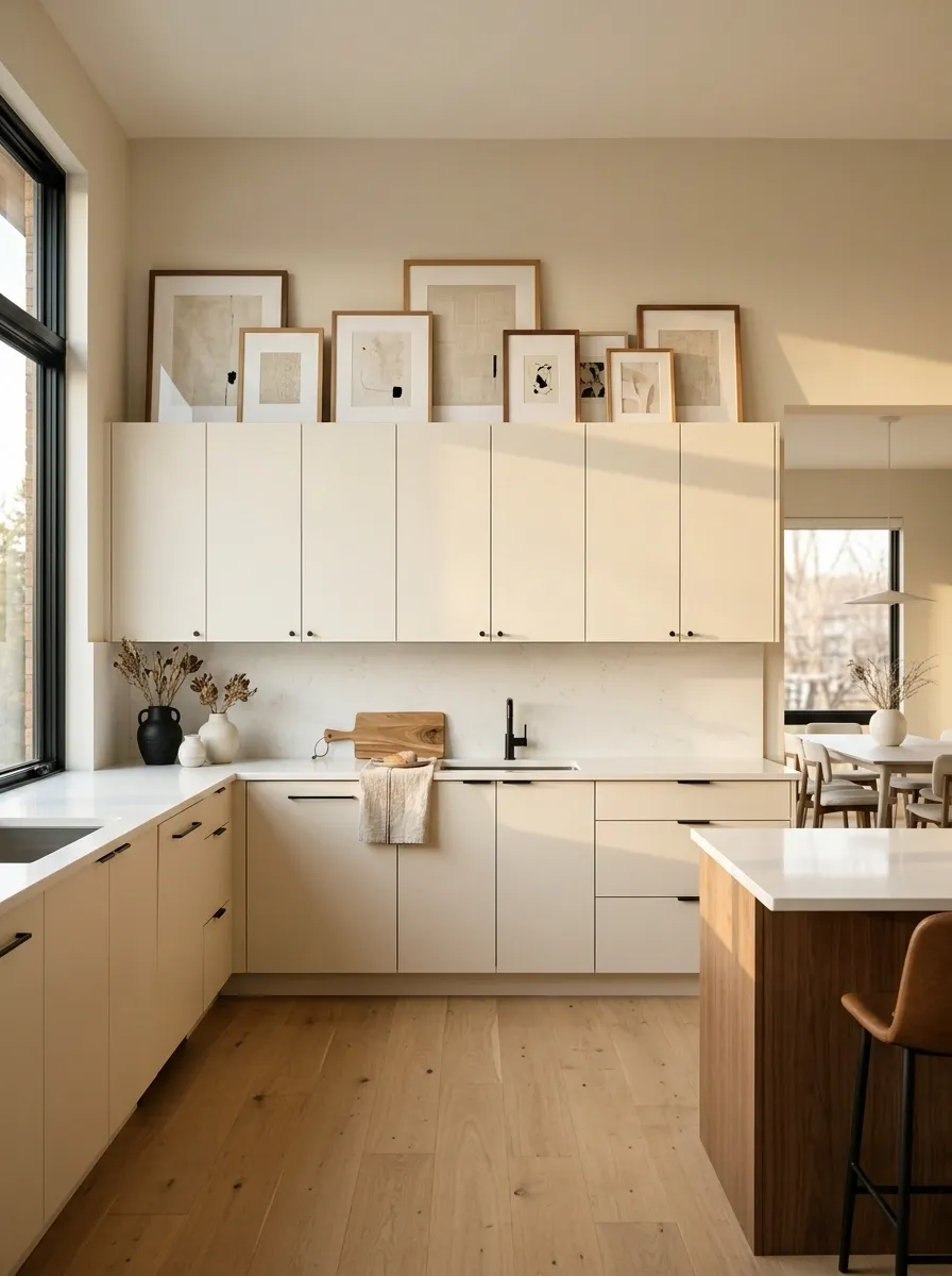
A contemporary kitchen with flat-front cabinetry and clean stone surfaces benefits from an equally disciplined treatment above the cabinets. Instead of pottery or storage baskets, a continuous run of framed artwork creates a subtle gallery effect.
Similar frame finishes keep the collection unified, while different artwork sizes prevent it from looking mechanically repeated. The artwork can lean rather than hang, adding a relaxed note to an otherwise precise room.
The palette should connect with the kitchen’s existing finishes. Neutral artwork, warm wood frames, and small touches of black can reinforce cabinetry, flooring, lighting, or hardware without introducing an unrelated color story.
Soft Taupe Kitchen With Subtle Linen and Ceramic Layers
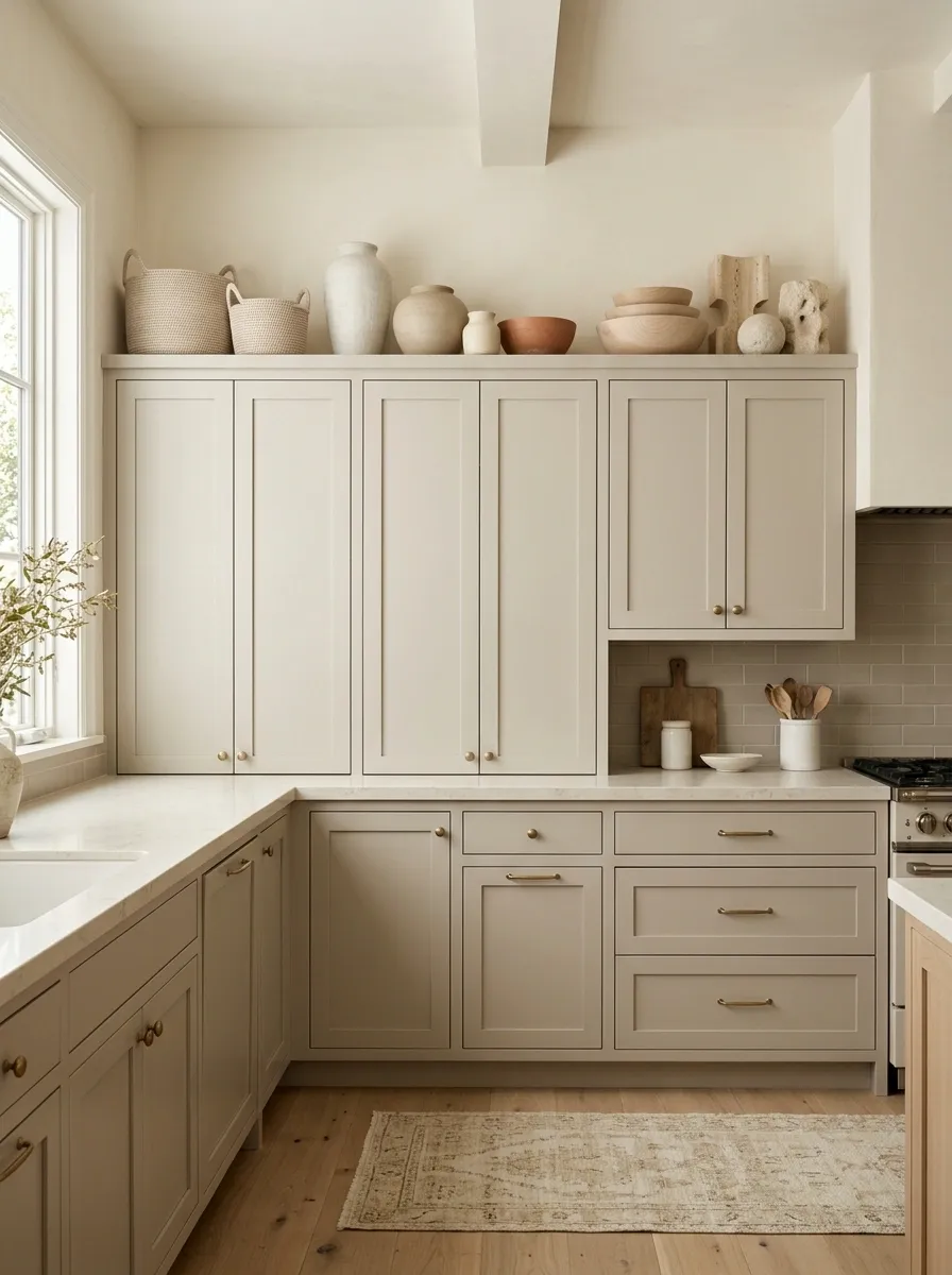
A taupe kitchen lends itself to a nearly monochromatic treatment above the cabinets. Soft linen-toned baskets, chalky ceramics, pale wood, and warm stone create layers that differ more through texture than color.
The palette stays intentionally quiet. Rather than introducing black or a bright accent, the composition uses small shifts between cream, taupe, beige, and warm brown. That lets sunlight, shadows, and material texture create the visual variation.
This is a strong direction for kitchens that already have several large surfaces competing for attention. The cabinet-top zone adds softness without creating another focal point.
Colorful Vintage Kitchen With Blue-and-White Ceramics

A blue-and-white ceramic collection can give a colorful kitchen a clear visual thread. Painted cabinets, patterned tile, natural wood, and vintage-inspired vessels create a room with personality, while repeating blue throughout the cabinet-top display keeps the composition controlled.
The ceramics can vary in pattern and shape. Some may stand alone, while others group together near a corner or above a taller cabinet section. The white portions of the pieces echo the lighter parts of the room, preventing the blue from becoming visually heavy.
The result feels expressive without becoming chaotic. Repeated color provides the structure that lets the vintage mix remain varied.
Small Cottage Kitchen With Practical Open Storage
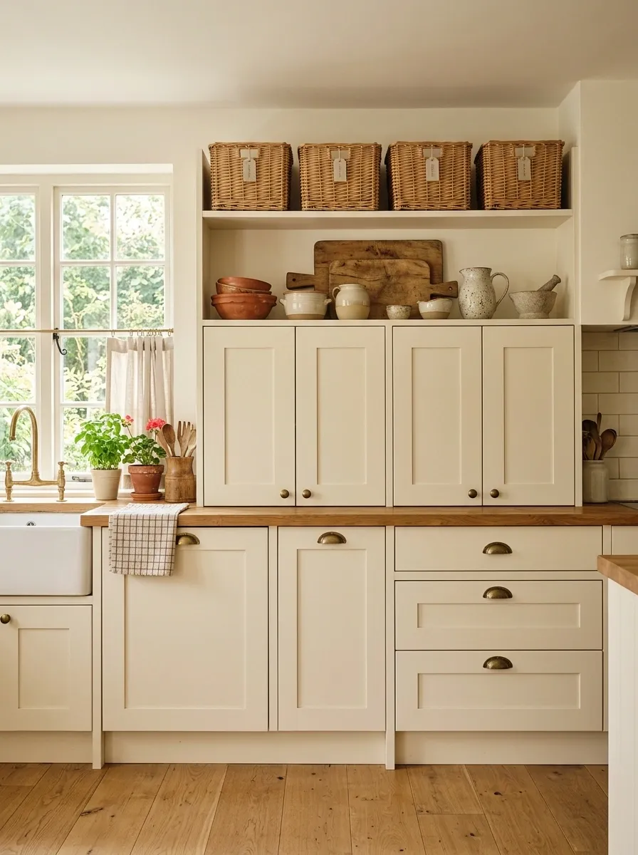
In a small cottage kitchen, the space above the cabinets can serve both the room’s visual character and its storage needs. Woven baskets, attractive serving pieces, wooden boards, and rarely used cookware turn an awkward gap into a useful upper layer.
The important part is keeping everyday clutter out of sight. Matching baskets create visual calm, while a few exposed pieces add warmth and personality. The arrangement should have a clear color story so practical storage still looks like part of the room.
This works especially well in compact kitchens where every cabinet is already working hard. The upper gap becomes a deliberate extension of the room instead of an unused strip.
Dramatic Stone Kitchen With Minimal Upper Styling
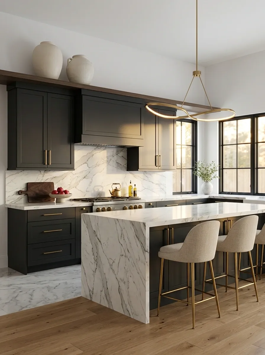
When a kitchen already has dramatic veined stone, the space above the cabinets should not compete with it. Dark cabinetry, expressive stone, warm wood, and statement lighting can carry the room, leaving only a few sculptural forms in the upper gap.
A large ceramic vessel or two carefully placed objects can provide scale without creating another focal point. Keeping the colors quiet allows the stone to remain visually dominant.
The success of this composition comes from hierarchy. The eye reads the stone first, the cabinetry second, and the upper styling last. That order makes the whole kitchen feel polished rather than overloaded.
Maximalist Kitchen With a Full Collected Cabinet-Top Composition
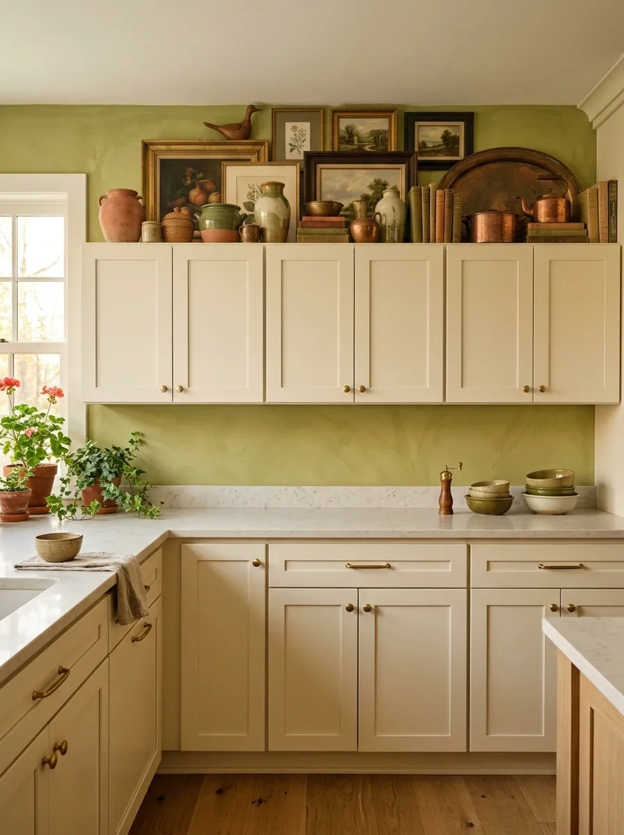
A maximalist kitchen can turn the entire cabinet-top area into a layered visual story. Artwork, books, ceramics, baskets, vintage kitchenware, and unusual objects fill the upper zone, but the composition still needs a clear color and material thread.
The strongest versions repeat two or three tones throughout the display. Similar finishes can appear at different heights, while larger pieces establish the background and smaller objects fill the gaps.
Maximalism works because every part of the arrangement contributes something. The finished scene should feel abundant without becoming directionless. Color repetition, varied scale, and intentional spacing keep the density under control.
Let the Kitchen Decide What Belongs Above It
There isn’t one right answer for that space above the cabinets. In some kitchens, it wants texture and collected objects. In others, artwork creates a stronger finish. A traditional room may benefit from extending the architecture upward, while a small kitchen can look better with most of the gap left completely open.
The useful starting point is the room itself. Cabinet color, ceiling height, countertop material, backsplash pattern, flooring, lighting, and the amount of visual activity already happening below the cabinet line should all influence the choice.
A finished kitchen feels cohesive when the upper space looks like it was considered alongside everything else, rather than decorated separately at the end. Save the compositions that feel closest to the architecture and mood of the room, then build from that direction.
Save this collection for the next kitchen refresh, renovation, or cabinet styling project.