
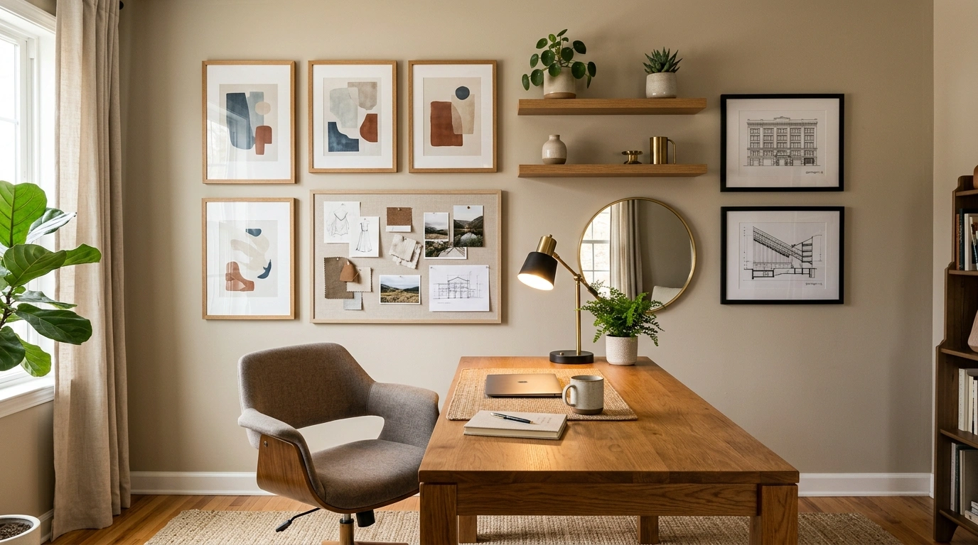
A home office can have a beautiful desk, a decent chair, good lighting, and still look strangely unfinished. The wall is usually where the problem starts. A completely bare wall can make the room feel temporary, while a pile of random frames can make it look like every leftover piece of decor got called in for backup.
The strongest office wall decor ideas don’t treat the wall as a separate shopping project. They make it part of the room. The artwork relates to the furniture. The wall color supports the wood tones. Shelving works with the desk instead of floating somewhere above it. Even empty space becomes part of the composition.
A wall with no plan is.
Office Wall Decor Ideas
Warm Oak Office With a Full Picture-Led Gallery Wall
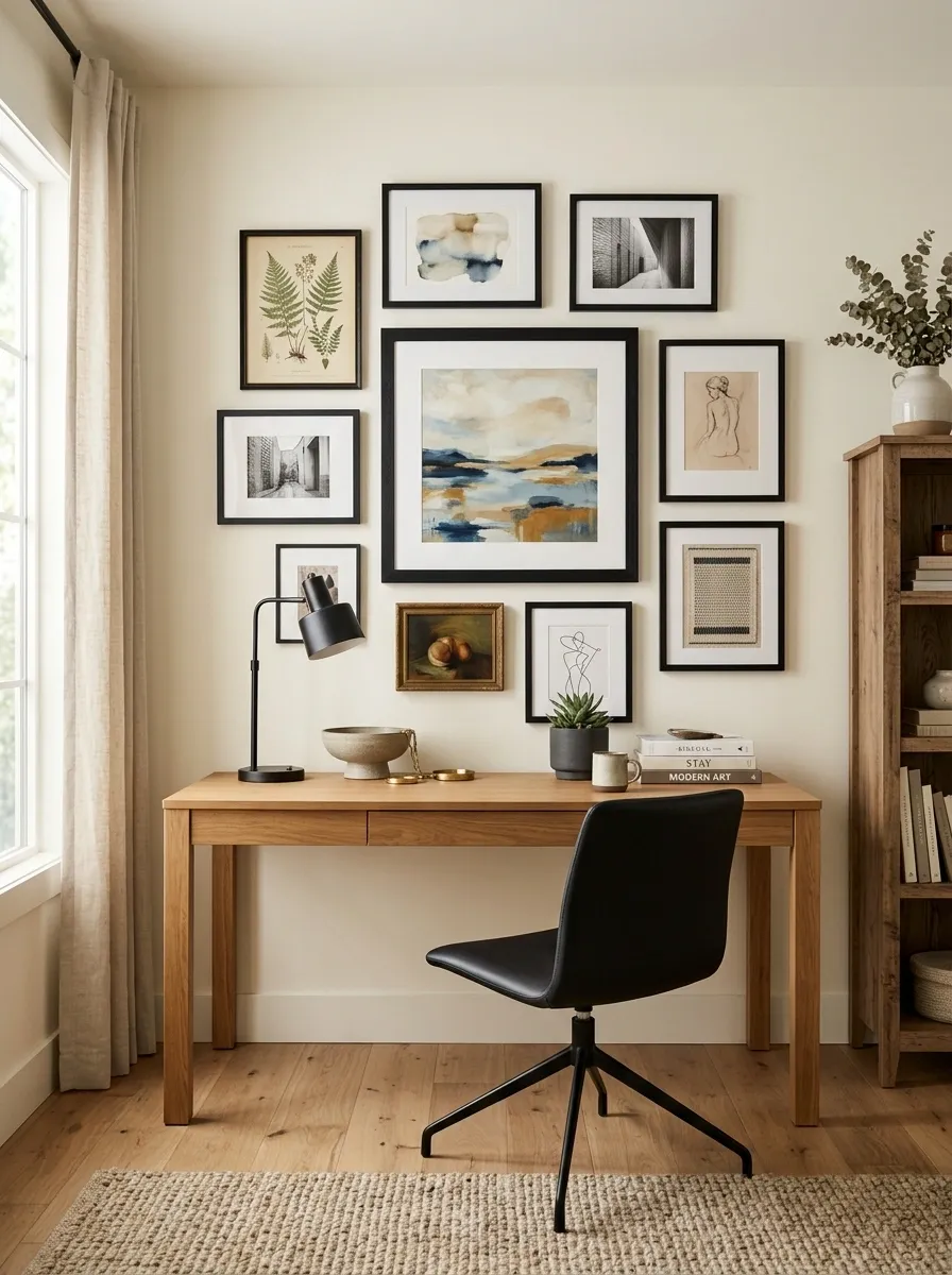
Warm oak and creamy walls give this office a softer starting point, so the gallery wall can carry more personality without making the room feel busy. A medium wood desk sits beneath a deliberately loose arrangement of framed artwork, with one larger piece acting as the anchor. Smaller frames fill the surrounding area without creating a rigid square.
The trick is the relationship between the wall and the furniture. Black details in the chair and lamp quietly echo the darker frame edges, while the flooring keeps the room grounded. Nothing needs to match perfectly. In fact, a little variation keeps the wall from looking like someone ordered a complete set at 2 a.m.
Moody Green Office With Dark Built-In Shelving
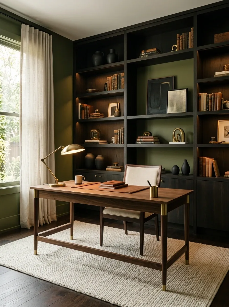
Deep olive walls turn the office into a richer, more architectural space, especially when paired with walnut furniture and dark built-in shelving. The shelves should hold a controlled mix of books, ceramics, framed pieces, and a few useful objects rather than becoming a storage dump with excellent lighting.
Warm brass from the desk lamp or hardware keeps the darker palette from becoming flat. Cream paper, upholstery, or a light rug provides the necessary break.
This look works because the wall, shelving, and desk read as one composition. The dark surfaces create depth, while the lighter objects give the eye small places to pause. Basically, the room gets drama without behaving like a teenager discovering black paint.
Soft Minimal Office With One Oversized Abstract Artwork

Sometimes the smartest wall treatment is the one thing that gets all the attention. A large abstract artwork fills the space above a pale oak desk, while the rest of the office stays intentionally quiet. Warm white walls, linen curtains, a simple chair, and a low-profile lamp keep the composition from becoming visually noisy.
Scale is what makes this work. A tiny print above a generous desk would leave the wall looking apologetic. One substantial piece gives the room a finished focal point without requiring a gallery of accessories.
The artwork should have enough tonal variation to hold attention but not so much detail that it competes with the work zone. A calm room is allowed to be calm. The drywall doesn’t need entertainment every Tuesday.
STRONG
FOCAL POINT.
Small Office With a Vertical Desk-and-Wall Composition
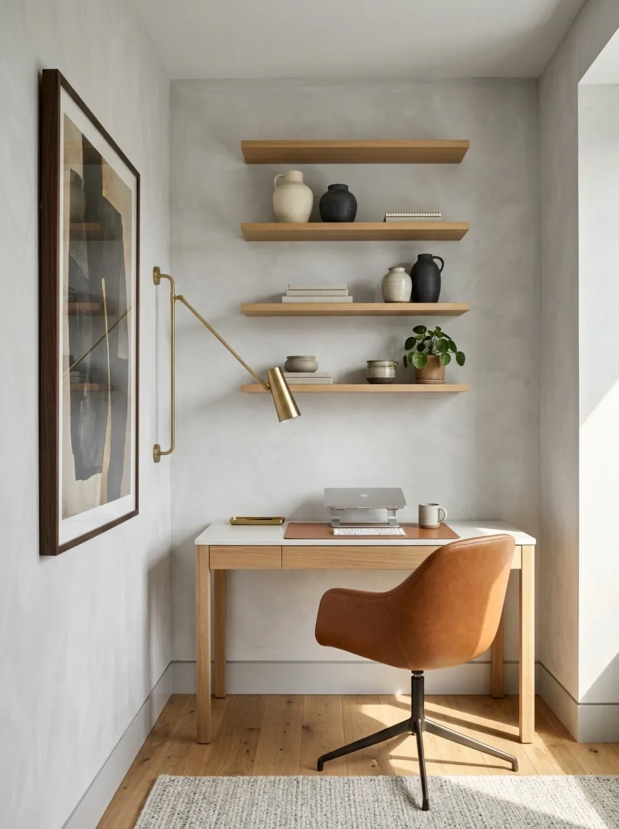
A narrow office needs the wall to work harder because the floor cannot do much. This design stacks visual interest upward with a slim desk, tall artwork, narrow shelving, and a wall-mounted light. The arrangement draws the eye vertically, making the office feel taller while preserving a clear path around the desk.
The wall itself stays fairly light, with just enough wood and darker detail to keep the composition from becoming bland. Storage is concentrated above and beside the desk, so the working surface doesn’t become the place where every notebook in the house goes to retire.
The important move here is proportion. In a compact room, spreading everything wide only emphasizes the lack of width. Going upward makes the limitation look intentional.
Scandinavian Office With a White Grid Gallery
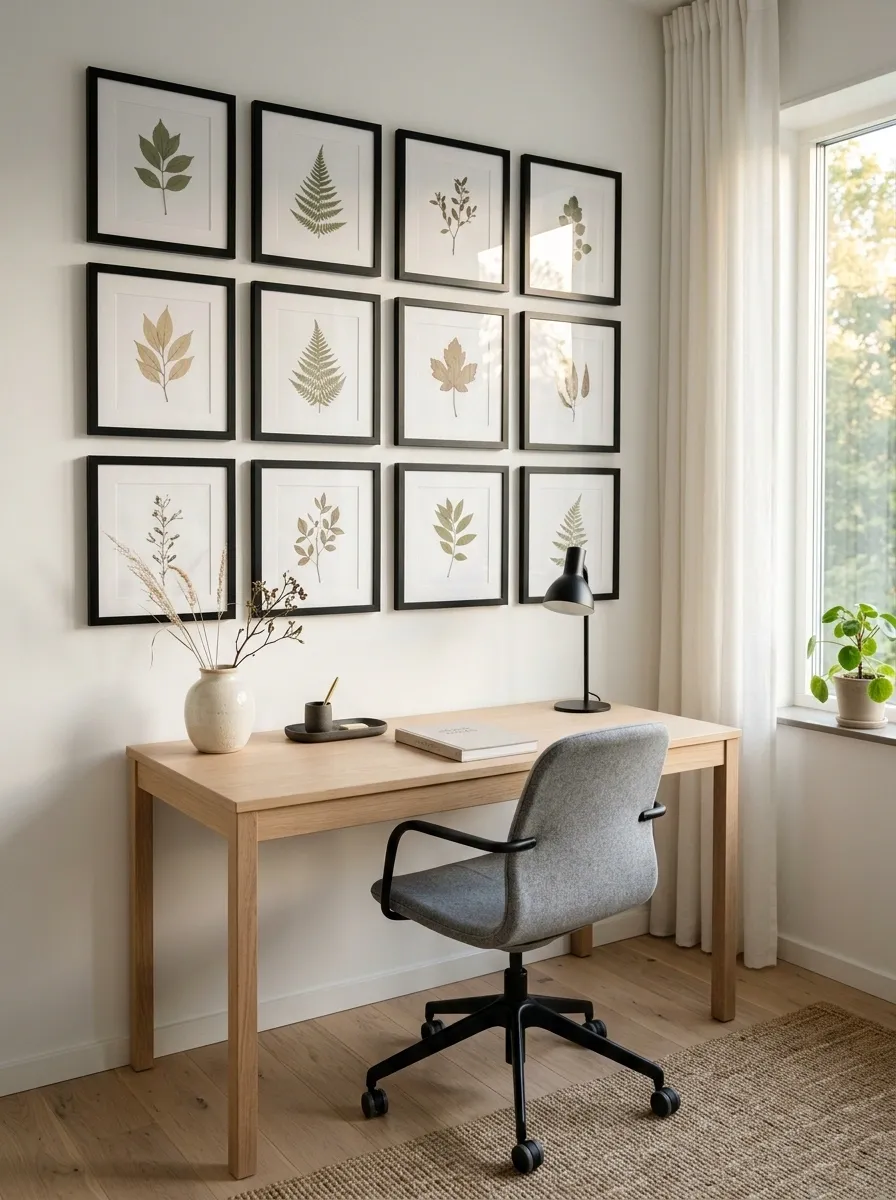
A Scandinavian office looks especially polished when the wall follows the same quiet discipline as the furniture. Pale oak, white walls, soft gray upholstery, and black details create the base, while a carefully aligned collection of framed prints adds interest without breaking the calm.
The gallery works because repetition does the heavy lifting. Similar frame finishes, related artwork, and consistent spacing make the wall feel intentional even when the individual pieces are simple. The desk stays visually quiet so the wall has room to breathe.
This isn’t the place for seventeen unrelated quotes fighting for screen time. Keep the artwork connected by tone, subject, or framing, then let the clean geometry tie everything together.
Warm Beige Office With a Textured Accent Wall
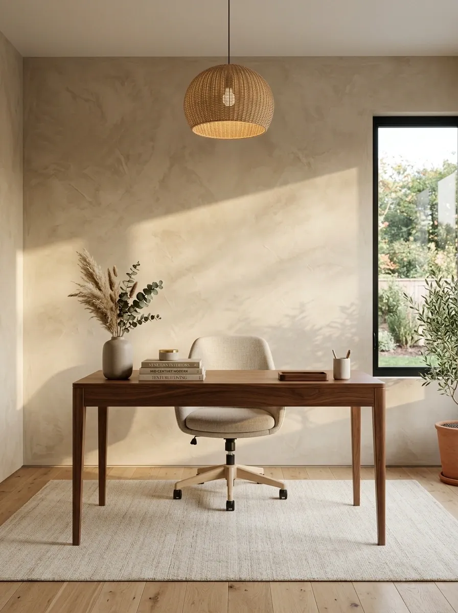
Here, the wall itself becomes the artwork. A warm beige textured finish sits behind a walnut desk, while woven lighting, neutral upholstery, natural flooring, and a few carefully selected accessories build a layered but restrained office.
Because the wall already has movement, the rest of the room needs fewer competing patterns. Smooth wood against the textured backdrop gives the eye a useful contrast, while soft textiles keep the harder surfaces from feeling flat.
This approach is particularly effective when the room has good natural light because changing daylight reveals the wall texture throughout the day. There is no need to hang every decorative object available just to prove that the wall has been decorated. It clearly got the memo.
Creative Studio Office With a Full Pinboard Wall
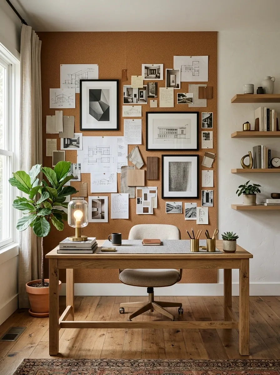
A full cork pinboard turns the office wall into part workspace, part visual archive. The desk is substantial enough for real projects, with open shelving nearby and a loose arrangement of sketches, references, notes, and clipped material covering the wall above.
The trick is containment. The wall can look active without looking chaotic when the desk stays relatively clear and the pinned material occupies a defined zone. A few framed pieces around the working material help the whole composition feel designed rather than accidental.
This is one of those rare setups where practical clutter actually becomes part of the aesthetic. The important distinction is that the clutter has a home. Random paperwork on the chair doesn’t count as wall decor, despite what the evidence on most home offices suggests.
Black-and-Cream Office With Graphic Typography Prints
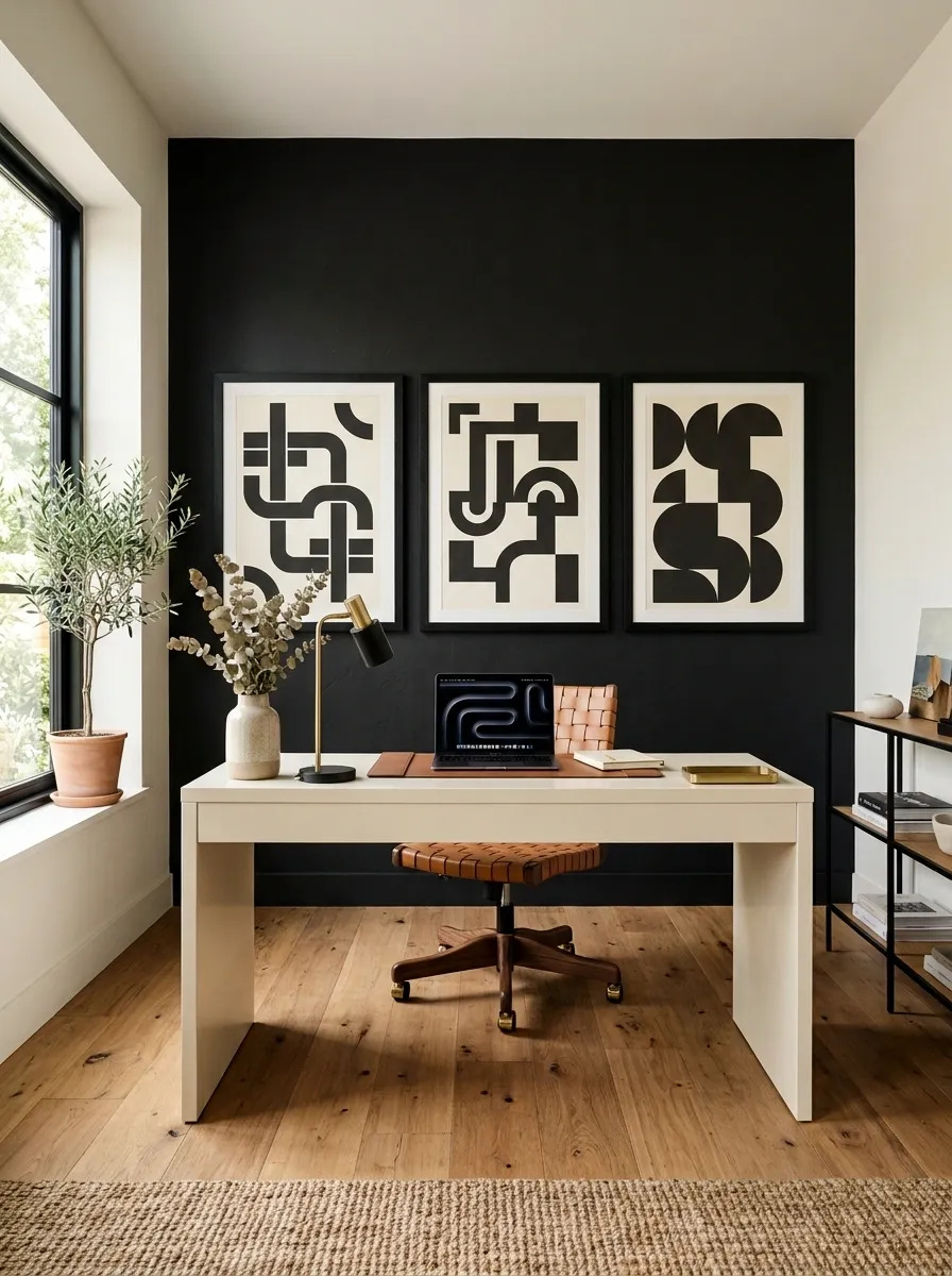
A matte black wall gives this office a bold foundation, while a cream desk and warm timber flooring keep it from becoming visually heavy. Oversized monochrome typography prints sit behind the desk, creating a graphic backdrop that feels modern without relying on lots of decorative pieces.
The contrast is the whole point. Black establishes depth, cream breaks it, and wood adds warmth between the two. Keep the frames substantial enough to hold their own against the dark wall, and let the artwork breathe rather than packing every inch with type.
The finished room has attitude, but it doesn’t need to shout. That’s the difference between a strong accent wall and a wall having a public meltdown.
Japandi Office With Slatted Wood and Quiet Artwork
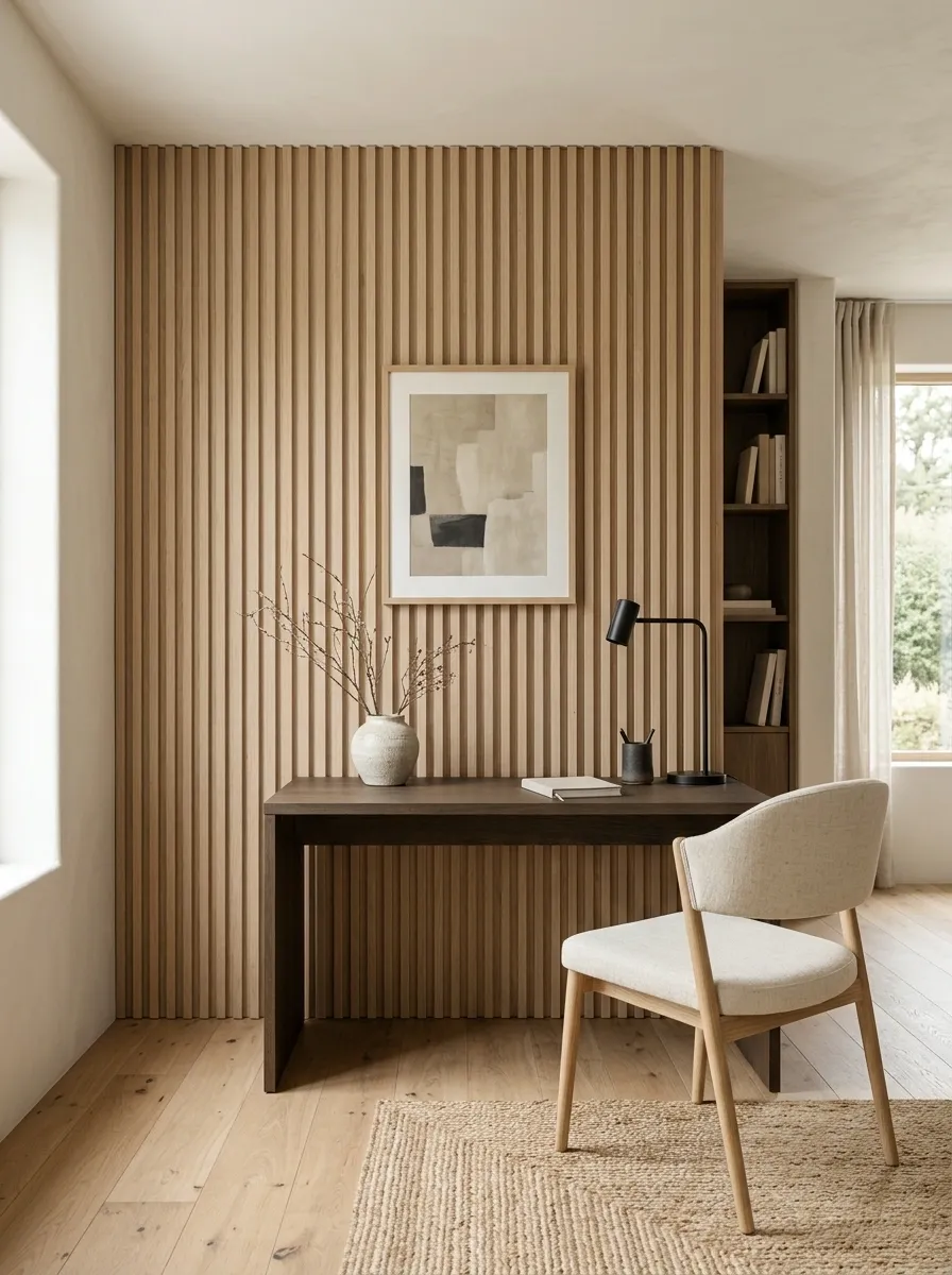
A Japandi office doesn’t need a crowded gallery wall to feel finished. Pale oak slats create gentle architectural rhythm behind a simple desk, while warm white surfaces, low-profile furniture, soft lighting, and one understated artwork keep the room visually calm.
The slatted wall provides enough texture that the artwork can remain quiet. That relationship matters. Adding several bold prints would compete with the natural rhythm of the wood and make the room feel busier than the style calls for.
Keep the palette close to natural timber, warm white, muted neutrals, and small touches of darker contrast. The whole design works through restraint, proportion, and material quality. Basically, the wall already has a job. Don’t give it twelve more.
Compact Apartment Office With a Floating Desk Wall
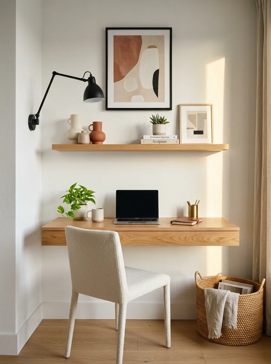
When floor space is tight, the wall has to earn its keep. This compact office uses a floating wood desk, a narrow shelf, framed artwork, and a wall-mounted task light to create a complete work zone without filling the room with furniture.
The arrangement stays visually light because the desk appears to grow out of the wall rather than sitting as a bulky block in the middle of the room. A small amount of storage sits above the work surface, while the artwork adds enough personality to keep the setup from looking purely functional.
The floor stays mostly open, which helps the room feel less cramped. That’s the whole trick. A tiny office doesn’t need tiny personality. It just needs fewer things fighting for floor space.
Cottage-Inspired Office With Soft Floral Wallpaper
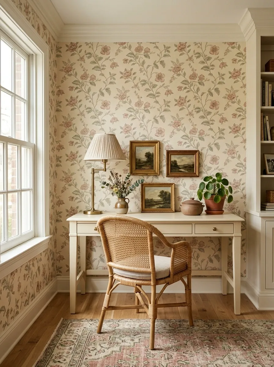
Soft floral wallpaper gives this office its personality before a single frame goes on the wall. The pattern sits behind a painted wood desk, woven chair, vintage-style lamp, and a restrained collection of artwork that feels collected rather than coordinated.
Because the wallpaper already carries plenty of visual information, the furniture stays fairly simple. Warm cream, muted green, dusty rose, and natural wood keep the palette grounded instead of pushing the room into full storybook territory.
The best part is the contrast between the detailed wall and the relatively quiet furniture. It makes the pattern feel intentional rather than overwhelming. And yes, floral wallpaper can exist without turning the office into somebody’s grandmother’s guest room. Balance remains undefeated.
Industrial Office With Concrete Finish and Warm Wood
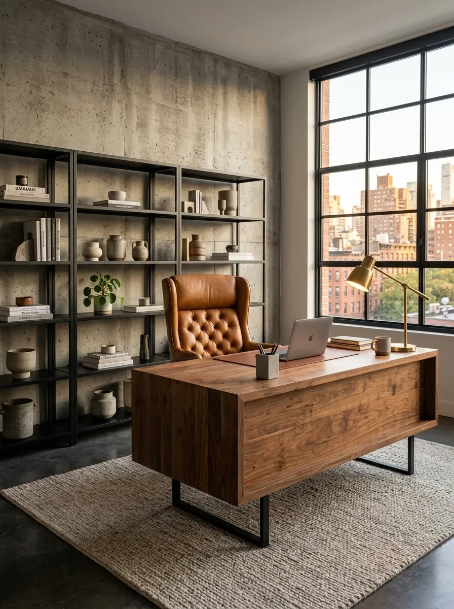
A concrete-look wall immediately changes the attitude of a home office. Pair it with a chunky warm-wood desk, black metal shelving, leather seating, and directional lighting, and the room takes on an industrial character without becoming cold.
The wall provides the hard, architectural backdrop. Wood and leather soften it. Black metal ties the pieces together and gives the office a stronger visual structure. A warm rug can also help keep the room comfortable underfoot without weakening the industrial language.
The important part is contrast. If every surface is gray, black, and hard, the room starts feeling more like a parking garage than a workspace. Concrete needs something warm beside it. Otherwise the office may accidentally start preparing for a quarterly earnings call.
Black metal
Architectural lines
Leather seating
Soft textiles
Soft Pink Home Office With Walnut Furniture
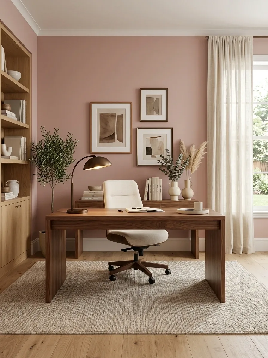
Dusty pink becomes much more sophisticated when it meets rich walnut. Instead of using bright blush tones, this office keeps the wall muted and lets the dark wood desk provide the visual weight. A cream upholstered chair, dark bronze lamp, neutral floor, and a few carefully chosen frames complete the composition.
The wall color softens the heavier furniture without making the office feel overly sweet. That balance matters. Keep the artwork simple and repeat the warm wood or bronze tones in small details so the room feels connected.
The result has color, but the color isn’t screaming for attention. It simply gives the office a recognizable identity. Pink can have range. It doesn’t have to arrive wearing glitter and demanding a selfie.
HEAVY WOOD.
CALM RESULT.
Home Office With Picture Rail and Layered Frames
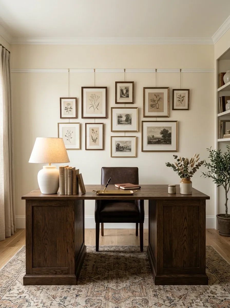
A picture rail gives this office an architectural starting point that ordinary hanging arrangements don’t have. The wall remains warm and light, while dark wood furniture sits below a collection of framed pieces that can be hung from or visually aligned with the rail.
The frames don’t need identical sizes, but they should share some connection through finish, color, subject, or scale. That keeps the arrangement collected rather than chaotic. Leave some wall visible around the composition so the moulding remains part of the design.
This approach works especially well in traditional homes because the artwork feels integrated with the room’s architecture. The wall isn’t simply decorated. It has a framework. A small detail, but suddenly the whole office looks like it has its paperwork together.
Modern Office With a Tonal Blue Accent Wall
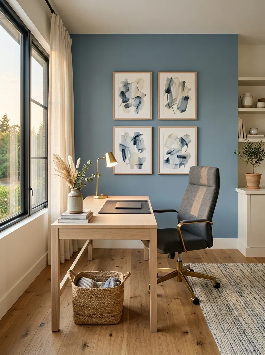
A muted blue wall gives this modern office a clear focal point without making the room feel overly colorful. The desk stays light with pale oak, the chair brings in charcoal, and the artwork repeats nearby blue tones in a looser, less matchy way.
The trick is using the same color family at different strengths. The wall provides the broadest field of color, artwork adds smaller areas of blue, and the furniture keeps the rest of the room neutral. That creates cohesion without turning the office into a paint-chip display.
Warm flooring and cream textiles soften the cooler wall. The result feels crisp but still comfortable, with enough personality to avoid the dreaded “company-approved home office” look.
Home Office With Floor-to-Ceiling Bookshelves
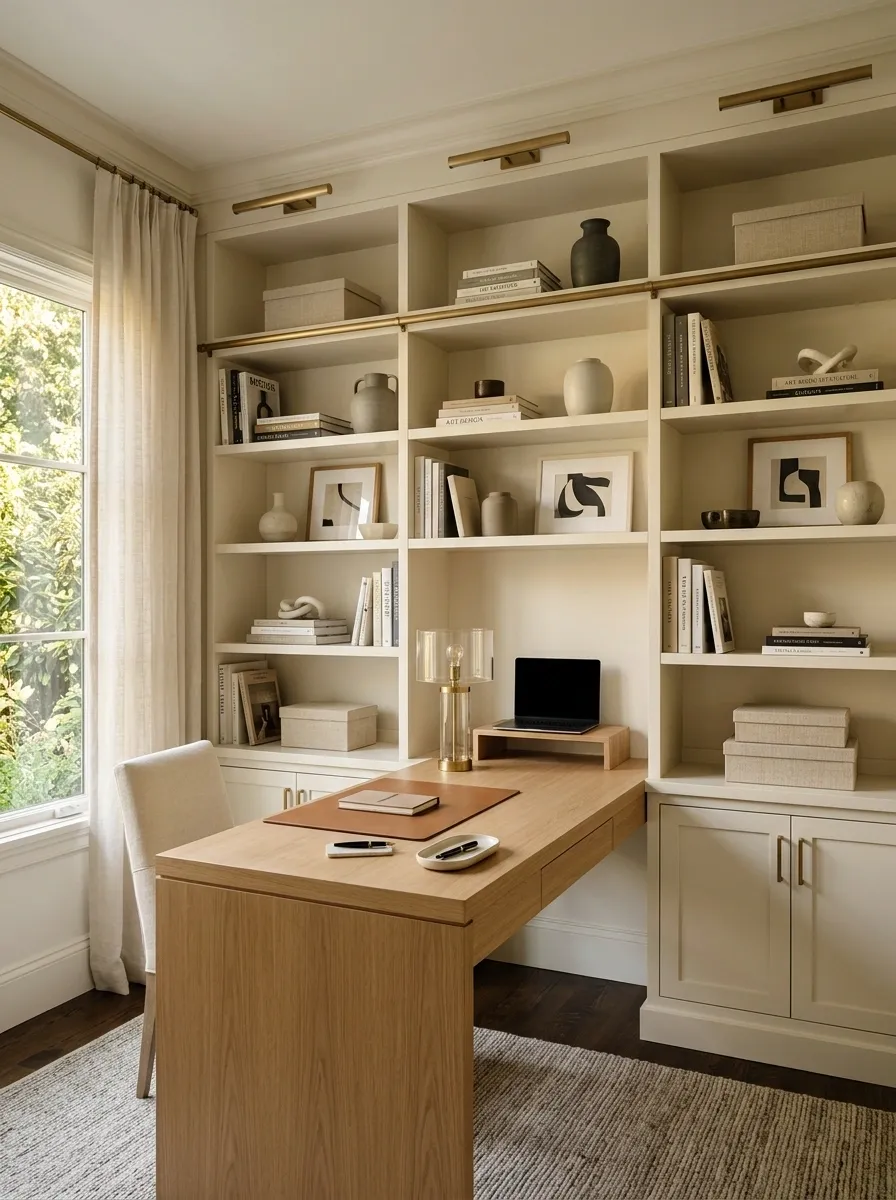
Instead of decorating an empty wall, this office turns the entire wall into architecture. Tall built-in bookshelves surround a centered desk, with books, closed storage, ceramics, and framed artwork distributed through the shelving.
The strongest detail is the mix of open and closed sections. Books and objects create texture, while closed cabinets hide the boring stuff that absolutely does exist in real life. The desk then becomes part of the built-in composition rather than a piece parked in front of it.
Keep some shelf sections intentionally quiet. An every-inch-filled bookcase can start looking more like a warehouse with Wi-Fi. Variation in density gives the wall rhythm and keeps the eye moving.
Minimal Black Desk Against a Warm White Wall
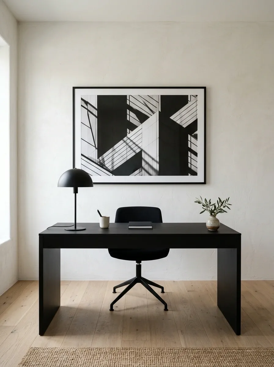
A warm white wall can look remarkably finished when the furniture and artwork have enough presence. Here, a matte black desk sits against the pale backdrop, with a black chair, natural timber flooring, and one large architectural print completing the composition.
There are very few objects, so proportions matter more than quantity. The artwork needs enough scale to relate to the desk, while the black furniture gives the lower part of the room a clear visual base. Warm white keeps the wall softer than a stark gallery white would.
This is minimal without feeling empty. And that’s an important distinction. Empty says “nothing happened here.” Minimal says “everything here was chosen.” The wall definitely knows which one it’s doing.
Coastal Office With White Paneling and Natural Textures
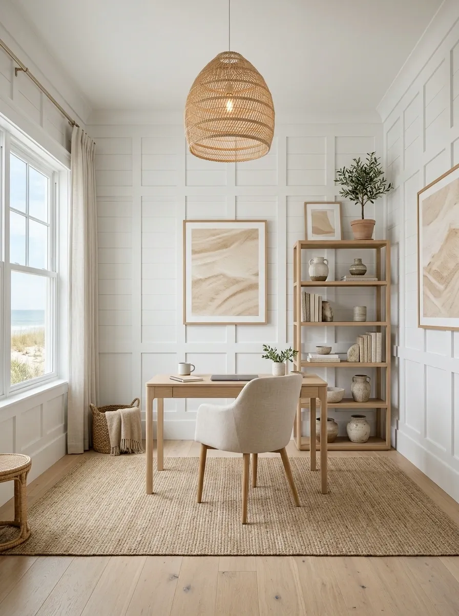
White wall paneling gives this coastal office an architectural backdrop, while pale oak, woven lighting, linen upholstery, and sandy-toned artwork supply the warmth. The result feels relaxed without relying on obvious beach signs, shells, or anything that says “vacation rental” in twelve different fonts.
The wall remains mostly white so the paneling can create subtle shadow and rhythm. Natural textures then add depth without introducing busy patterns. A pale wood floor and simple desk keep the lower half of the room just as light.
This design works through material restraint. Wood, linen, woven fibers, and painted paneling all feel different to the eye, even though they stay within a calm palette.
Dark Walnut Office With Integrated Picture Lighting
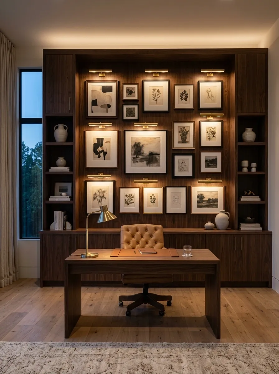
Deep walnut cabinetry gives this office a rich backdrop, but the real character comes from the way the artwork is lit. Small picture lights sit above framed pieces, creating warm pools of light across the wall while the desk below stays visually calm.
The cabinetry provides structure, the artwork adds personality, and the lighting creates the evening mood. A leather chair and warm neutral flooring keep the darker palette from feeling overly formal. Nothing needs to be flashy because the wall already has layers.
This setup is especially effective in an office used after sunset. The picture lights make the artwork part of the evening atmosphere rather than something that disappears once daylight goes away. Suddenly the office has ambience. The overhead light can take the evening off.
Renter-Friendly Office With a Removable Wall Composition
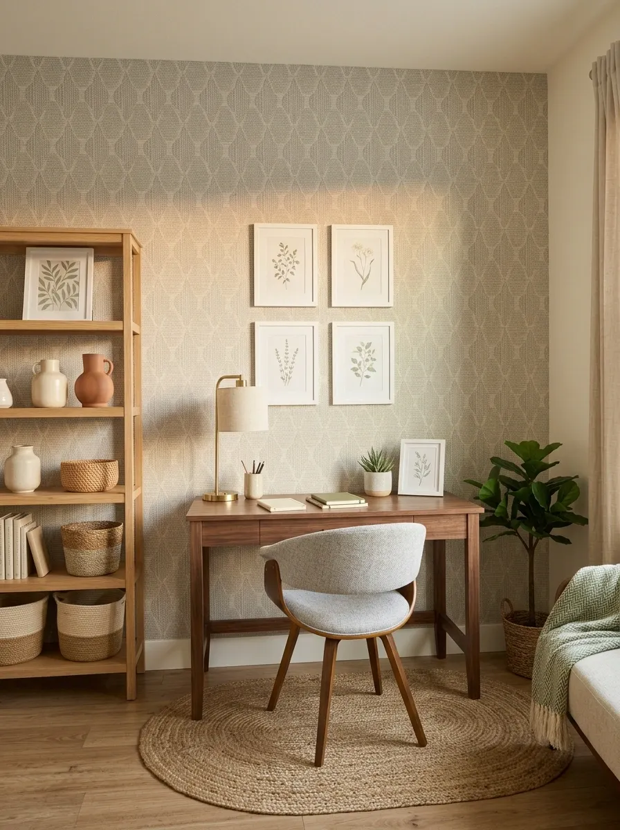
A rental office can still look thoughtfully designed without permanent built-ins or a wall full of holes. This setup combines removable wallpaper, lightweight framed artwork, a freestanding shelf, and a compact desk to create a complete backdrop that can move when the lease does.
The wall treatment carries enough visual interest to make the workspace feel established, while the furniture remains flexible. Keep the wallpaper pattern fairly controlled and let the artwork repeat one or two of its tones. That creates continuity without making every object look like it came from the same shopping trip.
The result is personal without becoming permanent. The landlord gets a wall back. The office gets a personality. Everyone survives the security-deposit inspection.
Keep the changes reversible.
Furniture: freestanding rather than built-in
Storage: movable shelving
Look: permanent-looking without actually being permanent
Soft Gray Office With a Planning Wall
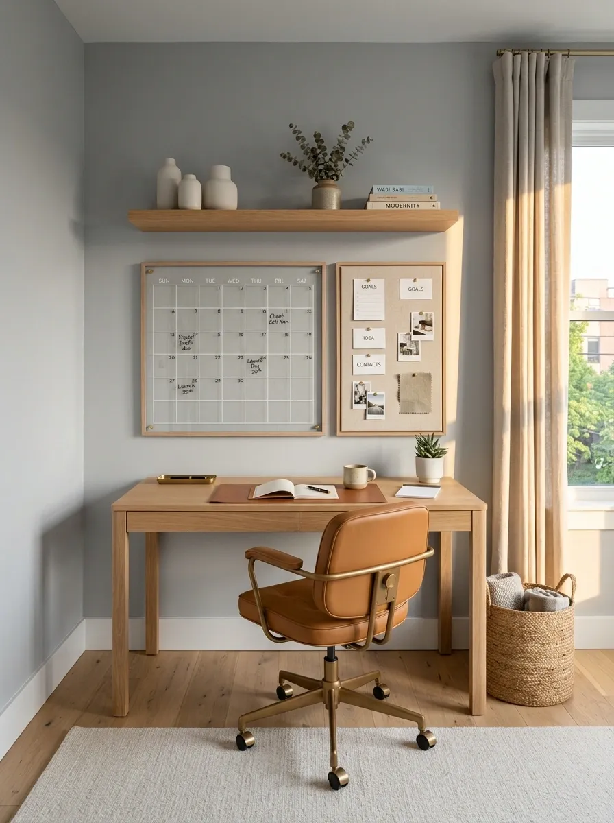
A soft gray wall gives this practical office a calm background for a large framed planner, a narrow pinboard, and a small amount of open shelving. The desk sits directly below, keeping the entire wall organized around the work happening there.
This isn’t just decoration pretending to be useful. The planning wall genuinely supports the room’s purpose while still looking polished. The large planner provides structure, the pinboard handles changeable notes and references, and the surrounding blank wall prevents the setup from feeling like a control room.
Keep the working materials inside defined areas. Once every spare sticky note starts migrating across the wall, the aesthetic has officially left the building.
Narrow Home Office With One Long Horizontal Art Piece
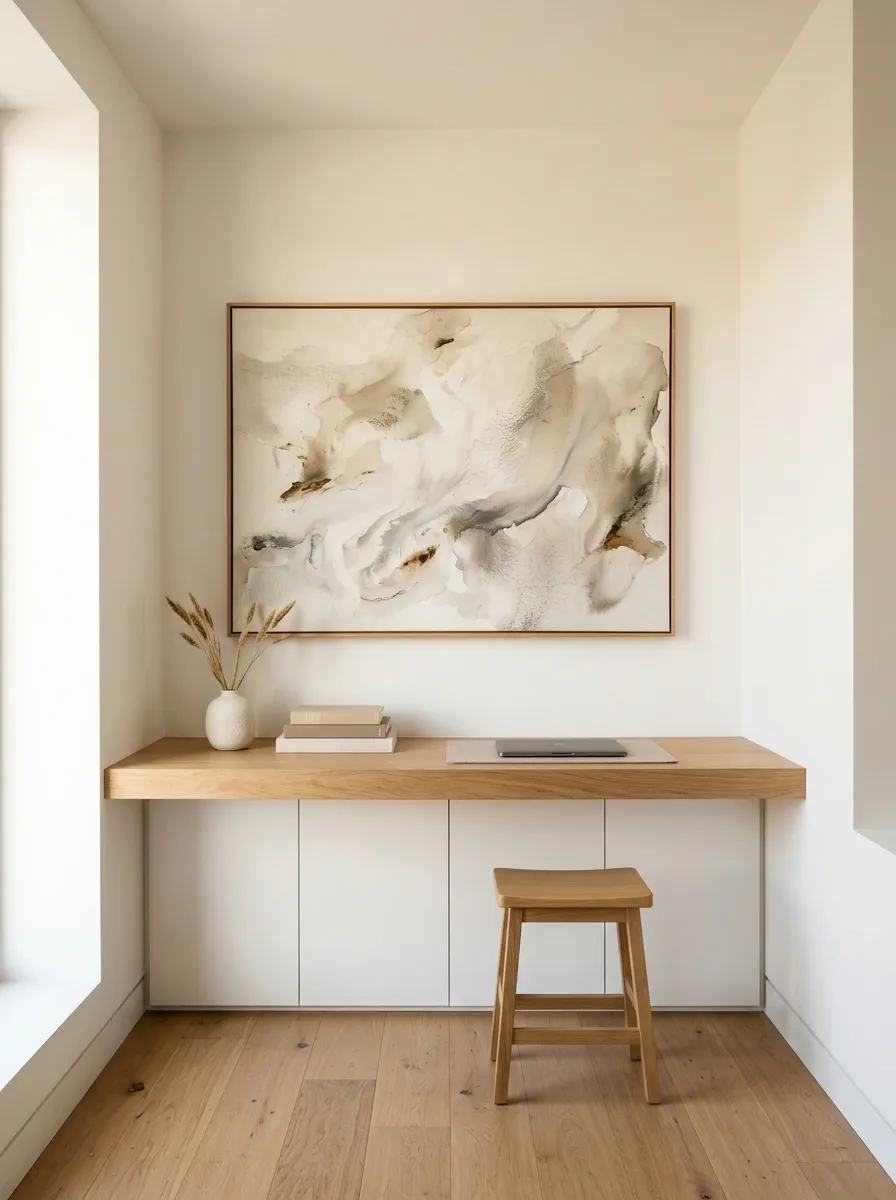
A long horizontal artwork can completely change the feeling of a narrow office. Instead of filling the wall with several vertically oriented frames, this design places one wide piece above a slim desk, with low shelving and minimal accessories underneath.
The horizontal artwork visually extends the composition from side to side, while the low furniture keeps the upper half of the room open. Warm white walls and natural wood prevent the narrow space from feeling cramped.
The secret is restraint. One strong horizontal piece can do more for the room than a cluttered gallery squeezed into every available inch. A narrow wall doesn’t need a collection of tiny rectangles auditioning for space.
Organic Modern Office With Plaster Walls and Natural Wood
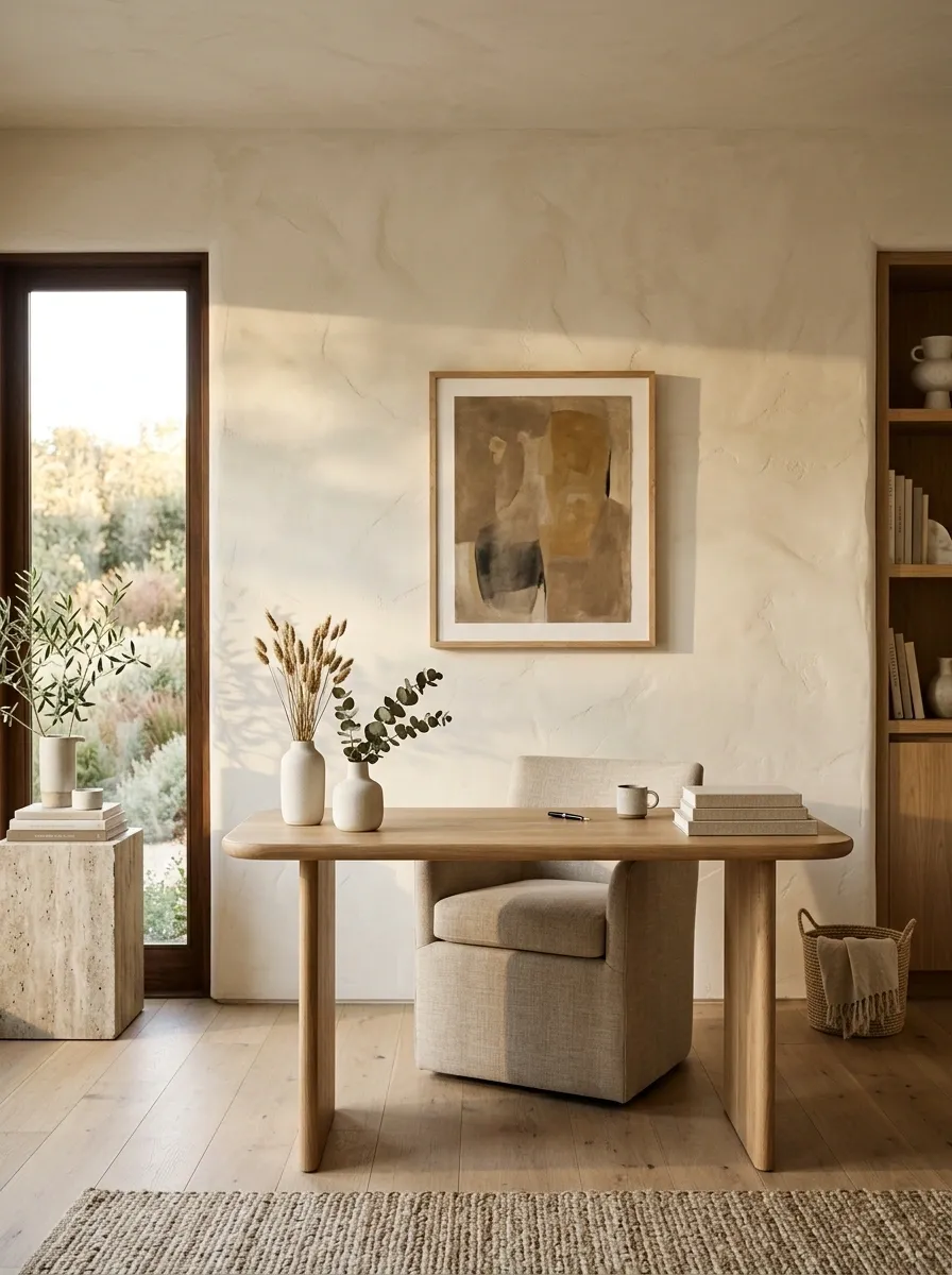
Soft plaster-like walls give this office an almost sculptural backdrop. Instead of covering the surface with a busy collection of decor, the room relies on texture, natural wood, woven upholstery, stone accents, and one restrained piece of artwork.
The desk has a simple sculptural shape, while the chair adds softness without introducing another competing pattern. Warm daylight moves across the textured wall, making the finish itself part of the room’s visual story.
This design works because nothing is trying to imitate anything else. The wall is tactile, the desk is warm, the textiles are soft, and the stone adds a little visual weight. It feels layered without looking crowded. Basically, the office has discovered that “more stuff” and “more interest” are not the same sentence.
Home Office With a Large Cork-and-Wood Work Wall
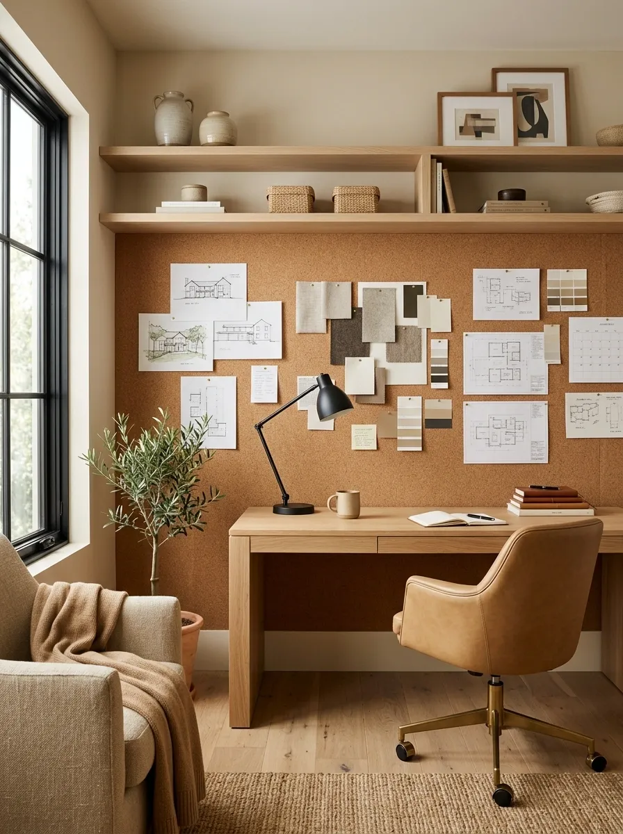
A broad cork wall turns this office into a practical creative workspace while keeping the overall room warm. A wood desk sits directly below the cork panel, with shelves for notebooks and supplies and a few framed pieces around the working material.
The wall has two distinct roles. It holds information that changes, while the surrounding artwork and shelving provide the permanent visual structure. Keeping those roles separate is what prevents the room from looking like a permanent brainstorming session.
Natural cork and warm wood also work beautifully together because neither feels overly polished. Add a simple task lamp and comfortable chair, then leave part of the desk clear. The wall can handle the chaos. The desktop really doesn’t need to apply for the position.
Soft Transitional Office With Built-In Desk and Framed Landscape Art
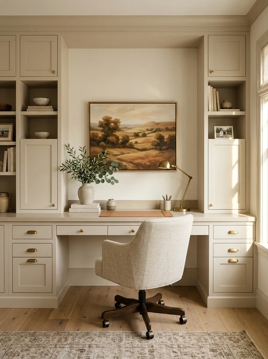
Painted cabinetry gives this office a calm architectural foundation, with a centered built-in desk tucked naturally into the wall. Above it, one framed landscape artwork adds color and depth without competing with the cabinetry.
The furniture is traditional enough to feel established but simple enough to keep the room current. An upholstered chair softens the built-in structure, while warm metal lighting and a few restrained accessories connect the smaller details.
Proportion matters more here than decoration. The artwork should relate clearly to the desk below, and the cabinetry should feel substantial without swallowing the entire wall. This is the kind of office that looks organized before anyone has even opened the laptop. Suspiciously competent, but we’ll allow it.
Bright Creative Office With a Gallery Wall and Colorful Furniture
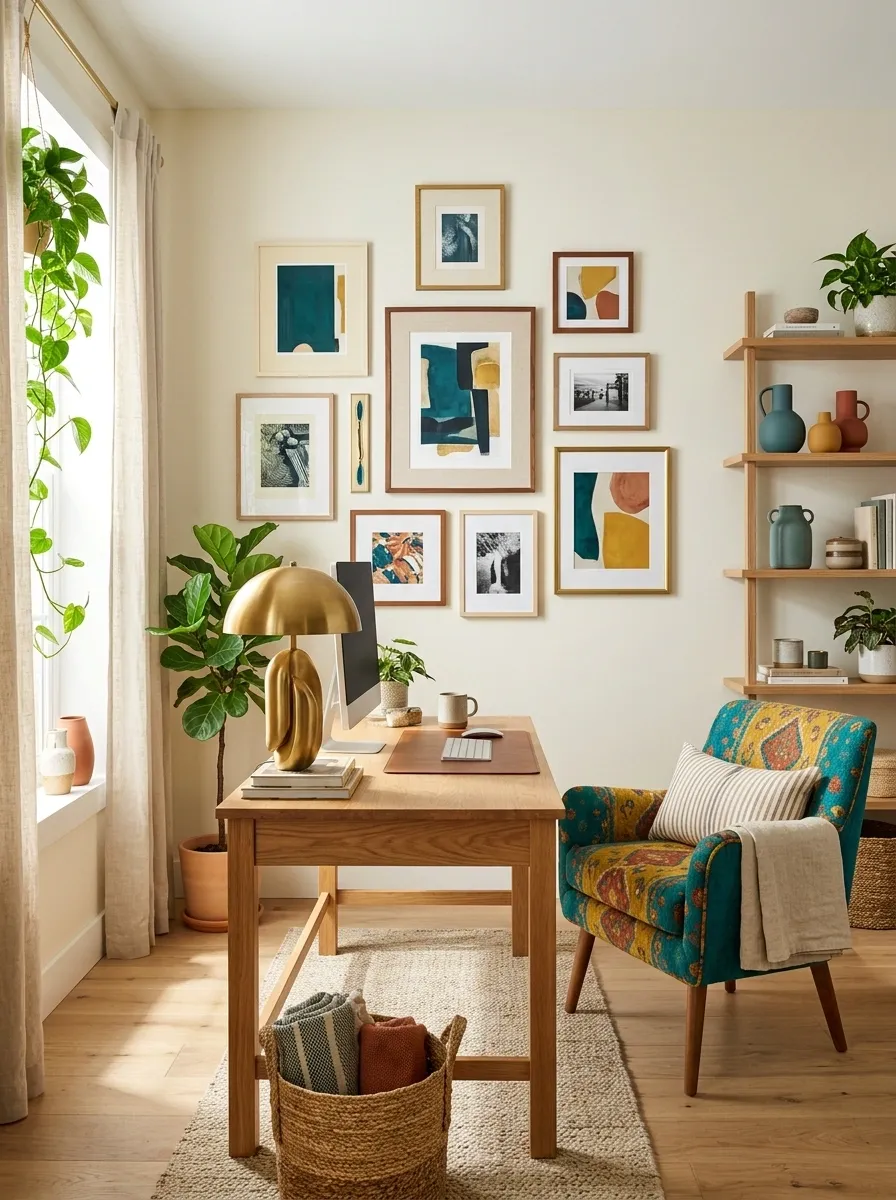
The final design brings color into the office through the furniture as much as the wall. A light neutral backdrop supports a warm oak desk, a colorful upholstered chair, mixed framed artwork, open shelving, and a sculptural lamp.
The gallery wall picks up small color notes from the chair and accessories, but nothing matches exactly. That keeps the room energetic without making it look coordinated down to the last pencil cup. The pale wall also gives the brighter pieces somewhere to breathe.
This works particularly well for a creative workspace because the room feels personal without becoming visually exhausting. The wall has character, the furniture has color, and the rest of the room knows when to stop talking.
Don’t copy the exact shade.
Conclusion
The best office walls don’t look decorated for the sake of being decorated. They look like they belong to the room. Sometimes that means one oversized artwork against a quiet wall. Sometimes it means shelves that become part of the architecture, a textured finish that carries the room by itself, or a gallery arrangement with enough personality to make the desk feel intentional.
The useful part is choosing the whole direction first. Look at the wall, desk, chair, flooring, lighting, and storage as one composition. Then decide where the visual focus should live. That single shift can turn an office from a desk shoved against a wall into a room that actually feels finished.