
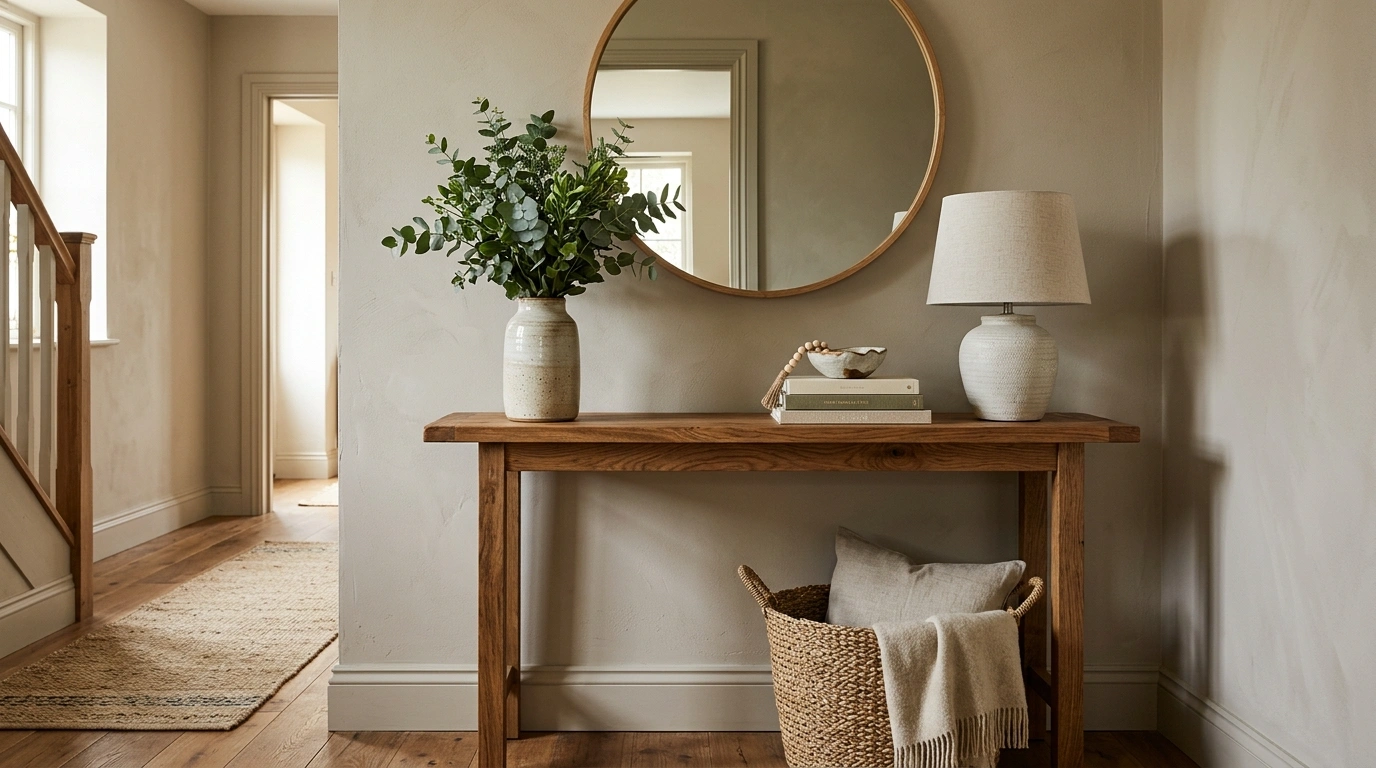
A console table can either make an entryway look intentional or become the place where keys, receipts, chargers, random mail, and one suspiciously permanent water bottle go to retire.
The difference usually isn’t the table itself. It’s the relationship between the console, the wall behind it, the floor, nearby furniture, lighting, and the rest of the room.
That is why isolated styling advice rarely tells the whole story. A lamp might look great in a photo, but it doesn’t explain what happens when the wall is narrow, the hallway is dark, the furniture nearby is traditional, or the console suddenly has to coexist with an actual family.
Console Table Styling Ideas
Modern Black Console With Round Mirror and Neutral Stools
This setup relies on striking contrast and clean lines. A deep black console anchors the space beneath a large round black-framed mirror, while a pair of textured white stools tuck neatly underneath to soften the darker tones.
The simple accessories keep the focus on scale and texture. A sleek vase with delicate florals and minimalist white candles add height without cluttering the surface, letting the bold silhouette of the furniture do the heavy lifting.
Everything has a clear purpose in this arrangement. The dark finish makes a confident statement while the cozy seating underneath keeps the composition feeling welcoming and complete.
Rattan Console With Coastal Artwork and Sandy Neutral Palette
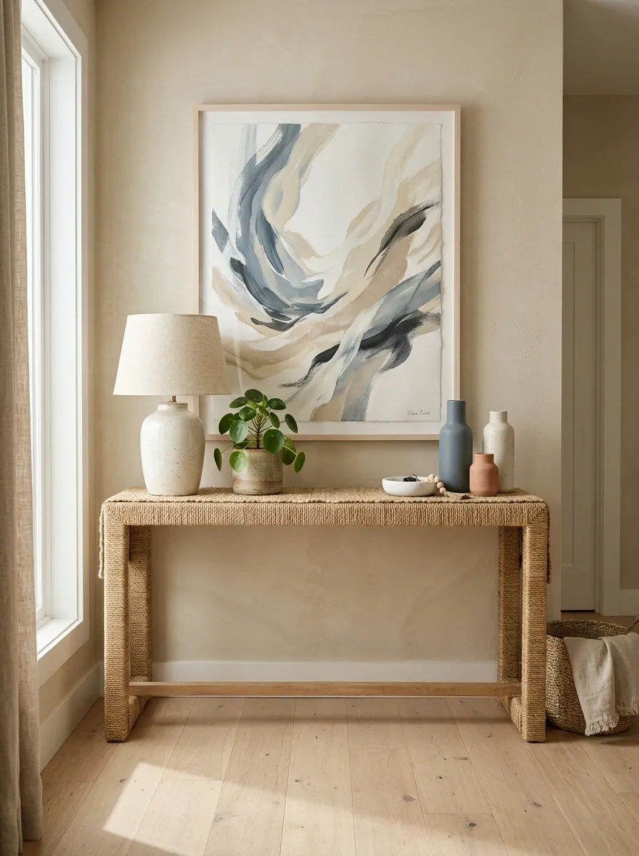
A rattan console gives a coastal room texture before a single accessory lands on the tabletop. This version pairs the woven furniture with sandy walls, pale wood artwork framing, blue-gray artwork, a ceramic lamp, and a textured runner. The colors stay muted rather than going full beach-house souvenir shop.
The woven console creates the strongest surface texture, so the rest of the room can stay soft and simple. Blue appears in small doses to break up the warm neutrals, while pale wood keeps the whole arrangement connected. A little greenery works here too, but it should look like part of the room rather than a jungle audition.
The overall effect feels relaxed without relying on seashells to announce that the house is near water.
Curved Wood Console With Organic Mirror and Lush Greens
A beautifully sculpted wood console brings architectural interest straight to the entryway. Paired with a matching rounded mirror and plenty of fresh green plants, this look leans heavily into natural warmth and organic shapes.
The sweeping lines of the console base create a stunning focal point against a neutral wall. Scattered greenery in simple pots introduces life and texture, transforming a simple passage into a vibrant welcome.
This arrangement proves that wood tones can feel modern and airy. The earthy palette keeps the space grounded while the curved silhouettes soften every corner of the room.
Industrial Steel Console With Concrete Walls and Warm Wood Accents
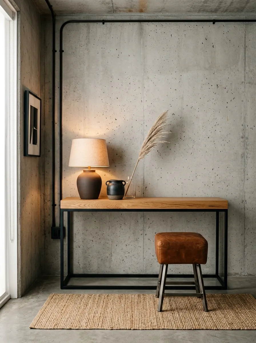
This setup leans into contrast. A slim black steel console with a warm wood top stands against a concrete-style wall, while a leather stool, textured rug, and warm lamp keep the room from becoming a collection of cold surfaces.
The metal frame gives the console a sharp architectural outline, but the wood top and leather nearby introduce enough warmth to make the composition livable. The concrete backdrop works because it stays visually simple. Covering it with lots of artwork and accessories would erase the reason the industrial look works in the first place.
A few strong materials carry this entire scene. Metal, concrete, wood, leather. Done. The room does not need a motivational sign explaining the aesthetic.
Hairpin Leg Console With Ambient Lighting and Radiator Cover
This clever entryway solution makes functional spaces look effortlessly chic. A warm wood tabletop resting on slim black hairpin legs sits gracefully above a radiator, framed by twin wall lamps that cast a soft, inviting glow.
A trailing houseplant adds a touch of life and casual movement across the wood surface, while minimal decor keeps the narrow walkway feeling open and uncluttered. The vertical lighting draws the eye upward.
Practicality meets great design in this setup. It turns a standard hallway obstacle into an intentional focal point without sacrificing an inch of precious floor space.
Painted Blue Console With Brass Mirror in a Classic Foyer
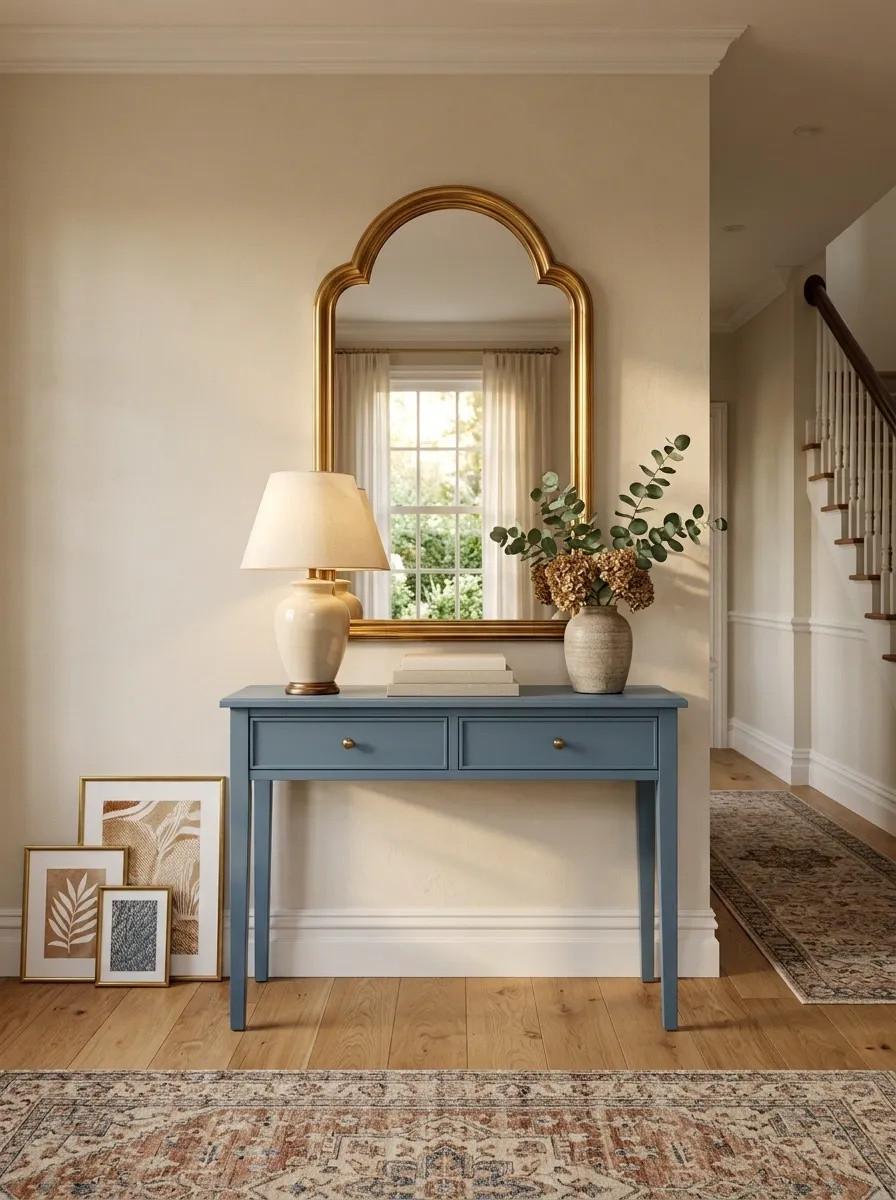
A painted blue console creates a much stronger focal point than a standard wood finish, especially against a warm neutral wall. This foyer combines dusty blue cabinetry with a brass-framed mirror, patterned runner, traditional lamp, and a handful of framed prints.
The color works because it has a clear job. Blue anchors the lower half of the composition, while brass adds warmth and cream-colored details keep the darker paint from taking over. The artwork introduces more personality but stays connected through repeated warm tones.
This arrangement has enough color to feel memorable without becoming loud. The blue is the statement. Everything else knows when to stop talking.
BRASS IS THE SPARK.
Fluted Black Console With Brass Accents and Nature
A fluted black console instantly elevates a foyer with rich texture and moody sophistication. Topped with a round mirror, sculptural black candlesticks, and tall branches in a matte vase, this composition feels both dramatic and refined.
The repeating ridges on the console base catch the light beautifully, adding depth to the dark finish. A neutral stone lamp and warm wooden tray balance the cooler tones, creating a curated, high-end look.
This styling proves that dark furniture doesn’t weigh down a room when paired with the right heights and textures. The tall branches draw the eye up, making the entire entryway feel grand and polished.
Minimal Floating Console Under a Tall Vertical Mirror
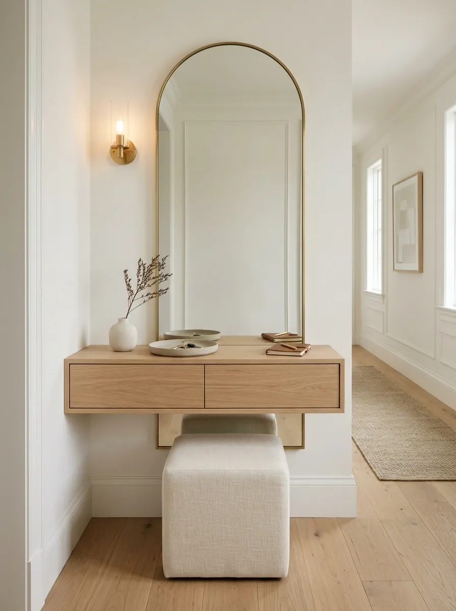
A floating console gives a narrow entryway a lighter footprint because more of the floor remains visible. This version uses a wall-mounted wood console beneath a tall vertical mirror, with a compact stool, one soft light source, and only a few carefully selected objects.
The vertical mirror works with the narrow proportions of the hallway instead of competing against them. Because the console has no visible legs, the floor reads as one continuous surface, making the passage feel cleaner and less interrupted.
There is also a practical advantage here. Closed storage can hide keys, chargers, and the mysterious collection of objects that somehow accumulates near every front door.
The floating design keeps the room looking polished while quietly doing some actual work.
Classic Black Console With Warm Wood and Patterned Wallpaper
Traditional charm meets modern contrast in this beautifully layered entryway. A slim black console table stands against intricate patterned wallpaper, topped with a gleaming gold mirror, a textured lamp, and framed artwork.
The lower shelf works overtime holding a woven storage basket and classic books, adding practical function while grounding the design. Warm lighting from the fabric-shaded lamp softens the sophisticated black frame.
Every element in this vignette tells a story through pattern and texture. It is a masterclass in mixing traditional details with clean furniture lines for a timeless welcome.
Farmhouse Console With Vintage Lamp and Woven Storage
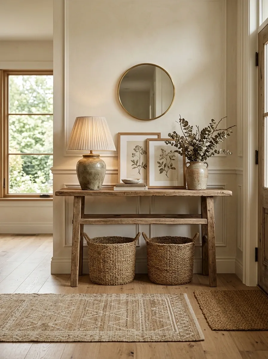
This farmhouse composition works through warm texture rather than excessive rustic decoration. A weathered wood console anchors the entry, with a vintage-style lamp, woven baskets underneath, framed botanical artwork, and a textured runner connecting the furniture to the floor.
The baskets are especially useful because they give the open space beneath the console a purpose without making it look packed. The artwork adds a little age and softness, while the lamp creates a warm vertical element against the wall.
Keep the palette close to weathered wood, cream, tan, and muted green. Once the arrangement starts collecting signs, quotes, metal stars, and every basket known to humanity, the farmhouse line has officially been crossed.
Botanical artwork
One or two tactile objects
Extra supplies
Small entryway odds and ends
Asymmetrical Mirror Styling With Black Console and Lanterns
An eye-catching organic mirror sets an artistic tone above a sleek black console table. Flanked by large floor lanterns and styled with matte black decor, this entryway creates a moody and unforgettable first impression.
The asymmetrical mirror shape breaks away from traditional lines, adding a playful yet sophisticated edge to the wall. Simple black vases and subtle seasonal touches keep the tabletop clean and uncluttered.
This setup proves that monochromatic styling can pack a massive punch. By playing with varied heights and dramatic shapes, the entryway feels like a fully finished art gallery.
Marble-Top Console With Soft Taupe Walls and Black Framing
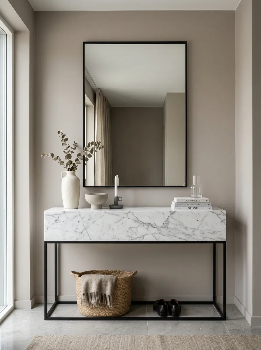
A marble-top console gives this room a crisp focal point without needing a complicated arrangement. The stone surface sits on a slim dark base, with a black-framed mirror above it, a soft taupe wall behind everything, and a few understated ceramic pieces on top. The palette is restrained, but the materials keep it from feeling flat.
The marble should remain the star. Accessories work best when their shapes are simple and their colors stay close to the surrounding neutrals. The black frame adds just enough definition to keep all those soft tones from melting together.
This is polished without becoming overly precious. And thankfully, nobody needs seventeen gold objects to make the marble look expensive. It already got the memo.
BLACK SECOND.
EVERYTHING ELSE QUIET.
Compact Console Beneath a Gallery Wall in a Creative Home Office
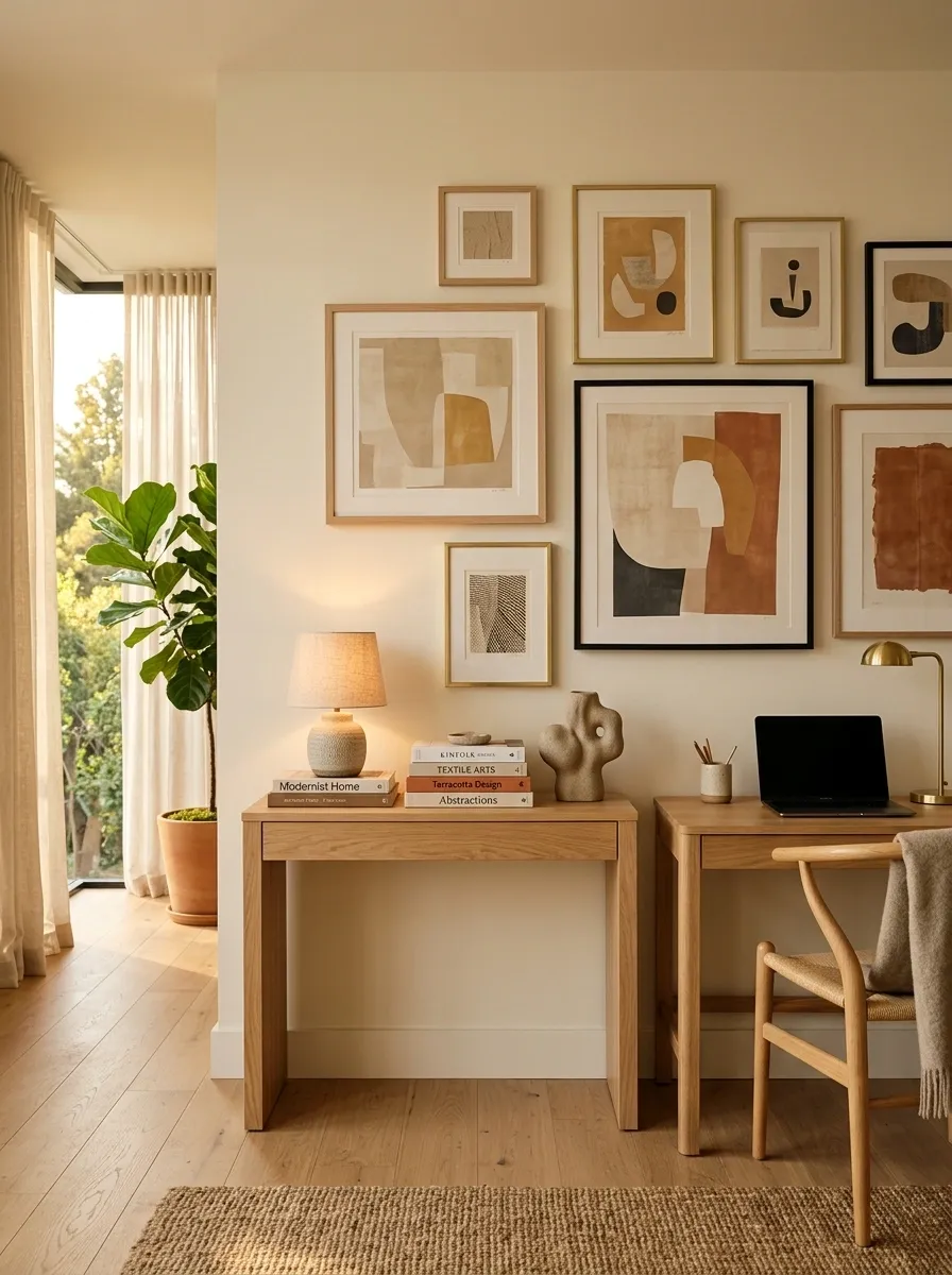
A console does not have to live in an entryway. In this home office, a compact wood console becomes the visual bridge between the working area and the rest of the room. A desk sits nearby, while layered artwork rises above the console and a small lamp adds warmth. Books and closed storage keep practical items nearby without turning the surface into another workstation.
The artwork is intentionally more playful than the desk setup, giving the room some personality without making the work zone feel chaotic. Repeating the console’s wood tone in the desk or shelving creates a quiet connection between the two areas.
It is part display wall, part support station, and somehow neither side looks confused about its job.
Warm lighting
Books and objects
Task lighting
Daily equipment
Entry Console With Bench Seating and a Layered Textile Palette
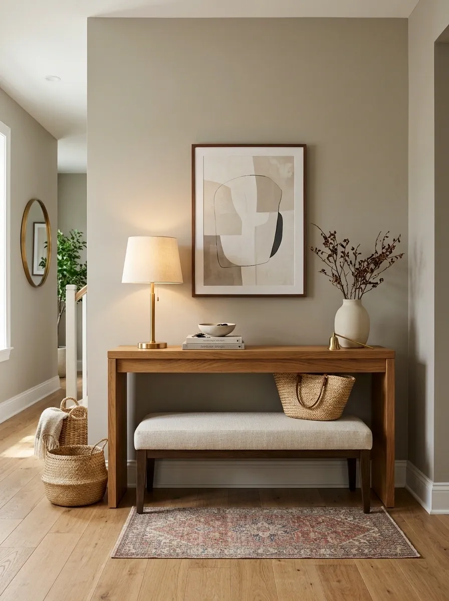
A console becomes more useful when it works with seating instead of standing alone against the wall. This arrangement combines a medium wood console with a low upholstered bench, soft cushions, a runner, a warm lamp, and simple artwork above. The bench fills the lower space with a practical purpose while the console keeps the wall visually anchored.
The textiles are where the room gets its depth. A woven runner, tailored cushion fabric, and softer upholstered seat create several textures without requiring a mountain of decor.
The whole arrangement feels finished because the upper and lower halves relate to each other. A console hovering over an empty floor can look a little lost. Give the empty space a job and suddenly everyone understands the assignment.
Scandinavian Console With Pale Wood, White Walls, and Black Accents
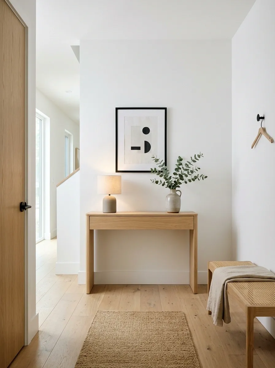
This Scandinavian-inspired composition uses a much quieter visual language. A pale wood console sits against white walls, paired with a simple black-framed artwork, a compact lamp, and restrained greenery. The floor stays light, and nearby furniture follows the same clean proportions.
The black details are important because they give the pale room definition. Without those small dark notes, the entire scene could become one large field of beige and white with no visual punctuation. The secret is keeping black limited to a few strong lines rather than spreading it across every accessory.
The room feels calm because there is space between things. Revolutionary concept, apparently.
Dramatic Stone Console With Sculptural Decor and Shadowy Lighting
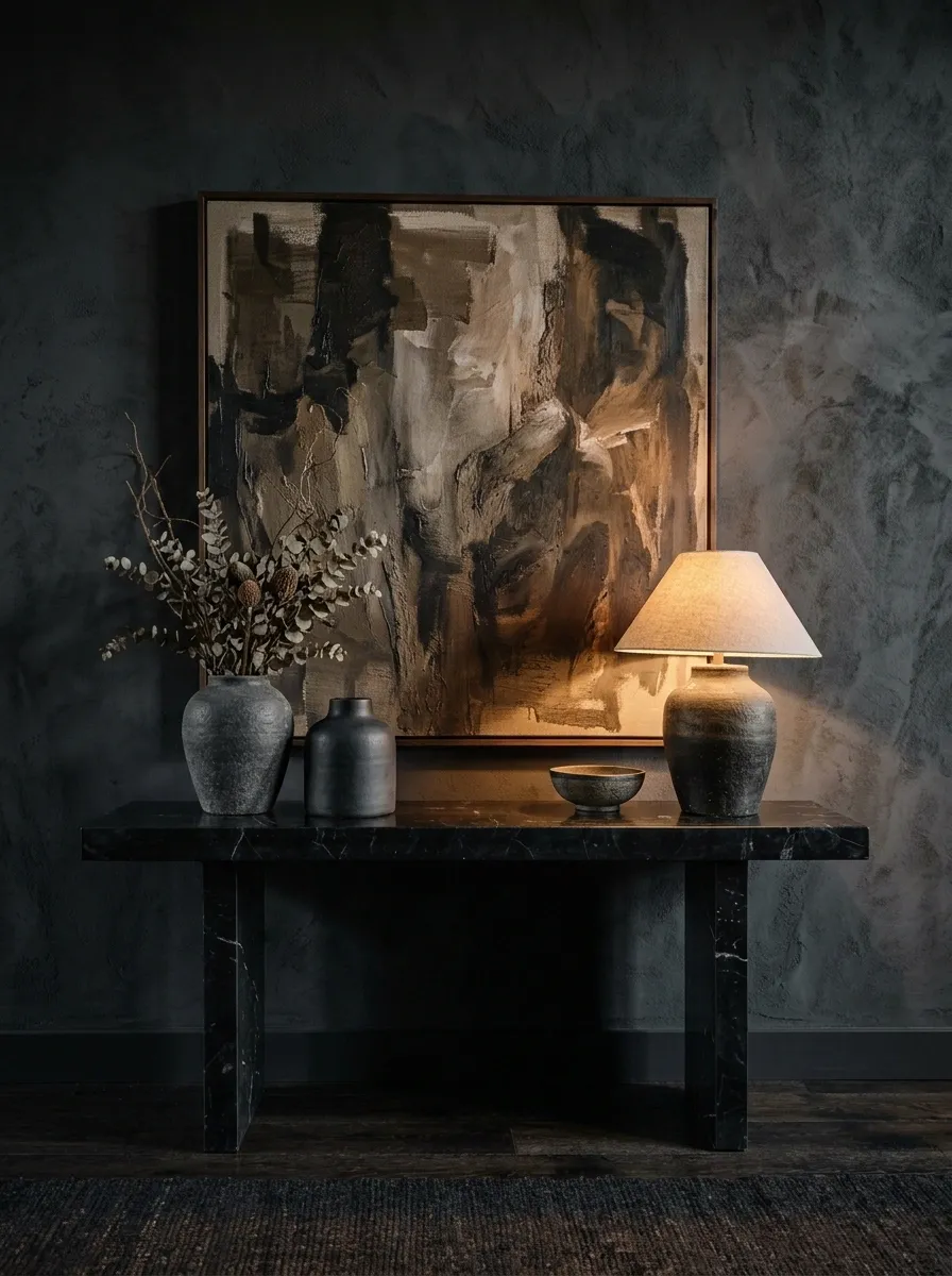
This is the version for a room that wants a little more drama. A dark stone or stone-look console sits against a textured wall, paired with an oversized artwork, a sculptural lamp, and a few large decorative forms rather than lots of tiny pieces. Warm directional lighting creates pockets of brightness while the rest of the wall remains intentionally subdued.
The composition works because the darkness is controlled. The console has visual weight, but the surrounding floor and selected objects keep the scene readable. Large forms also matter here. Tiny accessories would disappear against the deep backdrop, while oversized pieces reinforce the architectural mood.
Nothing about this setup whispers. It also does not need to yell.
Outer edges
Background surfaces
Lamp
Console surface
Dark floor tones
Negative space
Warm Transitional Console With Mirror, Lamp, and Upholstered Stool
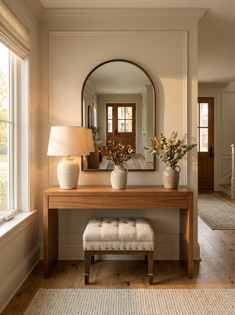
This transitional entryway sits comfortably between traditional and modern without looking like it is having an identity crisis. A medium wood console anchors the wall, while a classic mirror, tailored lamp, upholstered stool, neutral rug, and subtle brass details create a polished composition.
The trick is the mix of shapes and finishes. Traditional details give the room some character, while the cleaner furniture lines stop it from feeling overly formal. The stool also adds a softer lower element, balancing the console without making the entry feel crowded.
Keep the palette warm and fairly restrained. The goal is a room that feels established, not a showroom trying very hard to prove it has expensive taste.
Brass detail
Tailored lamp
Simple upholstery
Open visual space
Narrow Console Beneath a Large Leaning Artwork in a Long Hall
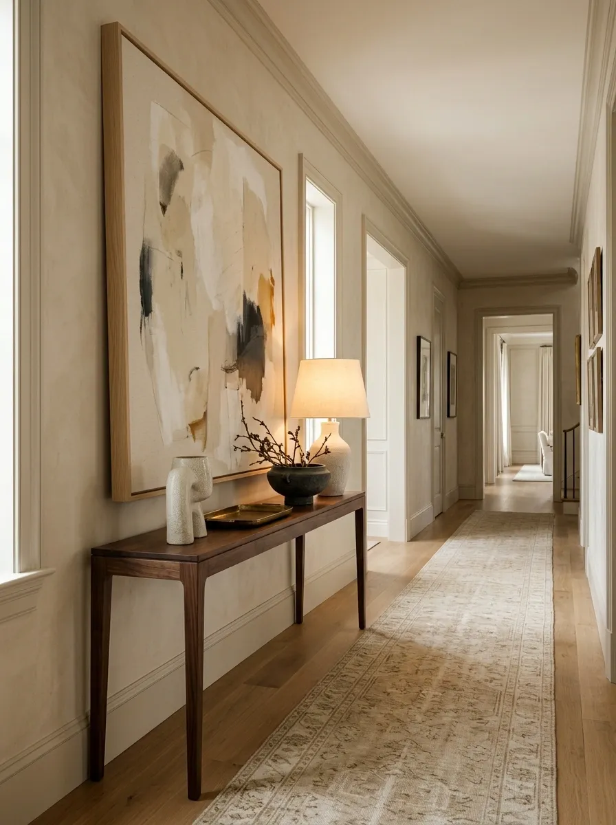
Long hallways often need stronger vertical interest to keep the eye from sliding straight through the room. This composition uses a slim console beneath a large artwork that leans against the wall, paired with one lamp and very little else. The artwork does most of the visual talking.
The large frame fills some of the vertical emptiness without requiring a gallery wall. A narrow console keeps the floor open, while a long runner reinforces the hallway’s direction. The result feels deliberate rather than packed.
The leaning artwork also adds a relaxed note. It looks styled, but not like someone measured the wall with a laser before placing every object. There is room for the room to breathe.
ARTWORK
Black-and-Wood Console With a Connected Living Room Palette
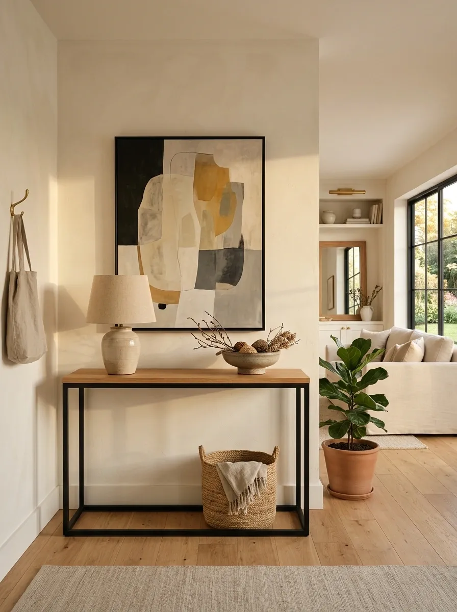
This console works because it belongs to the living room around it. A warm wood top and black base echo the finishes already used in the seating, lighting, or shelving nearby. A large piece of artwork sits above the console, while a simple lamp and low decor keep the arrangement visually connected rather than isolated.
That repetition matters more than matching every object. When the same black and wood tones appear elsewhere in the room, the console becomes part of the architecture of the space. It feels like a planned transition between areas instead of a decorative afterthought.
This is especially useful in open-plan homes, where a console can quietly connect two zones that would otherwise feel unrelated.
One table, two rooms, zero identity crisis.
Cane-Front Console With Soft Green Wall and Natural Accessories
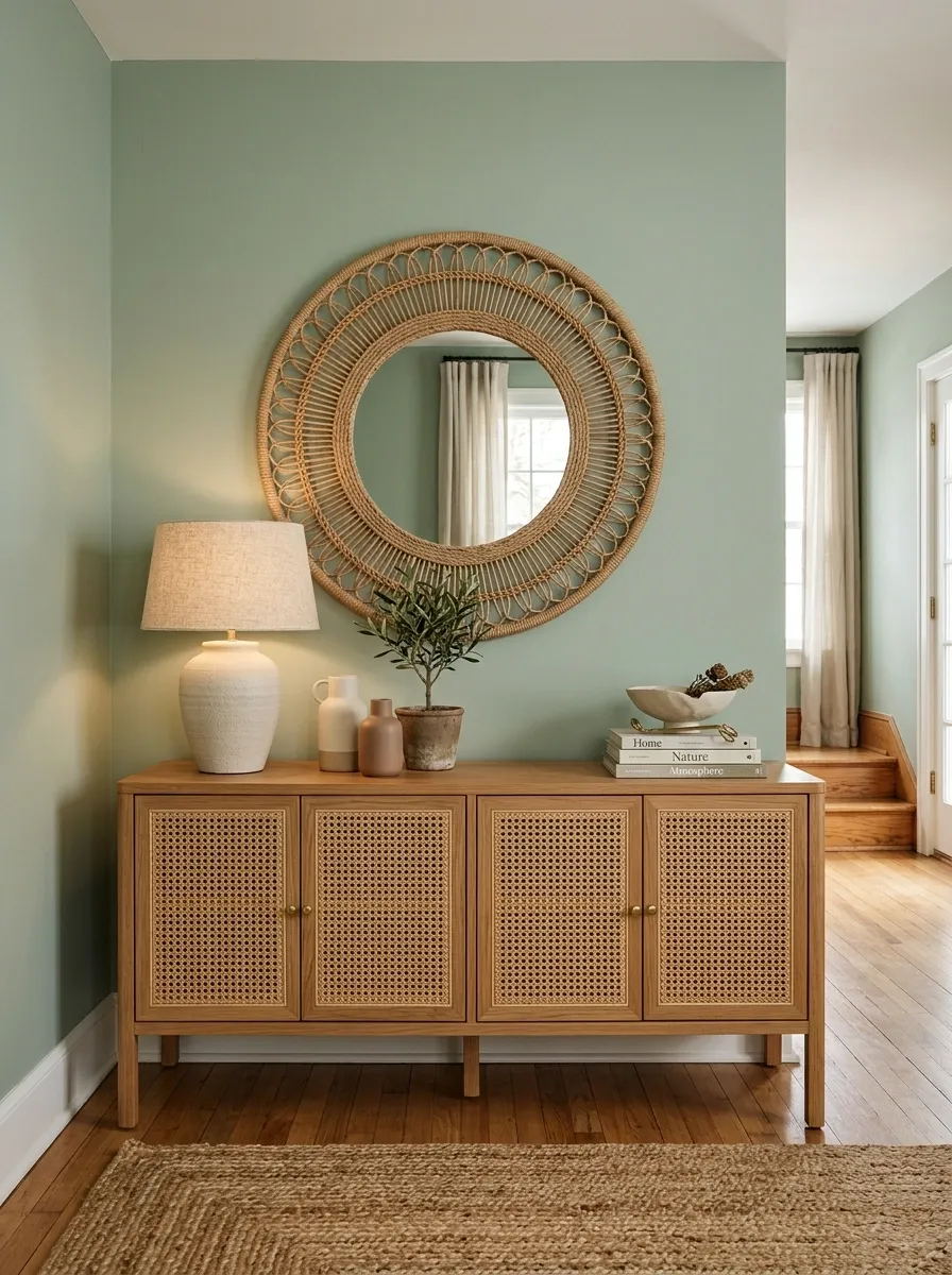
A cane-front console brings texture into this room before the styling even begins. The cabinet sits against a soft green wall with a woven mirror above it, a ceramic lamp on one side, and natural-toned accessories spread across the surface. A simple rug below keeps the same earthy direction.
The wall color and cane work especially well together because neither one needs to dominate. Green gives the background some depth, while the woven texture adds warmth and variation. Ceramic pieces introduce a smoother surface, so the composition doesn’t become one giant collection of rough natural materials.
The palette feels fresh without becoming overly botanical. There is greenery, sure, but no need to turn the console into a rainforest documentary.
Moody Library-Style Console With Books, Art, and Deep Brown Tones
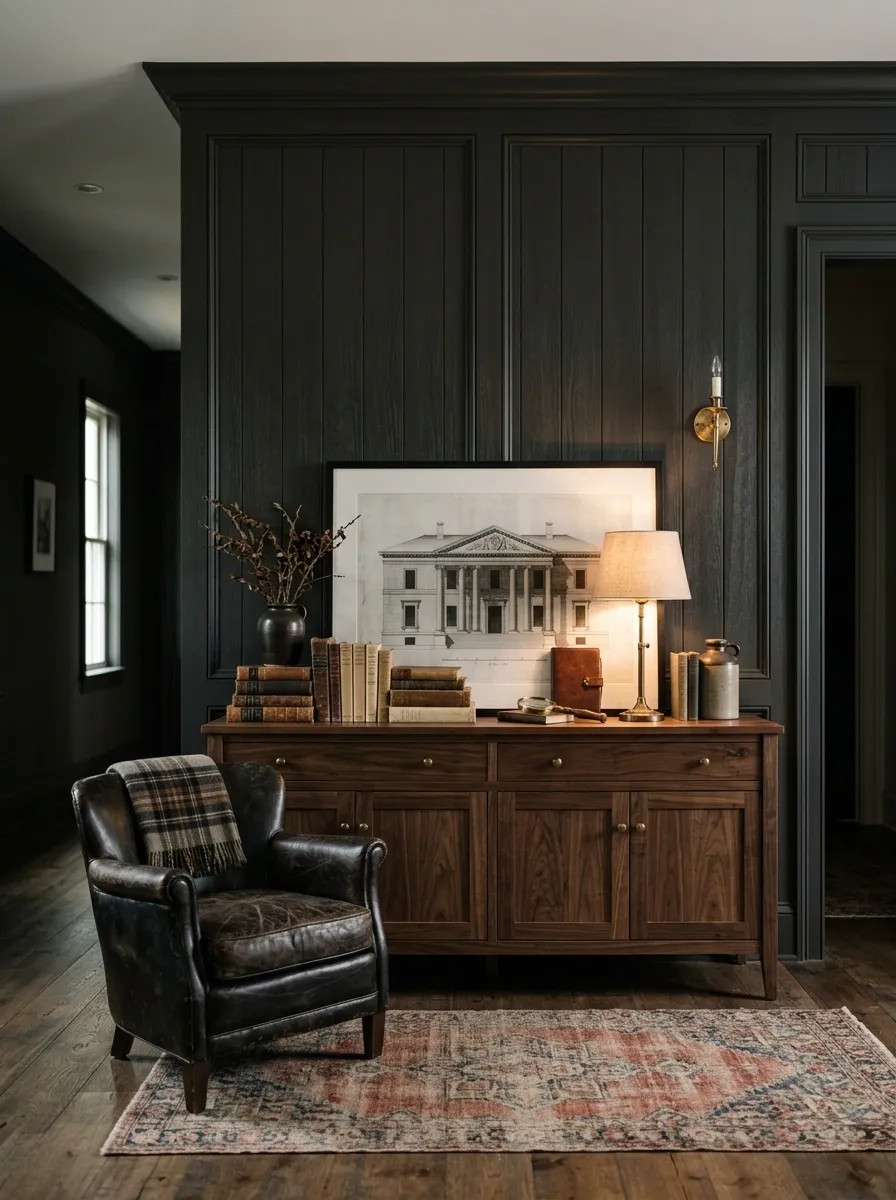
This console arrangement turns a hallway or living-room wall into something closer to a private library corner. A dark painted or paneled wall forms the backdrop for a substantial wood console, warm reading-style lamp, stacked books, framed art, and leather accents nearby.
The darker setting needs contrast, but not necessarily bright colors. Warm lighting, lighter book pages, and a few medium-toned objects keep the console readable against the deeper wall. The composition feels intimate because the lighting is selective rather than evenly bright.
Books also make practical sense here because they bring scale and texture without looking like decorative filler. The key is using real visual weight, not twenty tiny ornaments trying desperately to matter.
Console base
Deep wood
Leather
Wood undertones
Book pages
Small pale objects