
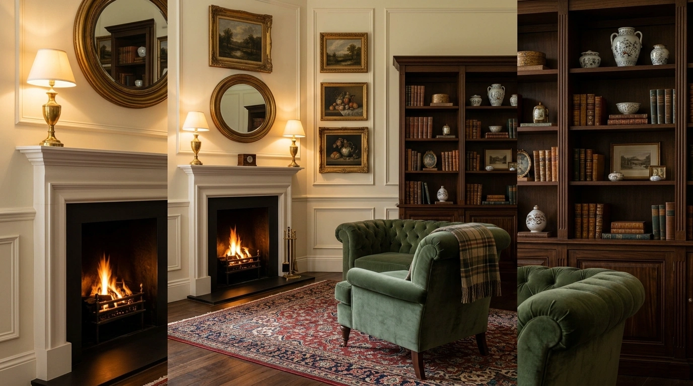
Character is usually missing from a room for one boring reason: too many safe decisions.
The furniture is fine. The colors are fine. The shelves are full. Nothing is technically wrong, yet the room still looks strangely forgettable. It has the personality of a password reset page.
A room starts feeling interesting when everything isn’t trying to match. One worn finish beside something polished. One strange little object that actually has a story. A lamp with a shape worth noticing. Art that doesn’t look like it was chosen five minutes after the sofa.
Ways to Add Character to Any Room
Give One Ordinary Wall an Unexpected Finish
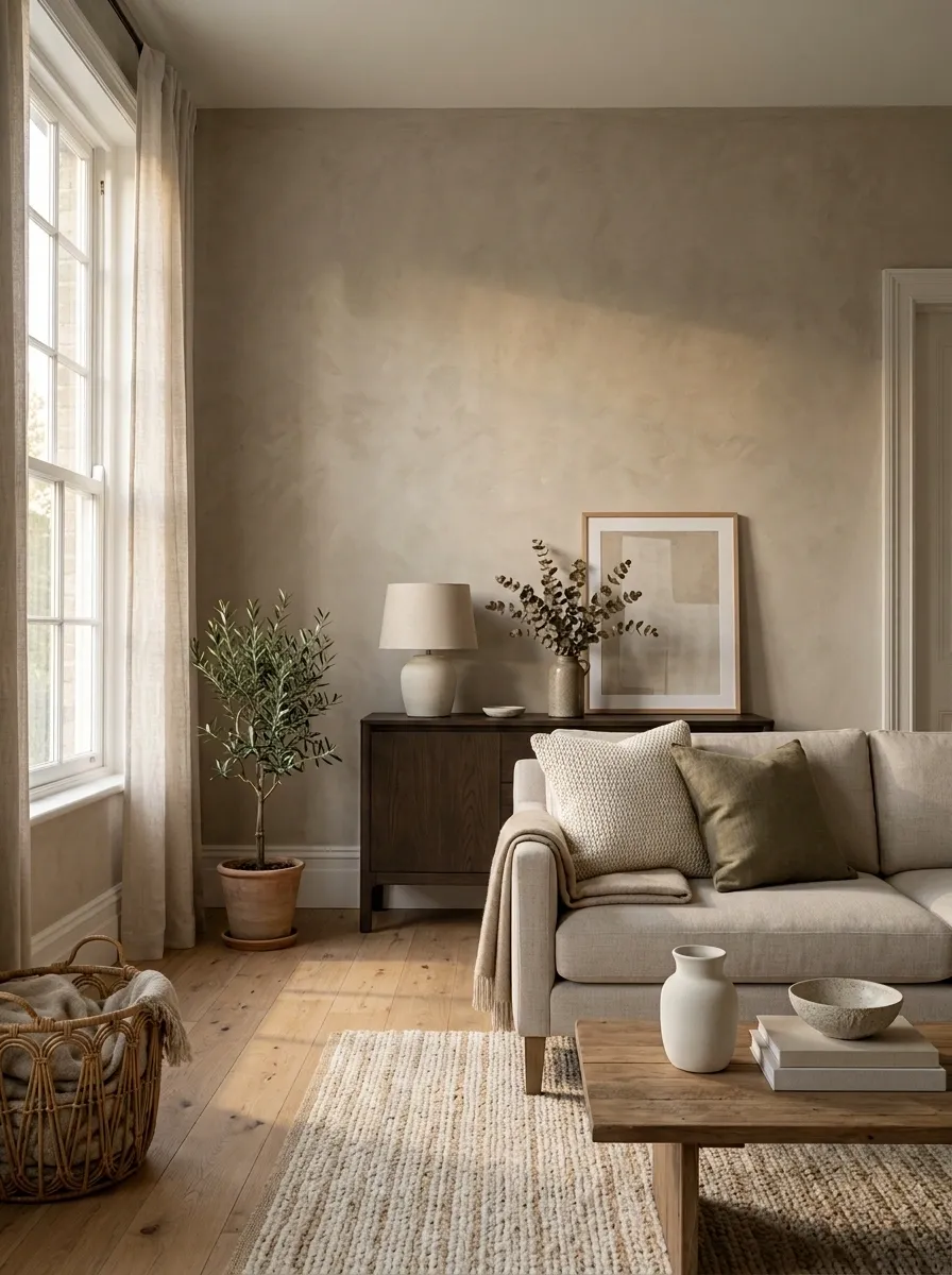
A completely plain wall isn’t automatically sophisticated. Sometimes it’s just waiting for something to happen.
Pick one wall and change the surface without covering every inch of it. A limewash look, subtle paneling, a deeper paint color, or textured wallpaper can give the room an immediate focal point.
Don’t decorate the wall first. Fix the wall first.
Keep the move contained:
- Choose one wall with natural visual importance.
- Give it a finish with texture or depth.
- Keep nearby decor quieter so the wall can do its job.
That keeps the room interesting without making every surface audition for attention.
Make the Lighting Part of the Room’s Personality
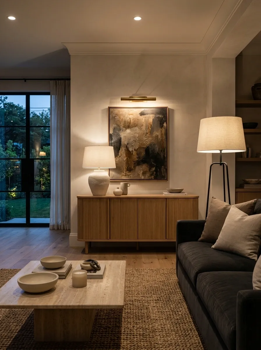
Bad lighting can make good furniture look suspicious.
Don’t treat lamps as background equipment. Choose fixtures with shape, material, and scale that add something to the room even when they’re switched off.
Start with the light closest to eye level. A table lamp with a sculptural base, a shaded floor lamp, or a small picture light can create a more intimate layer than one harsh ceiling fixture ever will.
Use this order:
- General room light
- Lower lamp or side light
- Focused light near art, shelves, or a reading spot
The room instantly feels less flat once light comes from more than one level.
Let Your Books Become Part of the Decor
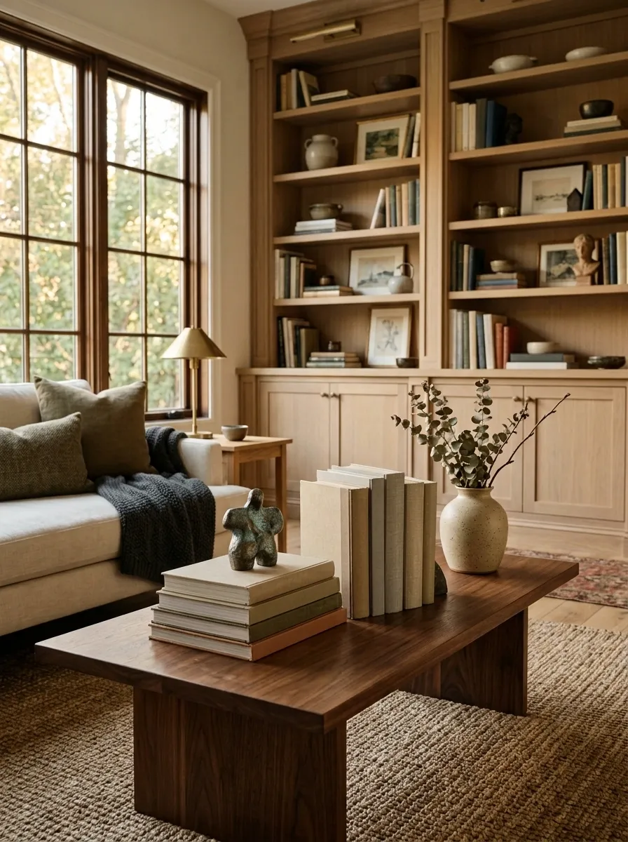
Books add a room something tiny decor often can’t: visual weight without looking like filler.
Use them where the room needs a little height, color, or softness. Stack a few on a coffee table. Place a short group beside a lamp. Mix upright books with one horizontal stack on a shelf.
The mistake is treating every book like a showroom prop.
Choose covers that actually suit the room, but don’t make them all match. A little variation keeps the display believable.
Better formula: one stack, one upright group, one object placed beside them.
That’s enough to make a shelf or table feel collected rather than carefully staged five minutes ago for the camera.
Choose One Pattern That Makes the Whole Room Less Predictable
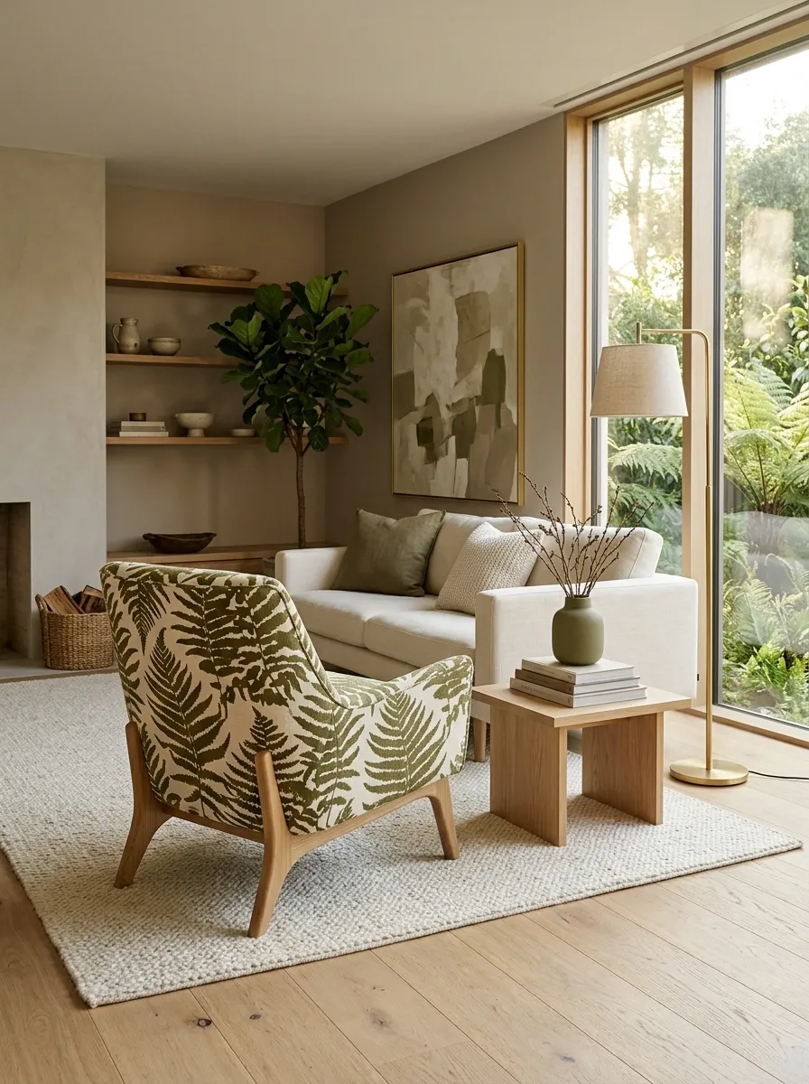
Pattern doesn’t need to take over the room. It just needs to interrupt all that quiet, matching upholstery before everything starts looking like it was approved by a committee.
Pick one pattern with a clear shape or rhythm. Stripes, checks, botanical forms, geometric prints, or a bold abstract can all work. Keep the pattern concentrated in one noticeable place, such as a chair, cushion, curtain, or rug.
The rule is simple: one strong pattern beats five nervous little prints fighting for attention.
Frame Something Unexpected Instead of Another Generic Print
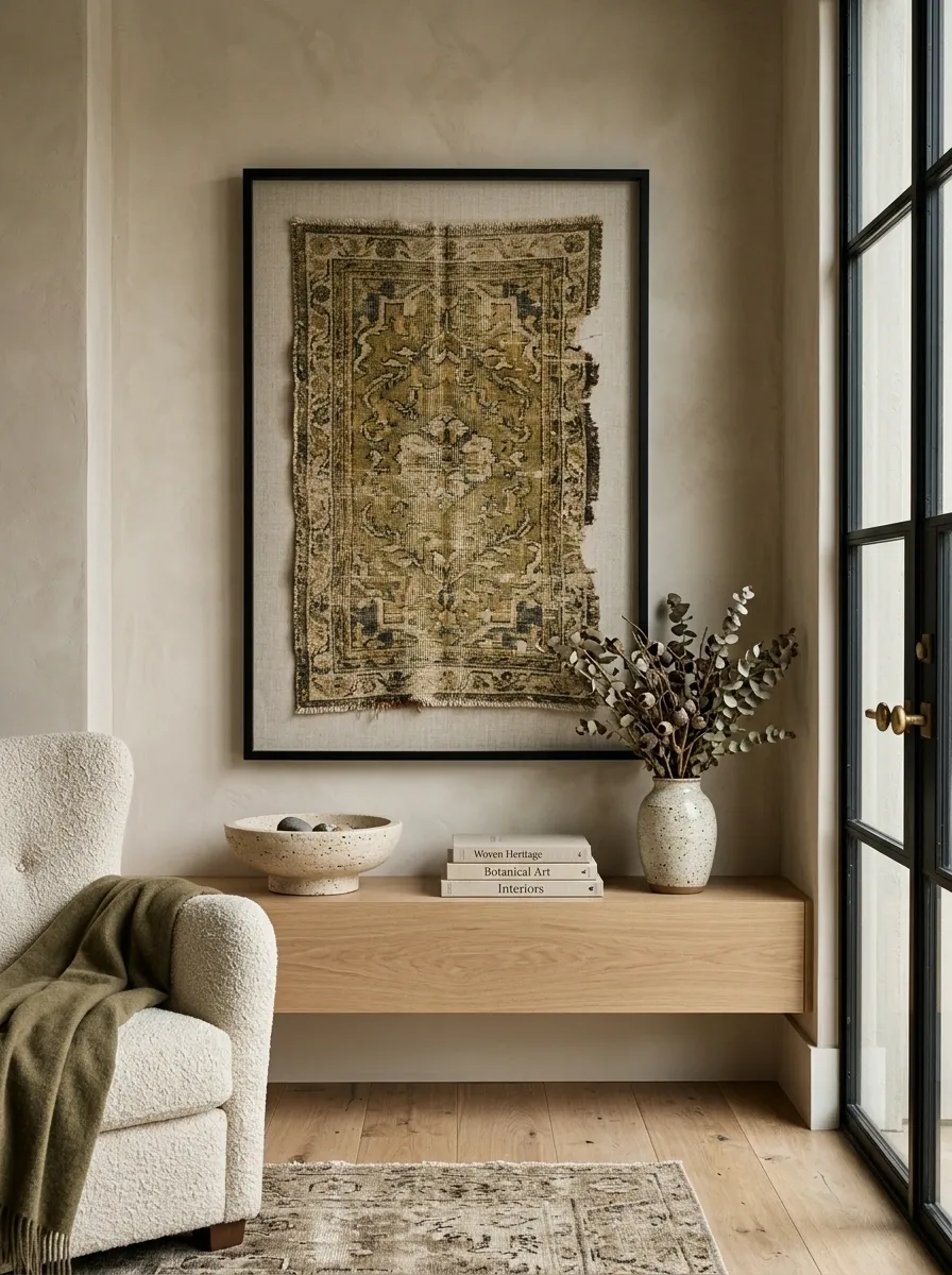
A wall gains personality fast when the frame contains something people don’t see in every second scrolling photo.
Use a vintage textile, architectural sketch, old map, pressed botanical shape, handwritten recipe, interesting fabric sample, or an object with a naturally flat profile. The point isn’t to find the rarest piece in the universe. It’s to choose something that feels specific.
Keep the frame simple when the contents are busy. Let unusual content do the talking.
Good wall art should give the eye a reason to stop. Generic filler usually gets promoted to “decor” and then immediately forgotten.
Break Up Matching Furniture With One Contrasting Piece
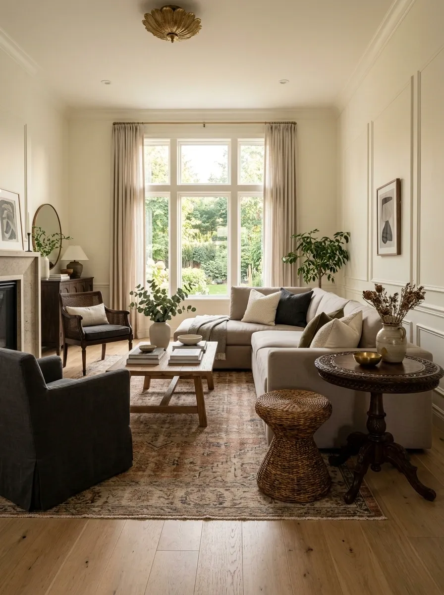
A room full of matching furniture can look organized and strangely lifeless. The fix doesn’t require replacing the set.
Keep most of the larger pieces related, then add one chair, stool, cabinet, or table that breaks the pattern. Change the silhouette first. A round table beside angular furniture can be enough. Material comes next. Wood beside metal, woven texture beside smooth upholstery, or a darker finish against pale furniture can create the needed contrast.
| Too Predictable | More Character |
|---|---|
| Same finish everywhere | Two related finishes |
| Same shape repeated | One contrasting silhouette |
| Same fabric family | One different texture |
The room still feels connected. It just stops looking like a bundle deal.
Use Curtains to Add More Than Just Privacy
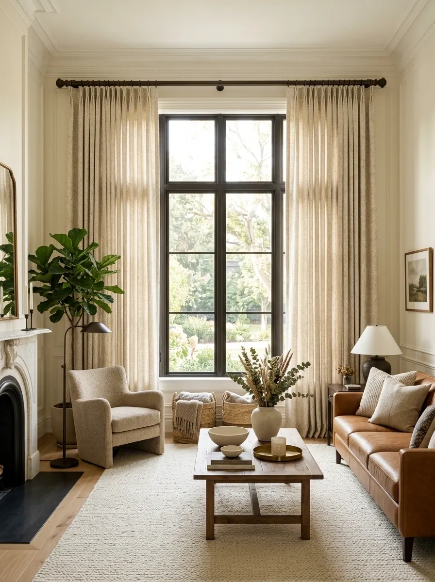
Curtains are often treated like the room’s boring utility player. That’s a missed opportunity.
Hang them high and let the fabric fall generously toward the floor. Choose a texture that supports the room instead of automatically reaching for the safest solid color available.
Linen-like fabric adds softness. Heavier woven fabric brings visual weight. A subtle pattern can give a quiet room some rhythm.
The biggest character boost comes from proportion. Skimpy curtains sitting halfway down a wall make the entire room feel shorter and cheaper. Full-length panels create a stronger vertical line and make the window feel properly dressed.
The curtain rod matters too. A beautiful fabric on a tiny, awkward rod is still losing the argument.
Give Small Decor Objects More Height and Presence
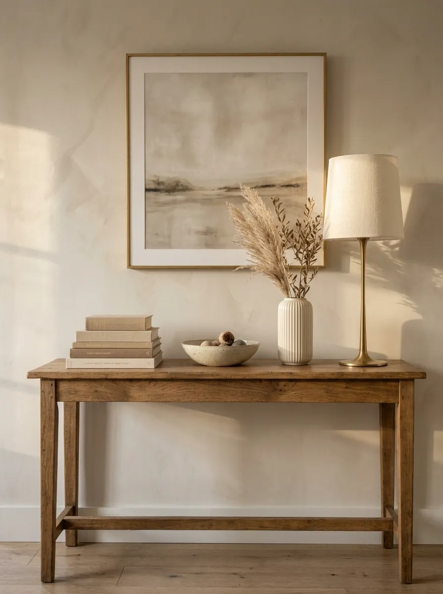
Tiny objects look even tinier when they sit alone on a large surface. That’s why a lovely little vase can somehow look like it got lost on the console.
Create height instead of buying more stuff. Raise a small object on a stack of books, place it beside a taller lamp, or group two pieces with clearly different heights.
Use three visual levels:
- Low, such as books or a tray
- Mid, such as a bowl or small vase
- High, such as a lamp or tall branch arrangement
The eye reads the group as one composition instead of a row of unrelated objects. That’s the whole trick.
Create a Personal Display From Things You Already Own
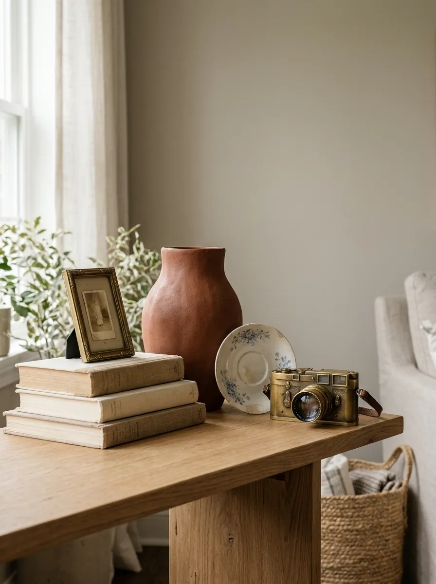
A room feels different when the objects actually have some connection to real life.
Use a few pieces that already matter: travel finds, inherited dishes, old cameras, handmade pottery, favorite books, or framed scraps that would otherwise sit in a drawer forever.
The key is editing. Three meaningful objects beat twelve random accessories.
Group them by shape or color so the display feels intentional without looking like a museum exhibit that charges admission.
Replace Builder-Basic Hardware With Something Noticeable
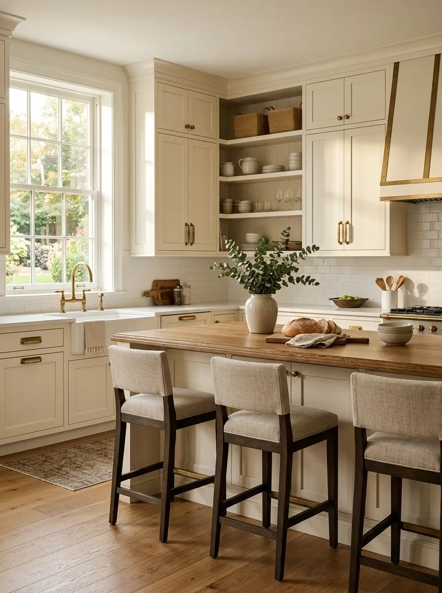
Tiny hardware gets ignored until it’s ugly. Then somehow the whole cabinet looks guilty.
Changing knobs and pulls is one of the quickest ways to make a basic piece feel more considered. Try aged brass, dark metal, ceramic, wood, or a shape with enough presence to be noticed from across the room.
Measure the existing holes before buying anything. That’s the boring part that saves a trip back to the store.
Use one finish consistently on the same piece. Mixing six unrelated handles doesn’t make a cabinet interesting. It makes the hardware section of the store look like it exploded.
Use a Rug to Connect Pieces That Don’t Match
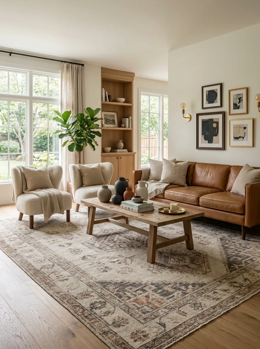
A rug can make a collection of unrelated furniture look like an actual room instead of several Craigslist listings sharing a floor.
Choose the rug after considering the largest seating or furniture group. It should visually gather the pieces rather than sit like a tiny island under one coffee table.
Color helps, but scale matters just as much. A larger pattern can anchor simple furniture. A quieter rug can calm a room with stronger chairs, art, or curtains.
The rug is the handshake between the furniture. It doesn’t need to match everything. It just needs to give the pieces a common ground.
Add Texture Where the Room Looks Too Flat
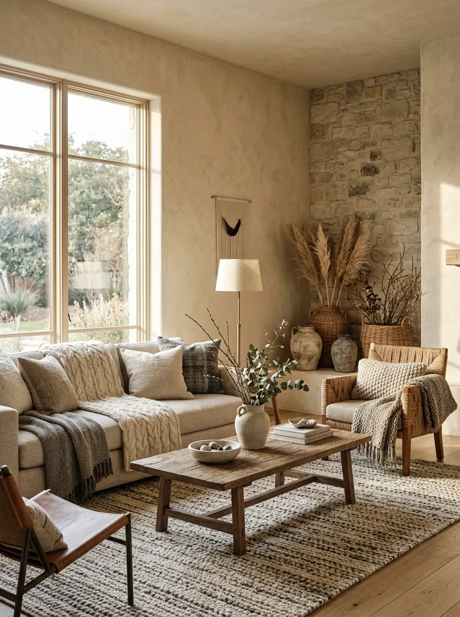
A room doesn’t need more color to feel interesting. Sometimes it just needs something rough, woven, ribbed, aged, or soft.
Look around the room for surfaces that all feel the same. Smooth wood beside smooth upholstery beside smooth walls is where the personality quietly leaves the building.
Add one contrasting material at a time.
Useful texture swaps:
- Woven basket against painted cabinetry
- Bouclé or nubby fabric beside smooth leather
- Rough ceramic beside polished stone
- Knotted or braided textile on a simple chair
Texture works best when the difference can actually be noticed from several feet away.
Leave One Space Slightly Imperfect on Purpose
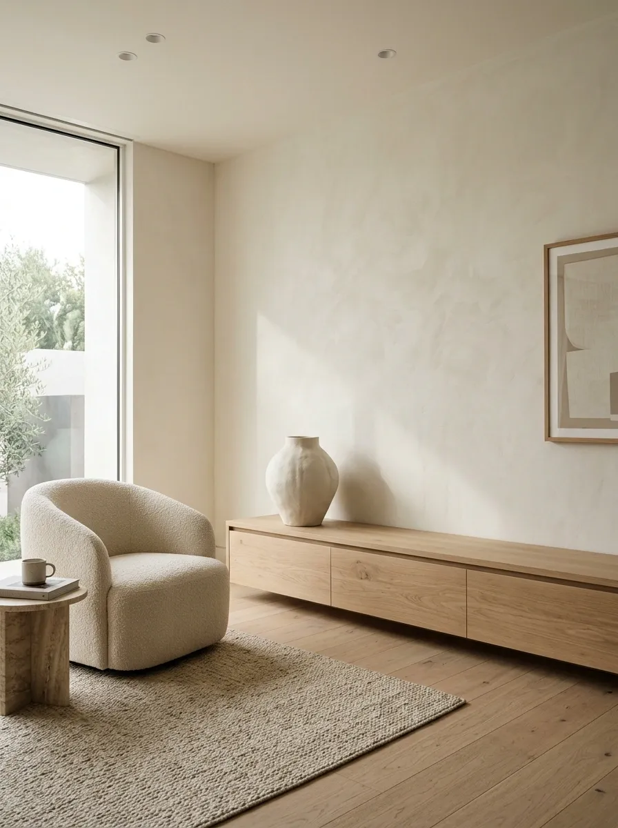
Perfectly filled surfaces look finished for about five seconds. Then they start looking exhausting.
Leave a little empty space around your strongest objects. Let one shelf breathe. Leave part of a console uncovered. Resist the urge to fill every blank wall simply because the wall exists.
That negative space makes the interesting pieces look more important.
A useful test: remove one object from a crowded arrangement and step back.
If the composition suddenly looks cleaner, congratulations. The removed object was working overtime for absolutely no reason.
Repeat a Color in Small Unexpected Places
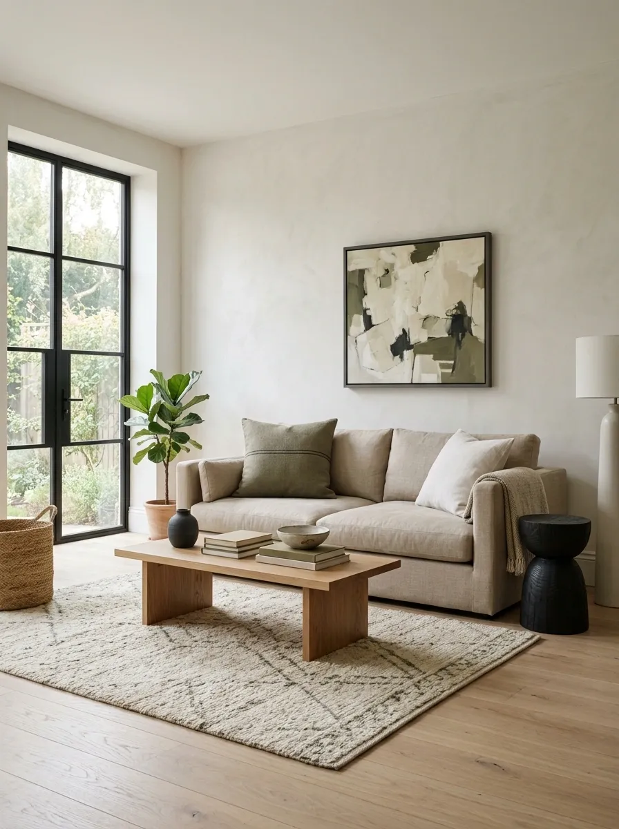
A room doesn’t need ten matching accessories to look pulled together. That’s how a color scheme starts looking like it came with instructions.
Pick one color already present in the room, then repeat it in two or three smaller places. A dark frame can echo a side table. A muted cushion can pick up a stripe in the rug. A tiny ceramic piece can quietly repeat the color of the curtains.
The repeated shade creates a visual thread without turning the room into a color-coordination hostage situation.
Keep the repeats spread out. Put them on different surfaces and at different heights so the connection feels natural instead of painfully obvious.
Turn a Forgotten Corner Into a Distinct Little Moment
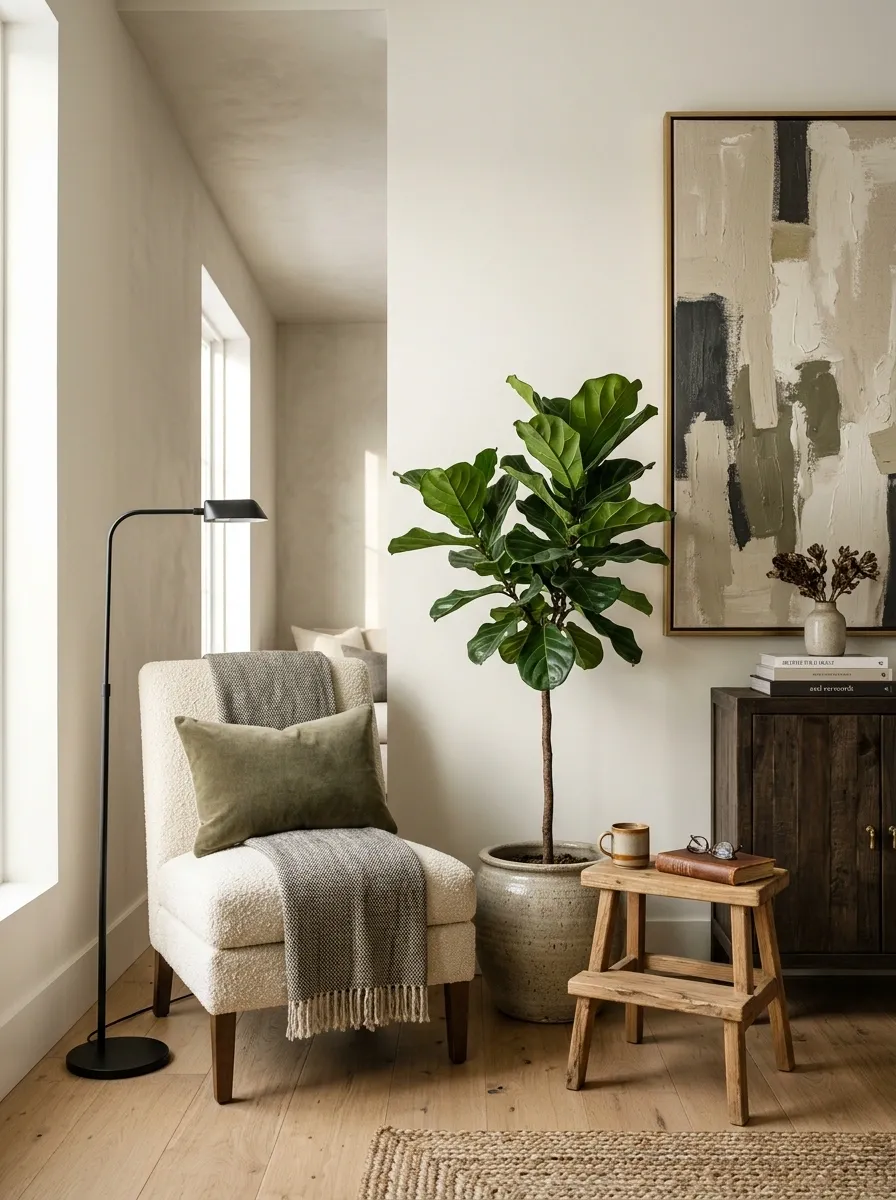
That empty corner isn’t always a problem. A completely dead corner is.
Give one neglected spot a clear purpose and a clear look. Add a narrow chair with a floor lamp. Try a tall plant beside a small stool. Place a slim cabinet underneath a piece of art. Even a tiny reading corner can make the rest of the room feel more layered.
The important part is visual grouping. Keep the pieces close enough to read as one little scene.
A forgotten corner becomes useful, and the room gains another point of interest without adding clutter everywhere else. Suddenly that awkward space isn’t awkward. It has a job.
Use Art That Relates to You Instead of the Room Trend
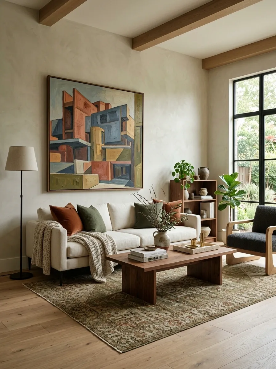
Trendy art ages faster than people admit.
A room feels more convincing when the art has a reason to be there beyond matching the sofa. Look for subjects that connect to places, hobbies, architecture, books, craft, travel, or simple things worth looking at every day.
The art doesn’t need to explain a life story. It just needs to feel chosen rather than assigned.
Start with the image, then match the room around it. A strong piece can introduce a color, shape, or texture that makes the rest of the room easier to build.
And no, the wall doesn’t need the same three beige abstracts everyone has already seen 14 times this week.
Make the Ceiling Part of the Design Story
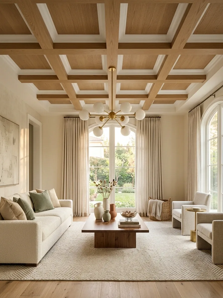
Most ceilings get exactly one coat of white paint and then are never invited back into the conversation.
That’s a missed surface.
A ceiling can add character through a painted color, simple molding, exposed beams, wallpaper, wood slats, or even a statement light fixture that visually belongs there. The treatment doesn’t need to be elaborate. It just needs to connect to the architecture and the scale of the room.
In a small room, a subtle ceiling treatment can make the space feel far more deliberate. In a larger room, it can stop the upper half from becoming one giant blank void.
Look up. The ceiling has been ignored long enough.
Mix Materials So Everything Doesn’t Look Too Similar
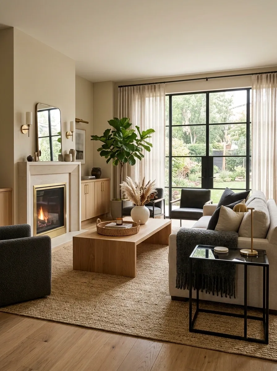
Rooms get flat when every surface has the same visual temperature.
Smooth wood beside smooth wood doesn’t create much movement. Add something woven. Put metal beside timber. Mix matte ceramic with glossy glass. Pair a soft textile with a hard stone surface.
The secret isn’t collecting every material available. It’s creating clear differences that still share a color or shape connection.
Try building each major area around two or three material contrasts. A coffee table doesn’t need five different finishes sitting on it. A single woven basket beside a smooth cabinet can do more.
Display One Oversized Object Instead of Several Tiny Ones
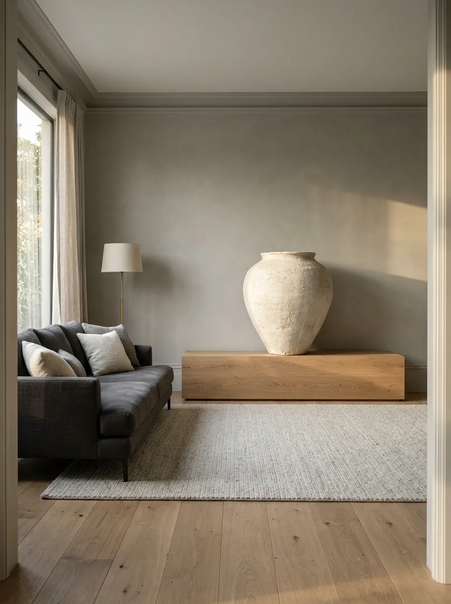
Small decor has a habit of multiplying until the shelf starts looking like a clearance aisle.
One oversized object usually creates more impact with less visual noise. Try a large ceramic vessel, a substantial lamp, an oversized basket, a big mirror, or a sculptural piece with a strong silhouette.
Scale gives the room confidence.
The object should have enough presence to hold its own against the furniture around it. A giant sofa with three microscopic accessories isn’t balance. It’s a furniture convention where nobody invited the accessories.
Go bigger first. Then remove two nearby pieces if the arrangement still feels crowded.
Add Character With a Piece That Has a Story Behind It
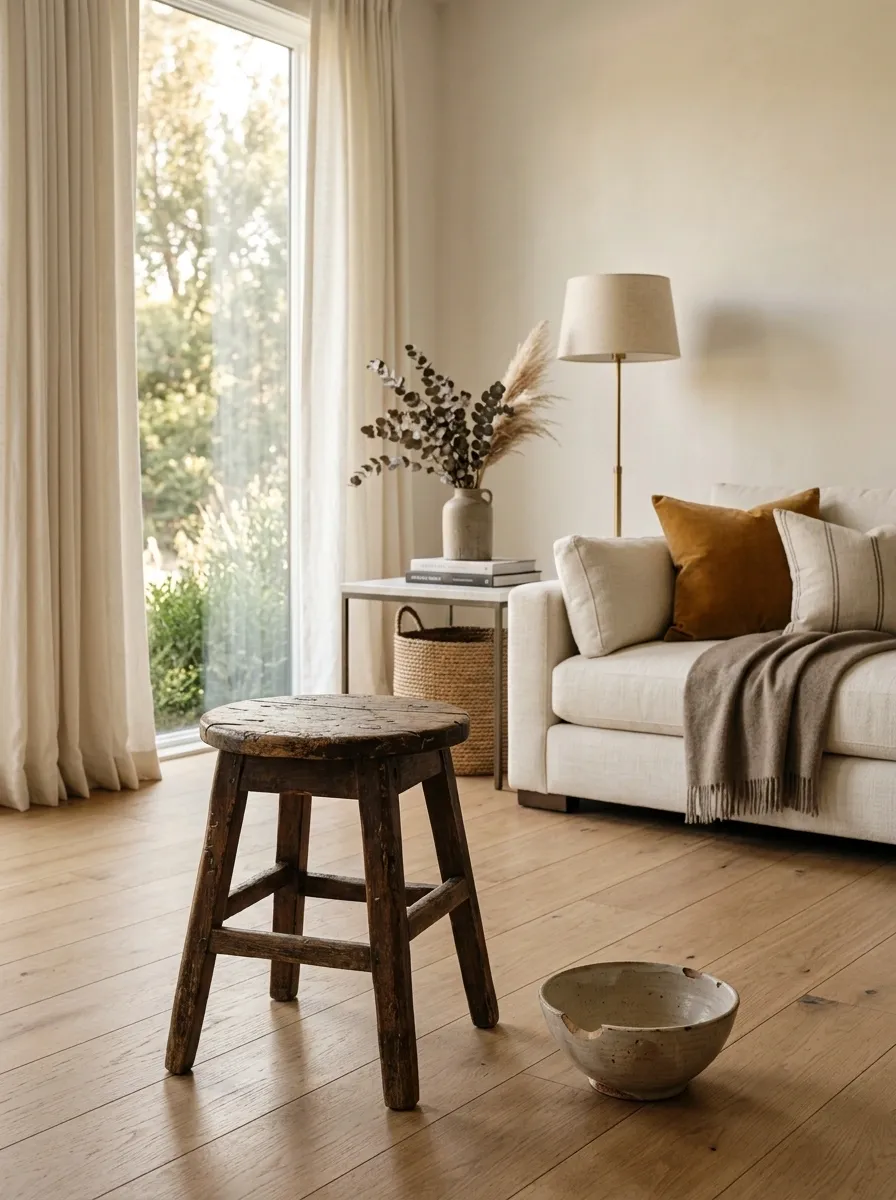
The object doesn’t need to be valuable. It needs to feel like it came from somewhere.
An old stool from a family home, a handmade bowl from a local maker, a framed ticket, a travel find, or a well-worn piece of furniture can give a room a layer that new decor simply can’t manufacture.
Keep that object visible rather than hiding it among ten decorative pieces.
Story beats price. A slightly imperfect item with meaning usually feels more convincing than an expensive accessory chosen because it looked good in a thumbnail.
And yes, the chipped bowl is allowed to have a personality.
Use Mirrors for More Than Making a Room Look Bigger
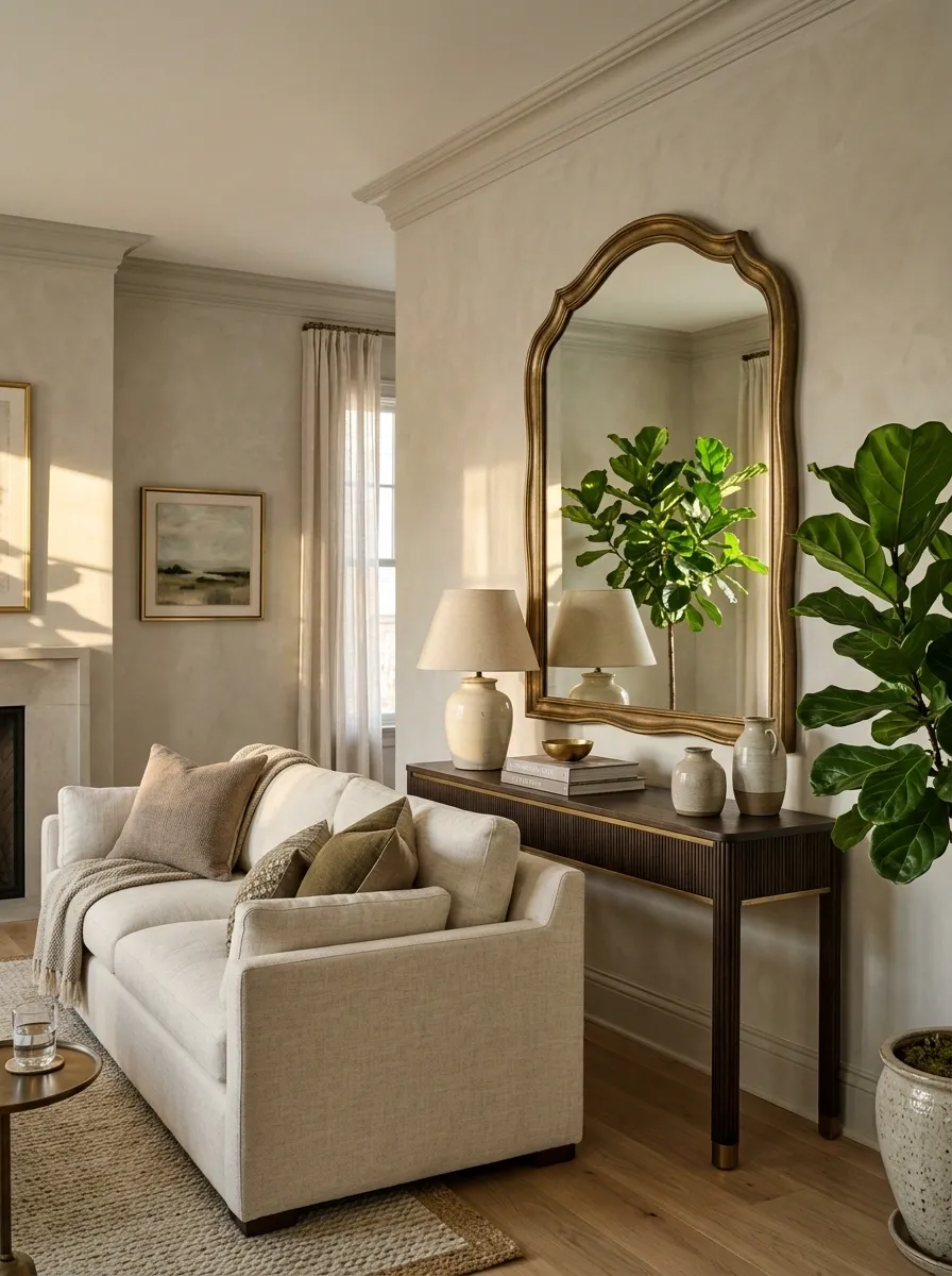
A mirror doesn’t have to spend its entire career making a room look “larger.”
Choose one with an interesting frame, unusual shape, aged finish, or sculptural edge. Then place it where it reflects something worth seeing, such as a window, artwork, lamp, or architectural feature.
A mirror facing a blank wall simply reflects the blank wall. Congratulations, now there’s two of them.
Use reflection strategically. It can bounce light, repeat a strong color, highlight a favorite corner, and add another layer to a simple room without bringing in another piece of furniture.
Create a Strong Focal Point With What You Already Have
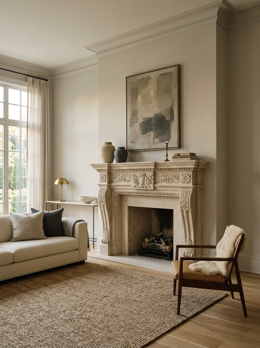
Not every room needs a dramatic new centerpiece. Sometimes the strongest feature is already sitting there, completely ignored.
Pick one existing element and make it the visual lead. It could be a fireplace, a beautiful window, a large piece of art, a textured wall, a distinctive chair, or even an old cabinet with great lines.
Then quiet the area around it.
Remove competing objects. Rearrange furniture so it points toward the feature. Adjust lighting if needed. Let the strongest part of the room actually be seen.
The fastest way to create character isn’t always adding something. Sometimes it’s finally letting the right thing win.
Finish With One Detail That Feels Slightly Unexpected
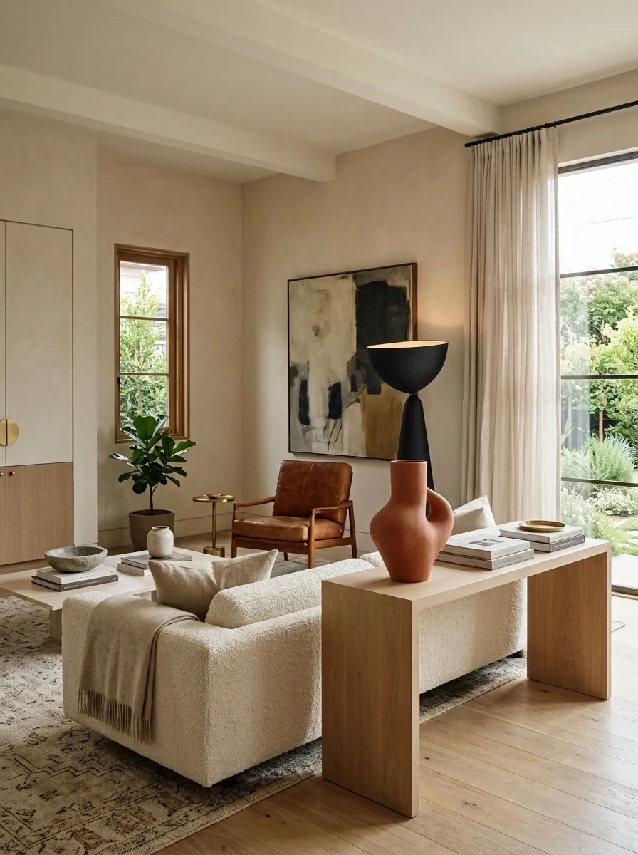
The room doesn’t need one final shopping spree. It needs one last detail that nobody saw coming.
Use an unusually shaped vase. Hang art slightly lower than expected. Place a vintage object beside something very modern. Add a bold lamp to an otherwise quiet corner. Choose one chair in a different material.
The detail should feel intentional, not random.
That’s the sweet spot: familiar enough to belong, unusual enough to interrupt the scroll.
Because the room with absolutely no surprises is usually the room everyone forgets five minutes later.
Final Thoughts
Character doesn’t arrive because a room suddenly contains more stuff. It shows up when the choices stop looking interchangeable.
Mix something old with something clean. Let one wall have a little attitude. Use lighting that actually contributes to the room. Give books, art, rugs, hardware, and odd little objects a reason to be there. Then stop before every surface gets covered.
The strongest rooms aren’t the ones where every detail matches. They’re the ones where the eye keeps finding small things worth noticing.
And that’s the real trick. Don’t decorate until the room is full. Edit until the room feels like somebody lives there.
Save these ideas for the next time a room feels a little too plain, a little too matched, or suspiciously close to looking like a furniture catalog.