
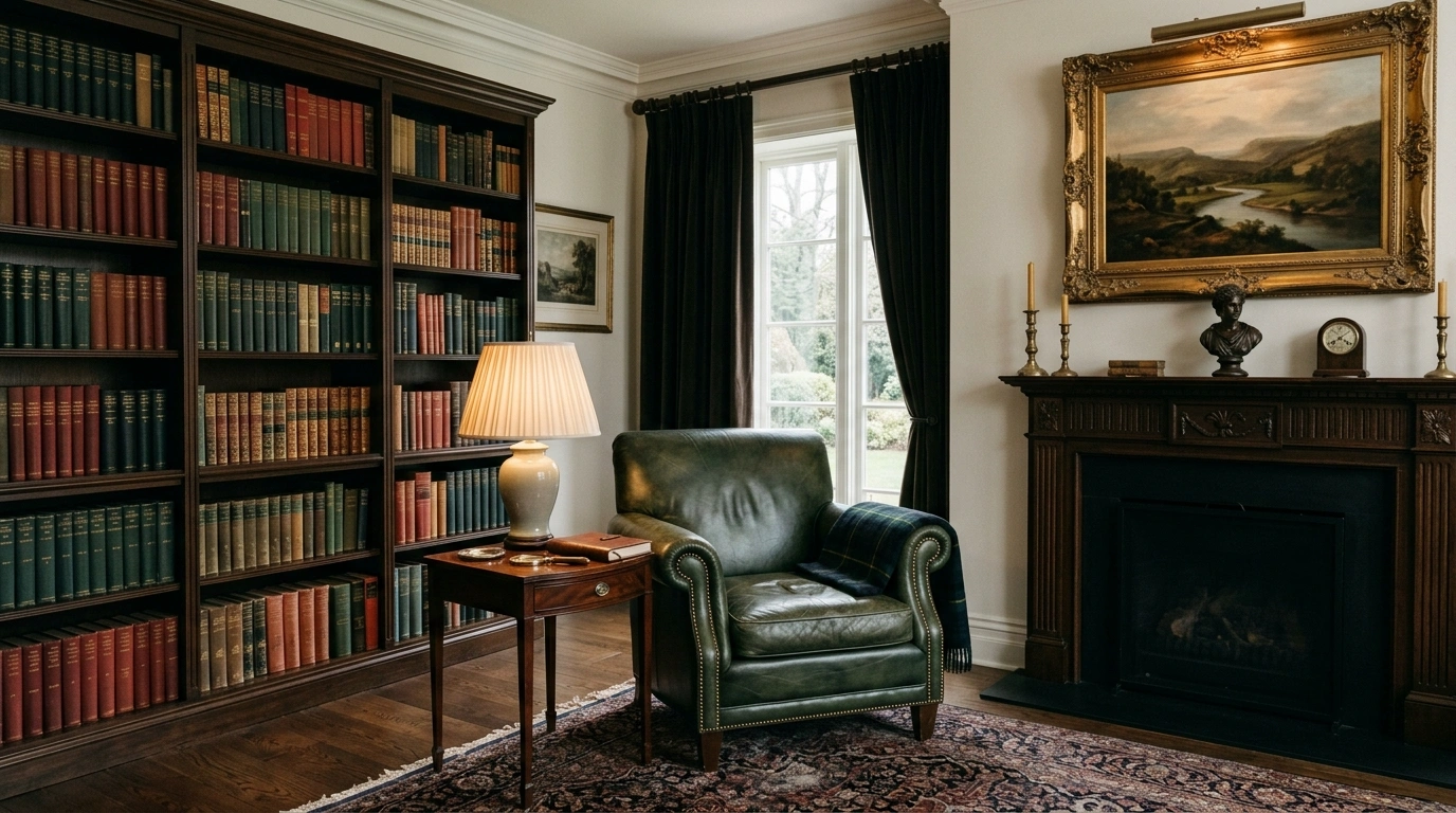
Old-money style gets ruined the second a room starts trying to prove it has money.
That’s why so many attempts end up looking oddly fake. There are beige walls, shiny brass everywhere, an oversized mirror, six decorative books that have clearly never been opened, and somehow the room still feels like it was ordered online last Tuesday.
The better approach is quieter. Think warm wood instead of glossy furniture, linen instead of stiff polyester, aged finishes instead of bright metallic shine, and artwork that looks collected rather than purchased as a matching set. Good proportion does more than another decorative object ever will.
Old Money Home Decor Ideas
Embrace Moody Wall Treatments
A powder room is precisely where you can abandon all caution and lean into heavy, saturated drama without committing to an entire floor plan.
Combine crisp vertical stripes with dark paneled wainscoting to instantly lower the perceived ceiling height into something wonderfully intimate and enveloping. The visual friction between the structured wallpaper and the rich wood brings an effortless gravity.
Accessorize with polished brass hardware, traditional framed sketches hung in a casual cluster, and a faded vintage runner to anchor the tiled floor. It looks less like a modern renovation and more like a space that evolved over a century.
Anchor the Room With a Traditional Wood Console
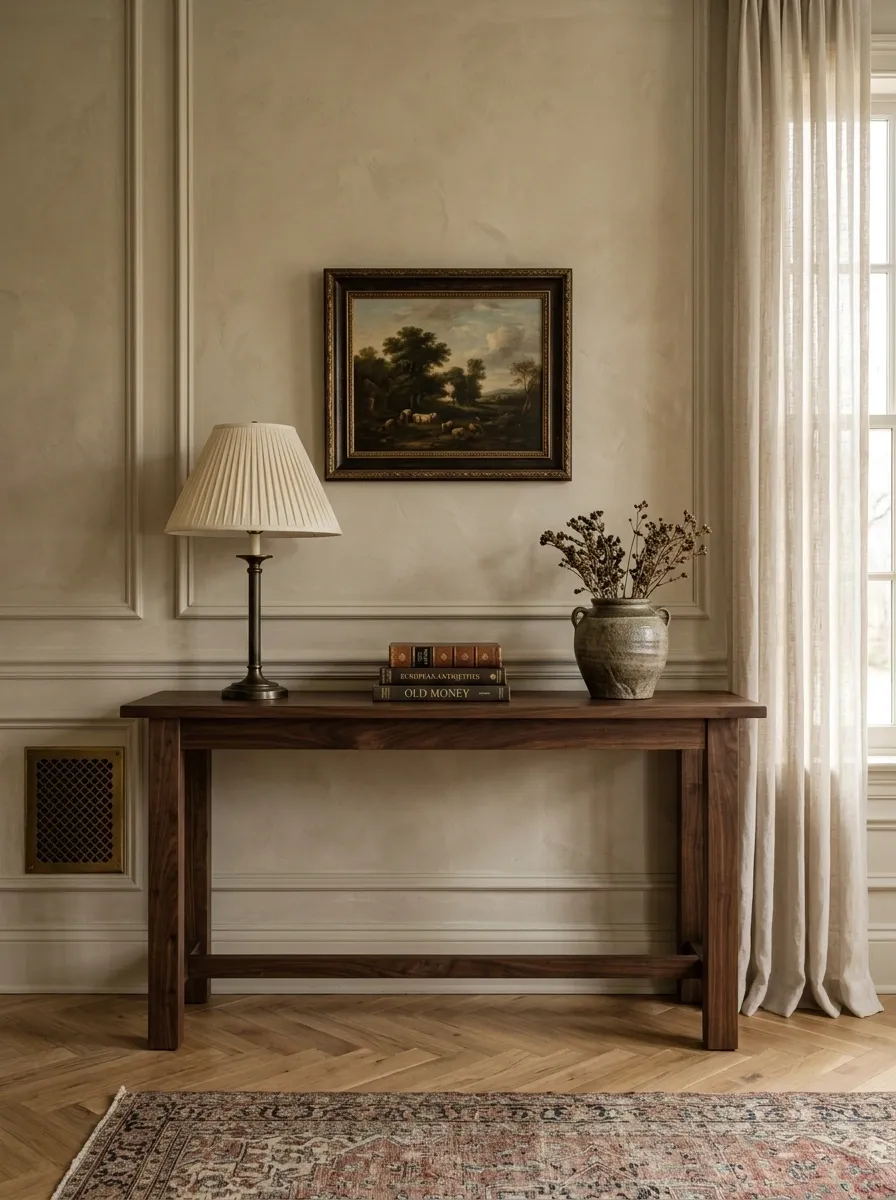
A good wood console makes a room look settled before a single accessory hits the surface.
Choose a piece with visible grain, a substantial top, and legs that don’t look flimsy. Dark walnut, medium oak, and warm mahogany tones all work because they bring visual weight without demanding attention.
Keep the styling edited. One lamp, a small stack of books, and a ceramic or stone object are enough. That’s the trick. The console should look useful first and decorative second.
Skip the ultra-glossy finish. Nothing says “newly purchased” quite like furniture reflecting the ceiling light.
Solid-looking proportions
Warm, quiet finish
A few books
One textured object
Tiny decorative overload
Weak, spindly shapes
Style a Dedicated Writing Desk
Every room needs a surface that looks like someone actually sits down to answer correspondence, rather than just stare at a screen.
Position a traditional wooden desk near a natural light source, and keep the styling functional yet curated. A sleek brass banker’s lamp, a heavy stoneware pitcher filled with dried botanicals, and a neat stack of leather-bound books do all the heavy lifting.
Hang framed landscape art slightly off-center to break up the rigid lines of the wall. The goal is an arrangement that feels personal, collected over time, and entirely devoid of corporate stiffness.
Mix Stripes With Soft Neutrals
Dining chairs upholstered in bold black-and-white stripes instantly ground a casual breakfast nook with a dose of tailored elegance.
Pair the graphic seating with a warm black pedestal table, and layer a natural jute rug underneath to soften the entire vignette. The key is balancing high-contrast patterns with organic textures so the space doesn’t read as overly formal.
Keep table styling minimal with a simple silver champagne bucket acting as a vase, flanked by glowing taper candles. It makes a Tuesday morning coffee feel like an impromptu weekend dinner party.
Build the Color Palette Around Warm Neutrals and Deep Greens
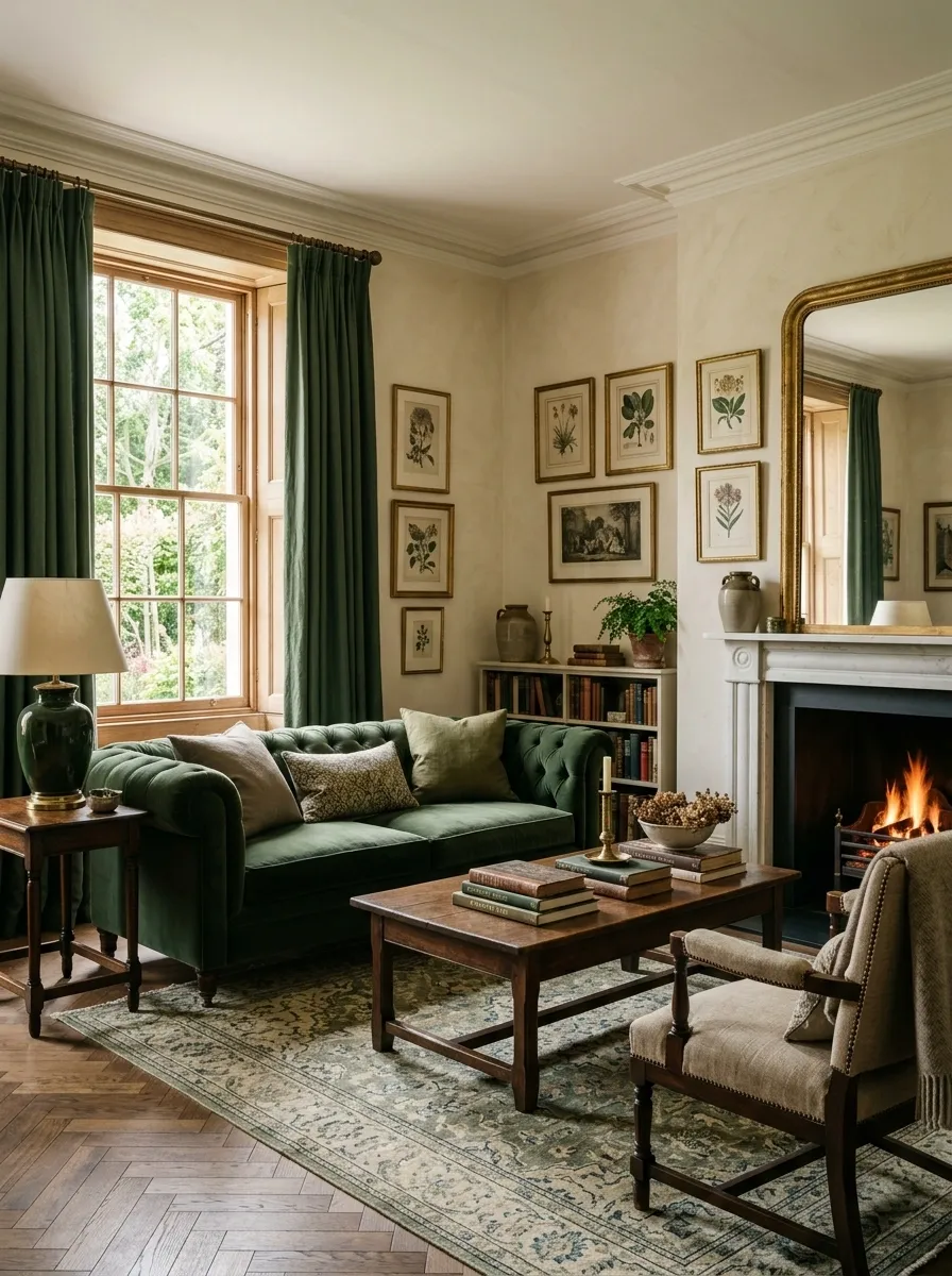
Old-money rooms rarely need ten colors fighting for attention. A quiet base with one deeper color looks far more convincing.
Start with warm ivory, mushroom, taupe, or soft brown. Then bring in forest green, olive, burgundy, or muted navy through upholstery, books, art, or smaller pieces.
The important part is repetition. One green cushion floating alone in a beige room looks accidental. Repeat that green through a lamp base, artwork, or plant pot and suddenly the room has a visual thread.
And no, every object doesn’t need to match. That’s how a room starts looking like it came with a receipt.
Curate a Statement Gallery Wall
A dramatic gallery wall should never look like a corporate office waiting area or a random assortment of clearance frames.
Gather an eclectic mix of vintage landscapes, architectural sketches, and tiny portraits, making sure they all share a warm, muted color family. Anchor the entire installation around an antique mirror to break up the paper and add functional depth.
Leave generous amounts of breathing room between each frame and let the patterned wallpaper peek through. The arrangement should look like it accumulated over generations of travel and estate sales, rather than a single trip to a big-box store.
Style an Architectural Fireplace
A carved stone fireplace topped with a dramatic arched built-in creates a focal point that instantly commands the entire room.
Fill the upper shelves with a thoughtful mix of vertical books, framed art, and treasured ceramics, ensuring the styling looks lived-in rather than merchandised. Trailing greenery adds organic movement against the structured woodwork.
Anchor the hearth with classic cream armchairs and pile low coffee tables with lush arrangements of soft pink roses. The overall effect is timeless, deeply inviting, and effortlessly sophisticated.
Swap Glossy Hardware for Aged Brass
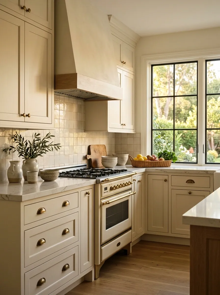
Tiny hardware changes can quietly change the whole room.
Replace overly shiny cabinet pulls, drawer handles, and knobs with aged brass, antique brass, or warm bronze. The softer finish looks established instead of factory-fresh.
Keep the shape simple. A classic pull with a slightly worn finish works harder than an elaborate piece covered in fake detailing.
Good rule: repeat the same metal finish across nearby details, then stop. Every drawer doesn’t need to announce its metallic career.
Mirror-like chrome
Highly polished surfaces
Antique brass
Warm bronze
Keep shapes simple
Don’t add five more metals
Add One Serious-Looking Reading Chair
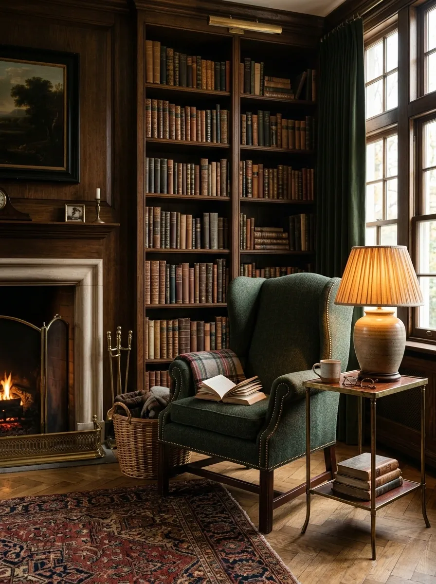
A single upholstered chair can give a living room the collected feeling that ten decorative cushions can’t.
Look for deep upholstery, visible texture, and a sturdy frame. A wingback chair, classic club chair, or simple skirted chair works especially well beside a bookcase, fireplace, or floor lamp.
Don’t make the chair match the sofa exactly. Matching sets are efficient, but old-money interiors rarely look like the furniture department bundled them together.
Add one small side table and a lamp. That’s enough.
Hang a Classic Mirror Above a Fireplace or Console
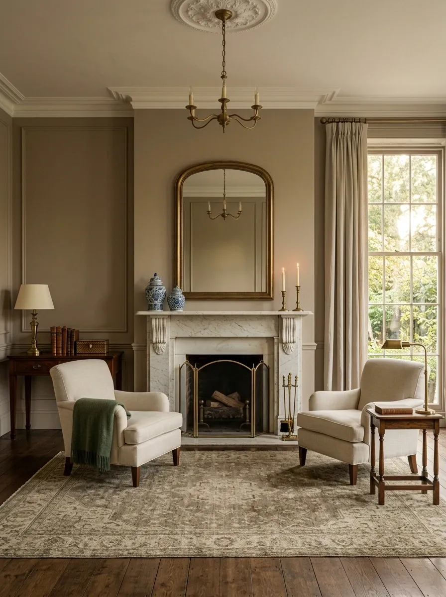
The mirror needs to relate to the furniture beneath it. Too small and it looks like the wall swallowed it. Too ornate and the room suddenly starts auditioning for a period drama.
Choose a classic rectangular, arched, or gently curved frame in wood, antique brass, or another restrained finish.
Center it above the console or fireplace and let the surrounding wall stay relatively quiet.
The easiest test: stand back and check the whole arrangement, not the mirror by itself. The furniture and mirror should read as one composition.
② Give it enough visual width
③ Keep nearby wall decor restrained
Use Table Lamps With Fabric Shades
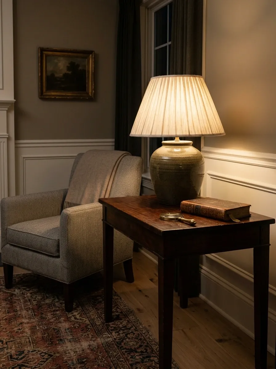
A room with only overhead lighting feels flat, no matter how expensive the furniture is.
Add table lamps with linen, cotton, or softly pleated fabric shades to create pools of warm light around the room. Place one on a console, side table, dresser, or desk rather than scattering tiny lamps everywhere.
The shade matters too. Soft fabric beats shiny metal when the goal is a settled, traditional look.
Choose lamps with some visual weight, then let the rest of the surface stay quiet. A lamp, a book, and one small object can carry the whole arrangement. The lamp should make the room feel warmer after sunset, not make the room look like a lighting showroom.
Let Wood Furniture Show Its Natural Grain
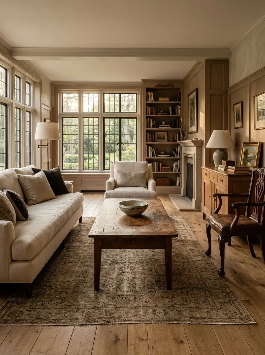
Wood gets strangely expensive-looking the moment it stops being drowned in a thick glossy finish.
Choose tables, cabinets, nightstands, and chairs where the grain remains visible. Walnut, oak, mahogany, and other warm woods bring depth without needing extra decoration.
Mix wood tones carefully instead of buying one matching furniture set.
Keep the finish tactile. Slight variation, visible grain, and softened edges make furniture feel more established. Razor-sharp lacquered surfaces do the opposite.
And don’t cover every wooden top with accessories. A beautiful wood surface needs some room to actually be seen.
Warm undertones
Soft, natural sheen
Stone
Aged metal
Let the grain carry the detail
Mix Antique-Looking Pieces With Simpler Modern Furniture
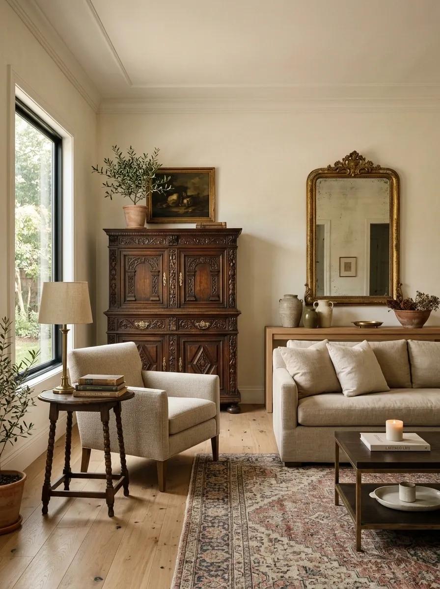
The room gets more believable when not everything comes from the same decade.
Pair a traditional-looking wood cabinet with a clean-lined sofa. Put a vintage-style mirror above a simple console. Add an older-looking side table beside a more current upholstered chair.
That contrast is what keeps the room from becoming a costume.
The trick is scale. One substantial traditional piece makes a statement. Six of them start forming a period set.
Keep the newer pieces quiet, with simple shapes and natural textures. Let the older-looking piece bring the history while the modern furniture keeps the room comfortable for actual life.
Put a Small Bench at the Foot of the Bed
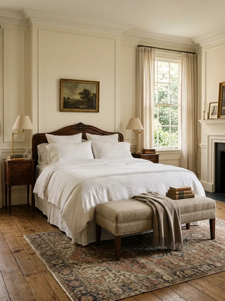
The foot of the bed doesn’t always need a trunk, a pile of cushions, and enough upholstery to open a furniture warehouse.
A small upholstered bench keeps the arrangement useful while adding structure. Choose linen, wool, cotton, or another textured fabric in a muted shade.
Keep the bench narrower than the bed and low enough that it doesn’t compete with the headboard.
It also gives the bedroom a natural landing spot for a folded throw or the clothes that somehow never make it to the wardrobe. That’s what makes the detail work. It looks polished because it has a job.
Narrower than the mattress
Linen, wool, cotton, muted upholstery
Seating, layering, and useful landing space
Choose Striped or Checked Textiles in Muted Colors
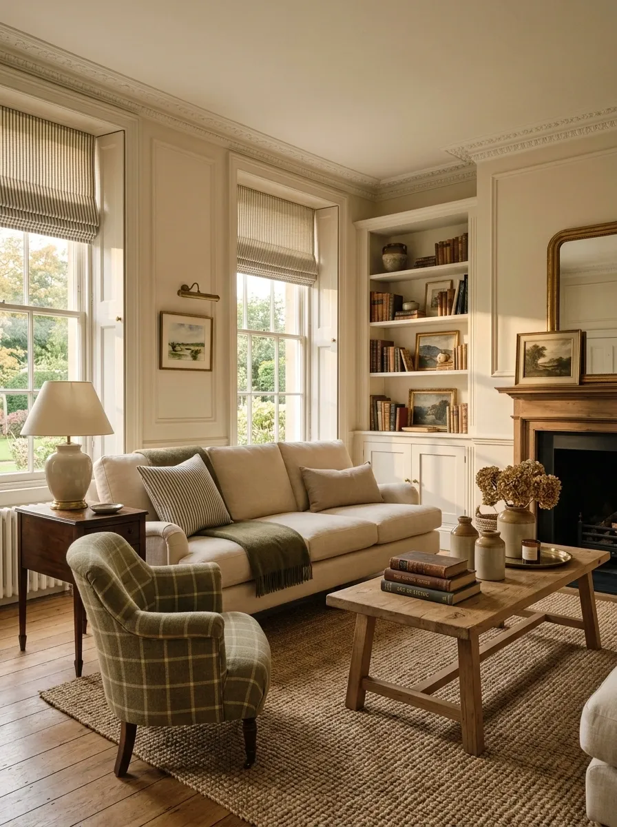
Patterns add character, but the wrong pattern turns a quiet room into a textile argument.
Stripes and checks work especially well because they feel familiar without becoming overly decorative. Try a muted ticking stripe on a cushion, a soft check on an accent chair, or a narrow stripe on a roman shade.
Keep the colors grounded: olive and cream, navy and ivory, brown and beige, muted burgundy and tan.
Mix pattern scales instead of repeating the exact same print everywhere. A fine stripe beside a larger check creates contrast without visual noise.
And please don’t put the same plaid on the chair, curtains, pillows, and bed. That’s not coordination. That’s a hostage negotiation.
Display Silver, Ceramic, or Glass Pieces in Small Groups
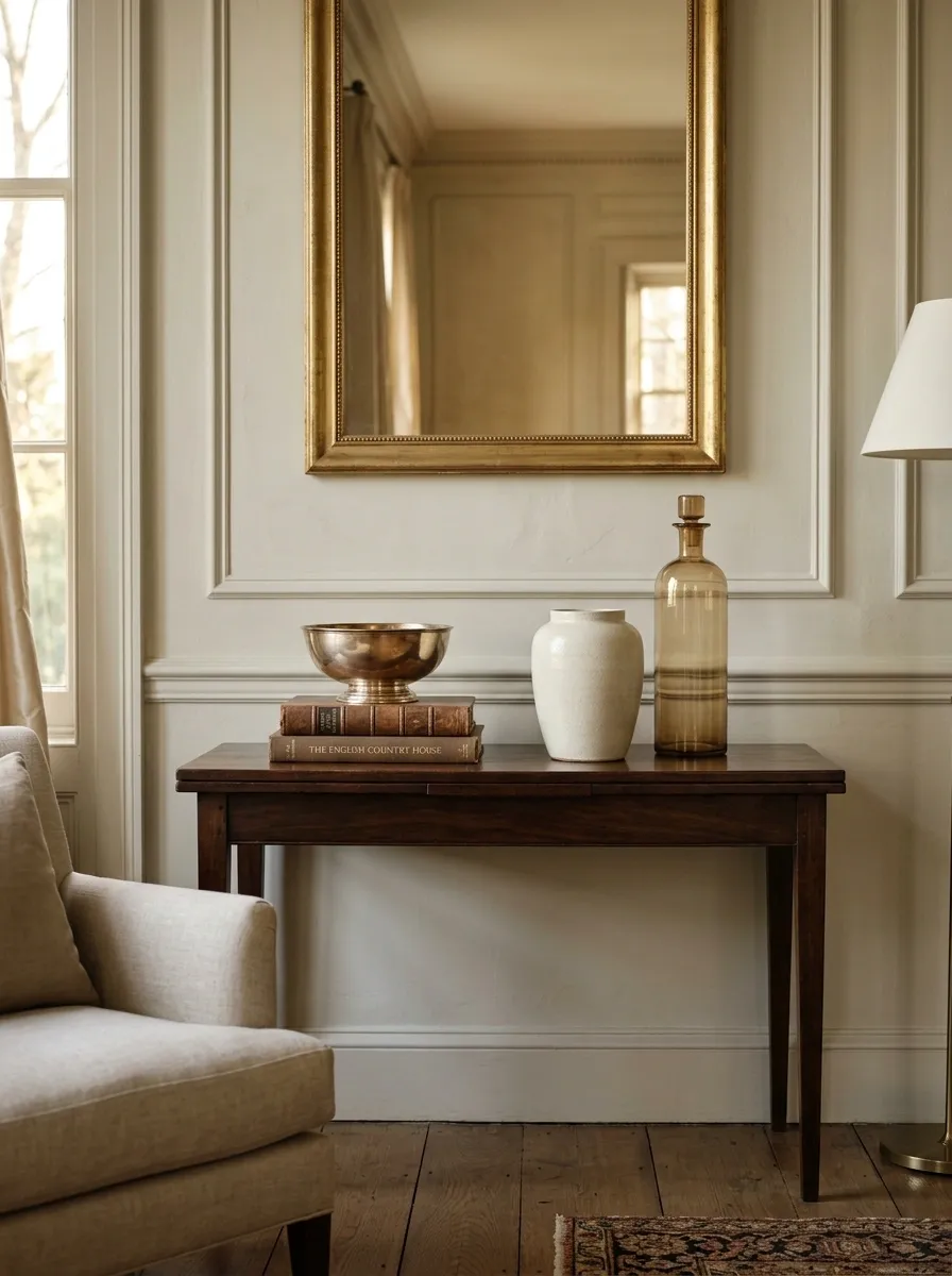
Small decorative objects look more intentional when they’re grouped instead of scattered across every available surface.
Choose three pieces with different heights and shapes. A silver bowl can sit beside a small ceramic vessel and a glass object. The materials don’t need to match, but they should share a quiet color story.
Keep the group slightly off-center on a console, sideboard, or bookshelf.
The trick is restraint. Three objects with breathing room look collected. Twelve objects packed together look like someone emptied the junk drawer onto the furniture five minutes before guests arrived.
Use Interior Doors as a Design Feature
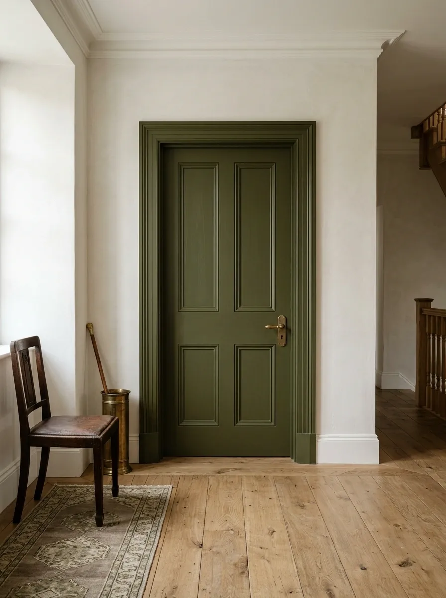
Doors get ignored because they’re practical, which is precisely why they can make such a difference.
A paneled interior door, painted wood door, or door with traditional molding adds architectural character without filling the room with more decor. Even a simple interior door can look richer with the right trim and a classic handle.
Keep the finish consistent with the rest of the room. Deep olive, warm white, soft taupe, stained wood, and other grounded finishes work especially well.
Don’t decorate around the door just because it’s there. Let the architectural detail do the work.
Keep Bedding Layered but Visually Quiet
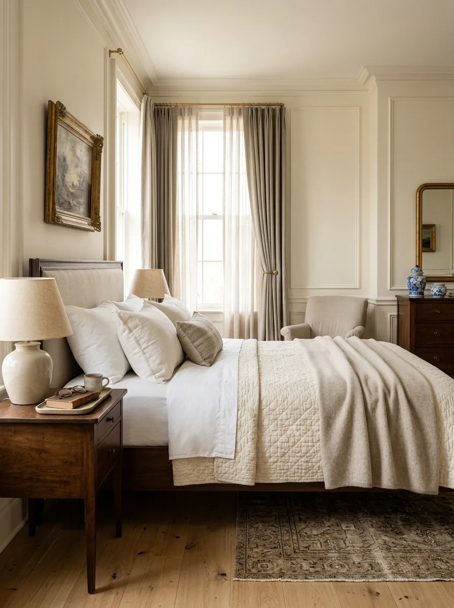
A bed looks more expensive when the layers feel natural instead of carefully stacked for a catalog photo.
Start with crisp sheets, then add a duvet or coverlet, a folded blanket, and a small number of pillows. Keep the colors close together and let texture provide the variation.
Linen, cotton, quilted fabric, and soft wool-looking layers create depth without requiring a pile of decorative cushions.
Keep the bed easy to use. A bedroom that needs twenty minutes of pillow removal every night isn’t luxurious. It’s unpaid labor.
Create a Dedicated Coffee or Tea Corner
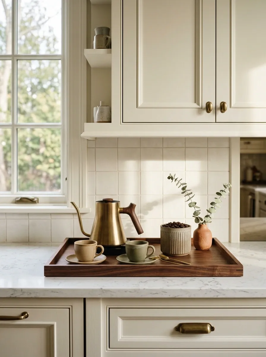
A small beverage station can make an ordinary kitchen or dining area feel much more considered.
Use a wood tray, stone surface, or compact sideboard to define the area. Add the everyday pieces that actually belong there: a kettle or coffee maker, cups, a container for tea or coffee, and one decorative object.
Keep the colors restrained and the countertop mostly clear.
The secret is making the useful things part of the composition. When the objects already needed for daily life look good together, the room gains character without accumulating random decor.
And yes, that means the giant collection of novelty mugs may need a separate discussion.
Bring in Upholstery With Real Texture
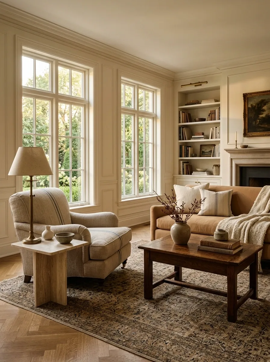
Flat fabric makes furniture look flat. Texture gives even simple shapes more depth.
Look for linen, cotton, wool, boucle used sparingly, brushed fabric, subtle stripes, or woven upholstery. The goal isn’t to cover the room in texture. It’s to make the seating feel tactile and substantial.
A textured armchair can balance a smooth wood table. A woven bench can soften a room full of hard surfaces. Even one fabric ottoman can break up a sea of polished furniture.
Think contrast. Smooth wood beside rougher fabric. Hard stone beside soft upholstery. Matte finish beside something with a little weave.
That’s where the room starts feeling layered instead of simply decorated.
Frame Everyday Objects as Part of the Decor
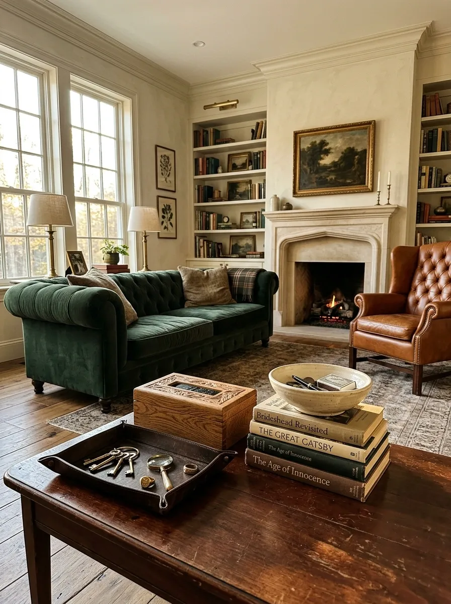
The easiest way to make a room feel collected is to stop hiding every useful object.
A wooden box can hold remotes. A pretty tray can corral keys. A stack of well-worn books can support a lamp. A ceramic bowl can catch the little things that usually migrate across the house.
Choose objects with good shape and material first. Wood, leather, ceramic, brass, stone, and glass already look decorative without trying very hard.
The result feels more natural because the room reflects actual life. Apparently, old-money style allows a remote control to exist. Revolutionary.
Use Curtains, Rugs, and Furniture to Define Proportion
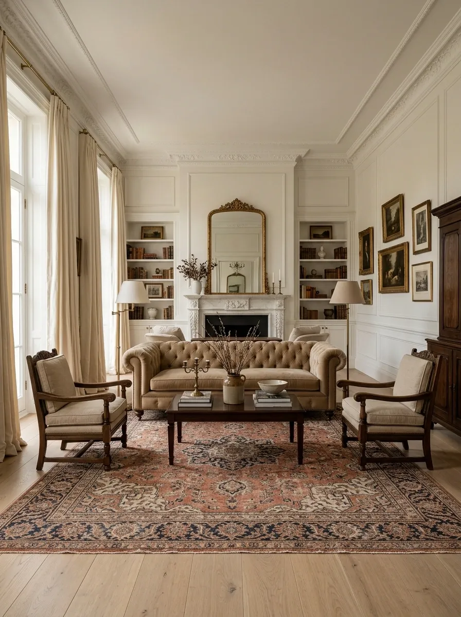
A beautiful room can still look wrong when the furniture is too small, the rug stops awkwardly in front of the sofa, or the curtains barely clear the window.
Before buying another decorative object, check the scale of the big pieces.
The sofa should relate properly to the rug. The rug should visually connect the seating. Curtains should frame the full height of the wall rather than hugging the window like a nervous little curtain emoji.
Think in relationships, not isolated pieces.
Add Fresh or Dried Branches in Heavy Vessels
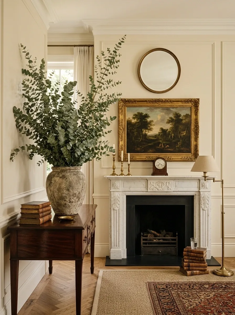
A tall branch arrangement adds height without filling the room with tiny decorative pieces.
Use a substantial ceramic urn, stone vessel, glass bottle, or aged-looking container. Then add branches with an intentionally loose silhouette. Olive branches, eucalyptus, bare stems, and other simple foliage can create the same effect without becoming a giant bouquet demanding applause.
Keep the arrangement slightly wild. Perfect symmetry makes natural branches look strangely artificial.
Place the vessel in a corner, on a console, beside a fireplace, or on a dining sideboard where the vertical shape balances lower furniture.
The goal is height, texture, and a little irregularity. Not “florist had a meeting here.”
Keep Decorative Metals Consistent Across the Room
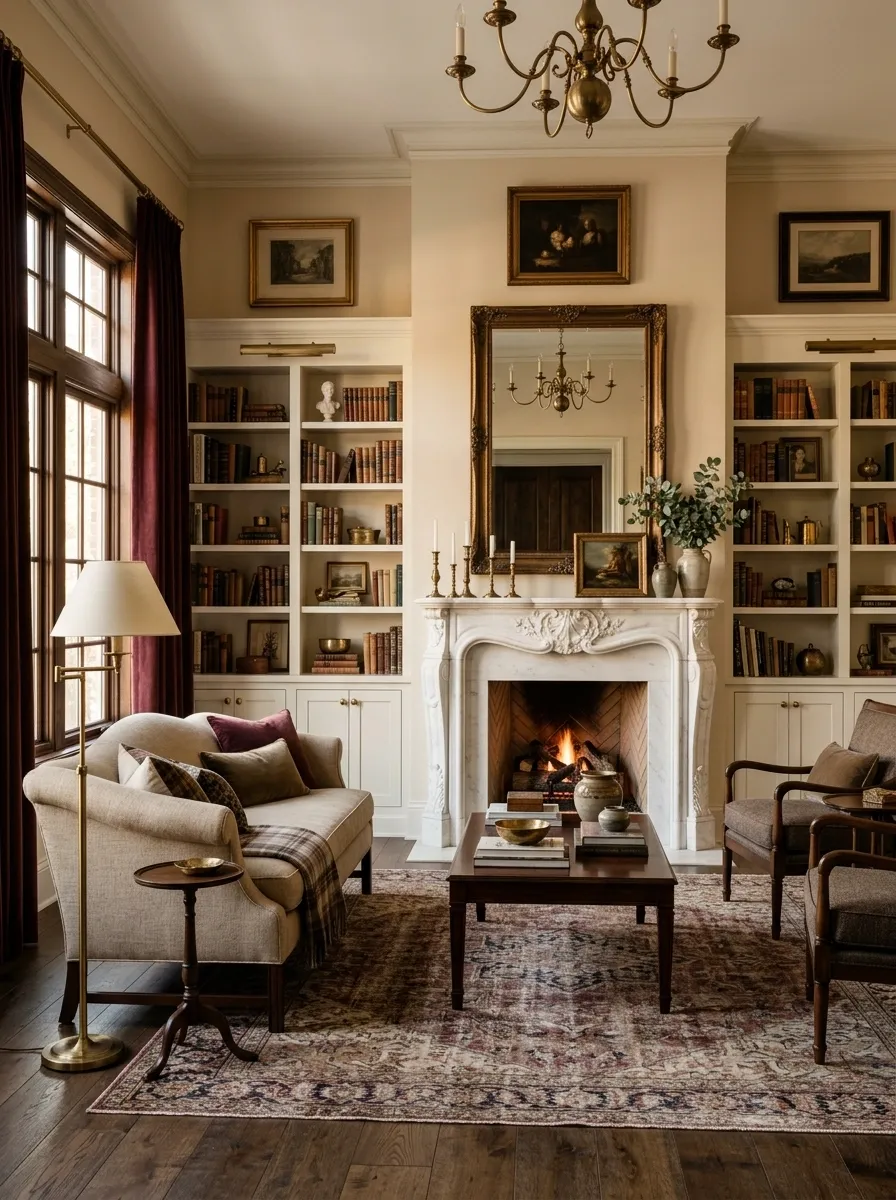
Mixing metals can work, but random mixing makes a room feel undecided.
Choose one primary metal for the room, then repeat it through handles, lamps, frames, curtain hardware, or small accessories. Aged brass can appear on cabinet pulls and a lamp base. Bronze can repeat through a mirror frame and side table.
The finish matters as much as the color. Two pieces can both look “gold” while having completely different undertones and levels of shine.
A calm room usually needs fewer metallic finishes, not more.
Finish With One Unexpected Heirloom-Looking Piece
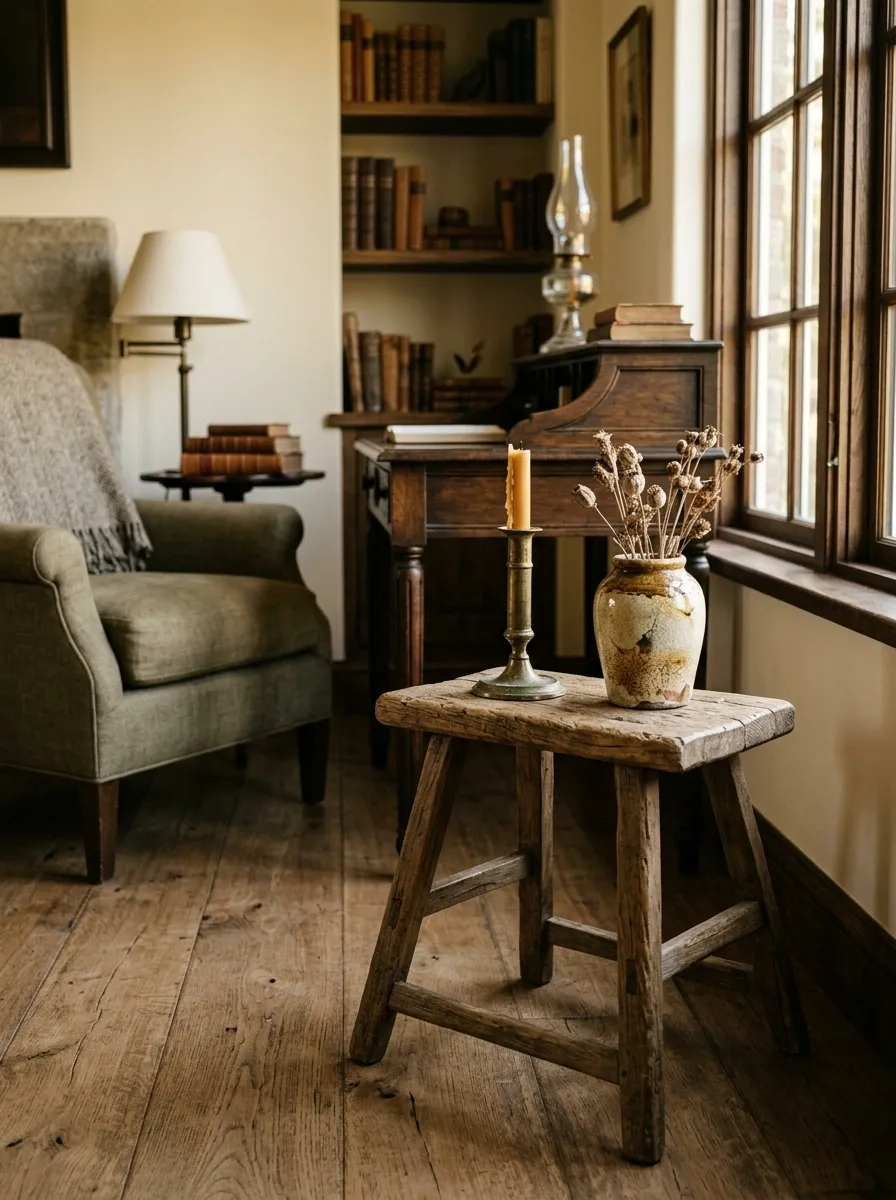
The last detail should have some personality.
Choose one piece that looks as though it could have been found in an old family home, antique shop, flea market, or tucked away in a well-used study. It could be a slightly worn wooden stool, an old-looking landscape, a carved box, a brass candlestick, a traditional clock, or a ceramic vessel with an imperfect finish.
One is enough.
Place it somewhere the eye naturally lands, then let the rest of the room stay calm. The contrast between that singular character piece and the cleaner furniture makes the whole space feel less predictable.
Because apparently the secret to looking established is owning one object that looks like it has witnessed some family gossip.
A Room That Looks Established Doesn’t Need to Work That Hard
The old-money look comes down to a few very unglamorous decisions: better proportions, quieter colors, natural materials, useful objects, and enough restraint to let individual pieces breathe.
That’s also why adding more isn’t always the answer. A second lamp won’t rescue bad furniture placement. More brass won’t fix flat textures. Another framed print won’t make an empty composition suddenly make sense.
Start with the pieces that control the room visually. Then add texture, age, pattern, and personality in smaller doses.
The finished space should feel comfortable enough for ordinary mornings and interesting enough that nobody can immediately tell when it was decorated. That’s the real flex.
Save this list for the next room refresh, especially when the shopping cart starts getting a little too ambitious.