
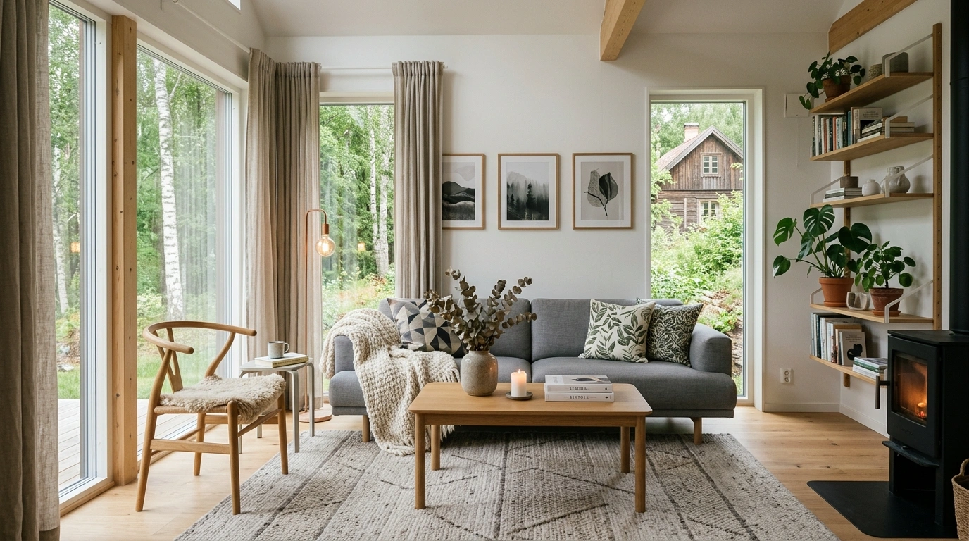
Scandinavian style gets ruined by one very common mistake: people see a pale room online and assume the answer is to buy more beige stuff.
That’s not how the look works.
A Scandinavian home feels good because the room has breathing space. Furniture has a reason to be there. Natural materials keep the neutrals from looking flat. Lighting is layered instead of brutally bright. Even the empty areas are doing something.
The result isn’t a house where every surface looks suspiciously untouched. It’s a home that feels calm, practical, warm, and genuinely comfortable to live in.
And that’s the part worth copying.
You don’t need to replace every piece of furniture or turn the house into a showroom where nobody is allowed to eat toast. Small changes in layout, texture, lighting, storage, and color can push a room much closer to that relaxed Nordic look.
The trick is knowing what to change first and, more importantly, what to leave alone.
Build the Scandinavian Look Around These Design Ideas
Warm Wooden Kitchen Accents
A Scandinavian kitchen relies on warm wood tones and organic textures to keep minimalist white cabinetry from feeling clinical or stark.
Displaying natural cutting boards and sleek open shelving instantly infuses the space with earthy warmth and practical charm.
Keep surrounding surfaces quiet so the beautiful grain of the wood takes center stage without visual clutter.
Start With Warm White Walls Instead of Harsh White
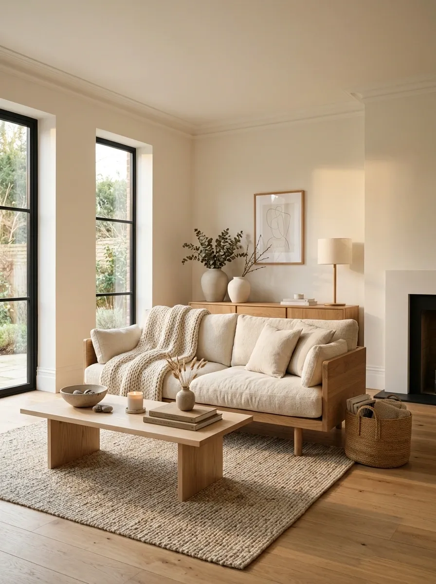
Cold white walls can make a room feel unfinished rather than Scandinavian.
Choose warm whites, soft off-whites, or very pale neutral shades. They reflect daylight without giving the room that icy showroom feeling.
This matters most when the furniture is already light. A harsh white wall beside pale furniture can flatten everything into one giant blank rectangle.
Keep the backdrop quiet and let the materials do the talking.
A warm wall also gives wood, linen, woven pieces, and greenery more visual weight without needing stronger colors.
Inviting Dining Space
Dining areas in Nordic homes are designed for gathering, featuring clean lines, pale wood tables, and understated pendant lighting.
Adding simple botanical elements and minimal wall art brings life into the room without overwhelming the calm palette.
Let natural light flood across the wooden textures to create a welcoming, effortless atmosphere for everyday meals.
Let Natural Light Become Part of the Design
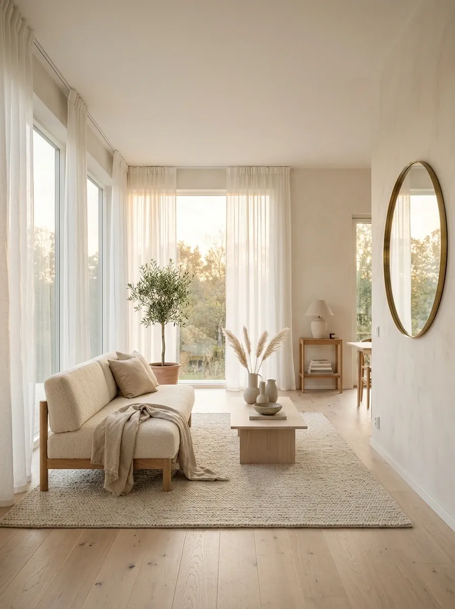
Scandinavian rooms don’t fight daylight. They make room for it.
Keep windows visually light with simple curtains and avoid placing bulky furniture directly in front of the brightest part of the room. Mirrors can bounce light into darker areas, while pale walls and flooring help spread it.
Don’t cover a beautiful window with layers of unnecessary decoration.
The window is already doing a lot of work. Let it.
A bright room also makes pale wood, cream textiles, and soft neutral colors look richer instead of dull.
Lightweight and full length.
Place where they can reflect useful light.
Don’t block the brightest window area.
Layered Neutral Styling
Creating depth in a neutral hallway or entryway comes down to layering subtle textures, soft ceramics, and ambient candlelight.
Floating shelves and minimalist frames offer a clean way to display curated artwork without making the walls feel crowded.
Keep the color scheme muted and let organic shapes and warm lighting do the heavy lifting for your decor.
Bring In Pale Wood Before Adding More Decor
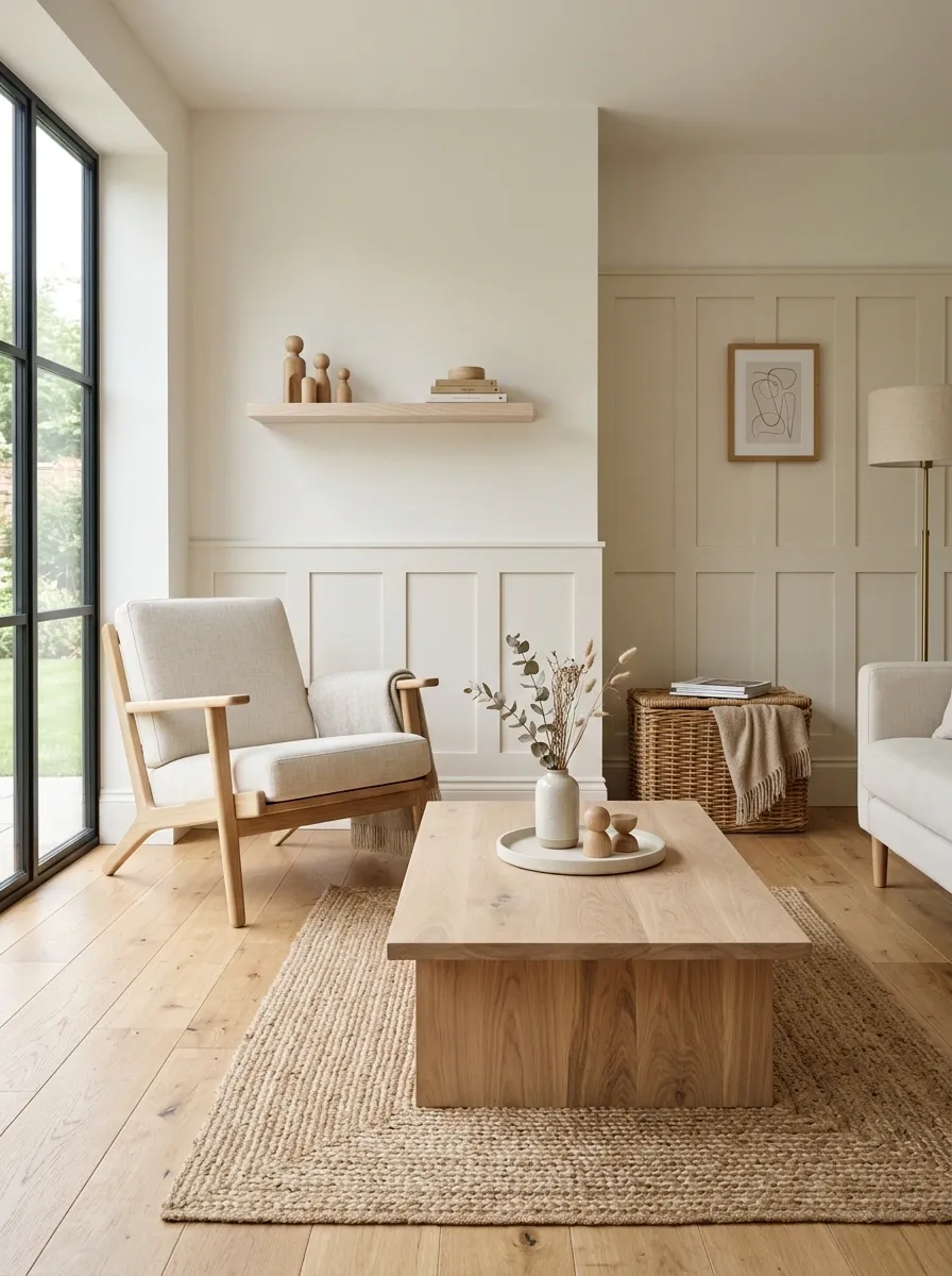
Pale wood does something beige paint can’t do. It gives a room warmth and visible texture at the same time.
Use it on coffee tables, dining tables, shelves, benches, bedside tables, or even small accessories. The finish should look natural rather than heavily glossy.
The beauty is in the variation. Slightly different wood pieces can still work together because they share the same visual family.
A wooden table is doing more for the room than another decorative vase ever will.
Keep the surrounding colors quiet so the grain remains visible.
Textured Living Room
A comfortable, low-profile sofa paired with a plush neutral rug instantly grounds a spacious living area in effortless Scandinavian style.
Incorporating a unique textured coffee table and subtle accent lighting adds character and dimension to the bright room.
Stick to a cohesive, earthy palette to ensure the space feels both deeply relaxing and visually balanced.
Keep the Main Sofa Comfortable, Low, and Visually Simple
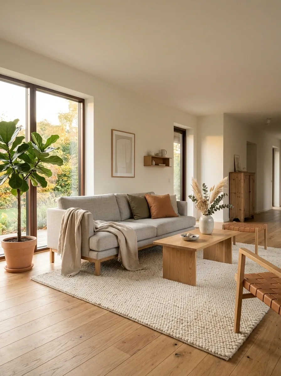
A Scandinavian living room doesn’t need a sofa that looks like it requires a booking appointment.
Choose a comfortable shape with clean lines and enough visual breathing room around it. Cream, beige, light gray, or muted earthy upholstery keeps the sofa from becoming an oversized block of color.
Let the sofa be substantial without letting it dominate everything else.
One comfortable sofa beats a collection of decorative chairs nobody actually wants to sit in.
Add softness through a throw, one or two cushions, and a textured rug instead of piling accessories onto every seat.
Cozy Breakfast Nook
A round pedestal table paired with sleek modern chairs creates an intimate and functional dining nook by a bright window.
Adding a warm wooden bench and open shelving overhead maximizes both seating and storage while enhancing the room’s organic feel.
Let fresh florals and soft illumination turn a simple corner into your favorite spot in the house.
Ground the Seating Area With a Large Neutral Rug
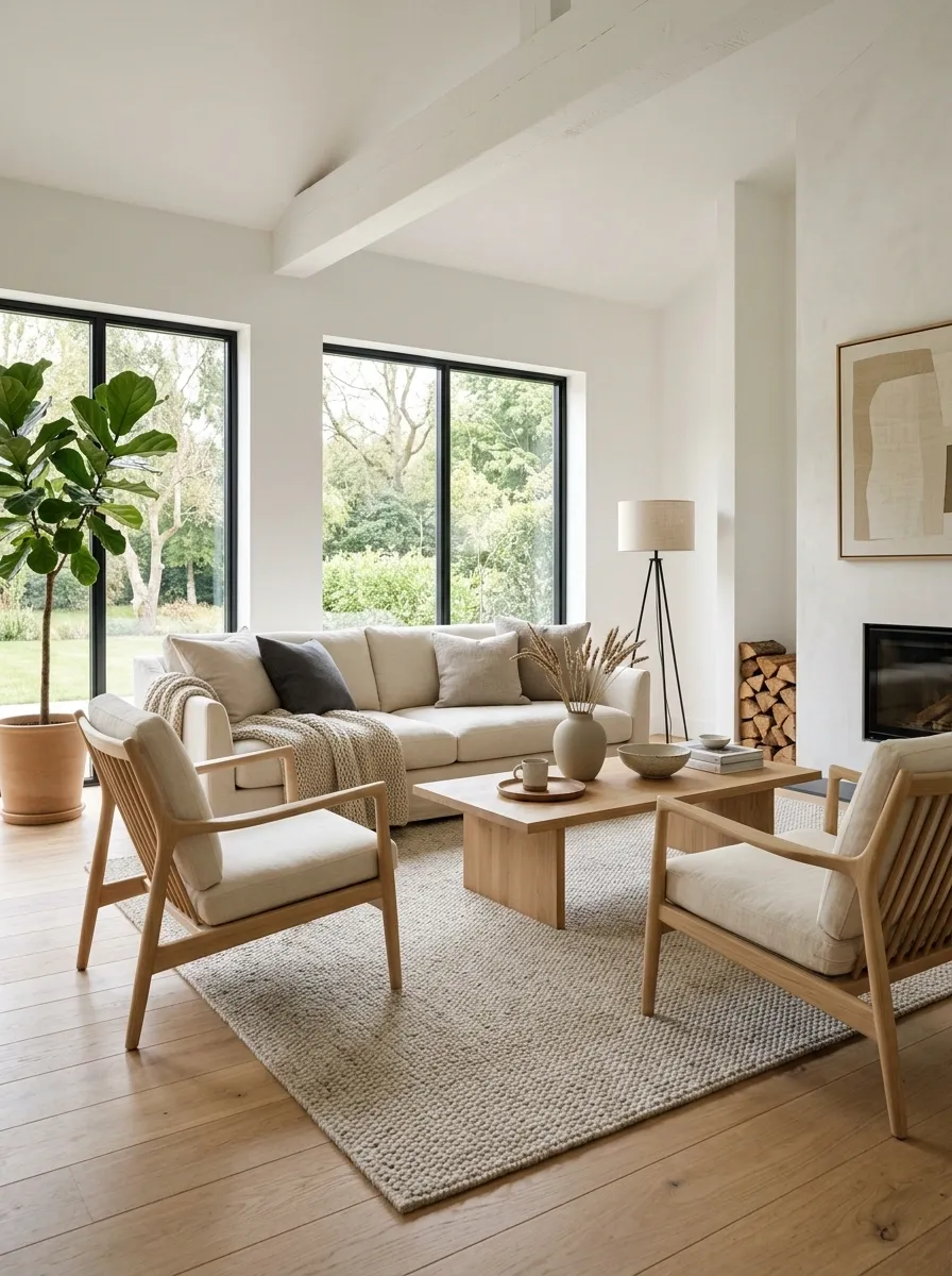
A small rug floating awkwardly in the middle of a large seating area makes the furniture look like it’s waiting for the rest of the room to arrive.
Use a rug large enough to visually connect the main seating pieces. Keep the pattern restrained and let texture provide most of the interest.
Wool, woven, flatweave, and other tactile neutral rugs work especially well with pale wood and cream upholstery.
The rug should connect the furniture, not look like a tiny island surrounded by flooring.
A quiet rug also gives stronger furniture shapes somewhere to land visually.
Hang Curtains High and Let Them Fall All the Way Down
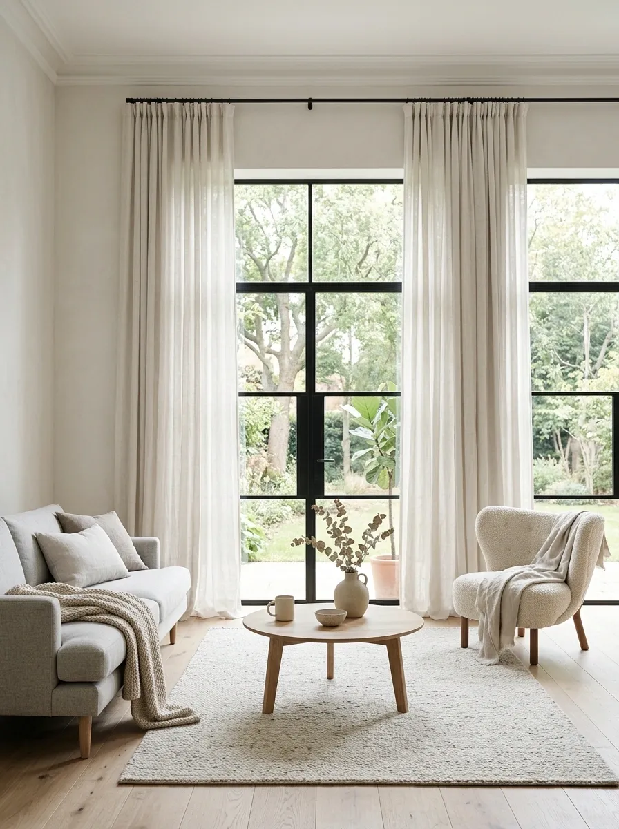
Curtains are one of those small details that can make a room look noticeably more polished.
Mount them high and let the fabric fall close to the floor. Lightweight linen or linen-look curtains work particularly well because they soften the window without making it visually heavy.
Keep the color close to the wall so the curtains feel architectural rather than decorative.
Curtains should frame the window, not scream “LOOK AT MY CURTAINS.”
Avoid short panels that stop awkwardly above the floor. They can make an otherwise calm room feel visually chopped up.
Layer Cream and Beige Textiles Without Making Everything Match
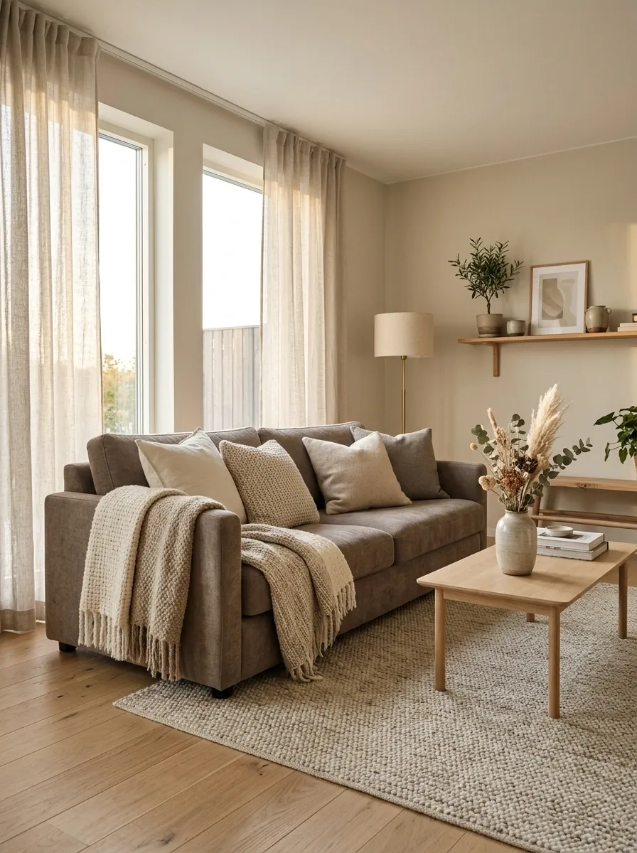
A Scandinavian room doesn’t need every textile to be the exact same shade.
Actually, that can make the room look flat.
Mix cream, oatmeal, soft beige, warm gray, and muted taupe. Keep the colors close enough to feel related, then introduce variation through linen, wool, cotton, boucle, or knitted textures.
Matching is easy. Layering is what makes the room look expensive.
Use the sofa, rug, curtains, cushions, and throw as separate surfaces rather than one giant coordinated beige package.
Oatmeal knit
Soft beige wool
Warm gray cotton
Muted taupe upholstery
Give the Room One Useful Focal Group Instead of Decorating Everything
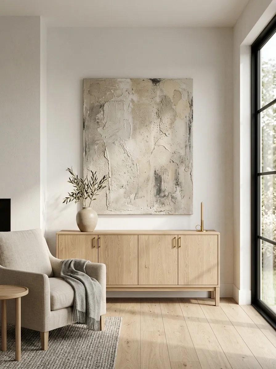
A room needs somewhere for the eye to land.
Create one strong focal group with a few related pieces. A large artwork above a sideboard, a mirror over a console, a sofa paired with a floor lamp, or a dining table beneath a simple pendant can all do the job.
The important part is restraint.
One clear composition beats six tiny decorative situations fighting for attention.
Leave nearby surfaces quieter so the focal area actually has visual importance.
Add a Slatted Wood Detail Without Turning the Room Into a Sauna
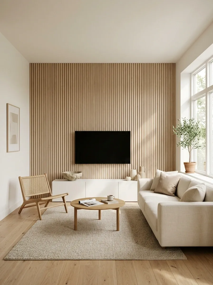
Wood slats can bring beautiful rhythm to a Scandinavian interior, but covering every wall in them is where things get dramatic for absolutely no reason.
Use slats selectively. A small feature behind a media console, around a niche, or on one architectural section can introduce warmth and vertical rhythm.
Keep the surrounding walls and furniture quiet.
The feature should frame the room, not swallow it.
Pale oak or another light natural finish works especially well with warm whites, cream upholstery, and soft neutral textiles.
Around a recessed niche
On one short wall
Behind a simple desk
Choose Furniture With Visible Legs to Keep the Floor Feeling Open
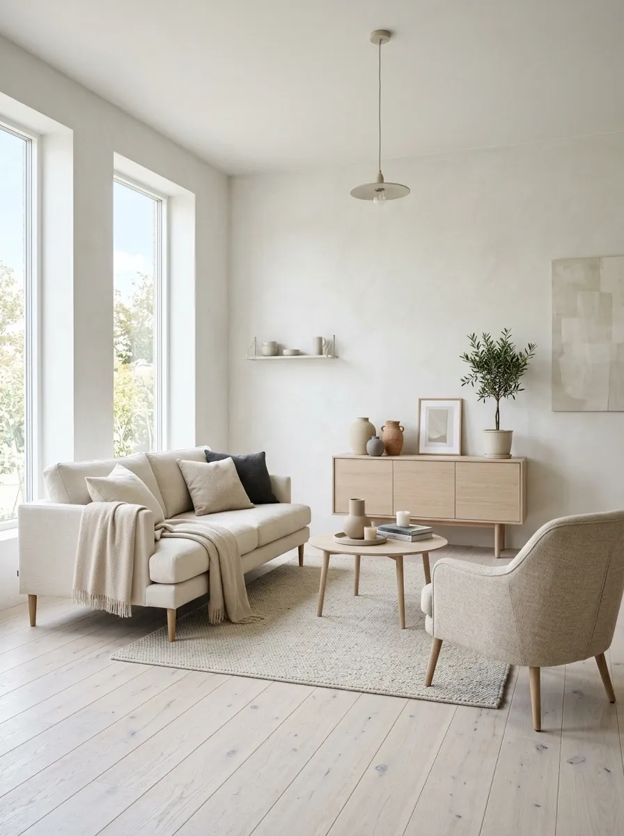
Heavy furniture sitting directly on the floor can make a small room feel packed surprisingly fast.
Furniture with visible legs creates small pockets of floor beneath sofas, chairs, sideboards, and cabinets. Those gaps let the room breathe and make the pieces feel lighter.
This is especially useful when the walls, furniture, and textiles are already pale.
You don’t need smaller furniture. Sometimes you just need furniture that can show a little floor underneath itself.
Use this trick selectively. Too many delicate legs can make a room feel visually busy, so balance them with a few solid pieces.
Use Greenery Sparingly and Keep the Pots Simple
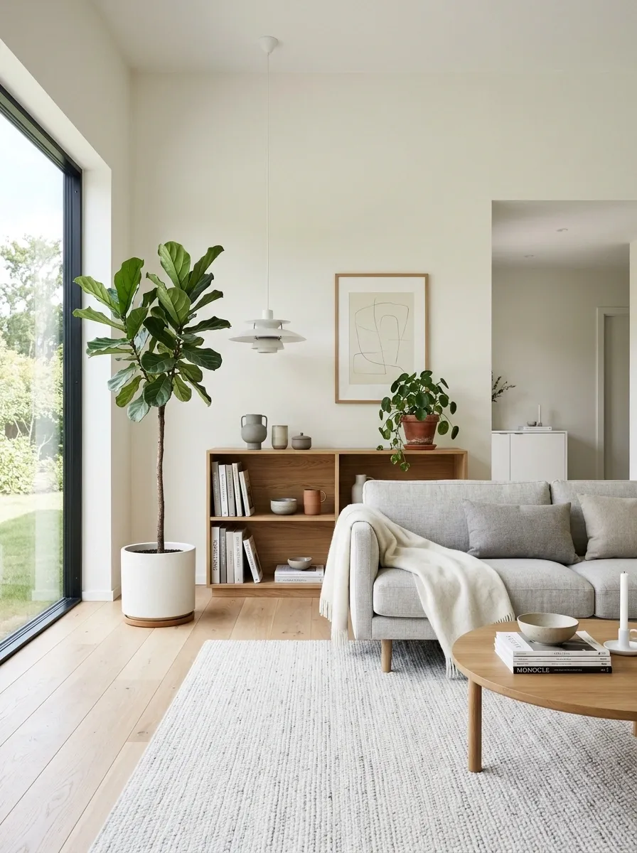
A little greenery gives a pale Scandinavian room some life without turning it into an indoor jungle.
Choose plants with a clean silhouette and let the foliage provide the visual interest. A tall plant beside a sofa, a small branch on a dining table, or one compact plant on an open shelf is enough to break up large stretches of neutral color.
Keep the containers simple. Matte white, stone, terracotta, or muted green finishes work better than ornate planters covered in decorative details.
The plant is the feature. The pot doesn’t need a personality crisis.
Create a Reading Corner With a Chair, Lamp, and Table
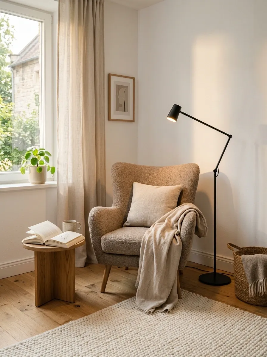
An empty corner doesn’t need seven decorative objects to justify its existence.
Give it a job. A comfortable chair, a slim floor lamp, and a small side table instantly create a useful zone without adding much visual weight. Keep the chair in a warm neutral or muted color so it belongs to the rest of the room.
Place the lamp close enough to the chair to actually light a book. The table should hold the essentials and nothing that requires dusting with a tiny brush.
Three pieces can look far more intentional than a corner full of filler.
Use Black Accents to Give Pale Rooms Some Definition
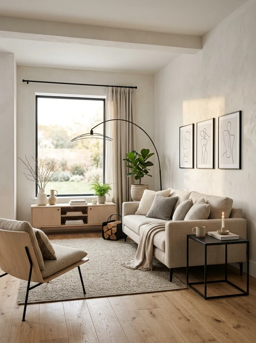
A soft neutral room needs a little contrast or everything starts blending into one very polite blob.
Black works best in small doses. Use it through a lamp frame, picture frame, chair legs, curtain rod, cabinet hardware, or a simple side table. These details create edges that make pale walls and wood tones look sharper.
The key is repetition. A black accent in one corner can feel random. Repeat the color in two or three small places and it starts looking intentional.
Don’t buy a black sofa just to solve a contrast problem. A lamp frame can do plenty of work.
Swap Random Decor for a Few Pieces You Actually Use
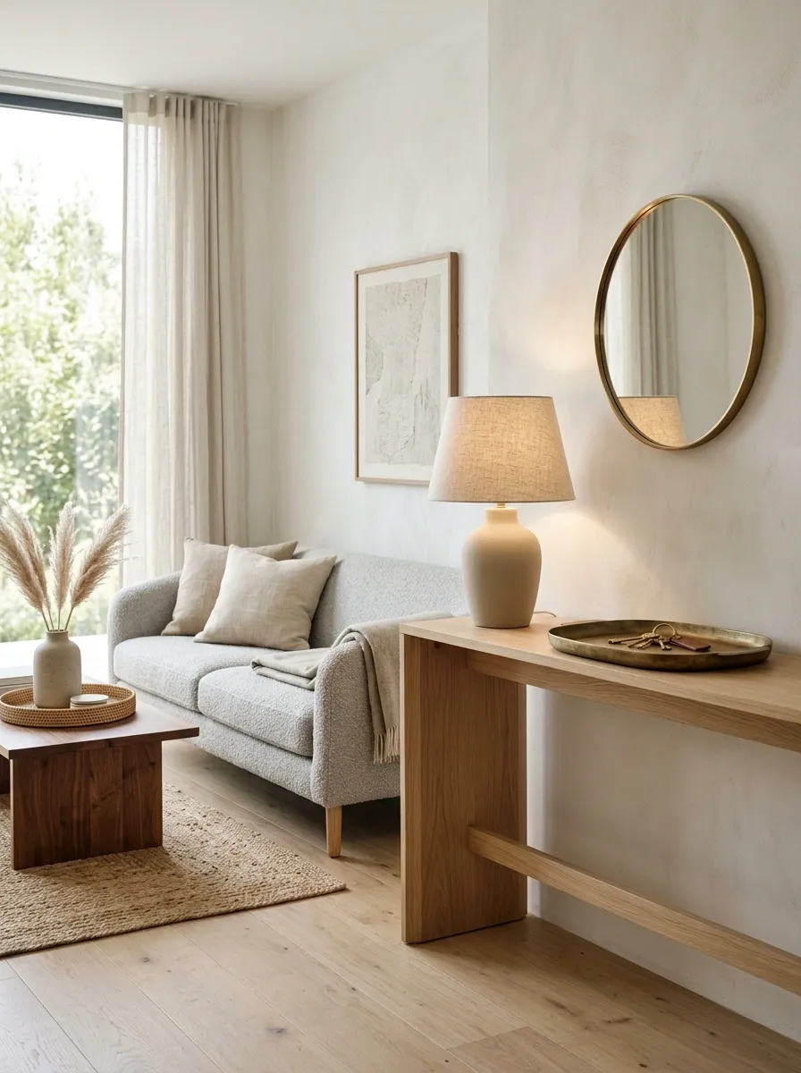
Decor gets messy when every blank surface becomes an invitation to go shopping.
Start by deciding what the surface needs to do. A console might need a lamp and somewhere to drop keys. A coffee table might need a tray and one useful object. A bedroom dresser might need a mirror and a small lamp.
Everything else gets questioned.
Use this brutal little filter:
- Does it serve a purpose?
- Does it add useful texture or shape?
- Does it connect to something already in the room?
- Would the surface look better without it?
A Scandinavian room doesn’t need to prove how much stuff can fit on one shelf.
Layer Soft Lighting Instead of Relying on the Ceiling Fixture
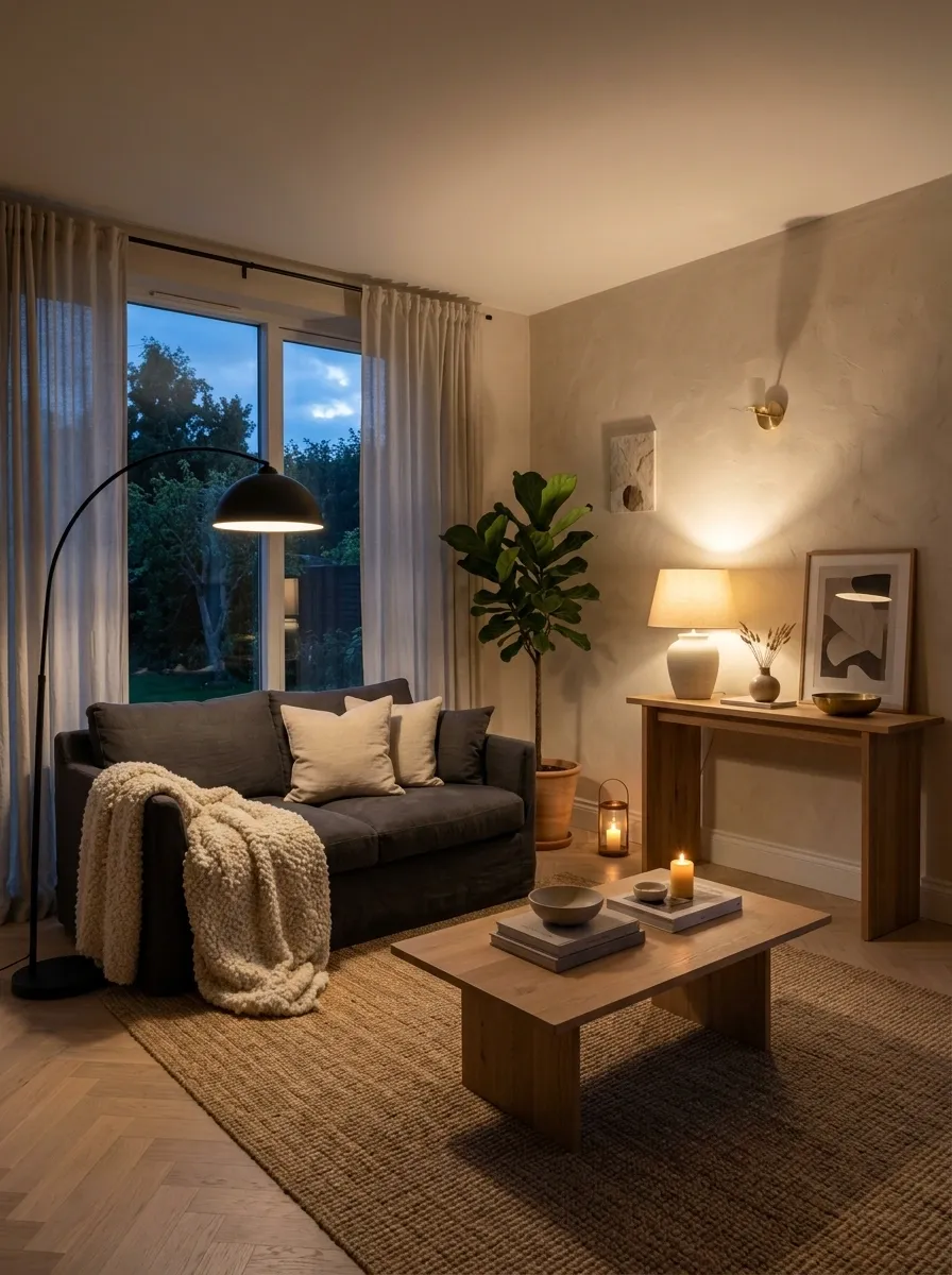
The overhead light shouldn’t have to do every job in the house. That’s how a cozy room ends up looking like an office at closing time.
Build layers instead. Use a floor lamp beside a sofa, a table lamp on a console, and softer light near the bed or dining area. Keep the fixtures simple, with materials that echo the wood, metal, or fabric already in the room.
The point isn’t to make the room brighter. It’s to make the light more useful.
Bright for tasks. Soft for relaxing. Focused where people actually sit.
Keep the Dining Area Simple With a Wood Table and Clean Chairs
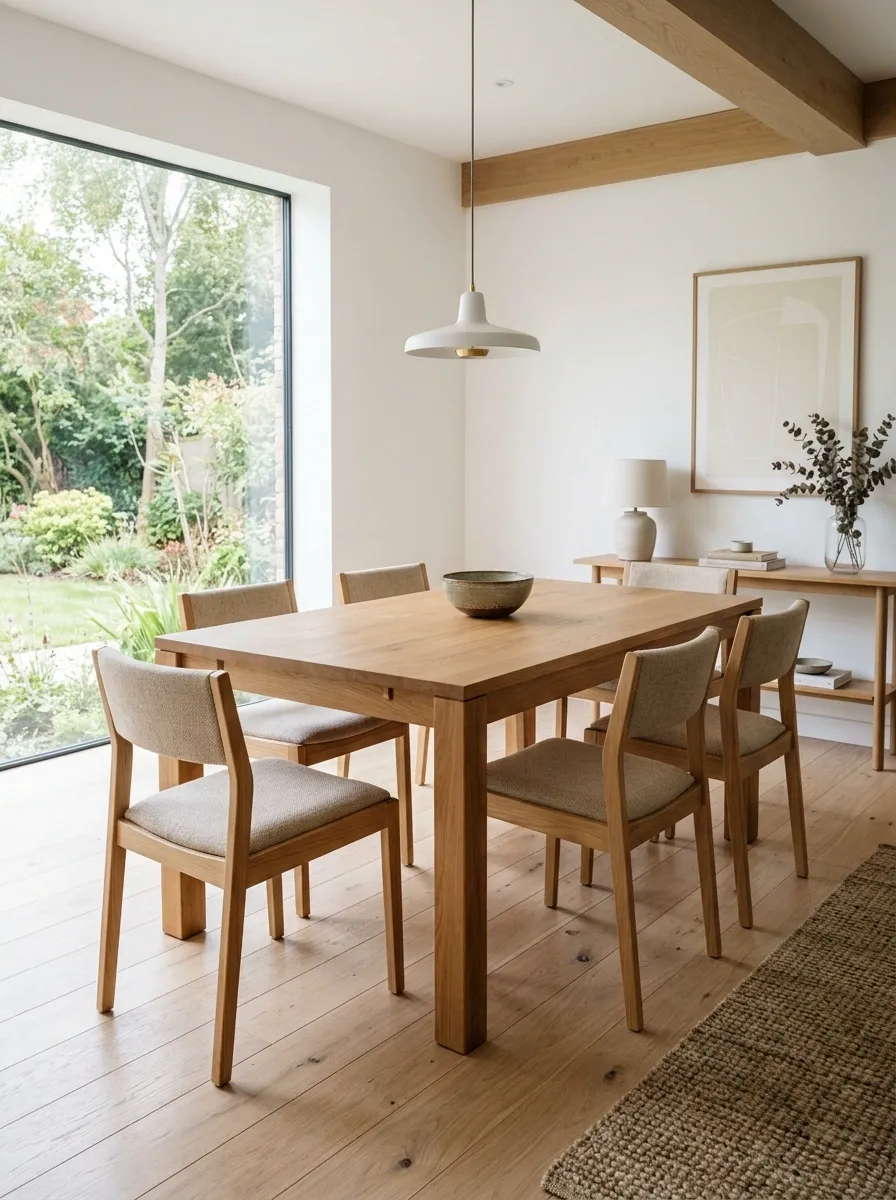
The dining area looks better when the furniture gets to be the decoration.
A simple wood table brings natural warmth, while clean-lined chairs keep the room from feeling crowded. Leave enough space around the table for people to pull chairs out without performing furniture gymnastics every time dinner starts.
Keep the centerpiece low. A small bowl, branch, or candle is enough.
The dining table should look ready for dinner, not ready for a product catalog photo shoot.
Use Open Shelving Only Where It Can Stay Uncluttered
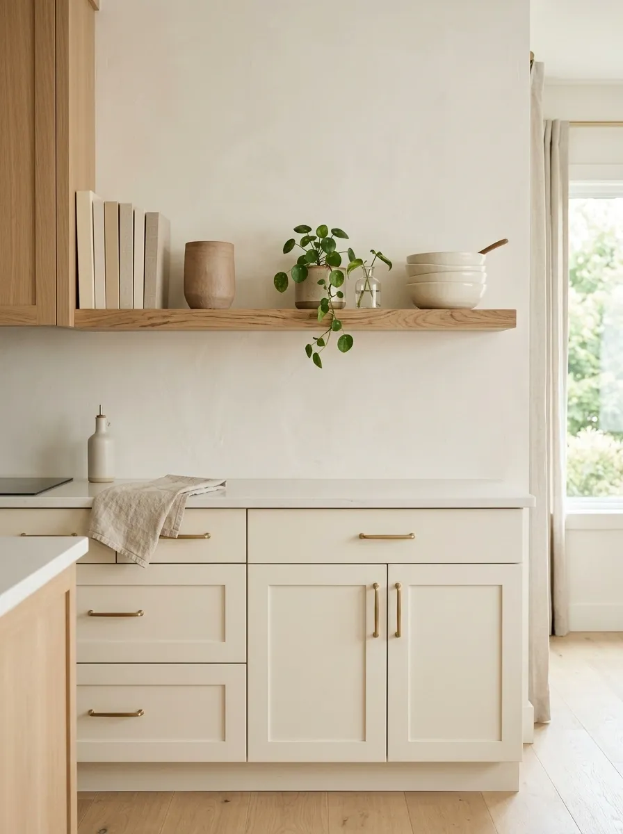
Open shelving looks fantastic right up until every mug, cable, receipt, and mystery object gets promoted to permanent display.
Use open shelves for the things worth seeing. Stack a few books, add one piece of pottery, leave a little empty space, and stop before the shelf starts looking like a storage unit with excellent lighting.
Keep everyday clutter in closed cabinets or drawers nearby.
The shelf needs breathing room just as much as the rest of the room does.
A good test is brutally simple: stand across the room and look at the shelf. The objects should read as small groups, not individual emergencies.
Handmade pottery
A small plant
Useful serving pieces
Random paperwork
Bulky packaging
Anything without a home
Make the Bedroom Calm With Low-Contrast Bedding
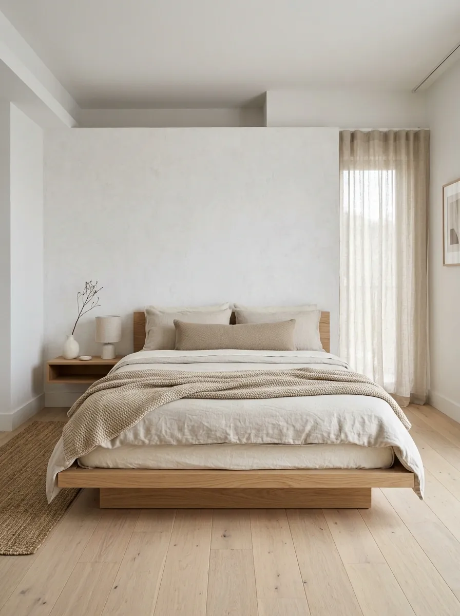
A Scandinavian bedroom should feel quiet before bedtime, not like the bedding section of a department store exploded.
Stick with nearby shades such as cream, soft beige, light gray, or muted taupe. Then create interest through texture instead of loud patterns.
Use a duvet with a relaxed finish, add one or two tactile layers, and let the bed remain the clear focal point.
Skip the giant pile of decorative cushions that has to be moved before anyone can lie down.
The best bedroom styling decision is making the bed look inviting without making it look precious.
Relaxed duvet or cover
One textured throw
A small pillow arrangement
Add Texture With Linen, Wool, Bouclé, or Knitted Pieces
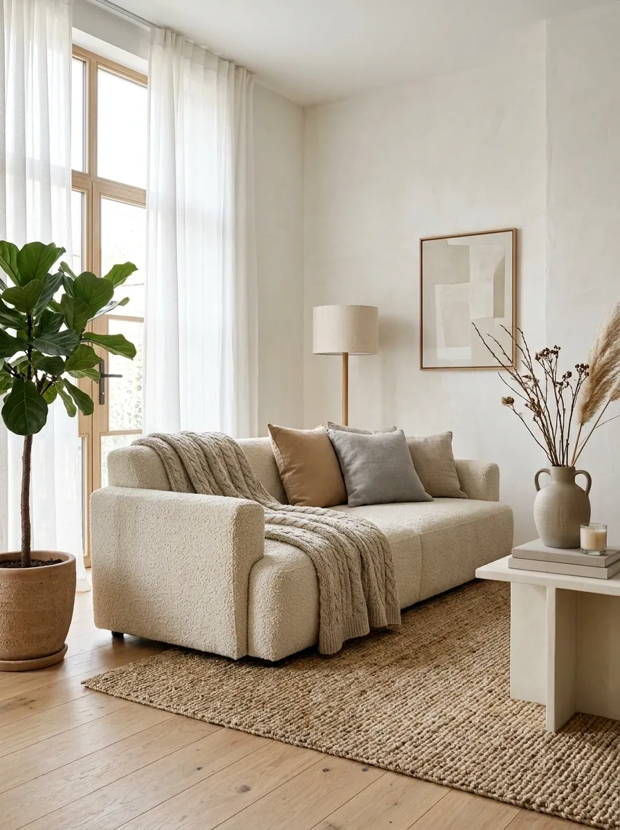
Texture is what keeps a neutral Scandinavian room from becoming visually flat.
A linen curtain beside a woven rug feels richer than two more decorative objects ever could. A knitted throw on a sofa adds softness. Bouclé upholstery can bring depth to a chair without introducing another strong color.
Mix textures across different heights and surfaces so the room feels layered from across the space.
The trick is touching different materials, not collecting every fabric in the store.
Keep the color family restrained, then let the surfaces do the interesting work.
Keep the Entryway Clear With One Useful Storage Zone
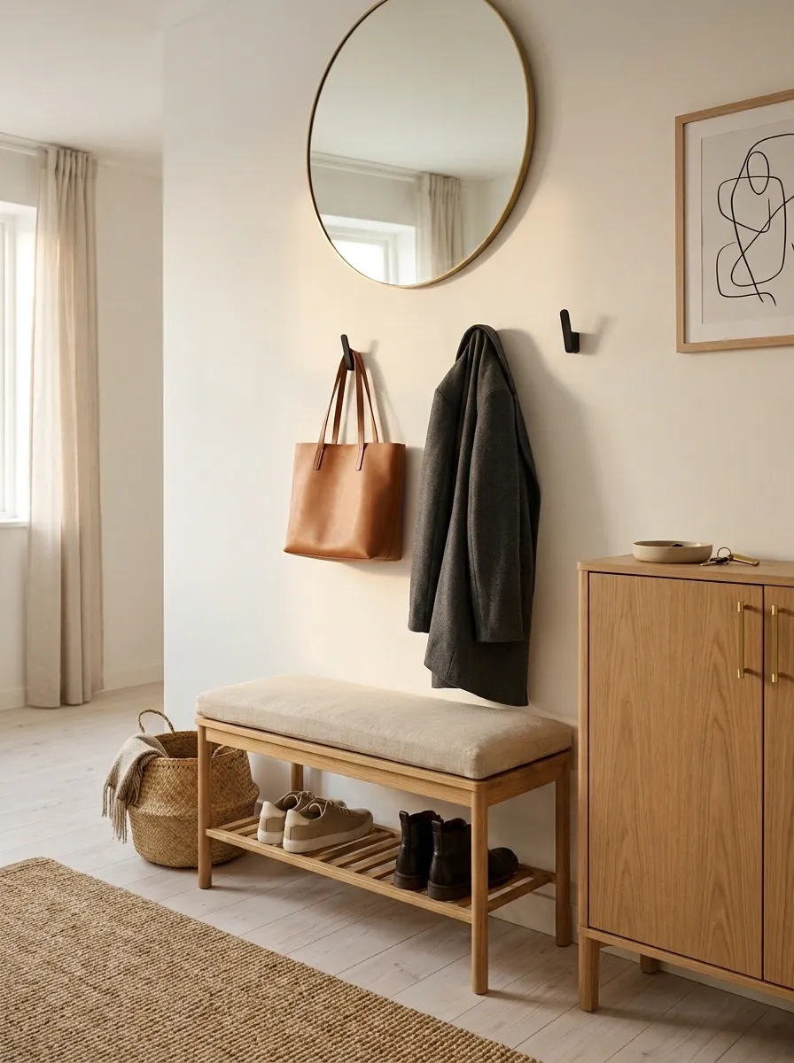
The entryway sets the tone before anyone reaches the living room.
Give shoes, bags, keys, and outerwear a proper landing spot so they don’t spread across the floor like they’ve signed a lease. A narrow bench, wall hooks, and one basket or closed cabinet can handle the everyday mess without filling the entrance.
Keep the decor minimal. A mirror, small lamp, or simple artwork is enough if the storage already has visual weight.
The goal isn’t a showroom entrance. It’s an entrance that still looks decent five minutes after everyone gets home.
Repeat the Same Few Materials Across Different Rooms
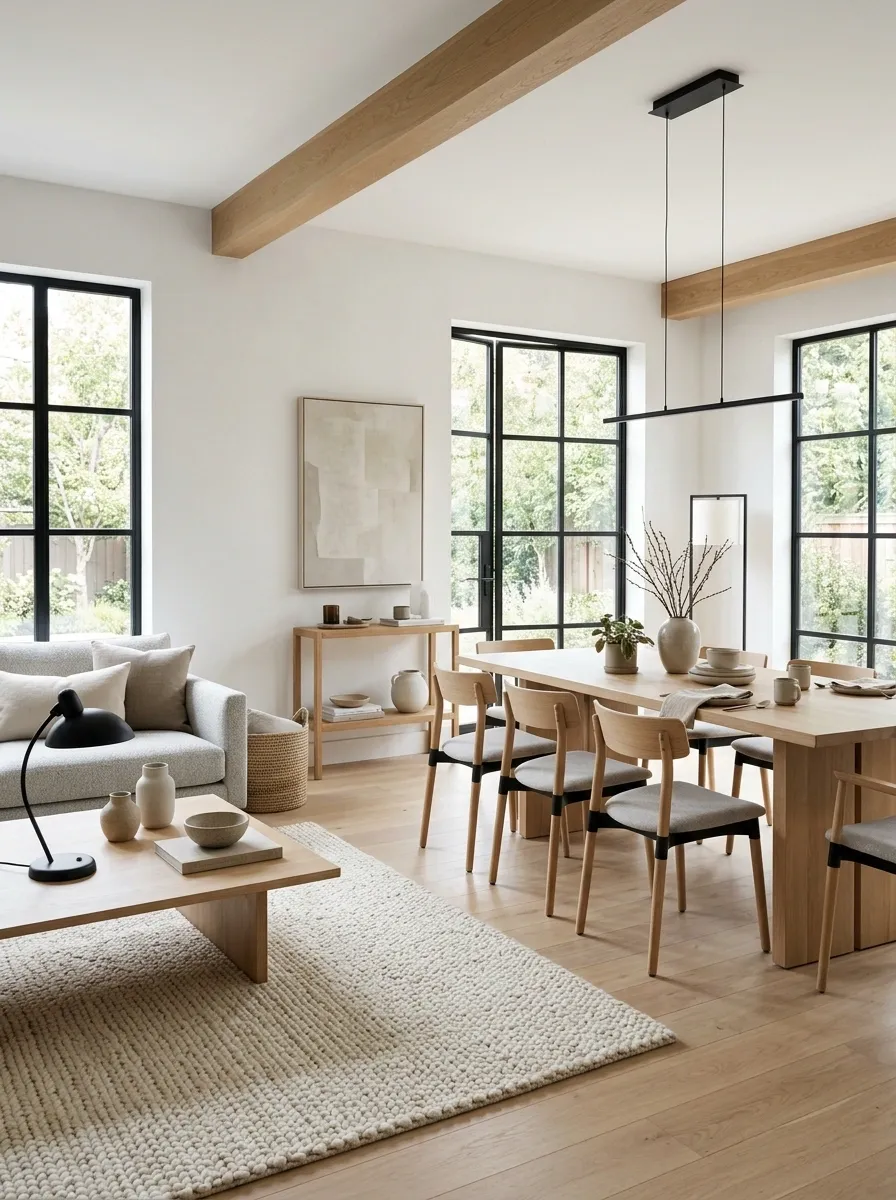
A house starts looking pulled together when the same materials quietly show up in more than one room.
Repeat pale wood in the living room, dining area, and bedroom. Echo black through a lamp, picture frame, and cabinet handle. Carry woven textures into a basket, rug, or lampshade.
The repetition doesn’t need to be obvious. That’s the point.
Think visual family, not matching furniture.
When every room introduces a completely different finish, the house starts feeling like several apartments accidentally sharing one address.
Dining room: table
Bedroom: bedside furniture
Dining room: chair detail
Hallway: frame or hook
Bedroom: basket
Entryway: storage piece
Choose Simple Artwork With Plenty of Empty Wall Space
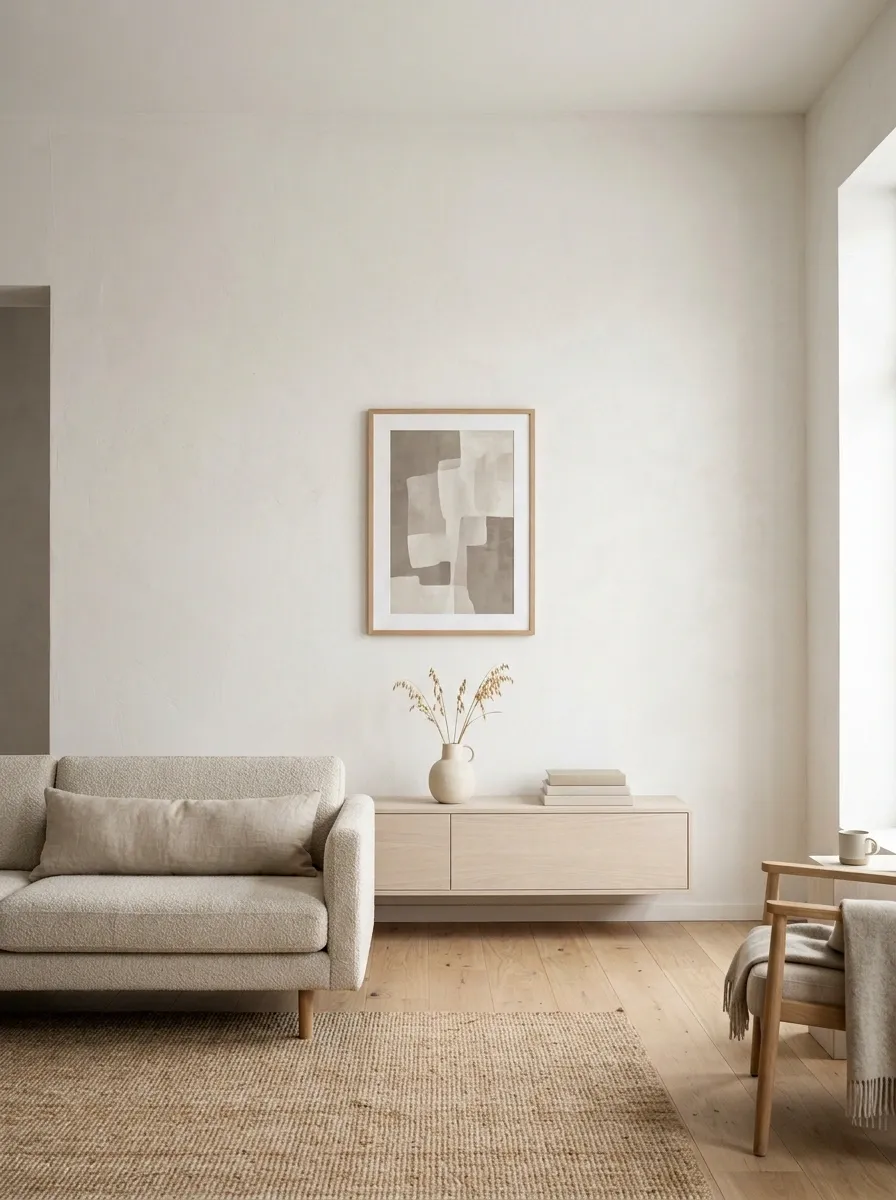
Artwork doesn’t need to cover every available inch of wall.
Choose a few pieces with clean shapes, muted tones, simple photography, line work, or restrained abstract forms. Then give each piece enough empty space around it to actually register.
A small print can look far more intentional on a quiet wall than six pieces squeezed together because the wall “felt empty.”
Empty wall space isn’t wasted space. It’s part of the composition.
Keep frames consistent or closely related, especially when the artwork itself varies. The result feels collected without looking chaotic.
✓ Simple subject matter
✓ Comfortable spacing
✓ One clear focal group
✕ Loud unrelated colors
✕ Frames touching each other
✕ Filling the wall simply because it’s blank
Use Baskets and Closed Storage to Hide Everyday Mess
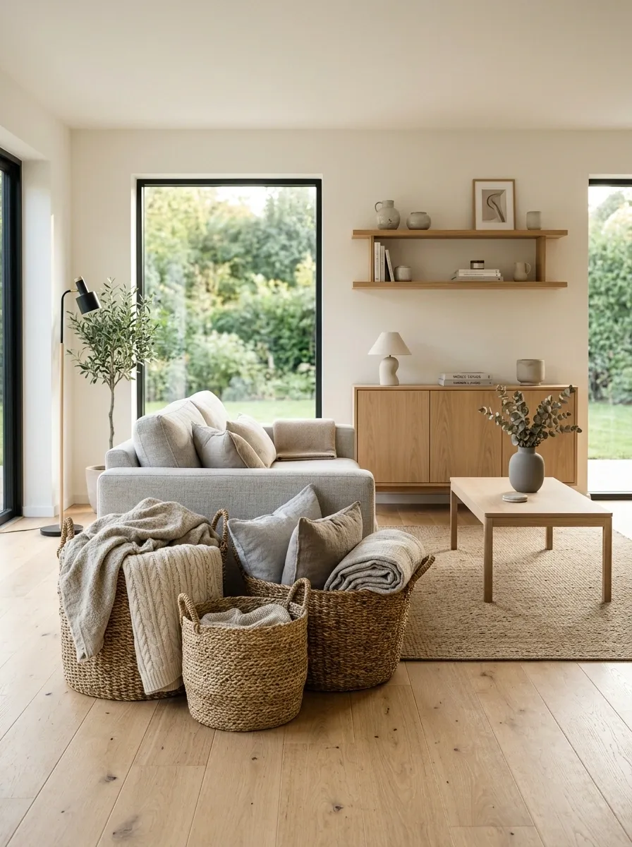
A beautiful room still has chargers, blankets, shoes, toys, paperwork, and the mysterious pile of things that somehow belongs to nobody.
That’s why good Scandinavian styling relies on storage that makes everyday clutter easy to disappear.
Use baskets where loose items collect. Use drawers and closed cabinets for visual chaos. Keep open storage for things worth displaying.
Pretty storage isn’t the goal. Invisible clutter is.
The best storage is the kind that takes two seconds to use. Nobody is carefully folding a throw blanket into an elaborate basket arrangement every evening.
Extra cushions
Everyday loose items
Paperwork
Items that don’t need displaying
Pottery
Selected everyday objects
Leave Some Empty Space Instead of Filling Every Corner
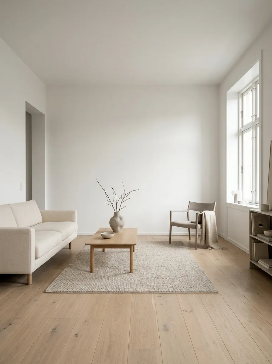
Some corners are allowed to exist peacefully.
A Scandinavian room doesn’t need a chair, plant, basket, floor lamp, pedestal, and little decorative table in every empty spot. That isn’t styling. That’s an aggressive misunderstanding of the word “empty.”
Leave enough open floor around major furniture so the room has visual pauses. Keep pathways clear. Let one wall stay quieter than the others.
Empty space makes the pieces that remain look more important.
Before buying something for a blank corner, live with the corner for a while. If it doesn’t need a job, it doesn’t need furniture.
Finish With Warm Personal Details That Make the House Feel Lived In
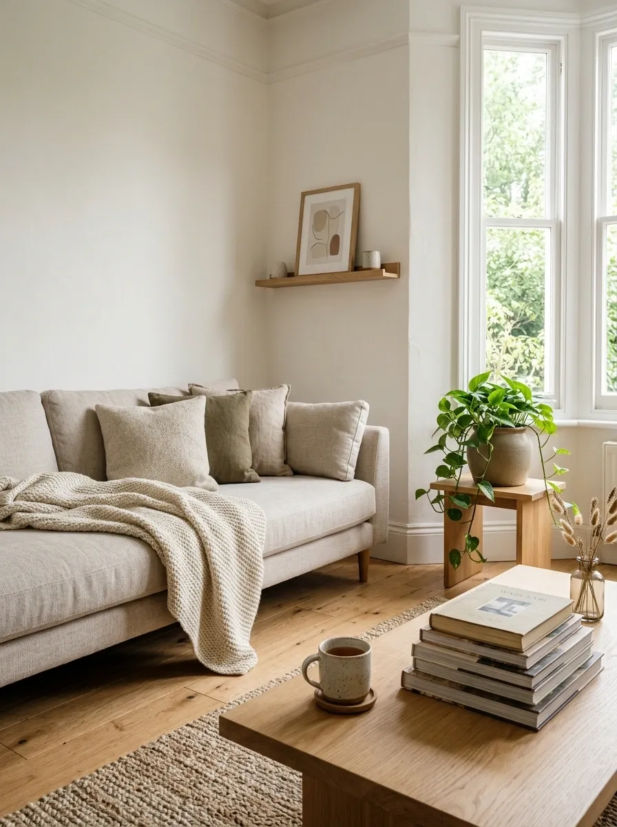
The final layer should make the house feel human without undoing all that visual calm.
Bring in details that have a reason to be there. A favorite ceramic mug on an open shelf. A woven throw on the sofa. A stack of books that actually gets read. A small piece of artwork with a quiet frame. These details give the neutral backdrop some personality without turning every surface into a display.
Keep the colors restrained and let the objects carry the story.
Scandinavian style isn’t about removing personality. It’s about giving personality enough space to breathe.
That balance is what separates a genuinely welcoming home from a room that looks like nobody is allowed to sit down.