
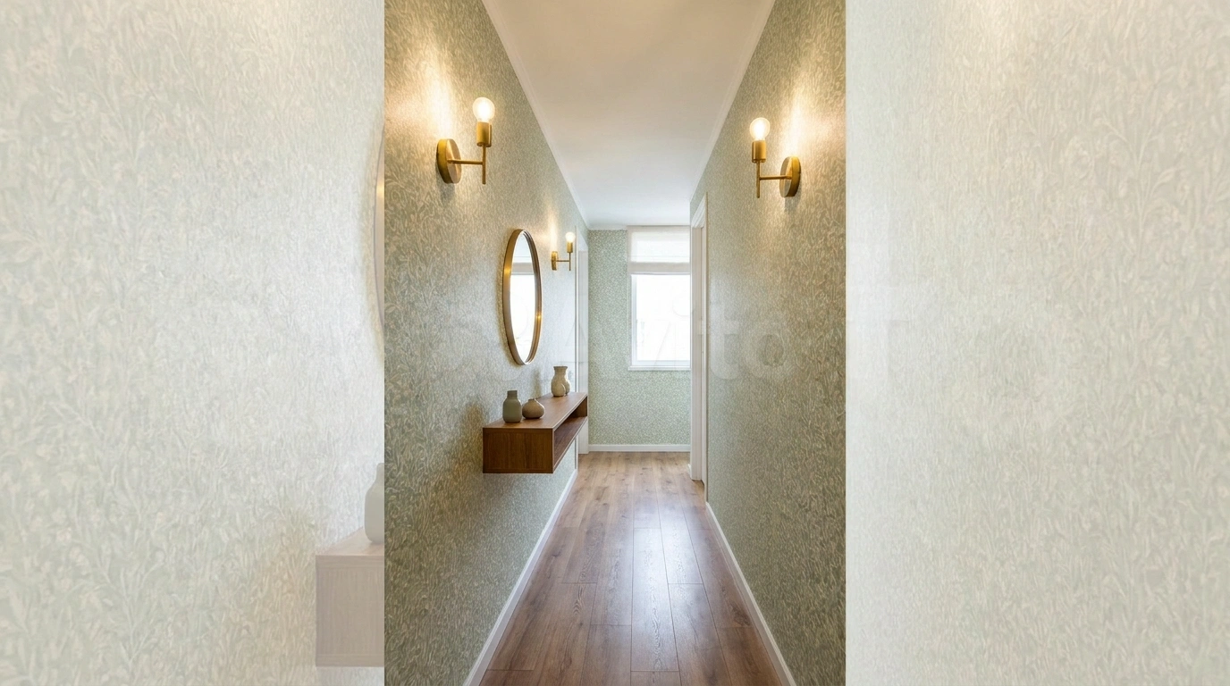
A narrow hallway often gets treated like a problem the rest of the house would prefer not to discuss. Paint it white, add a small mirror, and hope nobody notices the long, slightly joyless walk to the bathroom.
Wallpaper gives you more options than that.
You can introduce texture without much contrast, make the end wall interesting, or use a pattern that works with the hall’s length. The important decision is where the wallpaper belongs. Covering every surface with the most energetic print available is certainly a decision, but it may not be the one you enjoy carrying groceries past.
Look at the Hall From Both Ends
Check the floor, doors, trim, and lighting together. Notice where the hall narrows, where daylight reaches, and which wall you see first.
Order samples large enough to reveal the repeat. For removable products, follow the manufacturer’s surface, preparation, paint-curing, and removal instructions. “Peel and stick” describes an application method, not a universal guarantee against damage. Tempaper & Co.
Wallpaper Directions for a Narrow Hall
Bold Florals With Color Blocking
A vibrant botanical wallpaper can anchor a hallway accent wall while playful color-blocked paint brings structure to the surrounding surfaces. Choose a saturated hue from the print to paint your lower walls and baseboards.
Pairing a busy print with solid color blocks requires a careful eye for scale. Keep your flooring simple and graphic so the eye has a place to rest between the floral motifs and the painted zones.
Your narrow corridor instantly gains depth and personality without feeling overcrowded. Let the playful colors bounce off each other to make the journey from room to room an absolute delight.
Fine Vertical Stripes With Warm White Trim
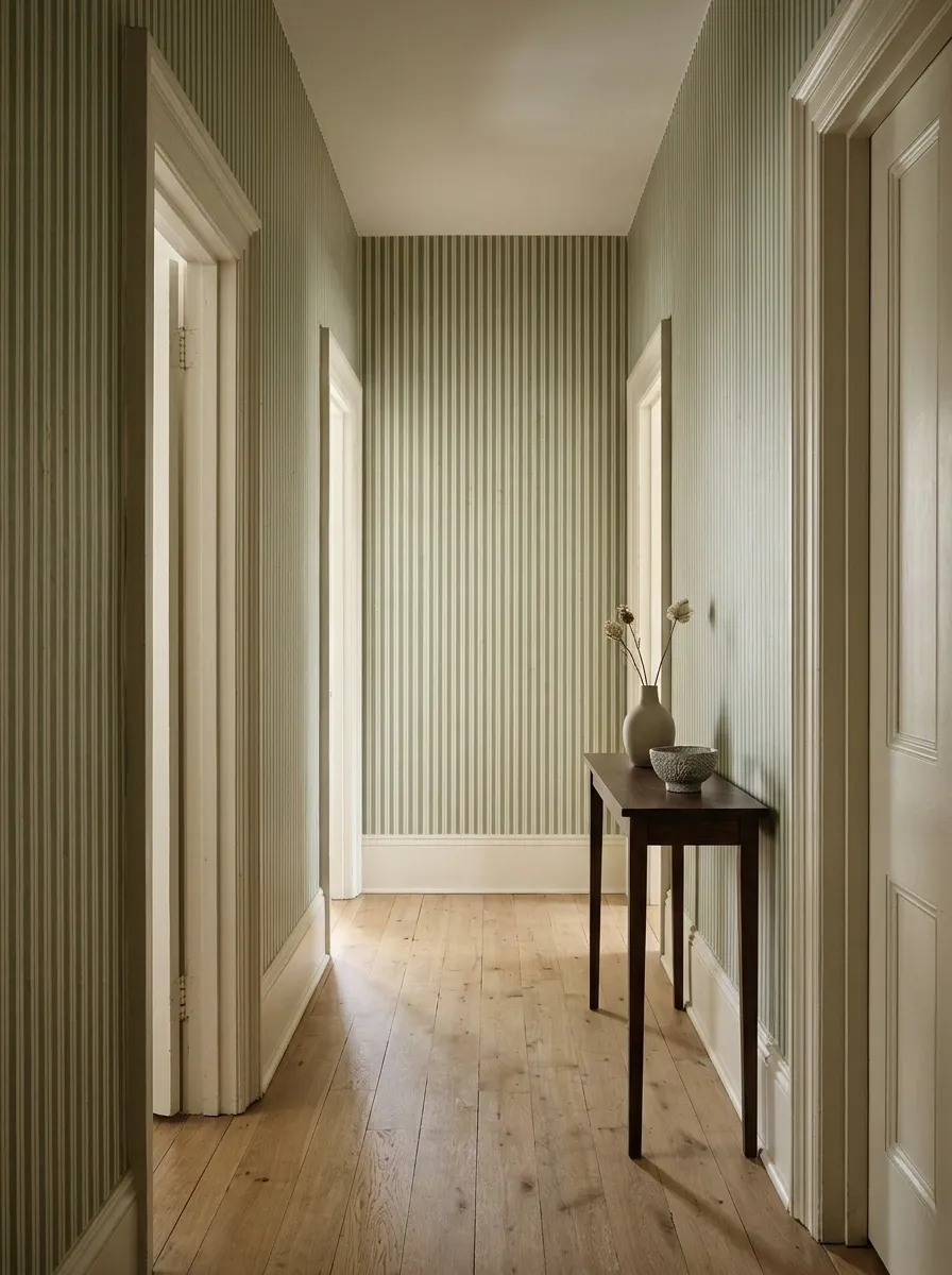
Fine stripes give a plain hall a steady rhythm without introducing a large motif. Try muted blue, sage, or warm gray against an off-white background.
Use trim that relates to the lighter stripe. Check the pattern beside doorframes, particularly where older walls are uneven.
A slightly softened stripe can be more forgiving visually than a very sharp, high-contrast design. Your hallway does not need to become an architectural accuracy test every time someone looks down it.
THE STRIPE RELATIONSHIP
Trim repeats the lighter background, rather than adding another contrast.
Whimsical Branches and Classic Wainscoting
Delicate arboreal prints introduce an organic, illustrative charm to a narrow passage. Pairing this airy design with crisp lower wall paneling keeps the vertical space feeling balanced and remarkably bright.
Choose neutral tones that complement your lighting strategy. Soft taupes and muted creams allow the faint botanical sketches to shine without overwhelming the senses as you walk past.
A slender console table and a well-placed round mirror complete the composition effortlessly. Your hallway transforms into a sophisticated gallery stroll that guests will admire from the moment they step inside.
Broad, Soft Stripes for a Less Formal Look
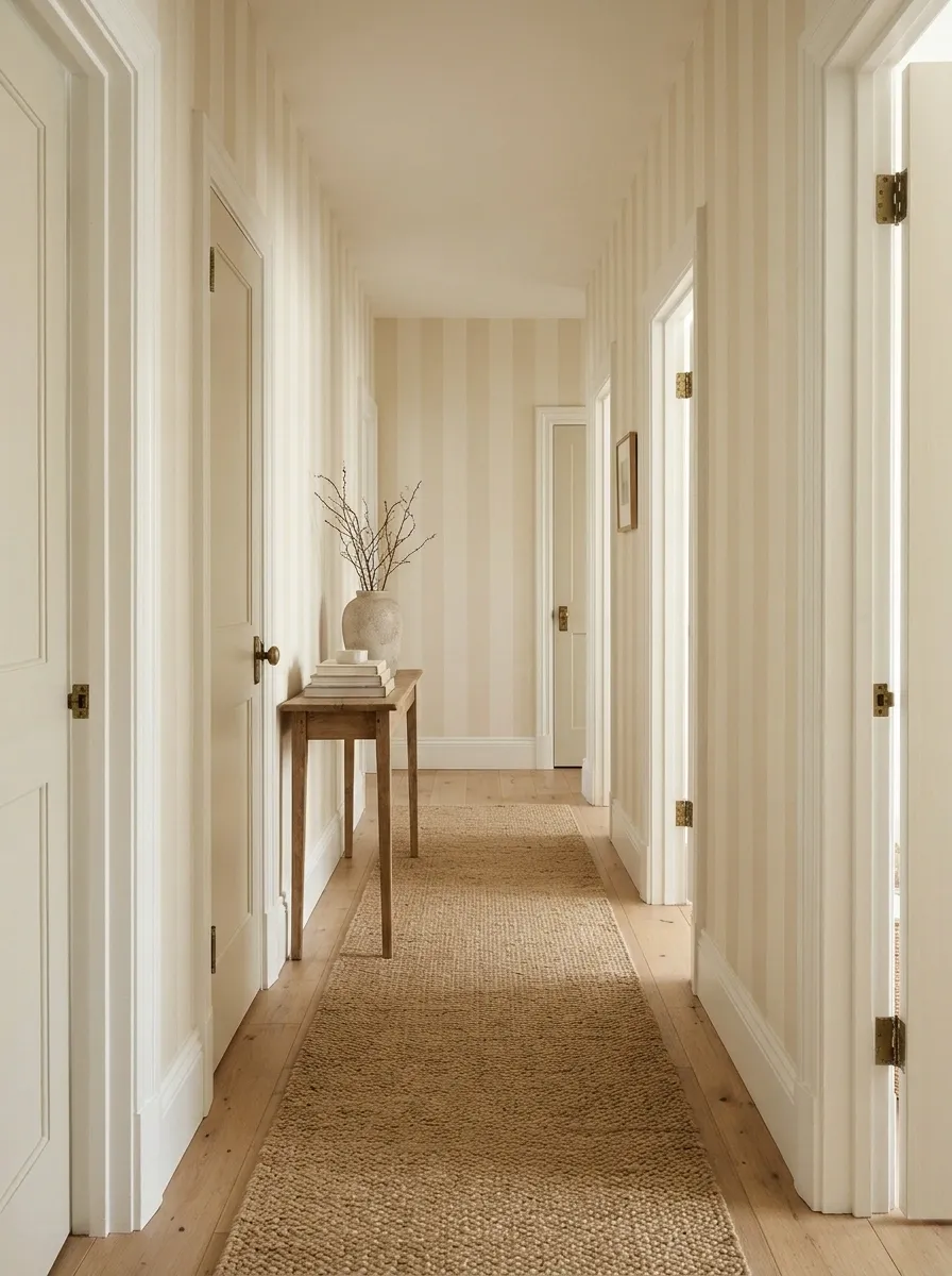
Wider stripes can feel relaxed when the colors sit close together. Cream and pale oat, for example, offer variation without a very graphic effect.
Plan the sequence across door openings before installation. Avoid a final narrow sliver that looks accidental.
Keep the floor runner relatively simple. Broad stripes already establish a clear pattern, and the hall probably does not need a second set of lines attempting to direct traffic.
Sample check: Compare the lightest stripe with the ceiling, trim, and nearby doors before choosing the wallpaper.
Rich Grasscloth for Instant Texture
Natural grasscloth wallpaper brings incredible tactile warmth to a transitional corridor. The subtle woven variations catch the ambient light beautifully, offering a sophisticated alternative to flat painted drywall.
Coordinate your hallway runner and accent furniture to echo the organic tones of the weave. Sandy shades and rich jute textures create a cohesive flow that grounds the entire narrow layout.
Keep nearby wall art understated to let the gorgeous texture do the heavy lifting. Your hallway achieves that effortlessly curated look that proves neutral does not have to mean boring.
Geometric Neutrals for Modern Flow
A restrained geometric pattern adds a contemporary rhythm to a hallway without shouting for attention. The repeating motifs draw the eye gracefully down the length of the narrow passage.
Pair the graphic paper with classic warm wood doors and moody accent pieces for a balanced look. The contrast between the structured pattern and natural elements feels both modern and welcoming.
Allow the subtle wallpaper to define the mood while your floor runner softens the footsteps. Your transitional space becomes an intentional design feature rather than just a way to get from A to B.
Small Botanical Prints With Plenty of Background
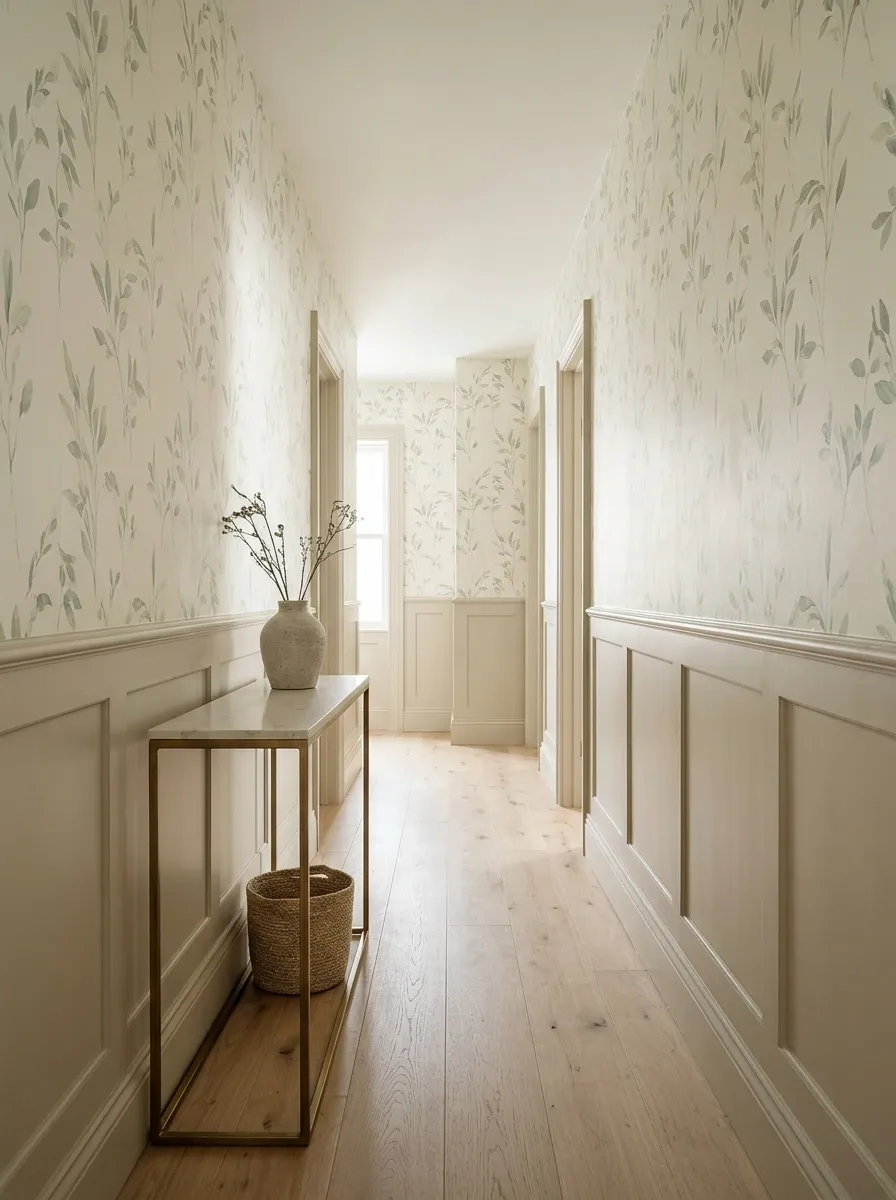
A small botanical print can make a hallway feel personal without overwhelming it. Look for visible background between leaves and stems.
Pull a quiet color from the paper for nearby paint or accessories. Keep the other finishes restrained.
The amount of empty space matters as much as the plant motif. A delicate leaf print and a dense botanical jungle may share a category online while behaving very differently across several meters of wall.
| Look for | Be cautious with |
|---|---|
| Clear background between motifs | Dense detail across every surface |
| A restrained color range | Several competing greens and accents |
| A repeat you enjoy close up | A pattern chosen only from a tiny image |
Trailing Vines That Follow the Wall’s Height
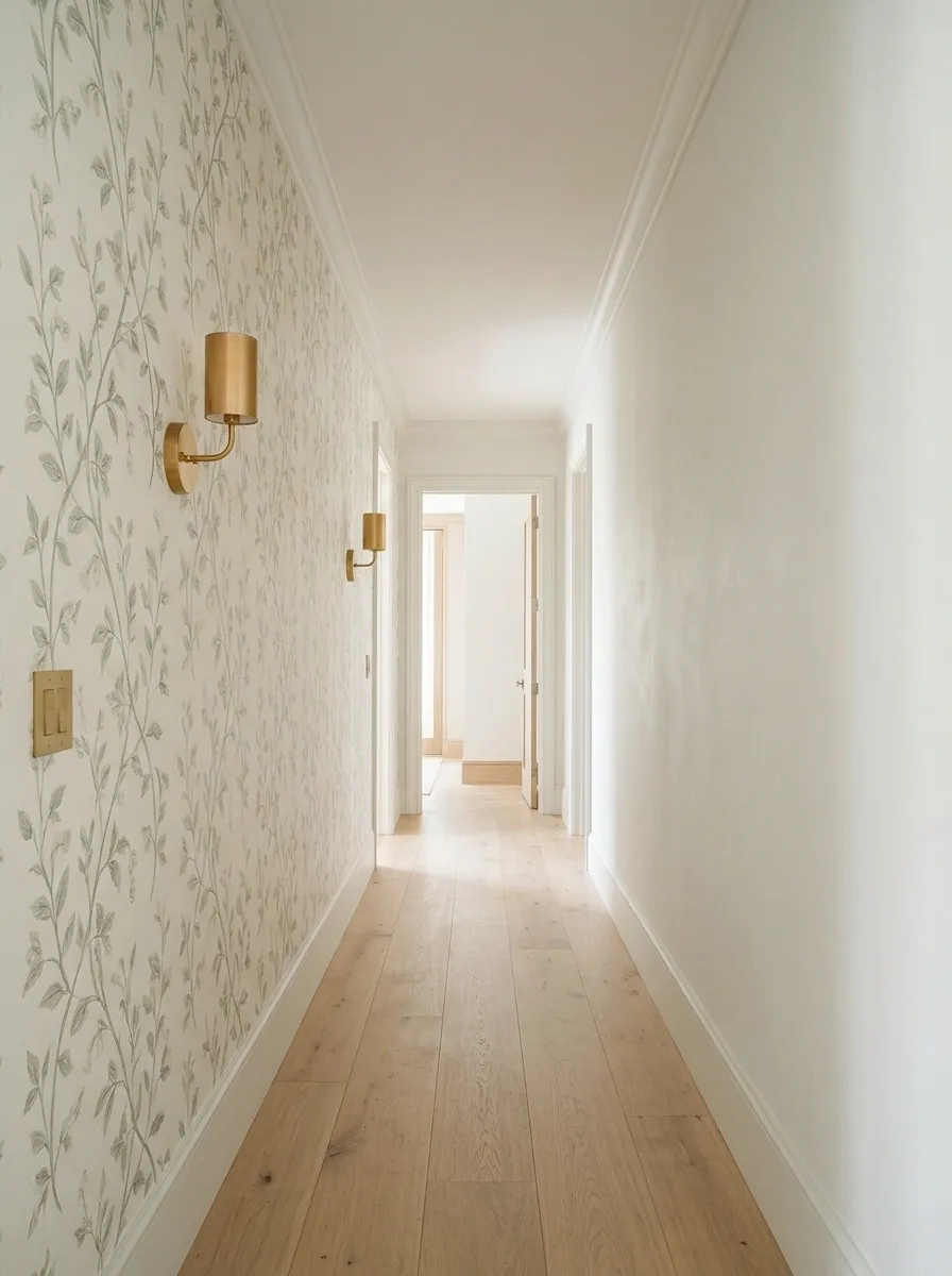
A climbing vine pattern can work with the vertical shape of a narrow hall. Choose stems that move naturally rather than a rigid repeated column.
Keep nearby hooks, switches, and wall lights in mind. They will sit within the pattern, whether the mood board acknowledged them or not.
A quieter opposite wall can give the foliage space. You can enjoy a botanical hall without asking every surface to join the gardening committee.
GIVE THE PATTERN A PARTNER
Movement and detail.
A place for the eye to rest.
An Airy Large Floral on One Wall
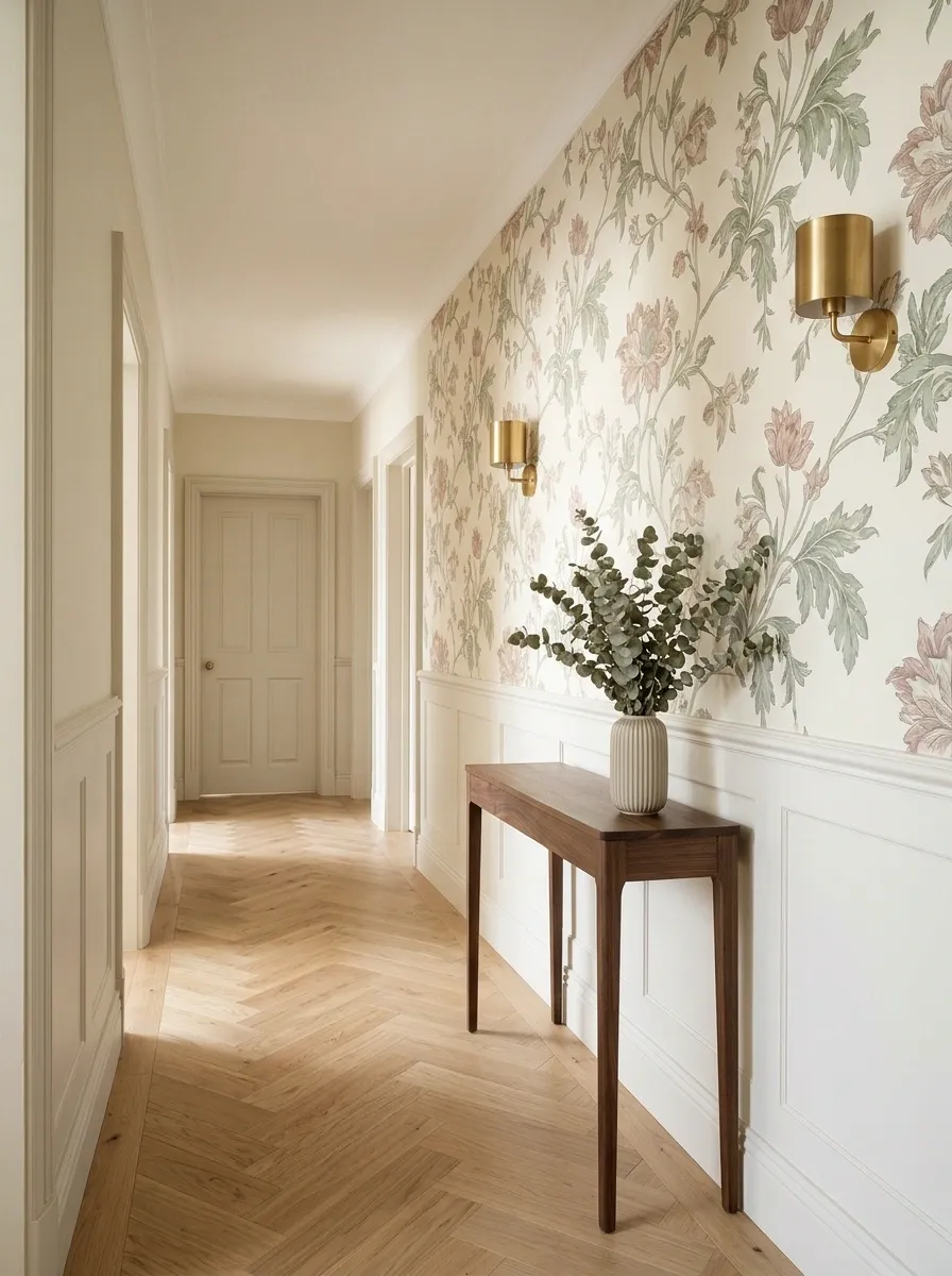
A large floral is not automatically wrong for a small space. An open composition with generous background can feel clearer than a tiny, crowded repeat.
Use one wall if the print is strong. Keep the trim and other walls related to its background.
View a full repeat before ordering. You want to understand where the flowers land, rather than discovering that one enormous bloom has chosen to sit directly behind the thermostat.
Plan the placement: Large motifs need consideration around doors, switches, and wall lights.
A Woodland Mural on the End Wall
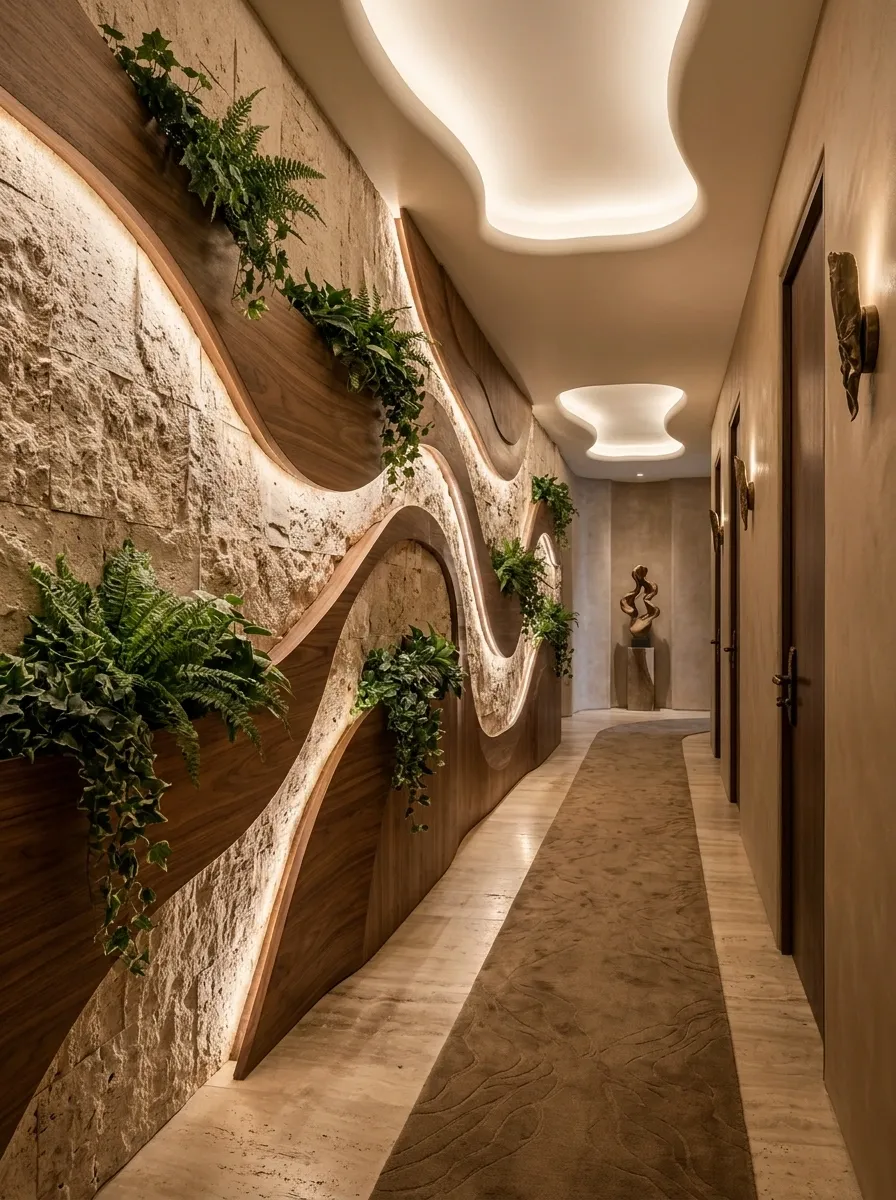
A woodland-style end wall can give the hall a destination. Choose a composition whose scale fits the visible wall area.
Keep the side walls quieter so the mural remains readable from the entrance. A pale or softly layered design can suit a restrained home.
Check where the scene is cropped. The end wall should look deliberately composed, not like a forest has been squeezed behind a cupboard door with several important trees missing.
Quieter side walls support the destination.
A Graphic Print at the End of the Hall
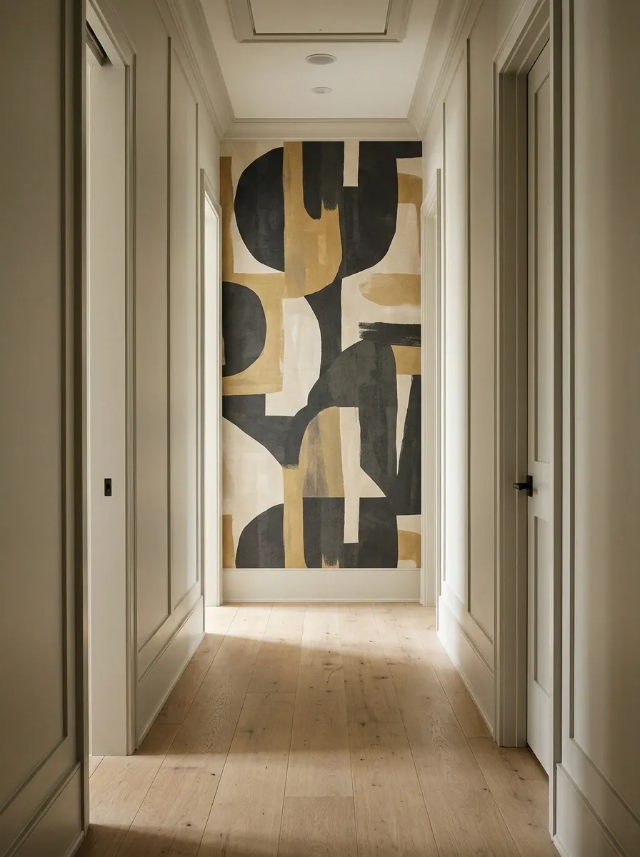
A geometric or abstract end-wall paper can make the hall feel intentionally finished without covering its full length.
Choose colors connected to the floor and adjoining rooms. Keep the scale large enough to read from the entrance.
This works particularly well when furniture would obstruct the end wall. The wallpaper provides the interest without introducing a console table that everyone has to edge around while pretending the hall is still spacious.
| End-wall feature | Supporting choice |
|---|---|
| Graphic wallpaper | Quiet side walls |
| Strong color | Restrained trim |
| Clear pattern | Minimal objects in front |
Wallpaper Above Existing Dado Paneling
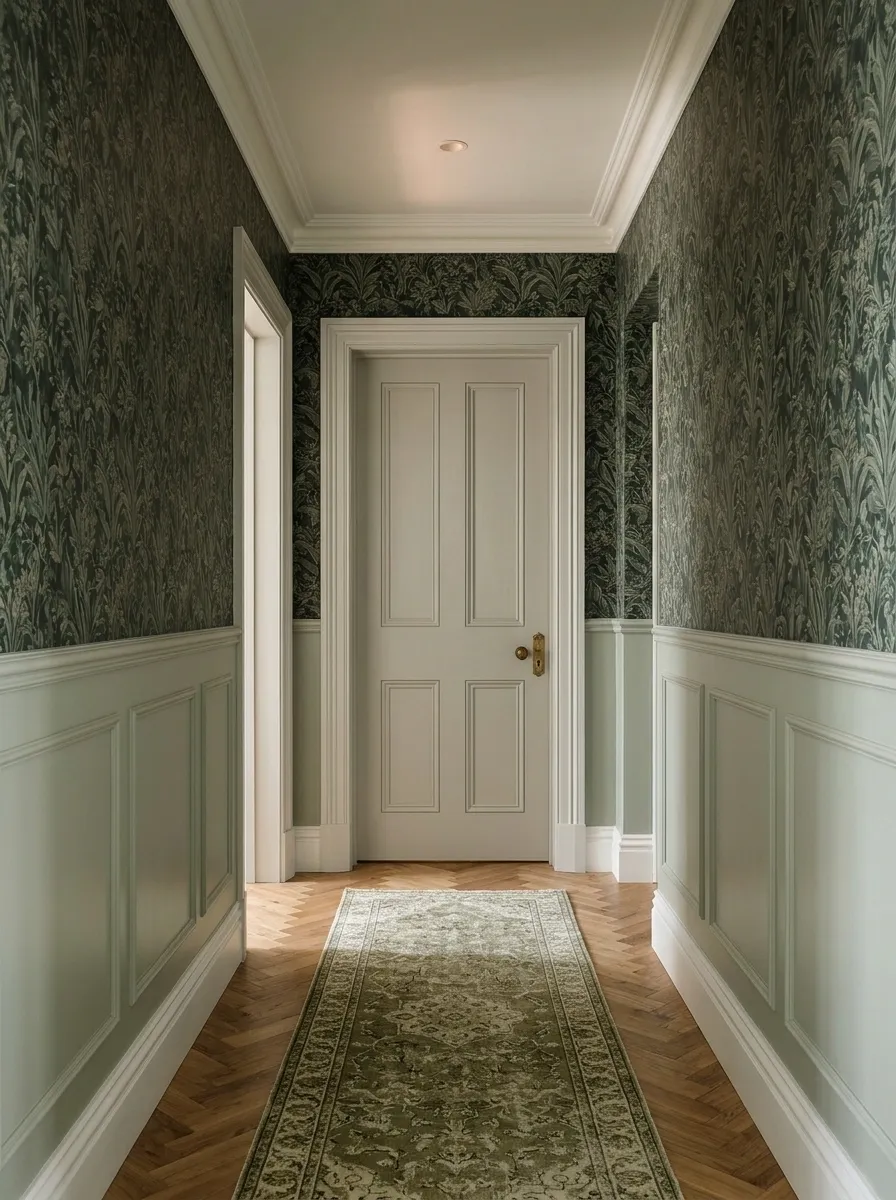
Existing lower paneling gives wallpaper a natural boundary. Use the paper above and let the painted lower section provide a calmer base.
Choose the paint from a quieter shade within the pattern. Check the relationship with doors and skirting as well.
The paneling does not have to match the paper exactly. It needs to support it. An almost-match can look more accidental than a deliberate change in tone.
Wallpaper Below a Clear Painted Upper Wall
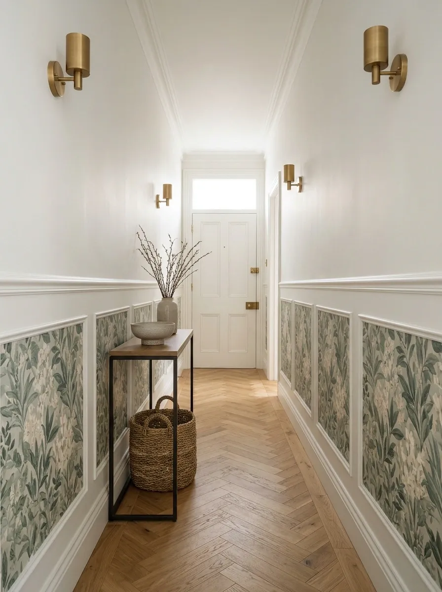
Lower-wall wallpaper can introduce pattern while leaving the upper hall visually quieter. Use an existing suitable boundary or plan a deliberate finish line.
Choose a product appropriate for the position and likely contact. Bags, coats, and passing hands are part of hallway life.
Keep the upper color connected to the paper’s background. The division should look intentional rather than suggest the wallpaper budget expired halfway up the wall.
Practical priority: Product durability and cleanability matter more where people regularly brush past the wall.
A Tonal Pattern Wrapped Around the Hall
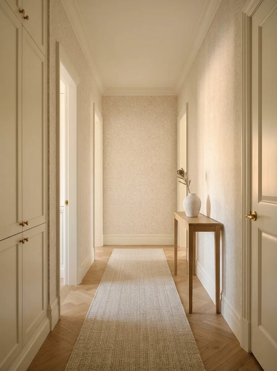
A low-contrast pattern can work across several walls when you want a continuous atmosphere. Think pale leaves, soft geometrics, or a subtle textured repeat.
Test enough material to judge the effect around a corner. Keep doors and trim visually coherent.
The continuity can make the hall feel considered, but the pattern still needs breathing room elsewhere. Avoid adding several small patterned rugs and heavily decorated doors simply because the walls have become more interesting.
CONTINUITY THROUGH RELATED TONES
Keep the transitions quieter than the overall pattern.
A Deep-Colored Paper on One Long Wall
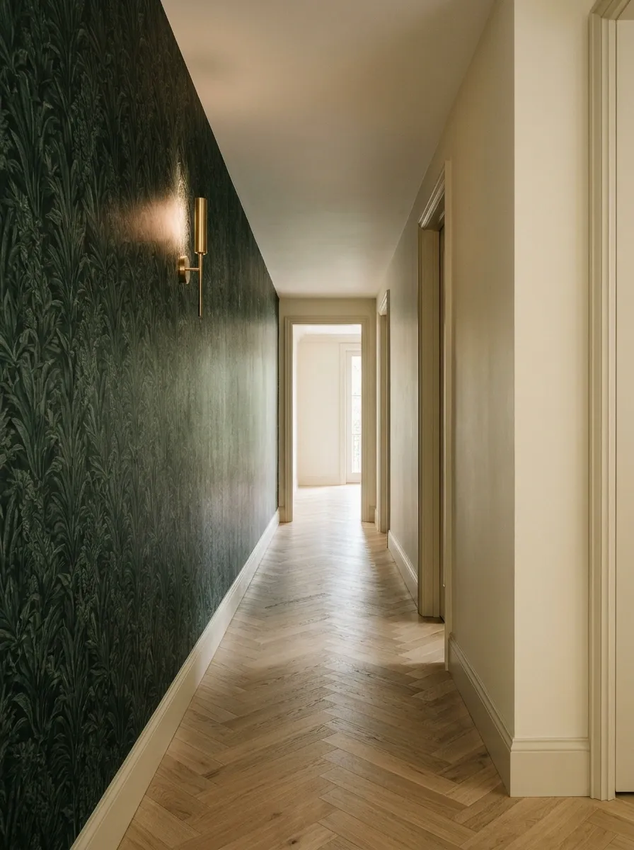
A deeper wallpaper can create a strong atmosphere along one side of the hall. Balance it with a lighter opposite wall and suitable lighting.
Choose the shade against the floor rather than assuming dark green or navy will behave identically in every home.
Keep protruding furniture limited. Dark wallpaper can look composed in a narrow space, but it cannot negotiate additional width from a wall that is already occupied by a large console.
| Stronger side | Quieter side |
|---|---|
| Deep wallpaper | Related pale paint |
| Main pattern | Minimal decoration |
| Visual emphasis | Clear circulation |
A Grasscloth-Look Finish With Easier-Care Qualities
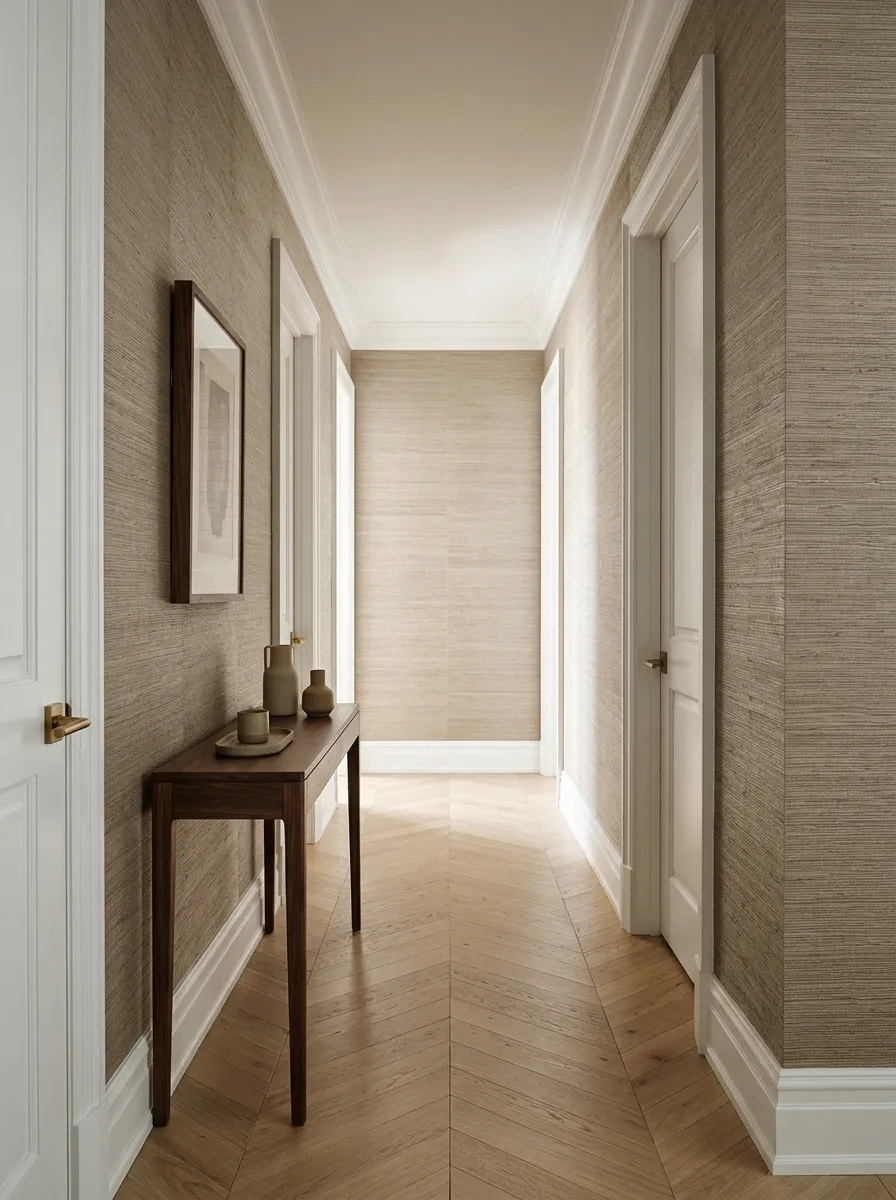
A grasscloth-look paper can provide a woven appearance without necessarily choosing a natural grasscloth product. Compare the actual construction, cleaning guidance, and seam appearance.
A warm neutral suits many timber floors, while a cooler version needs testing beside gray finishes.
Do not assume every woven-looking paper performs the same way. Choose for the hallway’s traffic and your maintenance preferences, not merely for the satisfying texture of a sample book.
Separate the look from the specification.
Check cleaning, seams, and suitability for a busy passage.
Soft Geometrics With Rounded Shapes
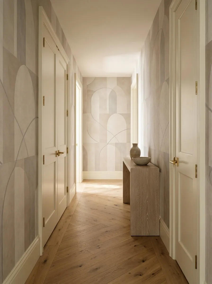
Rounded geometric patterns can add order without the severity of sharp black-and-white lines. Try muted arches, circles, or softly drawn curves.
Keep the color range restrained and compare the repeat with the floor pattern.
A hallway with several doors already contains plenty of rectangles. Softer shapes can provide contrast without turning the entire passage into an argument between competing grids.
Pairing tip: Rounded wallpaper shapes often benefit from simpler flooring and straightforward door detailing.
Art Deco-Inspired Fans With Simple Surroundings

A fan pattern can bring elegance to a narrow hall when its scale and contrast suit the space. Muted green, warm cream, or softened metallic-look details can work.
Check reflective effects under the actual lights. Some finishes are much more assertive after dark.
Keep the rest of the hall relatively plain. A decorative fan repeat already has movement; it does not need ornate lighting, elaborate trim, and another patterned surface joining at full volume.
LET THE CURVES LEAD
Pattern supplies the detail. Trim and lighting stay quieter.
A Gentle Wave Pattern for an Informal Hall
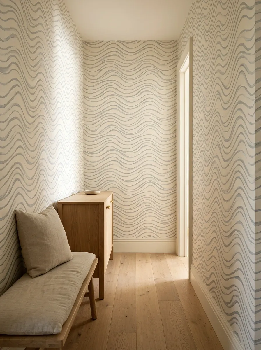
A soft wave can make a narrow passage feel less rigid. Choose a restrained design with enough background to avoid constant visual movement.
Compare its direction with the floorboards or runner. You do not need every line in the hall pulling the eye differently.
This suits homes where a formal stripe feels too tailored. Keep nearby textiles simpler so the wallpaper remains the main flowing element.
| Choose | Avoid piling on |
|---|---|
| One clear wave rhythm | Competing wavy textiles |
| Muted contrast | Several equally strong colors |
| A readable repeat | Excessive small decoration |
A Fine Speckled Paper for Subtle Interest
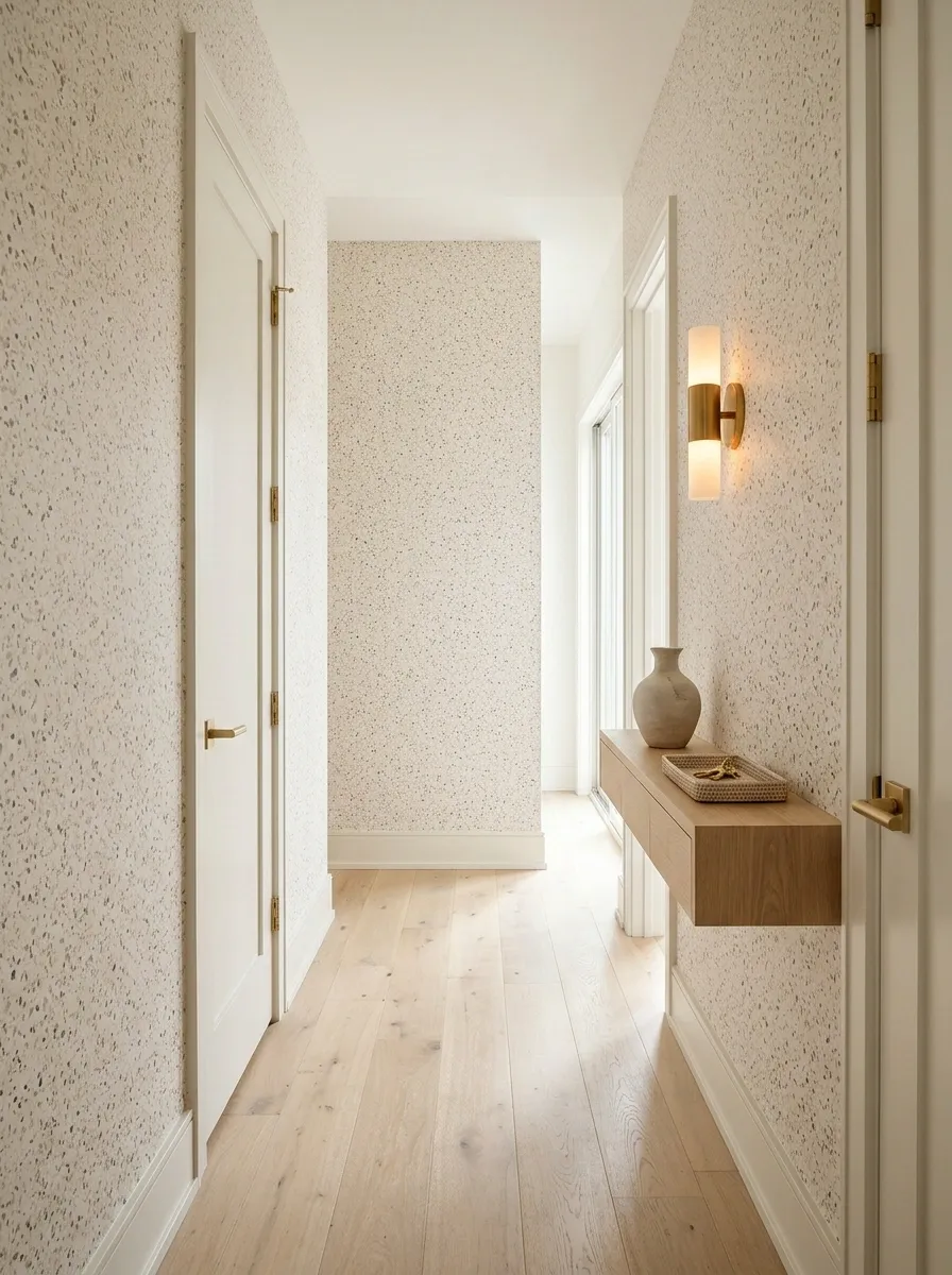
A speckled or lightly terrazzo-inspired print adds variation without a strong directional pattern. It can work where doors interrupt most wall sections.
Keep the speckle colors related to existing finishes. Small accents may pick up the floor, handles, or lighting.
Inspect the sample from a distance. The effect should read as intentional texture rather than make the walls appear permanently in need of a more enthusiastic cleaning routine.
Use a small shared palette. The flecks should connect to finishes already present.
Quiet Checks With Plain Painted Doors
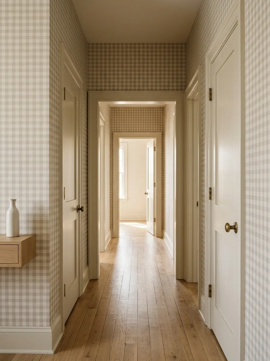
A restrained check can give the hall a tailored appearance. Use a low-contrast version if several doors and corners already divide the wall.
Keep the doors plain and let their color relate to the paper’s background.
Check the pattern around corners before installation. A grid makes alignment noticeable, especially in an older house where the walls have developed their own interpretations of straight.
Installation reality: Ask how the repeat will meet corners, doorframes, and an uneven ceiling line before ordering.
Wallpaper on One Side With Matching Background Paint Opposite
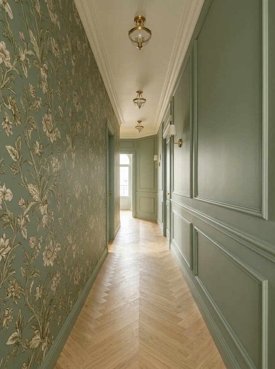
Choose a wallpaper you love, then use its background color on the opposite wall. This provides a direct relationship without repeating the print everywhere.
The paint need not be an exact digital match. Compare physical samples in the hall.
Keep the floor runner connected to the quieter side of the palette. The result should feel balanced from either end, rather than decorative on one side and accidentally unfinished on the other.
One shared background connects both sides.
Wallpaper on the Ceiling With Quiet Walls
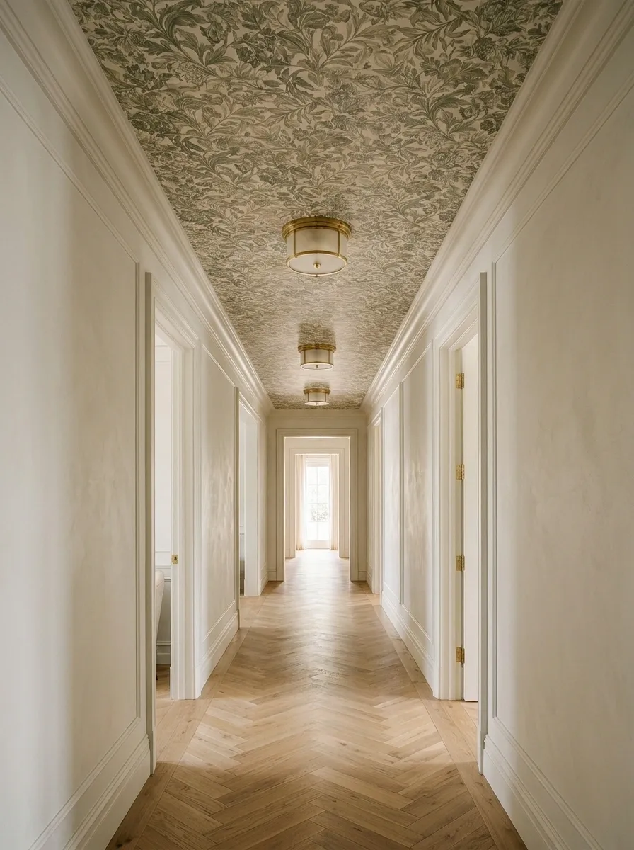
A patterned ceiling can give a hallway personality while leaving the side walls calm. It is particularly interesting where the ceiling plane is simple.
Check how the paper meets lights, cornices, and adjoining rooms. Safe installation access matters as much as the decorative plan.
Use a pattern you enjoy seeing from below. The ceiling becomes a feature, which means the walls can stop competing for the same job.
| Ceiling | Walls |
|---|---|
| Main pattern | Quiet supporting color |
| Deliberate light placement | Simple trim treatment |
| Carefully planned edges | Minimal competing detail |
Wallpaper Within Existing Architectural Panels
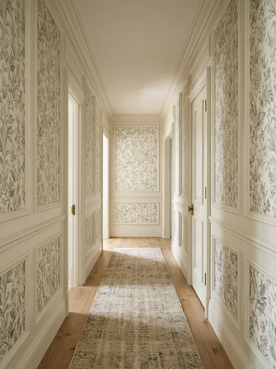
Existing molding or panel divisions can contain wallpaper in clearly defined sections. Choose a print whose scale remains readable within each opening.
Keep the painted framework coherent with nearby doors and skirting. Plan how motifs are cropped before cutting.
This can suit a formal hallway without needing several framed pictures. The architectural structure supplies the order, while the paper provides color and pattern.
Scale the print to the panel opening, not the full wall.
A Patterned Recess Beside an Otherwise Plain Hall
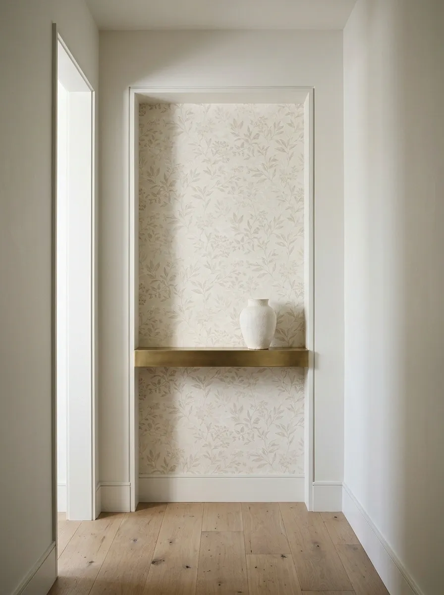
A shallow recess or alcove can take wallpaper while the main passage remains painted. The architectural boundary makes the placement feel natural.
Use a restrained object or narrow shelf only if it fits without obstructing movement.
This is useful when you want a small amount of pattern. You do not need to cover every wall simply because the first sample was attractive and the wallpaper shop was encouraging.
Let the recess do the framing: Keep the outer wall calmer and avoid overcrowding the patterned area.
A Continuous Pattern Around Several Door Openings
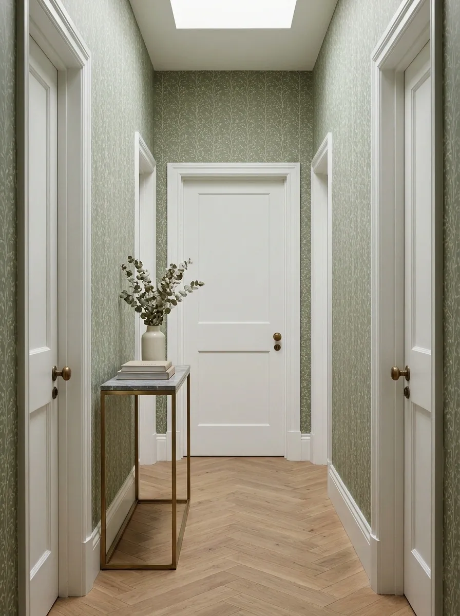
Where doors dominate the hall, one continuous wallpaper can connect the remaining wall sections. Keep the pattern scale suitable for the narrow strips between frames.
Plan the repeat across the whole run before installation. Decide how the door colors relate rather than treating each opening independently.
The goal is continuity. A hall with several doors already has enough interruptions without every gap presenting a different decorative opinion.
ONE PATTERN THROUGH THE GAPS
A Softer Print Near a Bright Hall Window
A hall with useful daylight may suit an airy botanical or pale abstract paper. Choose the pattern against both the window light and the darker interior end.
Avoid selecting only in the brightest spot. The same paper may read quite differently beneath the evening lights.
Keep window treatments straightforward so the pattern and daylight remain visible. The window is helping the room; it does not need to be buried beneath a heavy decorative arrangement.
| Test location | What to notice |
|---|---|
| Beside the window | True color and glare |
| Darker end | Pattern visibility |
| Evening lighting | Undertone changes |
A Removable Feature Wall for a Rental Hallway
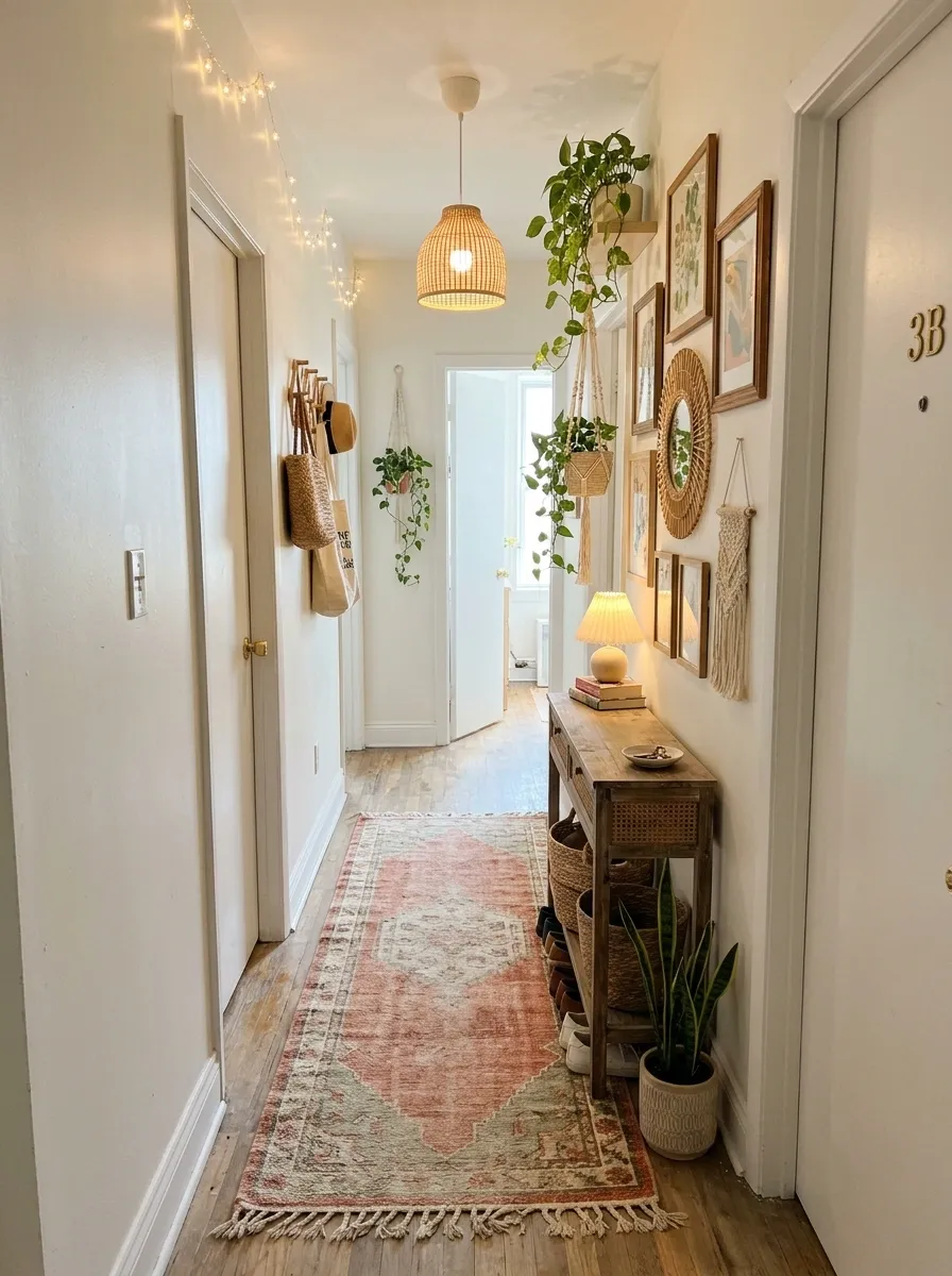
A removable paper can provide a contained update where your lease and the product’s surface requirements allow it.
Choose one defined wall and test the product as instructed. Keep information about application and removal, and do not assume every painted surface is suitable.
A manageable feature area can be more useful than wrapping a complicated passage. Reversibility should be planned before installation, rather than discovered through an optimistic conversation with the security deposit.
Before applying: Confirm permission where needed, inspect the finish, test suitability, and read the removal instructions.
Carry Something Through the Hall Before Adding Anything Else
Once the wallpaper is in place, use the hall normally. Open doors, carry a bag, and check the lighting after dark.
You may discover that the walls now provide enough interest and the remaining decorations can leave.
A narrow hallway is allowed to be a passage with personality. It does not also need to become a furniture showroom operating at reduced width.