
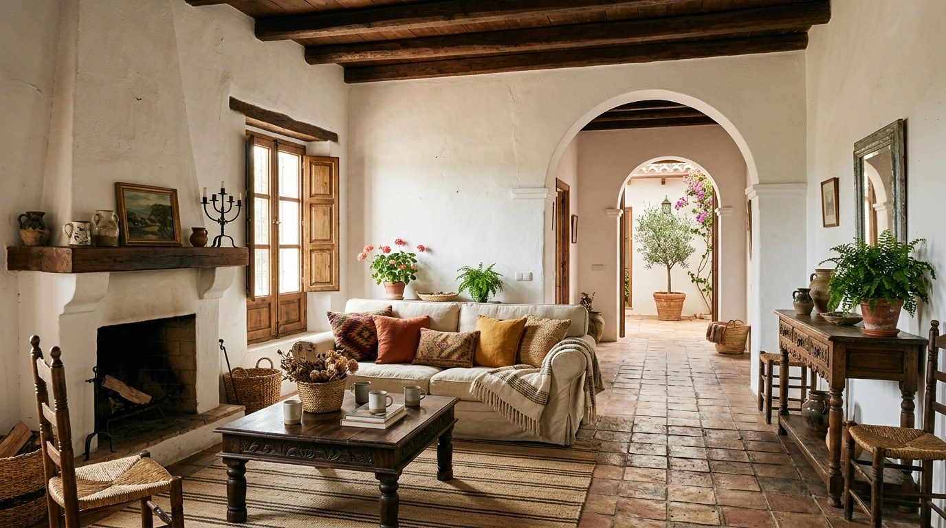
Spanish-inspired homes have one very specific talent: they can look warm, expensive, relaxed, and slightly dramatic without screaming for attention.
Meanwhile, a room with ten beige pillows and a suspiciously large fake olive tree somehow gets called “Mediterranean.” Be serious.
The real Spanish look comes from the bones of the room. Think warm plaster, aged wood, handmade tile, iron details, earthy color, chunky furniture, and lighting that makes everything look better after 6 PM. It isn’t about covering every surface with terracotta accessories and hoping for the best.
The Spanish Home Cheat Sheet
Spanish Home Ideas
Wash the Walls in Warm Plaster Tones
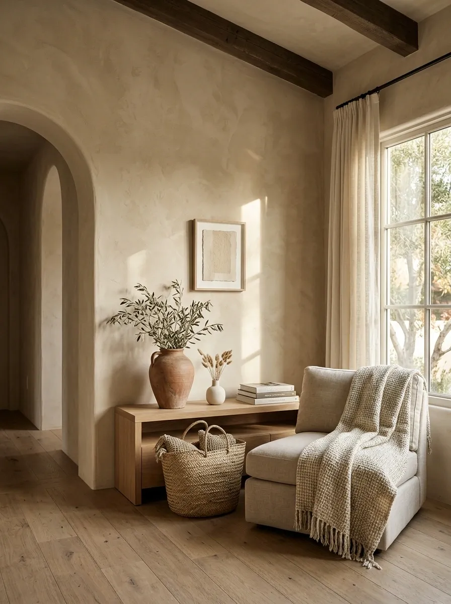
Start with the walls. Not the accessories. Not the decorative baskets. The walls.
Spanish interiors rely heavily on warm, imperfect-looking surfaces, so a flat icy white wall immediately fights the mood. Choose creamy plaster, warm ivory, muted sand, or a soft clay-beige instead.
The finish matters as much as the color. A limewash or subtle textured finish creates tiny variations that make the wall feel aged rather than freshly printed by a builder.
Quick palette:
- Warm ivory
- Sand
- Mushroom beige
- Muted clay
- Soft ochre
That slight unevenness is doing more work than another decorative vase ever could.
Put Dark Wood Against All That Warm Plaster
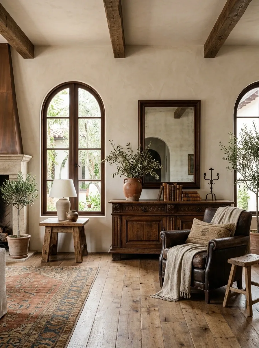
Nothing makes Spanish interiors feel grounded faster than dark, substantial wood.
Use walnut, aged oak, reclaimed wood, or a similarly deep finish for dining tables, benches, consoles, ceiling beams, stools, and side tables. The wood should look like it has a history, not like it arrived yesterday wearing a barcode.
The strongest combination is simple:
warm wall + dark wood + natural fabric.
Skip matching furniture sets. Spanish rooms look better when the pieces feel collected instead of ordered from the same product page.
Let Terracotta Tile Become the Main Character
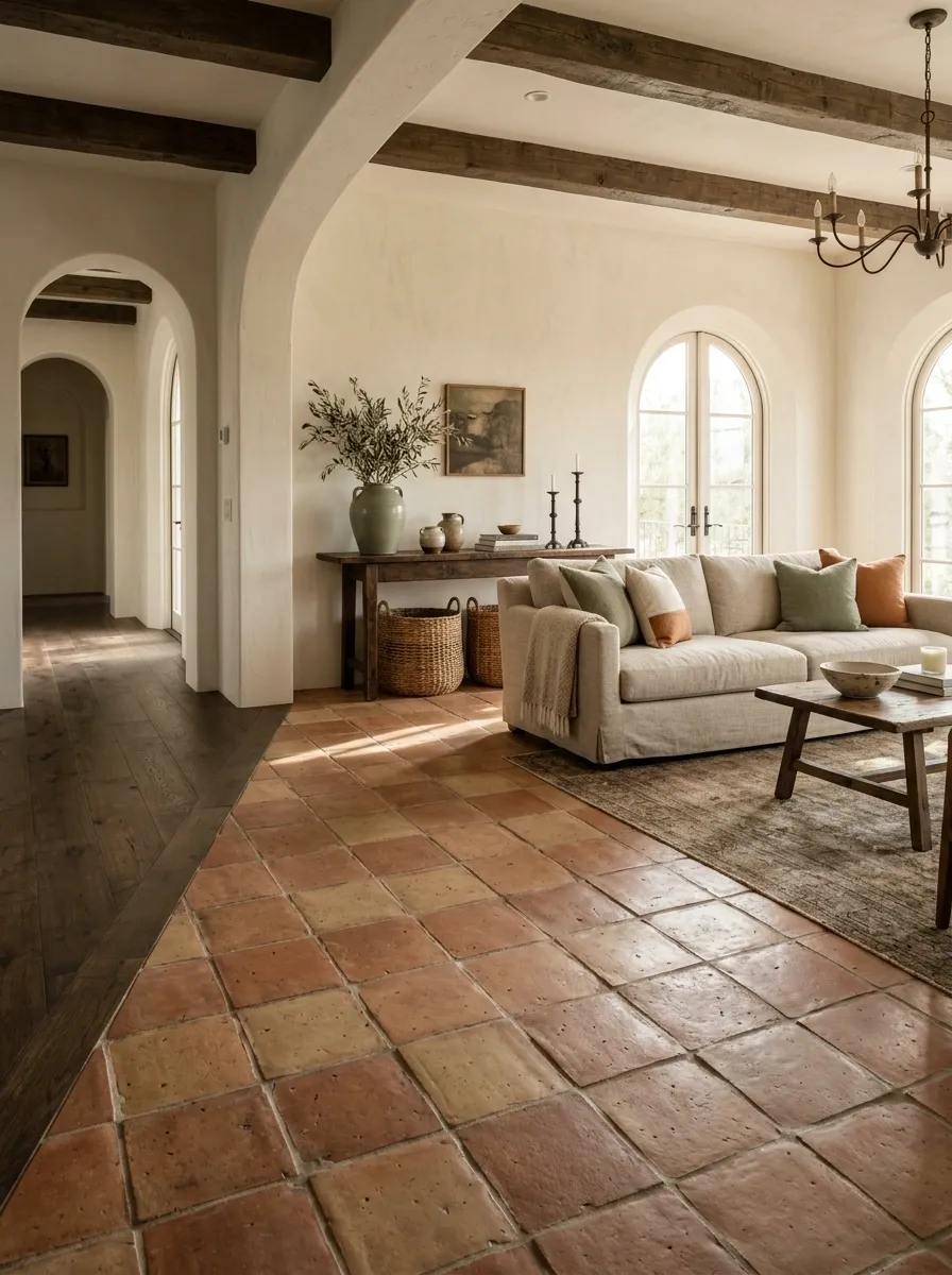
Terracotta works because it looks warm before anything else even enters the room.
Use it on floors, backsplashes, fireplace surrounds, entryways, or small sections where a full renovation isn’t realistic. The best versions have variation in tone, slightly irregular edges, and a matte finish.
Don’t surround terracotta with ten more orange accessories. That’s how a warm floor becomes a color-themed restaurant.
Let the tile do the talking.
Best companions: cream walls, dark wood, aged metal, linen, woven baskets, and muted green.
Add Handmade Tile Where the Room Needs Personality
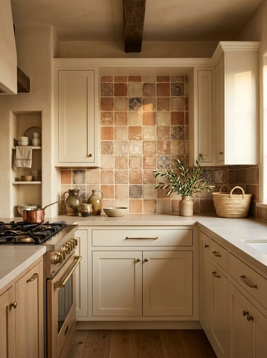
Spanish interiors aren’t afraid of pattern, but the pattern usually feels tactile rather than digitally perfect.
A handmade-look tile backsplash instantly adds that quality to a kitchen or bathroom. Look for slight color variation, uneven edges, soft gloss, or traditional geometric motifs.
The trick is restraint.
If the tile has strong pattern, keep the cabinets and counters quieter. If the tile is subtle, a larger area can handle it without becoming visually noisy.
Good places for it:
- Kitchen backsplash
- Bathroom vanity wall
- Shower niche
- Stair risers
- Fireplace surround
Build a Fireplace Moment Even Without a Fireplace
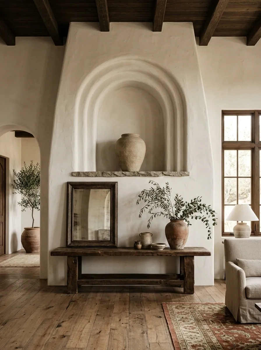
Spanish architecture loves a strong focal point, and a fireplace is an easy way to get there. But the same visual principle works without one.
Create a single architectural-looking moment with a plaster alcove, oversized artwork, chunky console, arched niche, or stone ledge.
The key is scale.
A tiny decorative object sitting on an ordinary shelf won’t create architectural weight. A wide plaster hood, oversized mirror, or substantial wood console will.
Think structure first, decoration second.
Swap Shiny Metal for Aged Iron
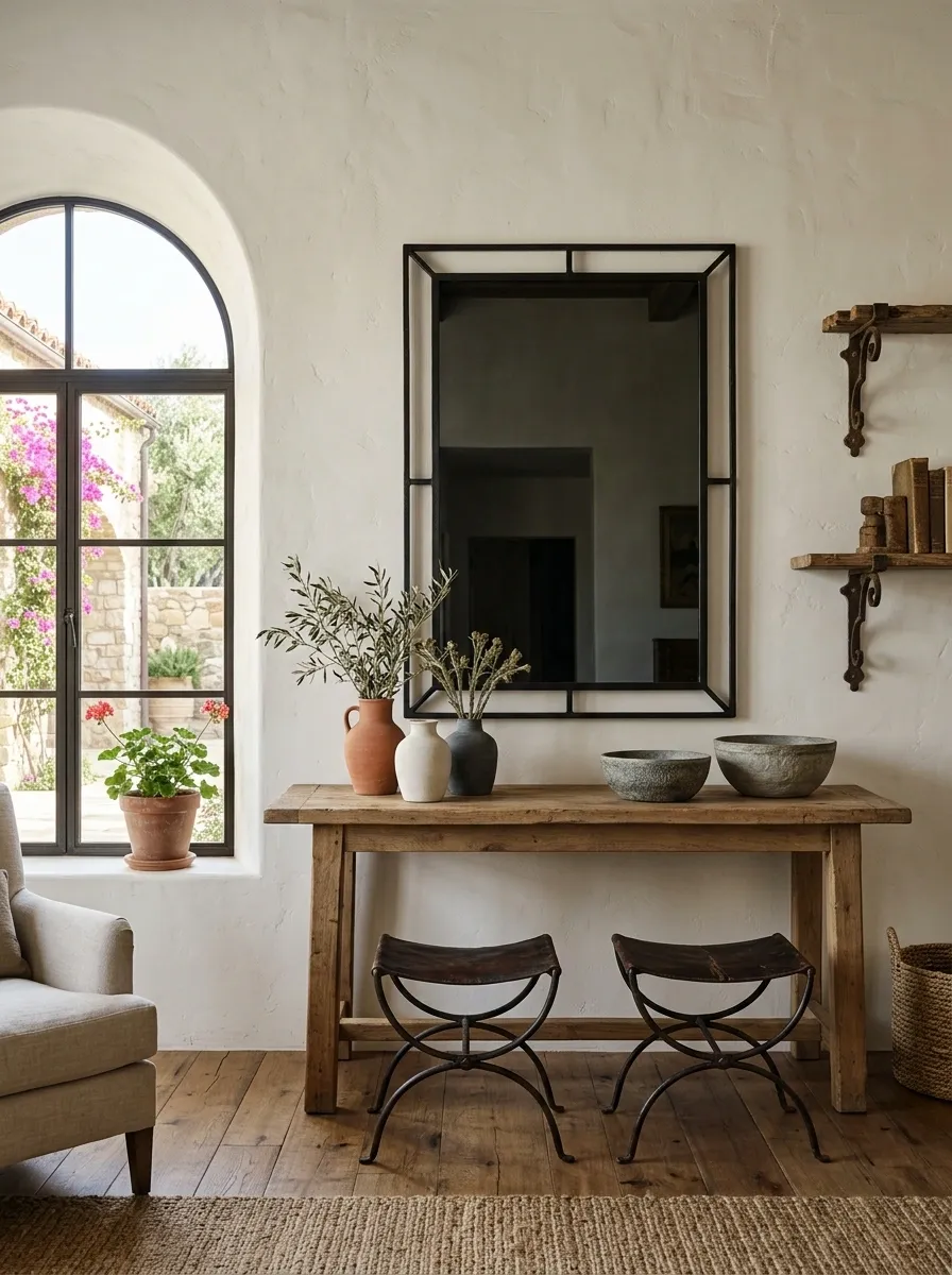
Glossy chrome has its place. Spanish-inspired rooms aren’t usually begging for it.
Aged iron brings weight and contrast without making the room feel overly polished. Use it for curtain rods, cabinet hardware, sconces, mirrors, stools, tables, and decorative brackets.
The finish should look slightly worn or matte.
A black iron mirror over a warm plaster wall can do more for the room than an entire shelf of decorative objects.
Keep the shapes simple. Ornate iron everywhere quickly turns charming into medieval castle gift shop.
Use Arched Shapes Without Turning the House Into a Castle
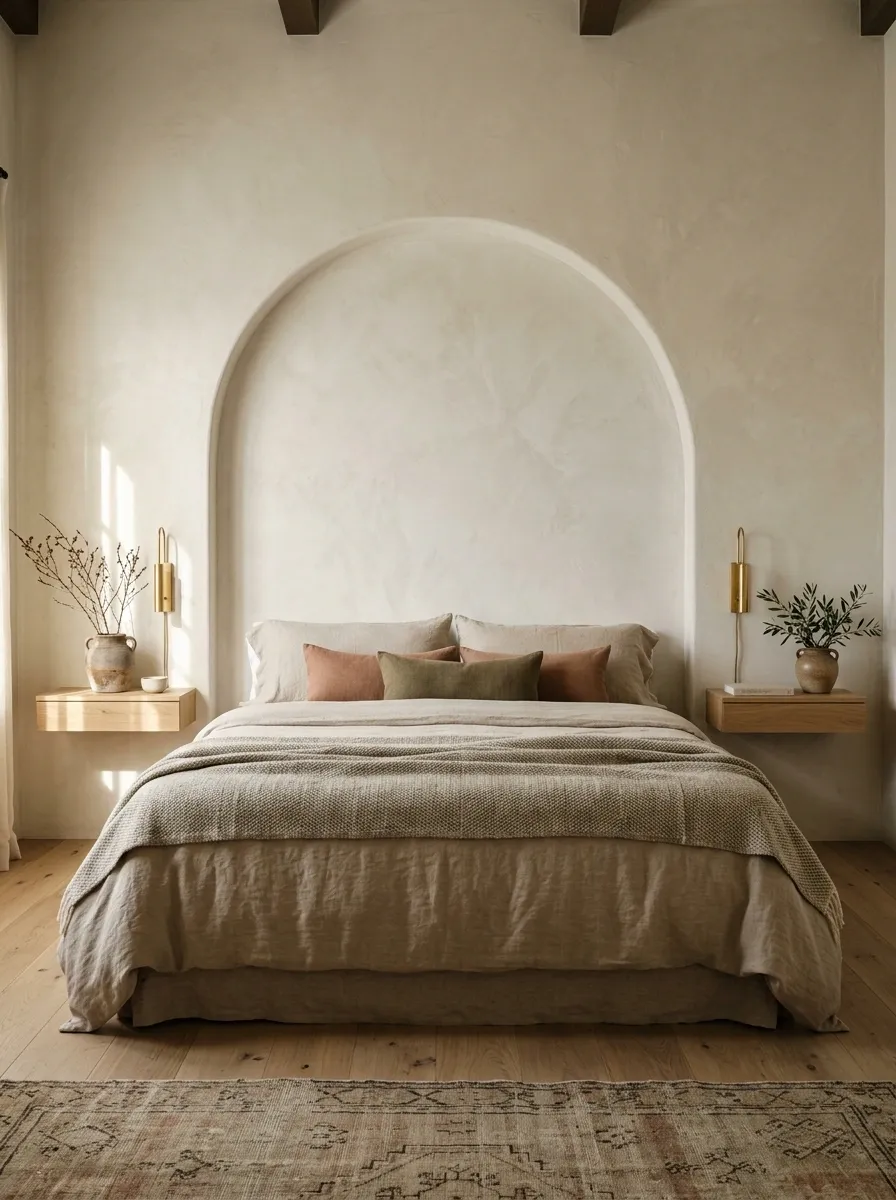
Arches are one of the fastest visual shortcuts to Spanish architecture.
A rounded doorway is ideal, but it isn’t required. Add the shape through a mirror, wall niche, shelving unit, shower opening, headboard, or artwork.
The mistake is using arches on everything.
One or two strong curved shapes feel architectural. Five different arched objects lined up together start looking like the house has developed a personality disorder.
Pick one architectural curve and let it breathe.
Make the Sofa Look Heavy and Comfortable
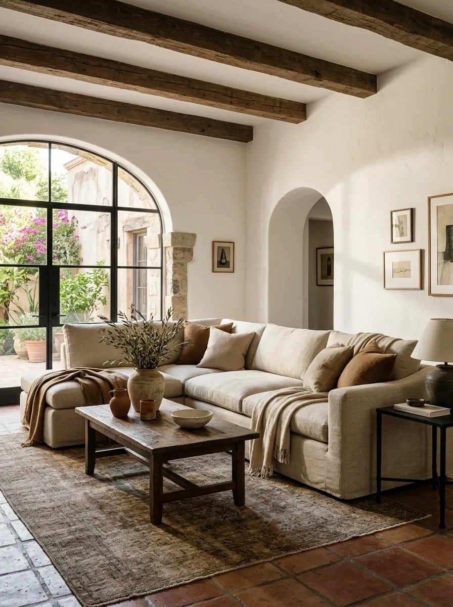
A Spanish living room doesn’t need a delicate sofa that looks like nobody is allowed to sit on it.
Choose a sofa with visual weight, relaxed cushions, natural upholstery, and a deep seat. Cream, oatmeal, warm beige, tobacco, and muted brown work especially well.
Then add contrast with a dark wood coffee table or iron side table.
The goal is relaxed structure, not showroom stiffness.
The sofa should look like it survives actual evenings.
Layer Linen Instead of Filling Every Surface
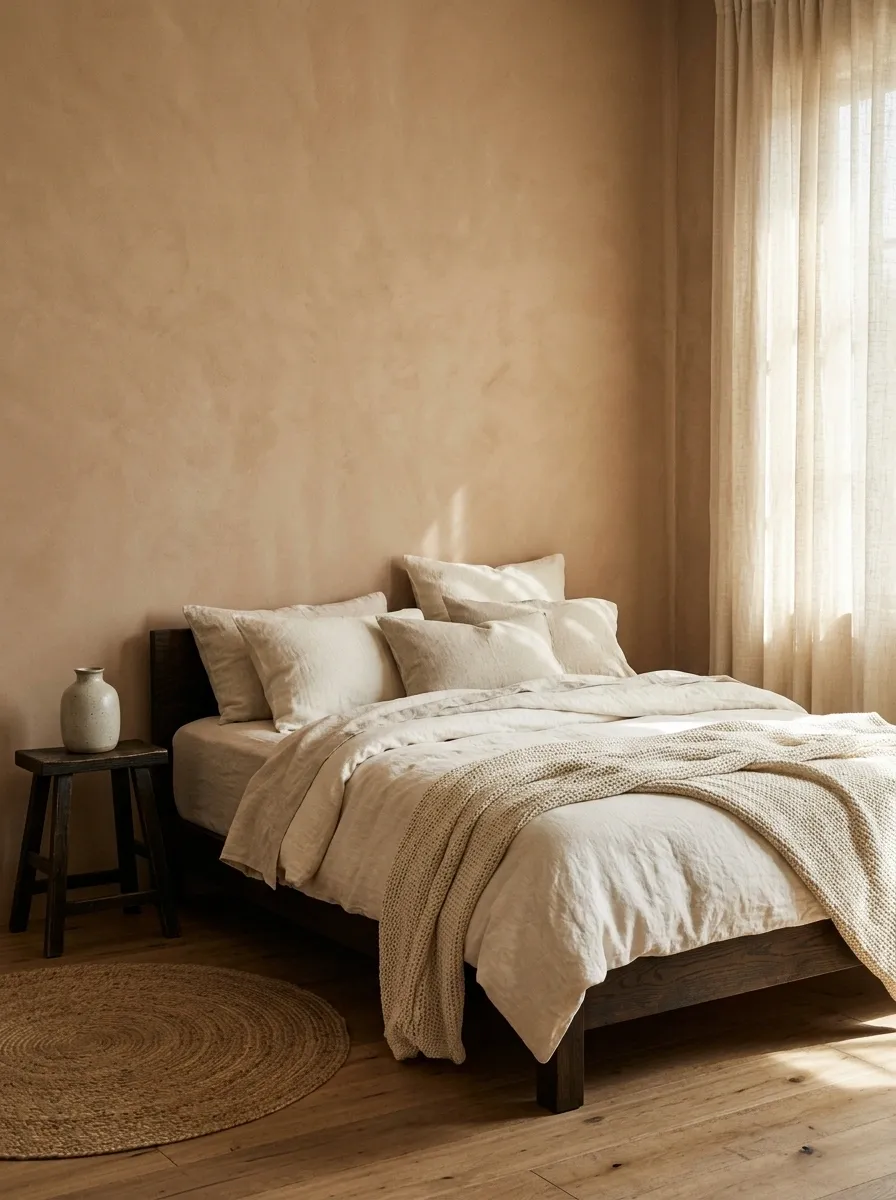
Spanish interiors look rich because of texture, not because every horizontal surface has a decorative object sitting on it.
Use linen curtains, loose cushion covers, cotton throws, textured bedding, and natural upholstery. Let wrinkles happen. Linen that looks slightly lived in is doing exactly what it needs to do.
Keep the colors quiet.
Cream linen beside a clay wall and dark wood furniture already creates plenty of visual interest.
Texture is the decoration here.
Hang a Large Rustic Mirror Where Light Can Work
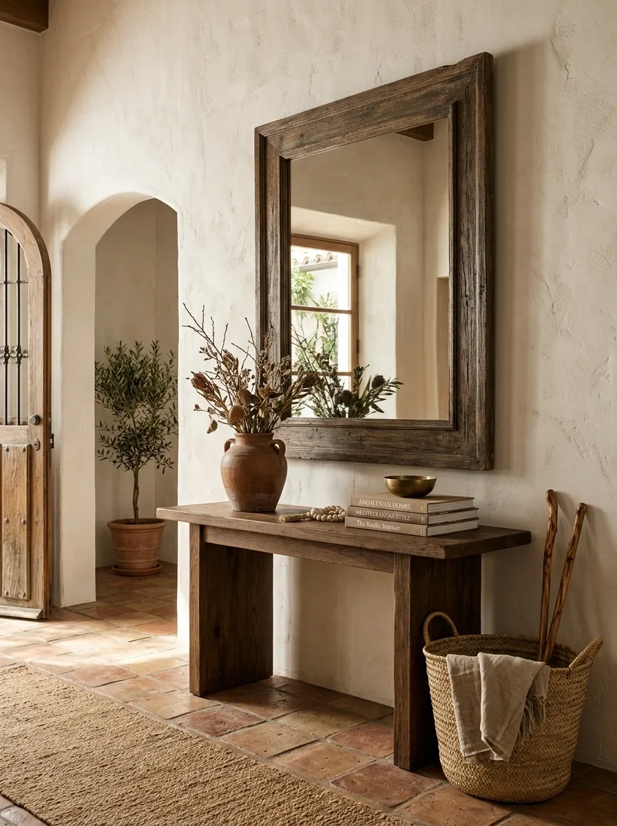
A mirror doesn’t need to be ornate to make a Spanish room feel finished.
Choose an oversized frame in dark wood, aged metal, or a plaster-like finish. Hang it where it catches daylight or reflects a warm lamp in the evening.
The important part is scale.
A tiny mirror above a large console usually looks like the furniture ate it.
Go bigger than expected and keep the surrounding wall quiet.
Bring in Muted Olive and Dusty Green
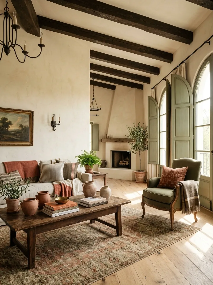
Spanish interiors aren’t limited to brown, cream, and terracotta.
Muted green adds a natural counterpoint to warm clay tones. Think olive, sage, eucalyptus, or dusty green rather than bright emerald.
Use it on kitchen cabinets, a single accent chair, cushions, shutters, tile, or artwork.
The color should feel slightly softened, as though sunlight has had several years to negotiate with it.
Best pairing: olive green + terracotta + warm ivory.
Choose Furniture With Visible Legs and Strong Shapes
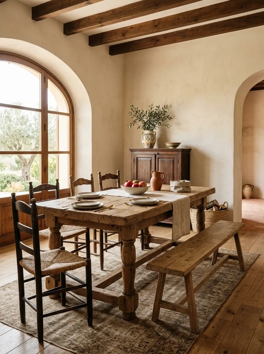
Spanish-inspired furniture shouldn’t look overly delicate.
Look for chunky wood legs, turned details, woven seats, thick frames, simple benches, and substantial tables. The silhouettes can be rustic without becoming bulky.
Mixing several wood tones is fine as long as the undertones stay warm.
Avoid buying every piece from one matching collection. That polished showroom effect works against the relaxed, collected feeling.
A little mismatch makes the room look more believable.
Use a Statement Pendant Instead of Generic Ceiling Lights
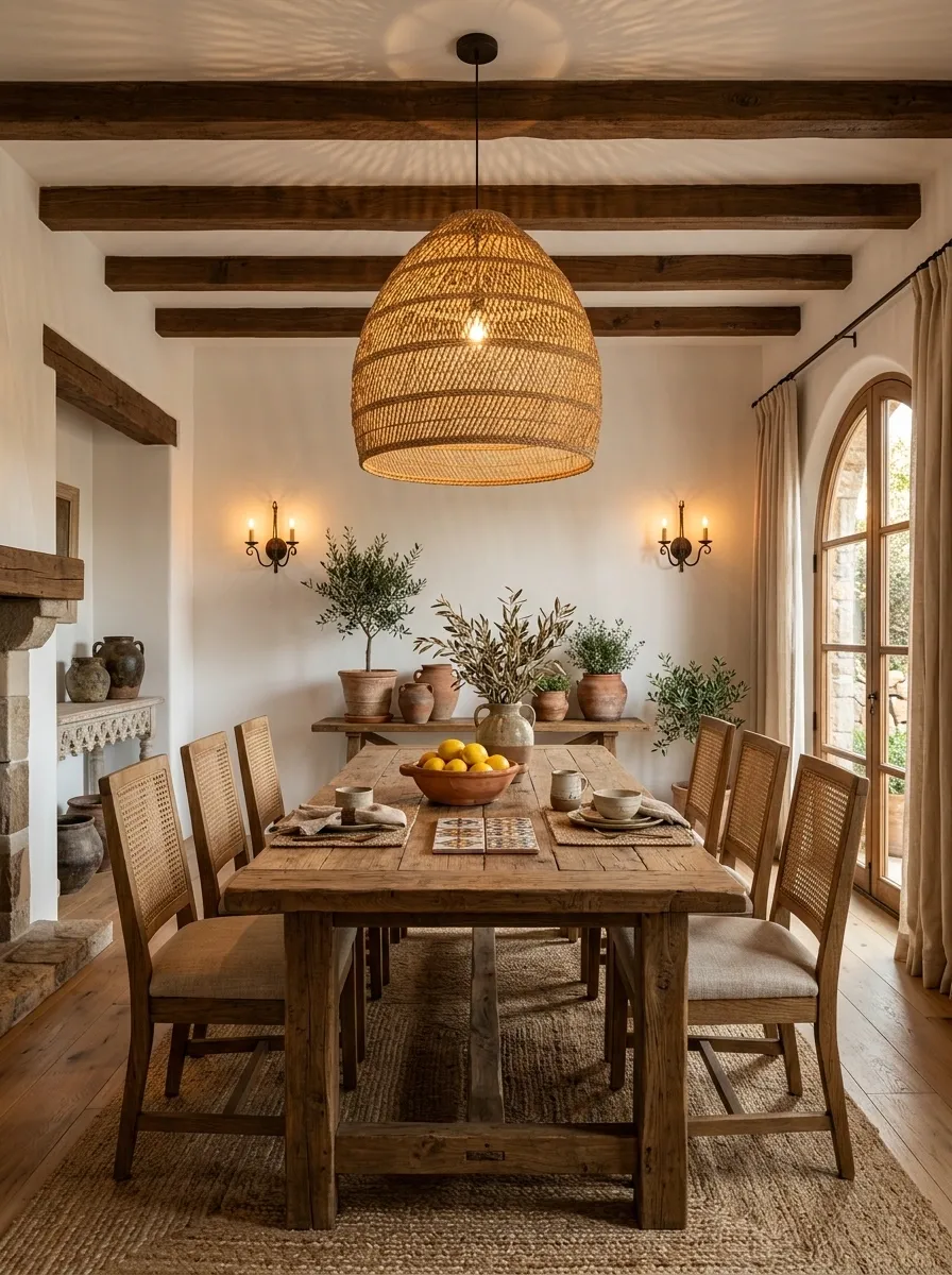
The ceiling is often where otherwise good rooms completely give up.
Replace a basic fixture with a woven pendant, aged iron chandelier, ceramic pendant, or sculptural lantern. Spanish-inspired lighting looks better when it creates shadows and texture.
A woven shade works especially well above a dining table or kitchen island.
An iron fixture works beautifully with plaster walls and dark wood.
Keep the bulbs warm. Cool white lighting has never met a Mediterranean room it didn’t immediately annoy.
Make the Kitchen Feel Built, Not Assembled
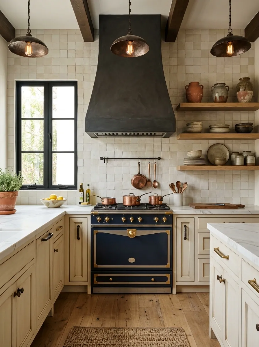
Spanish kitchens usually benefit from visual warmth.
If a full renovation isn’t happening, focus on the pieces that sit directly in the sightline: cabinet color, backsplash, hardware, lighting, and countertop accessories.
Paint cabinets warm cream, muted olive, dusty taupe, or deep wood tones. Add aged brass or iron hardware. Use handmade-look tile behind the range.
Then leave some shelves intentionally sparse.
A kitchen doesn’t become Spanish because someone placed three ceramic jars beside the toaster.
Warm tone
Handmade look
Aged finish
Warm glow
Add a Long Wooden Dining Table
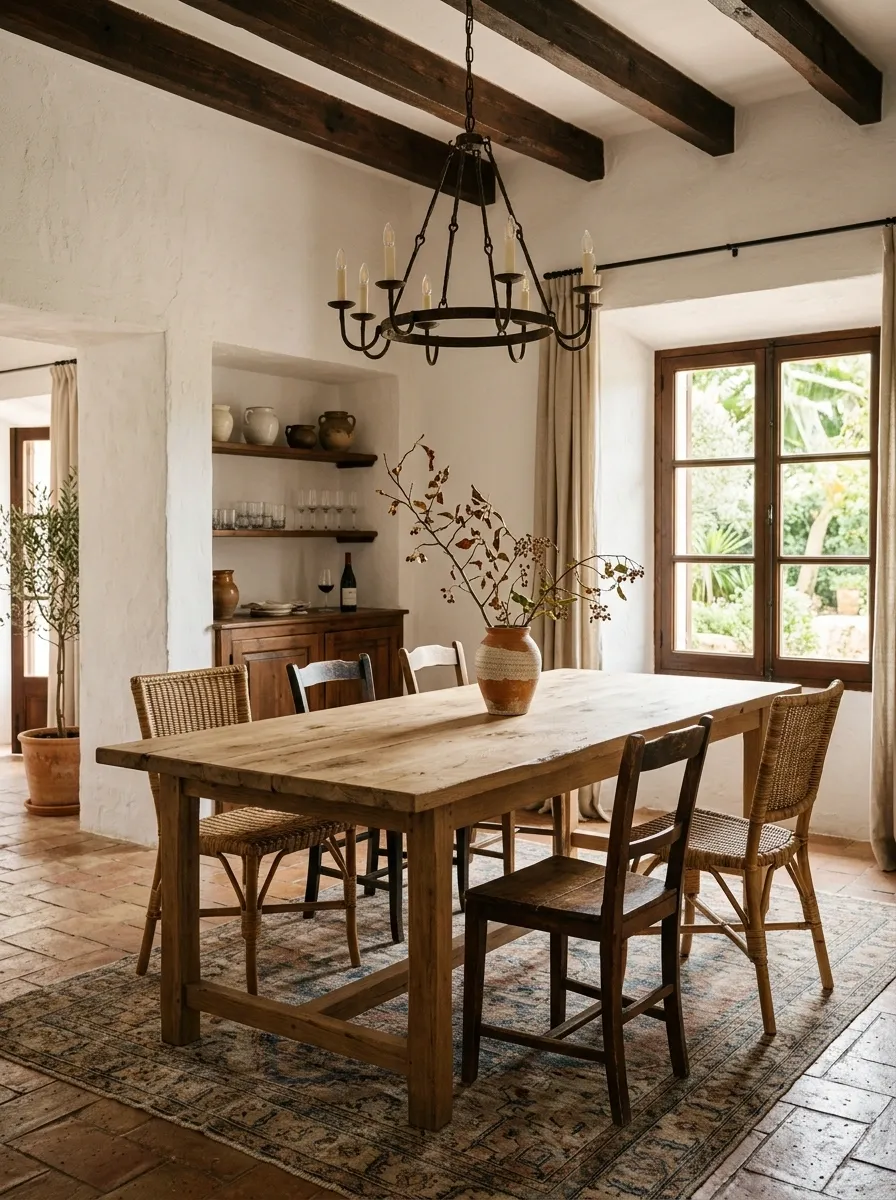
The dining table should feel substantial enough to host dinner, homework, groceries, arguments, and somebody inevitably leaving their phone on it for three days.
Choose a long wood table with a simple silhouette. Pair it with woven chairs, upholstered seats, or mismatched wood chairs.
Don’t cover the entire table with decor.
A single ceramic vessel, a low bowl, or a simple branch arrangement is enough.
Empty table space is part of the look.
Give the Bedroom a Plastered, Quiet Feeling
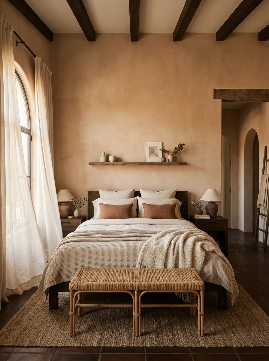
A Spanish bedroom shouldn’t look like a hotel showroom.
Start with warm walls and natural bedding. Add dark wood through the bed frame or nightstands, then bring in linen curtains and one substantial textile.
A woven bench at the foot of the bed works especially well because it adds texture without adding visual clutter.
Keep the bedding layered but restrained.
Cream sheets, an oatmeal coverlet, a textured throw, and one or two earthy cushions are plenty.
Frame Art Like It Belongs to the Architecture
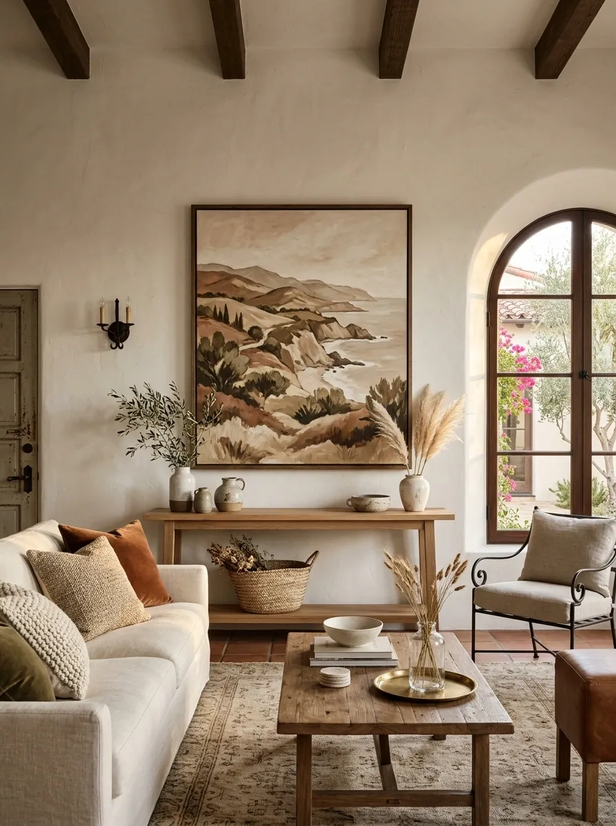
Art shouldn’t feel randomly attached to a wall after everything else is finished.
Choose pieces with earthy landscapes, abstract shapes, architectural studies, botanical forms, or muted traditional motifs. Then use frames in dark wood, aged brass, or black metal.
Large art works especially well above a console, sofa, or bed.
A collection of tiny prints scattered across a giant wall usually looks more accidental than intentional.
Scale is the secret.
Clay, cream, brown, olive
Let one piece anchor the wall
Wood, iron, or aged metal
Turn the Entryway Into a Mini Architectural Moment
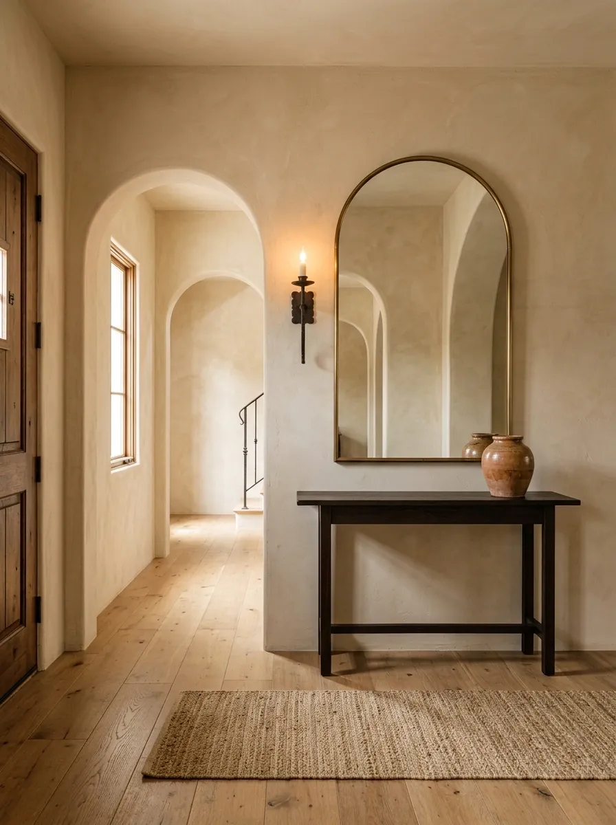
The entryway sets the tone before anyone reaches the living room.
Use a narrow dark wood console, an oversized mirror, an iron sconce, and a ceramic vessel. If there’s enough room, add a woven runner or small bench.
Keep the floor visible.
Spanish style benefits from breathing room, so don’t turn the entry into a storage depot decorated with eight baskets and a motivational sign.
The first impression should feel warm, not busy.
- Dark wood console
- Large mirror
- Warm wall color
- One ceramic piece
- Warm lighting
Use Woven Baskets for the Texture, Not the Storage Olympics
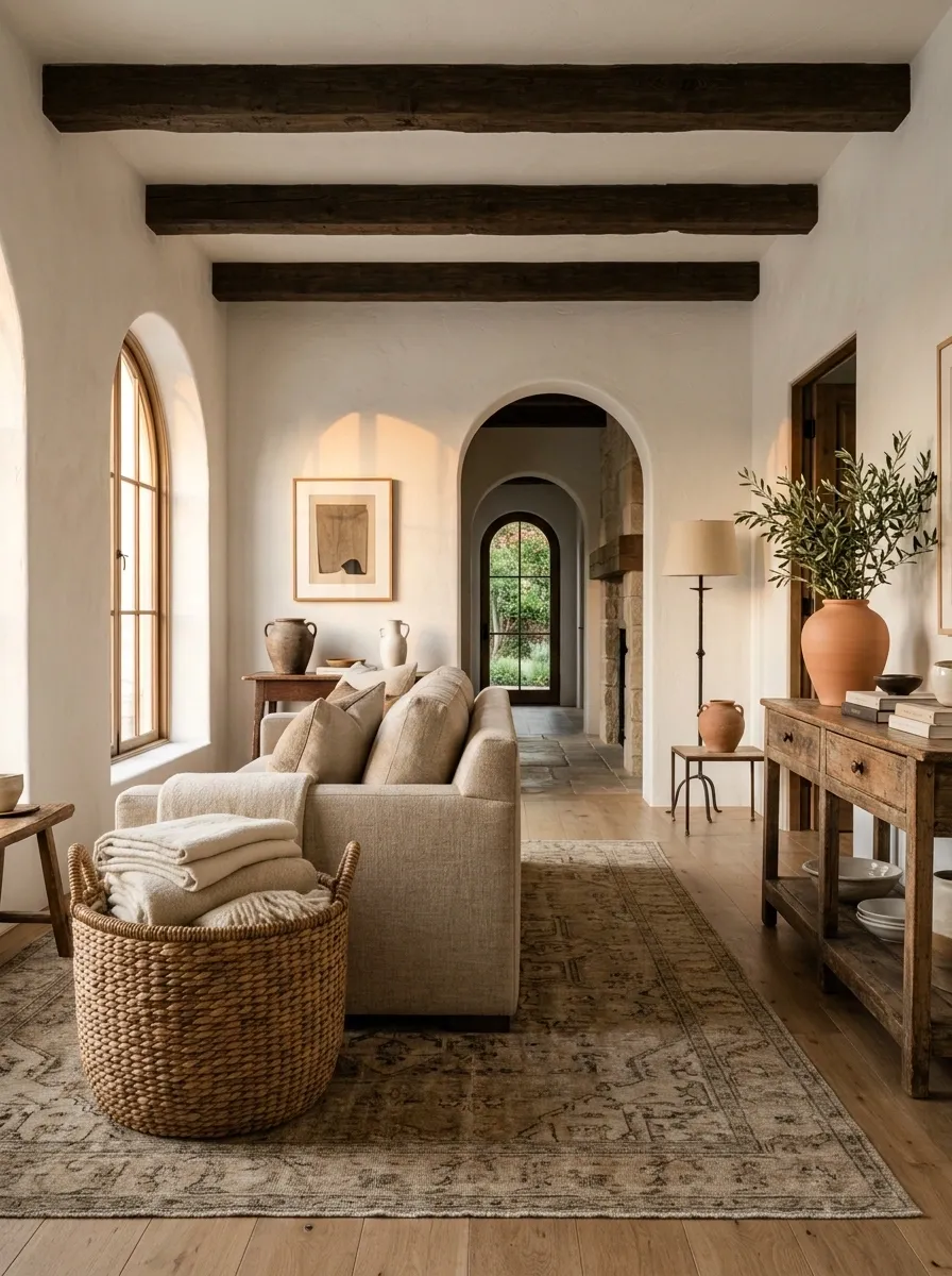
Woven baskets fit the Spanish look naturally because they add rough texture without introducing another loud color.
Use one large basket beside a sofa, under a console, near a fireplace, or at the end of a bed.
Avoid lining an entire wall with matching baskets.
The goal is to make natural fiber visible, not to convince guests that the house is secretly a basket warehouse.
One oversized basket usually beats five tiny ones.
BASKET
Firewood
Extra textiles
Use Ceramic Pieces With Imperfect Shapes
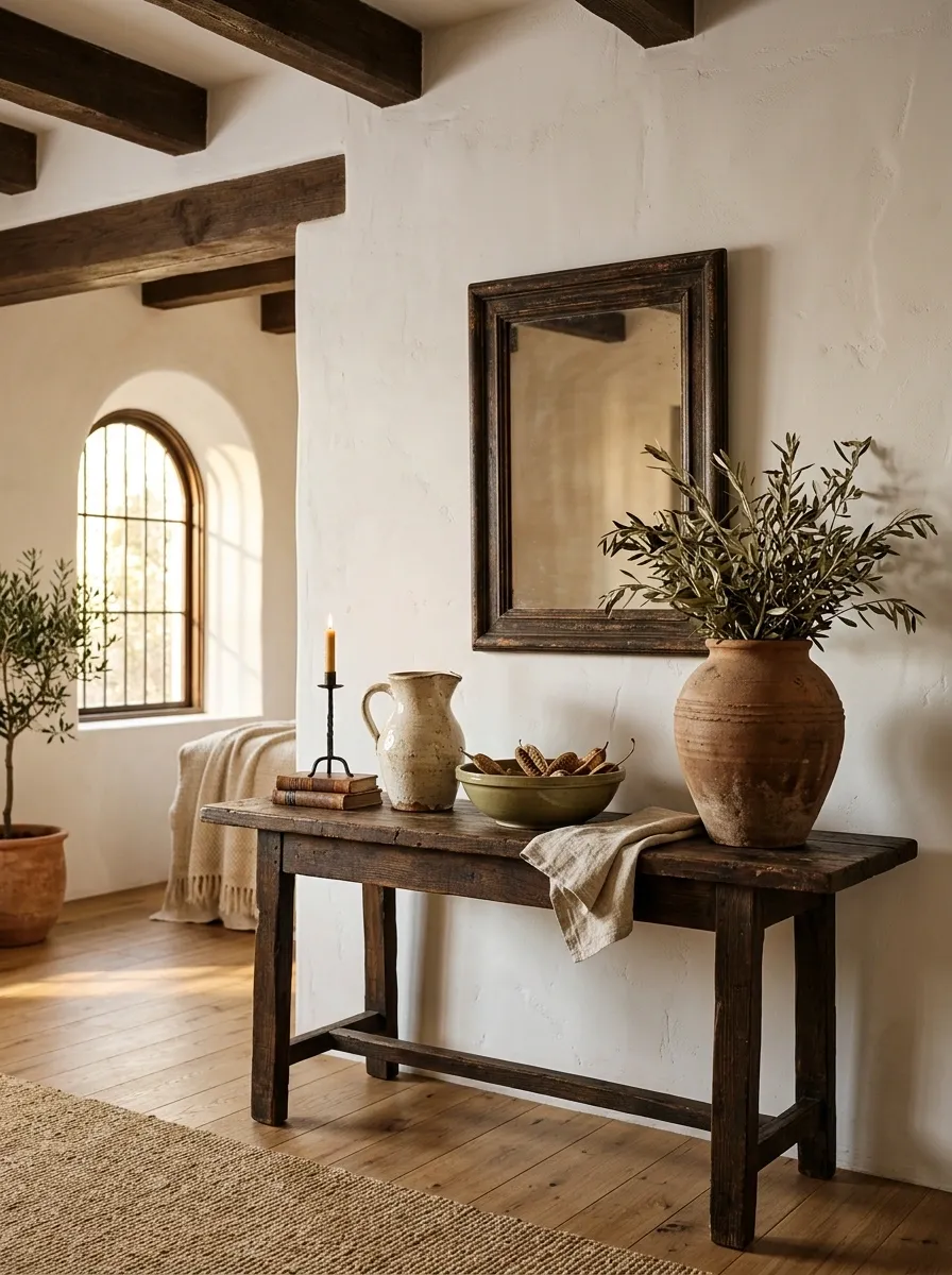
Ceramics are one of the easiest ways to introduce Spanish character without changing the architecture.
Choose handmade-looking pitchers, shallow bowls, oversized vessels, candleholders, and small sculptural pieces.
Look for irregular rims, matte glazes, earthy colors, and visible texture.
Don’t buy everything in exactly the same shade.
A cream vessel beside a muted green bowl and a clay-colored pitcher looks collected. Twelve identical beige vases look like the decorative aisle had a clearance sale.
Add a Stone Surface Somewhere Unexpected
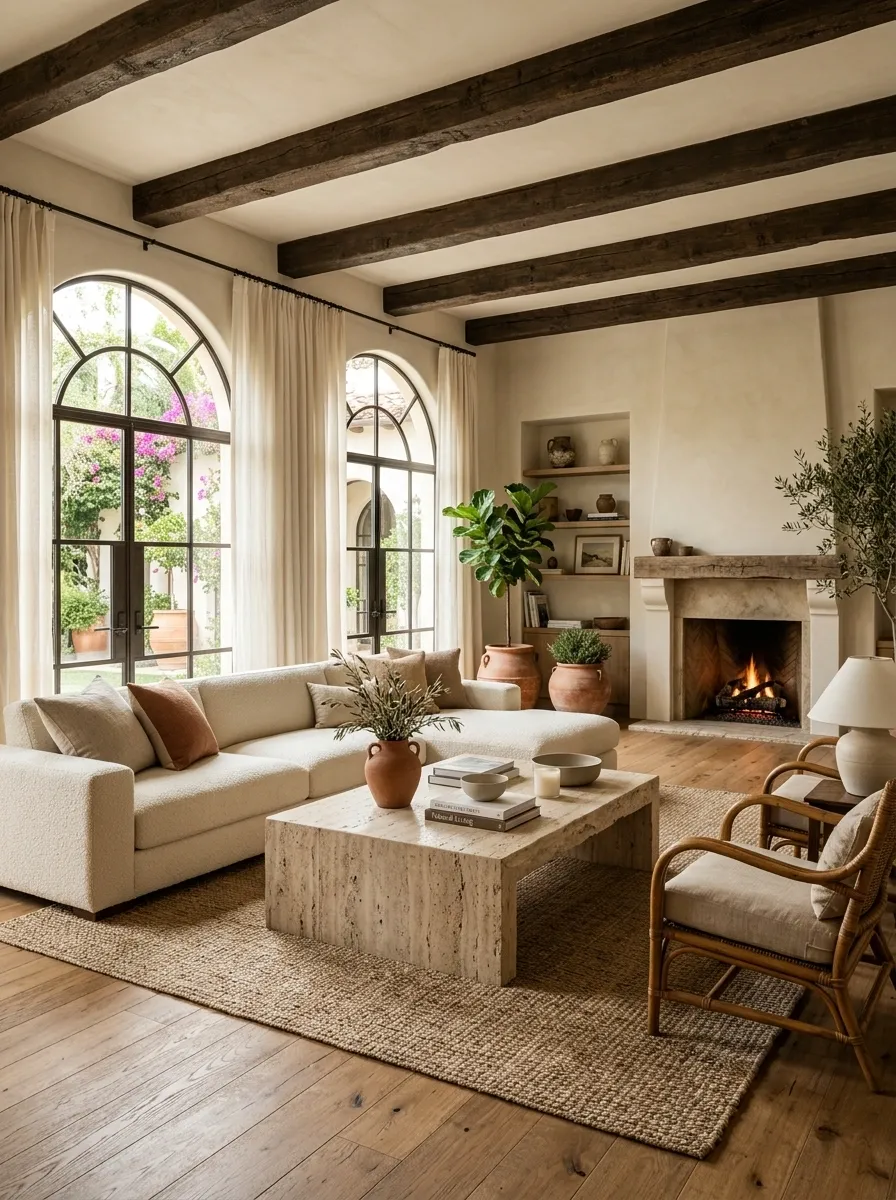
Stone adds the raw quality that Spanish interiors need.
A limestone coffee table, travertine side table, stone shelf, marble threshold, or chunky stone accessory can break up rooms that contain too much fabric and wood.
The surface should look natural rather than mirror-polished.
Place one substantial stone piece against softer materials.
Stone + linen + wood is an almost unfairly effective combination.
Paint Interior Doors in a Deeper Earthy Color
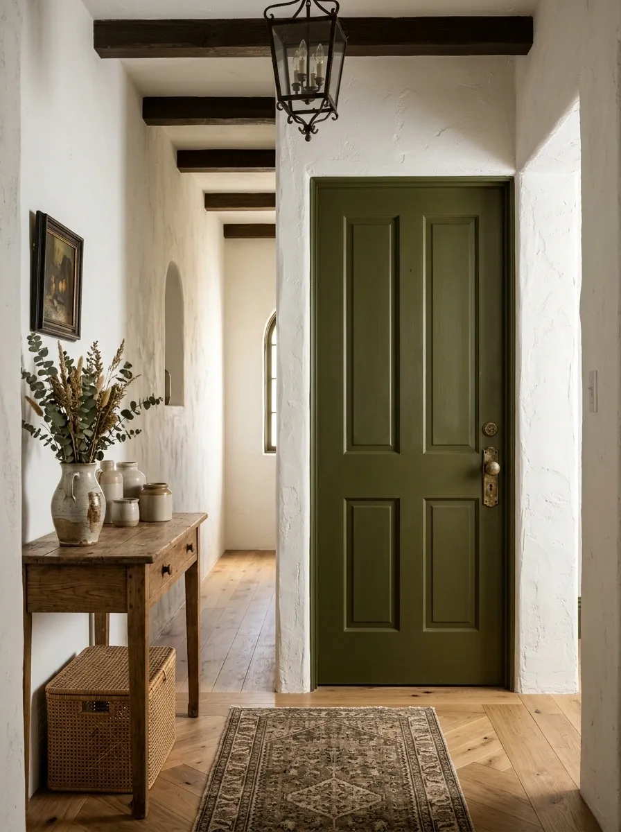
Walls aren’t the only place color can work.
Painting an interior door in deep olive, warm brown, muted clay, or charcoal can create the visual weight found in older Spanish homes.
This works particularly well on pantry doors, bedroom doors, bathroom doors, and narrow hallways.
Keep the surrounding walls lighter so the door becomes an intentional architectural detail.
A dark door is a shortcut to character when the house has none.
Create a Courtyard Feeling Indoors
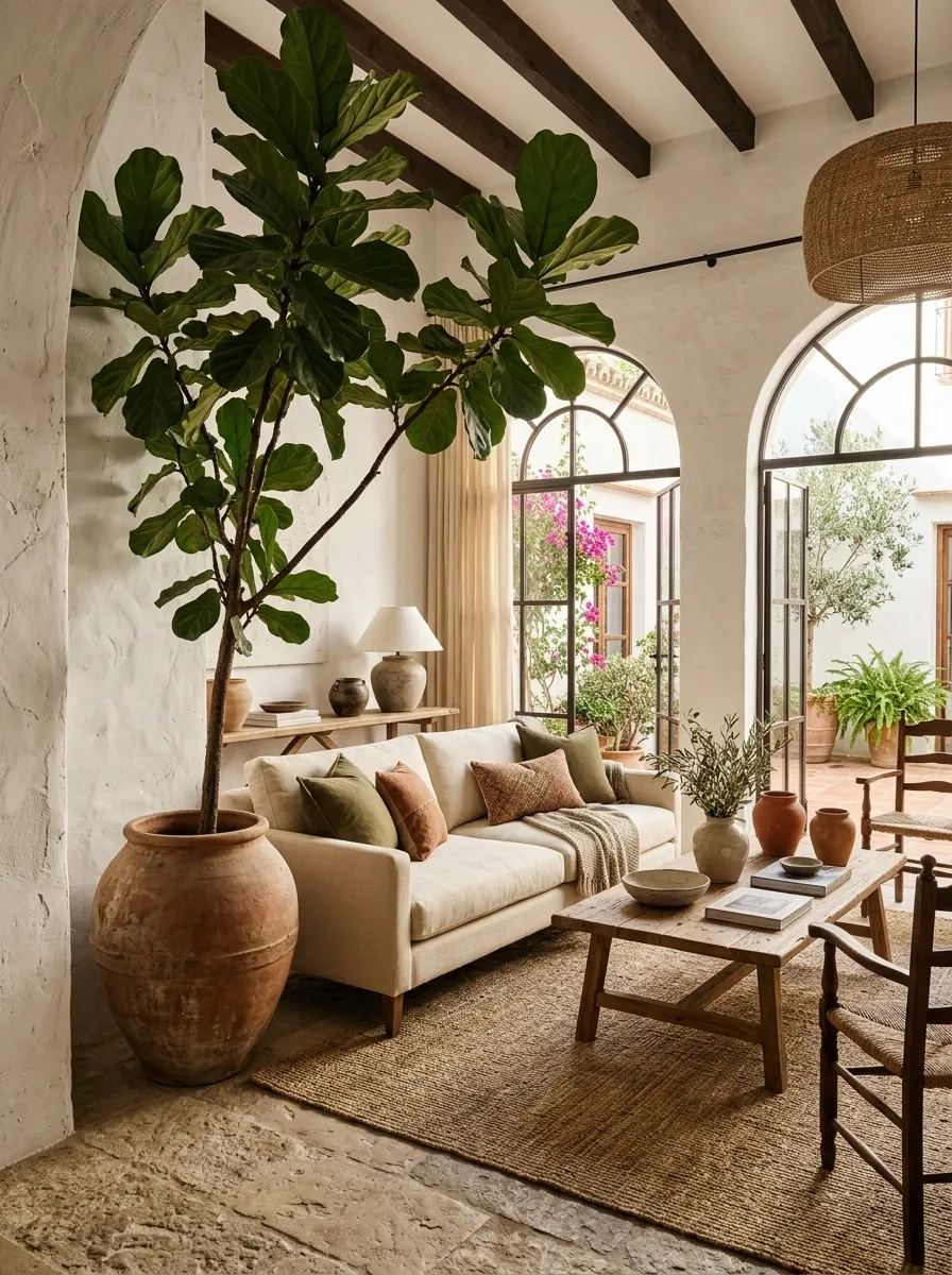
Spanish architecture often blurs the boundary between interior and exterior, so bring that feeling inside.
Use potted greenery, terracotta planters, natural stone, woven textures, and plenty of daylight.
A large plant beside a plaster wall can create the impression of an indoor courtyard without requiring an actual courtyard.
Choose plants with strong shapes rather than filling every corner with greenery.
One dramatic plant has more presence than a jungle of tiny pots.
Strong greenery
Terracotta pot
Raw texture
Natural light
Use Striped Textiles in Small Doses
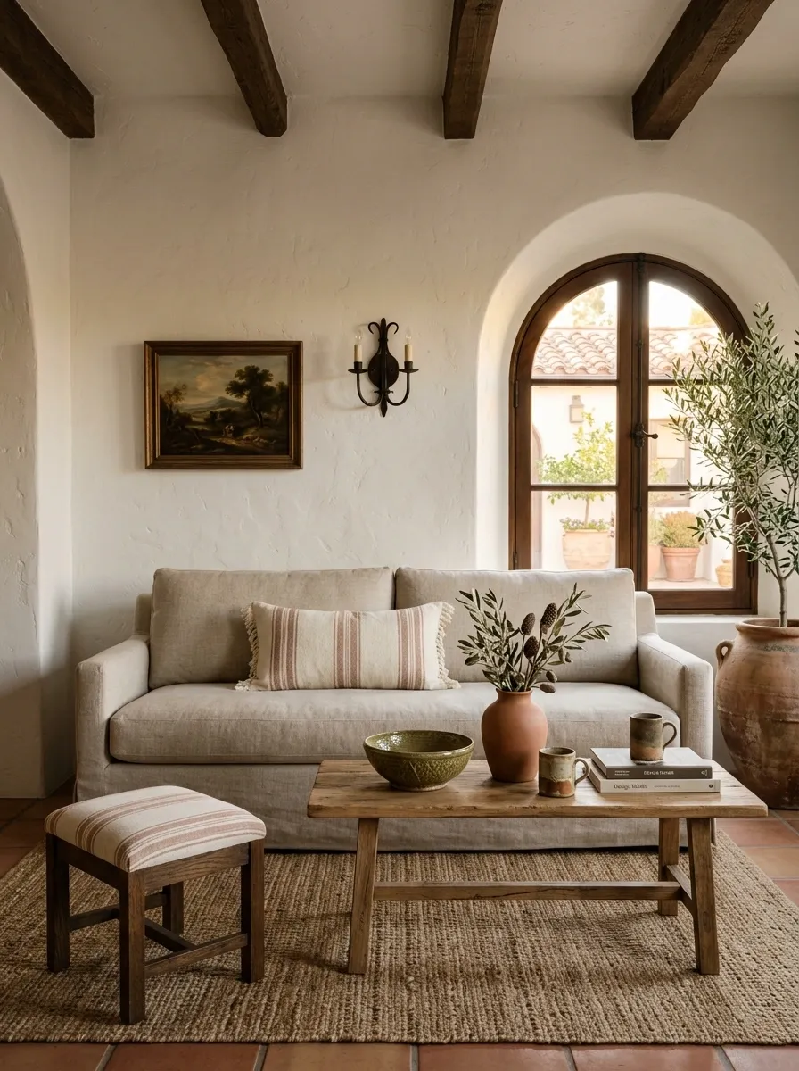
Stripes can bring a relaxed Mediterranean note without overpowering the room.
Use them on a lumbar cushion, runner, throw, upholstered stool, or occasional chair.
Stick with earthy combinations such as cream and tobacco, cream and muted terracotta, or cream and olive.
Don’t stripe the sofa, curtains, rug, and pillows at the same time.
That isn’t layered design. That’s a hostage situation.
One striped textile is enough to introduce the pattern.
- One lumbar cushion on a plain sofa
- A narrow runner on a dining table
- One relaxed throw over a chair
- A small upholstered stool
Give the Bathroom a Spanish Tile Moment
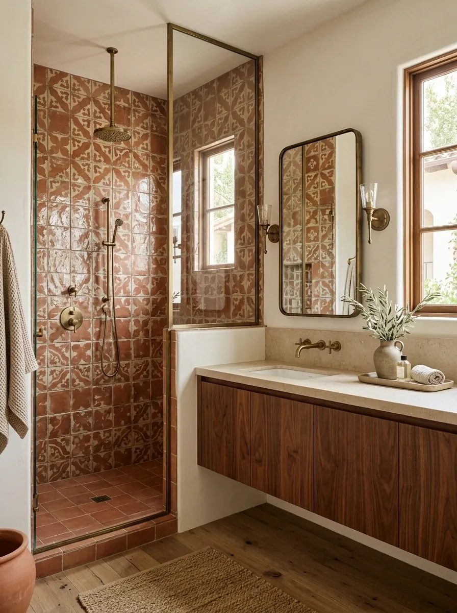
Bathrooms are one of the easiest rooms to push toward Spanish style because tile already does so much visual work.
Choose a handmade-look tile in cream, terracotta, olive, dusty blue, or a muted geometric pattern.
Pair it with warm wood, aged brass, black iron, or stone.
Avoid making every surface patterned.
A patterned shower wall with quiet surrounding finishes feels intentional. Patterned floor, walls, shower, vanity, and accessories starts looking like the tile department won.
Replace Perfect Symmetry With Collected Layers
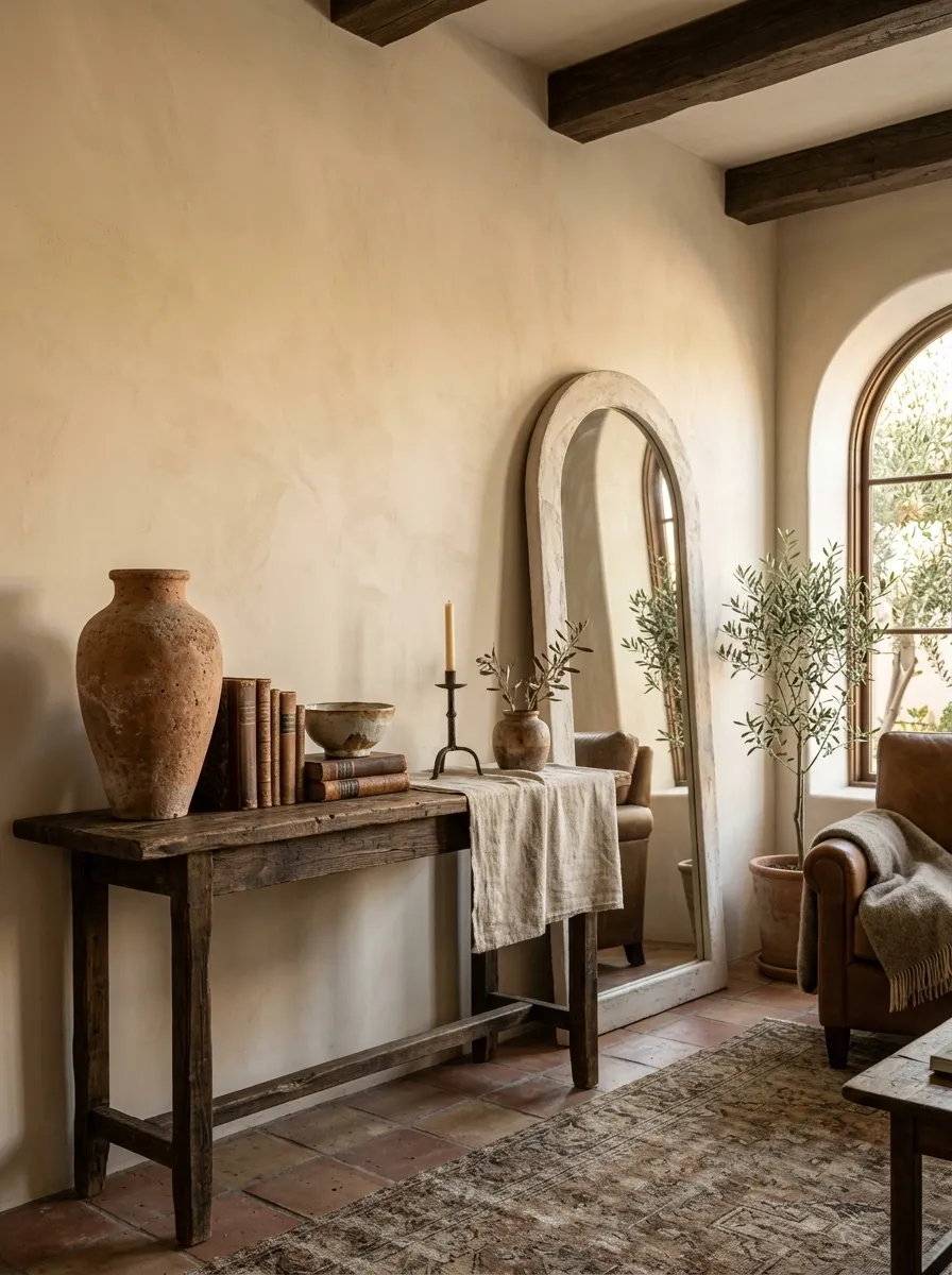
Spanish rooms rarely need everything to line up like a showroom display.
Put a tall vessel beside a low bowl. Pair a chunky lamp with a smaller ceramic object. Mix a rectangular table with a rounded mirror.
The contrast makes the room feel lived in.
Symmetry still has its place, especially around beds and sofas, but the accessories don’t need military discipline.
A little imbalance creates life.
Add a Rustic Bench Where the Room Feels Too Polished
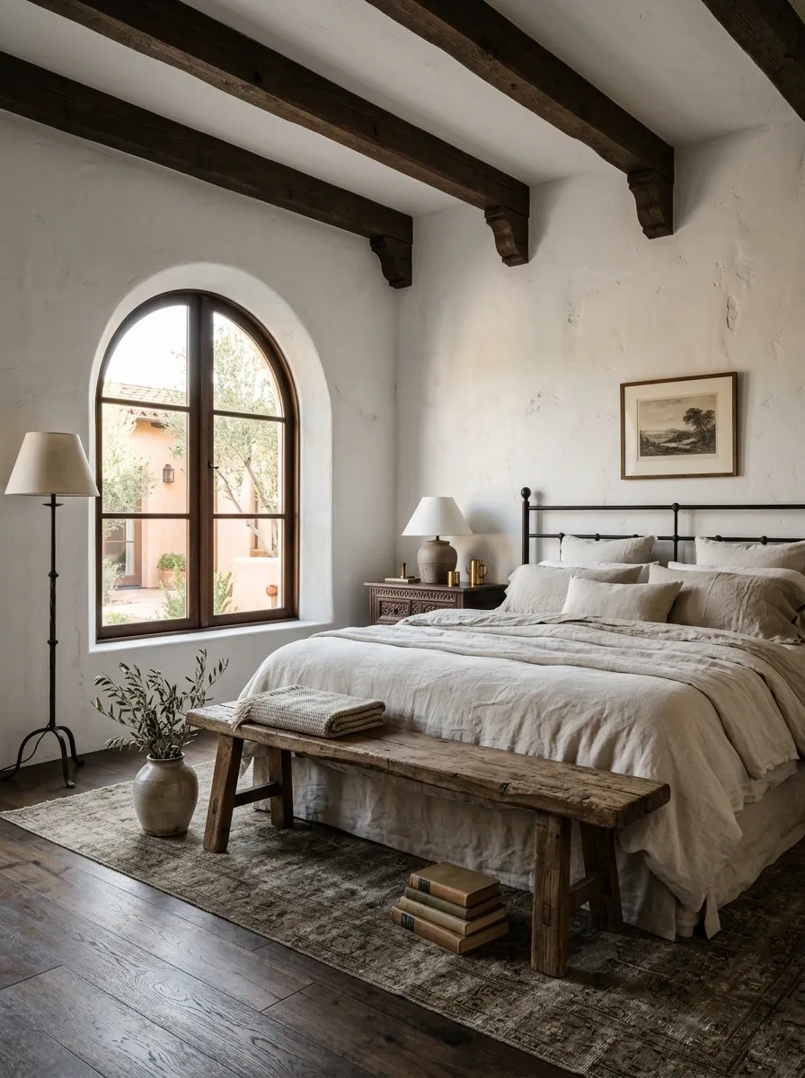
A rustic bench instantly introduces the relaxed quality Spanish interiors need.
Place one at the foot of the bed, beneath a window, in an entryway, or along a dining table.
Look for worn wood, simple joinery, woven seats, or chunky legs.
The bench shouldn’t match everything else.
In fact, it looks better when it doesn’t.
The slightly imperfect piece is often the one that makes the room feel finished.
Use Warm Lighting to Make the Materials Matter
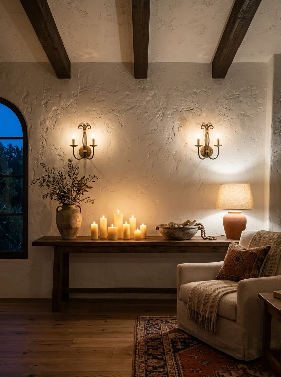
Spanish interiors can look completely different after sunset.
Add table lamps, wall sconces, floor lamps, and candles so the room isn’t relying on one bright ceiling fixture.
Warm light makes plaster look richer, wood look deeper, and terracotta look more saturated.
Use several small pools of light instead of flooding the entire room from above.
The evening version of the room should feel better than the daytime version.
Candle
Low glow
Table lamp
Task glow
Sconce
Wall glow
Keep the Decor Imperfect Enough to Look Real
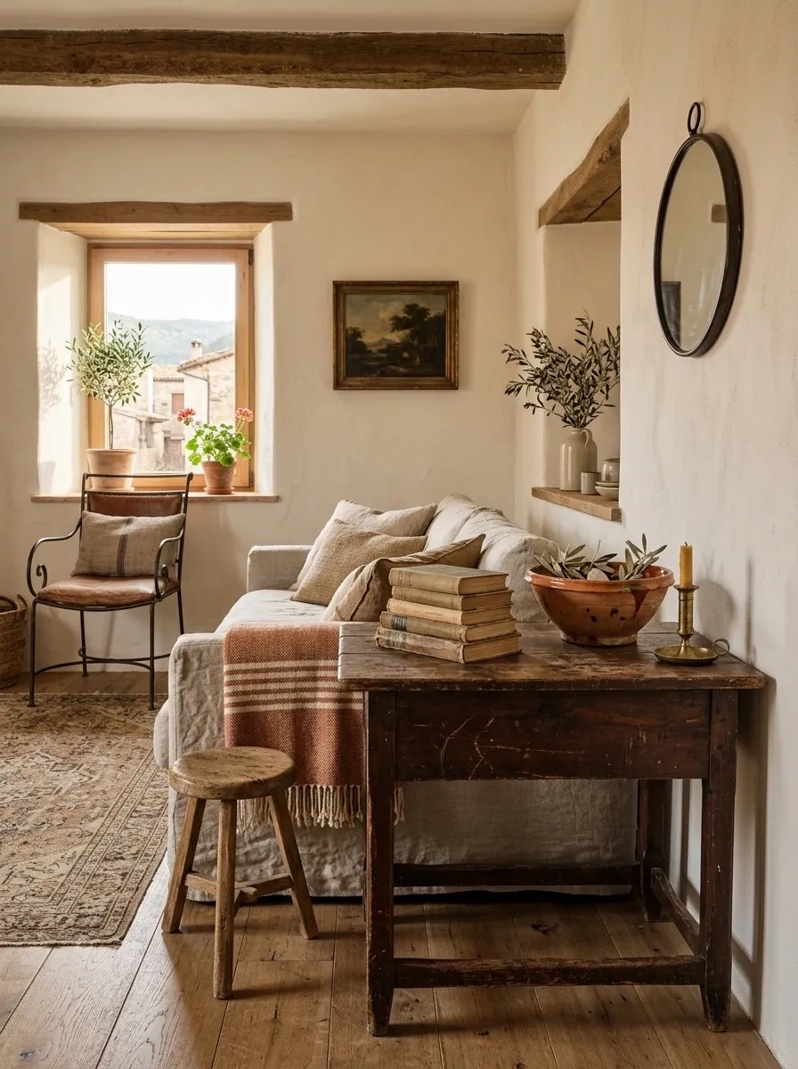
This is the final filter, and it’s the one that saves the entire room from looking staged.
Don’t make every ceramic piece symmetrical. Don’t straighten every linen cushion. Don’t choose furniture because the whole collection matches.
Spanish-inspired rooms need evidence of human use.
A slightly crooked stack of books, a worn wooden stool, a wrinkled linen curtain, a handmade bowl, or a small scratch on a table adds more character than another perfectly styled accessory.
If the room looks too perfect, remove something.