
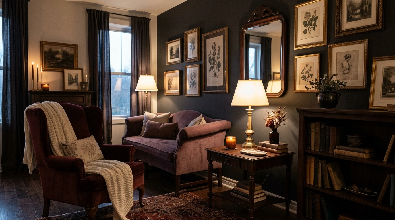
Dark feminine interiors have a very specific line between sophisticated and completely unhinged. Deep walls can look rich and architectural.
Add black furniture, black curtains, black shelves, six candleholders, and enough faux roses to open a flower shop, and suddenly the apartment looks less mysterious and more like it is auditioning for a period drama.
The strongest rooms don’t come from throwing every “dark feminine” reference into the same space. They come from choosing one complete visual direction and carrying it through the walls, furniture, lighting, materials, color, and empty space.
A burgundy sofa should make sense with the wall color. Warm wood should have somewhere to go. Soft fabrics should balance the harder finishes. Even the dramatic pieces need a quieter neighbor.
Everything black? Please calm down.
Dark Feminine Apartment Ideas
Charcoal Living Room With Plum Velvet and Antique Brass
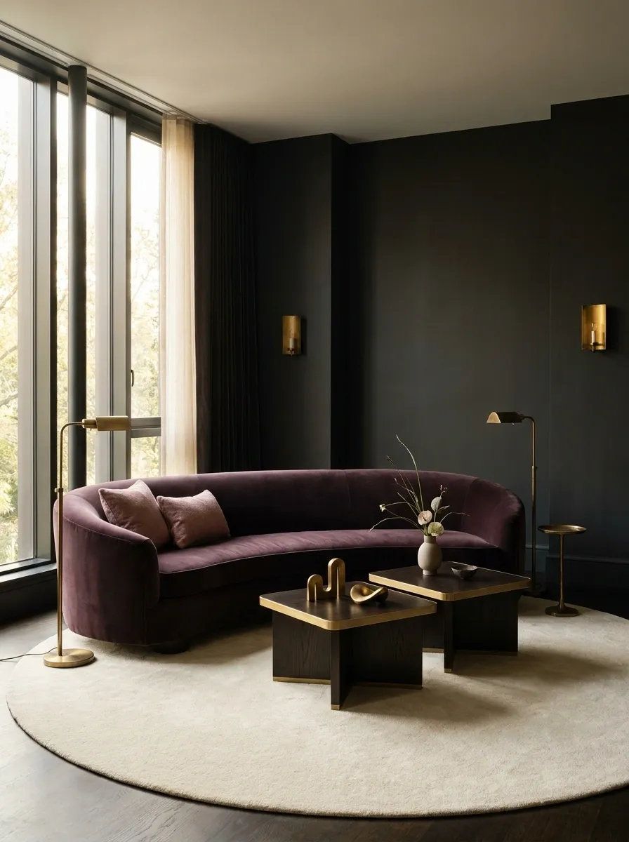
Charcoal walls give this living room its depth, while a curved plum velvet sofa brings in the feminine side without making the palette sugary. Dark wood tables ground the seating area, antique brass lighting adds warmth, and a creamy rug creates a visual pause under everything.
The smartest part is the restraint. The sofa already carries plenty of personality, so the surrounding furniture stays simple and architectural. A few sculptural pieces and one restrained floral arrangement are enough. No need to cover every surface in tiny decorative objects just because the room has shelves. The result feels rich because the materials are doing the work.
Moody Parisian Apartment With Black Trim and Soft Cream Furniture
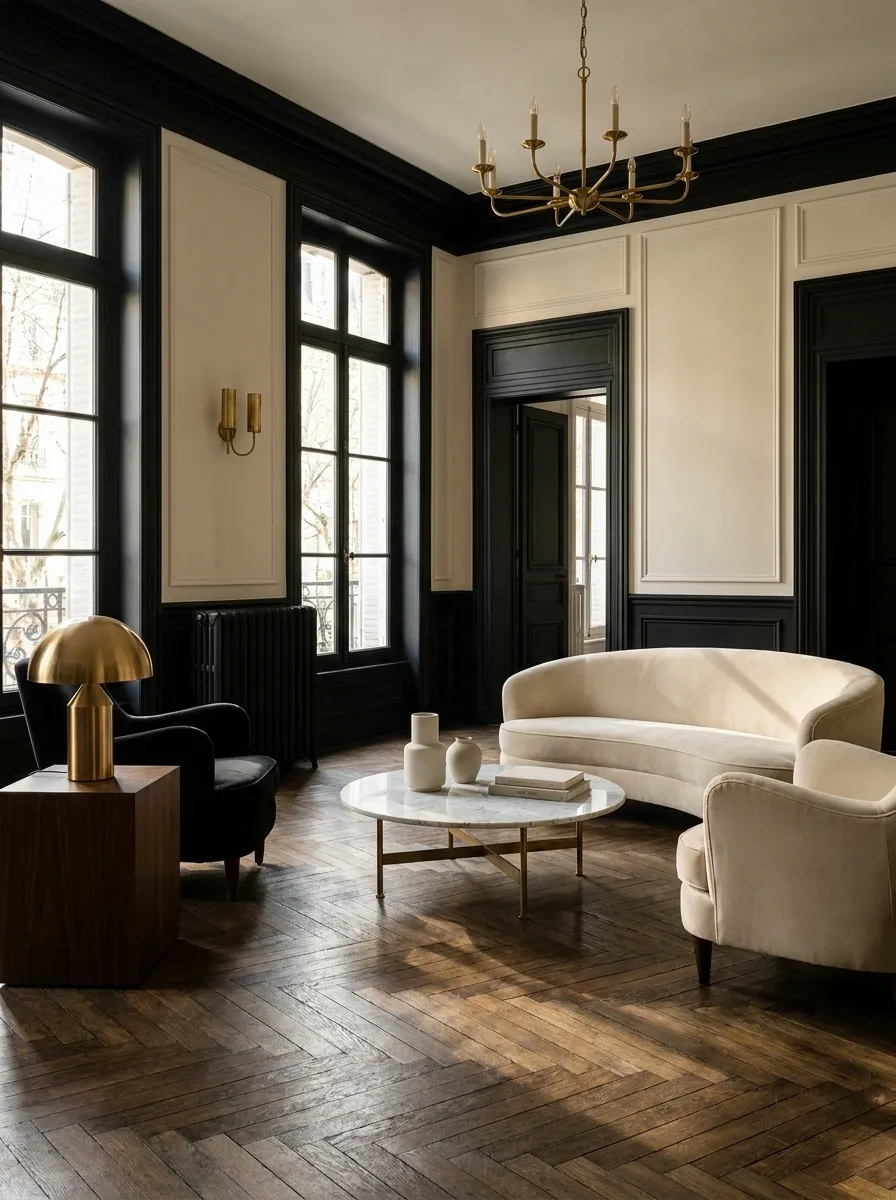
This version gets its drama from the architecture first. Tall ceilings, black-painted trim, herringbone flooring, and dark-painted door frames create a classic Parisian foundation, while cream sofas and chairs keep the room from becoming visually heavy.
Black trim works especially well here because it outlines the architecture rather than swallowing it. A marble-topped table, aged brass lighting, and a few dark wood pieces add layers without turning the apartment into an antique shop. The soft upholstery is important too. Without it, all that black detailing could feel severe. This is feminine through shape, texture, and proportion rather than an overload of pink.
Espresso Brown Apartment With Dusty Rose Upholstery
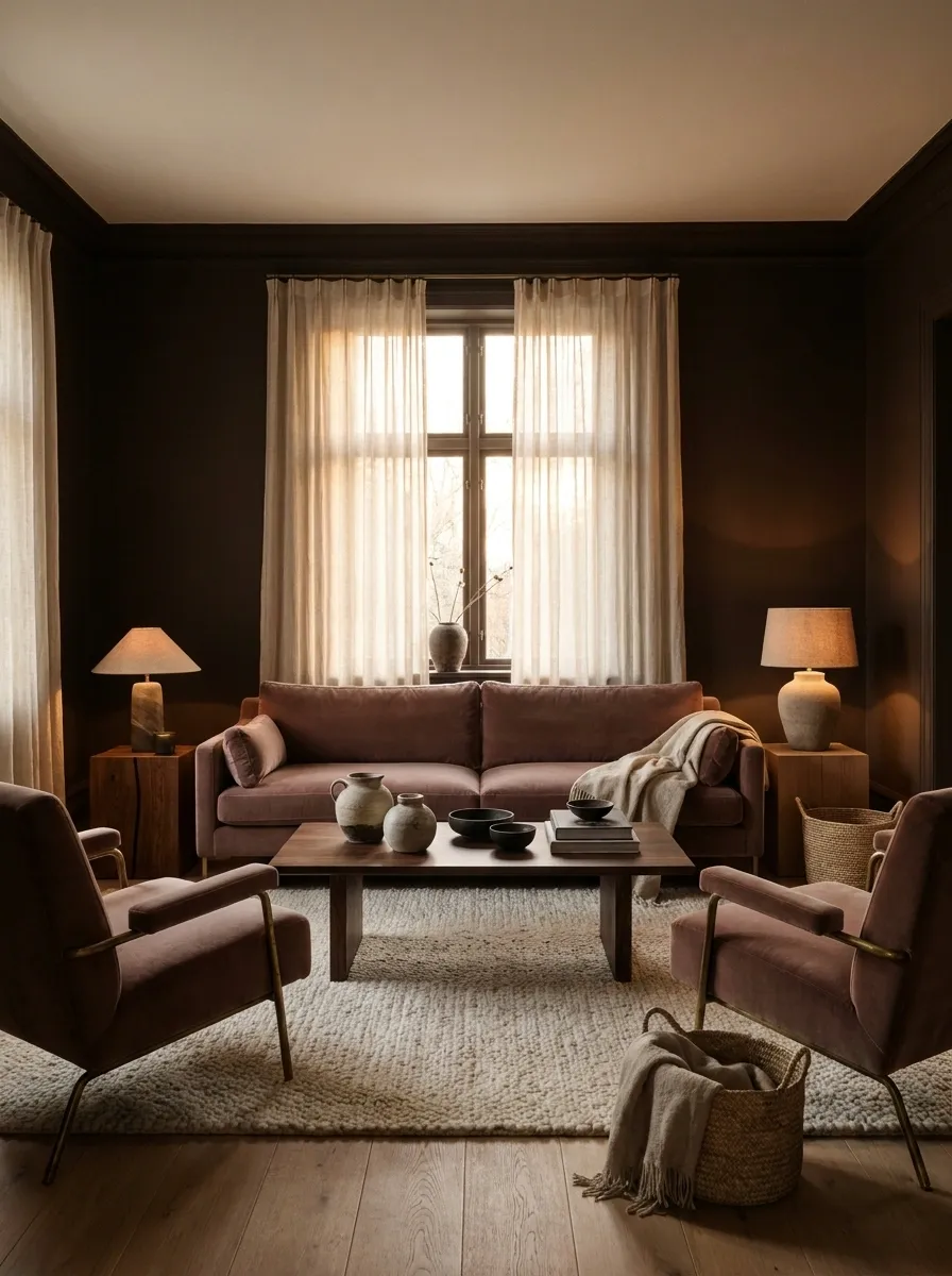
Espresso brown creates a softer kind of darkness than pure black. Used across walls and larger furniture, it gives the apartment a warm envelope that pairs naturally with dusty rose seating, walnut tables, cream textiles, and aged metal.
The color combination works because the rose isn’t trying to become the star. It sits inside an otherwise earthy palette and gives the room a feminine note without making everything look candy-colored. A large cream rug helps separate the darker furniture from the floor, while warm lamps keep the brown from appearing muddy at night.
The result has character without looking like every trend from the mood-board folder got invited.
Dusty rose softens it.
Ivory lets everything breathe.
Black-and-Wine Apartment With a Dramatic Dining Room
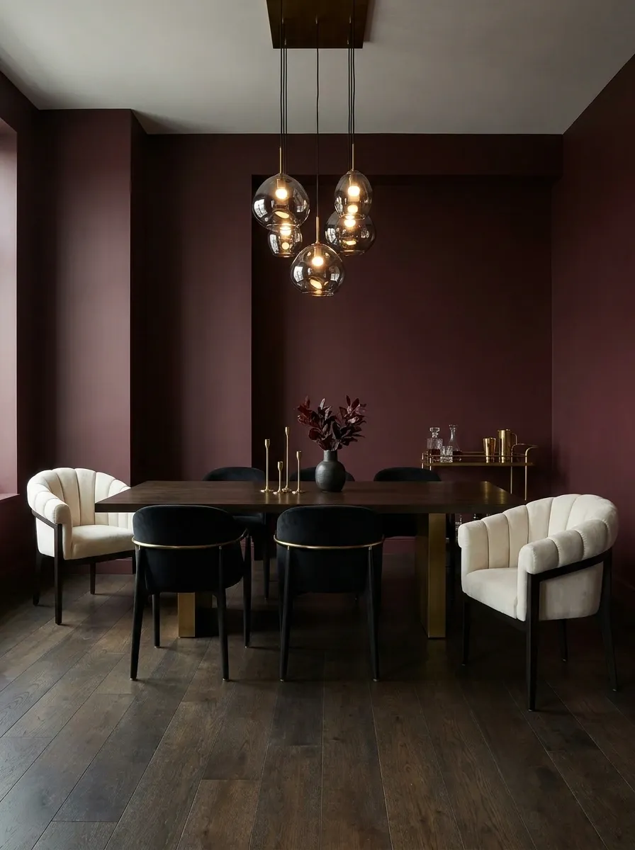
This dining room goes unapologetically dark, with wine-colored walls, black furniture, smoked glass, and warm low lighting. An ivory upholstered chair or two keeps the table setting from disappearing into the background, while brass details add small flashes of warmth.
The key is giving the dining area one clear focal relationship: the table, chairs, and pendant should read as one composition. Everything around them gets quieter. The darker palette makes the space feel intimate, but the lighter seating stops it from becoming visually dense.
This is where restraint pays off. Once the walls and furniture are doing this much work, the tabletop doesn’t need a decorative personality crisis.
Dark Green Apartment With Blush Accents and Natural Wood
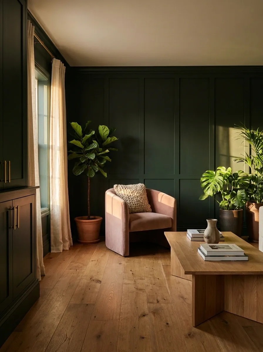
Forest green gives this apartment a richer, earthier foundation, while warm oak prevents the darker walls from feeling too formal. Muted blush upholstery adds softness, linen curtains lighten the windows, and leafy plants bring another layer of green without introducing a random rainbow of accent colors.
The wood is what makes the whole composition feel grounded. Against green walls, it reads warm and substantial rather than merely practical. Blush works best here in small doses, such as one chair, a cushion, or a textile panel. Covering every available surface in pink would completely change the mood.
The finished room feels feminine because of its curves, softness, and color relationships. The walls aren’t doing all the talking.
Black Kitchen With Cream Stone and Walnut Cabinetry
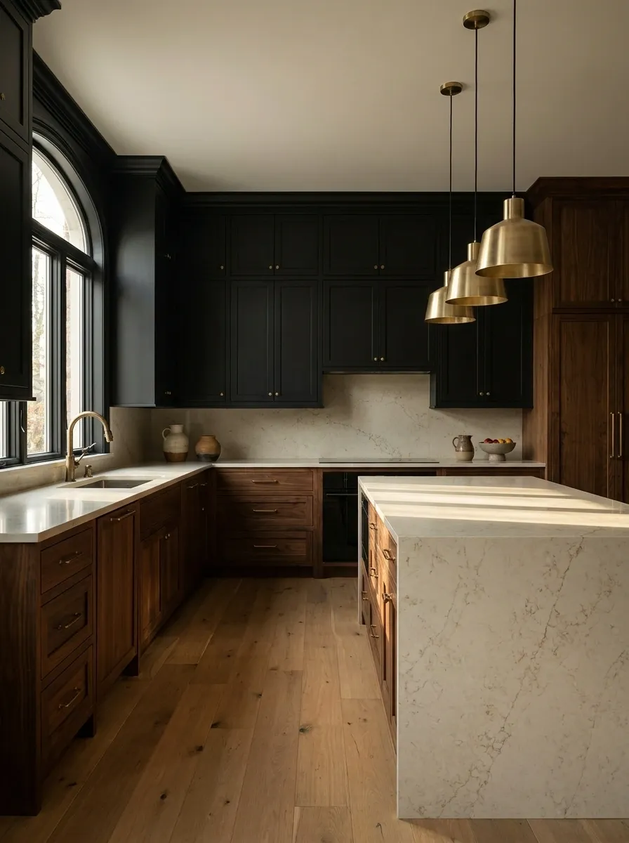
Black cabinetry gives this kitchen a strong architectural backbone, but the cream stone worktop keeps the whole composition from becoming one giant dark rectangle. Warm walnut cabinetry adds another layer of depth, while aged brass fixtures and softly glowing pendants bring in the feminine warmth.
The important relationship is between the cold-looking black surfaces and the warmer materials around them. Walnut softens the cabinetry, cream stone catches the available light, and brass creates small points of visual warmth. The styling stays fairly quiet so the materials can carry the room.
A dark kitchen can absolutely have personality without looking like a villain’s renovation project.
Soft Gothic Apartment With Arched Furniture and Oxblood Walls
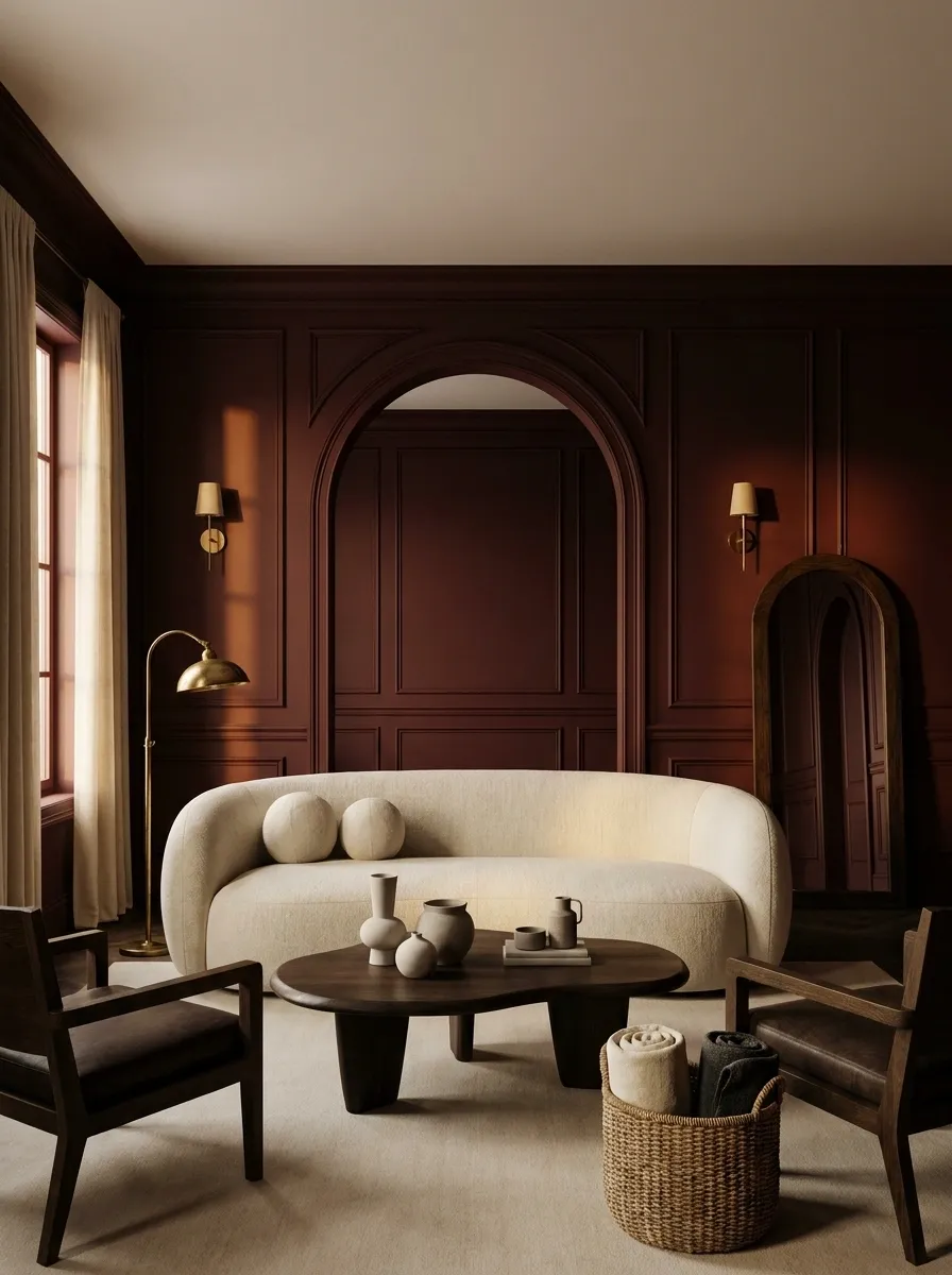
Oxblood walls give this apartment its immediate drama, but the architecture stays graceful through repeated arches and curved furniture. A rounded sofa, arched doorway, dark oak pieces, ivory textiles, and old-world lighting create a gothic influence that feels polished rather than costume-like.
The curves matter. They introduce softness against the heavy color and keep the room from becoming a collection of hard black rectangles. Ivory upholstery gives the eye somewhere lighter to land, while dark wood connects naturally with the oxblood background.
This is gothic for people who want an apartment with character, not a room that looks like it owns twelve ravens.
Arches and curves give it softness.
Feminine Modern Apartment With Cocoa Walls and Bouclé Furniture
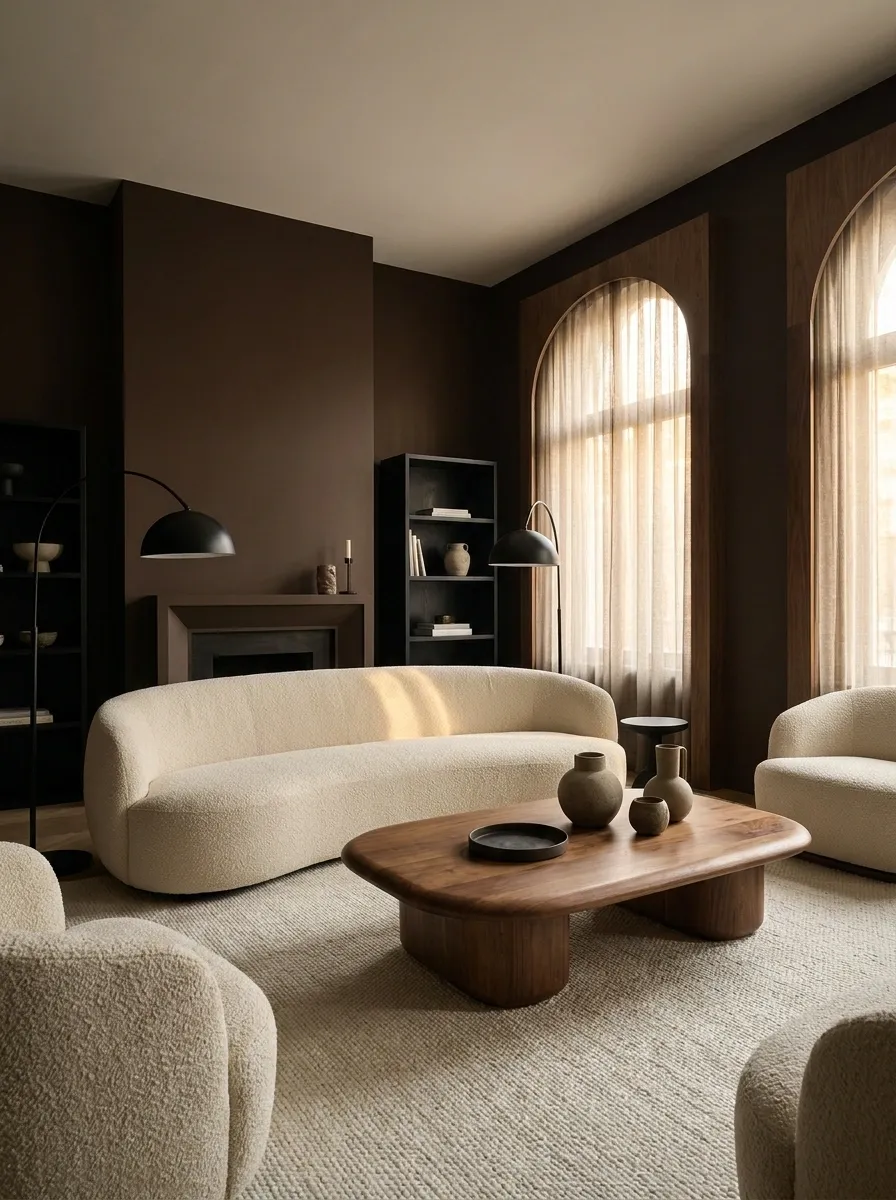
Cocoa walls create a warm, enveloping background for this modern apartment, while low cream bouclé furniture brings softness without making the space feel overly delicate. Walnut tables, matte black accents, rounded silhouettes, and diffused lighting keep the composition contemporary.
The darker wall color works because the furniture isn’t fighting it. Pale upholstery creates a clear foreground, while the walnut adds a middle tone between the cream and cocoa. Curved forms make the room feel softer without relying on decorative clutter.
The overall effect is feminine through texture and shape rather than obvious motifs. No giant pink neon sign is required. Thankfully.
Midnight Blue Bedroom With Burgundy Bedding and Brass Lighting
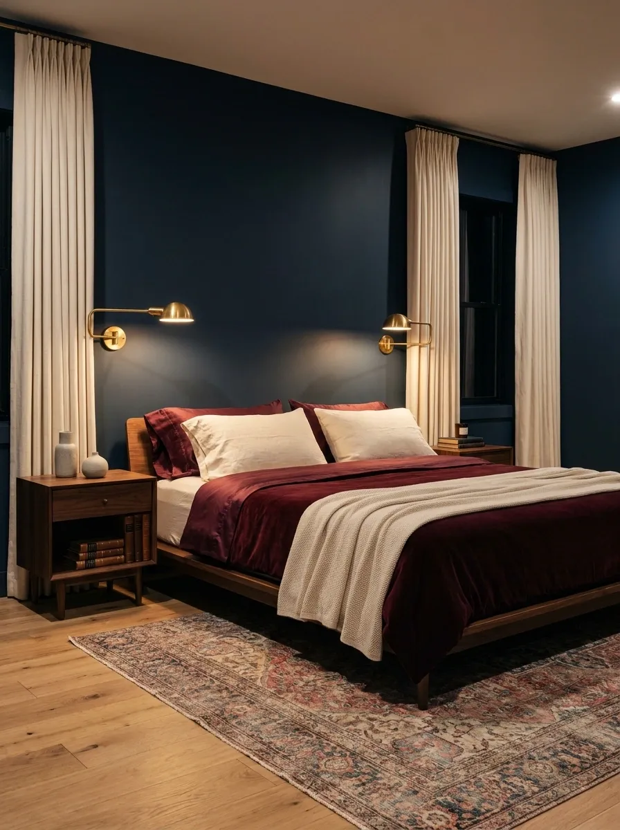
This bedroom uses midnight blue as the main envelope, creating a deep backdrop for layered burgundy bedding, walnut nightstands, cream textiles, and warm brass sconces. The bed remains the visual center because the lighter bedding sits against the dark walls rather than disappearing into them.
Burgundy adds depth without introducing a completely unrelated color. It sits close enough to the blue and warm wood to feel intentional, while cream breaks up the darker field around the mattress and curtains.
The lighting is kept warm and low, which makes the brass feel richer and the bedding more dimensional after sunset. The bedroom gets drama from color relationships, not from twelve decorative pillows staging a coup.
Midnight blue walls establish the room’s visual depth.
Burgundy bedding gives the bed its strongest color.
Cream bedding and textiles keep the composition readable.
Moody Romantic Bedroom With Chocolate Walls and Lace-Inspired Textiles
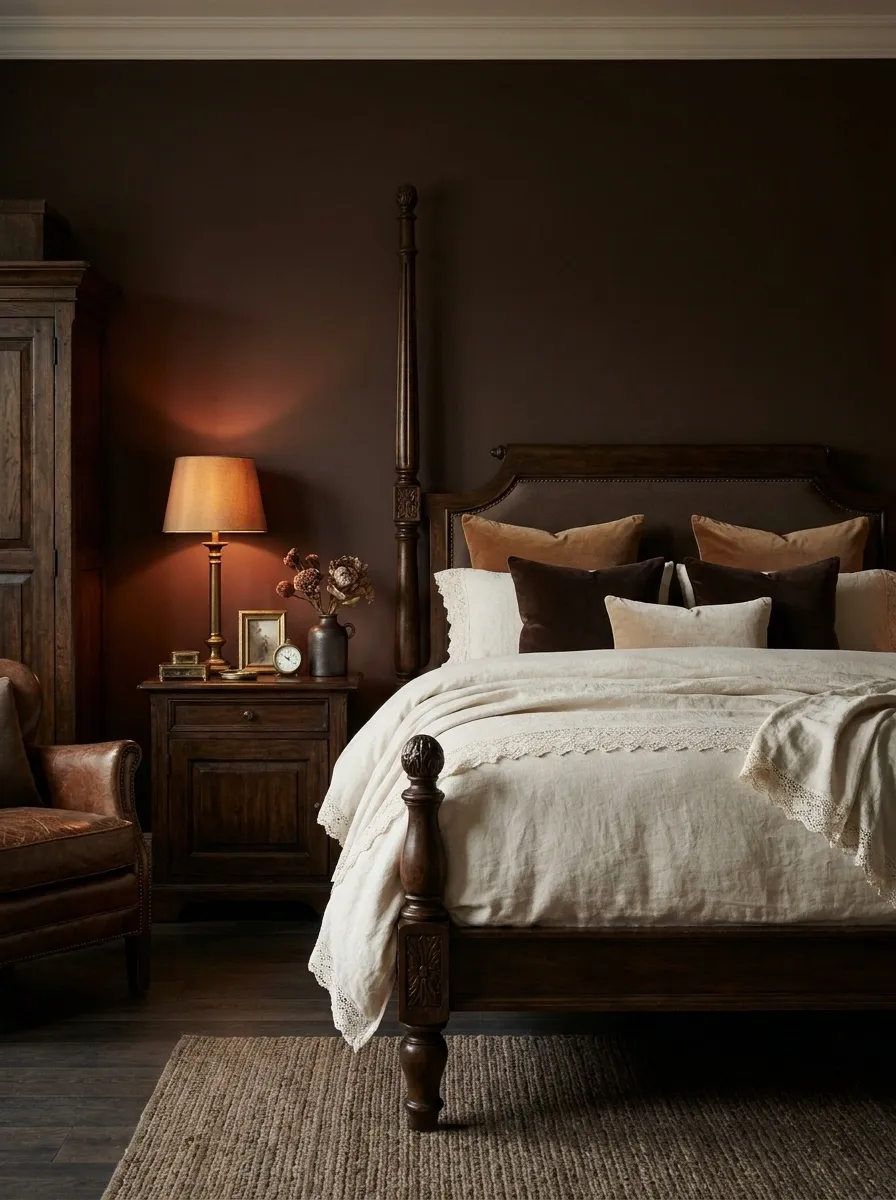
Chocolate walls create a warm, intimate shell around this bedroom, while an upholstered bed, ivory bedding, subtle lace-inspired textile details, dark timber, and antique-style lamps introduce a softer romantic character.
The important distinction is subtlety. The textile pattern appears as texture rather than a loud decorative theme, so the room still feels mature. Dark wood adds weight beneath the softer fabrics, while warm lamps bring out the reddish undertones in the brown walls.
A small floral arrangement can reinforce the romantic mood, but it should stay restrained. The room already knows what it’s doing. There is no need for a flower shop to move in.
Dark Feminine Studio Apartment With a Burgundy Kitchenette
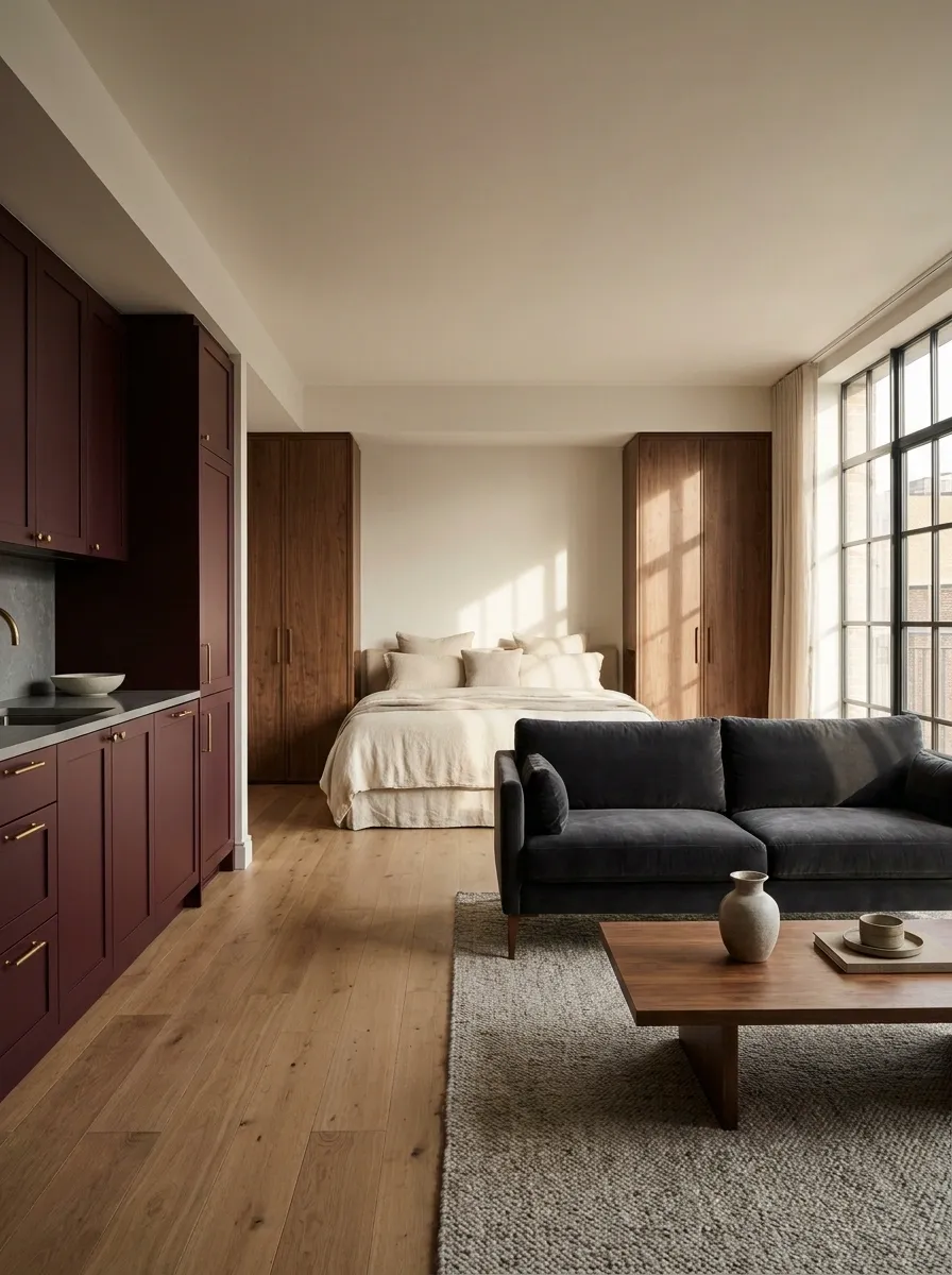
Small apartments can handle a dark palette surprisingly well when the colors are used to create zones rather than visual chaos. This studio uses a deep burgundy kitchenette as the strongest architectural feature, then carries charcoal into the seating area while a cream bed and warm walnut storage keep the sleeping zone visually lighter.
The clever part is that the apartment doesn’t need walls everywhere to feel organized. Tonal shifts create separation between cooking, lounging, and sleeping areas while keeping the whole space connected. A few repeated materials, especially walnut and warm metal, make the transitions feel intentional.
Small footprint, big personality. The floor plan didn’t get the memo about playing it safe.
Black Living Room With Soft Pink Marble and Walnut
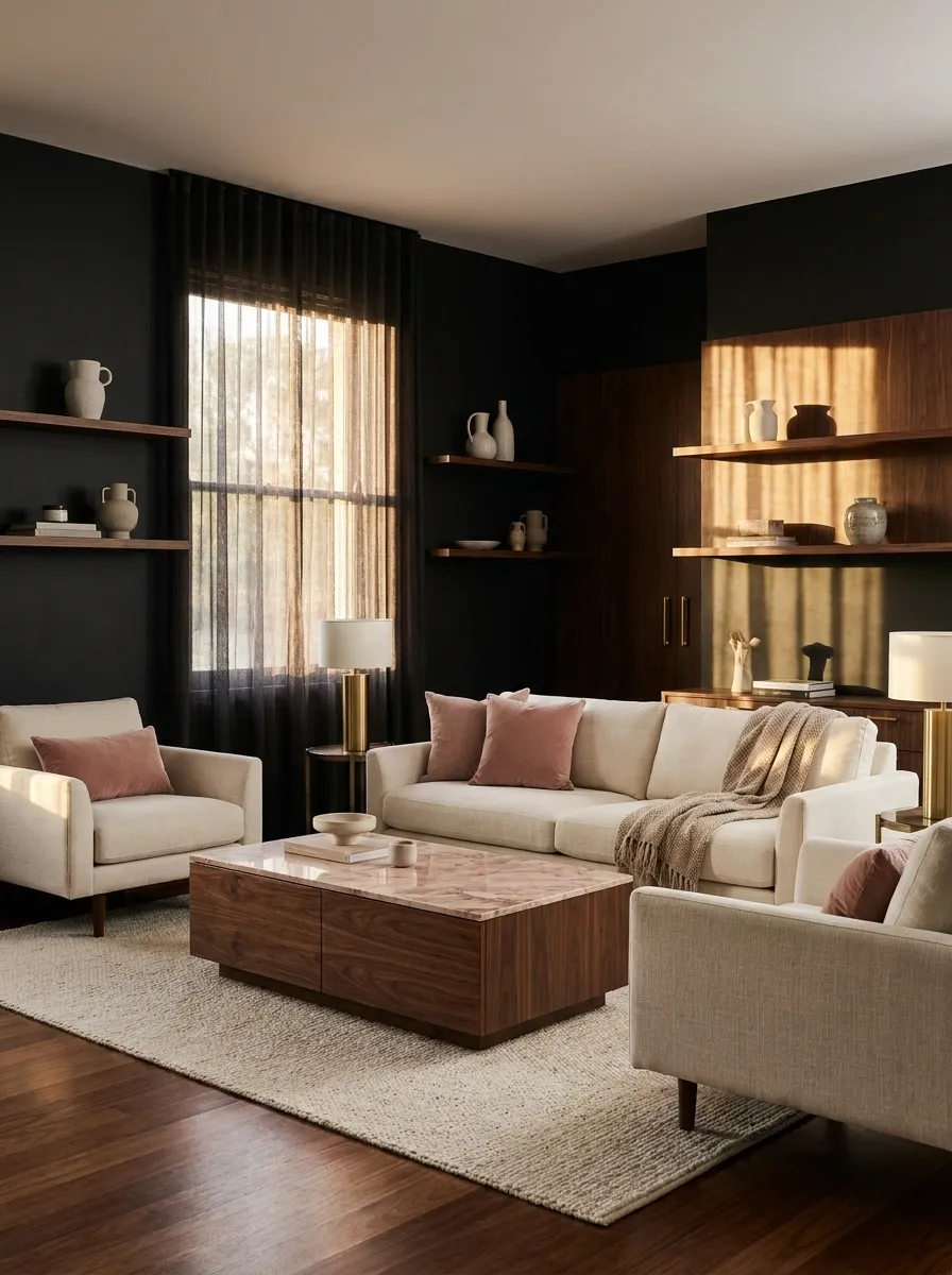
This living room takes black in a more polished direction, pairing matte dark walls and furniture with warm walnut and soft pink-toned marble. Cream upholstery keeps the seating area from becoming too visually dense, while subtle brass details catch the light without shouting for attention.
The marble works because there isn’t much of it. Used on a coffee table, side table, or fireplace surround, the muted pink tone becomes a quiet accent inside a mostly neutral composition. Walnut bridges the gap between the stark black and softer stone, giving the room a warmer visual middle.
It’s feminine without a single cliché in sight. The marble does the whispering. Everything else knows when to sit down.
Walnut gives it warmth.
Soft pink stone gives it personality.
Dark Terracotta Apartment With Burgundy and Aged Bronze
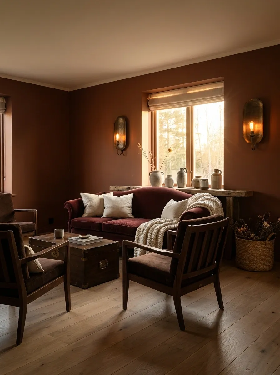
Dark terracotta gives this apartment a warmer, sunbaked kind of mood, especially when paired with burgundy upholstery, dark wood furniture, aged bronze lighting, and cream textiles. The palette feels dramatic, but it stays rooted in earthy colors instead of relying on black for every major surface.
The terracotta and burgundy sit close enough in temperature to feel related, while cream breaks up the darker furnishings and helps the room stay readable in natural light. Aged bronze works better here than bright gold because it keeps the finish looking soft and lived-in.
The room has drama without screaming for attention. Honestly, it has enough confidence already.
Largest background color.
Furniture and textile depth.
Visual breathing room.
Small warm highlights.
Moody Scandinavian Apartment With Charcoal, Oak, and Mauve
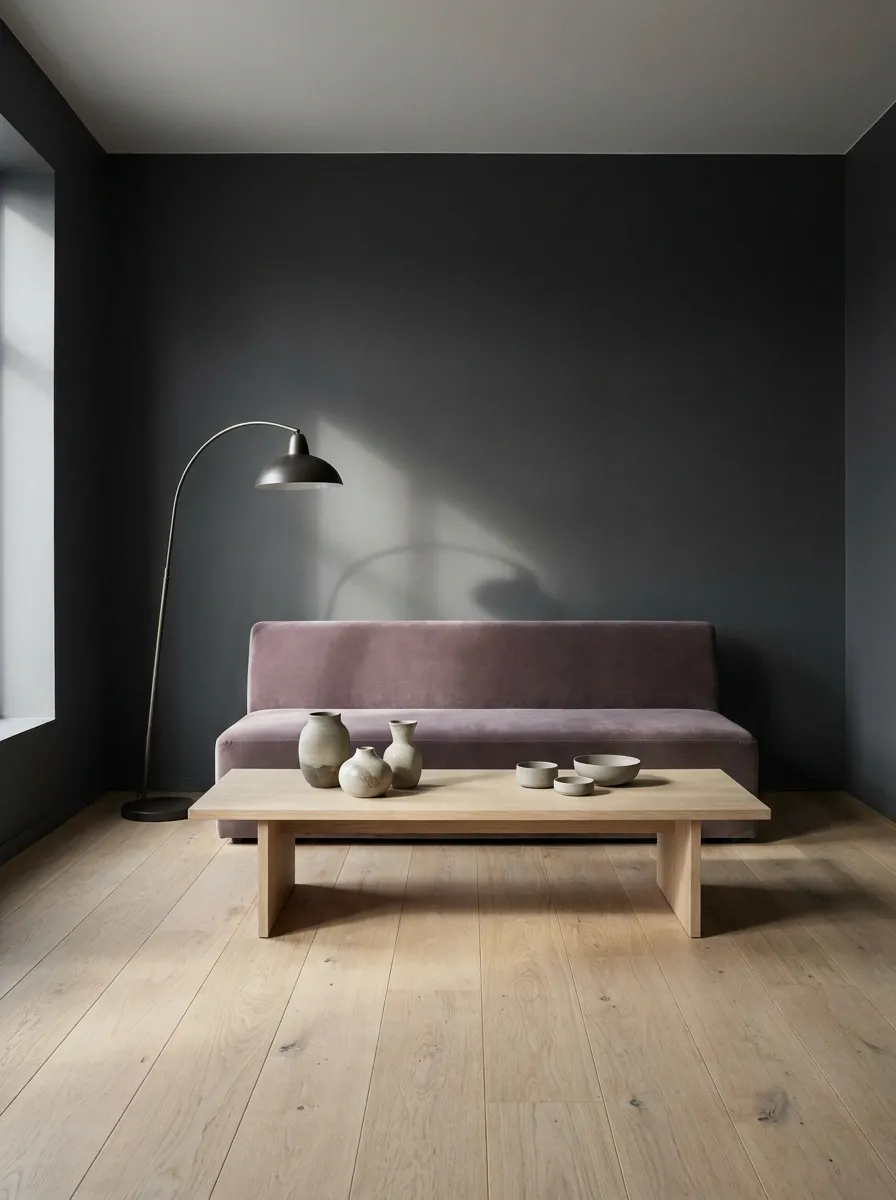
Scandinavian design gets a darker, softer treatment here with charcoal walls, pale oak furniture, muted mauve upholstery, simple ceramics, and carefully controlled lighting. The room stays visually clean, but the darker envelope gives the familiar light-wood formula considerably more personality.
Pale oak is doing serious work in this composition. Its natural grain adds warmth and movement against the flat charcoal background, while mauve introduces softness without turning the room sugary. The furniture stays low and simple, leaving enough negative space for the apartment to feel calm rather than crowded.
Minimalism with actual warmth. Revolutionary concept, apparently.
Oak is the warmth.
Dark Feminine Entry-Led Apartment With a Dramatic Hallway
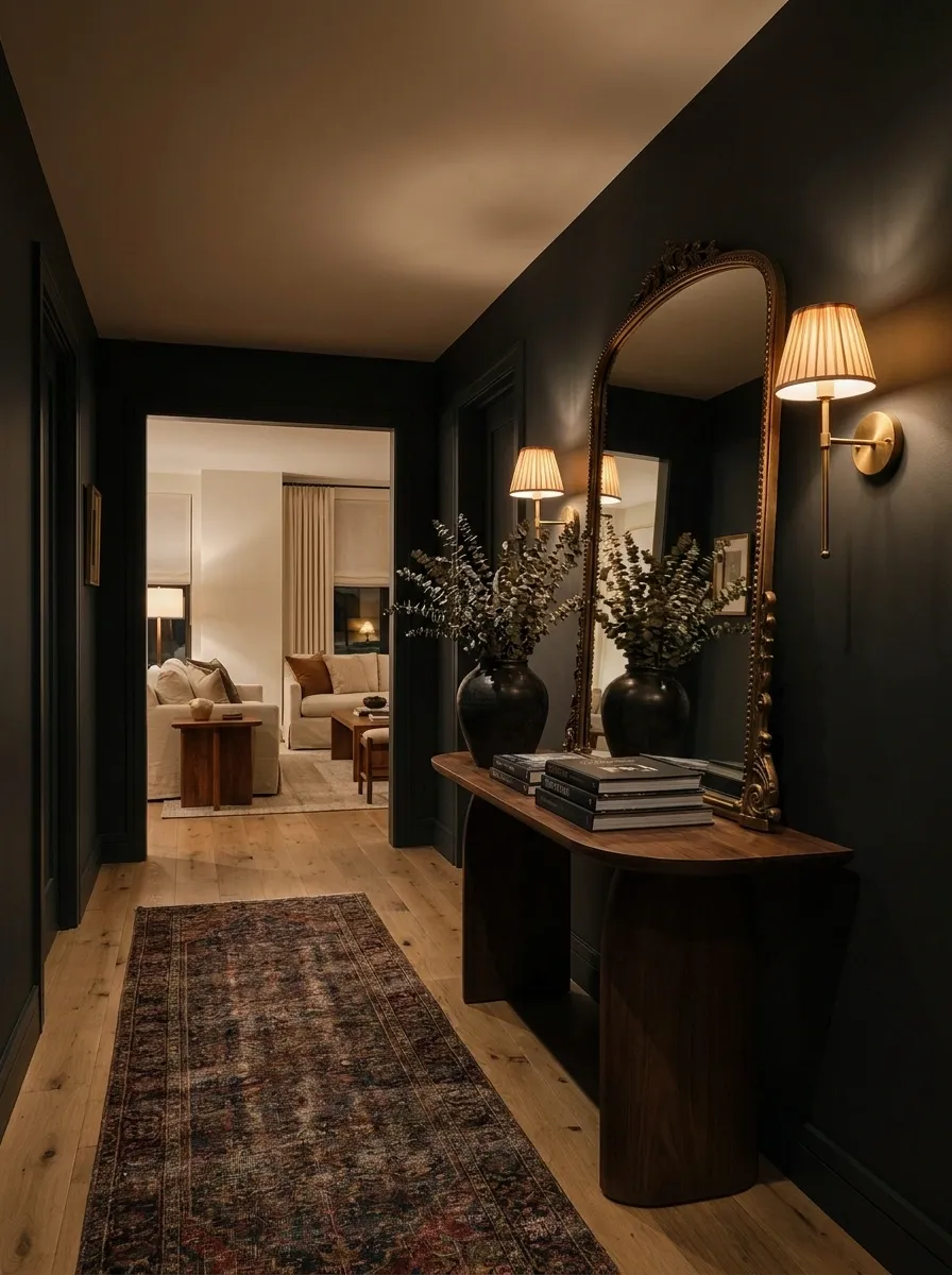
The hallway becomes the opening statement in this apartment, with deep wall color, a vintage runner, a curved console, an oversized mirror, and warm sconces leading into a softer living space. Instead of making every room equally dramatic, the entry gets the strongest dose of mood.
That creates a useful rhythm. The hallway feels intimate and intentional, while the rooms beyond can introduce cream upholstery, warm wood, or softer colors without losing the overall identity. Repeating one or two materials between the entry and living room keeps the transition from feeling random.
A dramatic hallway is a little extra. But at least it’s extra with a floor plan.
Burgundy Dining Nook With Black Banquette and Marble Table
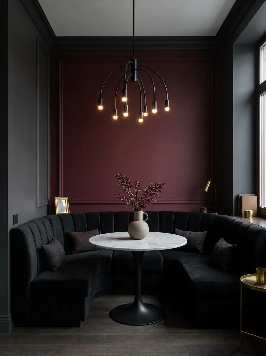
A compact dining area can feel deliberately designed rather than squeezed into whatever corner the apartment had left over. This version uses a burgundy wall as the backdrop for a tailored black banquette, a small round marble table, and a sculptural pendant hanging directly above the seating zone.
The round table is important because it keeps circulation comfortable in a tighter footprint and softens all the straight architectural lines around it. Marble adds a light visual surface, while the banquette keeps the seating visually contained against the wall instead of pushing chairs into the walkway.
Tiny dining nook, suspiciously large personality.
Dark Feminine Home Office With Walnut, Ink Blue, and Velvet
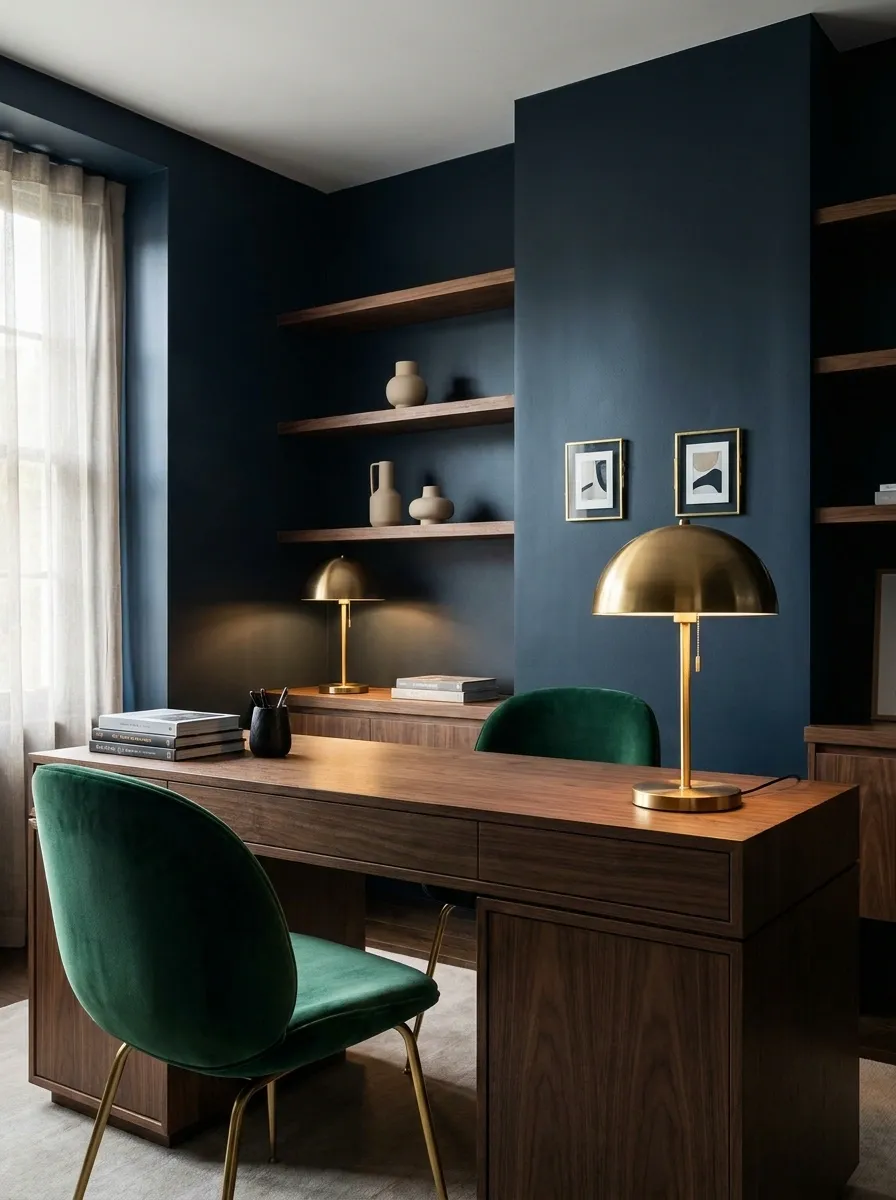
This home office takes dark feminine style somewhere more tailored, with ink-blue walls, a substantial walnut desk, a velvet desk chair, warm brass lighting, and carefully edited shelving. Instead of decorating every visible inch, the background is kept fairly quiet so the desk and lighting become the main visual anchors.
The walnut prevents the blue from feeling too cool, while velvet adds softness to an otherwise structured room. A framed artwork arrangement can sit behind the desk, but the scale should remain controlled so it doesn’t compete with the workspace.
It looks polished enough for video calls and dramatic enough to make answering emails feel vaguely cinematic.
The largest visual and functional element.
A warm lamp keeps the darker palette usable at night.
Art and shelving support the desk rather than compete with it.
Black Bedroom With Cream Drapery and Soft Mauve Accents
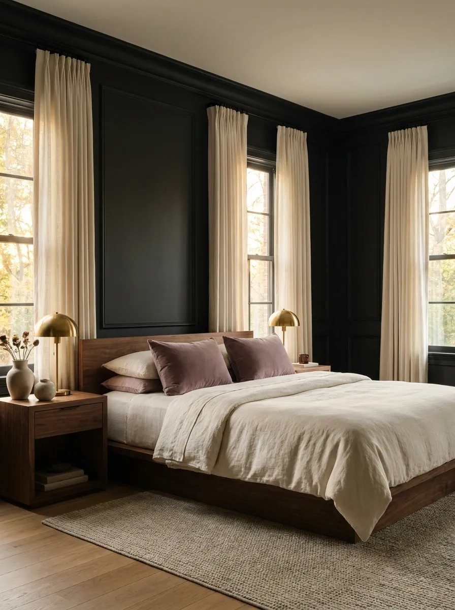
Near-black walls make this bedroom feel enveloping, while full cream curtains create a lighter frame around the windows. The bed continues that contrast with pale bedding, soft mauve cushions, walnut furniture, and warm lamps placed on either side.
The trick is keeping the lightest tones concentrated around the bed and window areas. That creates a visual center instead of allowing the dark walls to dominate every surface equally. Walnut provides a warm transition between the black background and cream textiles, while mauve adds just enough color to keep the room from becoming a simple black-and-white scheme.
It’s dramatic, soft, and thankfully not one faux fur throw away from becoming a nightclub lounge.
French-Inspired Apartment With Smoky Gray Walls and Rosewood
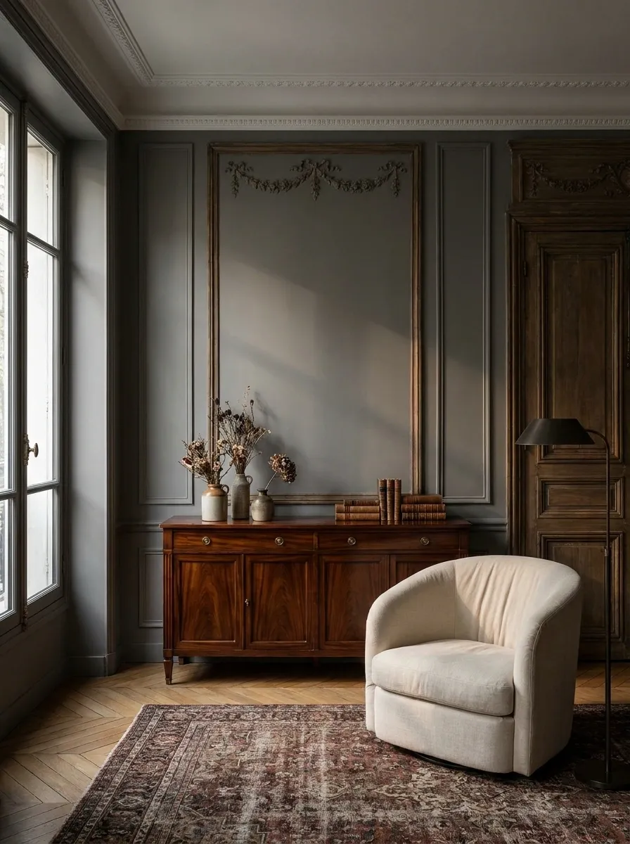
Smoky gray walls give this French-inspired apartment a softer interpretation of dark feminine style. Rosewood furniture brings warmth and richness, while cream upholstery, antique brass, carved details, and restrained floral arrangements add traditional character without making the rooms feel overly formal.
The palette works because the gray acts as a quiet middle ground. It is deep enough to create atmosphere but soft enough to let the warm wood remain visible. Rosewood becomes the material with the most visual character, so the rest of the finishes stay relatively calm.
The room should feel collected rather than decorated in one afternoon from a single shopping tab. A little imperfection makes the whole thing more convincing.
Dramatic Rental Apartment With Removable-Style Color Blocking
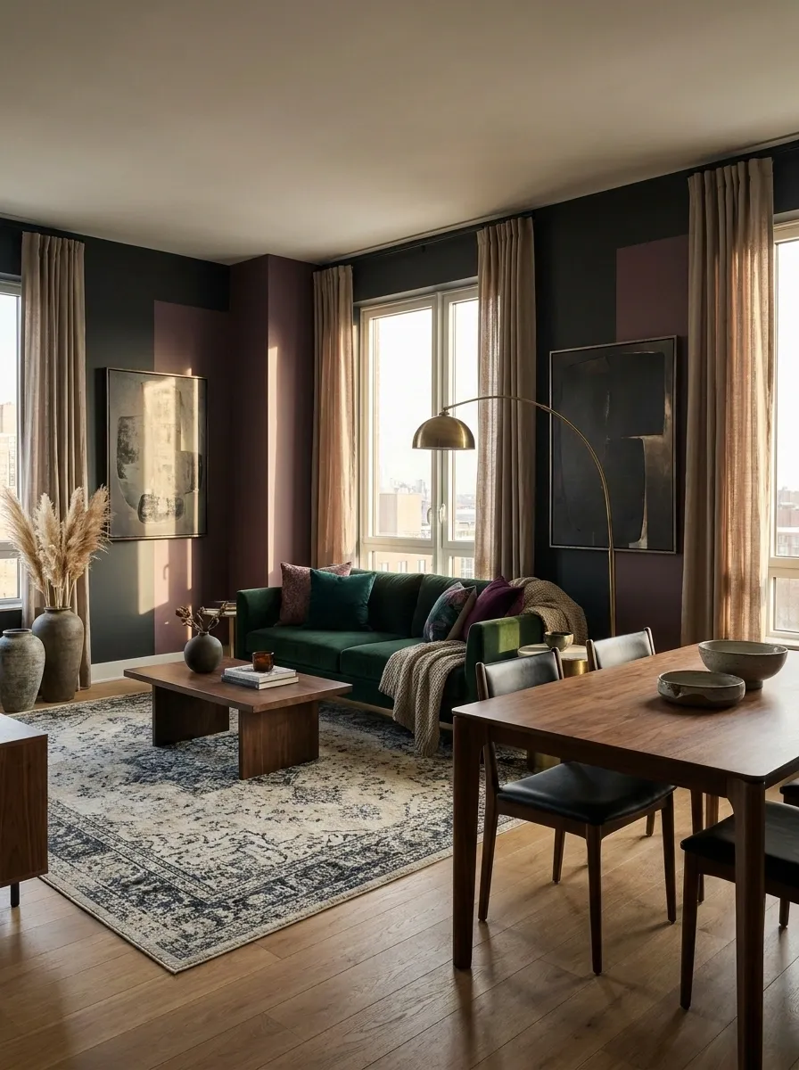
A rental apartment doesn’t have to look like every design decision was made by the landlord’s beige paint committee. This concept uses deep color zones, dark furniture, warm textiles, and artwork to create a dramatic interior without depending on permanent architectural changes.
The strongest move is using color to give separate areas their own identity. A dark seating zone can feel intentional beside a softer dining or sleeping area, especially when walnut, cream, and aged metal repeat throughout the apartment. Large rugs help define those zones further without physically closing them off.
The finished look feels personal without requiring a demolition crew, which is probably preferable for anyone hoping to get the security deposit back.
Dark Feminine Apartment With a Statement Velvet Sofa
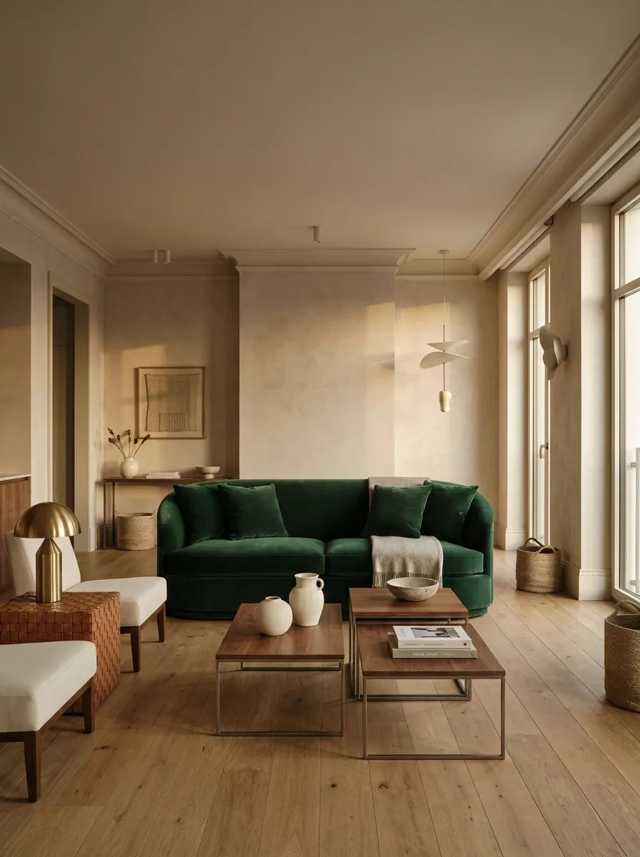
This open-plan apartment revolves around one serious piece of furniture: a deep emerald velvet sofa. Warm plaster-like walls create a soft background, while walnut tables, cream architectural details, and sculptural lighting keep the rest of the room deliberately understated.
The sofa works because it occupies the center of the composition without being surrounded by ten equally dramatic objects. Curved edges soften the open-plan layout, and the warm wall color keeps the emerald from feeling disconnected from the rest of the apartment.
A statement sofa should actually make a statement. Otherwise it’s just an expensive place to lose the remote.
Moody Minimal Apartment With Black, Mushroom, and Walnut
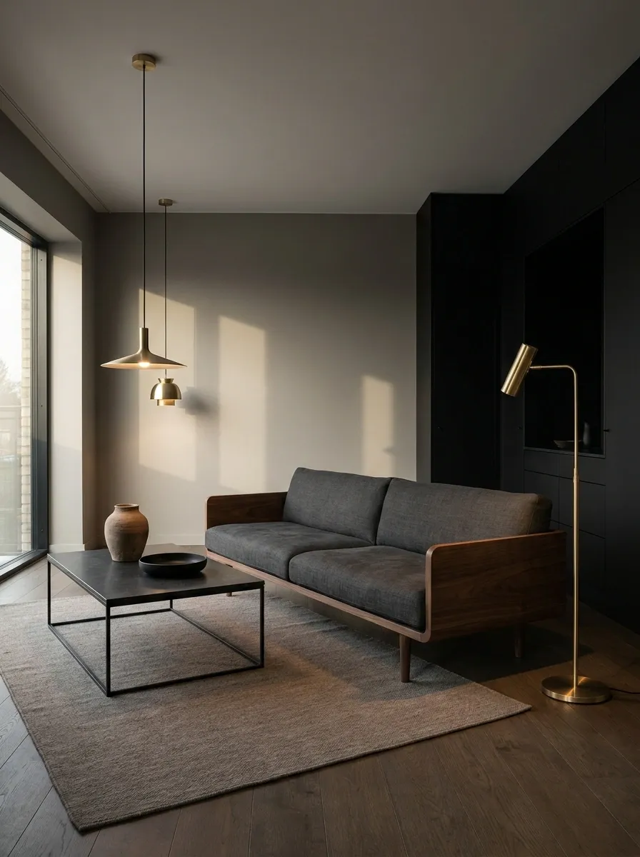
Minimalism becomes considerably moodier in this apartment, where mushroom-colored walls meet black cabinetry, low walnut furniture, sculptural lighting, and very little decorative clutter. The room feels finished because the materials and proportions are doing the visual work.
The mushroom tone is especially useful because it sits between stark cream and heavy brown. Against black, it creates enough contrast to show the shape of furniture and cabinetry without introducing a loud new color. Walnut gives the darker scheme a natural grain, while the low furniture leaves more visible negative space above it.
There are fewer objects here, but each one has a job. Revolutionary behavior in the age of decorative clutter.
Chocolate Brown Kitchen and Living Room With Soft Lavender Accents
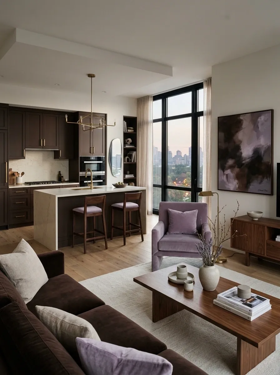
Chocolate brown creates continuity across this open-plan apartment, carrying from the kitchen cabinetry into the living area so both zones feel intentionally connected. Cream stone counters and warm walnut furniture lighten the darker composition, while soft lavender upholstery introduces a surprising feminine accent.
Lavender works here because it appears sparingly. A lounge chair, cushion, artwork, or occasional textile is enough to create the color shift. The brown base keeps it grounded, while cream stone provides a clean visual break between the kitchen’s darker cabinetry and work surfaces.
The combination is unexpected but not chaotic. Brown and lavender can absolutely coexist without starting a color theory argument in the comments.
Old-World Dark Feminine Apartment With Patterned Wallpaper
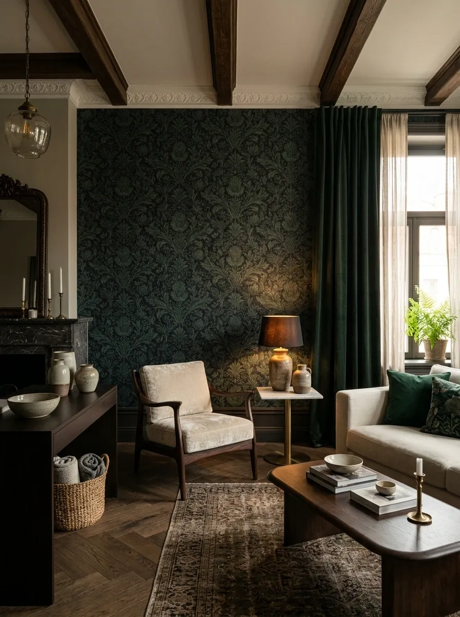
Patterned wallpaper becomes the main character in this old-world apartment, where deep botanical or damask-inspired walls surround curved wood furniture, cream upholstery, marble accents, and warm lamps. The pattern brings femininity into the room immediately, but the darker background keeps it from feeling sugary.
The rest of the furnishings need restraint. Solid upholstery gives the eye somewhere to rest, while dark wood echoes the wallpaper’s depth without competing with it. A marble side table or fireplace surround adds a lighter surface and breaks up the darker materials.
Patterned walls can carry plenty of personality on their own. There is no need to add seventeen decorative prints because apparently the wallpaper wasn’t already doing enough.
Soft Black-and-Cream Apartment With Sculptural Curves
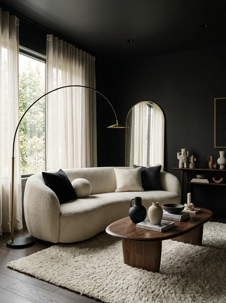
Soft black walls create a dramatic backdrop in this apartment, while cream curved seating, dark wood, ivory rugs, and organic-shaped tables make the overall composition feel gentler. The darker palette is strong, but the silhouettes keep it from becoming rigid.
Curves appear throughout the room rather than being isolated to one chair. A rounded sofa, oval coffee table, curved lamp, and softly shaped mirror create a rhythm that carries across the space. The repetition makes the shapes feel intentional, while the cream upholstery provides enough contrast to keep the furniture visible against the walls.
Black doesn’t automatically mean severe. Give it a few curves and suddenly the room has manners.
Large soft curve establishes the main silhouette.
Oval or round shape repeats the softness at a lower level.
A curved silhouette keeps the upper half of the room connected.
Moody Coastal Apartment With Ink Blue and Weathered Wood
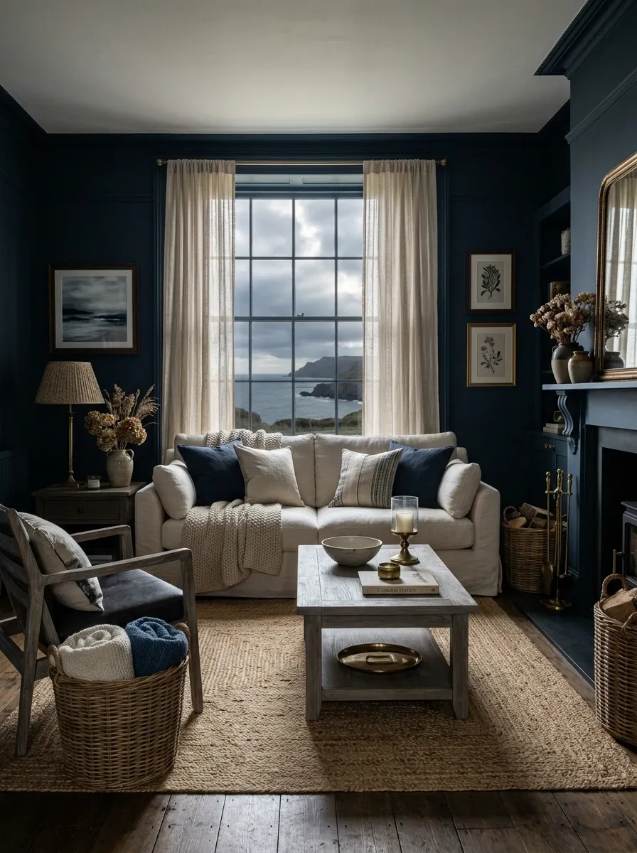
Dark feminine style doesn’t have to mean velvet, chandeliers, and enough brass to open a small museum. This coastal interpretation uses ink-blue walls, weathered wood, cream linen, aged brass, and woven textures for a moodier take on relaxed coastal design.
The weathered wood brings natural variation against the solid blue walls, while cream linen keeps the larger furniture light. Woven textures add warmth without introducing another strong color. Brass appears in small amounts so it catches light without turning the room into a shiny nautical fantasy.
The result feels relaxed but still layered and intentional. Coastal design with a little more attitude and considerably less seashell merchandise.
Dark Feminine Apartment With a Soft Mauve-and-Charcoal Bedroom Suite
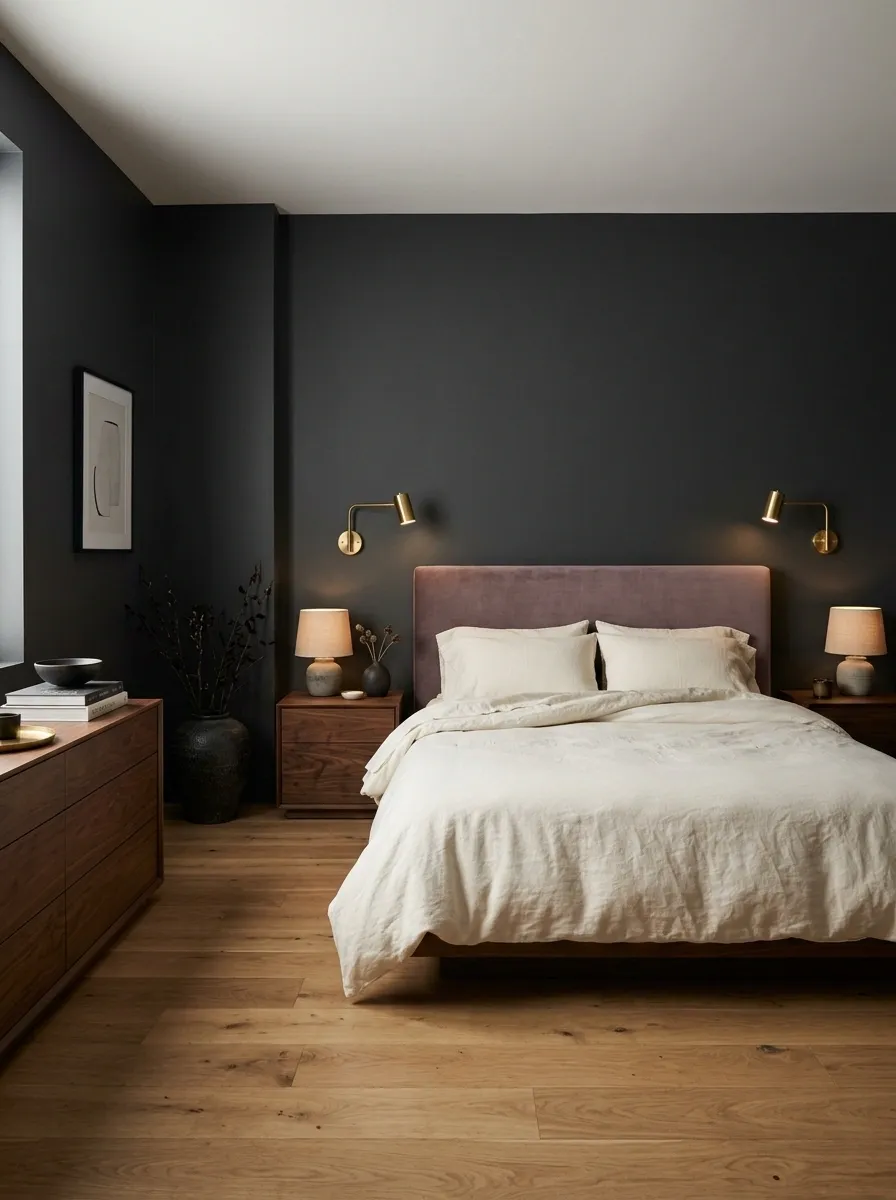
This bedroom uses charcoal as the main architectural color and brings softness through muted mauve upholstery, cream bedding, walnut furniture, and warm indirect lighting. Instead of relying on one dramatic object, the room feels finished because every major piece belongs to the same restrained palette.
The bed remains the visual center through contrast rather than excessive decoration. Cream bedding sits clearly against the charcoal background, while mauve adds a softer color between the dark wall and warm wood. Walnut nightstands and a low dresser provide enough visual weight to keep the pale bedding from making the room feel top-heavy.
It’s soft, dramatic, and very far from the “add more pillows until nobody can sit down” school of bedroom design.
Largest background field
Soft color transition
Main visual rest point
Grounding warmth
Sophisticated Black-and-Ochre Apartment With Sculptural Lighting
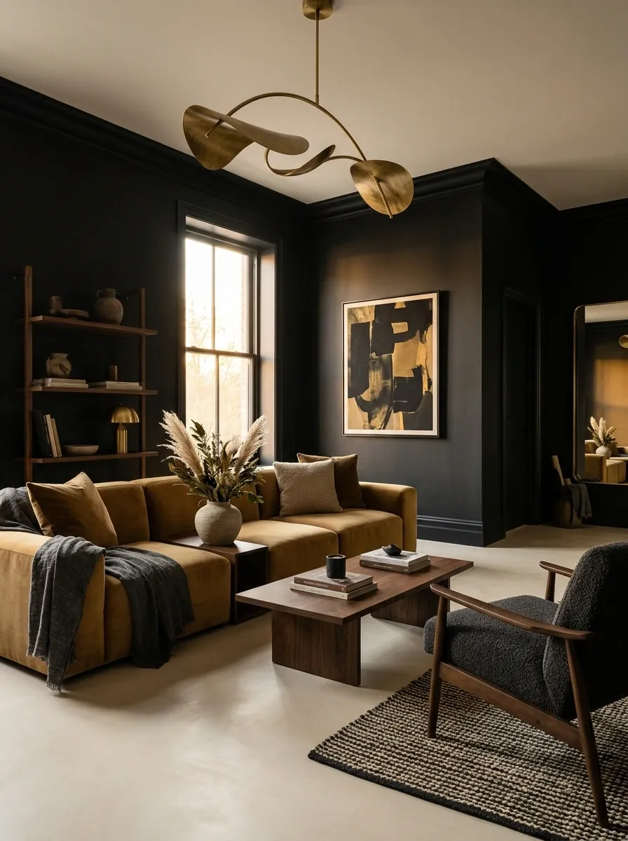
The final concept pushes dark feminine design into a more modern direction, using black walls, muted ochre upholstery, dark walnut, cream flooring, and sculptural lighting. Vintage-inspired furniture can sit beside cleaner contemporary pieces, giving the apartment a collected quality without making it look period-specific.
Ochre is intentionally restrained here. One sofa, occasional chair, or textile can carry the color against the black background, while cream flooring and lighter details prevent the room from becoming visually heavy. Sculptural lighting adds a final layer of shape, especially when the furniture itself stays relatively simple.
The room has drama, warmth, and enough personality to look finished without needing a decorative object on every available surface. Growth.