
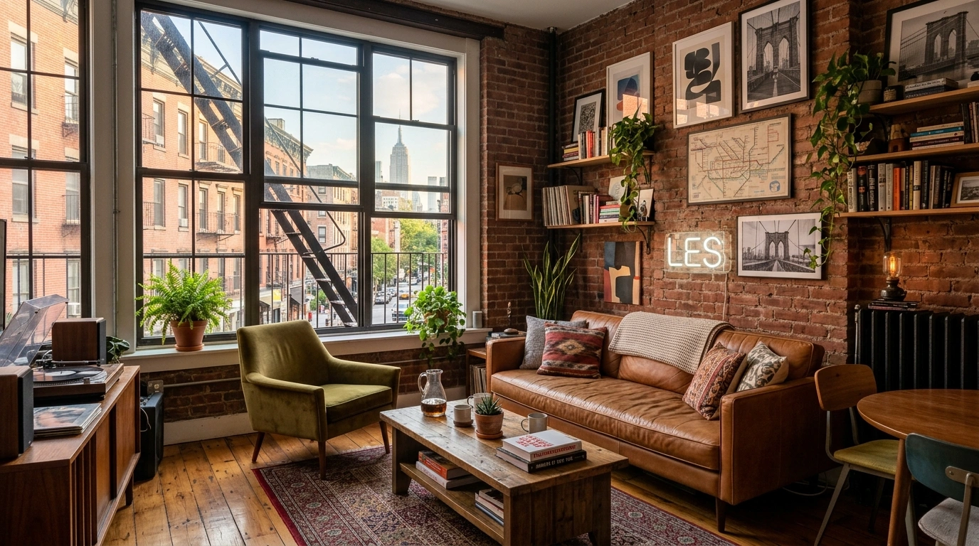
Some apartments look stylish before you’ve even figured out where the bathroom is. Others have nice furniture, decent lighting, and every trendy accessory imaginable, yet somehow still look like a furnished rental waiting for its next tenant.
The difference usually isn’t money. It’s editing.
A stylish NYC apartment has a certain visual discipline. Furniture has room to breathe. Curtains actually reach the floor. Art has enough scale to matter. Lighting comes from more than one sad ceiling fixture. Old-looking pieces sit beside newer ones, so the room feels collected instead of ordered from one giant matching catalogue.
That’s the trick worth stealing. You don’t need exposed brick, a fireplace, or windows the size of a small country. You need the right proportions, a little contrast, and fewer things competing for attention.
The NYC Apartment Style Audit
NYC Apartment Ideas
Start With One Strong Sofa Instead of Filling the Room With Furniture
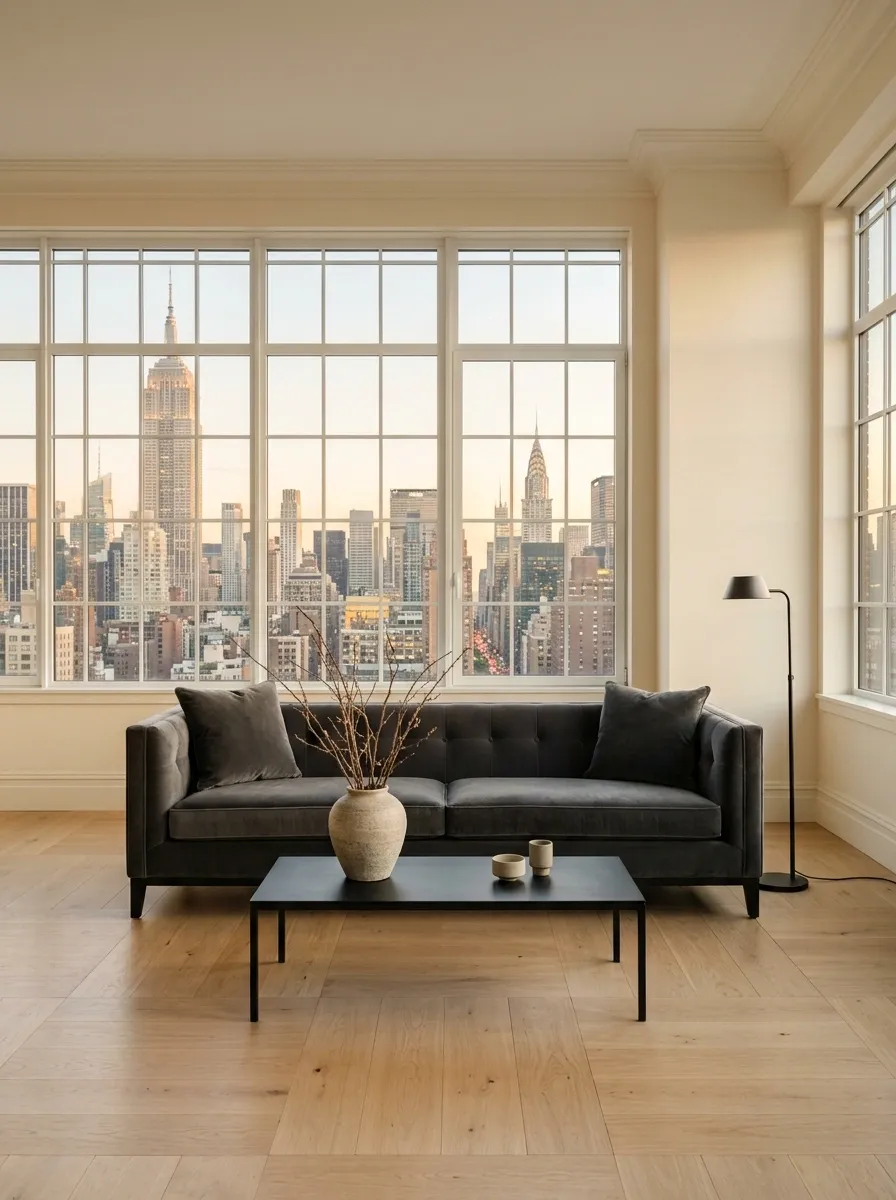
The fastest way to make a small living room look chaotic? Keep adding seating because an empty corner feels “wrong.” It isn’t wrong. It’s breathing room.
Pick one sofa with a strong silhouette, then let it anchor the whole arrangement. A low, clean shape usually keeps the room feeling open, while a deeper sofa gives a more relaxed city-apartment feel.
Skip the urge to surround it with random ottomans and chairs. One intentional piece reads far more expensive than a crowd of furniture that clearly wasn’t introduced properly.
Choose a shape that looks deliberate from across the room.
Keep nearby pieces from crowding its edges.
Let the sofa establish the room instead of competing with five other stars.
Use a Large Rug to Visually Pull the Seating Area Together
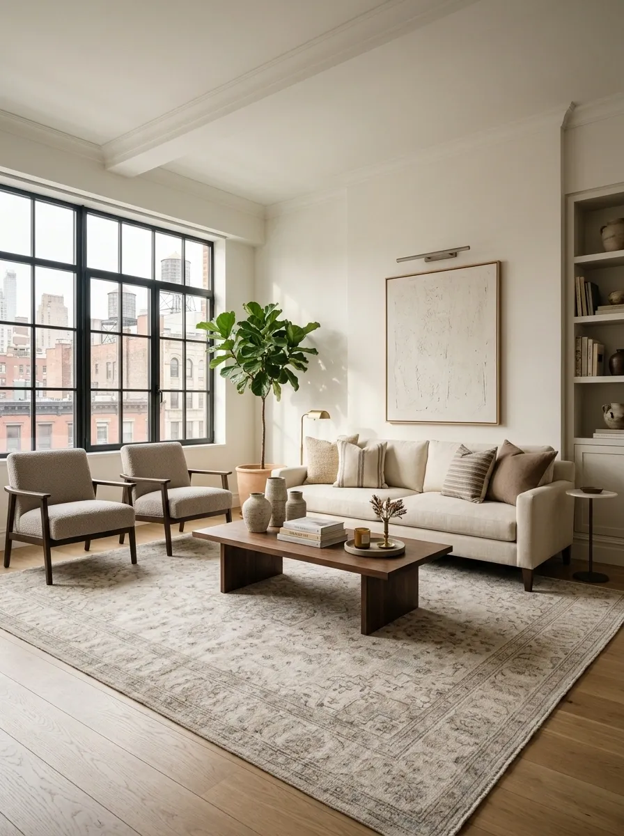
That postage-stamp rug floating under the coffee table isn’t making the room look cozy. It’s making the furniture look like it got separated at baggage claim.
Choose a rug large enough to connect the main seating pieces visually. The front legs of the sofa and chairs should relate to the rug instead of sitting miles away from it.
Keep the shape simple. A soft neutral pattern, faded vintage look, or low-contrast texture works especially well when the furniture already has personality.
Hang Curtains High to Make the Ceiling Feel Taller
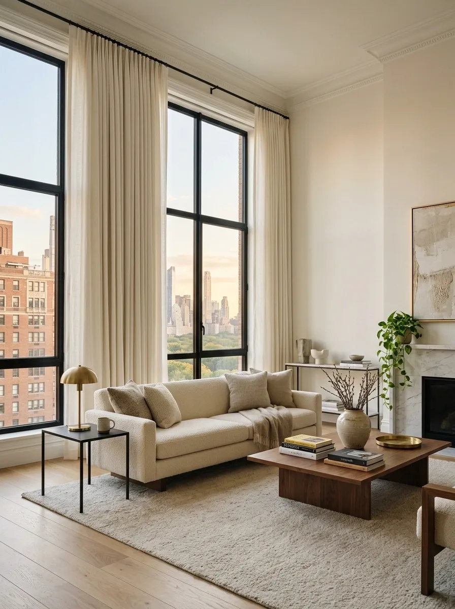
Most curtains are hung like an apology. A few inches above the window, barely wide enough to cover the glass, then everyone wonders why the room feels squat.
Mount the rod higher and wider than the window so the fabric frames the whole wall instead of just the glass. Let the panels fall cleanly toward the floor.
This works especially well in compact apartments because the eye follows the fabric upward. Suddenly the ceiling gets to participate in the design instead of sitting there doing absolutely nothing.
Build a Warm Floor Lamp Corner Beside the Sofa
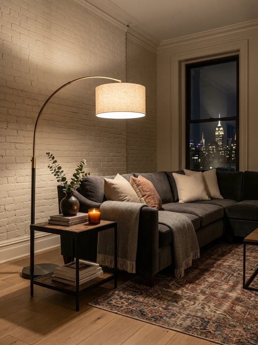
A ceiling fixture can’t do all the emotional labor. It will leave the room looking flat at night, then somehow the lamp gets blamed.
Place a floor lamp beside the sofa or reading chair where a dark pocket usually appears after sunset. Choose a shade that throws light outward instead of a tiny spotlight aimed at the floor.
Keep the lamp visible, but don’t wedge it into a walkway. The goal is a small pool of warm light that makes the seating area feel finished when the overhead light is off.
Lean Oversized Art Instead of Covering Every Wall
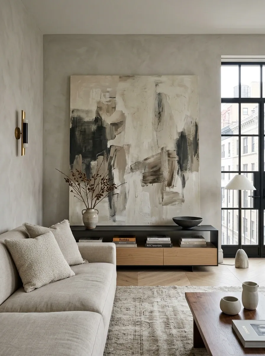
A wall doesn’t become sophisticated just because someone attacked it with tiny frames.
Choose one oversized piece and let it breathe. Lean it against a console, position it above the sofa, or give it a generous patch of wall so the artwork actually has visual weight.
The style can be abstract, graphic, vintage-looking, or restrained. What matters is scale. A larger piece gives the room a clear focal point, while a collection of undersized prints often creates visual static.
Basically, stop making the wall attend six separate meetings at once.
Mix Old-Looking Pieces With Clean Modern Furniture
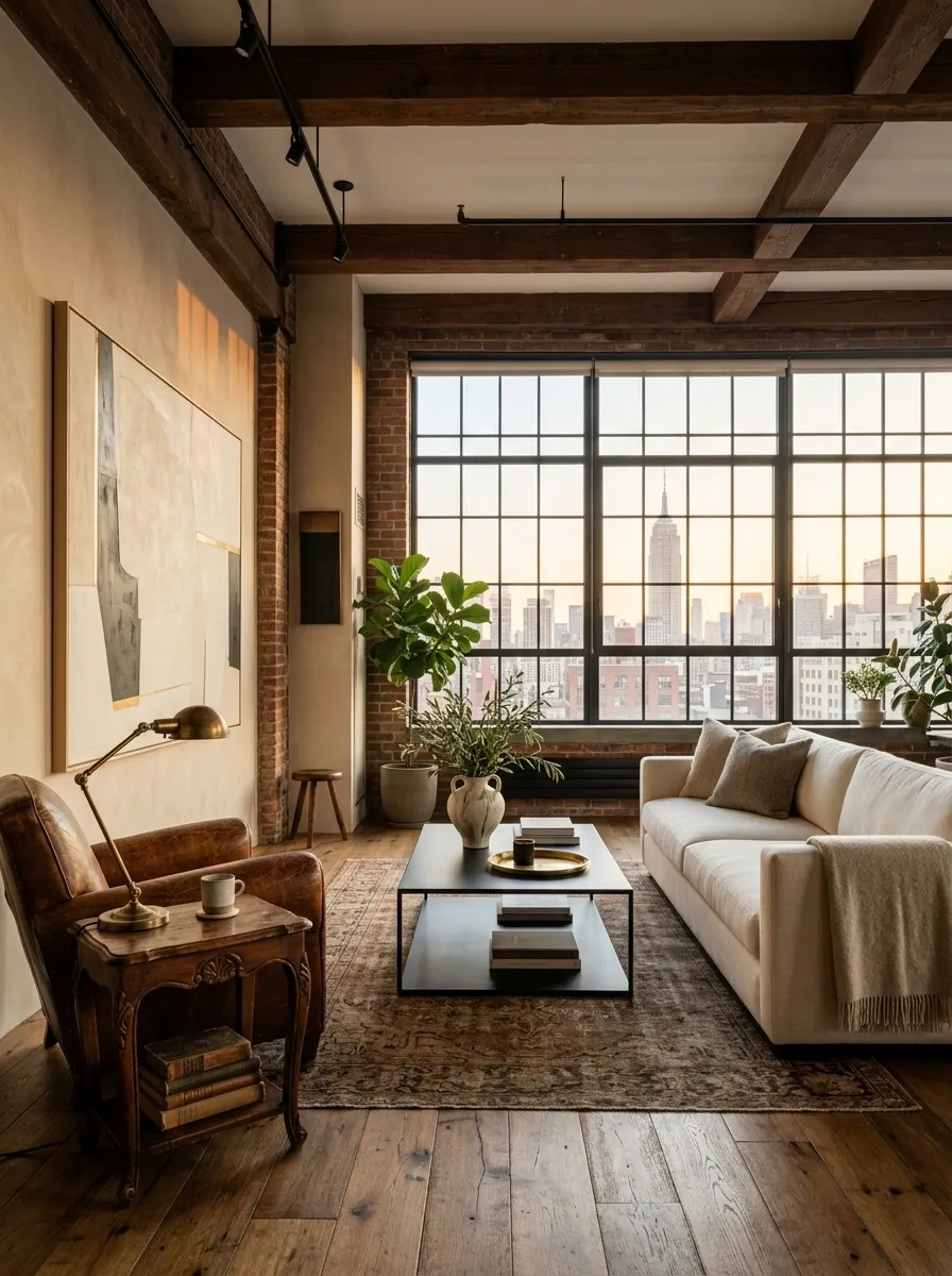
A room full of brand-new furniture can look strangely anonymous. Everything matches, everything coordinates, and somehow nothing has a personality. Tragic.
Break that showroom effect by mixing one or two pieces with an older visual character into cleaner modern furniture. A vintage-style side table beside a simple sofa works. So does an aged wood cabinet under a crisp TV setup.
The trick is contrast, not clutter. Keep the silhouettes clean, then let one piece bring scratches, patina, carved details, or a slightly unusual shape.
Choose a Coffee Table That Leaves Real Walking Space
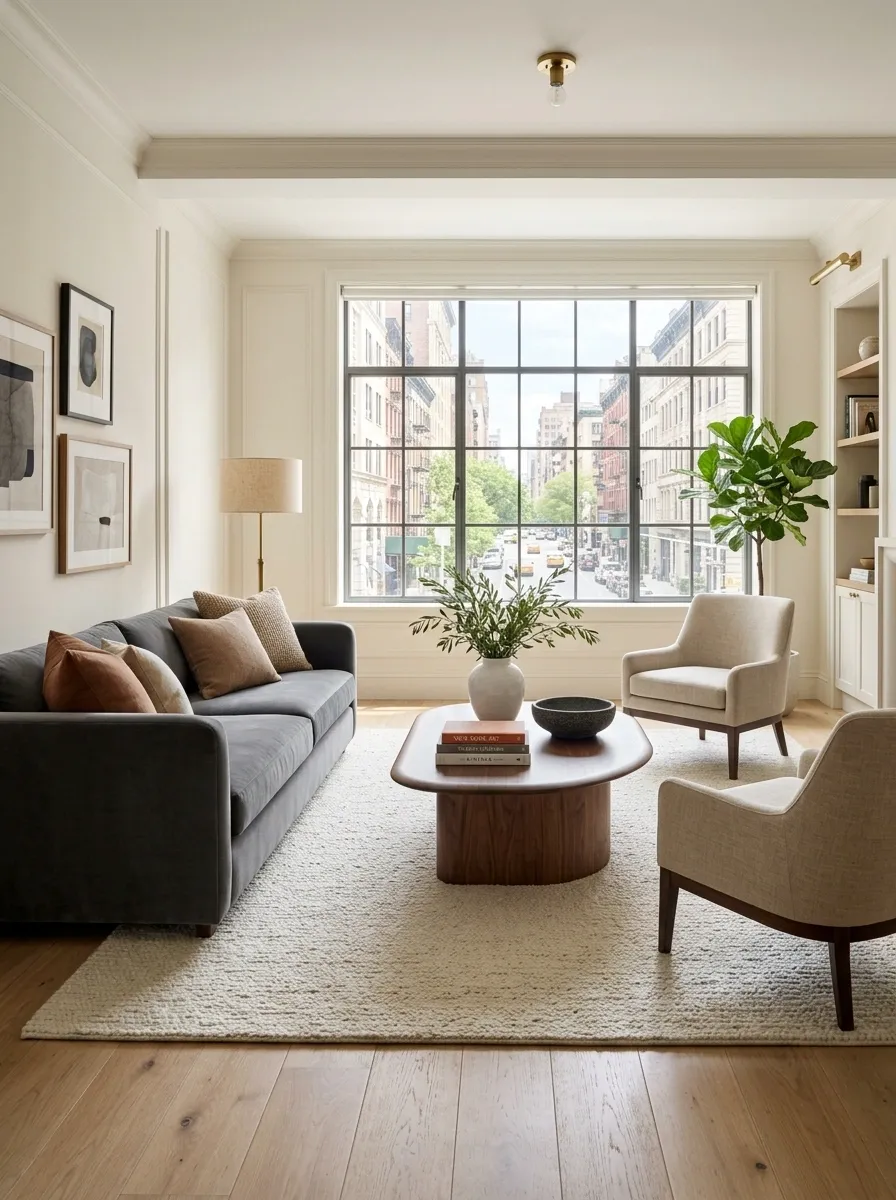
The coffee table should support the sofa, not become its roommate.
A chunky table shoved directly against the seating makes a compact room feel even tighter. Choose a piece with enough visual weight to anchor the sofa, then leave a comfortable path around it.
Round and oval shapes work especially well when the room has awkward corners or narrow routes because they remove hard corners from the traffic flow.
And please don’t pick the table first just because it looked cute in a showroom. The room gets a vote.
Make a Small Kitchen Look More Custom With One Material Repeat
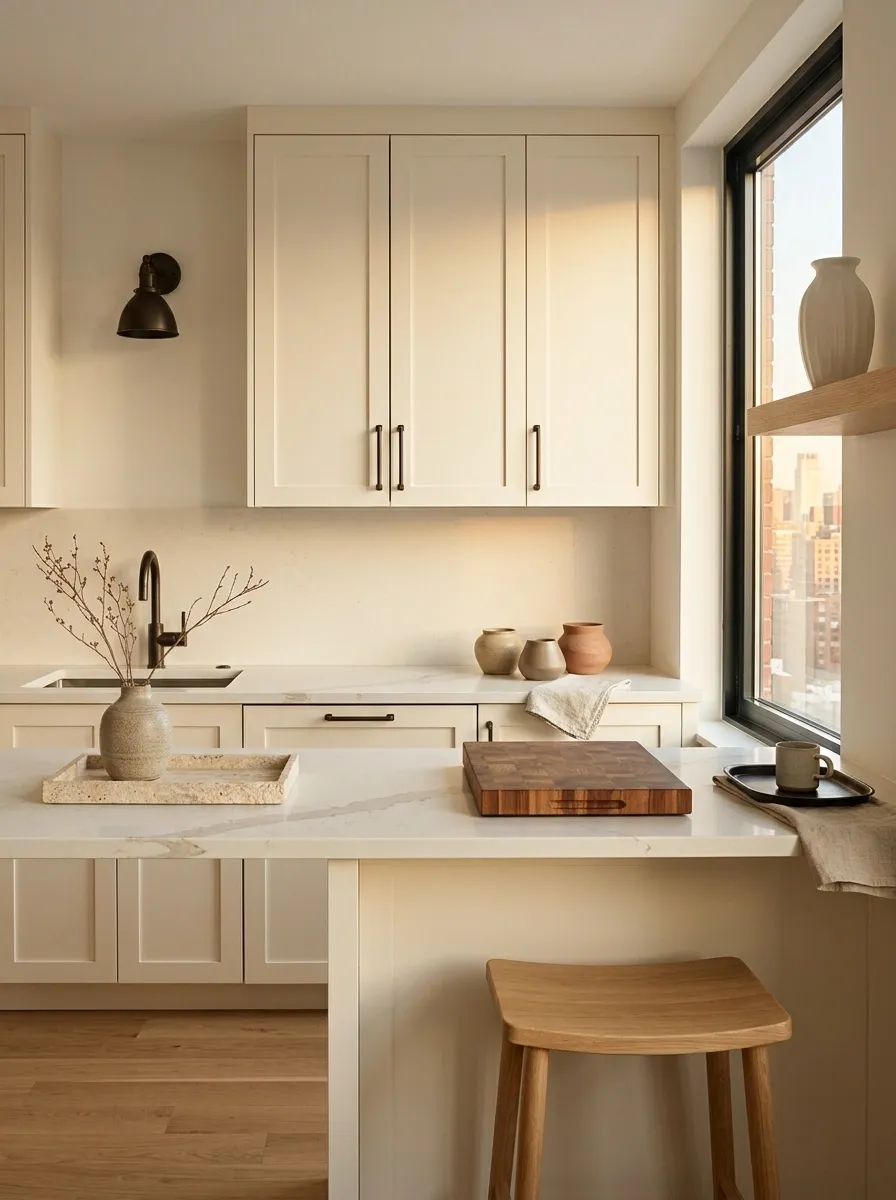
Small kitchens don’t need a renovation every time they look boring. They need repetition.
Repeat one finish or material in two or three places so the kitchen feels connected. Wood can appear on a cutting board and a stool. A warm metal can show up on cabinet pulls and a small lamp. Stone tones can repeat through a tray, vase, or countertop accessory.
That tiny bit of visual continuity makes ordinary cabinets feel more deliberate.
The mistake is collecting five unrelated finishes because each one looked good alone. Of course they did. So did every contestant before the group project started.
Use Open Shelving Like a Display, Not a Storage Dump
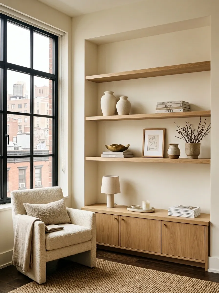
Open shelving only looks good when the eye gets somewhere to rest. If every inch is packed with mugs, jars, boxes, and appliances, it’s not styling. It’s a pantry with better lighting.
Keep the larger pieces toward the bottom or back, then leave visible gaps between groups. Mix practical objects with a few decorative pieces so the shelf feels lived in without looking chaotic.
The secret isn’t buying prettier stuff. It’s removing half the stuff already sitting there.
Add a Narrow Console Behind the Sofa
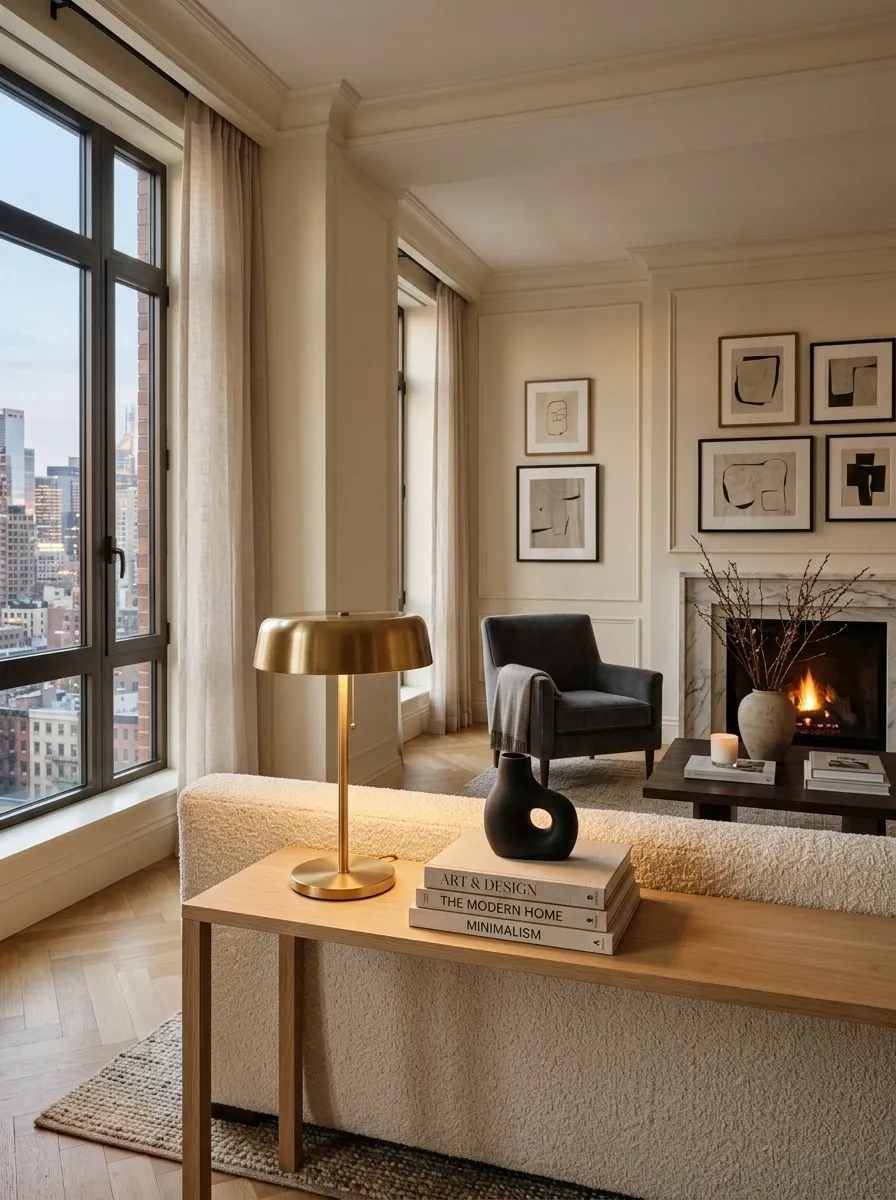
That awkward strip of floor behind the sofa is doing absolutely nothing, which is rude considering apartment space is basically real estate with walls.
A slim console can turn that leftover zone into useful visual structure. Keep it shallow enough that people can still move around the sofa comfortably, then use the surface for a lamp, a few books, or one sculptural object.
The trick is restraint. The console shouldn’t become a second junk drawer with legs.
Create a Window-Side Reading Spot From Almost Nothing
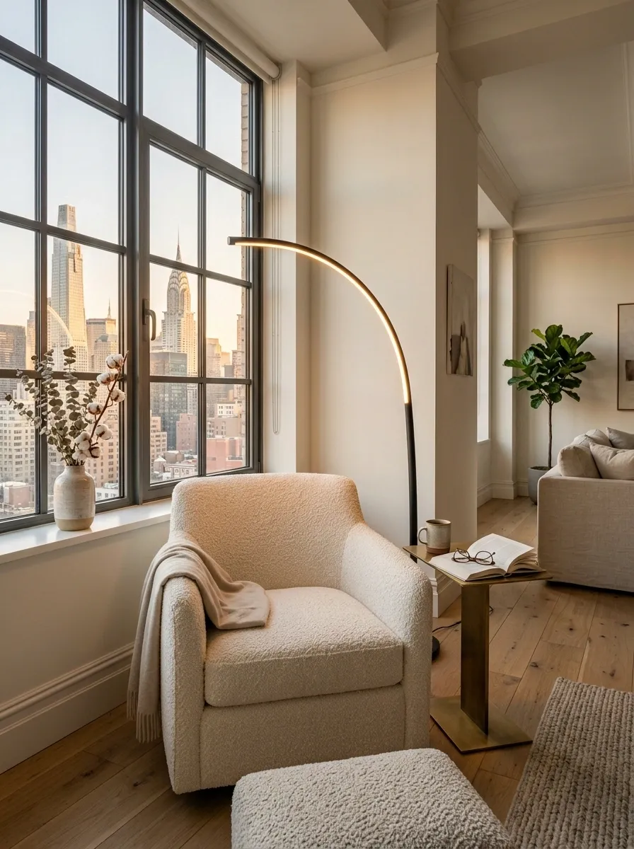
The corner beside a window doesn’t need a full furniture makeover. It needs a reason to exist.
Place one comfortable chair near the natural light, add a slim side table, and give the area one warm lamp for evening use. A folded throw or a small footstool can finish it without turning the corner into a furniture convention.
This works especially well in apartments where the living room has one bright edge and several sad little corners.
The goal is simple: make the space feel useful instead of merely available.
Use Mirrors to Bounce Light Through Darker Rooms
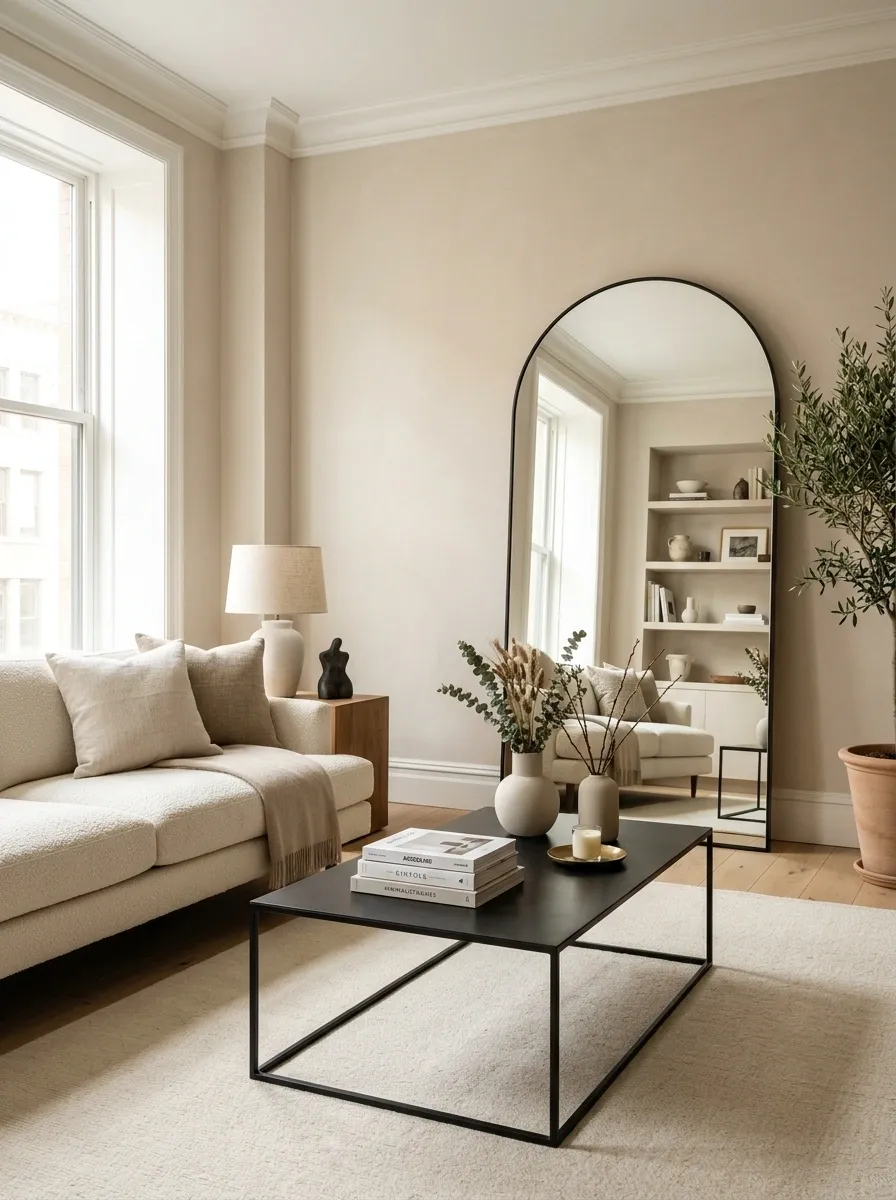
A mirror isn’t just there for outfit checks before leaving the apartment. Put it in the right place and it becomes part of the lighting strategy.
Position a larger mirror where it can catch daylight from a window or reflect a brighter part of the room. Leaning one against a wall can feel more relaxed, while a properly hung mirror gives a cleaner architectural look.
Don’t scatter tiny mirrors around the apartment hoping they’ll multiply the light. That’s not interior design. That’s a very expensive funhouse.
Let Wood Bring Warmth Into an Otherwise Clean Interior
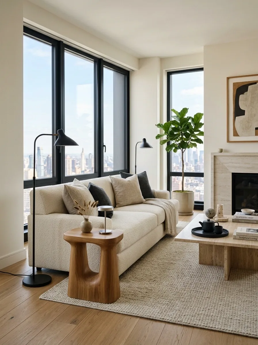
Clean furniture needs something with texture beside it, or the room starts looking like a showroom waiting for a customer.
Wood fixes that fast. Bring in a warm wood stool, side table, bench, cabinet, or even a substantial cutting board in the kitchen. Keep the shape simple so the material gets to do the talking.
Don’t try to match every wood tone perfectly. That level of coordination can make a home look strangely manufactured.
A little variation feels collected. Five nearly identical finishes can feel like the furniture department had a meeting.
Layer Several Small Light Sources Instead of Relying on the Ceiling Fixture
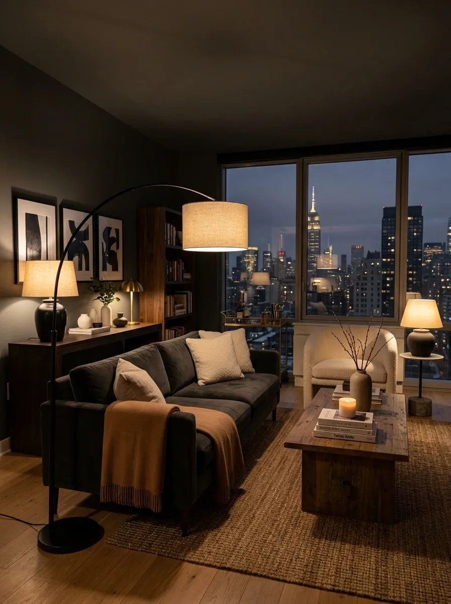
One ceiling light doing the entire job at night is how a beautiful apartment turns into a waiting room at 8 p.m.
Spread light around the room instead. Use a floor lamp near seating, a table lamp on a console or side table, and a small accent light where a darker corner needs attention.
Each source should do something different. One lights the reading spot. Another washes a wall. Another gives the room a soft glow from across the space.
Then turn off the overhead light. Suddenly the furniture starts looking like it was actually chosen on purpose.
Keep a Tight Color Story Across the Main Living Areas
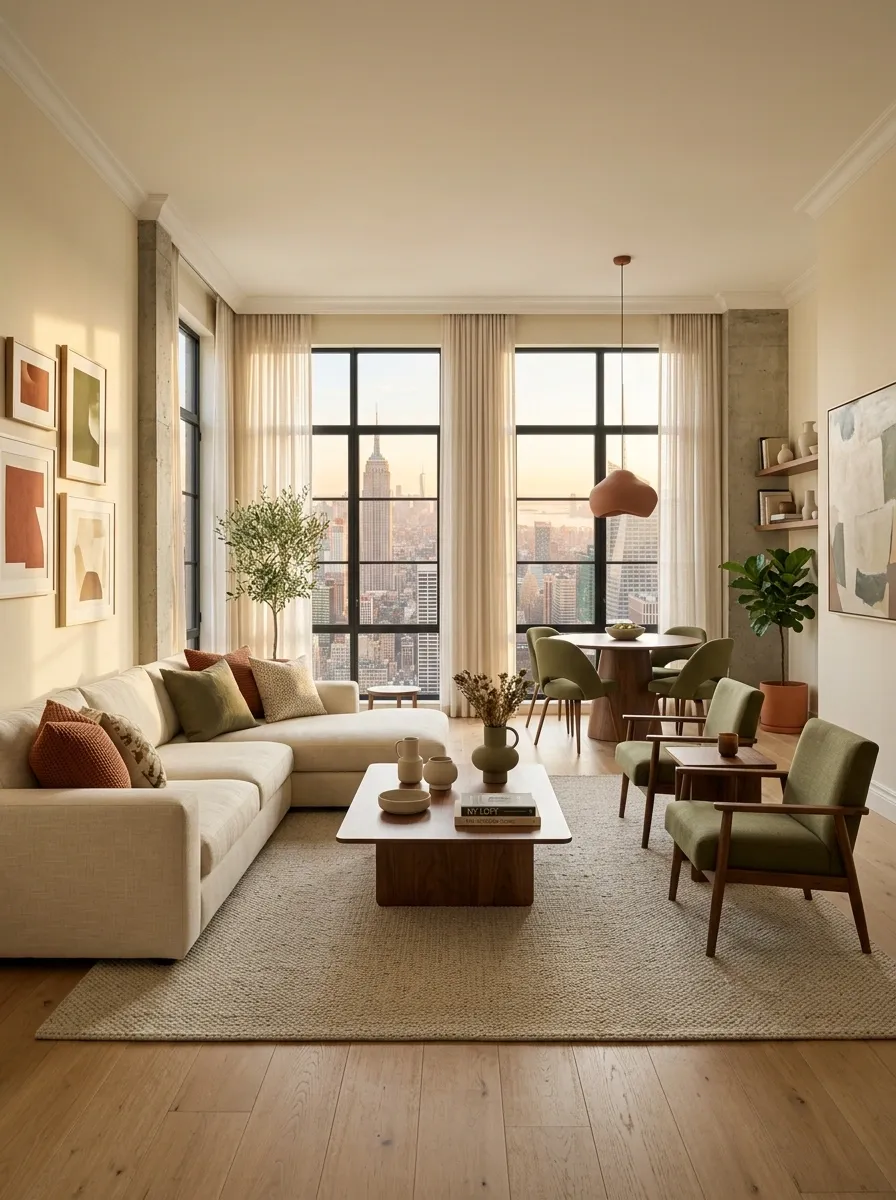
A stylish apartment doesn’t need every room painted the same color. It needs the colors to know they’re related.
Pick a small group of tones and let them repeat through upholstery, rugs, curtains, art, and accessories. The repetition makes separate areas feel connected, which matters even more in an open-plan apartment.
Keep the loudest color in smaller doses. If the sofa, rug, curtains, artwork, and cushions are all competing for attention, the room has stopped having a color story and started having a custody battle.
Use One Dramatic Chair to Break Up a Basic Sofa Setup
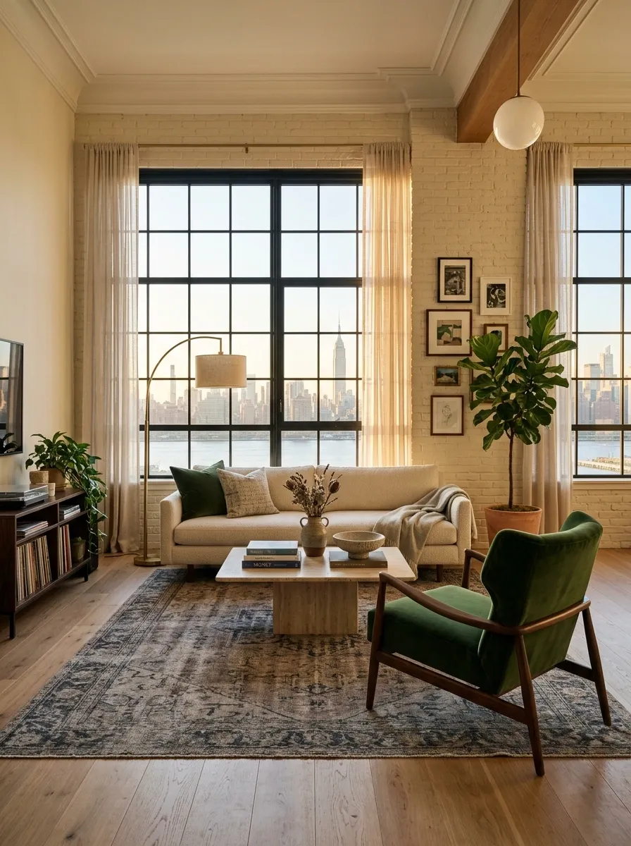
A sofa plus matching loveseat plus matching chair is the furniture equivalent of showing up in the same outfit as your entire group chat.
One distinct chair breaks that repetition immediately. Look for a sculptural shape, a vintage-inspired frame, a rich fabric, or a color that quietly contrasts with the sofa.
Place it where it helps form a conversation zone instead of shoving it into a corner because that’s where the store suggested it belongs.
The chair doesn’t need to match. It needs to relate to the room’s scale and give the eye something unexpected to notice.
Turn a Blank Corner Into a Useful Mini Zone
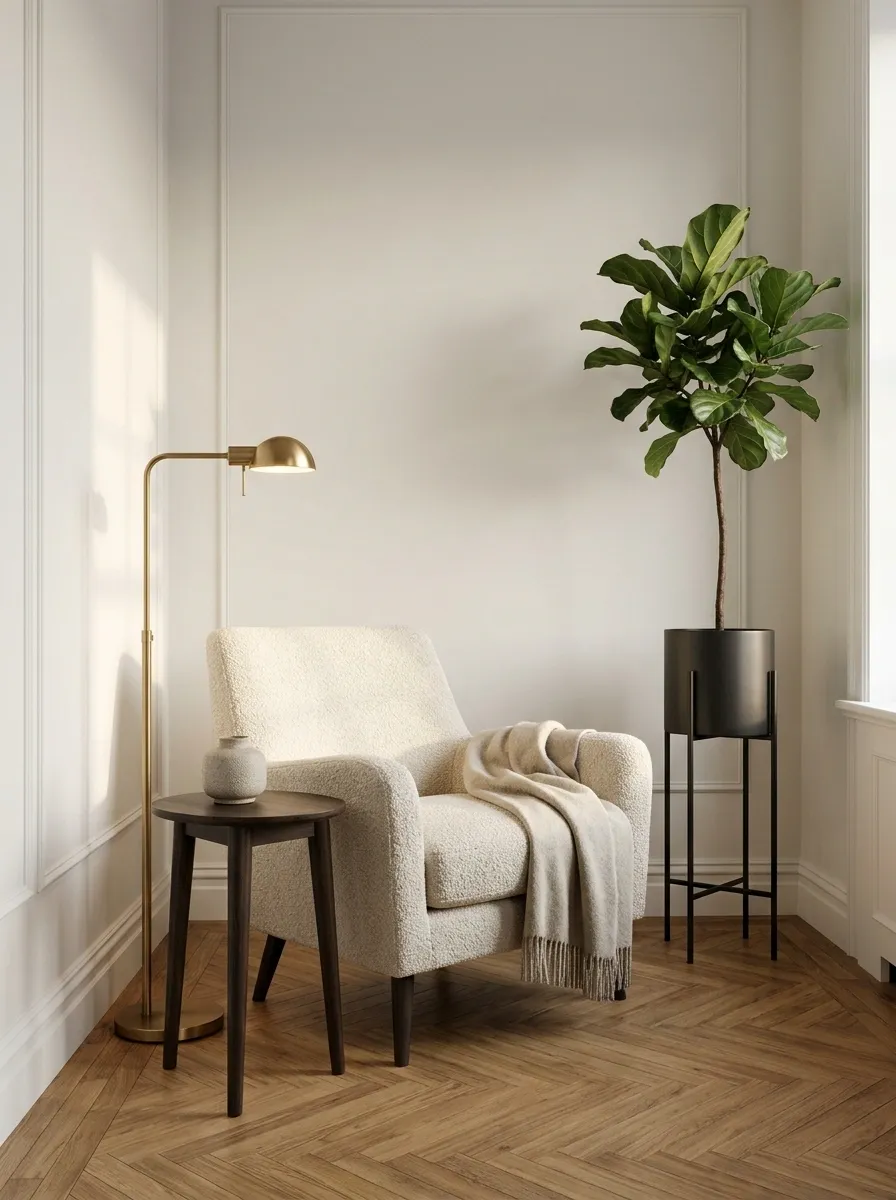
That empty corner isn’t automatically minimalist. Sometimes it’s just an unfinished sentence.
Give it one purpose. A compact desk creates a work zone. A narrow bookcase creates a reading corner. A tall plant stand adds height. A small stool and lamp can create a landing spot without demanding much floor space.
Don’t pile three functions into the same corner just because there’s room. Pick one job, give it a clear boundary, and stop.
The apartment will feel larger when every zone makes sense instead of looking like furniture was parked wherever the floor happened to be empty.
Choose Bedding That Looks Relaxed Instead of Overstyled
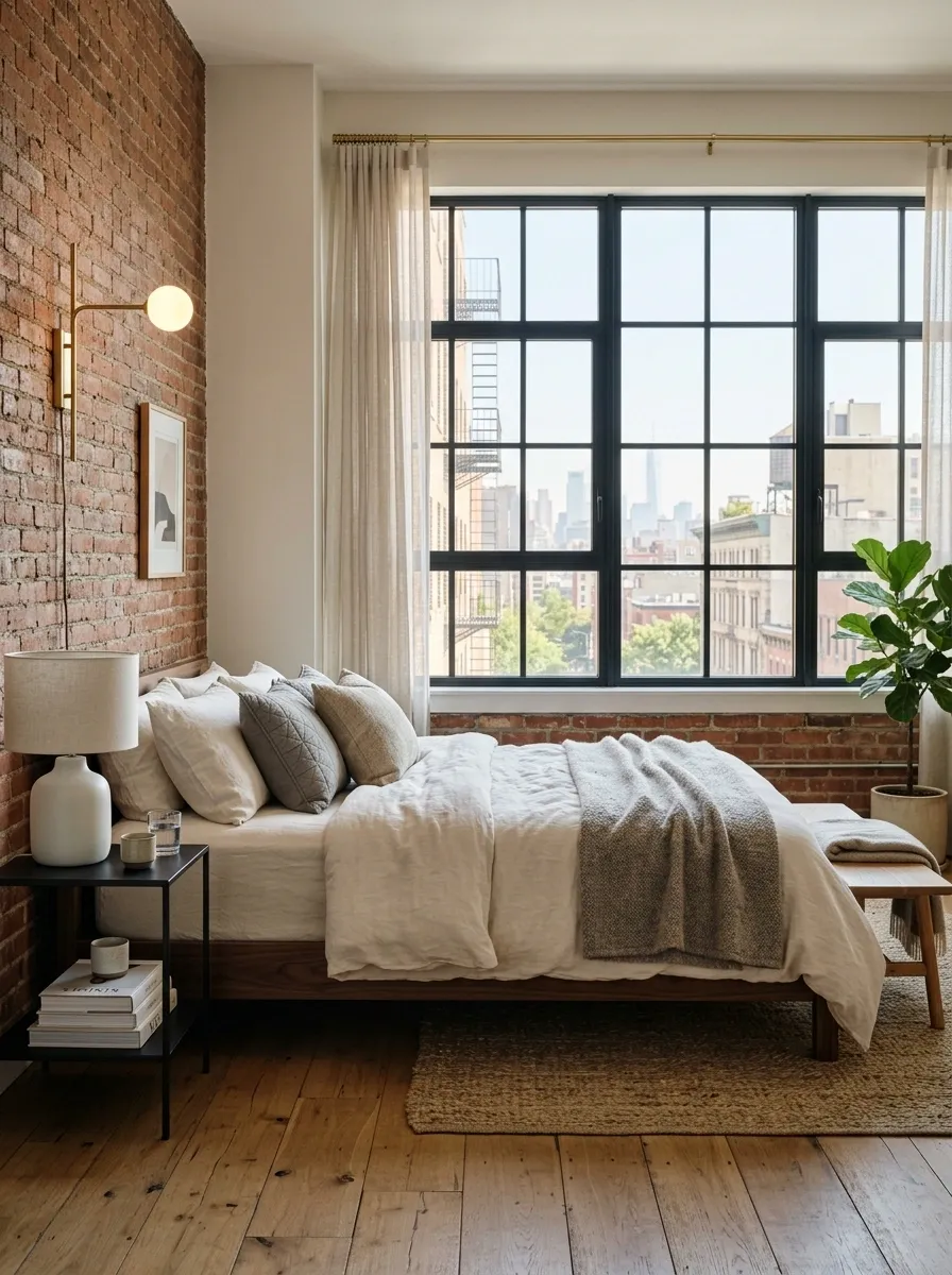
A bed can be technically tidy and still look like it belongs in a furniture catalogue nobody asked to visit.
Start with simple bedding in a restrained palette, then build softness through layers rather than a pile of decorative cushions. Let the duvet or quilt fall naturally, add one folded blanket near the foot, and use a small number of pillows with different textures.
The best part is the slight imperfection. A bed that looks too carefully arranged can feel cold.
Save the seventeen matching cushions for the showroom floor. The apartment has bills to pay.
Use Black Accents Sparingly for an Urban Edge
Black is useful because it gives a room a visual outline. Too much of it, though, and the apartment starts looking like every object was given the same eyeliner pencil.
Use black on small architectural details: a lamp frame, picture frame, curtain rod, stool legs, hardware, or a slender side table. Repeating the tone across a few places creates contrast without making the room feel heavy.
Keep the pieces spread around the room so the eye travels between them.
The trick is repetition, not saturation. Three smart black details beat a black-everything shopping spree.
Make Your Dining Area Feel Intentional Even in a Small Apartment
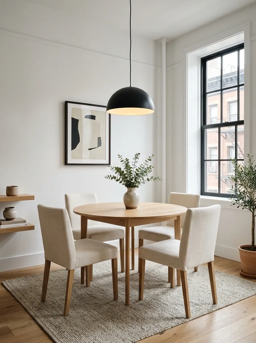
A dining table shoved against the nearest wall isn’t automatically a dining area. It’s a table experiencing an identity crisis.
Give the zone some visual structure. A compact round table can soften a tight layout, while a slim rectangular table works better when the room needs to preserve a clear path. Add one strong pendant overhead or a piece of art nearby so the area feels connected to the rest of the apartment.
Don’t over-furnish it. Four chairs, a table, and one good light can say far more than a six-piece dining set fighting for oxygen.
Style the Windowsill Instead of Adding Another Piece of Furniture
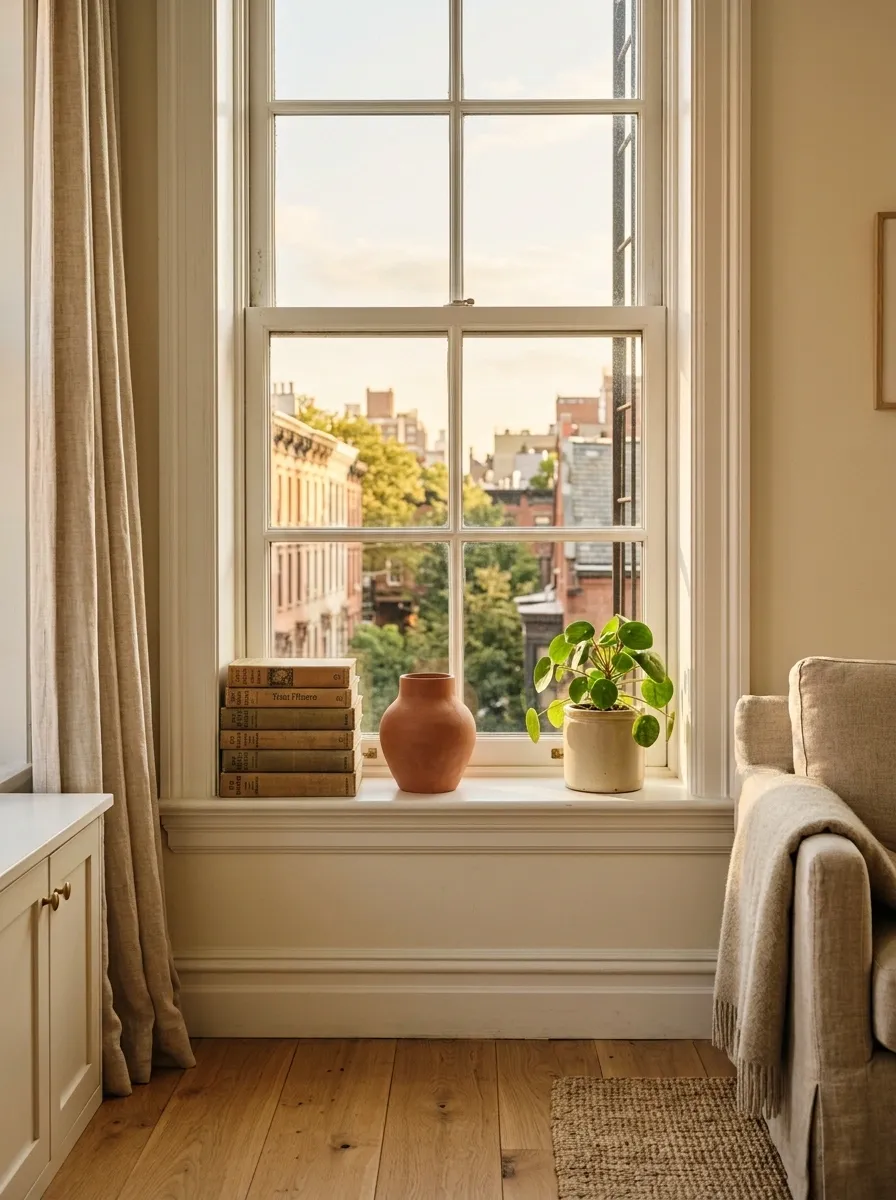
A windowsill is free display space. In an apartment, that’s basically a tiny miracle.
Use it for a small stack of books, a ceramic piece, a narrow planter, or one sculptural object. Keep taller items toward the ends so the middle doesn’t block the view or make the window feel boxed in.
This move works especially well in compact rooms because it adds personality without taking another inch of floor space.
And no, every windowsill doesn’t need twelve plants. The jungle can remain somebody else’s problem.
Use Vintage-Looking Frames to Give Walls More Character
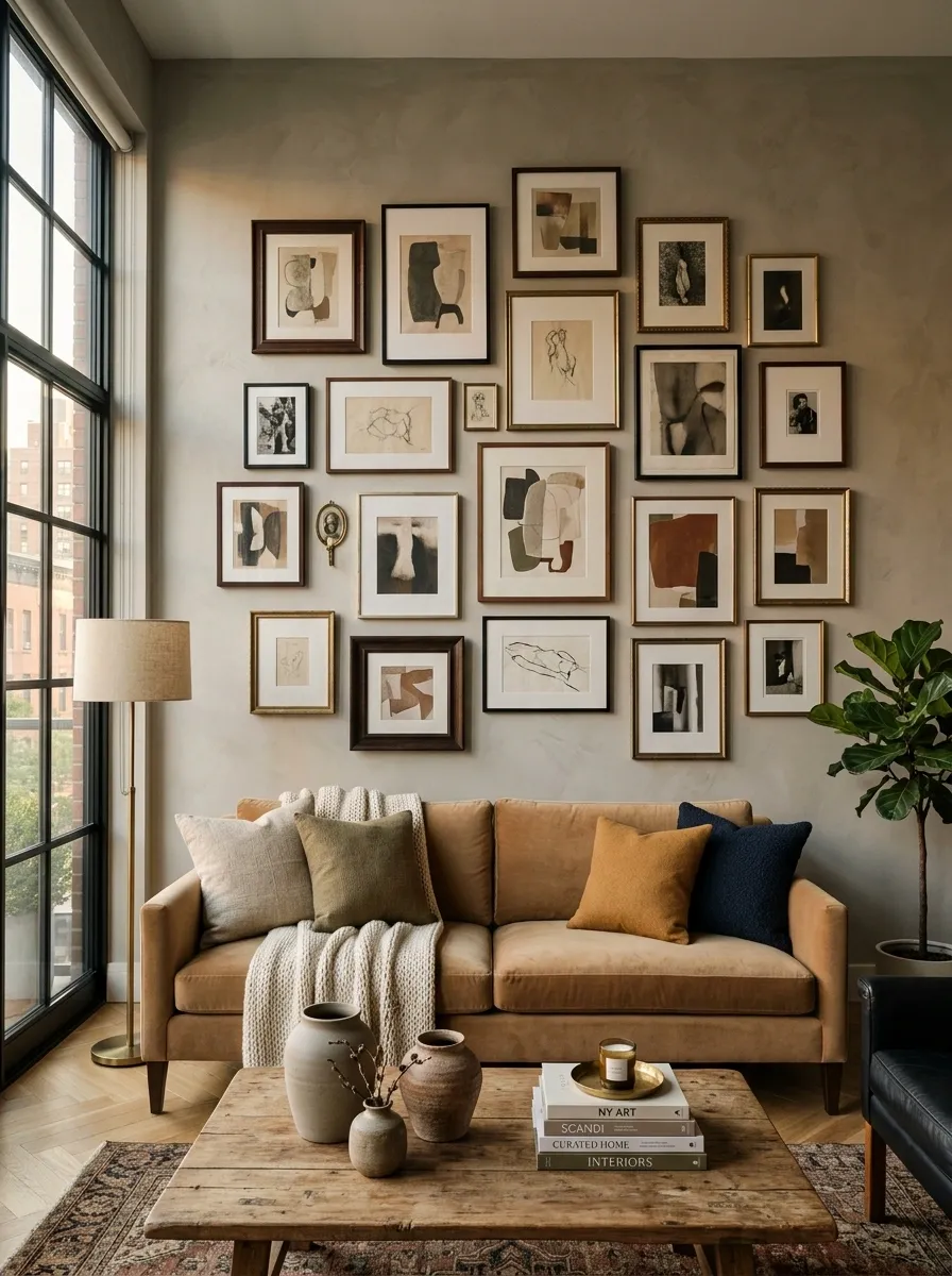
A wall full of matching frames can look suspiciously like it was ordered in one click.
Mix frame finishes instead. Pair a dark wood frame with a thin metal one, then bring in one warmer or more worn-looking frame to stop the arrangement from feeling too polished. The artwork itself can stay relatively simple.
For a gallery wall, vary the sizes while keeping a visual connection through color or subject. For one larger piece, an older-looking frame can make even a modern print feel more collected.
Basically, the wall should look like it has a backstory, not a shopping cart.
Hide Everyday Clutter With Furniture That Works Harder
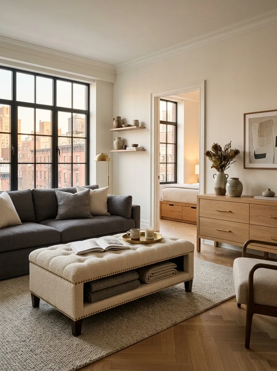
Stylish apartments still contain chargers, blankets, paperwork, remotes, shoes, and all the other glamorous evidence of being alive.
The difference is where that stuff goes.
Choose furniture with hidden storage whenever possible. A storage ottoman can swallow blankets. A console with drawers can handle keys and cables. A bed with built-in storage can keep bulky extras out of sight without adding another cabinet to an already crowded room.
Prioritize pieces that solve a real problem before buying decorative storage for the sake of having decorative storage.
Because buying a prettier basket for the same pile is still the same pile.
Add a Bold Pendant or Ceiling Light as a Focal Point
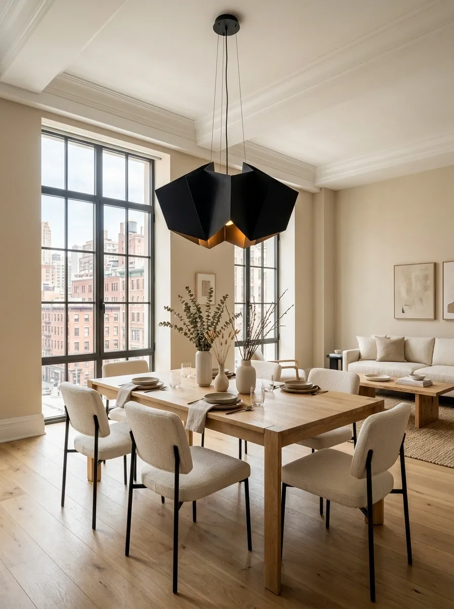
A ceiling light doesn’t have to be the boring thing in the room that everyone ignores.
Use a pendant with a strong silhouette over a dining table, kitchen island, entryway, or other natural focal point. The fixture can introduce an interesting shape, material, or dark contrast without requiring the rest of the room to become dramatic.
Keep the surrounding area relatively calm so the light gets some visual space. That’s what makes a statement fixture feel intentional instead of noisy.
And yes, the ceiling deserves better than the builder-grade disk that came with the apartment.
Use Brass or Aged Metal Details in Small Doses
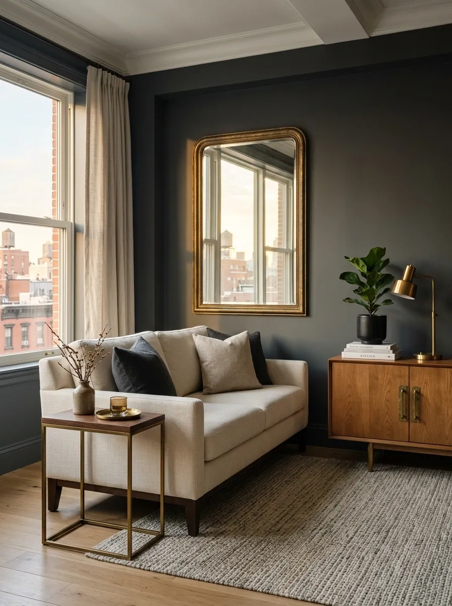
Warm metal can make an ordinary room feel more layered without demanding a whole furniture overhaul.
Use brass or aged metal on a mirror frame, lamp base, cabinet hardware, side table, or decorative tray. Keep the finish visible in a few strategic places so the eye notices a quiet connection.
Aged finishes work particularly well beside wood, cream upholstery, darker colors, and vintage-looking pieces. They add a little visual warmth without turning the room into a brass showroom.
The point is to repeat the metal quietly. Nobody needs their apartment to scream, “Hello, I just discovered hardware.”
Make the Bathroom Feel More Like a Boutique Hotel With Simple Layering
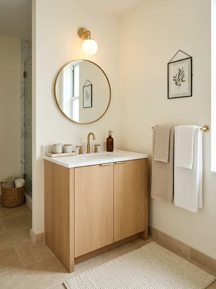
Bathrooms get left out of the decorating conversation, then everyone wonders why the apartment feels finished everywhere except the room with the mirror.
Start with better layers. Use a substantial bath mat, clean towels in one consistent palette, a small tray, and one useful decorative object such as a ceramic container or framed print.
Keep the countertop mostly clear. The bathroom instantly feels calmer when everyday products aren’t forming a skincare convention around the sink.
A warm light source also helps if the fixture allows it.
No renovation required. The bathroom just needed an adult present.
Repeat One Signature Detail From Room to Room
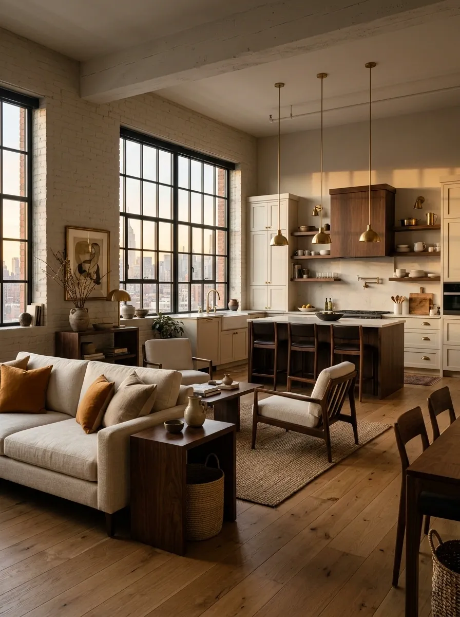
A stylish apartment feels connected because small details keep showing up.
Choose one signature element and repeat it across different spaces. That might be dark wood, warm metal, a particular shade, arched shapes, vintage-looking frames, or a certain textile texture.
Don’t copy the exact same object into every room. That’s how the apartment starts feeling like a hotel franchise.
Instead, repeat the idea in different forms. A dark wood stool in the kitchen can relate to a wood side table in the living room. Aged metal in the entryway can return through bathroom hardware.
The rooms don’t need to match. They need to recognize each other.
Finish With One Lived-In Detail That Keeps the Apartment From Feeling Staged
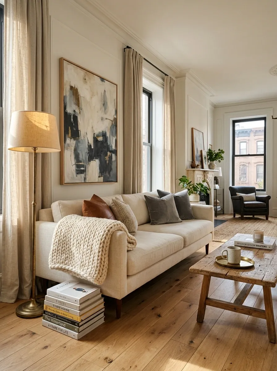
The last thing a stylish apartment needs is to look like nobody has ever actually used it.
Leave one or two signs of ordinary life in the right places. A stack of books beside the sofa. A folded throw resting naturally over a chair. A ceramic mug on a small tray. A few cookbooks near the kitchen. Something that says the room exists for living, not for photographing from one carefully approved angle.
Keep the detail contained. Clutter isn’t the goal.
The sweet spot is a room that looks polished at first glance, then reveals little traces of real life when you look closer.
The Finished Look Comes From Editing, Not Buying More
The stylish NYC apartment look isn’t built from a giant shopping list. It comes from noticing what the room is already doing badly and fixing that first.
Start with scale. Give the sofa room. Hang the curtains properly. Get the rug under the seating. Improve the lighting. Add one strong piece of art, one older-looking detail, and a little wood or warm metal where the room feels too cold.
Then stop.
That’s usually the part people skip. They keep adding things after the room already works, and suddenly the original problem has returned wearing twelve decorative objects.
A good apartment should feel considered, comfortable, and slightly collected. It doesn’t need to prove anything.
Save this list for the next time your apartment feels almost right but still somehow looks suspiciously like a furniture showroom with Wi-Fi.