
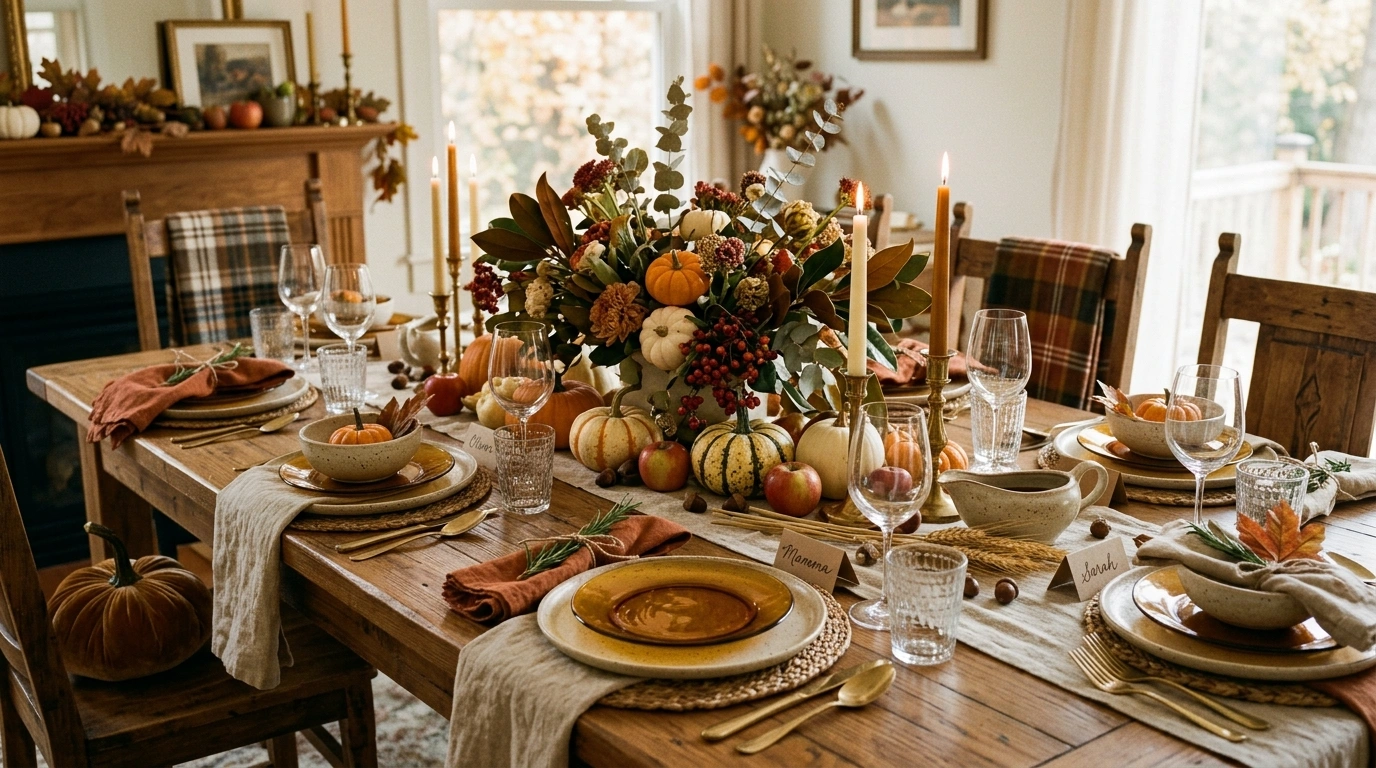
Thanksgiving tables get weirdly complicated. A few plates go down, then come the pumpkins, candles, flowers, napkin folds, leaves, little signs, another candle because there is apparently a shortage of candles, and suddenly the table looks more like a craft-store clearance aisle than somewhere people are supposed to eat.
The goal is simple: a table that looks intentional from across the room, still works when the food arrives, and gives guests somewhere to put their elbows. A surprisingly high bar, apparently.
The difference is rarely the number of pumpkins, candles, plates, or little decorative things fighting for attention. A good tablescape has a clear visual direction, then lets everything else behave accordingly. Revolutionary, apparently.
Thanksgiving Tablescape Ideas
Warm Pumpkin and Cream Tablescape With Natural Wood
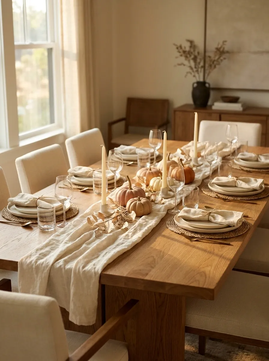
A warm wood dining table gives this setting its strongest foundation, while creamy linen keeps the overall scene light. Soft pumpkin tones appear through napkins, small seasonal accents, and scattered foliage rather than taking over the entire table. Cream ceramic plates, simple glassware, and slim candles keep the composition relaxed and usable.
The trick is restraint. The orange works because the table already has plenty of warmth from the wood and natural textures. Cover every surface in orange and suddenly dinner starts looking like a fall-themed retail display. Keep the pumpkins and foliage concentrated around the centerpiece, then let the wood and linen do the quieter work.
natural wood
cream linen + ceramics
pumpkin warmth
Keep the strongest orange close to the center of the table. The rest of the composition stays calm, which makes the seasonal color feel intentional instead of loud.
Elegant Burgundy and Brass Thanksgiving Table With Candlelight
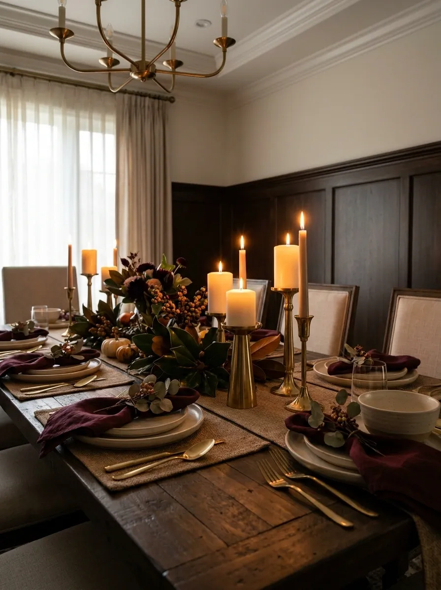
This table takes Thanksgiving into a darker, more polished direction with rich burgundy napkins, warm brass candleholders, cream dinnerware, deep foliage, and clusters of glowing candles. The dark colors feel especially rich against lighter plates, while brass gives the setting enough warmth to avoid becoming visually flat.
Spacing matters here. The brass should appear in several small moments instead of one giant metallic centerpiece trying to win an argument. Burgundy carries the drama, cream provides visual relief, and candlelight softens the deeper shades once the meal moves into the evening. The setting feels formal without looking like the dining room is auditioning for a royal banquet.
Rustic Farmhouse Thanksgiving Table With Linen and Dried Foliage
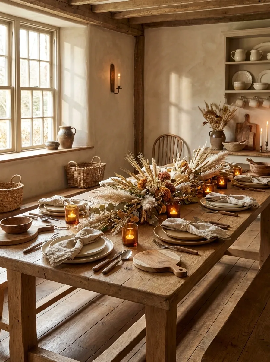
A long farmhouse table, softly rumpled linen, stoneware plates, wood serving pieces, dried grasses, and warm candles create a setting that feels gathered rather than staged. Nothing needs to be overly precious here. The beauty comes from repetition of natural materials and a palette that stays close to wheat, cream, tan, and warm brown.
The dried foliage works best when it stretches gently along the table instead of becoming a giant centerpiece in the middle. That keeps the long shape of the table visible and gives the setting an easy family-dinner feel. Add too many decorative objects and the farmhouse charm disappears fast. Suddenly it is just clutter wearing linen.
Soft: linen napkins and runner
Warm: dried foliage, candlelight, and earthy brown tones
The mix works because no single material dominates. Every surface gets a quieter partner.
Moody Forest Green and Burnt Orange Thanksgiving Tablescape
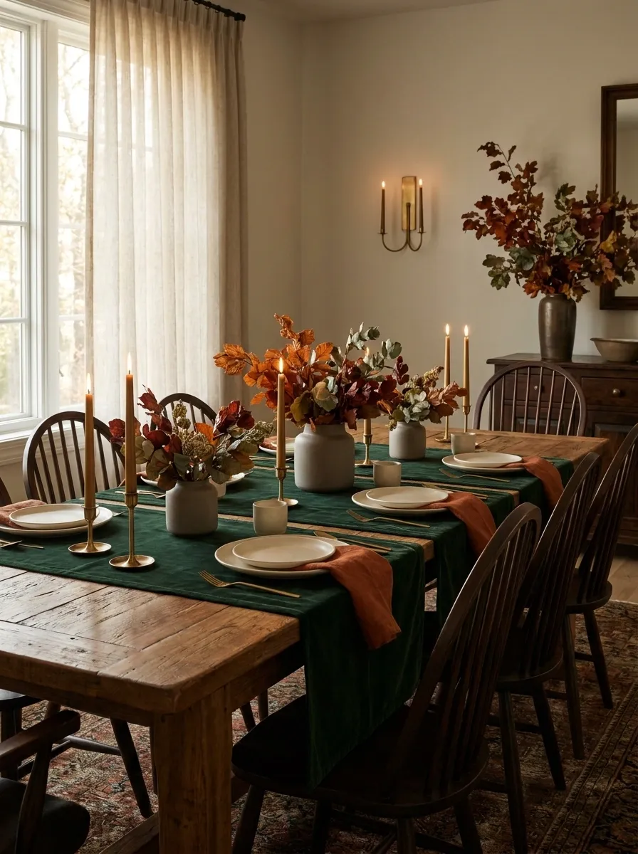
Deep forest green creates the backdrop here, with burnt orange napkins, warm wood, matte ceramics, and low seasonal foliage adding controlled flashes of autumn color. It feels richer than a traditional orange-and-brown table because the green gives the palette somewhere cooler to breathe.
The strongest feature is the balance between dark and warm elements. Keep the larger surfaces in green and wood, then let burnt orange appear in smaller, repeated moments around the place settings. That keeps the table dramatic without turning every inch into a different Thanksgiving color. The orange should make an entrance, not demand a microphone.
visual foundation Burnt orange
focused accent
Cream plates and small candle highlights keep the darker palette from swallowing the table.
Classic White Thanksgiving Table With Subtle Autumn Color
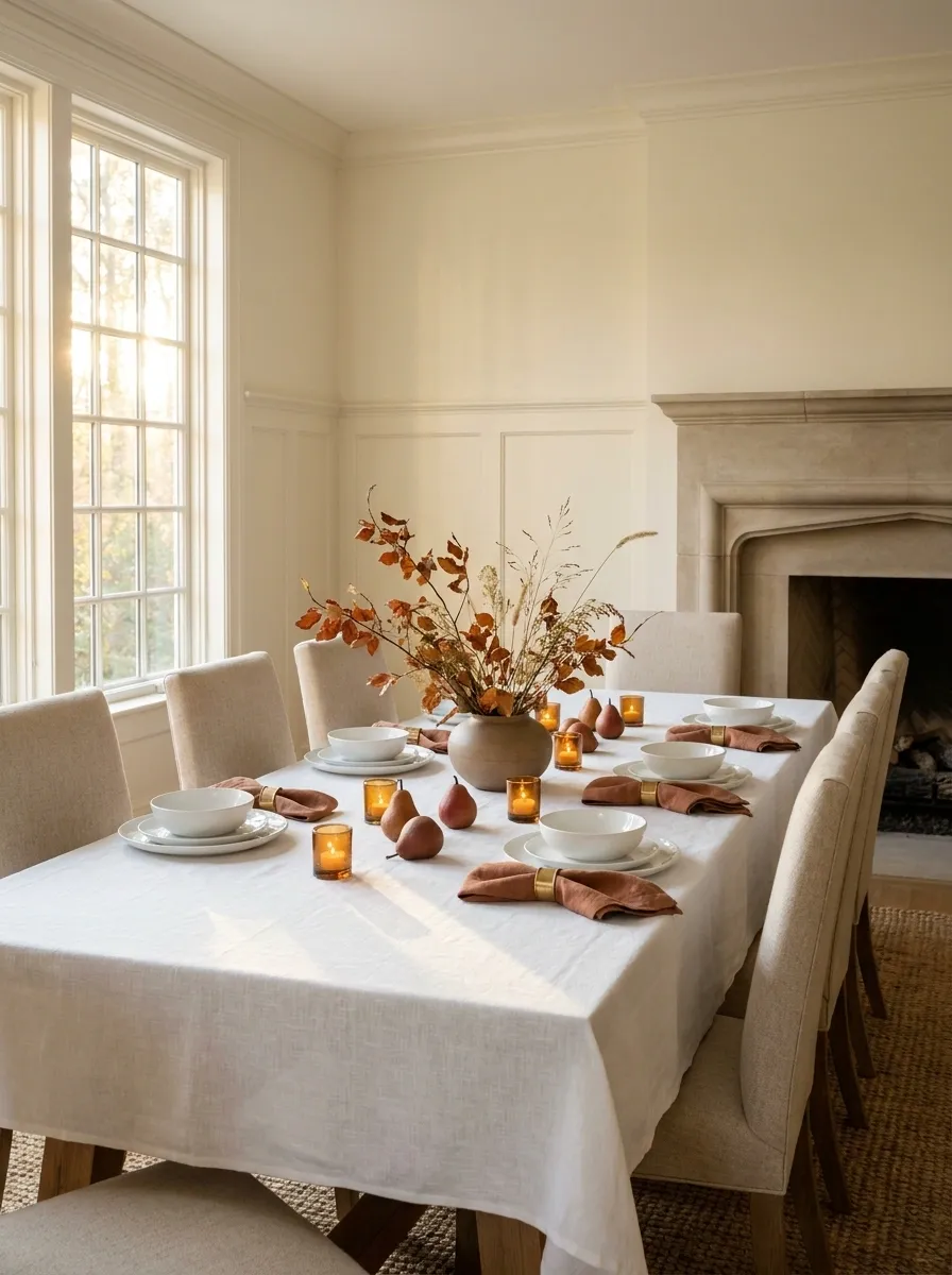
Crisp white linen and classic white dinnerware create a clean foundation, while muted rust, amber, and natural foliage quietly introduce the season. The overall effect is brighter and more refined than a table packed with traditional fall colors, but it still reads immediately as Thanksgiving.
The restraint is what makes this one work. Instead of adding orange to every place setting, use it selectively in napkins, fruit, foliage, or small centerpiece details. White gives those autumn tones plenty of room to stand out, while natural wood or woven textures keep the table from feeling too formal. The table knows it is Thanksgiving. It doesn’t need to announce it in all caps.
Rust + amber: selective seasonal accents
Natural texture: keeps the setting grounded
Collected Vintage Thanksgiving Table With Mismatched China
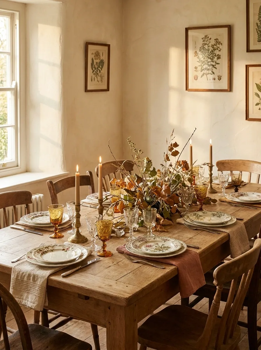
Vintage china gives this table its personality, with different floral patterns, old-fashioned glassware, aged brass, patterned napkins, and loose autumn stems gathered down the center. The plates don’t match, but the colors quietly repeat, which keeps the whole setting from looking like everyone brought one random dish from home.
That repetition is doing serious work. Cream, muted green, faded rust, and warm brown appear across several pieces, tying the mismatched tableware together. Keep the centerpiece slightly loose rather than perfectly arranged. The charm comes from the feeling that the table has stories behind it, not that someone spent six hours measuring every fork.
floral + botanical
cream + rust + muted green
vintage finishes
The plates can disagree on pattern because the palette keeps negotiating peace behind the scenes.
Minimal Thanksgiving Tablescape With Clay, Cream, and Wood
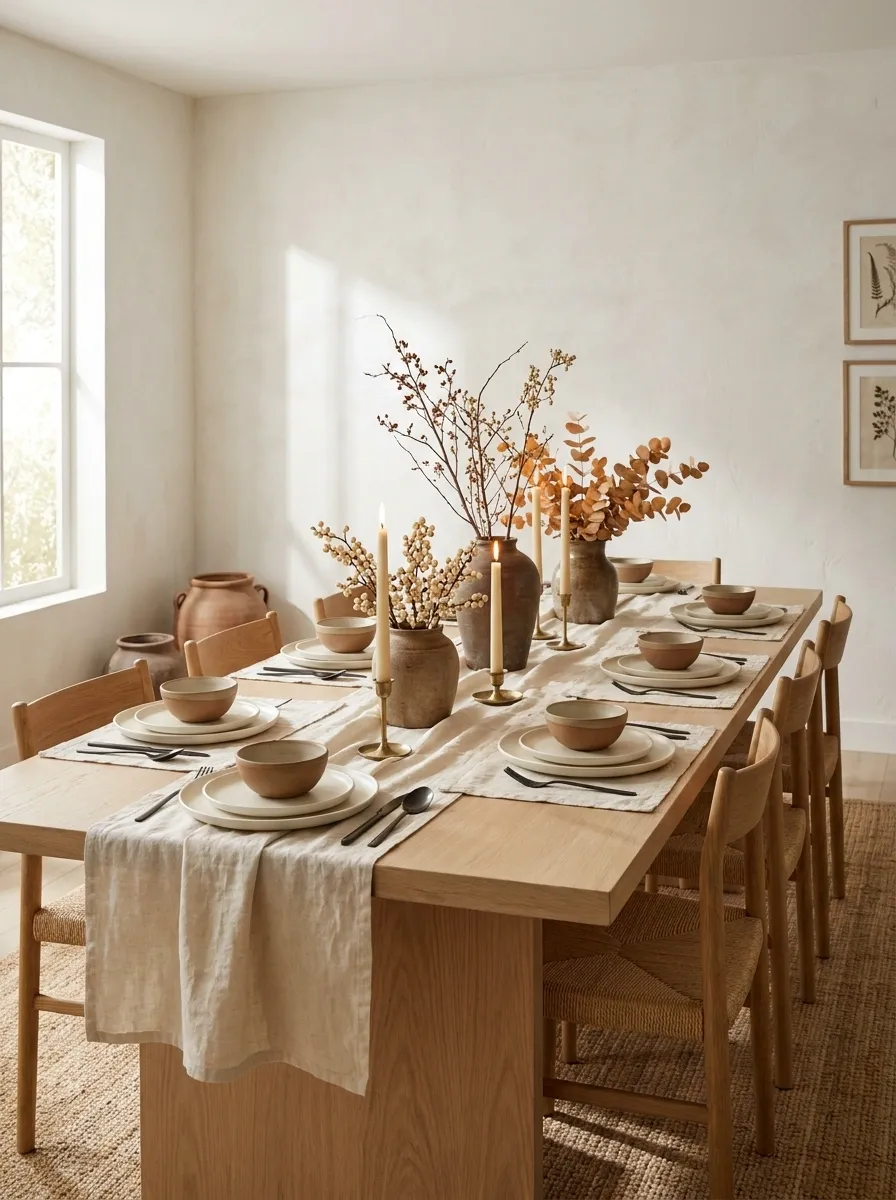
This setting strips Thanksgiving back to warm clay tones, creamy textiles, handmade-looking ceramics, pale natural wood, sparse foliage, and soft candlelight. There is no giant centerpiece demanding center stage. The table feels intentional because every material has room to breathe.
The strongest feature is the limited palette. Clay introduces just enough seasonal color without turning the table orange from corner to corner. Cream keeps the dinnerware light, while wood adds a little visual weight underneath everything. The result feels modern without becoming cold. And thankfully, there is no decorative turkey staring directly into the soul of every person trying to eat.
Layered Neutral Thanksgiving Table With Textured Linen
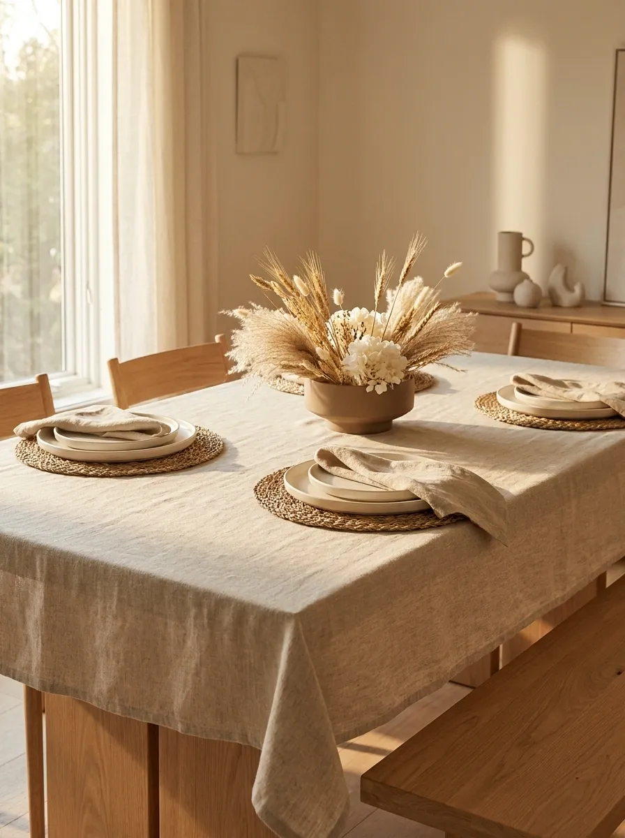
Oatmeal linen, ivory plates, beige napkins, woven placemats, light wood, and soft dried botanicals create a Thanksgiving table almost entirely through texture. There is very little strong color, so the eye starts noticing the differences between rough linen, smooth ceramics, woven surfaces, and natural wood.
That makes the table especially useful for anyone who likes a quiet dining room but still wants the holiday to feel special. The centerpiece stays restrained, allowing the textiles to become part of the visual story. Add too many colorful decorations here and the whole point disappears. This table is basically whispering, and somehow everyone can hear it.
soft, irregular texture
smooth, weighty contrast
warm natural grounding
Black and Copper Thanksgiving Table With Dramatic Autumn Foliage
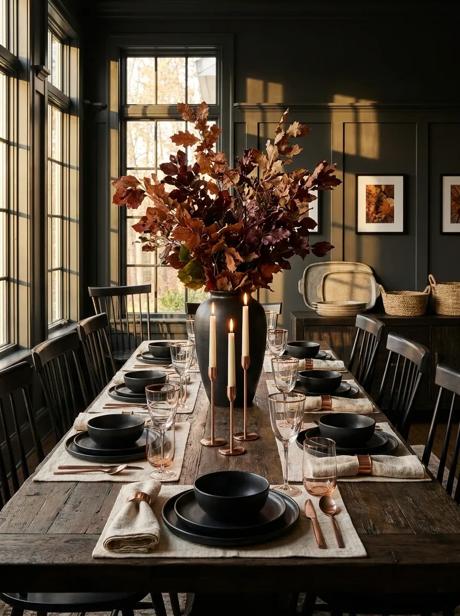
Matte black dinnerware creates the boldest element in this setting, balanced by copper accents, warm wood, creamy linen, and sculptural autumn branches. The table feels dramatic without relying on a complicated centerpiece because the contrast between dark surfaces and warm metallic details does most of the visual work.
Copper should stay scattered rather than concentrated in one place. A candleholder here, a subtle rim there, perhaps a little warmth in the glassware. That repetition makes the metallic finish feel connected to the entire table. Go too heavy on shiny copper and the table starts looking like autumn decor discovered a hardware aisle.
Small Thanksgiving Dinner Table With a Compact Centerpiece
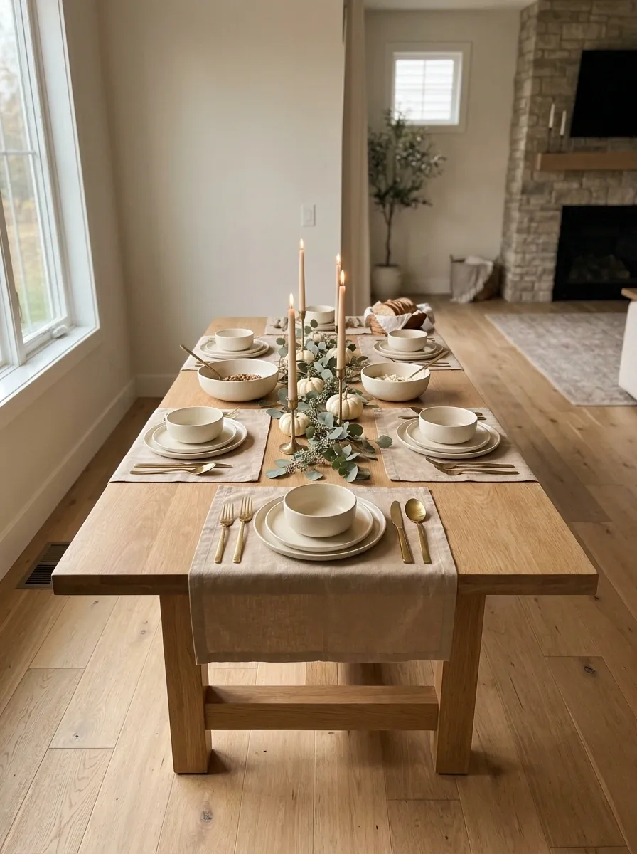
A smaller dining table doesn’t need a smaller personality. This setting uses a narrow centerpiece, streamlined cream dinnerware, warm linens, compact foliage, and candles arranged with enough breathing room for actual plates and serving dishes. The table feels festive without forcing guests to eat around a decorative obstacle course.
The centerpiece stays low and concentrated, which is especially important when the table is doing several jobs at once. Keep the larger visual elements near the centerline and allow the place settings to remain simple. Every inch matters here, and decorative clutter burns through those inches remarkably fast. Nobody wants to spend Thanksgiving moving pumpkins every time the potatoes arrive.
The table still feels layered because the visual interest comes from color, texture, and candlelight rather than width-hogging decorations.
Long Family-Style Thanksgiving Table With Shared Serving Pieces
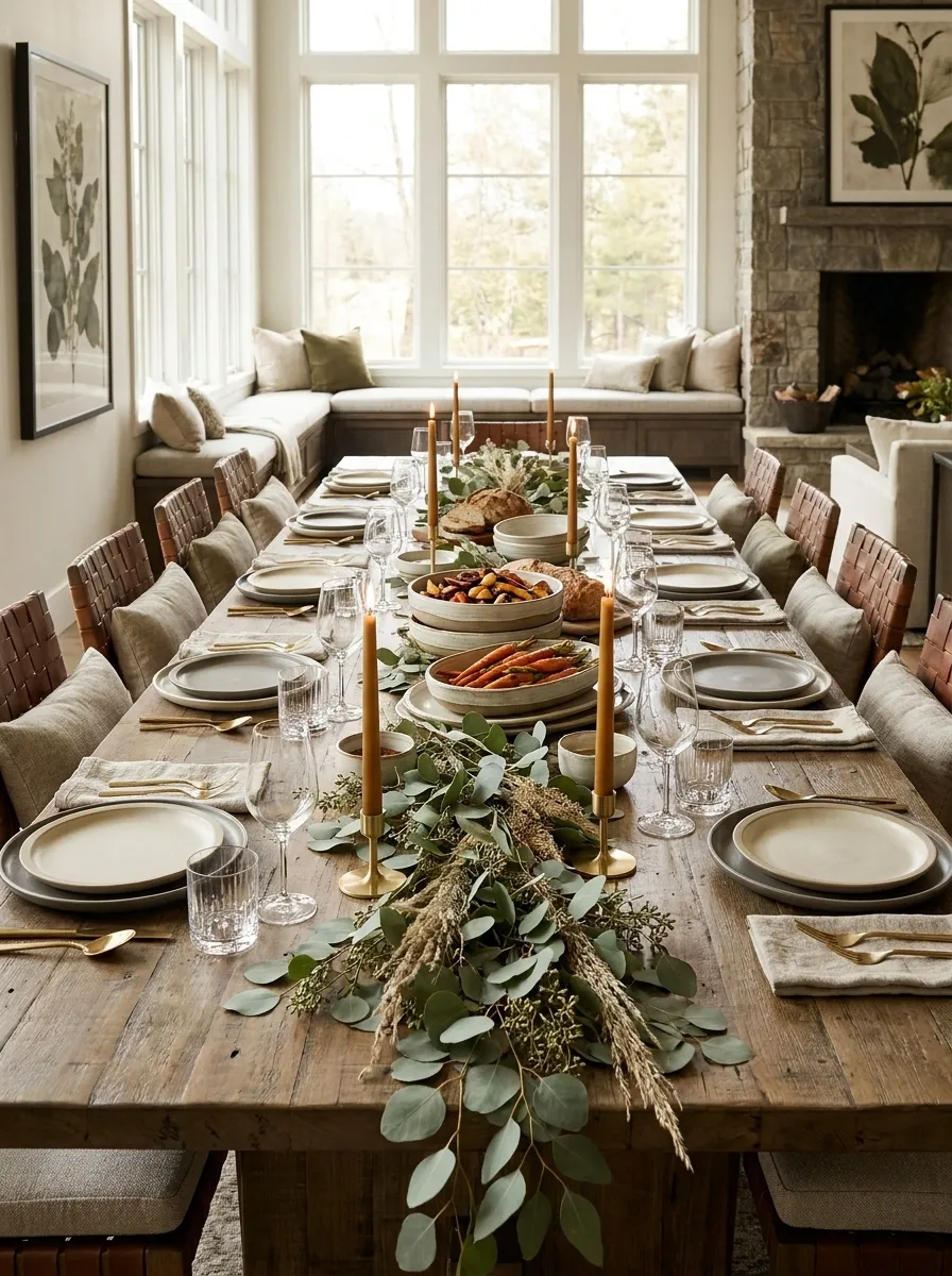
This long table is built around the meal itself. Place settings sit in clearly defined zones, while generous serving bowls, platters, bread boards, candles, and loose greenery run through the center. The result feels abundant without looking like every available inch has been decorated.
The important detail is the relationship between serving space and personal space. The centerpiece shouldn’t swallow the middle of the table because the food needs somewhere to land too. Keep decorative elements low and distribute them between serving pieces. Thanksgiving has enough dishes arriving from the kitchen without the centerpiece joining the traffic jam.
plate + glassware
serving dishes + low greenery
plate + glassware
Let the food share the visual stage with the centerpiece. A Thanksgiving table is allowed to look pretty and still remember what dinner is for.
Blue and Rust Thanksgiving Tablescape With Traditional Details
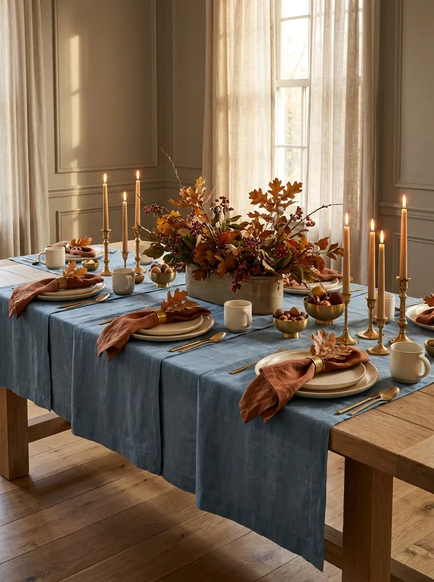
Dusty blue linens bring an unexpected cool note to this setting, while rust napkins, cream dinnerware, warm brass, and autumn foliage keep it firmly in Thanksgiving territory. The combination feels familiar enough for the holiday but avoids the predictable orange-and-brown formula.
Blue works best as the quieter background color here. Rust carries the seasonal energy, while cream plates interrupt the deeper tones and keep the table visually open. A few warm metallic details bridge the two sides of the palette. The result has personality without needing twelve different shades of fall. Orange can finally take the day off.
calmer foundation
seasonal emphasis
small connecting note
Candlelit Thanksgiving Table With Deep Plum and Amber Tones
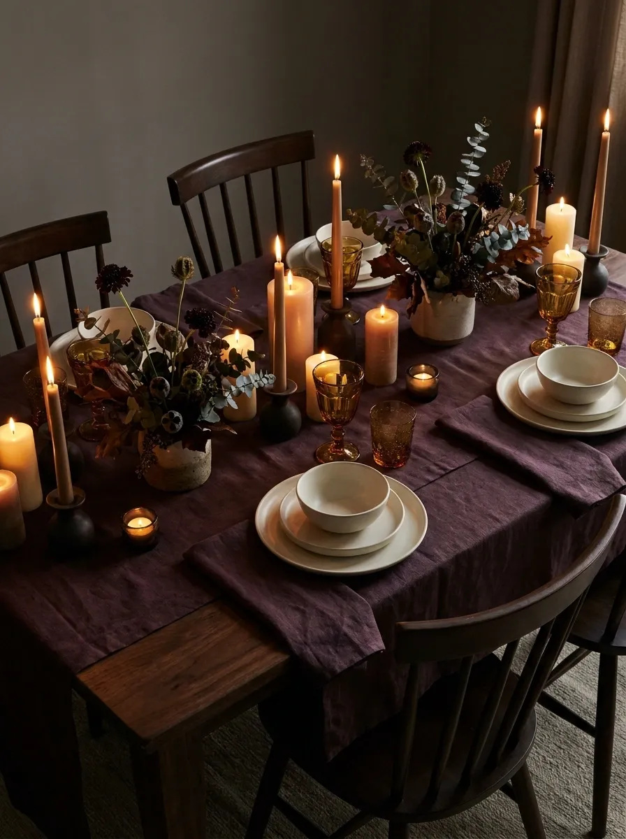
Deep plum textiles, amber glassware, dark foliage, creamy dinnerware, and scattered candles create an evening table that feels intimate rather than overly formal. The colors become richer as the light drops, while the warm candle glow softens the darker surfaces.
The key is keeping the illumination low but varied. Candles should appear at several points across the table instead of one giant glowing arrangement in the middle. Amber glass then catches that light and adds another layer without introducing a completely new color. The table basically does its own lighting design, because apparently overhead lights had to ruin everything eventually.
Organic Modern Thanksgiving Table With Stoneware and Olive Branches
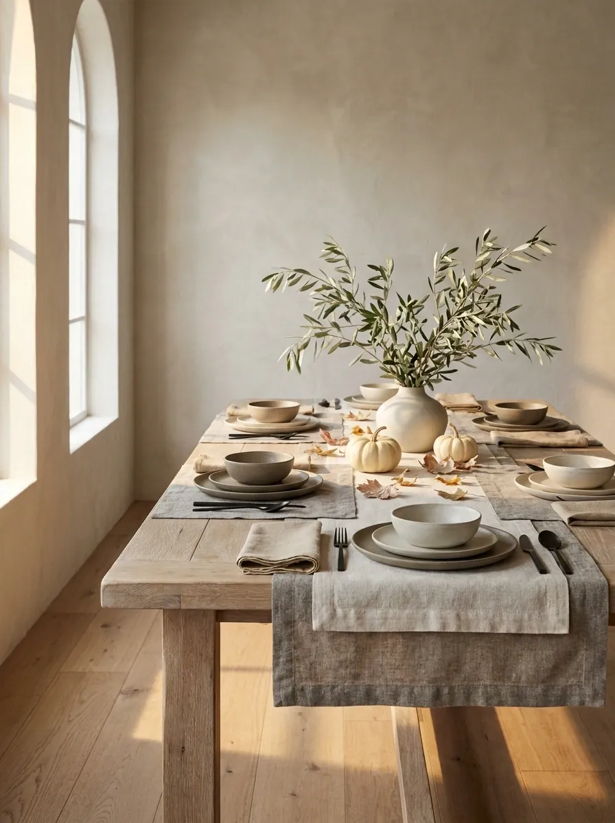
Handmade-looking stoneware, natural linen, pale wood, olive branches, and a few muted autumn accents give this table a relaxed modern character. The palette stays earthy, but the clean shapes of the dinnerware keep the setting from drifting into full rustic farmhouse territory.
The olive branches provide a quieter alternative to a traditional fall arrangement. Their thin stems and soft leaves add movement without creating a bulky centerpiece. Pair that natural shape with substantial stoneware and simple linens, and the table gets contrast through form as much as color. Nothing needs to scream “Thanksgiving” because the material mix is already doing the seasonal work.
Traditional Thanksgiving Table With Plaid Napkins and Taper Candles
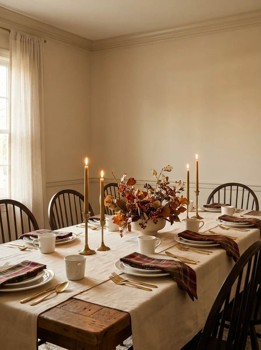
Warm cream linens, classic ceramic dinnerware, plaid napkins, brass candleholders, and full autumn foliage create a traditional Thanksgiving setting that doesn’t need much explanation. It feels familiar, warm, and layered without becoming fussy.
The plaid should be the main patterned element. Everything around it works better when the colors and surfaces stay comparatively calm, allowing the napkins to connect the place settings visually. Taper candles add height while the foliage fills the center horizontally. It is classic, warm, and unapologetically Thanksgiving. No trend report required.
Copper and Terracotta Thanksgiving Tablescape With Warm Ceramics
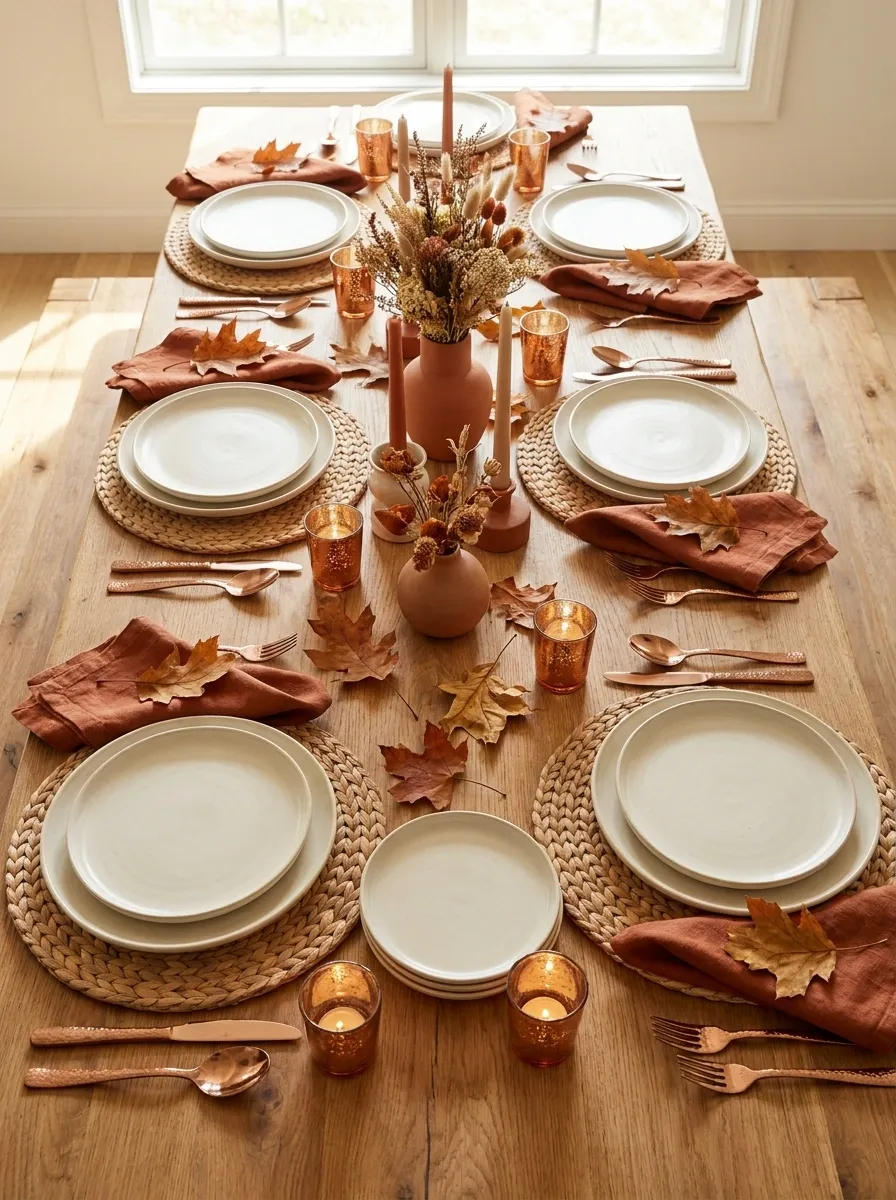
Terracotta napkins, softly hammered copper accents, cream stoneware, natural wood, and scattered autumn leaves give this table a warm, sun-baked quality. The colors sit close together, so the composition feels rich without needing a huge amount of decoration.
The copper is most effective when it appears in small flashes around the table rather than dominating the centerpiece. Terracotta carries more of the visual color, while cream dinnerware interrupts the warmer shades and gives the eyes somewhere to rest. The whole thing feels collected and earthy. Very little here needs to sparkle, which is convenient because Thanksgiving dinner already has enough competing for attention.
main seasonal color Cream
visual breathing room Copper
small reflective accents
Modern Black Dining Table With Soft Ivory Thanksgiving Styling
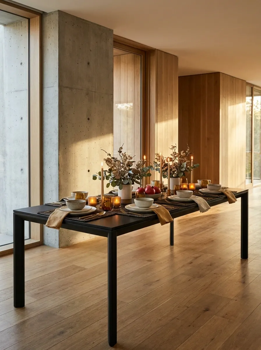
A deep black dining table becomes the architectural backdrop for ivory plates, warm linen napkins, understated foliage, and amber candlelight. The contrast is crisp, but the soft textures stop the setting from becoming overly severe.
The table surface carries enough visual weight that the styling can stay remarkably simple. Keep the dinnerware pale, use warm rather than icy whites, and allow a few natural elements to soften the edges. This is the Thanksgiving table for a dining room that already has strong modern architecture and doesn’t need another dozen decorative objects competing with it. The table has made its point. It can sit down now.
Dark surface first. Pale dinnerware second. Warm accents third. That order keeps the contrast sharp without turning the table into a monochrome showroom.
Cozy Cottage Thanksgiving Table With Floral China and Candles
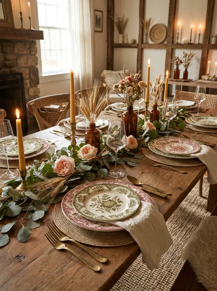
Floral china, soft linen napkins, aged brass, delicate glassware, loose autumn flowers, and warm candlelight create a cottage table with plenty of personality. The setting feels layered without becoming overly formal, largely because the patterns look gathered rather than coordinated by a committee.
The floral plates should remain the visual star. Keep the runner, napkins, and surrounding pieces quieter, pulling colors from the china instead of introducing unrelated shades. A few stems with an imperfect, slightly loose shape make the center feel alive without requiring a giant bouquet. It is charming, but not trying too hard. The table equivalent of showing up beautifully dressed and pretending it took five minutes.
Harvest-Inspired Thanksgiving Table With Gourds and Seasonal Produce
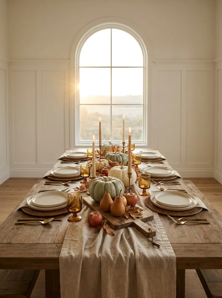
This tablescape leans fully into the abundance of harvest season, using gourds, pears, apples, autumn leaves, warm linen, wood serving boards, and simple stoneware throughout the setting. Rather than separating decor from the table, the centerpiece lets seasonal produce become part of the composition.
A long, low arrangement works especially well because fruit and gourds can spread naturally across the table without creating one oversized mound. Repeat a few shapes and colors, then leave clear gaps between groups. That keeps the abundance feeling intentional. More is not automatically more here. At some point, the centerpiece stops saying “harvest” and starts saying “the grocery delivery fell over.”
Group a few seasonal pieces, then give each group some empty table surface around it. The negative space is what keeps abundance from becoming visual traffic.
Elegant Neutral Thanksgiving Table With Pleated Linen and Gold Details
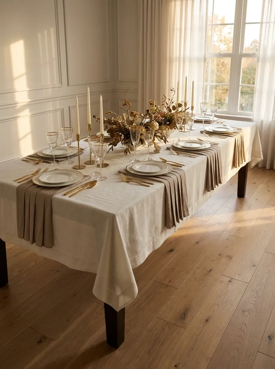
Ivory and taupe linens establish a soft neutral foundation, while pleated textures, refined dinnerware, delicate gold details, sculptural candles, and restrained foliage give the setting a formal finish. There is no need for bright orange here. The holiday character comes through warmth, texture, and carefully spaced metallic accents.
Gold works best in small repeated moments, such as flatware, candleholders, or subtle trim. The pleated linen adds enough surface interest to prevent the neutral palette from feeling plain, while sculptural candles introduce height without turning the center into a floral fortress. It feels polished and composed, but still like somewhere actual people are expected to eat.
primary texture
quiet color foundation
small repeated highlight
Casual Thanksgiving Table With Denim Blue and Warm Orange
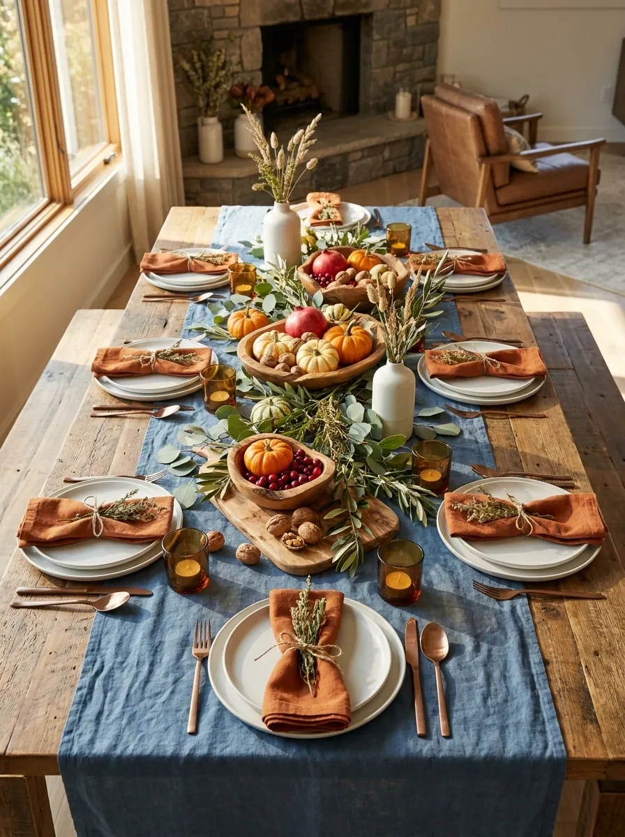
Denim blue textiles bring a relaxed, slightly unexpected base to this Thanksgiving table, while warm orange napkins, white stoneware, wood serving pieces, and loose greenery keep the setting seasonal. It feels welcoming rather than formal, with enough texture to make the table interesting without making dinner feel like an event with assigned seating and security clearance.
The cool blue is important because it keeps the orange from becoming overwhelming. Let blue handle the larger textile surfaces, then repeat orange in smaller moments around the place settings. White dishes create clean pauses between the stronger colors, while wood connects everything back to a natural, casual setting.
large textile surfaces
visual breathing room
small repeated accents
Rustic Black and Natural Wood Thanksgiving Tablescape
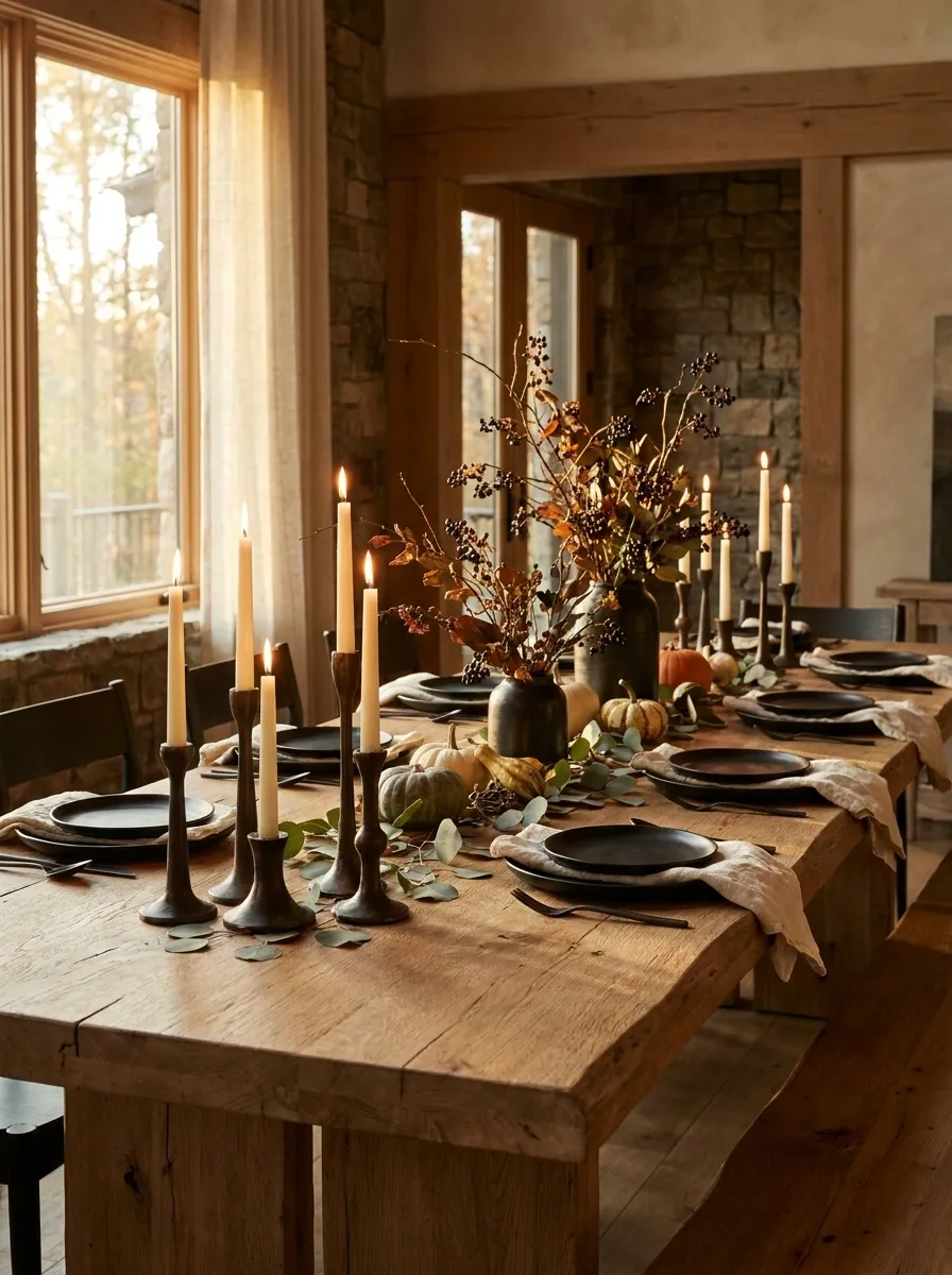
A substantial wood table anchors this setting with matte black ceramics, relaxed linen napkins, dark candleholders, and loose autumn branches. The combination feels rustic without leaning heavily on traditional orange, giving the table a stronger architectural quality.
Black brings visual weight, so lighter linen is important around the place settings. The wood then connects the dark pieces to the warmer side of the palette, while the branches introduce irregular shapes through the center. Keep the foliage loose and slightly imperfect. Too much symmetry would make the whole thing look like it was assembled with a ruler and a personal grudge against joy.
The palette stays grounded because every dark element gets a natural or light counterpart nearby.
Soft Blush and Terracotta Thanksgiving Table With Romantic Styling
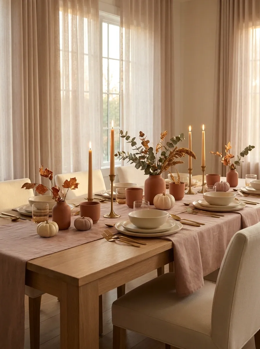
Muted blush linen, terracotta accents, creamy dinnerware, warm brass, and delicate autumn foliage create a softer Thanksgiving palette that feels romantic without drifting into spring territory. The colors are warm enough for the holiday but gentler than the usual saturated oranges and reds.
Cream should remain the visual bridge between blush and terracotta. Use terracotta in a few stronger moments, such as napkins or small vessels, then let blush occupy the larger textile surfaces. Brass adds a quiet golden note that catches candlelight and keeps the palette from feeling flat. It is basically proof that Thanksgiving can wear blush without filing a formal complaint.
Outdoor Thanksgiving Tablescape With Woven Textures and Foliage
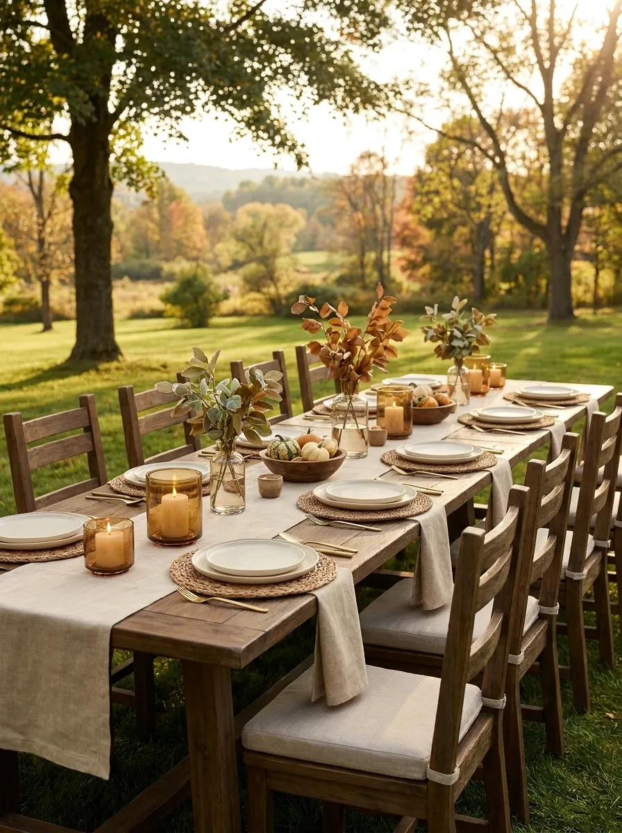
An outdoor Thanksgiving table feels strongest when the surrounding landscape becomes part of the design. This setting pairs natural linen with woven placemats, simple cream ceramics, wood accents, autumn foliage, and warm candlelight. The styling is relaxed, but the materials have enough texture to hold their own against an open-air backdrop.
Keep the tabletop colors close to the environment. Warm browns, muted greens, cream, and soft autumn tones sit comfortably beside natural foliage and wood. Woven textures add interest where an indoor room would normally provide architectural detail. And because wind has no respect for Pinterest, lightweight decorative pieces should stay sensible and stable.
Let the view do some of the decorating. The table doesn’t need to compete with the scenery.
Long Rustic Table With Layered Runner and Natural Branches
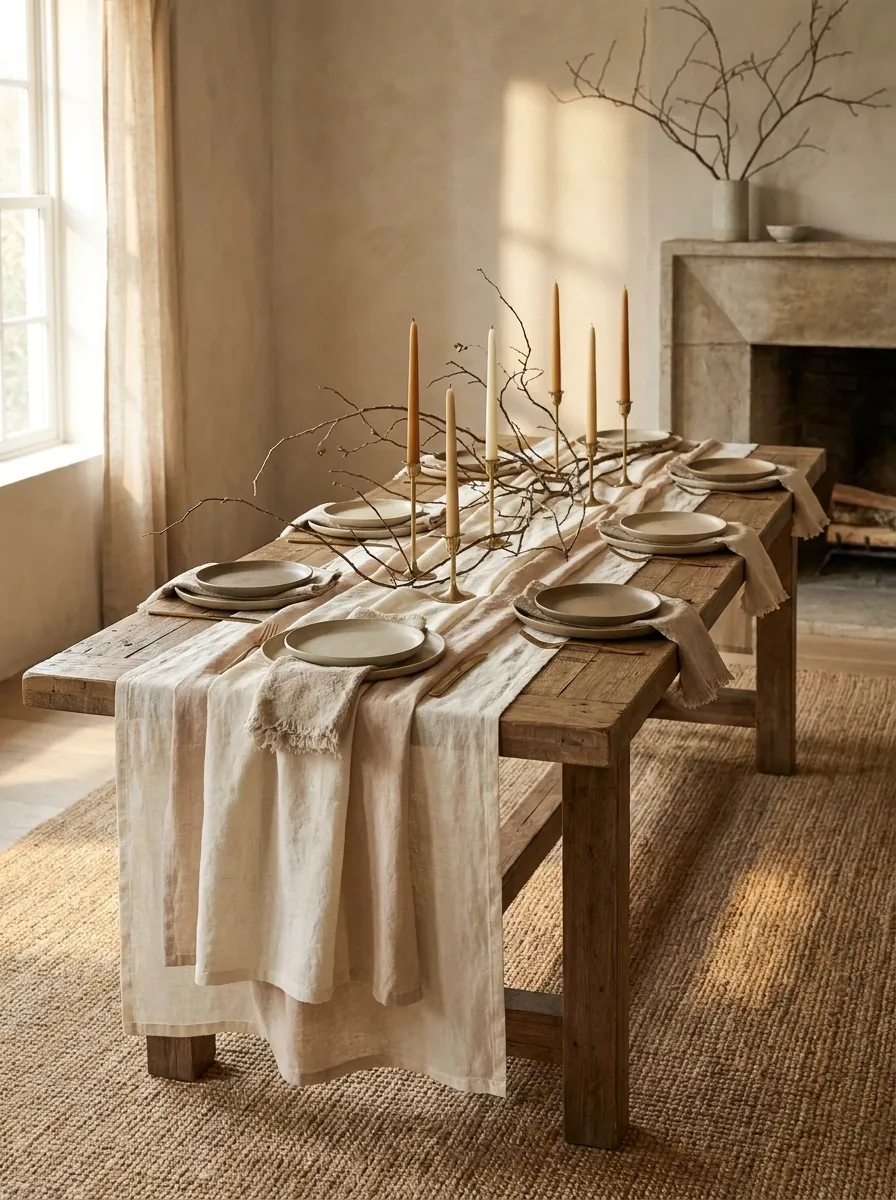
A long wood table becomes the entire visual foundation here, with layered runners, simple stoneware, linen napkins, candles, and natural branches extending through the center. Rather than creating one concentrated centerpiece, the styling establishes a rhythm that carries the eye from one end of the table to the other.
This approach suits long dining tables especially well because the repeated elements make the whole surface feel connected. Keep the branches low enough to preserve sightlines, then repeat candles and smaller accents in loose groupings. The goal is movement, not perfect symmetry. A little asymmetry makes the table feel collected. Too much makes it look like the branches are escaping.
The repeated elements should feel related, not copied. Long tables need rhythm or they start looking oddly empty in the middle.
Contemporary Thanksgiving Table With Sculptural Ceramics
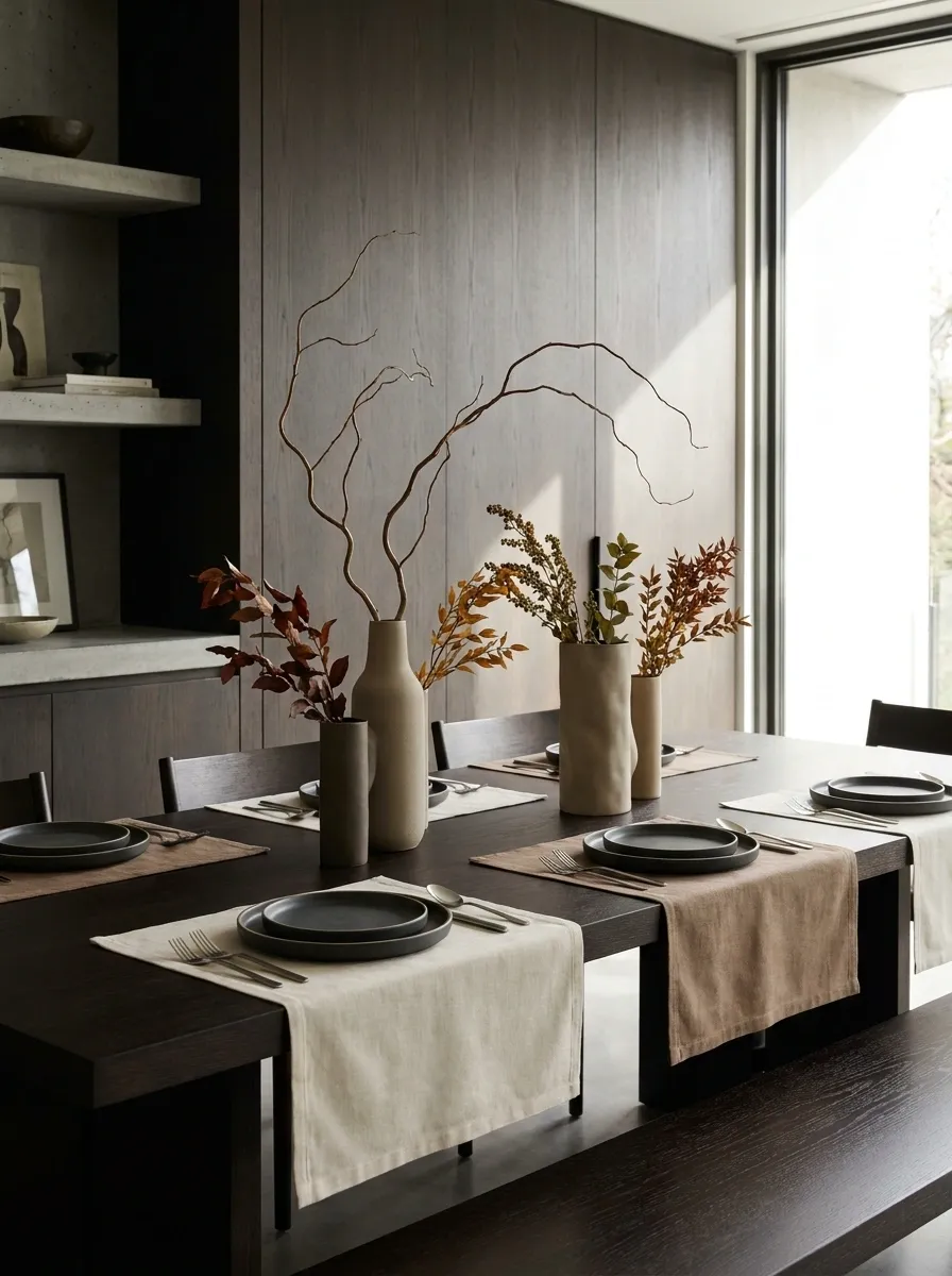
Clean-lined stoneware, sculptural vessels, warm neutral linen, dark wood, and restrained foliage give this table a distinctly contemporary character. Instead of relying on lots of seasonal decorations, the design gets its interest from shape. Curved ceramics, tall vessels, irregular branches, and simple place settings create enough movement without making the table feel busy.
The palette stays intentionally quiet so the silhouettes can do the talking. A few warm autumn tones appear in the foliage, but the overall setting remains modern and grounded. This works especially well in a dining room with strong architectural lines. The table doesn’t need a centerpiece with seventeen opinions. One good shape can carry a surprising amount of visual weight.
softens the setting Height
creates vertical interest Weight
grounds the composition
Deep Chocolate Brown and Cream Thanksgiving Tablescape
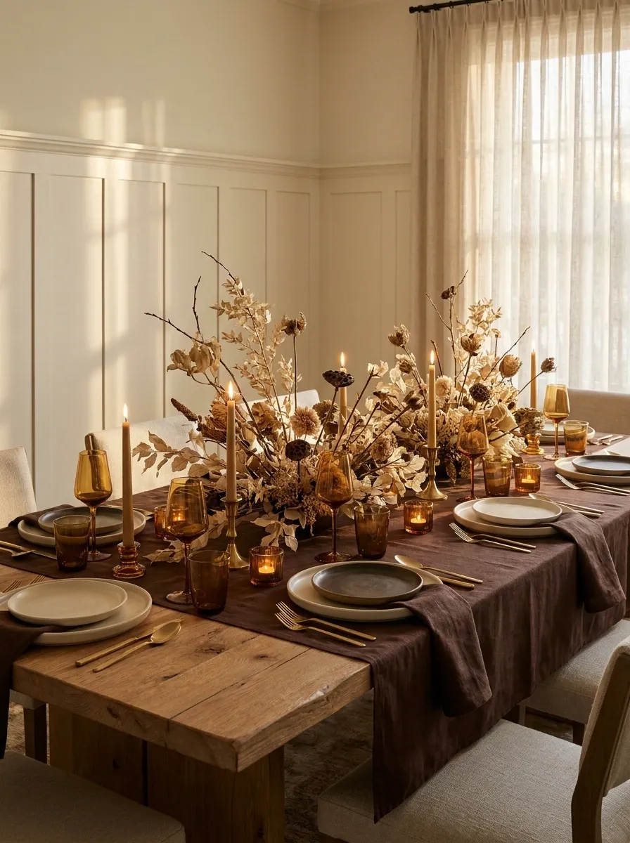
Chocolate brown linens and darker ceramic accents establish a rich foundation, softened by cream dinnerware, natural wood, muted foliage, and glowing candles. The palette feels distinctly autumnal without depending on bright pumpkins or orange accessories.
The contrast between dark brown and cream is what keeps the table from becoming visually heavy. Keep the larger textile surfaces deep and let the plates create clean interruptions between them. Warm wood adds another brown tone, but its natural grain prevents the palette from becoming too flat. This is a table for anyone who likes fall colors but would rather skip the yearly orange explosion.
Use cream to break the darker field, then let wood grain and warm candlelight create the smaller tonal shifts. The palette stays rich without needing brighter colors.
Thanksgiving Brunch Table With Soft Florals and Seasonal Fruit
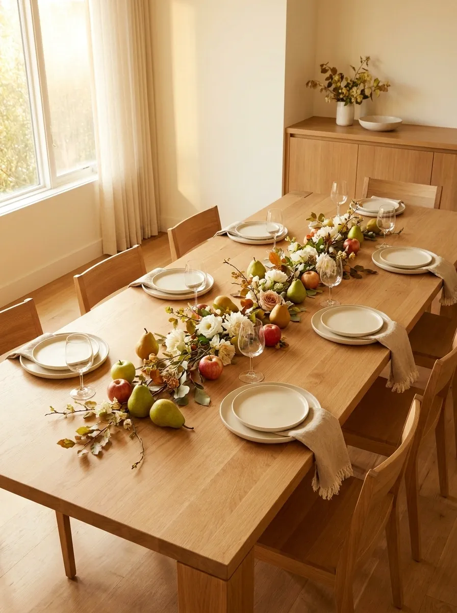
A Thanksgiving brunch gets a lighter treatment with pale ceramics, soft flowers, seasonal fruit, natural linen, simple glassware, and warm wood. The setting feels fresh enough for daytime while still carrying the color and texture of the season.
The centerpiece works through loose groupings rather than a dense arrangement. Pears, apples, small flowers, and foliage can sit naturally between the place settings, creating a table that feels generous without looking formal. Lighter textiles keep the daylight bouncing around the table, while warm wood gives the composition enough grounding. Basically, Thanksgiving before everyone has committed to a three-hour food coma.
reflect natural light across the table
adds color without heavy decoration
keep the centerpiece airy
Dramatic Autumn Table With Tall Branches and Layered Candlelight
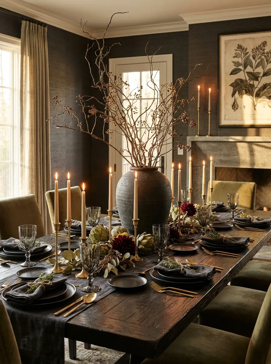
A larger dining room can handle a more dramatic Thanksgiving arrangement, built around tall sculptural branches, deeper foliage, rich linens, formal dinnerware, and candles placed at different heights. The centerpiece rises rather than spreading endlessly across the tabletop, creating a strong vertical focal point without requiring every surface to be covered.
The trick is variation in height. Taller branches provide the main silhouette, medium candleholders fill the middle zone, and lower foliage connects the arrangement back to the table. Keep the place settings comparatively restrained so the center remains the focal point. Drama is useful. Visual chaos is just drama that forgot its manners.
branches Medium
candlelight Low
foliage
Intimate Thanksgiving Table for Two With a Refined Autumn Palette
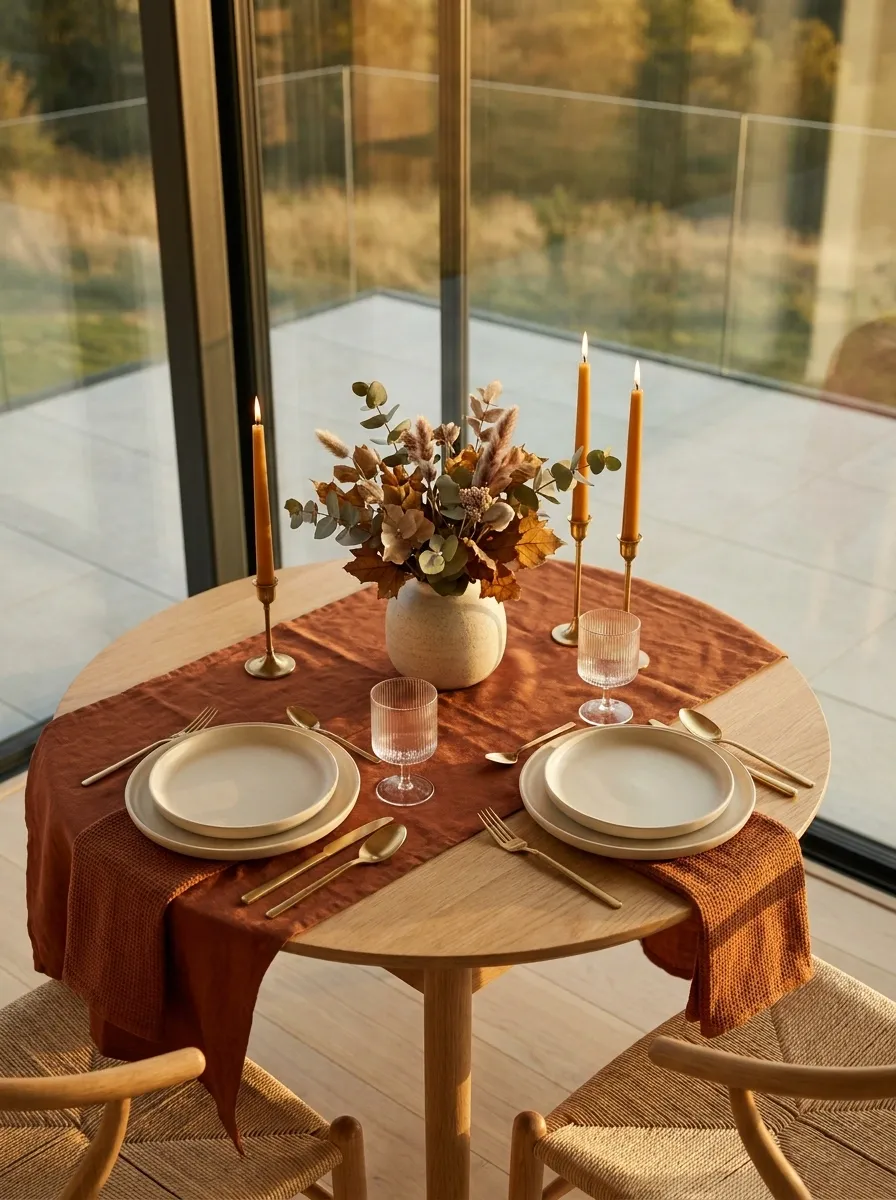
A small table for two gets a deliberately edited Thanksgiving treatment with rich rust linen, creamy dinnerware, delicate glassware, compact foliage, and warm candlelight. The smaller scale allows every piece to feel considered without requiring a sprawling centerpiece.
The palette stays tight so the setting feels intimate rather than crowded. A folded napkin, one compact floral or foliage arrangement, and a few candles create enough visual interest around the two place settings. Leave generous empty space between the pieces. On a table this small, negative space isn’t wasted space. It is what keeps dinner from becoming an archaeological dig.
A smaller table looks more refined when the empty surface is treated as part of the composition rather than something that needs filling.
Making the Finished Table Feel Like One Design
The easiest way to improve a Thanksgiving table is to stop treating every object like it deserves a speaking role.
Choose the mood first. Then let the table surface, linens, dinnerware, centerpiece, lighting, and seasonal details support that direction. A rustic table needs natural texture. A dramatic table needs contrast. A neutral table needs variation in surface and shape. A small table needs breathing room. None of this requires decorating every square inch just because the square inch exists.
Before shopping, save a handful of complete tablescapes that feel genuinely right. Look at the entire scene, not one cute napkin or one viral centerpiece. The finished composition tells you much more about what will actually work together.
Save these Thanksgiving tablescape ideas now, then come back when the table needs to look festive without looking like Thanksgiving threw up on it.