
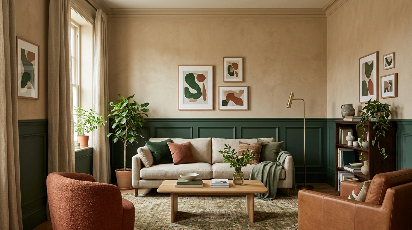
A living room can have two genuinely good colors and still end up looking like three different people decorated it during three different moods.
One shade looks great on the wall. Another looks great on the sofa. Then they meet in the same room and suddenly nobody knows what is happening.
That is why choosing two colors is less about finding a pretty pair and more about deciding how the whole room is going to behave.
Walls, seating, flooring, curtains, wood tones, lighting, artwork, and even the amount of empty visual space all affect whether the colors feel connected.
Two Tone Living Room Ideas
Muted Mauve + Olive Green
Soft mauve walls with delicate molding create a warm, enveloping envelope that completely shifts the mood of this living room. An olive green velvet sofa anchors the space, introducing an earthy contrast that grounds the lighter wall treatment without feeling harsh or clinical.
Natural wood tones in the coffee table and bookshelf bridge the gap between the rosy walls and the green seating. Trailing plants and warm lamp lighting add organic layers, ensuring the room feels lived-in and breathing rather than like a static color swatch.
Restraint keeps this pairing sophisticated. By letting the mauve and olive do the heavy lifting, the space avoids visual clutter and leans into a quiet, grounded harmony.
Warm Greige + Terracotta With Walnut Furniture
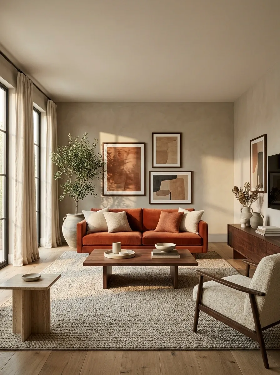
Warm greige walls create a quiet backdrop for a terracotta sofa, deep walnut furniture, creamy textiles, and soft linen curtains. The terracotta shows up again in artwork and a few smaller pieces, so the color feels built into the room rather than dropped onto it at the last minute.
The walnut matters here. Its deeper brown connects the earthy wall and sofa tones while giving the room enough contrast to avoid looking washed out. Keep the larger surfaces calm and let the terracotta carry the personality. This is how an earthy palette feels collected instead of becoming a showroom devoted to clay pottery.
wall field
focal color
visual weight
Soft Gray + Blush Pink
Balanced gray walls provide a sleek, neutral foundation that allows accents of blush pink to introduce a gentle warmth. Plush seating in coordinating gray tones creates a cohesive base, while pink throw pillows and a patterned rug softly break up the monotony.
Textured fabrics and a glowing electric fireplace add layers of comfort, making the cool gray architecture feel inviting and cozy. The modern media console and structured shelving keep the layout clean and organized.
This approach proves that neutrals do not have to be boring. Adding subtle hints of blush transforms a simple gray box into a thoughtful, cohesive retreat.
Textured Black + Crisp White
A dramatic black paneled accent wall instantly commands the room, offering a bold architectural backdrop for a sleek white sofa. The contrasting monochrome palette feels remarkably sharp, while warm gold and wooden decor elements soften the stark edge.
Throw pillows in soft cream and textured beige help bridge the gap between the deep black wall and the bright seating, creating a comfortable visual balance. Overhead, a striking crystal chandelier adds a layer of unexpected elegance.
The secret here is intentionality. When working with high-contrast elements, keeping the surrounding furniture minimal lets the dramatic feature wall speak for itself.
Sage Green + Warm White With Natural Oak
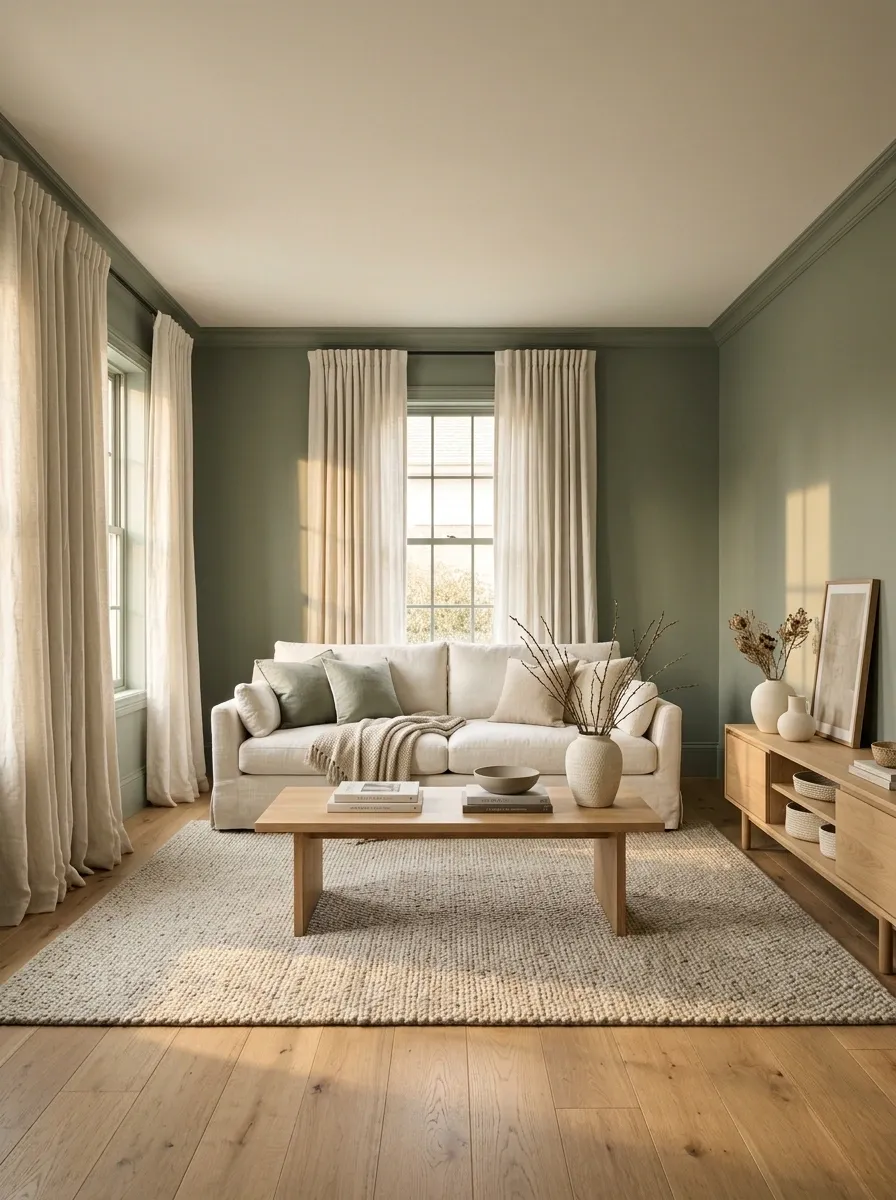
Muted sage walls create the color story while warm white seating, curtains, and ceiling surfaces keep the room open and light. Natural oak furniture acts as the bridge between the two, adding warmth without introducing another strong color.
The composition works because the sage stays visually connected to the architecture while the white remains concentrated around the places that need to feel lighter. A large cream or oatmeal rug can soften the transition underfoot.
The trick is restraint. Once sage and warm white are doing the main work, the room doesn’t need a parade of five extra accent colors trying to join the conversation.
architecture Warm white
furniture + light Oak
visual bridge
Olive Green + Caramel Brown
Muted olive green walls set a moody, organic tone that pairs effortlessly with a rich caramel brown sectional sofa. The combination feels deeply comforting, drawing inspiration directly from nature without tipping into theme-room territory.
A swirling patterned rug in cream and green ties the seating area together, while a gallery wall of framed botanical art enhances the earthy narrative. Natural wood finishes and trailing green plants reinforce the harmonious atmosphere.
This palette succeeds through balance and texture. By keeping the larger surfaces in calming, muted tones, the room achieves a collected, designer-grade look that feels effortlessly put together.
Navy + Soft Beige in a Library-Style Living Room
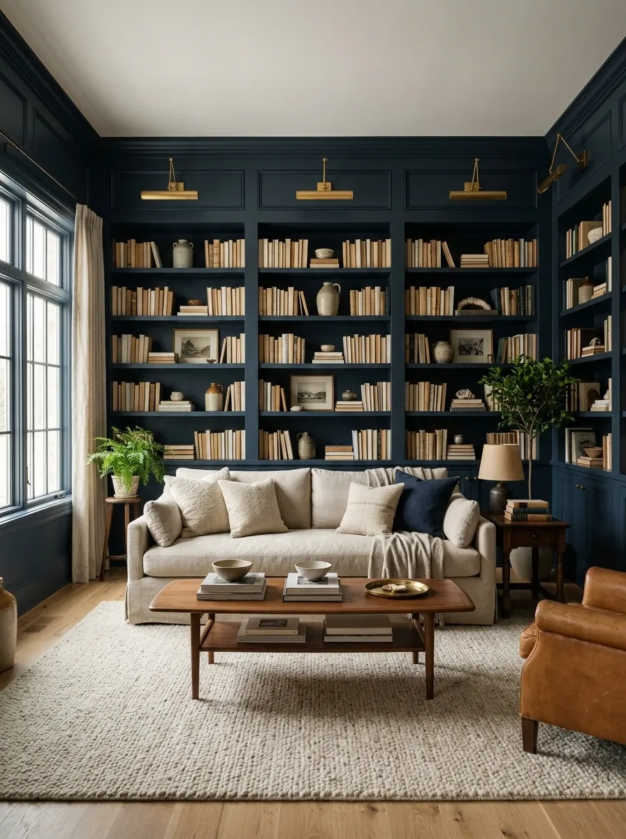
Deep navy wraps the walls and built-ins, turning the room into a rich backdrop for soft beige seating, warm wood furniture, and layered lighting. The beige sofa and rug create a lighter central zone, keeping the darker envelope from swallowing the room.
This concept works especially well when the architecture already has shelves, a fireplace, or another feature that can carry the deeper color. Warm lamps add another layer of depth without introducing a competing palette.
The navy should feel intentional and substantial. A single navy cushion floating in an otherwise beige room would not create this effect. That is less “library retreat” and more “the paint sample won an argument.”
envelope
relief
Dusty Blue + Warm Sand With Linen Textures
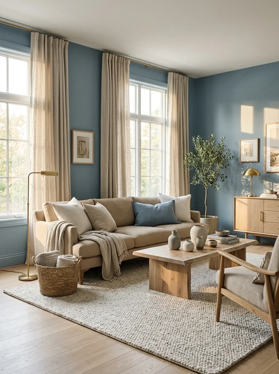
Dusty blue walls give this living room a cool, muted backdrop while warm sand upholstery, linen curtains, pale wood, and woven textures bring the temperature back up. The colors are close enough in intensity to feel calm, but different enough to create a clear visual relationship.
The finish is intentionally relaxed. A low sofa, soft rug, natural timber, and generous window treatment keep the room from looking overly decorated. Texture matters more than extra color here, especially when the palette is this restrained.
The blue does not need to shout. In fact, shouting would completely miss the point.
Warm sand
Olive + Bone White With Dark Wood
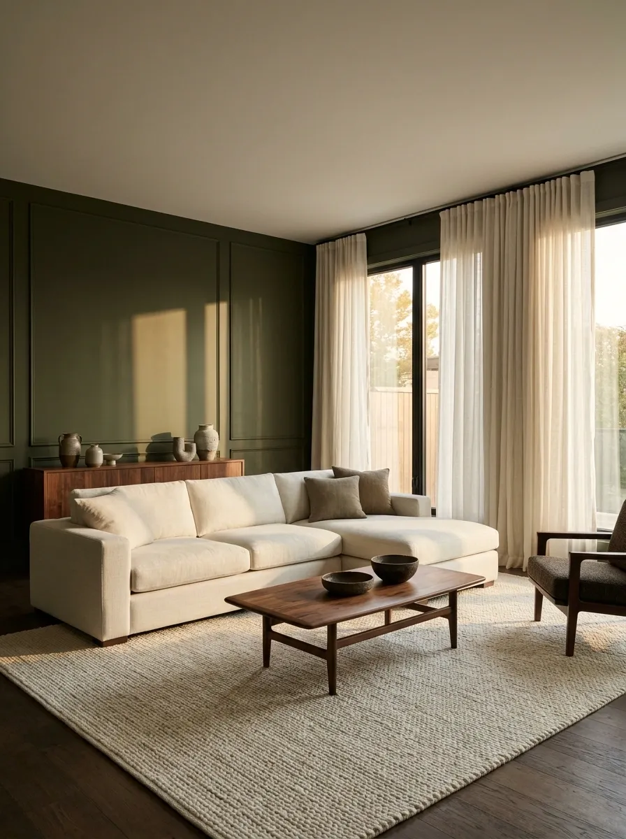
Olive green walls give this living room its depth, while a bone-white sofa and pale rug open up the center of the space. Dark wood furniture adds enough contrast to keep the palette grounded, and the result feels rich without becoming heavy.
The key is keeping the olive tied to the architecture. Let it travel across the main walls or built-ins while the lighter color stays closer to the seating and major soft furnishings. Dark wood then acts as the middle ground between the two.
This is earthy without turning the living room into a botanical gift shop. A little restraint goes a long way.
architectural backdrop Bone white
light central mass Dark wood
grounding element
Forest Green + Warm Ivory Around a Stone Fireplace
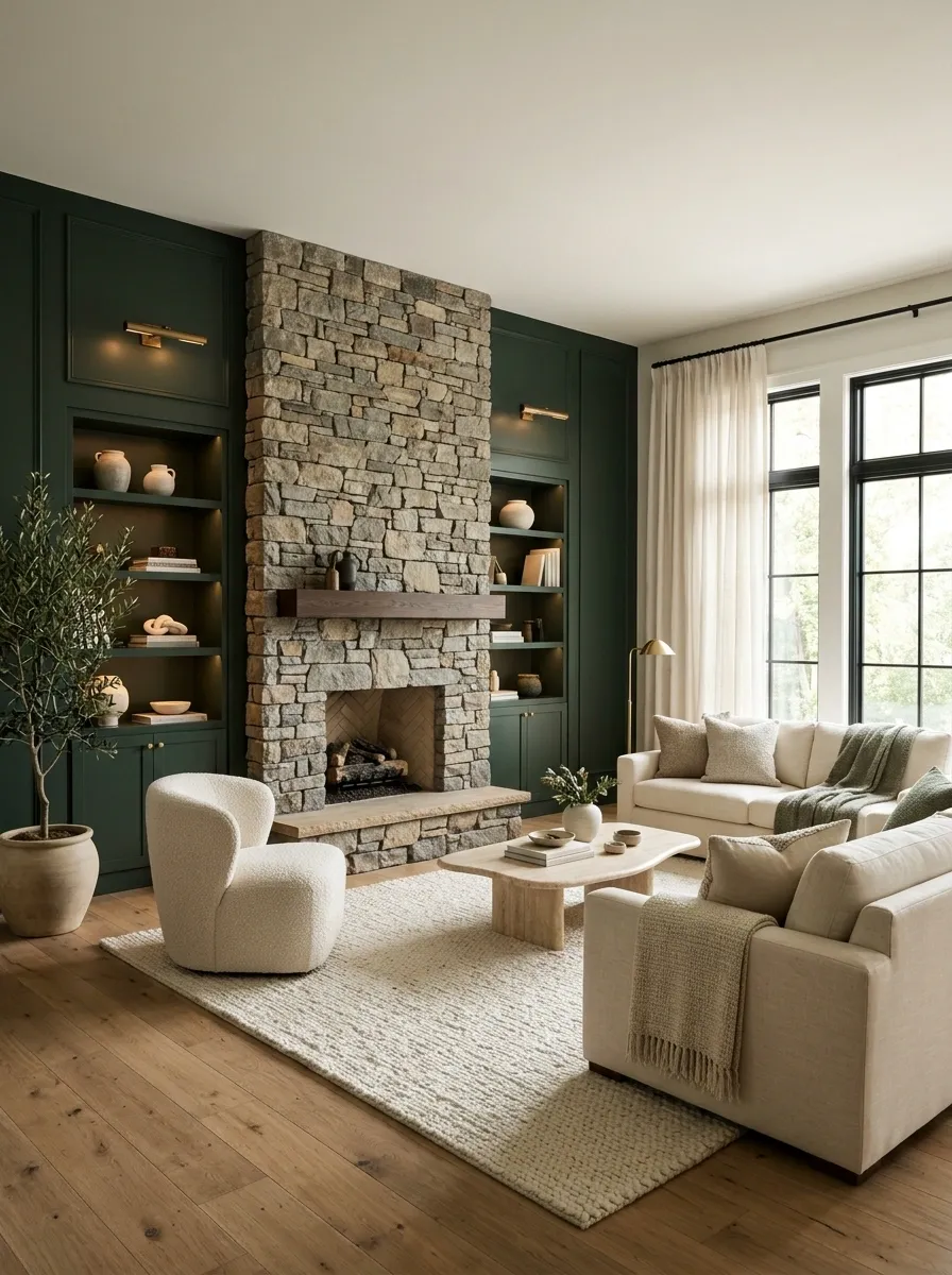
Forest green walls create a deep architectural backdrop, while warm ivory furniture keeps the seating area bright. A stone fireplace sits between them, adding a natural material that makes the two tone palette feel connected to the architecture.
This composition is strongest when the fireplace remains visually simple. Let the green provide drama and the ivory create relief, then allow the stone to quietly bridge both sides. Oak flooring and warm lighting fit naturally into the same story.
There is no need to turn every shelf into a tiny forest. The green wall already handled the assignment.
depth + structure Stone
material bridge Warm ivory
light + relief
Black + Warm White in a Crisp Contemporary Room
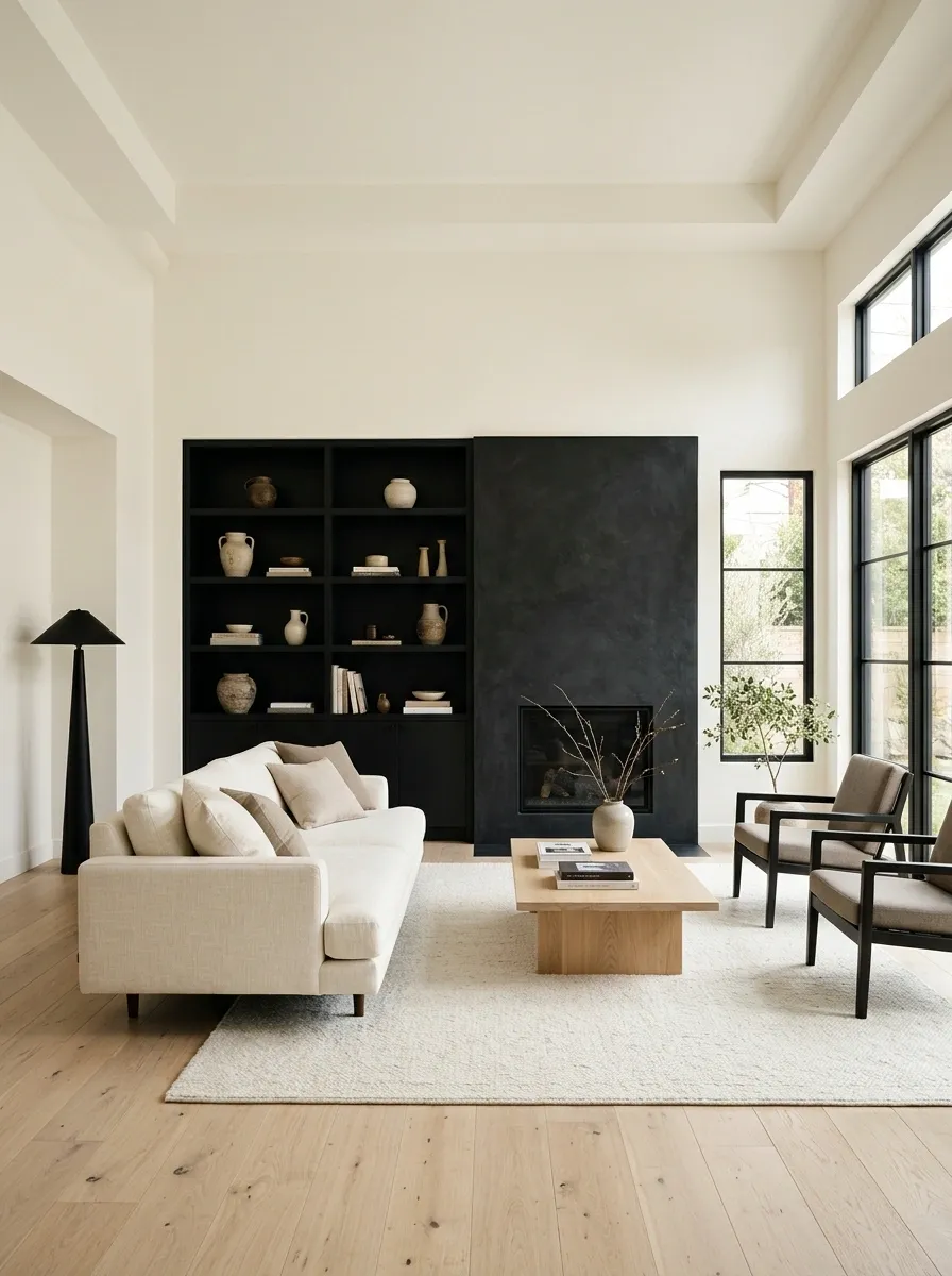
Warm white walls and ceilings create a bright shell for black built-ins, a dark fireplace surround, and carefully chosen furniture. Pale timber flooring keeps the room from becoming too stark, while the black elements provide a strong architectural outline.
This works because black is concentrated where structure matters. The fireplace, shelving, or media wall becomes the darker framework, while the lighter surfaces surrounding it keep the room open.
The important part is the warmth of the white. A cold blue-white paired with black can make the room feel clinical. Warm white gives the contrast a much softer landing.
Clay + Mushroom Beige With Soft Curves
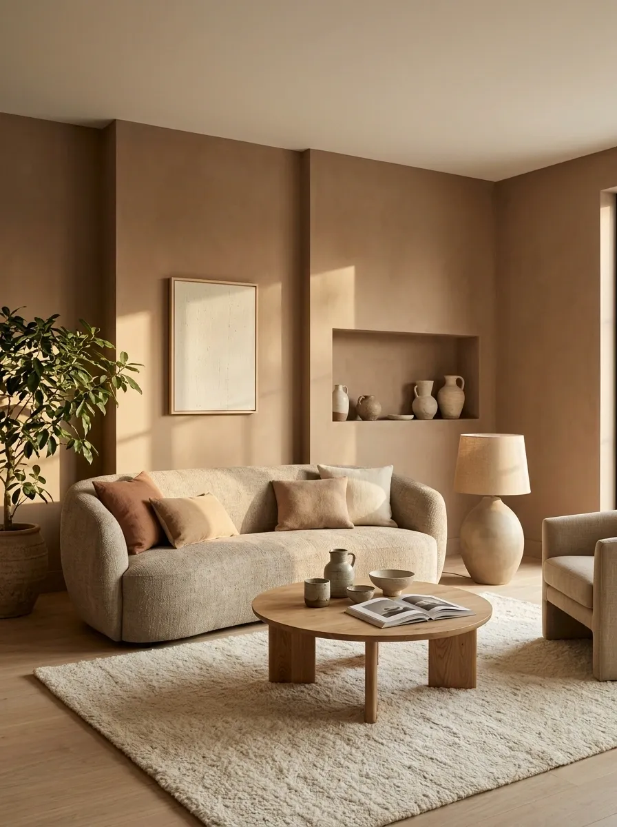
Muted clay walls give this contemporary room a warm, earthy envelope, while mushroom beige seating, pale wood, and rounded furniture soften the overall composition. The curved forms matter just as much as the colors, keeping the room from feeling flat despite the restrained palette.
A curved sofa, low coffee table, rounded lamp, and soft rug create a gentle rhythm across the space. The clay should remain more substantial on the walls, while mushroom beige occupies the larger furniture pieces.
The finished room feels intentional without trying too hard. Which, frankly, is more than can be said for the average neutral room featuring seventeen nearly identical beige cushions.
strong vertical plane Mushroom
soft furniture volume
Pale Taupe + Rust With Mid-Century Shapes
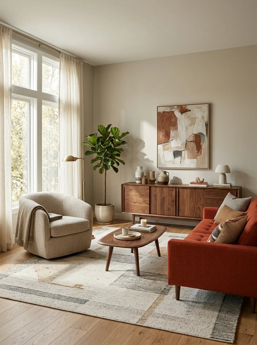
Pale taupe walls create an understated backdrop for a rust-colored sofa, walnut furniture, and clean mid-century silhouettes. The room gets its personality from the contrast between the quiet wall color and the warmer, more saturated seating.
Tapered legs, a low credenza, a rounded armchair, and a simple geometric rug reinforce the era without turning the room into a museum set. Rust appears mainly around the seating and a few carefully placed details, giving the eye a clear focal zone.
The palette feels warm without drifting into orange overload. Because nobody needs a living room that looks permanently stuck on “sunset filter.”
quiet architectural field Rust
focused seating zone
Soft Gray + Ochre With Graphic Black Accents
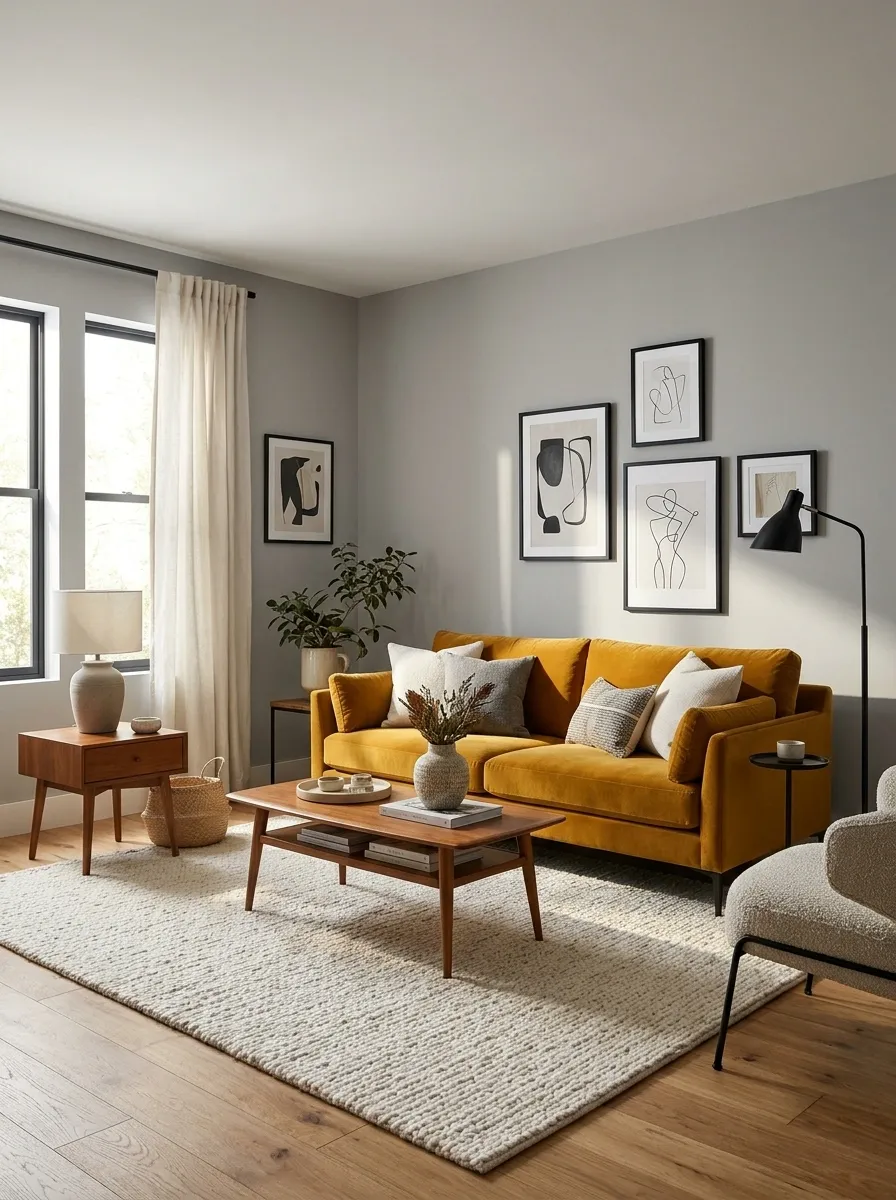
Soft gray walls create the calm base for an ochre sofa, warm wood furniture, and carefully limited black details. The black appears in picture frames, lighting, and slim furniture lines, giving the room definition without becoming a third dominant color.
Ochre works best here because it stays concentrated around the seating and selected artwork. The rest of the room gets to breathe. Pale timber flooring and an off-white rug soften the contrast further.
The black accents are punctuation, not the entire sentence. Once every lamp, vase, frame, basket, and table becomes black, the room starts looking like it joined an extremely aggressive monochrome club.
background Ochre
focal warmth Black
fine definition
Warm White + Brick Red in a Historic-Feeling Room
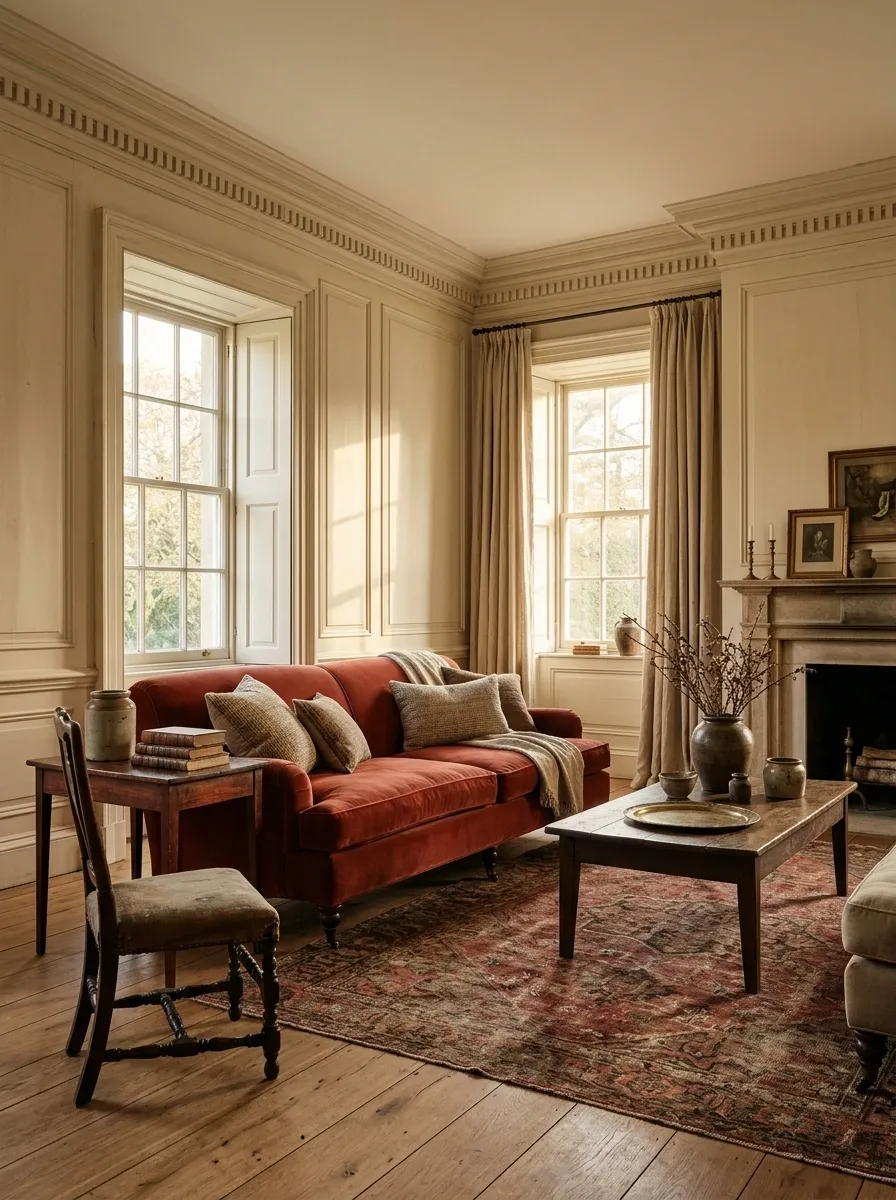
Warm white walls keep the room bright while brick red upholstery, a vintage rug, dark timber furniture, and aged architectural details give it a sense of history. The red appears as a concentrated layer rather than covering every available surface.
A high ceiling, deep window trim, old-world molding, or exposed architectural texture makes this pairing especially convincing. The warm white should remain slightly creamy so it sits comfortably beside the richer red.
The room feels established rather than freshly assembled. No matching furniture set required, thankfully.
Powder Blue + Walnut for a Light Classic Interior
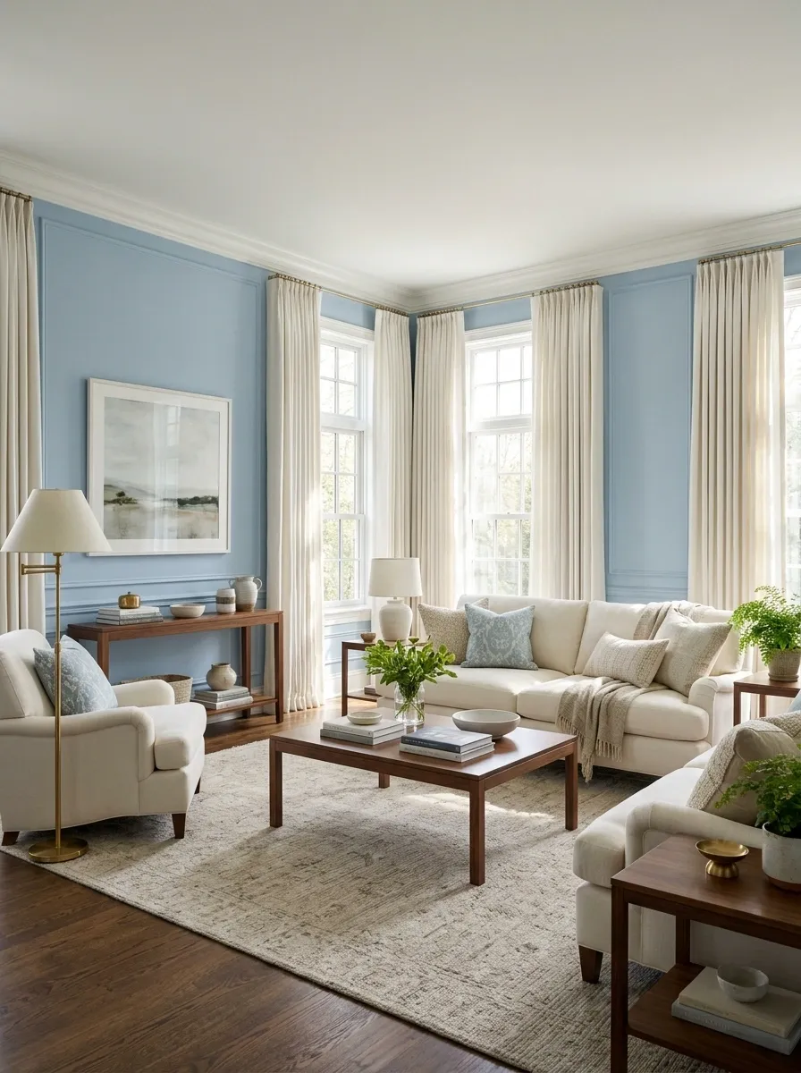
Powder blue walls create a fresh, airy backdrop for warm walnut furniture, ivory upholstery, classic curtains, and softly patterned textiles. The room feels traditional without becoming overly formal because the blue remains light and the wood provides the stronger visual weight.
A walnut console, coffee table, or bookcase can repeat throughout the room, while ivory seating prevents the darker furniture from taking over. Brass lighting works naturally here, but it should stay secondary to the blue and walnut relationship.
This is the kind of room where morning light does half the decorating. Convenient when the decor budget has already filed for bankruptcy.
air + light Walnut
warmth + weight
Terracotta + Cream With Southwestern Texture
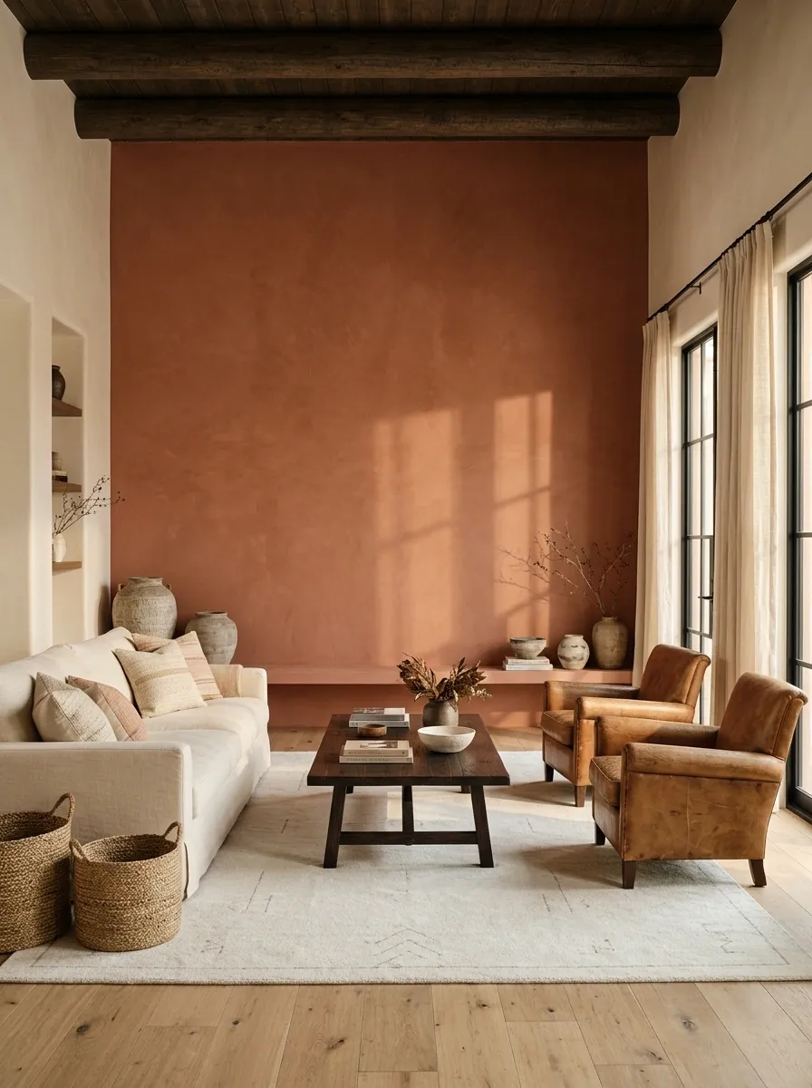
Terracotta walls and cream upholstery create the main two tone relationship here, while leather, natural timber, woven textiles, and plaster-like surfaces add texture without introducing a chaotic color mix. The warmer materials make the palette feel substantial, especially in a room with strong sunlight.
A terracotta wall behind the sofa can carry most of the color, while cream seating, a pale rug, and light curtains keep the center of the room open. Dark timber or aged leather can quietly ground the lower half.
It has warmth, texture, and personality without looking like every object was purchased during the same southwestern phase.
wall color
light relief
warm depth
texture
Charcoal + Dusty Rose in a Moody Modern Room
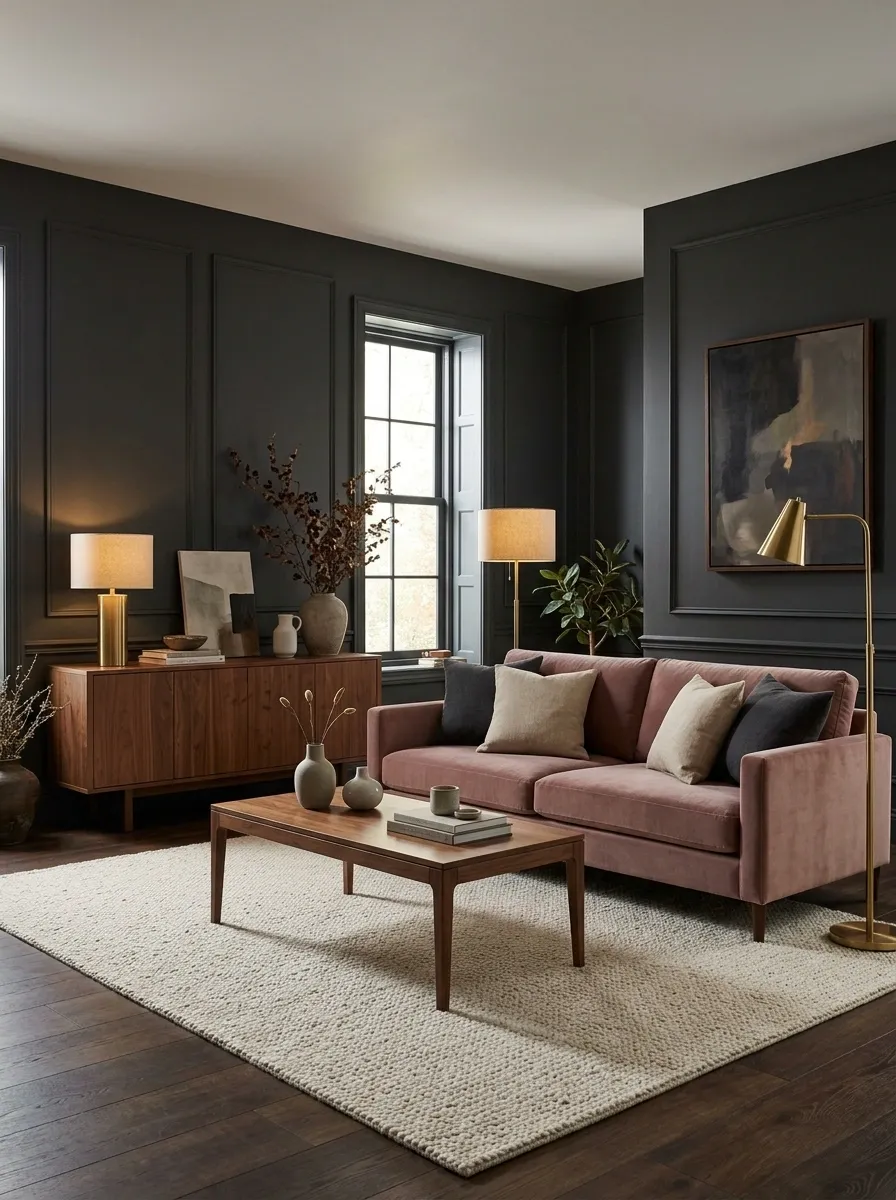
Charcoal walls create a dramatic shell for a dusty rose sofa, warm walnut furniture, and a softly textured rug. The pink stays muted and sophisticated, giving the darker room a softer focal point without turning it sugary.
The contrast is strongest when charcoal covers the architectural background and dusty rose occupies the main seating zone. Walnut furniture sits comfortably between the two, while warm lighting brings out the brown undertones.
The darker wall does most of the dramatic work. The sofa simply needs to show up and look good. A surprisingly manageable job description.
dramatic shell Dusty rose
soft focal point Walnut
warm middle
Warm Beige + Cocoa in a Layered Neutral Living Room
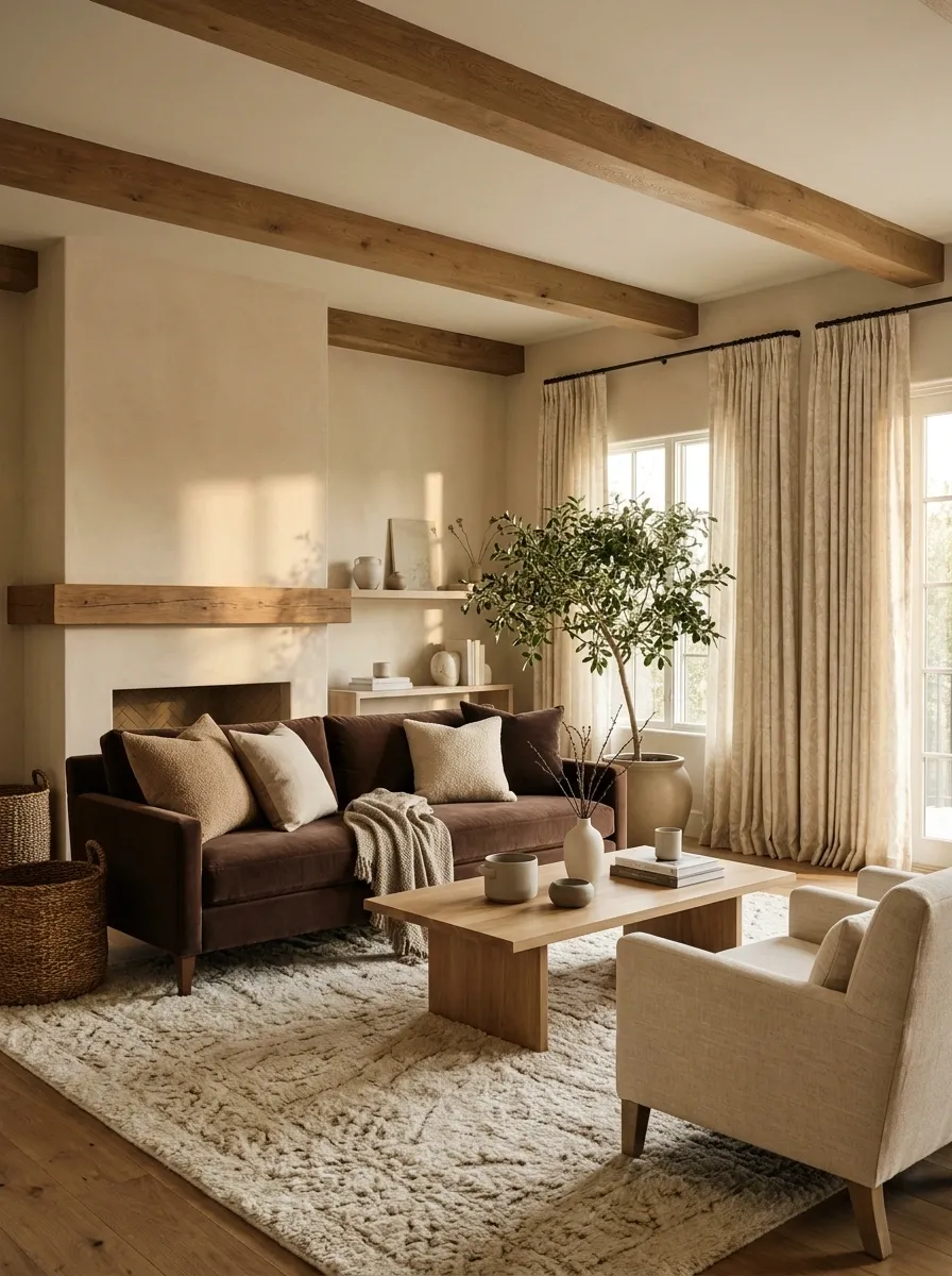
Warm beige walls form the quiet base while cocoa-colored seating provides the stronger visual anchor. Cream textiles, oak accents, and subtle woven textures fill the room without competing with the two primary colors.
The composition depends heavily on texture. Bouclé, linen, wool, timber, and softly patterned fabric keep the neutral palette from becoming flat. Furniture shapes can vary more freely because the colors are doing so little shouting.
This is neutral done properly. Not twelve shades of beige standing around asking why nobody looks different.
Brick + Soft White Around a Black Fireplace

A brick-toned fireplace or feature wall becomes the defining color field in this living room, while soft white surrounding walls keep the architecture visually open. A black fireplace frame, warm timber furniture, and a tan sofa connect the two sides without stealing the spotlight.
The brick should feel like part of the architecture, whether it comes from genuine masonry, a textured finish, or a convincing tonal treatment. Keep the surrounding walls calm and let the fireplace establish the center of the room.
The result has enough contrast to feel interesting without requiring decorative objects to scream for attention. The fireplace already brought the personality.
surrounding architecture Brick
central visual field
Dark Brown + Ivory With Leather and Linen
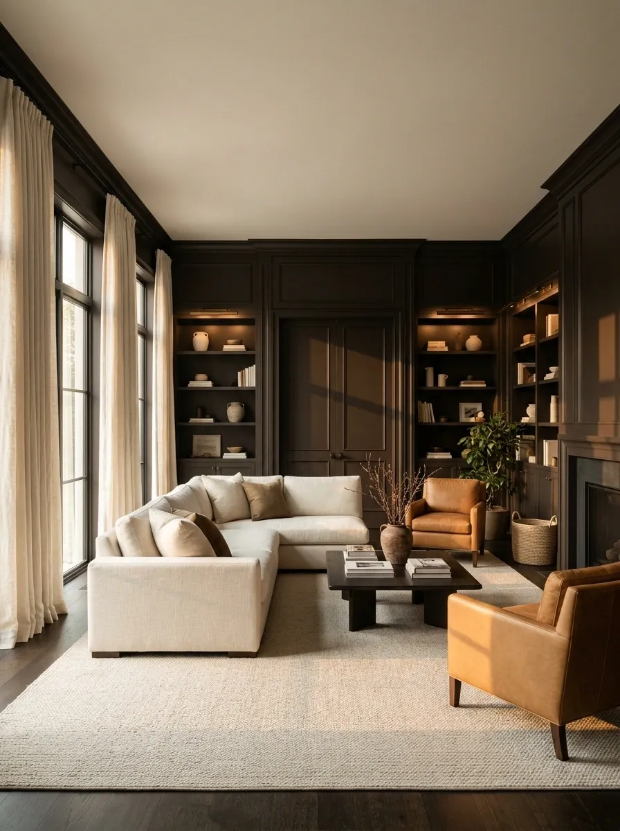
Dark brown walls and cabinetry create a deep, cocooning backdrop for ivory seating, linen curtains, and a pale rug. Caramel leather adds another warm layer while keeping the room connected to the darker architectural surfaces.
The important move is giving the ivory enough visual territory. A large light sofa, pale rug, and generous curtains prevent the brown from making the room feel smaller than it is. Keep the furniture shapes simple so the rich color and natural materials stay in focus.
It feels luxurious without looking like someone discovered a “moody interiors” filter and refused to turn it off.
architectural shell Ivory
visual relief Leather
warm transition
Soft Peach + Olive for an Unexpected Warm-Cool Pairing
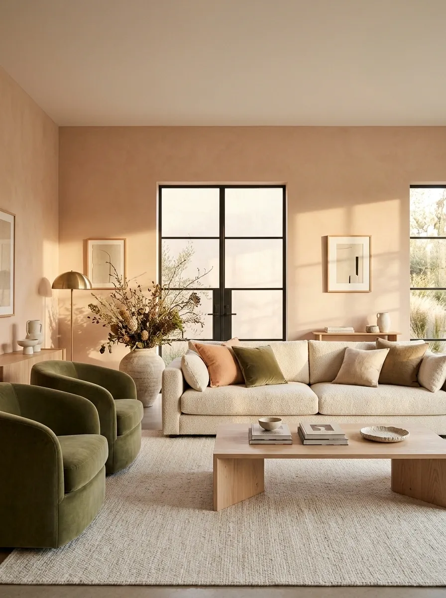
Soft peach walls give this living room a warm glow while olive seating introduces a grounded, muted contrast. Cream upholstery, pale oak furniture, and a restrained rug keep both colors from becoming too intense.
The pairing works because both shades are softened. A bright peach would make the green feel much harsher, while a very dark olive could overpower the lighter room. Here, the colors meet in the middle and let natural wood quietly connect them.
It feels unexpected without becoming weird for the sake of being weird. Pinterest can finally rest easy.
Mineral Blue + Natural Beige for a Coastal-Modern Room
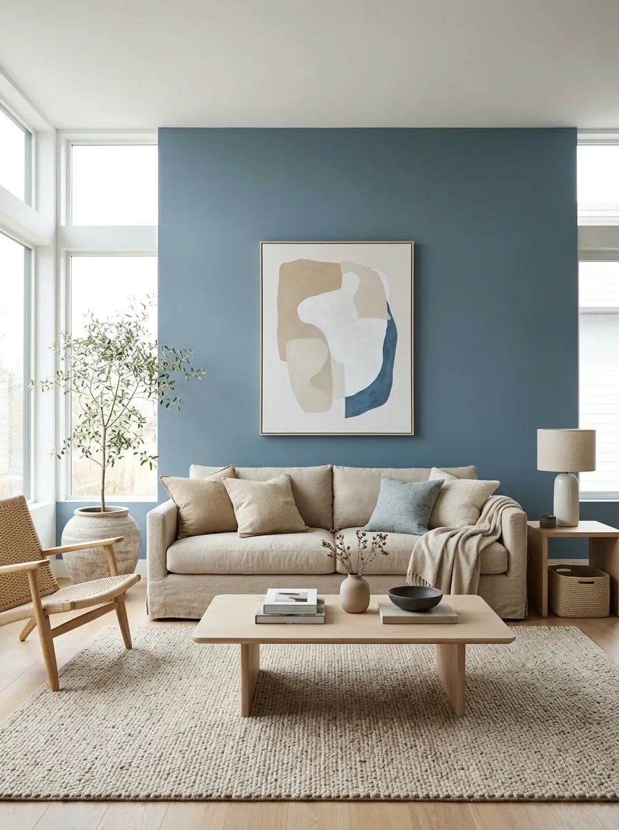
Mineral blue walls establish a calm, slightly cool backdrop while natural beige upholstery keeps the furniture warm and relaxed. Pale oak tables, woven textures, and large windows add softness without introducing another major color.
The room should feel open rather than themed. Skip obvious nautical decoration and let the color relationship, natural materials, and daylight do the work. A low beige sofa against the blue wall creates a particularly strong focal composition.
The whole thing says coastal without hanging a giant anchor on the wall. Progress.
cool architectural depth Natural beige
warm furniture mass
Plum + Soft Cream for a Dramatic Sophisticated Interior

Muted plum walls give the room a dramatic foundation, while soft cream seating, warm timber, and a patterned rug keep the composition balanced. The darker color is strongest around the architecture, allowing the furniture to create a lighter central island.
Plum works particularly well when its undertones lean dusty rather than intensely purple. Cream upholstery then feels rich against it, while warm lamps bring out the brown and red notes in both colors.
This room has drama without needing twelve crystal chandeliers and a personal grudge against minimalism.
walls + architecture Cream
seating + light Warm timber
visual bridge
Moss Green + Putty With Built-In Shelving
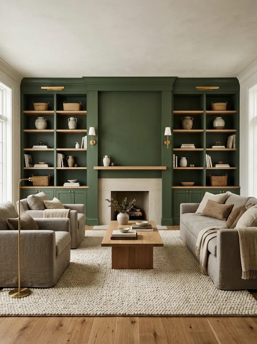
Moss green built-ins or a painted feature wall form the architectural backbone of this living room, while putty-colored seating keeps the furniture zone soft and understated. Oak shelving, a textured rug, and warm lighting add depth without breaking the two tone relationship.
This concept works especially well in rooms with a fireplace wall or substantial built-in storage because the deeper color can follow the existing architecture instead of being forced onto an arbitrary surface.
The green gets to be interesting. The putty gets to be calm. The furniture gets to sit there looking expensive without making a speech about it.
Soft Black + Camel in an Editorial Apartment
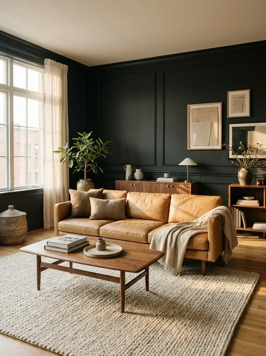
Soft black walls create a strong backdrop for camel upholstery, walnut furniture, and a large cream rug. The darker color gives the apartment a defined architectural edge, while the camel sofa brings warmth into the center of the room.
The palette works best when black stays concentrated around the walls, built-ins, or fireplace rather than spreading across every object. Camel then becomes the obvious furniture color, with warm wood quietly reinforcing the connection.
The result feels polished without becoming precious. And yes, the black wall can survive without a neon quote sign telling everyone to “dream.”
architecture Camel
seating focus Walnut
supporting warmth
Cream + Denim Blue With Relaxed Traditional Furniture
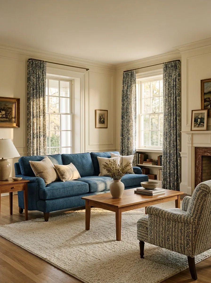
Cream walls give this traditional living room a light foundation while denim blue upholstery, patterned curtains, and medium-tone wood create the visual contrast. The blue is repeated around the main seating and windows, making the room feel connected rather than pieced together.
Classic furniture shapes keep the palette from feeling too casual. A blue sofa, patterned chair, cream rug, and warm wood coffee table create enough variation without needing a dozen decorative colors.
It has the easy comfort of a traditional room without looking like every piece arrived as part of the same suspiciously enthusiastic furniture set.
Warm Gray + Burnt Orange With Sculptural Lighting
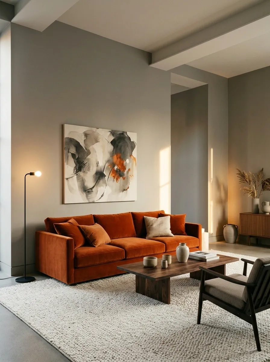
Warm gray walls create a quiet architectural base for a burnt orange sofa, dark timber table, soft rug, and sculptural lighting. The orange becomes the focal color, but its placement is concentrated enough to keep the room sophisticated.
A large sofa or pair of lounge chairs can carry most of the orange, while artwork repeats a smaller amount nearby. The rest of the room stays restrained, allowing the furniture shape and lighting to add interest without introducing another strong hue.
Burnt orange brings enough energy on its own. No need to give every vase an orange personality crisis.
calm background Burnt orange
focal furniture zone
Soft White + Deep Green With Painted Millwork
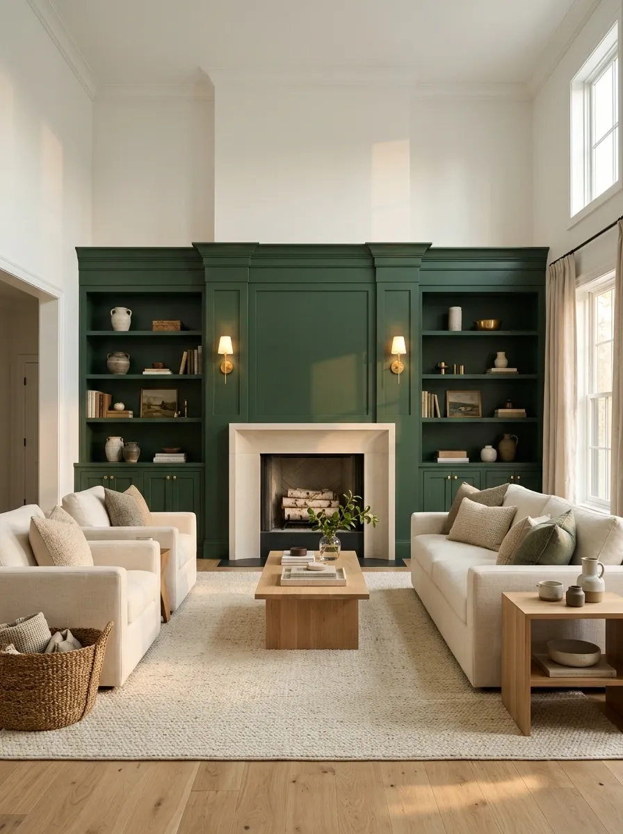
Soft white walls and ceiling keep this living room bright while deep green millwork, shelving, or a fireplace surround creates a substantial architectural feature. Cream seating and oak flooring soften the transition, while warm metal lighting adds just enough detail.
The deep green feels especially convincing when it follows the shape of existing cabinetry or built-ins. Rather than treating the color as a random accent wall, the architectural treatment makes it look intentional from every angle.
The green is doing enough. Let it. There is no prize for making the side table green too.
Taupe + Ink Blue for a Refined Contemporary Room
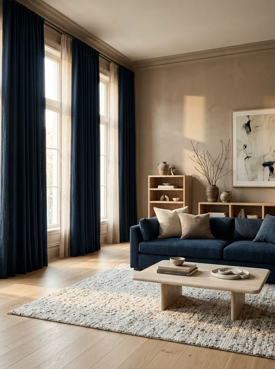
Taupe walls give this contemporary room a warm foundation while ink blue seating, curtains, and selected artwork bring in strong visual depth. Light oak and stone surfaces soften the contrast, keeping the composition refined rather than severe.
The blue works best when it occupies the lower and middle parts of the room, especially around furniture and window treatments. Taupe can then carry the larger architectural surfaces, creating an easy shift from warm background to deeper foreground.
It is polished, layered, and calm. Basically, the living room equivalent of replying “noted” while silently having excellent taste.
large surfaces Ink blue
furniture + drapery Oak
warm transition
Buttery Yellow + Soft Gray for a Cheerful Modern Room
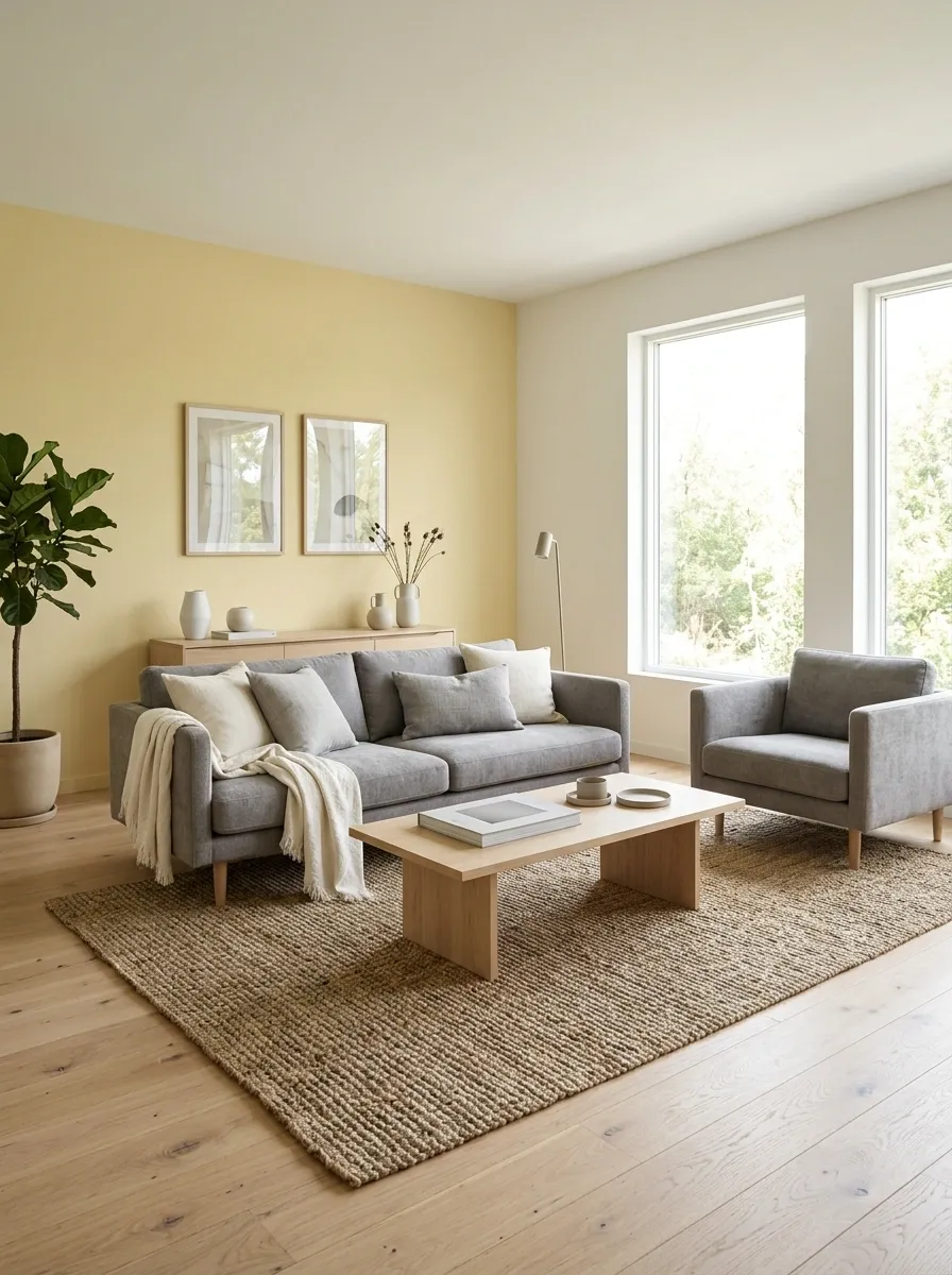
Muted buttery yellow creates warmth across the main wall plane while soft gray seating and pale wood prevent the room from becoming overly bright. A woven rug, simple artwork, and streamlined furniture keep the palette modern without making it feel cold.
The yellow should stay soft and slightly creamy rather than intensely saturated. Gray then provides the cooler counterpoint, while pale oak keeps both colors connected to something natural.
It is cheerful without looking like a highlighter exploded in the living room. A very important distinction.
warm wall field Soft gray
cool furniture base Pale oak
natural bridge
Deep Burgundy + Warm Cream With Classic Woodwork
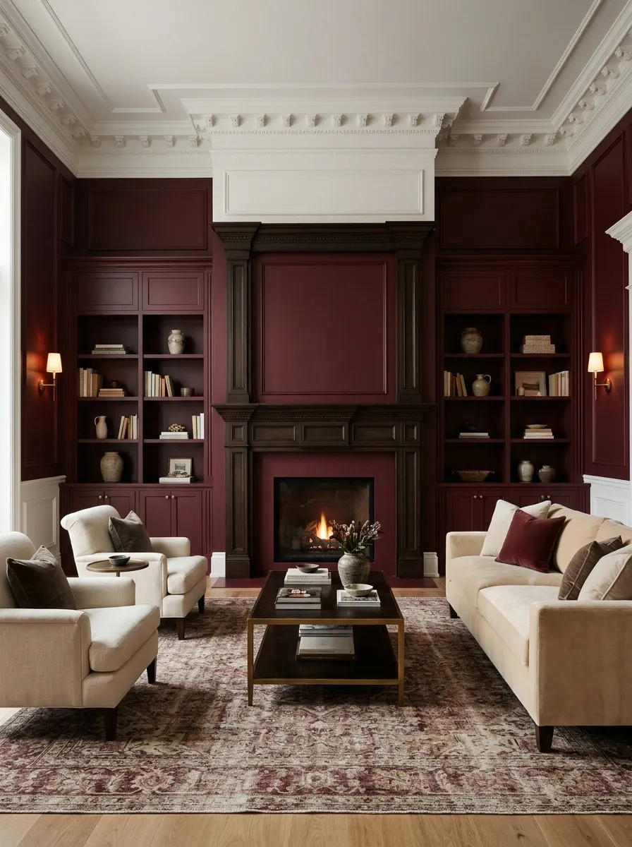
Burgundy walls and cabinetry create a rich traditional atmosphere while warm cream furniture and detailed woodwork prevent the room from feeling visually dense. The darker shade gains even more character when carried through a fireplace surround, built-ins, or a substantial architectural wall.
Cream seating creates a clear light zone in the middle of the room, while a patterned rug can quietly repeat the burgundy without competing with it. Warm lighting brings out the red and brown undertones, giving the whole space a softer finish.
It is dramatic, traditional, and slightly theatrical. The room knows it has entered wearing velvet. Let it enjoy the attention.
architecture Cream
furniture relief Dark wood
classic structure
Pale Green + Caramel With Contemporary Vintage Character
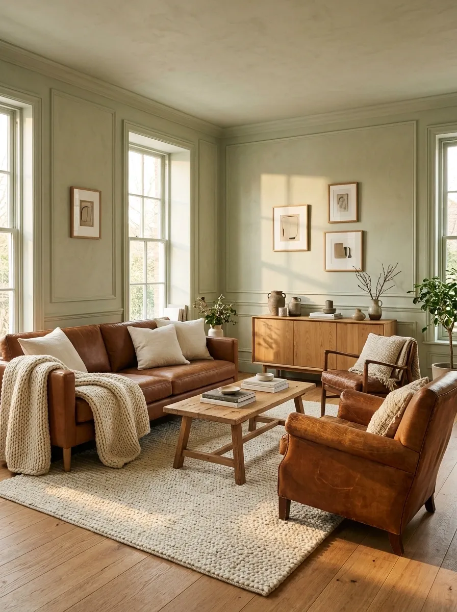
Pale green walls combine with caramel leather, warm oak, cream textiles, and vintage-inspired furniture for a relaxed but distinctive finished room. The green provides a gentle architectural color while the caramel seating gives the room a deeper focal point.
A vintage armchair, low wood cabinet, textured rug, and simple artwork add character without making the room feel themed. Cream textiles keep the darker caramel from becoming too heavy, especially when the space gets strong daylight.
The palette has enough personality to be memorable and enough restraint to stay livable. Rare combo. Worth keeping.
wall color Caramel
focal furniture Oak
warm connector Cream
light relief
Choosing a Two Tone Living Room That Actually Feels Cohesive
A good two tone living room is not built by finding two colors that look attractive beside each other on a screen. It is built by deciding what those colors are actually doing once they share a full room.
One may belong to the architecture. The other may gather around the furniture. One may create depth while the other keeps the center light. Sometimes the contrast comes from warm and cool undertones. Sometimes the colors are close enough that texture has to do most of the work.
Start with what already exists. Look at natural light, flooring, the largest sofa or sectional, fireplaces, built-ins, window treatments, and the visual weight of the room. Then choose the two colors that make those things feel connected.
The best palette is rarely the one that looks most impressive as a tiny paint swatch. It is the one that still makes sense when the sofa, rug, curtains, coffee table, lighting, and actual human life all show up.
Save the combinations that feel like places worth staying in, not just photographs worth double tapping.