
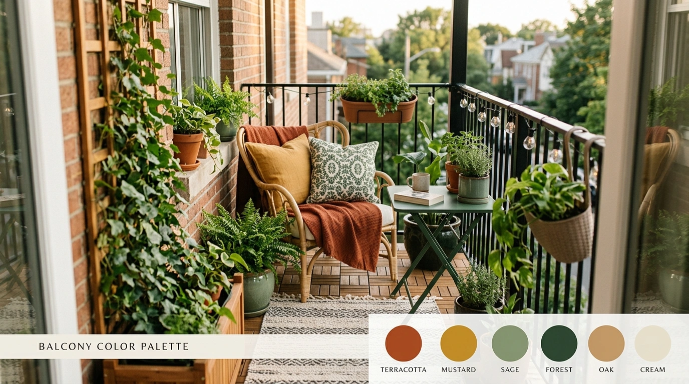
Tiny balconies have a talent for making perfectly normal decorating decisions look suspiciously bad.
A nice chair arrives. A pretty cushion gets added. Then a terracotta pot shows up, followed by a black planter, a gray rug, a random blue accessory, and suddenly the balcony looks like several shopping carts collided.
In a compact outdoor space, every color sits close to every other color. The floor, railing, walls, furniture, textiles, plants, and planters all become part of the same visual conversation, whether they were invited or not.
Small balconies have very little room for color chaos. Once the furniture, flooring, walls, plants, and cushions are all competing for attention, the space starts looking less like a finished design and more like a group project nobody supervised.
Small Balcony Color Palette Ideas
Botanical Green and Terracotta Balcony
Deep green walls, a patterned outdoor rug, and terracotta pots create an intensely lush balcony that practically requires a pair of gardening shears as an accessory. The monochromatic green creates an immersive backdrop while the clay pots keep the botanical theme grounded.
White metal bistro furniture prevents the heavier wall color from shrinking the space, offering a crisp metallic contrast to all those thriving leaves. Layered plants at varying heights fill every corner, making the small footprint feel like a secluded garden room high above the street.
Because nothing says city living quite like having more foliage than actual square footage.
Warm Sand and Terracotta Mediterranean Balcony
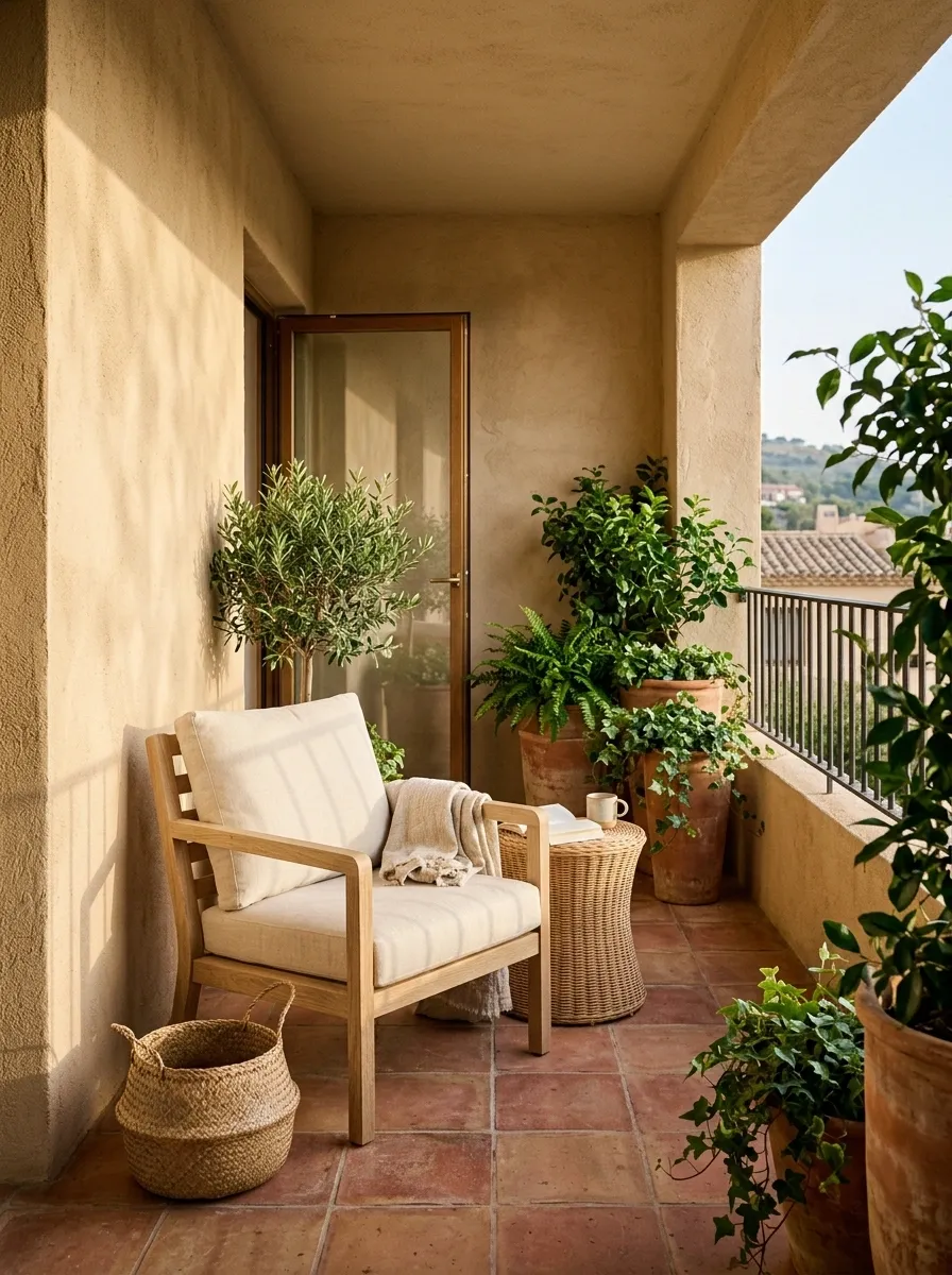
Warm sand walls, terracotta underfoot, pale oak furniture, cream cushions, and leafy plants turn a narrow balcony into a relaxed Mediterranean-inspired retreat. The terracotta should feel anchored rather than scattered everywhere, with the floor and a few planters doing most of the heavy lifting.
The lighter walls keep the composition open, while the wood prevents all that earthy color from becoming visually dense. Woven details work well here too, but restraint matters. Once the balcony has terracotta, timber, greenery, and woven pieces, it doesn’t need another seven accessories auditioning for a role.
Sunny Yellow and Green Balcony
Saturated marigold yellow walls combined with dark green shutters turn a compact balcony into a slice of sun-drenched Mediterranean architecture. The bright backdrop makes the small railing space punch far above its weight class while framing the outdoors like a classic painting.
Cascading red blooms and lush lemon trees introduce a vibrant color pop that feels entirely intentional rather than accidental. Slim bistro seating in matching red keeps the floor plan open, ensuring the intense wall color doesn’t overwhelm the petite seating area.
Proof that commitment to a bold hue pays off, provided you have sunglasses on hand.
Soft Sage and Cream Balcony With Natural Wood
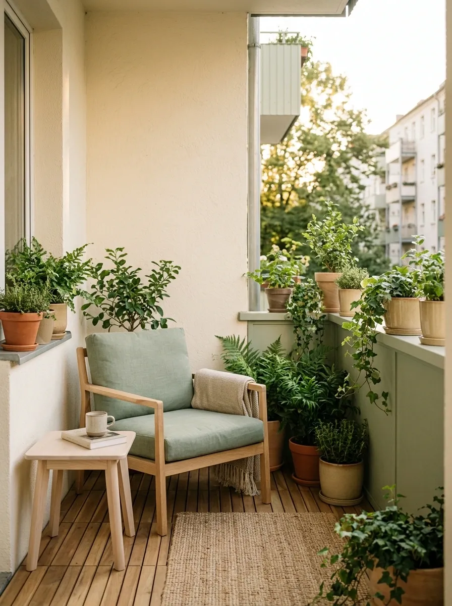
Muted sage, warm cream, and light oak create a balcony that feels calm without sliding into sterile minimalism. Keep the larger surfaces pale, then let sage appear through cushions, a compact chair, planters, or a painted railing.
The key is the wood. Pale timber adds just enough warmth to stop the cream and sage combination from looking flat, while leafy plants reinforce the green without introducing a completely new color family. The result feels light and collected, especially when the furniture stays visually slim.
And yes, sage is still allowed on Pinterest. It hasn’t been banned yet.
Blush Pink and Soft Blue Balcony
Soft pastel blue walls paired with a cloud of cascading pink roses make this tiny balcony feel like an absolute fairytale retreat. The pale backdrop keeps the small area feeling airy, while the abundance of floral blooms introduces a romantic texture that softens the railing.
A rattan hanging egg chair adds a cozy swinging element without eating up valuable floor space. Pale pink cushions, a striped rug, and delicate planters tie the entire pastel palette together into a cohesive, dreamy escape.
Who needs a sprawling backyard when you can sit suspended in a pastel pink cocoon instead?
Charcoal and Cedar Contemporary Balcony
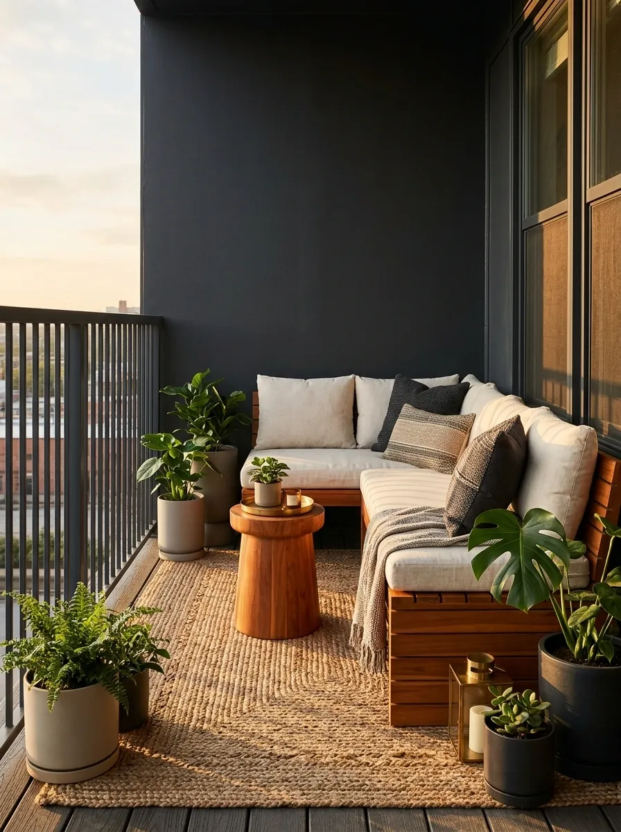
Charcoal gives this balcony a stronger architectural edge, while warm cedar-toned furniture keeps it from feeling like a very serious waiting room. Pair dark railings or walls with cream upholstery, medium-to-deep green planting, and a limited number of warm accessories.
The contrast works because the blackish tones are structural while the cedar carries warmth through the seating area. That distinction matters in a small space. When every surface is dark, the balcony loses depth. When the dark color is reserved for frames, railings, and selected furniture, the composition feels sharper without becoming gloomy.
A little contrast goes a long way here. Tiny balcony, huge opinions.
Midnight Blue and Warm Wood Balcony
Rich midnight blue walls paired with warm wood tones and glowing lanterns give this narrow balcony an effortlessly sophisticated evening atmosphere. The deep paint color creates a moody cocoon effect while framing the city lights beyond the railing.
A built-in banquette piled with patterned indigo cushions maximizes every inch of seating without cluttering the floor. Paired with a sleek wire accent chair and warm wood shelving, the composition balances dramatic color with functional comfort.
Because evening cocktails simply taste better when surrounded by moody walls and ambient lighting.
Dusty Blue and Weathered White Coastal Balcony
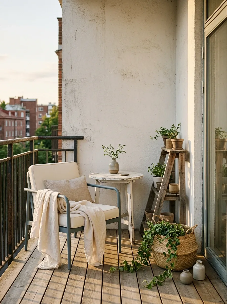
Forget the rope, anchor, and decorative lighthouse situation. This coastal palette works because it uses faded color rather than obvious beach props. Dusty blue seating, warm white walls, weathered wood, woven textures, and quiet greenery create the feeling without announcing the theme from three balconies away.
The blue works especially well when it stays slightly gray rather than bright. That lets the weathered timber and cream upholstery carry some warmth, while the greenery gives the scene enough organic variation to keep the palette from looking flat.
This is a strong choice for balconies with bright daylight, especially when the surrounding architecture already leans pale.
Olive and Walnut Moody Urban Balcony
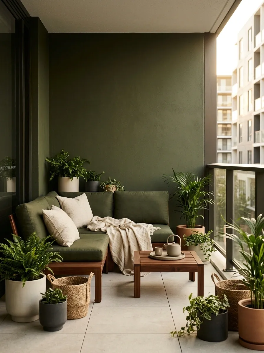
Deep olive and walnut give a small balcony a much moodier identity, especially when the architecture around it is modern and neutral. Use the darker green on cushions, a feature wall, planters, or upholstery, then bring in walnut-toned furniture and warm cream fabric to keep the scene balanced.
The trick is letting natural light do some of the work. The palette should feel deep, not dim. A cream cushion, pale floor, or light wall can keep the darker materials from swallowing the whole composition.
This is the balcony equivalent of wearing all black and then pretending the one beige bag wasn’t planned.
Blush Clay and Oatmeal Romantic Balcony
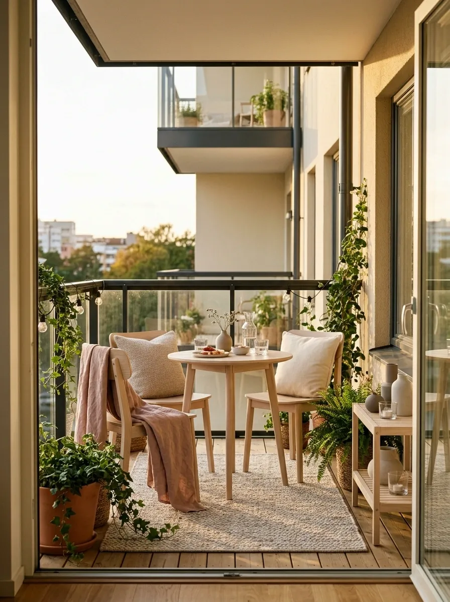
Dusty blush becomes surprisingly sophisticated when it’s paired with oatmeal, pale timber, warm cream, and plenty of green. Instead of making pink the whole personality of the balcony, use it around the seating zone and let the quieter neutrals handle the larger surfaces.
Clay-toned planters can reinforce the blush without making the palette feel overly matched. Pale wood adds a natural middle ground between the warm pink and soft neutrals, while greenery keeps the composition from becoming too sweet. The result has character without looking like a teen bedroom escaped outdoors.
The important move is keeping the pink muted. Bright bubblegum pink would change the entire mood and send this carefully balanced balcony straight into another group chat.
The blush has personality, but oatmeal covers more visual territory. That keeps the accent memorable without letting it take over the entire balcony.
Black and Warm White Parisian-Inspired Balcony
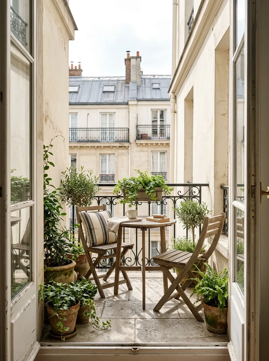
This palette gets its character from contrast and architecture rather than a mountain of decorative accessories. Slim black ironwork, warm white walls, natural wood, leafy plants, and a restrained black-and-cream stripe create a city balcony with a distinctly European feel.
The warm white matters. Pure brilliant white can make black metal feel harsh, especially in a compact space. A warmer wall tone softens the contrast while the timber prevents the setting from becoming too monochrome.
Keep the furniture silhouettes simple and let the railing do some visual work. There’s no need to add seventeen vintage-looking objects because the balcony already has an opinion.
Mushroom Beige and Black Minimal Balcony
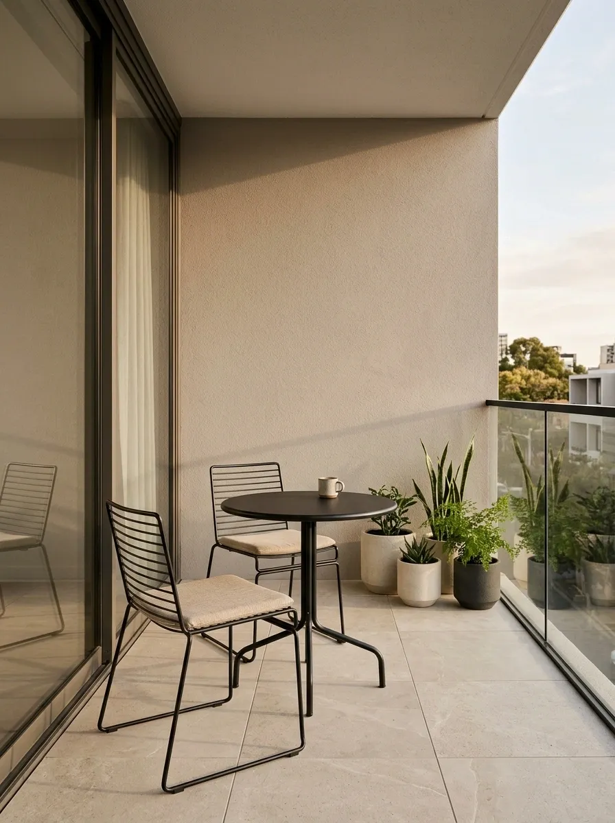
Mushroom beige gives this compact balcony a softer foundation than stark white, while slim black furniture introduces enough definition to make the space feel contemporary. Add stone-colored flooring, beige upholstery, and a restrained amount of greenery.
The palette is intentionally quiet. That makes proportion and spacing more important than decoration. A small table with generous visual clearance can actually make the balcony feel more polished than squeezing in extra furniture just because there’s technically room for it.
This is minimalism without the blank-stare showroom effect. The beige has warmth, the black has structure, and the plants prevent the whole thing from looking like a stylish architectural model nobody is allowed to touch.
Terracotta and Olive Garden Balcony
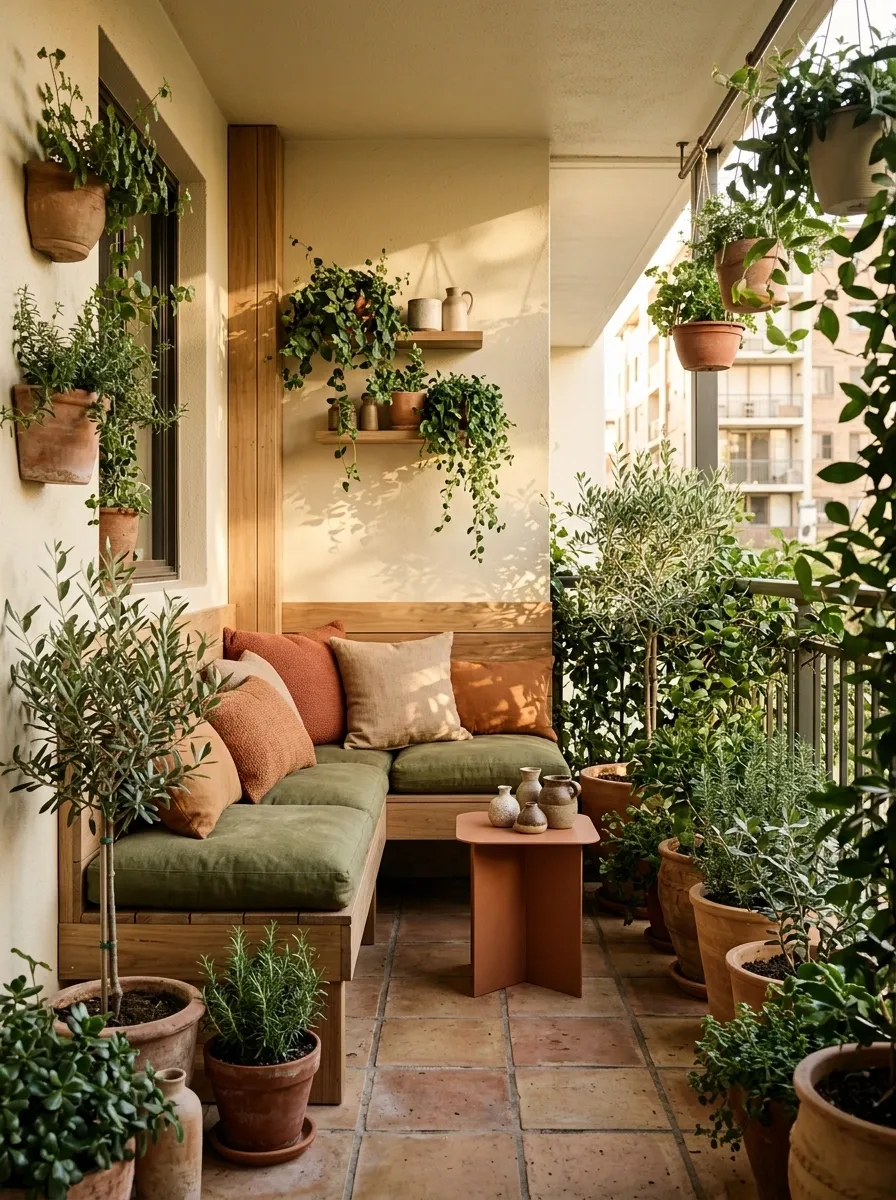
Terracotta and olive green make an especially convincing pair on a plant-heavy balcony because both colors already belong to the natural world. Terracotta can appear through floor tiles, pots, cushions, or a small side table, while olive develops through upholstery and foliage.
The strongest version keeps the architectural background quiet. Warm cream walls and timber give the saturated earth tones room to breathe, while different leaf shapes create variety without introducing another major color.
This is less “balcony with some plants” and more “tiny garden that happens to have somewhere to sit.” A fairly important distinction.
The palette builds upward naturally, with warm earth tones grounding the balcony and lighter surfaces keeping the vertical space open.
Powder Blue and Pale Oak Scandinavian Balcony
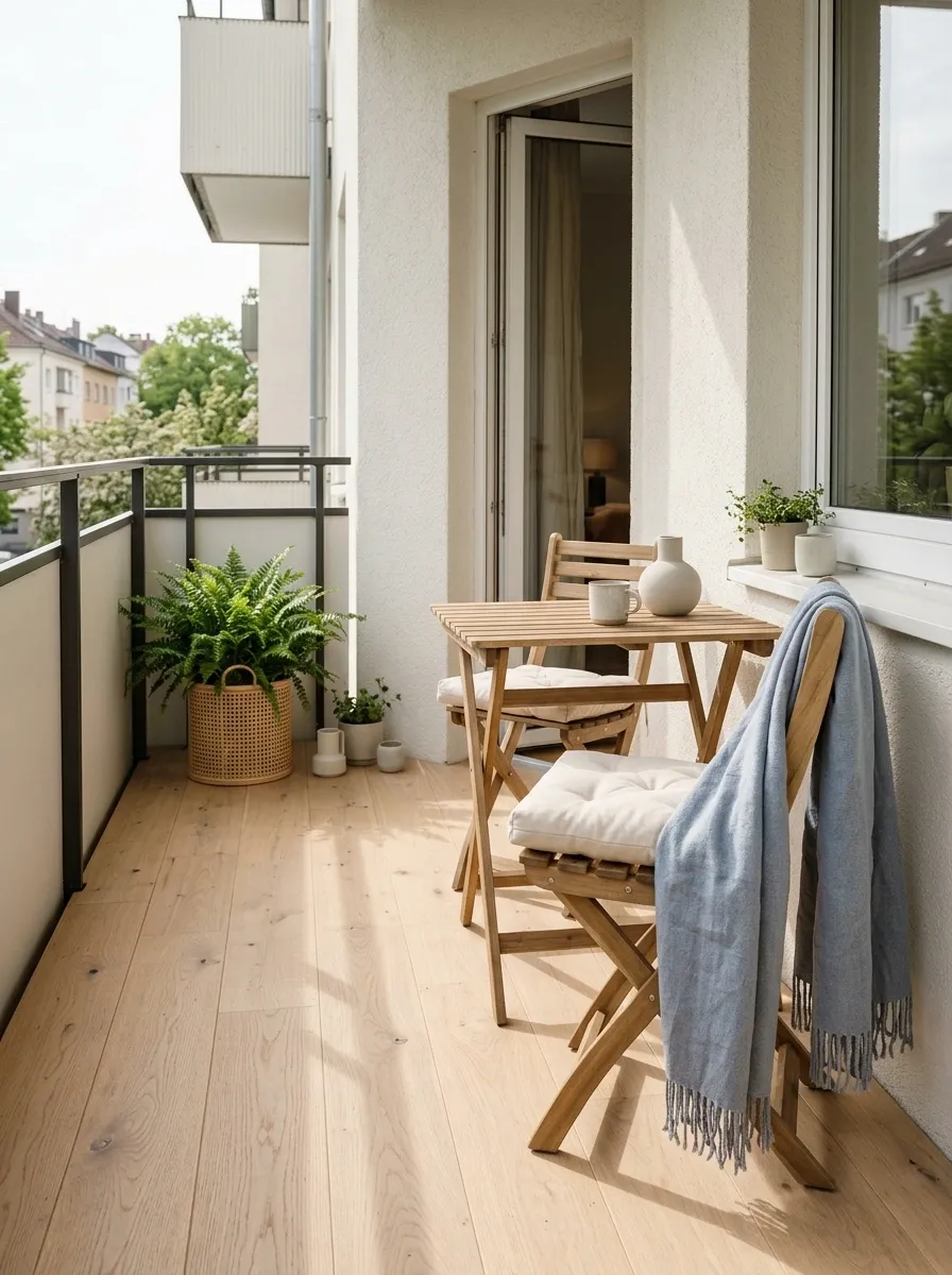
Powder blue brings just enough color to a small balcony without making it visually loud. Pair it with pale oak, cream upholstery, woven textures, and soft green plants, then leave plenty of the floor visible.
The overall composition should feel airy rather than empty. A compact folding chair, slim table, and one strong textile can do more visually than a collection of tiny accessories spread across every available surface.
The blue works best when it has a slightly gray or dusty undertone. That keeps the palette sophisticated and lets the wood carry warmth. Bright blue would change the character entirely and, frankly, would arrive at the party wearing a much louder outfit than everyone else.
Deep Forest Green and Limestone Balcony
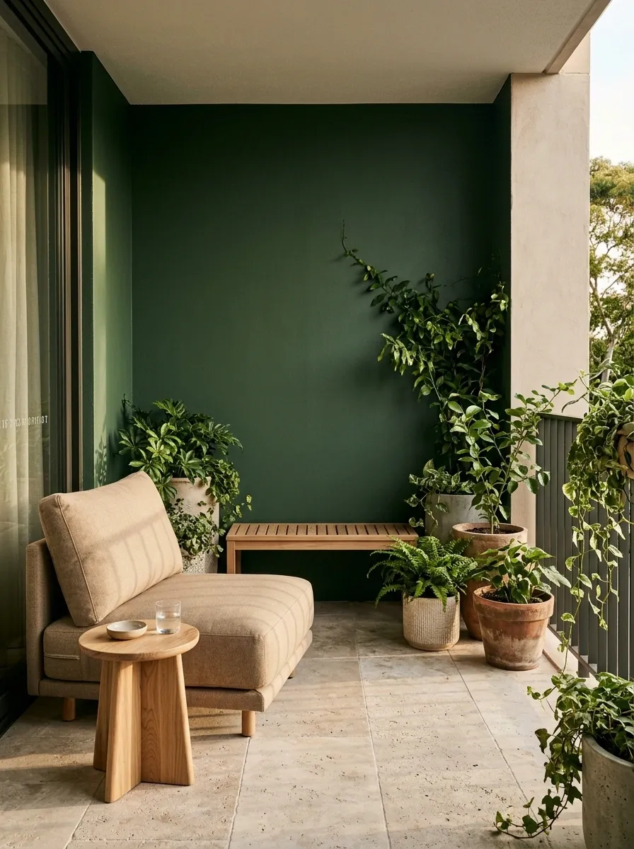
Deep forest green gives this balcony a strong sense of depth, especially when the surrounding architecture is pale. Pair it with limestone-toned flooring, warm beige upholstery, light timber, and generous foliage so the green feels connected to the rest of the setting rather than pasted on as an afterthought.
The important contrast happens between the dark green and the pale stone. That relationship gives the balcony a clear visual structure while the wood keeps the harder materials from feeling cold. Keep the furniture low and simple so the planting and color can do the work.
A dark green balcony can look sophisticated. A dark green balcony covered in twelve unrelated lanterns can look like the local garden center lost a bet.
Greige and Honey Wood Modern Balcony
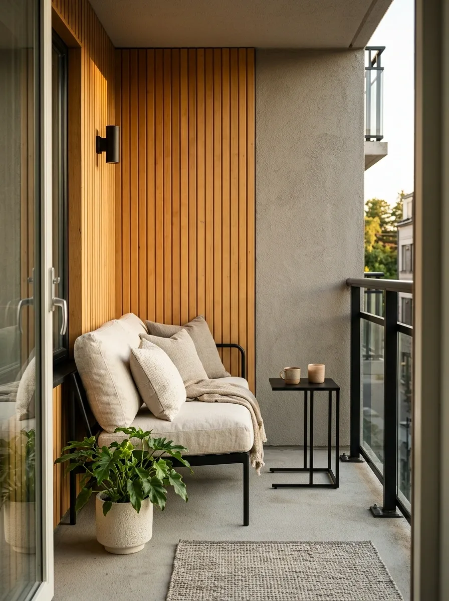
Greige gives a small balcony a softer modern base than cool gray, while honey-toned wood adds warmth without making the design rustic. Add cream upholstery, slim black details, and a small amount of green so the finished composition stays crisp.
This palette is especially effective when the balcony already has concrete or stone surfaces that need warming up. The greige acts as a bridge between those cooler architectural elements and the warmer furniture. Black should remain limited to frames, legs, or one carefully chosen detail.
The beauty of this scheme is that nothing has to shout. And on a tiny balcony, that is honestly a public service.
Burgundy, Cream, and Walnut Evening Balcony
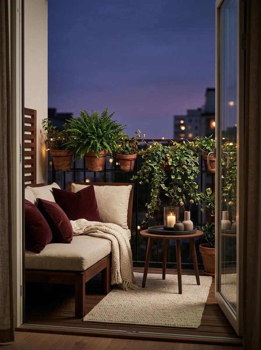
Burgundy gives a small balcony an unexpectedly rich evening personality when it’s kept around the seating area rather than spread across every surface. Pair it with walnut furniture, warm cream upholstery, dark green plants, and soft ambient lighting.
The cream is what keeps the darker palette from feeling compressed, especially when the balcony is viewed after sunset. Walnut adds depth without competing with the burgundy, while the planting introduces a quieter organic green.
This is the balcony for people who looked at a tiny outdoor space and decided it deserved main-character lighting.
Pale Yellow and White Sunny Balcony
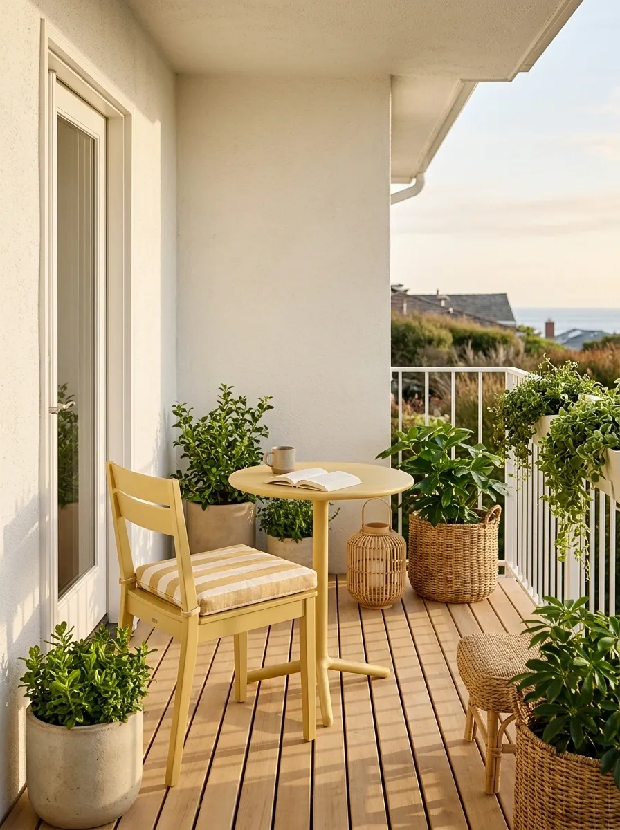
A muted buttery yellow can make a compact balcony feel cheerful without turning it into a children’s play area. Use the yellow selectively through cushions, a painted chair, striped textiles, or a small planter, then surround it with warm white, blond wood, woven textures, and fresh greenery.
The trick is choosing a softened yellow rather than a highlighter shade. Warm white keeps the composition bright, while timber adds enough natural variation to stop the palette from looking flat.
Yellow doesn’t need to be everywhere to be the star. In fact, putting it everywhere is usually how the star gets fired.
The yellow occupies a smaller share than the white and wood, which gives it more visual impact without overwhelming the compact setting.
Slate Blue and Warm Gray Modern Balcony
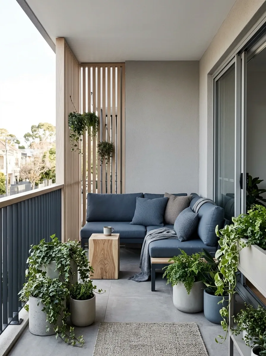
Slate blue introduces color without the intensity of brighter blues, making it a strong fit for contemporary balconies with gray tile, concrete, or metal railings. Warm gray walls and flooring soften the cooler palette, while pale timber and greenery add the missing warmth.
Keep the furniture shapes clean and let the slate blue stay concentrated around the seating zone. This creates a focal area instead of allowing the color to spread evenly across the whole balcony.
Warm gray is doing some serious unpaid labor here. Without it, the slate blue could turn cold very quickly.
Cocoa Brown and Linen Balcony Retreat
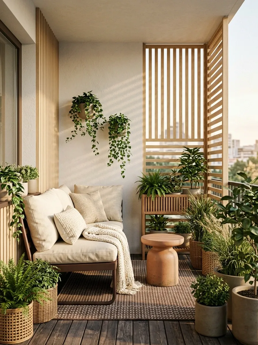
Cocoa brown brings a deeper, warmer character to a small balcony without relying on black. Use it around the seating zone through a compact chair, bench, cushions, or rug, then soften it with creamy linen, light timber, muted clay, and plenty of greenery.
The darker brown should sit lower in the composition, while the lighter fabrics and walls keep the upper half of the balcony open. That creates a grounded feeling without making the space visually squat. Natural textures also matter here because flat brown surfaces can become heavy very quickly.
This is warm, relaxed, and slightly dramatic. Basically, the balcony has stopped pretending it wants to be a waiting area.
Soft Black, Sage, and Natural Fiber Balcony
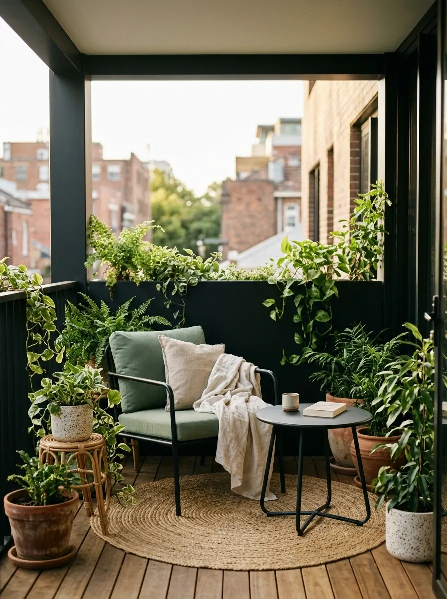
Soft black metal creates a clean frame around sage cushions, woven seating, natural timber, cream textiles, and abundant greenery. The palette feels contemporary, but the natural fibers keep it from becoming overly hard or industrial.
Texture does a lot of the work here. A black metal chair next to woven fiber reads very differently from black metal next to glossy plastic. The color remains simple, but the materials stop the composition from feeling flat.
Keep the sage around the main seating area and let the plants carry the deeper greens. The goal is contrast, not a botanical hostage situation.
Mauve, Stone, and Dark Green Balcony

Muted mauve makes an unusual but elegant pairing with pale stone, dark green, warm beige, and aged wood. The trick is keeping the mauve dusty and restrained, then allowing the deeper green planting to provide the stronger contrast.
This works particularly well in a balcony surrounded by pale masonry or stone-colored architecture. The mauve brings a little personality to the seating area while the stone tones keep the larger surfaces quiet.
The palette feels collected rather than color-matched. That distinction matters. Matching every little object exactly is how a balcony starts looking like it came with assembly instructions.
Cream, Rust, and Weathered Wood Balcony
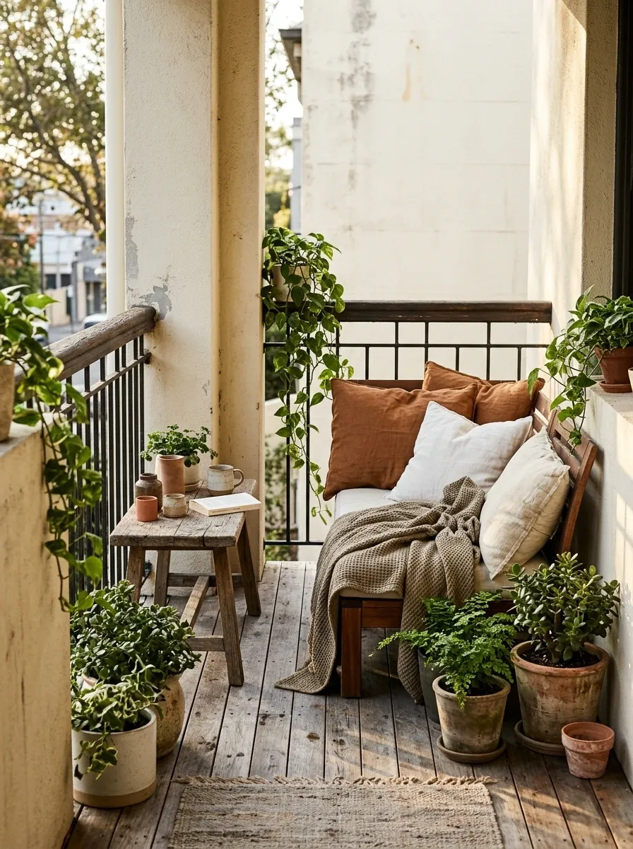
Cream walls, rust-colored textiles, weathered timber, handmade-looking pottery, and green planting create a balcony that feels relaxed and established rather than freshly assembled from one shopping trip.
The strongest compositions let the wood show some variation. Perfectly matching timber furniture can make the palette feel overly coordinated, while slightly different warm wood tones create more depth. Rust should appear in a few substantial places, such as cushions and pottery, rather than being sprinkled across every available object.
The whole thing should look like it acquired character over time. Not like someone searched “rustic balcony” at 2 a.m. and bought everything in one cart.
Deep Navy, Brass, and Warm Cream Balcony
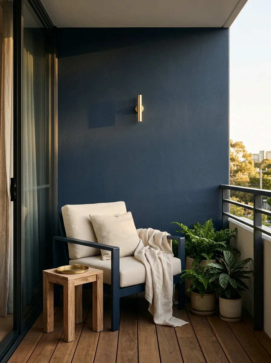
Deep navy gives a small balcony a polished, almost tailored feeling when paired with warm cream, restrained brass details, natural timber, and leafy plants. The navy works best around the main furniture or one architectural surface, while cream keeps the overall scene from becoming visually dense.
Brass should stay tiny and deliberate. A slim light, table detail, or hardware can catch the light without turning the balcony into a showroom for shiny gold objects. Timber softens the contrast and gives the navy somewhere warmer to land.
This palette is proof that a small balcony can look sophisticated without needing to cosplay as a luxury hotel terrace.
Clay Pink and Sage Small Apartment Balcony
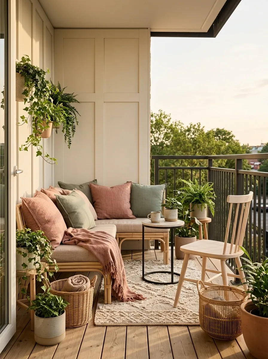
Clay pink and muted sage bring a softer personality to a small apartment balcony without making the space feel overly sweet. Use clay pink around the main seating area, then bring sage through cushions, planters, and greenery. Cream and pale wood should handle the larger visual surfaces.
The two main colors work because neither one is aggressively bright. Their dusty quality lets them sit together without turning the balcony into a color competition. Woven textures and simple furniture keep the composition relaxed, while a small amount of black can sharpen the edges.
It has just enough color to feel intentional. Not enough to make the balcony look like it has been personally offended by neutral paint.
Warm Gray, Terracotta, and Black Urban Balcony
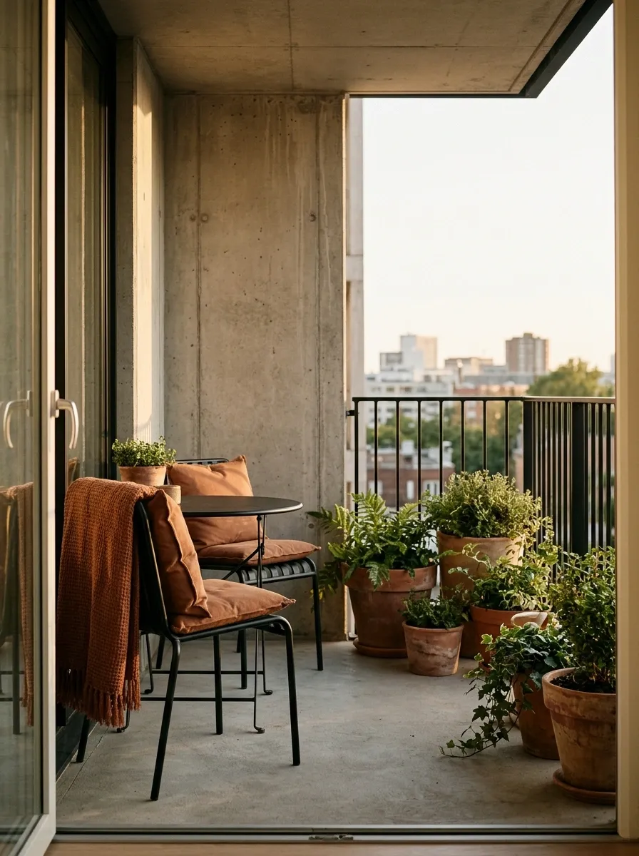
Warm gray gives this balcony a dependable architectural base, while terracotta brings the color and black adds definition. Gray can occupy the flooring or walls, black works through slim furniture and railing details, and terracotta appears around cushions, planters, or one substantial textile.
This combination feels particularly strong against modern apartment architecture because it works with concrete without becoming completely gray-on-gray. The terracotta also warms up the black in a way that feels intentional rather than severe.
The palette has a nice “city apartment, but someone here owns a plant” quality.
Cream, Rattan, and Eucalyptus Balcony
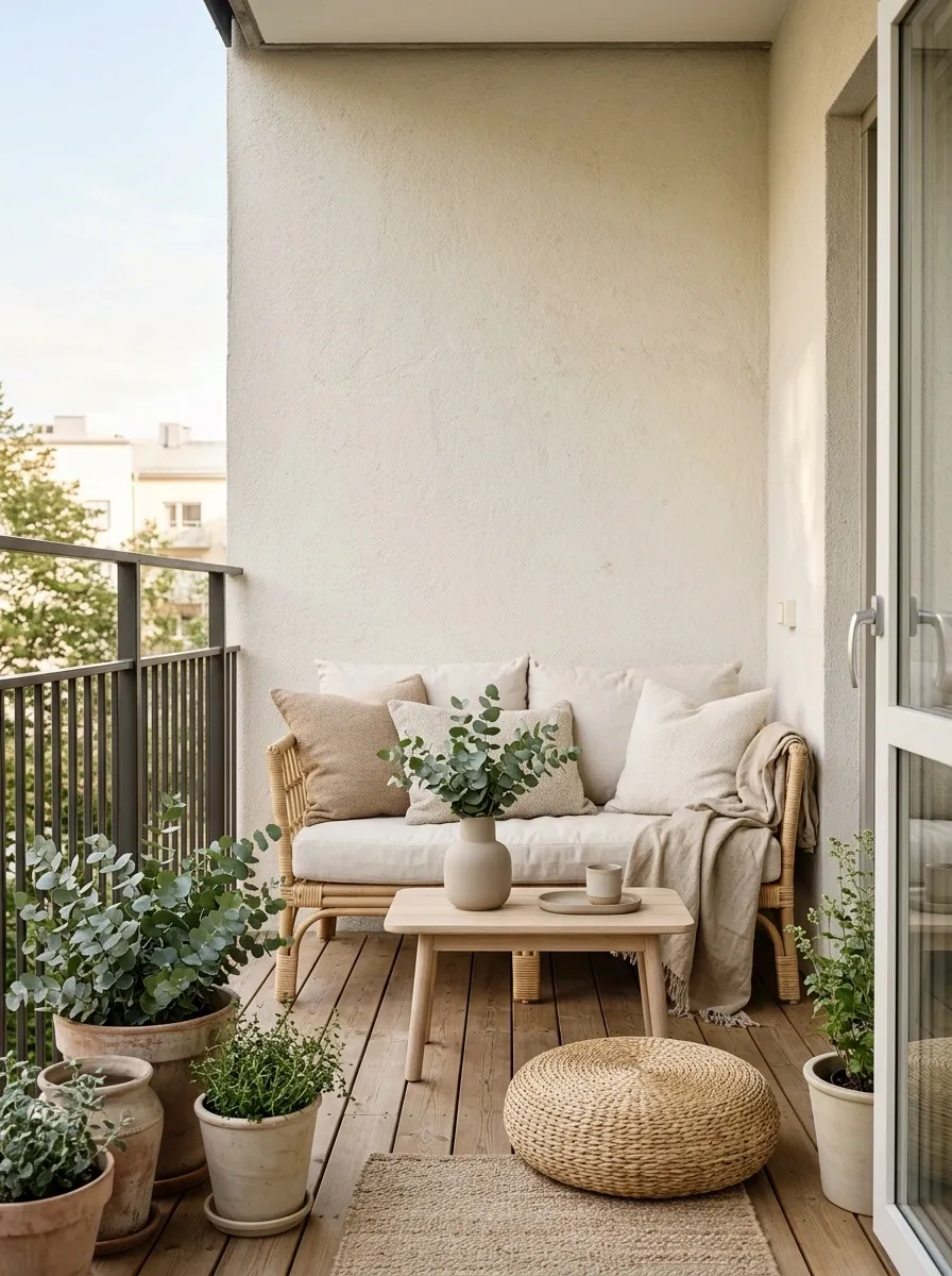
Cream, warm beige, natural rattan, pale timber, and soft eucalyptus green create a light balcony where texture carries almost as much visual weight as color. Keep the architectural background simple and let woven furniture, linen cushions, timber, and foliage create the variation.
This scheme is especially effective on very small balconies because there isn’t a strong contrast line chopping the space into sections. The colors remain close in value, so the eye moves across the materials instead of stopping at every object.
Basically, the balcony gets to whisper. There is no need for every chair cushion to submit a personal statement.
Espresso, Cream, and Brass City Balcony
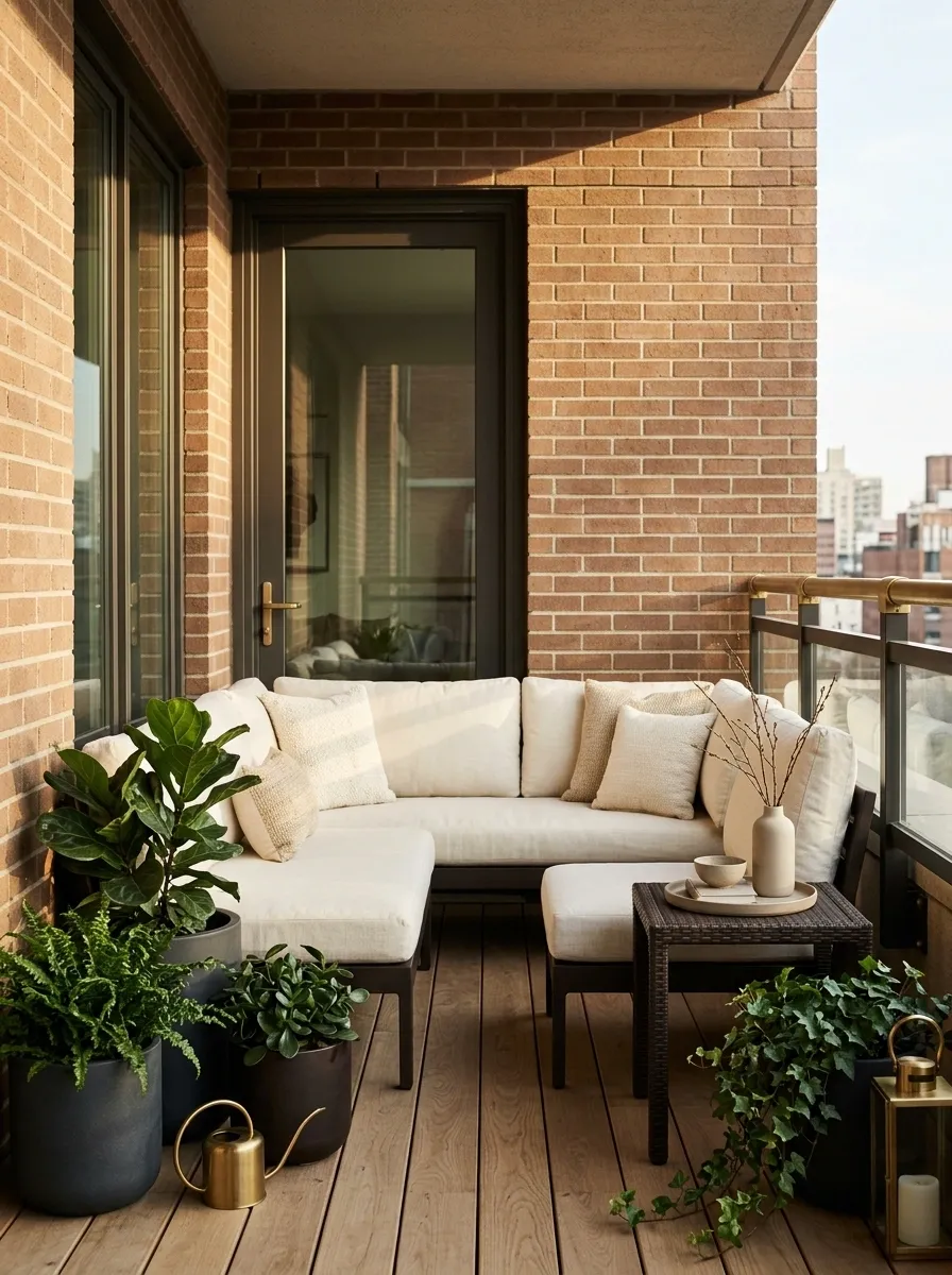
Espresso brown gives compact outdoor furniture a richer appearance than standard black, especially when paired with cream cushions and warm brass details. Dark greenery can deepen the palette, while a warm architectural background prevents the furniture from looking too heavy.
Keep espresso concentrated around the seating and lower half of the balcony. Cream should sit higher in the composition through cushions or walls, giving the eye a lighter area to move toward. Brass belongs in tiny quantities, where sunlight or evening lighting can catch it.
The result feels grown-up without becoming painfully formal. Nobody needs a balcony where even the side table looks like it has a mortgage.
Faded Green, Terracotta Tile, and Oak Balcony
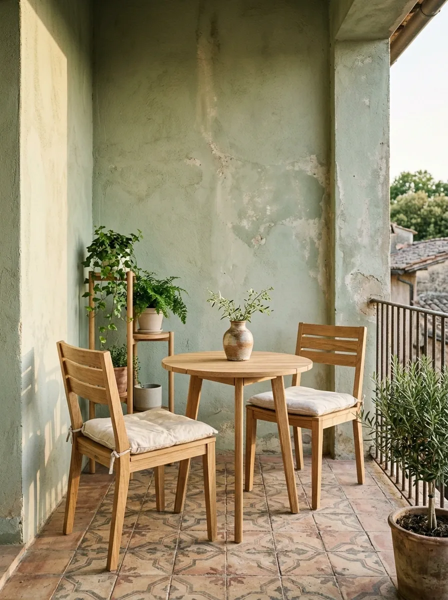
Faded green walls or textiles paired with terracotta flooring and warm oak furniture create a balcony with strong old-world character. The floor becomes part of the palette instead of being treated as a background, which gives the entire design a more grounded appearance.
Cream cushions and soft greenery keep the colors connected, while the oak bridges the green and terracotta beautifully. Let the tile pattern remain visible rather than covering most of it with rugs and furniture. In a small balcony, the floor is valuable visual real estate.
The terracotta is already doing enough. It does not need twelve matching pots lined up like they’re waiting for roll call.
A small balcony doesn’t need a complicated palette to look considered. What matters is that the colors have a relationship with each other and with the architecture around them. A warm floor can anchor a pale scheme. Dark furniture can sharpen a soft one. Plants can extend a green palette instead of becoming another unrelated color. Even a bold shade like burgundy or cobalt can work when it has a clear place in the composition.
The easiest way to narrow the choices is to start with what cannot easily change, then build outward. Existing tile, railing, walls, and surrounding architecture already occupy visual space, so the movable pieces should work with them rather than starting an entirely separate color story.
Save the combinations that feel closest to the balcony already sitting outside the door. That usually gets a better result than trying to force a fantasy palette into a space that clearly has other plans.
Save this collection for the next balcony refresh, and keep the favorite palettes handy before the shopping cart starts making unauthorized decisions.