
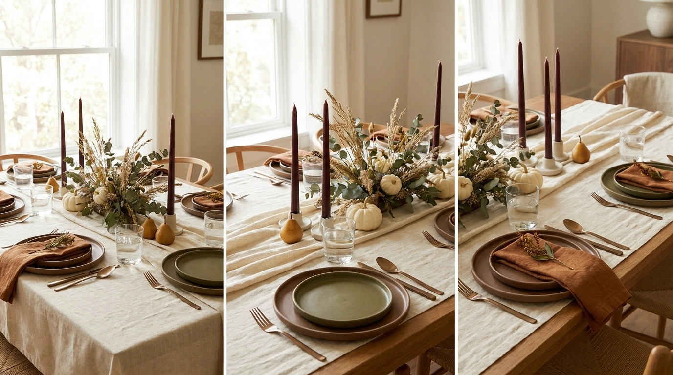
A Thanksgiving table can have beautiful plates, expensive candles, fresh flowers, and enough decorative pumpkins to supply a small farm, yet still look like everything was purchased during three separate emotional shopping episodes.
Usually, the problem isn’t the decorations themselves. It’s the lack of a plan. A rustic centerpiece sits awkwardly beside contemporary dinnerware, the runner competes with the plates, and the flowers occupy the exact space needed for the mashed potatoes. The table is technically decorated. The overall look, however, is having a small crisis.
From understated oak and ivory to moody jewel tones, graphic patterns, and lively Friendsgiving setups, these designs offer practical inspiration for tables that look considered without taking themselves too seriously. The food still gets a place at the table. Imagine that.
The Thanksgiving Tablescape Group Chat
Pretty table. Questionable decisions.
Before the turkey arrives, let’s discuss a few decorating choices that deserve to stay in the drafts.
Gorgeous flowers. Shame nobody can see the person sitting across from them. Thanksgiving is dinner, not a botanical obstacle course.
Seventeen pumpkins, three pinecones, and approximately six inches of usable table space. The produce aisle would like a word.
The tablescape is thriving. Dinner service is currently experiencing a housing crisis.
Make the table look incredible. Leave room for dinner, conversation, and human elbows.
Modern Thanksgiving Tablescape Ideas
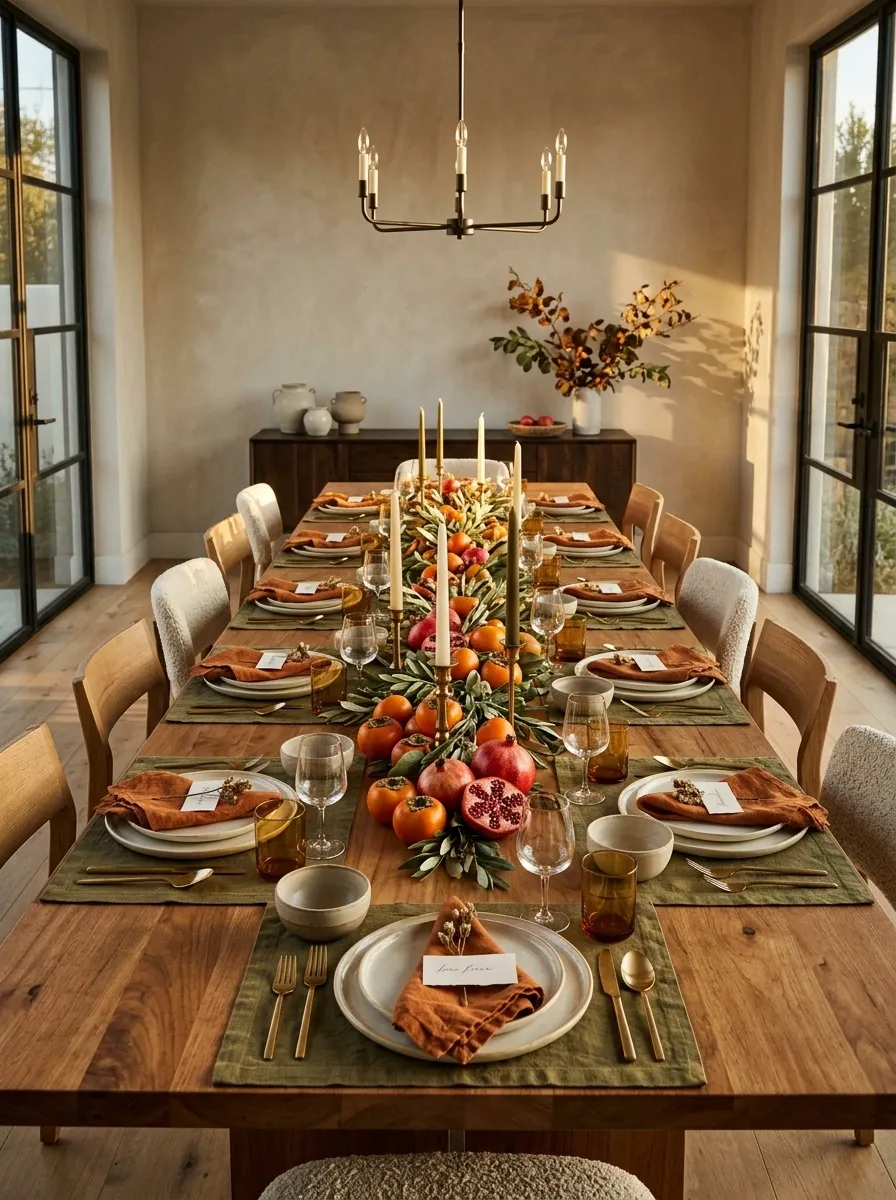
Persimmon, Rust, and Olive Harvest Table
Persimmon, Rust, and Olive Harvest Table
This table brings autumn indoors without covering every available surface in orange leaves.
Burnt-orange napkins sit against olive-green linen, warm timber, and handmade stoneware. Persimmons, pomegranates, and restrained greenery create a low, abundant centerpiece, while simple cream plates give the stronger colors somewhere to rest.
The composition works because the colors recur in different parts of the table. Rust appears in the textiles and fruit, olive grounds the arrangement, and ivory keeps the whole thing from becoming visually heavy. The result feels seasonal without resorting to the familiar pumpkin parade.
Keep the fruit clustered rather than scattered randomly. A few deliberate groupings read as a centerpiece. Fruit everywhere reads as a grocery delivery that took a wrong turn.
A palette with a purpose
Each color gets its own job. Nobody needs to shout.
Plum and Ink Tablescape With Dramatic Candlelight
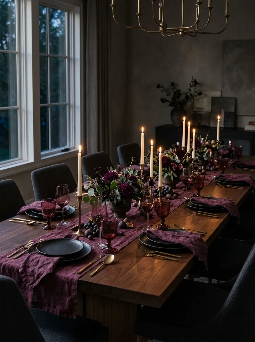
Deep plum, near-black dinnerware, and warm candlelight create a Thanksgiving table with considerably more evening energy than another beige-and-burlap arrangement.
A dark dining table anchors plum textiles, near-black plates, translucent burgundy glassware, and slender ivory taper candles. A low arrangement of dark foliage and restrained flowers provides depth without turning the table into an obstacle course. The surrounding room stays relatively quiet, with the warm candlelight bringing out the different finishes.
The balance comes from placing the darkest colors in the larger surfaces and allowing glass and candlelight to introduce lighter moments. Keep the floral arrangement below seated eye level, and leave open spaces between candle clusters.
This is the dramatic dinner-party direction. It doesn’t need an additional layer of fake cobwebs, gothic lettering, or anything else that suggests Halloween missed its checkout date.
Drama belongs in the details, not in someone’s line of sight.
Scandinavian Thanksgiving With Pale Wood and Chalk Ceramics
Clean lines, pale timber, and chalk-white ceramics give this tablescape its quiet Scandinavian character. Nothing is fighting for attention, and somehow that makes every detail look more considered.
A pale wood dining table is dressed with soft gray linen, simple white stoneware, clear glasses, and a sparse arrangement of delicate branches. Light timber chairs and uncluttered surroundings preserve the airy feeling, while a few tactile details keep the composition from looking like a furniture showroom that has never encountered a human being.
The trick is to keep the shapes simple but not identical. Slightly irregular plates, loosely folded napkins, and a textured runner introduce enough variation to stop the neutral palette from feeling flat.
Skip the urge to fill every empty space. Here, the breathing room is part of the design.
The takeaway: Simple shapes need texture, not a pile of accessories to keep them interesting.
Sage and Limestone With Organic Modern Details
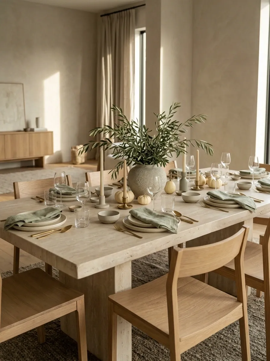
This tablescape is for anyone who wants an autumn dinner to feel grounded and natural without bringing an entire woodland indoors.
A pale stone or limestone table pairs with sage-green napkins, rounded cream ceramics, and timber dining chairs. A low stone vessel holds olive branches, while the dining room’s soft plaster walls and natural light reinforce the muted palette. The overall composition feels organic, but its cleaner furniture silhouettes keep it firmly in modern territory.
The appeal comes from the contrast between hard and soft materials. Stone gives the table visual weight, linen takes the edge off the architecture, and wood introduces a warmer note. The greenery adds movement without demanding an elaborate floral arrangement.
Keep the greenery loose and the centerpiece low. The goal is a dining table, not a luxury spa reception desk.
Three textures. One calm composition.
Keep in mind: Similar colors look more interesting when their surface textures are different. Beige on beige isn’t the problem. Beige with absolutely nothing happening is.
Black-Tie Thanksgiving With Porcelain, Brass, and Black Linen
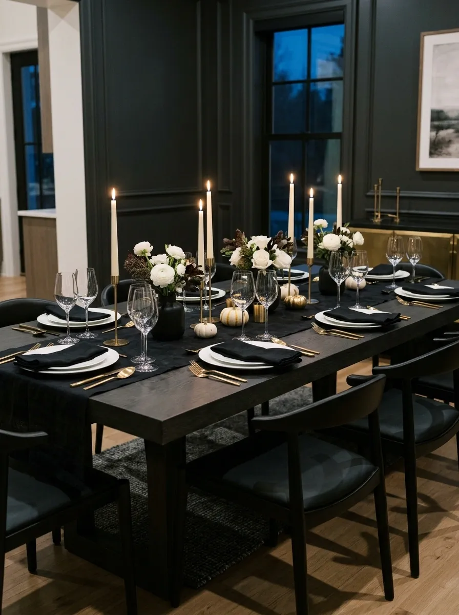
Black linen, crisp white porcelain, and brass flatware give this Thanksgiving table the energy of a very expensive dinner reservation, except nobody has to ask for separate checks.
A dark dining table anchors the setting, while white dinner plates create a sharp contrast against the black textile. Polished brass flatware, clear wine glasses, and slender ivory taper candles introduce warmth. A compact arrangement of white flowers sits near the center, surrounded by dark contemporary chairs and restrained room finishes.
The secret is contrast with a clear hierarchy. Black grounds the composition, white keeps it from feeling heavy, and brass supplies just enough shine. Keep the flowers understated and resist adding metallic accents to every possible object. The table is elegant already. It doesn’t need to audition for a jewelry commercial.
Modern Heirloom Table With Antique Silver and Contemporary Glassware
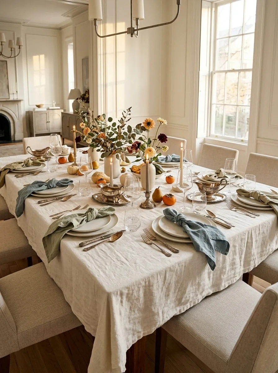
Antique silverware and modern glassware make a surprisingly good pair. One brings the family-history energy. The other makes sure the entire room doesn’t look like a period drama.
A relaxed ivory tablecloth covers a traditional dining table, with vintage silver serving pieces arranged alongside plain contemporary plates, clear stemware, and muted sage or dusty-blue napkins. The centerpiece uses loose seasonal branches and a few understated flowers. Modern dining chairs and a bright room stop the older pieces from dominating the composition.
The magic lies in the contrast between ornate and simple. Let the silver carry the intricate detail, then keep nearby surfaces comparatively quiet. Mixing inherited pieces with contemporary basics also means the setting can feel personal without requiring an entire matching vintage collection.
And no, the silver doesn’t need to be polished until guests can check their eyeliner in it.
The mix is the whole point.
Intricate details, patina, and a sense of history.
Simple silhouettes and visual lightness.
The balancing act: Give the elaborate pieces room to stand out. Plain plates and uncomplicated linens keep the whole table from feeling like an antique shop acquired a catering license.
Citrus and Persimmon Tablescape With Bold Autumn Color
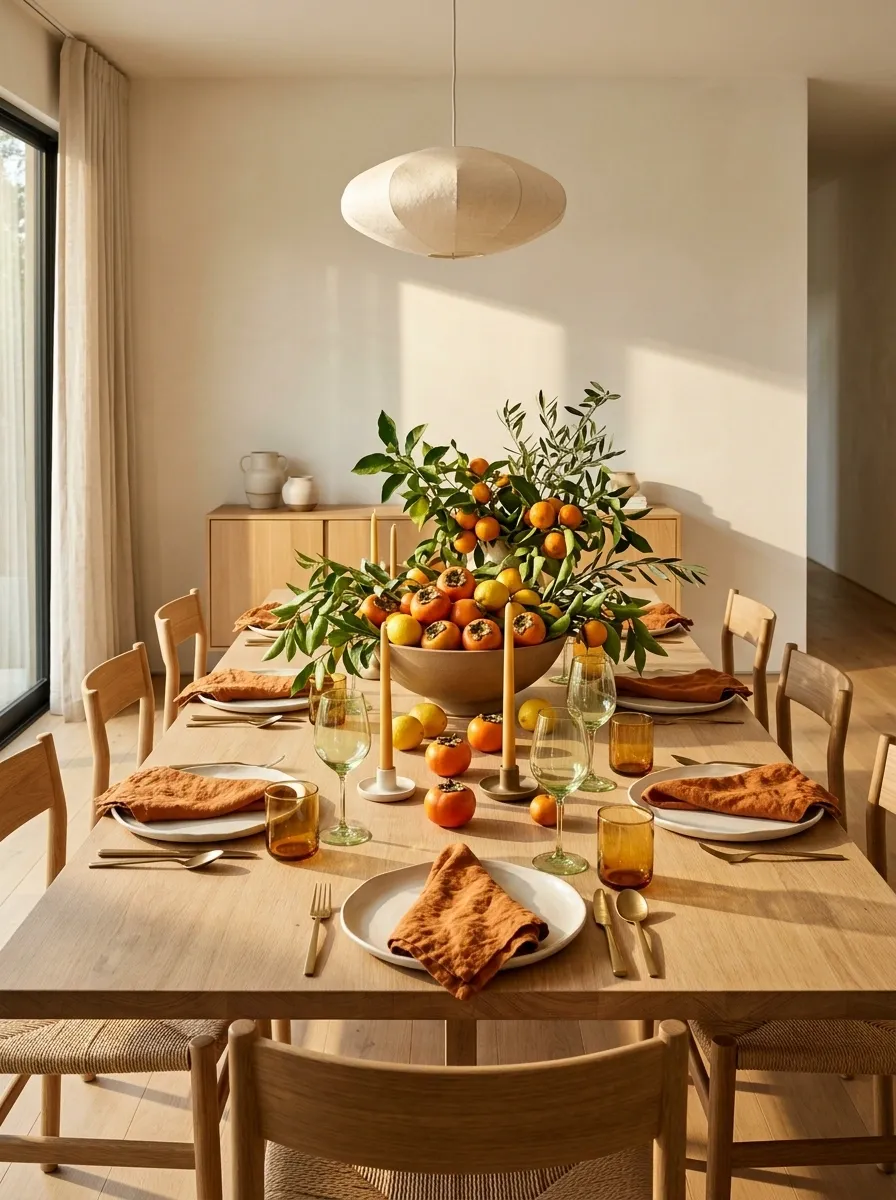
Who decided Thanksgiving had to choose between beige everything and orange everything? This tablescape respectfully declines both options.
A light timber dining table sets the stage for persimmons, lemons, leafy green branches, warm-white plates, and colored glassware in shades of amber or pale green. Tangerine or rust-colored napkins add another seasonal layer, while the surrounding room stays light and uncluttered. The fruit arrangement forms one concentrated focal point rather than a trail of decorative produce running between every plate.
The palette works because the bright colors are balanced by plenty of neutral surface. Fruit also adds irregular shapes that make the centerpiece feel more natural than a perfectly symmetrical arrangement of matching objects.
Keep the fruit grouped in shallow bowls or compact clusters. The goal is a lively harvest composition, not a farmers’ market with a seating chart.
Let the fruit bring the drama.
Coastal Thanksgiving With Washed Blue, Sand, and Weathered Wood
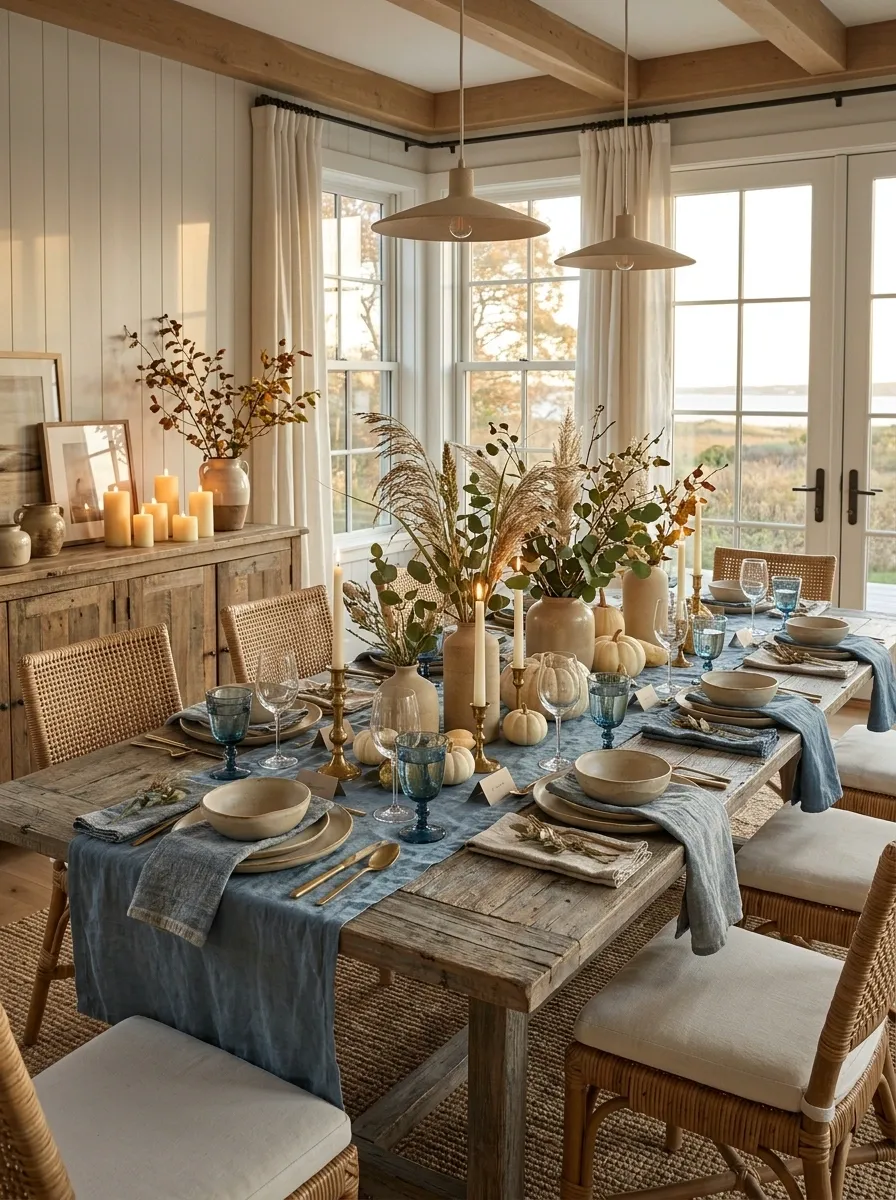
Not every Thanksgiving table needs to look like autumn moved into a barn. A coastal setting can feel seasonal without a single burlap runner in sight.
A weathered wood dining table is paired with washed-blue linen, sandy neutral ceramics, woven chairs, and loose coastal grasses. Clear glassware keeps the setting light, while a few ivory candles introduce warmth for a late-afternoon meal. The surrounding room features natural textures and generous daylight, with the furniture and tabletop working together as one complete scene.
The palette balances cool blue against warm wood and sandy beige. This makes the setting feel relaxed without drifting into a summery beach-party look. A slightly deeper blue in the napkins or glassware helps give the table enough visual weight for Thanksgiving.
Keep seashells and nautical accessories out of the centerpiece. The coast has already made its point. No one needs a miniature lighthouse next to the gravy boat.
Small Apartment Thanksgiving on a Round Dining Table
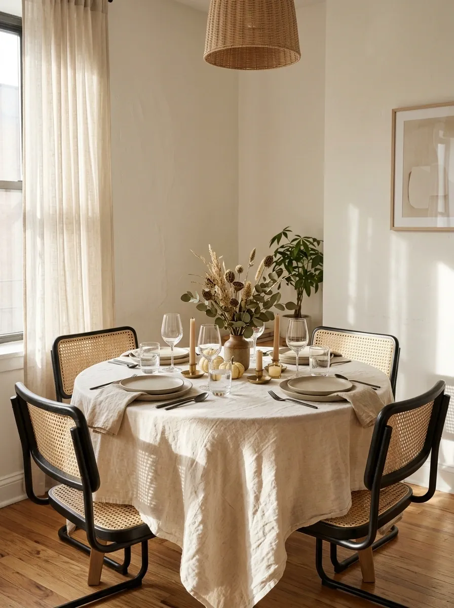
A small dining area can host a genuinely lovely Thanksgiving dinner. It simply cannot host a twelve-foot centerpiece, three serving platters, and the fantasy that nobody needs to move their chair.
A compact round table sits in a bright apartment dining nook, surrounded by slim-profile chairs. A simple linen cloth, neutral stoneware, clear glasses, and a low centerpiece keep the arrangement visually open. Nearby, a narrow console or kitchen counter handles extra serving dishes, leaving the actual dining surface for plates, drinks, and conversation.
The round shape encourages an intimate composition, while the restrained centerpiece avoids creating a visual wall in the middle of the table. Light finishes help the small room feel connected rather than crowded.
The smartest move is to plan where the food will go before choosing the decorations. The gravy deserves a seat at this gathering too.
The table has limited real estate. Act accordingly.
Small-room rule: Protect the space needed to sit down, serve food, and move around. A beautiful dinner is less convincing when the host has to relocate a candle every time someone wants a roll.
Jewel-Tone Thanksgiving With Emerald, Teal, and Berry
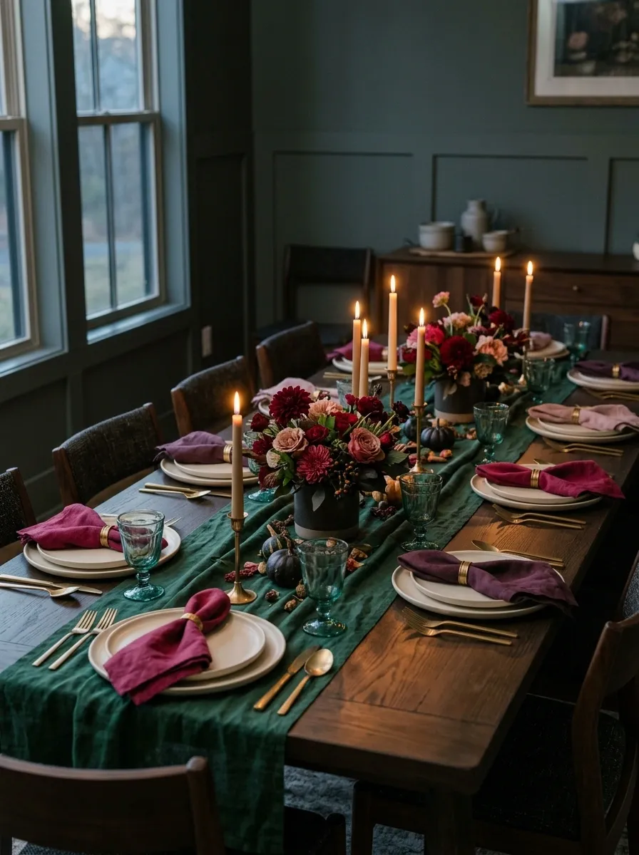
Neutral tables have their place. This one would prefer a little drama, thank you very much.
Deep emerald textiles meet teal glassware, berry-colored napkins, cream plates, and dark wood furniture. Carefully positioned warm lighting brings out the richer colors, while a compact floral centerpiece in burgundy and muted pink ties the palette together. The surrounding room stays relatively simple, allowing the layered color to do the heavy lifting.
The important distinction is that the colors have different jobs. Emerald anchors the table, berry supplies the contrast, and cream prevents the entire arrangement from turning into one dark mass. Teal glassware adds a translucent layer that catches the light without introducing another competing focal point.
This is a strong direction for an evening dinner with a little personality. Just resist the urge to add five more jewel tones because the fabric shop made them look irresistible.
Let one color lead the conversation.
Keep a little breathing room. Cream plates and warm lighting prevent the saturated shades from becoming visually exhausting. The table can be colorful without looking like a paint store lost control of the sample wall.
Tonal Cream Tablescape With Sculptural Shapes and Soft Texture
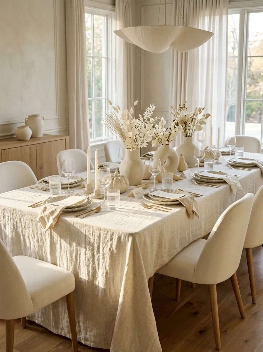
An all-cream Thanksgiving table sounds like a cleaning bill waiting to happen. Visually, though, it can be one of the most sophisticated looks in the collection when the materials do more than sit there looking beige.
A softly textured cream tablecloth supports fluted ceramic plates, ribbed glassware, a sculptural matte vase, and pale flowers. Upholstered dining chairs and warm wood flooring give the room a subtle contrast, while daylight reveals the differences between the woven textile, curved ceramics, and transparent glass.
The key is variation within the same color family. Texture, silhouette, and shadow keep the composition dimensional even though the palette barely changes. Avoid introducing a strong new accent just to make the table more interesting. That would be like interrupting a good conversation to announce the color of the walls.
The texture does the decorating.
Walnut and Copper Table for a Low-Light Thanksgiving Dinner
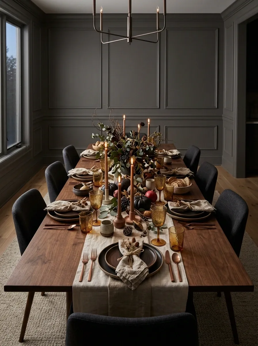
This is the table for a dinner that starts in the late afternoon and quietly turns into the kind of evening where nobody checks the time.
A rich walnut table anchors copper-toned accents, deep brown ceramics, amber glassware, and a loosely arranged centerpiece of dark foliage. Ivory or oatmeal linen softens the deeper surfaces, while candlelight and restrained overhead lighting create pools of warmth across the setting. The dining room stays visible enough to appreciate the wood grain and surrounding furniture rather than disappearing into darkness.
Copper works particularly well here because its warm sheen responds to the light without needing a polished, mirror-like finish. Amber glass echoes the timber, while pale linen supplies contrast.
Keep the candle placement deliberate and stable. Mood lighting is lovely. Trying to locate the bread basket in a dramatic cinematic shadow is less charming.
Warm light, visible dinner.
Keeps the table and dining room readable.
Add warmth and intimate pools of light.
Desert Modern Thanksgiving in Clay, Blush, and Sand
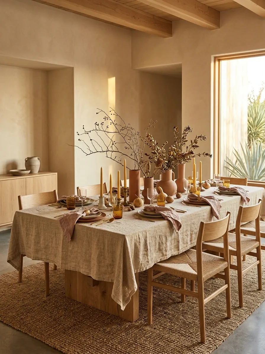
Autumn colors don’t have to stop at burnt orange and forest green. A desert-inspired palette offers a softer, sun-warmed alternative, with terracotta, dusty blush, sand, and natural wood working together in a relaxed modern composition.
A sand-colored tablecloth anchors terracotta vessels, muted blush napkins, and handmade-looking ceramics. Dry branching stems create an airy centerpiece, while natural wood chairs and warm plaster walls give the dining room a Southwestern-inspired character. The arrangement has warmth without relying on heavy rustic props or literal harvest decorations.
The palette works because its colors share a muted, earthy quality. Terracotta gives the table definition, blush softens it, and sand keeps the composition light. Natural textures connect everything without introducing a new color at every turn.
Keep the stems loose and the ceramics varied in shape. The aim is sculptural simplicity, not a themed restaurant where every object has been instructed to wear desert colors.
Earthy, muted, and deliberately imperfect.
Make the finishes do some work. Matte ceramics, woven linen, and visible wood grain give this palette depth. Matching every object to the same terracotta shade would flatten the entire composition.
Botanical Green-on-Green Table With Layered Foliage
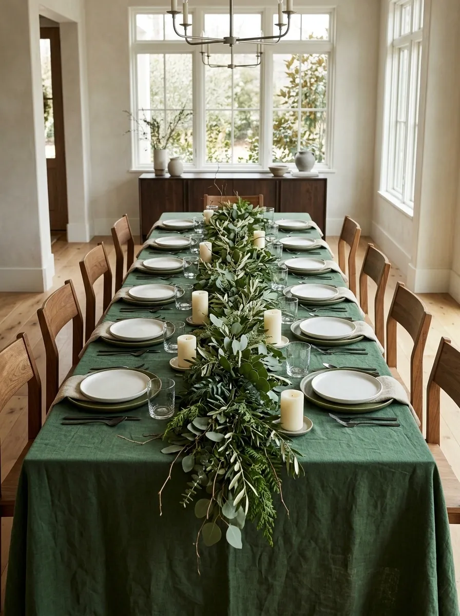
For anyone who thinks a Thanksgiving centerpiece should contain more leaves than flowers, this green-on-green composition makes a convincing case.
Forest-green linen anchors moss-toned ceramics, clear glassware, and a low, spreading arrangement of foliage. Timber chairs soften the darker palette, while a bright dining room keeps the setting from feeling like dinner is taking place inside a very expensive hedge. A few ivory candles create subtle breaks in the greenery.
The trick is to vary the shades and shapes of the leaves rather than relying on one uniform green. Broad foliage, slender branches, and smaller clustered leaves create depth without introducing more colors. Keep the plates relatively simple so the centerpiece remains the focal point.
And please, no need to place a tiny potted plant beside every guest. The table is botanical enough already.
Depth comes from shape, not more stuff.
Ground the table with linen and larger foliage.
Introduce softer leaves and secondary details.
Create lighter moments throughout the arrangement.
Keep the foliage varied. Mix leaf sizes and silhouettes, then leave open patches between clusters. Otherwise, the centerpiece risks becoming a very ambitious salad bar.
Cool Modern Table With Chrome, Clear Glass, and Soft Gray
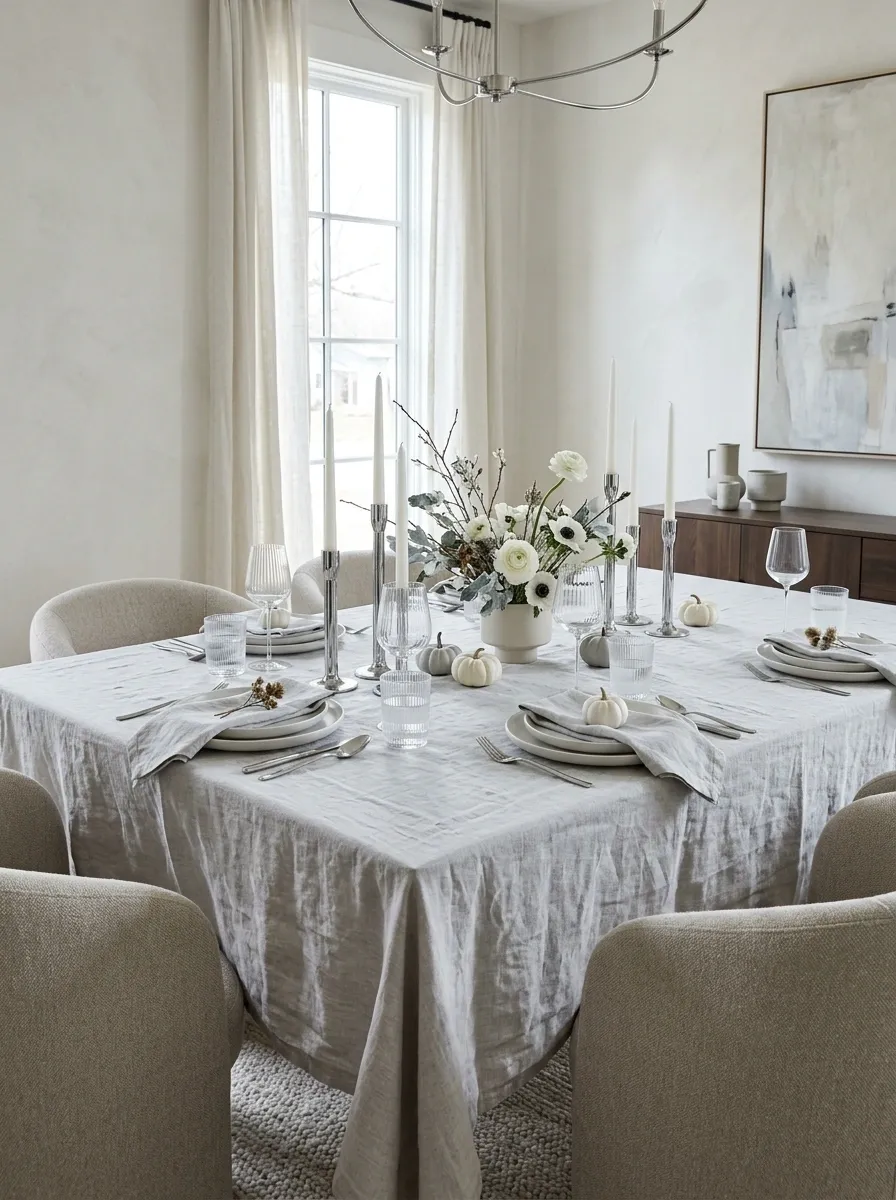
Thanksgiving doesn’t have to be warm-toned to feel welcoming. This contemporary tablescape trades rustic wood and amber glass for polished metal, clear surfaces, and cool gray textiles.
A pale-gray tablecloth covers a clean-lined dining table, with streamlined white dinnerware, chrome candlesticks, and clear ribbed glassware. Rounded upholstered chairs soften the reflective finishes, while a restrained arrangement of white flowers adds a little organic movement. Natural daylight catches the glass and metal without making the entire composition look like a showroom for kitchen appliances.
The secret is mixing reflective and matte surfaces. Chrome and glass provide brightness, while linen and upholstery absorb some of that visual shine. A few white flowers help bridge the difference between the sleek architecture and the more relaxed atmosphere expected at a holiday meal.
Keep the metallic accents selective. Nobody needs to see their entire face reflected in the gravy boat.
Shine needs something soft beside it.
Balance the finish. A matte textile gives reflective details somewhere to rest. Without that contrast, the table could pass for the waiting area of a very futuristic dentist.
Graphic Thanksgiving With a Checkerboard Runner and Hand-Thrown Stoneware
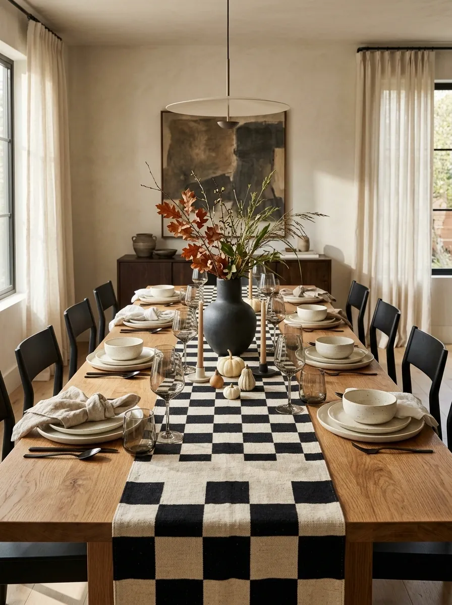
A checkerboard runner does something most Thanksgiving decorations don’t: it gives the whole table a strong visual identity before the centerpiece even arrives.
Black-and-cream checks run down the center of a natural timber table. Hand-thrown stoneware, softly folded neutral linen, smoked glassware, and a sculptural dark vase provide contrast without competing with the pattern. Contemporary dining chairs and warm ambient lighting bring the room together, making the graphic textile feel like an intentional design decision rather than an experimental craft project.
The runner is the star, so everything surrounding it needs a little restraint. Choose dinnerware with simple outlines and keep the centerpiece compact. A few seasonal branches or restrained foliage are enough to introduce organic texture against the geometric pattern.
Avoid adding several other prints. The table already has a main character, and unlike some dinner guests, it doesn’t need a supporting cast of six.
Let the runner do the talking.
The strongest pattern on the table.
Simple shapes that let the pattern breathe.
A small sculptural detail that echoes the checks.
A strong print looks more deliberate when the neighboring surfaces stay simple. Three competing patterns would turn a graphic statement into an argument.
Asymmetrical Floral Tablescape With Wine-Colored Dahlias
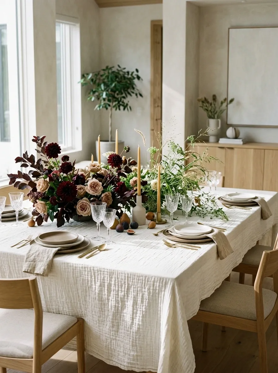
Perfect symmetry has its place, but Thanksgiving flowers don’t need to stand at attention like they’re waiting for a formal inspection.
A loose floral arrangement of wine-colored dahlias, muted blush blooms, and pale seasonal flowers sits off-center on an ivory-clothed dining table. The arrangement gradually tapers into delicate foliage rather than ending in an abrupt wall of flowers. Simple dinnerware, translucent glasses, and understated napkins keep the eye focused on the flowers, while contemporary chairs and soft natural light complete the room.
The asymmetry gives the arrangement movement and keeps the table from feeling overly formal. Grouping the stronger colors together establishes a focal point, while the lighter blooms connect the composition to the surrounding table setting.
Leave some negative space around the arrangement. It should feel artfully placed, not like the entire flower delivery arrived and refused to leave.
Uneven is the point.
Cluster the richer flowers to establish the main focal point.
Let lighter stems and foliage extend outward without matching the opposite side.
For a finished composition: Keep the vase proportionate to the table and the arrangement low enough to preserve conversation across it.
Outdoor Thanksgiving on a Patio With Linen and Lanterns
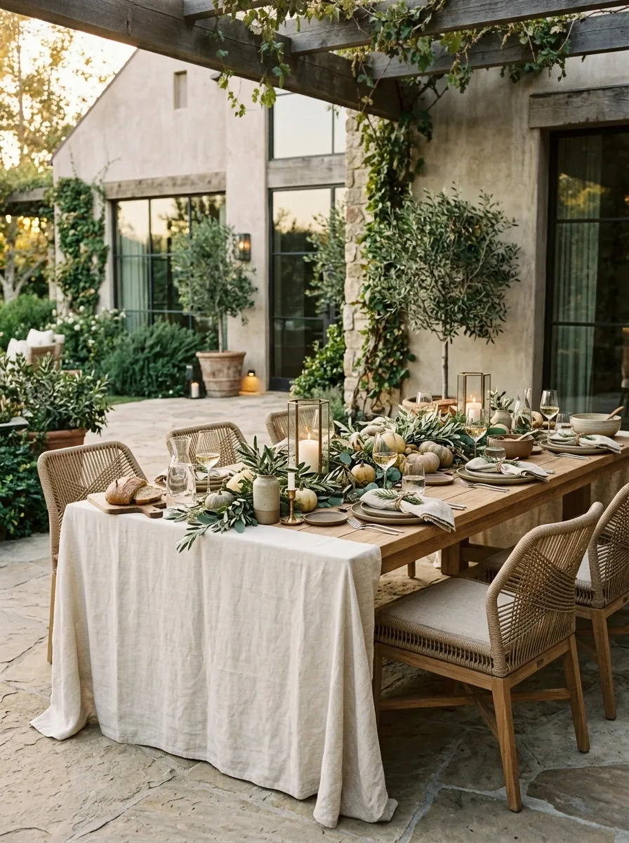
Thanksgiving outdoors has a different set of design rules. The table needs to look inviting, the textiles need to behave in a breeze, and the centerpiece cannot be one strong gust away from an unscheduled flight.
A sturdy outdoor dining table is dressed with natural linen, substantial stoneware, clear glasses, low seasonal greenery, and lanterns positioned at the edges of the arrangement. Woven chairs, textured patio paving, and nearby planting establish a complete outdoor dining environment. Warm afternoon light and a few softly glowing lanterns make the table feel ready for the transition into evening.
The materials should suit the setting. Heavier dinnerware and stable vessels provide a practical foundation, while secured napkins and low decorations reduce the chance of things moving around. Keep serving dishes within easy reach and avoid overcrowding the tabletop.
The result is relaxed but intentional. Outdoor entertaining is lovely until the linen starts behaving like a kite, so a little restraint is a very good investment.
Plan for the setting, not just the photograph.
Outdoor hosting reality check: Check the weather and wind before setting the table, and use enclosed or battery-operated lanterns where appropriate. A candle escaping into the garden is not the ambience anyone ordered.
Golden-Hour Harvest Table With Amber Glass and Wheat Tones
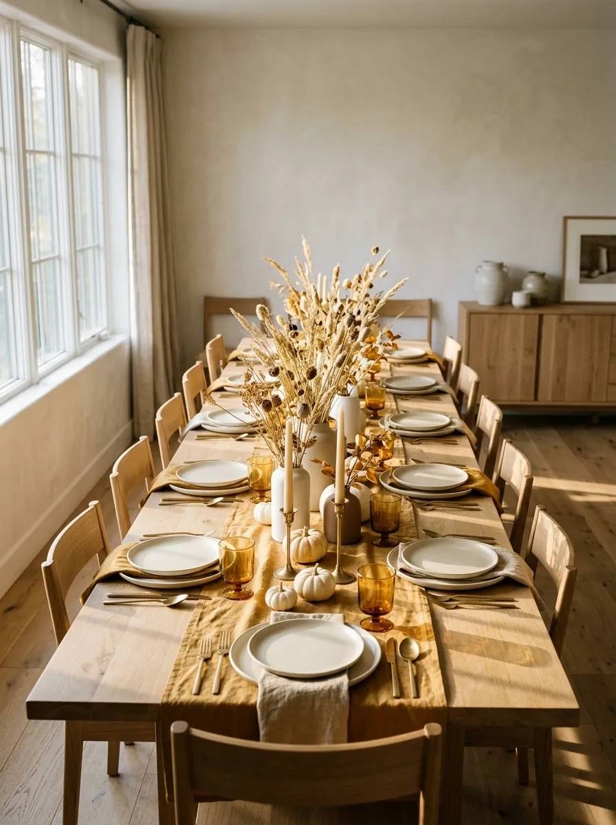
Some Thanksgiving tables rely on color. This one lets the light do half the decorating, which is convenient because the sun is considerably less demanding than a professional florist.
A warm oak table is dressed with golden-ochre textiles, amber glassware, pale stoneware, and a loose arrangement of dried grasses. The dining room catches the late-afternoon light, bringing out the grain in the wood and the warm translucence of the glass. Simple chairs and understated surroundings keep the setting focused on the relationship between light, color, and texture.
The secret is to layer warm tones without making everything the same shade of mustard. Ochre provides the textile accent, amber adds depth, and cream dinnerware prevents the composition from becoming too heavy. Natural stems introduce movement without needing an elaborate floral arrangement.
Position the table where the natural light can reach it, but keep artificial lighting available for dinner. Sunset is gorgeous, but it has a notoriously unreliable dinner-service schedule.
Warm tones that look even better in natural light.
Let natural light reveal wood grain, glass, and textile texture.
Use pale plates and linens to stop all those warm tones becoming one giant mustard situation.
Plan for the sunset. Set up a comfortable ambient light source for the meal itself, because the sun will leave without helping with the dishes.
Navy Plaid and Cream Tableware With a Modern Traditional Finish
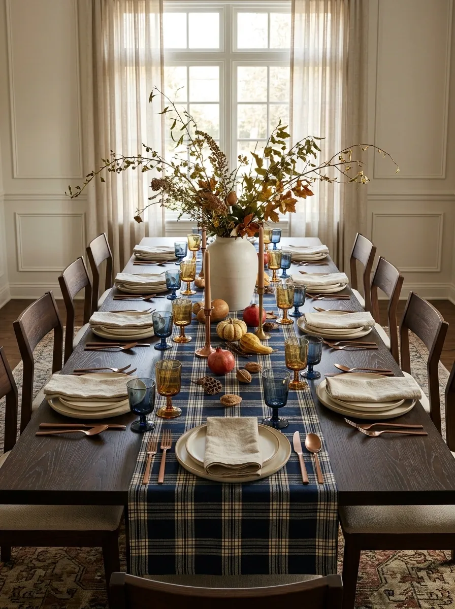
Navy plaid brings a traditional Thanksgiving feeling to the table without requiring a single distressed wooden sign announcing that the kitchen is, in fact, a kitchen.
A navy-and-cream plaid runner stretches across a dark wood table, paired with simple cream dinner plates, deep-blue glassware, and muted copper details. Loose seasonal branches give the centerpiece a natural shape, while modern dining chairs and clean-lined serving pieces keep the setting from looking overly old-fashioned. Warm light softens the contrast between the dark table and pale ceramics.
The pattern works because it has a defined place in the composition. The runner supplies the main graphic element, while the plates and napkins remain relatively quiet. Repeating navy in a few small details creates continuity without turning the entire table into a matching set.
Avoid introducing florals, stripes, and another plaid just because they look good individually. The runner has already secured the lead role. Casting three more leading actors would be a production problem.
Traditional pattern. Cleaner supporting cast.
The composition rule: Let the runner carry the pattern. Use simpler plates and understated centerpiece details so the table feels coordinated instead of visually overbooked.
Forest Green and Charcoal Table in a Nordic Winter Dining Room
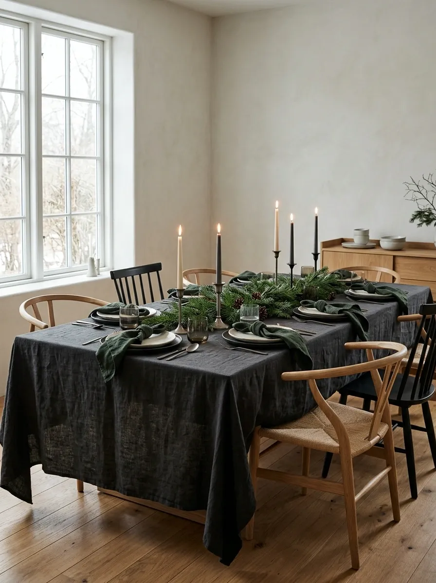
This darker tablescape feels like a Scandinavian winter evening, minus the pressure to own a remote cabin and an alarmingly photogenic wool blanket.
Charcoal linen anchors forest-green napkins, dark matte pottery, understated metal candlesticks, and evergreen branches. The table sits in a Nordic-inspired dining room with pale walls, warm wood flooring, and clean-lined furniture. Candlelight softens the darker palette, while a little natural wood keeps the entire setting from becoming one continuous charcoal rectangle.
The visual interest comes from the contrast between the deep greens and the warmer surroundings. Matte ceramics absorb light, foliage adds irregular shapes, and the wood gives the room an inviting counterpoint. The result feels seasonal without leaning on obvious Thanksgiving symbols.
Keep the evergreen arrangement loose and low, and introduce a little ivory through dinnerware or candles. Dark-on-dark styling can be wonderfully dramatic, but guests should still be able to distinguish the bread plate from the centerpiece.
Give the shadows a few warm neighbors.
Keep one lighter element visible. Pale walls, ivory plates, or softly glowing candles give the darker tones room to breathe. A moody dining room should feel atmospheric, not like the power has gone out.
Modern Maximalist Thanksgiving With Layered Patterns and Color
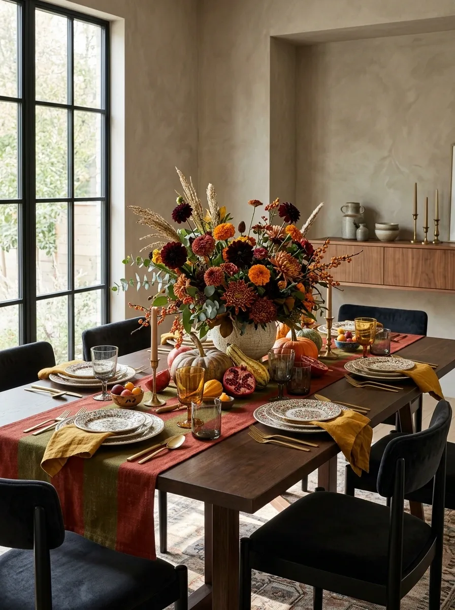
Minimalism has had its moment. This Thanksgiving table would like to introduce itself, its patterned dinnerware, its colorful glassware, and absolutely no intention of whispering.
A striped runner grounds a lively mix of patterned plates, contrasting napkins, saturated glassware, and a generous seasonal flower arrangement. The table sits in an expressive dining room with contemporary furniture and a few carefully chosen decorative pieces. The surrounding space has personality too, but the tabletop remains the main event.
The trick to maximalism is giving the chaos a secret structure. Repeat a couple of colors across different pieces, vary the scale of the patterns, and preserve some solid surfaces between them. A bold runner can work alongside smaller motifs when the rest of the composition isn’t competing for equal attention.
The result feels collected rather than randomly assembled. More importantly, it proves that a colorful table can look intentional without every item coming from the same painfully coordinated set.
More personality. Fewer competing main characters.
Pattern rule: Vary the scale, repeat selected colors, and leave some surfaces plain. Maximalism can be expressive without becoming the visual equivalent of 42 open browser tabs.
Bright Friendsgiving Table With Magenta, Tangerine, and Playful Glassware
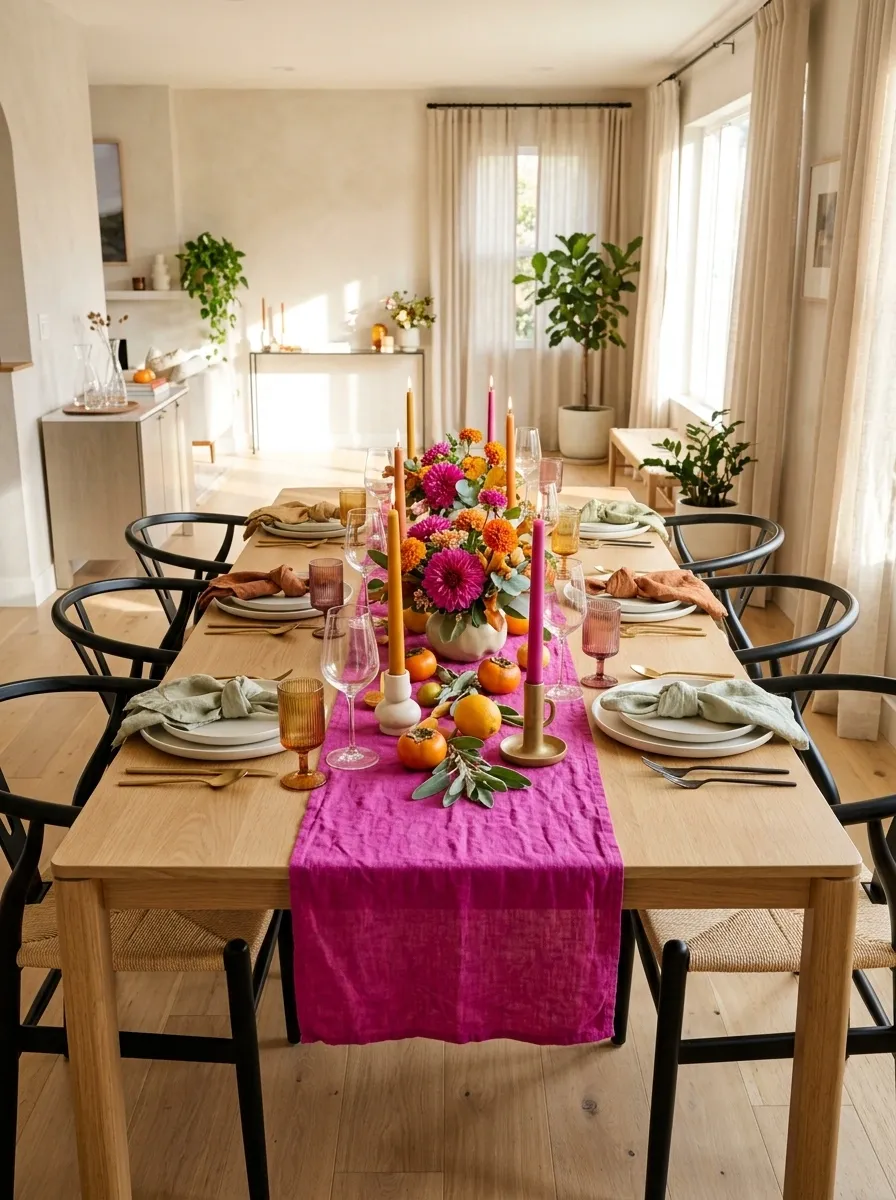
Friendsgiving doesn’t have to look like a formal family dinner with a different guest list. This version is colorful, relaxed, and ready for the group chat photos before anyone has even taken their coat off.
A vivid magenta runner anchors tangerine accents, playful colored glassware, simple dinner plates, and a lively arrangement of seasonal flowers. Sculptural candles and contemporary dining chairs give the setting a deliberate shape, while the surrounding entertaining space feels open and social rather than overly formal.
The balance comes from using a few strong colors repeatedly instead of introducing every shade in the craft store. Magenta creates the focal point, tangerine brings warmth, and clear or neutral dinnerware keeps the table from becoming too busy. The flowers connect the colors without requiring every single place setting to match.
This look suits an informal gathering where the table should feel energetic and personal. Keep the serving areas clear, because even the most photogenic Friendsgiving still needs somewhere to put the mac and cheese.
A little color goes a long way. A little more can be fun too.
Carry the main colors through flowers, napkins, and glassware in different proportions.
Keep the centerpiece compact and leave clear room for shared serving dishes.
The Friendsgiving brief: Make it colorful enough to feel celebratory, relaxed enough for a casual meal, and functional enough that the food doesn’t end up on someone’s lap.
Choosing a Tablescape That Works in Real Life
The strongest tablescape isn’t necessarily the most elaborate one. It’s the one that makes sense for the dining room, the people around the table, and the kind of gathering being hosted.
A smaller dining area benefits from a compact centerpiece and lighter finishes. A formal evening meal can handle deeper colors, reflective details, and candlelight. A long communal table needs a centerpiece that travels along its length rather than one oversized arrangement that leaves the ends looking forgotten.
Before buying anything, identify the table’s main materials and choose a palette that works with them. Then select the linen, dinnerware, glassware, and centerpiece as parts of the same overall composition. Leave enough room for serving dishes and comfortable conversation, because actual use matters more than the photograph.