
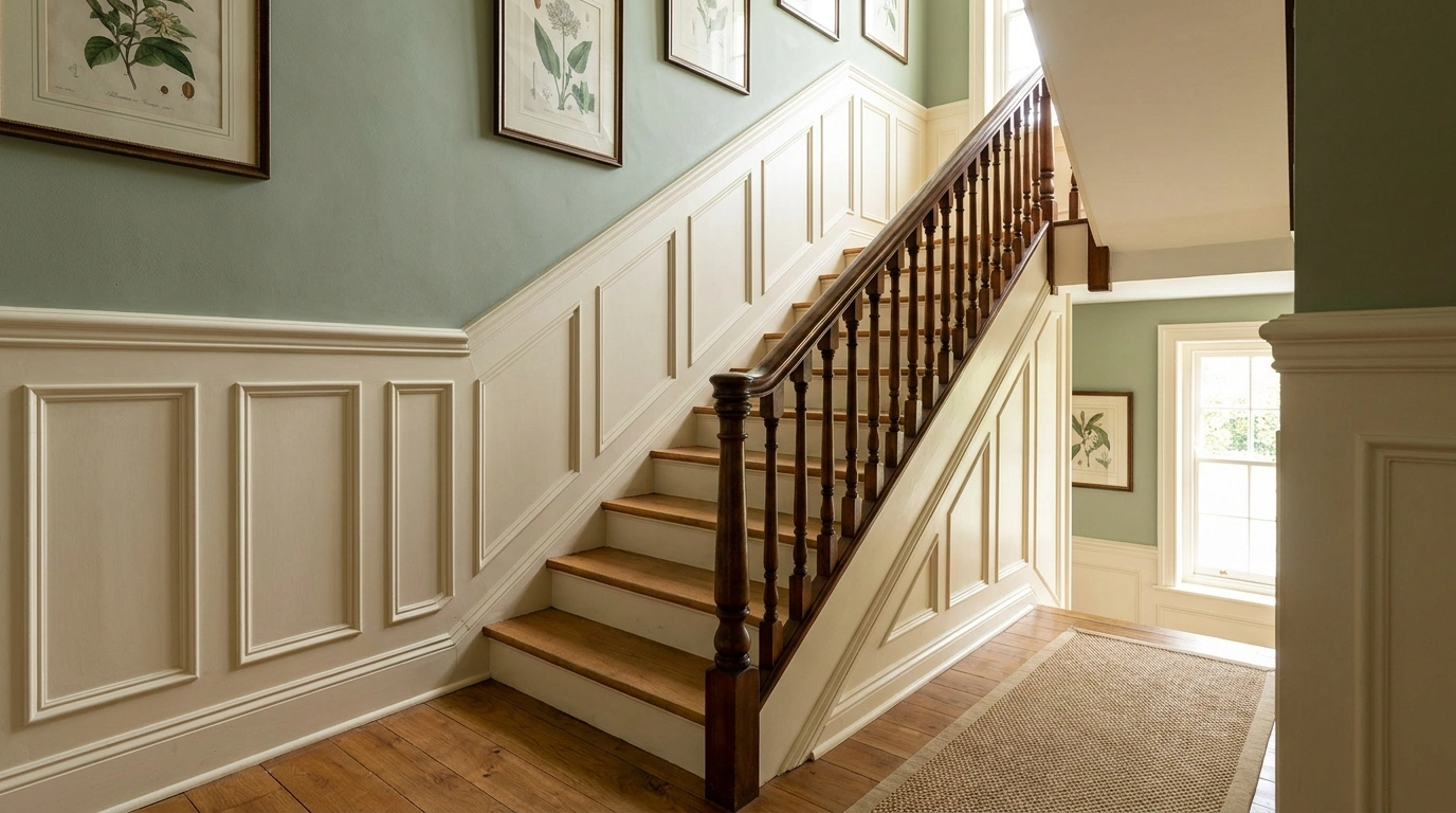
A staircase can have gorgeous timber treads, a beautiful railing, and lovely flooring, yet the wall beside it still looks like somebody forgot to finish the renovation.
And no, adding random rectangles of moulding isn’t automatically going to save it. Poorly spaced panels can make a narrow staircase feel cramped, oversized trim can overwhelm the architecture, and a wall treatment that ignores the stair angle can look awkward from every possible viewing position.
Congratulations, the wall has become the problem.
THE STAIRWELL REALITY CHECK
Good paneling follows the stairs. Bad paneling starts a fight with them.
The railing, tread color, panel scale, and landing need to look like they were in the same group chat. Otherwise, the stairwell gives “saved every Pin, skipped the planning part.”
Get the scale right
Tiny frames on a huge wall can look fussy. Oversized panels in a narrow stairwell can feel like the wall is wearing a suit three sizes too big.
Respect the staircase slope
Trim that ignores the angle usually looks like it gave up halfway through the project.
Make the finishes cooperate
Wood, paint, railing, and runner should tell the same design story. Drama is welcome. Visual confusion isn’t.
Staircase Paneling Ideas
Classic White Box Moulding With Warm Oak Treads
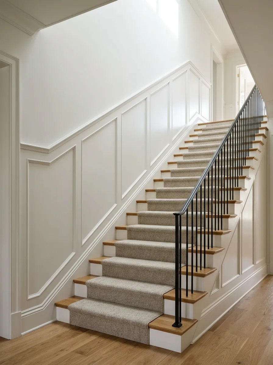
Crisp white box moulding, warm oak treads, a slim black handrail, and a restrained stair runner make this staircase feel finished without turning the hallway into a museum. Large rectangular panels follow the incline, while the upper wall stays light and uncluttered. The landing continues the same white trim, tying the stairs to the rest of the house.
The secret is proportion. Generous frames give the wall room to breathe, while the oak adds enough warmth to stop all that white from feeling clinical. Keep the moulding aligned with the staircase and avoid squeezing too many little rectangles onto a long wall. Nobody needs a hallway that looks like graph paper got promoted.
THE PANEL PROPORTION CHECK
Give the wall a rhythm, not a spreadsheet.
Too many divisions
Small frames can make a large wall feel busy.
More generous frames
Fewer, larger panels give the composition room to settle.
The right proportions depend on the wall height, stair angle, and spacing around doors or landings. Mock up the layout before cutting trim.
Soft Ivory Paneling With a Curved Timber Handrail
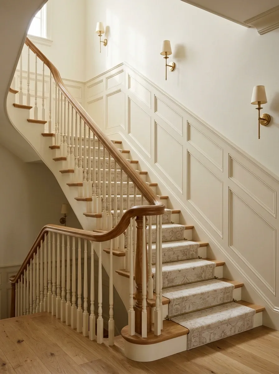
A curved timber handrail sweeps along creamy ivory paneling, softening the staircase without relying on fussy decoration. Pale walls, a subtle runner, traditional stair details, and warm lighting create an elegant transition between floors. The panel divisions stay regular beneath the handrail, while the curve provides the movement that makes this composition different from a standard straight staircase.
The important relationship is between the continuous handrail and the repeated panels. One gives the eye a flowing path, while the other keeps the wall organized. Too many competing curved details would make the result feel overly ornamental. Let the handrail own the curve, and allow the paneling to provide the calm structure underneath.
THE LINE THAT CONNECTS IT ALL
One flowing curve. A steady panel rhythm.
CONTINUOUS TIMBER HANDRAIL
Keep the panel spacing consistent even when the wall or rail changes direction. The handrail brings movement; the repeated frames stop the wall from feeling chaotic.
French Country Staircase With Arched Panel Moulding
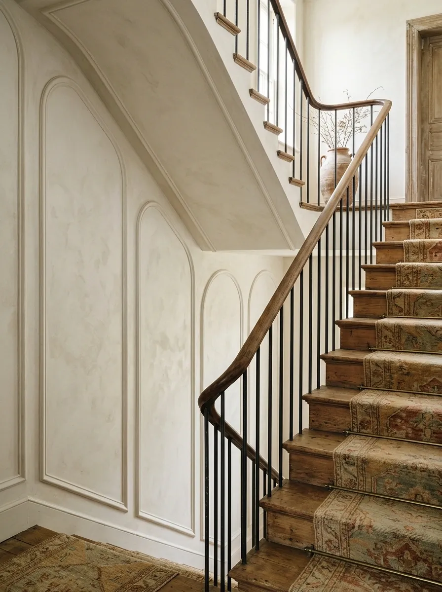
Arched moulding brings a softer, French country character to a staircase with creamy walls, a natural timber handrail, and gently aged finishes. A vintage-inspired runner adds pattern underfoot, while the landing carries the same warm palette instead of abruptly switching styles. The result feels collected and architectural rather than newly installed just for a photo.
The arches are the signature, so they need space around them. Pair the shaped panels with straightforward stair treads and quiet wall colors. Overly ornate balusters, busy wallpaper, and elaborate lighting all competing at once would make the staircase feel like it lost an argument with an antique shop. One expressive architectural detail is often enough.
THE SHAPE DOES THE TALKING
Let the arch be the feature.
Rounded moulding adds softness against straight treads and a linear handrail.
THE BALANCING ACT
Keep the runner, wall color, and timber finishes quiet enough to let the shaped trim stand out. If every surface has an elaborate pattern, the architecture loses its moment.
White Beadboard Wainscoting With Botanical Wallpaper
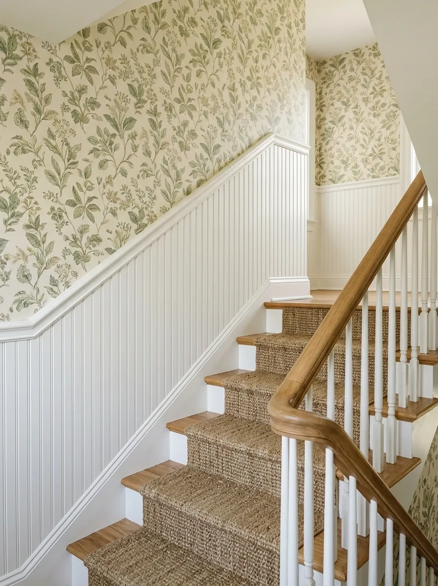
Fine vertical beadboard below delicate botanical wallpaper gives a cottage staircase its own personality. Painted trim follows the slope, while the wallpaper continues through the landing to connect the upper and lower sections of the hallway. A natural-fibre runner and timber handrail add warmth without competing with the print.
The key is a clean boundary between the two wall finishes. The beadboard provides a steady vertical pattern, while the wallpaper brings organic shapes and color. Choose a wallpaper background that works with the paneling rather than one that introduces several unrelated shades. This combination should feel relaxed and collected, not like two leftover renovation samples were forced to share a wall.
WHERE THE TWO FINISHES MEET
A clear boundary keeps the pattern in check.
Planning note: follow the stair angle carefully, then carry the division through the landing without an awkward jump in height.
Muted Sage Board-and-Batten With Natural Oak Stairs
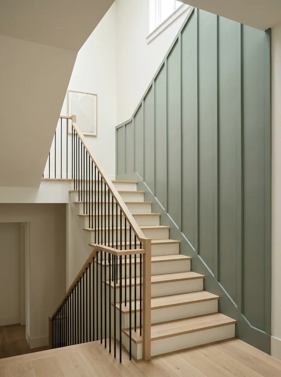
Muted sage-green battens, pale oak treads, slim dark balusters, and warm white walls give this staircase a fresh, grounded look. The vertical trim creates a steady rhythm along the rising wall, while the oak adds warmth that keeps the green from looking cold. On the landing, simple artwork and understated lighting maintain the same relaxed style.
The winning combination is the contrast between painted woodwork and natural timber. Keep the battens evenly spaced and the railing visually light. Heavy furniture, several competing wood tones, and extra decorative trim would crowd the composition. The staircase already has a personality. It doesn’t need a full supporting cast.
THE THREE-FINISH AGREEMENT
Green brings the depth. Oak brings the warmth.
Muted sage
Vertical rhythm and color depth.
Natural oak
Warmth across the treads and handrail.
Dark metal
A crisp architectural outline.
Keep the dark railing as the fine outline, not the dominant color. The green and timber should do most of the visual work.
Charcoal Paneling With Light Timber Treads
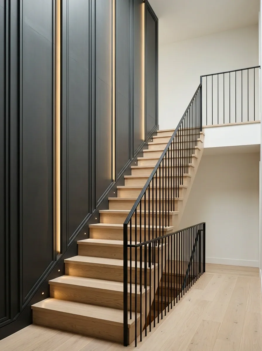
Charcoal paneling makes a staircase feel architectural rather than merely functional. Pair deep gray wall panels with pale oak treads, a slim black railing, and warm lighting that grazes the wall. A light-colored landing or adjacent wall gives the darker section room to stand out without turning the entire hallway into a cave with excellent taste.
The contrast is what makes this design work. The stairs remain easy to distinguish against the dark background, while the timber softens the sharp lines. Keep the panel profiles simple and avoid throwing several dark finishes into an already shadowy stairwell. Moody is a design choice. Accidentally dim is a maintenance issue waiting to happen.
THE CONTRAST FORMULA
Dark walls need a few lighter exits.
Charcoal paneling
The visual anchor. Keep the profile clean and understated.
Light timber treads
The contrast that helps define each stair against the wall.
A lighter landing
A visual pause between the darker staircase and the adjoining rooms.
Lighting should reveal the panel details and stair edges. Dark paint cannot do that job alone, no matter how dramatic it looks in a Pin.
Flush Minimalist Panels With Concealed Stair Lighting
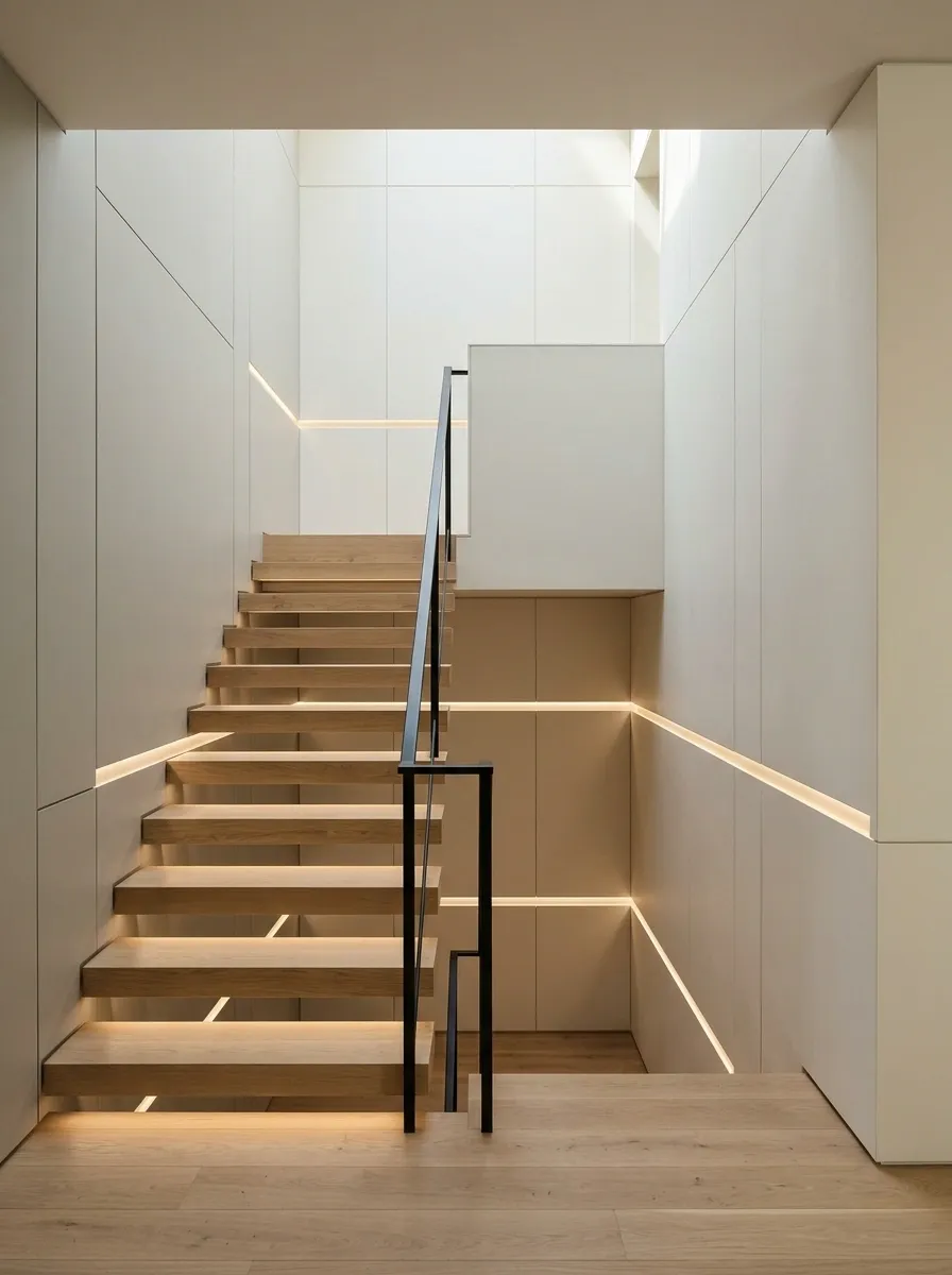
Large, flush wall panels create a nearly seamless staircase wall, with fine joints replacing decorative moulding. Warm white or pale greige finishes keep the architecture quiet, while concealed lighting highlights the wall surface or illuminates the steps. A streamlined railing and simple flooring complete the restrained look.
This approach depends on precision rather than ornament. Panel joints need to align cleanly, and lighting should be planned before the wall is finished. Adding strips of light as an afterthought can leave visible cables, awkward gaps, or glare right where nobody wants it. The result should feel calm and deliberate, not like a smart-home showroom trying to demonstrate every setting at once.
THE DETAIL THAT MAKES MINIMALISM WORK
Hide the hardware. Keep the lines.
Illustrative wall-joint and concealed-light relationship, not a construction drawing.
Plan early
Coordinate panel joints, wiring, drivers, and access before installation.
Keep the light soft
Avoid exposed glare and bright strips that overpower the clean wall.
Deep Forest-Green Paneling With Brass Wall Lights
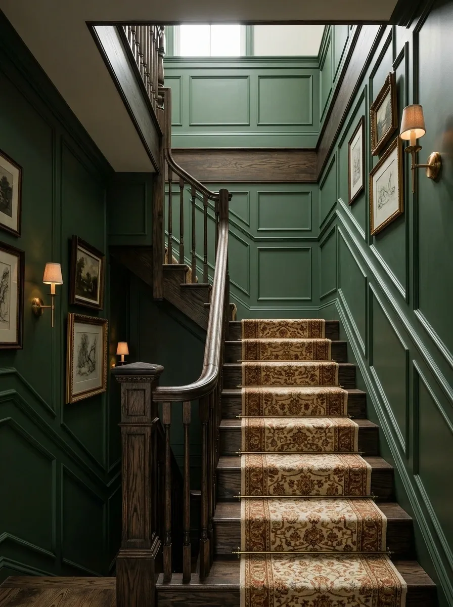
Deep forest-green panels, warm brass sconces, a traditional stair runner, and dark timber accents give this staircase a rich, heritage-inspired character. The green continues across the landing wall, while framed artwork and restrained detailing make the space feel connected to the rest of the home. Brass lighting adds warmth without turning every surface into a shiny distraction.
The strongest part of this design is the contrast between the deep paint and the warm metallic finish. A patterned runner can introduce cream, rust, or muted gold, tying the materials together without making the wall overly busy. Keep the panel profiles traditional and the artwork selective. When the staircase already has this much character, covering every available inch with decorations is less maximalism and more a cry for editing.
THE FINISH PALETTE
Deep green. Warm metal. Zero visual chaos.
Forest green
The dominant architectural color.
Brass
A restrained source of warmth.
Soft neutral
The visual breathing room.
Repeat brass in a few carefully placed details, not every handle, frame, light, and object in sight. Consistency looks intentional. Overmatching looks like a shopping basket became a design brief.
Navy Geometric Moulding With a Modern Brass Railing
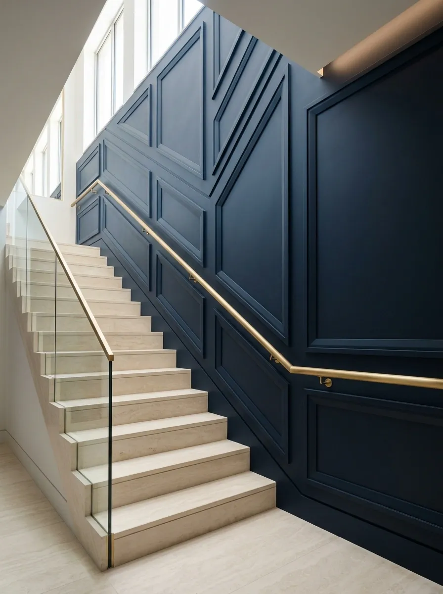
Deep navy paint and oversized geometric moulding give this staircase a sharper, more contemporary identity. A brass-toned railing adds a warm line against the cool wall, while pale stone flooring and simple surrounding finishes keep the composition from feeling heavy. Large panel shapes follow the stairwell’s geometry, and restrained lighting brings attention to the lines rather than competing with them.
The geometry needs to look intentional from both the foot of the stairs and the landing. Aligning moulding with the stair angle and nearby architectural edges helps the design feel integrated. Keep the brass finish limited to the most visible metalwork, and resist adding several more geometric patterns to the runner or floor. The wall already has a graphic personality. It doesn’t need an entire committee of shapes.
THE GEOMETRY CHECK
Strong angles need a clear visual order.
One warm metal accent
A brass railing softens the navy without breaking up the geometric composition.
The diagram represents a panel rhythm, not a cutting plan. Final frame sizes should follow the actual wall, stair slope, landings, and railing clearance.
Warm Walnut Panels With Cream Plaster Walls
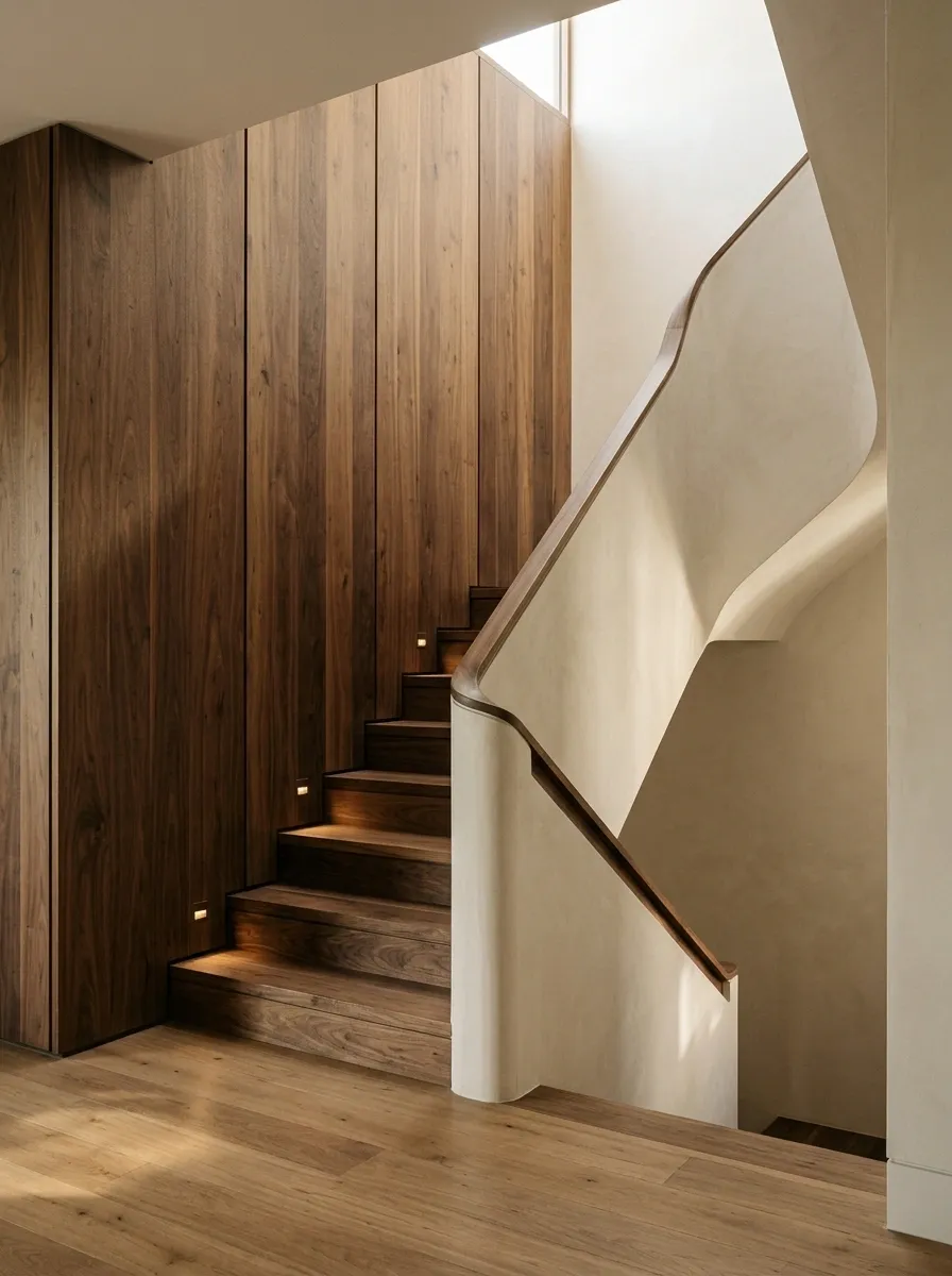
Wide walnut panels add depth and natural grain to a staircase surrounded by creamy plaster walls. Pale stone or warm timber flooring continues the earthy palette, while low-profile lighting lets the wood remain the main attraction. Rather than covering every wall in timber, the design uses a substantial panelled section as an architectural focal point and leaves neighboring surfaces quiet.
That contrast matters. Walnut has enough visual weight to make the staircase memorable without additional ornament. Choose panel divisions that respect the wall’s proportions, and coordinate the timber undertone with the stair treads if they are visible together. Mixing every possible shade of brown into the same view can become less organic modern and more wood-sample indecision. Let the grain do the work.
MATERIAL HIERARCHY
Let walnut lead. Let plaster breathe.
Walnut
The focal surface, rich in grain and depth.
Cream plaster
The quieter surface that gives the timber space.
Keep together: wood finishes visible in the same sightline should have compatible undertones.
Keep separate: don’t extend heavy timber across every wall simply because one panelled section looks good.
Vintage Floral Stairwell With Painted Lower Paneling
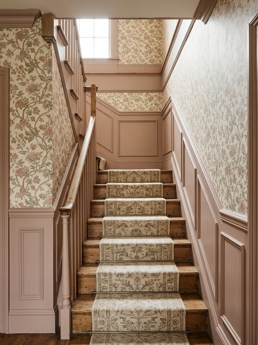
Dusty rose or muted green lower paneling paired with vintage floral wallpaper creates a staircase that feels collected rather than overly polished. Aged timber, a quietly patterned runner, and a landing that carries the wallpaper around the corner complete the composition. The painted lower wall gives the floral print a visual boundary, so the pattern feels like part of the architecture instead of a last-minute impulse buy.
The wallpaper should lead the color story. Pull one or two quieter shades from the print into the lower paneling, then keep the railing and flooring simple. Oversized modern artwork and another strong pattern can easily compete with the wallpaper. Floral doesn’t mean every available surface needs to bloom. A little restraint is what keeps the result charming instead of chaotic.
THE WALLPAPER COLOR PULL
Choose the quiet color hiding inside the print.
Floral print
Sets the main colors and pattern.
Muted rose
Repeats a softer flower tone.
Muted green
A second option drawn from leafy details.
The colors above are illustrative. Match the paint sample to the actual wallpaper in both daylight and artificial light. Screenshots lie about color often enough without letting them choose the paint, too.
Black Paneling With a Warm Oak Staircase
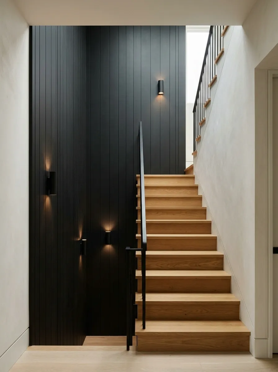
Matte black paneling creates a bold backdrop for warm oak treads, a simple railing, and a light-colored landing. The strong contrast gives the staircase a clean, contemporary identity, while discreet wall lighting makes the panel details visible. The surrounding interior stays relatively pale, so the black wall feels like a deliberate focal point rather than a dark tunnel connecting two floors.
The balance depends on the amount of black used around the stairs. Keep the wall treatment simple, choose oak with a warmth that complements the dark finish, and preserve enough light on the stair surfaces to distinguish each tread clearly. Repeating black on the railing is enough to create continuity. Black walls, black floors, black furniture, and black everything else can wait for a different design brief.
LIGHT AGAINST DARK
Let the black wall frame the staircase, not swallow it.
Conceptual contrast study showing light treads against a dark wall, not a construction drawing.
Keep visible
Tread edges, railing details, and the transitions at the landing.
Keep restrained
Extra dark finishes that make the whole space feel visually heavy.
Test dark paint under the stairwell’s actual lighting. The goal is a rich architectural backdrop, not a staircase where every step disappears after sunset.
Scandinavian Greige Paneling With Pale Ash Wood
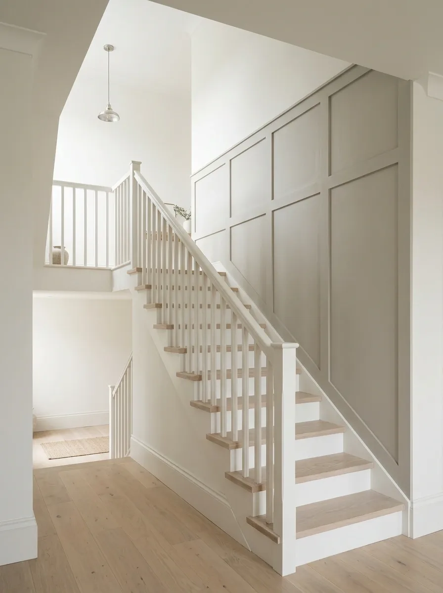
Pale ash treads, understated greige paneling, a clean white railing, and soft natural light give this staircase a distinctly Scandinavian character. The wall treatment uses simple, evenly spaced frames rather than ornate moulding, while the light timber adds texture without darkening the hallway. A minimal pendant and an uncluttered landing keep the architecture in focus.
The secret is the subtle difference between the neutrals. Greige adds more depth than plain white, while pale ash brings a gentle warmth that stops the wall from looking flat. Keep the railing light and the trim simple. Add too many contrasting colors and decorative accessories, and the calm Scandinavian composition starts looking like every saved inspiration photo got invited to the same party.
THE QUIET NEUTRAL PALETTE
Three subtle finishes. One calm staircase.
Soft greige
Adds depth without a strong color shift.
Pale ash or oak
Brings natural grain and warmth.
Warm white
Keeps trim and surrounding walls light.
Sample all three finishes beside each other. Neutrals can have very different undertones, and a grayish wall beside orange-toned timber can ruin the harmony rather quickly.
Coastal Shiplap Staircase With White Oak Details
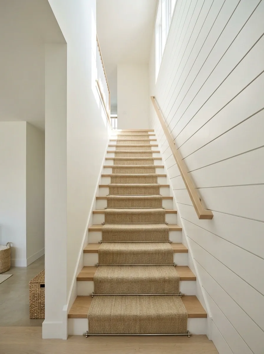
Horizontal shiplap brings a relaxed coastal character to a staircase, especially when paired with white oak treads, a pale handrail, and a natural-fibre runner. The painted boards follow the incline, creating long horizontal lines against the diagonal movement of the stairs. Above, light walls and a simple landing keep the composition open rather than overcrowded with nautical accessories.
The charm comes from that change in direction. Horizontal boards stretch the visual rhythm across the wall, while the staircase naturally leads the eye upward. Keep the board gaps subtle and the timber warm but not overly orange. Add a lighthouse sign, anchor motifs, rope decor, and a dozen seashells, and suddenly the stairwell is auditioning to become a gift shop.
FOLLOW THE LINES
Horizontal boards meet a rising staircase.
Concept sketch showing the contrast between horizontal wall lines and the rising stair profile.
Keep the shiplap quiet
A simple paint finish lets the long board lines do their job.
Warm up the timber
White oak and woven textures soften the painted wall.
Reclaimed Timber Paneling in a Rustic Modern Home
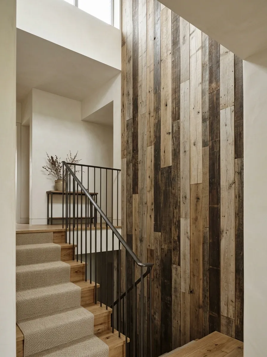
Weathered timber planks bring a naturally varied surface to this rustic modern staircase. The wall combines different grain patterns and restrained shifts in wood tone, while sturdy timber treads, dark metal balusters, and pale plaster keep the interior from becoming too heavy. A simple runner and understated landing furniture complete the composition without hiding the character of the wood.
The difference between intentional variation and visual chaos is restraint. Reclaimed boards should feel related through their undertones, texture, or finish, even when individual pieces vary. Pairing them with several unrelated timber finishes elsewhere makes the staircase look as though the wood was collected during a particularly ambitious clearance sale. Let the reclaimed wall have the strongest grain, then keep neighboring surfaces calmer.
A CONTROLLED MIX OF WOOD TONES
Variation is the charm. Randomness is not.
Deep weathered brown
Provides the heaviest grain and visual depth.
Mid-tone timber
Links the darker boards to the lighter surroundings.
Pale surrounding finish
Gives the reclaimed timber visual breathing room.
Sample reclaimed boards in the actual stairwell. Old wood can carry unexpected red, gray, or yellow undertones, and those differences become obvious when the pieces sit side by side.
Farmhouse Tongue-and-Groove Paneling With a Painted Stair Runner
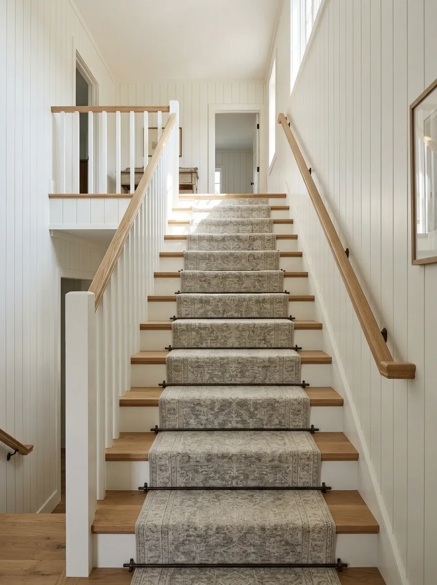
Vertical tongue-and-groove paneling, painted stair risers, warm timber treads, and a muted runner give this farmhouse staircase a practical, lived-in appearance. The white wall treatment creates structure without the formality of elaborate raised panels, while simple dark hardware adds definition. At the landing, the same finishes continue into the hallway, keeping the staircase connected to the rest of the home.
This design earns its charm through repetition. Vertical boards give the wall a steady rhythm, and painted risers echo the light paneling without making the treads disappear. Choose a runner pattern that works with the painted details rather than adding another loud motif. Farmhouse style doesn’t require every surface to look distressed, every object to say something inspirational, or every room to own a wooden sign. The architecture can carry the look.
THE FARMHOUSE FINISH COMBINATION
Repeat the materials without repeating every pattern.
Vertical paneling
Provides the consistent wall rhythm.
Painted risers
Connect the steps to the white wall.
Muted runner
Introduces pattern without stealing focus.
A runner needs to be securely installed and suitable for stair traffic. Looks matter, but a loose edge on a staircase is a plot twist nobody needs.
Organic Modern Staircase With Textured Plaster and Oak Panels
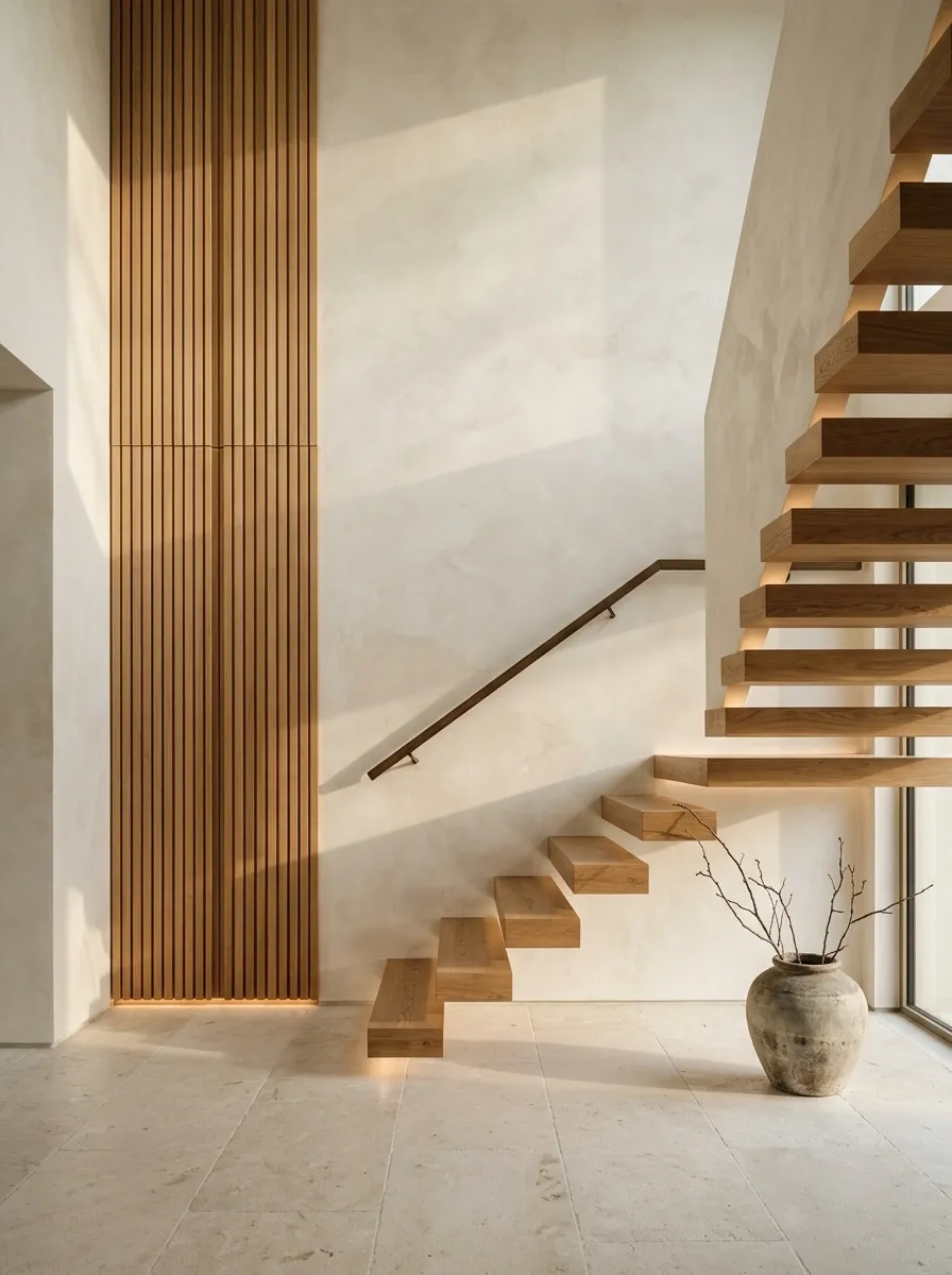
A restrained oak feature panel meets softly textured plaster in this organic modern staircase. Pale stone flooring, discreet lighting, and simple stair treads keep the palette grounded, while the contrast between visible wood grain and the cloudy plaster surface gives the wall its character. Instead of wrapping the entire stairwell in timber, the design concentrates the material where it can create a clear focal point.
The transition between the two finishes is the detail worth getting right. A clean vertical edge can emphasize the height of the space, while a carefully aligned boundary can connect the paneling to the stair geometry. The oak should feel intentional, not like the leftover section of a very expensive cabinet. Leave enough plain plaster around it for the grain and texture to remain visible.
THE MATERIAL TRANSITION
Let the oak end cleanly. Let the plaster breathe.
Oak feature panel
Adds grain, warmth, and a distinct visual anchor.
Textured plaster
Keeps the surrounding wall soft and visually open.
Where the materials meet matters.
Align the panel edge with the real wall geometry, consider the visible joins, and coordinate lighting before installation. A clean transition looks architectural. An unexplained strip of timber looks like an unfinished decision.
Victorian Stairwell With Dark Gloss Panels and Patterned Flooring
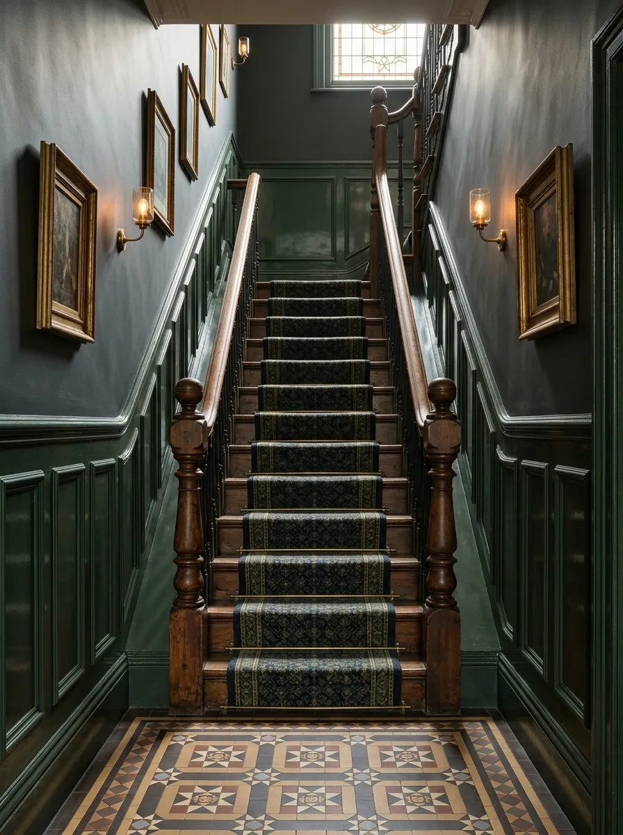
Deep burgundy or forest-green gloss paneling, a traditional timber handrail, an intricate stair runner, and patterned landing tiles give this staircase genuine Victorian character. The reflective paint catches light across the raised moulding, while darker balusters and vintage-style wall lights reinforce the period-inspired look. The flooring continues the decorative story without requiring every surface to feature another elaborate pattern.
The finish is what separates this design from a standard traditional staircase. Glossy panels bring depth and reflect light differently from a matte wall, so their surroundings need a little restraint. Let the paneling and flooring provide the drama, then keep artwork selective and the runner colors connected to the wall. Victorian interiors can handle detail. They just don’t need every detail arguing for the lead role.
THE PERIOD FINISH STUDY
Gloss brings the drama. Pattern needs a supporting role.
Reflective paneling
Adds color depth and highlights the raised profile.
Patterned flooring
Repeats a limited set of colors from the stairwell.
The editing rule
When both wall and floor have strong patterns, keep the runner’s design quieter. Check the actual paint sheen under the stairwell lighting before committing to a glossy finish.
Art Deco Staircase With Stepped Geometric Paneling
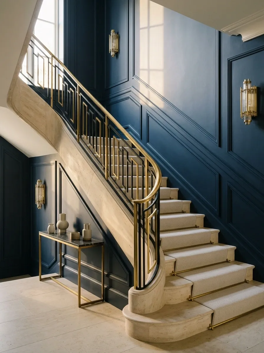
Stepped wall mouldings, deep blue paint, warm metallic details, and terrazzo or pale stone flooring give this staircase an Art Deco identity. The geometry follows a clear visual rhythm, while streamlined metalwork and a few brass accents provide the period’s characteristic polish. Rather than relying on ornate carving, the design uses bold shapes and carefully controlled contrast to make the architecture stand out.
The trick is keeping the geometry organized. Repeat the stepped motif across the wall, but don’t force the same pattern onto the runner, lighting, artwork, and floor. The strongest Art Deco interiors use contrast deliberately, not as an excuse to purchase every gold object in the neighborhood. Let the paneling supply the graphic statement and use the metallic details to connect the staircase to the surrounding rooms.
ART DECO, WITHOUT THE VISUAL NOISE
Build the pattern around one confident shape.
A simplified stepped motif illustrating the visual rhythm.
Deep blue
Creates a dramatic field for the geometric trim.
Warm metallic detail
Adds light and polish in carefully chosen places.
Treat this as a design reference, not a cutting template. Adjust the geometry to the wall dimensions and staircase slope rather than squeezing a motif into unsuitable spaces.
Compact Apartment Staircase With Narrow Vertical Panels
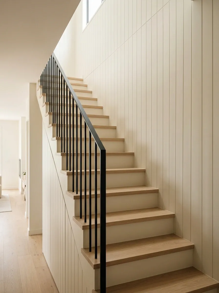
A narrow staircase doesn’t need grand moulding to look considered. Slim vertical panels, pale paint, light timber treads, and a straightforward railing create a tidy architectural composition without crowding the wall. The detailing stays close to the staircase’s actual proportions, while the landing remains uncluttered and connected to the main living area.
Smaller panel divisions can suit a compact wall, but the goal isn’t to fit as many rectangles as possible. The spacing should remain calm, with trim positioned away from awkward corners, door casings, and handrail brackets. Bulky mouldings can make a tight stairwell feel even narrower, especially when the lighting is limited. This is one occasion when restraint deserves the credit instead of another decorative feature.
SMALL WALL, BETTER PROPORTIONS
Keep the detailing slim and the route clear.
A crowded wall
Too many heavy frames compete for a limited wall area.
A calmer rhythm
Lighter profiles and generous spacing give the wall room.
Before installation, account for door openings, switches, handrail supports, and the usable width of the stair route. Decorative trim shouldn’t turn normal circulation into an obstacle course.
Paneled Stair Landing With an Integrated Storage Bench
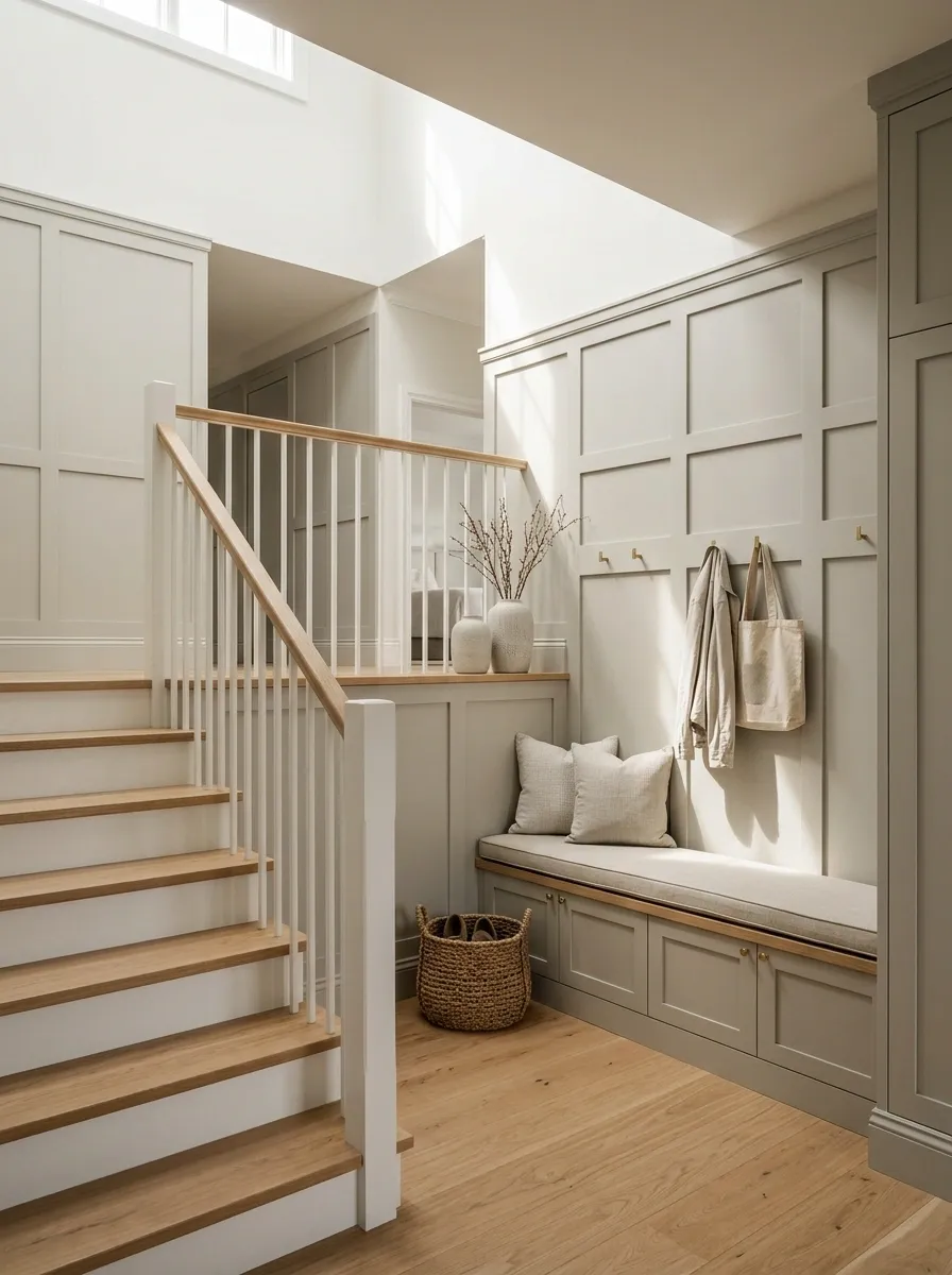
A paneled landing can do more than look pretty while collecting dust. In this family-friendly design, painted wall panels continue into a fitted bench with concealed storage, a timber seat, and discreet hooks above. The staircase uses warm wood treads and a simple railing, while the landing becomes a practical place to sit, remove shoes, or put down a bag without blocking the path.
The built-in approach works best when the storage feels like part of the wall rather than a piece of furniture that was stranded halfway up the stairs. Match the cabinet fronts to the paneling and use timber to distinguish the seat. Most importantly, protect the clear route through the landing. A gorgeous bench that leaves nowhere to walk is just a very expensive obstacle.
A LANDING THAT EARNS ITS SPACE
Storage belongs against the wall, not in the walking route.
Wall zone
Hooks and paneling
Timber seat
Closed storage
Clear route
Keep this area open
This is a planning diagram, not a dimensioned layout. Check the landing’s actual width, door swings, stair clearance, seating depth, and local safety requirements before building fitted storage.
Full-Height Paneled Staircase With a Dramatic Chandelier
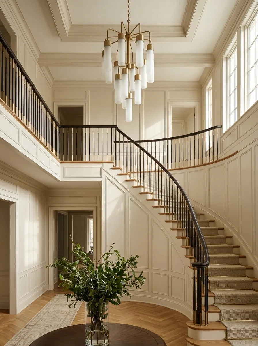
Tall paneling, an elegant sweeping railing, warm timber treads, and an oversized chandelier make this staircase feel like part of a grand entry rather than a passage between floors. The vertical scale of the wall becomes the main attraction, with the trim continuing through the upper landing and the light fixture giving the eye a clear focal point. Soft neutral paint lets the architectural proportions do the talking.
A high stairwell needs panel divisions that respond to the wall’s height. Repeating short frames all the way up can make the space feel oddly busy, while huge empty sections may lose the sense of detail. Choose a rhythm that fits the architecture and position the chandelier where it reads clearly from both floors. Grand doesn’t have to mean adding gold leaf to every available surface. Let the scale provide the drama.
DESIGNING FOR VERTICAL SCALE
Let the panel rhythm rise with the room.
A clear focal point
A pendant or chandelier occupies the central vertical space without competing with every panel.
Conceptual relationship, not a scale drawing.
Check ceiling height, the fixture’s hanging position, sightlines from the upper landing, and access for bulb replacement and cleaning. A spectacular chandelier loses some charm when every maintenance visit requires a small expedition.
Curved Staircase Wall With Continuous Custom Moulding
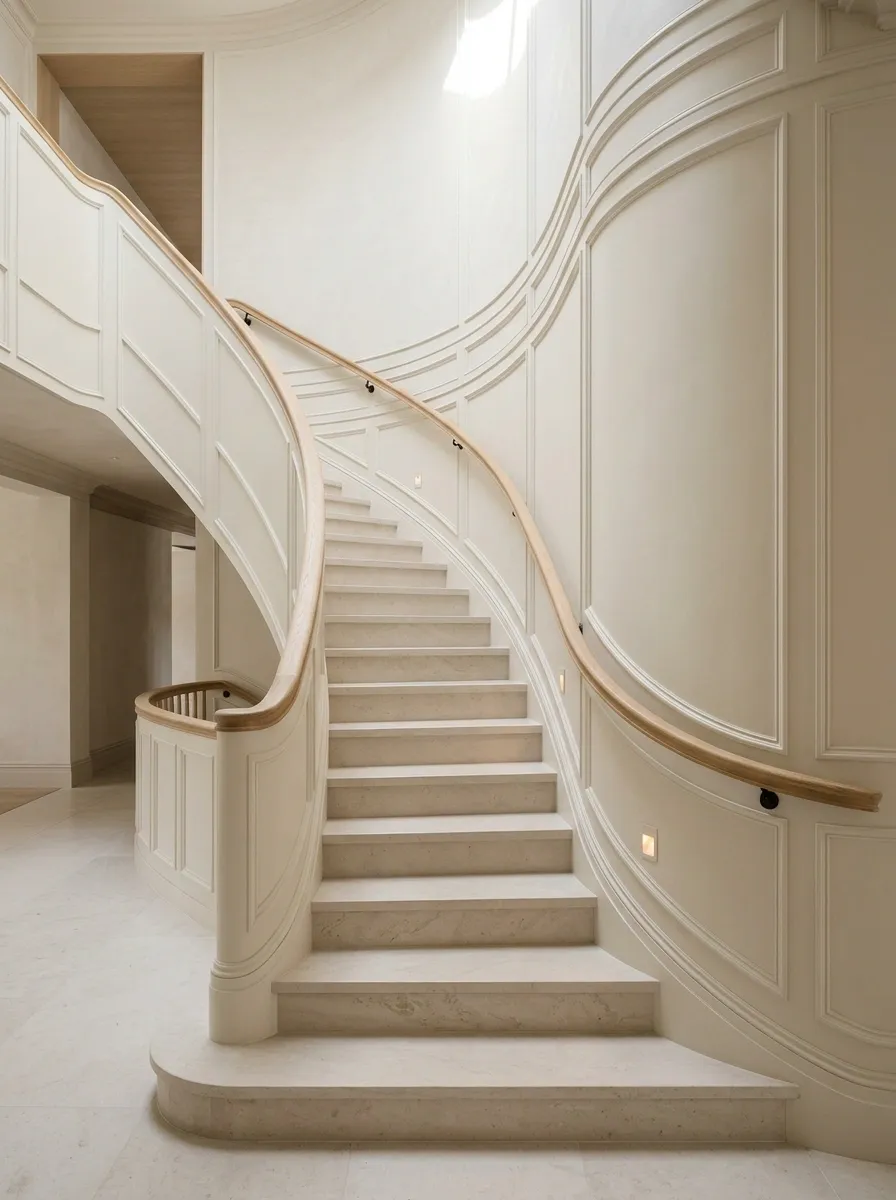
A curved staircase calls for paneling that follows the architecture instead of pretending the wall is perfectly straight. Soft ivory moulding traces the bend, while a flowing timber handrail, pale stone or oak treads, and discreet wall lights reinforce the staircase’s graceful shape. The landing continues the same finish, allowing the curved wall to become a natural focal point rather than an isolated architectural stunt.
The important detail is how the panels change along the curve. Their spacing and proportions need to respond to the actual wall, especially where the staircase turns or meets a flat section. Standard rectangular frames forced onto a curved surface can look painfully awkward. Custom-shaped moulding takes more planning, but a smooth transition beats trim that looks like it lost a wrestling match with the architecture.
DESIGNING AROUND THE CURVE
The moulding should follow the wall, not fight it.
Conceptual illustration of nested curves, not a dimensioned moulding plan.
Keep the curve continuous
Plan panel transitions where the wall changes direction or reaches a landing.
Let straight finishes stay simple
Quiet treads and restrained lighting balance the more expressive wall geometry.
Two-Tone Staircase With Olive Lower Panels and Cream Upper Walls
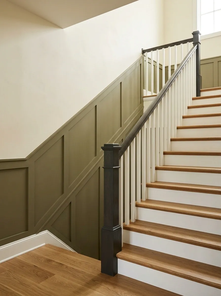
Muted olive paneling below creamy upper walls gives this staircase a relaxed transitional look. Warm oak treads soften the painted finishes, while a dark timber handrail adds definition without overwhelming the palette. The olive treatment follows the incline and continues into the landing, creating a clear visual boundary that connects the stairwell to the adjoining hallway.
The two-tone effect works because each color has a job. Olive grounds the lower wall, while cream keeps the upper section light and open. The division needs to follow the real staircase geometry, particularly where the wall meets the landing or a doorway. A random color break halfway through the wall can make the proportions feel off. The goal is a deliberate architectural transition, not a paint job that ran out of enthusiasm.
THE TWO-TONE BALANCE
Ground the wall without darkening the whole stairwell.
Follow the architecture
Carry the color boundary along the staircase slope, then resolve it cleanly at the landing. Coordinate it with the railing, trim, and nearby door casings.
Contemporary Staircase With Oversized Rectangular Wall Panels
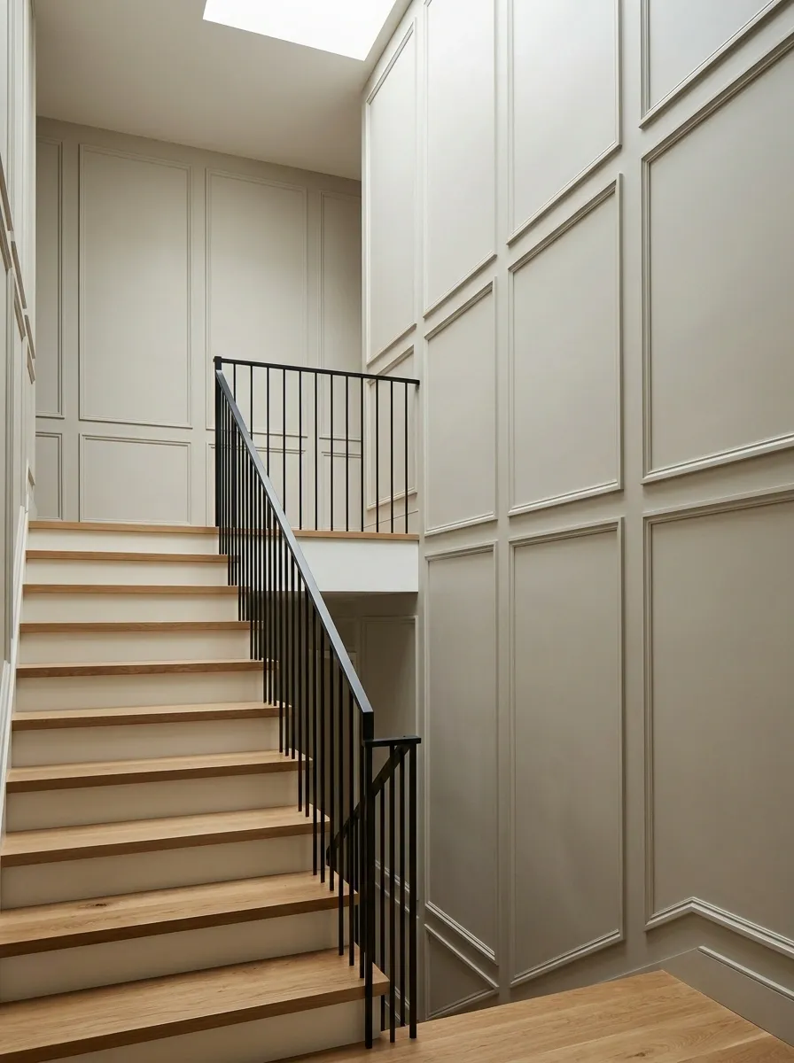
Large rectangular wall panels give this modern staircase a strong architectural rhythm without relying on ornate trim. Warm-white or pale greige paint keeps the surface quiet, broad oak treads add warmth, and a slim black railing outlines the stair run. The oversized frames continue across the landing, creating a cohesive composition that feels more like part of the building than a decorative afterthought.
The design depends on scale and clean edges. Fewer, larger panels give the wall a more relaxed rhythm than a dense grid of little rectangles. They also make the proportions of the staircase more noticeable, so alignment matters around corners, doorways, and the landing. Keep the moulding profiles simple and avoid adding extra decorative borders inside every frame. Minimalism doesn’t mean the wall is unfinished. It means the details have finally learned when to stop talking.
BIG PANELS, CLEANER RHYTHM
Let the empty wall space do some work.
Illustrative panel arrangement. Actual proportions should follow the wall and stair slope.
Fewer divisions
Large frames create a calmer, more contemporary appearance.
More breathing room
Plain wall sections preserve a sense of scale around the trim.
Paneled Staircase Gallery Wall With Integrated Picture Lighting
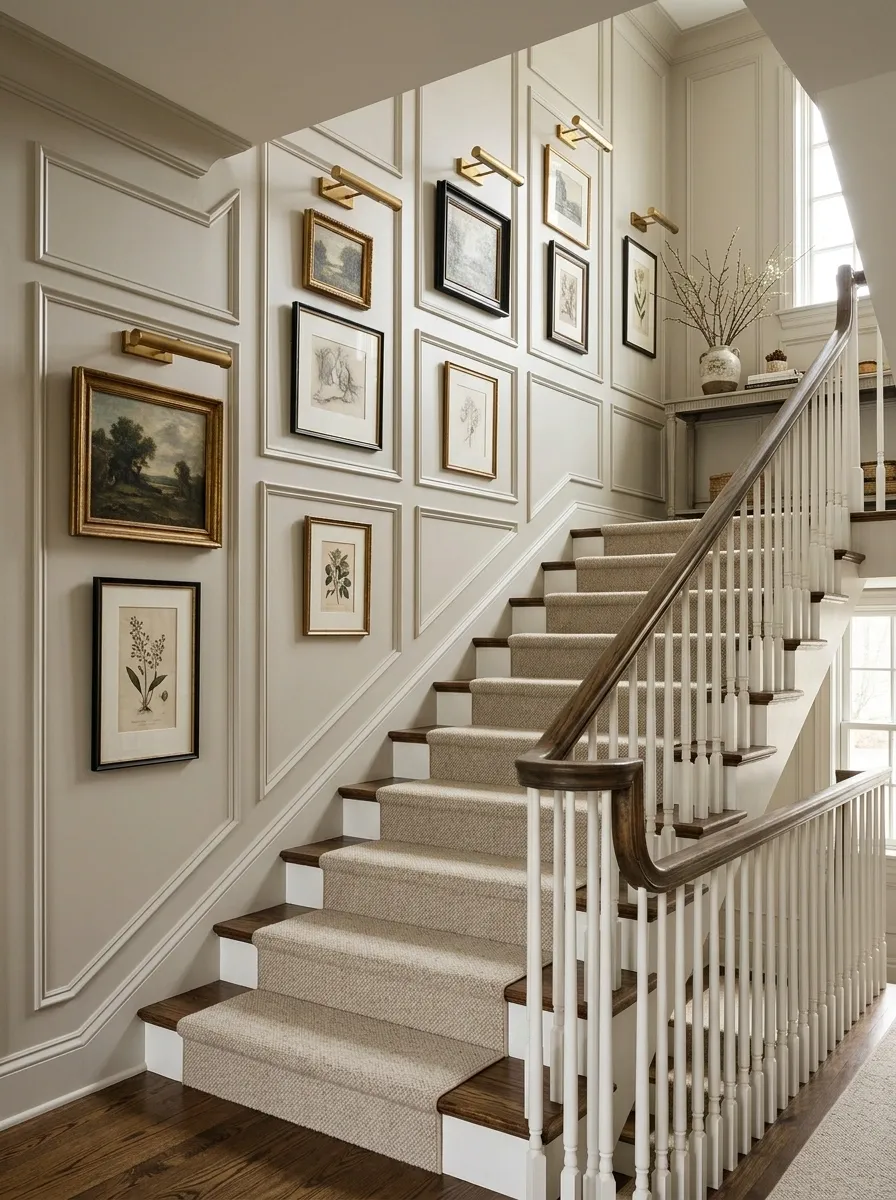
Picture-frame moulding and carefully positioned artwork can turn a staircase into a gallery that feels built into the house. Each framed piece sits within the wall’s architectural rhythm, while small picture lights create a warm evening glow. Timber treads, a restrained runner, and a simple handrail stop the display from competing with the staircase itself. At the landing, the artwork can continue at a comfortable viewing height.
The difference between a proper gallery wall and a chaotic collection of frames is planning. Choose the artwork and its approximate dimensions before finalizing the moulding layout. That way, the frames have enough breathing room and picture lights can sit in sensible positions. Hanging random art wherever a nail fits is a perfectly good way to discover that the wall has become an expensive game of Tetris.
THE BUILT-IN GALLERY PLAN
Fit the art to the architecture before the nails come out.
Art inside moulding
Conceptual relationship between artwork, panel frames, and picture lights.
Plan in this order
Artwork dimensions first, moulding layout second, lighting positions third. Check viewing height from the stairs and landing, plus wiring access before the wall is finished.
Contemporary Staircase With Painted Plywood Panels and Concrete Flooring
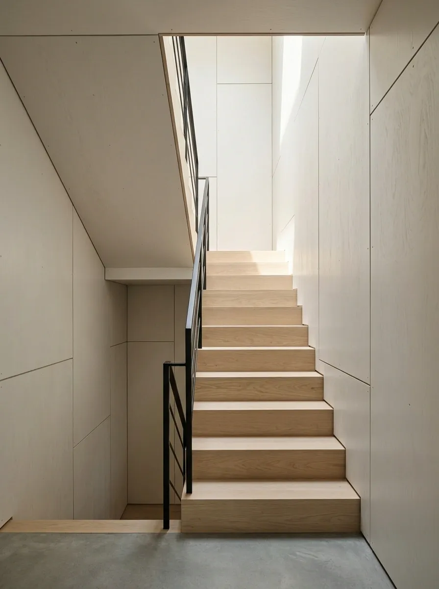
Flat painted plywood panels, pale timber treads, a slim metal railing, and smooth concrete flooring give this staircase a practical contemporary character. Fine panel joints remain visible beneath the paint, providing structure without raised decorative mouldings. A light neutral wall finish and simple lighting keep the staircase connected to the surrounding architecture, while the material combination feels a little more industrial than a conventional all-white stairwell.
The appeal lies in the honest, clean-lined construction. Consistent seams and carefully finished edges matter more than elaborate profiles, and the plywood needs to be suitable for the intended application. Plan panel thickness, fixing points, exposed edges, and transitions before installation. This is the kind of design that looks effortless only after somebody has paid attention to all the details. A visible gap that wasn’t part of the plan is not an avant-garde feature.
CLEAN JOINTS, HONEST MATERIALS
Flat panels need precision, not extra decoration.
Clean panel joints
Consistent seams create a deliberate modular rhythm.
Raised moulding
Adds traditional depth through the raised frame profile.
The construction detail matters
Use appropriate panel material and fixing methods for the location. Account for exposed edges, movement, surface preparation, and the junctions between paneling, stairs, and concrete flooring.
Making the Final Choice
The staircase that works best is the one that makes sense with the architecture already in place. A traditional hallway may call for raised panels and a runner, while a compact modern home may look better with slim trim, pale paint, and warm timber. Color can change the mood dramatically, but proportion, alignment, and the relationship between the wall and railing matter just as much.
Before buying moulding or choosing a paint color, photograph the actual stairwell and mark out a few possible panel arrangements. Check the wall from the bottom step and the upper landing, then compare the design with the treads, flooring, and nearby doors. A little planning now can spare the unpleasant realization that the finished wall looks nothing like the inspiration photo.