
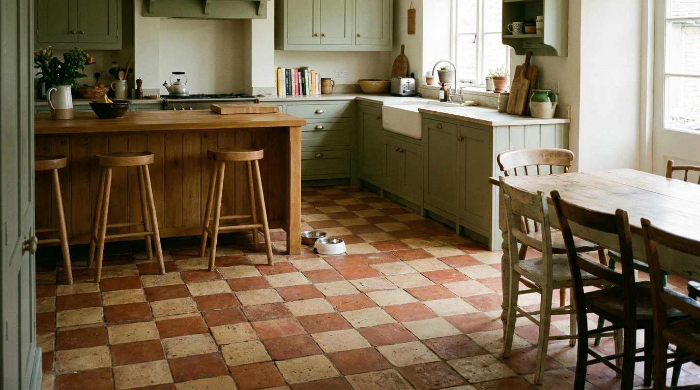
Cabinet samples get all the attention. The floor quietly occupies the largest uninterrupted surface in the kitchen and then gets blamed when the colors do not work together.
Choose it alongside the cabinetry, worktop, and adjoining room—not after everything else has been ordered. The right floor can supply warmth, pattern, or a calmer background, depending on what the kitchen already contains.
Before choosing a finish, establish the substrate condition, moisture requirements, appliance clearances, transitions, and installation method. Follow the exact product’s kitchen-use and care instructions. A material described as waterproof does not automatically make the entire room or its installation waterproof.
Kitchen Floor Ideas
Limestone-Look Porcelain for a Warm, Quiet Background
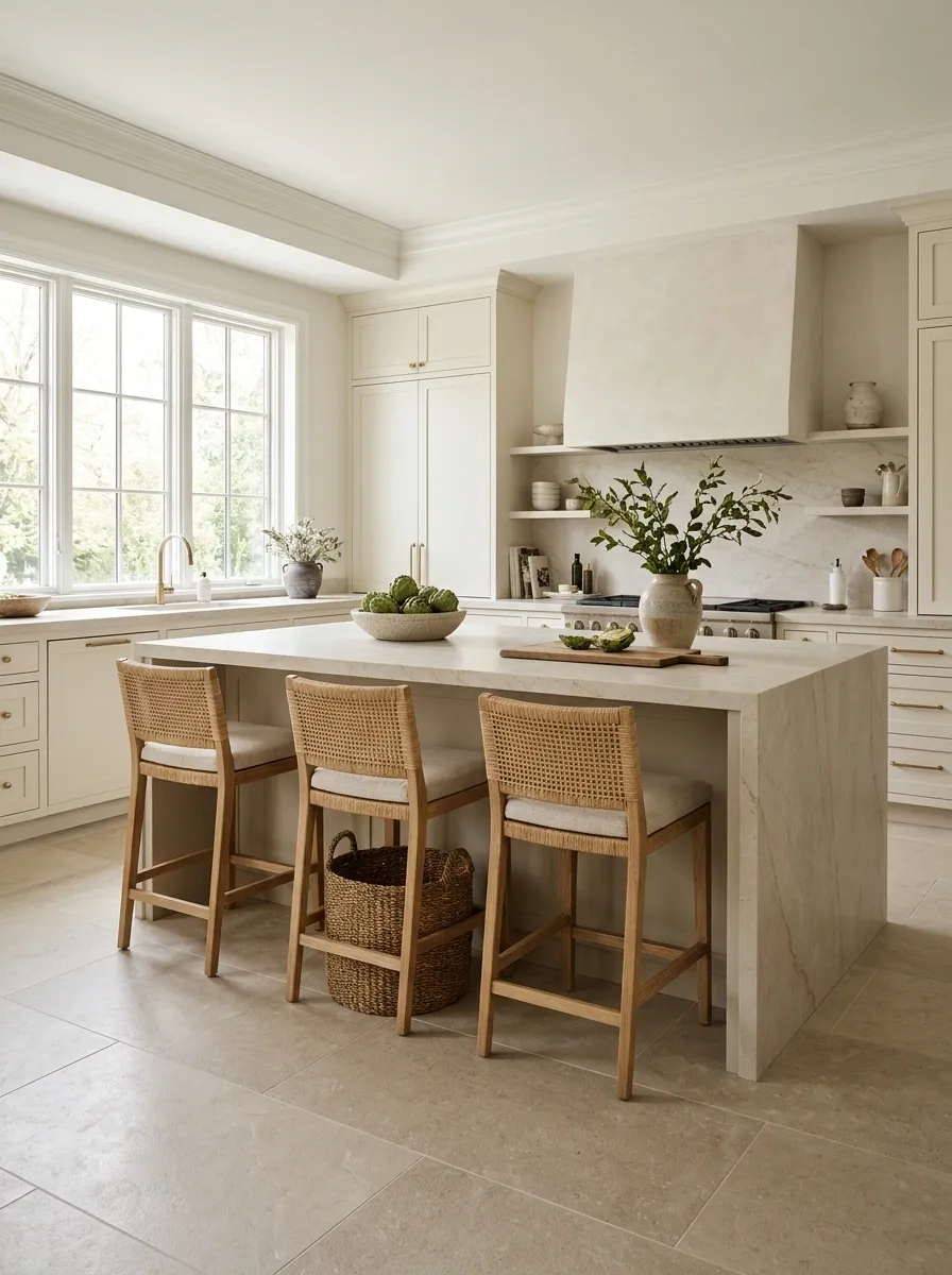
Limestone-look porcelain can give a kitchen a mineral appearance while letting you choose from a specified tile product rather than a natural-stone slab.
Look for restrained variation and a finish suitable for the intended floor use. Choose grout beside the actual sample so the joints support the look. An attractive matte appearance alone does not establish slip performance; Daltile explains why intended use and test information matter. (Tile slip-resistance guidance)
Let the floor be the quieter material
Soft variation · related grout · a finish selected for actual use
Wood-Look Porcelain Beside Painted Cabinets
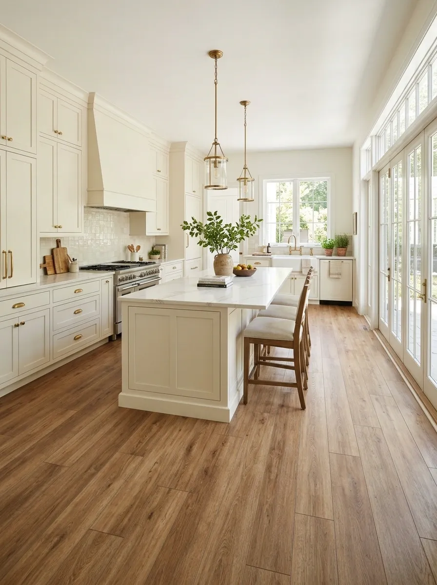
Wood-look tile can introduce a timber appearance where you want a tile floor.
Choose the tone against the cabinet color and inspect several tiles together. Repeated grain prints become more obvious over a larger area, so review the available variation and layout guidance. Keep plank proportions related to the room rather than assuming the longest available format is automatically the most convincing.
| Compare before ordering |
|---|
| Grain variation across several pieces |
| Warmth beside the cabinets |
| Grout width and color |
| The manufacturer’s layout requirements |
Small Square Ceramic Floor Tiles
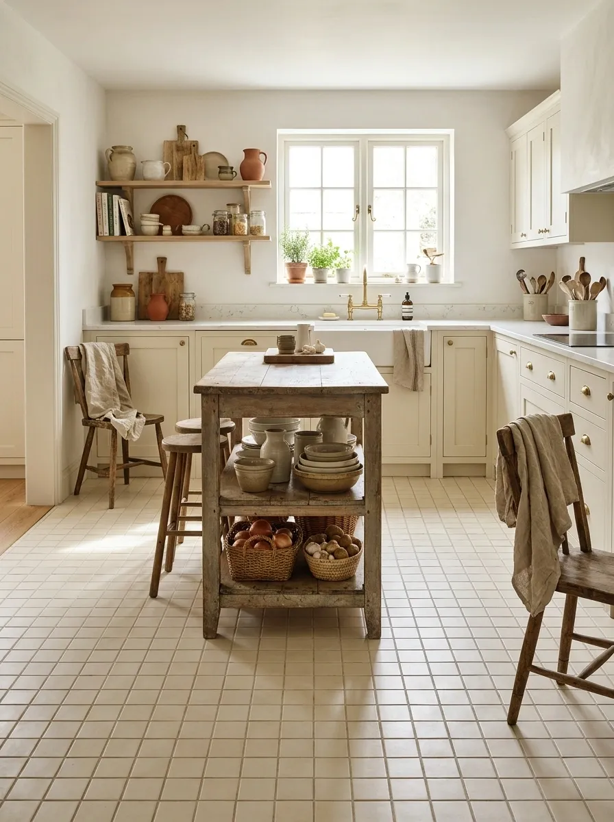
Appropriately specified ceramic floor tiles can give a kitchen a simple, slightly traditional rhythm.
Choose floor-rated products for the intended use, not decorative wall tiles that happen to be the right color. A small square format introduces more visible joints, which become part of the design and cleaning routine. Keep the grout close in color if you want a quieter result.
Pair with: straightforward cabinet fronts and a relatively restrained worktop, letting the floor’s grid provide the detail.
Sheet Vinyl With a Deliberate Pattern
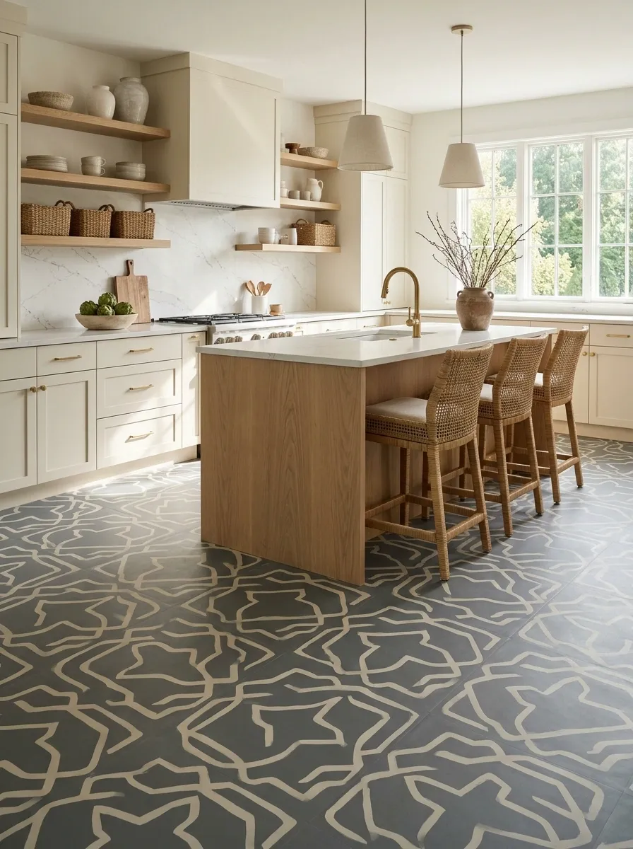
Sheet vinyl can offer a continuous-looking field with a pattern that would be more involved to assemble from individual tiles.
Check product suitability, substrate preparation, seams, and installation details. Mannington recommends trained installers and following the exact guidelines for its sheet products. Choose a pattern at room scale rather than from a small cropped image. (Sheet-vinyl installation guidance)
A continuous field still needs a layout plan
Review seams, edges, and the repeat beside the cabinetry.
Wood-Look Luxury Vinyl Planks
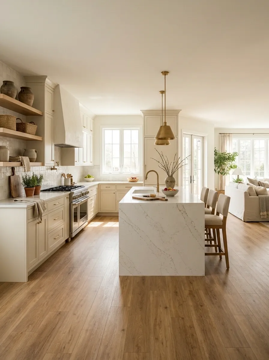
A wood-look vinyl plank can connect a kitchen with neighboring rooms while keeping the appearance relatively warm.
Compare construction, installation method, maintenance, and kitchen suitability rather than choosing by the photograph alone. Floating and adhered products have different requirements. Resolve cabinets, islands, transitions, and movement details using the selected manufacturer’s instructions. (Manufacturer installation resources)
Sample test: lay several pieces beside the cabinet door and adjoining flooring, not just one plank in isolation.
A Kitchen-Suitable Laminate With Clearly Defined Care Requirements

Some laminate ranges are specifically intended to handle household spills under stated conditions.
Read those conditions carefully, including edges, installation, cleaning, and warranty limitations. Do not treat every laminate as interchangeable. Choose a grain and surface texture that work with the rest of the room, then confirm you are comfortable with the product’s care routine. (Example of product-specific spill protection)
| Appearance question | Practical question |
|---|---|
| Does the grain suit the cabinets? | Is this product approved for this use? |
| Does it connect to adjoining rooms? | How are spills and edges managed? |
Engineered Wood for an Open-Plan Kitchen
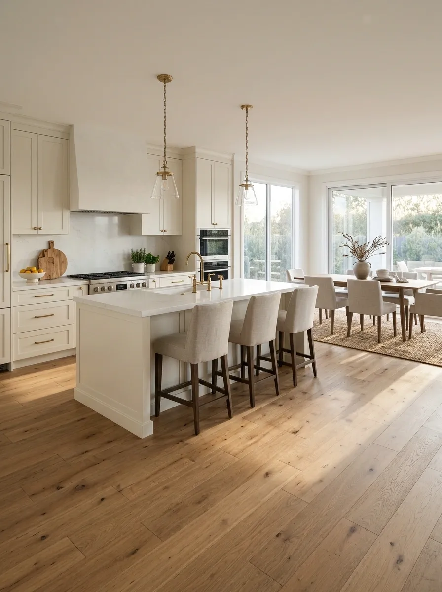
Where the selected product permits kitchen use, engineered wood can give a continuous timber character to an open-plan room.
Check the product, installation conditions, and care needs rather than assuming every engineered board has the same suitability. Deal with spills promptly and follow approved cleaning guidance. Choose the floor because you want to live with timber’s maintenance as well as its appearance. (Hardwood care guidance)
Continuity across the open plan
Restore a Suitable Existing Timber Floor
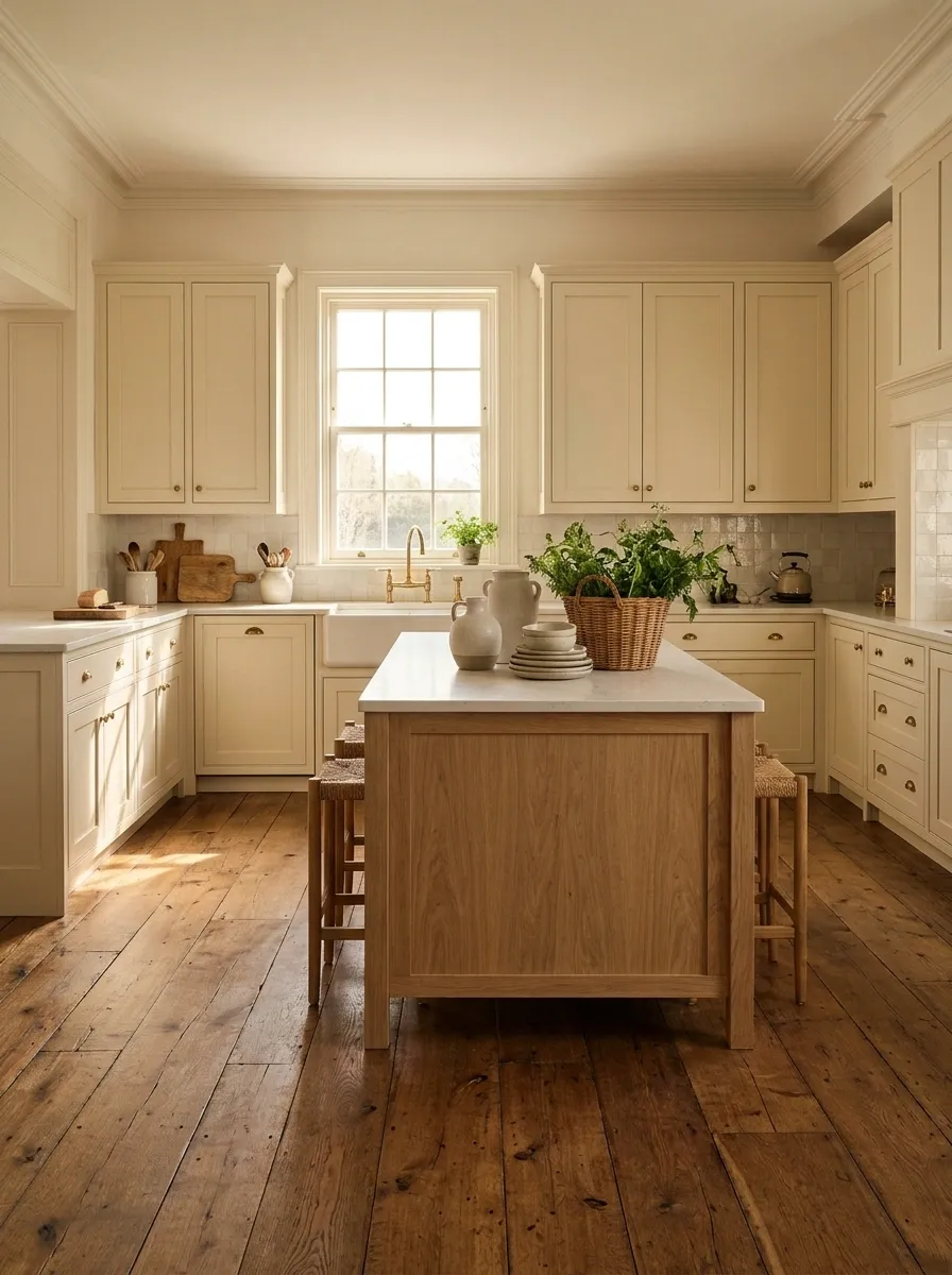
An existing floor may be worth retaining if its condition and construction suit restoration.
Have it assessed before assuming it can be heavily sanded or refinished. Check damaged areas, previous coatings, moisture problems, and the relationship to cabinets and appliances. A retained floor can bring character that a new surface cannot replicate, provided you accept its variation rather than demanding that old timber look newly manufactured.
Before replacing: compare the full restoration scope with the full replacement scope, including preparation and disruption.
Natural Limestone With a Realistic Care Plan
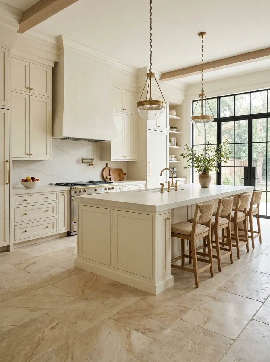
Natural limestone can give a kitchen depth and variation that feel quietly substantial.
Choose the actual stone and finish with a supplier who understands the use. Ask about staining, etching, cleaning, and any recommended treatment. The Natural Stone Institute notes that calcium-carbonate-based stone is sensitive to acids and that sealing does not make stone stain-proof. (Natural-stone care guidance)
Be honest about the appeal: you are choosing a natural material with character, not a surface that must remain visually untouched forever.
Terracotta With a Carefully Chosen Finish
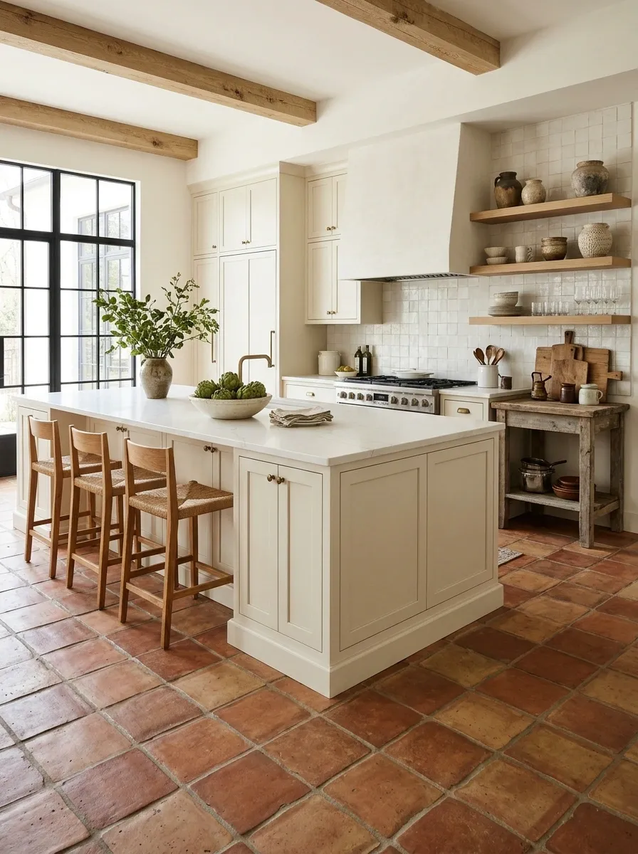
Terracotta can make a kitchen feel warm and grounded, especially beside cream, olive, or timber cabinetry.
Specify a product and treatment suitable for the kitchen, with clear installation and maintenance instructions. Review several pieces together so you understand the variation. Keep the surrounding materials restrained if the floor has a strong range of color and texture.
Warmth through real variation
Choose cabinets and grout beside a group of tiles, not one ideal sample.
Terrazzo-Look Porcelain With a Restrained Chip Pattern
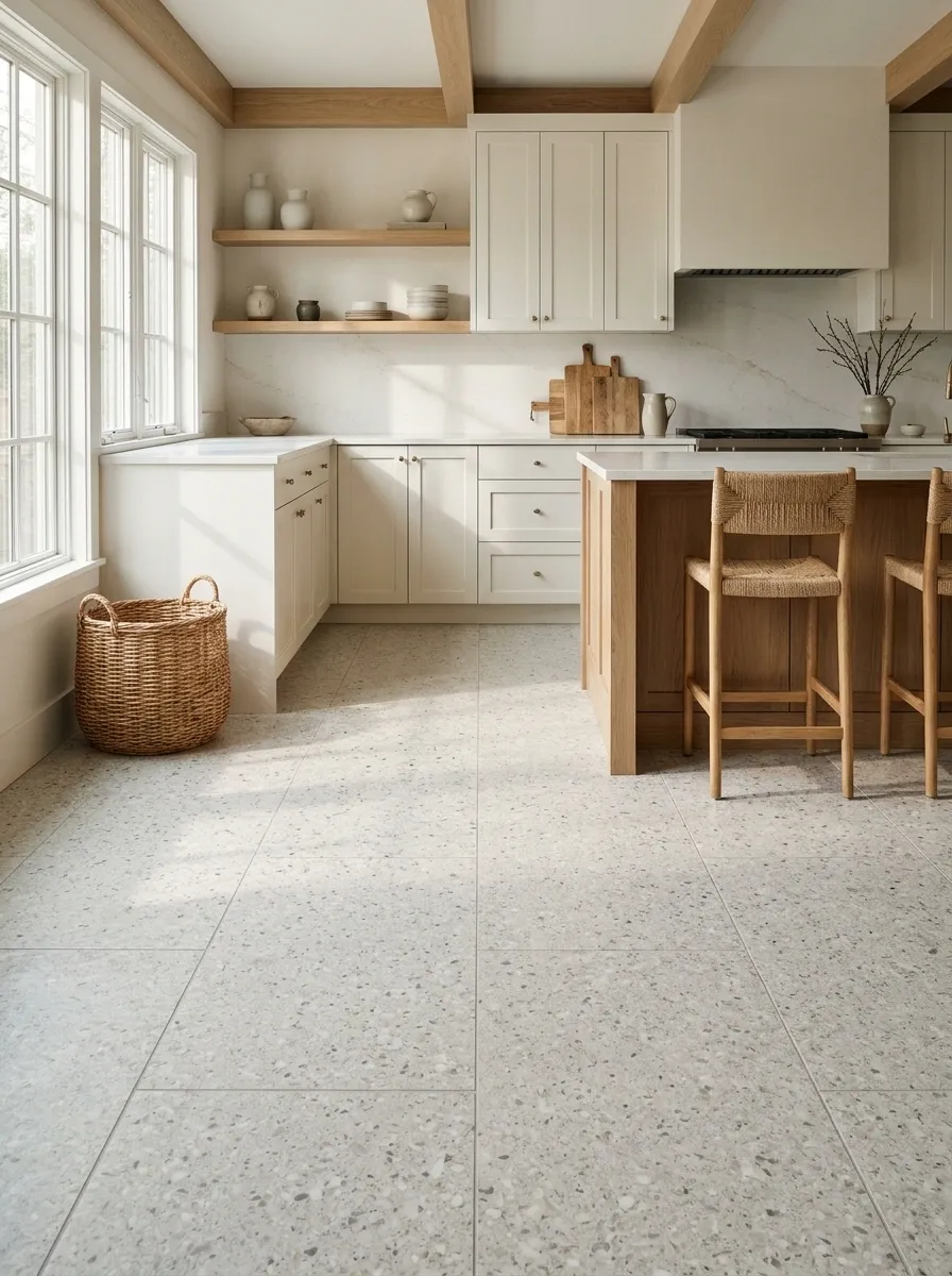
Terrazzo-look porcelain can introduce pattern without using an obvious repeating decorative motif.
Choose the background first, then look at the chip colors and density. A busy worktop usually benefits from a quieter floor pattern. View the tile across a larger sample area so you can judge whether the effect feels lively or simply crowded.
| Already have | Consider for the floor |
|---|---|
| Strong worktop movement | Finer, quieter chip pattern |
| Plain cabinets and worktop | A more expressive terrazzo effect |
Natural Linoleum in a Quiet Midtone

Linoleum offers a different material character from vinyl, and it can bring an understated continuous color to the room.
Select the product and installation for the kitchen and follow its care guidance. Forbo’s Marmoleum instructions specify suitable cleaning methods and warn against inappropriate cleaners and abrasive treatments. Keep the color related to the cabinetry so the floor feels integrated rather than like a separate design exercise. (Linoleum care instructions)
A continuous color beneath the cabinetry
A Professionally Finished Concrete Floor
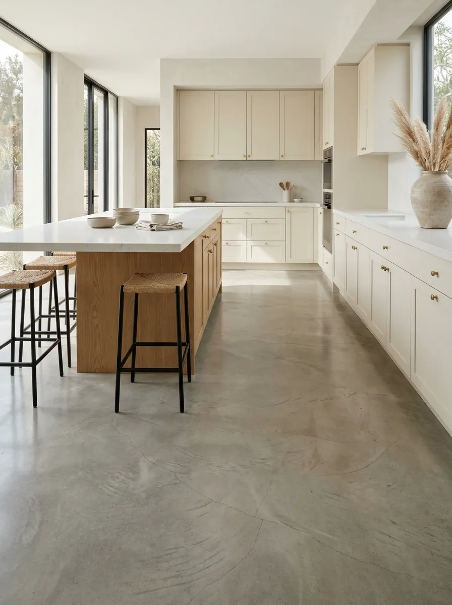
Concrete can suit a kitchen with simple cabinetry and an architectural character.
Have the substrate, finish, moisture conditions, maintenance, and suitability assessed as a complete project. Discuss the appearance of repairs and natural variation before deciding. A polished photograph does not show every mark a real slab may contain. Choose this direction because you like the material, including its less perfectly uniform moments.
Set expectations: the proposed finish, visible variation, traction, and care should all be part of the discussion.
A Soft-Contrast Checkerboard
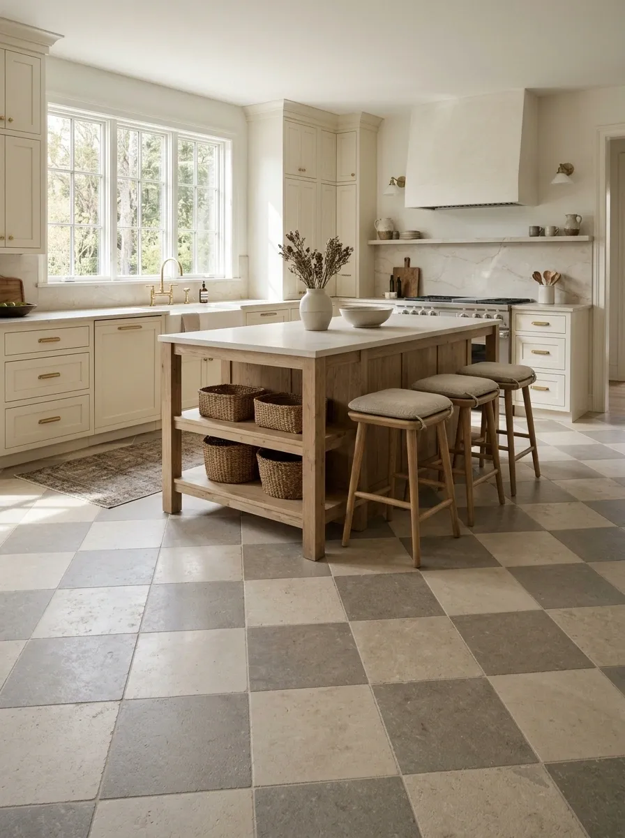
Checkerboard does not have to mean bright white against black.
Try limestone beige with warm gray, or cream with a muted green, using products suited to the floor. The lower contrast makes the pattern easier to combine with cabinetry. Plan the layout at the room’s edges so narrow cuts do not make the pattern feel squeezed into place.
A familiar pattern with softer contrast
A Diagonal Square-Tile Layout
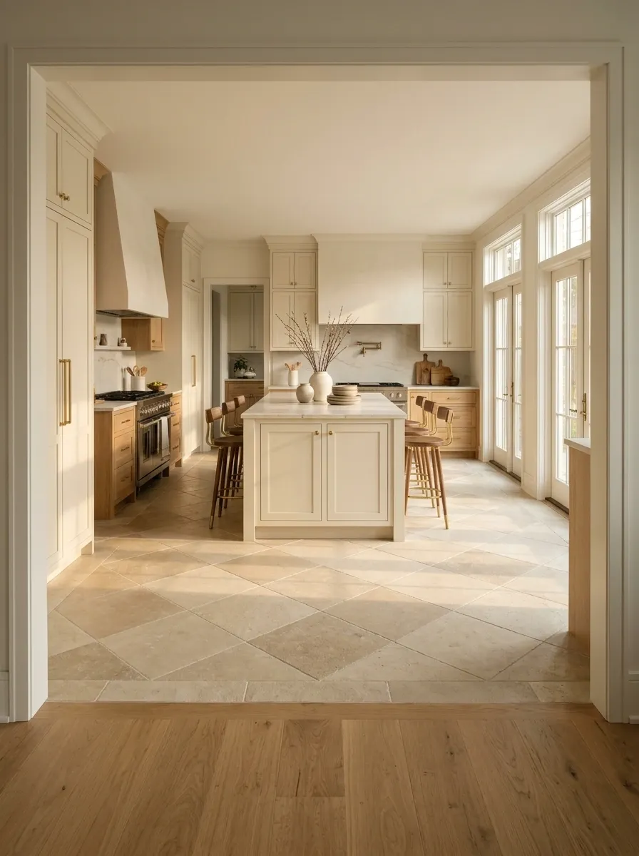
Turning a square-tile pattern can change how it relates to cabinet runs and doorways.
Mock up the layout and review perimeter cuts before committing. Diagonal does not automatically make a small room look larger; its main contribution is a different visual rhythm. Keep other patterns restrained if you want the floor to remain readable.
Check the main view: the approach from the adjoining room, with the island and cabinets included.
Herringbone With a Quiet Cabinet Palette
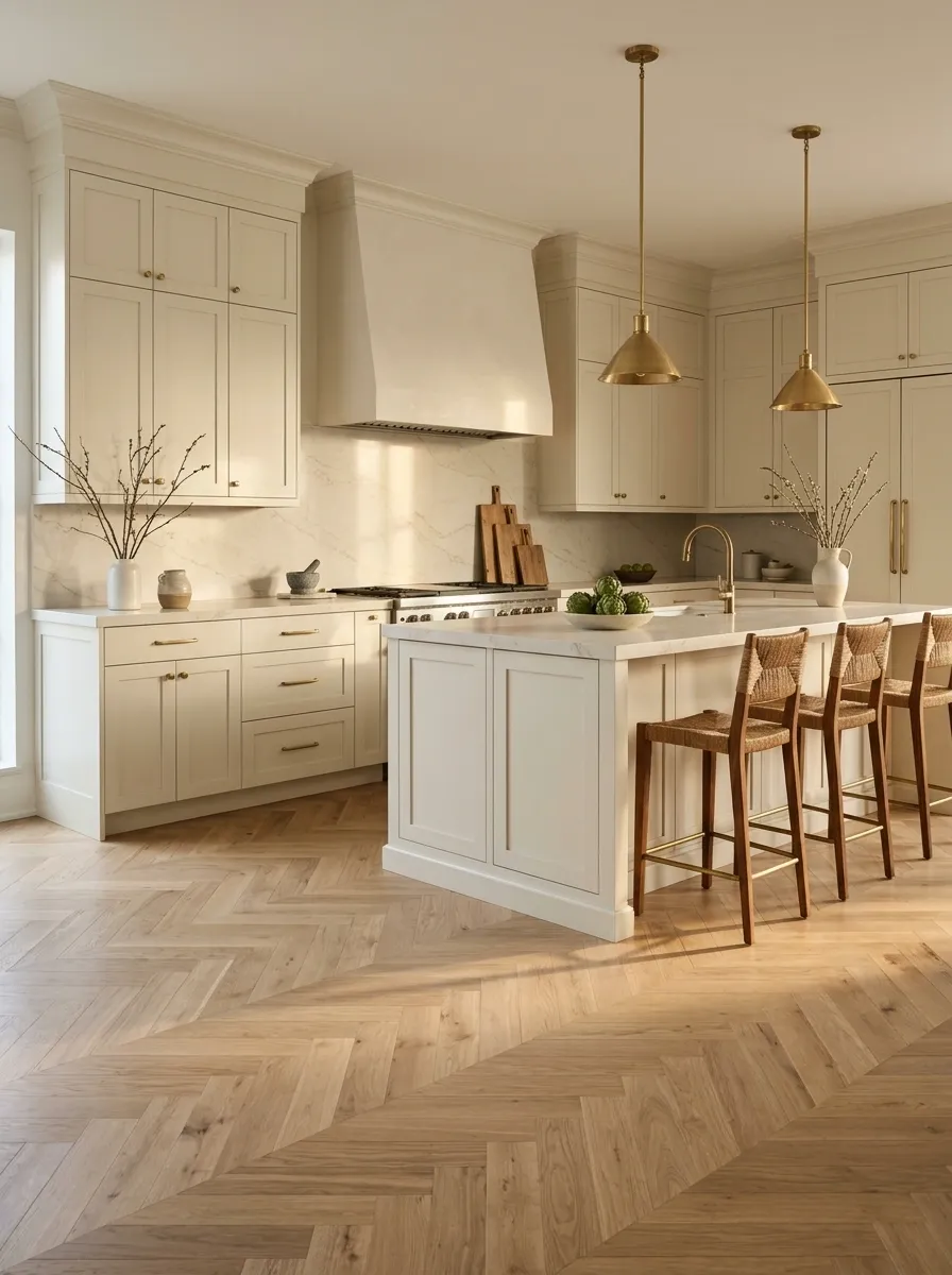
Herringbone brings movement to the floor, so give it relatively calm company.
Choose a flooring product intended for that layout and use the appropriate installation system. Plank proportions affect the scale of the pattern. Compare a realistic layout sample rather than a few pieces arranged on a counter, and decide how the pattern terminates at doors and adjoining flooring.
| Let the floor supply | Keep quieter |
|---|---|
| Direction and movement | Cabinet fronts |
| Repeated geometry | Worktop pattern |
| A room-scale focal surface | Small decorative accessories |
Basketweave for a More Traditional Rhythm
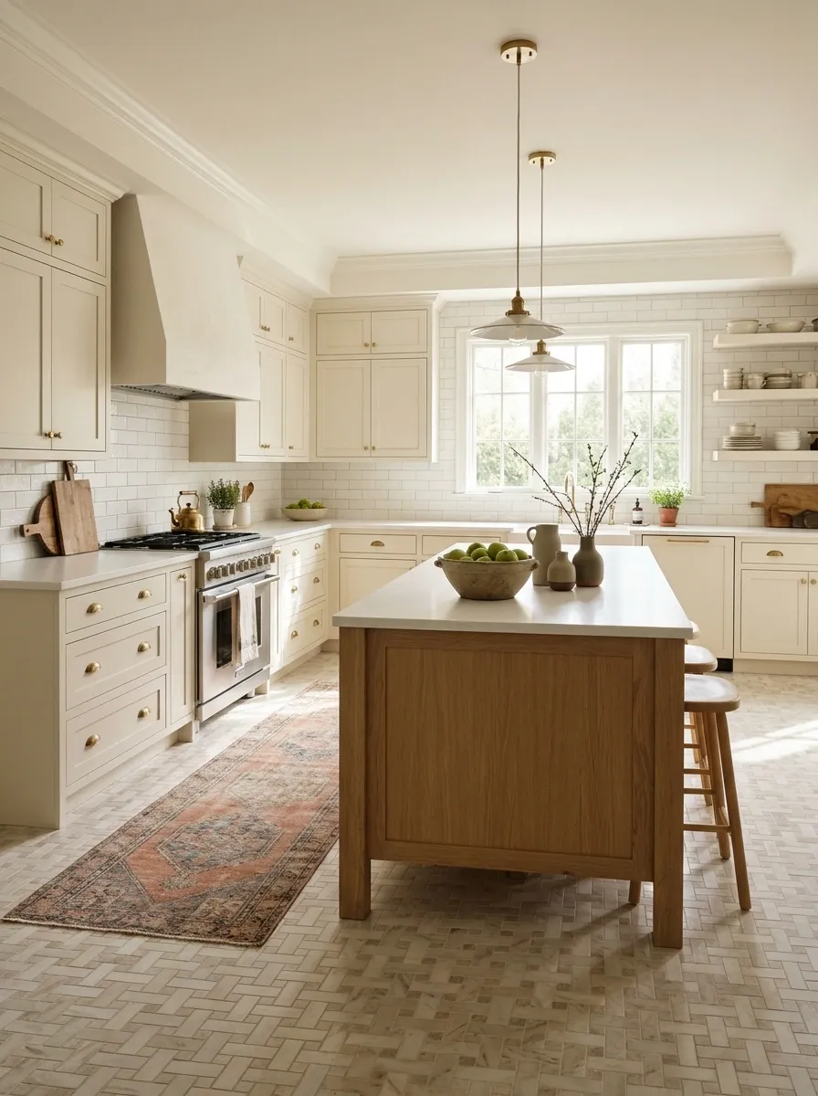
Basketweave can feel more contained than herringbone while still adding a clear geometric pattern.
Use a suitable tile or flooring system designed for the arrangement. Keep the contrast modest if the kitchen already has detailed cabinetry. The pattern should complement the room’s scale rather than become a dense field of small shapes competing with handles, moldings, and a busy backsplash.
Alternate direction within a clear repeat
Conceptual pattern only; follow the selected product’s layout requirements.
Hexagonal Floor Tile in One Color
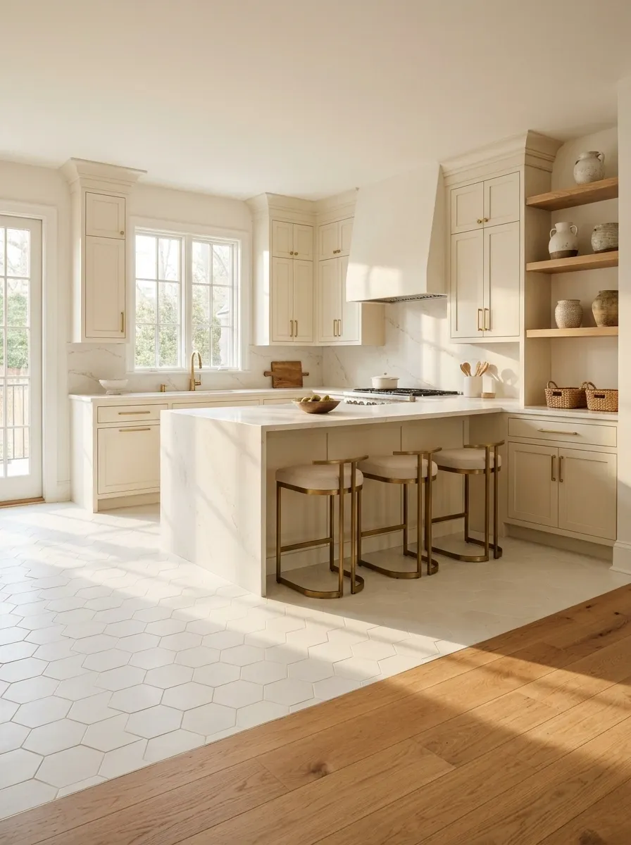
Hexagons add shape without needing a multicolor floor.
Choose the size around the room and the amount of visible joint pattern you want. A single color with related grout can feel restrained, while contrasting grout emphasizes every edge. Use floor-rated products and review the care implications of the finished surface rather than choosing on geometry alone.
Keep it coherent: repeat the tile’s general tone in another substantial finish, not necessarily its shape.
Large-Format Tile With Carefully Planned Cuts
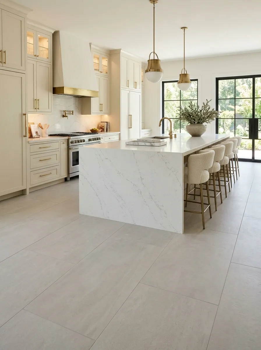
Large-format tile can create a broad, calmer field when the substrate and installation suit it.
Plan around cabinet runs, the island, doorways, and the room’s actual dimensions. Fewer visible joints do not remove the need for movement details or careful preparation. A large tile chosen without a layout plan can produce some very small, very conspicuous cuts at the edges.
Resolve the edges before installation
Check the whole room plan, including door thresholds and island positions.
Brick-Format Floor Tiles With Related Grout
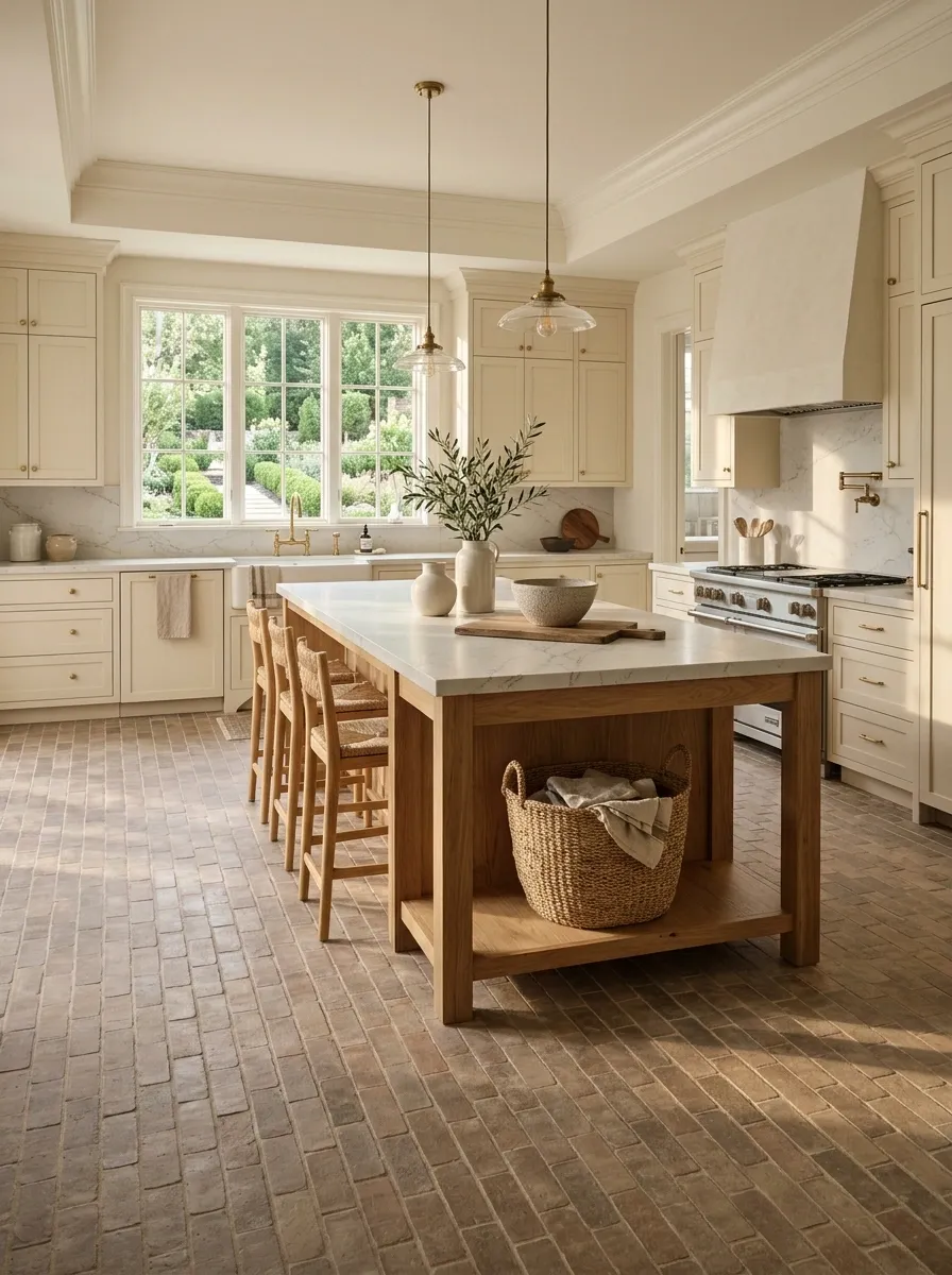
A brick-format tile can give the kitchen a directional rhythm without a strong color pattern.
Choose a product rated for the floor and follow the recommended offset and installation details. A related grout tone makes the surface feel more continuous. Use a stronger grout contrast only if you want the joint pattern to become a visible part of the design.
| Quieter result | More graphic result |
|---|---|
| Grout close to tile color | Clearly contrasting grout |
| Restrained tile variation | Stronger variation across pieces |
A Narrow Border Around a Plain Floor Field
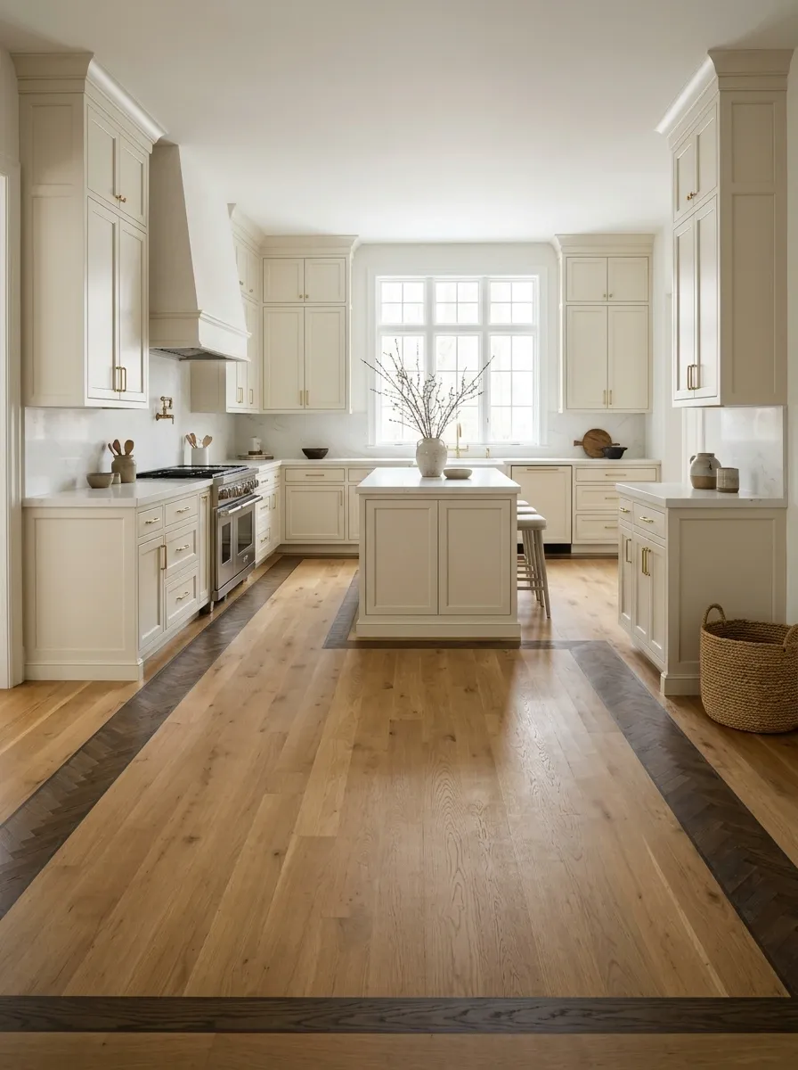
A border can define the kitchen footprint or acknowledge a traditional room’s proportions.
Plan it around fixed architecture rather than temporary furniture positions. Check how it meets cabinetry and doorways. The border should read as deliberate, not as an unrelated stripe trying to navigate around every appliance. Keep the center simple enough that the edge has a clear role.
A quiet center inside a defined edge
Relate the border to the room’s permanent boundaries.
A Tile Work Zone Beside a Different Adjoining Floor
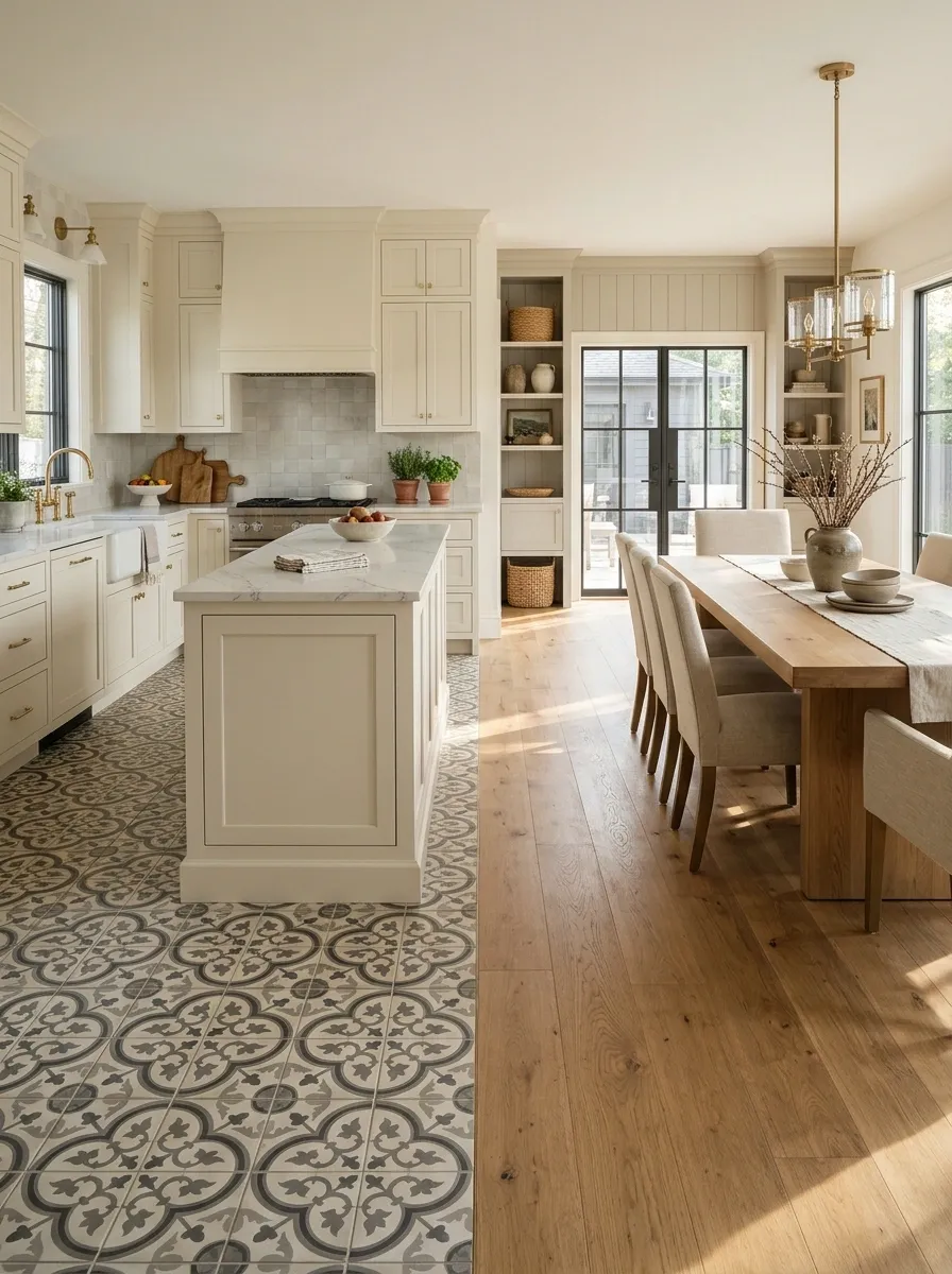
Two floor materials can distinguish the kitchen from a dining or sitting area when the transition is carefully designed.
Resolve finished heights, movement, edges, and cleaning before choosing the shape of the boundary. A straight, well-placed transition often looks more settled than a complicated zigzag. Do not assume a decorative junction detail can replace the installation requirements of either material.
Draw the boundary with the furniture present: it should relate to how the open-plan room is used.
One Continuous Floor Through Kitchen and Dining
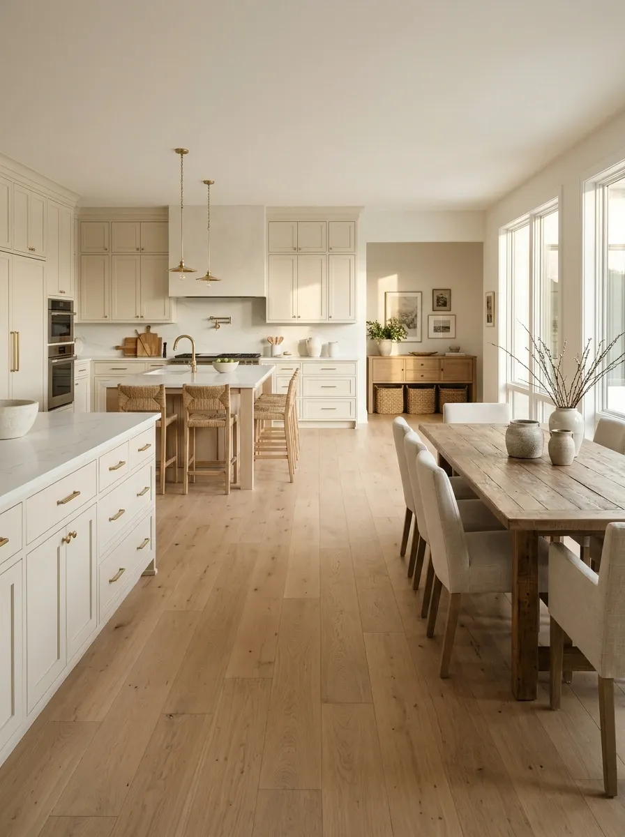
Using one suitable floor across the kitchen and eating area can make the rooms feel connected.
Choose a product that handles both uses and follow any required movement and transition details. Continuity is a visual goal, not permission to ignore the installation system. Compare the floor beside dining furniture as well as cabinets, since it needs to support both compositions.
One material, two everyday functions
A Floor Color Borrowed From the Worktop’s Quieter Detail

If the worktop has pattern, use one of its less prominent tones as the starting point for the floor.
This can connect the materials without repeating the same dramatic veining across every surface. Place large samples together and look from the doorway. The floor should support the kitchen as a whole, not compete with the worktop for the role of most expensive-looking rectangle.
Choose the supporting note: a warm gray, softened brown, or pale mineral tone already present in the worktop.
A Low-Contrast Pattern Beside Detailed Cabinetry
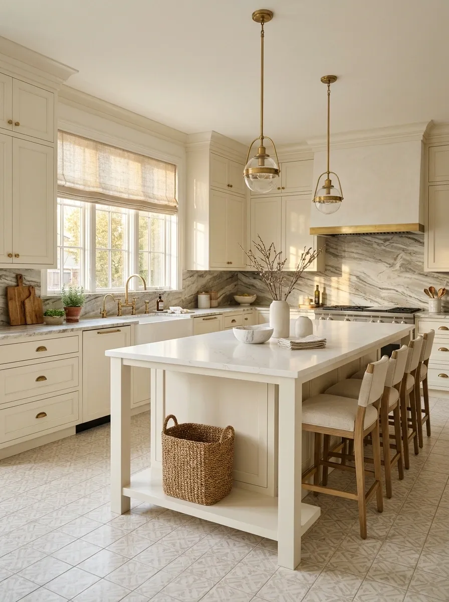
If the cabinet fronts, handles, and backsplash already provide detail, choose a floor pattern with a softer difference between its colors.
You can still have geometry or variation; it simply does not need to shout. Judge the whole combination at room scale and under the installed lighting. A floor that feels slightly quieter on its own may be exactly right once everything else is in place.
| Detailed kitchen element | Floor response |
|---|---|
| Decorative cabinet fronts | Lower-contrast pattern |
| Strong worktop movement | Restrained surface variation |
| Expressive backsplash | A clearer, calmer floor field |
Bring the samples down to floor level before deciding. That is where the material will live, catching different light and sitting beside the cabinets rather than on top of them. The final choice should make the whole kitchen feel resolved, not just produce the nicest sample board.