
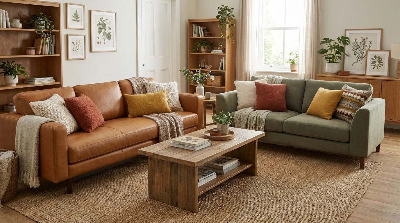
The sofas do not match. Good. Now give them a reason to share the room.
Different colors can make a living room feel collected rather than ordered from one page of a furniture catalog. The connection might come from a rug, related shapes, a shared wood tone, or simply a clear arrangement that lets both sofas look intentional.
Start with the upholstery you have. Place large color samples beside it before choosing new curtains, paint, or a rug. You are coordinating substantial pieces of furniture, not two tiny squares on a screen.
Two Tone Sofa Ideas
Teal and Stone Harmonized
Teal and stone bring a refreshing balance of rich color and calm neutrality to a modern living space.
Anchor the arrangement with a patterned rug that subtly ties the deep blue-green of the primary sofa together with the lighter tones of the secondary seating.
Let the textured fabrics do the heavy lifting for visual interest, keeping surrounding decor minimal to let the contrasting color palette shine.
Navy and Camel for a Settled, Tailored Room
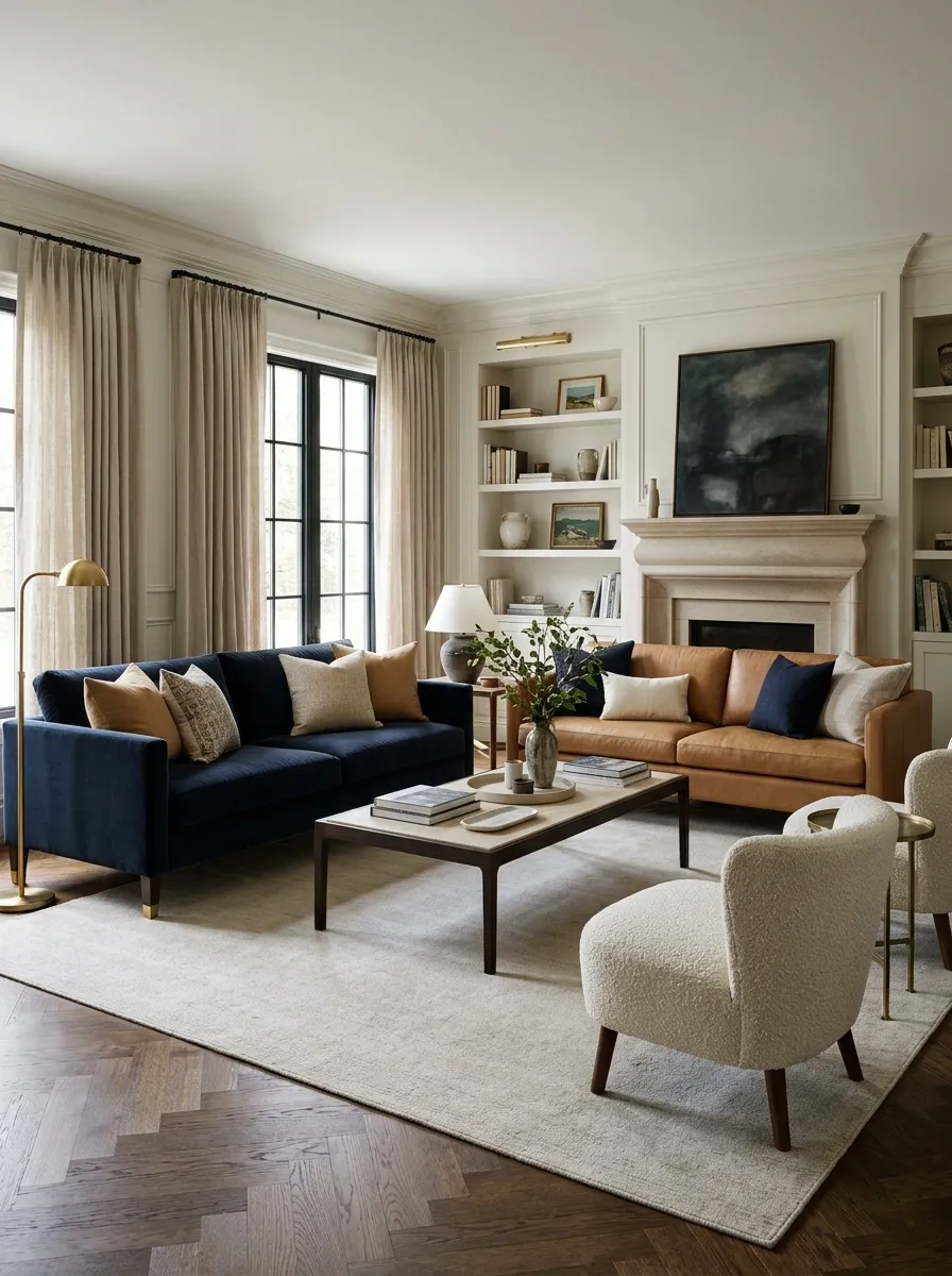
Navy and camel offer a strong contrast without either sofa looking like an afterthought.
Give them a shared pale rug or quiet floor area and use a restrained table between them. The navy supplies depth; camel brings warmth. If one sofa is leather and the other fabric, let that material difference remain visible rather than covering both with identical throws.
Two colors, one shared setting
Moss Green and Warm Rust
Moss green and warm rust create an earthy, inviting atmosphere that feels grounded yet full of life.
Use a large olive sectional as the primary anchor, then introduce the rust tone through a modular ottoman or accent pieces to warm up the neutral backdrop.
Keep wood tones and textured textiles natural and organic to enhance the seamless blend of these two rich, nature-inspired hues.
Olive and Oatmeal for a Softer Contrast
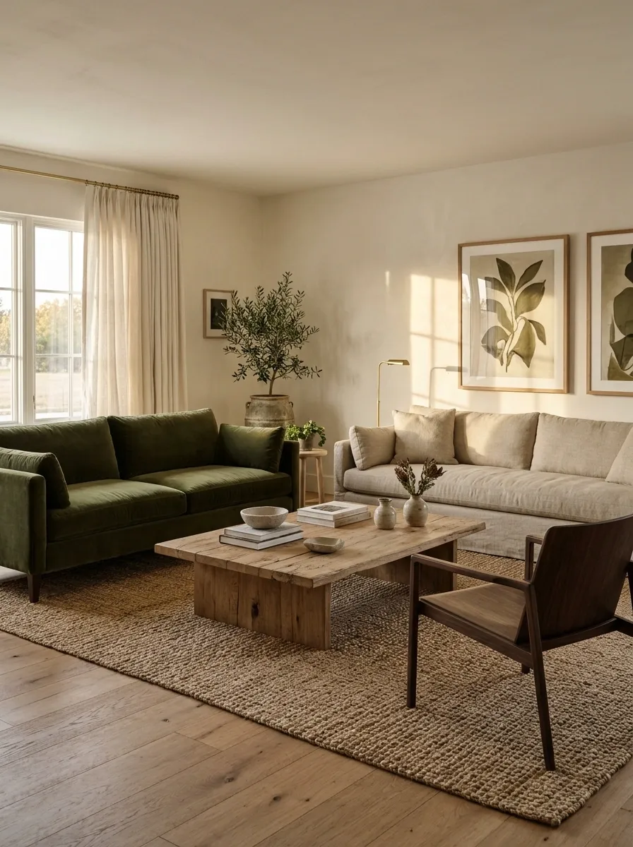
Olive and oatmeal work well when you want the sofas to differ without making the room strongly graphic.
Choose oatmeal with enough warmth to relate to the green. Carry a little olive into artwork or a textile near the lighter sofa, then leave space around that repetition. The room does not need green objects at regular intervals to prove the pairing was deliberate.
| Olive sofa contributes | Oatmeal sofa contributes |
|---|---|
| Depth and color | Lightness and texture |
| A natural anchor | A quieter companion |
Charcoal and Cream Contrast
Charcoal and cream offer a classic, moody contrast that instantly elevates a spacious, open-plan living area.
Pair a textured grey sectional with a lighter cream armchair to balance deep shadows with bright, inviting highlights.
Incorporate warm wooden flooring and soft lighting to keep the heavier charcoal tones from feeling overpowering in the room.
Rust and Cream With a Calm Background
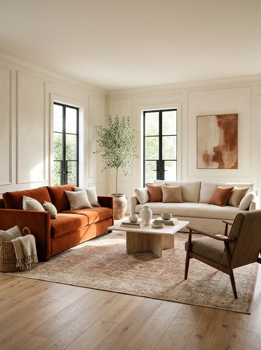
A rust sofa can be the focal piece while cream provides a lighter counterweight.
Keep the walls relatively quiet and choose a rug that contains a softened version of the warm tone. Avoid a rug so busy that the two sofas become secondary to it. In a bright room, compare cream samples carefully; some look pleasantly warm while others turn unexpectedly yellow beside rust.
Let rust lead: a clear focal sofa needs fewer competing colorful objects.
Sage Green and Soft Oatmeal
Sage green and soft oatmeal provide a serene, understated pairing that feels effortlessly chic and relaxed.
Let a textured sage sofa take center stage alongside a lighter oatmeal companion, bridging the two with matching boucle ottomans and a central coffee table.
Frame the setup with sheer curtains and classic wall moldings to create a bright, airy backdrop that lets the soft colors breathe.
Burgundy and Mushroom for an Intimate Sitting Area
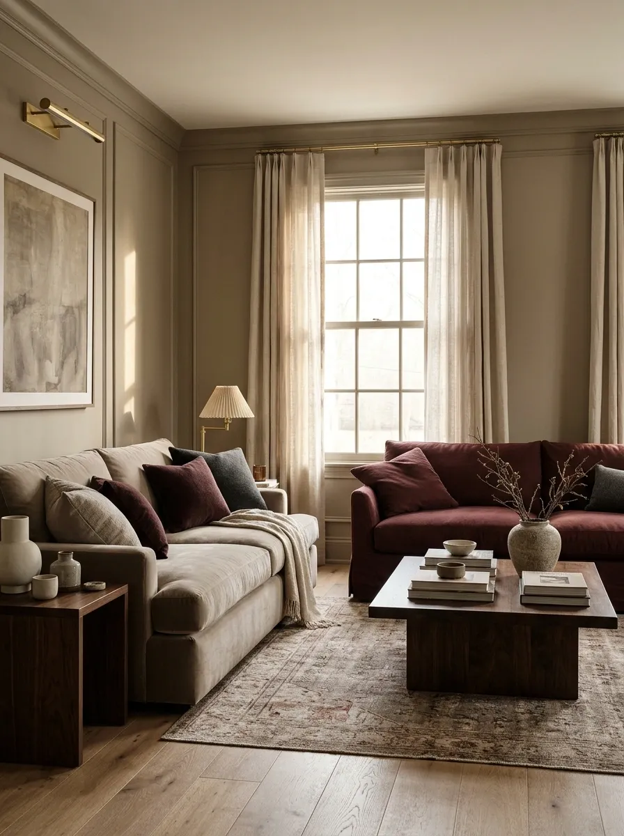
Burgundy feels more relaxed beside mushroom than it does beside stark white.
Use mushroom in the larger or more visually open position if you want to soften the room. A darker wooden table can bridge the difference, while plain curtains keep the arrangement from feeling formal. The sofas may have different silhouettes, but their scale should still feel comfortable together.
Give burgundy room to register
Dusty Rose and Chocolate Brown

Chocolate gives dusty rose substance. Rose keeps the brown from making the room feel too heavy.
This can be especially useful when you are keeping an older dark sofa and adding a lighter piece. Let plain upholstery do most of the work and bring texture through the rug or curtains. There is no need to make every cushion a matching brown-and-pink negotiation.
Try beside them: a warm pale wall and a table with a simple outline.
Charcoal and Muted Butter Yellow
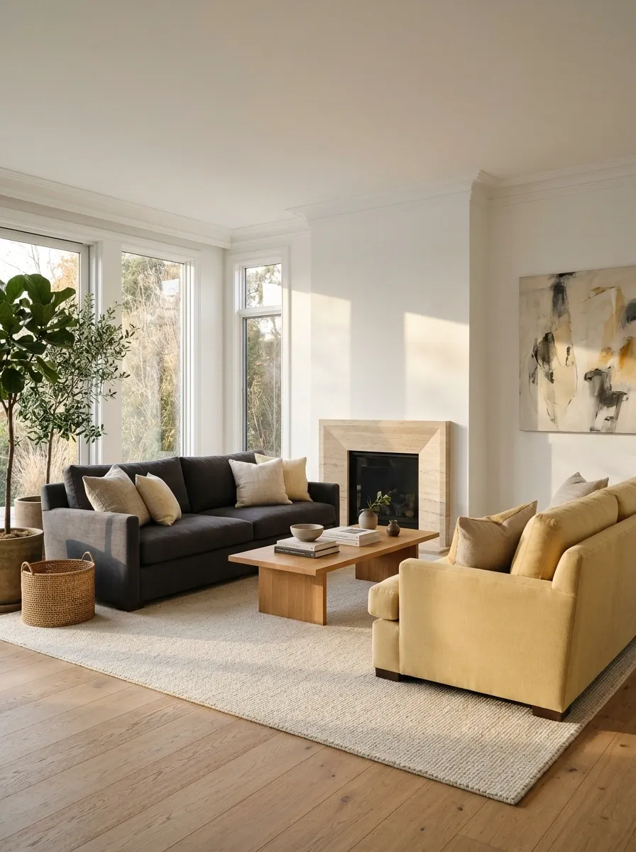
Charcoal provides a strong frame for a softer yellow sofa.
Keep the yellow muted enough to sit comfortably beside the rest of the room. Choose a pale rug if the floor and charcoal upholstery are both dark. The lighter sofa can then feel like a welcome emphasis rather than the only visible object in the room.
| If the room feels heavy | If the yellow feels isolated |
|---|---|
| Lighten the shared rug | Repeat a little yellow in art |
| Simplify dark accessories | Add a warm neutral nearby |
Teal and Caramel With Different Textures
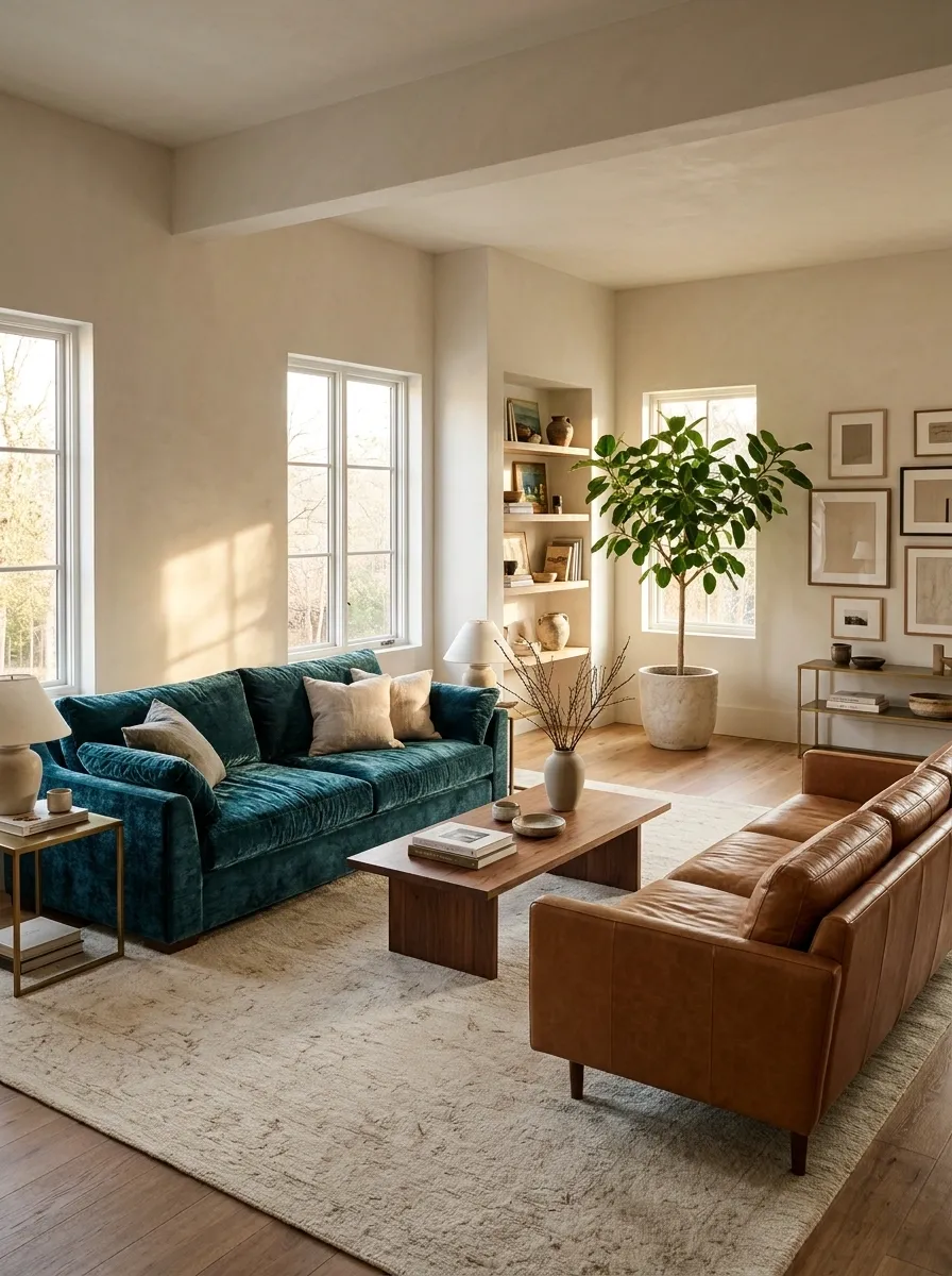
Teal fabric beside caramel leather creates interest through color and surface.
Let one material be softer and the other smoother. A low-pattern rug can connect them without hiding that difference. Choose surrounding metal and timber finishes deliberately; introducing several additional strong finishes may make an already rich pairing feel busy.
Let the surfaces differ, too
Powder Blue and a Deep Brown Sofa
Powder blue can make a dark existing sofa feel less imposing.
Choose a blue with enough depth to remain visible beside the brown, then use a warm neutral around both. Keep the room from becoming too cool with the wall and rug choices. The brown sofa does not need to be hidden beneath a pale throw; it is supplying the contrast that makes the pairing interesting.
Start with what stays: compare the blue against the actual dark upholstery in daylight and evening light.
Forest Green and Warm White
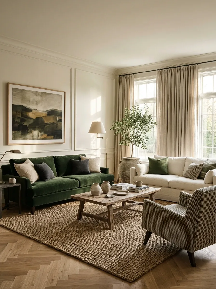
Forest green and warm white can feel crisp without the hardness of black and white.
The green sofa gives the room a clear anchor, while the white sofa keeps the arrangement lighter. Choose an upholstery and care routine appropriate to your household rather than buying a pale fabric solely for its appearance. Beautiful furniture becomes less relaxing when nobody feels allowed to sit on it.
Depth balanced by a light companion
Plum and Pearl Gray

Plum and pearl gray suit a living room that wants depth without relying on earthy colors.
Check the gray beside the plum: a softened, slightly warm gray often feels more settled than an icy one. Keep the larger supporting surfaces restrained. If you use a pattern, let it contain both colors without introducing a collection of additional jewel tones.
| Give plum | Give gray |
|---|---|
| A clear focal position | Space to lighten the group |
| Limited small echoes | Texture and a quiet background |
Terracotta and Washed Denim
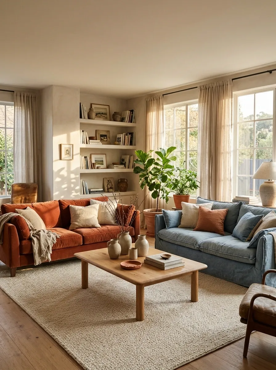
Terracotta and washed blue create a relaxed contrast that suits everyday living.
Keep the fabrics similarly softened even if their textures differ. A warm wooden table and a simple neutral rug can connect them. Avoid overly polished accessories if you want the room to remain casual; the sofas already suggest an easy, lived-in atmosphere.
Useful distinction: complementary warmth and coolness, with a shared level of softness.
Cobalt and Tan for a Bolder Room
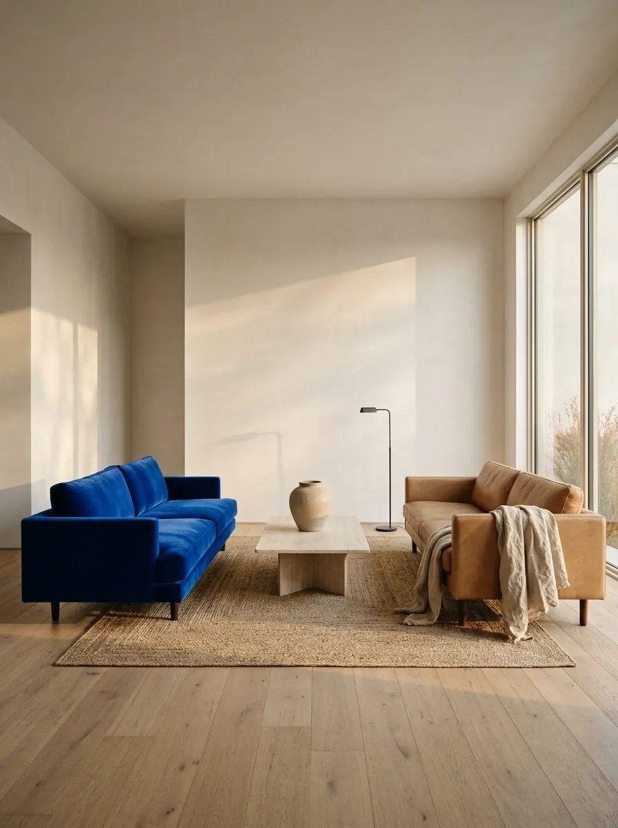
Cobalt beside tan feels confident, particularly when the surrounding room is simple.
Use tan as the quieter partner and keep the cobalt concentrated in one sofa. Large, calm areas around the furniture help the strong blue feel intentional. Repeating cobalt everywhere usually weakens the effect by turning a focal point into a theme.
Let the tan supply the pause
Soft Black and Cream With Distinct Shapes
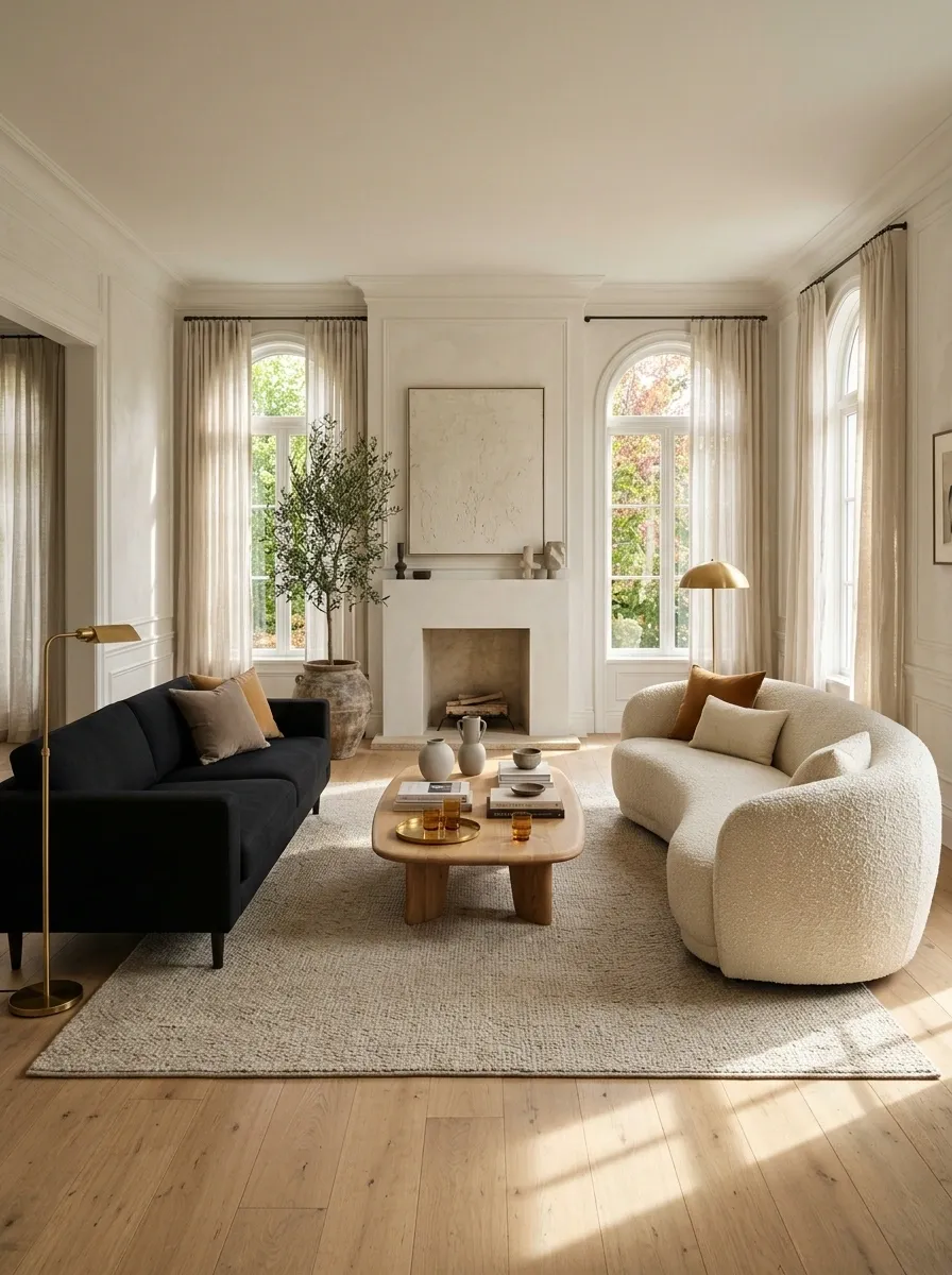
Black and cream can feel collected when the sofas differ in shape as well as color.
Try a simple dark sofa beside a softer curved cream one, provided their scale works together. Give them a shared rug and table so the arrangement feels like a group. Keep the cream warm and textured if you want to avoid a strongly graphic showroom effect.
Check proportions: a low, delicate sofa can look stranded beside a very tall, bulky one, regardless of how well the colors work.
Sage and Tobacco for an Earthy Mix
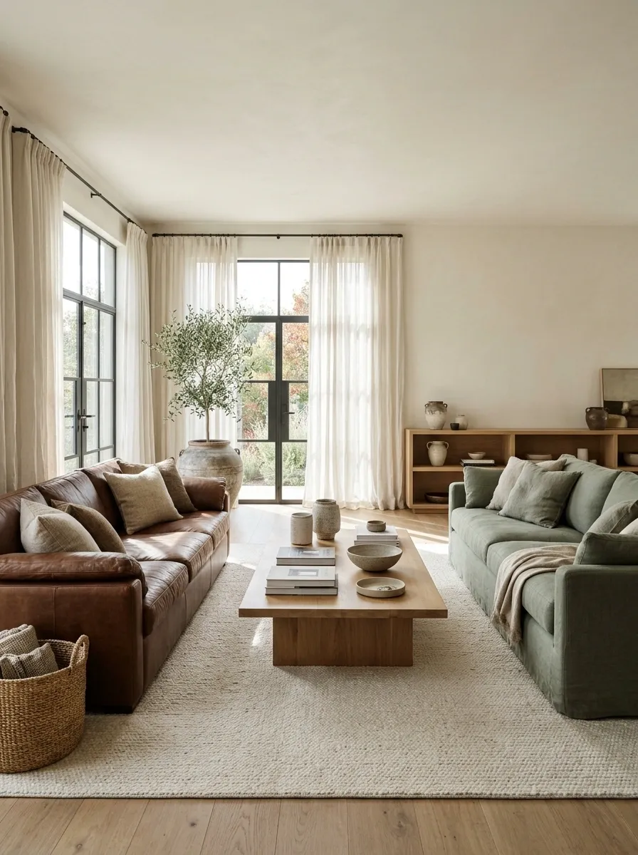
Sage gives a tobacco-colored sofa a softer, fresher partner.
Let the green remain muted and use warm pale surroundings to connect the two. If the brown sofa is visually heavy, choose a green companion with enough presence to balance it. A tiny accent sofa will not necessarily solve the imbalance just because its color is right.
| Color decision | Size decision |
|---|---|
| Muted sage with warm tobacco | Similar visual presence |
| Quiet surrounding neutrals | Comfortable shared table relationship |
Lavender Gray and Stone Beige
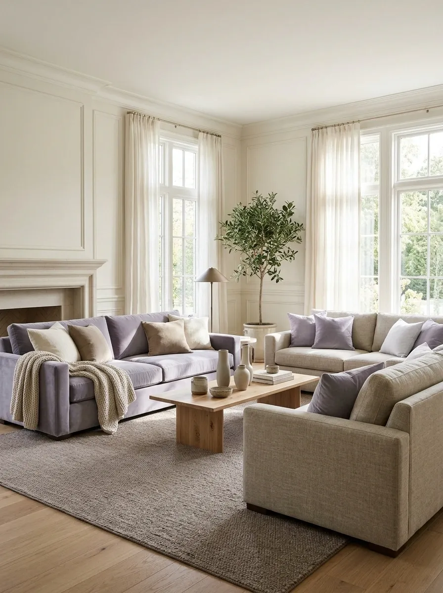
This pairing offers a subtle difference for people who want variety without a highly colorful room.
Choose a lavender gray that is visibly distinct from the beige, then use texture to keep both sofas from blending into a pale haze. A slightly deeper rug or table gives the seating group an anchor. Avoid matching the walls so closely that the furniture loses its outline.
Soft contrast still needs definition
Put the Darker Sofa Against the Stronger Background
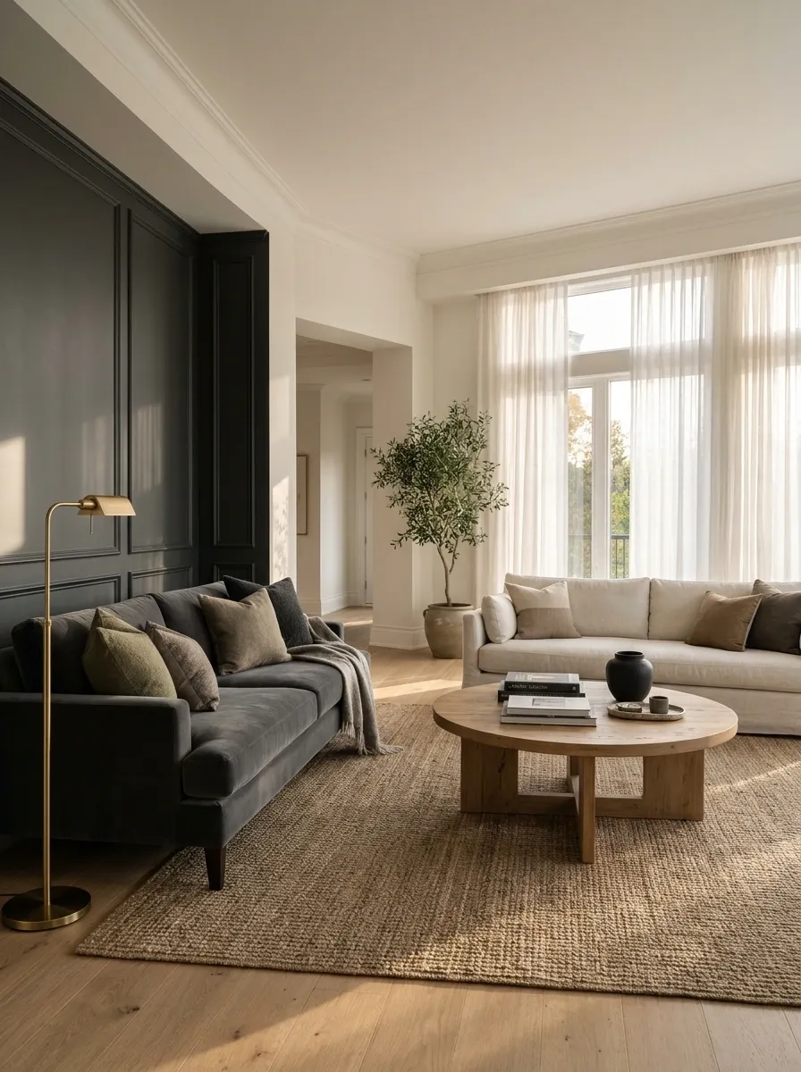
Where the room allows it, position the darker sofa near a substantial wall or architectural feature and give the lighter one a more open position.
This can make the difference in visual weight feel balanced. It is a layout idea rather than a rule: test the arrangement against windows, glare, circulation, and the actual view from each seat. The darker sofa does not deserve the worst seat in the house by default.
Test with the room in use: open doors, normal curtains, and the tables where people need them.
Connect Different Styles Through One Shared Proportion
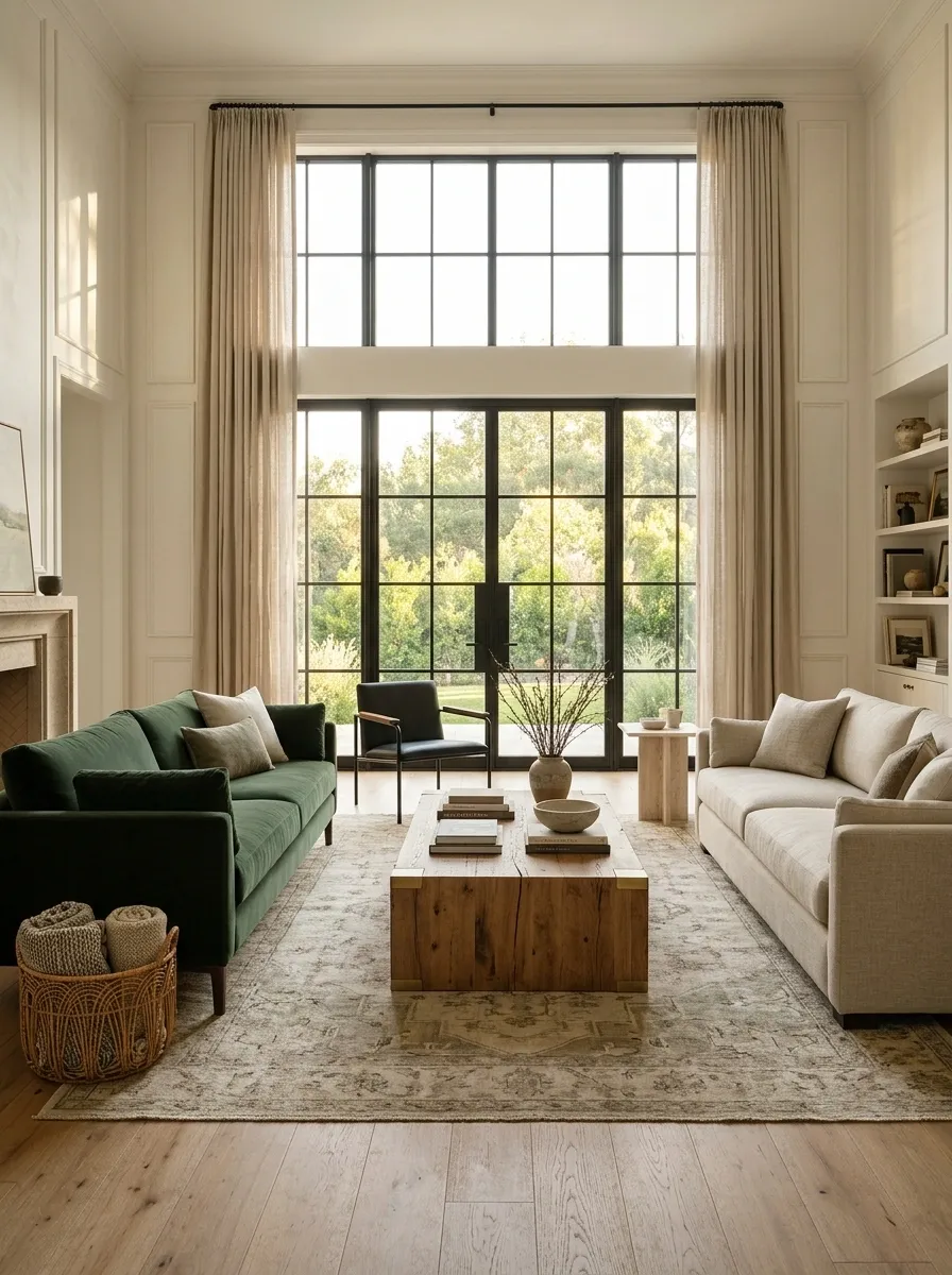
Two sofas can differ in color and still feel related through a similar seat height, overall scale, or arm profile.
Look for one convincing relationship rather than forcing every detail to match. Sit on both and check how they relate to the shared table. A pair that looks coordinated but makes conversation feel like sitting on different floors has missed a fairly important point.
Different color, compatible presence
Compare seat relationship, scale, and table use—not just the swatches.
Use a Rug That Contains Both Colors
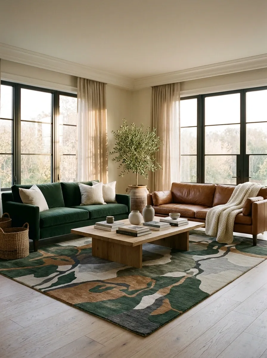
A rug can connect the sofas when its pattern includes a version of each upholstery color.
The rug does not need an exact match, and it should still work at room scale. Choose enough visible area that the pattern reads as a shared setting rather than a small patch between two unrelated sofas. Check practical cleaning and placement needs before selecting a delicate surface for a busy room.
| Look for | Avoid relying on |
|---|---|
| Related versions of both colors | Perfect digital color matching |
| A useful room-scale pattern | A tiny busy sample |
| Suitable care requirements | Appearance alone |
Let One Curtain Fabric Bridge the Upholstery
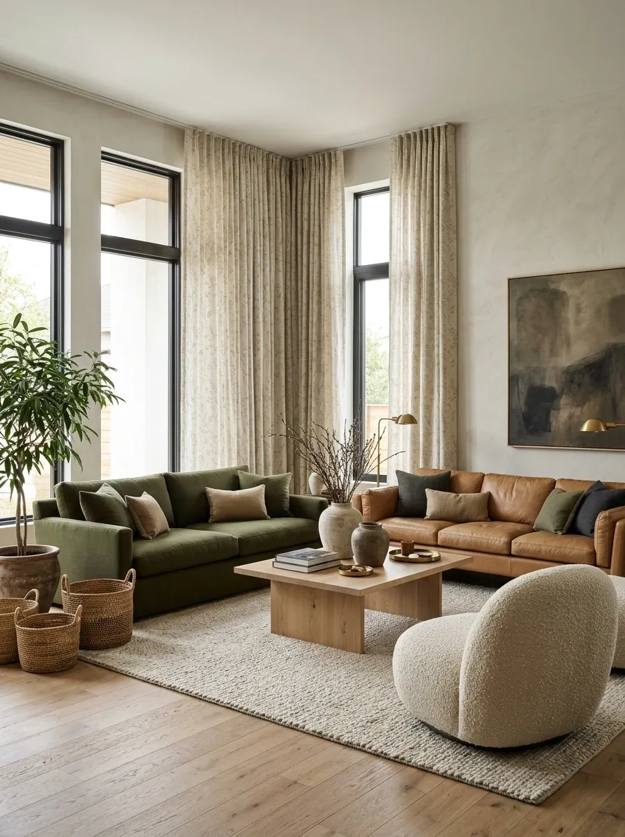
Curtains can connect the sofas without adding more objects to the seating area.
Choose a pattern or weave that relates to both colors, or a neutral that sits comfortably beside them. View a generous fabric sample with the upholstery. A curtain is a large vertical surface, so its background color matters as much as its decorative details.
Keep the role clear: the curtain connects the furniture; it does not need to become a third competing focal point.
Exchange a Little Color Through Cushions
Repeat a restrained amount of each sofa’s color on the other one.
A blue detail on a brown sofa and a warm brown textile on the blue one can create a link. Keep the cushion arrangements different enough to feel natural. Buying an identical set for each sofa often makes the contrast look more staged rather than more coherent.
A small exchange, not a matching uniform
Give Each Sofa Its Own Zone in a Larger Room
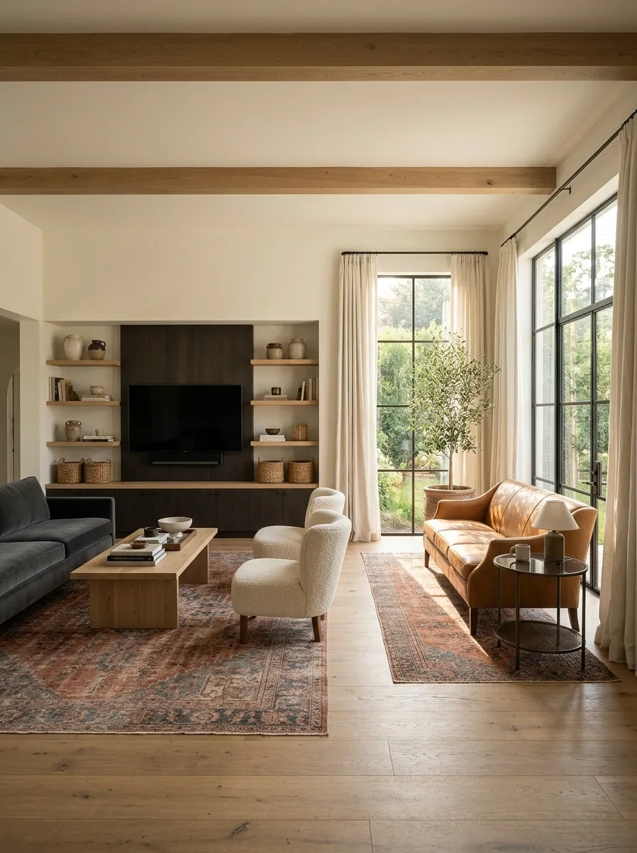
If the living room genuinely supports separate seating areas, the sofas can have different roles rather than forming one tightly coordinated pair.
One might serve the television area while the other belongs near books or a view. Repeat a material or accent between the zones so they still belong to the same home. Do not split a small room merely to justify two sofas that do not fit comfortably together.
Connect the zones with: a related rug palette, common timber finish, or shared wall color.
Arrange the Sofas in an Asymmetrical L
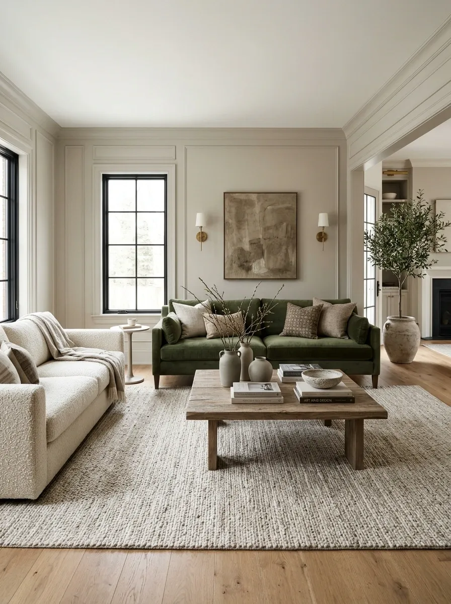
An L-shaped arrangement can make different sofa colors feel intentional because the pieces already perform different spatial roles.
Test access around the open side and keep both sofas related to the table or central activity. Their ends do not need to align perfectly. Leave enough space that the corner does not become an unusable gap filled with a plant nobody can reach to water.
Different directions, one conversation area
Open approach
Face the Sofas Across a Simple Table
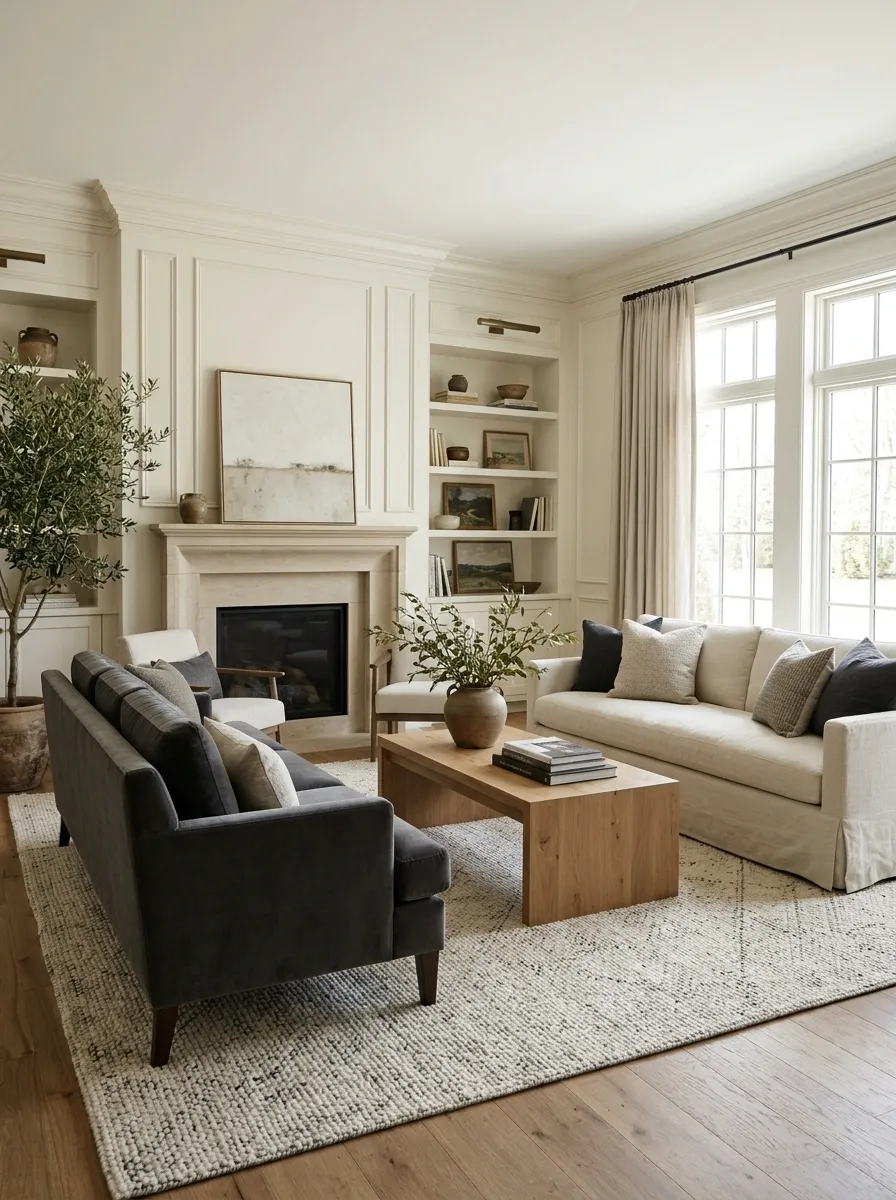
Facing sofas can feel balanced even when the upholstery differs.
Keep their relationship to the center clear and choose a table that serves both seats comfortably. Similar visual weight helps, but perfect symmetry is optional. Repeat the same general level of formality: an extremely tailored sofa may need thoughtful supporting pieces beside a very relaxed companion.
| Shared element | What it contributes |
|---|---|
| Central table | A common practical focus |
| Rug | A shared footprint |
| Related scale | Visual balance |
Use a Colorful Sofa to Link an Open-Plan Room
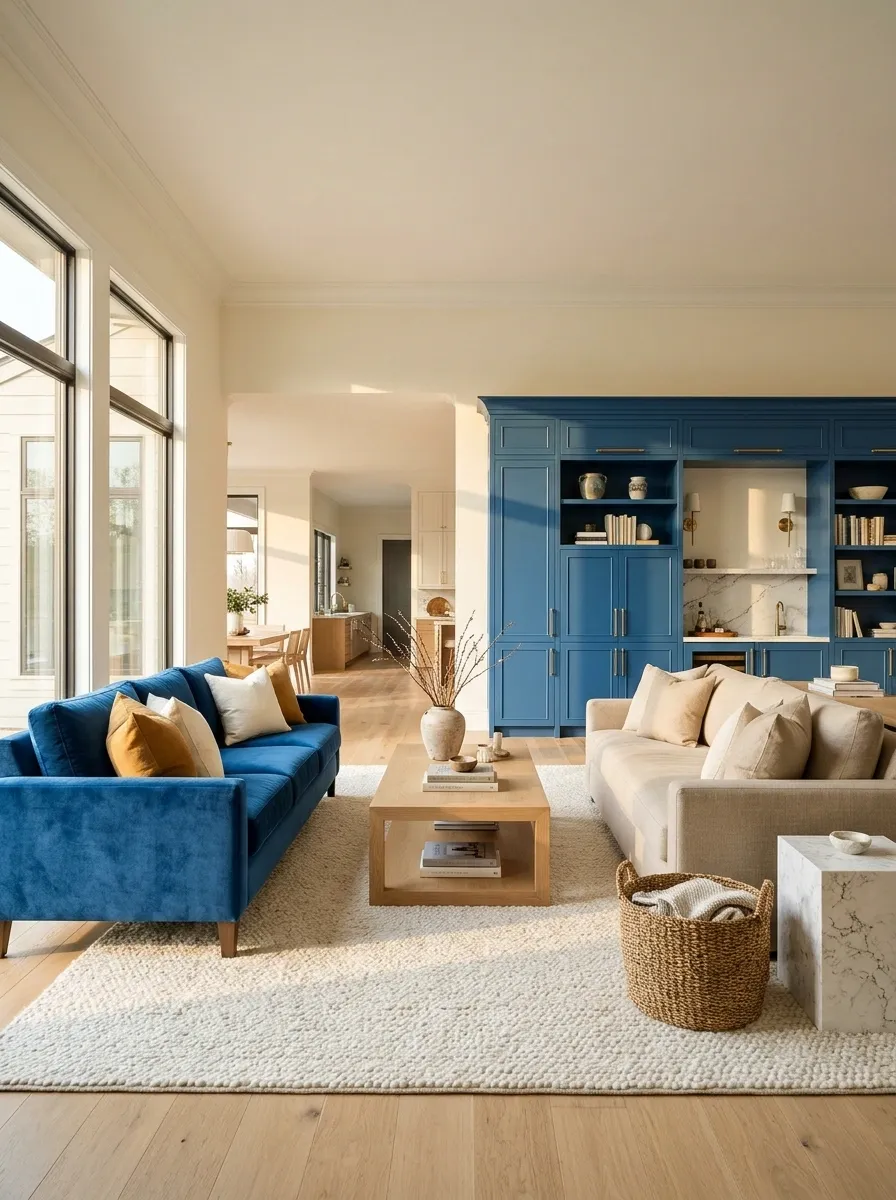
A colorful sofa can connect the living area to a cabinet, wall, or large textile elsewhere in an open-plan space.
Let the second sofa stay neutral so the connection remains clear. The repeated color should be visible from the main viewpoints, not hidden behind a door. You do not need to repeat it on every surface between the two areas; a clear visual relationship is enough.
Let one color travel across the plan
Make an Inherited Sofa Part of the Starting Palette
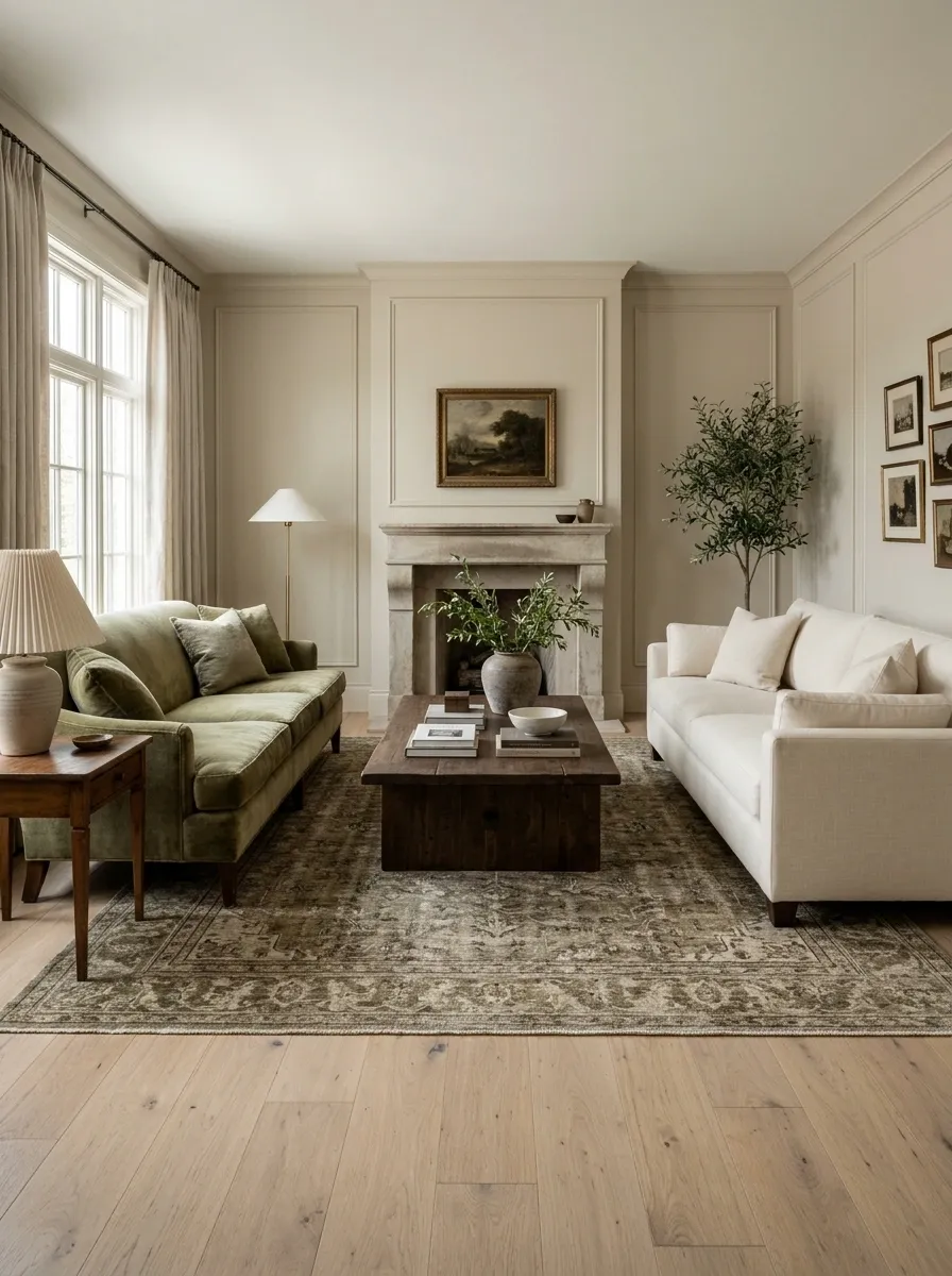
If one sofa came from family or a previous home, choose the new room around its actual color rather than treating it as an apology.
Bring its upholstery sample into decisions about the second sofa, rug, and curtains. Look for a companion that creates an intentional contrast. Almost matching can be harder to resolve than being clearly different, particularly when the fabrics have changed with age.
Keep the useful piece: a comfortable sofa does not need to leave because its color was chosen in another decade.
The room should feel connected from the doorway and comfortable from the seats. Once those two things work, the sofas are allowed to have different personalities.