
Hallway walls get the least creative treatment of any surface in the home. Living room walls get gallery arrangements and carefully chosen art. Bedroom walls get considered headboard moments and layered prints. Kitchen walls get open shelving and tile backsplashes. Hallway walls get a mirror from a chain store, hung slightly too high, next to a coat hook that was installed at an optimistic angle and has been leaning ever since.
The reasoning is always the same: hallway walls are narrow, they’re in a high-traffic zone, there’s not enough room to do anything interesting. None of this is true. Narrow walls are easier to make dramatic precisely because there’s less surface to cover and every decision registers immediately. High traffic means the wall decor gets seen more often than anything in your living room. And “not enough room” is what people say when they haven’t thought carefully about scale.
A hallway wall is one of the most high-impact surfaces in your entire home because it’s seen head-on — not at an angle, not from across a room, not partially obscured by furniture. You walk toward it. It’s the thing at the end of your corridor that your eye travels to every single time you move through the space. That’s not a wall to treat as an afterthought. That’s a wall that deserves to be the best-dressed surface in the house.
Why Hallway Wall Decor Usually Fails
The mirror-hung-in-isolation problem is the most pervasive. A single mirror on a hallway wall, however good the mirror itself is, reads as functional rather than decorative — it’s there so you can check your appearance before leaving, not because anyone made a visual decision. Giving it company — flanking art, a surface beneath it, a lighting source directed at it — transforms it from a utility item into a design element. The mirror doesn’t change. The context does.
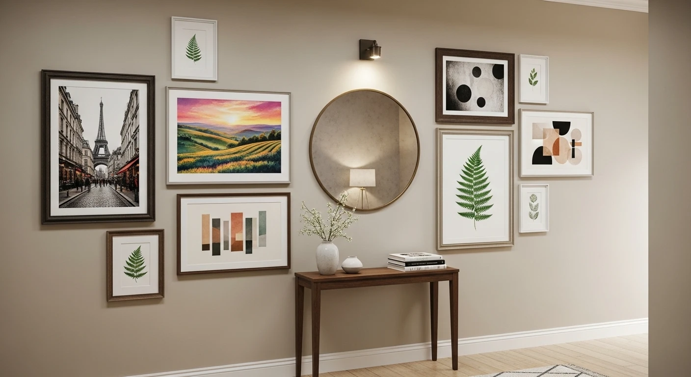
The second failure mode is art that’s too small. A single small print on a long hallway wall looks like a Post-it note stuck to a billboard. The eye registers it as insufficient before it registers what the print actually shows. Hallway walls need either one piece at the correct scale — which is almost always larger than feels comfortable — or a genuinely composed arrangement of multiple pieces that covers enough wall area to feel like a decision rather than a gesture.
The third problem is lighting, or rather its absence. Wall decor that isn’t lit is wall decor that doesn’t fully exist. Art, mirrors, paneling, wallpaper — every wall treatment performs better with some form of directed or ambient light source acknowledging it. A picture light, a sconce, an uplight, a recessed spot directed at the wall — any of these elevates the wall treatment from decoration to feature.
The Ceiling is Part of the Wall Story
This is the decision most people skip entirely, and it’s the one that makes the largest visible difference for the smallest amount of effort. A hallway ceiling painted in the same color as the wall below it — or in a complementary dark tone — immediately makes the space feel more enveloping and considered. A ceiling left in default brilliant white while dramatic wall decor is applied below creates a harsh, unresolved edge that undercuts everything happening lower down. The ceiling is not separate from the wall decor scheme. It’s the lid on the box, and leaving it untreated is leaving the box open.
What Wall Decor Does That Paint and Furniture Can’t
Paint sets the mood and furniture provides function, but wall decor is what creates specificity — the sense that this hallway belongs to a particular person with particular taste rather than being a generic corridor that could exist in any home. A gallery wall of collected prints communicates something. A single oversized piece of art communicates something. Botanical wallpaper communicates something. A completely bare wall painted in an excellent color communicates that someone was brave but ran out of ideas before they got to the finish line.
Specificity is what makes hallways memorable. And specificity comes from wall decor choices that are genuinely considered rather than defaulted to.
Hallway Wall Decor Ideas Worth Stealing
The Dark Ceiling Trick:
Cool, simple paint technique that has a dramatic impact in a long hallway. [736×1104]
by u/Helpful-Substance685 in RoomPorn
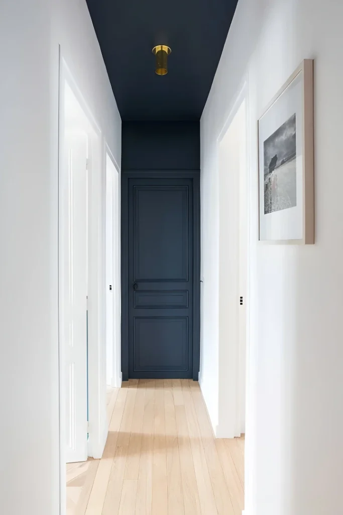
White walls running the full corridor length, pale bleached oak floorboards, white paneled doors — and a ceiling painted in deep navy that descends to meet the end wall in the same color, bringing the paneled door at the far end into the same dark tone so the whole end wall reads as one dramatic focal point. A single small brass flush mount sits in the navy ceiling like a star. One framed print in a natural wood frame hangs on the right wall. Nothing else is needed because the ceiling is doing everything — it creates depth, draws the eye forward, and gives the most ordinary white-walled corridor a sense of destination that no amount of accessories on the walls could have produced. The lesson is that the most powerful hallway wall decor decision you can make might not involve the walls at all.
Full-Wall Geometric Mirror With Bronze Frame:
Taupe walls, cream porcelain floor tiles, recessed ceiling spots — a perfectly ordinary hallway backdrop for a wall treatment that stops being a wall treatment and becomes an architectural feature. A full-height panel of mirrored glass divided into geometric sections by thick bronze diagonal framing covers the entire wall from floor to ceiling, with a slim floating white console shelf cutting across the front of it at waist height. The geometric pattern in the bronze framing is bold enough to read as deliberate art while the mirrored surface simultaneously doubles the apparent width of the corridor and reflects the ceiling light back into the space. White lilies in a copper vase and a modest console styling are the only accessories because the mirror wall needs no competition. This is wall decor that is also an architectural decision, which is the highest category of hallway wall treatment.
Monochrome Landscape Mural With Lacquered Black Trim:
Floor-to-ceiling illustrated landscape mural in black, white and grey — detailed garden scenery with trees, fencing and architectural elements — covering every wall surface and framed at every edge with heavy lacquered black molding and trim. A vaulted grey ceiling with a spiked sunburst chandelier, black-and-white diamond marble tiles, a black writing desk with hot pink peonies and a gold-framed oval mirror. This is wall decor operating at the level of total environment — the mural isn’t something placed on the walls, it’s what the walls are. The consistent monochrome palette means the illustration reads as texture and pattern rather than competing picture elements, which is why it functions in a small space rather than overwhelming it. The single vase of hot pink flowers is the only color in the entire scheme, and its impact is enormous precisely because everything else is committed to black, white and grey.
Damask Wallpaper With Brass Sconces:
Warm gold and cream damask wallpaper covering the full wall surface from floor to ceiling, white box molding frames creating panels within the wallpaper, brass arm sconces throwing warm light at regular intervals down the corridor length, warm hardwood floors, a blue-toned seascape in a gold frame as the single artwork, a traditional dark wood console with a lamp and plant styling at the far end, and a blue-and-cream Persian runner grounding the floor. Everything here is operating in a traditional decorative register and making no apologies for it — the wallpaper is pattern-heavy, the molding is detailed, the sconces are classic arm-and-shade. What makes it work rather than feel fussy is the consistent warm palette that ties every element together, and the restraint in the art selection — one strong painting rather than multiple competing pieces. Traditional wall decor succeeds when everything is in the same conversation.
Symmetrical Sconces With Abstract Runners:
Grey-blue paneled wainscoting running both walls of a long corridor, white ceiling with evenly spaced recessed spots, tall white drum sconces on brass arms alternating with framed abstract paintings at perfectly regular intervals down both sides — and on the floor, multiple abstract organic-shaped rugs in warm amber and cream laid end to end rather than one continuous runner. The symmetry here is total and deliberate — every element on the left wall is mirrored on the right, every sconce has a painting between it and the next one, every spacing is consistent. The wall decor succeeds because it commits completely to the rhythm it establishes at the first repeat and never breaks it. Dark wood console tables with botanical styling at intervals provide the only asymmetry in an otherwise perfectly ordered scheme. Repetition in a long hallway doesn’t create monotony. It creates architecture.
White Shaker Paneling, Berber Runner and Candlelight:
White wainscoting and shaker-style door frames, warm greige walls above the dado rail, rich dark hardwood floors, a white fluffy Berber runner with a dark geometric pattern laid over the floor, a small black pedestal table at the end corridor wall styled with pillar candles at varying heights, a white ornate-framed mirror above it, and framed prints in simple white frames arranged across the door panels and flanking walls on both sides. Every element here is modest on its own — the runner, the candles, the mirror, the prints — but collectively they create a hallway that feels genuinely warm and complete. The wall decor works because it acknowledges every surface without overloading any of them. The candles are doing the emotional heavy lifting: the warm flicker they imply makes the whole scheme feel inhabited rather than displayed, which is the hardest thing to achieve in a hallway and the most valuable.
Go for Gallery-Luxe with Oak and Marble
If you want your hallway to scream ‘I collect art, don’t talk to me,’ you need layers, not just white walls. Start by installing rich oak panels with matte black louvers to create actual structure (no, plywood doesn’t count). Slot in brass picture ledges right at eye-level and scatter minimalist ceramic objects, but keep your inner hoarder in check. Run warm LED strips just above your wainscoting to turn wood grain into mood lighting. Top it off with a nero marquina marble console under three oversized abstract panels—yes, oversized, because small art is for quitters. Don’t forget: Picture ledges aren’t a dumping ground; curate, edit, repeat.
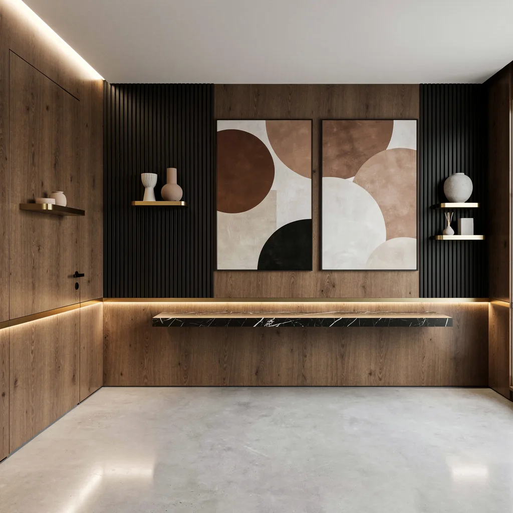
Block Party: Organic Texture Meets Sculptural Drama
Want sophistication without trying too hard? Go limestone or go home. Cover your walls in creamy limestone tiles with beveled edges—because flat is officially dead. Mount sculptural walnut blocks in random clusters for dimensional chaos that actually looks intentional. Highlight each block with cove lighting so your guests know you have taste (and money). Opposite side, line up glass vitrines with gold trim to show off minimalist botanical arrangements. Pro styling tip: Always group botanicals in uneven numbers—odd numbers = ‘cool’, even numbers = ‘chintzy thrift store.’
White Marble and Gold: A Hallway for Your Inner Diva
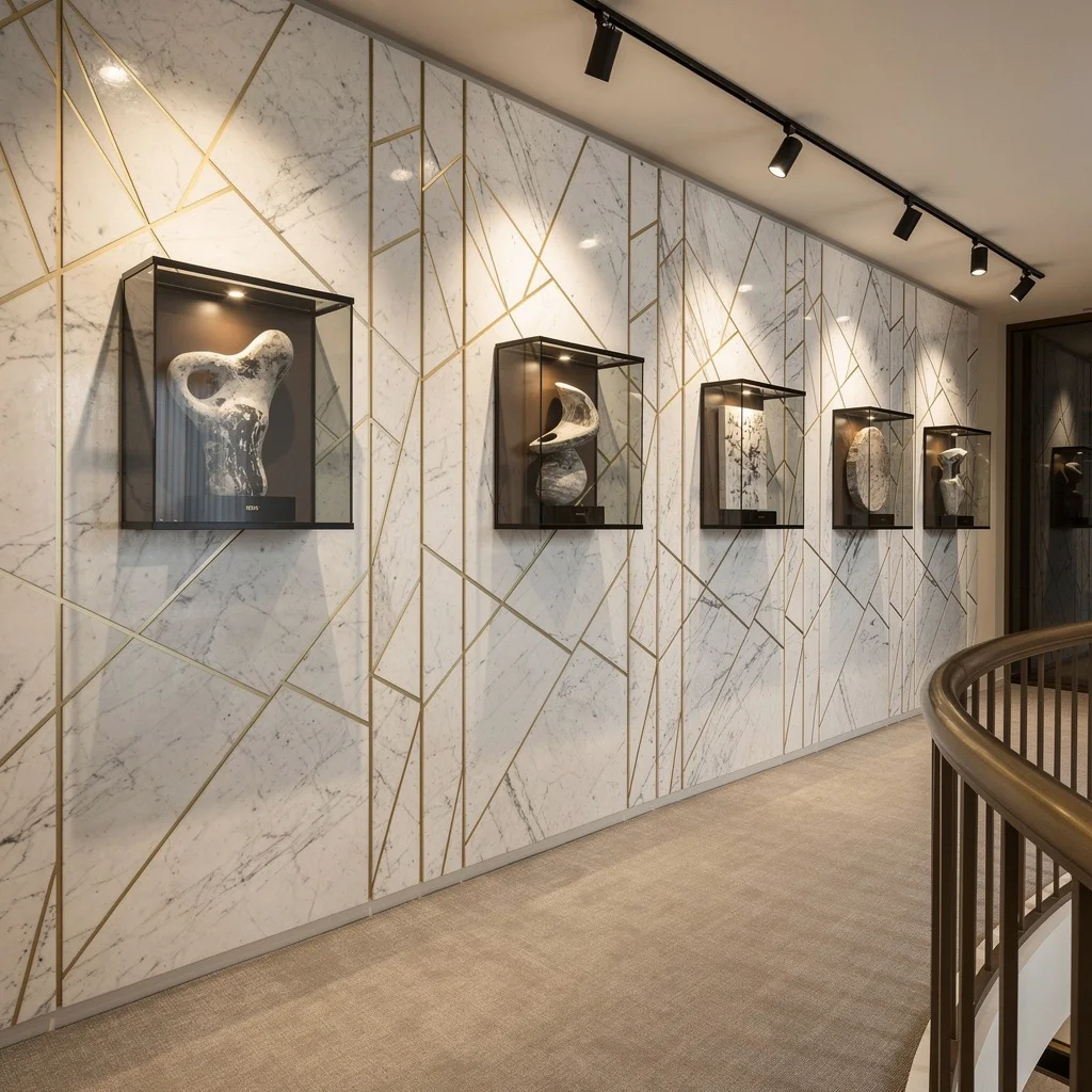
Want your hallway to look like it charges admission? It’s marble time. Cover your walls with gigantic white marble panels, shoot for thin gold inlays in a geometric pattern (because straight lines = luxury). Use floating smoked glass shadow boxes for monochrome abstract objects—don’t even bother with color unless you want to look like a dentist’s waiting room. Go for adjustable track lights overhead to direct the spotlight exactly where you want. Lay down a soft neutral carpet and run a matte bronze handrail along the edge, so even your basic hallway walk oozes glamour. Pro tip: Track lights should always be positioned to eliminate shadow, not amplify it.
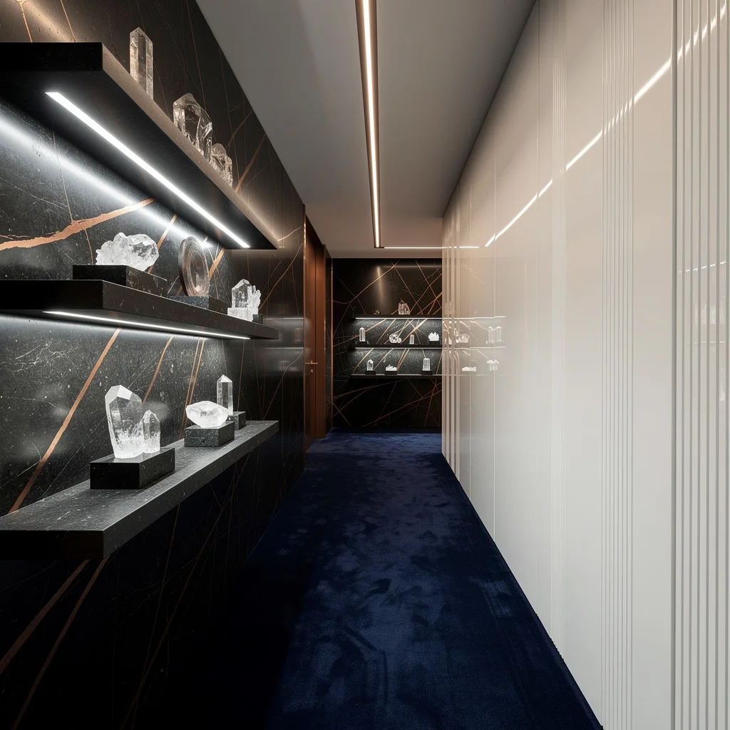
Olive Plaster and Alcove Art: Quiet Power Moves Only
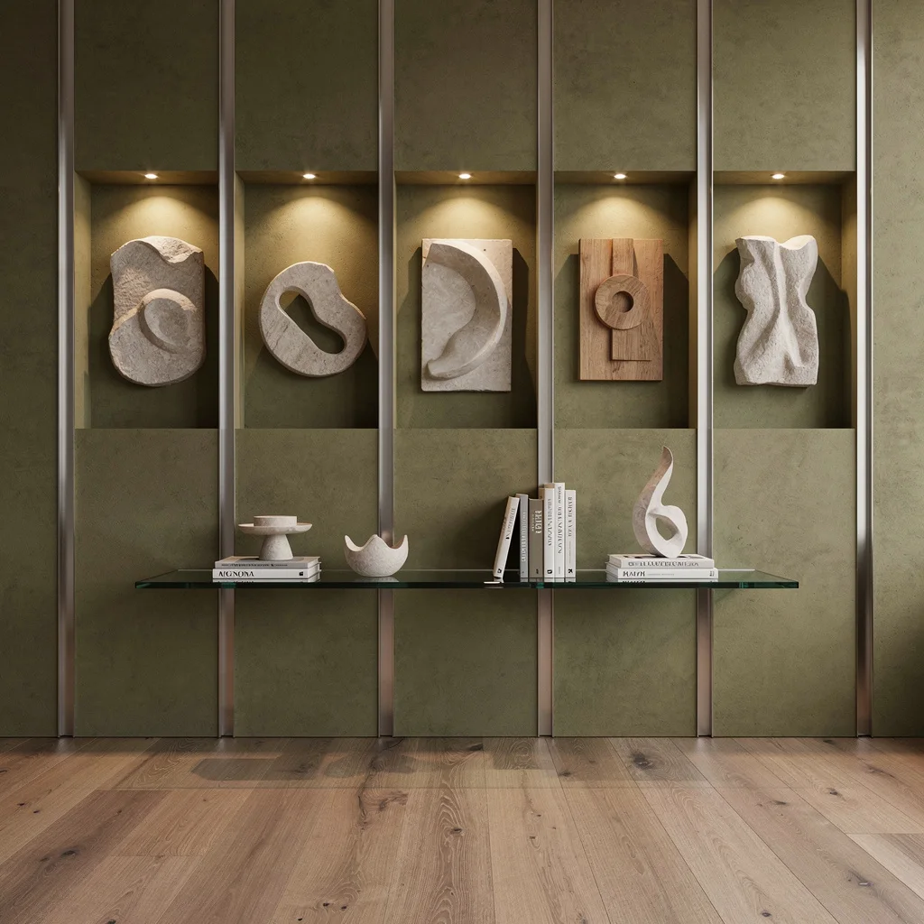
If muted confidence is your thing, cover your walls with matte olive-green plaster and vertical brushed aluminum strips—rich and understated. Carve out recessed alcoves and illuminate them from inside, using the brightest LED you can find, then dim halfway for dramatic shadows. Display minimalist art reliefs in stone and wood. Use mid-tone ashwood planks for flooring that won’t upstage the walls. Suspend a tinted glass shelf and throw on a few architectural books and sculptural decor. Rule: Alcove art needs negative space around it, so don’t cram everything together like you’re folding laundry.
Pearl Lacquer & Crystal: Hallway Bling That’s Not Tacky
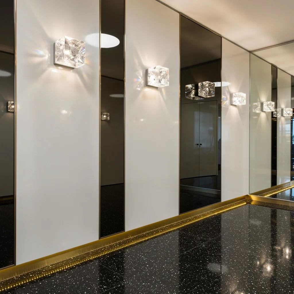
Want shiny but not tacky? Drench your walls in high-gloss pearl lacquer—because dull walls are for quitters. Mount bespoke crystal cubes with internal lights, alternating with smoke-tinted glass panels for mirrored effect that says ‘I have taste, deal with it.’ Use polished black terrazzo for the floor, silver flecks are mandatory, not optional. Roll out a ribbon of golden metal trim at the base of your wall so the sparkle travels. Designer rule: Don’t break up reflective surfaces with matte finishes; keep the vibe consistent for max impact.
The Living Wall: Moss, Float, and Glow
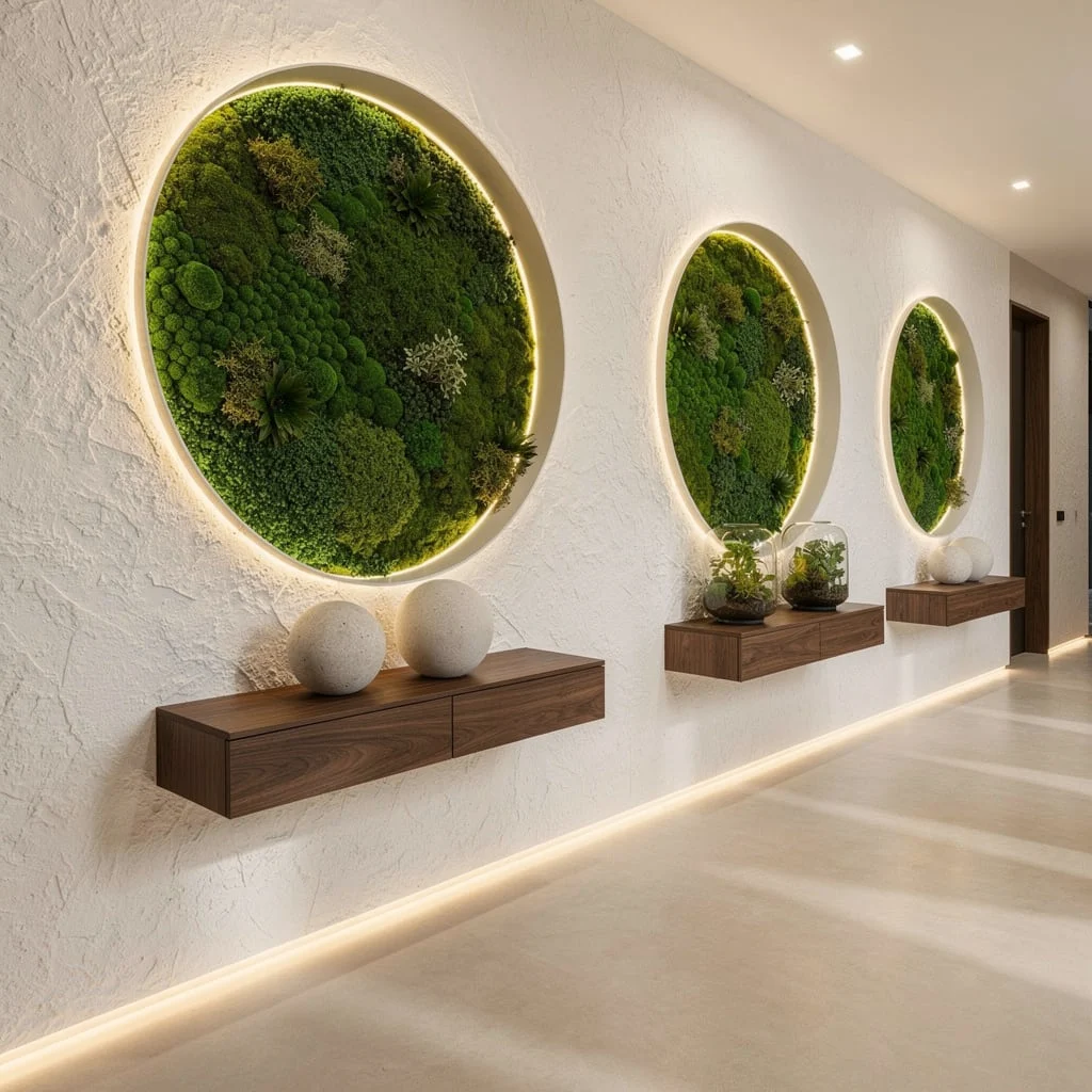
Plants belong everywhere, especially hallways. Slap matte white stucco on your walls, then embed oversized circular frames with natural moss, and backlight those beauties with warm LEDs. Float walnut consoles underneath and keep your decor strictly stone spheres and glass terrariums—try anything else and you’ll look like a suburban garden center. Microcement floors aren’t just trendy, they’re sleek and seamless, so get on board. Diffused uplighting is mandatory for soft shadows and more organic feels. Always use live moss for the frames—fake moss is an instant vibe-killer.
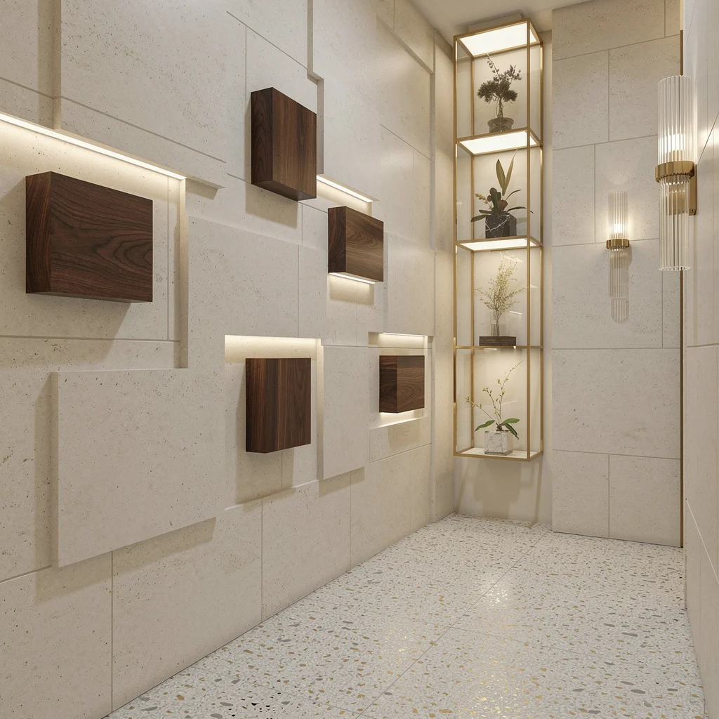
Ribbed Oak and Bronze: Textured Lighting Perfection
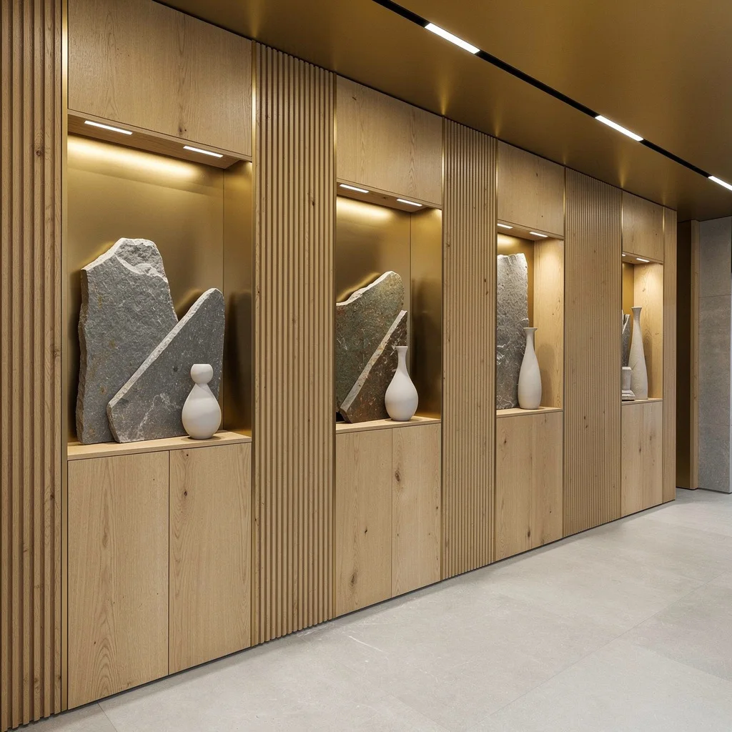
Want a hallway that looks like you hired a $500/hour designer? Use vertical ribbed oak paneling—texture equals grownup style. Add in metallic bronze accents and shallow, illuminated niches for creative stone slabs and minimalist porcelain vases. Stick discreet under-shelf lighting in every niche for instant drama. Go with a pale gray matte stone floor for that calm, expensive feeling. Rule: Never underestimate niche lighting—if you can’t see the art clearly, you’re missing the whole point. Keep the ceiling fixtures linear, never zig-zag.
Indigo & Alabaster: Go Dark, Stay Glam
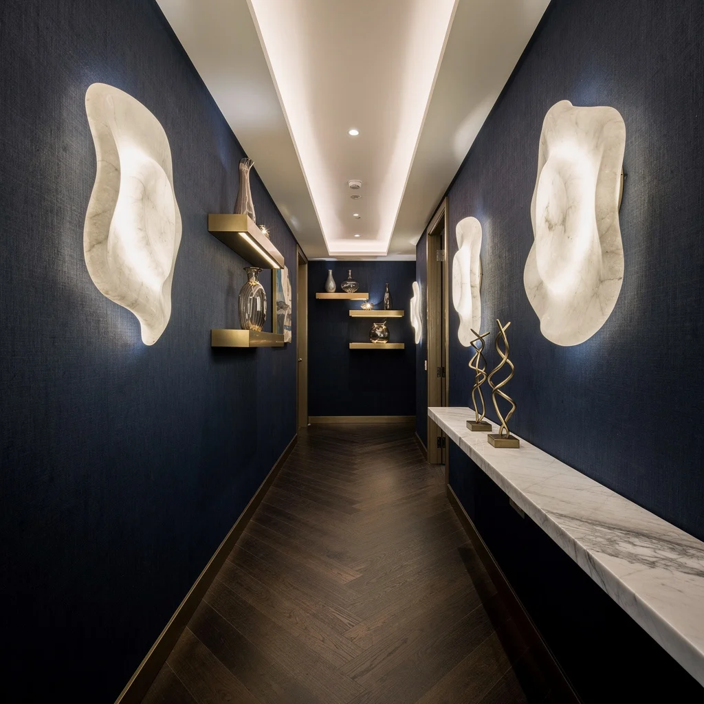
Deep indigo silk-finish wallcoverings will make your hallway lusher than your ex’s ego. Pair these with glowing alabaster panels that double as art and ambient lighting, because multitasking isn’t just for apps. Float matte champagne gold shelves with hand-blown glass vessels between panels—only buy clear or tinted, never colored. Dark walnut chevron wood flooring is non-negotiable, and trace a slim polished quartz ledge for abstract metallic decor. Pro tip: Cove lighting should be recessed and never exposed, unless your goal is to look like a Vegas buffet.
Copper Lines and Velvet Carpet: Ultra-Designer, Ultra-Snob
If you’re aiming for maximum flex, braid your walls in glossy, dark lacquer with copper veining—literally nobody will look away. Use floating shelves of honed black basalt and stagger minimalist crystal décor for high drama. Spot each object with micro LEDs—no generic overhead lighting allowed. Contrast with glossy white vertical-grooved panels so your dark game isn’t one-note. Lay down midnight blue velvet carpet, because if you’re not softening all that shine, your hallway is exhausting. Linear copper pendants overhead pull the whole look together—don’t mix metals, ever.
Final Thoughts
Hallway walls are not waiting rooms for better design decisions to happen. They are active surfaces that set the tone, introduce the personality, and establish the standard for everything in the home that follows. Treating them as leftovers from the room budget, or filling them with whatever was available and inoffensive, wastes the single most visible real estate in your house.
The wall decor that makes hallways memorable is always the result of someone deciding what the space should feel like before deciding what to put on the walls — and then finding the treatment that creates exactly that feeling rather than settling for whatever seemed reasonable. A painted ceiling that changes the entire atmosphere. A full-wall mirror that doubles the apparent space. A mural that turns a corridor into an experience. A simple traditional wallpaper applied with enough confidence and consistency that it becomes its own argument.
Your hallway walls are seen by everyone who enters your home, before they see anything else. They deserve the same quality of decision that you’d bring to any other surface that matters — which is to say, they deserve an actual decision, made on purpose, for a specific reason. Everything after that takes care of itself.