
At some point, someone convinced the entire interior design world that “grown-up” meant beige, that “sophisticated” meant empty walls, and that “timeless” meant a space so deliberately inoffensive it could be a hotel lobby in any city in any decade with zero identifying information. Millions of people bought this argument and decorated accordingly. Their homes are fine. They are perfectly, completely, utterly fine.
Fine is not the point.
The homes worth talking about — the ones that make you stop mid-conversation, grab someone by the arm, and say “come and look at this room” — aren’t fine. They’re specific. They have opinions. They were built by people who looked at a blank wall and thought “what if this was scalloped and painted orange” instead of reaching for the nearest can of agreeable grey. Funky home decor isn’t about chaos for its own sake and it isn’t about being deliberately weird to prove a point. It’s about having a strong enough sense of your own taste that you stop decorating in hypothetical approval of strangers and start decorating for the actual person who lives there, which is you.
Why “Eclectic” Gets Misunderstood and Executed Badly
The word eclectic has become a polite way of describing rooms where someone bought things they liked without thinking about how they’d work together, then blamed the concept rather than the execution. Real eclectic design is one of the most demanding approaches in decorating — it requires understanding your own visual language well enough to know which rules you’re breaking and why.
Personality Isn’t the Same as Clutter
A room crammed with objects that share no colour story, no material language, and no sense of scale isn’t eclectic — it’s avoidant. Personality in a room comes from deliberate choices that reveal something true about the person who made them, not from the accumulation of every interesting thing you’ve ever purchased without a plan.
Funky Has a Frequency, Not Just a Look
The spaces that read as coherently funky rather than just confused are operating at a consistent energy level throughout. Every decision — the wallpaper, the furniture shape, the rug pattern, the light fitting — is tuned to the same channel. When one element drops to a completely different frequency, the whole thing loses its nerve. Committing to a specific design personality means that even your practical choices — your storage, your lighting, your hardware — are all speaking the same language.
Rules Exist in a Conversation with the People Who Break Them
Knowing what you’re breaking and why is what separates genuinely good funky design from a room that’s just difficult to be in. The checkerboard floor that works is usually in a space where everything else is doing exactly the right amount. The mosaic tile wall that lands isn’t surrounded by twelve other competing ideas. Understanding the conventions well enough to subvert them deliberately is a different skill from simply ignoring them.
The Confident Statement
Why “fine” is failing your home, and how to execute bold design.
The Practical Framework Nobody Gives You
Inspiration is easy. Execution is where most funky rooms fall apart. Before you commit to any of the ideas below, there are structural decisions that will determine whether the finished result looks intentional or apologetic.
Find Your Anchor Colour and Work Outward
Every successful bold room has one colour that acts as the gravitational centre — everything else orbits around it. It might be the wall colour, it might be a sofa, it might be a rug that sets the entire palette. Identify this before you buy anything else, because it’s the thing that either makes all your other choices cohere or makes them fight.
Scale Your Boldest Moves to Your Largest Surfaces
A funky mirror in an otherwise cautious room is decoration. A funky mirror in a room where the walls, the rug, and the furniture are all equally committed is a design statement. The impact of any individual element is multiplied or diminished by what’s around it. If you want your bold choices to read as intentional, the largest surfaces in the room need to be on the same team.
Give Yourself One Surface That Breathes
Even the most maximalist rooms need somewhere for the eye to rest. A white ceiling in a heavily patterned room. Plain floorboards under a wildly coloured rug. One unpainted wall in a space where everything else is saturated. The contrast makes the bold elements read more clearly, not less dramatically.
Funky Home Decor Ideas Worth Stealing
The Scalloped Door Frame Bedroom That Turned Architecture Into Art
Paint your door frame with a scalloped or wavy border in a contrasting colour to the wall — not a thin line, but a thick, generous wave that extends outward from the frame like a decorative arch. Use chalk paint or eggshell finish in a warm terracotta, burnt orange, or cobalt, and trace the shape freehand or use a stencil cut from cardboard if your hand isn’t steady. Paint the door itself in the same colour as the frame so it reads as a single design moment rather than a frame around a door. Keep the surrounding walls in a soft neutral so the architectural intervention has space to land. Bring in a low platform bed with an upholstered headboard in a saturated mustard or olive, layer a large checkerboard shag rug in rust and cream across the floor, and hang a pair of abstract art prints above the headboard in matching natural oak frames. The architectural painting does most of the personality work — everything else just needs to keep up.
The All-In Heart Bedroom That Never Once Considered Restraint
Choose a single motif — hearts, stars, florals, anything with a strong graphic identity — and apply it across every surface without apologising. Start with a retro-pattern wallpaper featuring your chosen motif on one full wall, then paint the remaining walls in the dominant background colour of that wallpaper so the room wraps around you in the same palette. Commission or source a hand-painted ceiling mural that extends the motif upward using the same colours — warm pink, hot fuchsia, orange, and lilac work together in this palette — running the design along ceiling beams or sloped lines to make the ceiling feel architectural rather than just decorated. Find a bed with a headboard cut into the shape of your motif — an upholstered heart headboard in deep velvet fuchsia is the centrepiece everything else serves. Add a round orange shag rug for floor warmth, a bubble coffee table in pale pink or white, and pendant lights that echo the colour family. The rule here is total commitment: when every surface shares the same language, it stops feeling overwhelming and starts feeling considered.
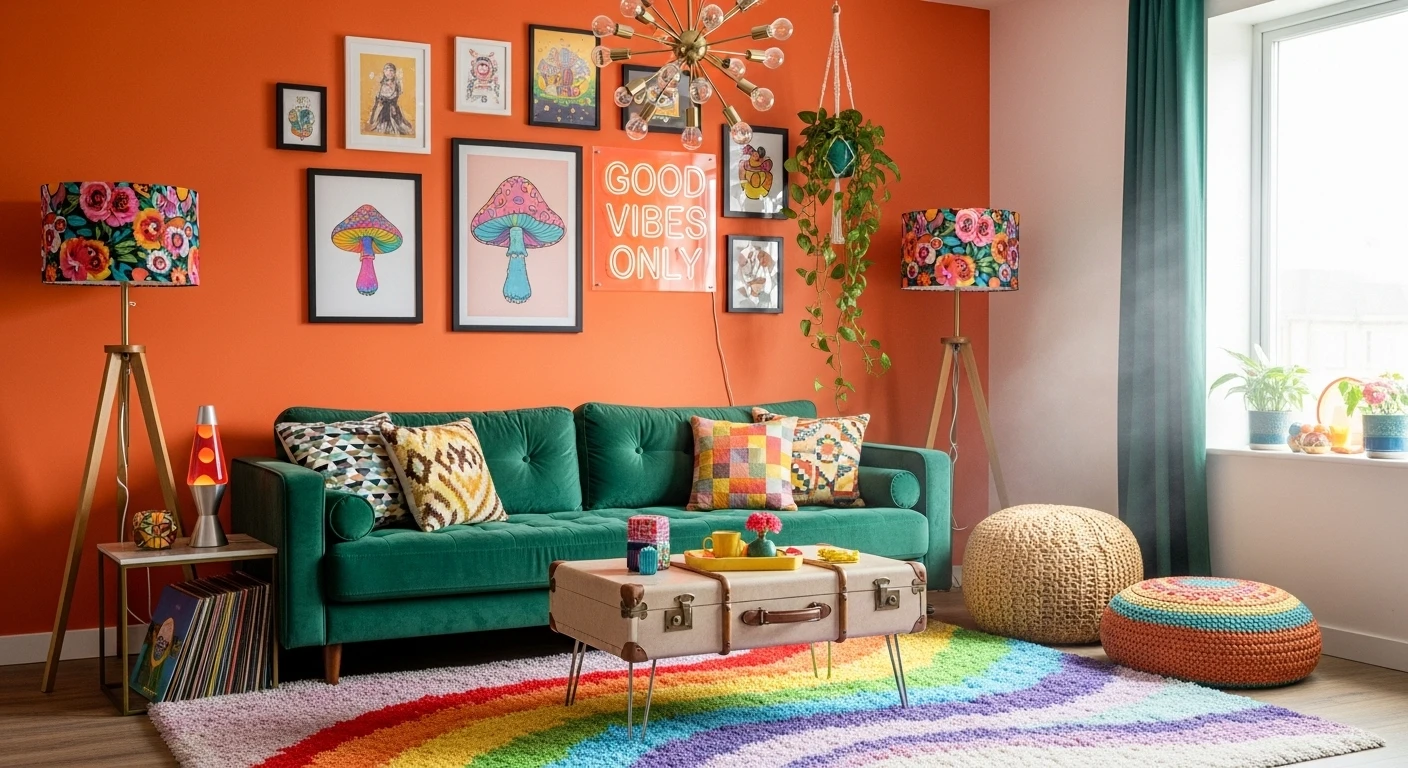
The Dark Boho Living Room Built Around One Extraordinary Sofa
Paint all walls in a deep charcoal, slate, or forest green — the kind of colour that would make most people nervous and makes this room work. The dark background is what allows everything else to glow. Source a large sofa upholstered in a bold floral or botanical print — orange with overscale flowers, jewel-toned tapestry, anything with a painterly quality — and let it be the entire statement. Add a fringe trim along the base if your sofa doesn’t already have one, because the traditional craft detail grounds the bohemian extravagance. Place plants — large ones, trailing ones, flowering ones — in every available corner and on every windowsill, and let them become structural elements rather than accessories. Hang one large botanical or floral painting above the sofa in a warm wood frame, sized generously so it reads clearly against the dark wall. Layer kilim or Persian rugs on the floor and resist the urge to add more decorative objects — when your sofa is this committed, it needs breathing room, not competition.
The Pink Home Office That Understood Monochrome Completely
Paint the entire room — walls, ceiling, and any built-in shelving — in the same shade of dusty pink or salmon. The monochrome envelope is what makes the graphic prints on the wall readable as a design feature rather than random decoration. Source your art prints from independent illustrators working in bold, flat graphic styles — text-based, geometric, illustrative — and frame them in two different coloured frames: one size in one colour, a slightly different size in another. Arrange them in a loose grid rather than a salon hang, two rows of two, so they read as a considered set. Choose a desk in a contrasting colour — yellow, mint, white with coloured legs — so it reads as a piece of furniture rather than disappearing into the pink background. Add a disco ball lamp for ambient scatter light and a small open shelf unit painted to match the walls, styled with objects that introduce one more colour into the palette. The success of this room is entirely dependent on the shade of pink being confident rather than pastel — it needs to be the kind of colour that looks intentional from across a room.
The All-Over Mosaic Tile Bathroom That Went All the Way
Source small-format mosaic tiles in a multi-colour mix — the kind that comes in sheets with individual tiles in red, yellow, green, and black randomly distributed — and apply them to every surface in the bathroom without exception: floor, all four walls, the inside of any alcove, the surround of any mirror. The total coverage is the entire point; partial application just looks like you ran out of tiles or nerve. Keep the ceiling in warm natural timber or white painted wood so the eye has somewhere to rest above the mosaic explosion. Choose plumbing fixtures in a warm metallic — copper or brushed brass basin, chrome traditional taps — because the richness of the metal reads well against the multi-colour tile rather than competing with it. Add one piece of furniture in a single saturated solid colour — a coral or terracotta chair — and leave it at that. A bathroom this committed to its tile choice doesn’t need accessories; it needs to be allowed to exist.
The Retro Wave Wallpaper Living Room That Committed to a Decade
Find a large-scale retro geometric wallpaper — vertical wave forms, overlapping arcs, or repeating S-curves — in the amber, tan, brown, and cream palette of 1970s graphic design and apply it to the full feature wall behind your sofa. The scale of the pattern is critical: it needs to be large enough to read as intentional graphic design rather than a busy background. Pair it with a tan or cognac leather Chesterfield or low-profile sofa — the warm leather tone pulls directly from the wallpaper palette so the two elements feel designed together rather than accidentally matching. Add a wire-frame side table, a directional floor lamp in matte black, and cushions that mix a geometric pattern with a plain in tones already present in the wallpaper. The ceiling and remaining walls should stay white or off-white so the feature wall reads as a deliberate graphic gesture rather than an all-over pattern. The restraint in the furniture styling is what allows the wallpaper to do what it was designed to do.
The Boho Reading Nook Built Around a Handmade Wall Hanging
Paint the walls in a deep, moody base colour — aubergine, midnight blue, or forest — using a matte finish so the colour reads as rich rather than shiny. Source or commission a large circular woven wall hanging in concentric rings of colour — these are available from independent makers on craft marketplaces in sizes large enough to anchor a full wall — and hang it centred on your main wall at eye level when seated. The hanging should be substantial enough to function as the room’s equivalent of a large painting. Place a deeply cushioned oversized chair or bean bag directly below it in a coordinating deep tone — purple, teal, fuchsia — and layer it with embroidered and patterned cushions that pull colours from the wall hanging. Lay a circular mandala rug beneath the chair so the round motifs echo each other vertically, from floor to wall. Add open shelving on either side styled with books, ceramics, and small objects in warm colours, and run fairy lights across the ceiling for ambient warmth. The entire room resolves around the wall hanging — find that first, then build everything else in response to it.
The Crimson Living Room That Used Red as a Neutral
Paint all four walls in a deep, saturated red — not terracotta, not burgundy, but actual red — and paint the ceiling in a contrasting dark tone, navy or charcoal, so the room feels enveloped rather than just coloured. Build your gallery wall across the two main walls without being precious about frame consistency: mix sizes, mix frames, prioritise art with strong chromatic presence that can hold its own against red — teal, orange, black, gold. Choose a sofa in a bold pattern — horizontal stripe in pink and red, large floral, geometric tapestry — and place it against the gallery wall so the art and the sofa read as a layered composition. Bring in one accent chair in a completely different colour family — deep mustard or saffron yellow — positioned at a slight angle so the seating arrangement feels like a conversation rather than a furniture lineup. Lay a multicolour stripe rug across the floor and add an ornate or mosaic coffee table at the centre. Red rooms work because red is warm and warm colours make people feel welcome — lean into that rather than away from it.
The Multicolour Kitchen That Painted Every Cabinet a Different Colour
Sand and prime each cabinet door individually, then paint each one in a different saturated colour — teal, hot pink, mustard, cobalt, forest green — using furniture-grade chalk paint for a durable finish. The variation doesn’t need to follow a strict pattern; adjacent doors in contrasting colours create the visual rhythm naturally. Paint the upper cabinets in a different but related approach — perhaps all in one colour per unit rather than per door — so there’s some variation in how the colour is applied across the kitchen. Source a patchwork or hand-painted tile splashback in a maximalist multi-pattern style — Moroccan, Talavera, or mixed Mediterranean tiles work beautifully here — and apply it full width across the cooking wall so it reads as a coherent mural. Install an industrial or aged metal extractor hood as the functional centrepiece, because the raw material quality anchors all the surrounding colour. Replace standard cabinet hardware with mismatched vintage or jewel-toned knobs and pulls — each one different, all within the same general aesthetic — and let the floor tile continue the patchwork logic of the splashback. The finished kitchen should look like it was assembled by someone who loved every single thing they chose.
The Psychedelic Painted Bathroom That Took Commitment to Its Logical Conclusion
Commission a local muralist or do it yourself with acrylic paint — cover every wall in a freehand abstract expressionist painting using the full chromatic range: electric pink, cobalt, yellow, teal, purple, orange, all applied in broad gestural strokes that collide and overlap. The point is energy and movement, not precision, so if you’re painting it yourself, work fast and commit to each stroke rather than overworking it. Apply black and white checkerboard adhesive tile to the lower half of the walls as a dadoing element, so the geometric pattern grounds the painterly chaos above it. Paint the floor in bold black and white stripes running lengthwise to elongate the space. Add neon signs rather than traditional lighting — a word or phrase in a warm glow that bounces off the painted walls and creates atmosphere without effort. Keep the sanitaryware itself white and classic so the fixtures read as clean counterpoints against the surrounding maximalism. The bathroom is small enough that total coverage of this kind doesn’t overwhelm — it envelops, which is a completely different and much better experience.
The Arched Niche Wall That Made Storage Into Architecture
Build or commission a floor-to-ceiling grid of recessed arched niches directly into a wall — sizes should vary deliberately, from small portrait niches to generous square ones, with arched tops of different heights creating an irregular but unified composition. Skim coat the entire surface including the inside of each niche in a single tone — dusty sage, pale clay, soft mint — so the whole wall reads as one sculptural object rather than a collection of shelves. Install small pin-spot LEDs inside each niche to illuminate objects individually so the wall glows at night. Style each niche with one object only: a ceramic vase with flowers, a sculptural lamp, a trailing plant, a glass object in a saturated colour. The objects should all be bold enough in colour or form to read clearly in their individual alcoves — this is not the place for beige ceramics and neutral styling. The whole effect should look like a gallery crossed with a curiosity cabinet crossed with ancient architecture, which is exactly as interesting as it sounds.
The Tufted Rainbow Mirror That Turned Getting Ready Into a Design Moment
Source a large full-length arch-top mirror and build up a frame around it using foam, cardboard, or polystyrene shaped into an organic, irregular border — wider in some places, narrower in others, with the inner edge of the frame creating a wavy rather than straight outline around the glass. Tuft the frame using a tufting gun and yarn in multiple colours — red, cobalt, yellow, green, orange, purple — layering colours in irregular sections so the frame looks like a cross-section through geology or a topographic map in saturated colour. Once tufted, seal with a fabric protector and lean rather than hang so the full length is visible. Commission or tuft a coordinating rug in the same colour palette and wavy organic pattern to lay at the base of the mirror — the continuity between the two creates the impression of a considered set rather than two separate objects. Place against a plain white or off-white wall so the mirror is the unambiguous focal point of the entire room.
The Painted China Cabinet That Turned Secondhand Into Showstopper
Source a large vintage display cabinet — the kind with glazed upper doors, open shelving, and solid lower drawers — from a charity shop, auction, or secondhand marketplace. Sand it thoroughly, prime it, and paint the entire exterior in a bold solid colour: mint green, cobalt, forest, or any saturated tone that works with your existing room palette. Open the upper doors and paint the entire interior — back panel, shelves, and the inside of the doors — in a completely different, contrasting colour. Hot pink interior against a mint exterior is the combination that stops people mid-sentence. Re-hang the doors and add wallpaper to the wall directly behind the cabinet so the cabinet sits in front of a pattern rather than a plain wall — a large-scale botanical or fruit print in yellow and green creates exactly the kind of layered richness that makes the piece feel designed rather than decorated. Style the interior with glassware, coloured ceramics, and one or two small sculptural objects. Add a statement floor lamp beside it in a contrasting colour. The finished piece should look like the most intentional thing in the room, because it is.
Final Thoughts
Every room in this list was made by someone who answered the same question differently from everyone around them. The question was: what does this space actually need to feel worth being in? And the answer, in every case, wasn’t more restraint or a more considered application of the same beige that everyone else is using. It was colour, or texture, or pattern, or a shape that nobody expected to see in that context, executed with enough conviction that the finished result felt inevitable rather than experimental.
Funky home decor isn’t a personality type you either have or you don’t. It’s a practice of paying attention to what you actually respond to rather than what you think you’re supposed to want — and then being honest enough to act on it. The scalloped door frame, the all-pink kitchen, the mosaic bathroom, the tufted rainbow mirror — none of these happened because someone threw caution to the wind and hoped for the best. They happened because someone had a specific, clear idea and followed it through without leaving themselves an exit. That’s the only design principle that ever really matters. Everything else is just execution.