
Somewhere between your third beige throw pillow purchase and the moment you seriously considered a “live, laugh, love” sign ironically, your home lost the plot entirely. It’s not that your space is bad, exactly. It’s just that it could belong to literally anyone, which is somehow worse than being bad.
Quirky home décor gets a reputation it doesn’t deserve. People hear the word “quirky” and immediately picture clashing prints, tchotchkes on every surface, and the general visual chaos of someone who shops exclusively at flea markets with their eyes closed. That’s not quirky. That’s just unedited. Real quirky is something else entirely — it’s the deliberate, joyful, occasionally unhinged decision to make your home look like it was curated by a person with actual opinions.
The spaces that make guests stop mid-sentence and say “wait, what?” are not accidents. They’re the result of someone looking at a wall and thinking “what if that was cobalt blue and covered in texture” instead of reaching for the safe off-white everyone else is using. They’re the result of someone deciding that their kitchen deserved a neon sign and a pink everything situation and then fully committing to the premise without apologizing for it.
The Quirky Kitchen Creator
Safe interiors age boringly. “Too much” is a matter of perspective. Commit to a design that provokes a reaction.
Result
Details
Why Playing It Safe Is the Most Expensive Design Mistake You'll Make
The myth that restrained, neutral interiors are universally sophisticated has done more damage to British and American homes than any single trend ever could. Let's dismantle it properly.
Safe Colours Don't Age Better, They Just Age Boringly
The argument for neutral walls is always that they're "timeless." What they actually are is undated — which sounds similar but means something completely different. A room with no personality doesn't date because it never had a moment to begin with. A bold, committed colour choice from a decade ago reads as character. The greige living room from the same period just reads as tired.
Maximalism Requires More Discipline Than Minimalism, Not Less
The assumption that maximalist, eclectic spaces are what happens when someone has no restraint is exactly backwards. Throwing colour, pattern, art, and objects into a room and having it land requires a sharper editorial eye than removing things until almost nothing is left. The rooms that look gloriously full without feeling chaotic are the result of extremely deliberate choices made by people who understand their own aesthetic language fluently.
Your Home Should Embarrass You in the Best Way Possible
If guests walk through your front door and feel absolutely nothing — no surprise, no delight, no moment of "oh, that's interesting" — your home has failed its primary job. Spaces that are worth living in should provoke a reaction. Quirky homes do this without trying because every room is built around the specific, unrepeatable taste of the person who lives there. That is, objectively, the point.
The Design Principles Nobody in the Mainstream Will Tell You
Conventional interior advice is written for people who want their homes to look like catalogue pages. Useful if that's your goal. Catastrophically unhelpful if it isn't.
Commit or Go Home
The graveyard of failed quirky interiors is full of spaces where someone got 70% of the way to a bold idea and then panicked and added beige curtains to calm everything down. Half-committed maximalism is the worst of both worlds — it's not calming enough to feel restful and not bold enough to feel exciting. Pick a direction, trust it, and stop trying to give yourself an escape hatch in the form of safe accessories.
Pattern Mixing Is a Skill Worth Acquiring
The reason pattern mixing looks chaotic in some rooms and completely intentional in others is scale, colour relationship, and quantity. Two large patterns in the same colour family create harmony. Eight medium patterns with no shared palette create a headache. Understanding this one principle separates the rooms that look like a vintage shop from the ones that look like a deliberate, considered design decision that happens to involve a lot of pattern.
Everything in Your Home Is Telling a Story
The question isn't whether your home is communicating something — it always is. The question is whether it's communicating something true about who you actually are or something vague and non-committal about who you think you should be. Art, objects, colour choices, furniture shapes — they all add up to a narrative. The only rooms worth spending time in are the ones whose story is worth reading.
Quirky Home Decor Ideas
The Maximalist Home Office That Refused to Produce Anything Ordinary
Start with a geometric peel-and-stick wallpaper in a multi-colour graphic print — the kind that uses primary colours without shame — and apply it to the entire feature wall behind your desk rather than a cautious single panel. Bring in mid-century modular shelving in warm oak and resist the urge to style it tidily; let plants trail, let objects overlap, let it breathe like a room someone actually uses.
Add one piece of pop art in a contrasting frame — something with a single bold subject on a flat colour background — and hang it at eye level so it reads clearly against the patterned wall. Choose your desk chair in a saturated solid colour, something that would normally make you nervous, and treat it as the room's anchor rather than its afterthought. The entire premise only works if nothing in the room is trying to calm anything else down.
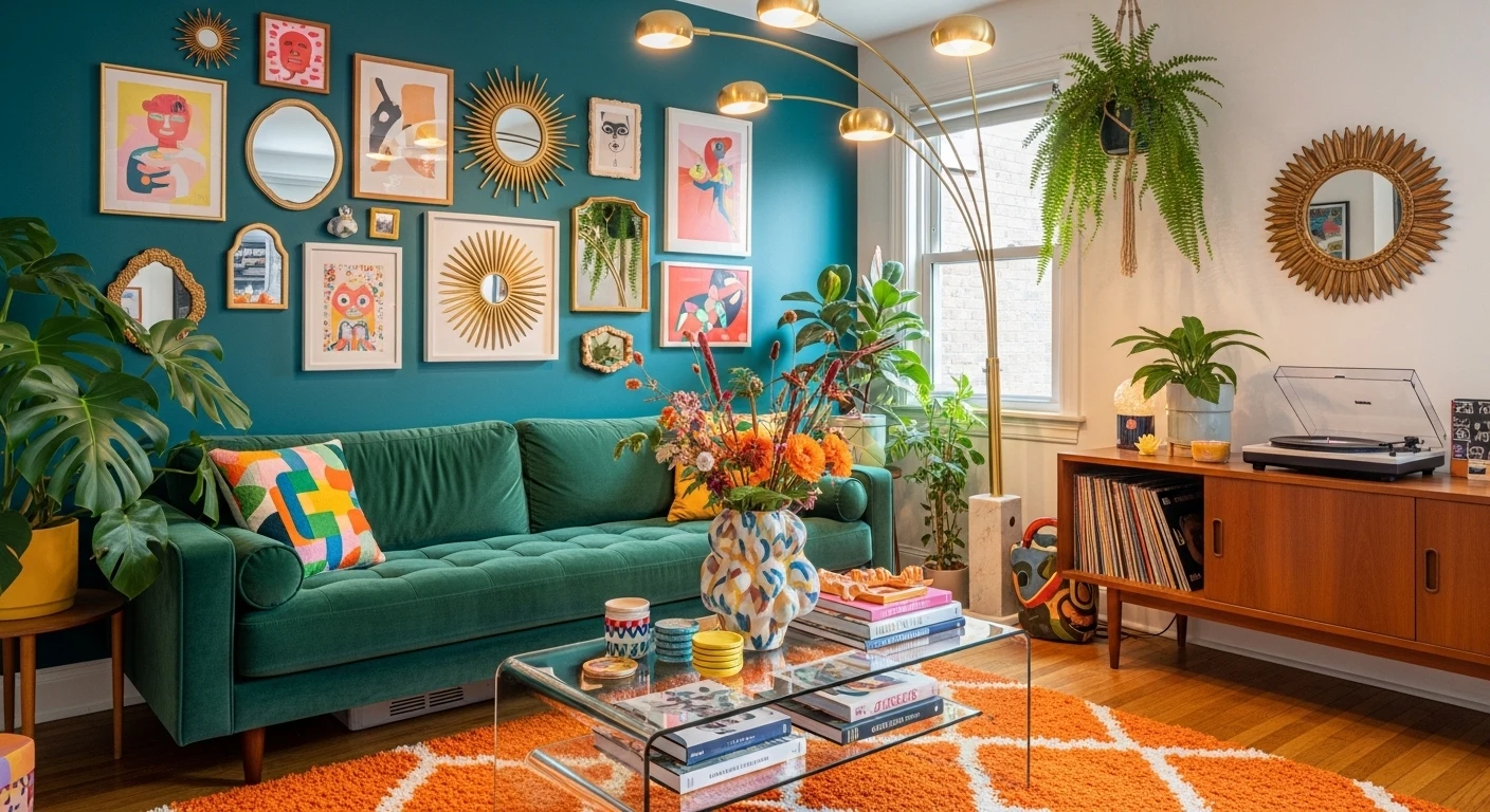
The Gallery Wall That Decided Quantity Was the Point
Choose a consistent frame style — same material, same depth, natural oak or black metal — and then abandon every other rule entirely. Source illustrated prints from independent artists rather than mass-market aggregators, and look specifically for work that shares a graphic language: bold outlines, flat colour, irreverent subjects. Food, cities, phrases, objects — variety in subject matter is the point, but visual consistency in style is what stops it looking like a car boot sale on a wall.
Install three rows of ledge shelving and lean prints rather than hanging them so you can keep adding, swapping, and rearranging without filling your walls with holes. Light the shelves from beneath with strip LEDs so the prints read clearly at night. The goal is a wall that looks like it was assembled obsessively over years, even if it wasn't.
The Bohemian Patio That Brought the Entire Mediterranean to the Back Garden
Paint your exterior walls in a deep cobalt or Mediterranean blue using exterior masonry paint — not a pale, safe blue, but the actual saturated kind that looks like it belongs on a Greek island. Build or buy a low concrete or rendered bench and upholster the seat with an outdoor cushion in fuchsia or deep magenta.
Layer kilim-pattern outdoor rugs over tiles or stone flooring, overlapping slightly rather than placing them in isolated squares. Hang woven rattan and ceramic lanterns from any overhead beam or pergola at varying heights — odd numbers, asymmetric arrangement. Then grow bougainvillea up every available wall and let it do whatever it wants. The plants do fifty percent of the work here; the paint and textiles do the other fifty.
The Kitchen Shelf Situation That Refuses to Be Just a Kitchen
Tile your splashback in dark green or navy metro tiles with dark grout — the combination reads as both vintage and graphic in a way white tiles with white grout never will. Install two or three open pine shelves with leather strap brackets and style them with a deliberate mix of trailing plants, brightly patterned ceramics, and hanging mugs in coordinating colours.
A disco ball on a shelf is not optional — it catches light and makes the entire kitchen feel like it exists in a better dimension. Paint the ceiling the same shade as your tiles or in a tone that picks up one colour from your ceramics, and let that decision quietly make everything below it look more intentional than it has any right to. Choose one statement appliance in a bold colour and position it where it reads immediately.
The All-Purple Living Room That Made a Decision and Stuck to It
Pick a saturated wall colour — proper purple, actual teal, genuine burnt orange — and paint every wall in the main seating area the same shade without breaking it up with an accent wall logic. Then find a sofa in the same colour family, or as close as your budget allows, and stop apologising for it. The monochromatic commitment is what makes the room feel considered rather than overwhelming.
Build your gallery wall entirely from art that exists in contrast colours — gold, rust, and green work beautifully against purple — so the art pops rather than disappearing into the wall behind it. Keep your floor neutral and let indoor plants provide the green that stops the whole thing from feeling airless. The rule is simple: when everything agrees on the colour direction, the accessories can be completely free.
The Bathroom That Put a "OH CRAP" Sign Above the Toilet and Won
Start with the floor — black and white checkerboard tile is available in self-adhesive vinyl if ripping up your existing floor isn't in the plan, and it immediately transforms a boring bathroom into somewhere with a point of view. Wallpaper the upper half of the walls above a tile dado in the most dramatic floral or botanical print you can find — dark background, overscale pattern, something that would make a cautious person nervous.
Keep the tiles themselves classic and simple so the wallpaper has something clean to sit against. Install one floating timber shelf and style it with a deliberately eccentric mix: a ceramic vase, a botanical print in a gilt frame, a trailing plant, something ceramic, something unexpected. Add a letter board with something that acknowledges the function of the room with complete honesty. A bathroom that knows what it is and says so is always going to be more interesting than one that's pretending to be a spa.
The Teal and Fuchsia Living Room That Chose Violence in the Best Way
The approach here requires accepting that two wallpapers can share a room if they share a colour story. Choose a dark botanical wallpaper for one wall and a cream-background floral for the adjacent wall — as long as both contain the same three or four colours, they'll argue less than you think. Bring in upholstered furniture in the colours present in both wallpapers rather than trying to pick a neutral that bridges them — teal velvet, mustard linen, fuchsia as an accent.
Install pink painted shelving and style it with books organised by colour spine so the shelving itself becomes part of the palette. Find a gold or brass ornate mirror for above the sofa — the richness of the frame echoes the layered quality of the wallpapers and stops the whole thing reading as juvenile. A boldly patterned rug that picks up every colour currently present on your walls ties the floor into the conversation and means the room works from every angle.
The Pink Hallway That Made Every Other Hallway Look Like a Crime Scene
Paint your stair banisters in a colour you actually want to touch — pink, yellow, cobalt, whatever your hallway needs to stop feeling like a transit corridor. Frame each doorway in a different pastel shade so that every threshold becomes a small moment of colour rather than a continuation of the same beige. Choose mirrors and console tables for their shapes rather than their finish — wavy edges, scalloped bases, curved frames — because hallways are primarily experienced in motion and shape registers faster than colour detail.
Install a scalloped or fluted side table in a painted finish for flowers, always fresh. The principle is that your hallway is the first and last room you experience every day, and treating it like it doesn't matter is the design equivalent of wearing great clothes and terrible shoes.
The Warm Gallery Living Room Where Every Print Has an Opinion
Gather illustrated prints over time rather than buying a set — the individual sourcing is what gives a gallery wall the feeling of being assembled by a person rather than a printer. Look for artists working in flat graphic styles with a warm palette — botanical, figurative, abstract, retro — and mix formats confidently: some large, some small, no strict grid. Hang them with warm Edison bulb pendants at varying heights so the lighting is doing as much work as the art itself.
Bring in a wavy or sculptural mirror frame somewhere in the room so the shapes extend beyond the prints. Choose your rug as if it's the largest piece of art in the room, because it is — something with an organic, abstract pattern rather than a geometric repeat, in warm terracotta and cream tones. Plants should be large enough to read as furniture, not just accents.
The Living Room That Has a Red Electric Guitar and a Smiley Face Pouf and Isn't Sorry About Either
The structural move here is placing two sofas in completely different colours opposite each other and committing to the confrontation rather than trying to separate them with a matching third piece. Orange and teal, red and green, mustard and blue — pick two saturated colours that sit opposite on the colour wheel and let them fight it out in the most productive way possible.
Lay a black and white checkerboard rug between them as the neutral ground. Build arched shelving in a bold paint colour and style it densely — ceramics, books, plants, small objects — so it reads as a cabinet of curiosities rather than a styling exercise. Then allow yourself one completely absurd object that has no design justification whatsoever — a giant inflatable, a novelty lamp, a guitar against the wall — and place it where it's immediately visible. Rooms that take themselves completely seriously have a ceiling on how interesting they can be.
The Maximalist Bedroom That Treats Bedding Like an Art Form
Layer your bedding in patterns rather than plain, starting with a stripe base layer and adding a floral duvet over the top in colours that share at least two tones with the stripe. Add a ruffled or tasselled cushion in a contrasting but related print so the cushion styling reads as intentional rather than accidental. Paint your nightstand in a deep, contrasting colour — dark blue against a pink headboard, forest green against a mustard wall — so it functions as a design moment rather than just a surface for your water glass.
Style the nightstand with objects that have different heights: a striped lampshade on a ceramic base, a ceramic vase with fresh flowers, one small sculptural object. Choose curtains in a single solid colour that picks up one tone from your bedding, and add tassel or fringe tiebacks to give them a finished quality that plain curtains can't match. The goal is a bedroom that looks like someone styled it but that someone is very clearly you.
The Beamed Cottage Living Room That Chose Joy Over Heritage Appropriateness
If you have exposed ceiling beams, paint the ceiling between them bright white so the timber reads clearly as an architectural feature rather than a darkening element. Then contradict the historical vernacular of the room with a mustard velvet sofa, a checkerboard rug in coral and pink, and a gallery wall that mixes fine art prints with personal photographs and text-based pieces that make you laugh out loud.
Style your coffee table with stacks of books you've actually read — spines visible, covers mixed — and add one ceramic object and one candle. The point is that the table reads as lived-in rather than staged. A vintage mid-century table is the right shape against a colourful rug because the clean lines of the legs stop the whole lower half of the room becoming visually heavy. The rule for beamed cottages is to let the architecture be old and let everything inside it be completely, joyfully now.
The All-Pink Kitchen with a Neon Sign That Understood the Brief
Paint every cabinet door, shelf surround, and skirting in the same shade of soft pink using a furniture-grade chalk paint for a flat, matte finish that reads as deliberate rather than accidental. Install open shelving above the countertops and style it with ceramics and pantry jars arranged by colour — warm tones together, cool tones together — so the shelving itself reads as a gradient. Commission or purchase a custom neon sign for above the upper cabinets in a cursive script with a phrase that either describes you perfectly or makes absolutely no sense in a kitchen context. Both are correct answers.
Add bold pink and white vertical stripe wallpaper above the cabinet line to the ceiling, so the colour story extends up rather than stopping at head height. Choose one appliance — kettle, toaster, espresso machine — in a contrasting colour that becomes the single point of visual interruption in an otherwise completely committed colour scheme. When your kitchen has a personality this specific, the only thing left to do is cook something worthy of it.ost restrained thing in the entire room. This kitchen has a theme, a colour story, a sense of humour, and absolutely no intention of blending in. The open shelving forces the styling to be intentional — every item visible, every colour chosen, every ceramic earning its place. When your kitchen has a catchphrase, you've won.
Final Thoughts
Quirky home décor isn't a trend with an expiration date on it. It's the natural result of what happens when someone stops decorating for approval and starts decorating for themselves. Every room in this list shares one quality that no amount of budget or square footage can manufacture: conviction. They were made by people who knew what they wanted, sourced it with genuine enthusiasm, and didn't leave themselves a beige emergency exit.
The homes people remember — the ones they describe in detail years later, the ones that made them feel something the first time they walked in — are never the cautious ones. They're the pink kitchens and the purple living rooms and the bathrooms with skull wallpaper and the cottage living rooms where a mustard velvet sofa and a cork-striped rug are having the best possible conversation. They're the spaces where someone's personality is so present in every corner that the room itself feels inhabited even when nobody's in it.
Your home is the only space in the world that exists entirely on your terms. The only design brief you're genuinely required to meet is your own. Make it interesting enough that you're glad to come home to it — which, it turns out, is the only rule that ever actually mattered.