
You’ve been sleeping in the same room for years. Same duvet. Same corner. Same tepid relationship with a pillow that’s technically fine. And every summer, you scroll through images of bedrooms that look like they were styled by someone who woke up glowing and has never once hit snooze. You pin them. You move on. Nothing changes.
This is the year you stop treating your bedroom like a storage unit with a mattress.
Summer is the one season your bedroom actually has something to work with — light, warmth, colour that doesn’t read as desperate. The problem isn’t inspiration. There’s plenty of that. The problem is that most people approach a summer bedroom refresh the wrong way entirely, shopping for accents before they’ve sorted the bones.
These rooms will give you something better than mood boards. They’ll give you a method.
The Colour Mistake That’s Making Your Bedroom Feel Like a Waiting Room
Most people think summer means adding colour. A new throw here, a patterned cushion there. The room ends up looking like it couldn’t commit to a direction and bought everything on sale instead.
When You Treat Colour as Decoration Instead of Architecture
Colour only works when it’s structural. That means it has to occupy the walls, the bedding, or the dominant piece of furniture — not just the throw pillow on the left side of the bed.
A single coral-pink bedroom with every element pulled from the same palette reads as intentional. The same pink used as an accent against a grey wall reads as indecisive. The difference isn’t the colour. It’s the commitment.
If you’re not ready to paint the walls, paint the headboard. If you’re not ready to do either, buy bedding in the colour and build everything around that. The point is to pick one thing and let it dominate.
The Beige Trap and How People Fall Into It
Neutral bedrooms are not the safe choice people think they are. They require just as much skill to execute as a bold one — arguably more. A neutral room that works is built on layered texture, varied materials, and at least one element that earns its presence through quality or form.
A neutral room without those things is just beige. Beige without intention is not calm. It is absent.
If your bedroom is currently some version of greige and you’re not sure it’s working, look at it and ask: is there anything here that has genuine visual weight? A rattan bedframe, a hand-knotted rug, a lamp that’s actually interesting? If not, you don’t need colour. You need objects.
The Seasonal Colour Logic Nobody Explains
Summer colour is not the same as spring colour. Spring wants pastels — soft, tentative, new. Summer wants saturation. Deep jungle greens, warm terracottas, proper botanical prints, the kind of pink that’s been sitting in the sun.
The rooms that feel genuinely summer are the ones where the colour has warmth baked into it. Cool blues can work, but only when they’re paired with warm wood or warm light. A cold blue room in summer just feels like somewhere you’re waiting for the dentist.
What Your Bedding Is Actually Doing to the Room
Bedding is not a background element. It is the dominant visual surface in the room. It is the first thing anyone sees when they look at your bedroom. And most people treat it like it’s barely worth thinking about.
The Pattern Mixing Problem
There is a rule people half-know and consistently misapply: vary the scale of your patterns. This is correct. But it requires actually varying — not picking two florals in slightly different sizes and calling it done.
A large-scale tropical print duvet wants a small geometric cushion and a plain lumbar. A classic blue-and-white plaid needs a solid quilted layer and maybe one pattern with a completely different character — a check, a stripe, something that breaks the visual repetition rather than adding to it.
The key is that one pattern leads. Everything else supports. The moment two patterns compete for dominance, the bed looks like it has an argument happening.
The Linen Question
Linen bedding in summer is not a trend. It is a logical response to sleeping in a warm room. It breathes. It softens with washing. It has the particular quality of looking good slightly wrinkled, which means low effort and high return.
The texture linen brings to a room is also different from anything cotton can offer. Cotton is smooth and flat at scale. Linen has a weight to it even visually — it reads as considered. A plain white linen duvet on a simple wooden bed in good light is more visually sophisticated than most elaborate bedding arrangements.
If you’ve never committed to linen, start with pillowcases. See how quickly it changes the texture story.
Layering That Has a Logic to It
The beds that look effortlessly abundant — the ones with throws and quilts and a stack of cushions that somehow doesn’t look excessive — are not effortless. They follow a system.
Base layer: duvet or quilt in the dominant print or colour. Middle layer: a folded throw in a complementary texture, draped across the lower third. Top layer: cushions in graduating sizes, largest at the back. One statement cushion in the centre.
That’s it. That’s the whole system. The chaos-looking cottagecore beds and the pristine coastal beds are both following some version of this. The difference is just in the palette and the level of looseness applied.
Before You Buy Anything: The Room Decisions That Change Everything
There are four decisions that shape every bedroom, and most people make them accidentally — by default furniture placement, blinds that came with the apartment, or a rug they bought because it was on sale. Making these deliberately changes the room more than any new cushion ever will.
How You’re Handling Your Windows
Windows are the light source. Light is everything in a summer bedroom. And yet the window treatment is often the last thing people think about and the first thing they compromise on.
Sheer curtains in a summer bedroom are not decorative. They’re doing real work — softening direct light, creating movement, adding a layer of visual privacy without blocking the garden or the sky. A bedroom with sheers in a soft floral or plain linen reads as intentionally summer in a way that a Roman blind never will.
Hang them high. Hang them wide. Mount the rod as close to the ceiling as you can and let the curtains extend past the window frame on both sides. This is the single most effective curtain upgrade and it costs nothing except the price of longer fabric.
The Rug Shape and Size You’re Probably Getting Wrong
The most common rug mistake in a bedroom: too small. A rug that only sits under the bed frame with a few inches to spare makes the room feel like the rug is hiding. You want the rug to extend generously on both sides of the bed, far enough that your feet land on it when you get up in the morning.
The second most common mistake: wrong shape for the vibe. A rectangular rug grounds a room. An organic, amoeba-shaped rug loosens it up — it signals that the room has a personality and isn’t following every convention. If your bedroom is otherwise quite orderly, an irregular rug is the cheapest way to add character.
The Overhead Light Problem
Most bedrooms have one central ceiling light. Most bedroom central ceiling lights are terrible. They throw flat, top-down illumination that makes a bedroom look like a hospital ward and removes any sense of warmth or atmosphere.
For summer, when you want the room to feel warm and lived-in and inviting, overhead lighting is not your friend. Use lamps. Two on the bedside tables as a minimum. Add string lights along a curtain rod or dresser edge if you want ambience without a major electrical commitment. A sun-shaped mirror that reflects the window light back into the room does the work of a light fixture without requiring one.
Summer Bedroom Ideas
The Maximalist Floral Bedroom Built Around a Wildly Brave Bedding Choice
Start with the bedding. Find a duvet cover with a large-scale, full-colour botanical print — the kind with orange, coral, pink, green, and yellow sharing the same surface without any of them apologising. This is your anchor. Everything in the room builds from it.
Paint the walls white. Not off-white, not cream — a clean bright white that reads as a backdrop, not a colour. Install vertical tongue-and-groove panelling on the lower half of the wall if you can. It adds architectural interest without competing with the bedding.
Choose a bedframe with rounded legs in warm timber — the bun foot style, or anything with a sculptural quality. Keep the nightstand simple: solid timber, open shelf at the bottom for a stack of books.
For art, hang two large botanical prints in natural frames directly above the bed on the panelling ledge rather than nailing them to the wall. The prints should be bright, illustrative, the kind that look like they came from someone’s studio rather than a homeware shop.
The rug should be organic-shaped in a soft warm neutral — oatmeal or sandy tone — large enough to extend past the bed on both sides. At the foot of the bed, place a tufted bench in terracotta or burnt orange velvet. The leaning floor mirror with a textural stone or resin frame pulls the natural materials through without adding more colour.
What makes this work is the white wall giving all that colour room to breathe. If you’re nervous about the bedding, that’s the sign you’ve picked the right one.
The Desert-Warm Rattan Bedroom That Earns Every Square Inch
The foundation here is a full rattan or cane bedframe in warm oak — not pale blonde, not dark walnut, but the honey-brown middle tone that doesn’t lean cold or heavy. The cane panels in the headboard and footboard are the defining material of the whole room.
Start with white bedding as the base — a plain white linen duvet, loosely arranged. Then layer in rust and terracotta through your pillow shams and a single round textured cushion in cream. A chunky knit throw in undyed natural wool gets draped casually over the lower third of the bed rather than folded neatly.
For the rug, layer two: a large flat-weave in cream or ivory as the base, and a smaller sheepskin or plush rug overlapping at the foot. This adds depth underfoot without adding colour.
Bring plants into both corners — a tall architectural plant like a dracaena or snake plant on one side, a trailing pothos in a simple white wall pot near the window. Keep everything potted simply: ribbed white ceramics, nothing ornate.
The art should be large, framed simply, and set above the headboard: a black-and-white landscape photograph works because it provides visual scale without adding colour to a palette that’s already doing exactly what it needs to.
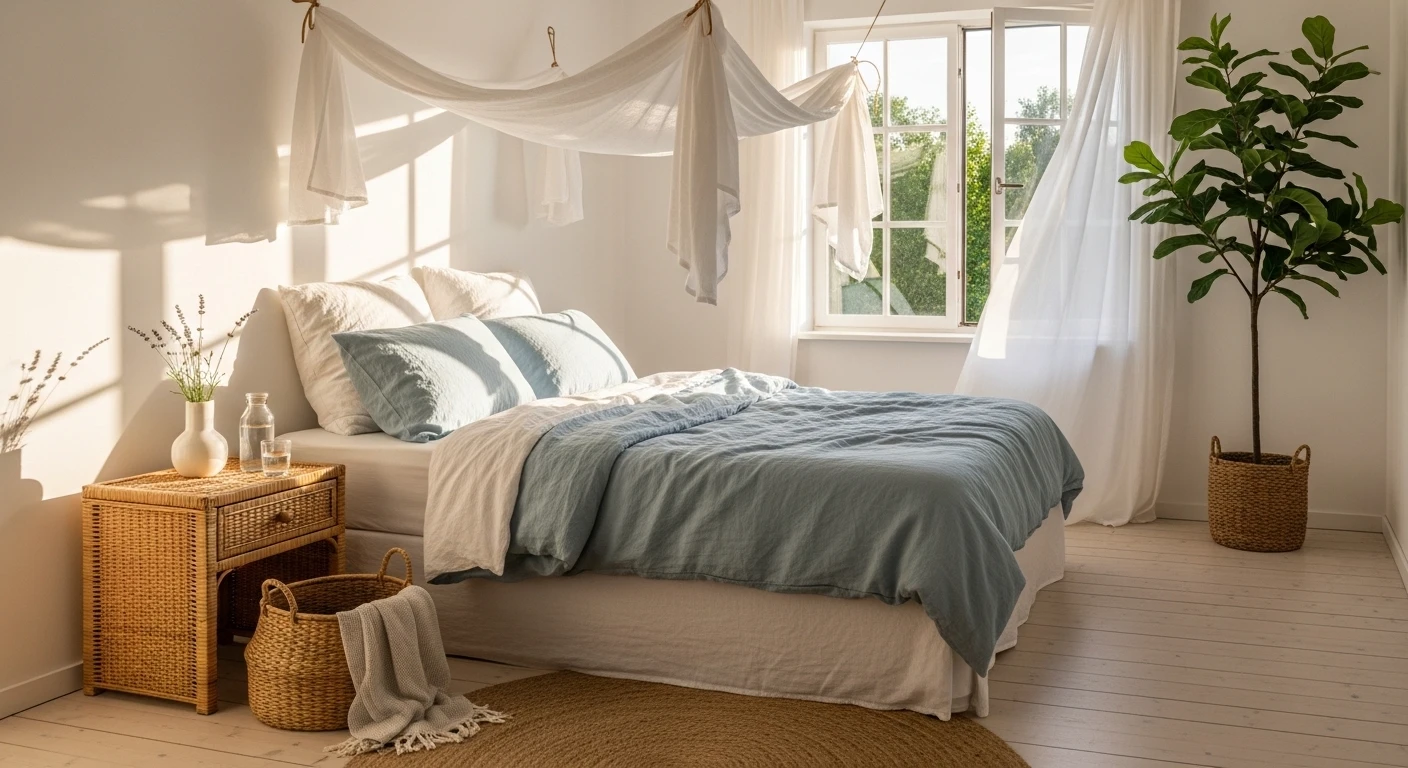
The Coastal Classic Bedroom That Uses Blue Like It Actually Knows What It’s Doing
The stripe wallpaper is the first decision. Choose a tone-on-tone stripe — white on very pale warm grey, or ivory on white — that reads almost as texture from a distance. This is the backdrop that lets the blue elements come forward.
The bedframe should be a painted wood panelled headboard in soft grey or off-white. The bedding goes full white: quilted coverlet, layered euro shams, crisp white pillowcases. The texture of the quilting — a geometric basketweave is ideal — gives the white surface enough visual interest to hold its own.
Now introduce the blue through the accent furniture. A tufted bench in slate blue velvet with turned wooden legs at the foot of the bed is the centrepiece of the lower half of the room. Ground it with a woven flat-weave rug in soft blue and cream plaid.
On the nightstands, keep things simple: white ceramic lamps, a small green plant, nothing fussy. Use the ceiling to introduce one character piece — a black wrought iron chandelier with some age to it, the kind that belonged in a country house.
The one piece of art: a coastal landscape in blues and greys, framed in painted white. Hang it above the headboard, centred. The room needs one narrative object. That’s it.
The Soft Farmhouse Bedroom Where Quiet Is the Whole Point
This one is built around restraint, which is harder than it sounds.
The palette is entirely neutral: ivory, cream, warm sand, one soft floral print in muted dusty rose and khaki. The bedding carries the floral — a quilted bedspread with a faded vintage print draped across the lower half of the bed. Under it, the duvet is plain cream linen, slightly rumpled.
Cushions should be in cream and natural linen — layered in size, textured but not patterned. No colour other than what’s already in the floral throw. A chunky hand-knit throw in warm camel hangs over one corner of the duvet.
The bedframe is an upholstered linen wingback in warm natural — the fabric should be loose-weave, textured, not structured. Pair it with blonde wood nightstands that match in height but not exactly in style.
Light the room with ceramic or linen-shade lamps. Use a vintage-style chandelier overhead — wood and iron with real candlestick-style arms. For the rug, choose a large vintage-style flatweave in faded tones: dusty pink, navy, ivory. The art above the bed should be text-based — two matching dark-framed quote prints, symmetrically hung.
The key to making this farmhouse rather than forgettable is the quality of the materials. Every fabric should feel substantial. The floral throw should look like it actually came from somewhere. The rug should look like it’s been loved.
The English Cottage Bedroom That Commits to the Whole Story
The iron bed frame comes first — painted white, with ornate scroll detail, slightly delicate. This is not a statement piece pretending to be simple. It is genuinely decorative and should be let to be so.
The quilt is the second anchor: choose a rose chintz or a traditional country floral in white and soft pink, quilted so it has body. This goes over the top of everything. Add a mix of patterned cushions in related but distinct florals: a blue block-print, a blue gingham bolster, a plain white with a frilled edge. The pattern mixing should feel collected over time, not purchased in an afternoon.
The nightstand is a wicker side table — dark rattan, with a lower shelf and drawer. On it: a lamp with a painted botanical shade, a small ceramic dish, a vase with fresh or dried hydrangeas. Under the nightstand, a wicker basket for storage.
On the window, fit a bamboo roman blind rather than curtains — it adds warmth and texture while letting in the kind of light that looks like it belongs in a storybook.
The art is old. Framed oil landscapes, an antique print, something that looks like it was found rather than bought. The worn timber floor underfoot asks for a natural sisal or jute rug. Everything in this room should look like it arrived over many years and found its place.
The Sunlit European Cottage Bedroom Held Together by One Perfect Window
This room starts with the window. Not the bed, not the walls — the window. Specifically, a large casement window that opens onto trees, light, or both, dressed with floor-length curtains in a delicate ditsy floral or small vine print in sheer or semi-sheer fabric.
Hang the curtains from the wall on each side so they frame the opening like a theatrical entrance. When the window is open, they move. That movement is the design event of the room.
The bed itself is a simple wrought iron frame in matte black — curved headboard and footboard, nothing fussy. The bedding is plain stone-washed linen in ivory or very pale ecru. Do not add pattern. One open book and a ceramic mug on the bed are enough detail.
The dark wood wardrobe stays because it grounds the room in something solid and old. The floors are bare timber. The walls are warm plaster — painted or unpainted.
On the bedside, a single small vase of white flowers. No lamp is needed if the window is that good. The whole design logic of this room is: put something worth looking at outside the window, then make sure nothing inside the room competes with it.
The All-Pink Bedroom That Wins Because It Doesn’t Apologise
The rule for a monochromatic bedroom: the colour goes everywhere, or it goes nowhere. Pale pink walls with a pink headboard and pink-printed bedding only works because there’s no dilution. The room commits.
Paint the walls in a warm soft pink — think coral-toned rather than baby, something with a little terracotta warmth in it. Then paint the headboard to match, or find one in the same family. The headboard profile should be the element that carries character: a panelled design with a curved top is ideal.
The bedding goes entirely white. White duvet, white shams, white pillowcases — and then the pink comes back through a printed duvet runner or bed scarf with embroidered or block-printed coral motifs. This is your bridge between the pink room and the white bed.
Keep the nightstand simple and painted cream or pale wood. A white ceramic lamp. A small white vase with fresh roses, not dried. On the wall beside the bed, one piece of art with a clear botanical or coastal motif in the same pink family, framed simply.
The accessories that ground the pink: a natural jute runner rug, a woven basket, a small rattan pouf. These warm neutrals stop the room from floating away into sweetness. The gilded oval mirror leaned against or hung on the headboard adds age and weight.
The Jewel-Toned Maximalist Bedroom Where More Is Genuinely More
This room will make people either love it instantly or feel anxious. That’s proof it’s working.
Begin with a botanical print duvet cover in deep forest green and gold — the kind with large painterly blooms on a dark background. This is not a subtle choice. Lean in.
Layer a second print on top: burgundy or deep wine in a leopard spot or abstract pattern for the large pillow shams. The clash between the floral and the animal print is the point. They share enough colour value to cohere without being matchy.
The nightstand is not a nightstand. It is an upholstered cube in an antique gold ogee-pattern fabric — the kind of thing that came out of a Victorian parlour. Stack books directly on top rather than inside it. Add one ornate gold-framed oil print.
Behind the bed, replace the idea of a headboard with a large expressive painting — abstract, gestural, dark and alive with colour. This is the wall. The painting is the headboard.
The floor should be bare or have a deep-coloured rug. The ceiling is optional real estate for a tapestry or more art. There should be no empty wall space visible and absolutely no beige anywhere in the room.
The Tropical Bedroom That Makes You Feel Like You’re Somewhere Else
Start with the walls. Paint them in a deep botanical green — the darkest shade you’re tempted to rule out. This is the decision the whole room depends on.
The bedding brings the jungle indoors: a large-scale tropical leaf print duvet in greens and pinks with a white ground. Layer in solid dusty pink and muted teal through the cushions. The mix of a patterned lumbar, a plain velvet square, and a textural fringe cushion gives the bed enough going on without losing the plot.
The headboard is woven rattan in a natural warm tone — as wide as you can find, ideally the full width of the wall behind it. This is the material bridge between the botanical print and the green walls.
On each side of the bed: oversized tropical plants in wicker or clay pots. A fiddle leaf fig, a calathea with dramatic patterned leaves, or a large parlour palm. These are not decorative plants. They are structural elements that blur the line between the room and the print.
Place a sun-burst mirror in brass above the headboard. Keep it simple — spokes radiating from a plain circular mirror. The gold reflects light back from the green walls and warms the whole scheme.
The flooring should be pale wood or painted white board — you need the contrast below to balance the density above.
The Sunlit Farmhouse Bedroom with One Yellow Throw That Does Everything
The bones of this room are very simple. Shiplap or tongue-and-groove walls in warm white. A linen upholstered headboard in natural camel. Bedding in cream and ivory — a quilted coverlet, linen pillow shams, a thin striped cotton layer.
Then one yellow throw. Mustard-gold, folded across the lower left third of the bed, slightly askew.
That throw is the room. Everything else is the backdrop that lets it work.
On the nightstands: one is rustic painted wood, slightly distressed white. The other is a simple stool or small table — intentionally mismatched. On both, a mix of vintage ceramic vessels, dried or fresh botanicals, a small stack of books. Keep the greenery abundant — trailing plants in clay pots are ideal.
Hang a round woven wall decoration above the bed — a large seagrass plate or disc, something with natural material and circular form. Beside it, a salvaged mirror with architectural framing.
The rug is jute or sisal, flat-weave, possibly with a subtle pattern. It should feel like it belongs in the countryside. The light through the sheer curtains in late afternoon is doing half the decorating.
The Four-Poster Canopy Bed That Turns Privacy Into a Design Feature
Build the canopy from reclaimed or rough-sawn timber — the frame should be deliberately un-precious, visibly constructed, with knots and grain showing. This is not the delicate Victorian four-poster. This is something closer to a shelter.
Hang full-length linen curtains on all four sides using simple clip rings — plain cream or natural undyed fabric. The curtains should fall to the floor and be wide enough to pool very slightly. They should move with air movement in the room.
The bed platform inside is low, built from the same reclaimed wood as the posts. Keep the bedding minimal: one good quality linen duvet in a warm greige, one textural throw in the same family, two pillows in organic linen cases. Nothing elaborate. The structure is the drama. The bedding is the rest.
Outside the canopy: whitewashed brick walls, pale grey wood floors, a large floor-standing plant in a woven basket. One small rattan or woven mat by the bedside. String lights along the window frame.
The canopy creates its own light environment. Inside feels different from outside. That psychological separation is what makes this idea worth the effort — it’s not about aesthetics alone, it’s about giving the bed its own room within the room.
The Blue Plaid Children’s Bedroom Built on a Framework of Pattern on Pattern
The wallpaper is a large-scale plaid in soft blue and cream. This is the bravest decision in the room and also the most correct one. Without it, the room is nice. With it, the room has a point of view.
Choose twin beds with high upholstered headboards in cream or ivory boucle. The tall headboards create a sense of symmetry and framing that makes two beds feel designed rather than doubled. Place a shared nightstand centred between them — warm timber with a single lamp.
The bedding on both beds matches: quilted coverlets in medium blue linen, white fitted sheets. Each bed gets one personalised name cushion in white with the name in a serif collegiate typeface in the same blue. This is a simple customisation that makes the room belong to whoever sleeps in it.
For the curtain panel centred between the beds at the window: plaid again, in the same family as the wallpaper but slightly different — the room can carry the pattern repetition because the plaid is used consistently rather than randomly. Layered beneath the curtain panel is a bamboo roman blind for light control.
The flooring needs to be pale, and the rug a flat-weave plaid in a softer, larger check that relates to but doesn’t copy the wallpaper. Round ottomans in blue at the foot of each bed replace a bench and give the kids somewhere to sit.
The Romantic Lace-and-Vine Bedroom That Has No Interest in Being Practical
The four-poster bed here is proper antique dark timber — carved headboard, solid posts. This is not the sleek modern frame. This is the frame your great-grandmother would have recognised.
The canopy layers fabric rather than using a single panel. Start with antique lace panels hung loosely on the posts — the kind with open crochet borders and scalloped edges. Layer sheer voile over and between them, allowing the fabrics to mix and fall unevenly. Add climbing vine or ivy stems woven into the canopy crown, along with clustered silk or dried florals.
The bedding continues this texture: multiple lace-trimmed pillowcases in white and ivory, a ruffled bedspread, a featherdown duvet that hasn’t been smoothed. The whole bed should look inhabited by fabric rather than dressed in it.
The light source in this room matters enormously. It must be soft. Candles on the nightstand, light filtering through the lace curtains, nothing direct overhead. The shadows cast by lace against a white wall in afternoon light are part of the decoration.
Bring in a cluster of fresh flowers — white peonies, hydrangeas, something full and slightly overblown — in a simple pot on the nightstand. The plants and vines outside the canopy on the posts bridge the gap between the garden-in-summer feeling and the interior.
This room is not for everyone. It is for the person who has committed to the romantic with the same resolve other people bring to minimalism.
The Candlelit Plant Bedroom Where the Golden Hour Never Ends
The building block here is warmth: warm-toned walls, warm wood furniture, warm light sources. Decide that every material and every light in this room will pull in the same golden direction.
Start with a large pine or warm oak dresser against the main wall. Top it with a full-circle round mirror in a simple natural wood frame. The mirror’s job is to reflect the light from the window across the room and to make the plants surrounding it feel like they’re hanging in space.
Let the vines grow. A pothos trained along the wall from the dresser, secured with small hooks, branching toward the ceiling and across the mirror frame. This takes months to look this good, which means the time to start is now. Keep the pots on the dresser top simple: terracotta, white ceramic, one dark brown clay pot.
Surround the dresser with more plants — a collection of small pots, different shapes, different species. The layering of leaf shapes and sizes builds complexity without needing to buy more furniture.
On the dresser: candlesticks, three of them, grouped asymmetrically. White taper candles only. The light they cast when the window light drops is the room’s evening identity.
String lights along the curtain rod or around the window frame — warm filament bulbs, nothing cool-toned. Use linen curtains in a warm blush or natural tone.
The bed is low, simple, with dusty pink or terracotta linen. Not the star of the room. The wall and the light are the star of the room.
The Countryside Morning Bedroom Built Around the Act of Being in Bed
This room is designed for one thing: slow mornings. Everything in it supports staying in bed longer.
The bed frame is raw or lightly oiled pine — a simple slatted design, solid without being heavy. The mattress sits low. The bedding is softly patterned linen: a striped duvet in warm cream and ivory, a gingham throw in red-and-white folded back across the foot. The combination of the stripe and the gingham is casual and country without being costume.
The window is the room’s entire south wall, dressed with a gathered balloon-style sheer in striped linen — pale enough to let the light in but with enough weight to move in the breeze. Outside: greenery. Inside: more greenery, a fresh-cut branch in a glass vase on the windowsill.
The walls are in vertical tongue-and-groove, painted in the palest warm grey or off-white. Small art is pinned or tacked directly to the panelling — a botanical print, a small figure sketch, nothing framed. The informality of this is intentional. This is a room that doesn’t try hard.
The floor is wide plank dark timber. Bare, or with a small cotton runner beside the bed. The nightstand is an older piece — wood with a ceramic lamp, a small painted jug for flowers, maybe a breakfast tray already positioned on the bed with a teapot and a mug.
The design intent is the morning itself. The light through that window, the flowers on the sill, the book splayed open on the covers. Set the room up to make that morning possible. Everything else will follow.
Final Thoughts
The rooms in this list don’t have one thing in common aesthetically. Some are maximalist to the point of audacity. Some are so restrained they’re barely there. One is entirely pink. One is mostly lace.
What they share is decision. Every one of them was made by someone who chose a direction and followed it without hedging. The cottagecore bedroom didn’t buy one floral pillow. It committed to the whole story — the iron bed, the wicker nightstand, the stacked books, the bamboo blind.
This is the part of interior design that no shopping guide will tell you, because it doesn’t translate to a product link: courage is the thing that makes a room work. Not expensive courage. Not expertise. Just the willingness to pick something that is actually you and stop apologising for it with a well-placed neutral.
Your bedroom is the room you see first and last every day. Make it look like someone interesting lives there.
You do.